Visualization
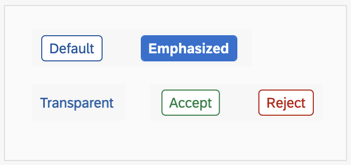
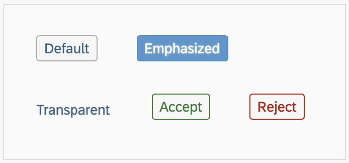
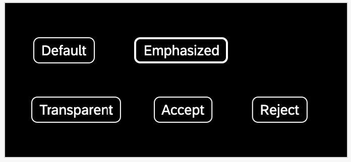
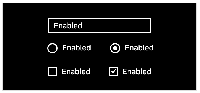
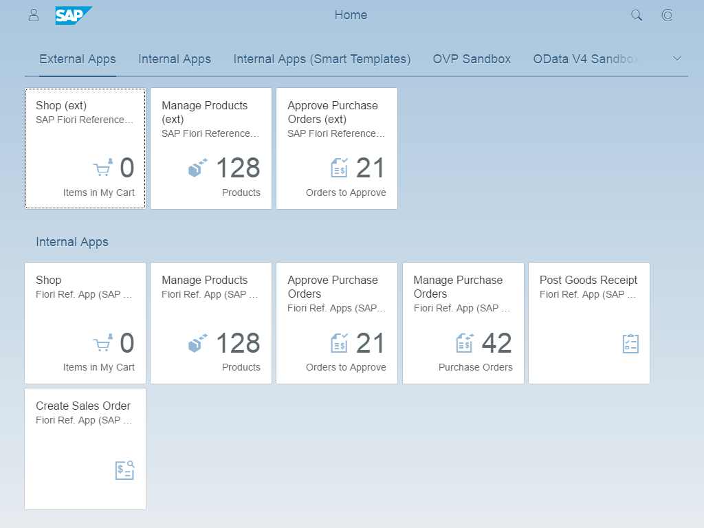
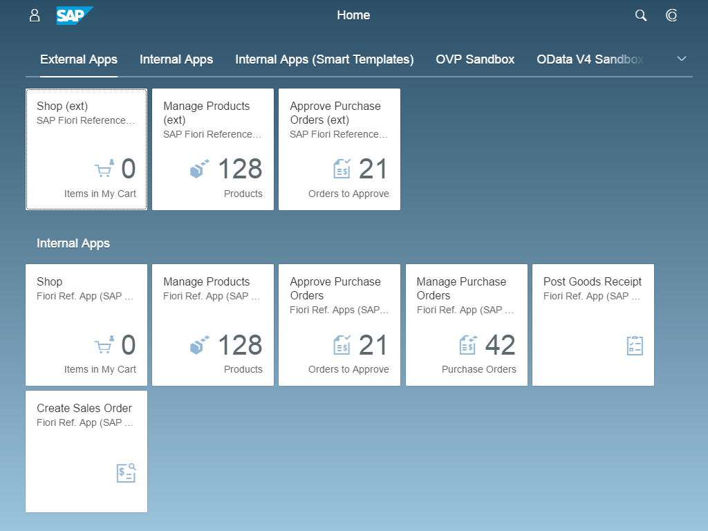
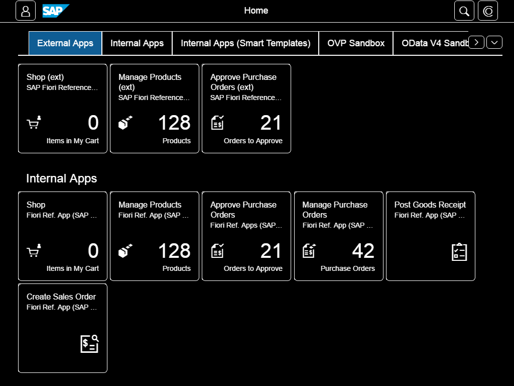
Minimum contrast: Following the requirements of the international Web Content Accessibility Guidelines WCAG 2.1 (see References), SAP Fiori’s default theme was designed to fulfill the requirements for minimum color contrast. In addition, we provide high-contrast themes that support the required contrast ratio of 7:1 for texts. They can be chosen in the user settings. The individual theme choice is saved as a preference until the user changes it again.
More information:
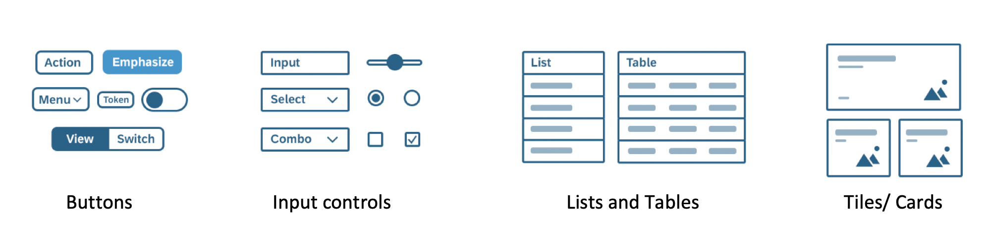
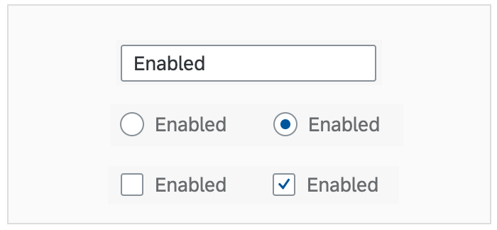
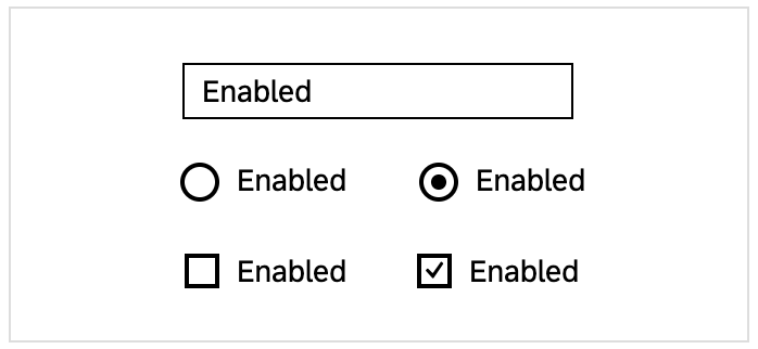
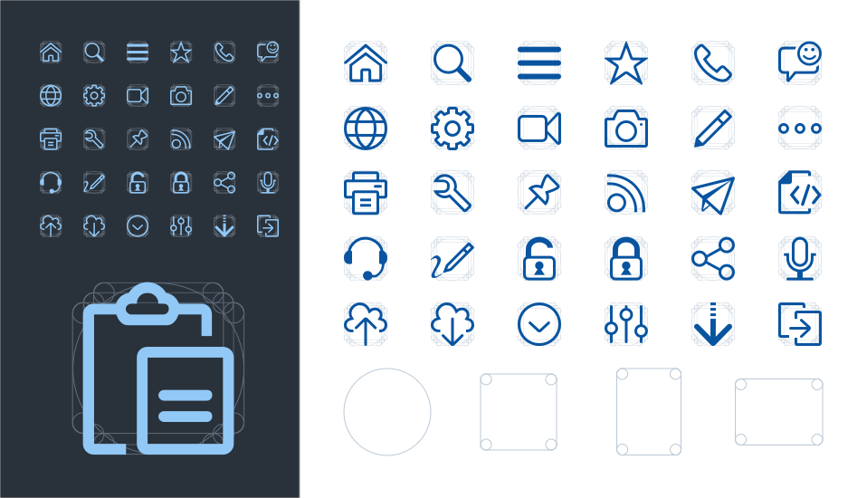
Consistency of icons: A comprehensive icon library ensures consistent icon usage within a product and also across products. The icon library includes predefined descriptions. This enables the development teams not only to use consistent icons, but also to implement meaningful descriptions for tooltips as a textual alternative for graphical representation. However, in some cases you may need to adapt these descriptions to the specific use case.
For more information, see Iconography.
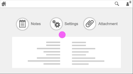
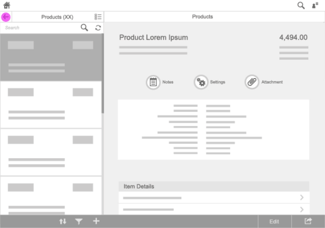
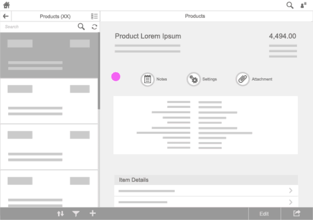
Keyboard focus visualization design: Focus visualization is very important for user efficiency. SAP Fiori uses a contrast ratio that makes the current focus stand out in all themes.
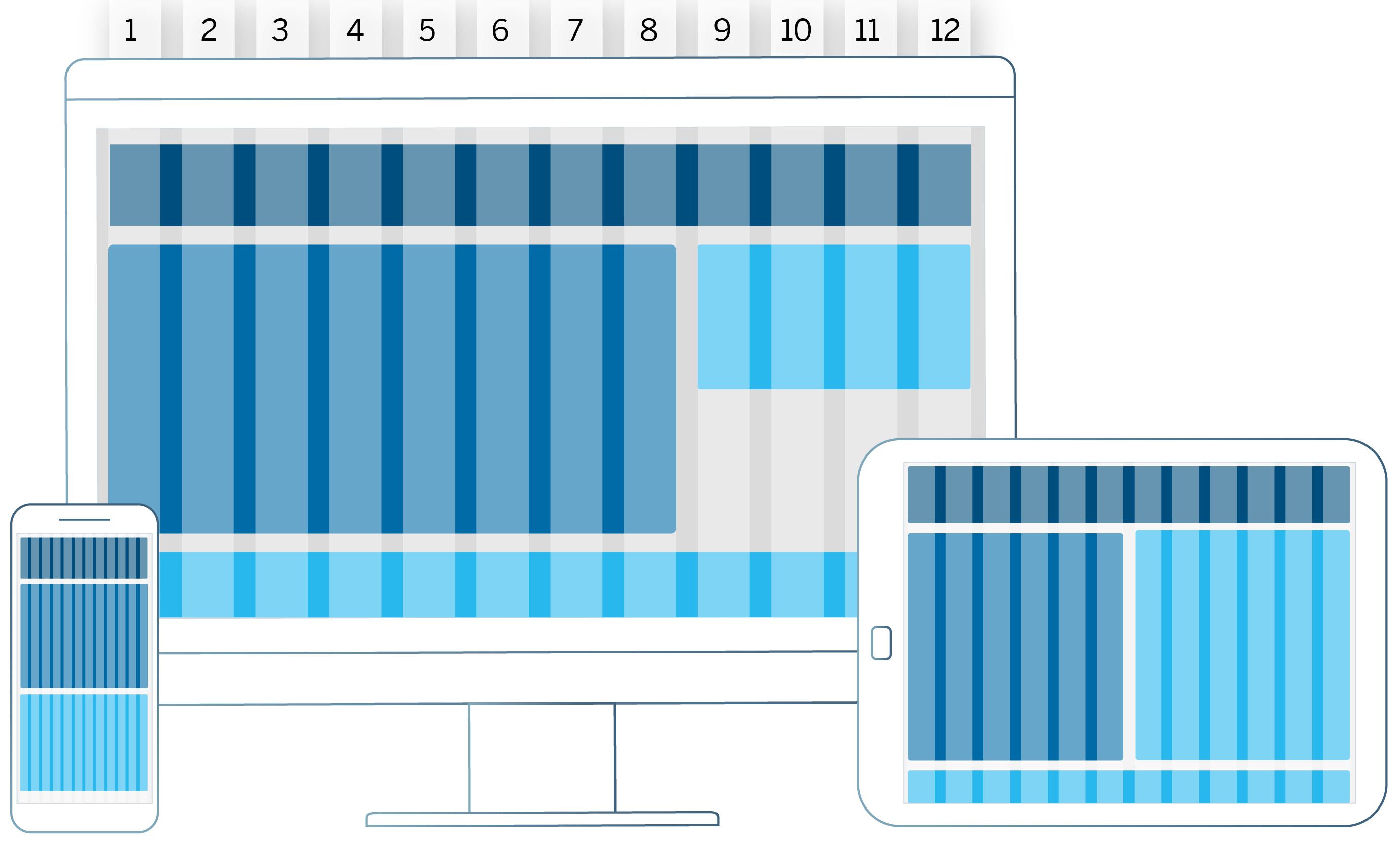
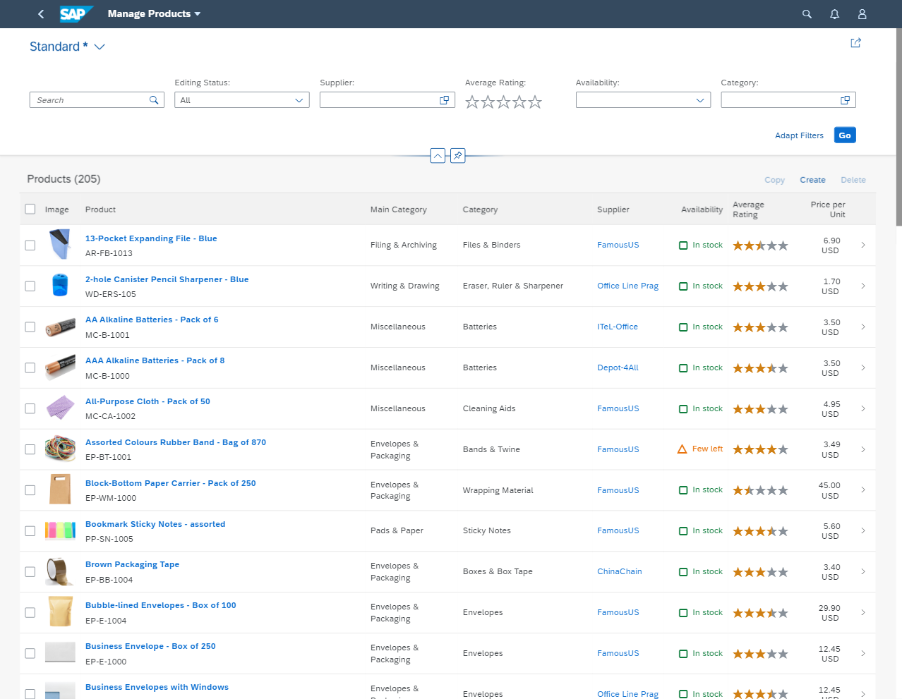
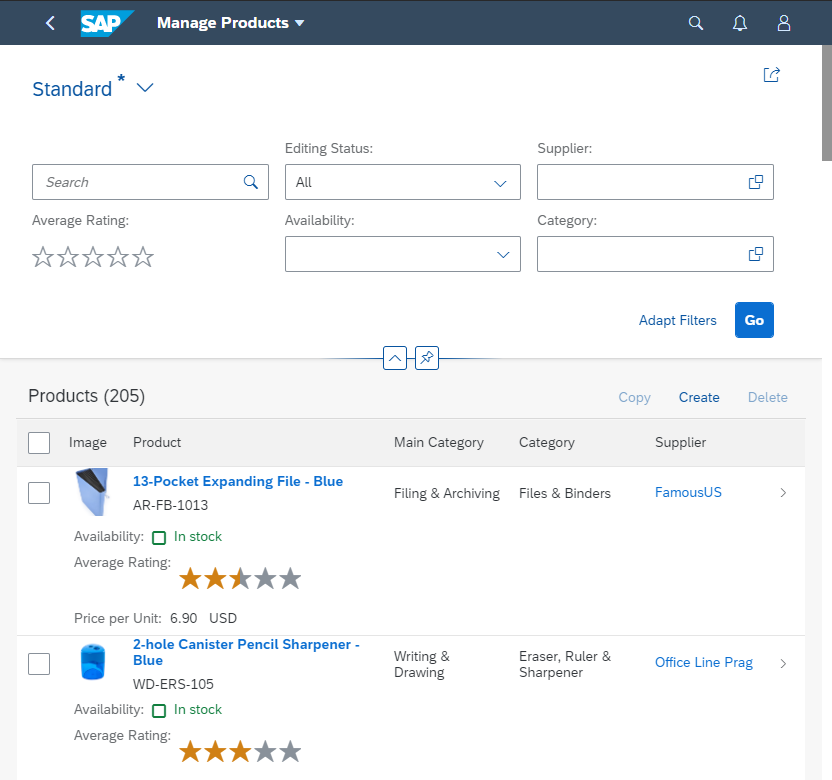
Layout adaptation for different devices: Since SAP Fiori can run on various devices, it comes with a responsive layout that adapts to the display resolution parameters of the individual device.
For more information, see Multi-Device Support: Responsive vs. Adaptive.
Support for text resizing: Users can adjust the font size themselves using the browser zoom. The responsive layout adapts to these manual adjustments automatically.
For more information, see Multi-Device Support: Responsive vs. Adaptive.
Keyboard Support
Keyboard navigation and control interaction: All standard UI elements and controls are designed to be keyboard-enabled. All suitable input channels (such as mouse, keyboard, or touch) are treated equally according to the capabilities of the device or the individual preferences of the user. For example, some users may prefer using the keyboard instead of a mouse, which lets them work faster.
For more information, see SAPUI5 keyboard support on SAP Help Portal.
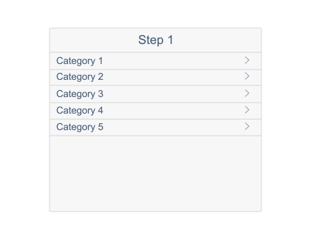
Tab order of controls: According to the placement of controls on the screen, SAPUI5 supports keyboard navigation with a predefined tab order sequence. This includes the tab order for the floorplan, the sequence of accessing individual applications, and the navigation in the application itself. According to control containers and layout, the application needs to be designed to support this order (left-right-top-bottom for western languages, for example).
Messaging Patterns
Standard messaging patterns (busy, errors, notifications): In SAP Fiori, a message system is implemented. This ensures that system messages appear at predefined locations with a consistent design.
For more information, see Message Handing.
Screen Reader Enablement
Screen readers retrieve visible and invisible textual information, as well as structural information from the user interface, in order to provide it as speech output or braille output to the end user. The SAPUI5 framework is technically prepared for screen reader support. This means that all the structural information and texts needed are handed over to assistive technology. Nevertheless, the actual structure, as well as the actual visible and invisible texts, need to be defined at application level.


 Your feedback has been sent to the SAP Fiori design team.