
Process Flow
The process flow control allows you to show flows of multiple types of objects, such as documents and approvals. Document flows can split into numerous branches, while approval flows are usually straightforward.
Usage
Use the process flow if:
- You need to display document flows.
- You need to display approval flows.
- You need to display other kinds of flows with linear and/or branching paths.
Do not use the process flow if:
- You want to display the process flow header in combination with something other than the flow map. In this case, use the icon tab bar (style: process) instead.
Responsiveness
The process flow reacts to the size of the container it is put into. It has four zoom levels, with level 1 being the largest and level 4 the smallest. In containers wider than 1024 px, level 2 is chosen automatically. For containers from 600 to 1023 px, level 3 is set, and below 600 px, it is level 4. For more information, see Behavior and Interaction.
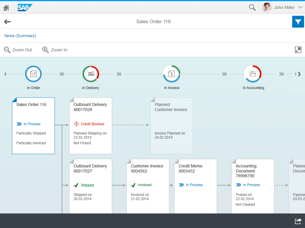
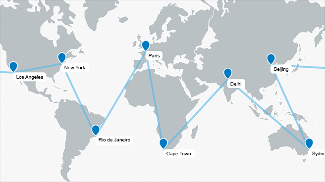
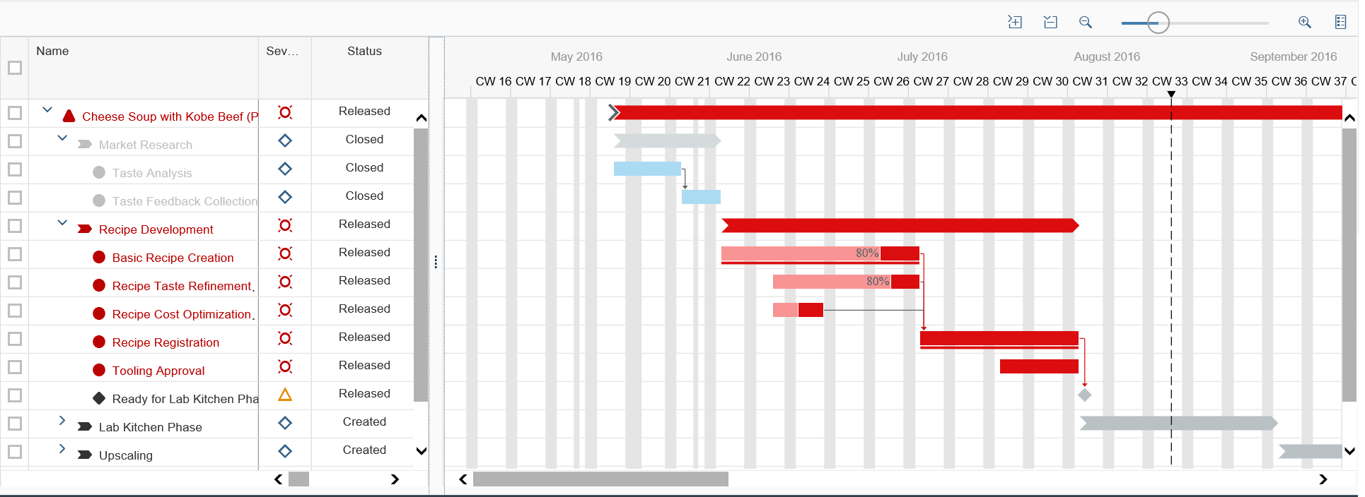
Process flow – Size S
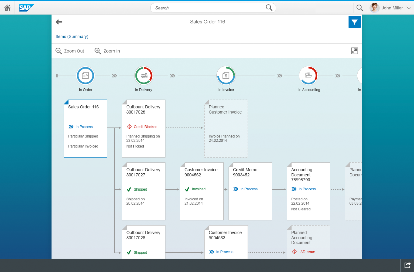
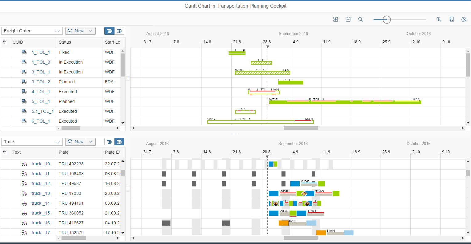
Process flow – Size M
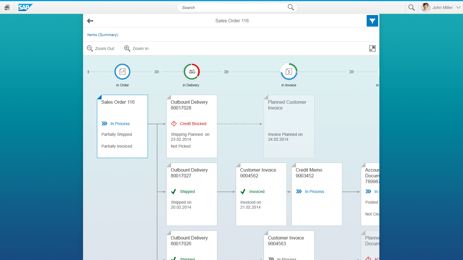
Process flow – Size L
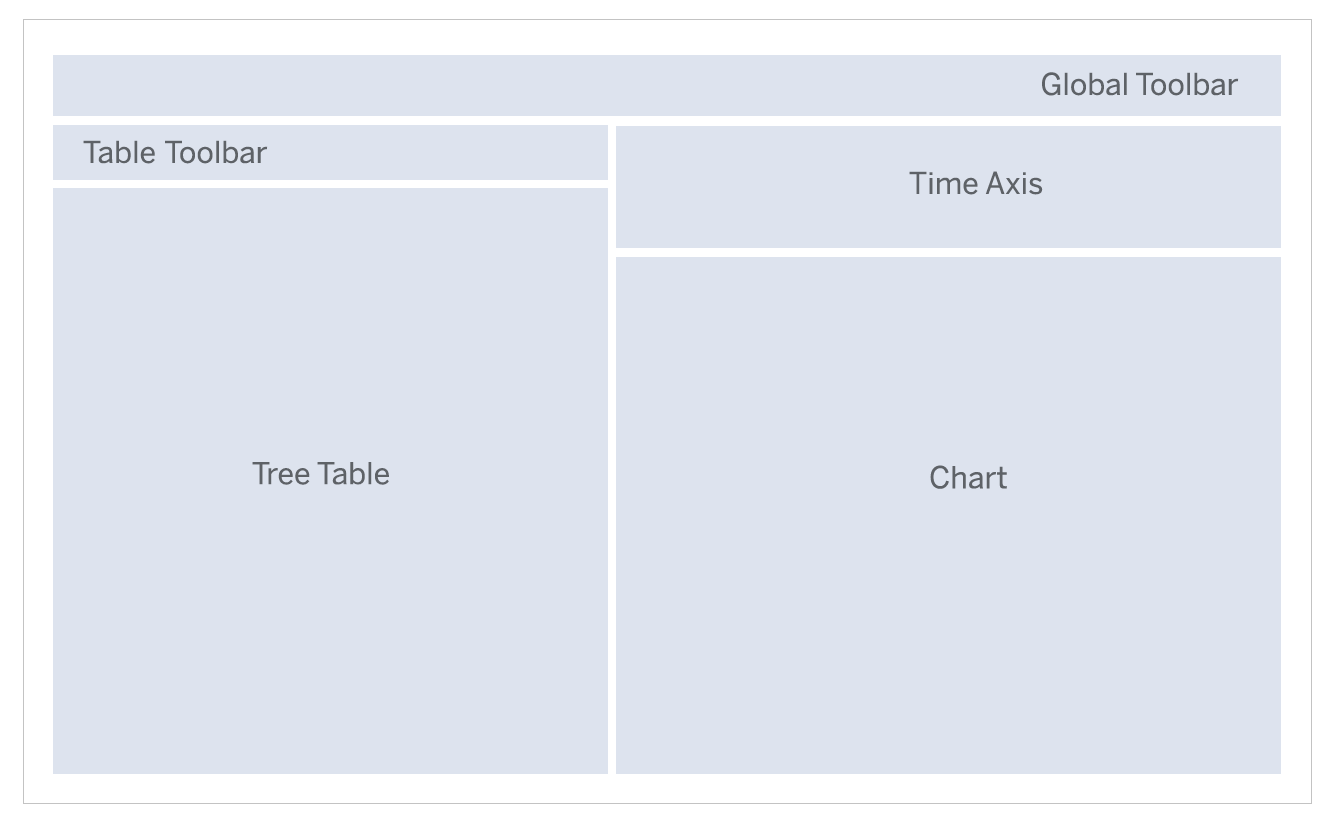
Layout
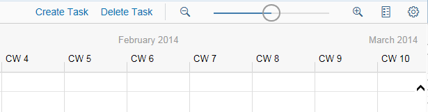
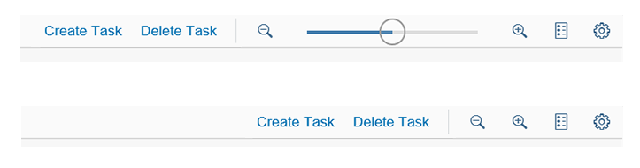
At the top of the control is a bar, with the zoom buttons on the left and the full screen toggle on the right.
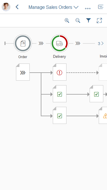
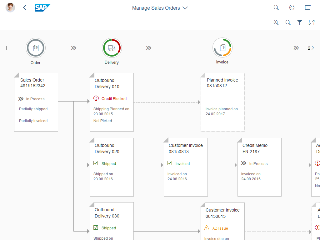
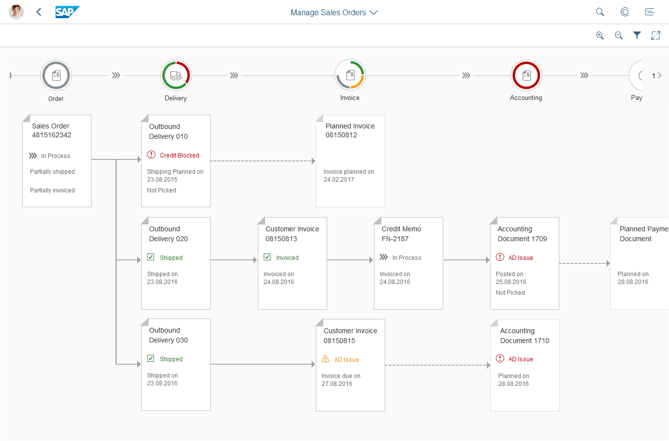
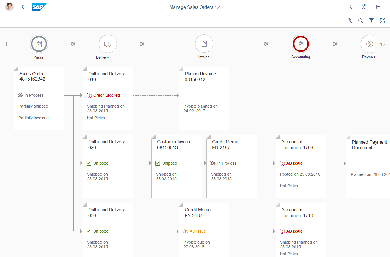
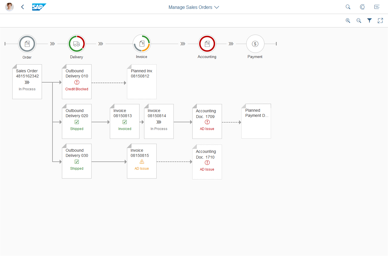
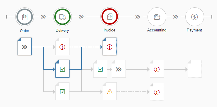
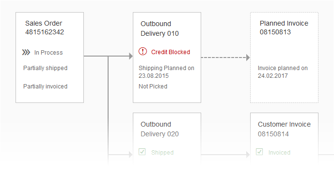
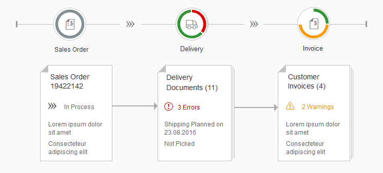
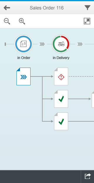
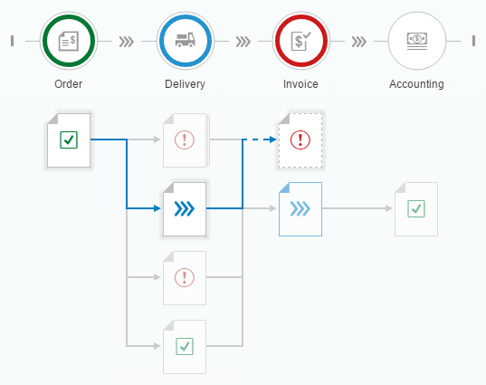
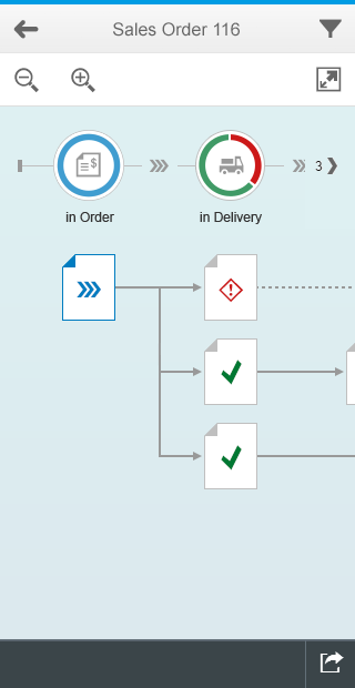
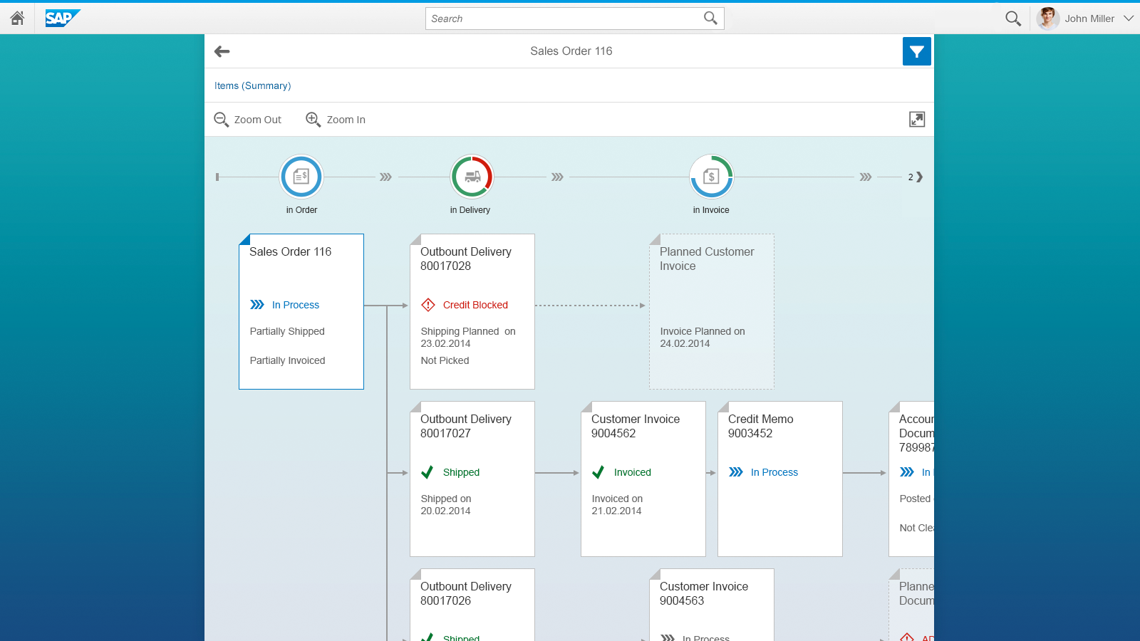
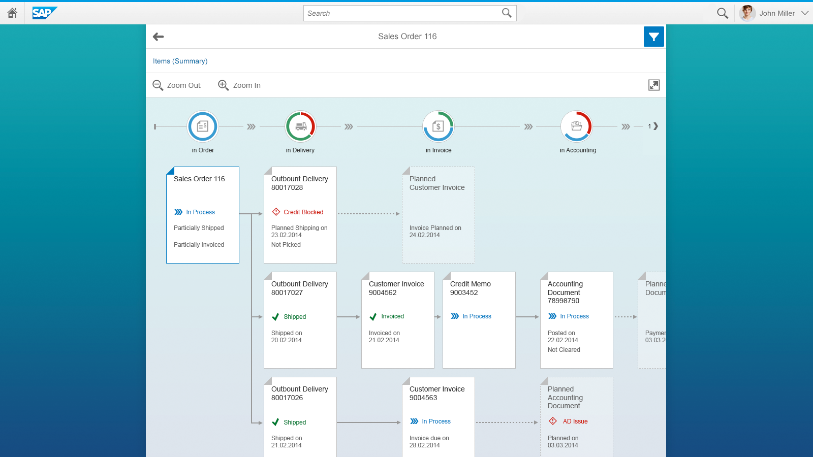
Below the bar is the process flow header, which can also be used on its own if the complex visualization of nodes is not required. The header consists of multiple steps, each of which is visualized by a circled icon. Optionally, each icon can be surrounded by a circular chart to indicate the distribution of statuses per column.
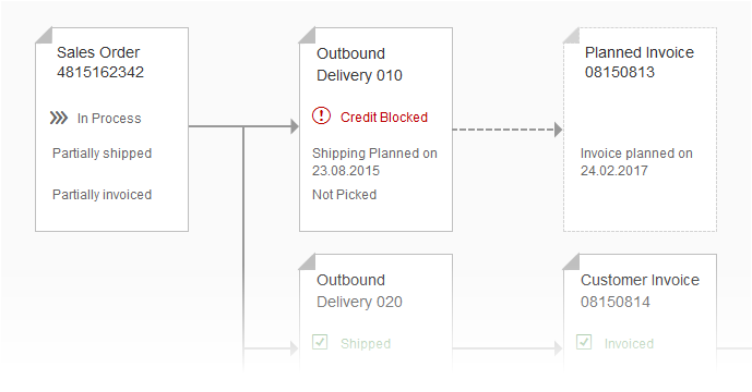
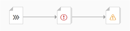
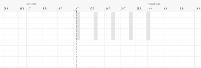
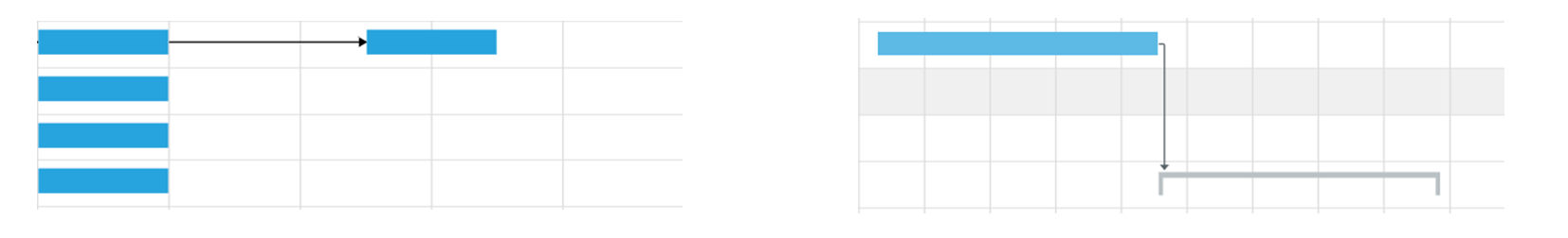
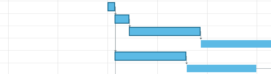
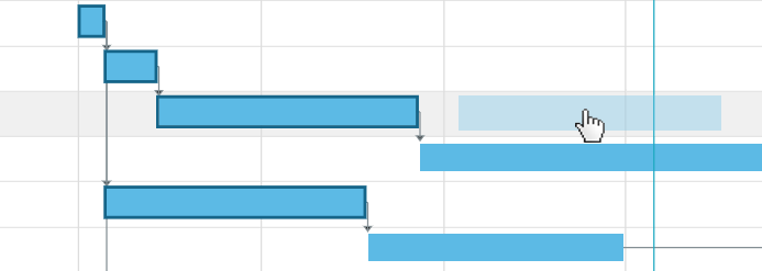
The flow map lies beneath the header. The elements belonging to a certain step are vertically aligned beneath one another. Arrows point to the next (follow-up) element or multiple elements. Dotted arrows pointing to semi-transparent elements indicate planned or pending elements.
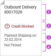
In turn, each element comprises different sections:
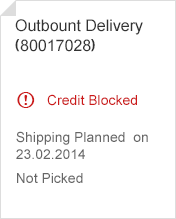
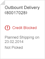
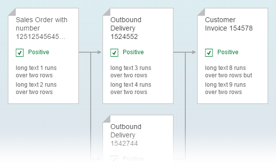
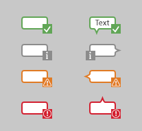
- Header (mandatory) –Wraps twice before truncation.
- Status (optional) – With semantic color and icon; can wrap once.
- Attribute 1 (optional) – Wraps once before truncation.
- Attribute 2 (optional) – Wraps once before truncation.
Layout – Sections
Naturally, the header information is mandatory because it is the key identifier of an object. The header should contain a brief but meaningful description and, if necessary, an ID in brackets.
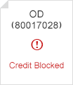
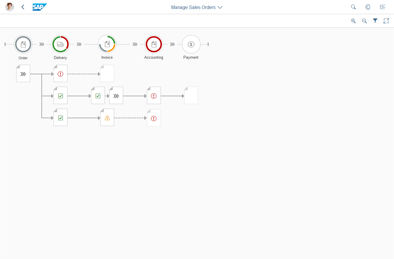
Although the status is optional, an icon appears on an item without a status at the smallest zoom level. When the user zooms out completely, only the status icon remains visible on an item. Without it, the element looks broken and does not provide any information.
You also have the option of putting a filter bar on top of the process flow to filter according to certain types or attributes.
Components
The process flow consists of a filter bar (optional), a toolbar with zooming controls and a full-screen switch, the process flow header, and the flow map.
Behavior and Interaction
Navigation and Zoom
User can move the whole flow with the left mouse button held down, just like they would move a street map in a browser.
To zoom in or out, the user can either click the respective buttons on the bar on top of the flow line or use the mouse wheel. The zoom is semantic: detailed information is added or removed depending on the zoom level.
If the process flow is wider than the available space, a chevron (< or >) appears on the side where the flow extends beyond the visible area. A number also indicates how many process steps lie outside, such as < 2 or 5 >.
Level 1
Larger elements provide the most space for
textual information. However, fewer elements
fit on the screen.
Zoom in (node)
Zoom in (process flow)
Level 2 (automatic preset for screens wider than 1024 px)
The standard size provides the best combination
of content information and overview.
Zoom in – Standard size
Zoom in – Standard size
Level 3 (automatic preset for screen widths from 600 px to 1023 px)
Elements are reduced to header and status
information to provide a better overview for
large flows.
Zoom in – Elements are reduced to a header and status information
Zoom in – Elements are reduced to a header and status information
Level 4 (automatic preset for screens below 600 px width)
The smallest zoom level provides a maximum
overview of the flow while the information about
each element is reduced to a status icon.

Zoom in – Element is reduced to a status icon
Zoom in – Elements are reduced to a status icon
The user can also expand the flow to cover the entire screen, in a similar way to the full-screen mode for charts. This is done by clicking or tapping the expand button in the toolbar:
Clicking a node in the flow spawns a popover with additional details about this element. It also gives the user a deeper insight into the status or, in the event of an issue, a way to solve the problem. From the quick overview, the user can navigate to the element’s fact sheet.
If no additional information needs to be displayed, an action sheet can be triggered instead of the popover to allow the user to perform actions on the item.
If no further information or actions need to be displayed, a node can also be read-only.
Labels on Connections
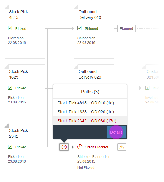
Some use cases focus on the connections between the nodes as much as on the nodes themselves. For these cases, we provide labels that can be displayed on each connection which, in turn, provide the user with the necessary information.
If multiple paths overlap, applications need to aggregate the respective labels and show the ‘worst’ status.

Labels
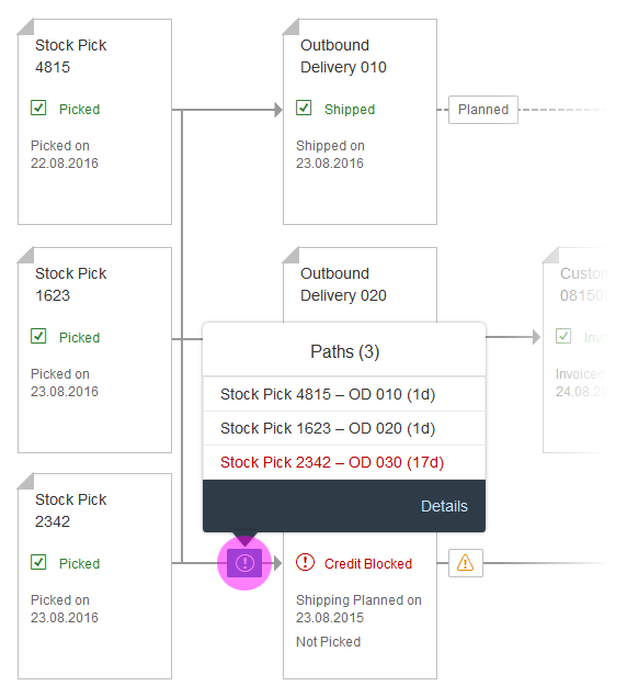
Process flow – Labels (1)
When the user clicks on an aggregated label, app developers need to provide a popover showing a list of connection paths for the user to select from. The first connection is selected in the popover and in the flow, while the rest of the flow is dimmed.
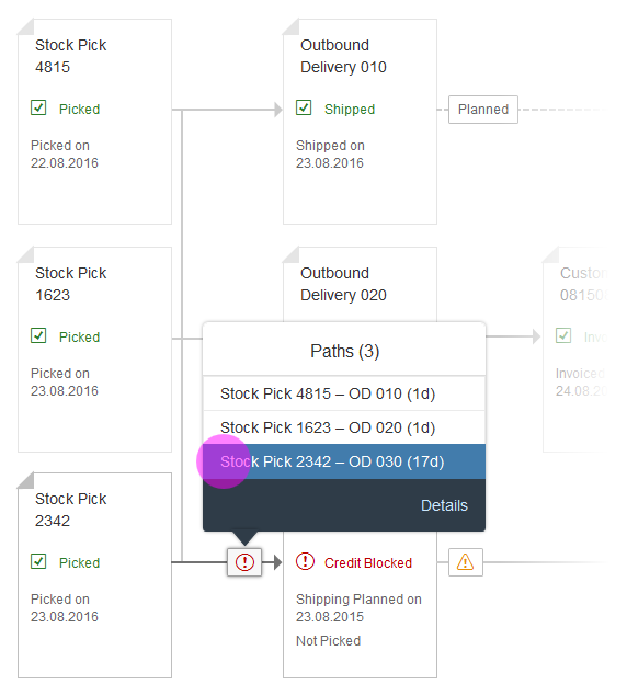
Process flow – Labels (2)
In the popover, the user can now browse through the paths, while the process flow is updated accordingly.
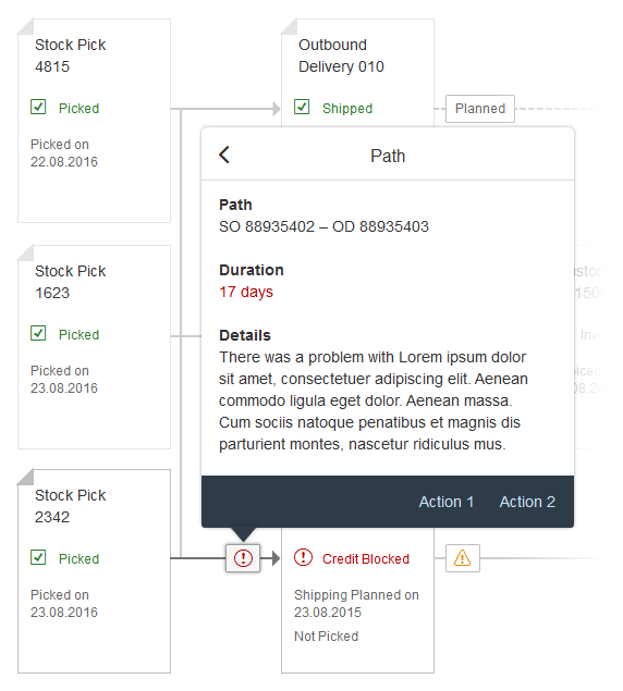
Process flow – Labels (3)
To give the user more information, a Details button needs to be shown in the footer.
The details must be shown in the same popover, and a back button must be offered that allows the user to return to the path overview.
The footer of the details overview can contain up to two actions.
Labels - Process flow
Highlight Path
The feature highlight path allows users to focus on specific nodes and their path through the process flow, for example by highlighting a search or filter result.
Example: A user searches for a specific item inside an order. The nodes containing or exclusively representing this item are highlighted, while the rest of the flow are dimmed.
Make sure to update the donut charts on top to only show data relevant to the highlighted results.
Highlight path
Business Focus
The business focus is a rarely used feature. It allows applications to put a visual focus on a node that is separate from (and not to be confused with) the selection or keyboard focus.
If, for example, the process flow is used next to another control (such as the timeline), the business focus can be used to highlight a node that corresponds to a selection in the other control:
- The timeline shows an automated post “There is an invoicing problem with Item 0815 from Order 4711.”
- The user clicks on the post (not onto a specific link).
- The respective node in the lane Invoice is highlighted.
If you use the business focus, make sure that only one node is selected at a time.

Business focus
Styles
Two visualizations are available for the nodes inside the flow: a specific visualization for documents, and one for general objects (basically everything except documents). App teams can use the FoldedCorners property to choose the type of objects that the process flow represents.
FoldedCorners = true: This style gives the node a “dog ear”, which makes it very recognizable as a document.
FoldedCorners = false (default): This setting has no specific visual style and is therefore suitable for all object types.
The property affects the entire flow; in other words, it cannot be applied solely to individual nodes. Therefore, it should only be set to true if all the nodes represent documents (or document-like objects). If some or all of the elements are better visualized with the general style, FoldedCorners should be set to false.
Styles – FoldedCorners – True
Styles – FoldedCorners – False
Aggregation
Some flows can be arranged more clearly by using aggregation. Nodes that belong to the same lane (column) can be displayed as a stack by setting the property Type to Aggregated. This means that nodes that would usually be displayed one below the other are shown as a stack of nodes.
The interaction for these stacks is identical to the regular nodes: the control provides a click event that app developers can use to show a popover with more detailed information.
The description on these stacks should be helpful to users, for example, by telling them how many nodes are in the stack. Aggregated amounts can also be shown.
The statuses in the stacks can be heterogeneous. However, it is imperative to show the ‘worst’ status(es) at the top so that users know whether they have to take action.
In the upper example on the right-hand side, the nodes under Delivery and Invoice are shown as stacks instead of individual nodes.
The lower example on the right shows the same stacks when zoomed out (level 4).
Aggregation
Aggregation (zoom)
Guidelines
The process flow header is not a substitution for the icon tab bar. For more details, see the Usage section at the top of this article.
Keep the amount of information inside each node to a minimum. Reveal more information via a popover.
Although technically possible, the node titles should not be turned into links. The IsTitleClickable property should be left in its default state (“false”). Titles that the user can click or tap may lead to usability issues. Handle every action or interaction via a popover and/or navigation to a subsequent page.
Resources
Want to dive deeper? Follow the links below to find out more about related controls, the SAPUI5 implementation, and the visual design.
Implementation
- Filter Bar (SAPUI5 samples)
- Process Flow (SAPUI5 samples)
- Filter Bar (SAPUI5 API reference)


 Your feedback has been sent to the SAP Fiori design team.