
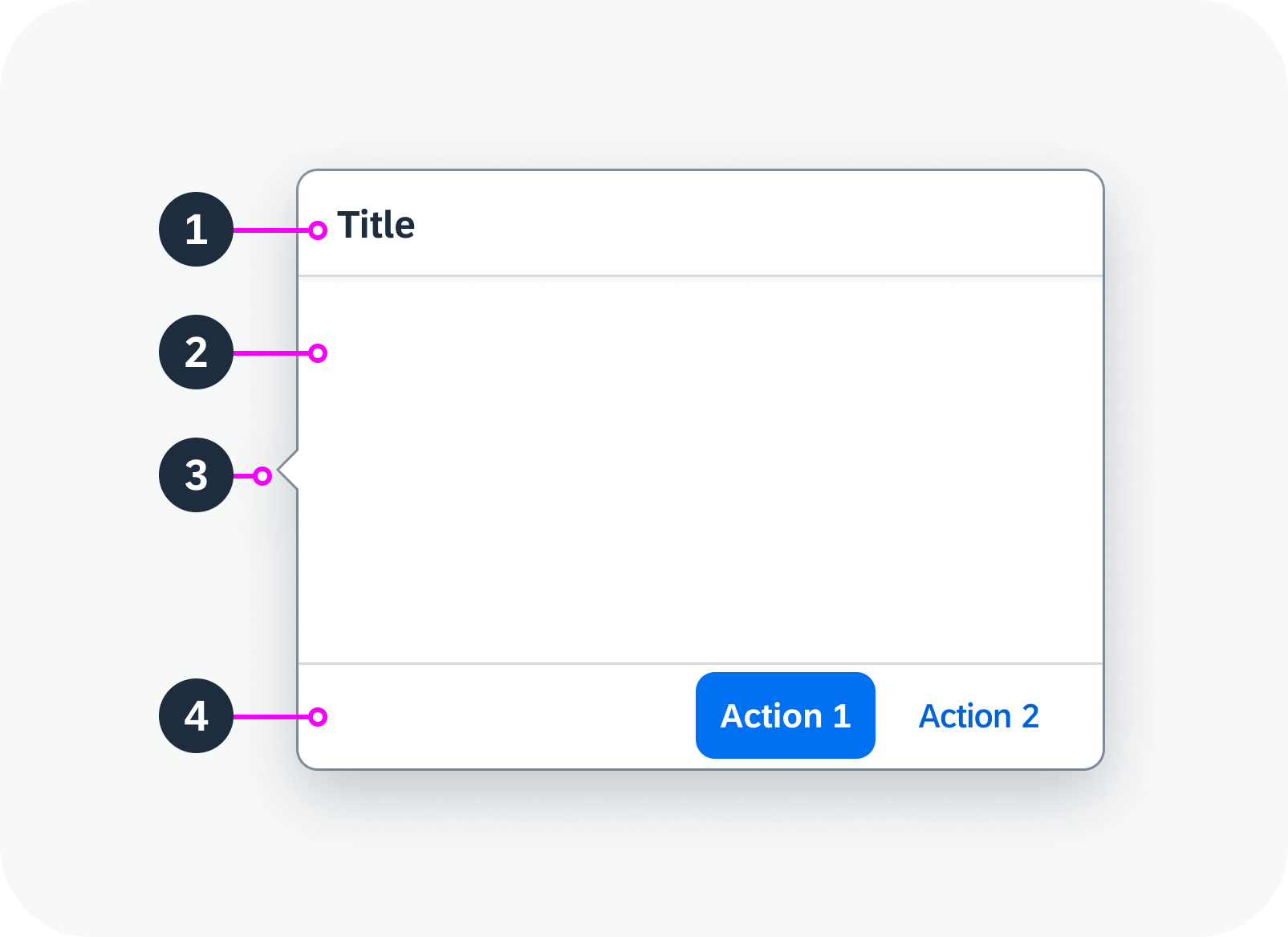
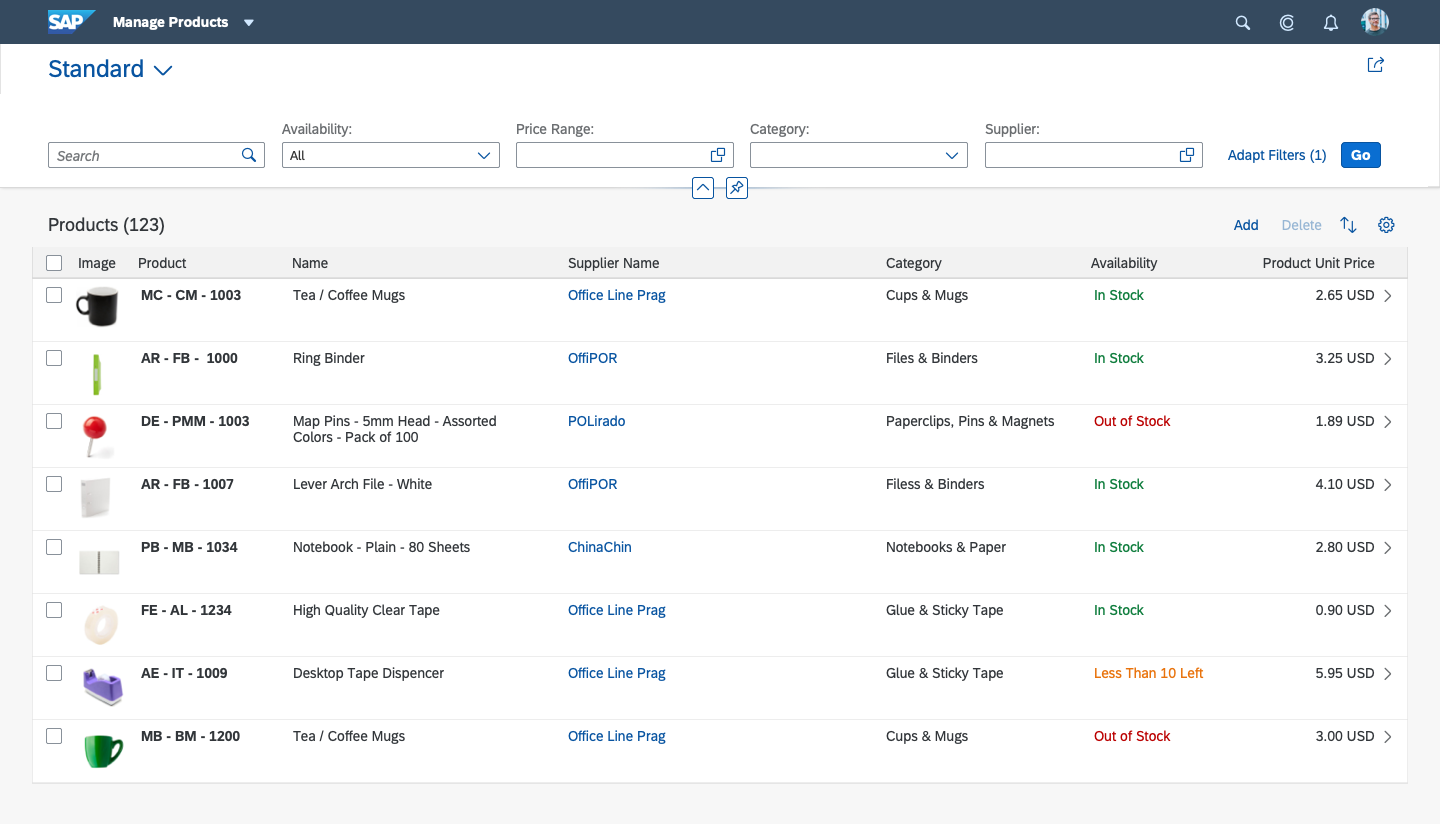
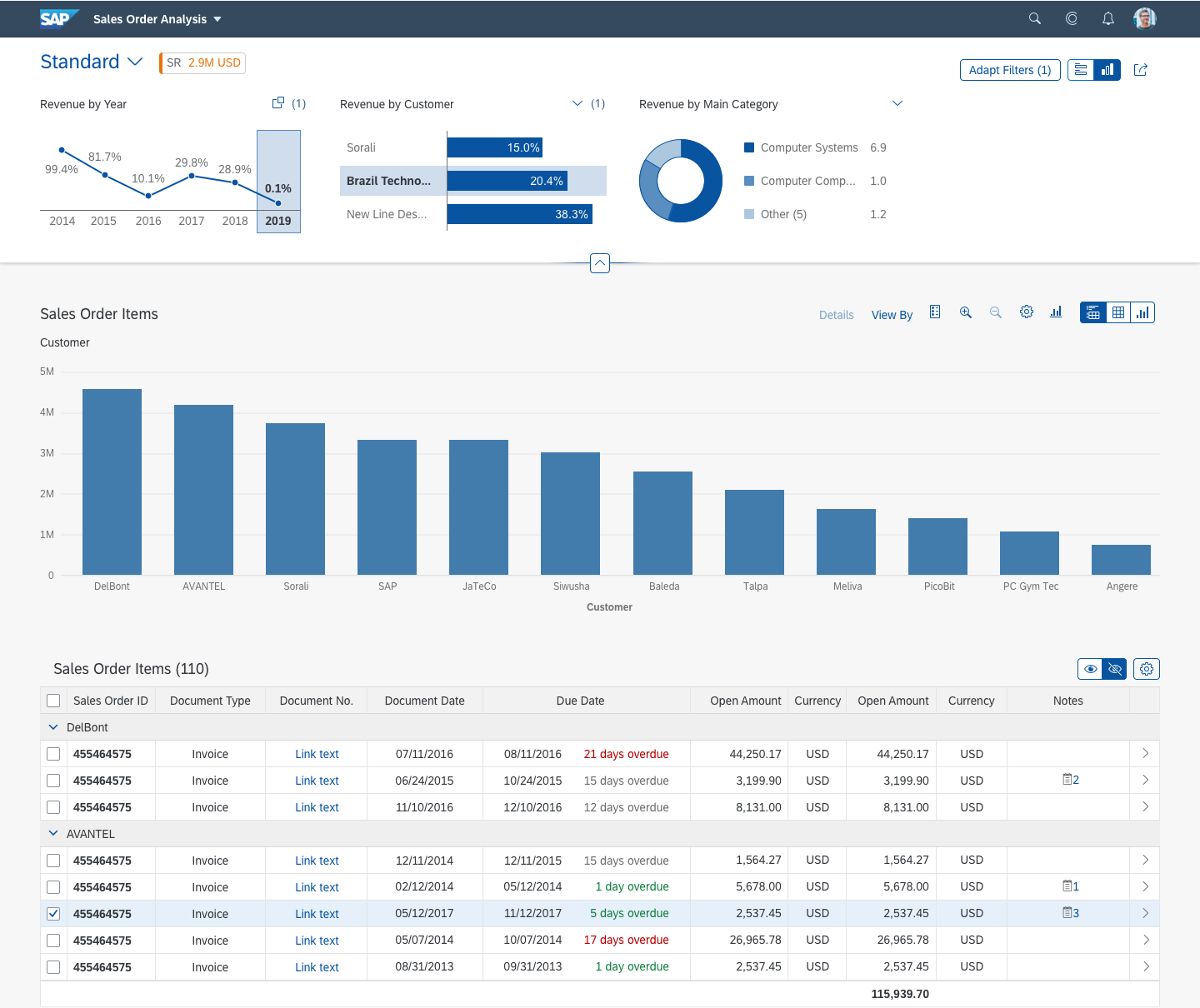
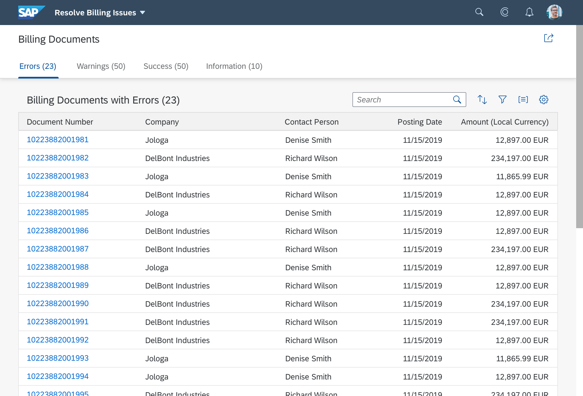
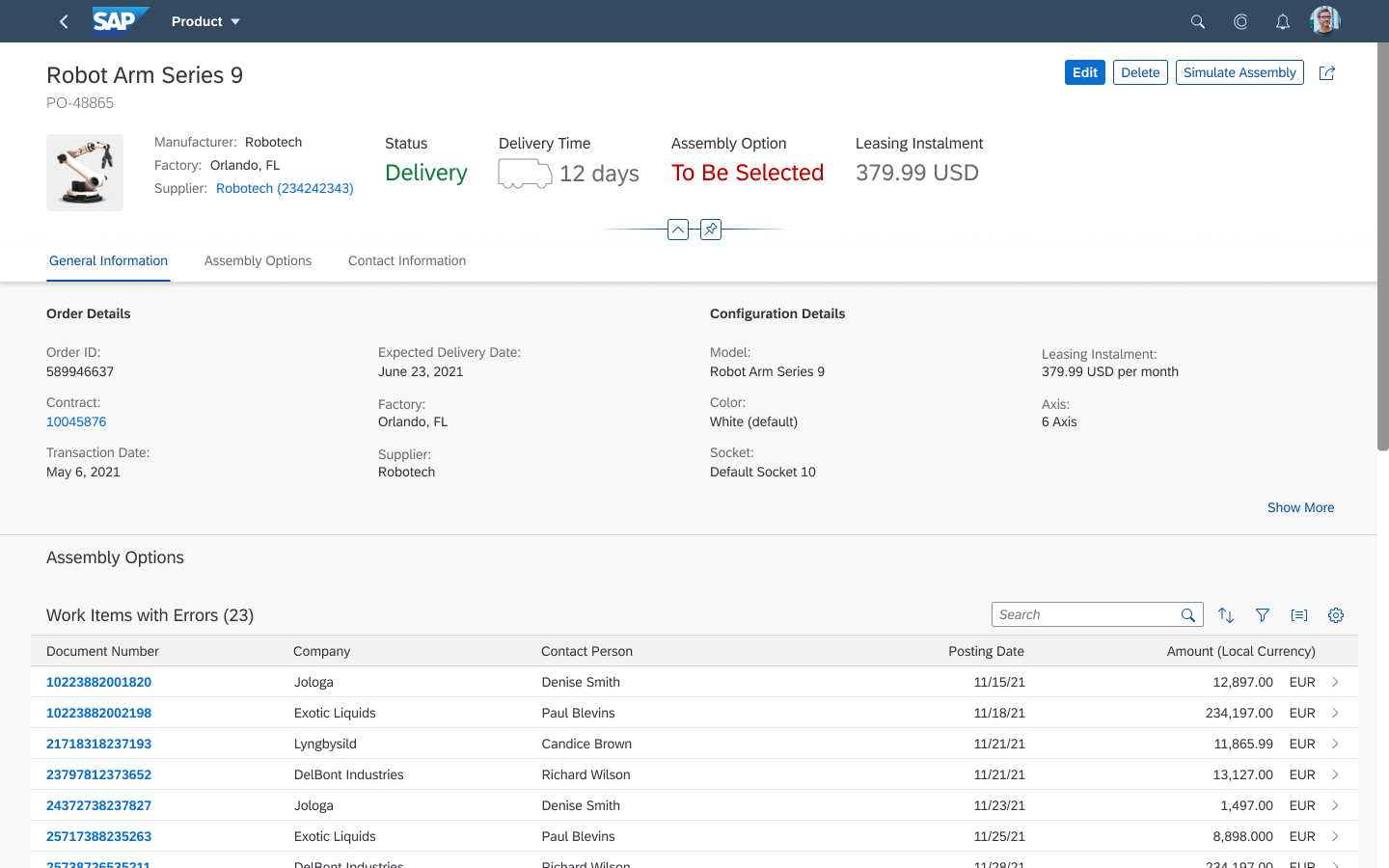
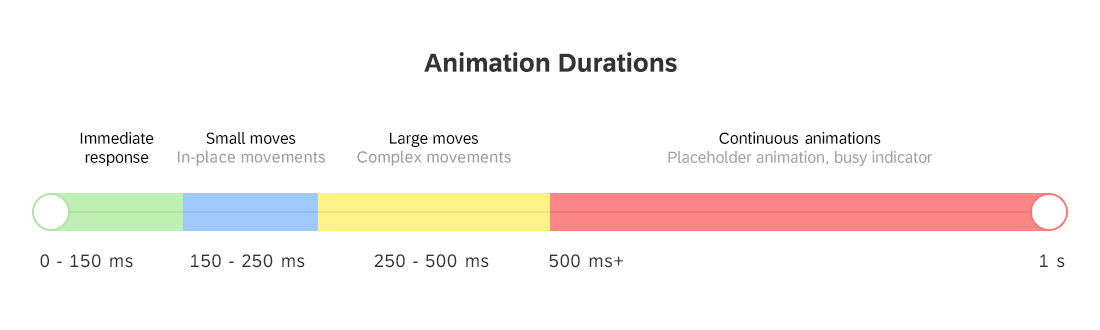
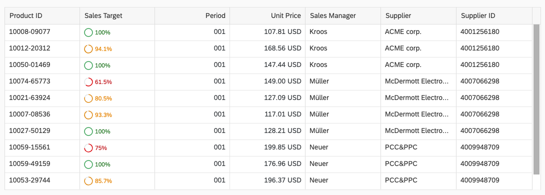
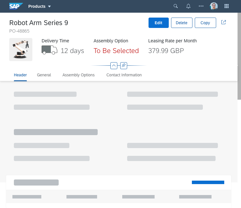
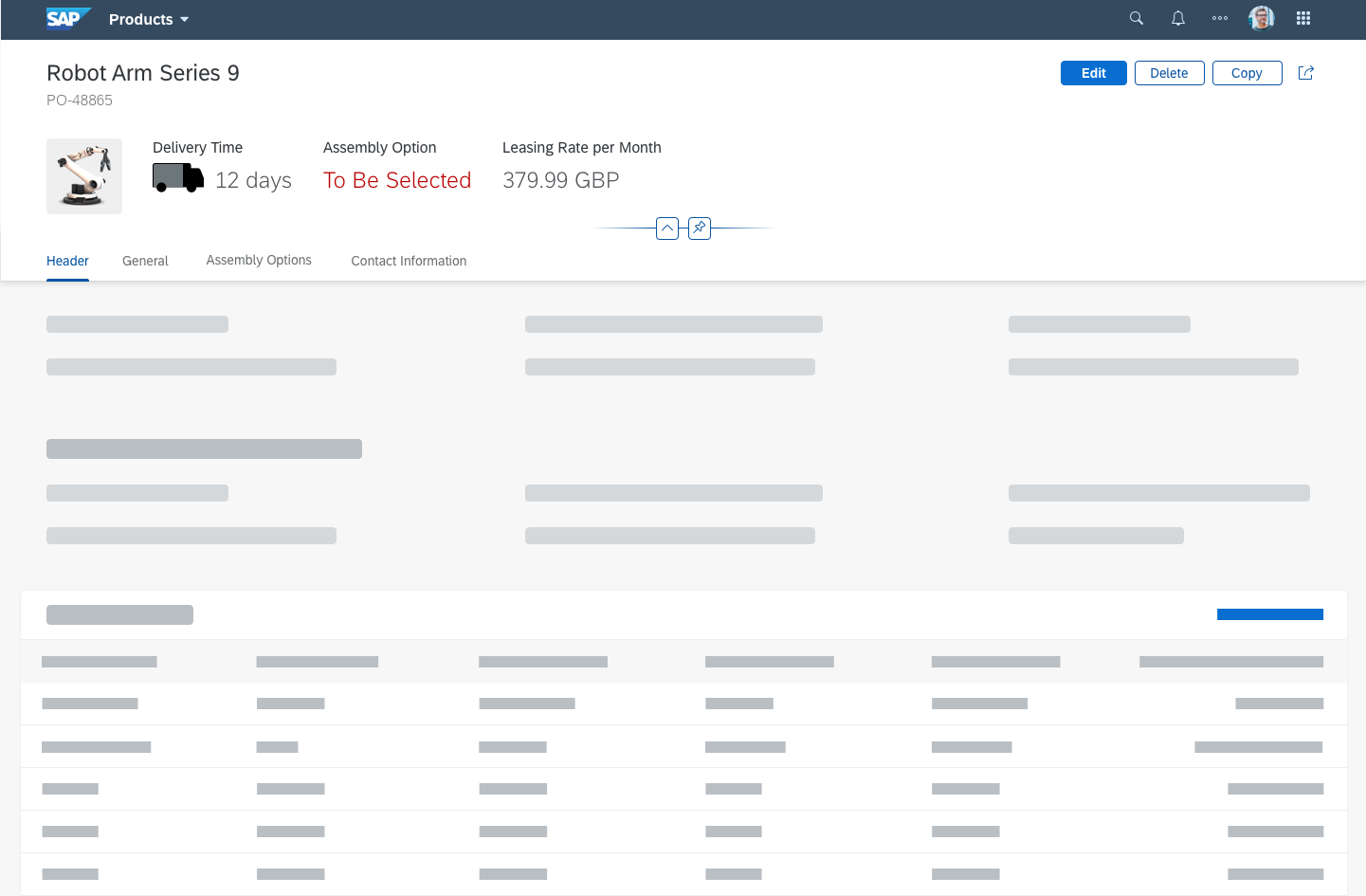
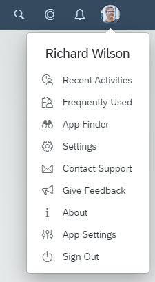
States
Using the correct state or combination of states for a UI element helps users to recognize possible options and see where they need to take action.
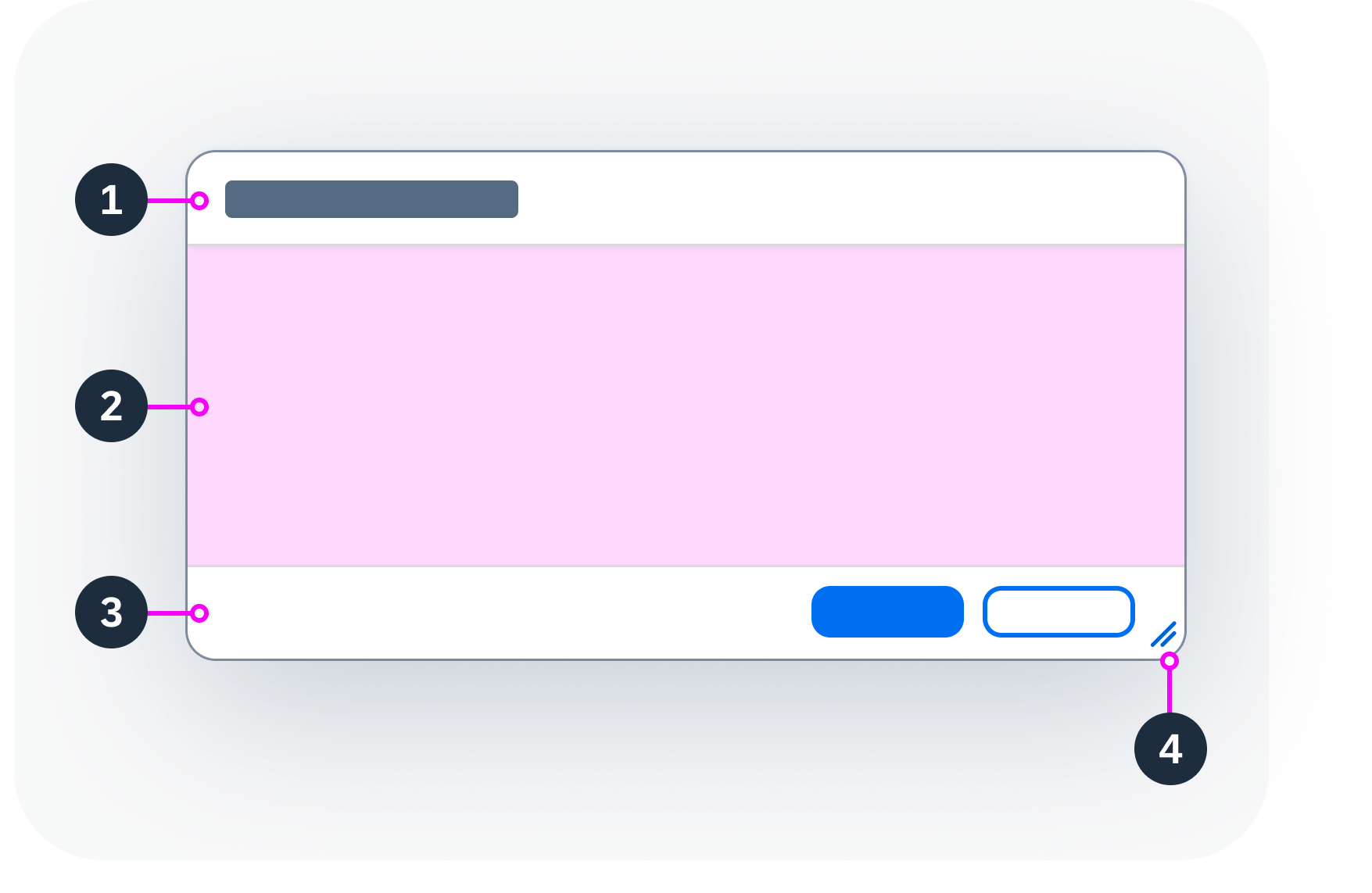
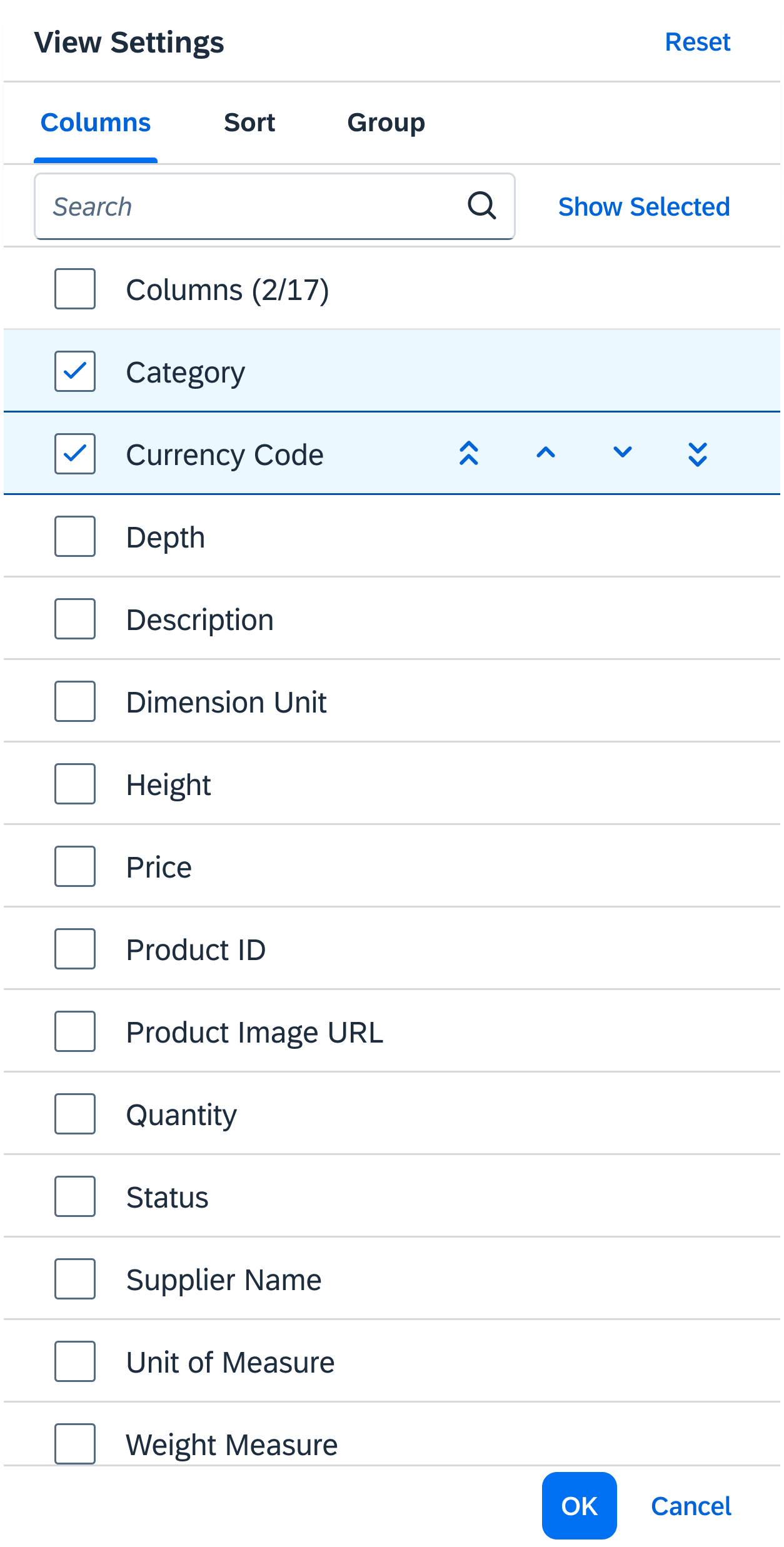
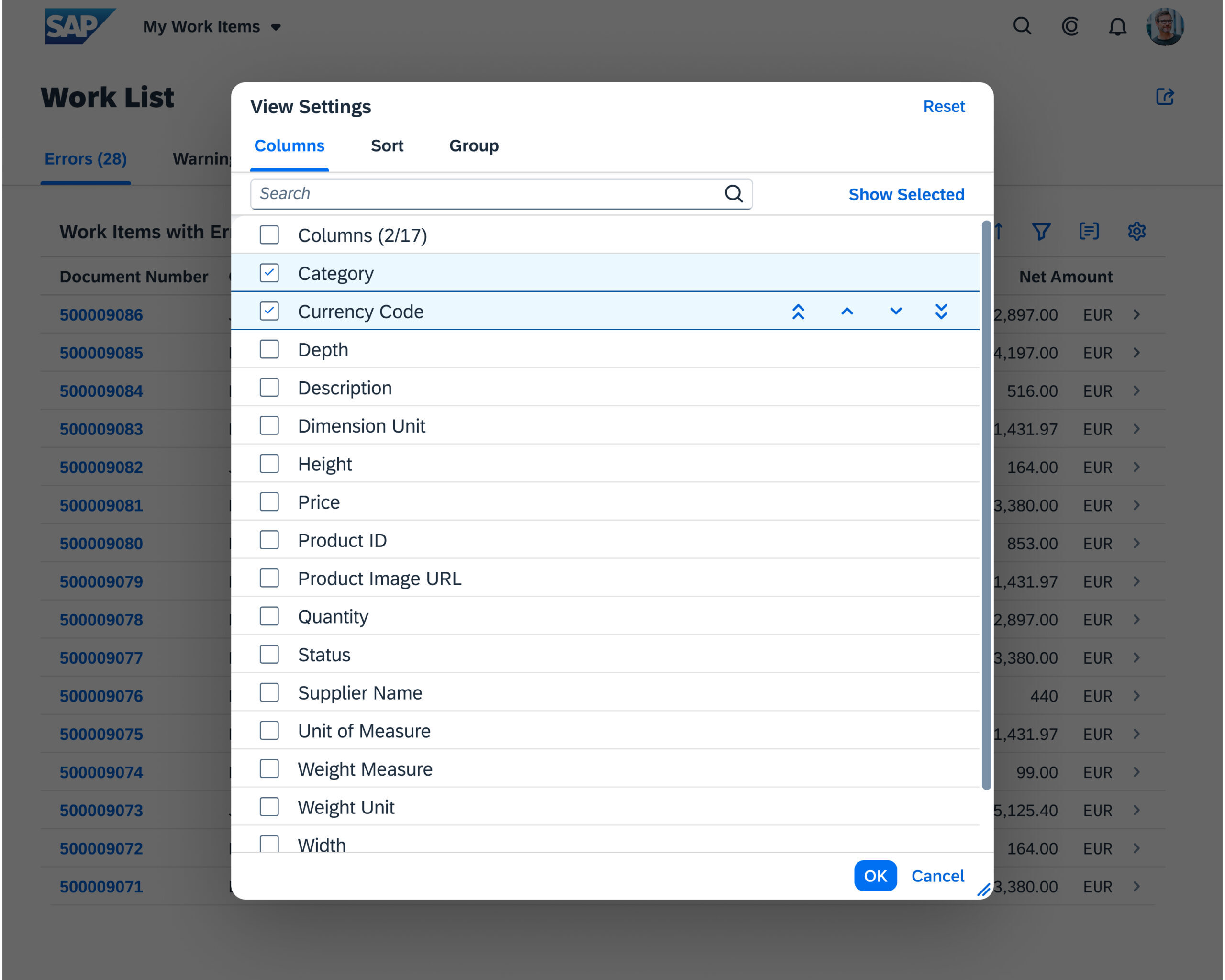
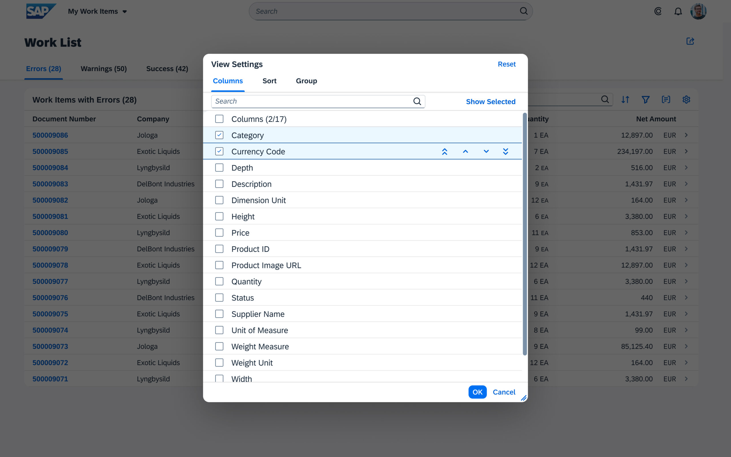
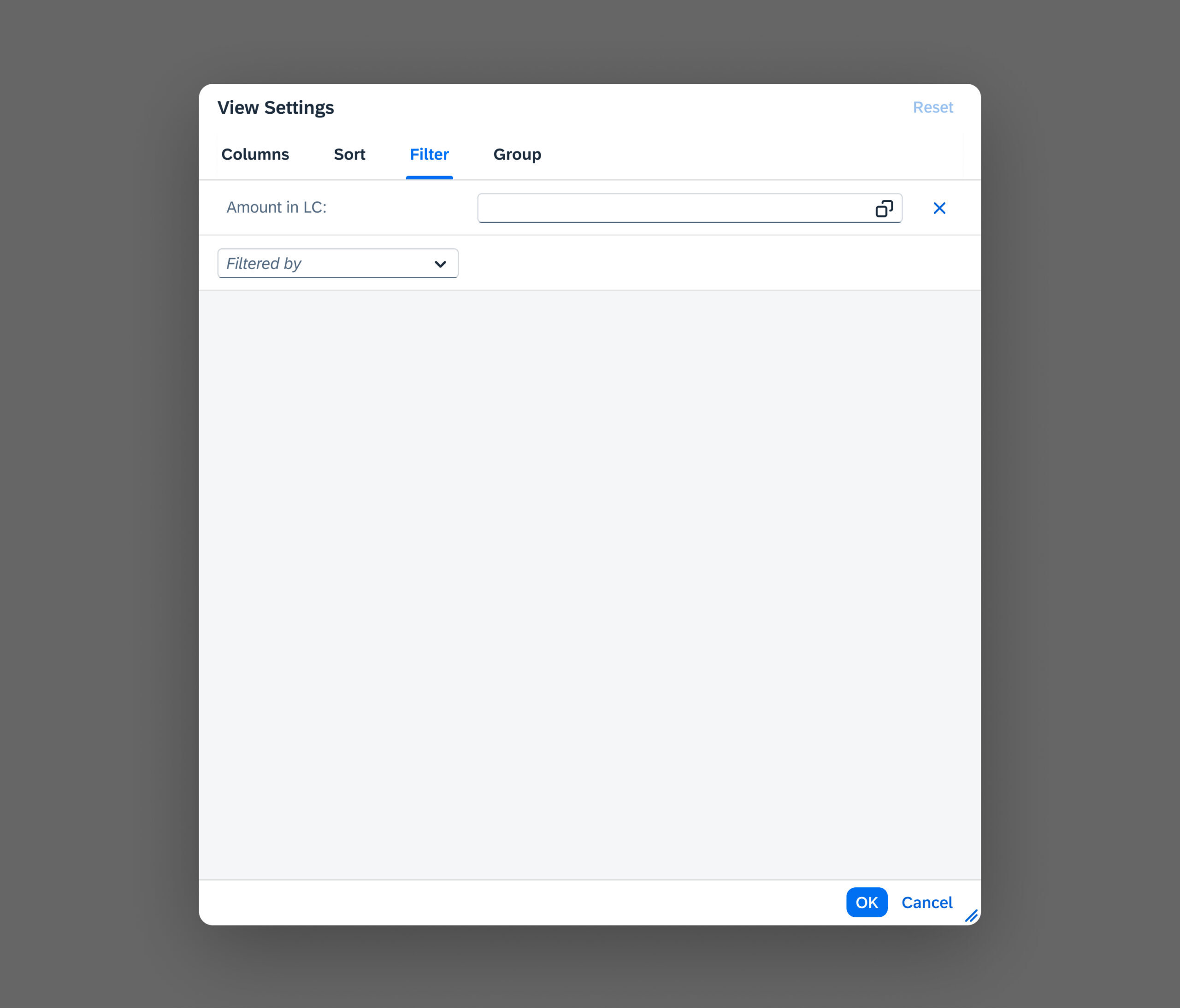
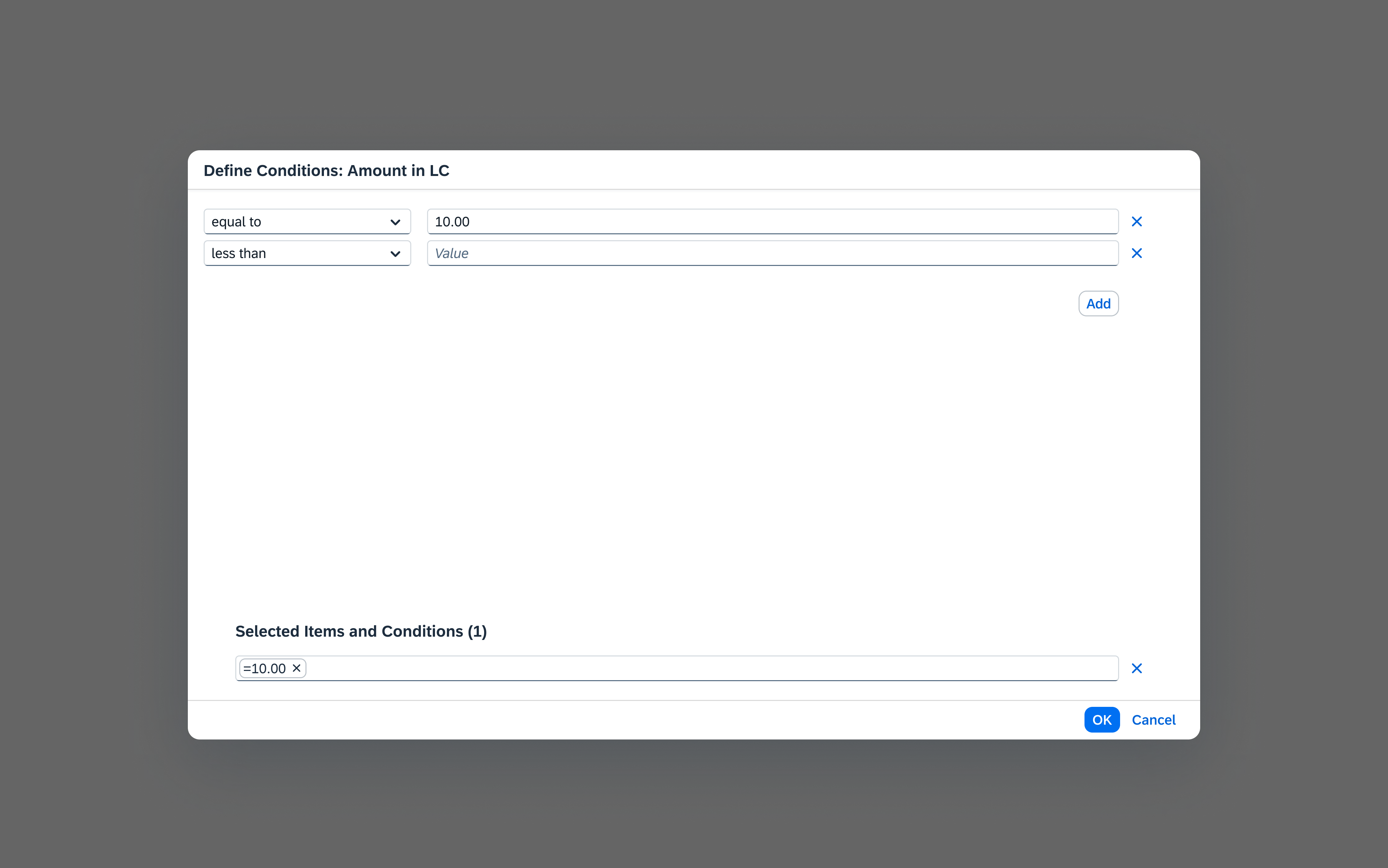
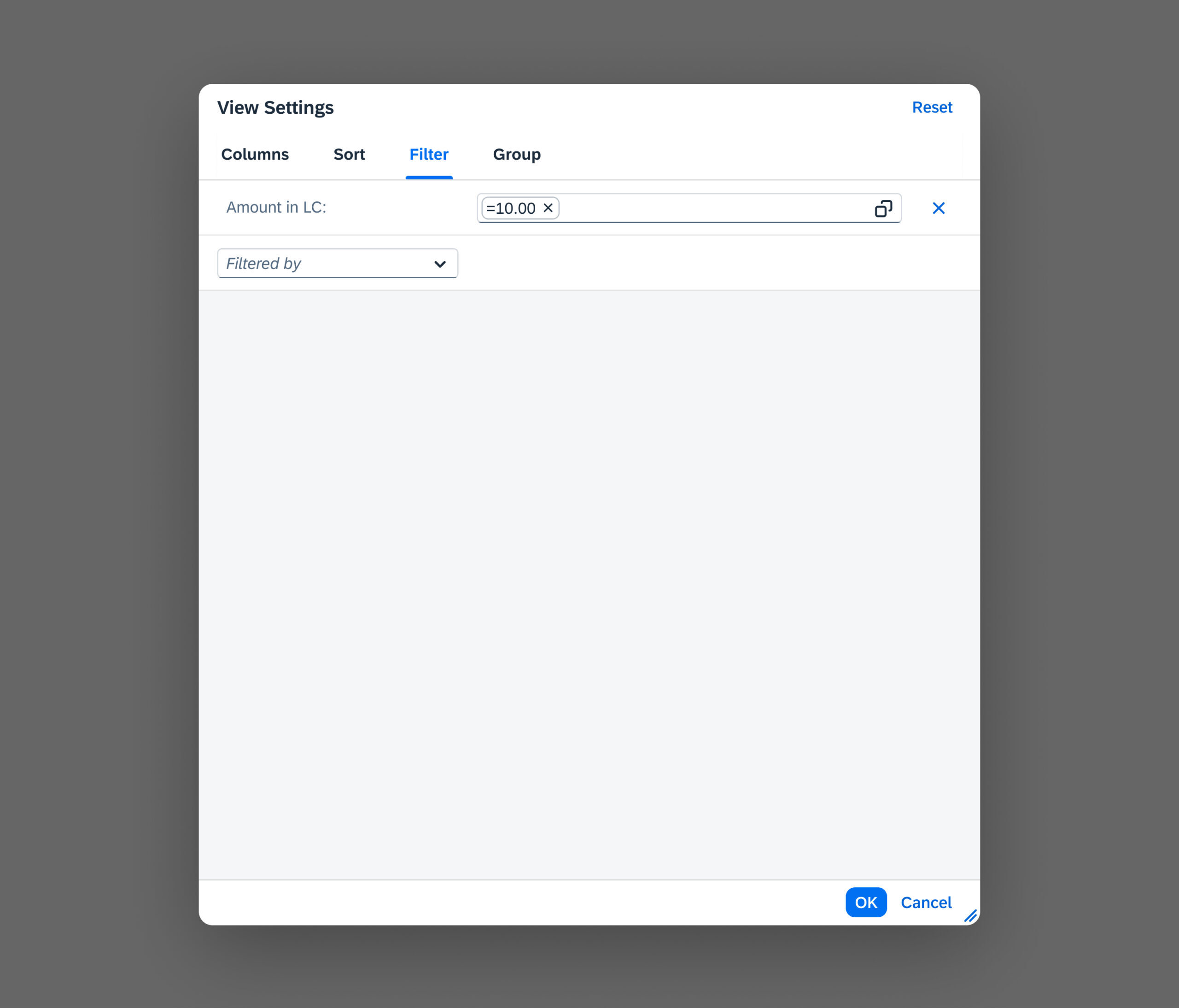
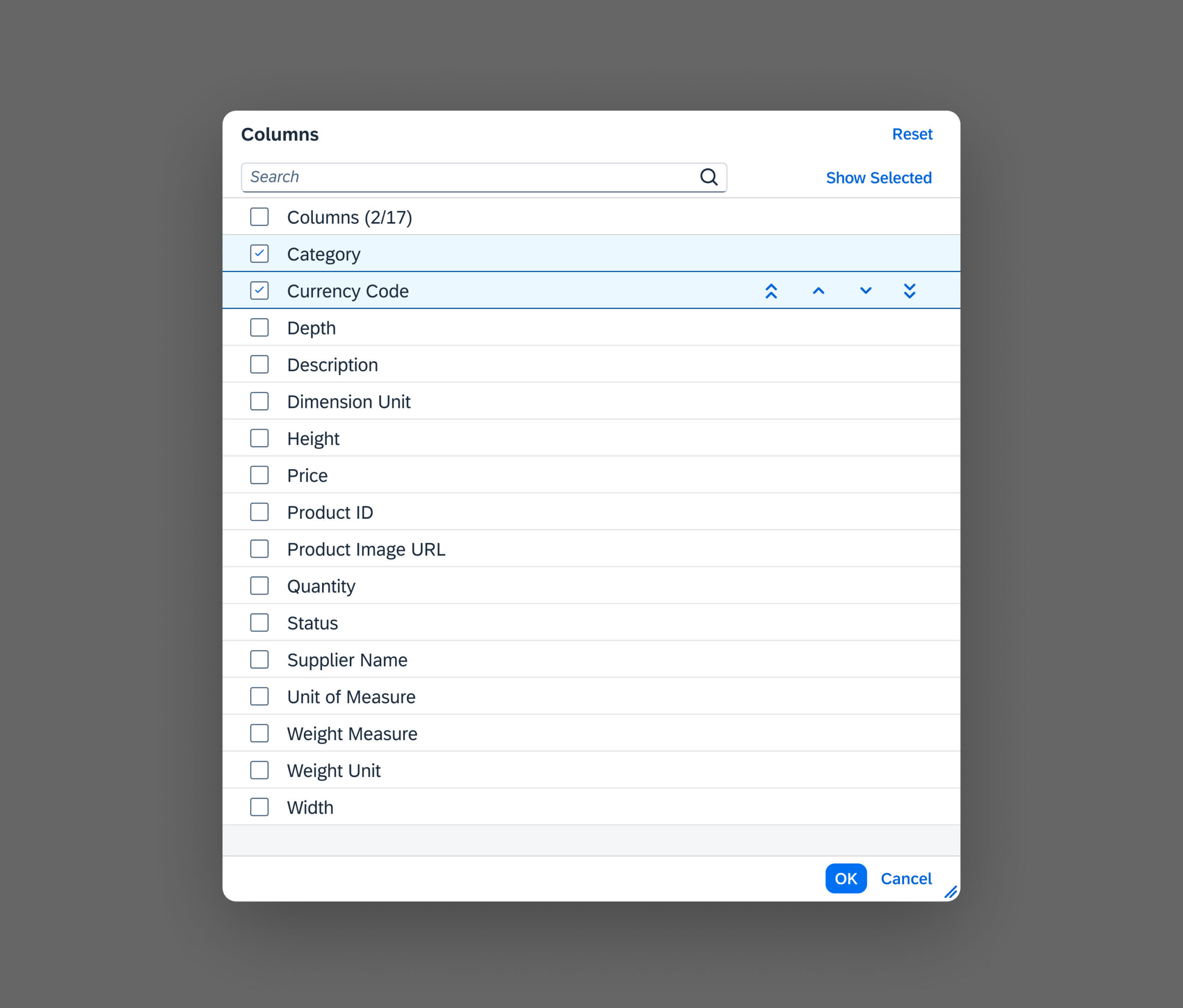
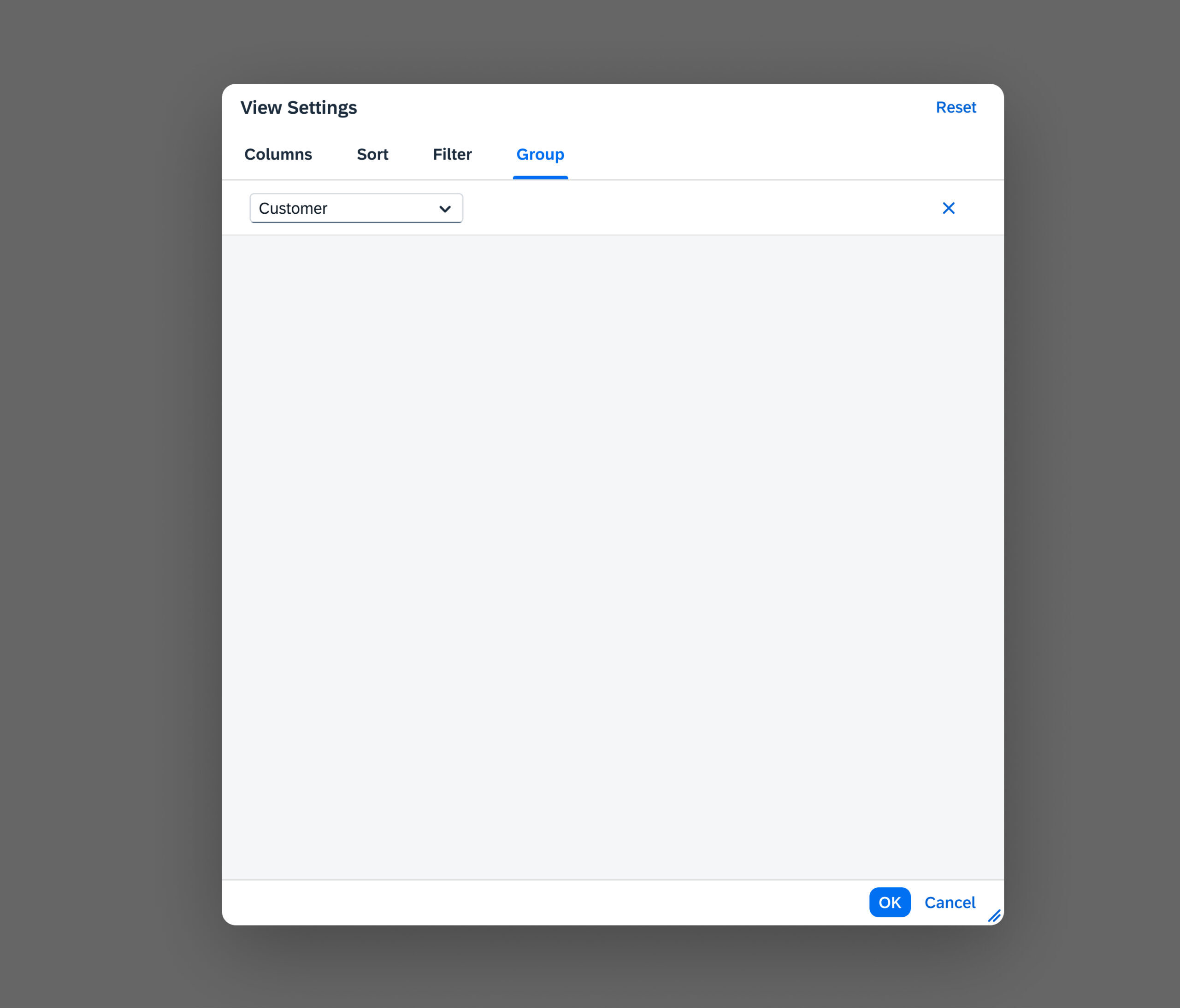
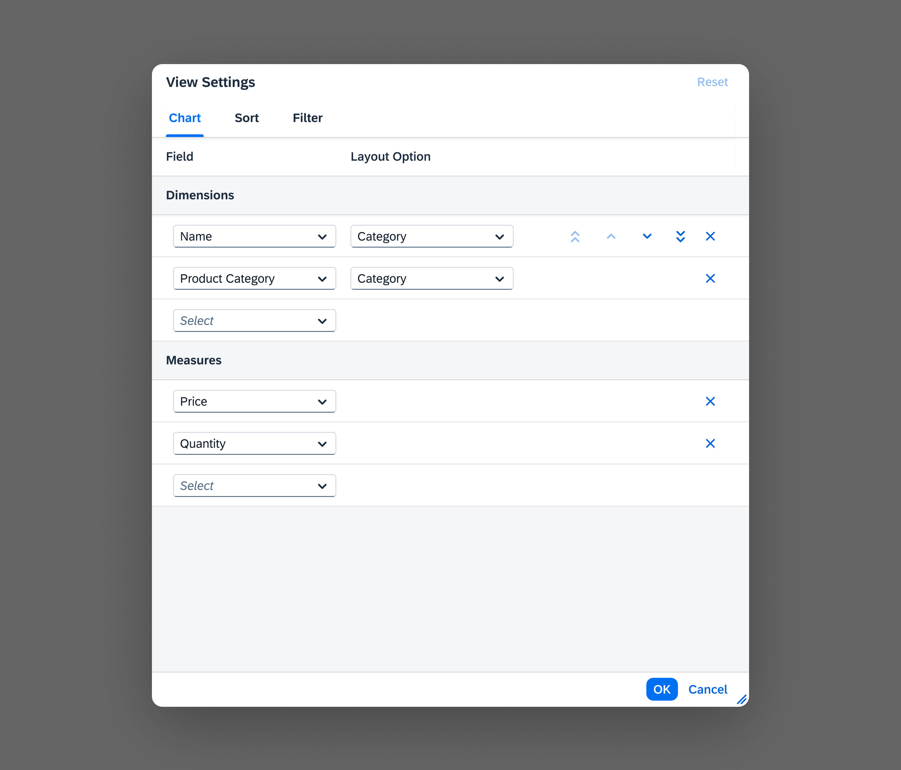
Types of State
UI elements can have different types of state. Follow the links below to see the guidelines for each state.
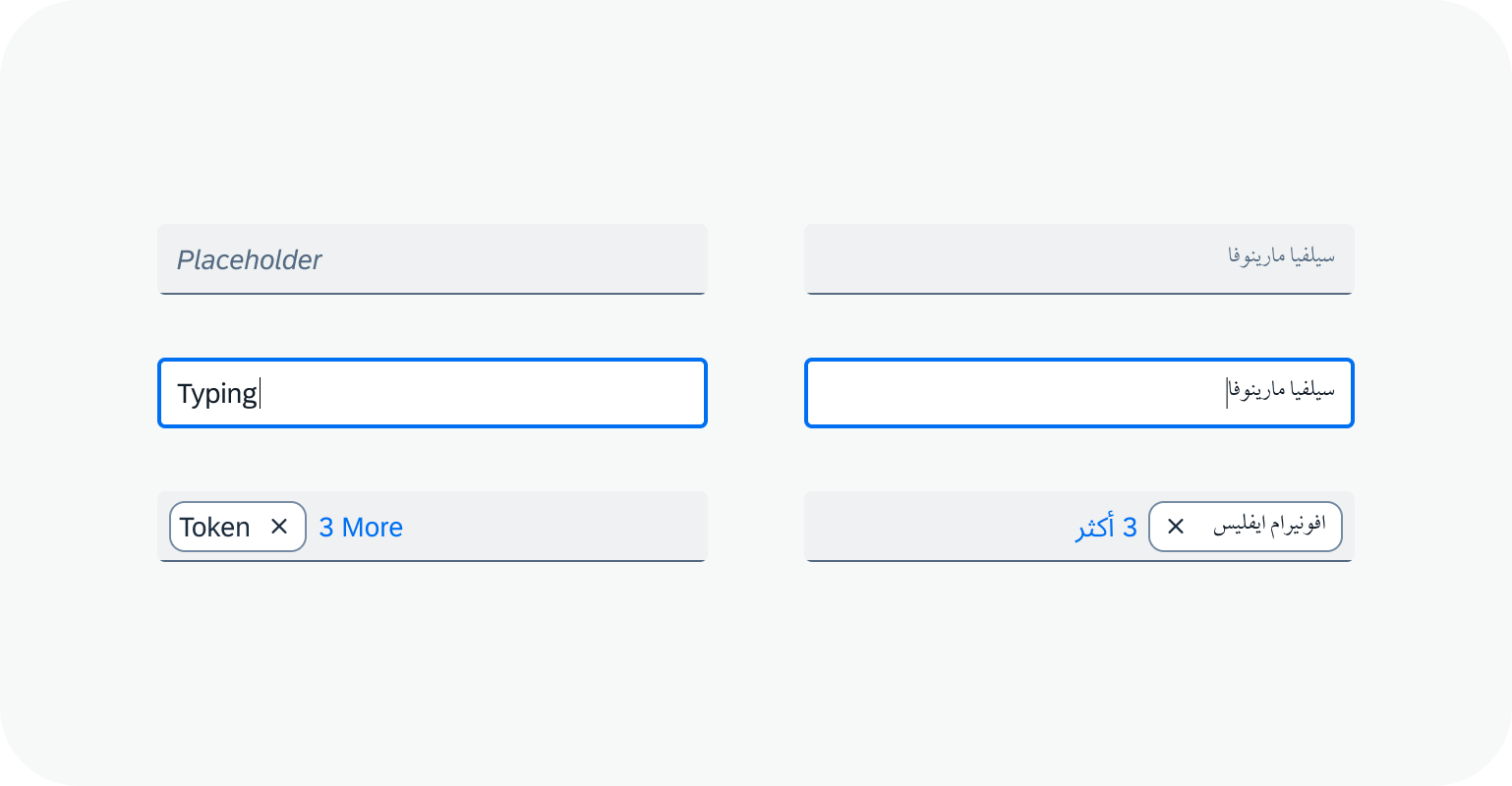
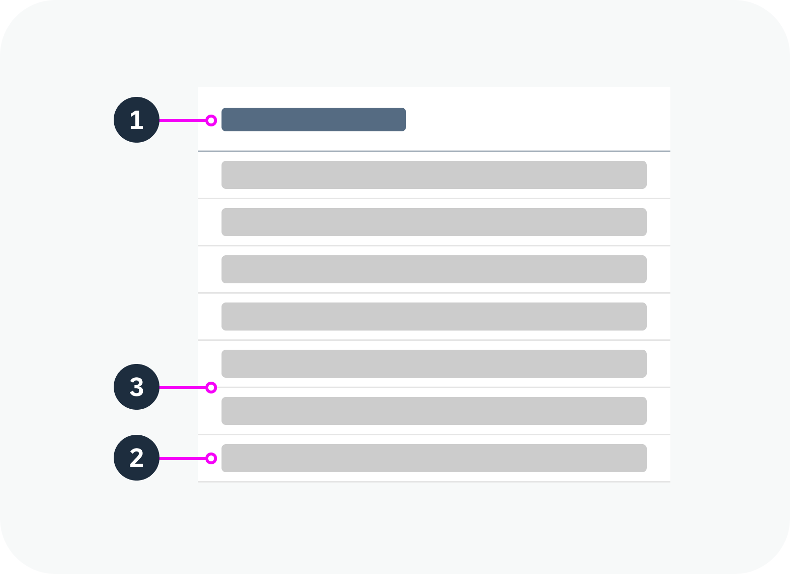
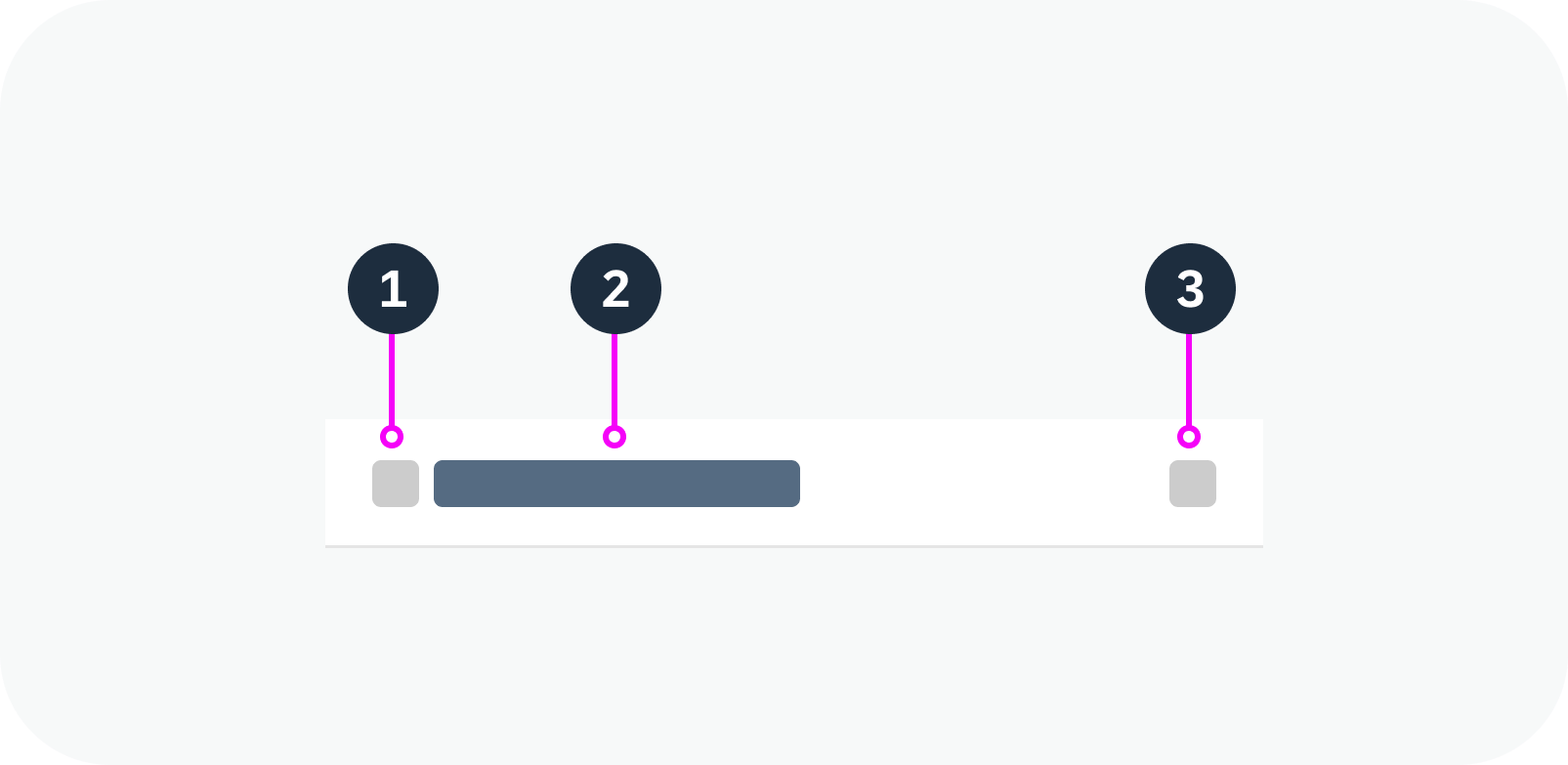
| State | Description | Variants |
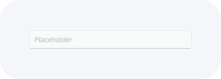
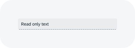
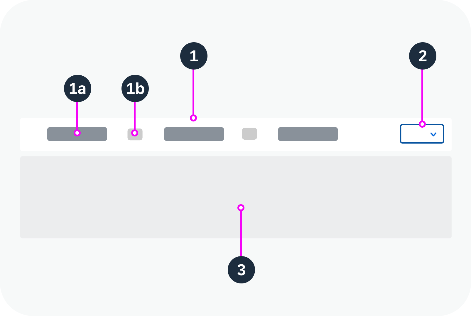
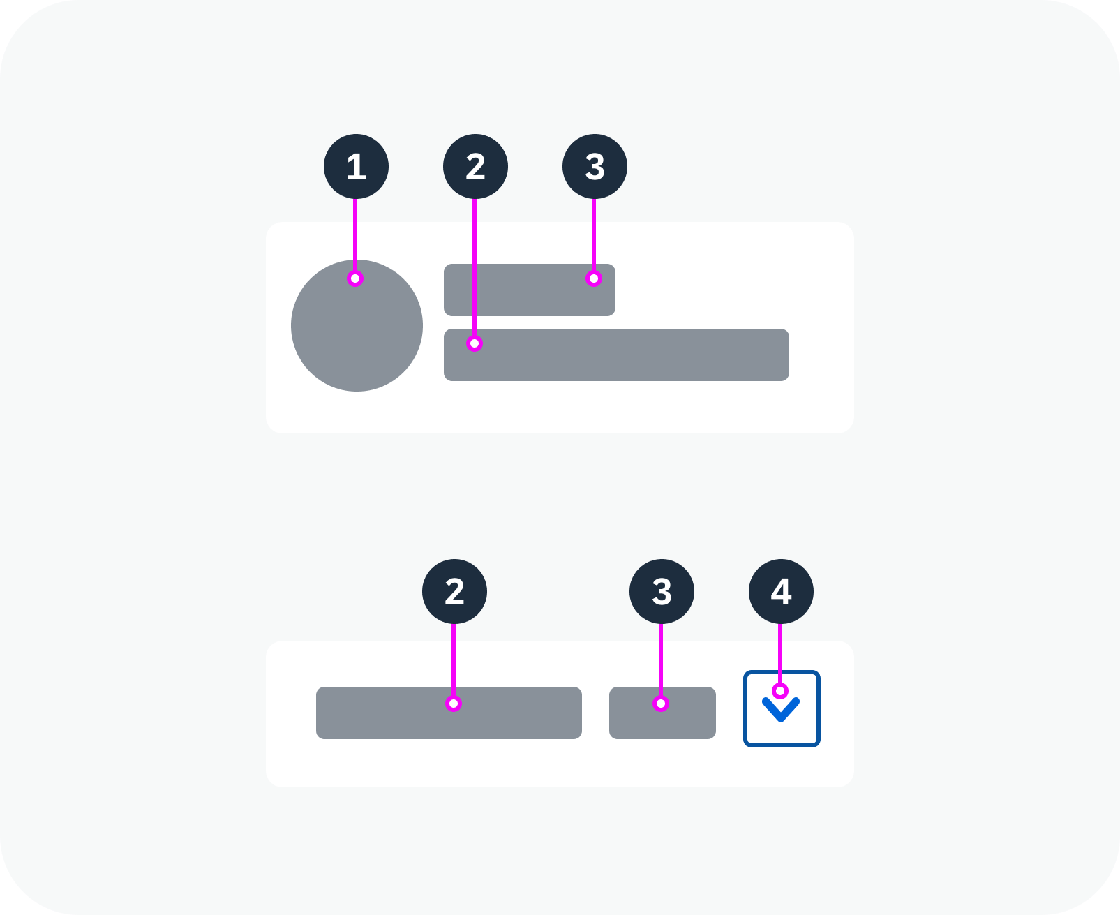
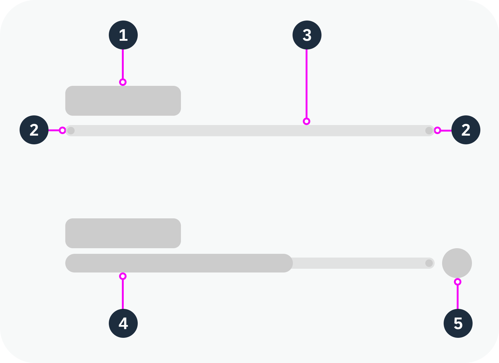
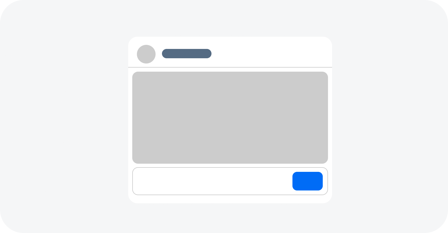
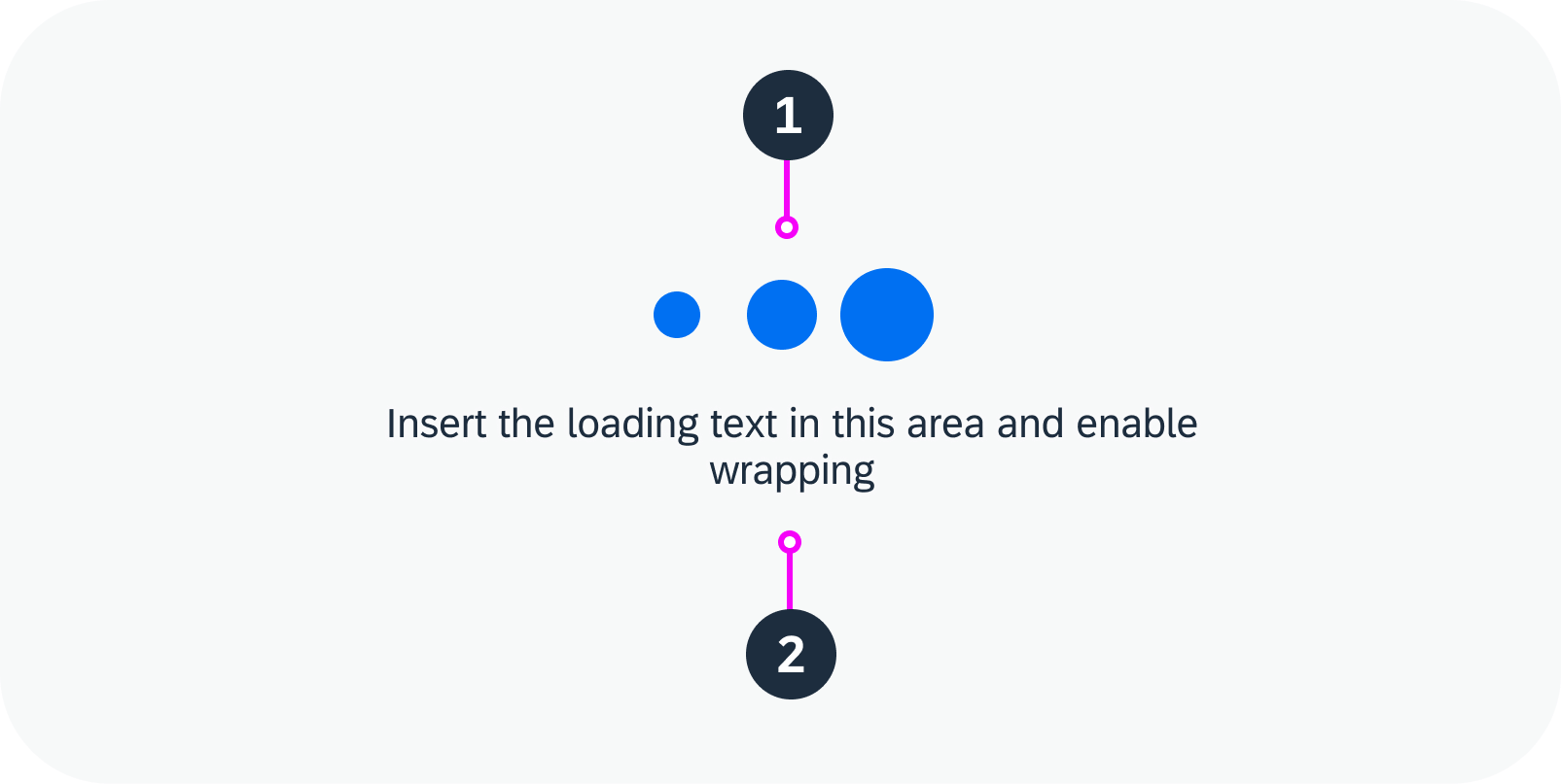
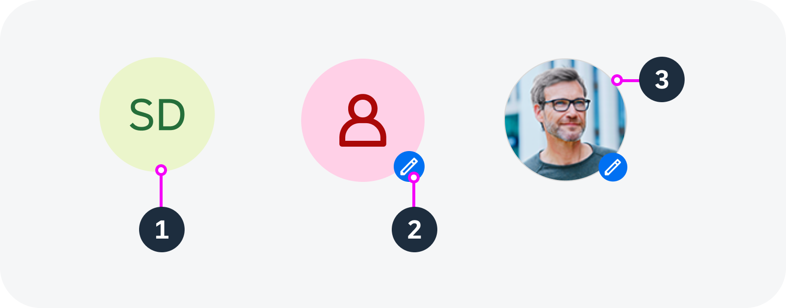
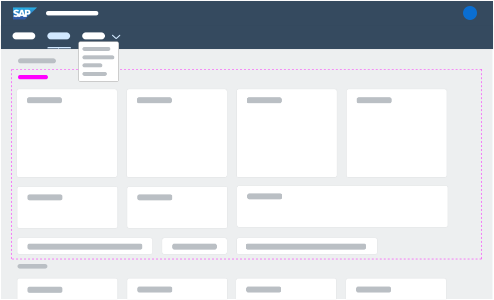
| Component State | Determines the interactivity and visibility of the component. | Enabled Disabled Read Only Hidden |
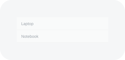
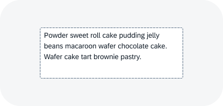
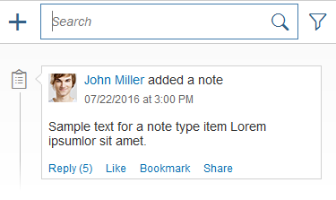
| Focus State | Determines which component receives the user‘s input. The focus state is most important for keyboard interaction. | Focused Unfocused |
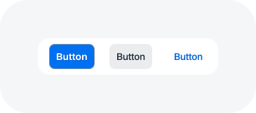
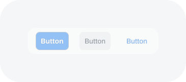
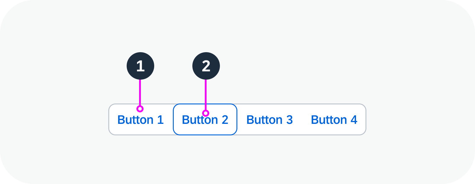
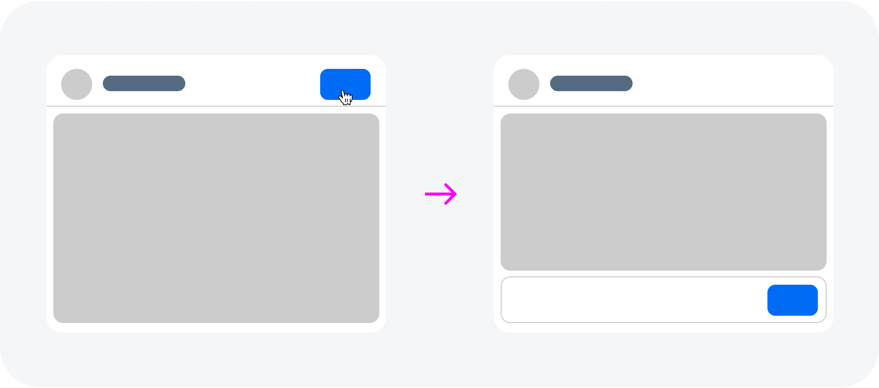
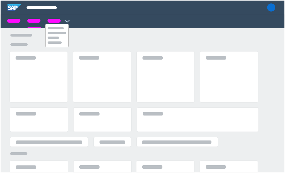
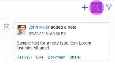
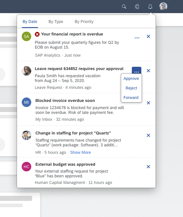
| Interaction State | Indicates the current the interaction state of a component. | Regular Hover Down |
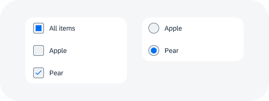
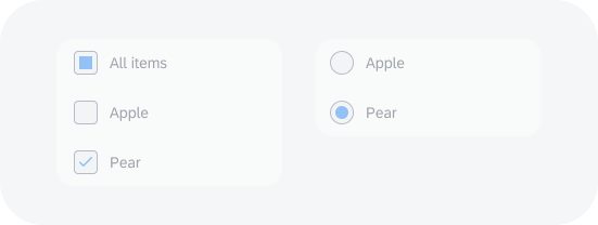
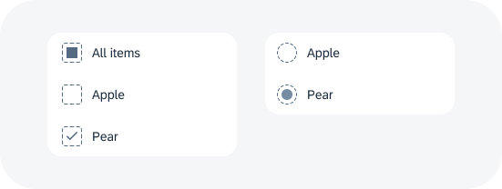
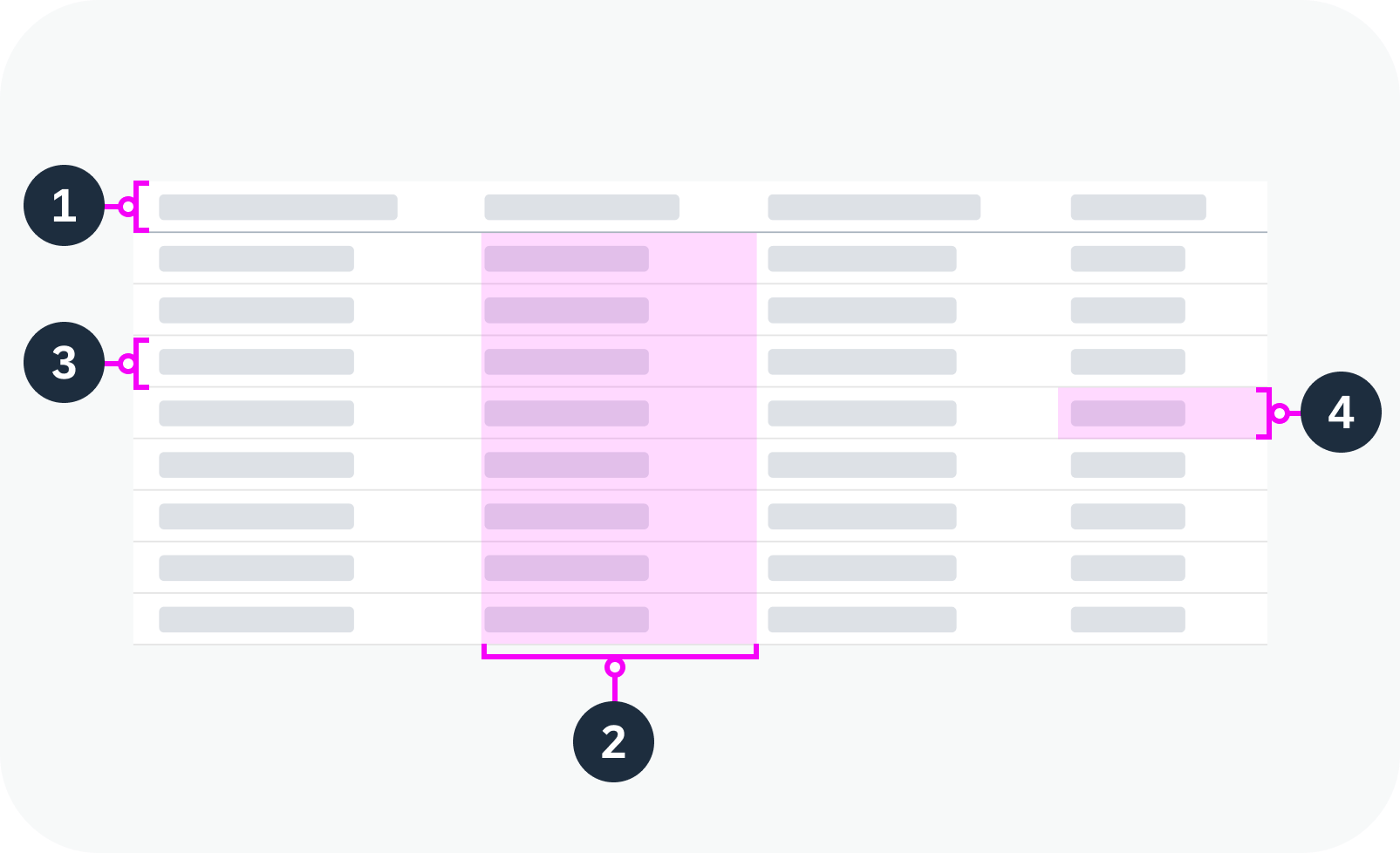
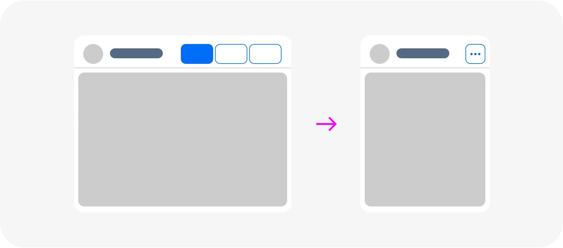
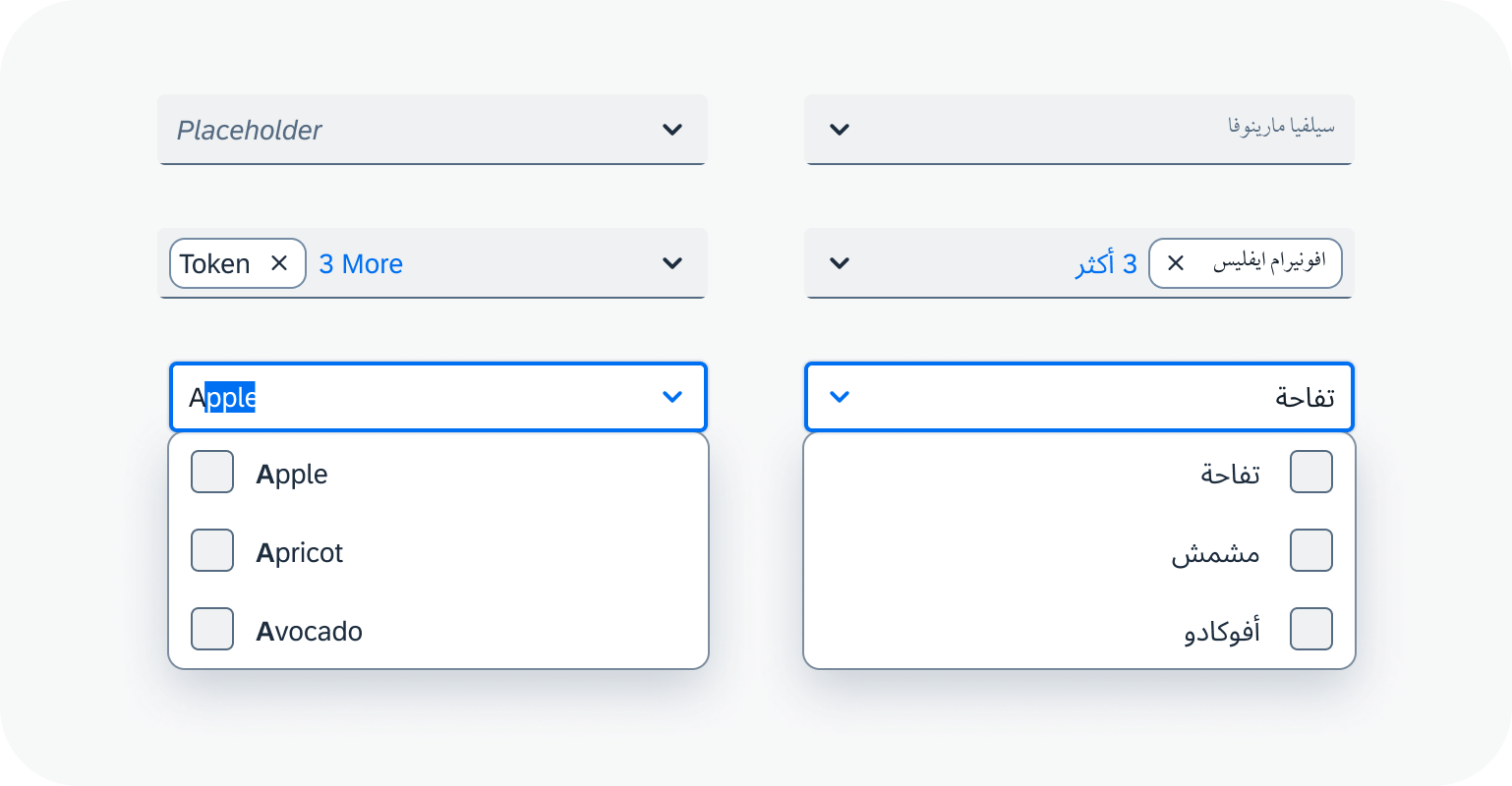
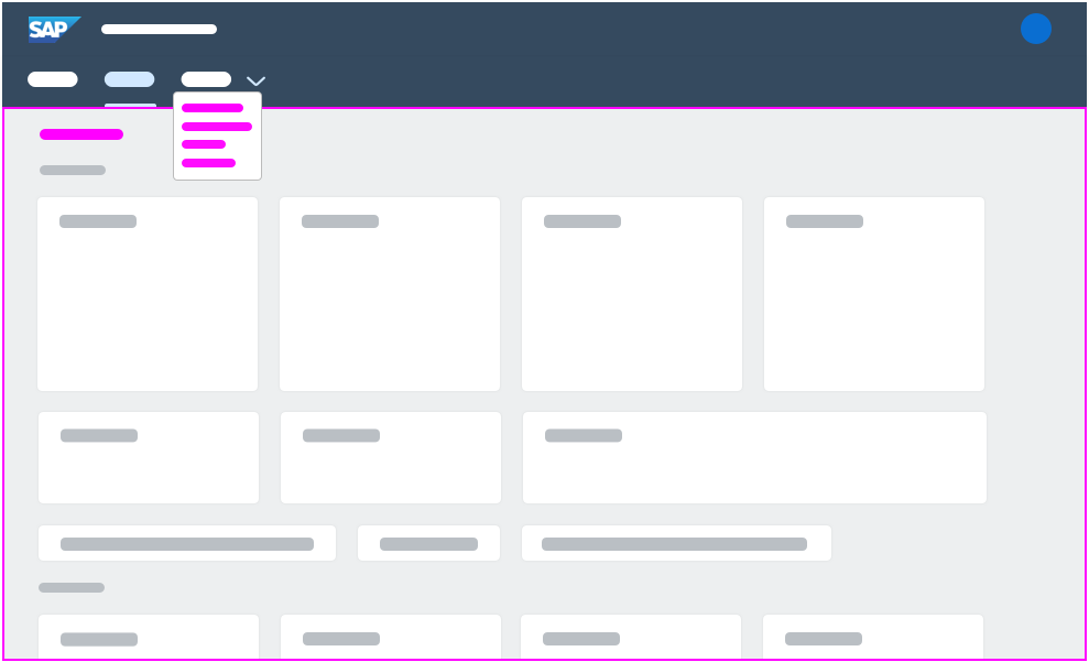
| Selection State | The selection state is applied after the user selects the element to distinguish it from other elements. | Selected Unselected Indeterminate |
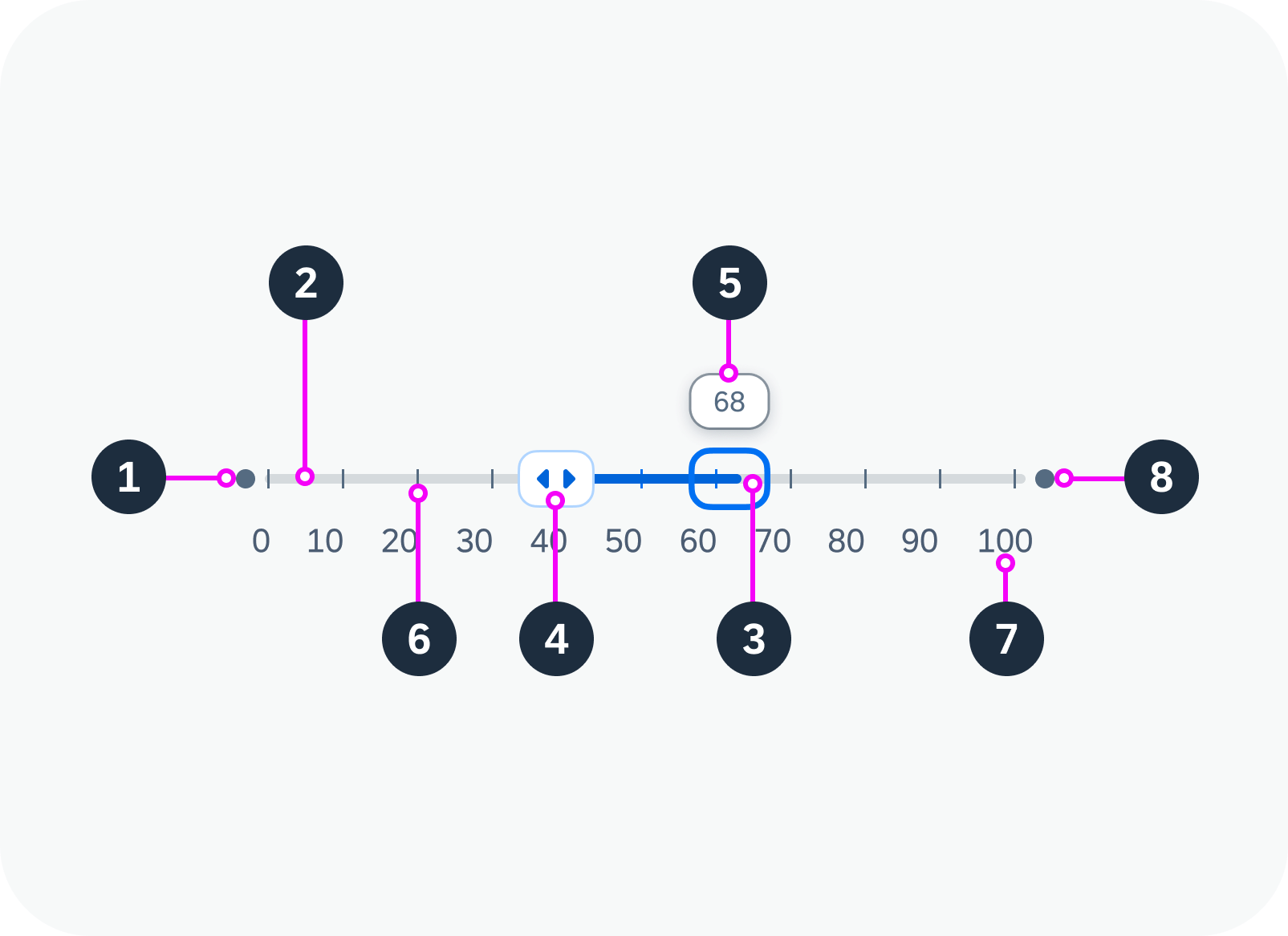
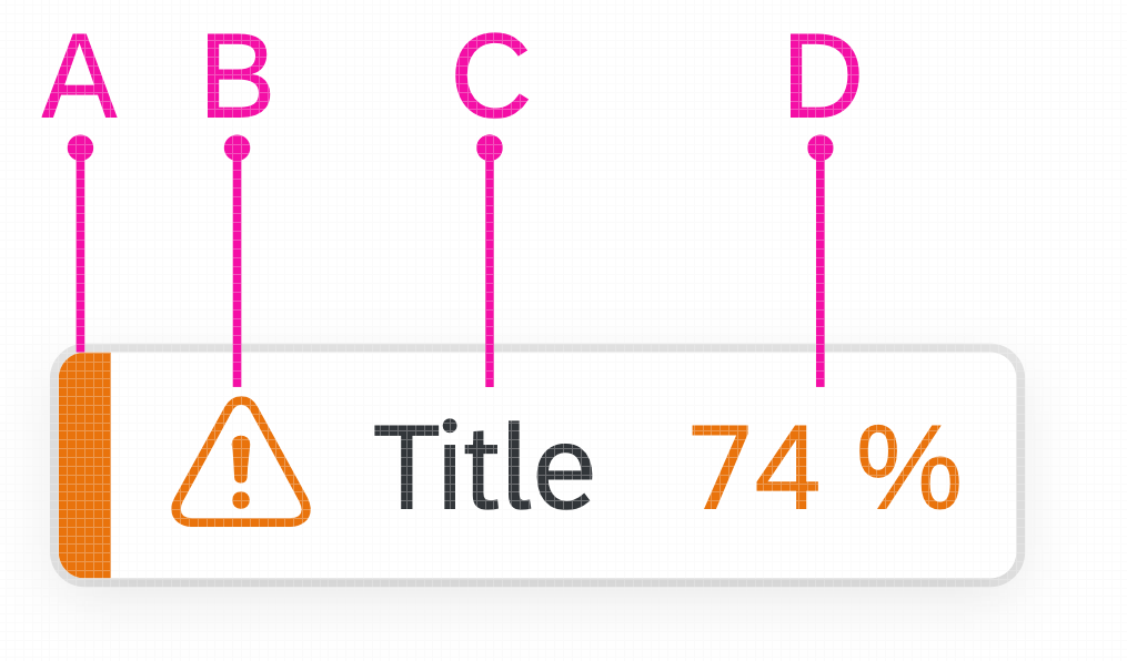
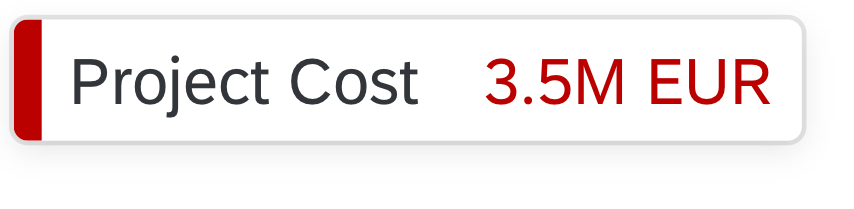
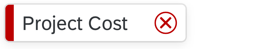
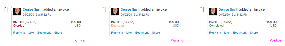
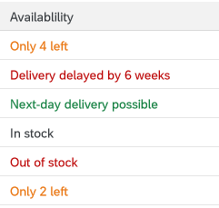
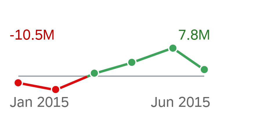
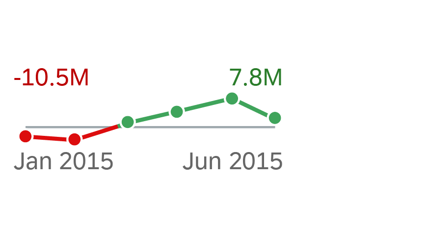
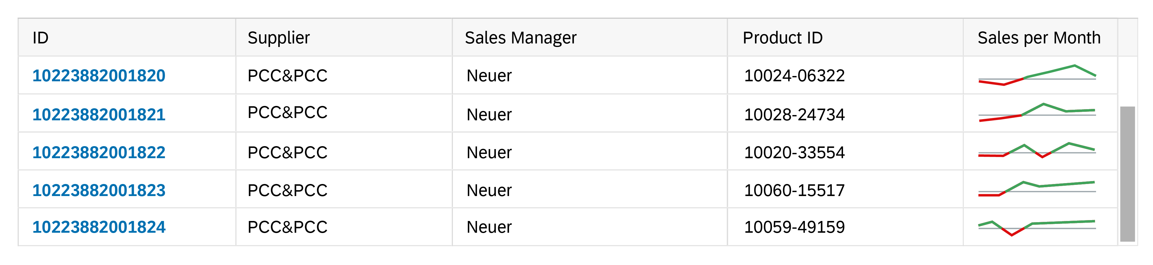
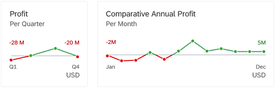
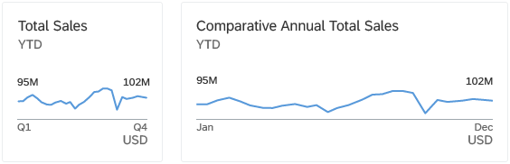
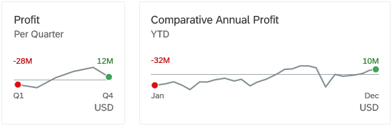
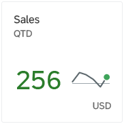
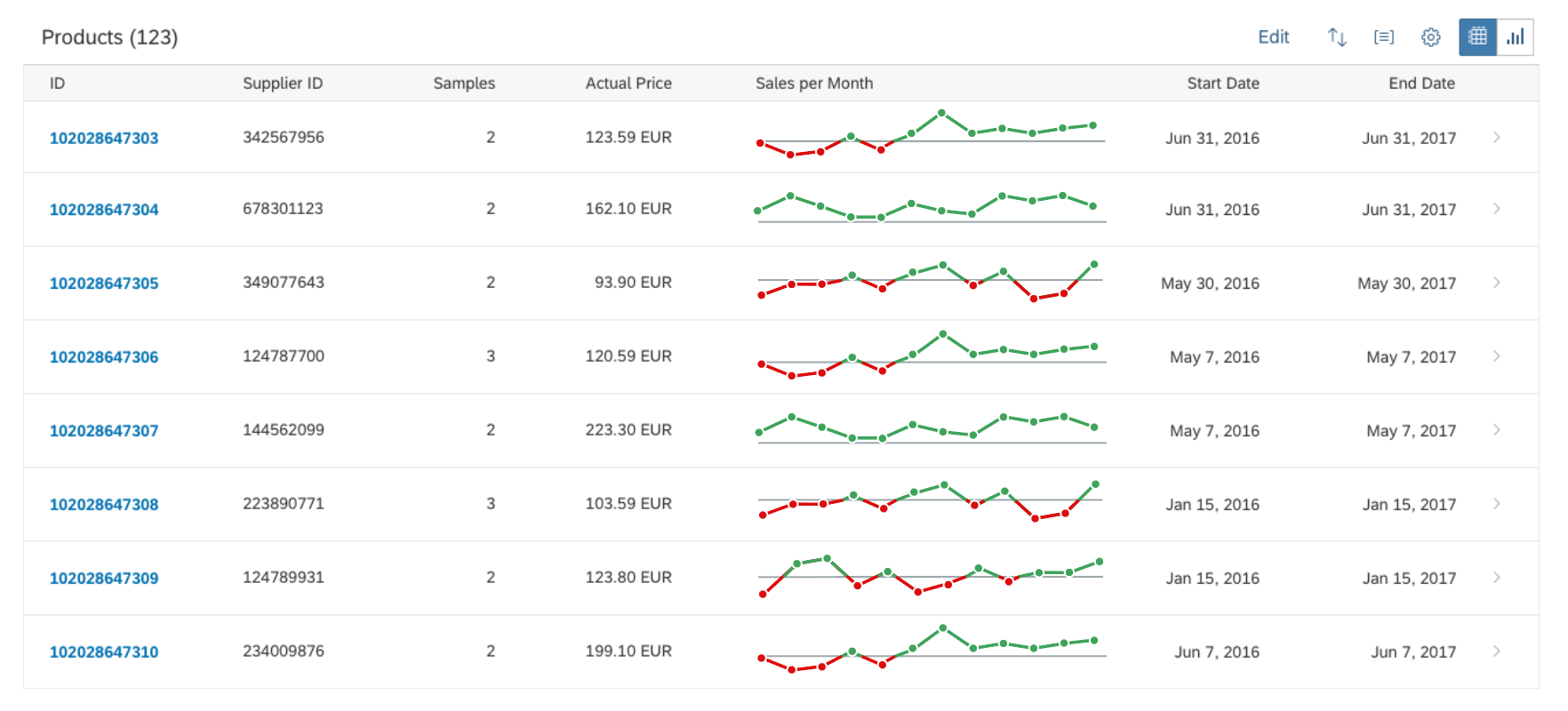
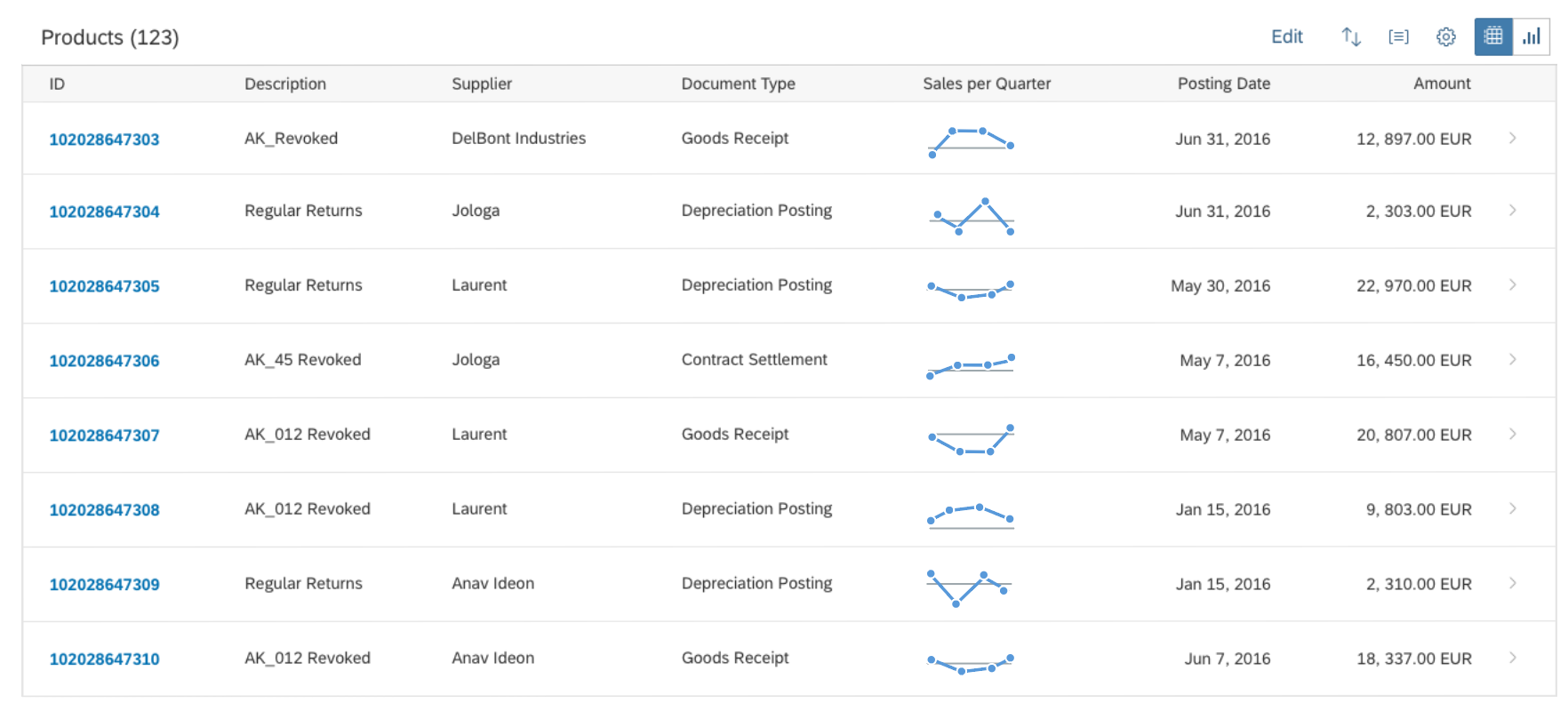
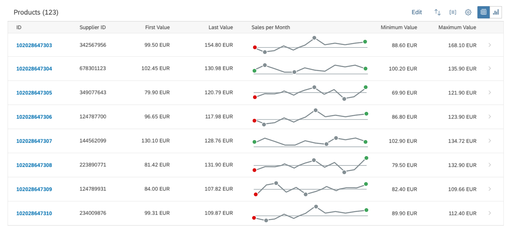
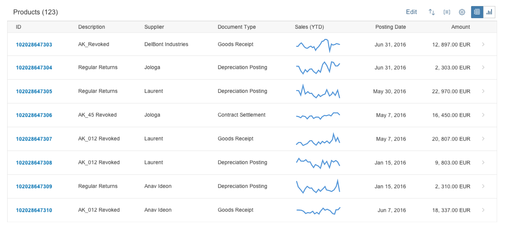
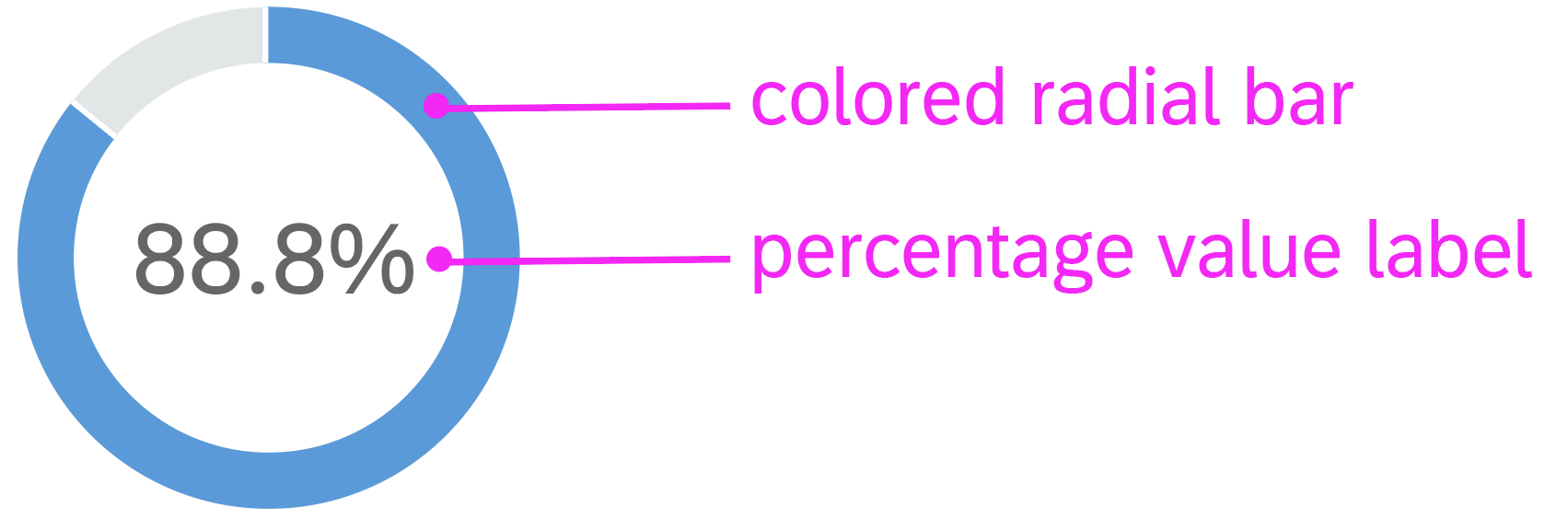
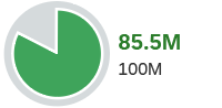
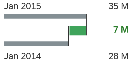
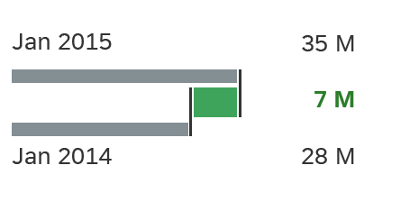
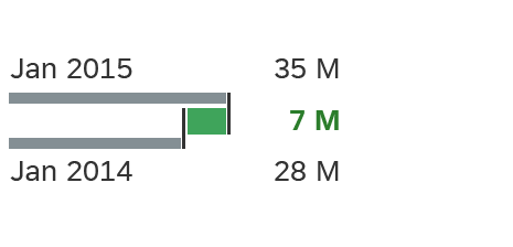
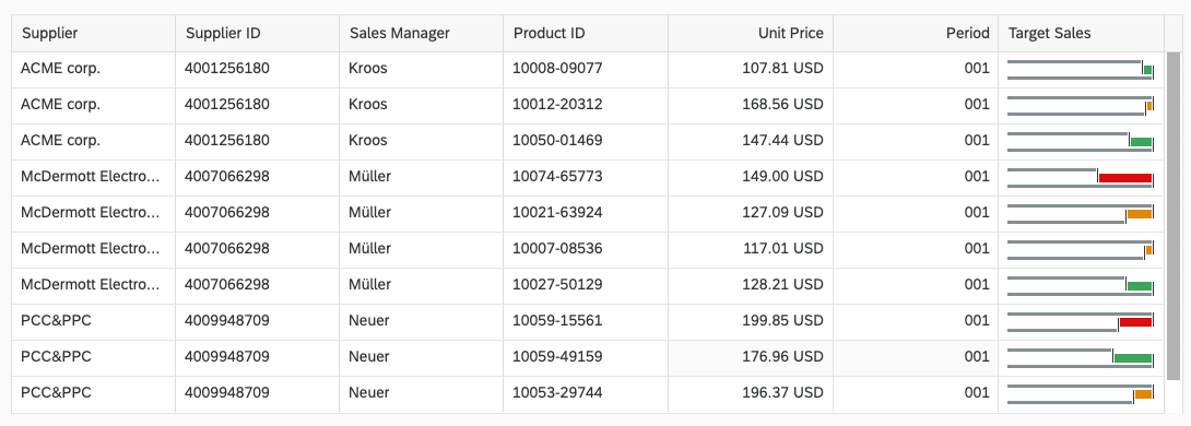
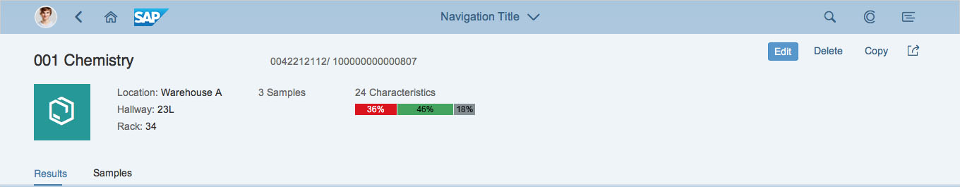
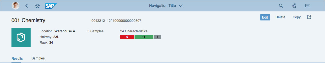
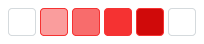
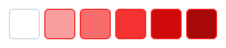
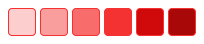
| Value State | Shows the semantic meaning of a UI element in a specific use case and context. | None Positive Negative Critical Information Custom |
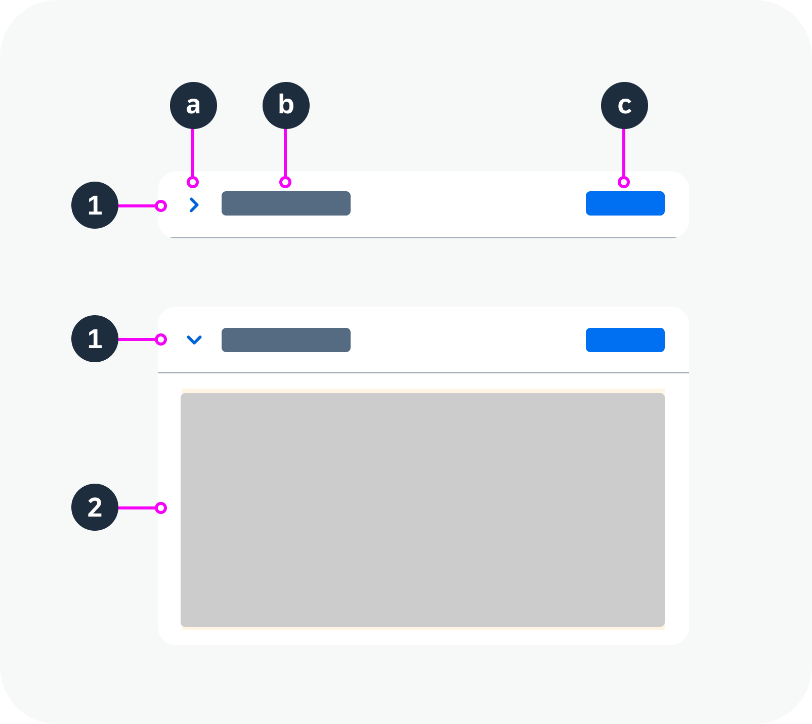
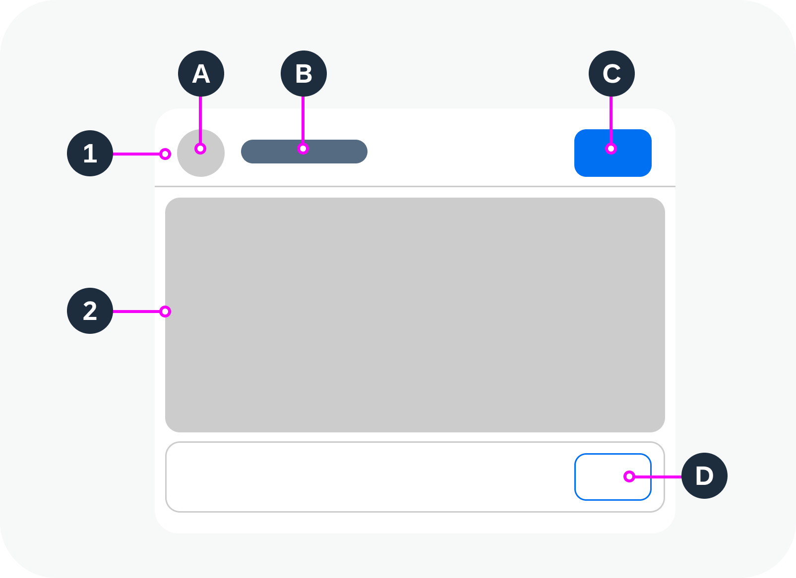
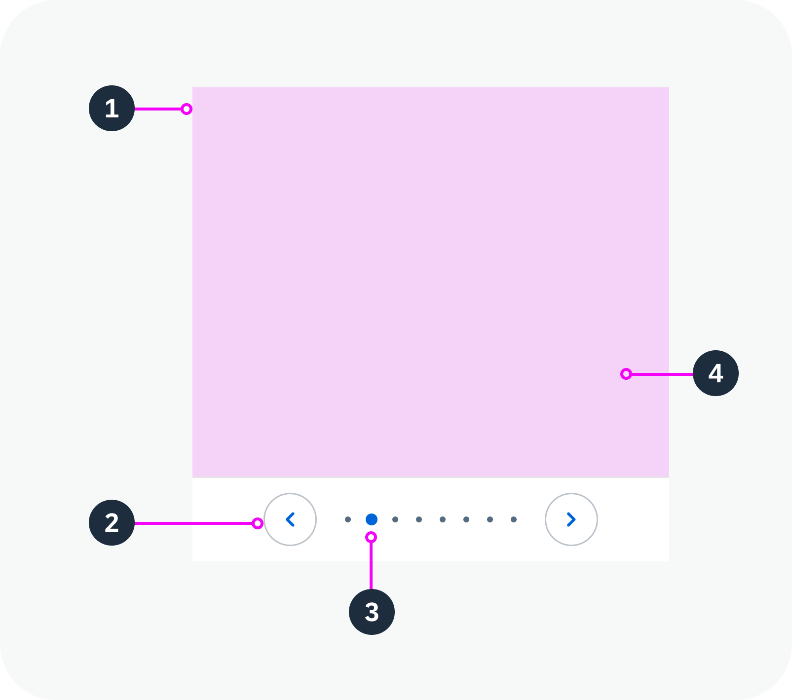
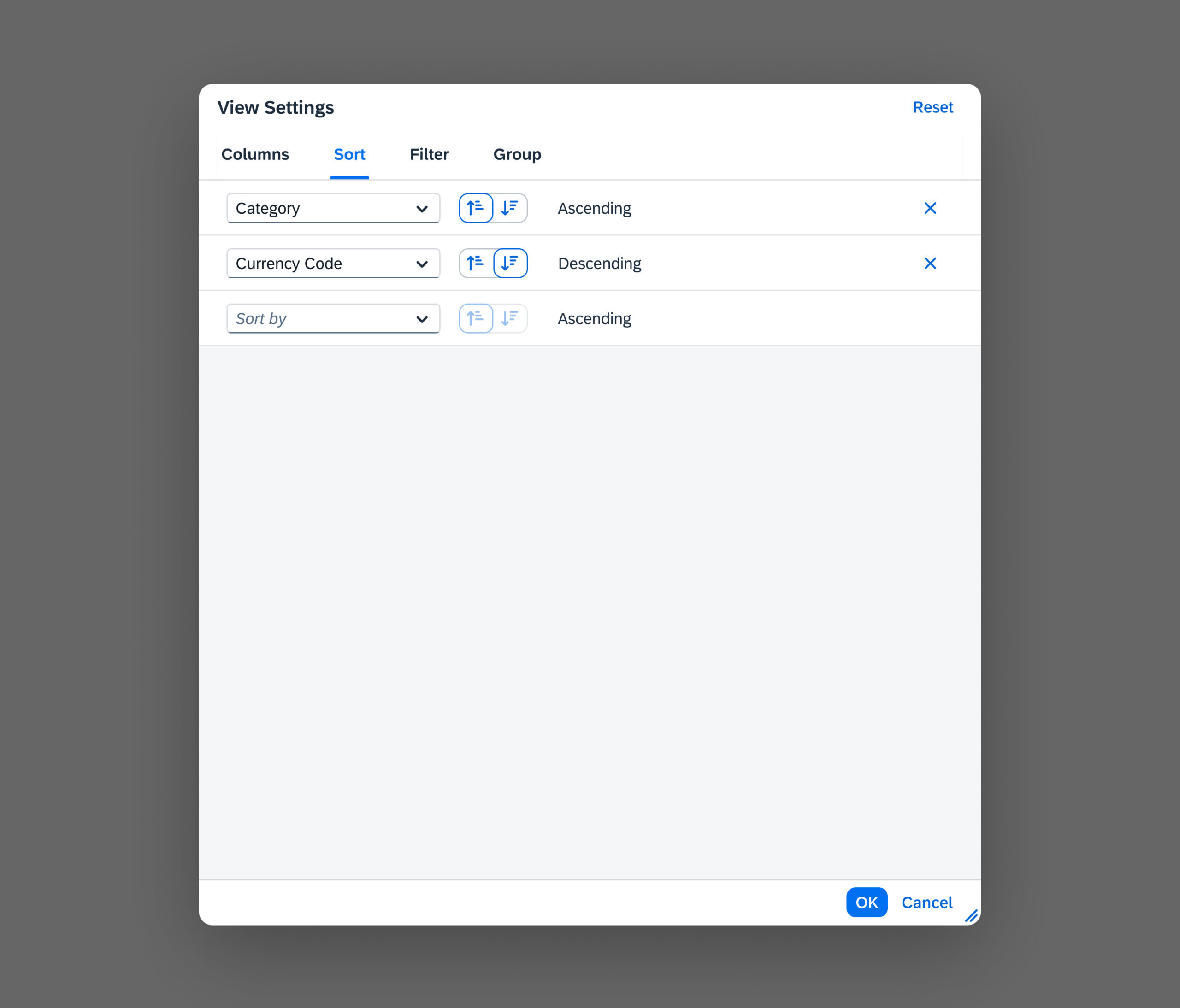
Combining States
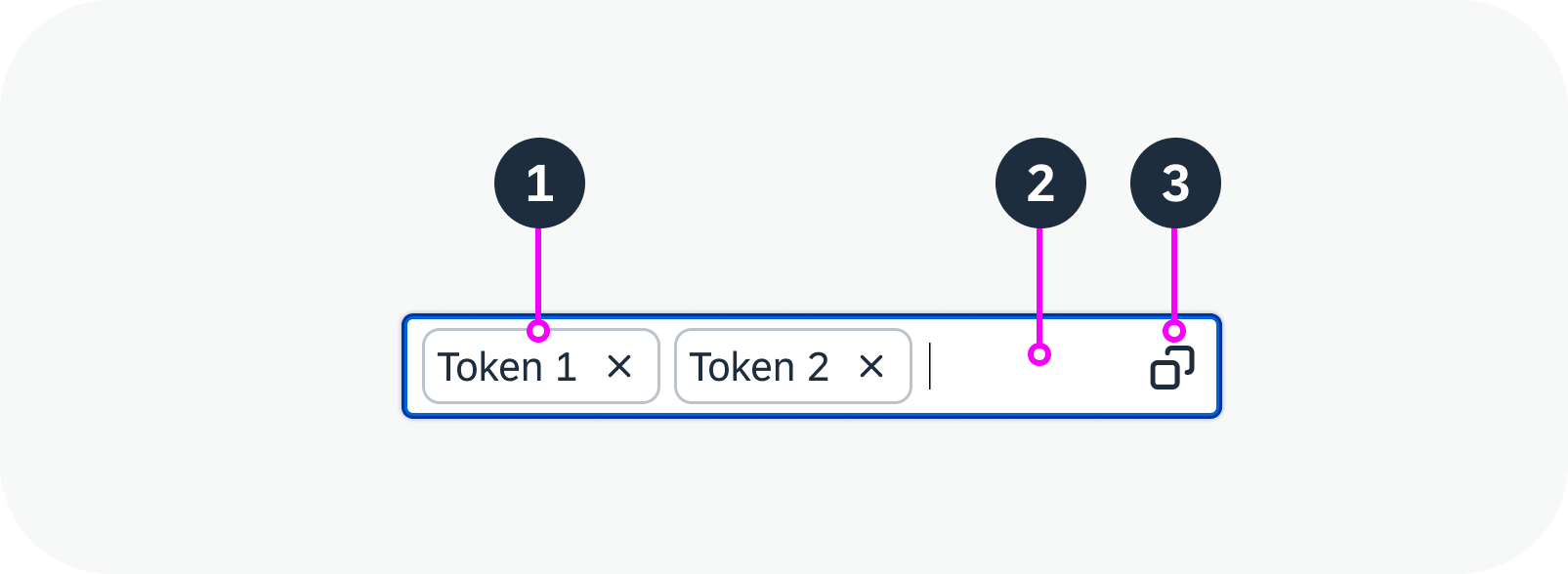
Certain states can also be combined. For details, see State Combinations.


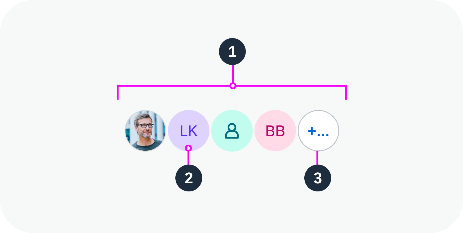
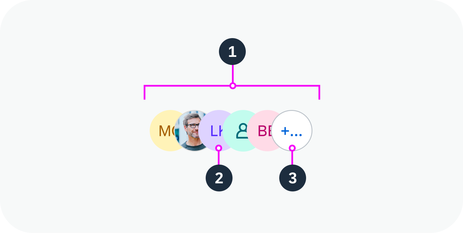


 Your feedback has been sent to the SAP Fiori design team.