
How To Use Semantic Colors / Industry-Specific Colors
You can use semantic colors and industry-specific colors to visualize the status or state of business data:
- Semantic colors denote standard value states (such as good, bad, or warning). Each color has the same basic meaning in all contexts.
- Industry-specific colors reflect the color conventions in a line of business or industry. The meaning of each color depends on the business context.
In SAPUI5, industry-specific colors are called indication colors.
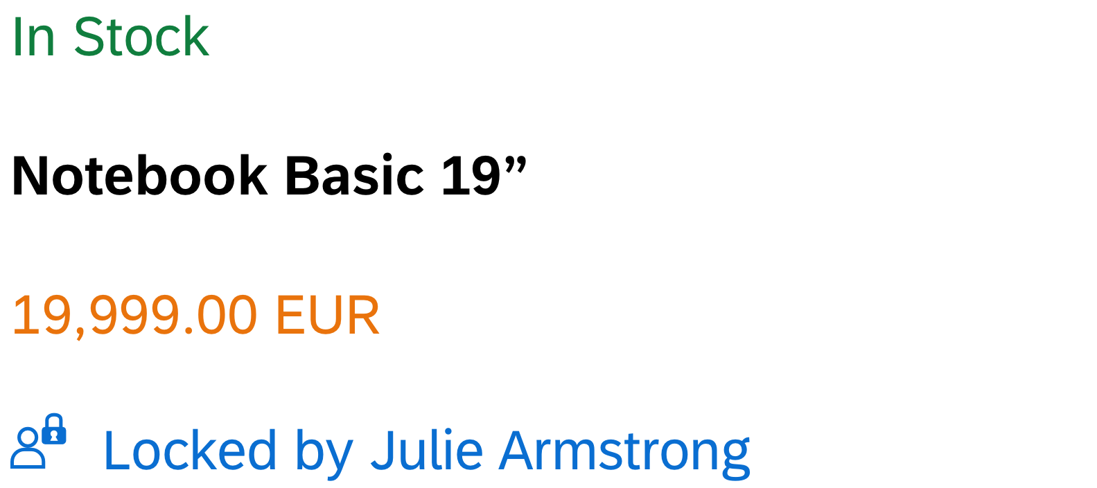
Nearly all input controls support semantic colors, while industry-specific colors are only supported by a few UI elements.
For information about the color values for other themes, see Belize Colors and Quartz Light Colors.
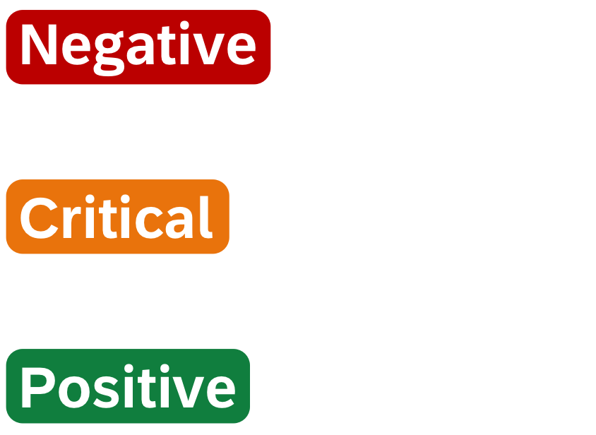
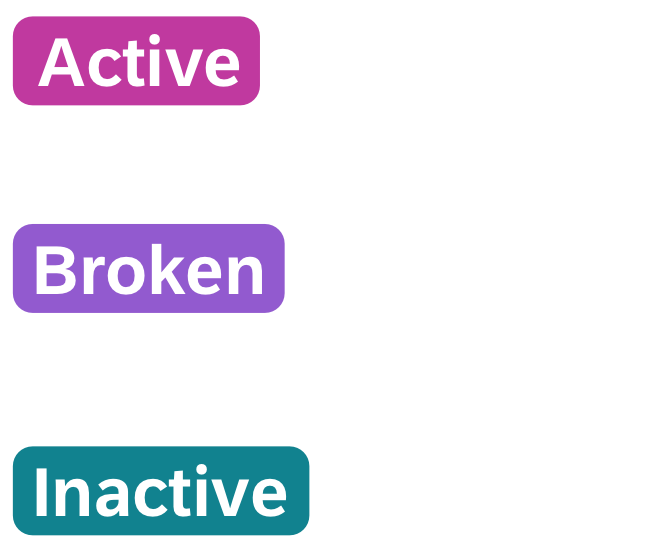
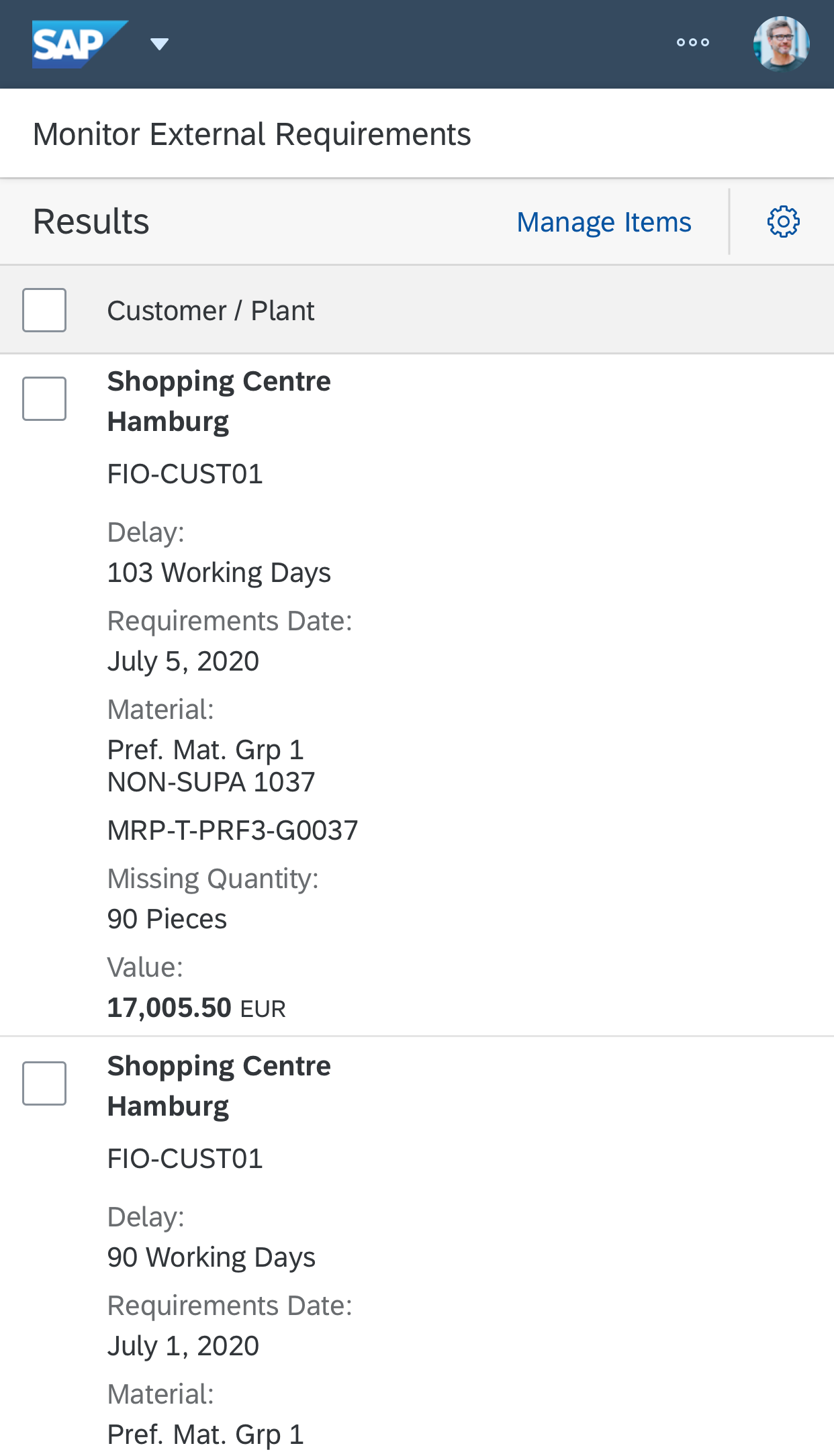
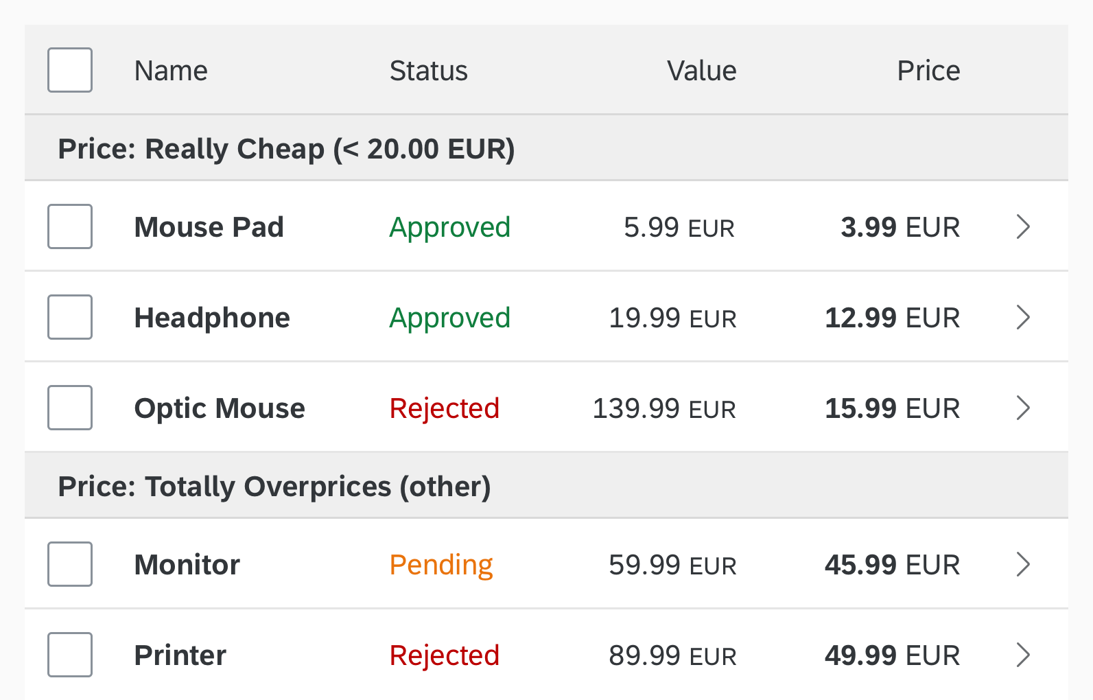
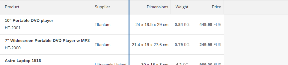
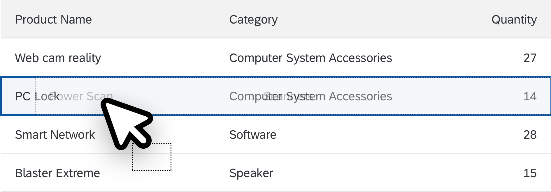
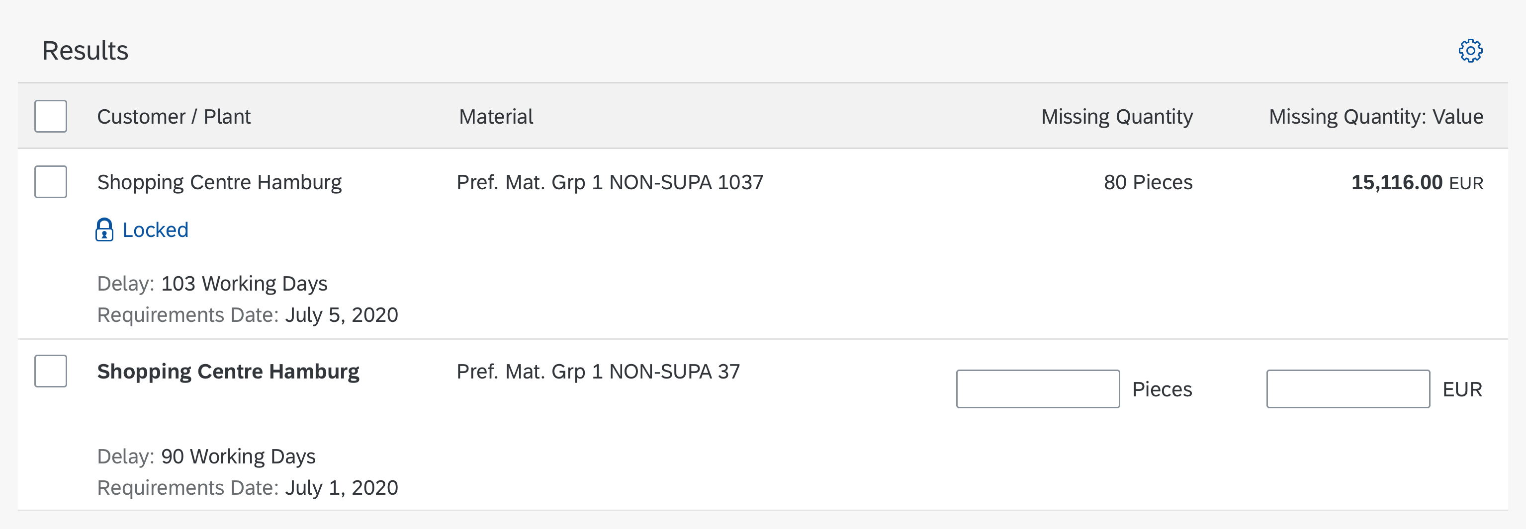
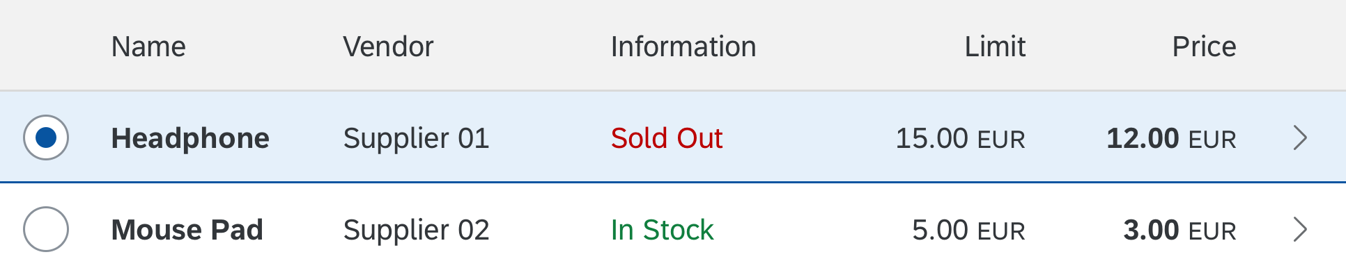
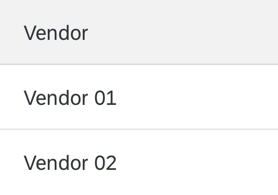
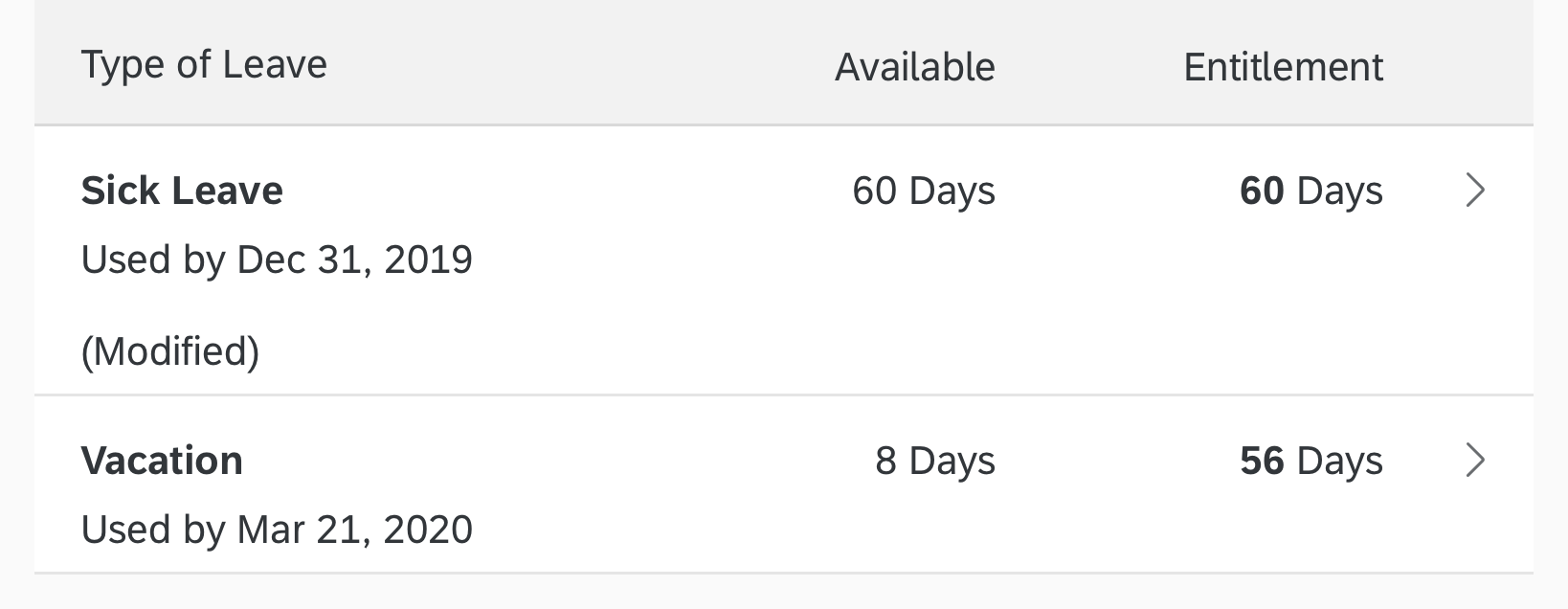
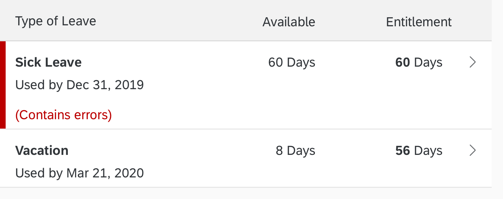
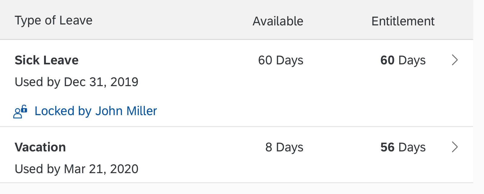
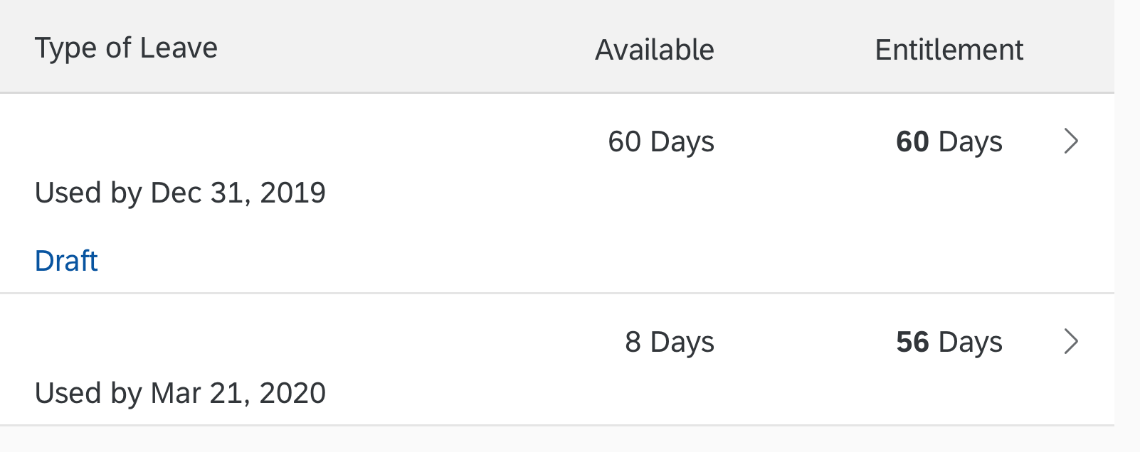
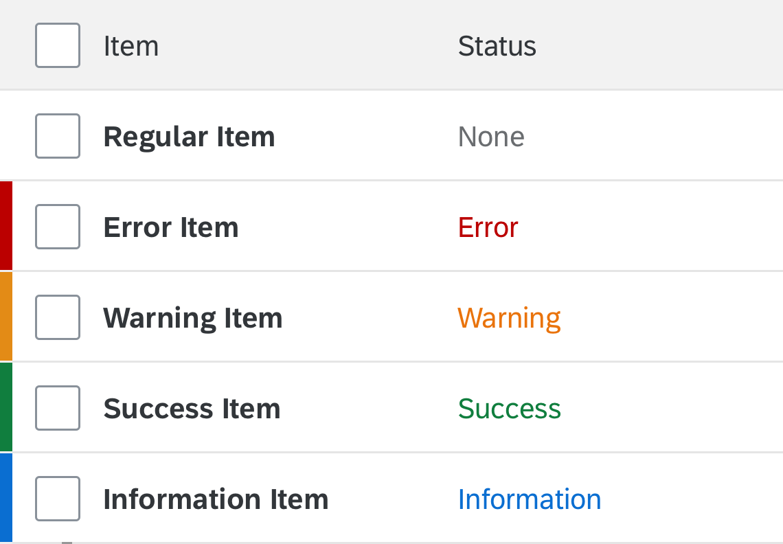
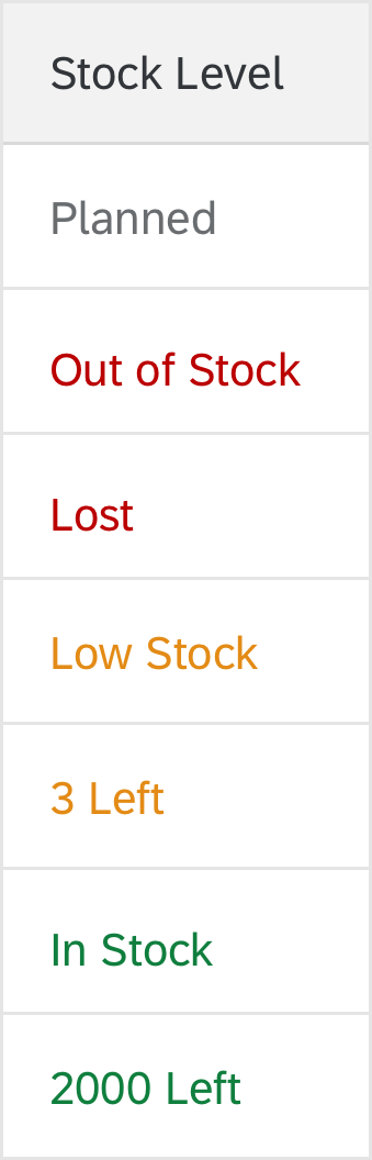
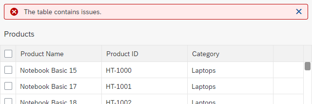
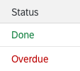
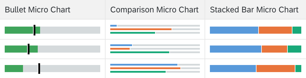
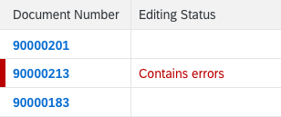
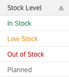
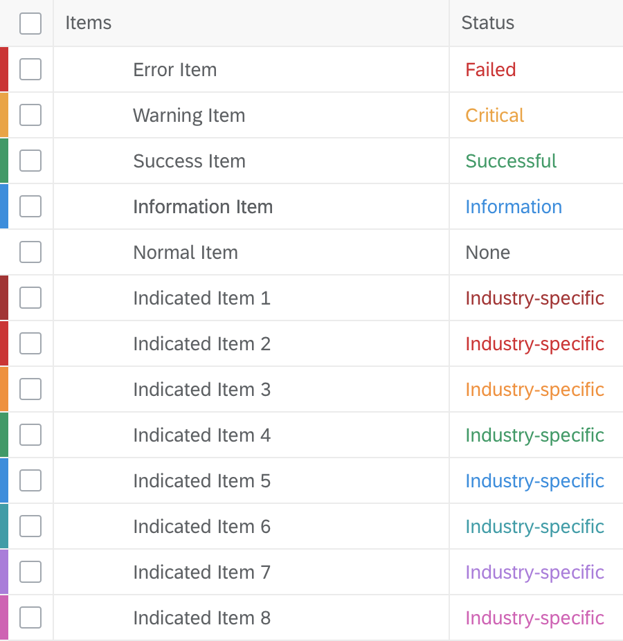
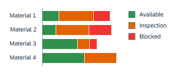
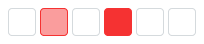
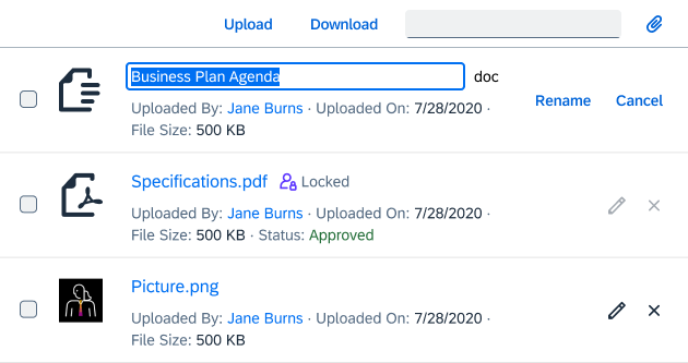
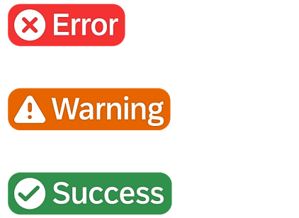
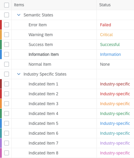
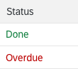
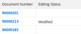
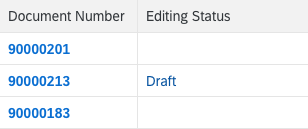
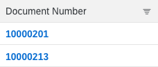
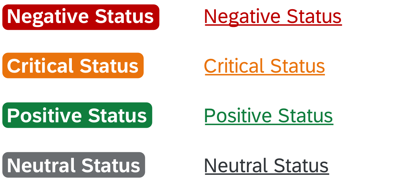
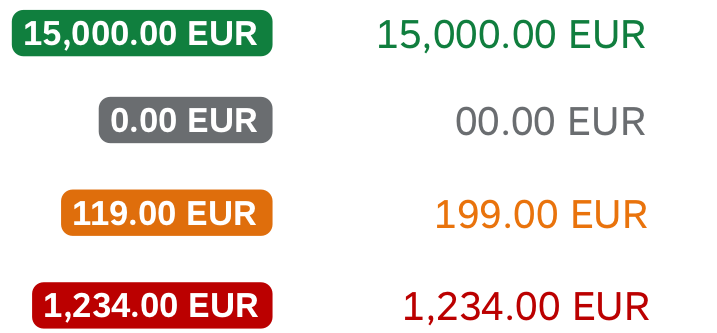
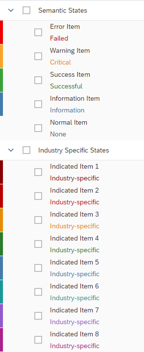
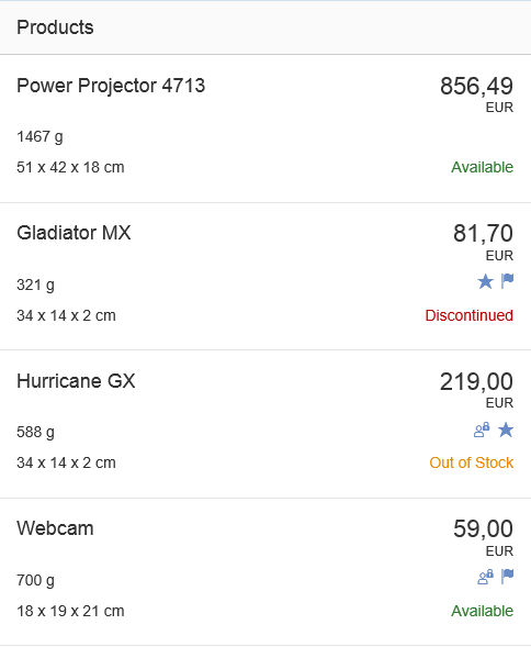
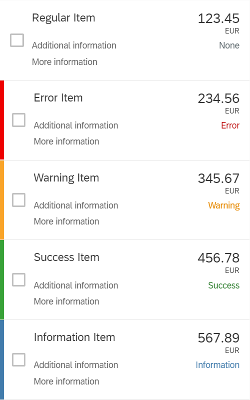
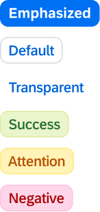
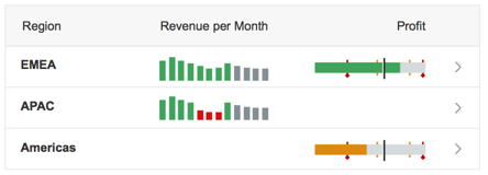
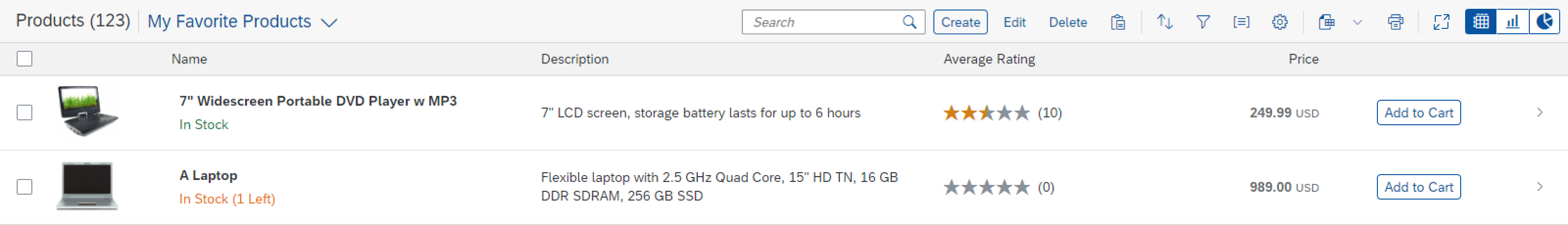
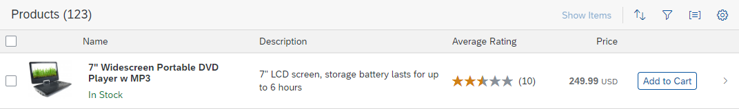
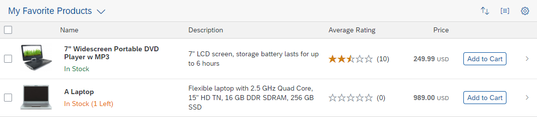
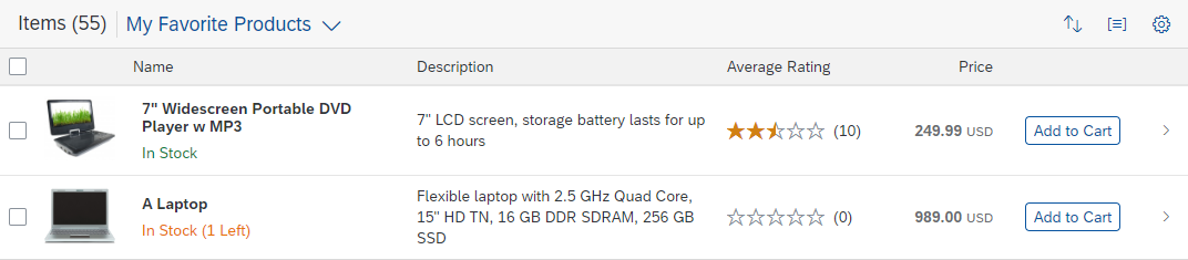
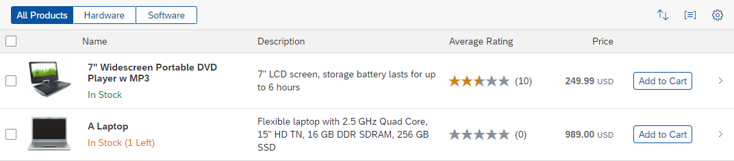
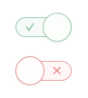
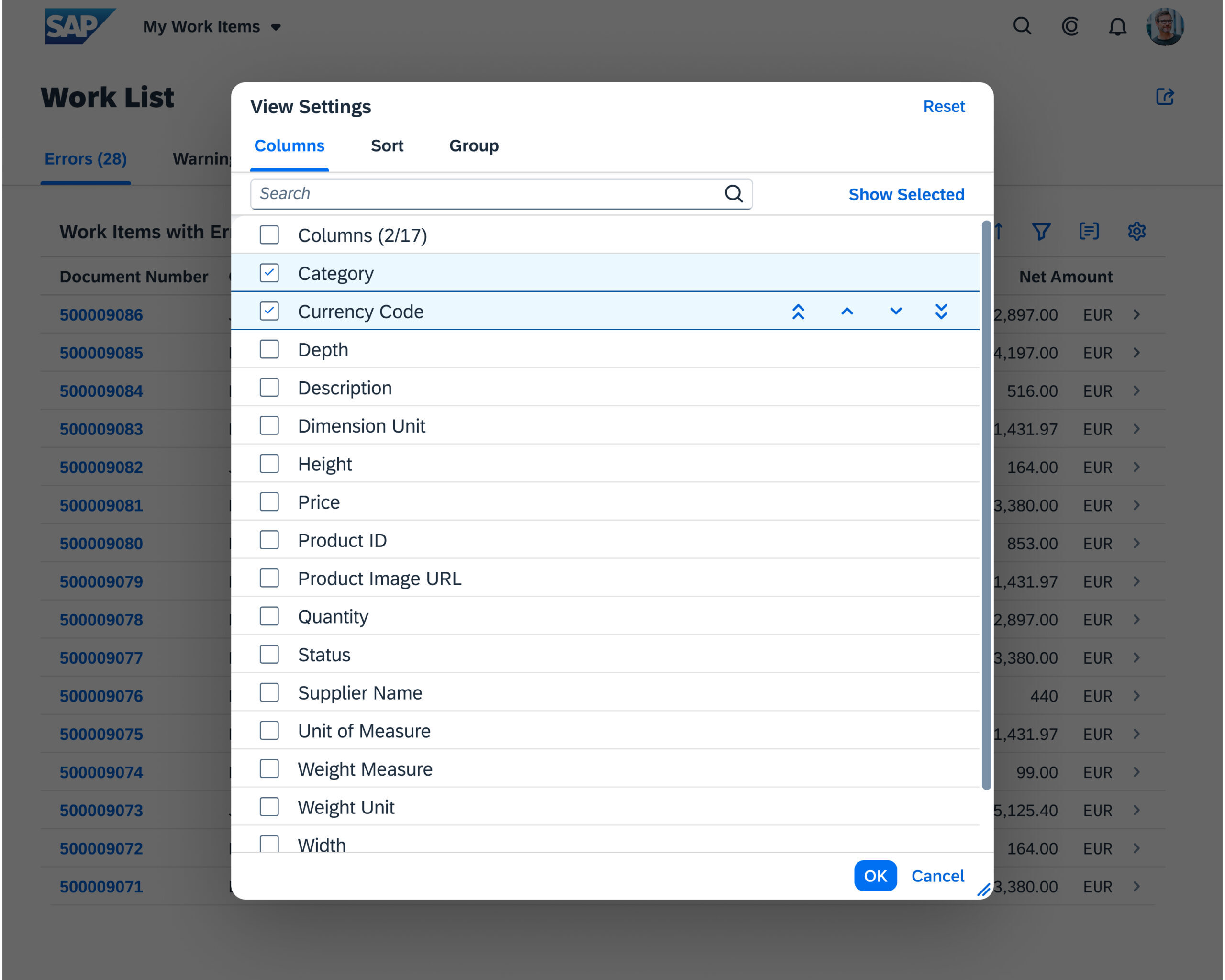
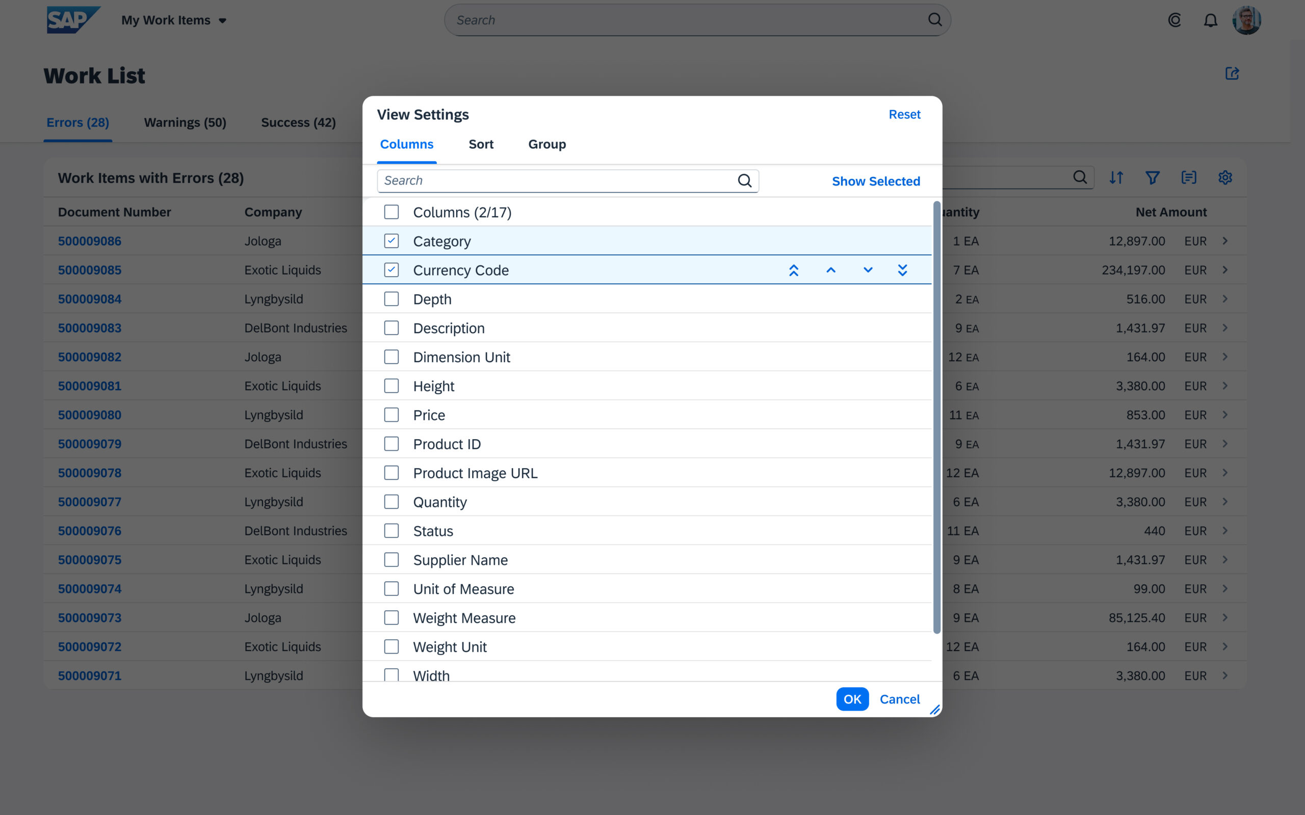
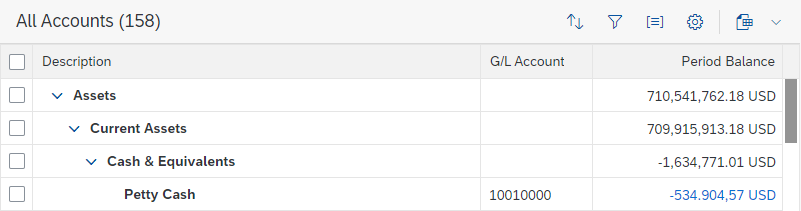
Object status with semantic colors
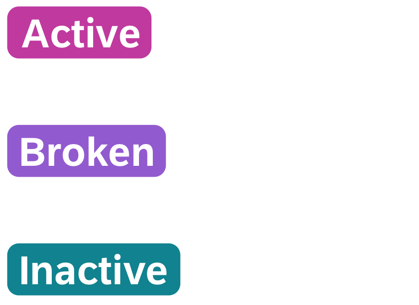
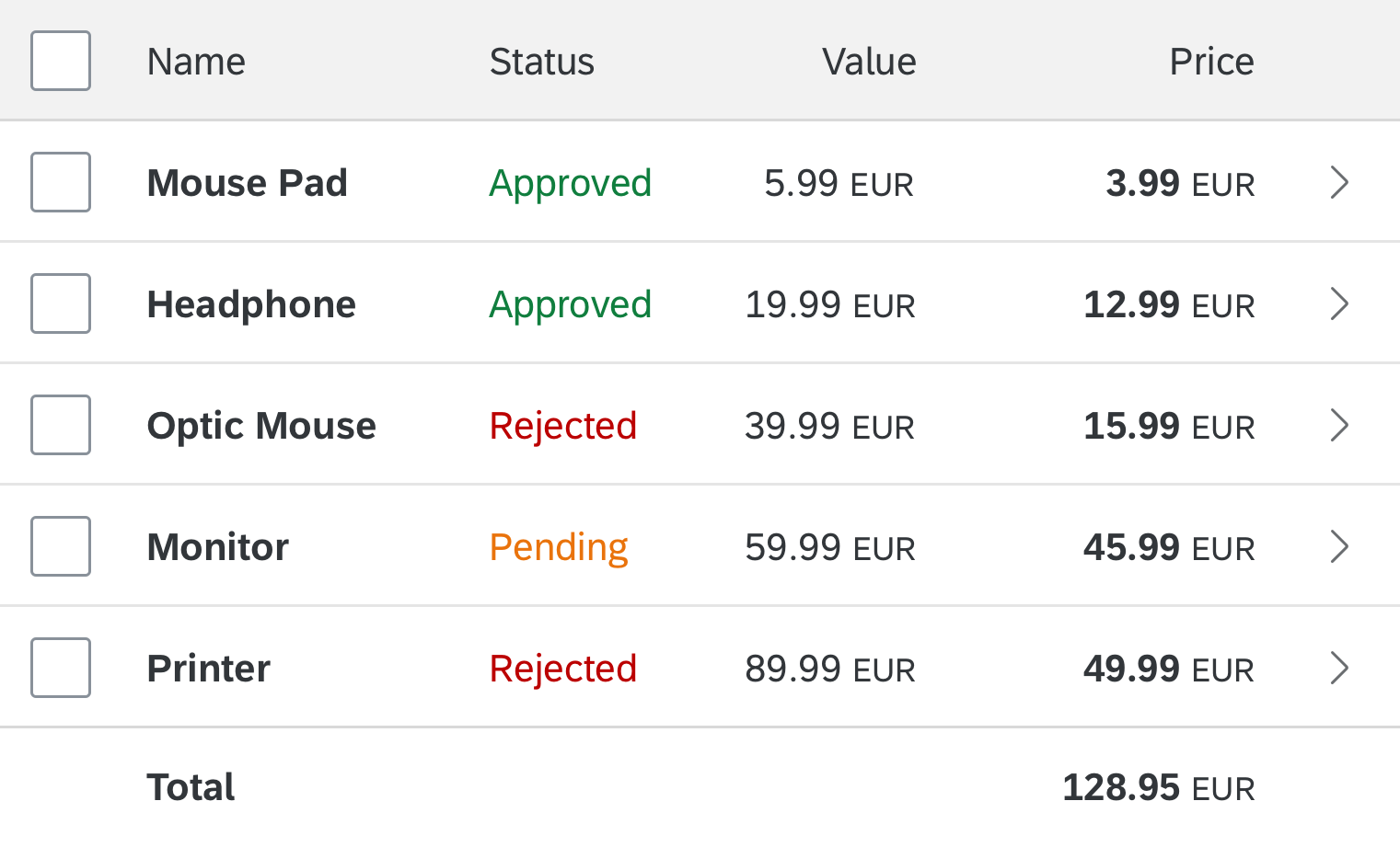
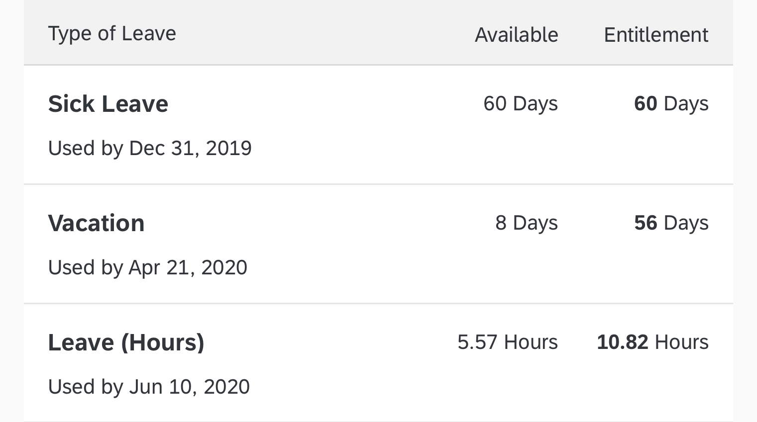
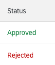
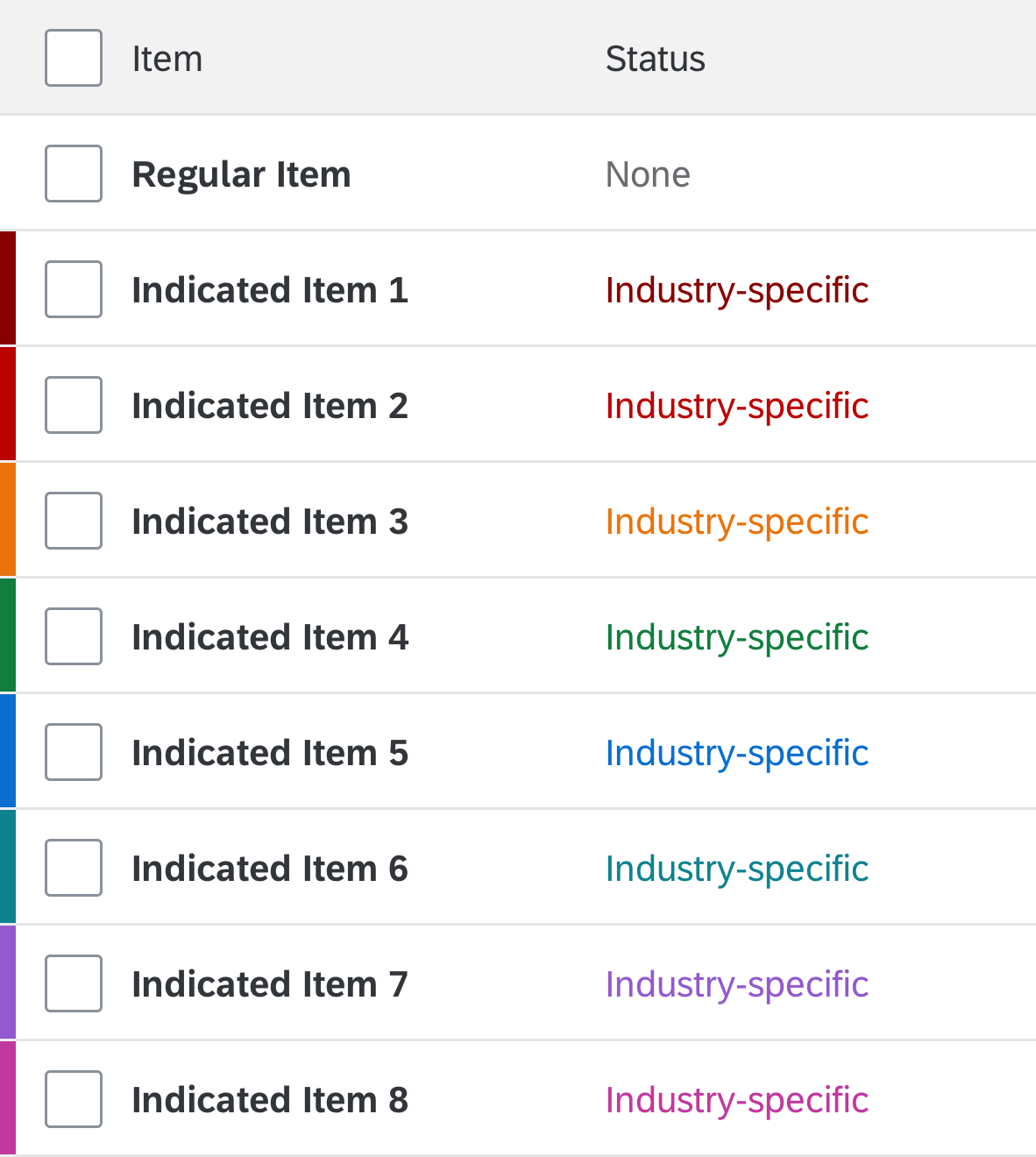
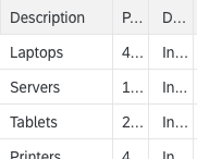
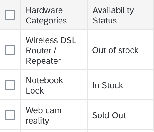
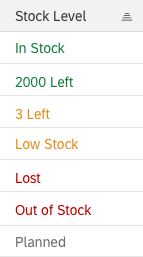
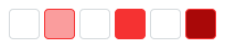
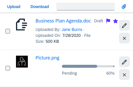
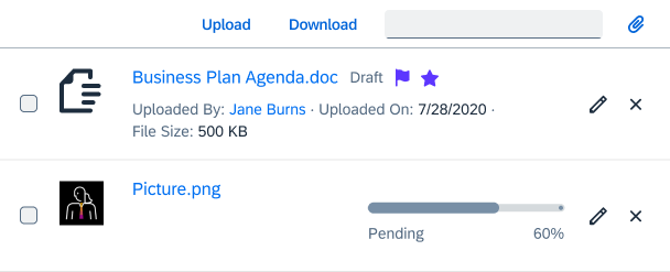
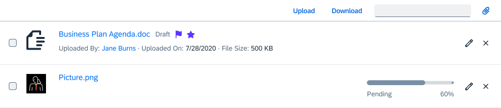
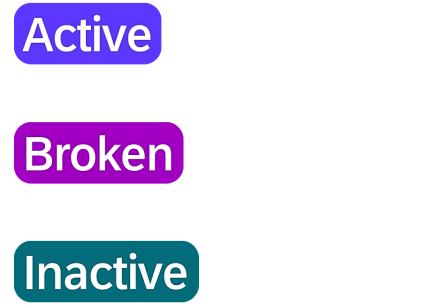
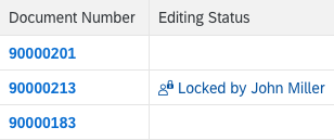
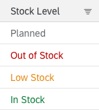
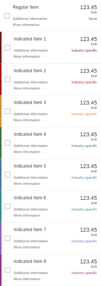
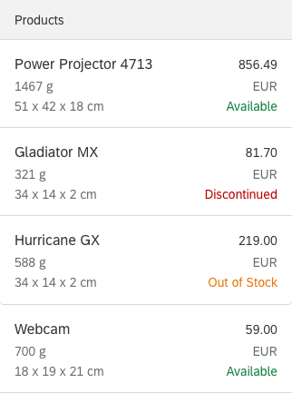
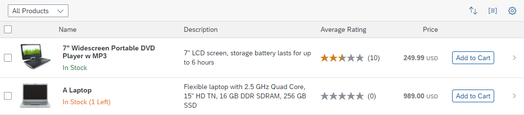
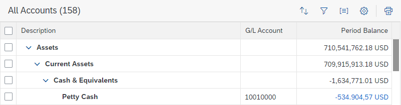
Object status with industry-specific colors
Usage
Use semantic colors if:
- You want to highlight an important status.
- You want to validate fields using form field validation.
- Your app needs message handling.
- You want to use the value states for a control.
Do not use semantic colors if:
- The color has no meaning and is used only for decoration.
- You want to use colors in an industry-specific context, where the meaning of the colors differs from the standard semantic meaning. Use the industry-specific colors instead.
Use industry-specific colors if:
- You want to use a color based on industry conventions (for example, when the meaning of a color is defined in an industry standard).
Do not use industry-specific colors if:
- The color has no meaning and is used only for decoration.
- No special industry color conventions apply. Use the standard semantic colors instead.
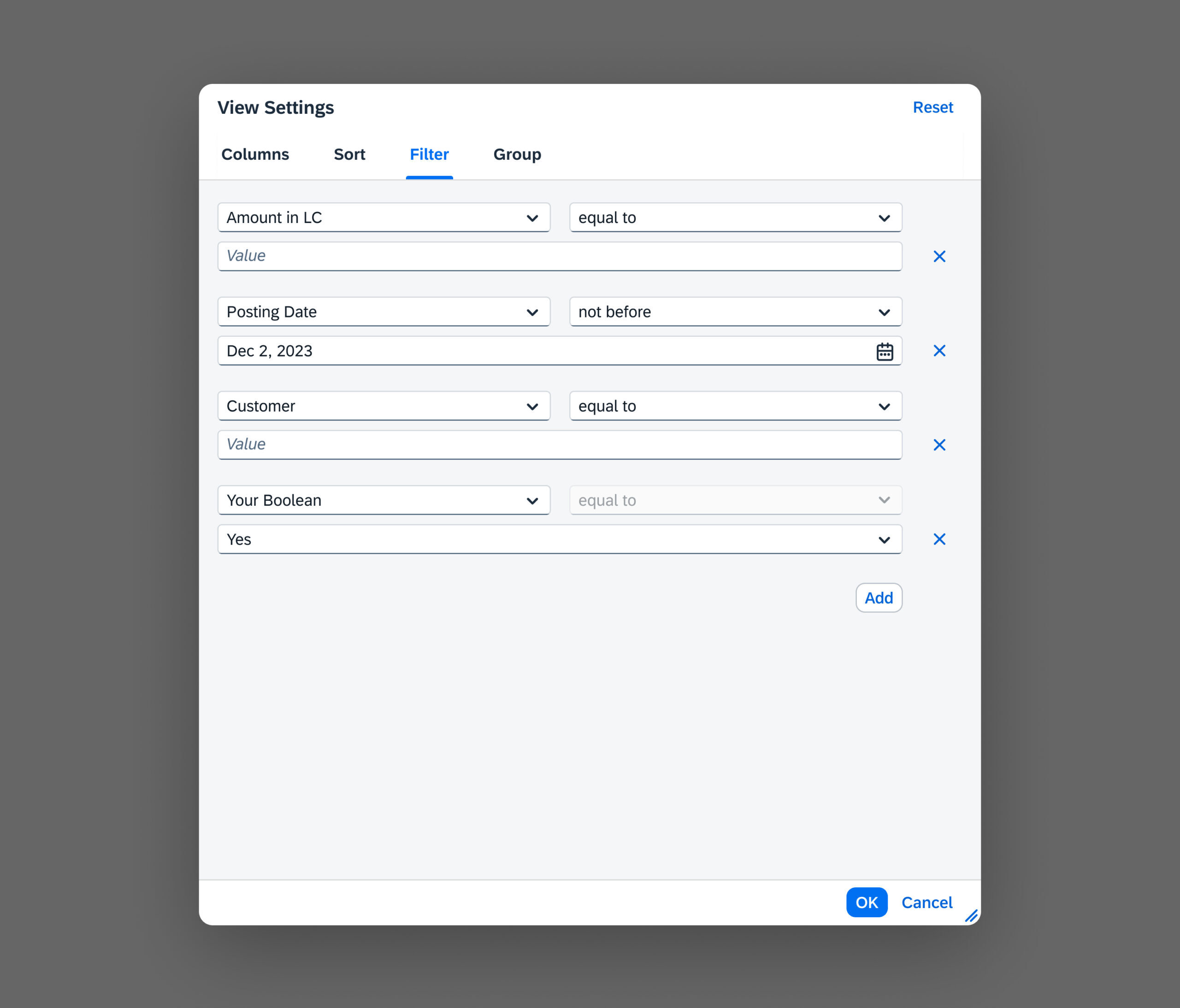
Overview
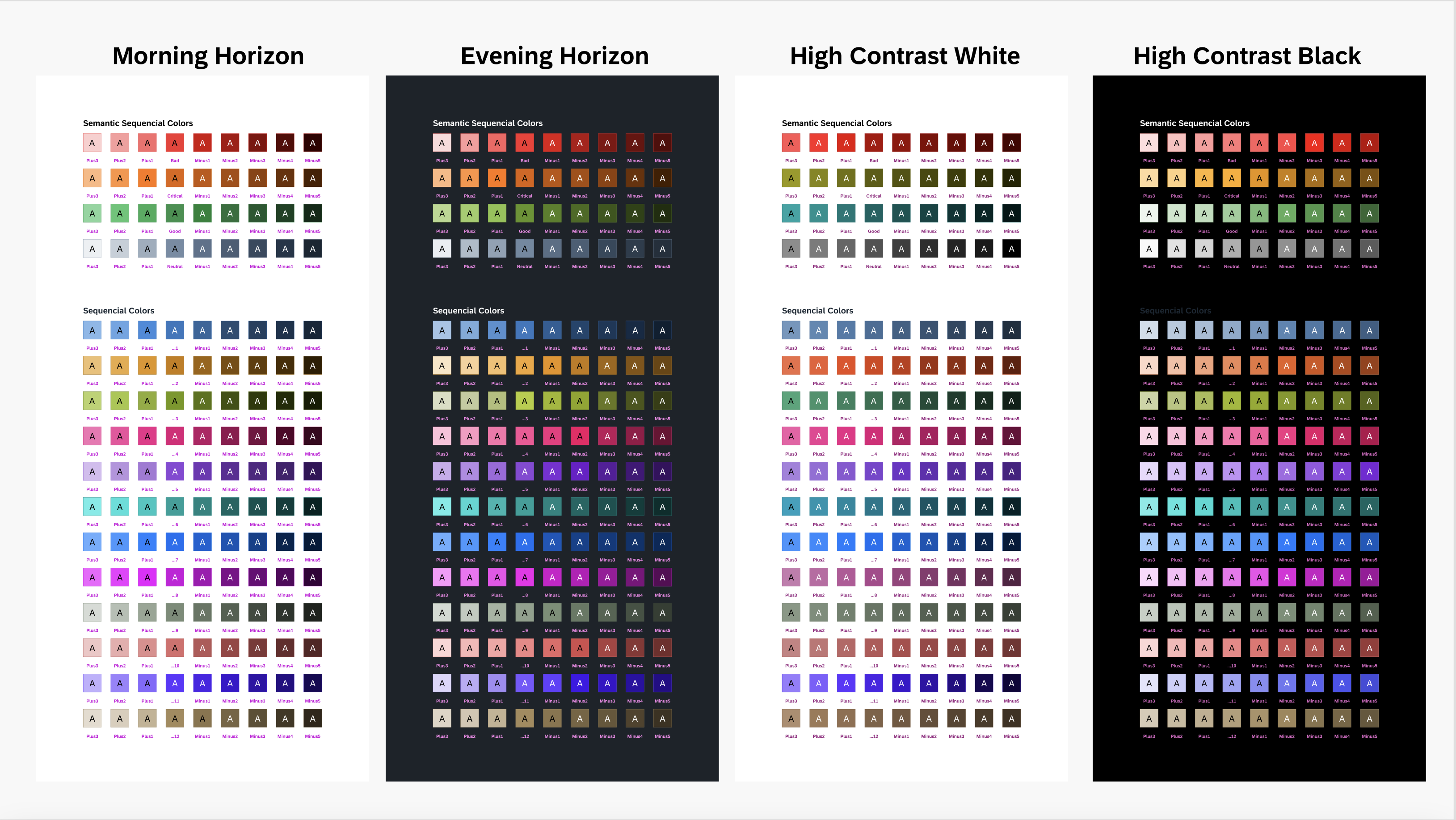
Semantic Colors
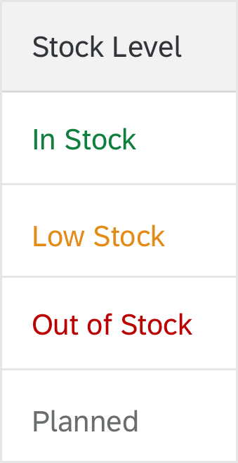
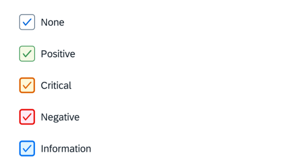
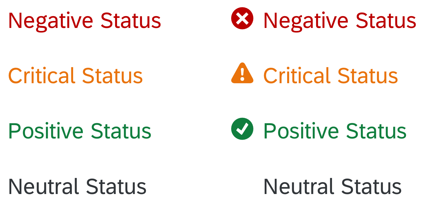
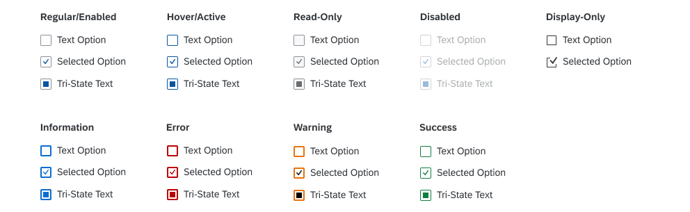
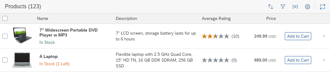
SAP Fiori has five semantic colors that are associated with the following predefined value states:
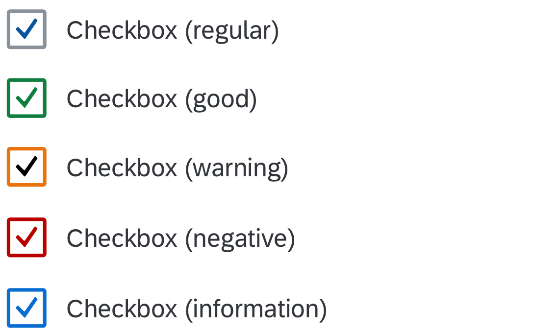
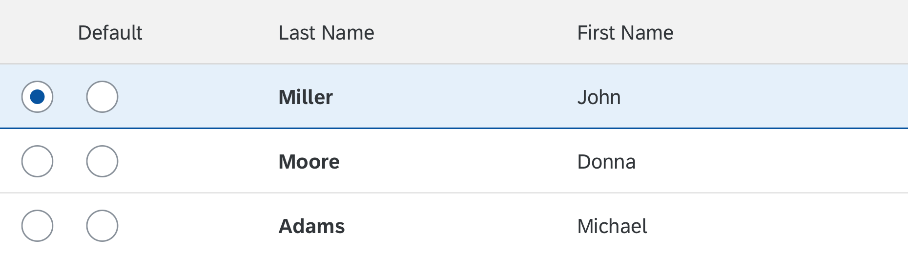
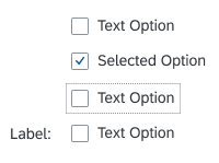
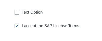
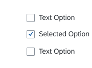
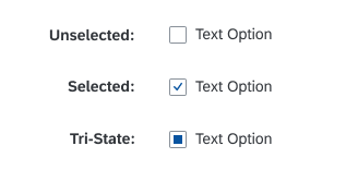
Semantic checkbox states
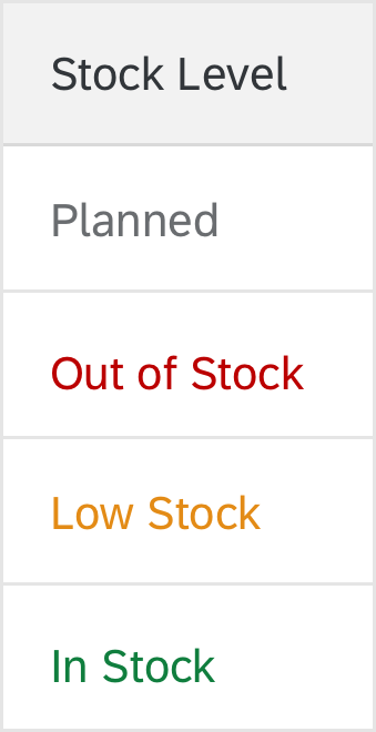
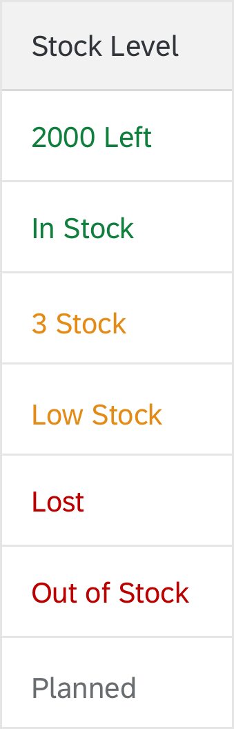
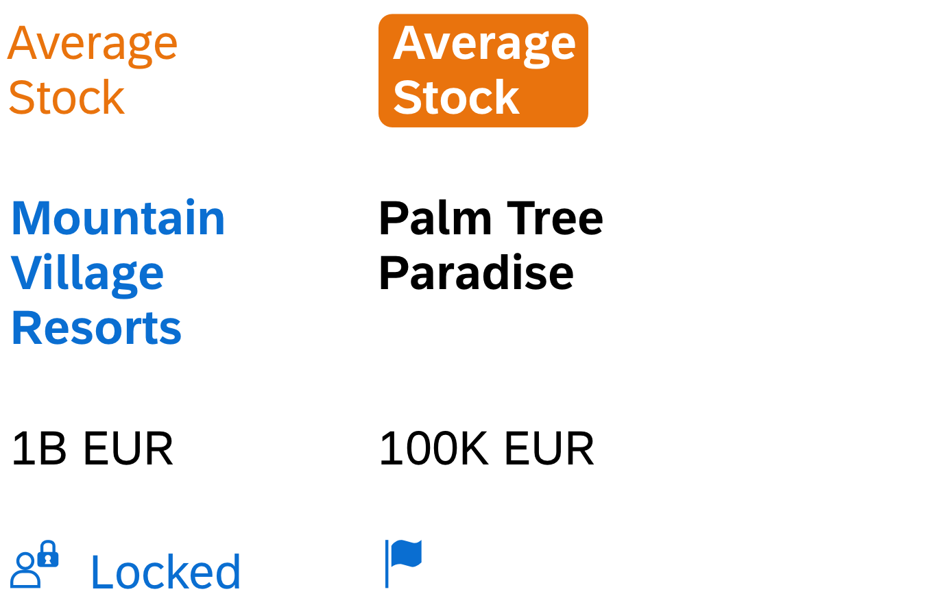
Industry-Specific Colors
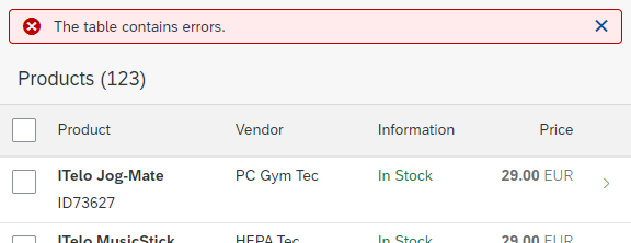
SAP Fiori has 10 generic indication colors that are intended only for industry-specific use cases. You can associate these colors with a specific meaning in a given industry context (for example, to reflect industry standards).
Each application must clearly communicate the meaning of each color. In addition to using a color, you must also provide a text, such as an object status. All colors require a corresponding descriptive text for accessibility purposes.
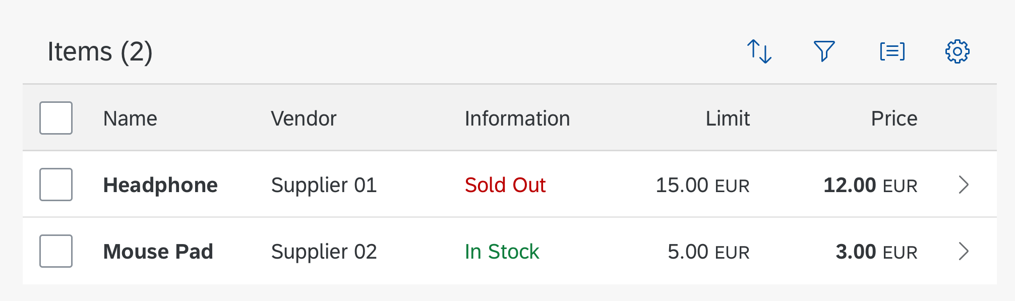
The indication color palette is supported exclusively by tables and the object status.
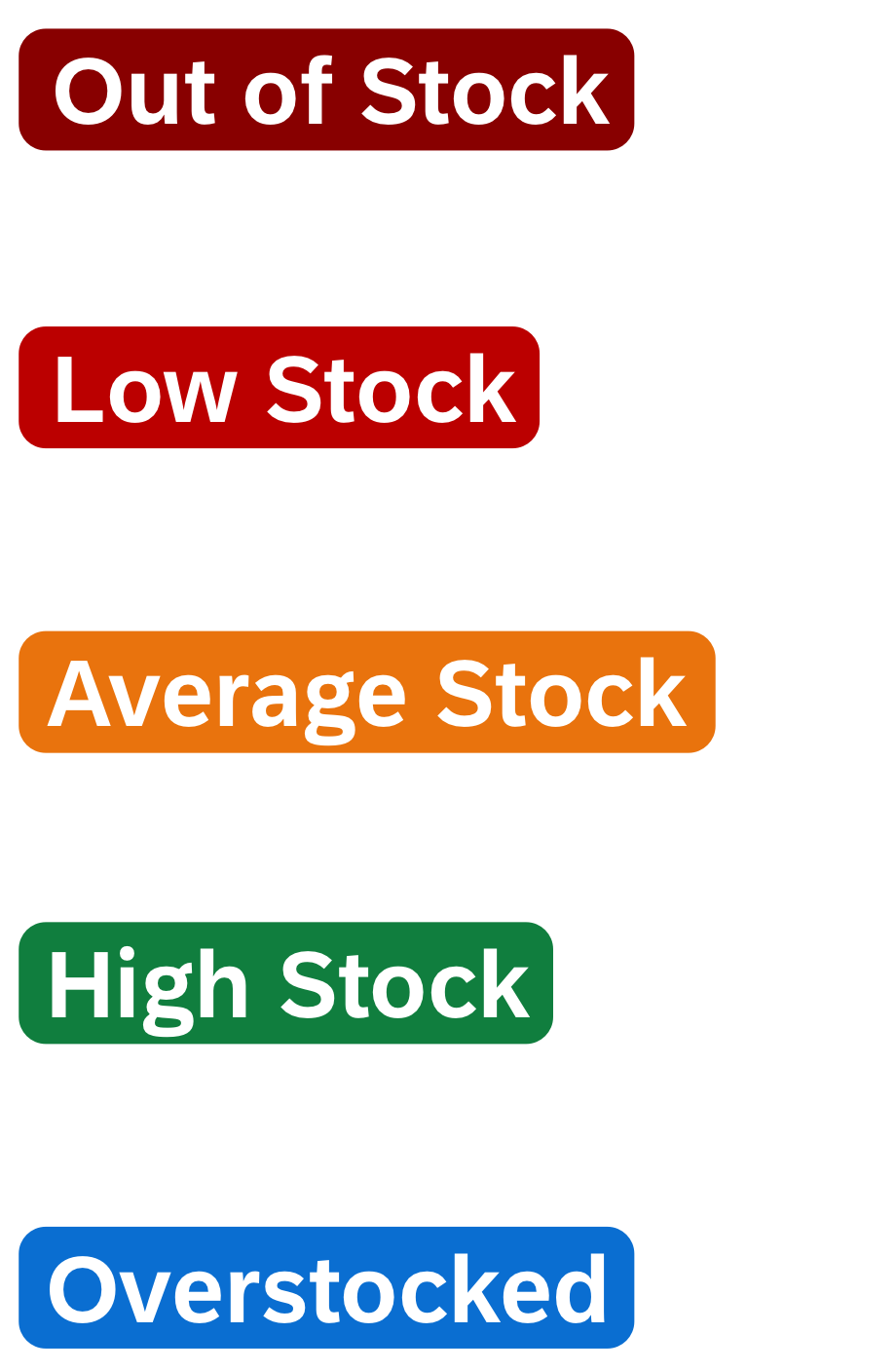
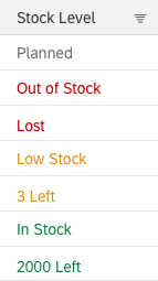
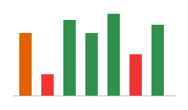
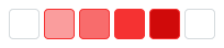
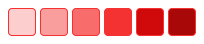
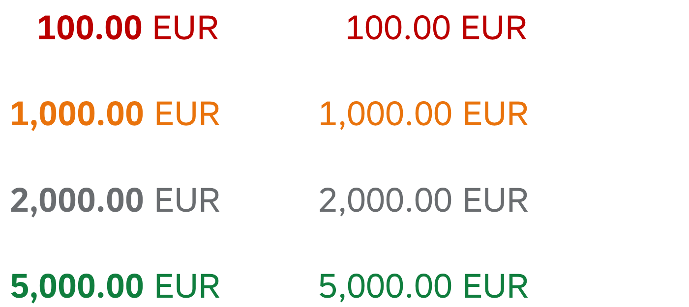
Object status with five industry-specific colors
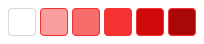
Object status with three industry-specific colors
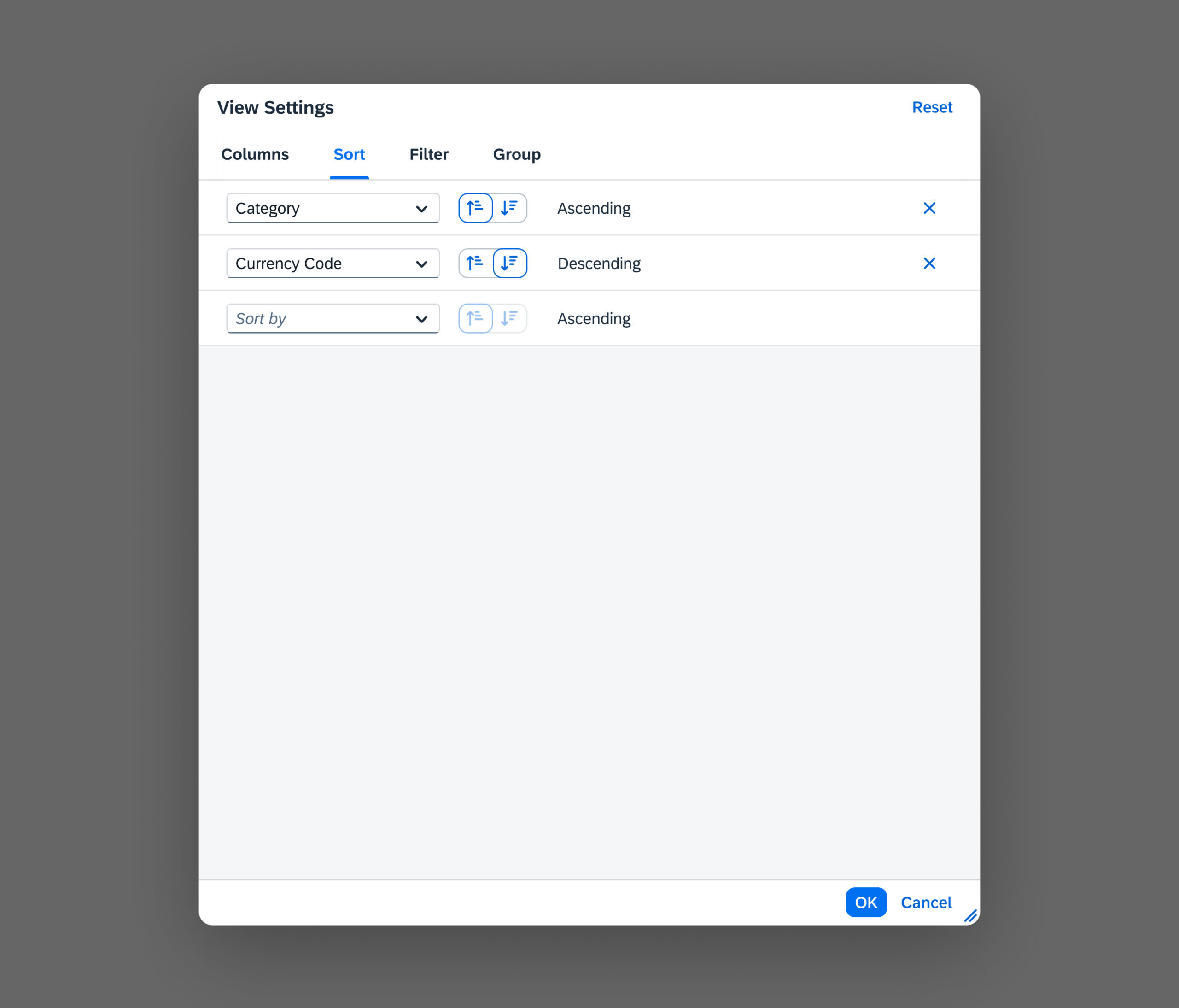
When To Use Which Semantic Color
Only use a semantic color if you need to convey the meaning defined for that color. This section looks at each semantic color in turn, and offers guidance on when to use each one.
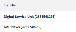
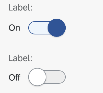
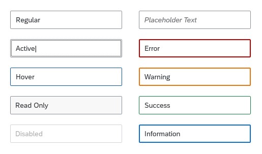
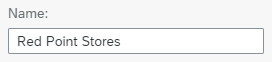
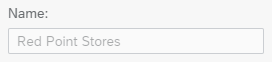
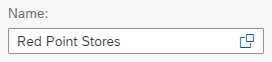
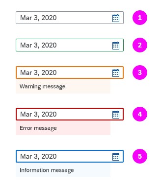
Regular (neutral)
Use this color as the regular, neutral state of all UI elements.
Use the regular (neutral) color if:
- You want to use the default of a UI element.
- There is no reason to use another value state.
- You want to indicate a neutral object status.
- A message contains non-critical, additional information for users.
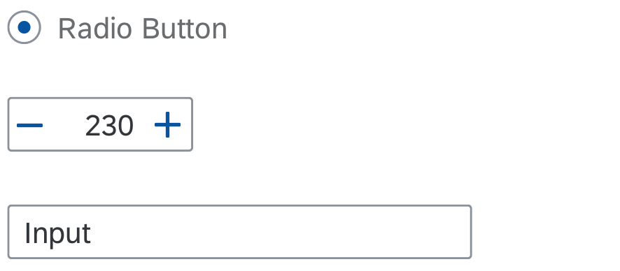
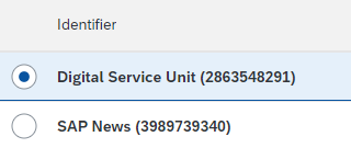
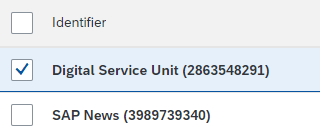
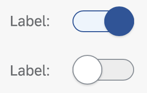
Radio button, step input, and input in regular state
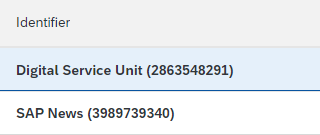
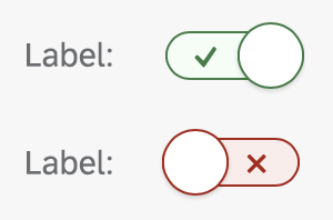
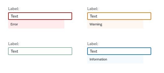
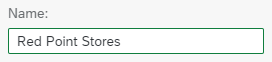
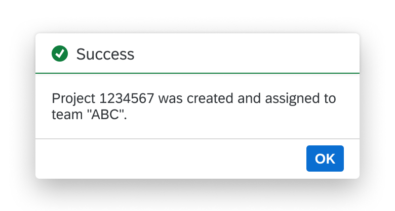
Good / Positive
This color stands for a good, positive situation, or for the successful completion of a task.
Use the good/positive semantic color if:
- You want to highlight a good or positive status.
- A message contains information about a process that was finalized without any issues. Users need this information later on (for example, to copy values to another app).
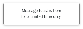
To indicate a successfully completed process, a short notification is enough. In this case, use a message toast and not the good/positive semantic color.
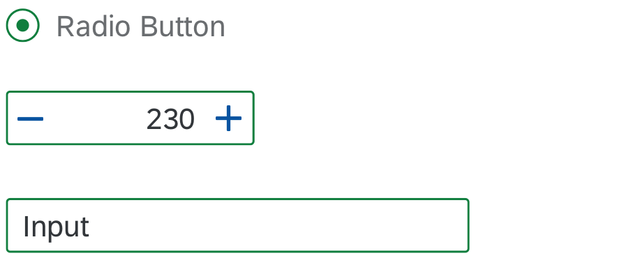
Radio button, step input, and input in positive state
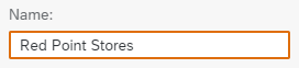
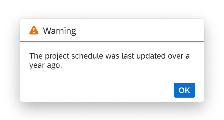
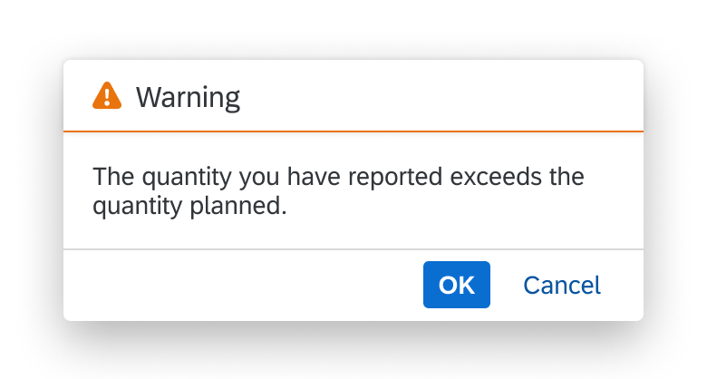
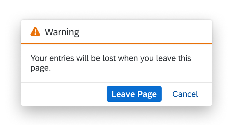
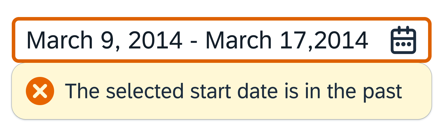
Warning / Critical
This color indicates a critical situation or warning.
Use the warning/critical semantic color if:
- You want to highlight a critical status.
- A minor problem has occurred. The user can carry on working, but might run into an error later on.
- The current mode or page can be finalized, but doing so might lead to an error later on.
- The user input was validated and a minor problem occurred. The user can continue without fixing the problem, but might run into an error later on.
- A message contains information about a warning.
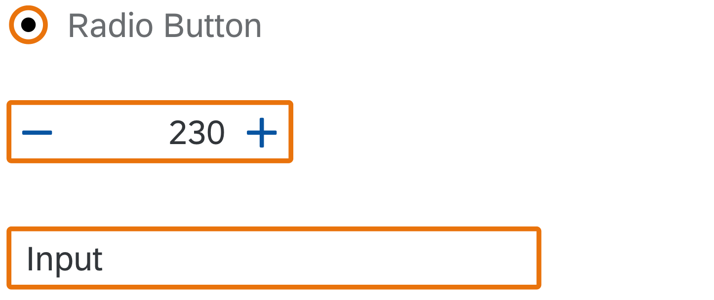
Radio button, step input and input in warning state
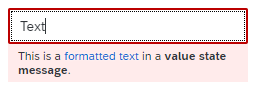
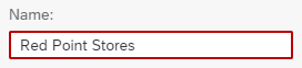
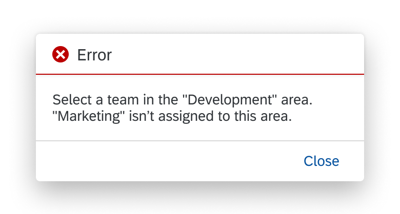
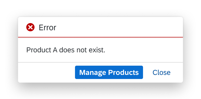
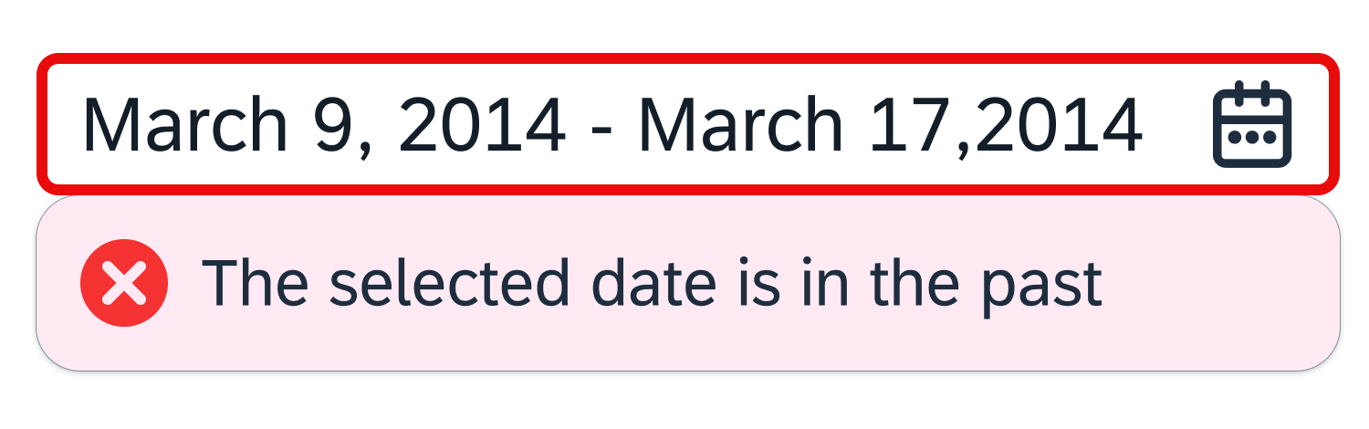
Bad / Error
Use this color for errors, or to indicate a bad or negative status or consequence.
Use the bad/error semantic color if:
- Something bad has happened, or is about to happen. The issue requires the user’s attention. Until the issue is resolved, the user can’t carry on working.
- You want to indicate that a value has caused an error.
- The user needs to be prevented from finalizing the current mode or page.
- The user input failed a validation, and the problem must be fixed before the user can continue.
- A message contains information about an error.
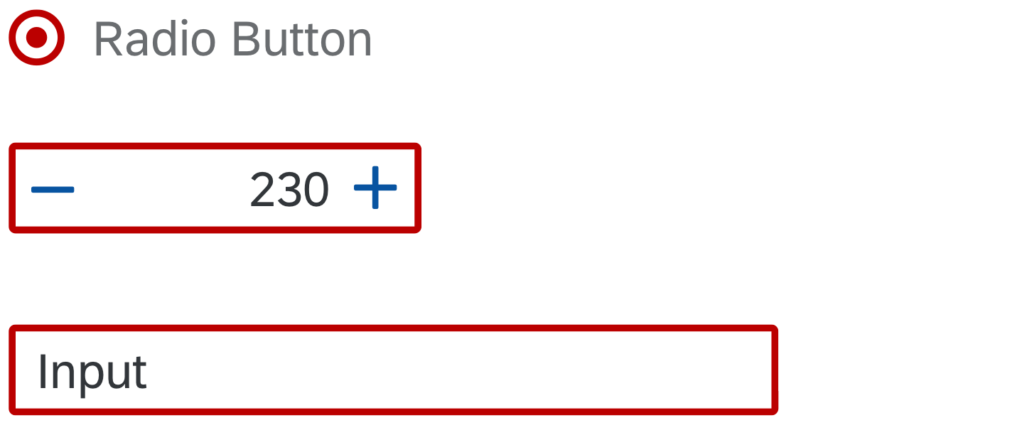
Radio button, step input and input in error state
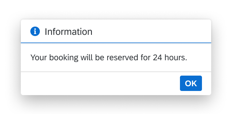
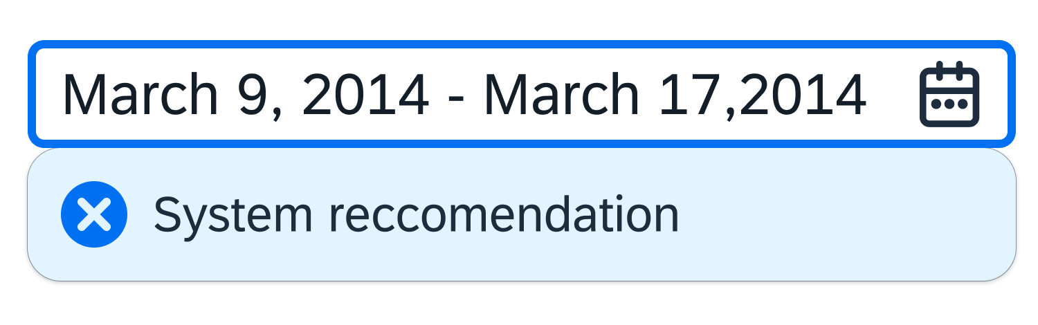
Information
Use this color for an information state.
Use the information semantic color if:
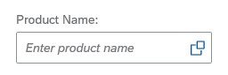
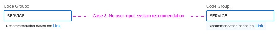
- You want to draw attention to a control for an important purpose, such as visualizing the recommendations from intelligent systems in input fields.
- You want to highlight newly added items, such as a new table row.
Don’t use the information color if you want to highlight an information text. The blue text color is explicitly reserved for links. Use bold or italic formatting instead.
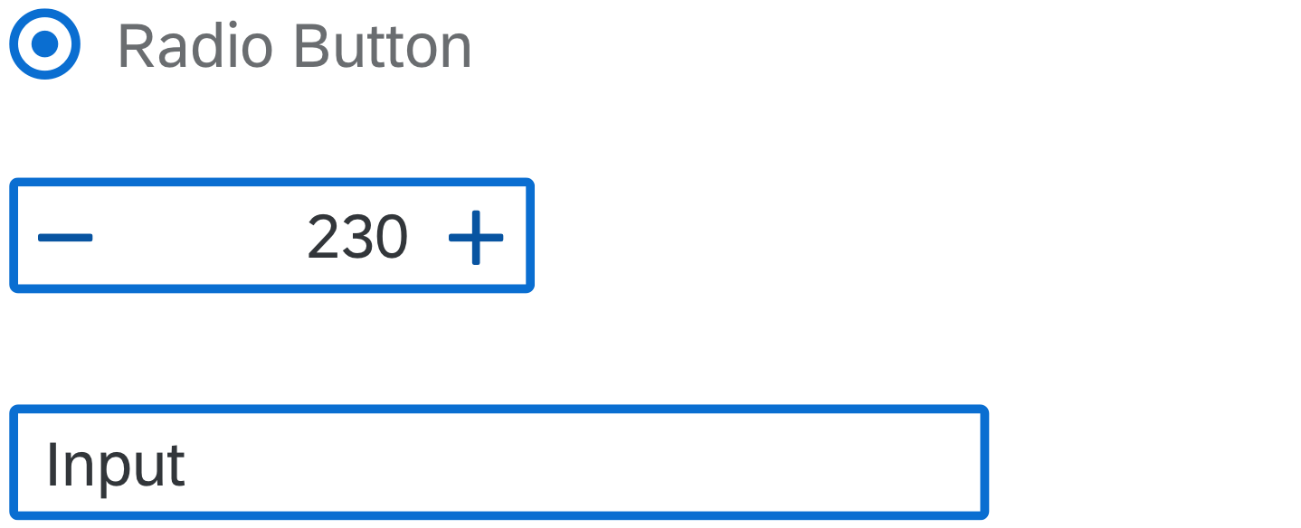
Radio button, step input and input in information state
Using Industry-Specific Colors
There is no predefined meaning for the individual colors in the generic palette. If you want to use one or several colors from the industry-specific color palette in your application, proceed as follows:
- Define the meaning for each color you want to use.
- Whenever you use an color, provide an additional text indicator (such as an object status) to ensure that the text is clear and accessible.
- Once you have defined the meaning for a color, use the color/meaning consistently within your application.
Color Overlap
By default, some colors are the same in the semantic palette and the industry-specific color palette (such as red, orange, green, and blue). This is intended. However, the two color palettes can be themed independently, which means that end users might not see the same colors in both.
No Palette Mix
Some UI elements support both the semantic color palette and the industry-specific color palette. However, you can only use one color palette at a time. It is not possible to mix different colors from both palettes.
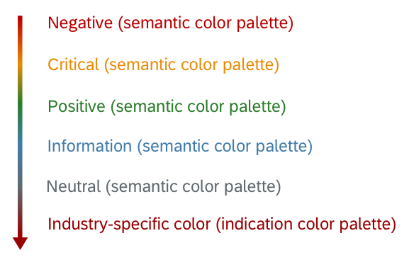
Color Hierarchy
If an UI element would have multiple semantic or industry-specific color statuses at the same time, the control may need to determine an “overall color” at first.
In this case, the overall color is based on the color hierarchy: colors higher up in the hierarchy take precedence over those lower down. Note that there is only one hierarchy for both semantic colors and industry-specific colors.
Color hierarchy
Styles
The semantic colors and industry-specific colors are themeable.
Resources
Want to dive deeper? Follow the links below to find out more about related controls, the SAPUI5 implementation, and the visual design.
Elements and Controls
- Quartz Light Colors (guidelines)
- Belize Colors (guidelines)
- UI Element States (guidelines)
- Form Field Validation (guidelines)
- Message Handling (guidelines)
- Object Display Components (guidelines)


 Your feedback has been sent to the SAP Fiori design team.