
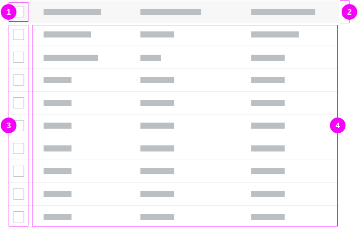
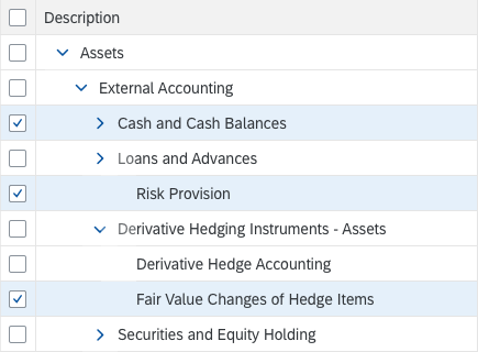
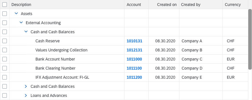
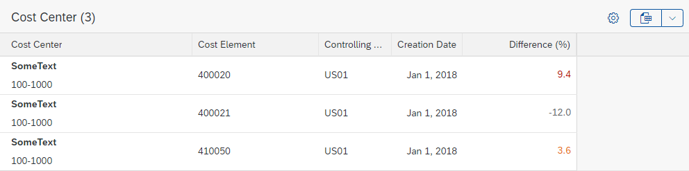
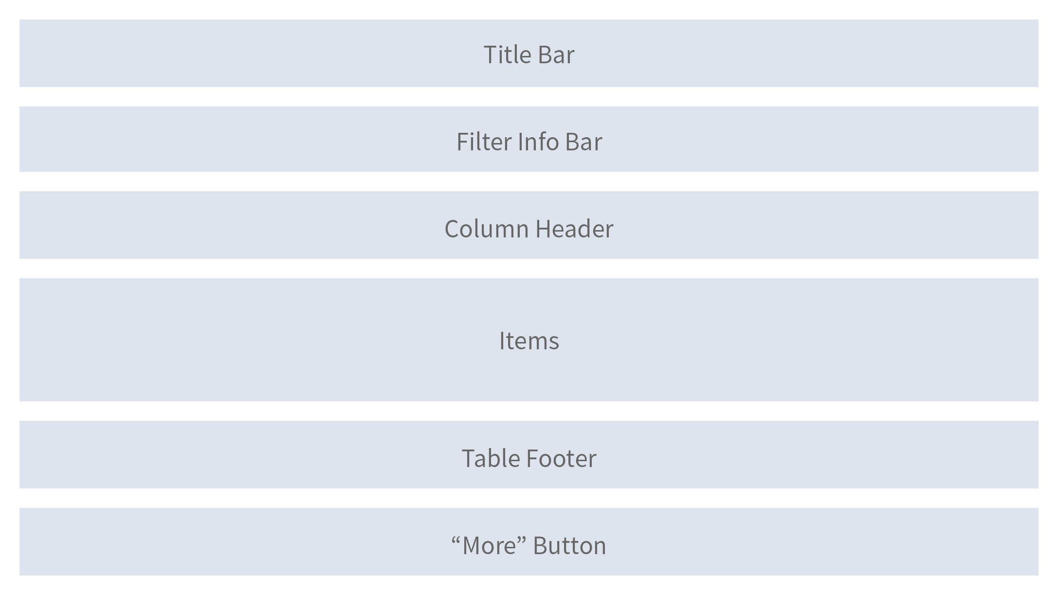
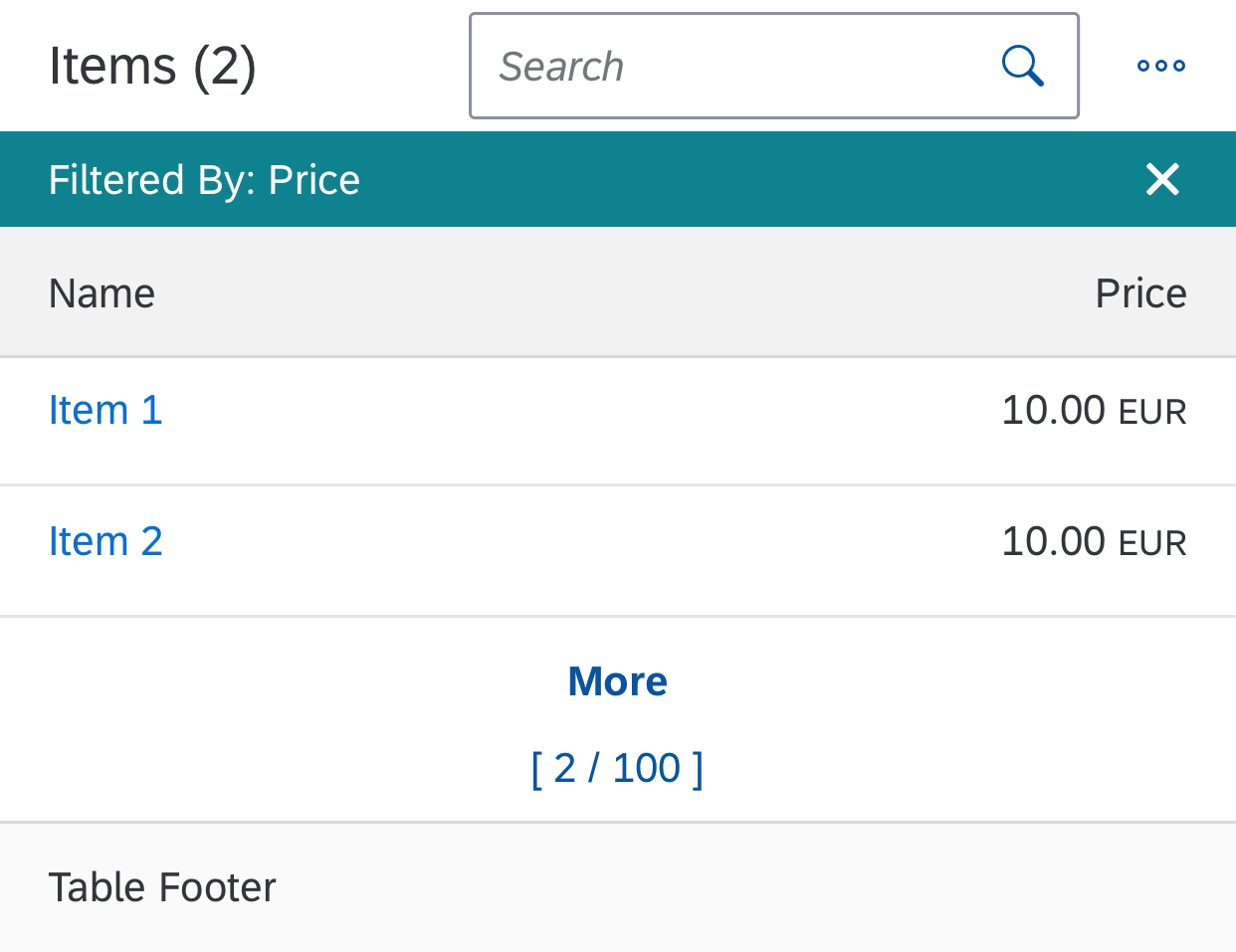
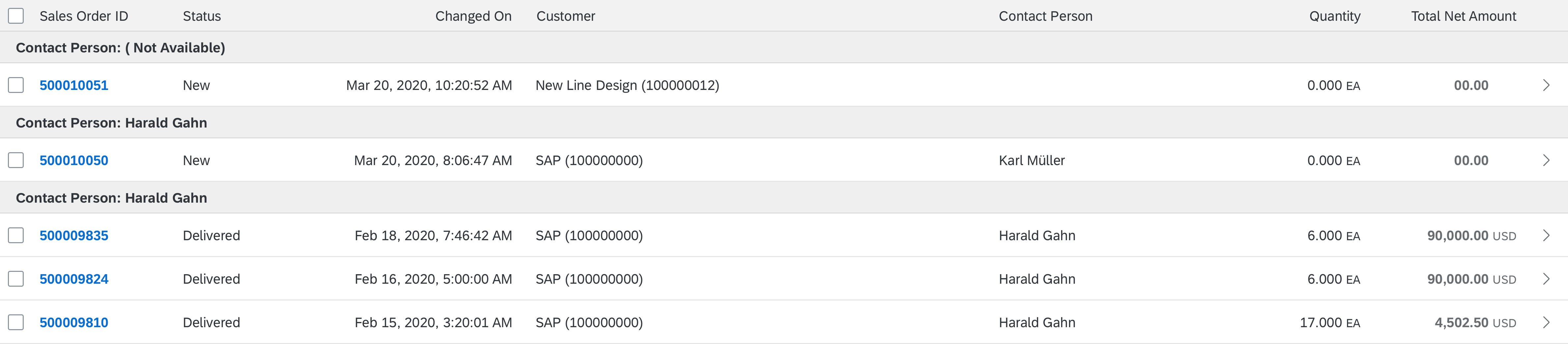
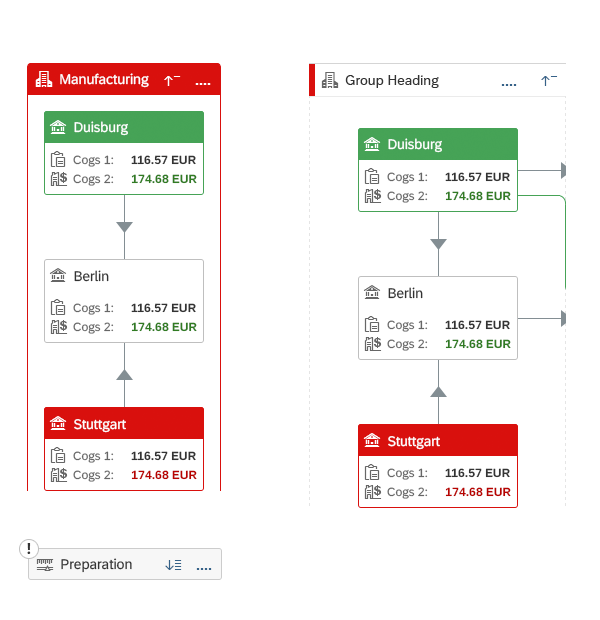
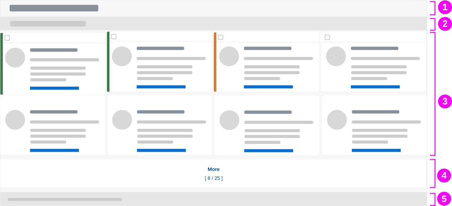
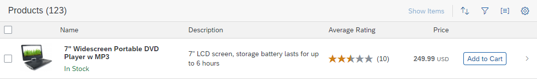
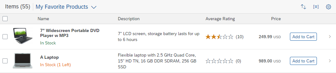
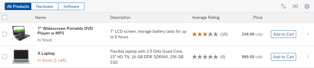
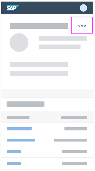
Tree Table
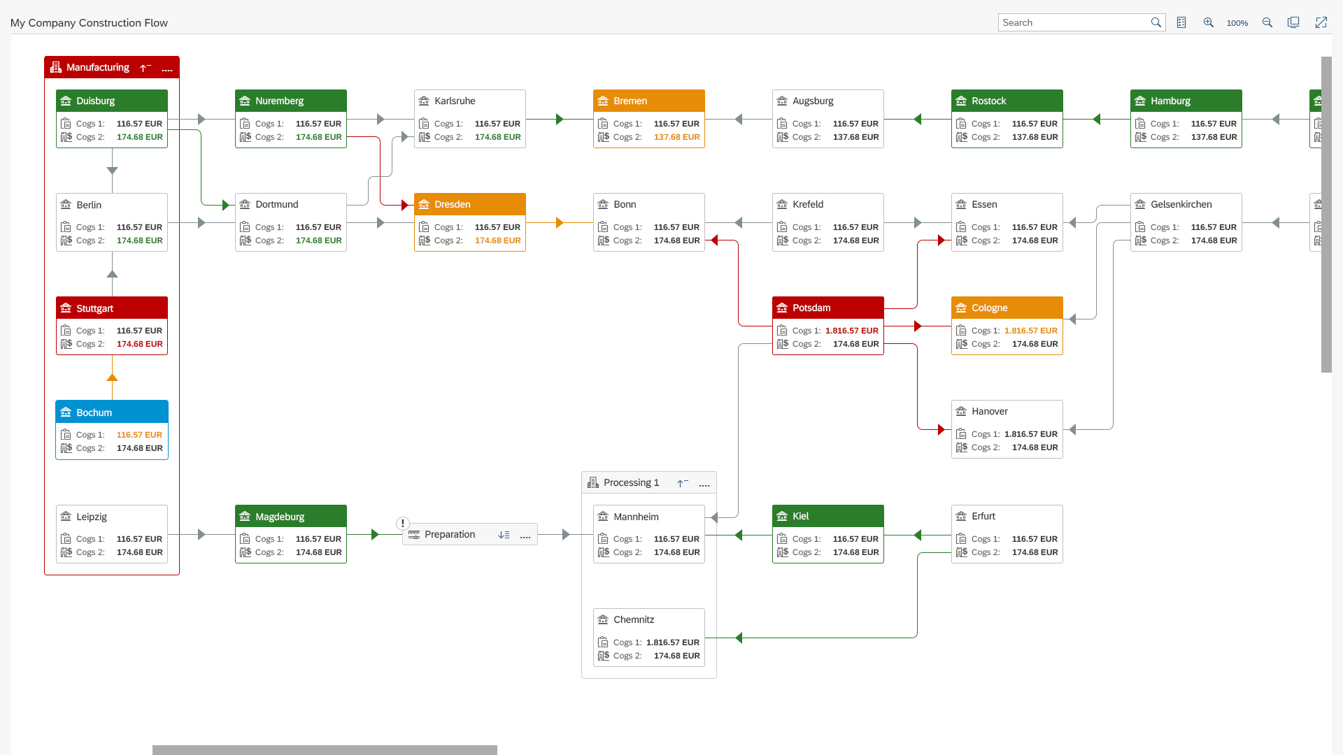
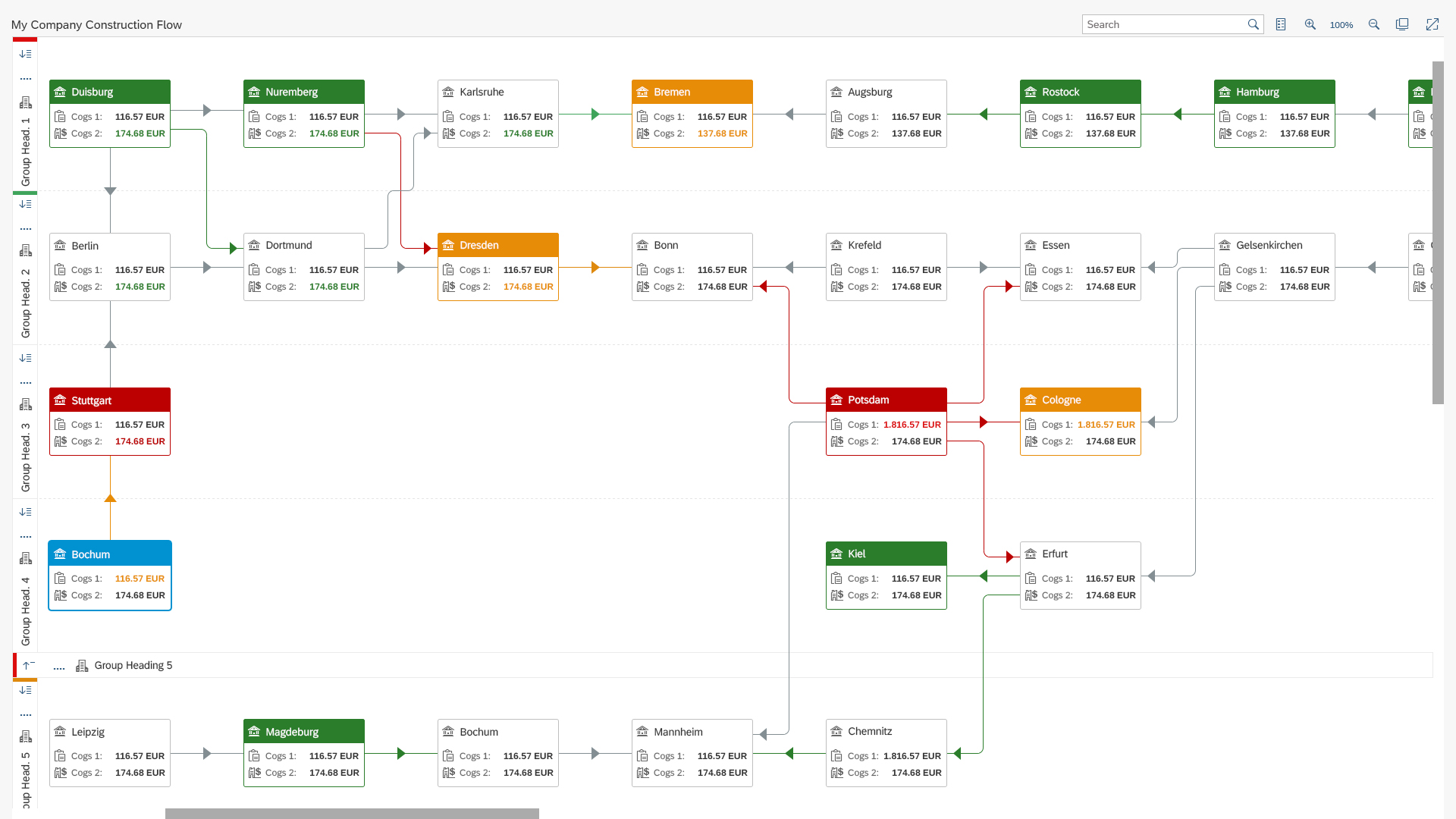
A tree table contains a hierarchical set of data structured in rows and columns and grouped into nodes. The analytical table (also know as ALV) can provide additional details in several non-hierarchical columns per line item.
Usage
Trees are used to display and work with large amounts of hierarchical data. They have a high data density and therefore convey an immediate feeling of complexity. Ideally, you should only show trees with a lot of hierarchical data as a last resort. Try the following instead:
- Break down the data into manageable chunks and allow the user to navigate or drill down between them.
- Use charts with drilldown functionality until the amount of data is more manageable.
Responsiveness
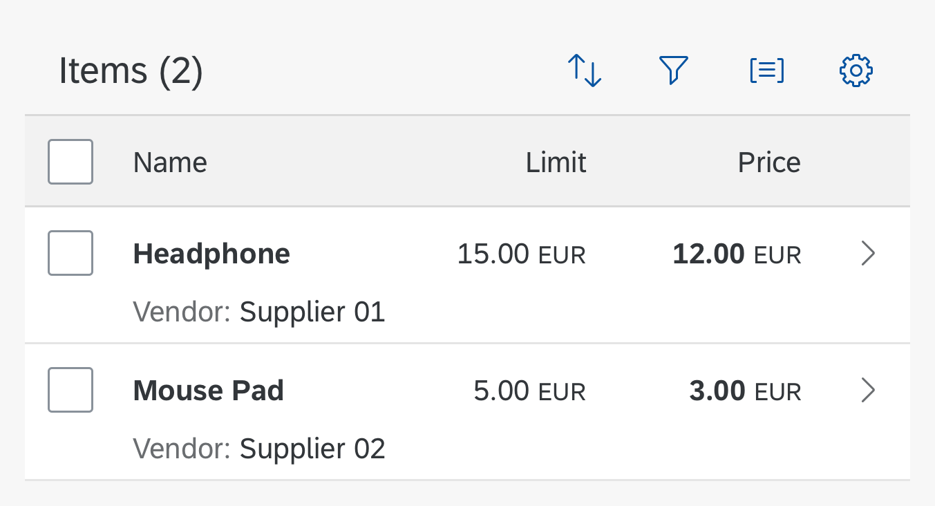
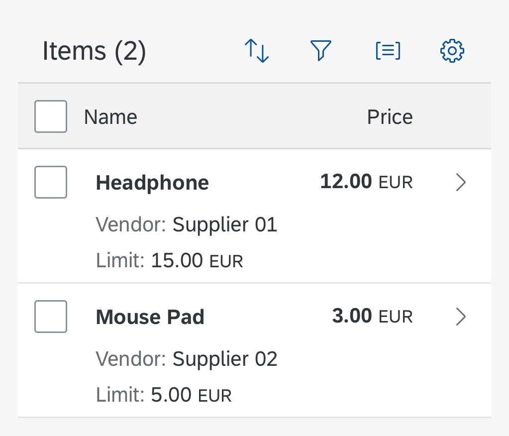
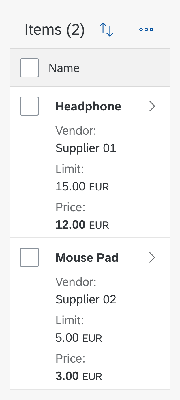
A tree table is available for desktops and tablets, but not in smartphone sizes. It supports touch devices, but is not optimized for small screens.
If you use a tree table, note that you have to implement a fallback solution for small screens. This fallback solution does not need to support all use cases.
Possible fallback solutions are as follows:
- Use navigation to different pages instead of a tree structure. This works well for structures that are no more than four levels deep.
- Remove levels until only one or two remain. Replace a single-level tree by a table, and a two-level tree by a grouped table or a split-screen layout.
- Use filtering instead of a tree structure.
You can try to create a fallback based on these ideas, but a completely different solution, such as showing charts in a read-only case, might be more appropriate.
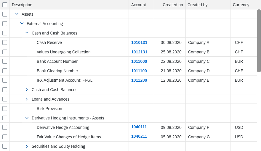
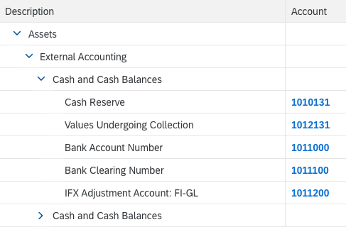
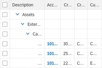
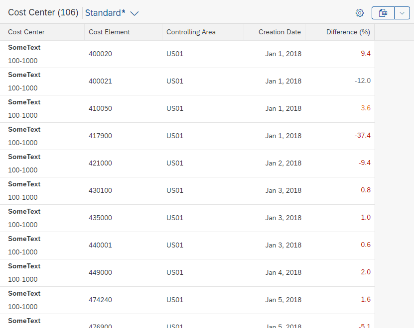
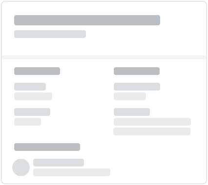
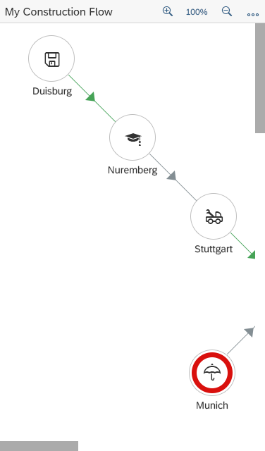
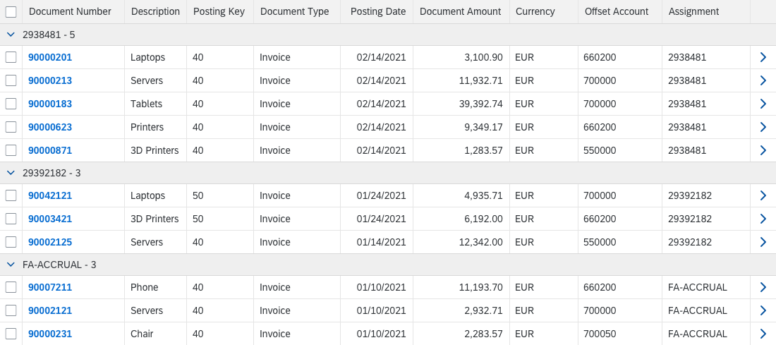
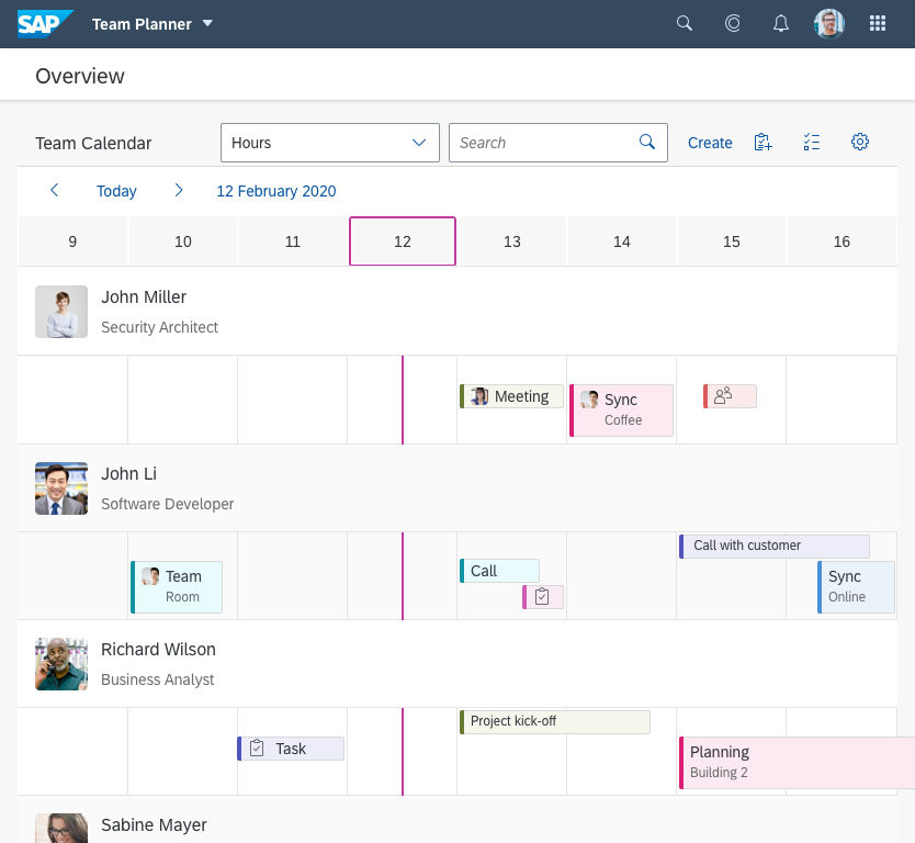
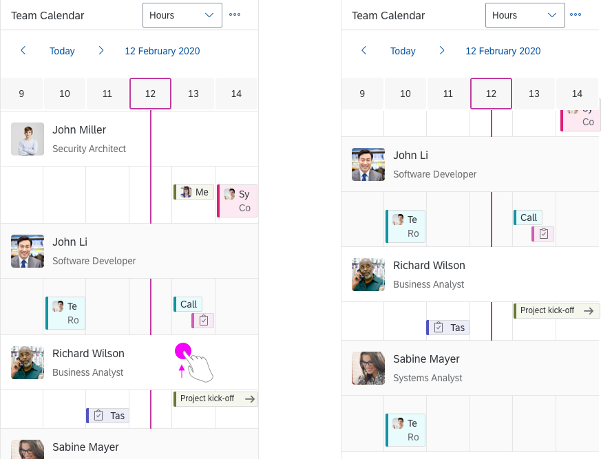
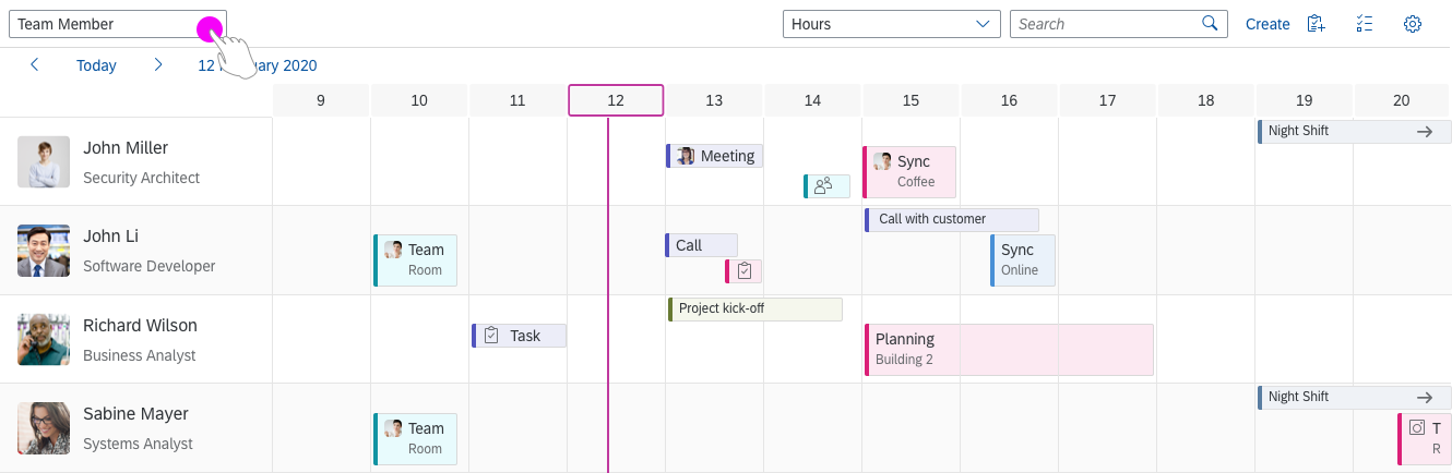
Tree table shown on a desktop
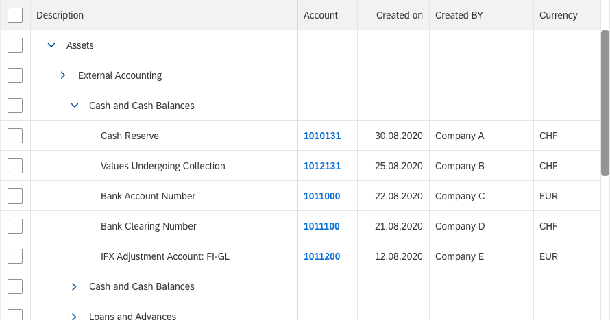
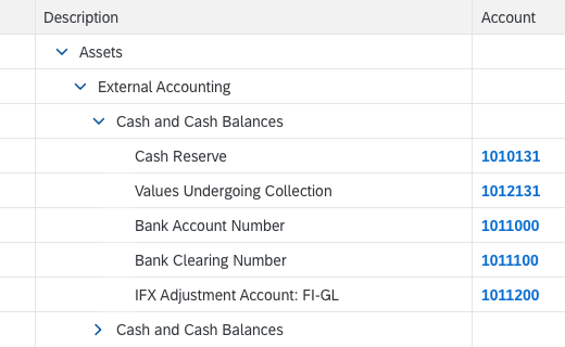
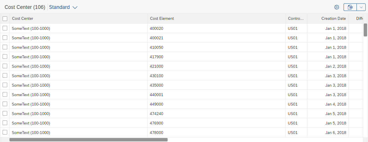
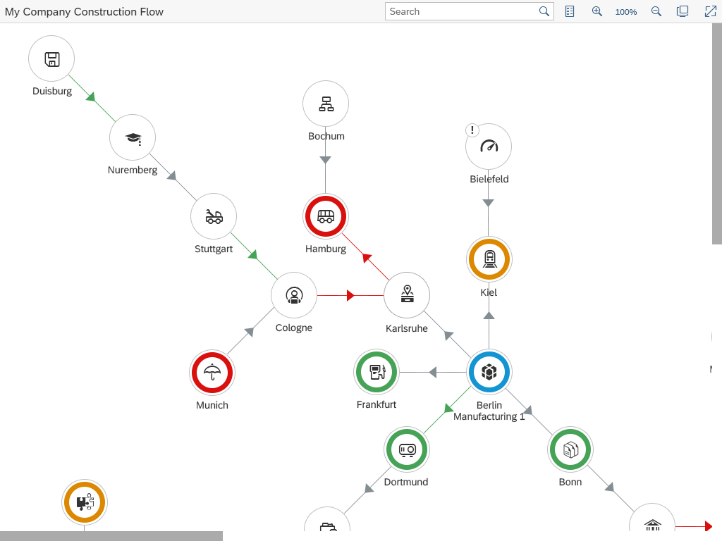
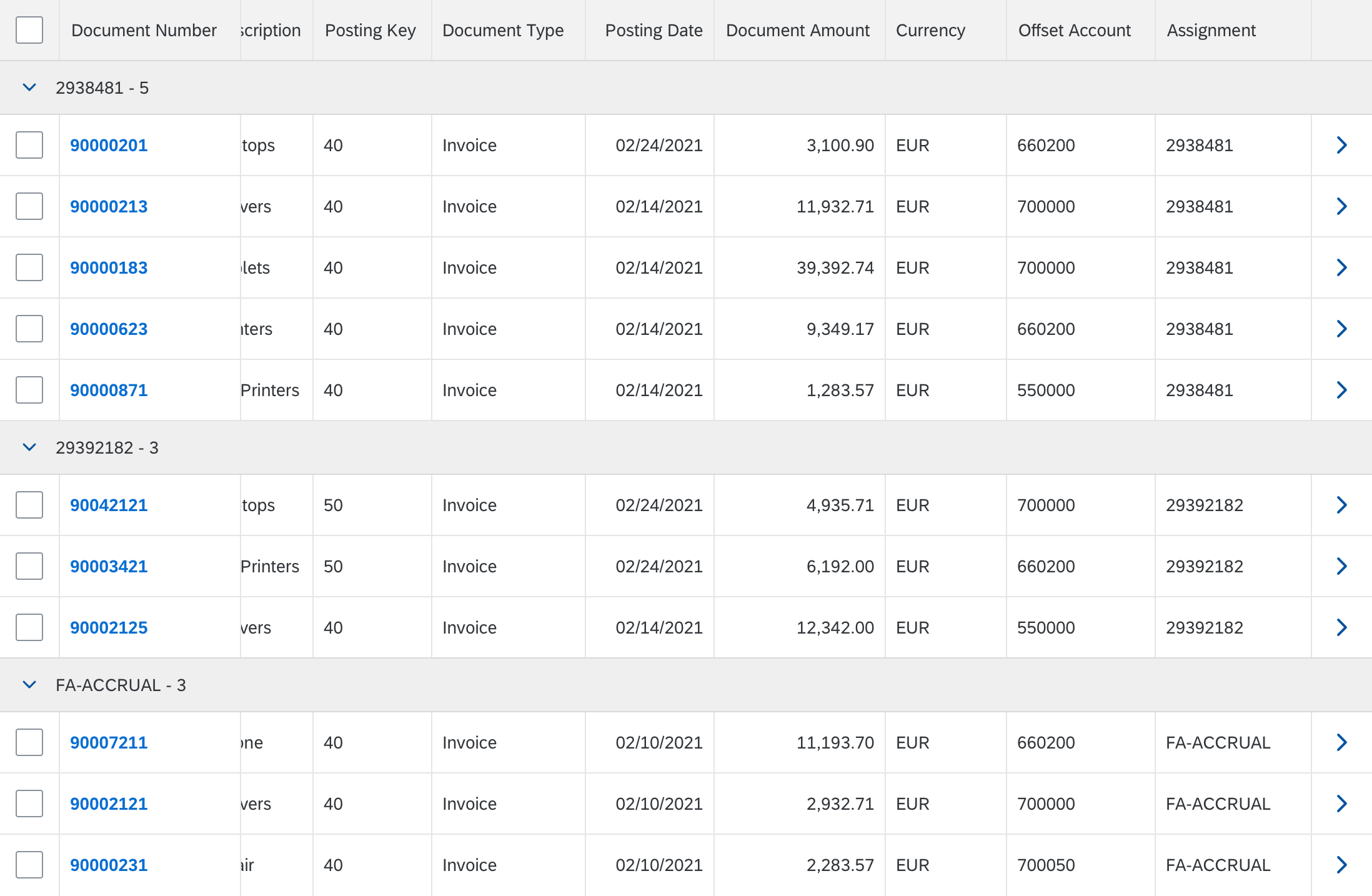
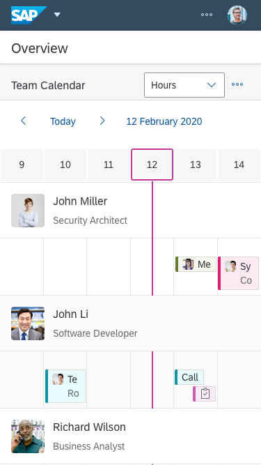
Tree table shown on a tablet
Types
Like all SAP Fiori controls, the tree table is shown in compact mode on a desktop and in cozy mode on tablets.
For a desktop, you can also display even more rows on the same screen height by adding the condensed mode in addition to the compact mode. This renders less white space for each item.
Note that the condensed content density has always to be set in addition to compact. Do not use condensed on its own. Do not mix condensed with cozy. Doing so could lead to unpredictable and / or unwanted results, e.g. cozy sized controls in condensed sized containers, missing paddings, etc.
Note that neither compact mode nor condensed mode can be interacted with touch. Even on a desktop with a touch screen, users will have difficulty selecting rows or using controls inside the cells when using their fingers.
Furthermore, condensed mode is not available for Internet Explorer 9. If condensed mode is to be used, please provide a fallback.
For more information on cozy and compact modes, see content density.
Compact Mode
Tree table – Compact mode
Condensed Mode
Tree table – Condensed mode
Components
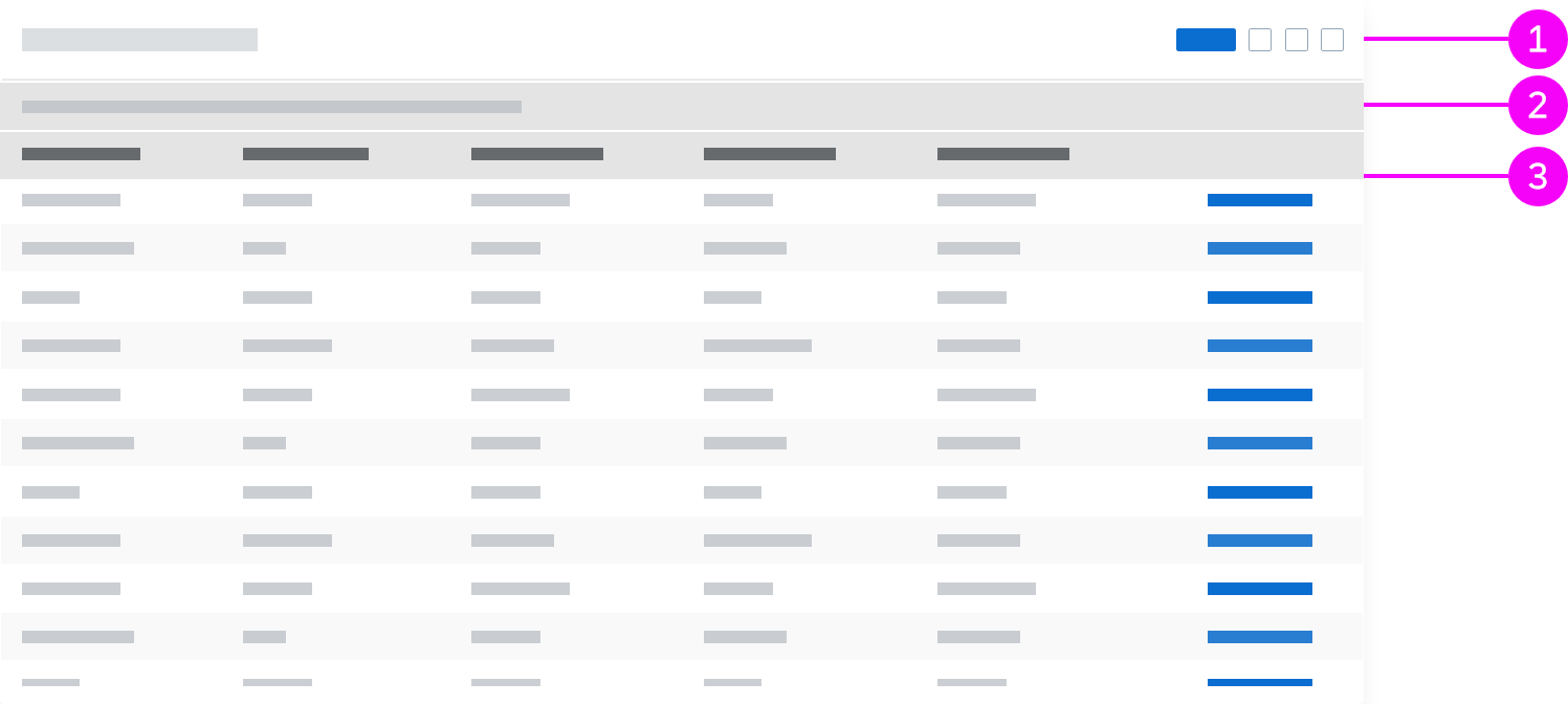
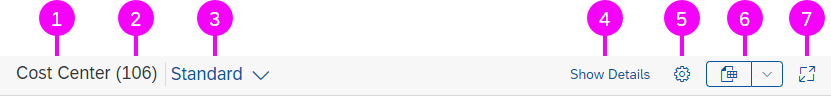
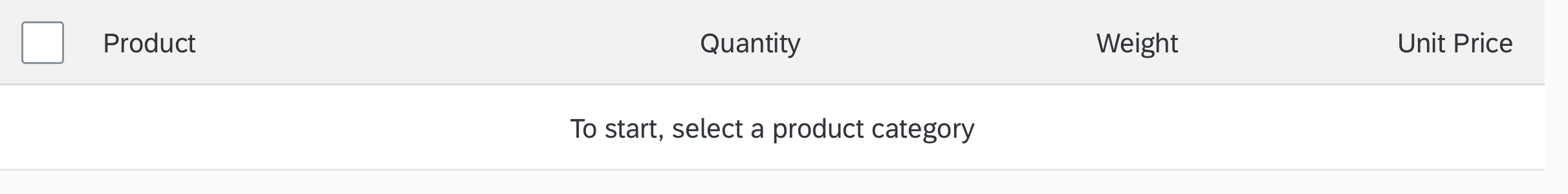
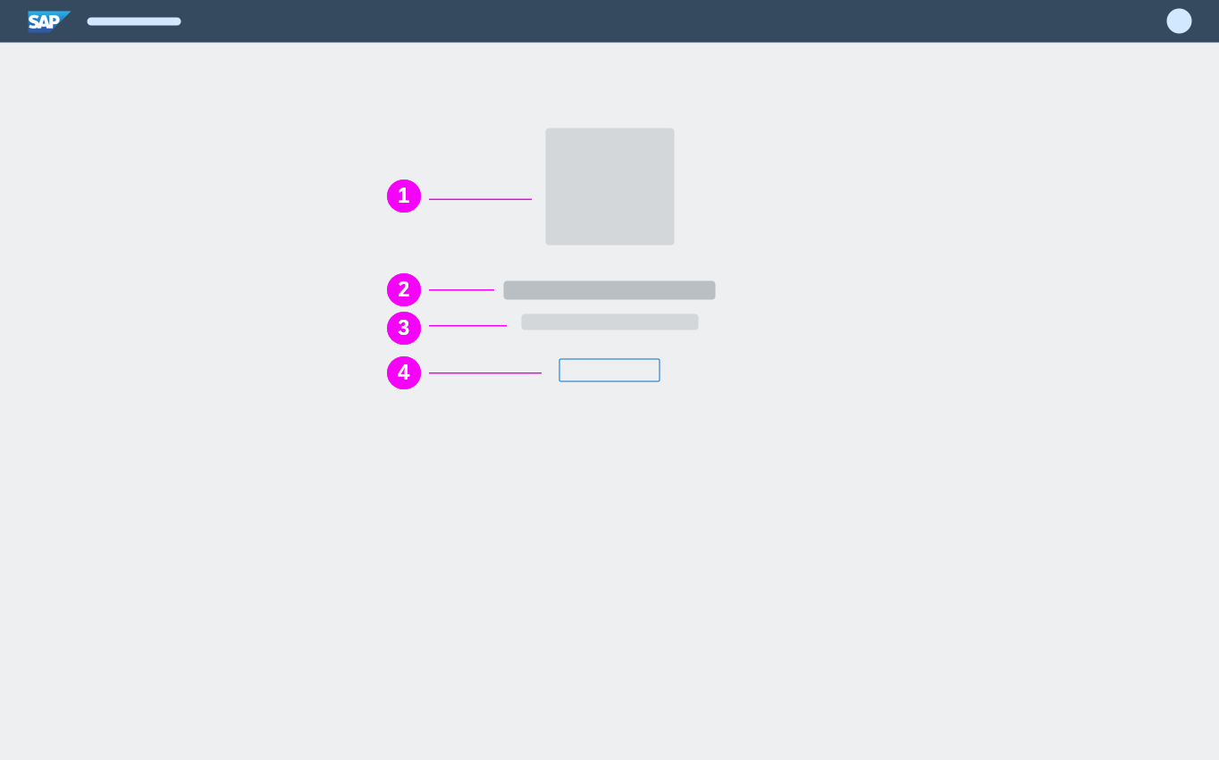
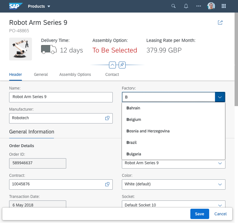
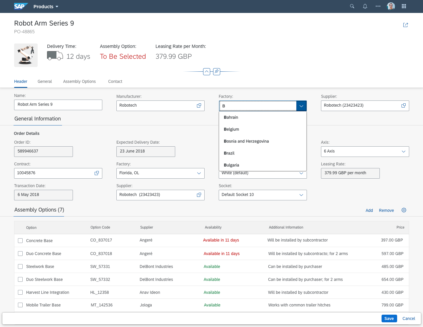
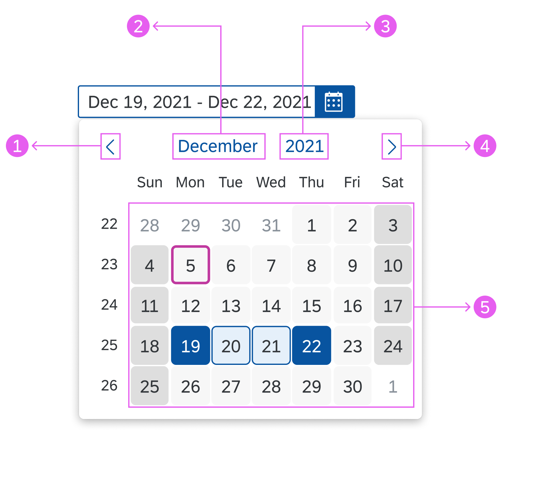
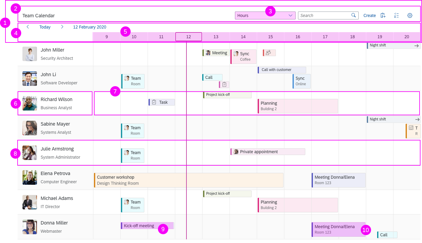
Column Header
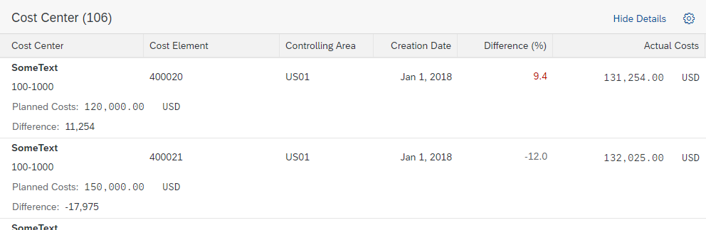
The column header provides the label for the corresponding column and access to the column header menu.
Resizing columns works in the following ways:
- Mouse interaction: Dragging the separator line between two columns (sap.ui.table. Column, property: Resizable). Double-clicking optimizes the column according to the length of the currently visible data and the label of the column header (sap.ui.table.Column, property: Autoresizable).
- Touch interaction: The user taps the column header to reveal two buttons: one for showing the column header menu and one for resizing. Drag the latter to resize the column.
- Keyboard interaction: The width of the focused column header can be increased with Shift+Right and decreased with Shift+Left.
After resizing a column, the adaptation of the column widths depends on how the column width is set:
- If column widths are set in pixel-based units (px, em, rem), the corresponding column is adapted and following columns are moved accordingly. The width of all other columns is not affected.
If all the columns together take up less width than the table control, an empty space is added. If all the columns together take up more width than the table control, a scrollbar appears. - If all column widths are set in percentage or “auto”, resizing one column might also lead to the automatic resizing of some or all other columns. The position of the resized column might also be affected. This is done to ensure that the whole table width is used and no white space is added. A scrollbar appears only, if all or most of the columns get very small. To avoid the unintended side effect of undersized columns, a minimum width can be set per column. Please be aware that this minimum width is only taken into account if columns are automatically resized. End users are still able to reduce the column width below the provided minimum. (sap.ui.table.Column, properties: width, minWidth)
Columns can be rearranged by dragging the column header to another position (sap.ui.table.TreeTable, property: enableColumnReordering). Keyboard: the focused column header can be moved by one position to the corresponding direction with Shift+Left / Shift+Right.

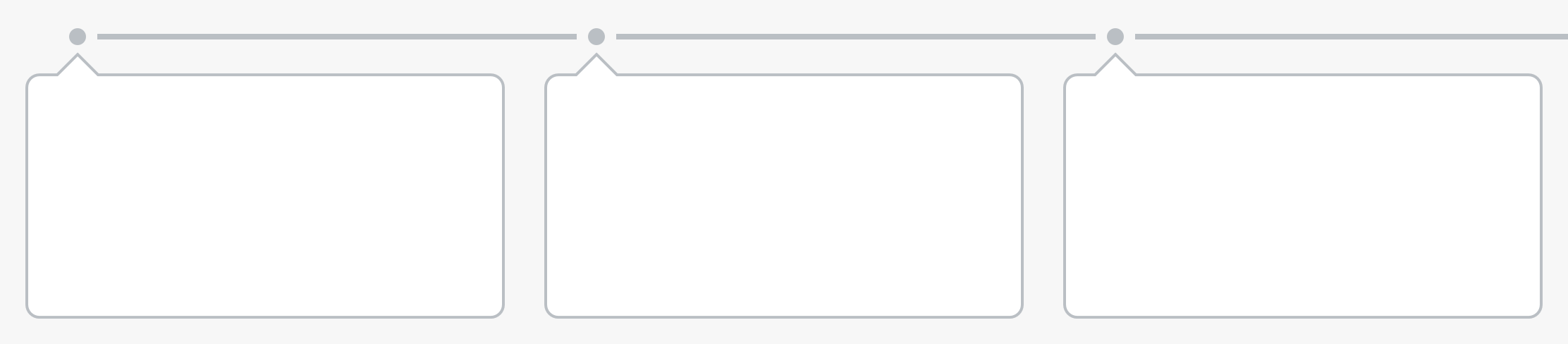
Tree table – Column header
Opening the column header menu on touch devices
Fewer columns than space available
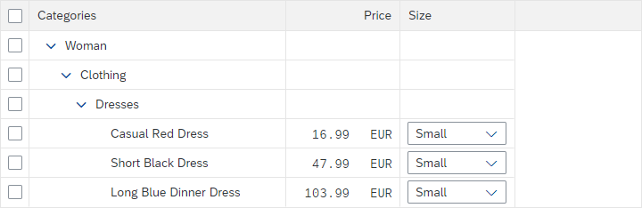
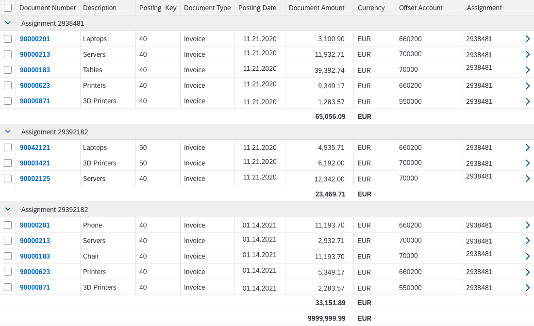
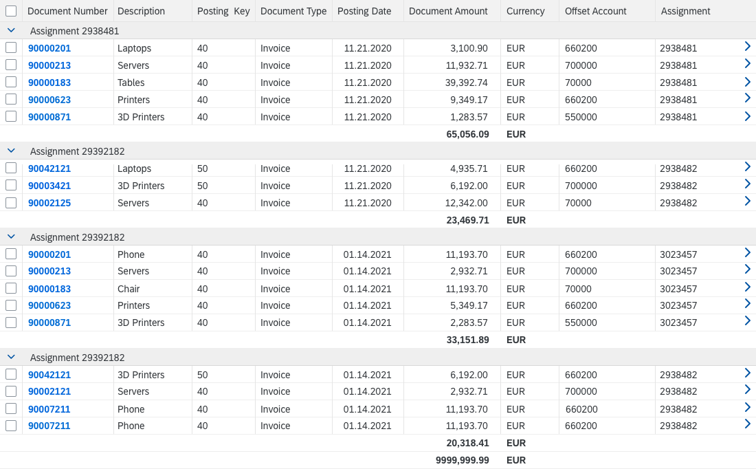
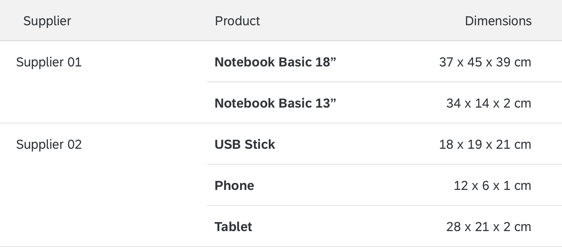
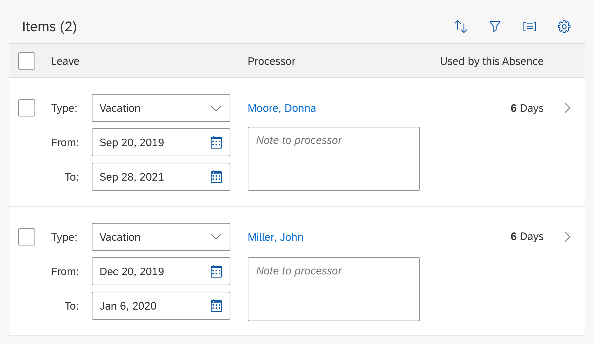
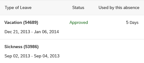
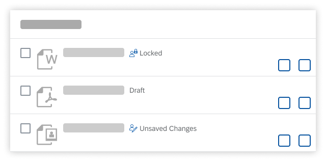
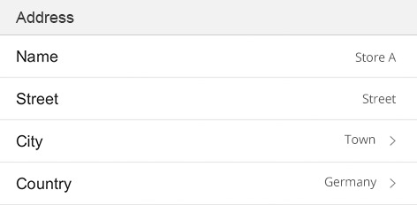
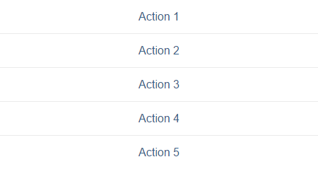
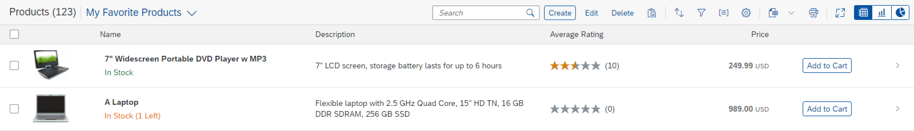
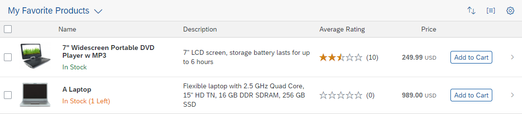
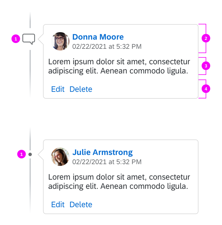
Line Item
A line item contains a set of cells and provides options for selecting the item.
To prevent adverse side effects when scrolling vertically, all line items must have the same height (sap.ui.table.TreeTable, property: rowHeight).

Tree table – Line item
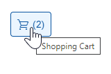
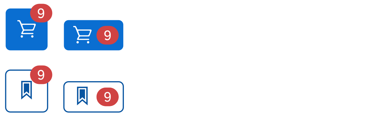
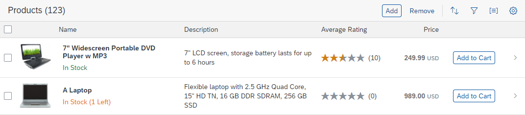
In rare cases, show the actions within the line item. One example would be an Add to Cart button in a shopping application. Since these actions are repeated in every line and thus use a lot of screen real estate, do this only for a maximum of one or two actions. Provide a separate column per action. Use a button, unless the action trigger belongs to a link. Hide the action in rows for which it is not applicable.
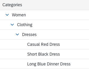
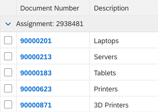
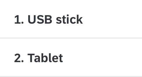
Tree Column
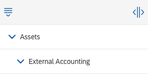
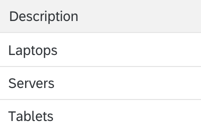
The first colum (tree column) provides the hierarchical structure.
Tree table – Tree column
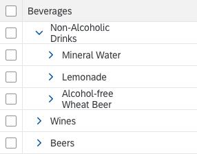
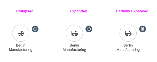
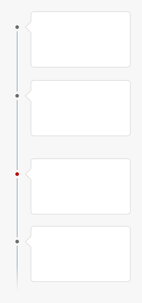
Expand/Collapse Button
The expand/collapse button is offered on container nodes to allow the child items of the corresponding container to be shown or hidden.

Tree table – Collapse

Tree table – Expand
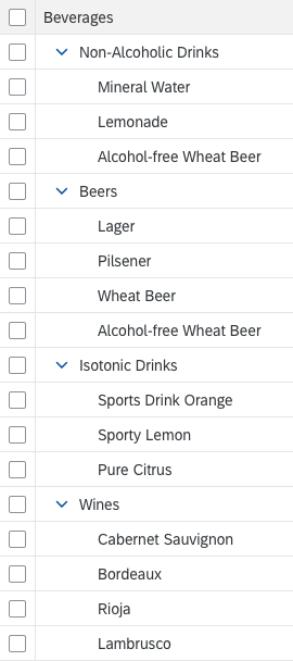
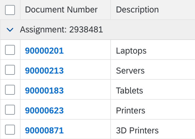
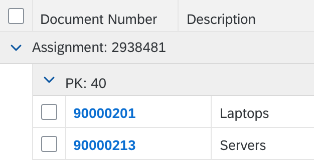
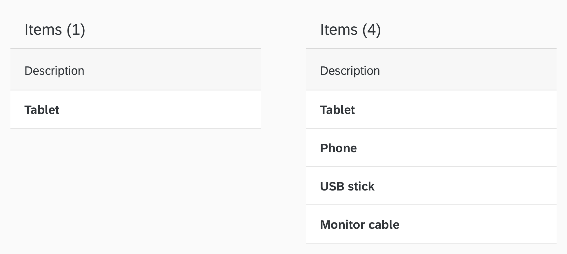
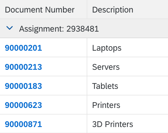
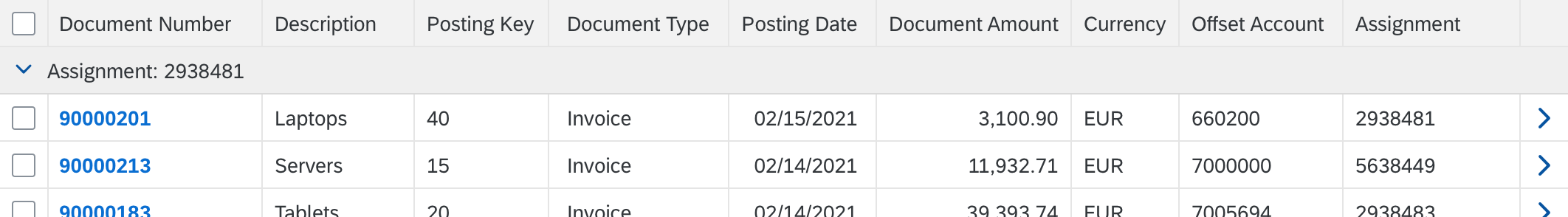
Container Node
A container node is a line item that contains child elements.
Tree table – Container node
Leaf Node
A leaf node is a line item that does not contain child elements.
Tree table – Leaf node
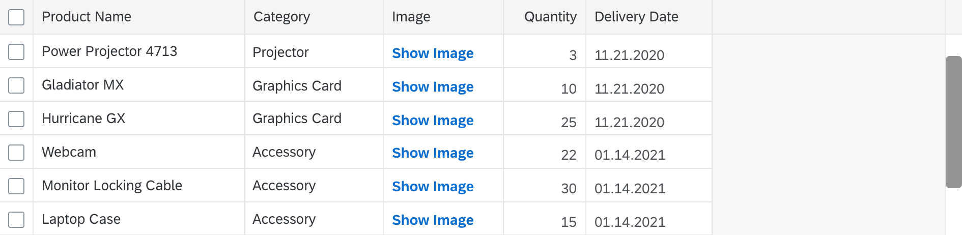
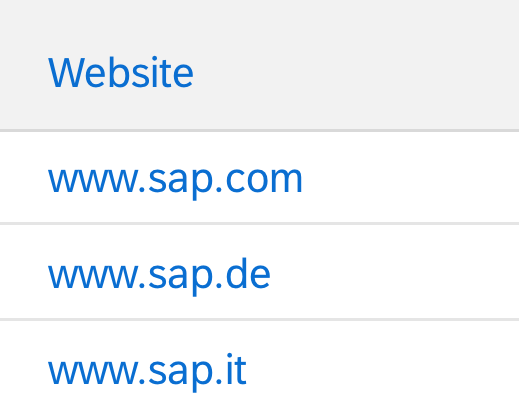
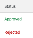
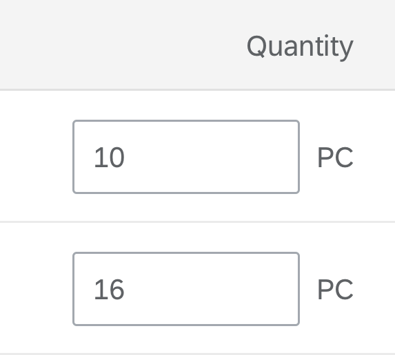
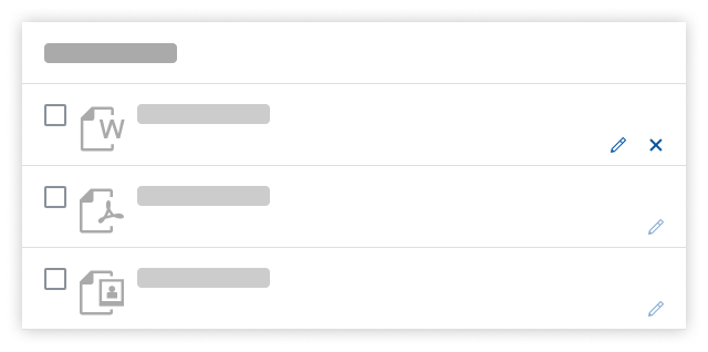
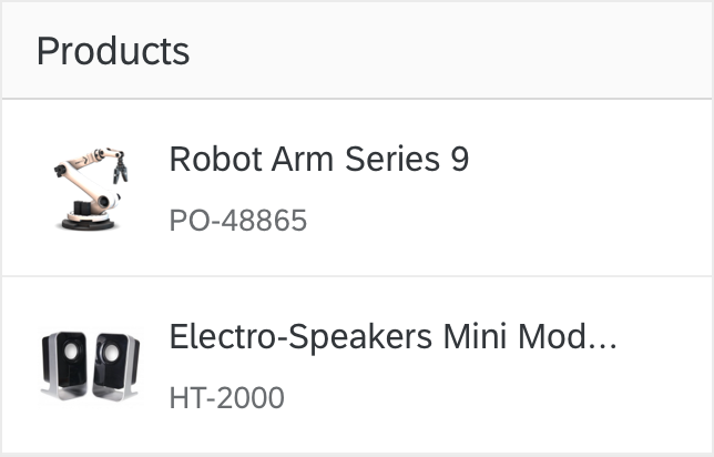
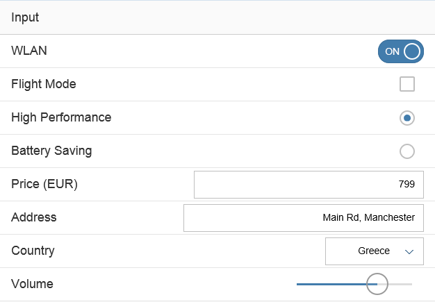
Cell
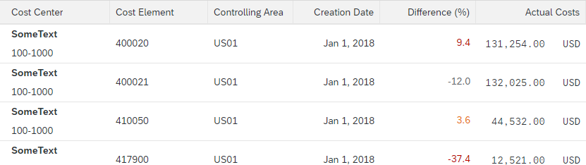
Each cell provides one data point. It can contain one of the following controls to display the data point:
- Text
- Label
- Object status
- Icon
- Button
- Input field
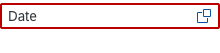
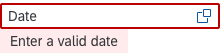
- Date picker
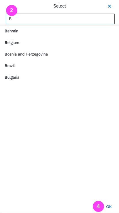
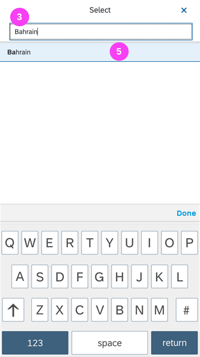
- Select
- Combo box
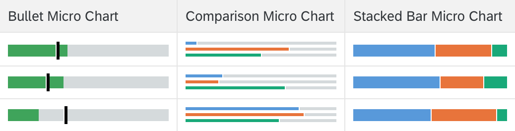
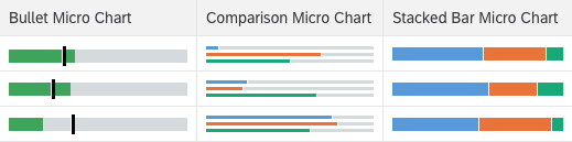
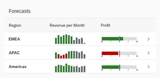
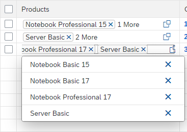
- The following micro charts in size XS: Bullet, comparison, stacked bar
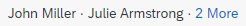
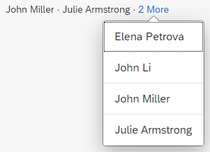
- Multi-combo box
- Multi-input field
- Checkbox
- Link
- Currency
- Rating indicator
- Progress indicator
While it is technically possible to also use other controls, doing so could lead to issues in regards to alignment, condensed mode, screen reader support, and keyboard support.
If you use text, use only single-line text to keep the same row height. Truncate if necessary as this prevents adverse side effects when scrolling vertically (sap.m.Text, property: wrapping, value: false).

Tree table – Cell
Tree Cell
A tree cell is a cell inside the tree column. Besides its data point, it provides a collapse/expand button on container nodes, and it indents the different hierarchy levels.
Tree table – Tree cell
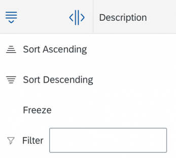
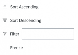
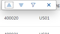
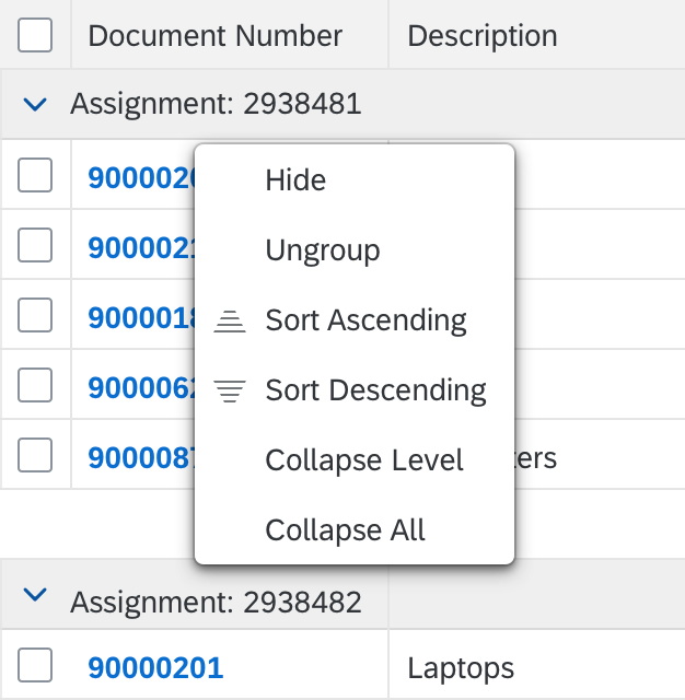
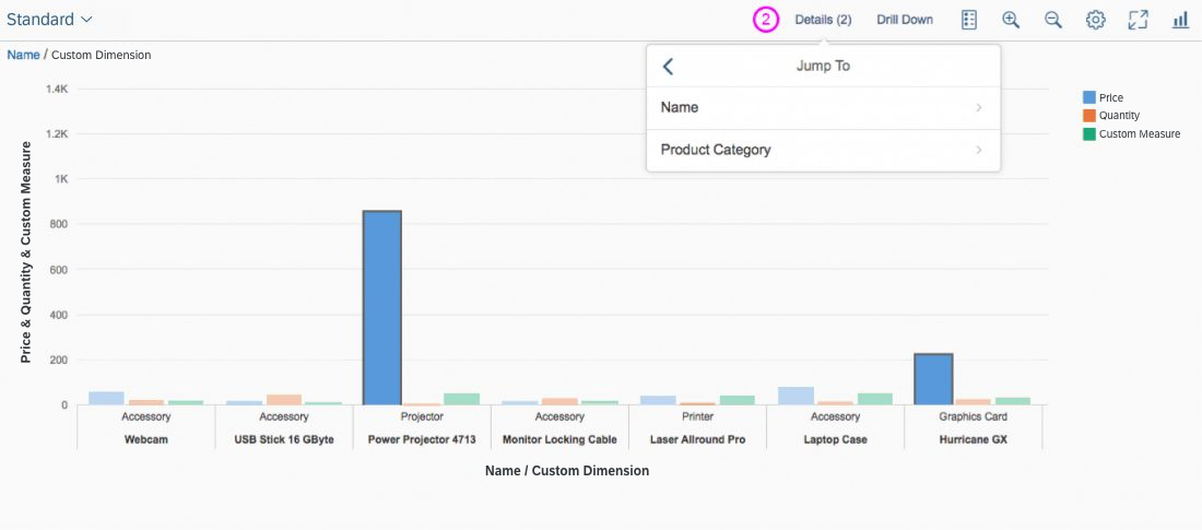
Column Header Menu
For the tree column, the column header menu can contain the menu item Freeze and a Filter field, in which the user enters free text.
For all other columns, only the free text filter is available.

Tree table – Tree column header menu
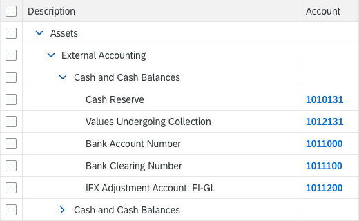
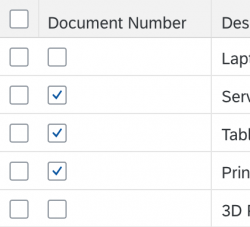
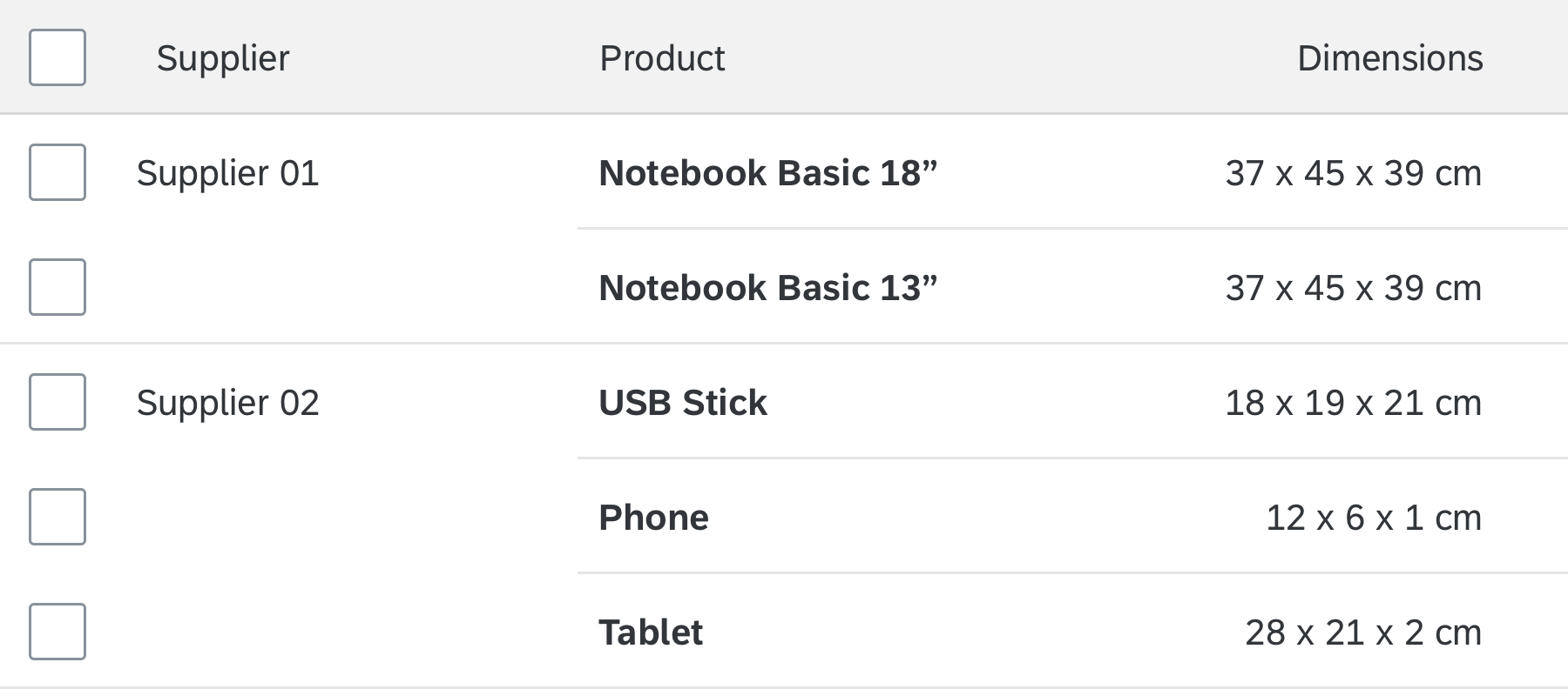
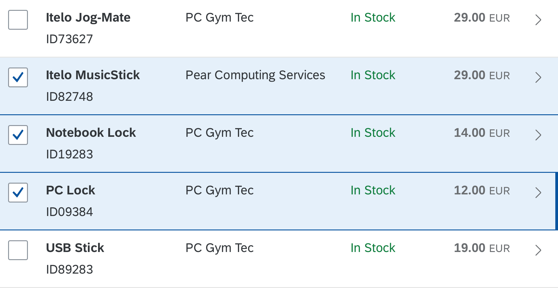
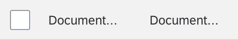
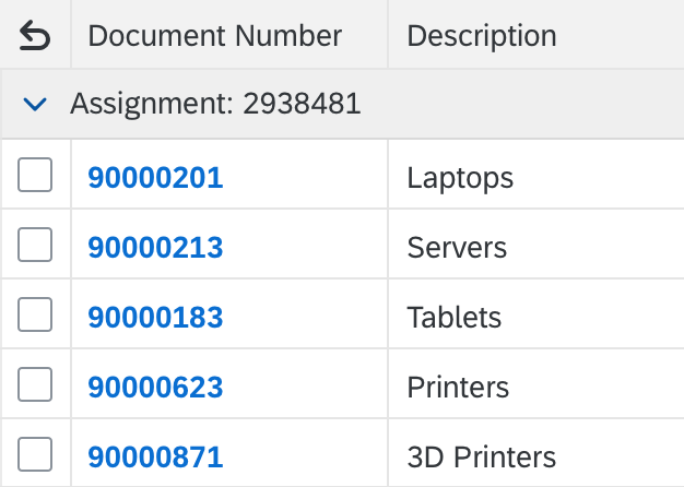
Selection Cells
For multiselection tree tables, the first column contains checkboxes for selecting line items. Besides multiselection, the tree table offers a single-selection mode and also a read-only mode, in which line items are not selectable.
Tree table – Selection cells
Select All
For multiselection tree tables, the column header can contain a checkbox above the selection cells for selecting or deselecting all line items.
Tree table – Select all
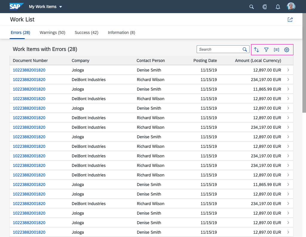
Scrollbar
The tree table allows horizontal and vertical scrolling. You can add any number of line items to the tree table, which uses “lazy loading”.
To prevent adverse side effects when scrolling vertically, all line items must have the same height (sap.ui.table.TreeTable, property: rowHeight).
The tree table is optimized to allow faster scrolling within the first 1000 items.

Tree table – Vertical scrollbar
Behavior and Interaction
Selection
The tree provides the following possibilities:
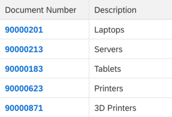
No selection: Items cannot be selected. (property: selectionMode = None)
Tree table – No selection
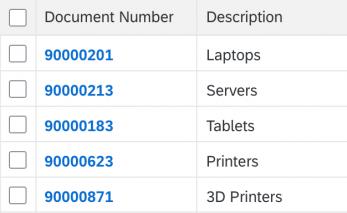
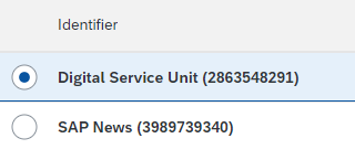
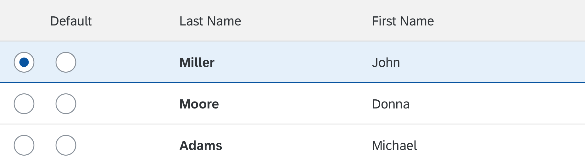
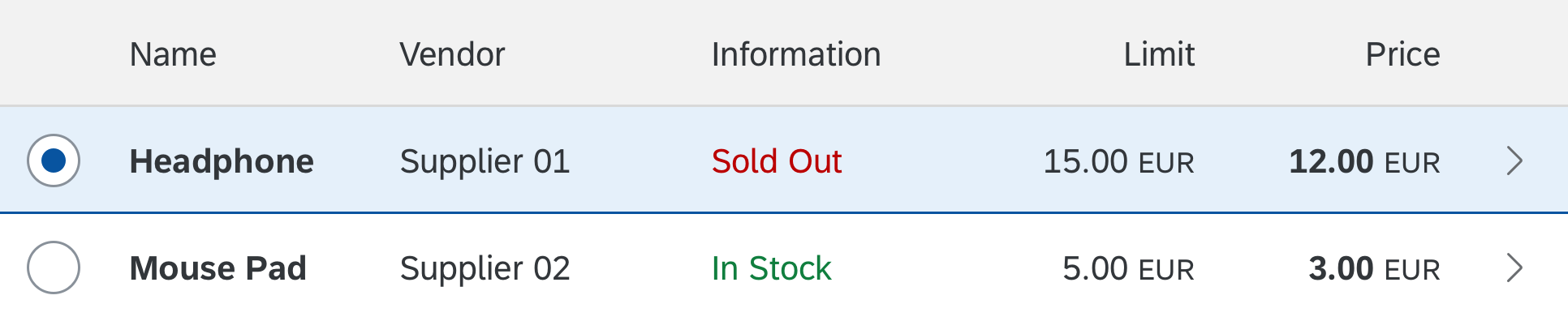
Single selection: One item in the tree table can be selected. A row selector column is shown. (property: selectionMode = Single)
Tree table – Single selection
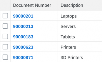
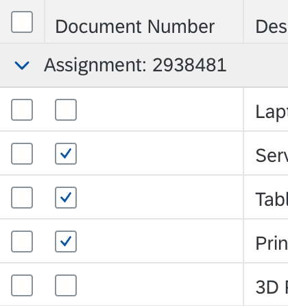
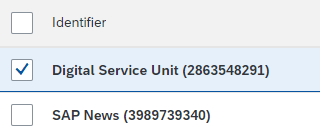
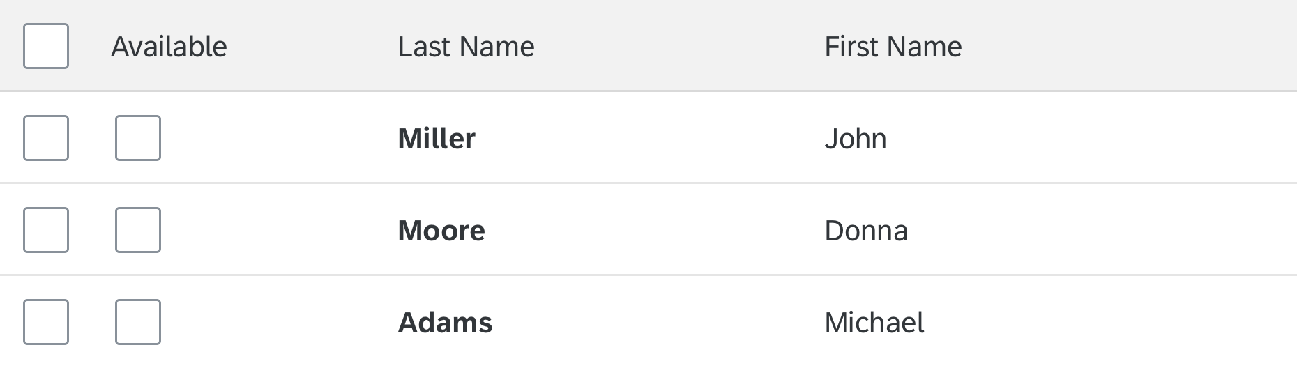
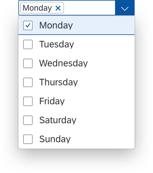
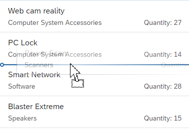
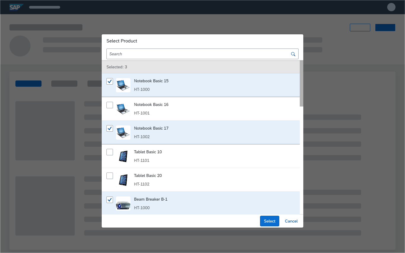
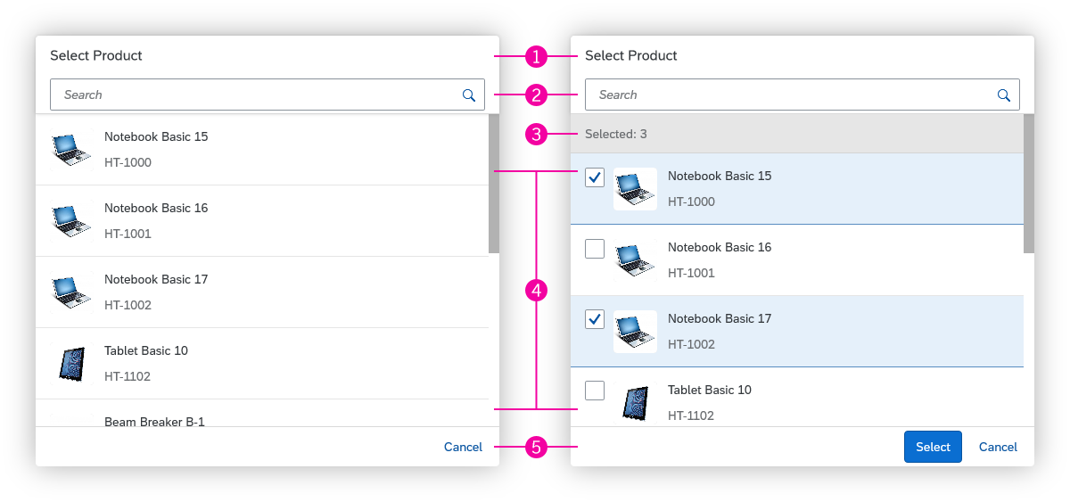
Multiple selection: One or more items can be selected. The tree table provides a column with checkboxes on the left-hand side. Clicking a checkbox toggles the state of the corresponding row from deselected to selected and back. The Shift key can be used to select a range.
For multiple selection, you can choose between two variants.
- Multi-toggle mode (property: selectionMode = MultiToggle)
- Multi-selection plug-in (sap.ui.table.plugins.MultiSelectionPlugin)
These variants behave differently when the user selects more items than are currently loaded in the front end.
Multi-toggle
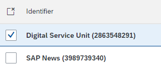
In multi-toggle mode, you can offer a Select All checkbox to the left of the column header (property: enableSelectAll). Selecting this checkbox selects or deselects all items that are currently loaded in the front end (keyboard: Ctrl+A). All other items are not selected/deselected. If the application data is stored in the back end, scrolling down further can reveal additional unselected items. The same can happen with range selections if not all items in the selected range have been loaded to the front end.
Multi-selection plug-in
If you use this plug-in instead of the multi-toggle selection mode, the behavior for range selection and Select All changes:
- By default, a dedicated Deselect All button replaces the Select All checkbox. There is no default UI element for selecting all items.
- You can set a limit for the number of items that can be selected (sap.ui.table.plugins.MultiSelectionPlugin, property: limit). This limit has the following effect:
- The range that can be selected using the Shift key is limited to the specified number of items (default = 200). The table automatically scrolls back to the last selected item and a message can appear (sap.ui.table.plugins.MultiSelectionPlugin, property: enableNotification). Users can select more items by selecting additional ranges (the specified limit applies each time).
- If the selection limit is set to 0, a Select All checkbox is shown. There is also no limit on the number of items that can be selected in a range. All selected items are loaded, which can lead to performance issues for large data sets (Keyboard: Ctrl+A).
- If selected items are not already available in the front end, they are loaded automatically by the plug-in and set as selected.
Tree table – Multiple selection

Multi-selection plug-in with a limit
Selection Behavior
An item can be selected in different ways, depending on the configuration of the tree table (sap.ui.table.Table, property: selectionBehavior):
- Row: An item is selected by clicking the checkbox or the row. Use this option for multi-selection tree tables if clicking a row or a cell is not used for anything else.
- RowSelector: An item is selected only by clicking the checkbox in the selector cell. Use this option if clicking the row (or a cell inside the row) is used for something else, such as navigation.
- RowOnly: An item is selected only by clicking the row, and not using checkboxes in the selector cells. Use this for single-selection tree tables if clicking a row or a cell is not used for another purpose, such as navigation.
Set the property collapseRecursive to “false” in order to keep the selection on subnodes even after collapsing and expanding the root node.
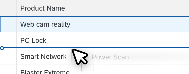
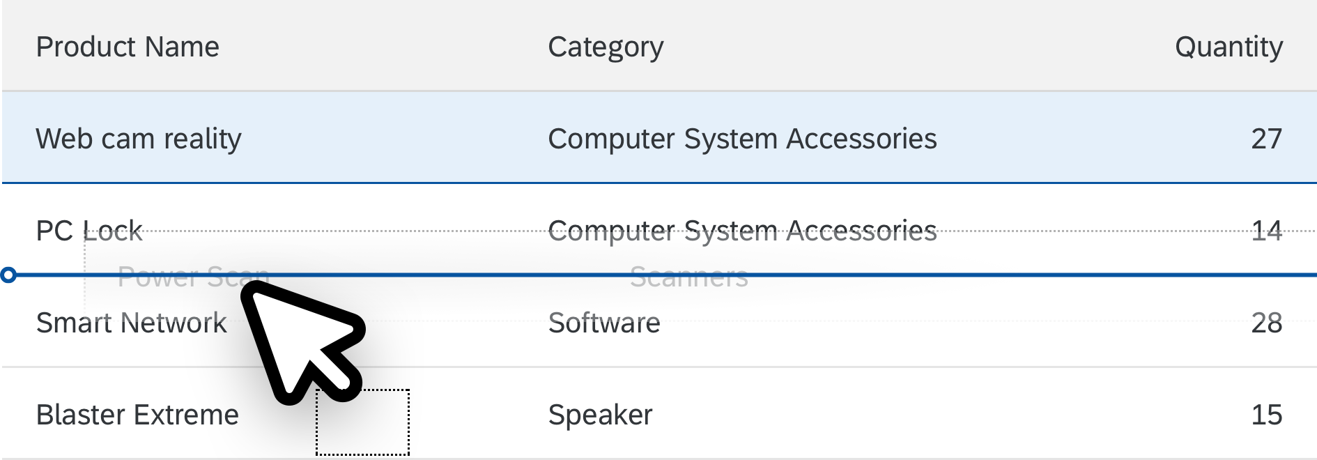
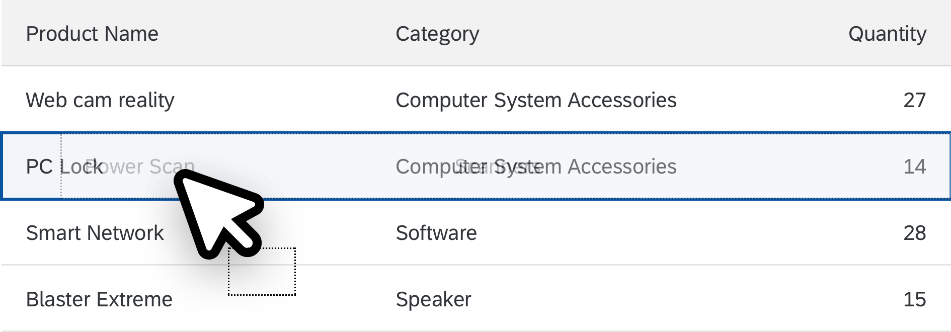
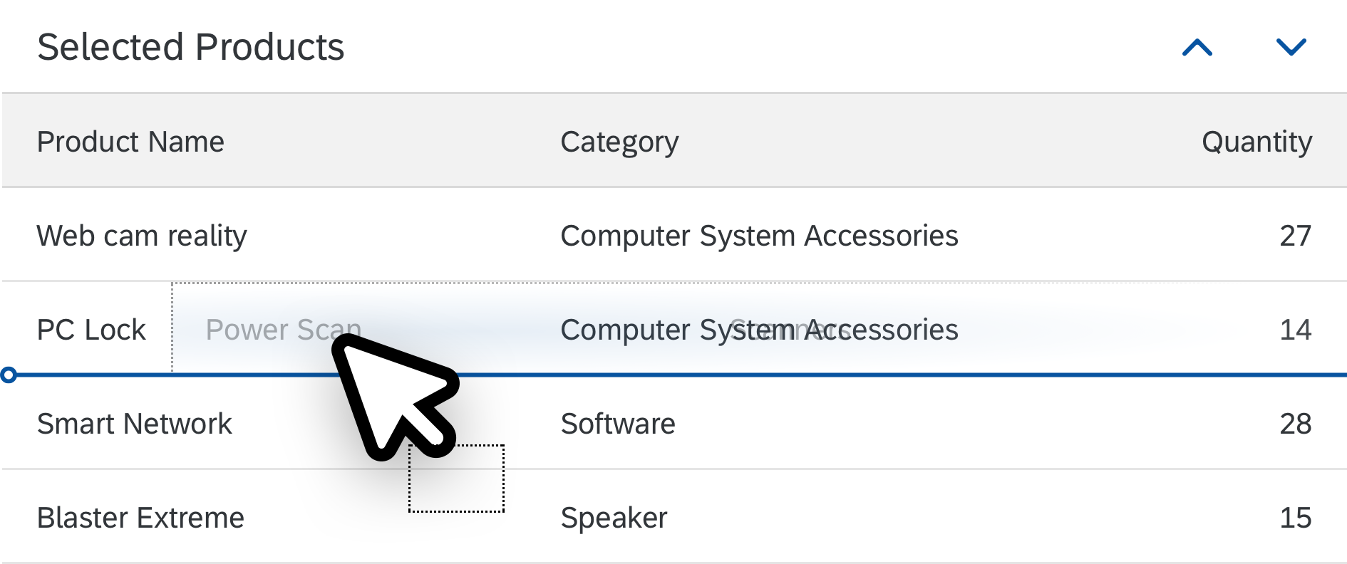
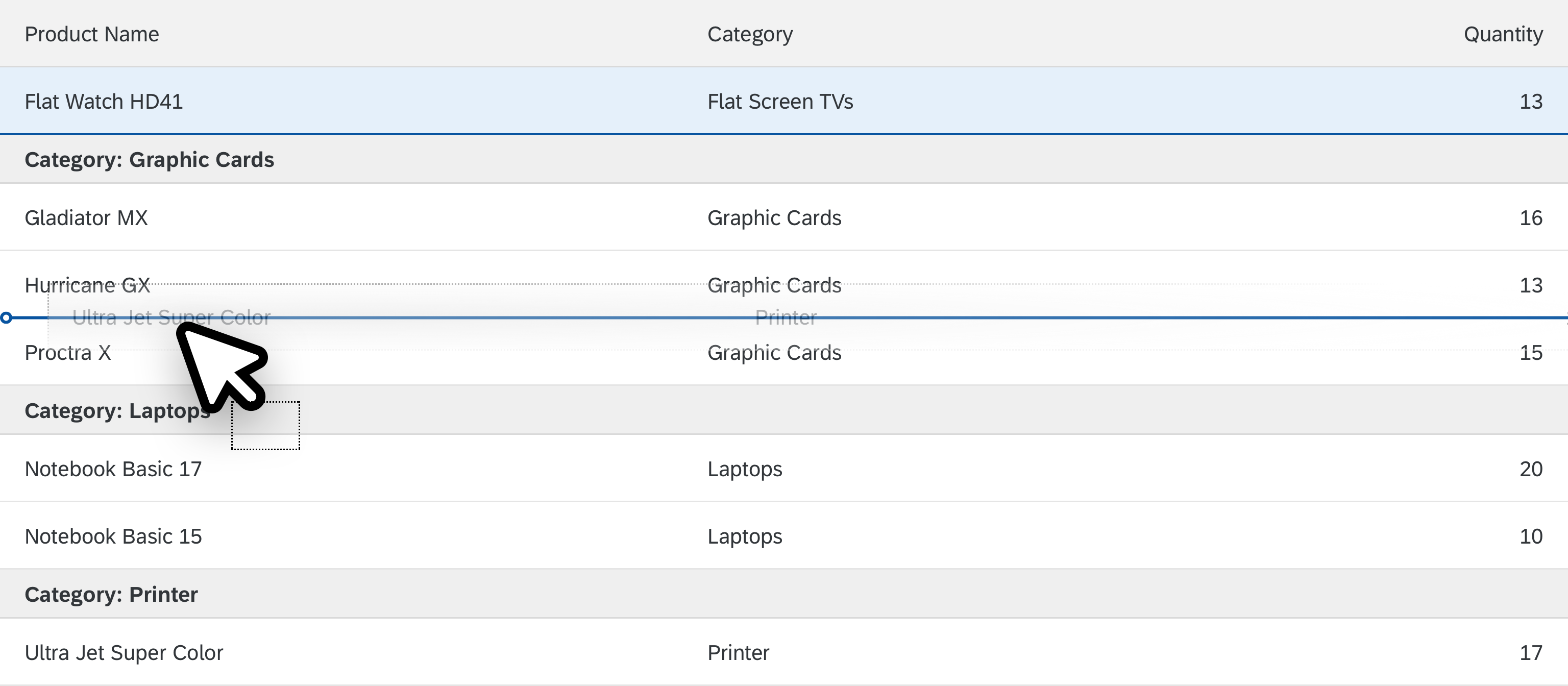
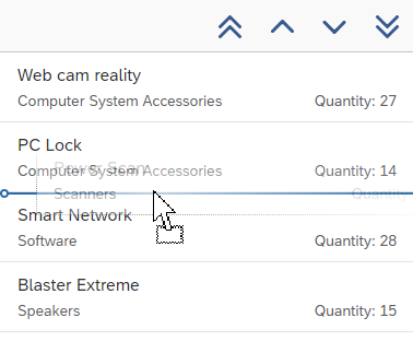
Drag and Drop
One or several items can be repositioned within a table or moved to other UI elements using drag and drop operations (sap.ui.table.TreeTable, aggregation: dragDropConfig). While being dragged, the items are shown as ghost elements on the mouse cursor.
Drop targets can be on items, between items, or both (sap.ui.core.dnd.DropPosition). On a drop target, the mouse cursor changes to either a “copy”, “link”, “move”, or “none” cursor. “None” indicates that the dragged item cannot be dropped in the current position (sap.ui.core.dnd.DropEffect).
Drag and drop is only available on supporting browsers.
Drag and drop
Column Header Menu
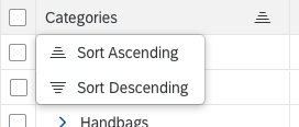
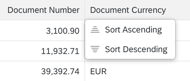
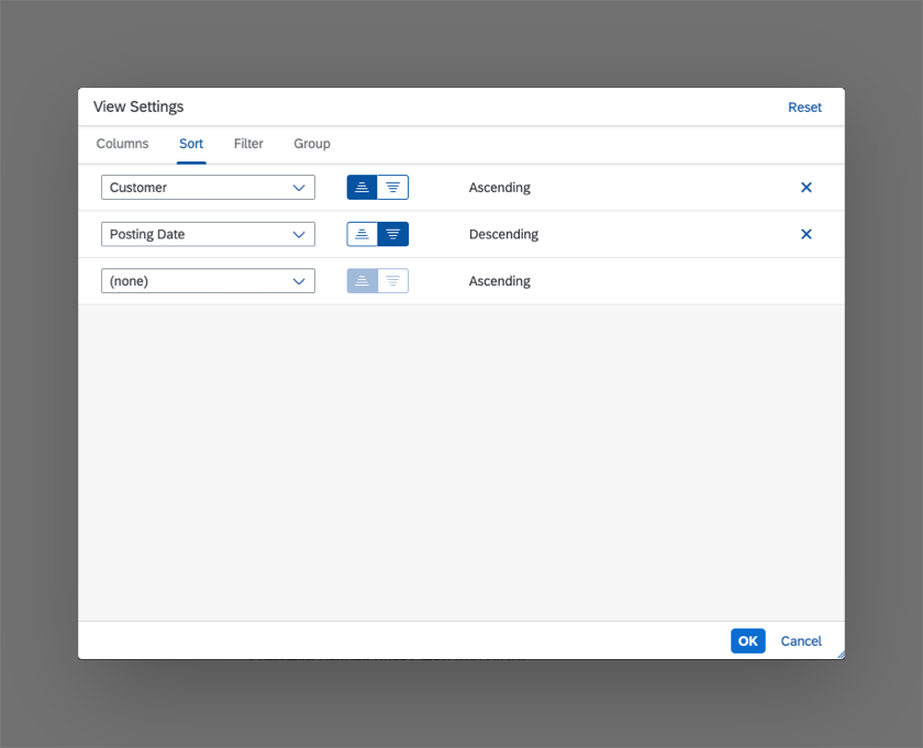
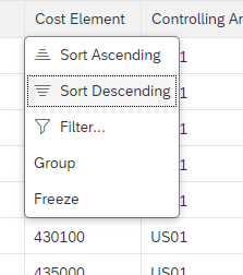
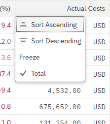
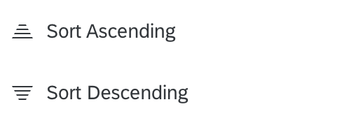
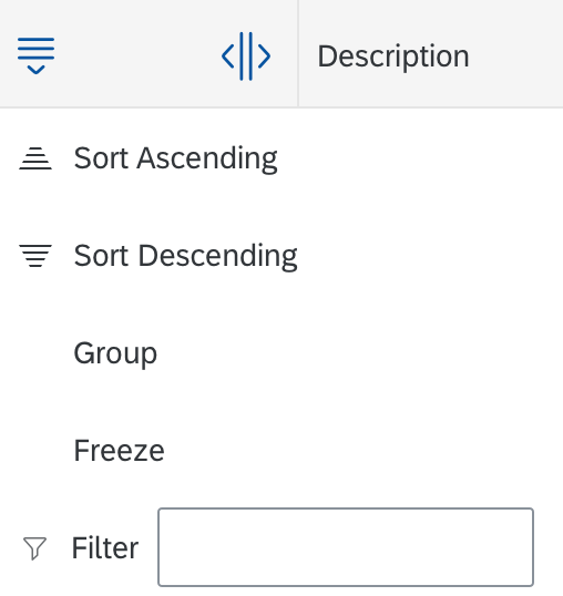
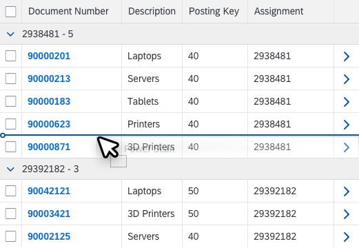
Sort
The column header menu can provide two sort options (sap.ui.table.Column, properties: sortProperty, showSortMenuEntry):
- Sort Ascending
- Sort Descending
The user selects one of these options to sort the corresponding column accordingly (sap.ui.table.Column, properties: sorted, sortOrder, sortProperty).
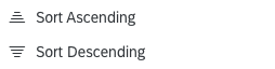
Sort settings in column header menu
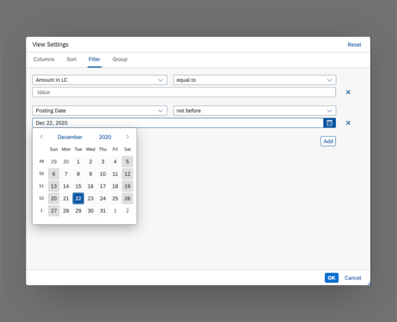
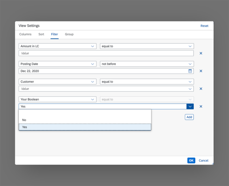
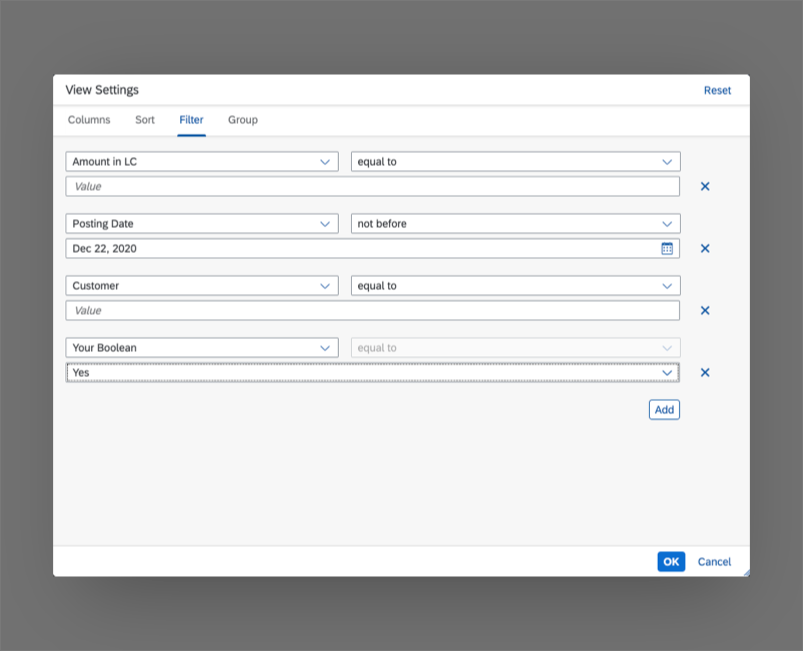
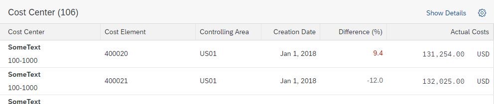
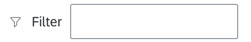
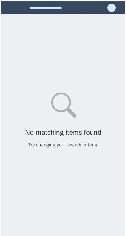
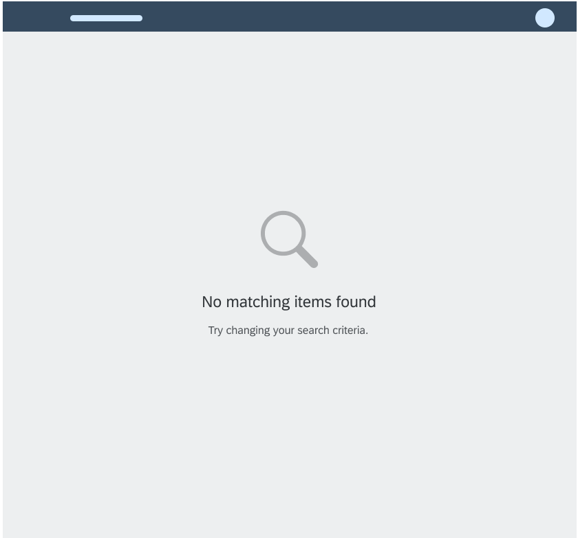
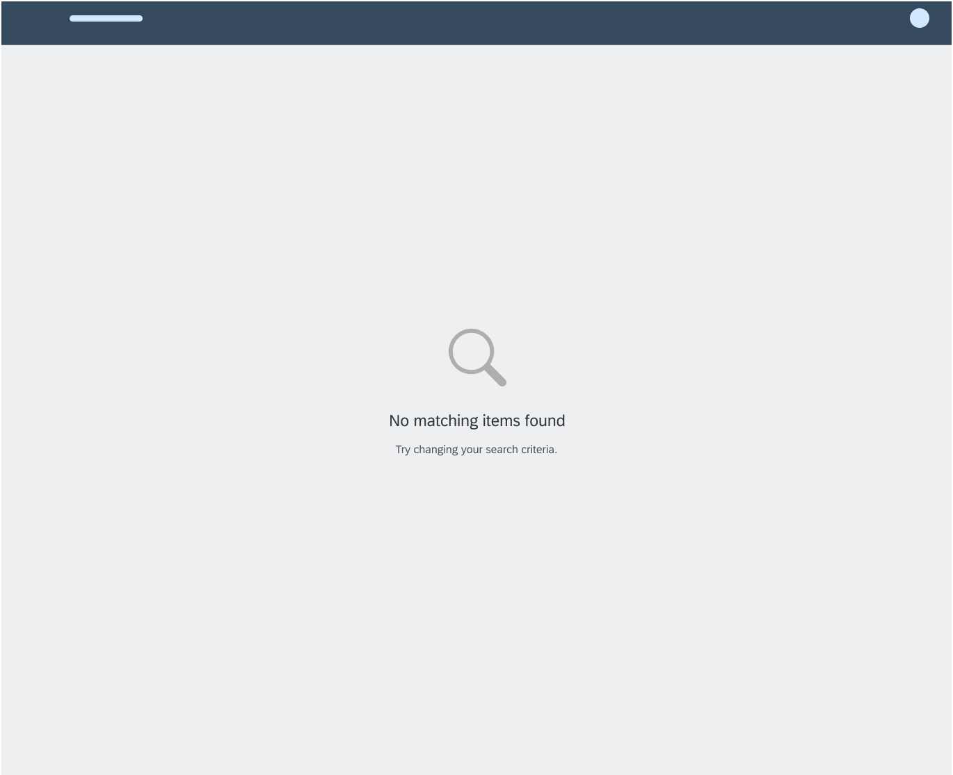
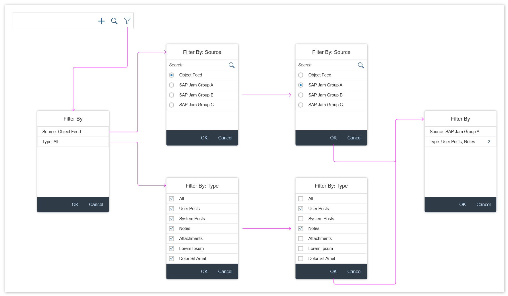
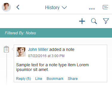
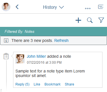
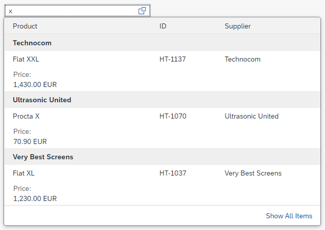
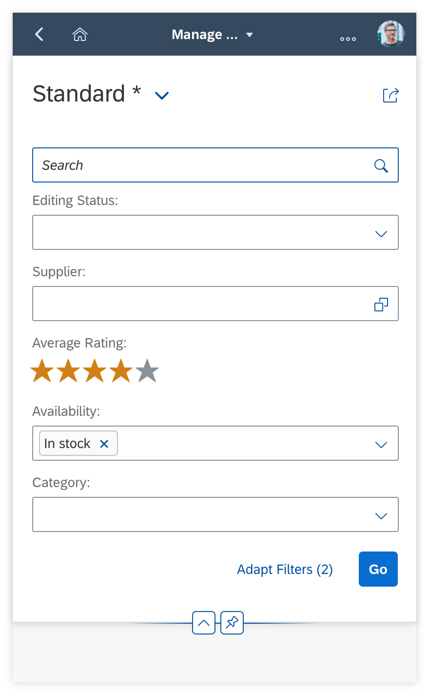
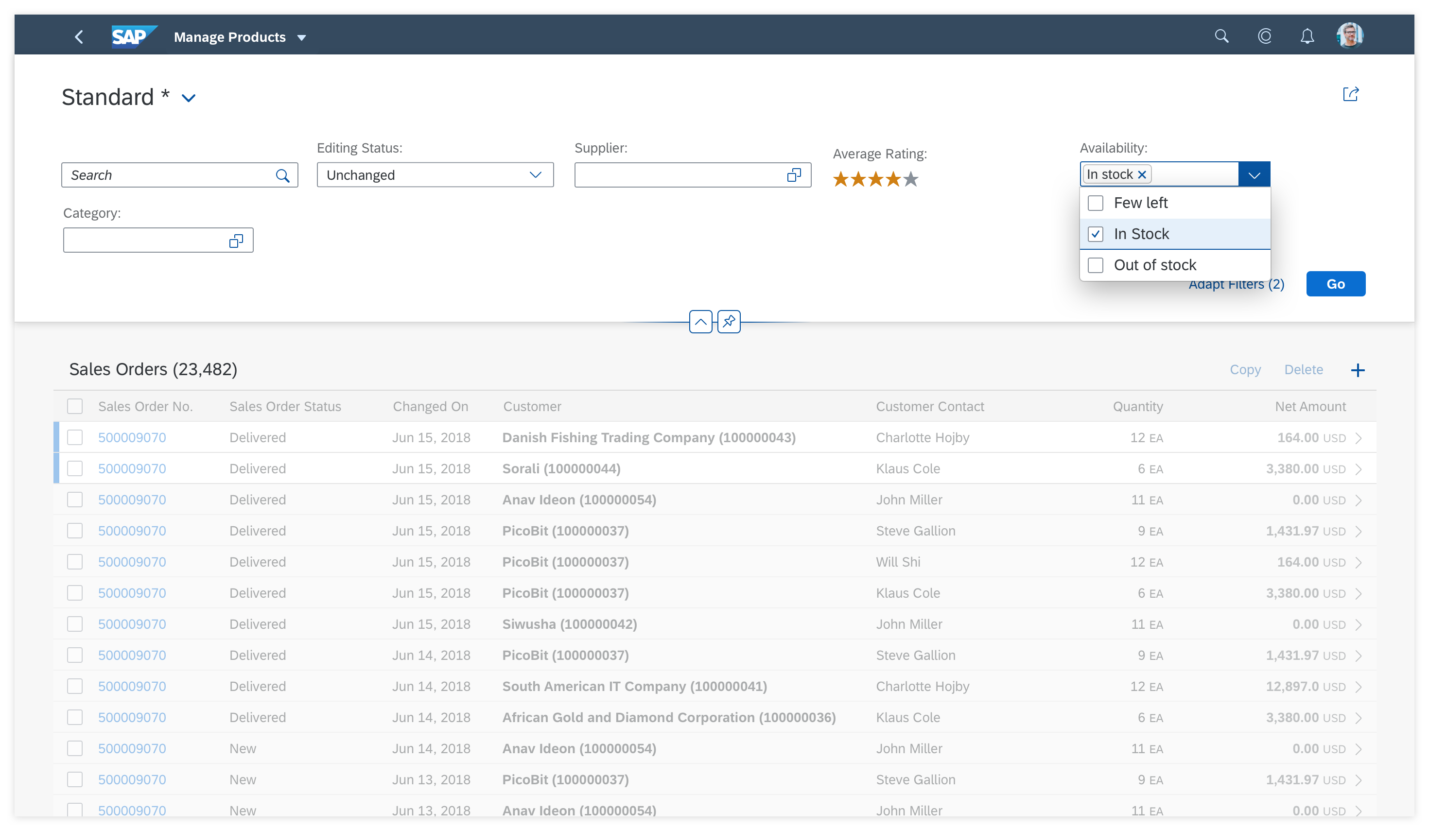
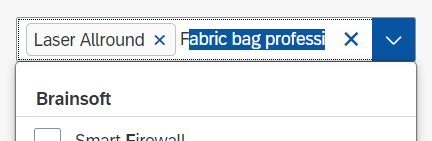
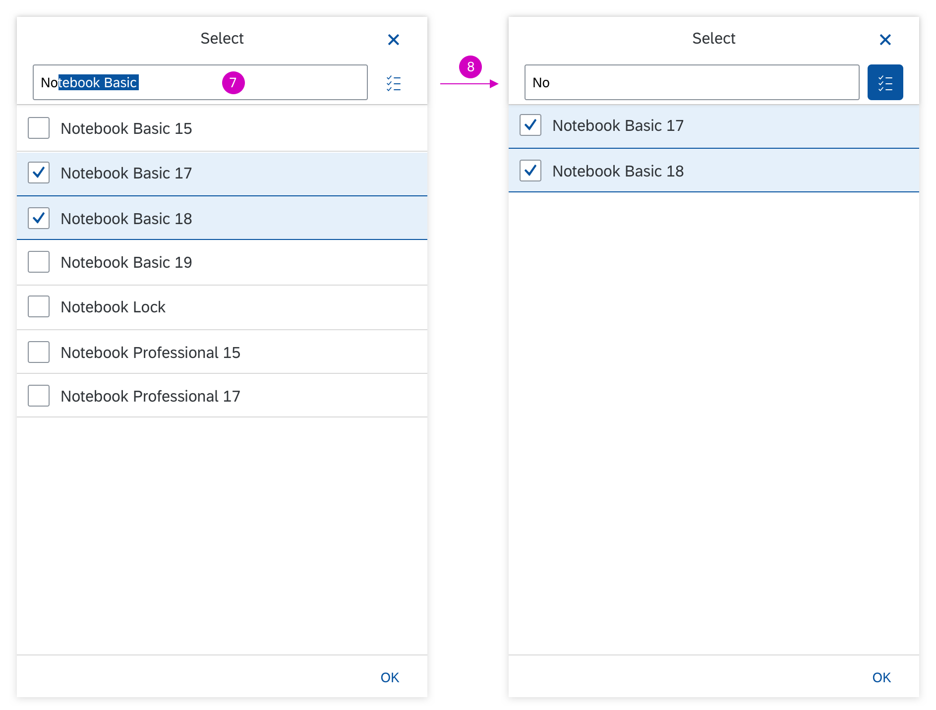
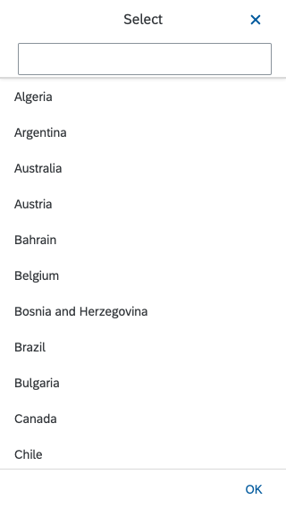
Filter
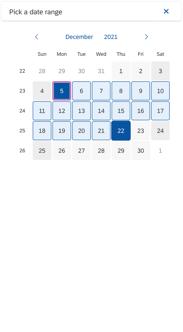
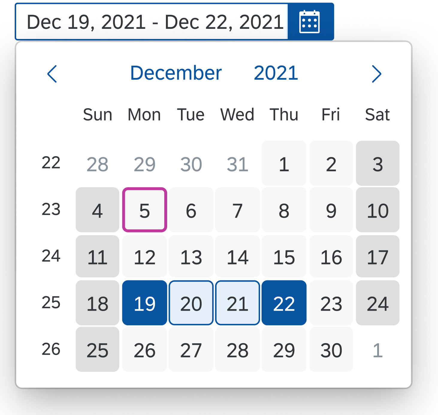
The column header menu can provide a search field for entering free text. If the user enters a term in the input field and triggers the search by pressing Enter, the tree is filtered by the tree column and the corresponding value. If no items match the filter values, the filtered tree table may be empty.
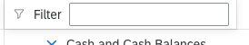
Tree table – Filter
Freeze Columns
The Freeze/Unfreeze option is provided in the column header menu of all columns. Using Freeze on one column freezes all columns from the first one to the selected one.

Tree table – Freeze
Column Handling
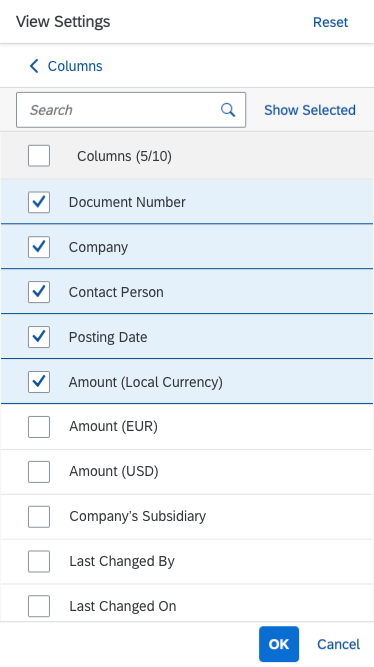
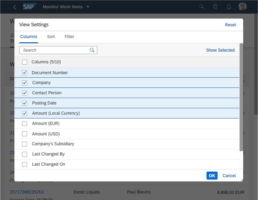
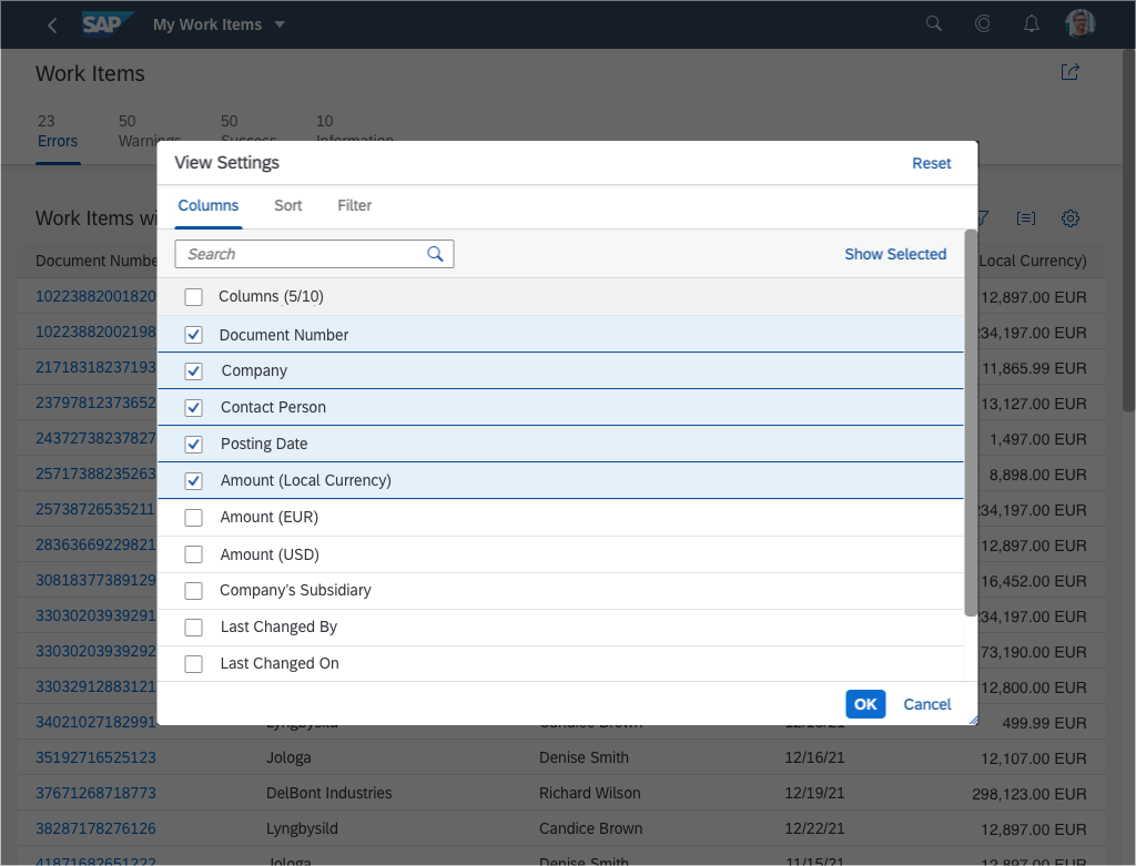
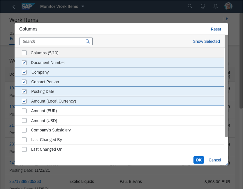
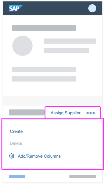
Show/Hide Columns
Columns can be shown and hidden. If the tree column is hidden, the following column is the tree column.
Rearrange Columns
The user rearranges columns by dragging and dropping the corresponding column header. The tree column is always the first column and cannot be dragged. Keyboard: the focused column header can be moved by one position to the corresponding direction with Ctrl+Left / Ctrl+Right.
Resize Columns
Columns are resized as follows:
- Mouse interaction: The user drags the separator line between two columns (sap.ui.table. Column, property: Resizable). Double-clicking the line optimizes the column according to the length of the currently visible data and the label of the column header (sap.ui.table.Column, property: Autoresizable). Note that auto-resizing works only if the cells in this column contain one of the following controls: text, label, link, or input.
- Touch interaction: The user clicks or taps the column header to reveal two buttons: One to show the column header menu, and one for resizing. The user drags the latter to resize the column.
- Keyboard interaction: The width of the focused column header can be increased with Shift+Right and decreased with Shift+Left.
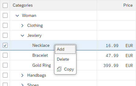
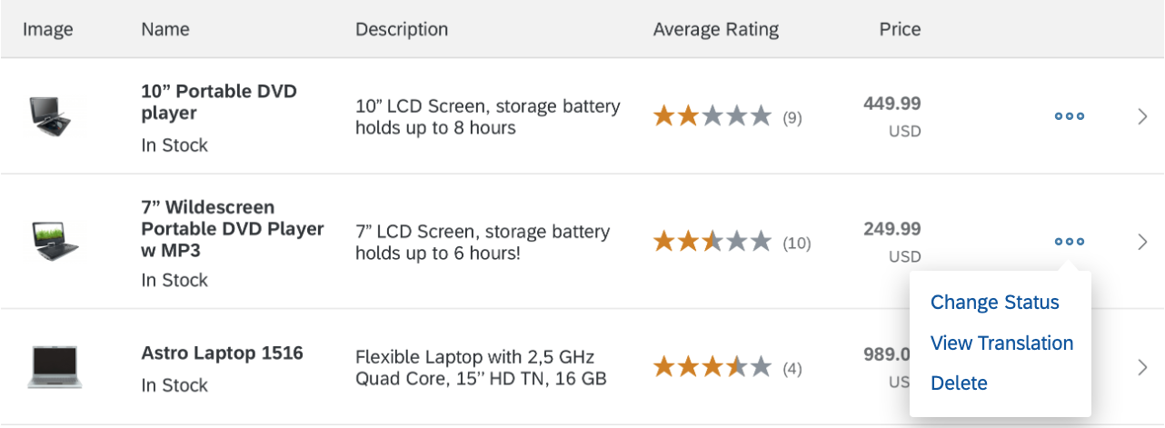
Context Menu
You can attach a context menu (sap.m.Menu) to a table. The context menu gives users an alternative way to modify the focused elements by giving them access to context-specific functions.
When opened, the context menu gets the row and column context, except for special columns (such as the selection column) or special rows (like group headers). Context menus can be implemented for a specific table, row, or cell (not recommended for editable cells).
Context menus are opened by right-clicking (desktop), long press (mobile), the context menu key, or Shift+F10.
Be aware that using the context menu overrides the browser context menu, which can no longer be opened.
If a control inside a table is the “click target”, and the control also provides a context menu, the control context menu “wins”.
Tree table with context menu
Cell Content
The tree is traditional in that each cell can contain only one data point in one single line.
Apart from plain read-only text, cells can contain the following:
- Text
- Label
- Object status
- Icon
- Button
- Input
- Date picker
- Select
- Combo box
- The following micro charts in size XS: Bullet, comparison, stacked bar
- Multi-combo box
- Multi-input field
- Checkbox
- Link
- Currency
- Rating Indicator
- Progress indicator
While it is technically possible to also use other controls, doing so could lead to issues in regards to alignment, condensed mode, screen reader support, and keyboard support.
If you use text, use only single-line text to keep the same row height. Truncate if necessary as this prevents adverse side effects when scrolling vertically (sap.m.Text, property: wrapping, value: false).
Guidelines
Filtering
What exactly needs to stay or be removed is highly dependent on the kind of structure and data your tree table displays. For many trees, the following approach works well if you want to apply filters only to the leaves of a tree:
- Remove all leaves that don’t fit the filter criteria
- Remove empty nodes
Where nodes need to be filtered, keep the following in mind:
- A node may or may not fit the filter criteria.
- A node can contain items (nodes and/or leaves) that fit the filter criteria.
Because of this, the results might contain more nodes than those that are relevant for the filter criteria.
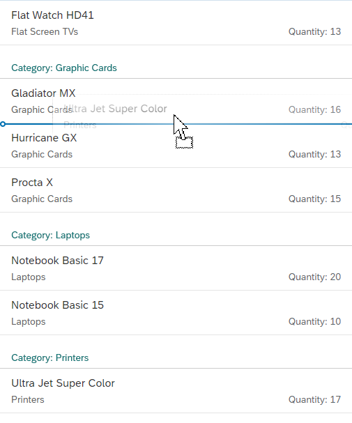
Sorting
First of all: Is sorting meaningful in your tree? If so, decide on a meaningful default sort order.
If sorting is meaningful, is it meaningful on all levels? Or does the tree structure need to be stable? In the latter case, sort only leaves, but not nodes.
Always sort the table in a meaningful way when it first loads. In most cases, this means sorting by the column that identifies the row. This is usually the tree column.
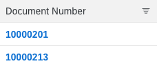
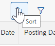
To display the current sort state, an icon is shown in the column header of the most recently sorted column. This icon indicates the sort direction (sap.ui.table.Column, properties: sorted, sortOrder, sortProperty).
The descending sort order must always be the exact reverse of the ascending sort order. For each column, provide a meaningful sort order. For example:
- Sort text alphabetically
- Sort numbers by their value
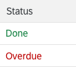
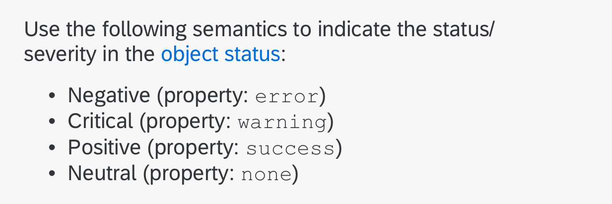
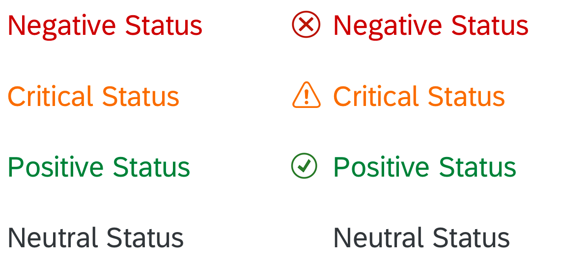
- Sort status information by the severity of the status:
- Ascending: Sort status information from positive to negative, with neutral last.
- Descending: Sort status information from negative to positive, with neutral first.
-
- Ascending with different values per severity level: Sort status information from positive to negative, with neutral last. Sort different values within a severity level (semantic color) alphabetically.
- Descending with different values per severity level: Sort status information from negative to positive, with neutral first. Sort different values within a severity level (semantic color) alphabetically.
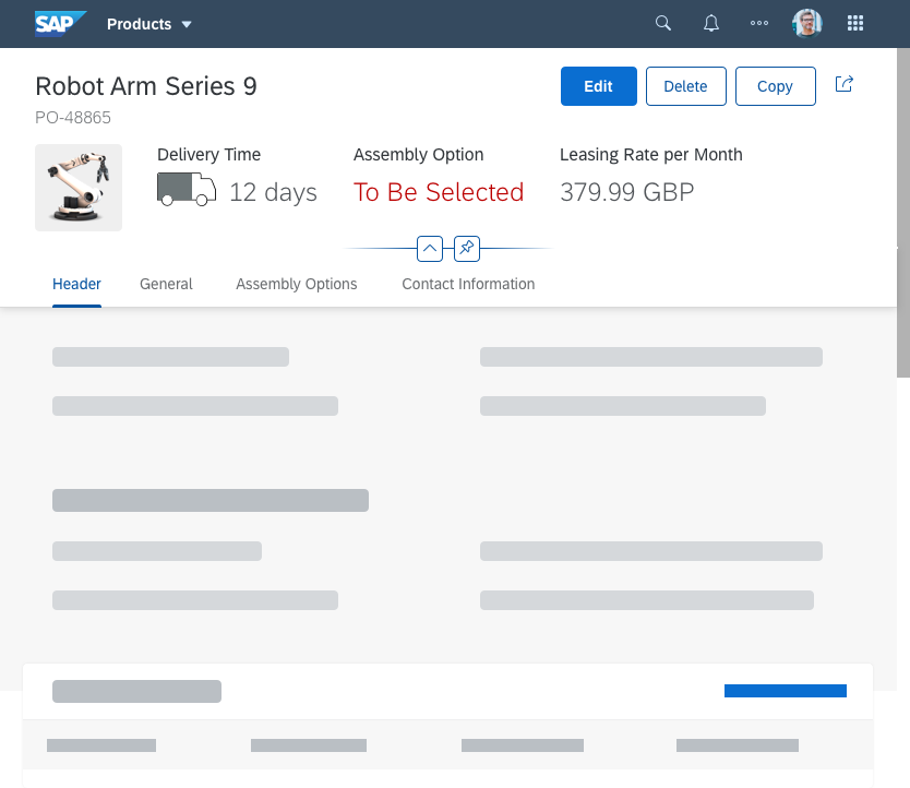
Loading Data
To indicate that the table is currently loading items, use the busy state (sap.ui.table.TreeTable, property: busy). Do not show any items or text. As soon as the data has been loaded, remove the busy state and show all items.
Initital Display
Think of the initial expand / collapse state of a tree: If your structure contains many items on the root level, it might make sense to collapse the whole tree in the beginning.
In contrast, if the main items to work with are displayed on a deeper level (e.g. the parent nodes are just some kind of categorization), the tree should be expanded up to the first level where the needed items appear.
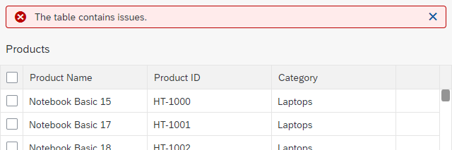
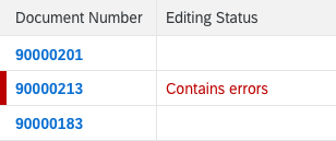
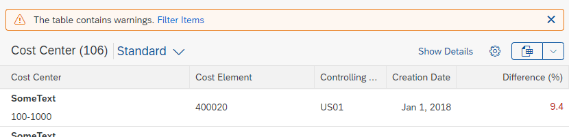
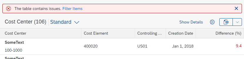
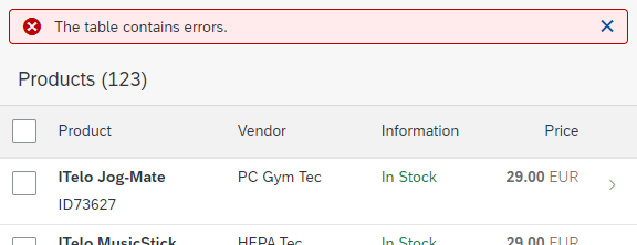
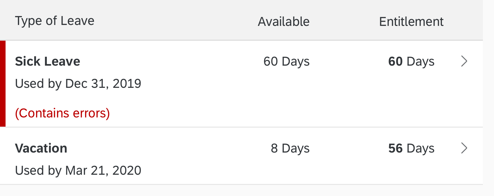
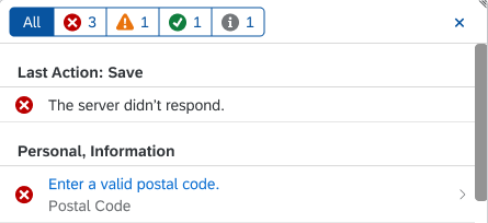
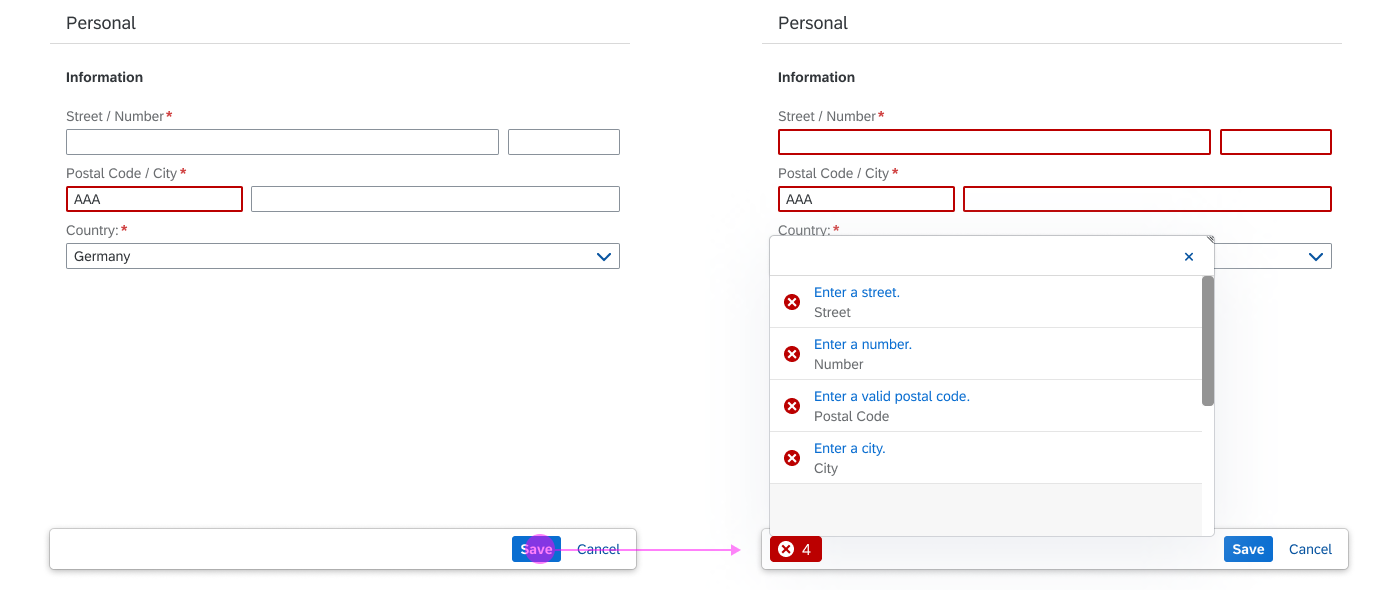
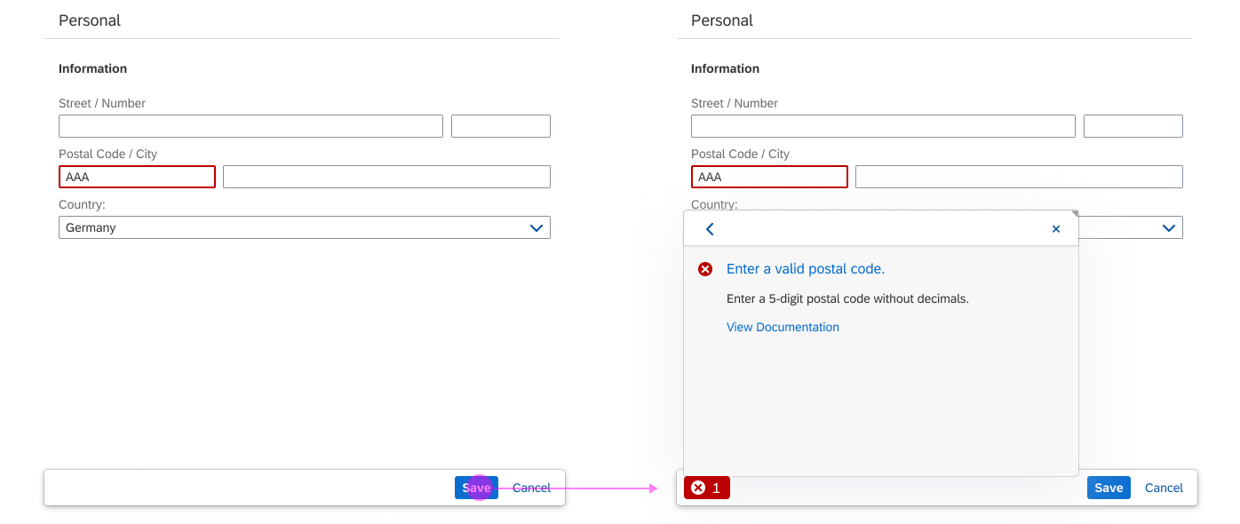
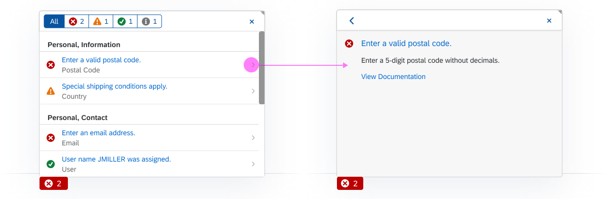
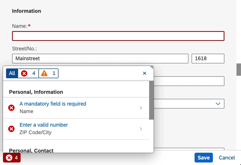
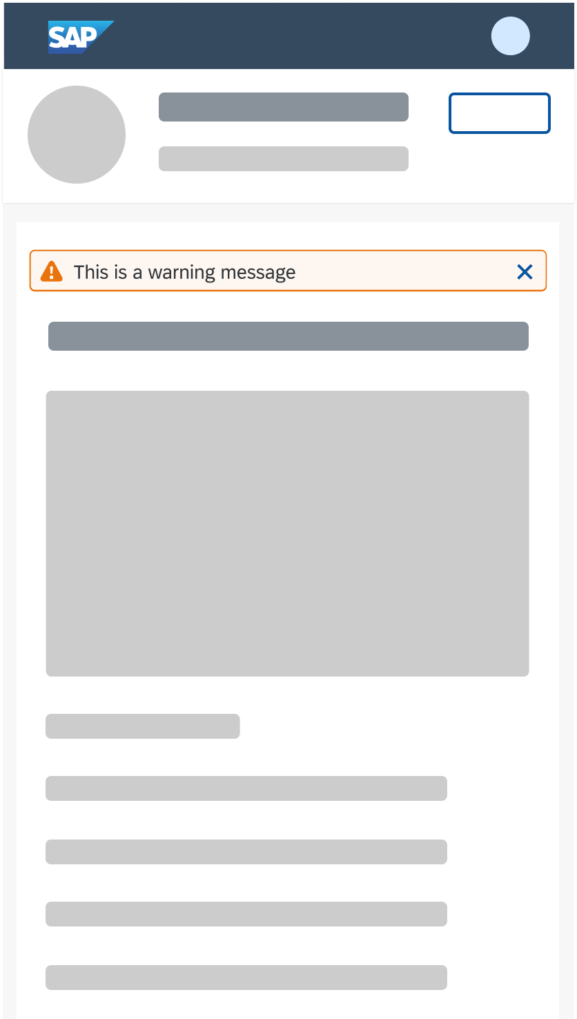
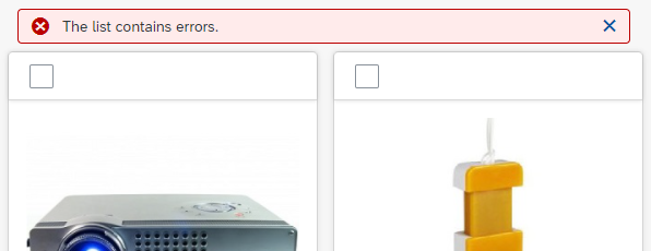
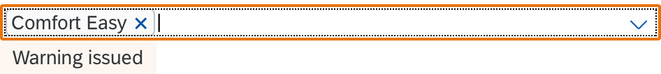
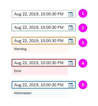
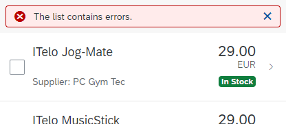
Errors and Warnings
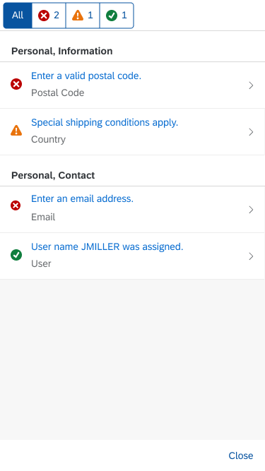
To indicate that the tree table contains items with errors or warnings, show a message strip above the tree table. On the message strip, provide information on errors or warnings. When issues are solved or when new issues appear, update the message strip accordingly.
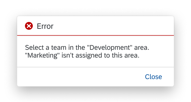
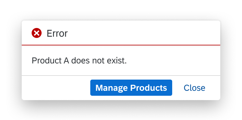
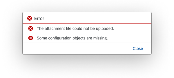
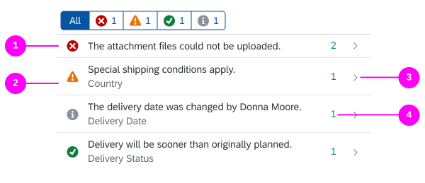
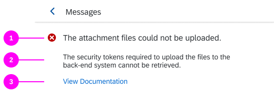
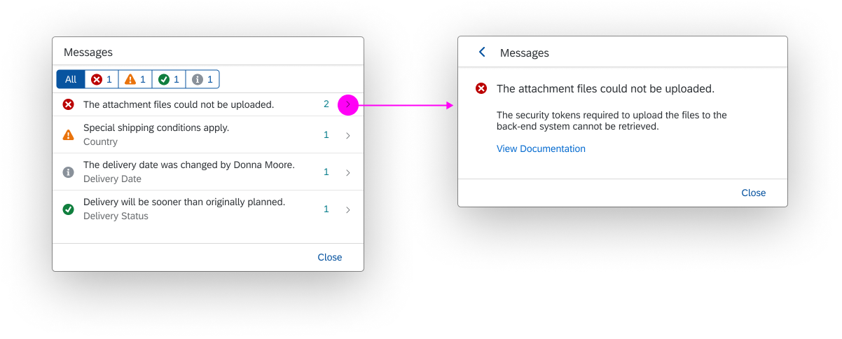
For details on displaying errors, warnings, and other messages, see Message Handling.
Selection
- We strongly recommend using the multi-selection plug-in. This ensures that all items selected using Select All or as part of a range are included – even if some items were not initially loaded in the front end. This is not the case if you use the multi-toggle option.
- Do not limit the range selection for the multi-selection plug-in unless you have to.
- If the dataset is small and/or completely available in the front-end, set the limit property to 0 to enable the Select All option and allow users to select any range.
- If you have a large dataset, set a limit on the number of selected items to avoid performance issues. Also bear in mind that some actions won’t be helpful if the dataset is too big (for example, a delete operation on 2 million database entries).
- When setting a limit, also display the corresponding message when the user selects more items at once than the limit allows (sap.ui.table.plugins.MultiSelectionPlugin, property: enableNotification).
- For single-selection list-detail scenarios within the flexible column layout, do not show an additional “navigated” indicator.
- In multiple selection mode, do not show checkboxes in the first data column in the default delivery to avoid confusion.
- Never disable the selection checkbox. If an action can’t be performed on a specific item, inform the user after the corresponding action has been triggered. For more information, see Enabling/Disabling Actions.
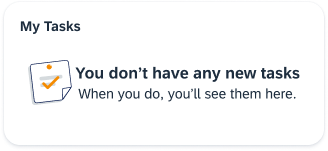
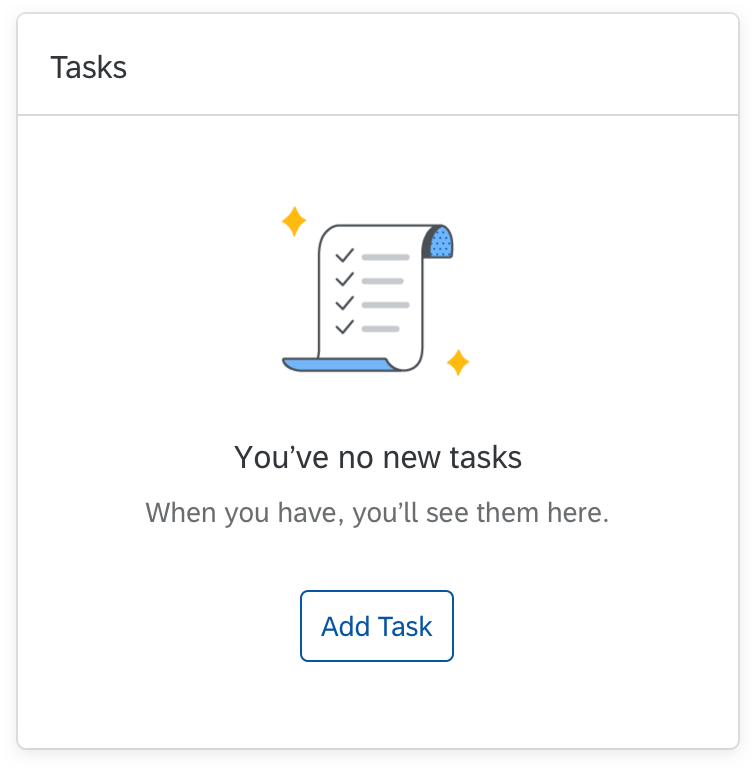
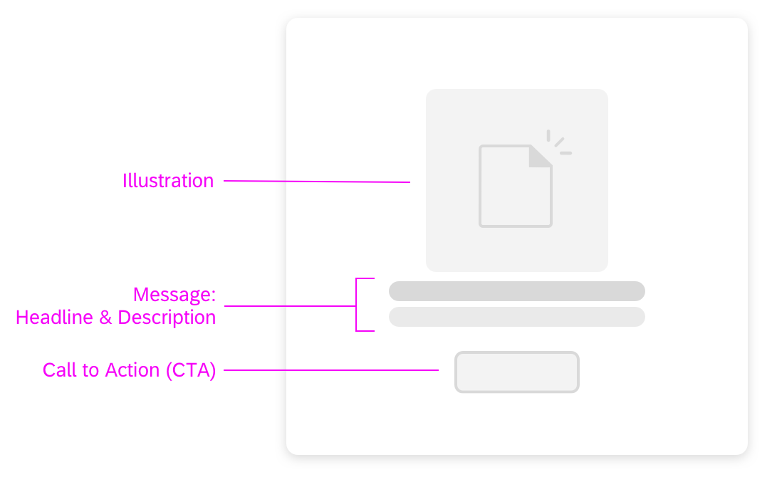
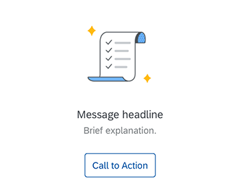
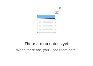
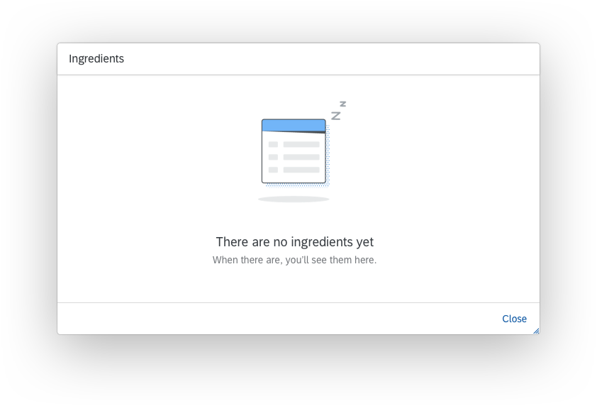
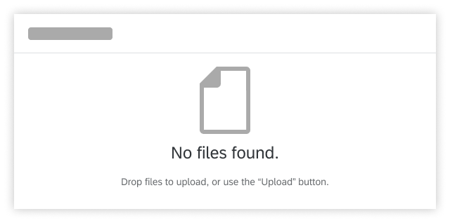
Empty Table
Try to avoid empty tables. If necessary, provide instructions on how to fill the tree table with data.
Remove the item count in the table title if there are zero items.
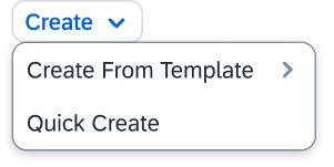
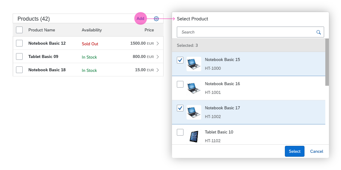
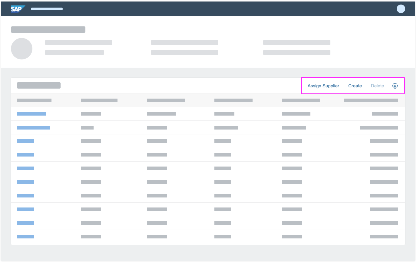
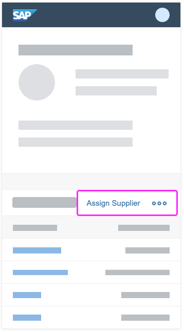
Add Items
For adding items, place an Add or Create text button on the table toolbar.
- Use Create if the button adds a brand new item that doesn’t yet exist on the database.
- Use Add if the item already exists and is merely added or assigned to the current object.
Enable the shortcut Ctrl+Enter (and ideally Enter in addition) to trigger the Add or Create button.
Show new items as the first item of the tree table or node:
- If nothing is selected, add the new item to the root.
- If a single node is selected, add the new item to the selected node.
- If a single leaf is selected, add the new item as child of this leaf. The original selected item becomes a node.
If your tree doesn’t support adding items to the root, selected node, or selected leaf, disable Create or Add for the corresponding levels.
Disable Create or Add if more than one item is selected.
There are three options for adding an item. In order of priority (most recommended first), these are:
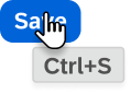
- Add the item inline. Create an empty, editable row as the first item of the selected node. Show the Save button on the tree toolbar. This option is recommended for simple scenarios with just a few columns and no option to hide columns.
- Open a dialog for larger tree tables with up to 8 editable columns. Save the new item at dialog level.
- Navigate to a new page. This behavior should only be used for very complex scenarios that cannot be handled by a dialog (for example, tree tables with more than 8 columns). When the user presses Save in the footer toolbar of the create page, navigate back to the tree table.
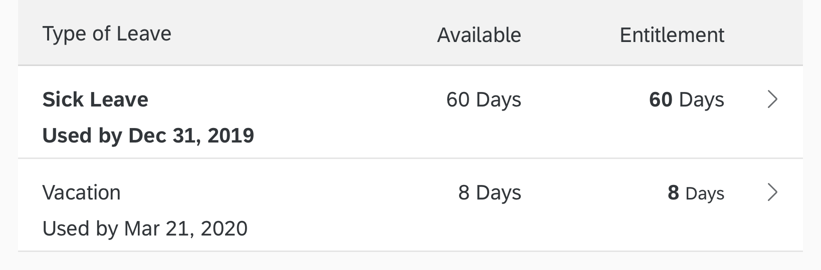
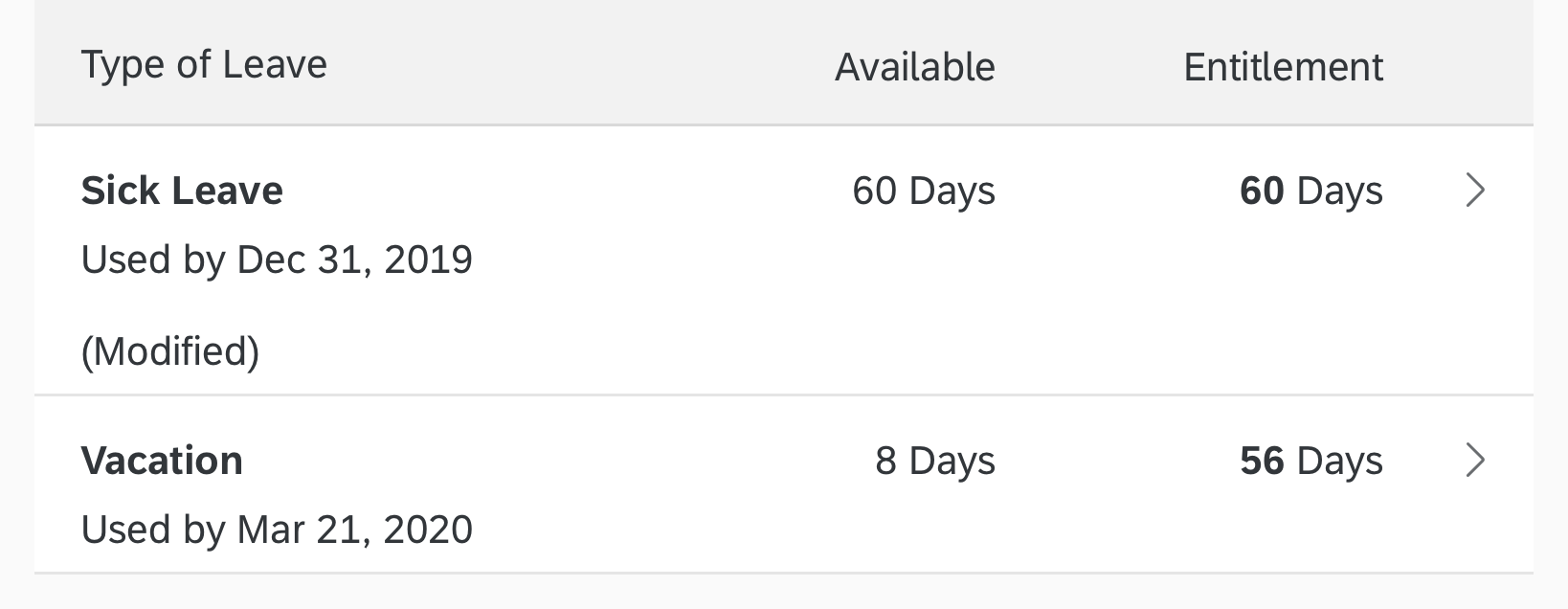
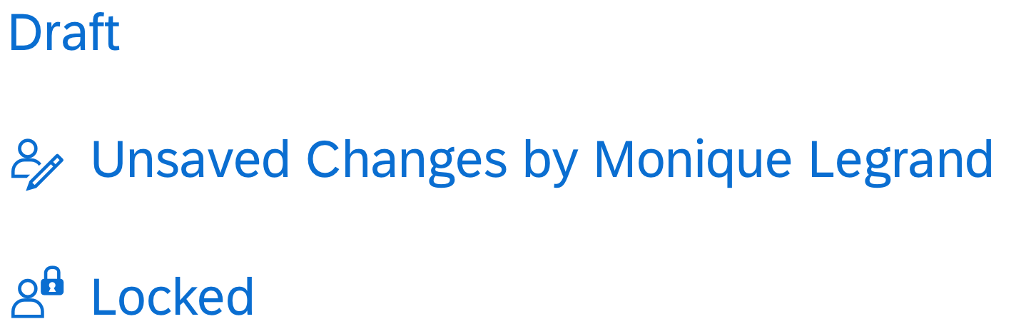
Depending on the flow, an item can be in one of three different states:
- New: The item was just created inline and is in edit mode (for example, after pressing the Create button). It is highlighted with a visual indicator (information state).
- Recent: The item was just created and is in read-only mode (for example, if Create leads to a dialog, and Save was triggered within the dialog). In this case, keep the item highlighted and display it as the first item of the corresponding node. Ignore current sort, filter, and grouping criteria to keep the item visible.
- Added: The item has been fully added. It follows the sort, filter, and grouping settings and also loses the visual highlight. This state is used after:
- Inline creation: After Save was triggered on the tree toolbar or at page level.
- Create with dialog: A tree table showing one or several items with the state “Recent” gets updated (for example, after sorting, filtering, or grouping, or when the browser is refreshed).
In the context of draft handling new items are not saved at tree table level, but rather with the entire draft.
For more details, see the guidelines for managing objects (including subarticles).
Enabling/Disabling Actions
To indicate if an action can be applied to the current selection:
- Enable the action if it always works, regardless of whether or not items are selected.
- Enable the action if it can be applied to all selected items.
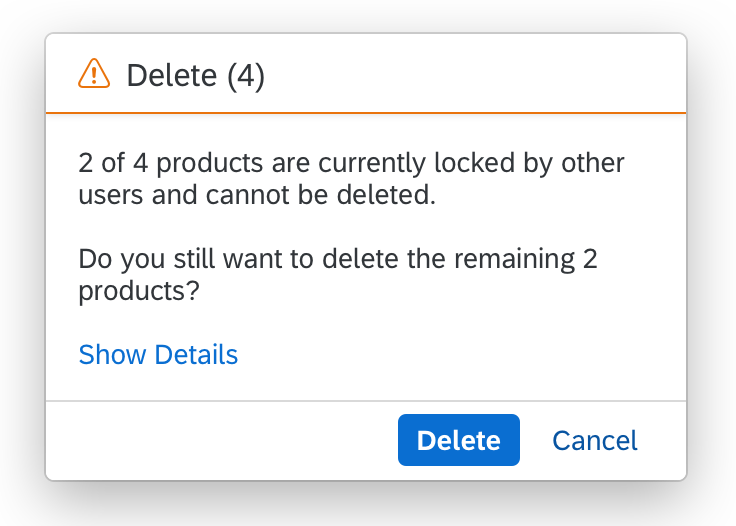
- Enable the action if it can be applied to some of the selected items. If the action is triggered, show a message that informs the user how many items will be affected. Let the user choose whether to apply the action anyway or cancel the action.
- Only disable the action if:
- The action can’t be applied to any of the selected items.
- The number of selected items doesn’t match the action. For example, disable Compare if only one item is selected.
For more details, see UI Element – States.
If the action was applied and the items are still available, keep them selected.
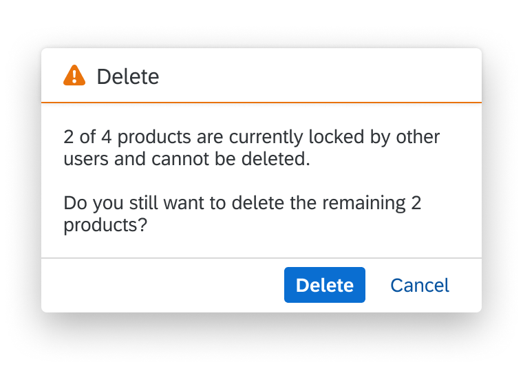
Message for an action that applies to a part of a selection
Columns
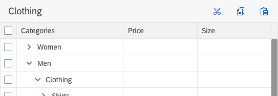
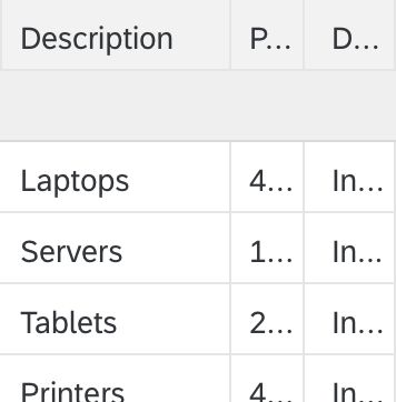
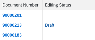
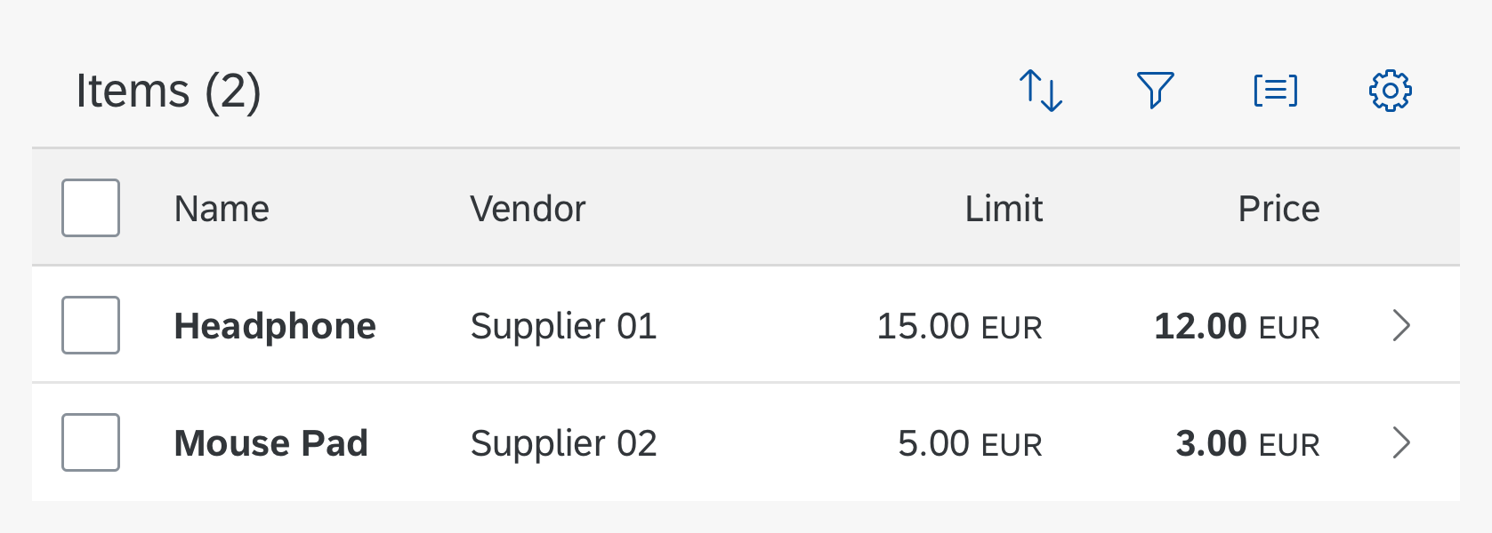
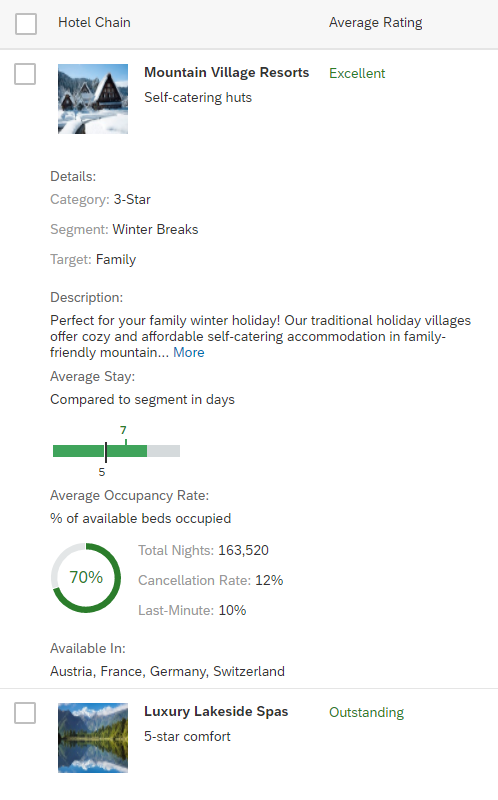
Minimize the number of columns. Avoid the need to scroll horizontally in the default delivery. In the first column, show the hierarchical data, which should identify the line item. Choose the name over the ID, but if both are needed, show the name first, then the ID.
The tree table assigns the same width to each column by default. It is recommended that you overwrite this default to provide optimal space for your content (sap.ui.table.Column, property: width).
If you define the column width in pixels or rems, resizing a column affects only the width of this specific column. Reducing the browser window size results in a scrollbar. After resizing a column, a scrollbar appears if the width of the table is not enough to show all columns. If the columns use less space than is available, white space appears on the right side of the last column.
If you define the column width as a percentage, resizing one column affects the width of several or all columns. Text becomes truncated when the browser window size is reduced. This is done to make sure that all columns together fill the space of the table. A scrollbar appears only in case the automatic change of the column widths is not enough to display all columns. To avoid the side effect of undersized columns, a minimum width can be set per column. Please be aware that this minimum width is only taken into account if columns are automatically resized. End users are still able to reduce the column width below the provided minimum. (sap.ui.table.Column, properties: width, minWidth)
If you define the column width as “auto”, the behavior is the same as for “percentage”. In contrast to percentage, “auto” distributes the columns equally.
To decide on how to set the column width (pixel/rem/em vs. percent/auto), keep the following tips in mind:
- For tables with only 2 to 3 columns, use pixel-based units. This ensures that on wide screens the values in the columns are not spread over the whole screen, which improves readability of line items.
- For tables with many columns, where a horizontal scrollbar is usually needed, use pixel-based units. This avoids unintended side effects when resizing columns.
- For all other tables, use whatever fits your case better.
Be cautious with mixing columns with pixel-based and percentage-based widths. While this can be helpful in some cases, it could also cause even more unintended side effects when resizing a column. When using percentage-based widths for one or more columns, think of the possibility to not allow end users to resize columns at all.
Alignment of Cell Content
Align column headers according to their cell content:
- Texts are left-aligned.
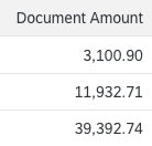
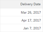
- Numbers (except for IDs), dates, and times are right-aligned.
- Icons are centered.
- Micro charts are left-aligned.
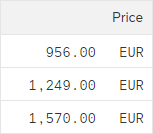
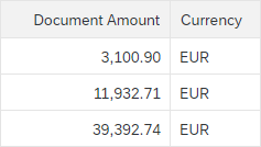
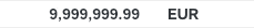
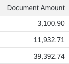
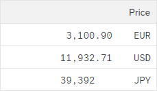
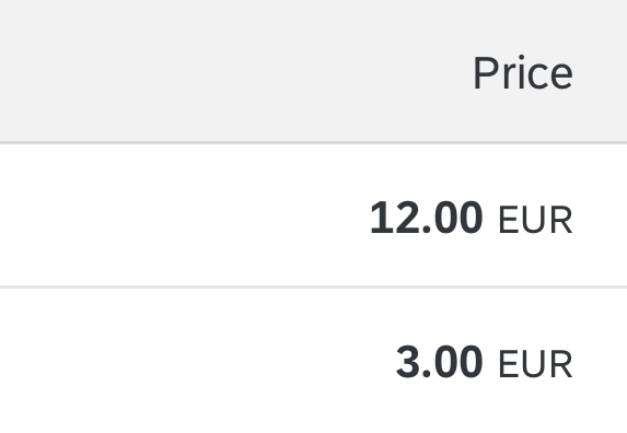
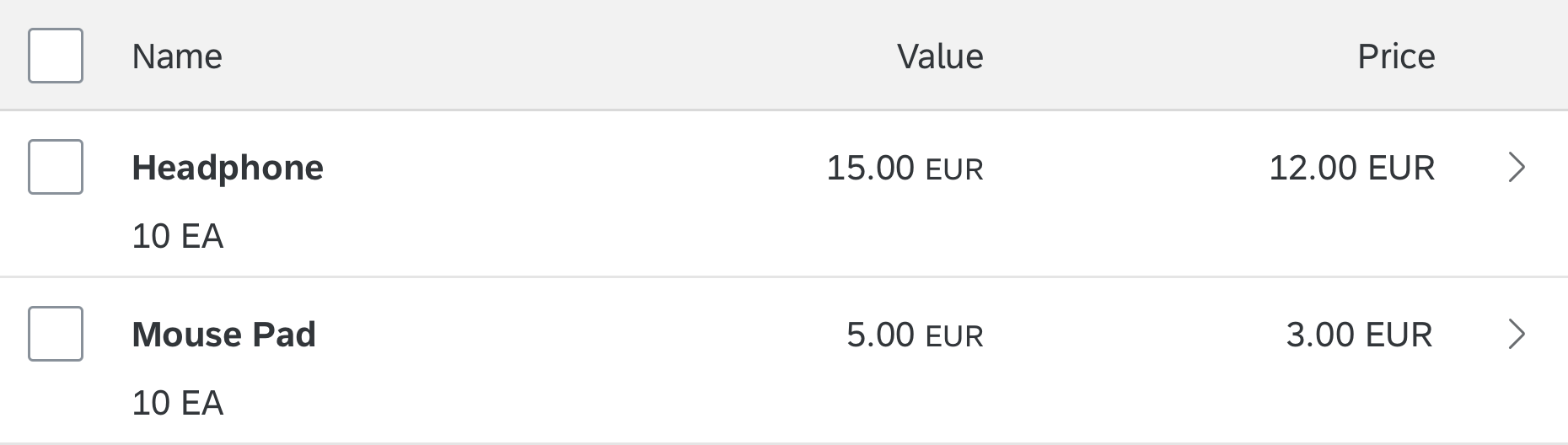
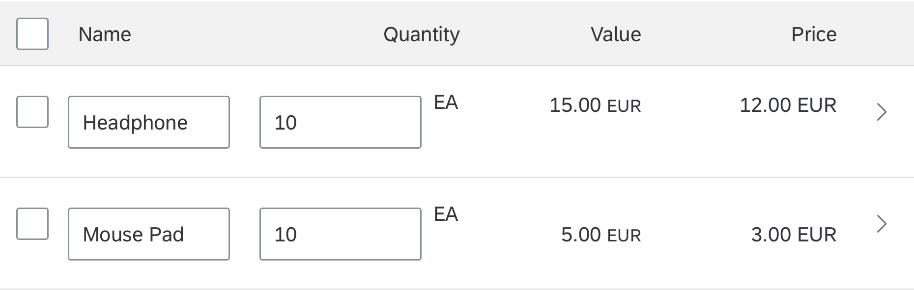
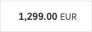
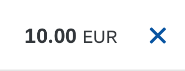
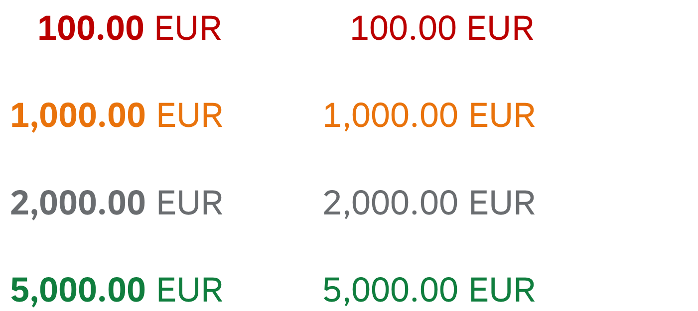
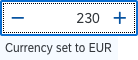
In addition, align amounts with currencies to the decimal point. You can do this with the sap.ui.unified.Currency control.
Note that most currencies have two digits after the decimal point, but there are exceptions, for example:
- The Tunisian dinar has three digits.
- The Japanese yen has no digits.
In tree tables with mixed currencies, all amounts still have to be aligned to the decimal point.
To enable positive and negative values to be identified more easily, position the minus sign to the right of the number. It is placed in the same position in every row.
For more information, see currency.
Formatting Cell Content
- Note that there are different locale formats, so show dates, times, and numbers in the correct format for the user’s language/country.
- If you show both a a text and an ID, consider the requirements for sorting, grouping and filtering:
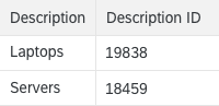
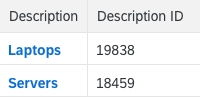
- If users need to sort, group, and/or filter by both text and ID, show the text and ID in two separate columns.
- If users only need to sort, group, and/or filter by either text or ID, show the ID in parentheses after the corresponding text.
- If the unit of measurement is the same for all rows, show the unit of measurement in the column header. Otherwise, show the unit of measurement within the row.
- If you want to let users sort, filter, or group by amount and by unit of measure independently, put both in different columns. If you combine them in one column, offer only sorting, filtering, and grouping by amount.
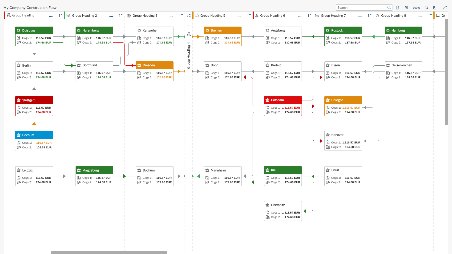
Tree vs. Table
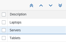
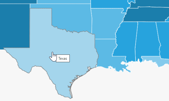
Trees are more complex than tables due to their hierarchical view. Users tend to have more problems finding items in hierarchical views than in flat lists, except where the hierarchical view is natural. By natural we mean that every child node should be part of only one parent, and this relationship between the child and parent is clear and well known.
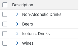
Example of an acceptable use of tree tables
A clear parent-child relationship
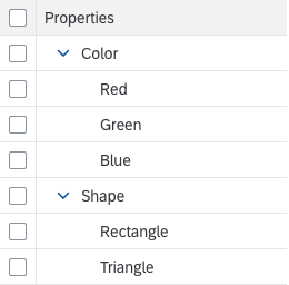
When you use trees, you should choose broad hierarchies over deep hierarchies. Deep hierarchies make finding items more complicated. So try to reduce hierarchical levels where possible, especially if the hierarchy is not natural. Ideally, a tree should have a maximum of four levels, the first two of which should contain the most important items.
Avoid unnecessary depth in the hierarchy
Favor breadth over depth in the hierarchy
You can use the following methods to reduce hierarchy levels:
- Avoid single root nodes. A single root node is often used to provide a Select All feature. Since the tree control provides an extra space for a Select All feature, the root node is not usually needed.
- When you use only two levels, choose a grouped table or grouped ALV over a tree table control. Expand all groups for the default delivery.
- Container nodes at the top level can usually be replaced by tabs or value pickers.
- Eliminate unnecessary mid-level containers, for example, by combining redundant ones.
- Exercise care when using a tree due to its overall complexity. The hierarchical structure of the data does not necessarily mean that a tree control is required.
Design Concepts
The tree table can be used to display large amounts of hierarchical data. Unfortunately, tree tables have a high data density and therefore convey an immediate feeling of complexity. Ideally, tree tables with large amounts of data should only be shown if there is no other option. You should instead try the following:
- Flatten the data. A list, table, or ALV is still complex, but less so than a tree table.
- Break down the data into manageable chunks. Allow the user to navigate or drill down between them.
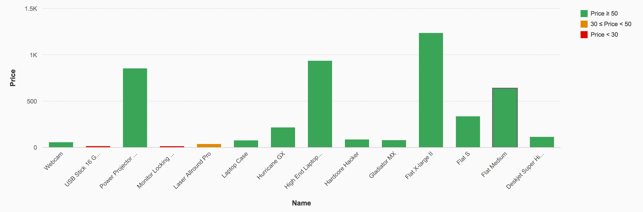
- Use charts with drilldown functionality until the amount of data is more manageable.
Try to avoid horizontal scrolling in the default delivery.
Navigation
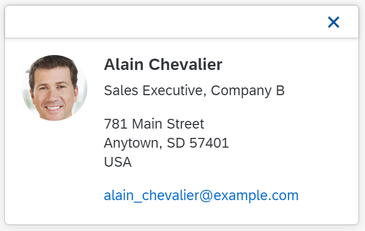
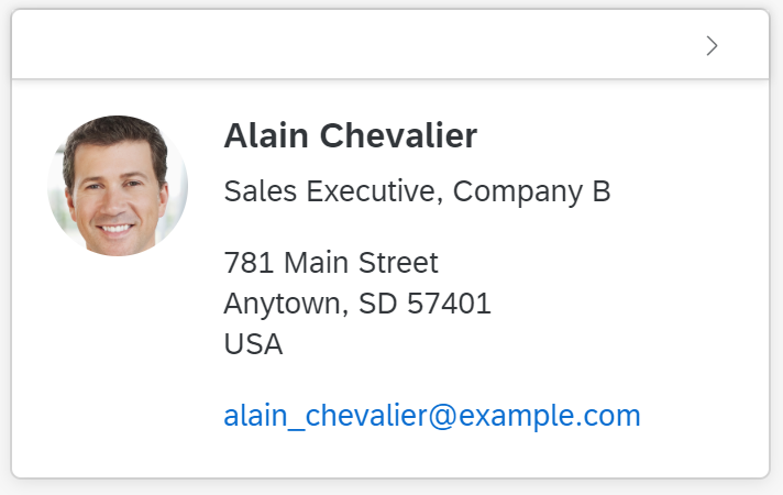
To trigger navigation on line item level, choose one of the following options:
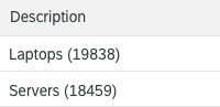
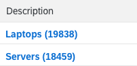
- Use a link for the attribute that identifies the row. Clicking the link triggers the navigation. This is the preferred option.
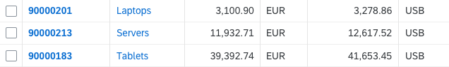
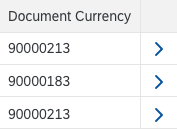
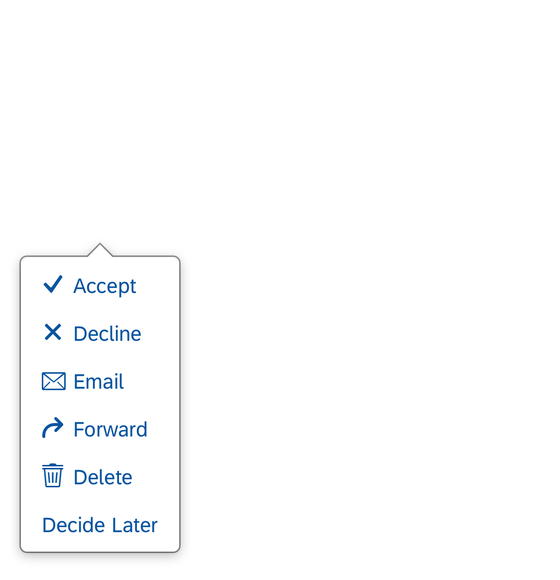
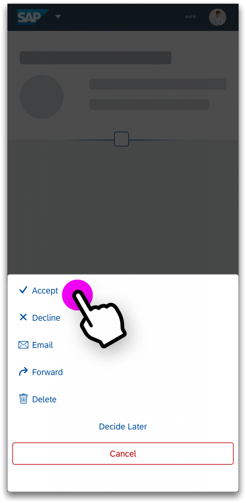
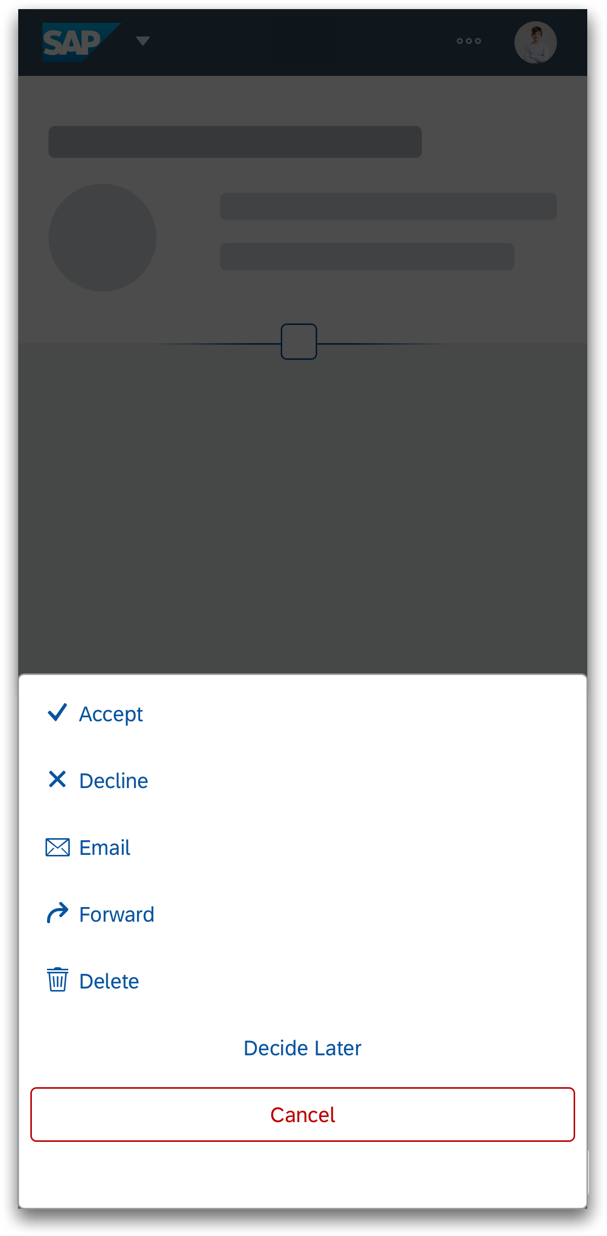
- Add the RowActions column and show the navigation arrow ( ) at the end of the row. No column header text is required. The navigation column is fixed and will not scroll away. Users also cannot personalize this column. The navigation arrow triggers the navigation.
Do not use the RowActions column for actions other than navigation and deletion.
Special case: Multi-selection in a list-detail scenario
When a multi-selection table is used in a list-detail scenario, it is not clear which item was last opened (for example, which item is currently shown in the second column of a flexible column layout). In this case, you can display a “navigated” indicator to show which item is currently open.
Examples of Incorrect and Correct Usage
When you use trees:
- Choose breadth over depth.
- Emphasize important values. Do not let the user run into a wall of text without guidance. You can use bold text for this.
- Try to minimize the number of columns, especially if there is a large number of rows.
- Optimize column width for its initial visible content. Do not automatically adjust column width based on content changes.
- Do not wrap content, truncate it. End users can easily change the column width to see the full text.
Avoid truncating the initial visible content in the default delivery
Never wrap texts
- Maintain a fixed layout, except when the user wants to change it.
- In the default layout, use the tree column for the item name or data that identifies the row. This helps the user to choose between different items.
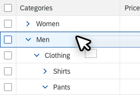
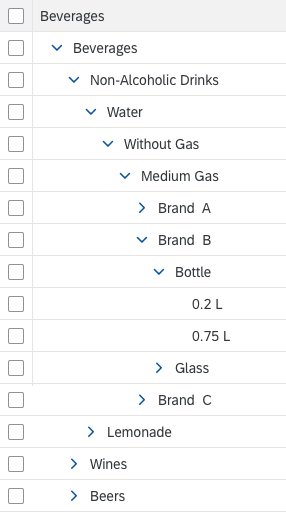
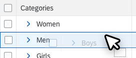
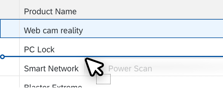
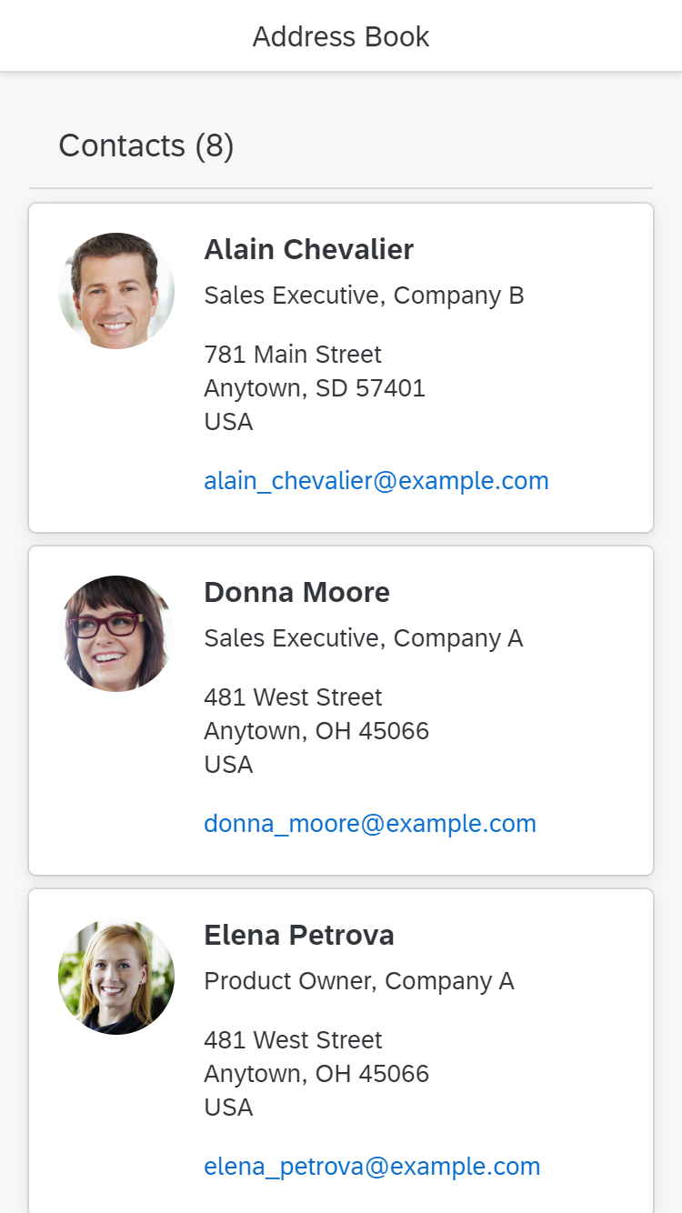
- Create a clear and immediately understandable hierarchy. Use clear parent-child relationships. If this is not possible, add a child in different nodes to help the user find the element.
Acceptable: repeat entries to optimize finding items
- Consider persisting the layout settings. When a user reopens the app, show the tree table with the same column sizes, column order, and view settings as last defined by this user.
- Use the Select All feature only if it makes sense. Note that selecting a lot of data also takes time and might not be appropriate for all use cases. For example, a delete operation on two million database entries might not be very helpful in many cases.
- Set the property collapseRecursive to “false” in order to keep the selection on subnodes even after collapsing and expanding the root node.
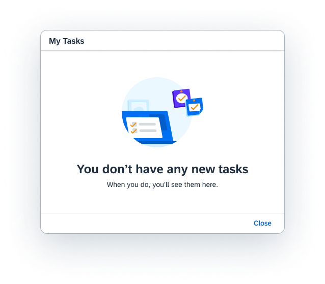
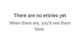
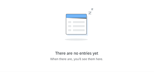
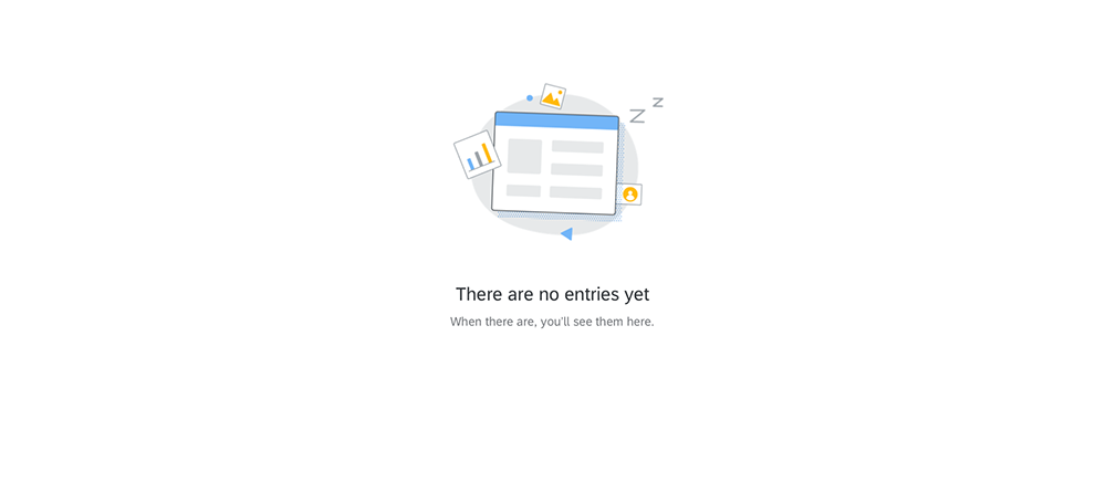
Empty Tree Tables
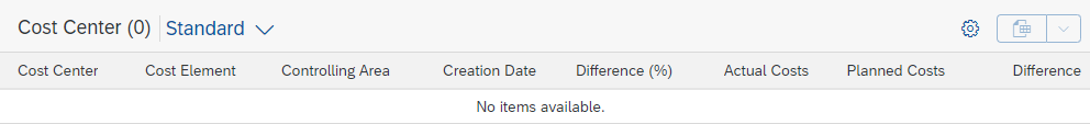
Avoid empty tree tables. If necessary, provide instructions on how to fill the tree table with data (sap.ui.table.TreeTable, properties: noDataText, showNoData).
Examples:
- If a tree table is initially empty, provide at least a basic text:
No items available.
Overwrite this whenever a hint can be provided on how to fill the tree table with data. - If a tree table is used together with a filter bar (as in the list report), and is initially empty, use the following text:
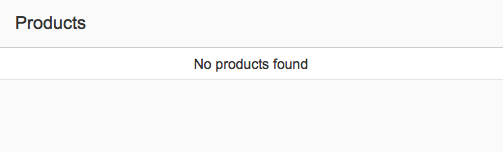
No filters set. To start, enter your search and filter settings and run the search. - If a tree table is used together with a filter bar and the filter does not return results, use the following text:
No items found. Check the search and filter settings.
Adapt the texts above if:
- The standard text is not precise enough for your use case (for example, no search is offered, only the search is offered).
- You are using the live search (no Go button in the filter bar). In this case, leave out “run the search”.
- The standard text is misleading (for example, if the data is filled based on a list-detail pattern instead of search and filter settings).
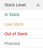
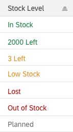
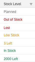
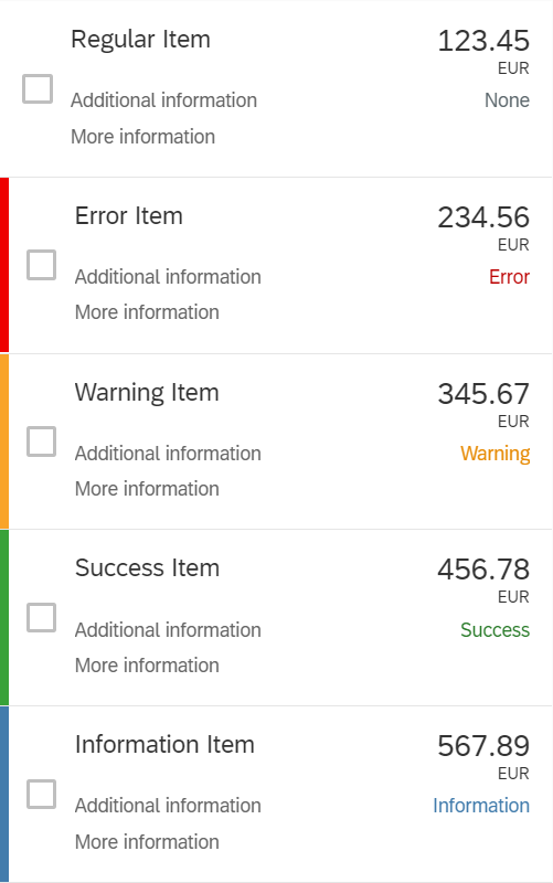
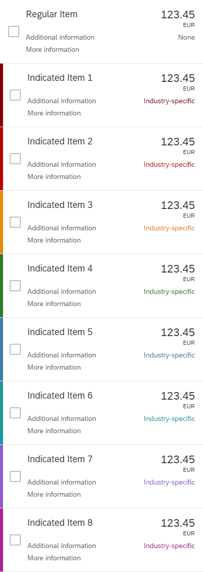
Highlight Items
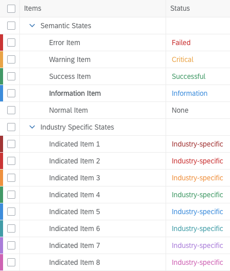
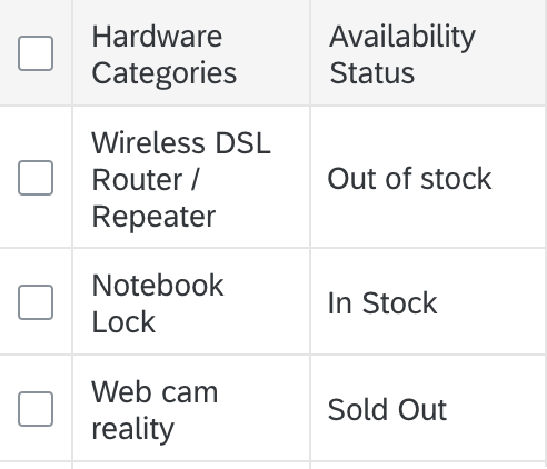
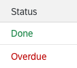
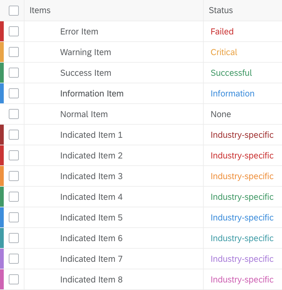
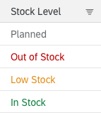
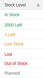
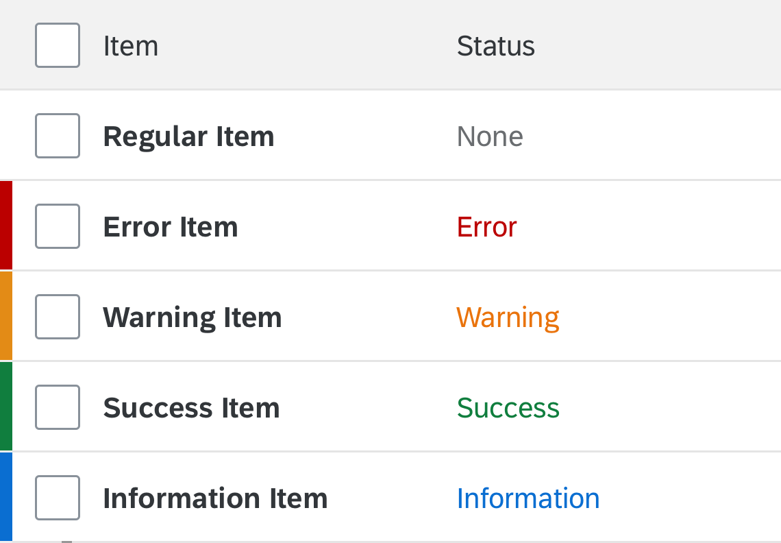
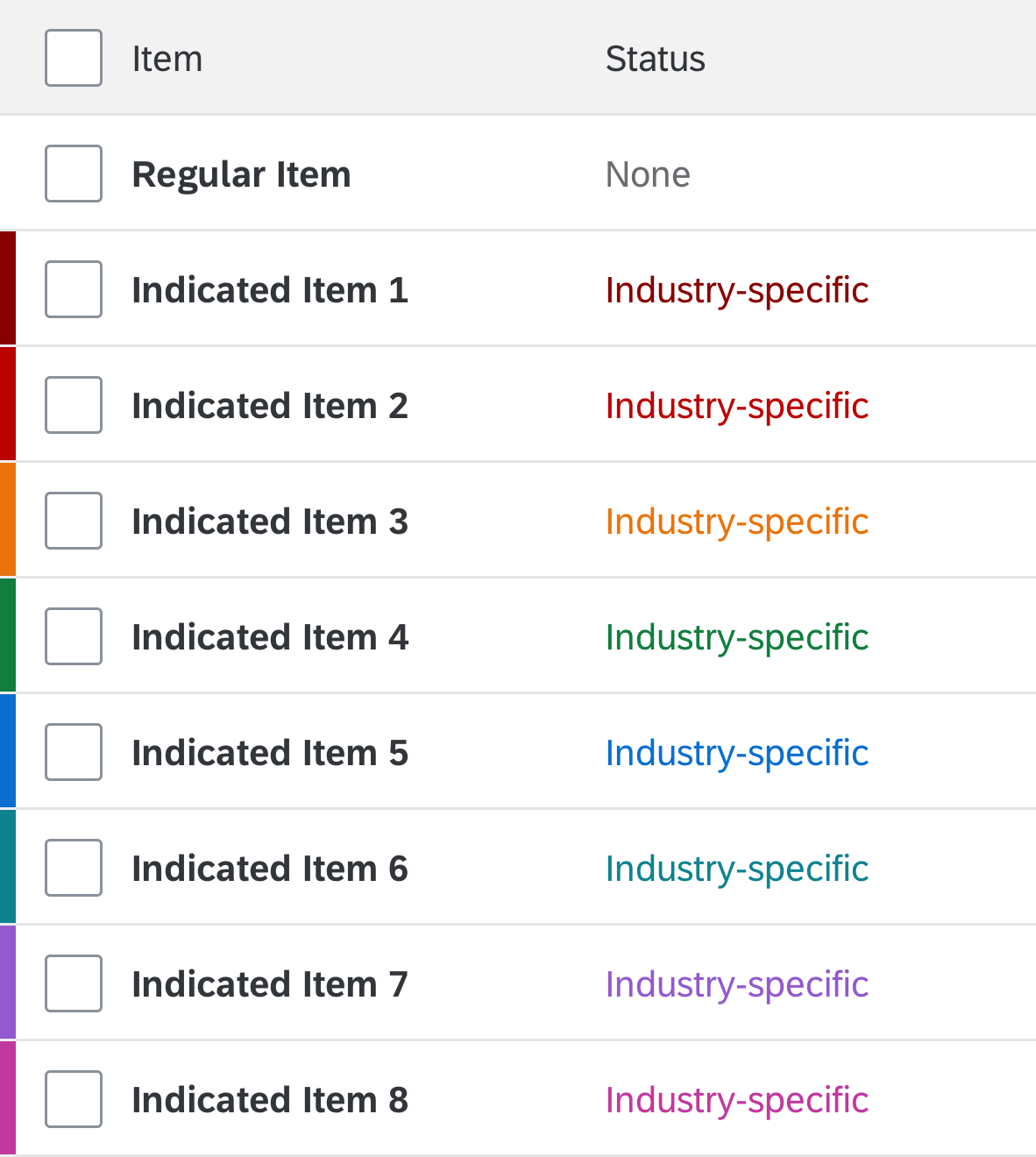
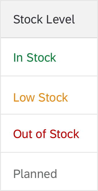
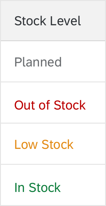
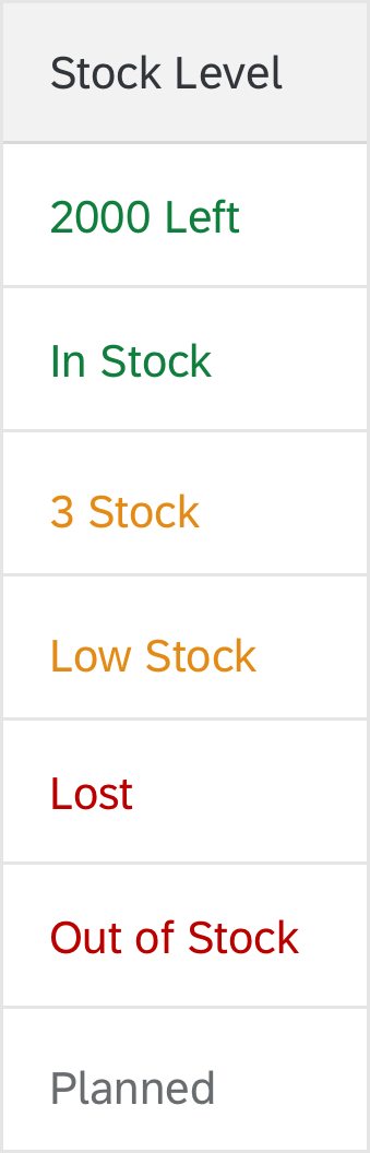
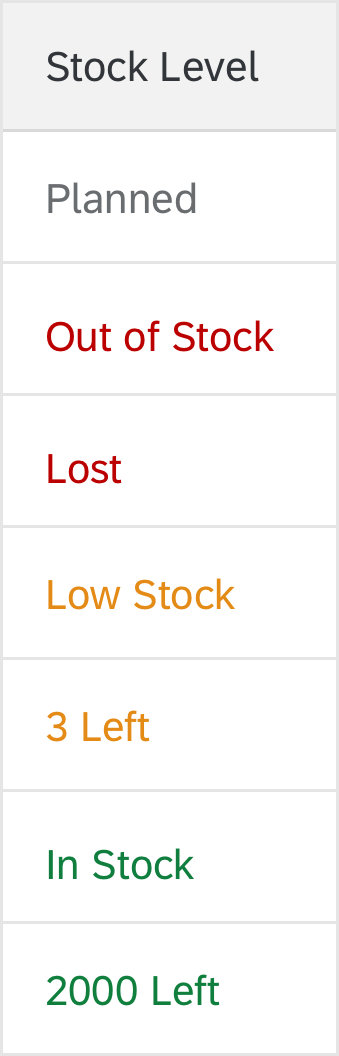
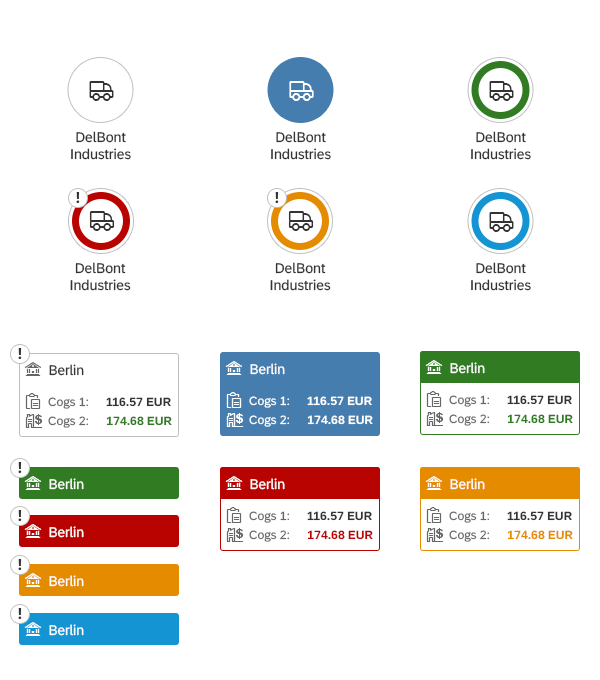
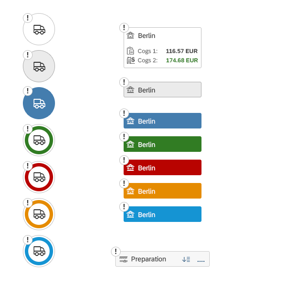
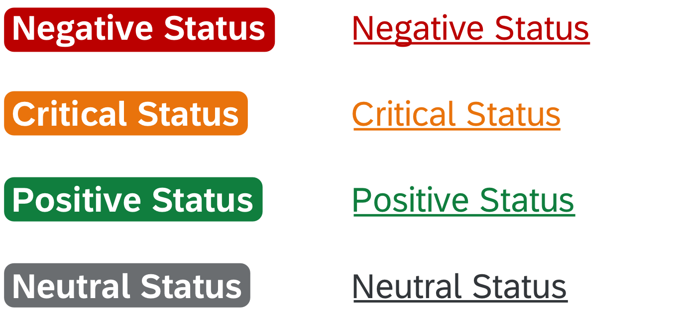
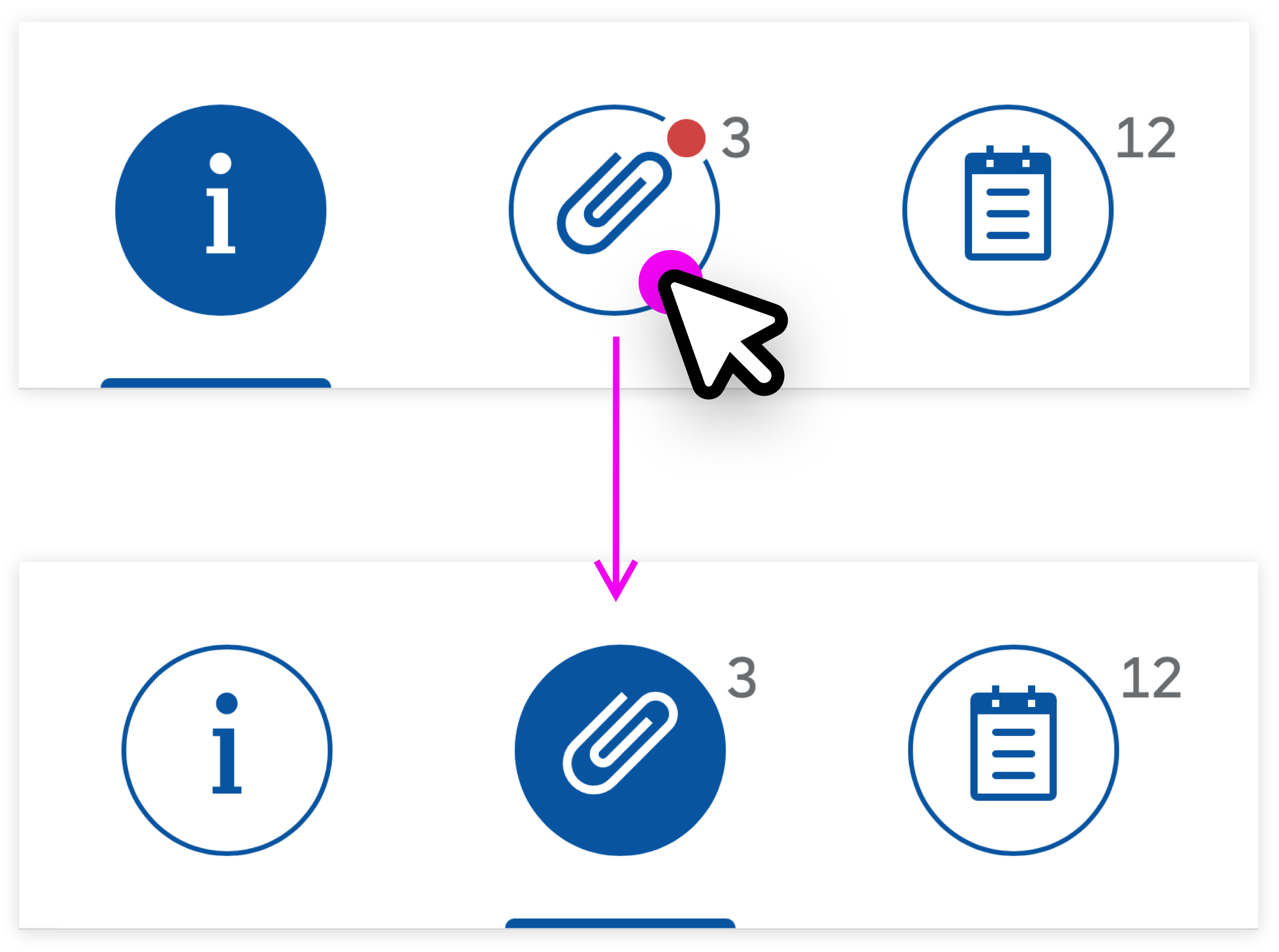
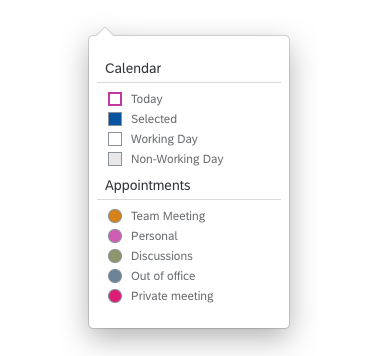
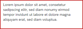
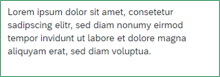
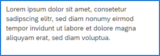
To show that an item needs attention, a highlight indicator can be shown in front of the item. The highlight indicator can be used to indicate:
- A semantic state, such as red or orange for an error or warning. In this case, use semantic colors.
- Additional information, such as blue to highlight newly added items. In this case, use semantic colors.
- Industry-specific or process-specific states, such as “out of stock” or “excess of inventory”. In this case, use indication colors.
Be aware that the highlight is just an indication. It does not tell users exactly what is wrong. Make sure that you provide this information within the table row, ideally in the same color.
For details on the use of highlight colors, see How To Use Semantic Colors / Industry-Specific Colors.
(sap.ui.table.TreeTable, aggregation: rowSettingsTemplate)
Highlighted items
Drag and Drop
Drag and drop is “invisible” on the UI: users can’t see where dragging is available and where it isn’t. In addition, there is no generic keyboard interaction. Drag and drop is also not available on all browsers. For these reasons, provide it only in addition to existing (and visible) UI elements that fulfill the same purpose. For example, offer (toolbar) buttons for moving or for copying and pasting items. These are keyboard operable and available on all browsers.
Use drag and drop only in addition to existing visible UI elements
If you offer drag and drop for rearranging items within a tree table, use the following options:
- For dropping items as a child, use whole nodes as drop targets (sap.ui.core.dnd.DropPosition.On).
- For dropping items on the same level, use the space between items as drop targets (sap.ui.core.dnd.DropPosition.Between).
- If you want to allow users to drop items as a child or sibling, offer both drop targets (sap.ui.core.dnd.DropPosition.OnOrBetween).
This provides better feedback on where the item will be inserted. Show the “move” mouse cursor (sap.ui.core.dnd.DropEffect.Move).
Drop target on an item
Do not combine rearranging items within one level and sorting. If you really need to do so, make sure there is a dedicated sort criterion for the user-defined sort order, and only offer options for rearranging items if this sort order is set.
Moving items from one node to another can be combined with sorting without any issues.
Do not combine rearranging items on the same level with sorting
Visible Alternatives to Drag and Drop
Depending on the functionality you need, use one or more of the following alternatives:
- To move items up or down within a node:
Use the Move Up and Move Down buttons on the toolbar. These buttons move the selected items until the first selected item can’t be moved up / the last selected item can’t be moved down any further.
Depending on your tree, this can make sense for both leaves and nodes, only for leaves, or only for nodes. When moving a node, move the whole node and (if applicable) all its children up or down to the next position within the parent node.
Always make sure that when the user moves an item in one direction and then moves it back, the order is the same as it was before.
Do not combine the option to move items up and down with sorting. - To move items to another node:
Use Copy and Paste buttons on the toolbar.
Alternatively, offer a Move To button. Clicking Move To opens a dialog that shows all the nodes of the tree, but no leaves. Selecting an item in this dialog closes the dialog and moves the corresponding items to the selected node. - To change the level of an item:
In some trees, such as document structures, users can change the level of an item without affecting the level of parent or child items. In this case, use left and right arrow buttons ( ).
Context Menu
Use the context menu only to give users a quick way of accessing functions that are already available elsewhere (for example, as buttons in the toolbar). Don’t just offer actions in the context menu itself, as users might not realize that these actions are available at all.
The context menu can be triggered for the table, row, or cell. However, we do not recommend using context menus for cells: because the content of a cell is a different touch target than the cell itself, opening a cell context menu via touch is quite hard, even in cozy mode.
Do not combine context menus with condensed mode: editable controls fill the entire space inside a cell. Because of this, context menus cannot be opened at all with touch or mouse interaction.
Tables in Object Pages
In the object page, we advise against using analytical, grid, and tree tables. Instead, use a responsive table and offer navigation to a list report with the table types mentioned above.
For more information on the use of tables within the object page, see the Tables section of the Object Page article.
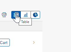
Export to Spreadsheet
On the table toolbar, apps can provide a menu button for exporting table data to a spreadsheet. For the export, use the export to spreadsheet function.

'Export to Spreadsheet' menu button
Resources
Want to dive deeper? Follow the links below to find out more about related controls, the SAPUI5 implementation, and the visual design.
Elements and Controls
- Bullet Micro Chart (guidelines)
- Button (guidelines)
- Checkbox (guidelines)
- Combo Box (guidelines)
- Comparison Micro Chart (guidelines)
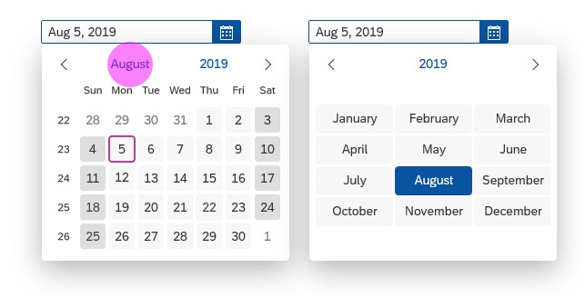
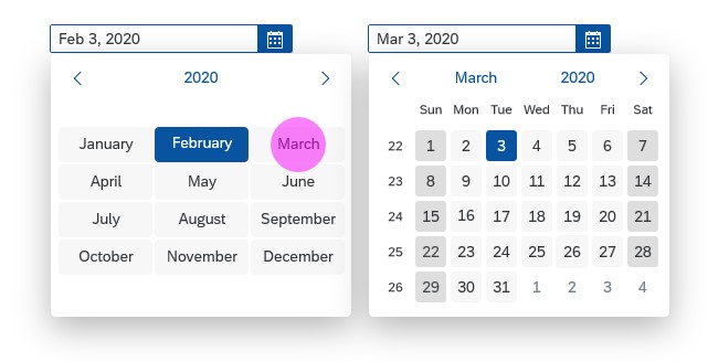
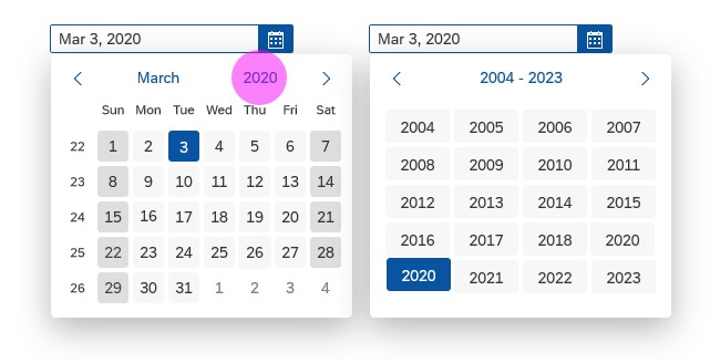
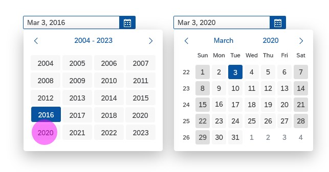
- Date Picker (guidelines)
- Filter Bar (guidelines)
- Formatting (guidelines)
- Icon (guidelines)
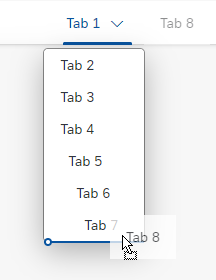
- Icon Tab Bar (guidelines)
- Input (guidelines)
- Label (guidelines)
- Link (guidelines)
- Multi-Combo Box (guidelines)
- Multi-Input Field (guidelines)
- Select (guidelines)
- Stacked Bar Micro Chart (guidelines)
- Table (guidelines)
- Text (guidelines)


 Your feedback has been sent to the SAP Fiori design team.