
Micro Process Flow
Intro
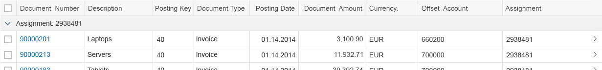
The micro process flow control enables you to visualize the state of individual items in a linear workflow, and is suitable for embedding into a list or a table.
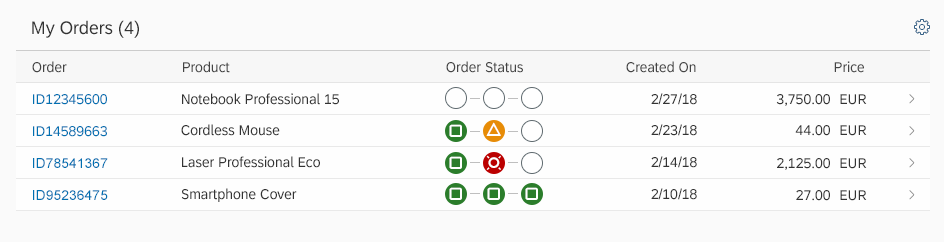
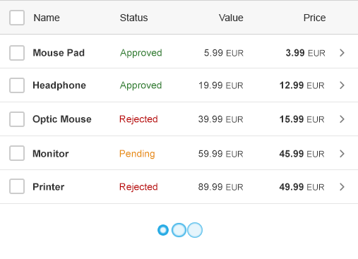
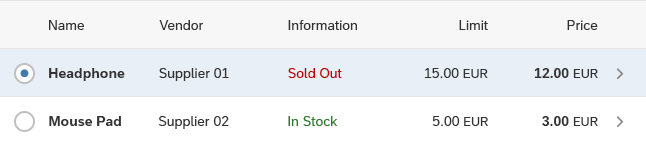
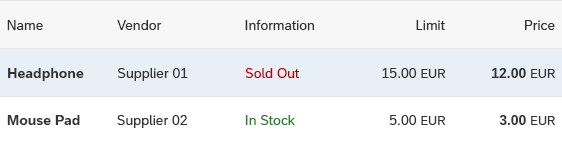
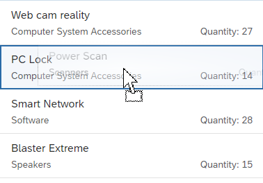
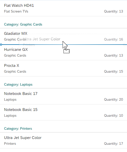
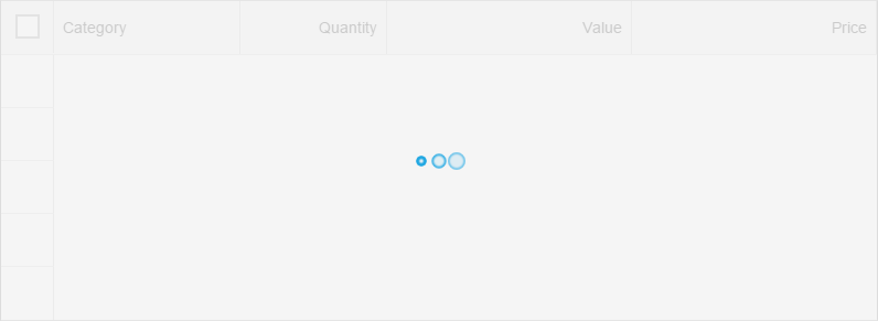
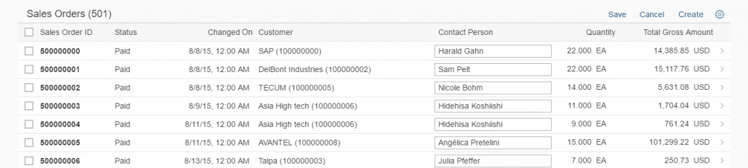
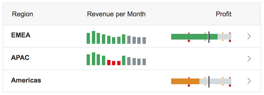
Micro process flow in a responsive table
Usage
Use the micro process flow if:
- You need to show the state of each step in a linear, multi-step process.
- Users need to see the progress of multiple items displayed in a list or table at a glance.
Do not use the micro process flow if:
- You only need to show the state of a single-step process. Use the progress indicator or object status instead.
- You want to visualize a complex non-linear workflow. Use the process flow instead.
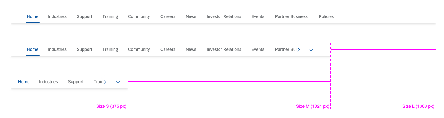
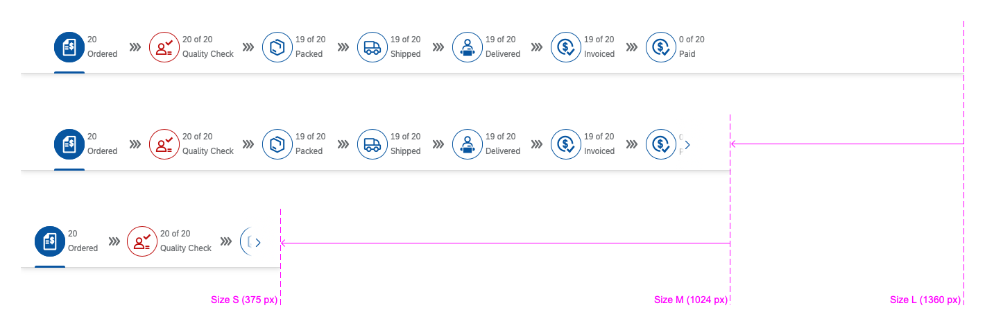
Responsiveness
The micro process flow is responsive and adapts to the size of its parent container. If the micro process flow is too long for the parent container’s width, you can choose how it should behave:
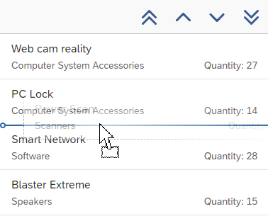
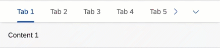
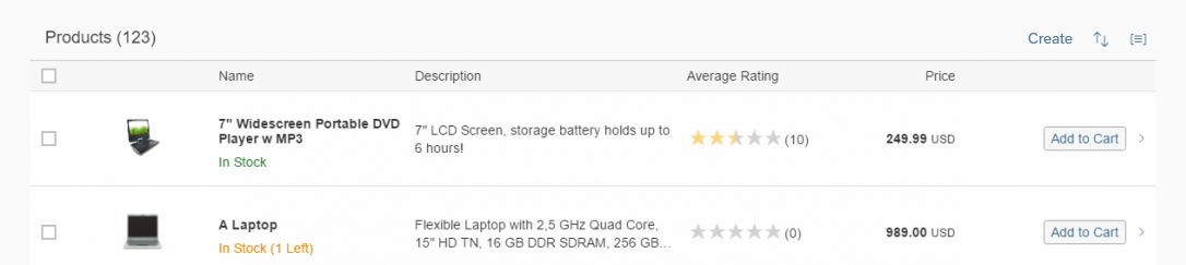
- Simple wrap: Steps that don’t fit into the width of the parent container wrap to a new line.
Simple wrap behaviour of micro process flow
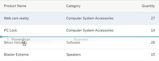
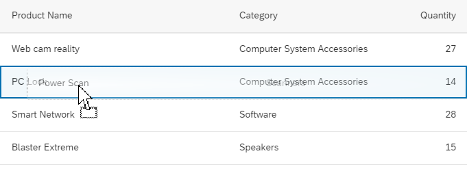
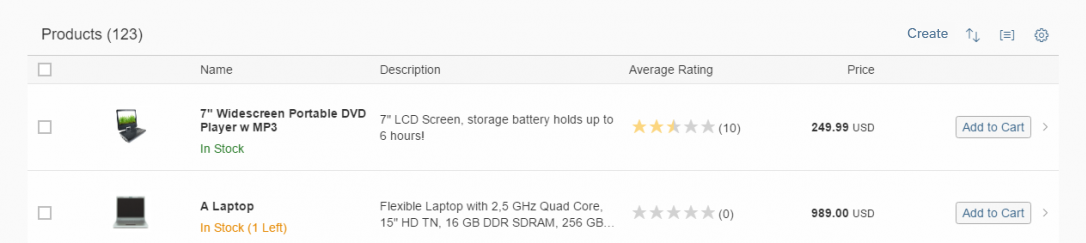
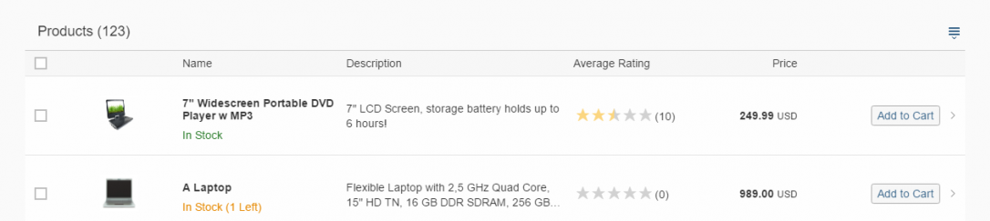
- Overflow: Navigation arrows appear on both sides of the micro process flow, with the number of hidden steps indicated next to each arrow. By clicking the navigation arrows, users can scroll horizontally through all of the steps in the micro process flow.
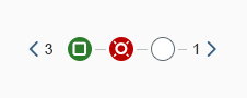
Overflow behaviour of micro process flow
The micro process flow control supports cozy and compact form factors.

Micro process flow in compact mode
Micro process flow in cozy mode
Layout
The micro process flow acts as a generic container in which process steps are laid out linearly along the horizontal axis. The control provides the following layout options:
- Default: The process steps appear as icons with a circular background, which use semantic colors and provide click events. You can choose from different icons provided by the SAP icon font.
Default layout with a circular background
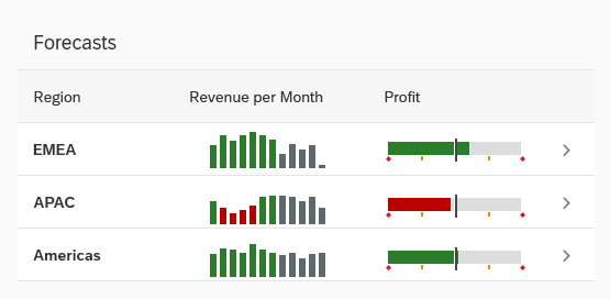
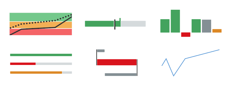
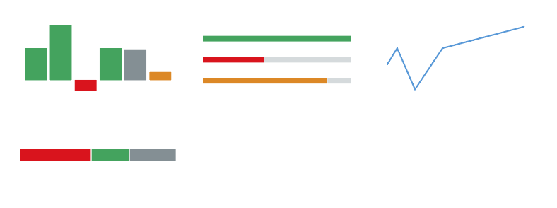
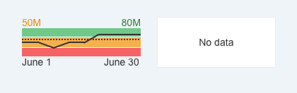
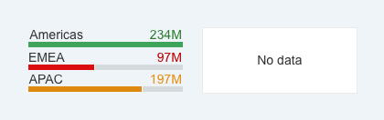
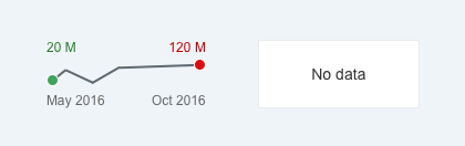
- Custom: The default steps can be replaced by other controls. The following controls are supported:

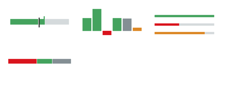
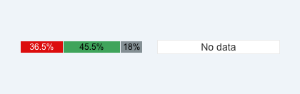
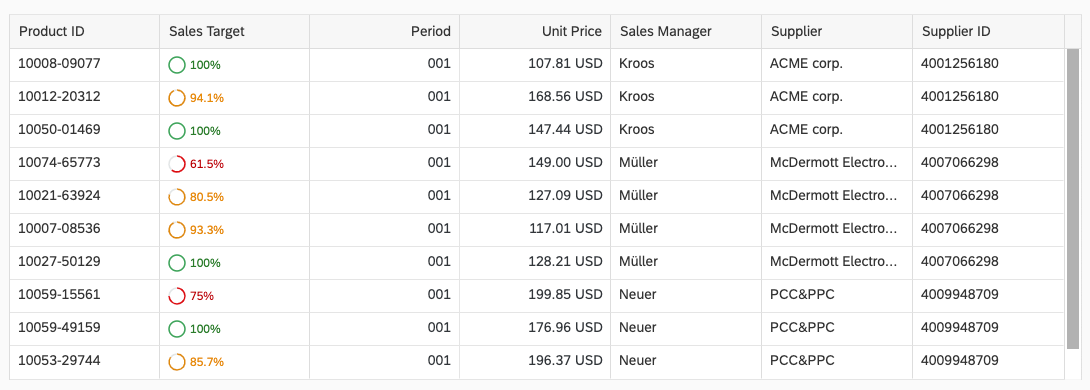
Custom layout using Status Indicator control

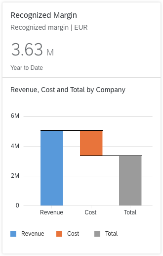
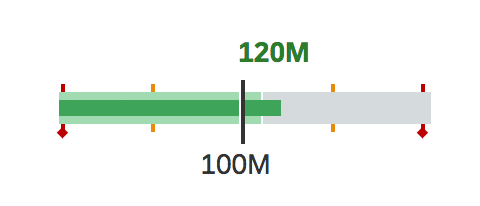
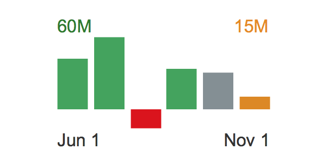
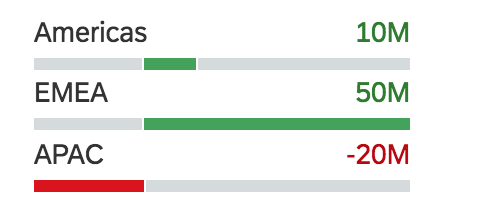
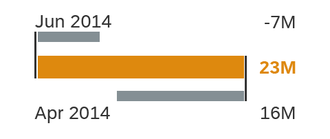
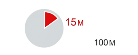
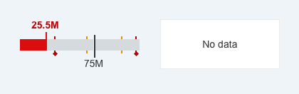
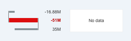
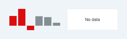
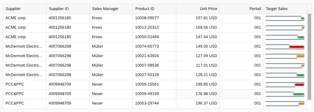
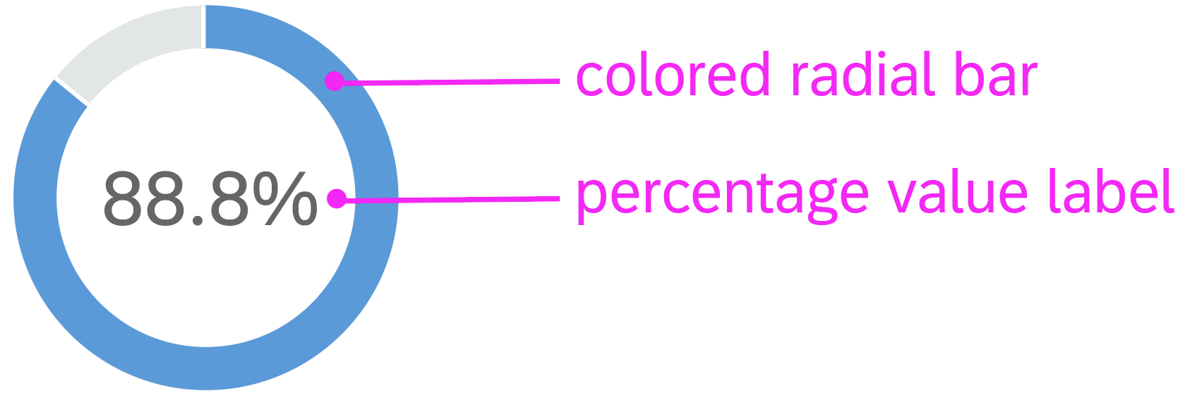
Custom layout using Micro Chart control
Types
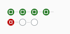
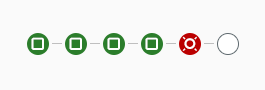
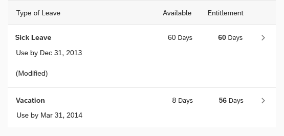
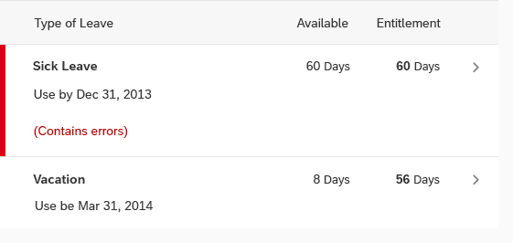
Micro process flow with dependent steps (default)
A connector line appears between the process step and the step that follows it. Use this type when the completion of a step is a precondition for the subsequent step.
Micro process flow with dependent steps
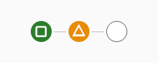
You can also indicate the state of the transition between two steps with a suitable icon.
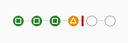
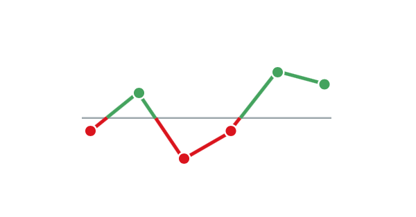
Micro process flow with transition state
Micro process flow with independent steps
Steps are not connected and can be processed in arbitrary order. Connector lines and transition states are not required.
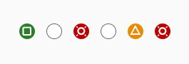
Micro process flow with independent steps
Behavior and Interaction
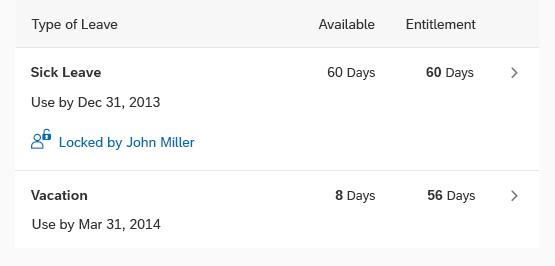
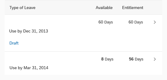
Popover
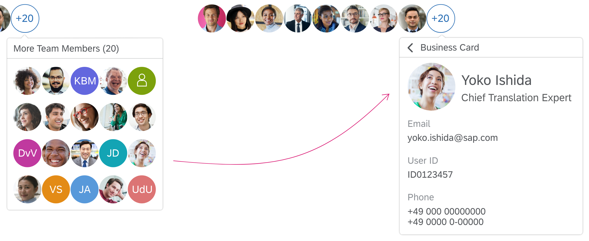
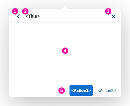
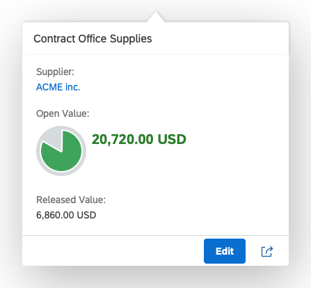
We recommend adding an on-click popover for each step to provide more details.
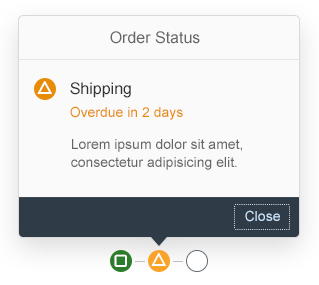
Micro process flow with on-click popover
Resources
Want to dive deeper? Follow the links below to find out more about related controls, the SAPUI5 implementation, and the visual design.
Elements and Controls
- Process Flow (guidelines)
- Popover (guidelines)
- Status Indicator (guidelines)
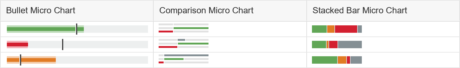
- Micro Chart (guidelines)
- Object Status (guidelines)


 Your feedback has been sent to the SAP Fiori design team.