
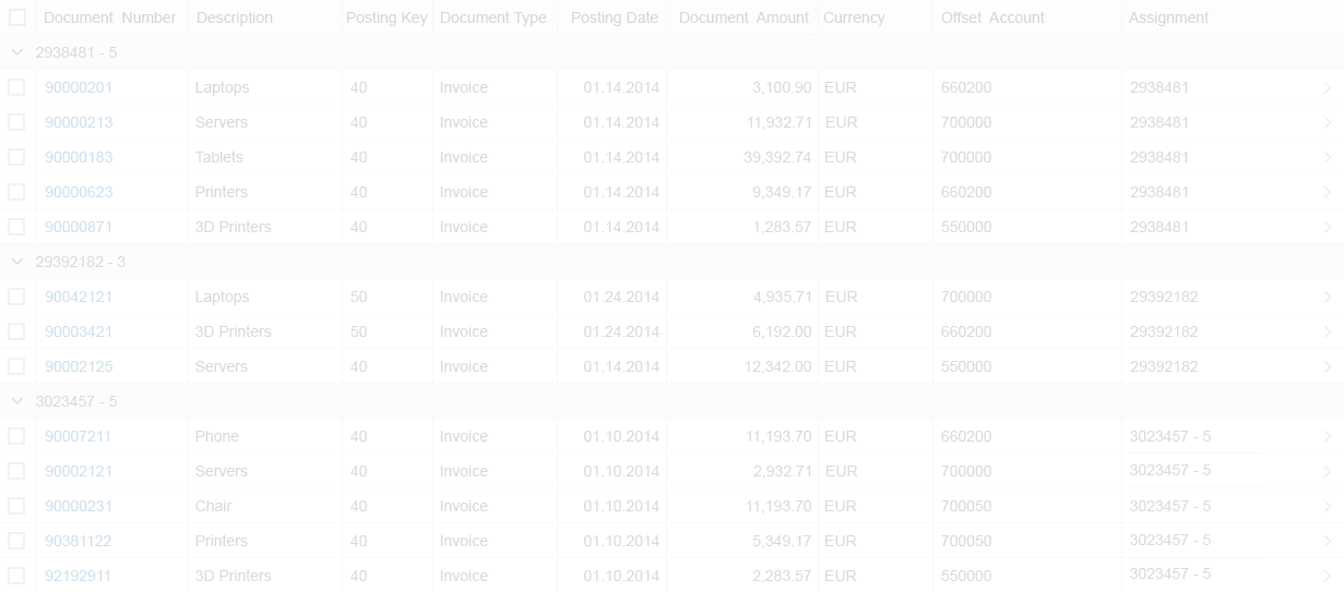
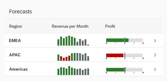
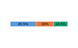
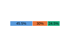
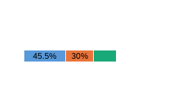
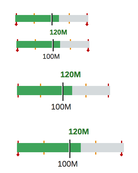
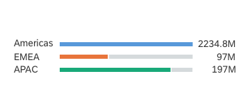
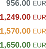
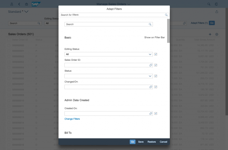
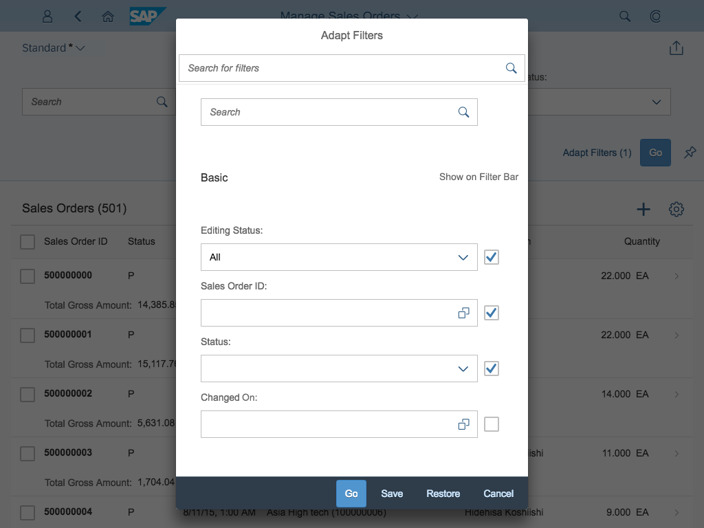
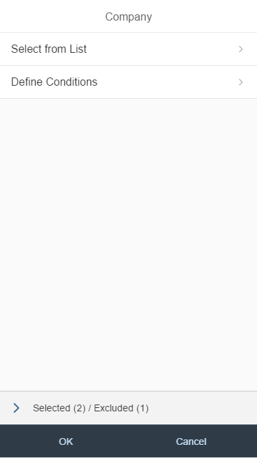
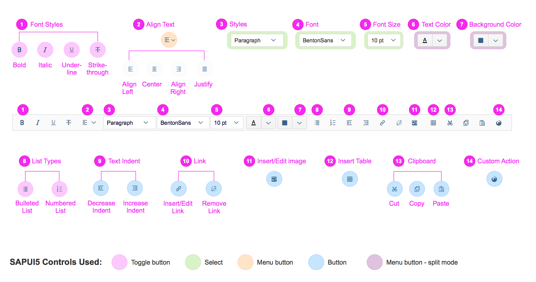
Delta Micro Chart
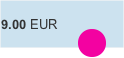
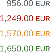
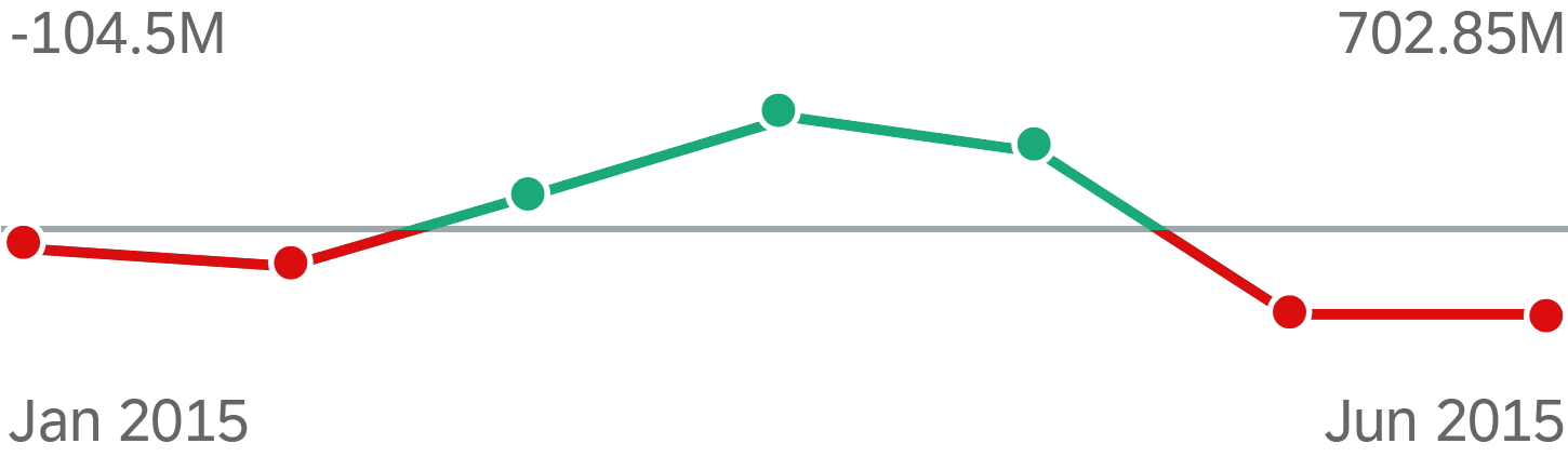
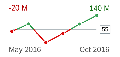
The delta micro chart helps to visualize a delta value (difference) between two main key figures. The delta can be a positive or negative value. Configured thresholds define the semantic coloring of the delta bar. The left-aligned labels can be omitted, whereas the right-aligned labels with the values are always shown.
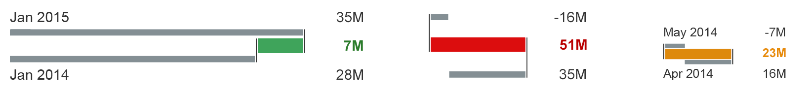
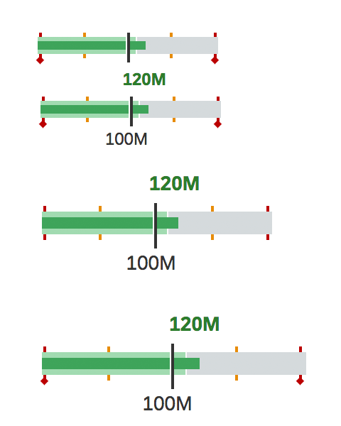
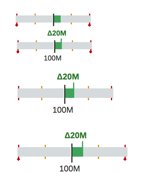
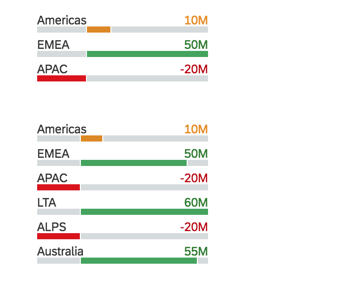
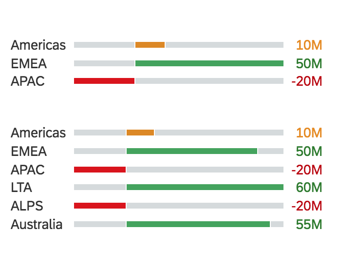
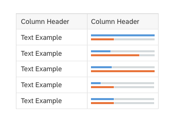
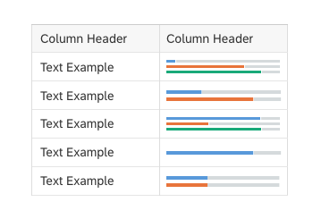
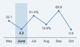
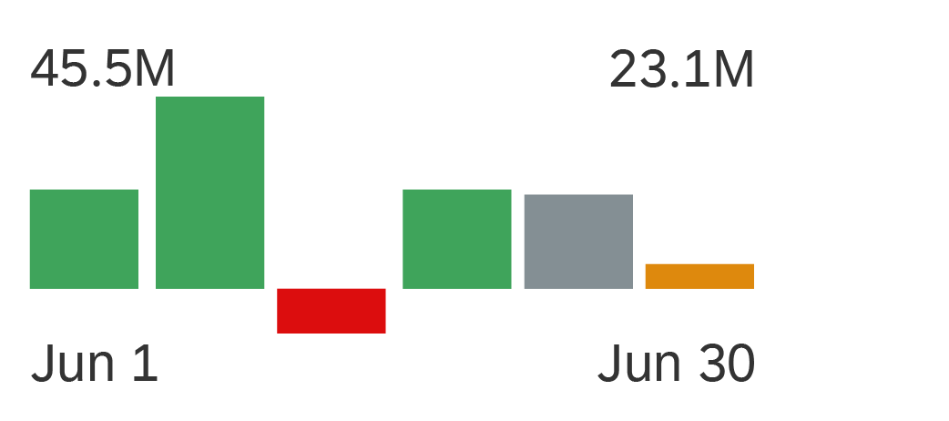
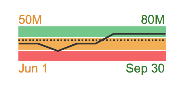
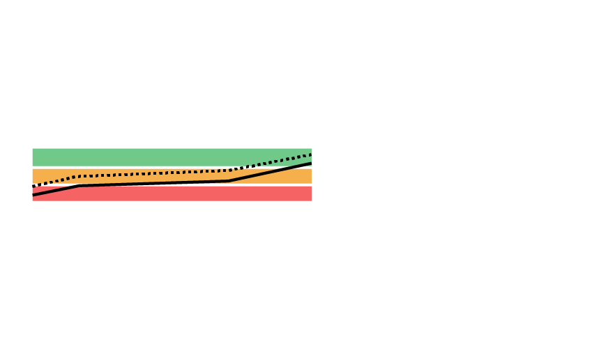
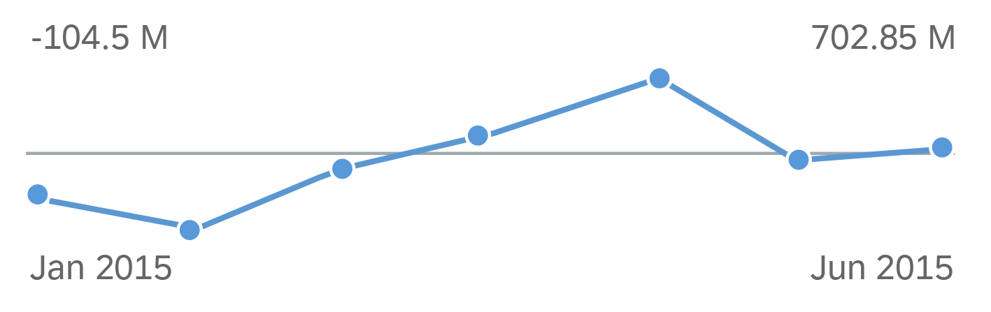
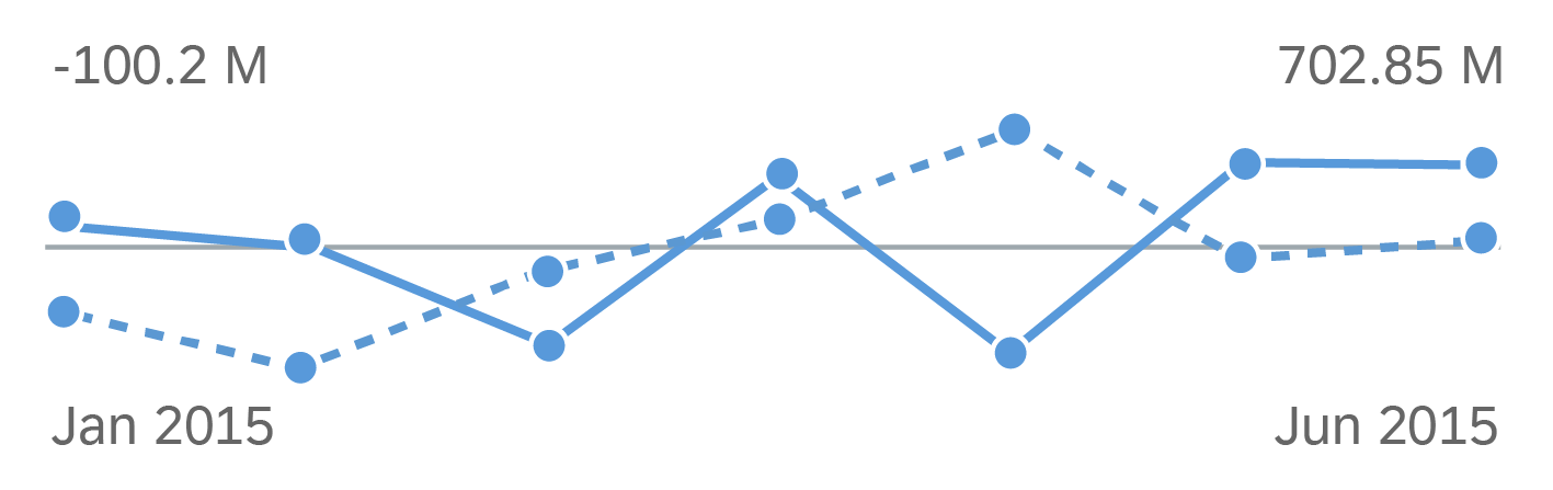
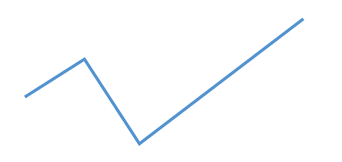
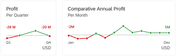
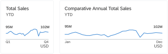
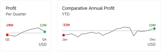
Different delta charts
Responsiveness
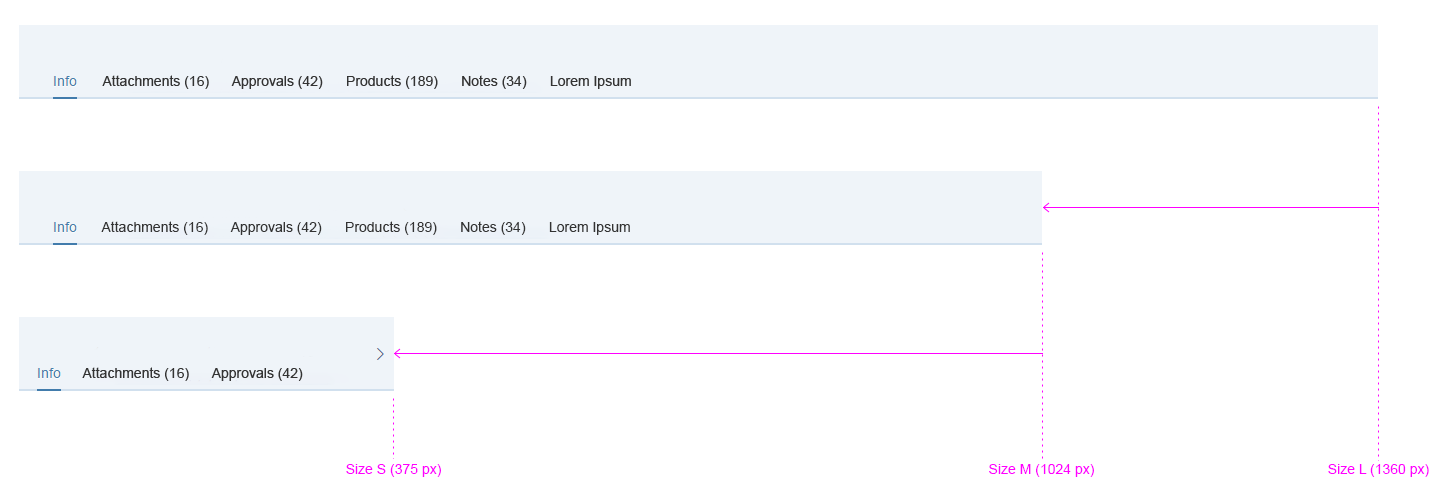
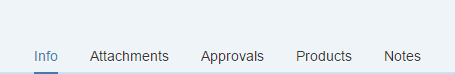
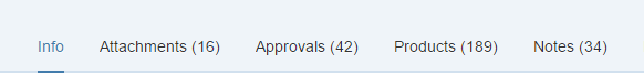
The delta micro chart is fully responsive. The size adjusts dynamically based on the dimensions of the parent container. In addition, there are four fixed sizes: L, M, S and XS. Each fixed size is a snapshot of the fully responsive micro chart for specific dimensions.
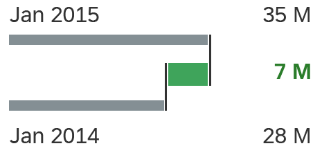
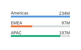
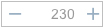
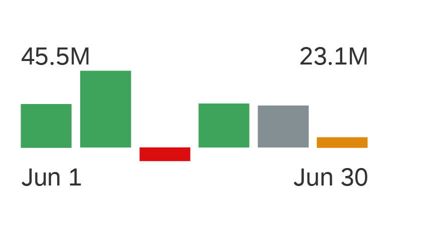
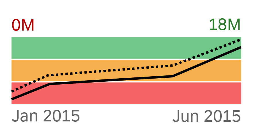
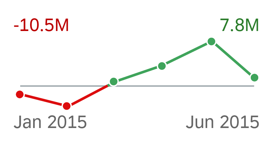
Delta micro chart - Size L
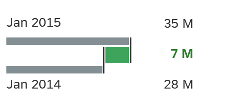
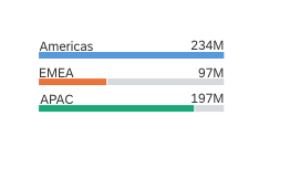
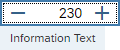
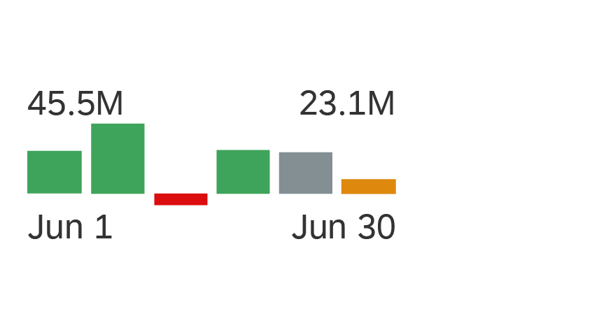
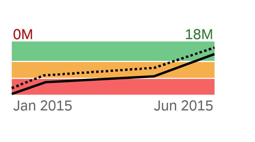
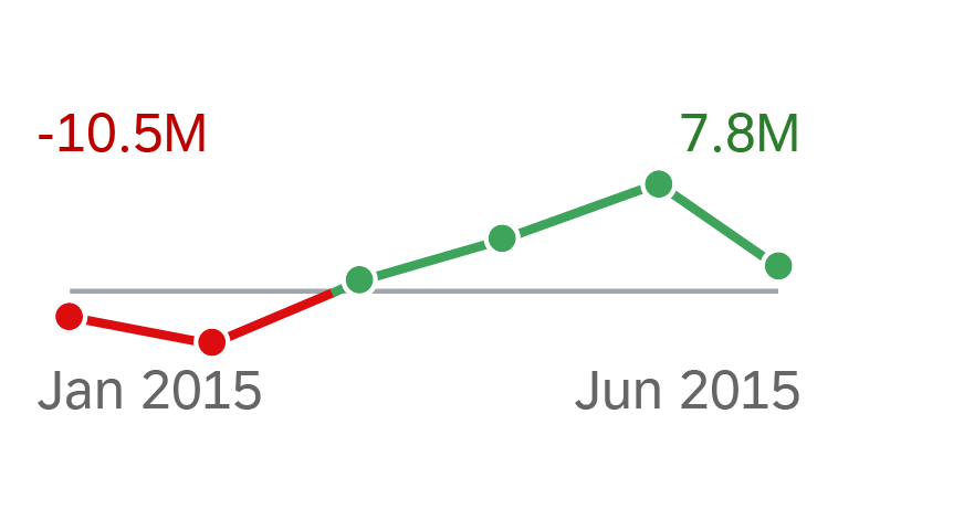
Delta micro chart - Size M
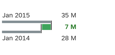
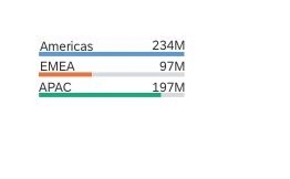
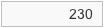
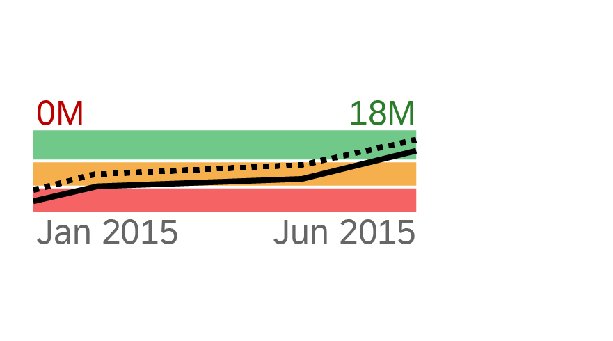
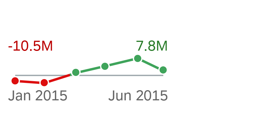
Delta micro chart - Size S

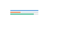
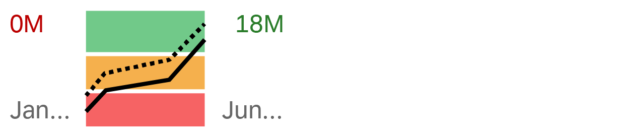
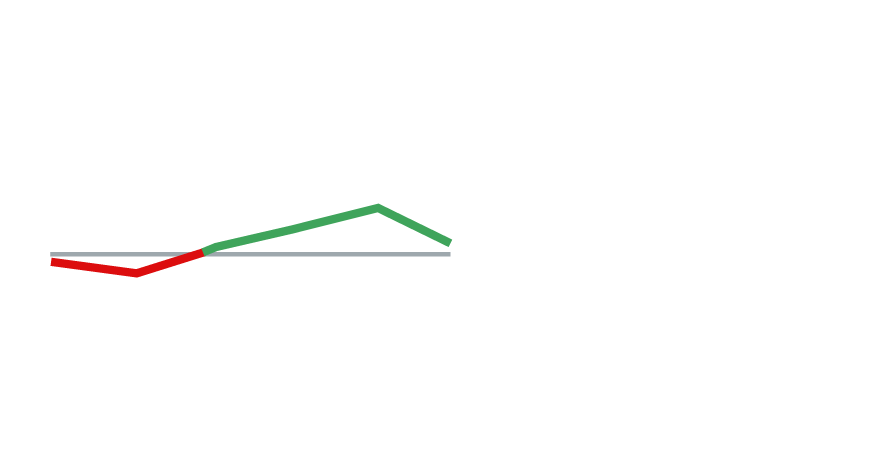
Delta micro chart - Size XS
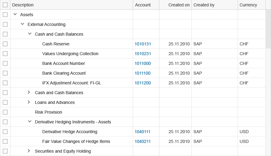
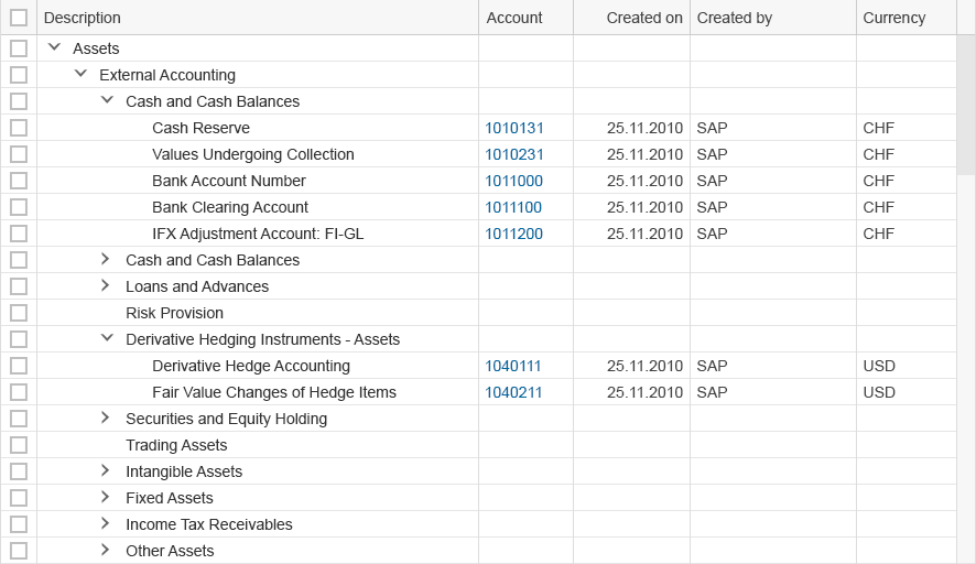
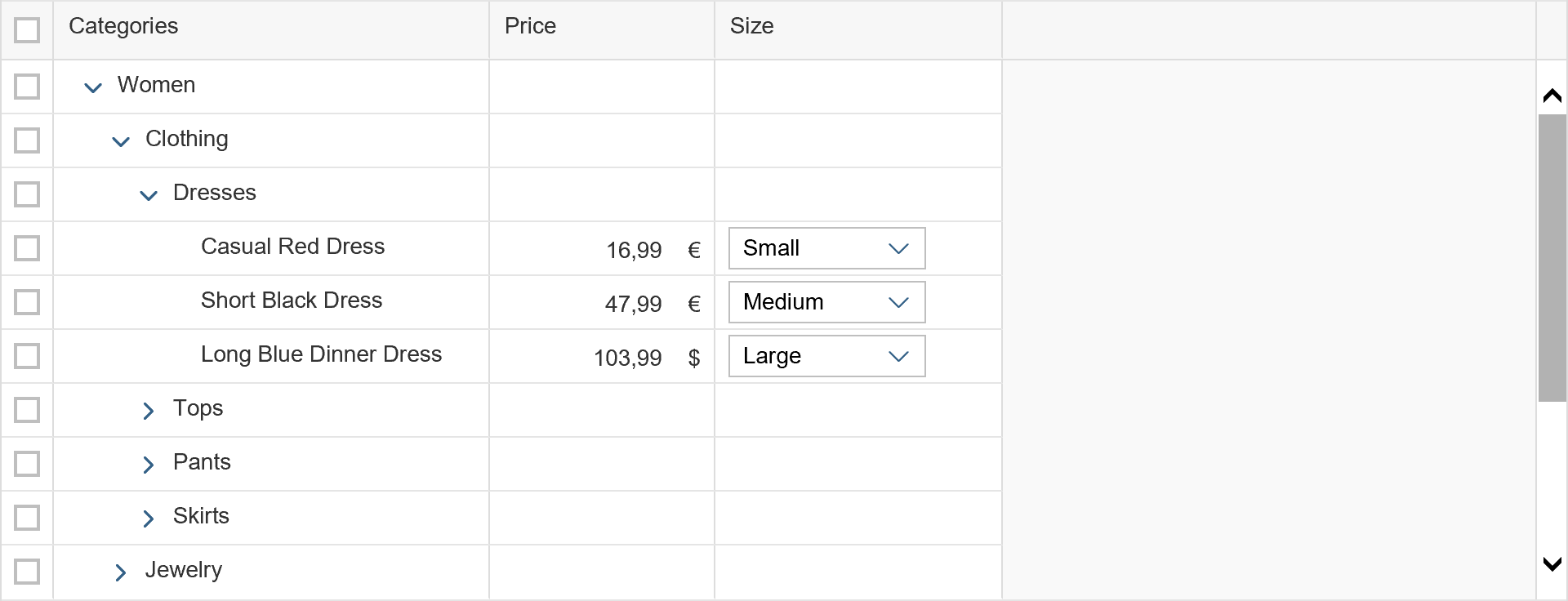
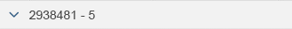
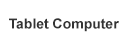
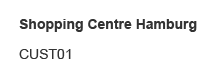
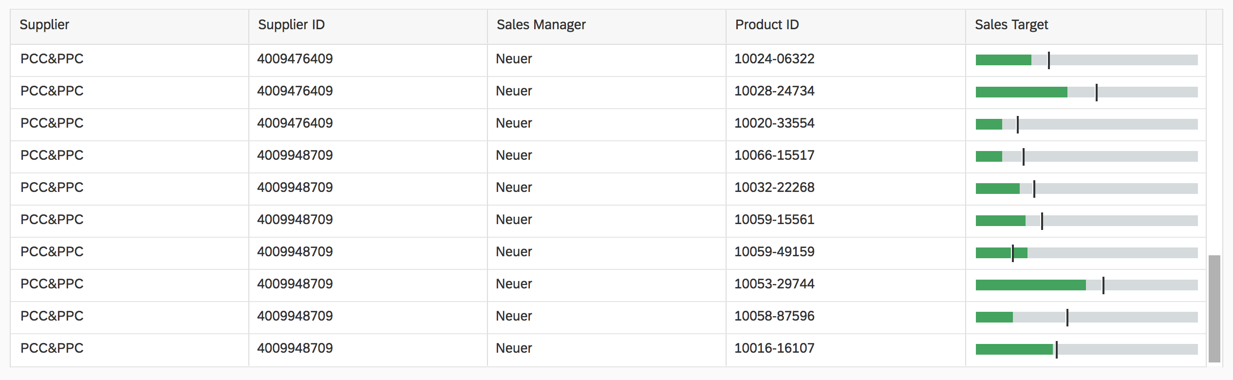
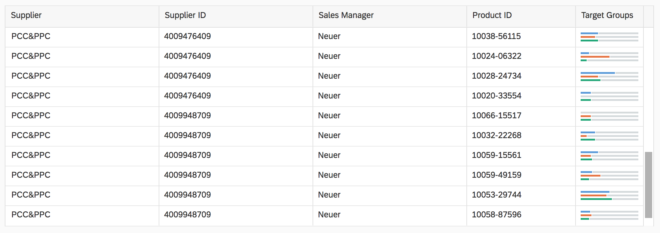
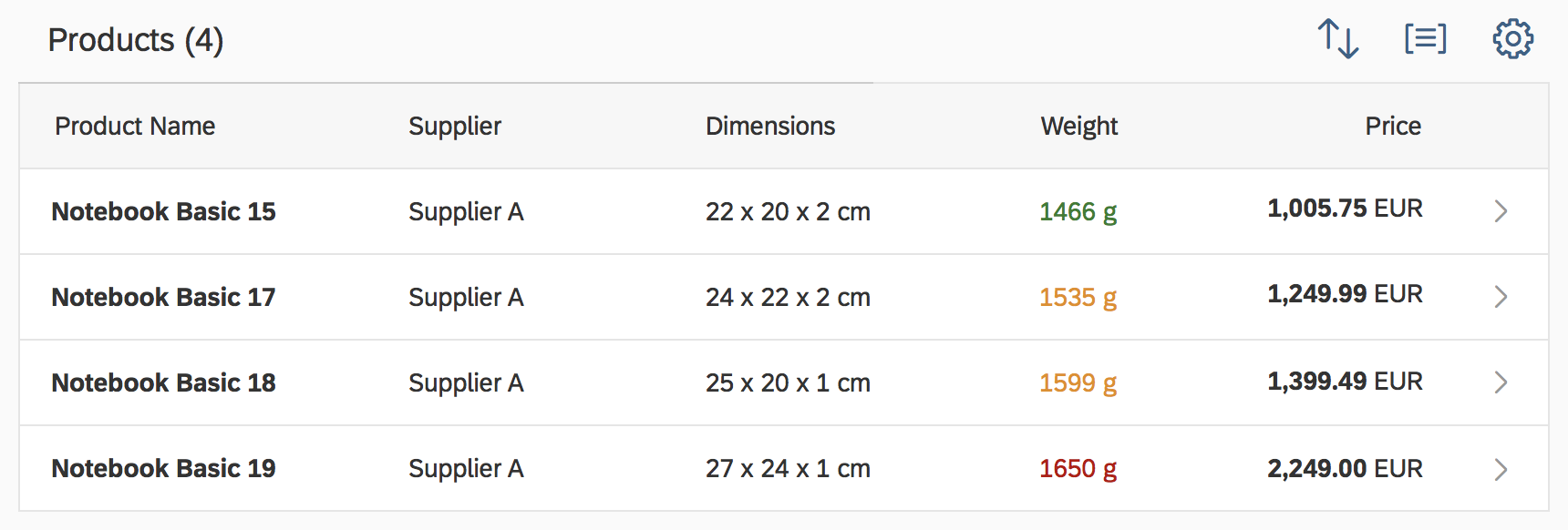
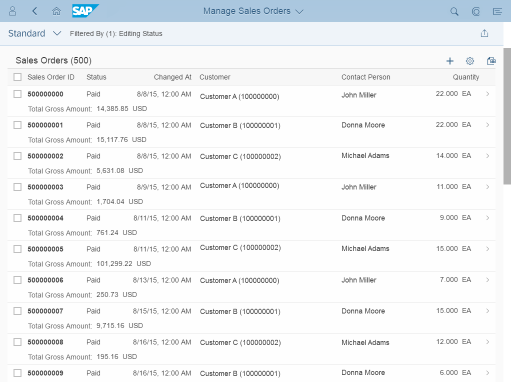
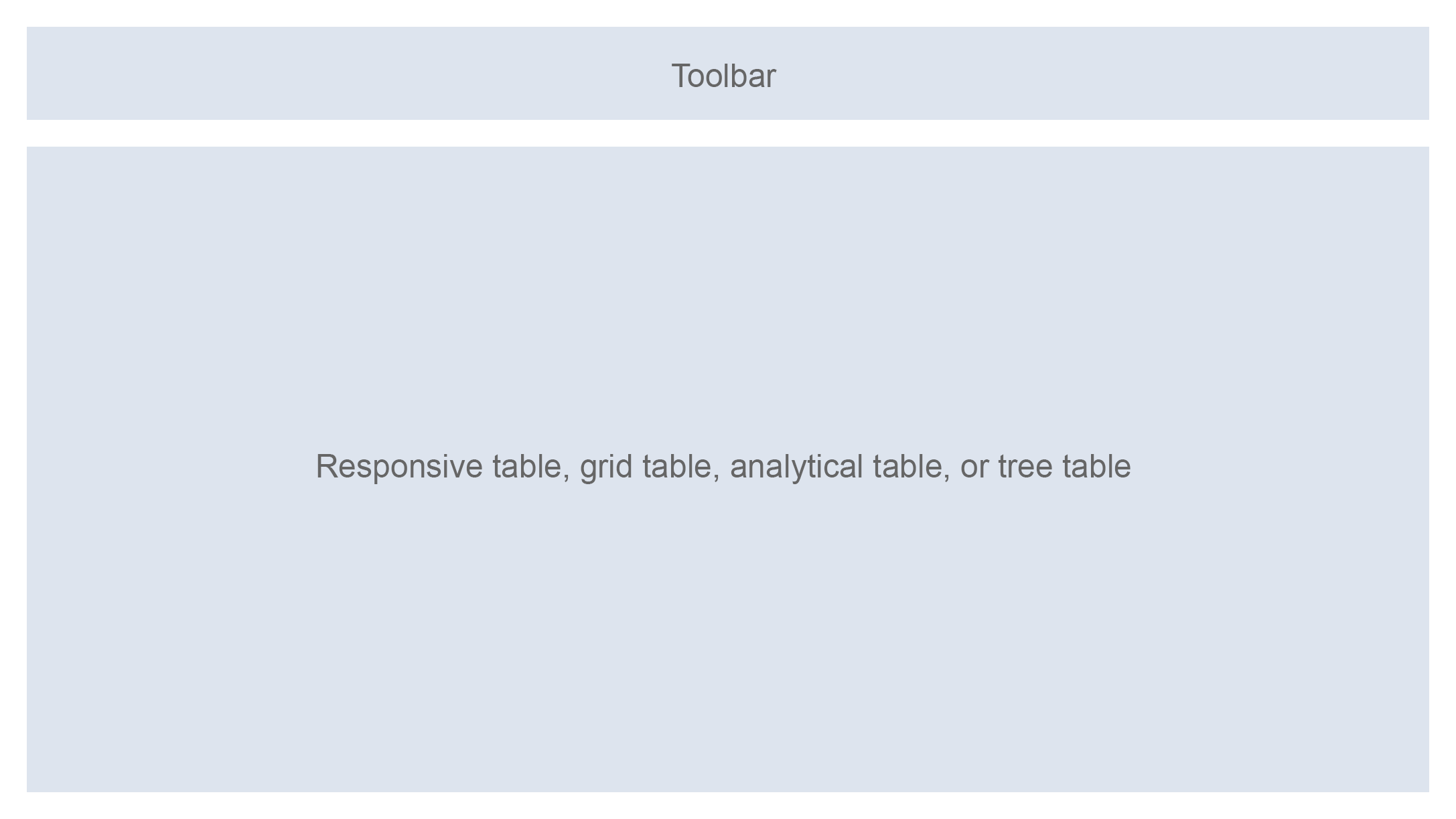
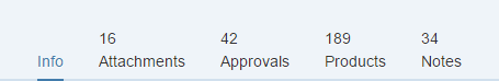
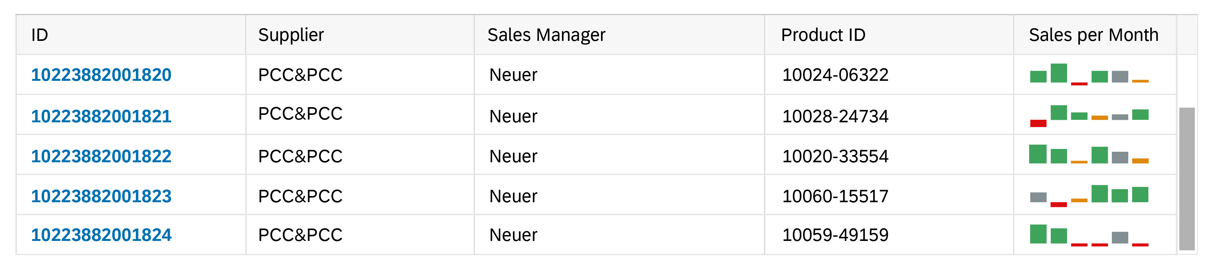
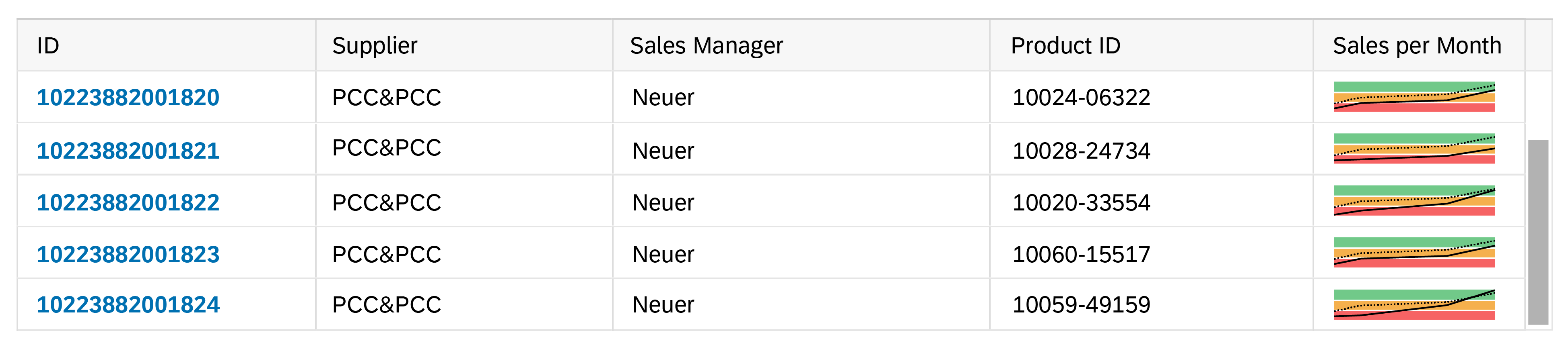
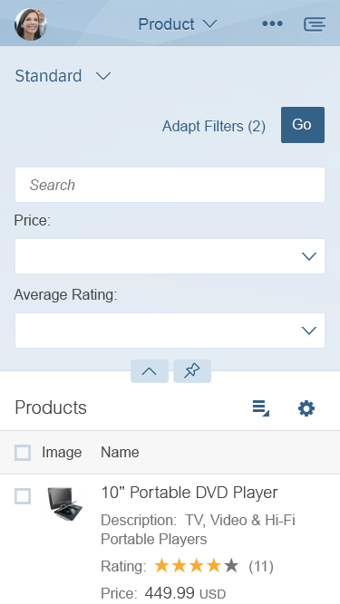
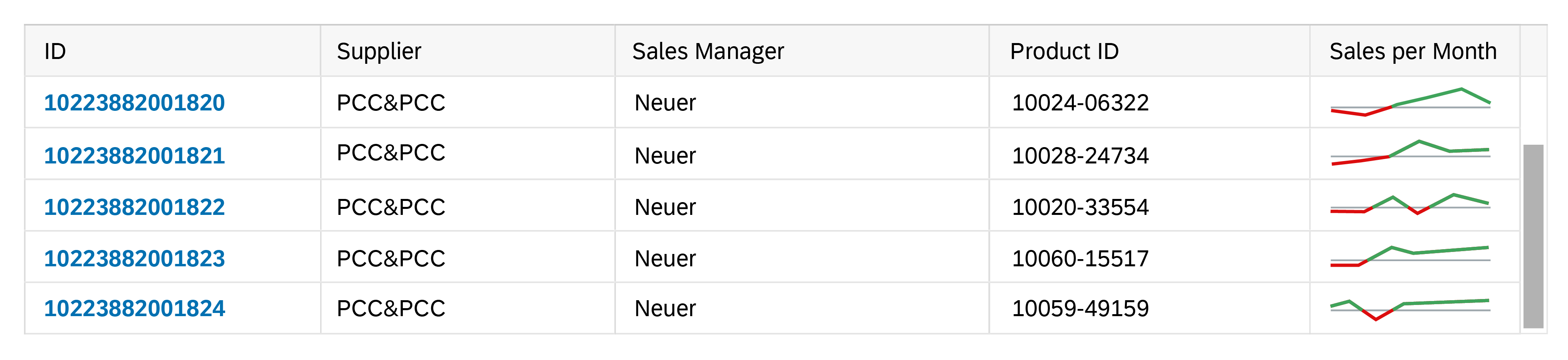
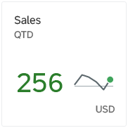
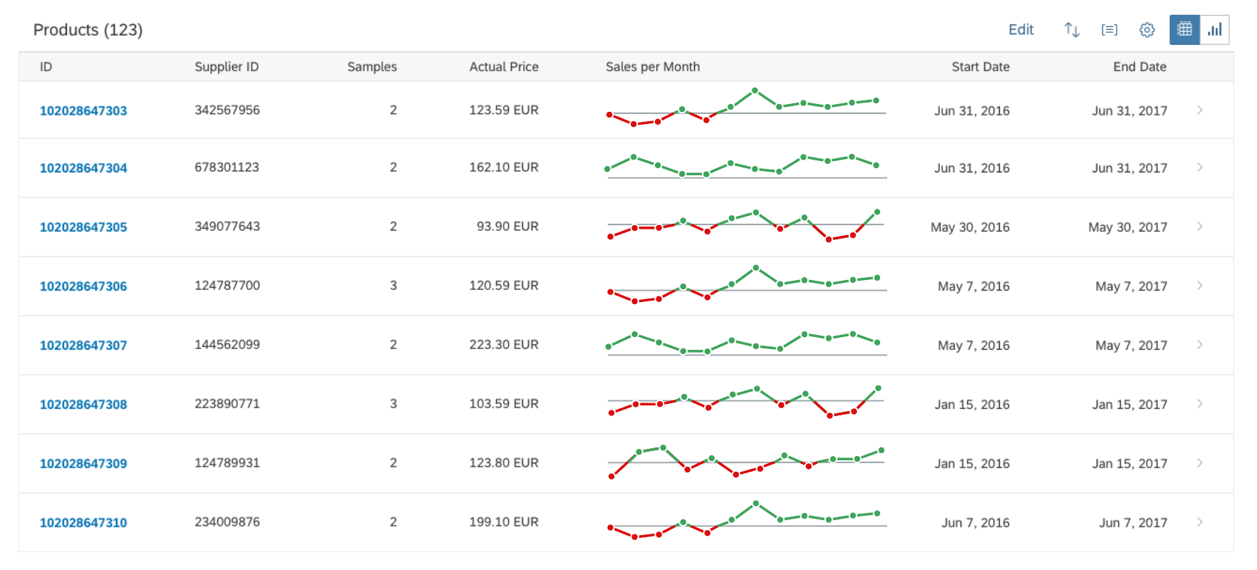
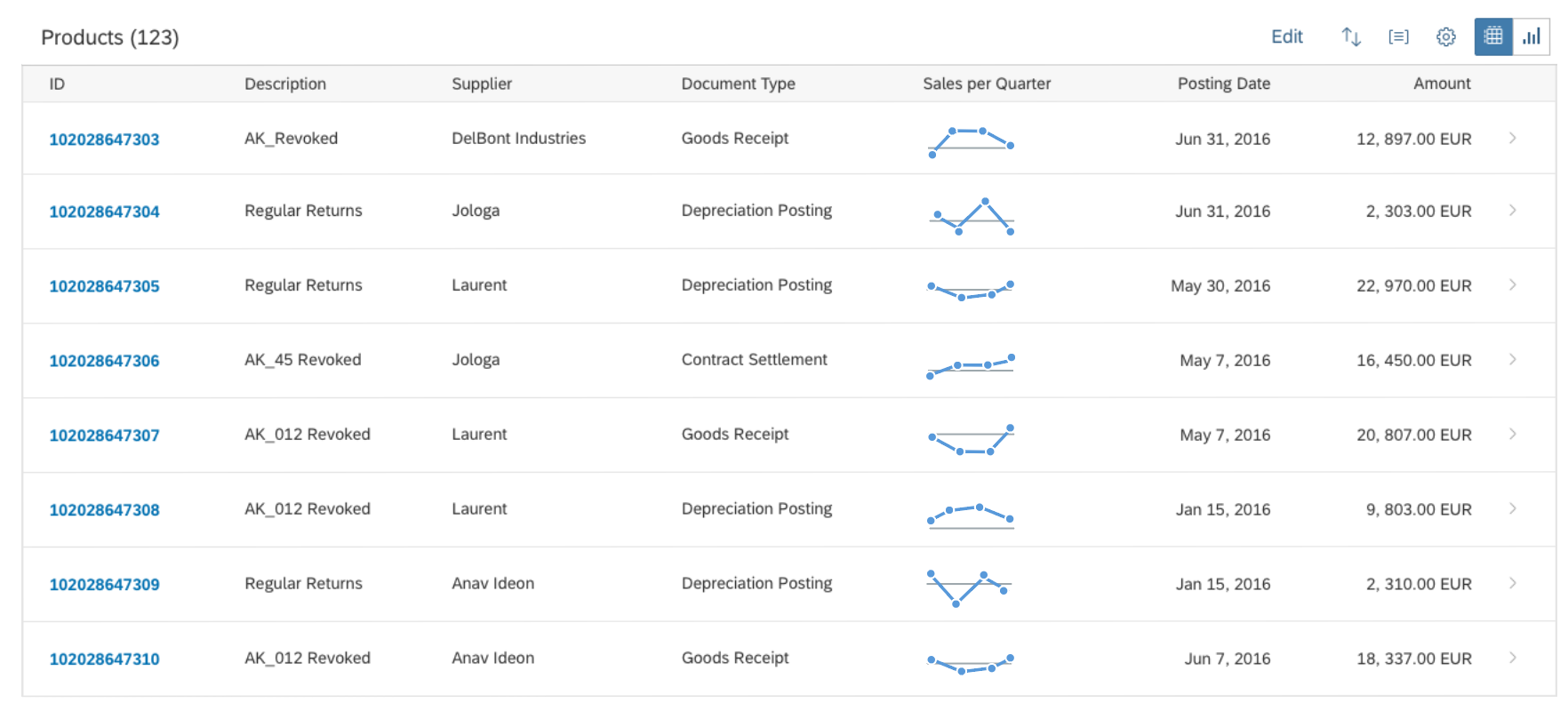
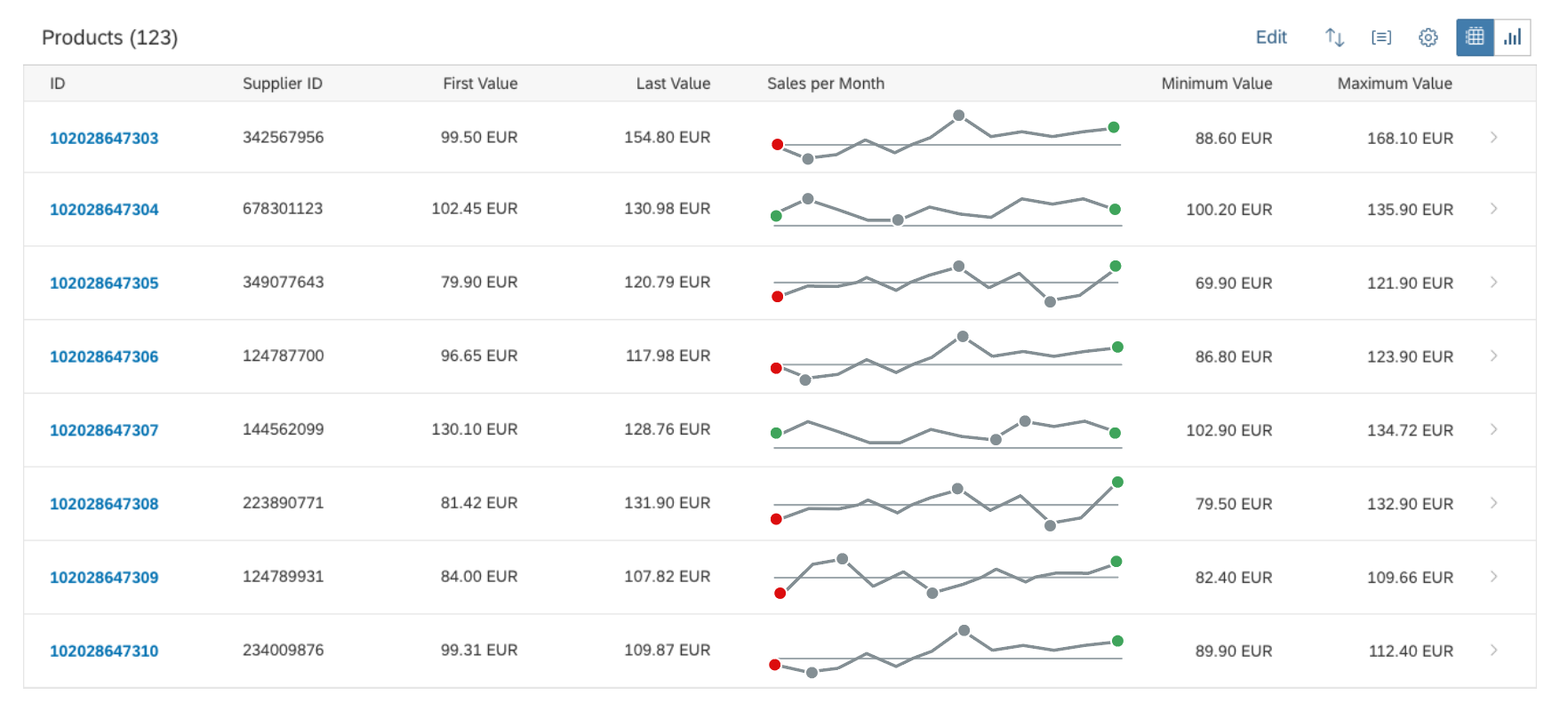
You can use size XS to embed the delta micro chart in the cells of a grid table, analytical table, or tree table (also in condensed mode). Left-align the delta micro chart in the table cell.
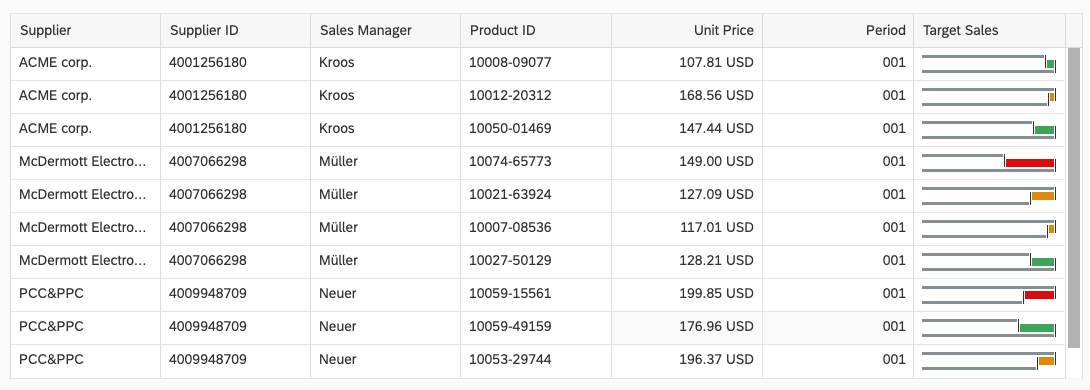
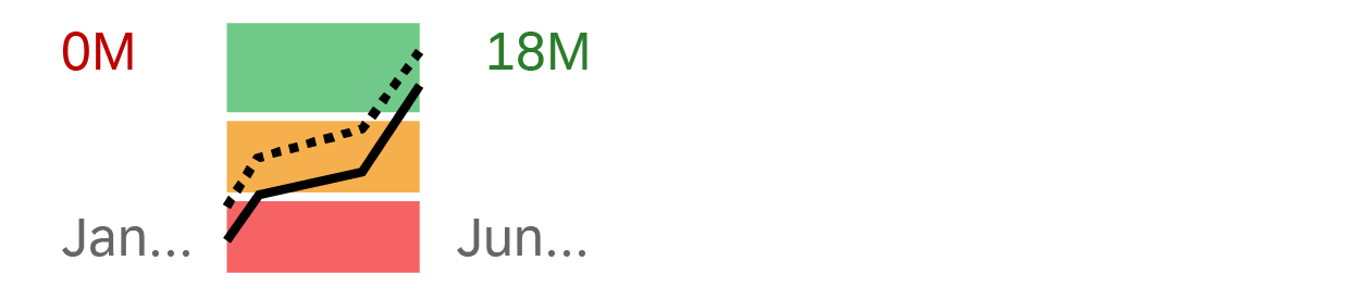
Delta micro chart in size XS in a grid table
Maximum and Minimum Sizes
The delta micro chart can have the following dimensions:
| Width | Height | |
| Maximum | 320 px | 94 px |
| Minimum | 64 px | 18 px |
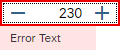
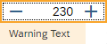
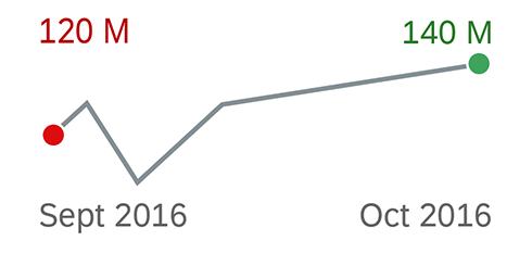
If the chart height is less than 56 px, all labels are hidden but the delta value is still visible.
With the minimum chart height, the labels are not shown.
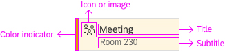
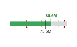
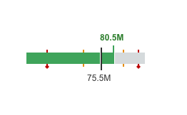
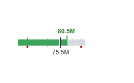
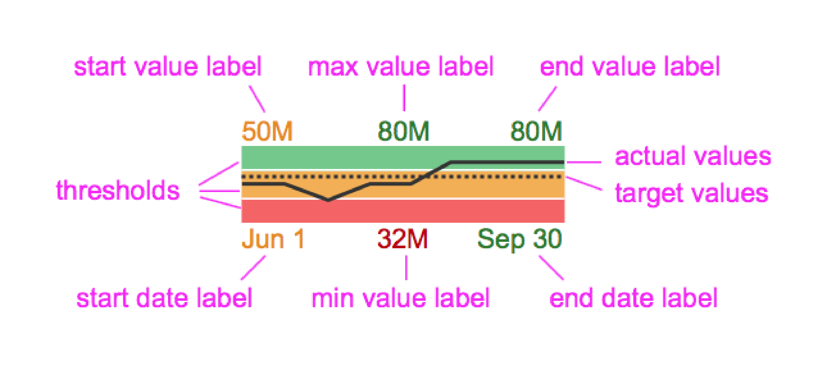
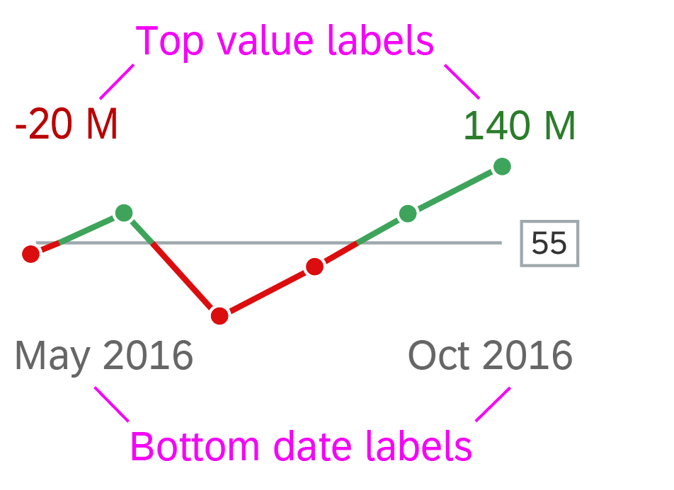
Components
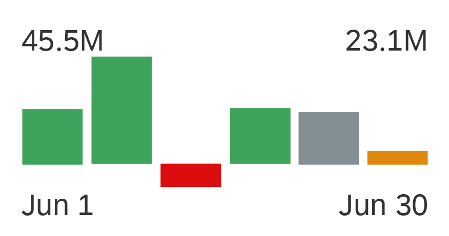
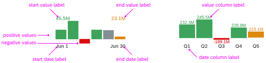
Labels
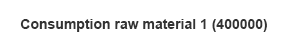
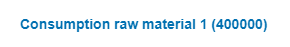
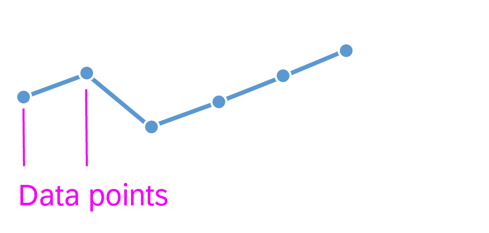
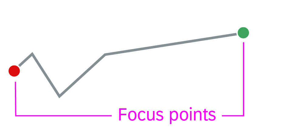
The delta micro chart has two main labels, which refer to two data points:
- The main key value labels indicate the actual data points that are used to calculate the delta.
- The delta value is the difference between these two data points and is displayed in a semantic color.
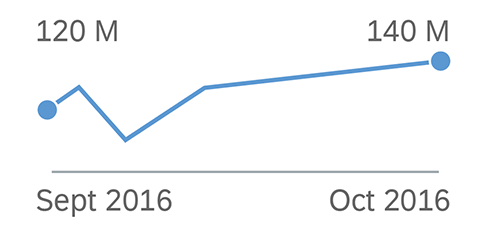
In the wide mode, the labels are placed before and after the chart. If the width is not sufficient to show all labels, the values are hidden first, followed by the date labels.
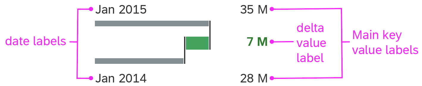
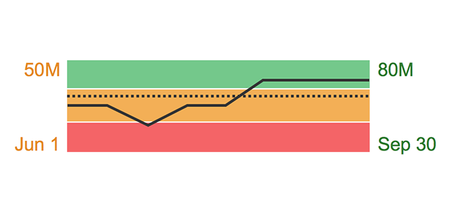
Delta micro chart - components
Resources
Want to dive deeper? Follow the links below to find out more about related controls, the SAPUI5 implementation, and the visual design.
Elements and Controls
- Micro Chart (guidelines)
- Chart – Color Palettes (guidelines)
- Choosing the Correct Chart Type (guidelines)


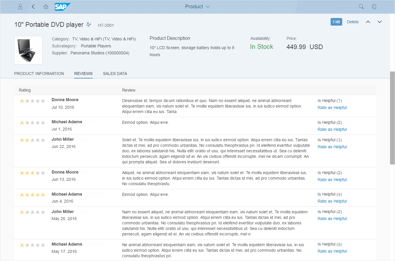
 Your feedback has been sent to the SAP Fiori design team.