
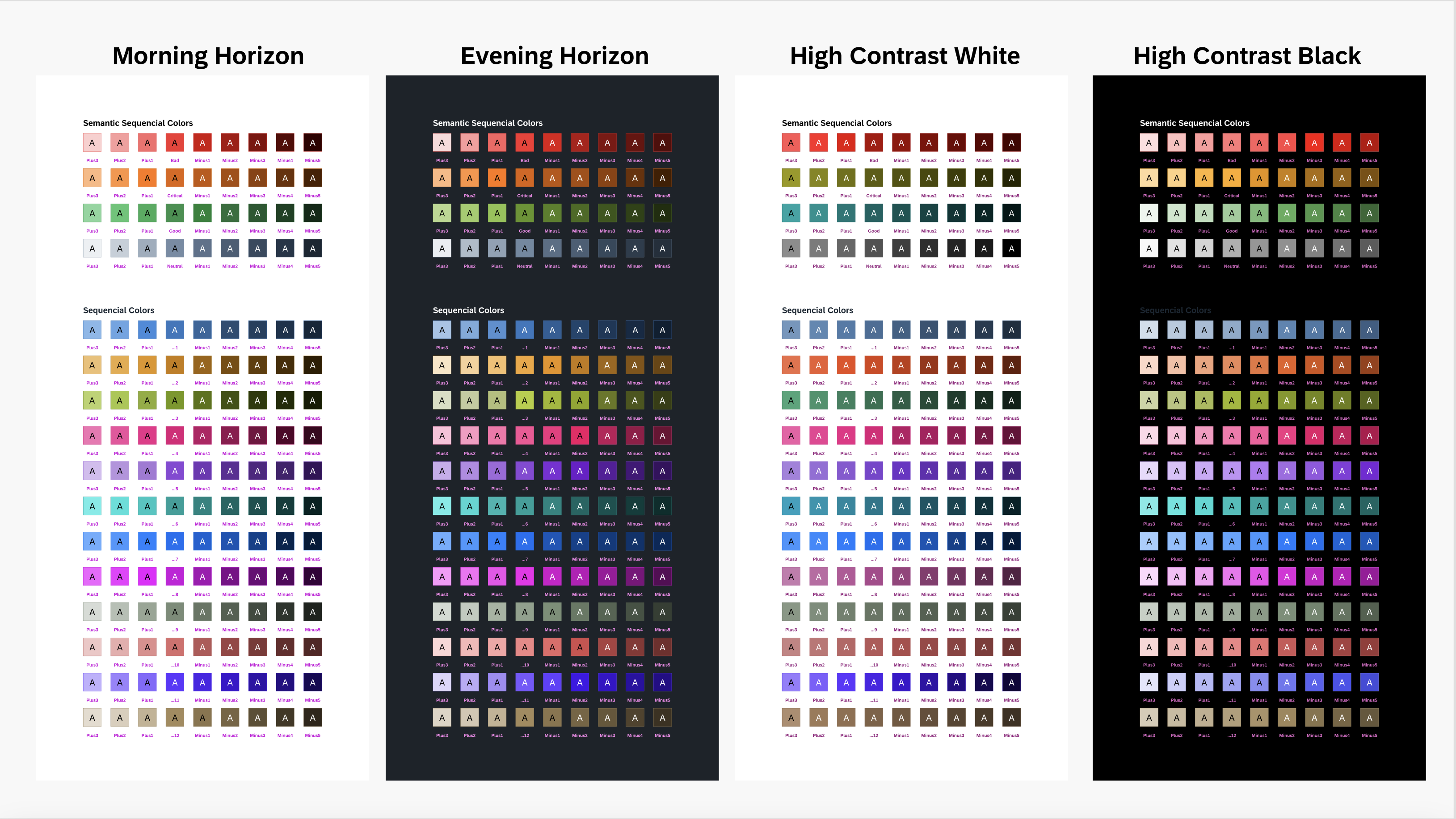
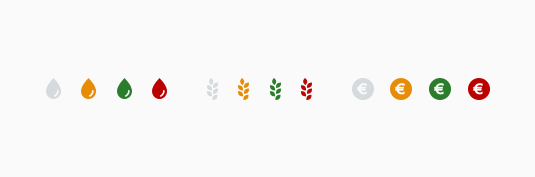
Chart Color Palettes
SAP Fiori uses qualitative, sequential, and semantic color palettes for chart visualization.
This article explains what the three color palettes are designed to do and how you can leverage their unique properties.
Palette Overview
For color names and HEX values, see Chart Color Palettes – Values and Names.
Qualitative Color Palette
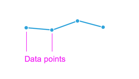
Designed to provide visual differentiation between data points using a specific order of colors.

Qualitative colors
Sequential Color Palette
There are 12 colors with 9 tints and shades for each, which are designed to visualize high to low values.
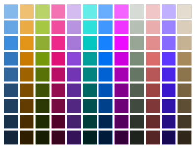
Sequential chart colors
Semantic Color Palette
Designed to communicate good (positive), bad (negative), critical and neutral values. The naming of the semantic values is generic and application teams determine the contextual usage of semantics within the charts.
Semantic colors
Rules
- Only use colors contained in the SAP chart palettes.
To ensure that we maintain visual design consistency across all charts used in all SAP applications, you should only use colors from the SAP color palettes. - Only use one palette per chart.
Don’t combine colors from different palettes in the same chart. Each palette has been carefully designed to serve a distinct purpose. - Ensure chart color token names are referenced in the code – not HEX values!
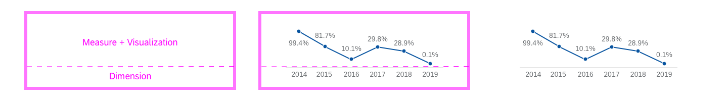
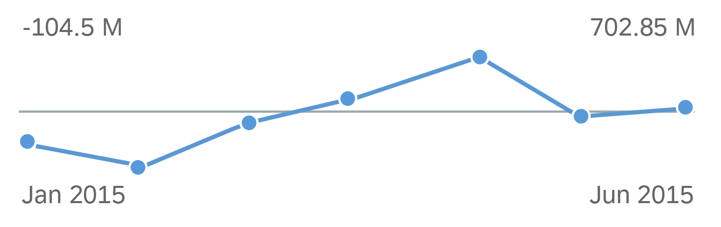
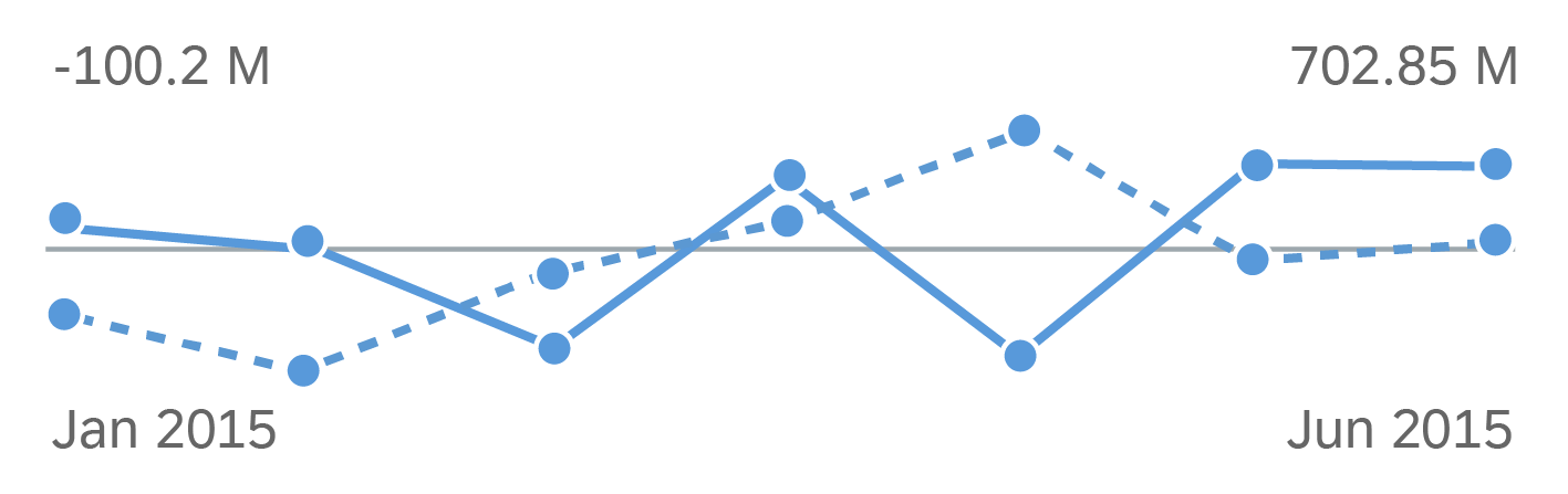
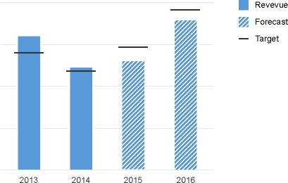
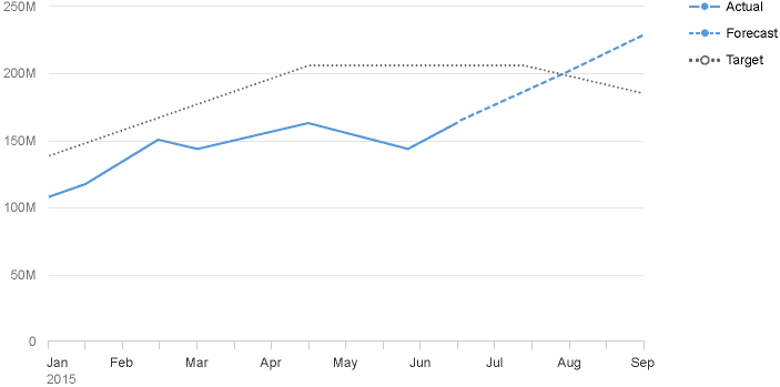
To support consistent color implementation across SAP UI technologies, as well as our theming capabilities, colors are defined by token names. This means that the HEX values of the colors may not be exactly the same in past, present, and future SAP visual design themes. This flexibility is made possible by the fact that the color token names will stay the same across all past, present and future SAP themes. You can get the color names and corresponding HEX values from the article on color palette values and names. - Don’t use color to distinguish between forecast, actual, and target values.
Use semantic patterns instead.
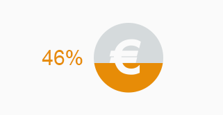
Default Colors
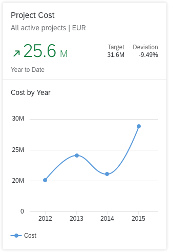
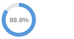
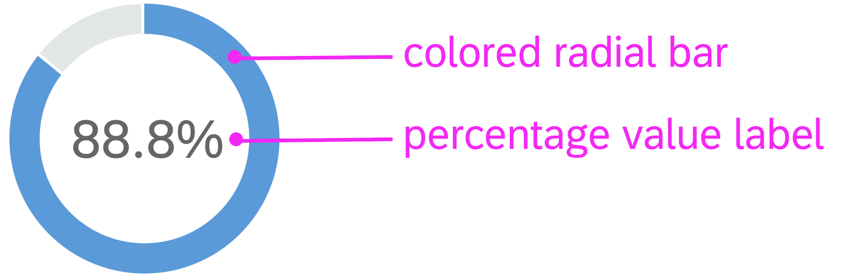
By default, every chart type comes with built-in colors that are applied automatically, based on your dataset. Here are three examples:
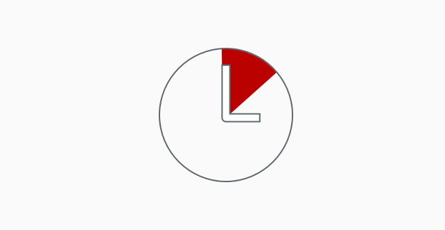
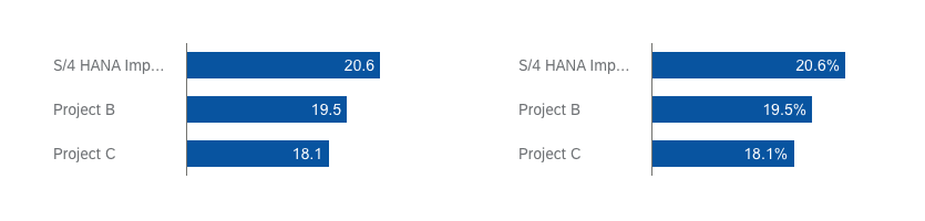
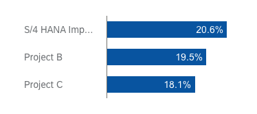
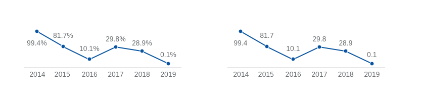
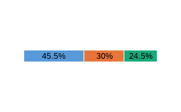
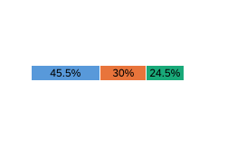
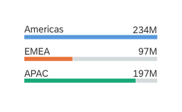
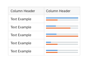
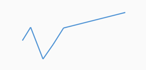
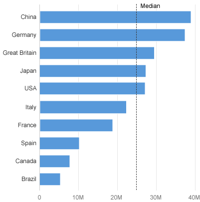
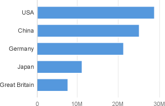
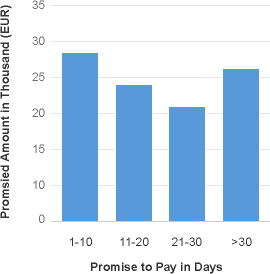
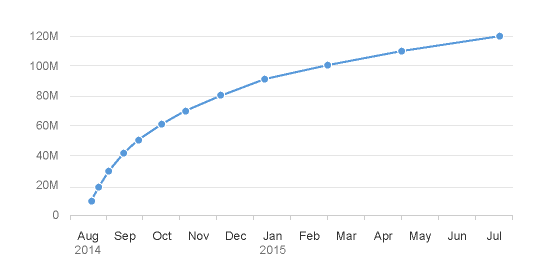
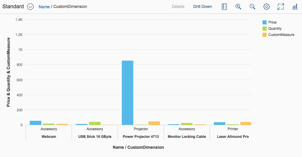
1. When only one series is displayed, the first color from the qualitative palette is automatically applied to each item.
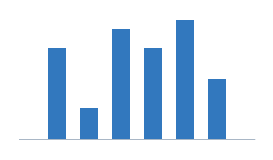
Column chart: One series
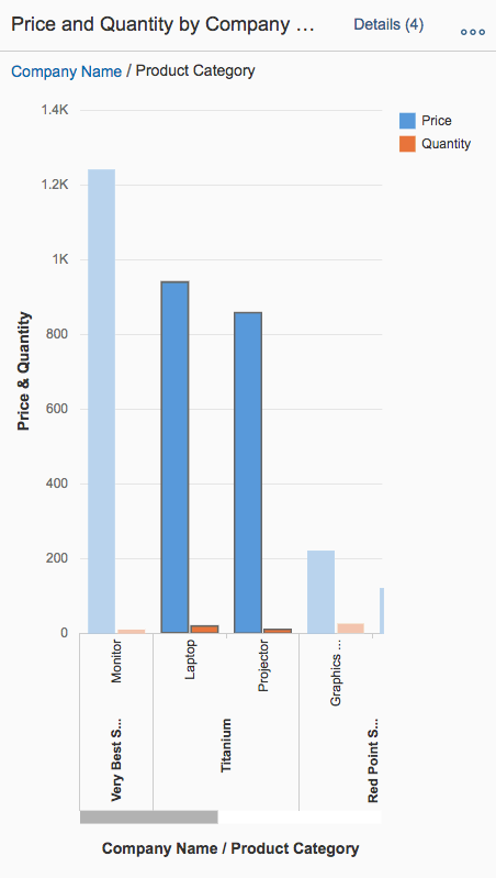
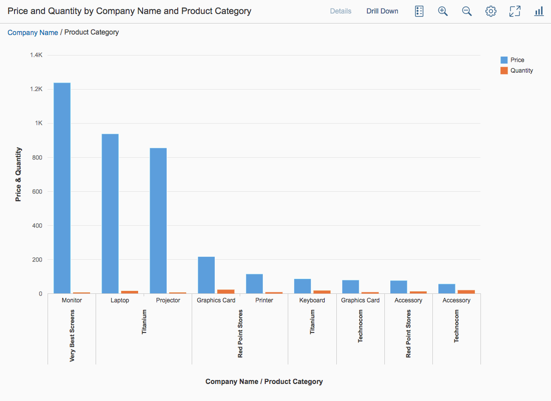
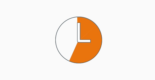
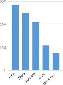
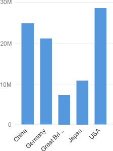
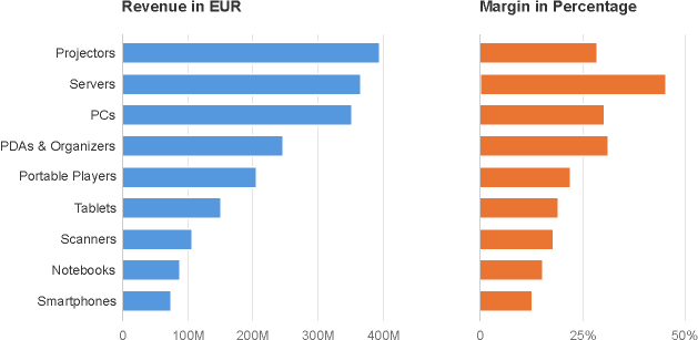
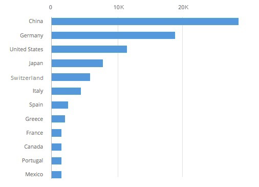
2. When multiple series are displayed, more colors from the qualitative palette are automatically applied to each item in the predetermined sequence.
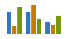
Column chart: Three series
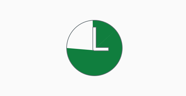
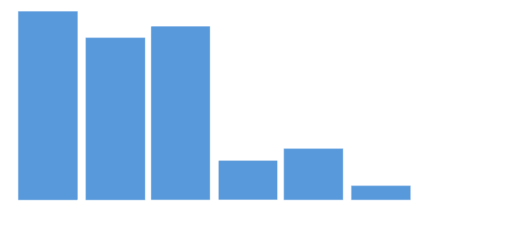
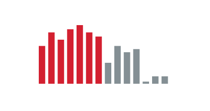
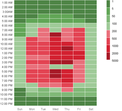
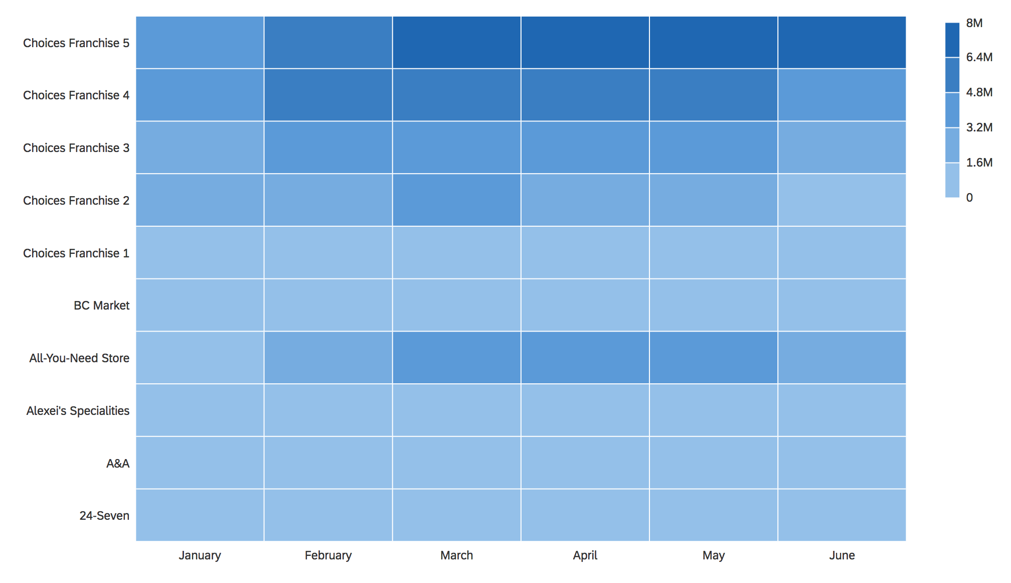
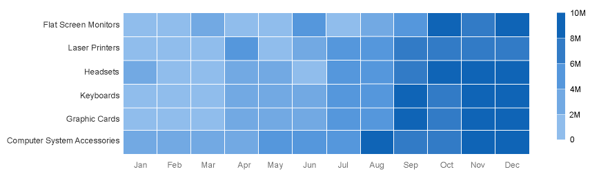
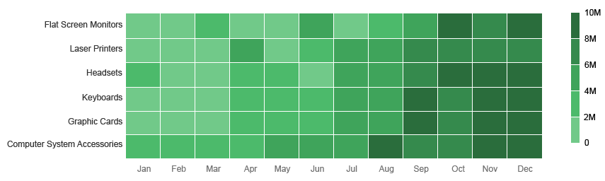
3. Colors from the sequential palette are automatically applied to the heatmap.

Default colors in a heatmap
Changing the Colors
There are three ways to change the colors in charts:
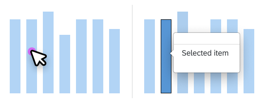
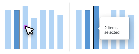
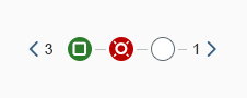
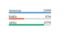
By Category Item
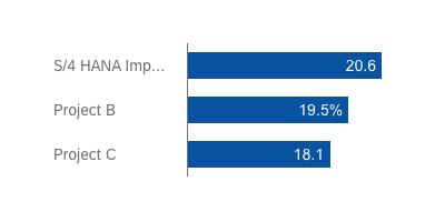
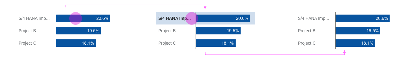
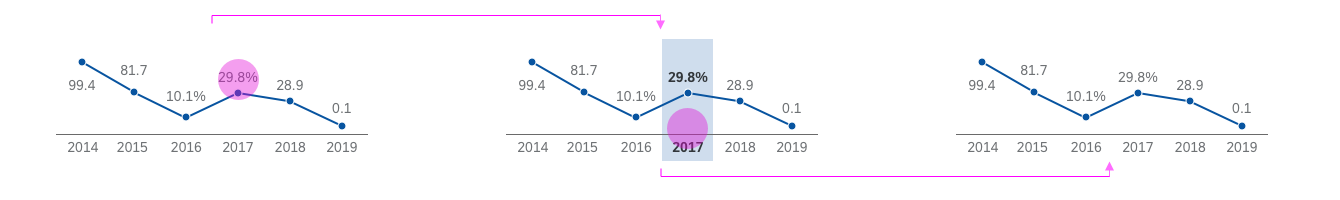
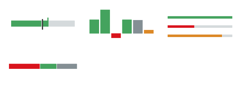
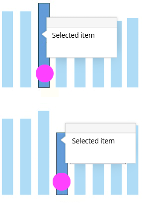
In the example below, one category has been highlighted using the second color from the qualitative palette.

Column chart with a highlighted category
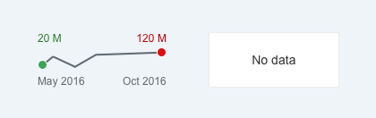
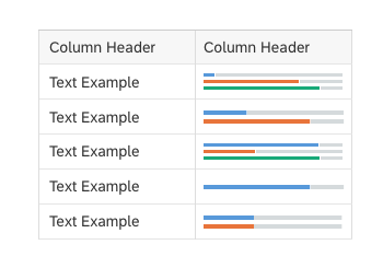
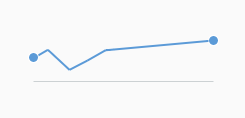
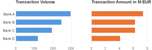
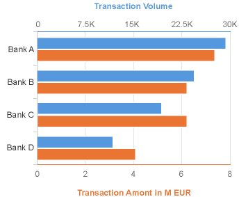
By Series
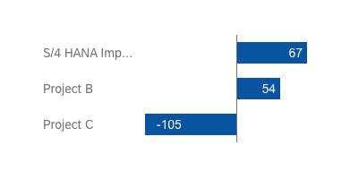
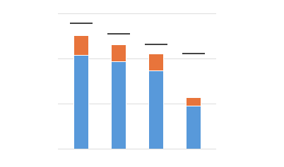
In the example below, the series use different shade of the same color because one series must be more visible than the other.
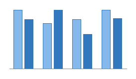
Column chart: Two series
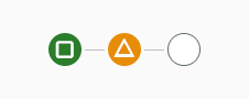
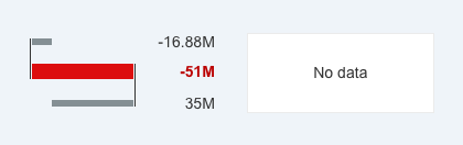
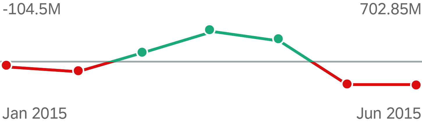
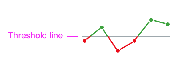
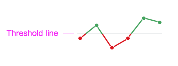
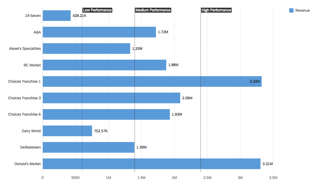
Based on Value
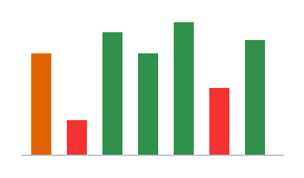
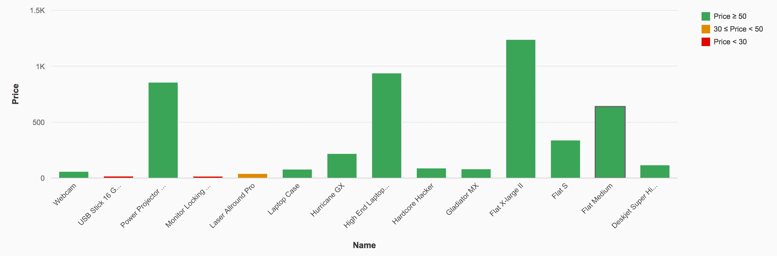
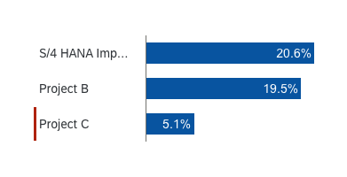
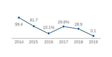
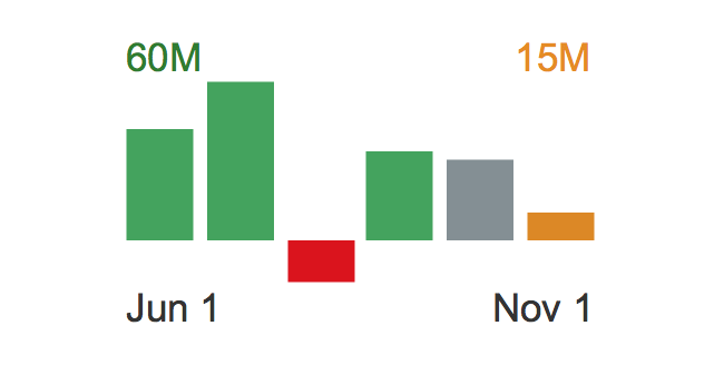
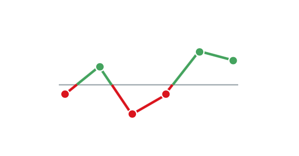
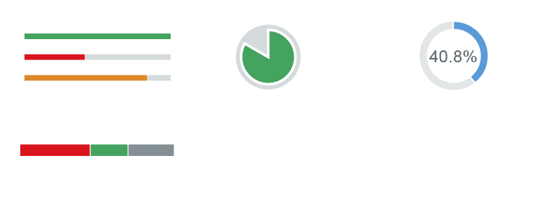
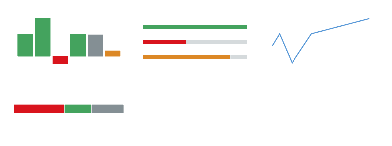
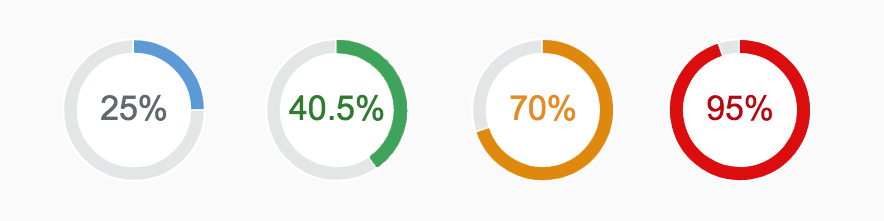
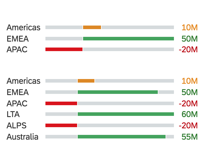
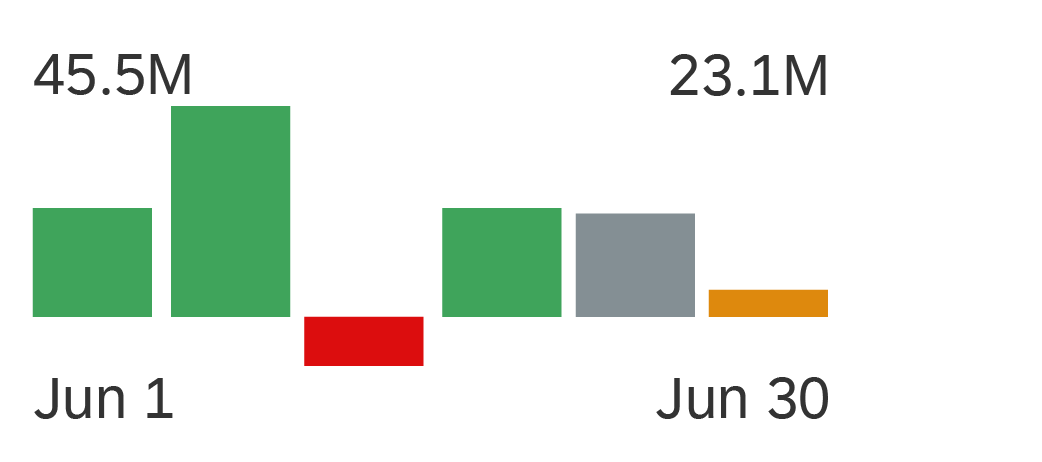
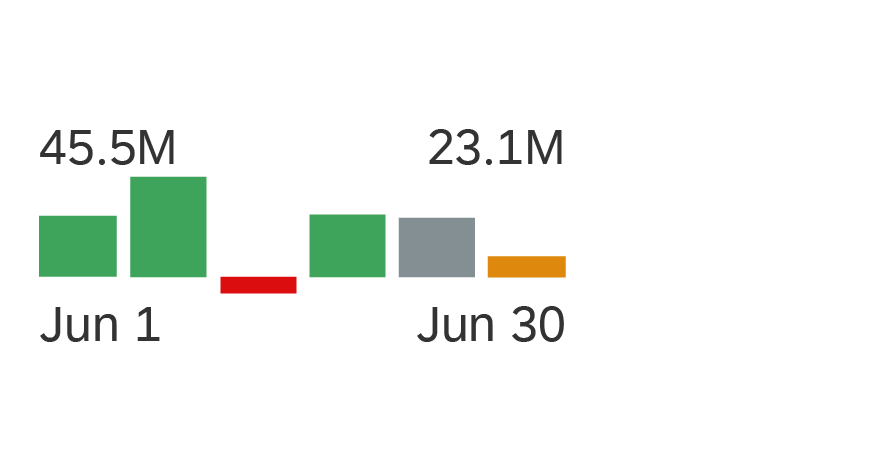
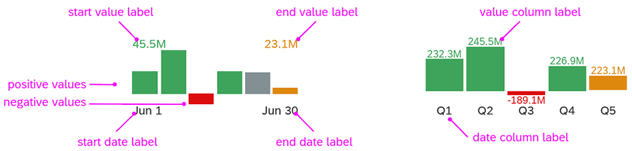
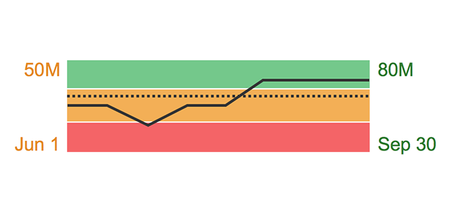
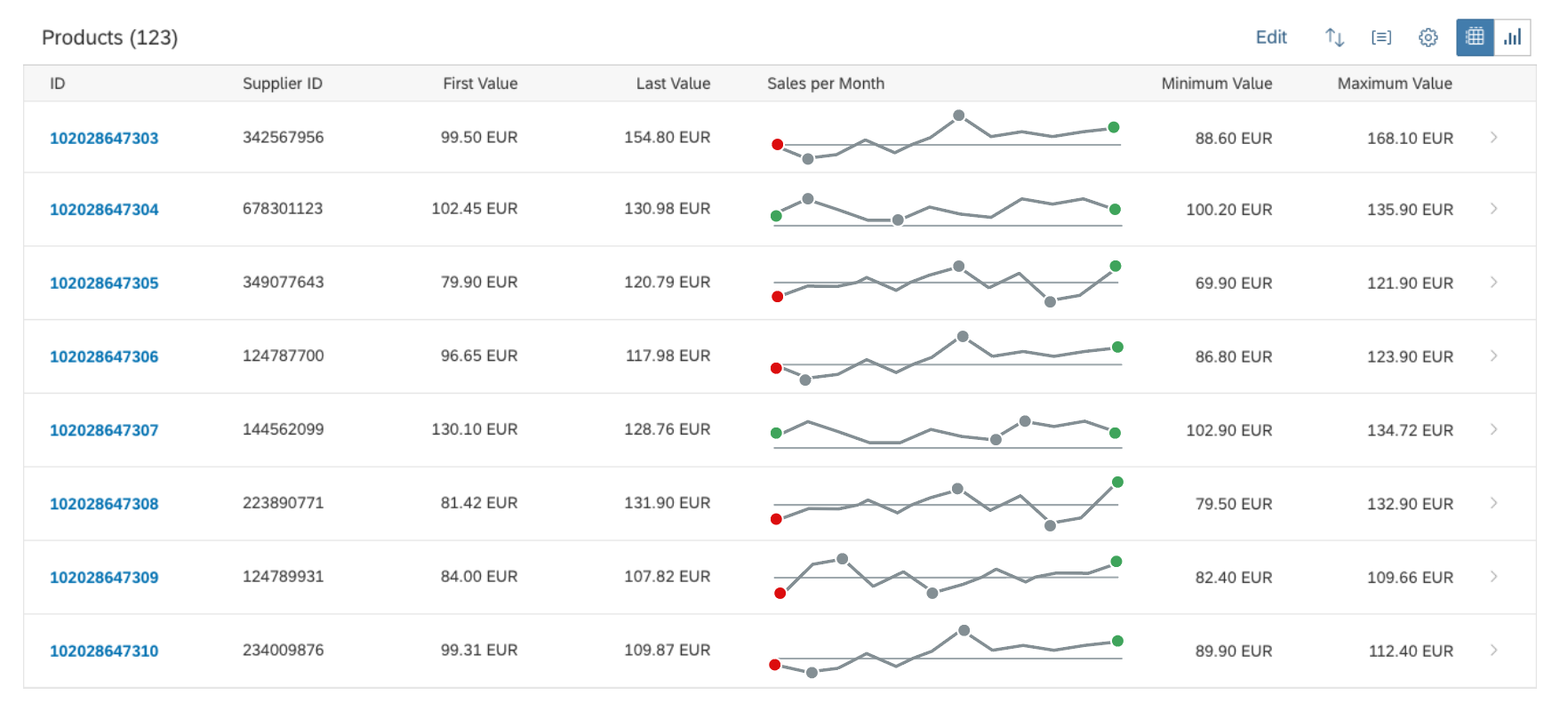
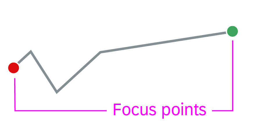
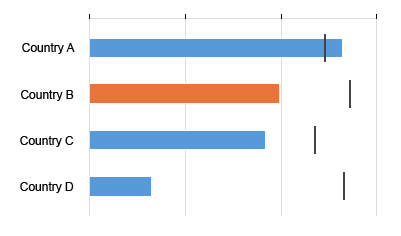
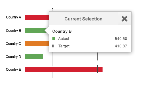
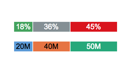
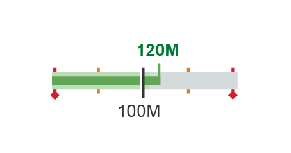
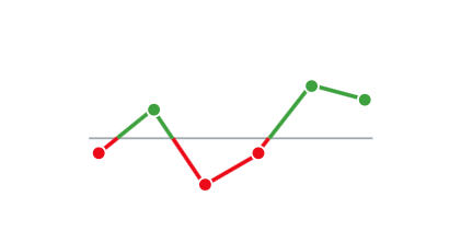
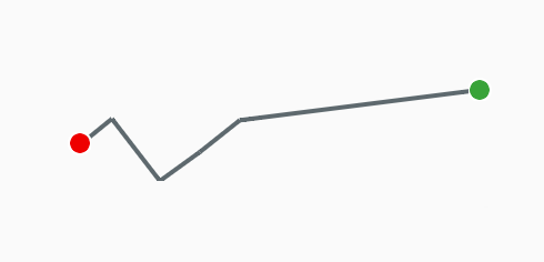
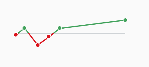
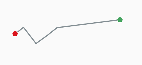
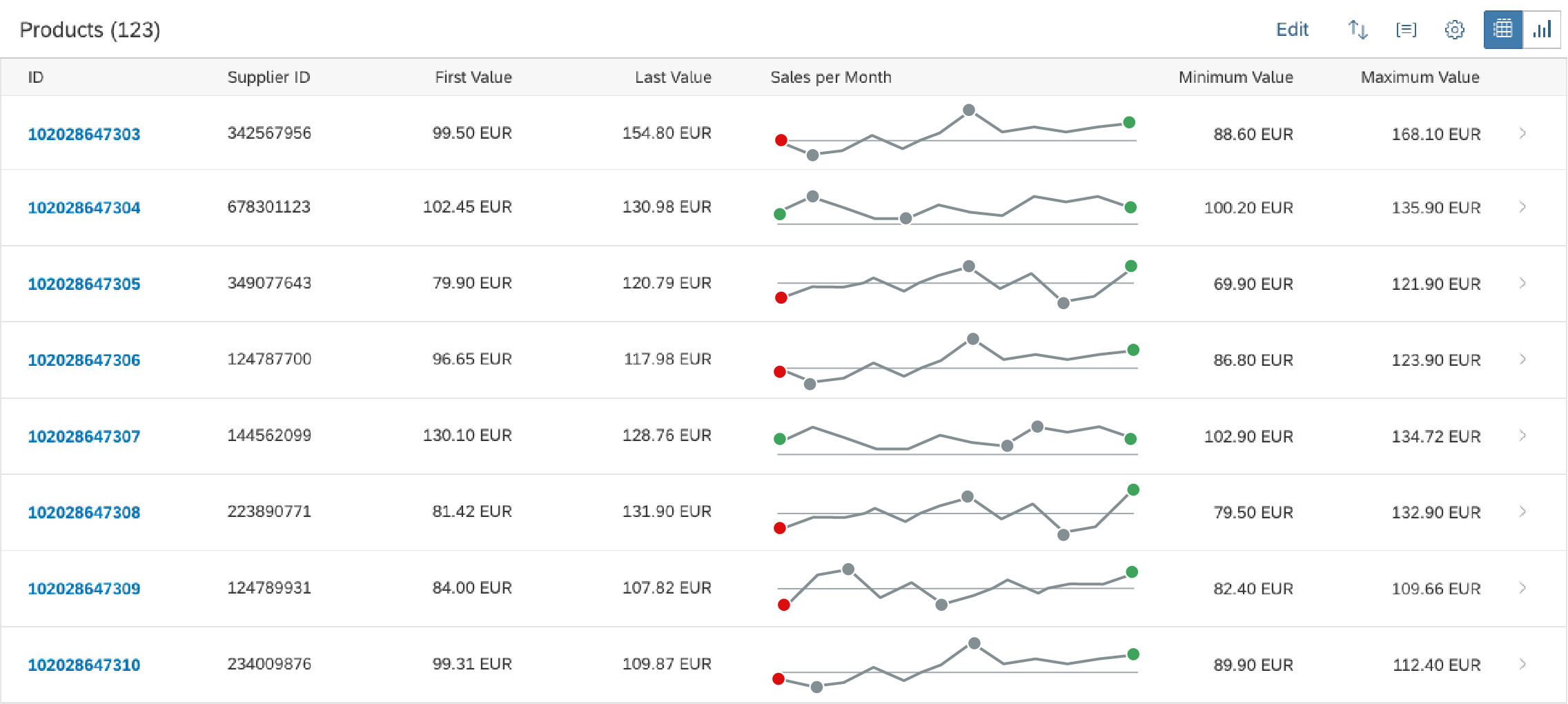
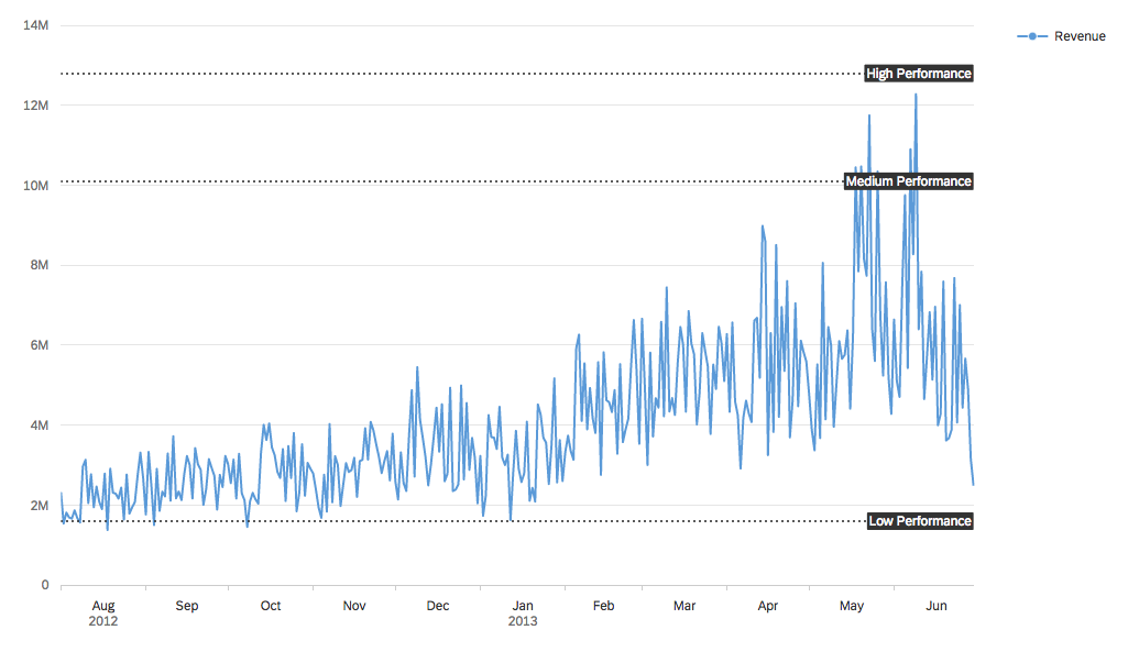
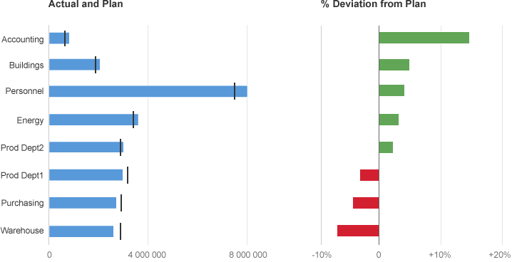
In the semantic color example below, the data points are red if their value is below a certain threshold, green if their value is above another threshold, and orange if their value is between the two.
Column chart with encoded values
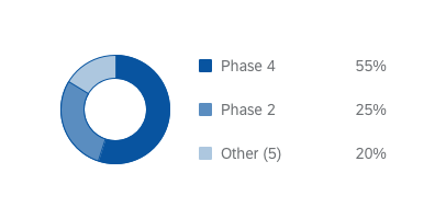
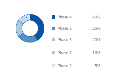
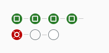
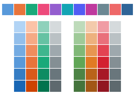
Qualitative Palette
The colors in the qualitative palette don’t carry semantic meaning. The palette has been designed to provide visual differentiation between data points by virtue of the fact that each color is visually distinct.

Qualitative palette

Qualitative palette - additional colors
For color names and HEX values, see Chart Color Palettes – Values and Names. Darker shades shown are taken from the sequence palette. Example: sapChart_Sequence_1_Minus2, sapChart_Sequence_2_Minus2, sapChart_Sequence_3_Minus2, etc.
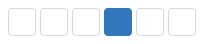
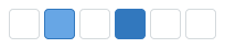
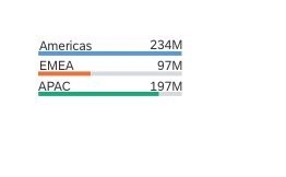
Highlight Category Items
By default, all the categories use the first color from the qualitative palette. However, you can use other colors from the qualitative palette if you want to highlight category items.

Using the qualitative palette to focus on a category item
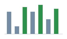
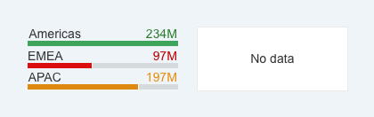
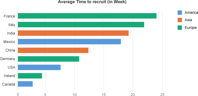
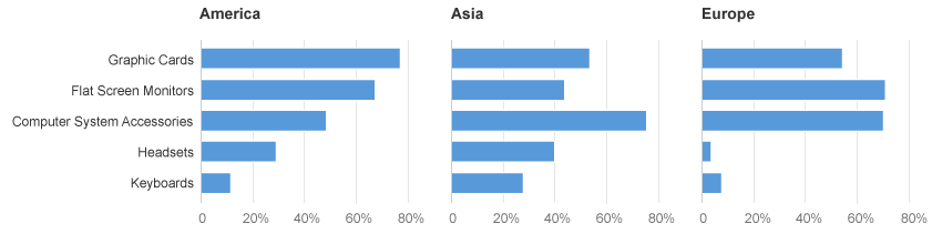
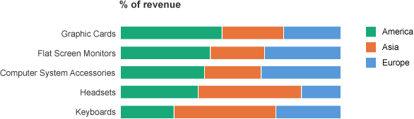
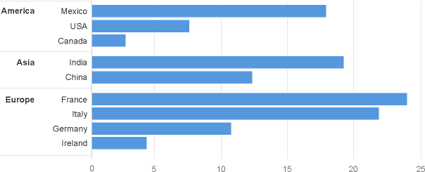
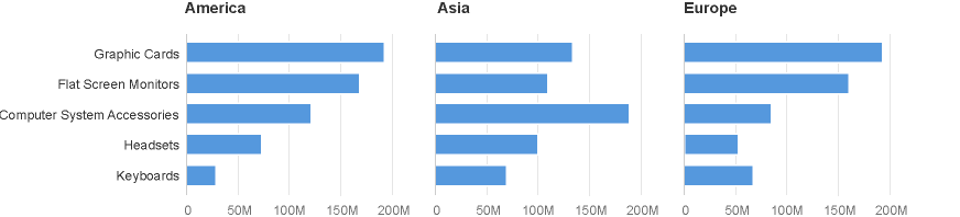
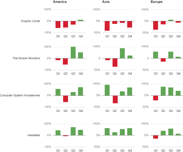
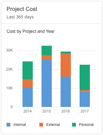
Group Items by Color
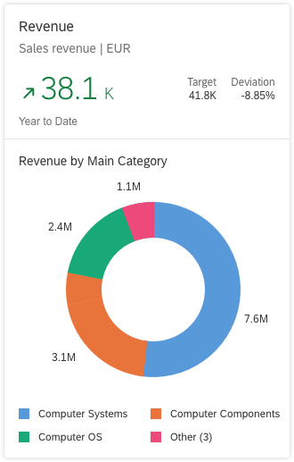
You can use the qualitative palette to group items into categories. In this example, we use green for Europe, blue for America, and orange for Asia.

Using the qualitative palette to show a hierarchy
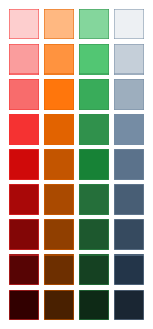
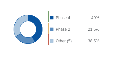
Semantic Palette
The semantic palette is designed to communicate bad (negative), critical, good (positive), and neutral values.
To maximize flexibility for chart design application teams, the semantic palette contains a selection of 9 tints and shades in each of the 4 main semantic colors.
Semantic palette
For the full set of color options, including color names and HEX values, see Chart Color Palettes – Values and Names.
Using the Semantic Palette
Here are some ways you can use the semantic palette:
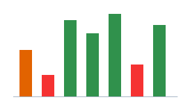
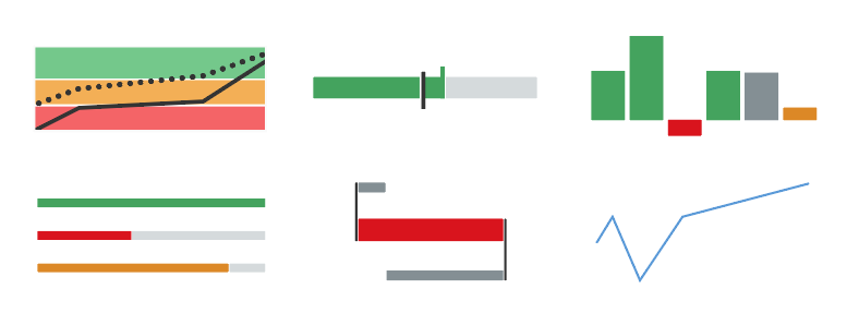
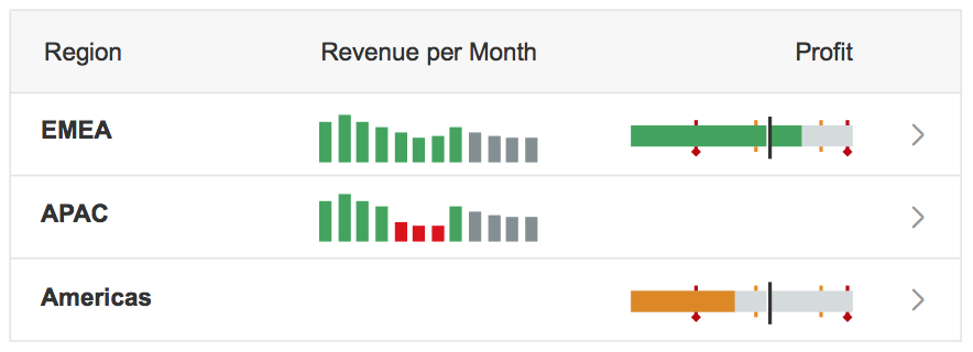
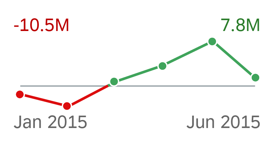
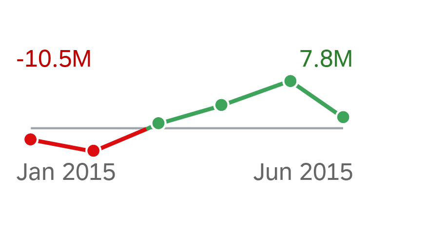
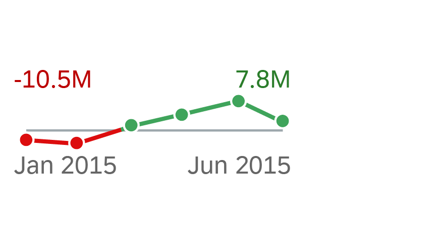
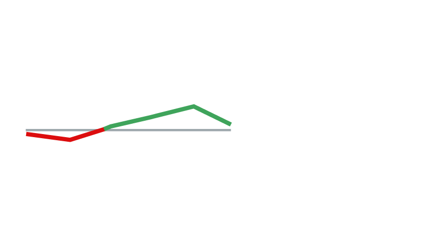
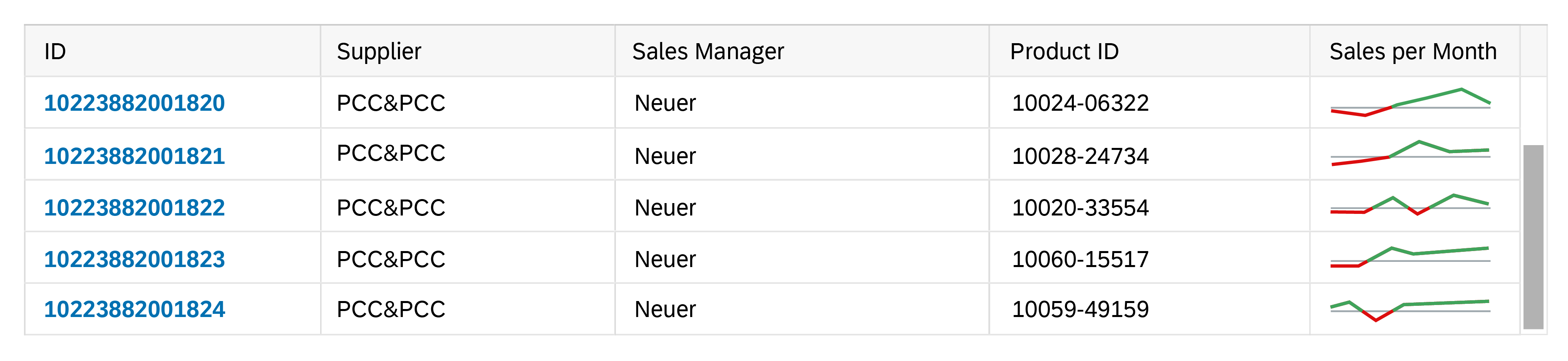
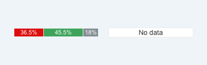
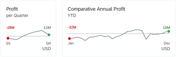
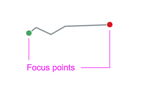
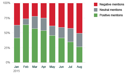
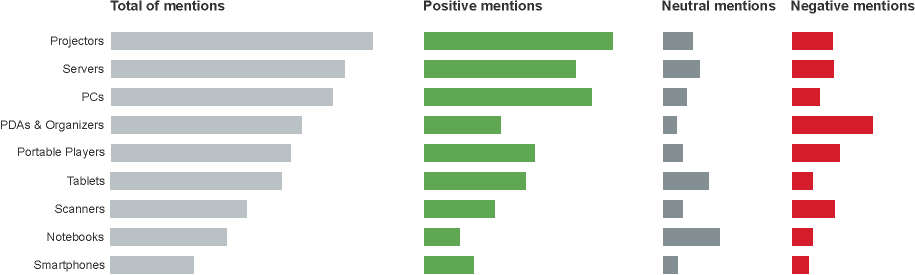
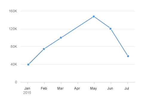
Illustrate the Top Three Values
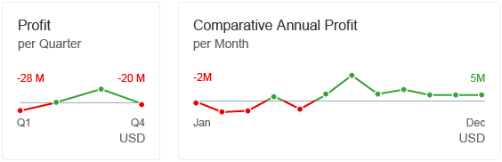
This column chart uses the semantic palette to display the sales revenue per month. The color green is used to highlight the top three months with the highest revenue.
Column chart: Top three values
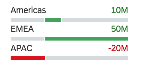
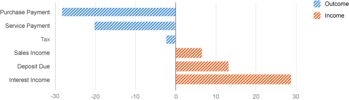
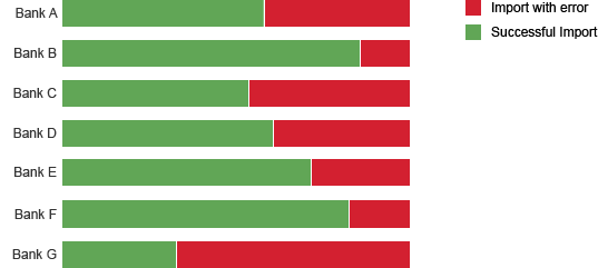
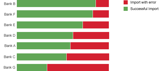
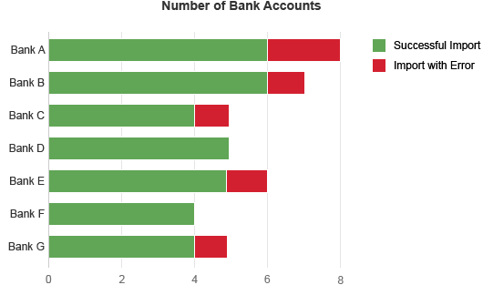
Show Positive and Negative Series
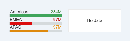
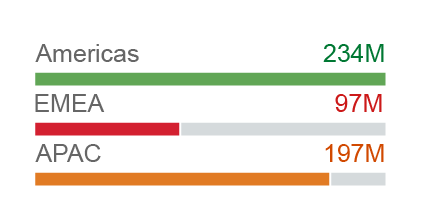
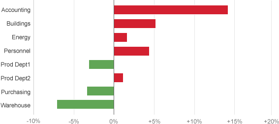
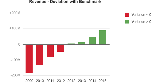
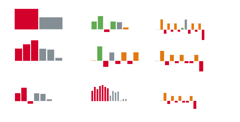
These stacked bars represent the availability of materials. The available series is green, the inspection series is orange, and the blocked series is red.
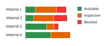
Stacked bars: Good and bad values
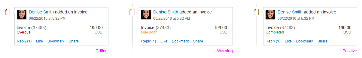
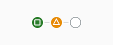
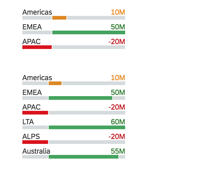
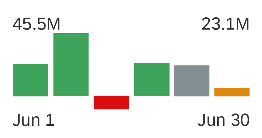
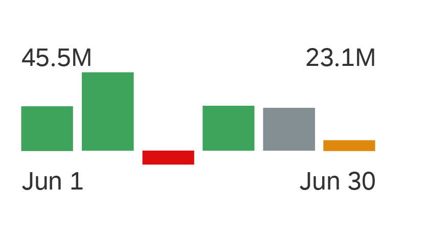
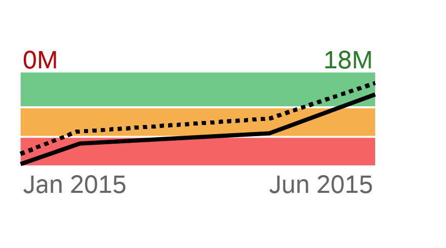
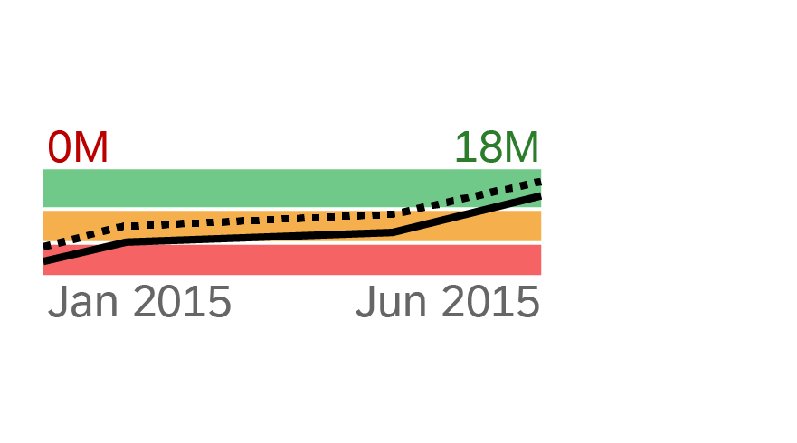
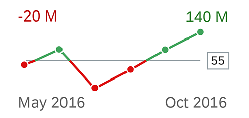
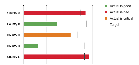
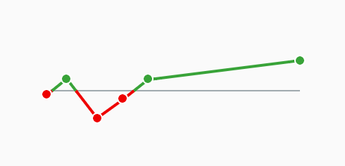
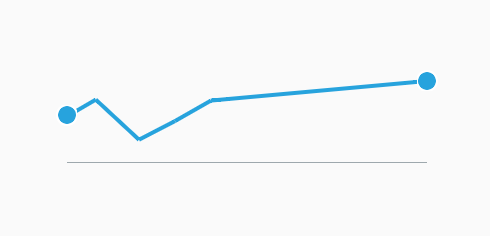
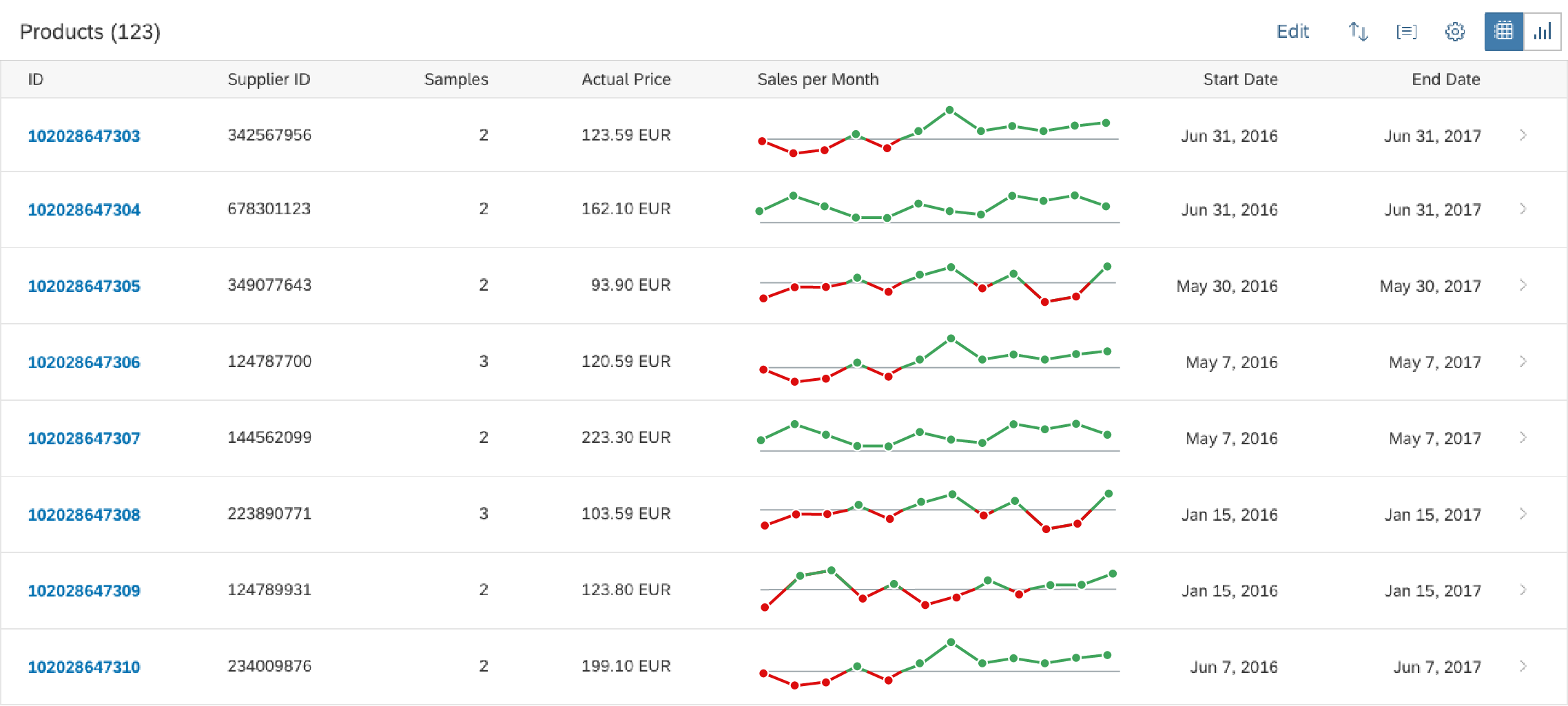
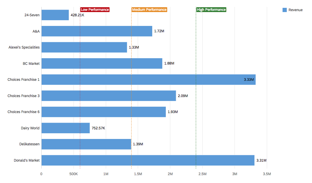
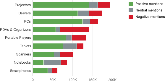
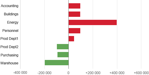
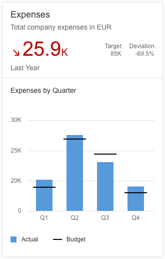
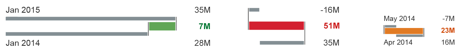
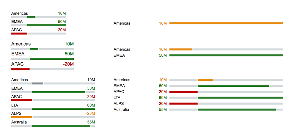
Denote Good or Bad Values
Each data point has a color based on its value. Data points are red if their value is below a certain threshold, green if their value is above another threshold, and orange if their value is between the two.
Column chart: Good and bad values
Visualize Different Levels
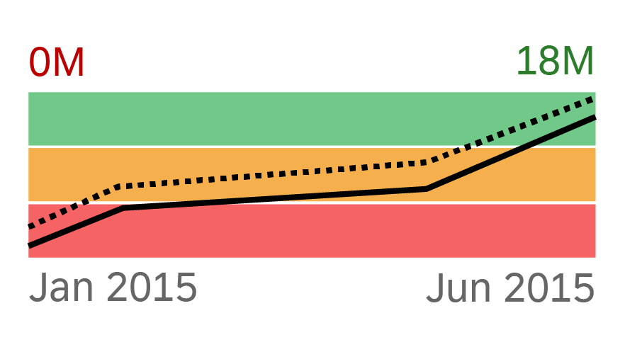
In this geomap, green is used to indicate states with good performance, and red for states with bad performance. The different shades express different levels of good and bad performance.
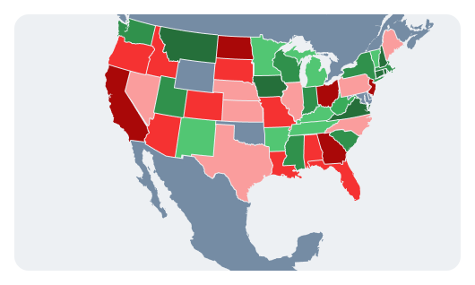
Geomap: Levels of performance
Default Color Shade Names
The default color shade names in the semantic palette are:
- sapChart_Sequence_Bad
- sapChart_Sequence_Critical
- sapChart_Sequence_Good
- sapChart_Sequence_Neutral
Column chart: Level 1 of the semantic palette
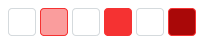
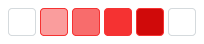
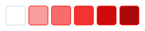
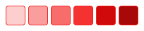
Selecting the Correct Combination of Shades (Semantic Palette)
There are 4 semantic colors with 9 tints and shades for each that are used to maximize flexibility for chart design application teams. For the full set of color options, see Chart Color Palettes – Values and Names.
The table below gives an example of how to combine shades for bad (negative) values. You can apply the same principle to critical, neutral, and good (positive) values.
No. of Levels
Shades to Use
Color Token Names
1 level
sapChart_Sequence_Bad
2 levels
sapChart_Sequence_Bad_Plus2
sapChart_Sequence_Bad
3 levels
sapChart_Sequence_Bad_Plus2
sapChart_Sequence_Bad
sapChart_Sequence_Bad_Minus2
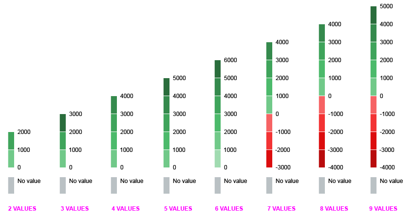
4 levels
sapChart_Sequence_Bad_Plus2
sapChart_Sequence_Bad_Plus1
sapChart_Sequence_Bad
sapChart_Sequence_Bad_Minus1
5 levels
sapChart_Sequence_Bad_Plus2
sapChart_Sequence_Bad_Plus1
sapChart_Sequence_Bad
sapChart_Sequence_Bad_Minus1
sapChart_Sequence_Bad_Minus2
6 levels
sapChart_Sequence_Bad_Plus3
sapChart_Sequence_Bad_Plus2
sapChart_Sequence_Bad_Plus1
sapChart_Sequence_Bad
sapChart_Sequence_Bad_Minus1
sapChart_Sequence_Bad_Minus2
Sequential Palette
The sequential color palette is designed to visualize high to low values for different measures.
Generally speaking, the lighter the shade, the lower the value. The darker the shade, the higher the value.
Sequential palette
For color names and HEX values, see Chart Color Palettes – Values and Names.
Using the Sequential Palette
Here are some ways you can use the sequential palette:
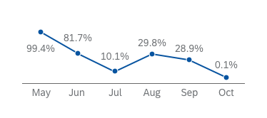
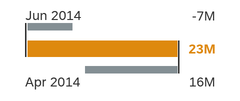
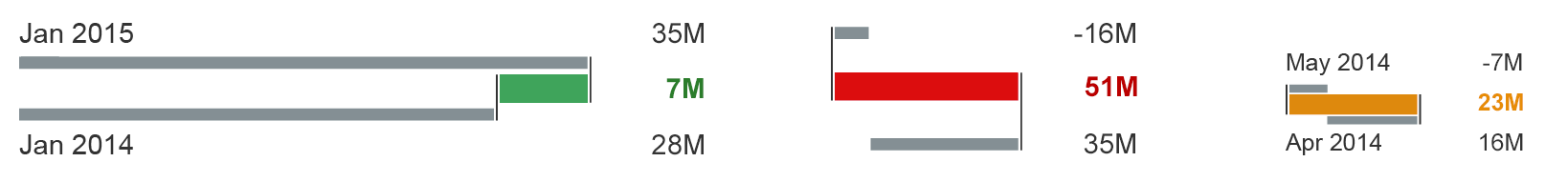
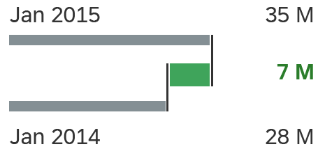
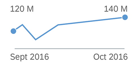
Distinguish between Past and Present
These two series use different shades of the same color to distinguish between last year and the current year.
Column chart: Two series
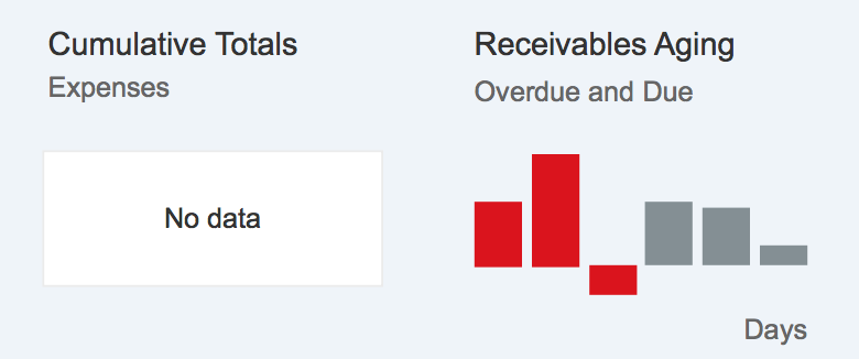
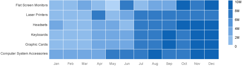
Show Time Gradation
These stacked bars represent payable aging by country. The different gradations of brightness are used to represent different time periods.
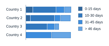
Stacked bars: Time gradation
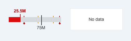
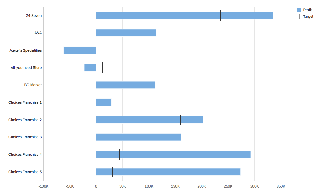
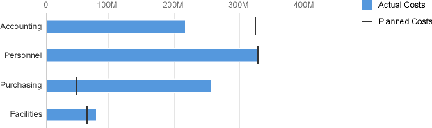
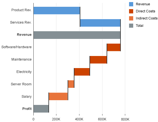
Visualize Different Levels
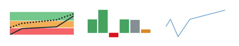
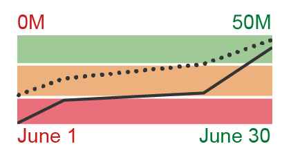
This bullet chart shows direct costs in a dark shade and indirect costs in a light shade.

Bullet chart: Different levels
This geomap contains two measures. Shades of blue are used to visualize high and low values for one measure while shades of orange are used to visualize high and low values for the other measure.

Geomap: Multiple levels in two groups
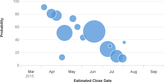
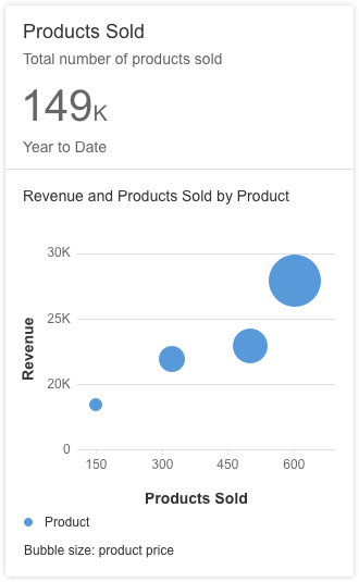
Ranked Values
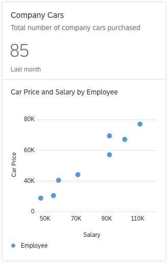
In this bubble chart, the size of the bubbles represents future sales deals. The probability of converting these deals is expressed using different shades of blue.
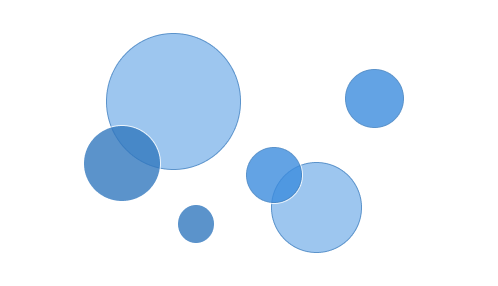
Bubble chart: Ranked values
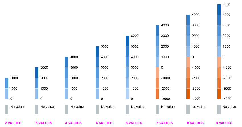
Selecting the Correct Combination of Shades (Sequential Palette)
There are 12 colors with 9 tints and shades for each that are used to maximize flexibility for chart design application teams.
The table below gives an example of how to combine shades for the default category item color (sapChart_Sequence_1). You can apply the same principle to the other colors in the palette.
No. of Values
Shades to Use
Color Token Names
1 level
sapChart_Sequence_1
2 levels
sapChart_Sequence_1_Plus2
sapChart_Sequence_1
3 levels

sapChart_Sequence_1_Plus2
sapChart_Sequence_1
sapChart_Sequence_1_Minus2
4 levels

sapChart_Sequence_1_Plus2
sapChart_Sequence_1_Plus1
sapChart_Sequence_1
sapChart_Sequence_1_Minus1
5 levels

sapChart_Sequence_1_Plus2
sapChart_Sequence_1_Plus1
sapChart_Sequence_1
sapChart_Sequence_1_Minus1
sapChart_Sequence_1_Minus2
6 levels

sapChart_Sequence_1_Plus3
sapChart_Sequence_1_Plus2
sapChart_Sequence_1_Plus1
sapChart_Sequence_1
sapChart_Sequence_1_Minus1
sapChart_Sequence_1_Minus2
Resources
Elements and Controls
- Chart (guidelines)
- Chart – Color Palette – Values and Names (guidelines)
- Design-Tokens (guidelines)
- Theming (guidelines)
Implementation
Chart tokens and technology-specific variables are provided as part of the GitHub repository of SAP themes.


 Your feedback has been sent to the SAP Fiori design team.