
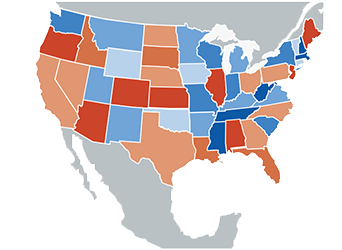
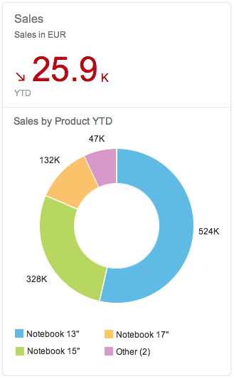
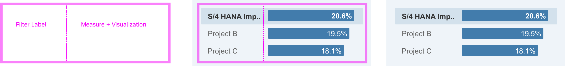
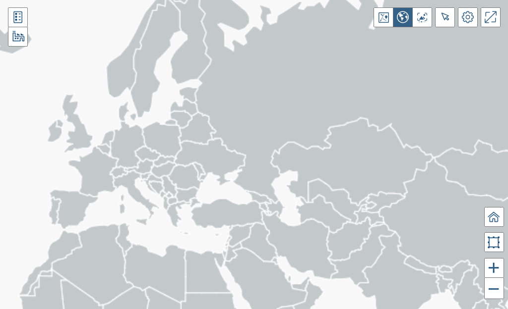
Smart Chart
The smart chart is a wrapper around existing chart types that can be used together with all existing chart types within VizFrame. The main purpose of the smart chart is to reduce development effort. However, this comes at the expense of decreased flexibility. The smart chart creates visualization based on the underlying OData service and the corresponding annotations. It also adds some generic functionality, such as a toolbar, complex personalization settings, variant management, breadcrumb, tooltip, drilldown and zoom capabilities. Everything that can be done using the smart chart can also be achieved using the standard VizFrame Chart, but with more development effort.
Smart chart
Usage
Use the smart chart if:
- Data is fed through OData services.
- You need to reduce development effort.
- You would like to profit from drilldown and detailed information support.
Do not use the smart chart if:
- You create your own UI coding, whereby the data is not fed through OData services. In this case, use the VizFrame Chart instead.
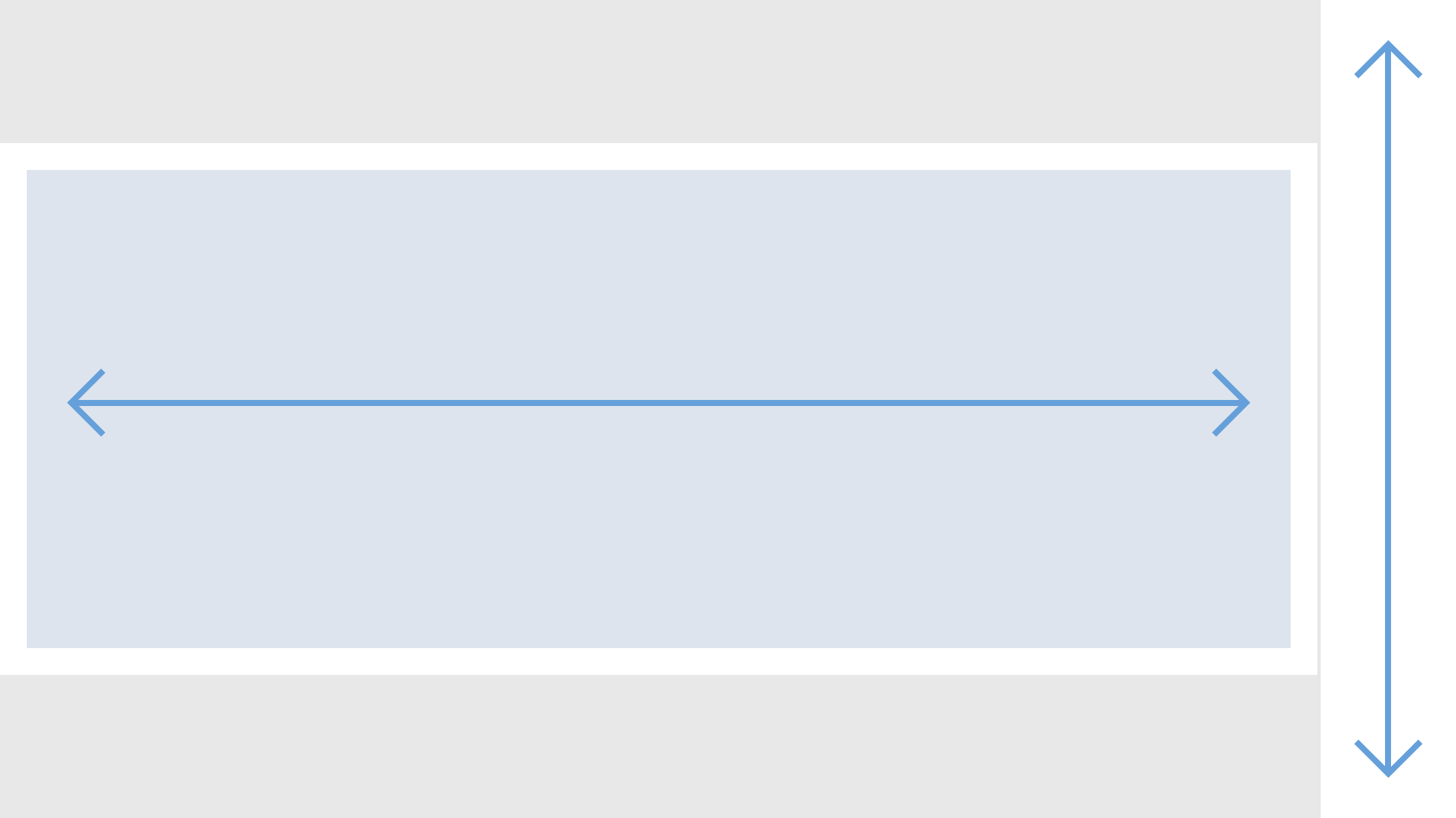
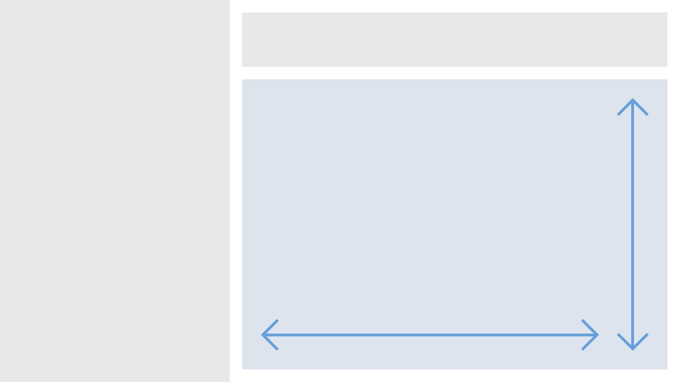
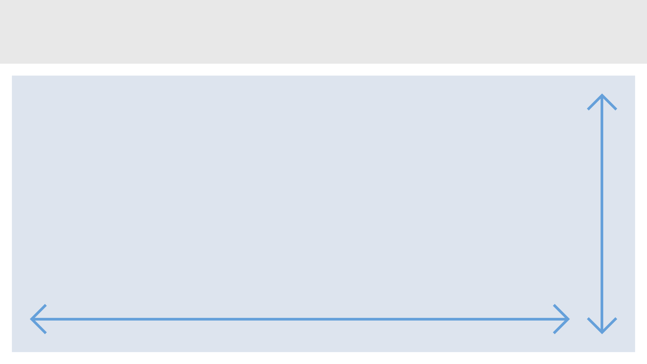
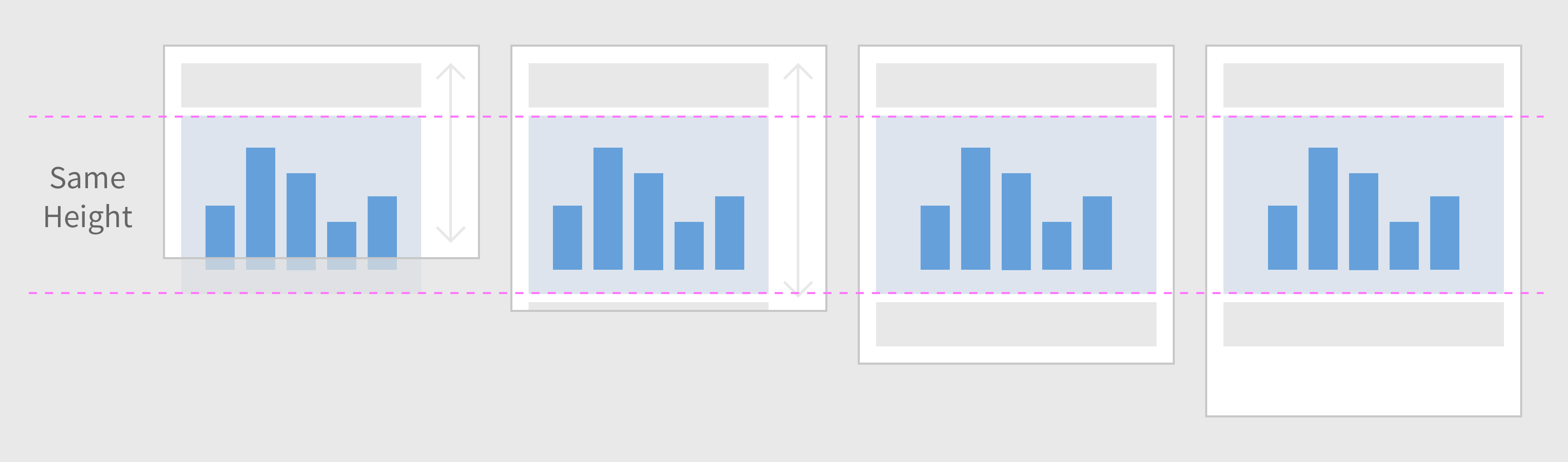
Responsiveness
The smart chart is fully responsive It uses the overflow toolbar control, which is a container based on sap.m.Toolbar and which provides overflow when its content does not fit in the visible area. The text button ‘Details‘ will never overflow as it has a central function.
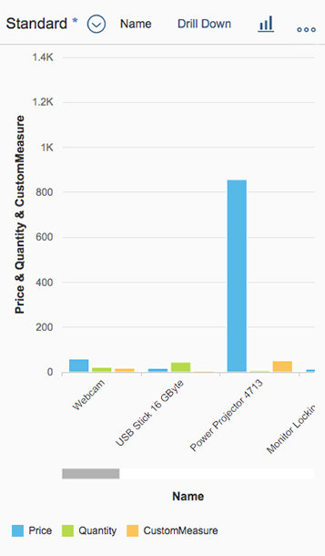
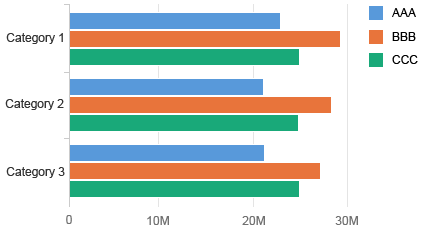
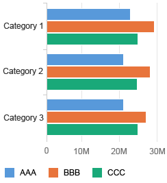
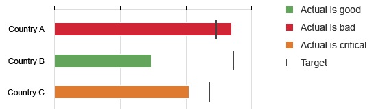
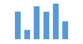
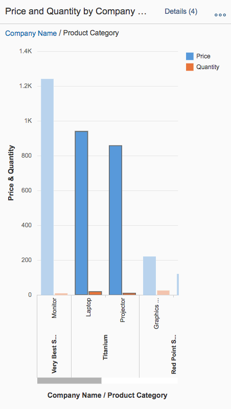
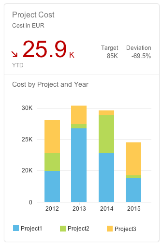
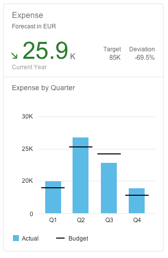
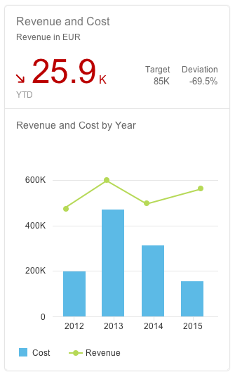
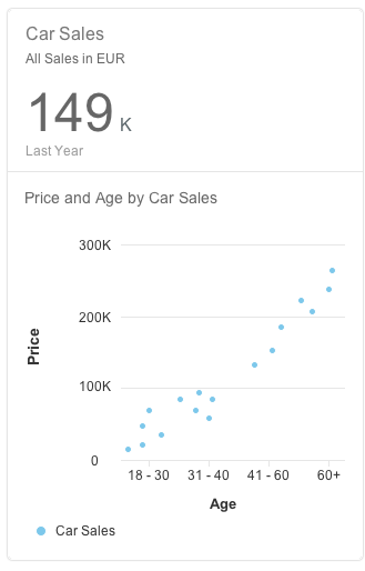
Size S
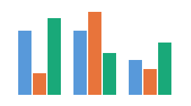
Size M
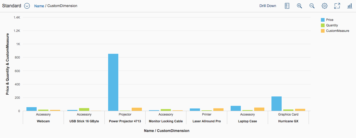
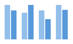
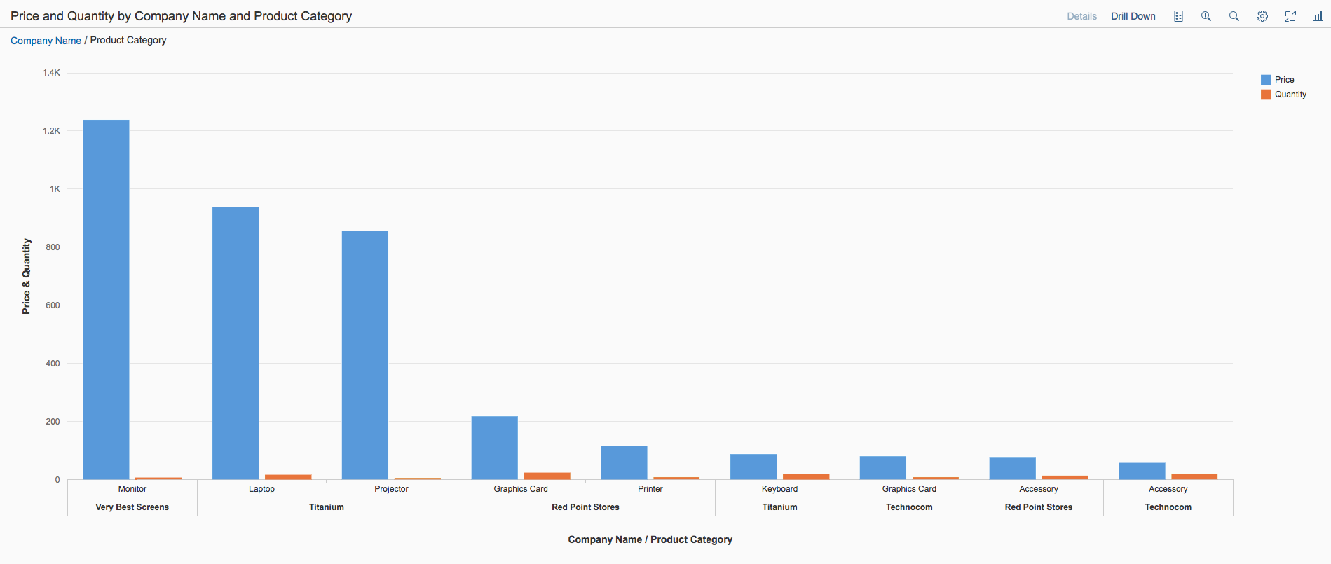
Size L
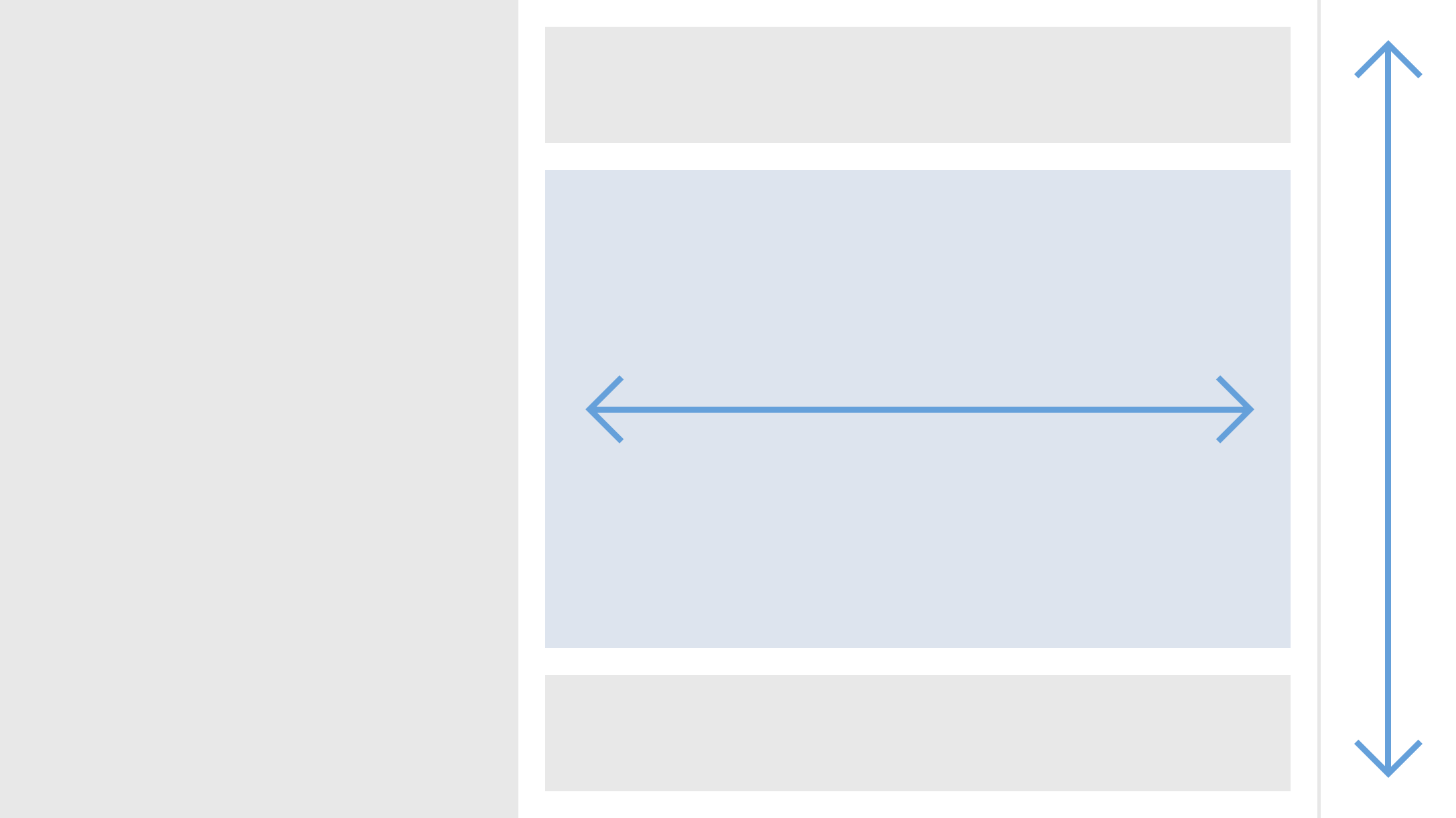
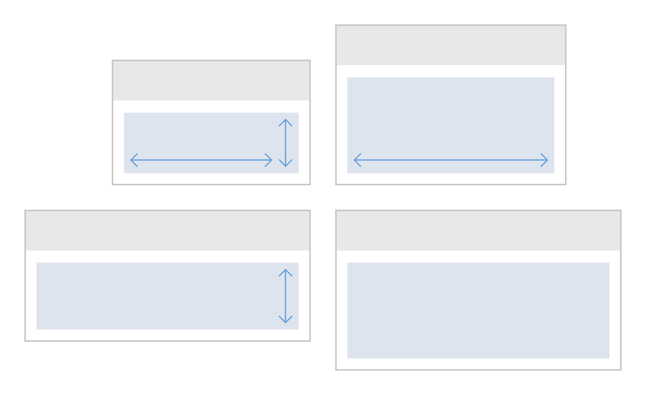
Layout
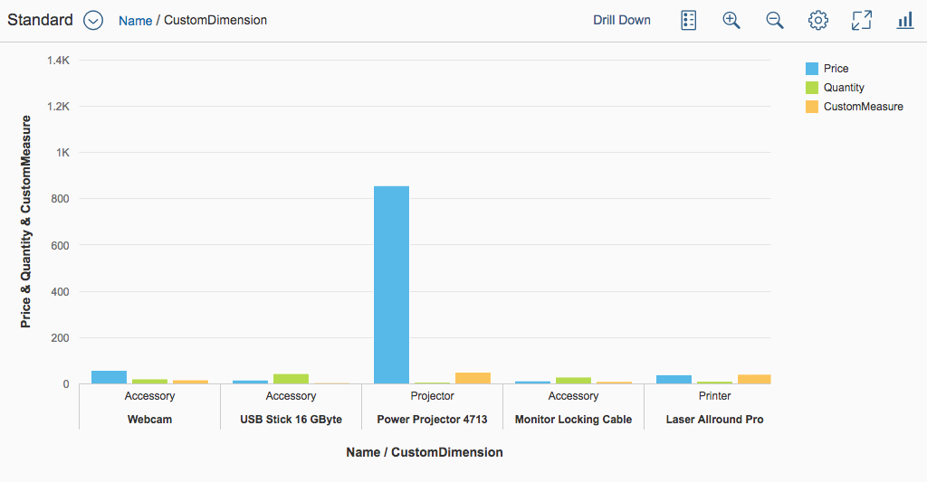
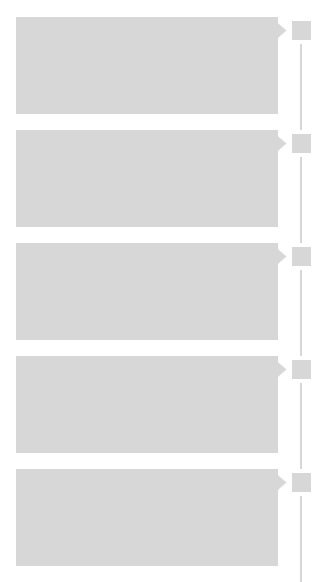
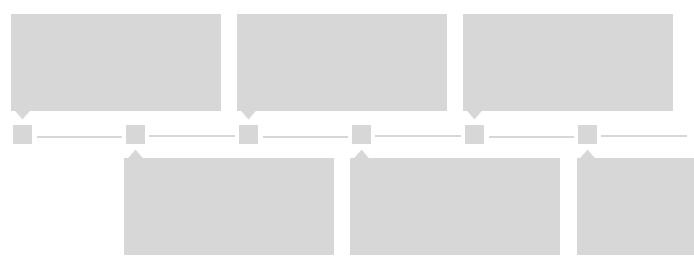
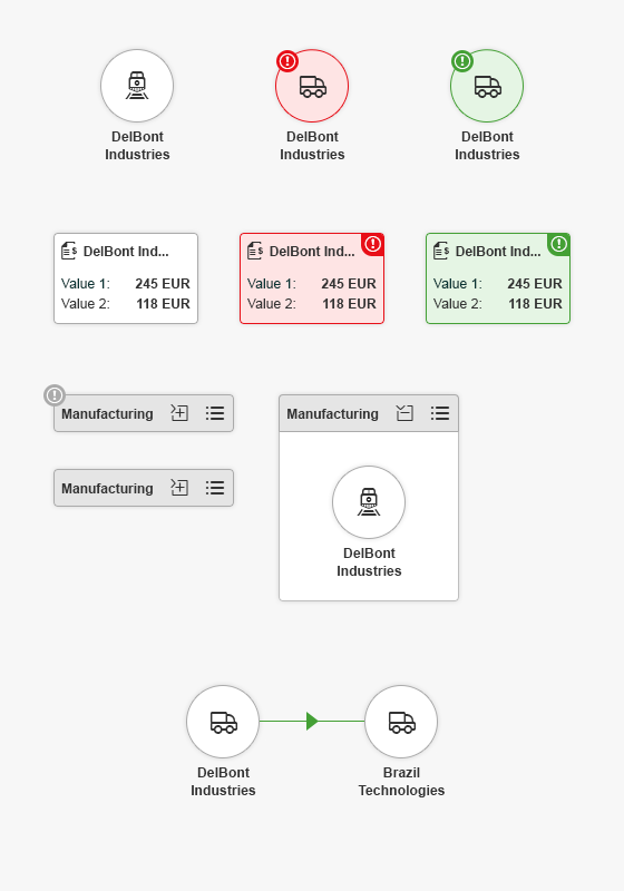
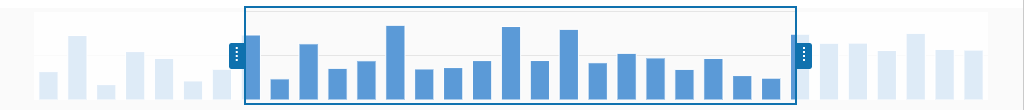
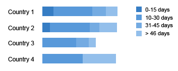
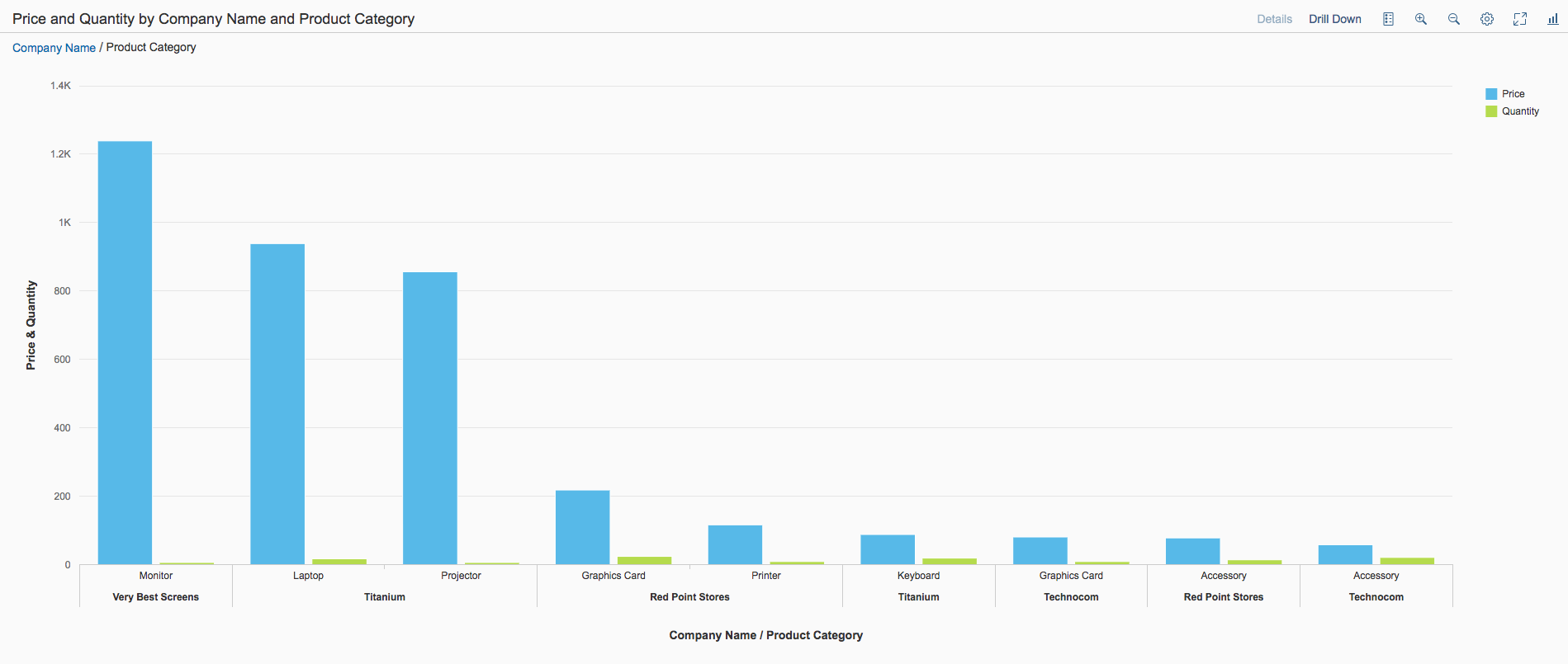
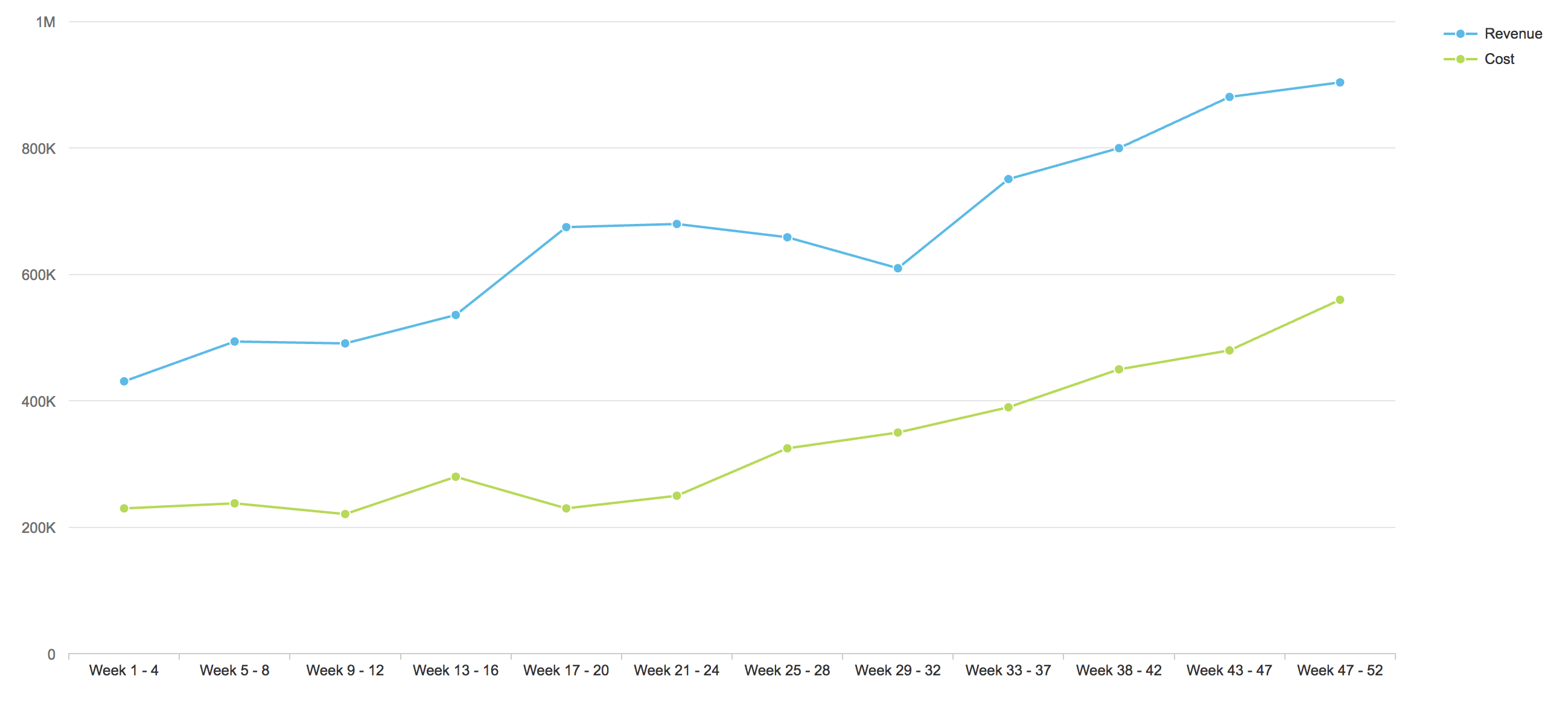
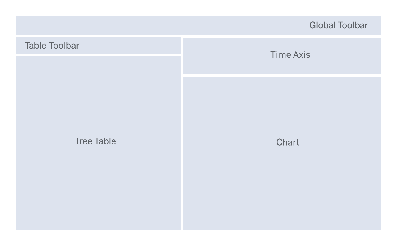
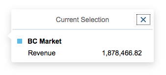
The header area contains the title of the smart chart, variant management, and the toolbar itself. All of these elements are optional.
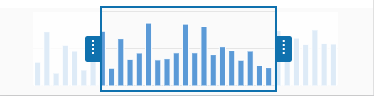
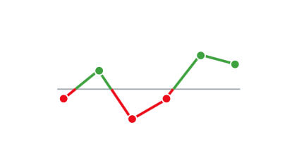
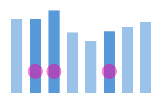
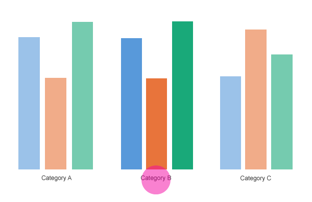
The chart area shows the corresponding chart.
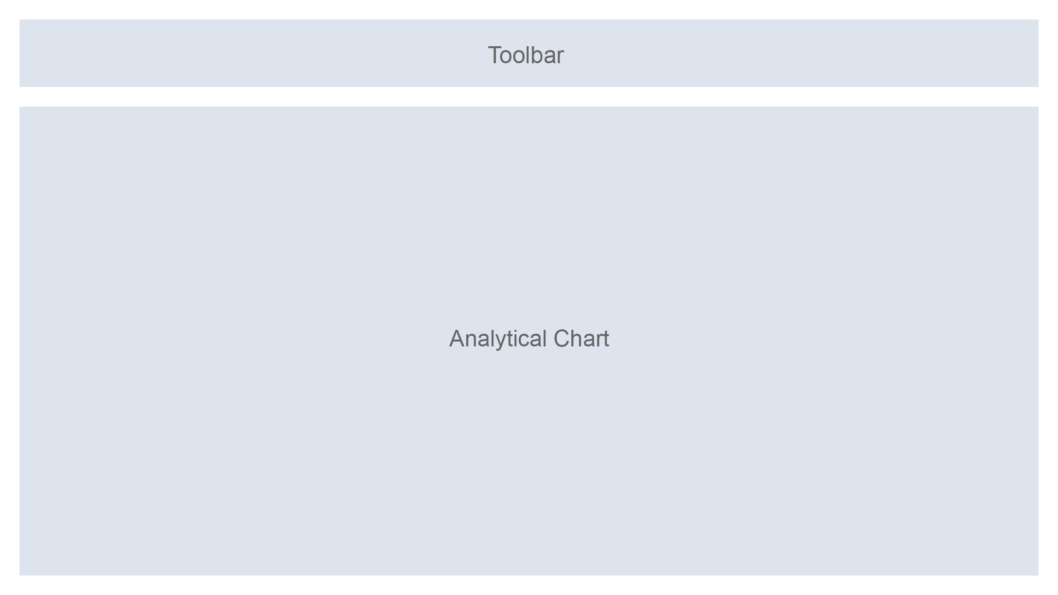
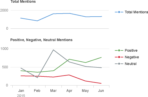
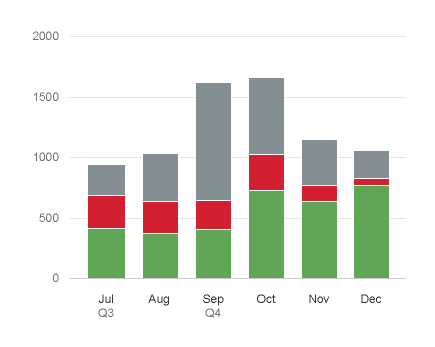
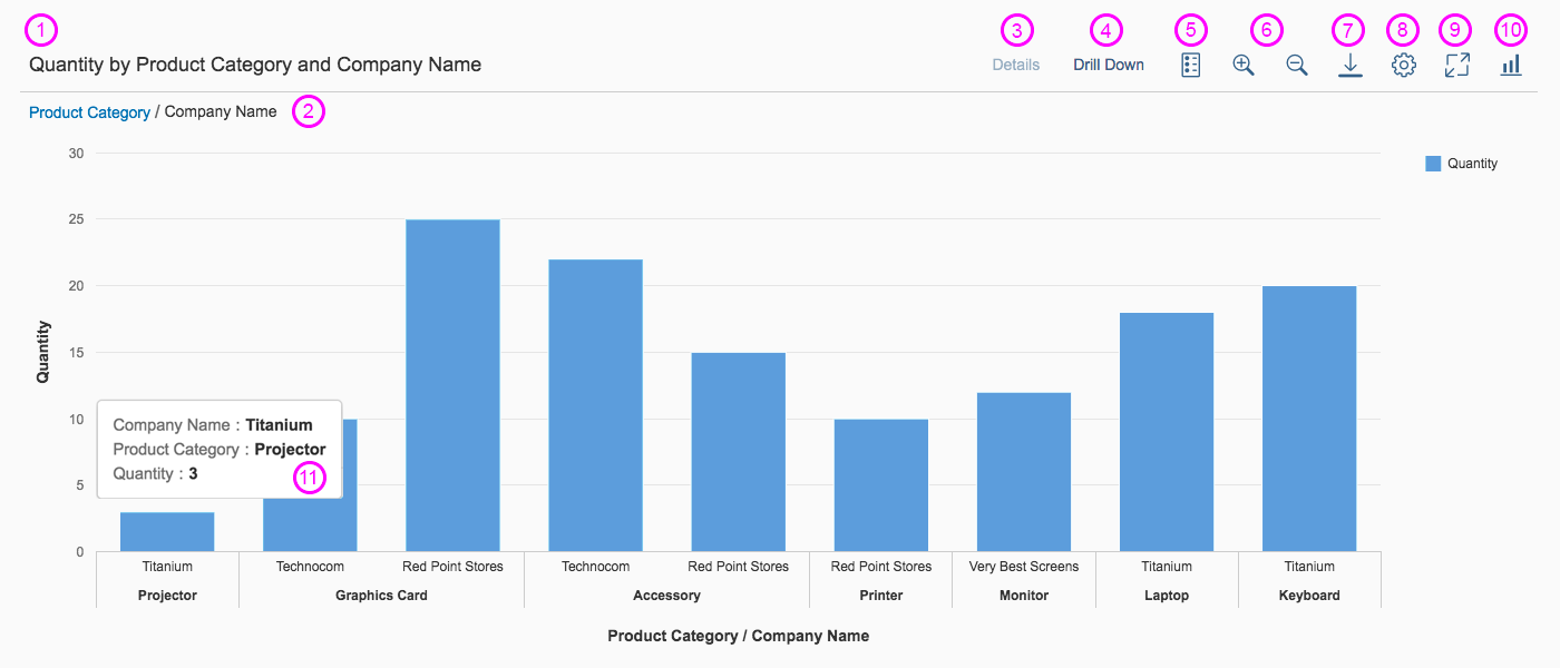
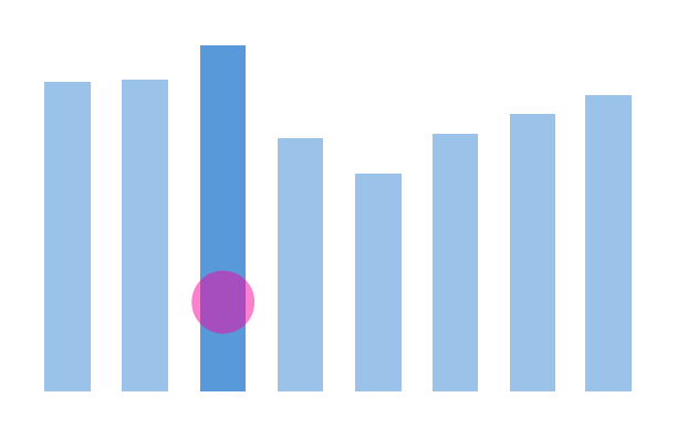
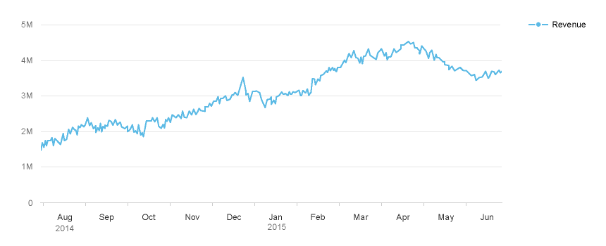
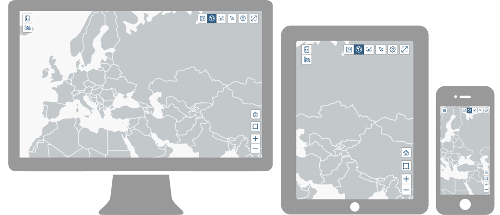
Schematic visualization of the smart chart
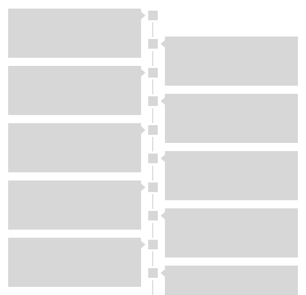
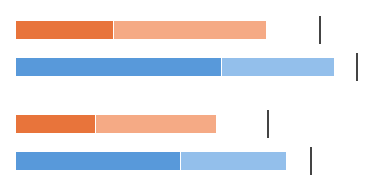
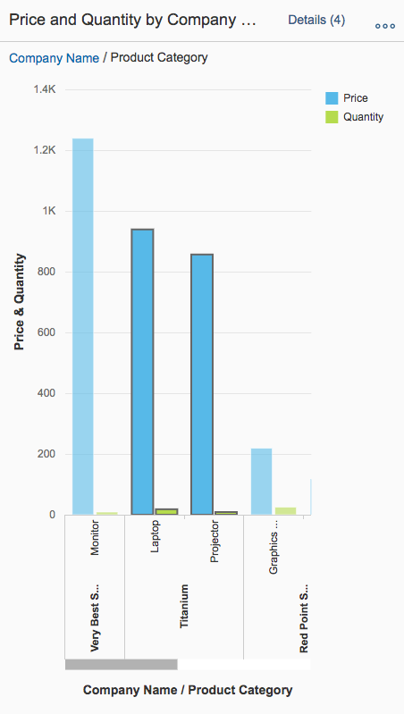
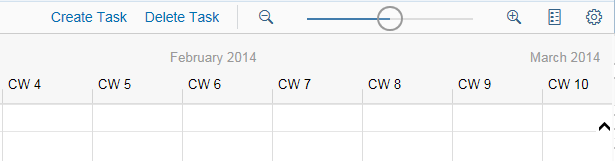
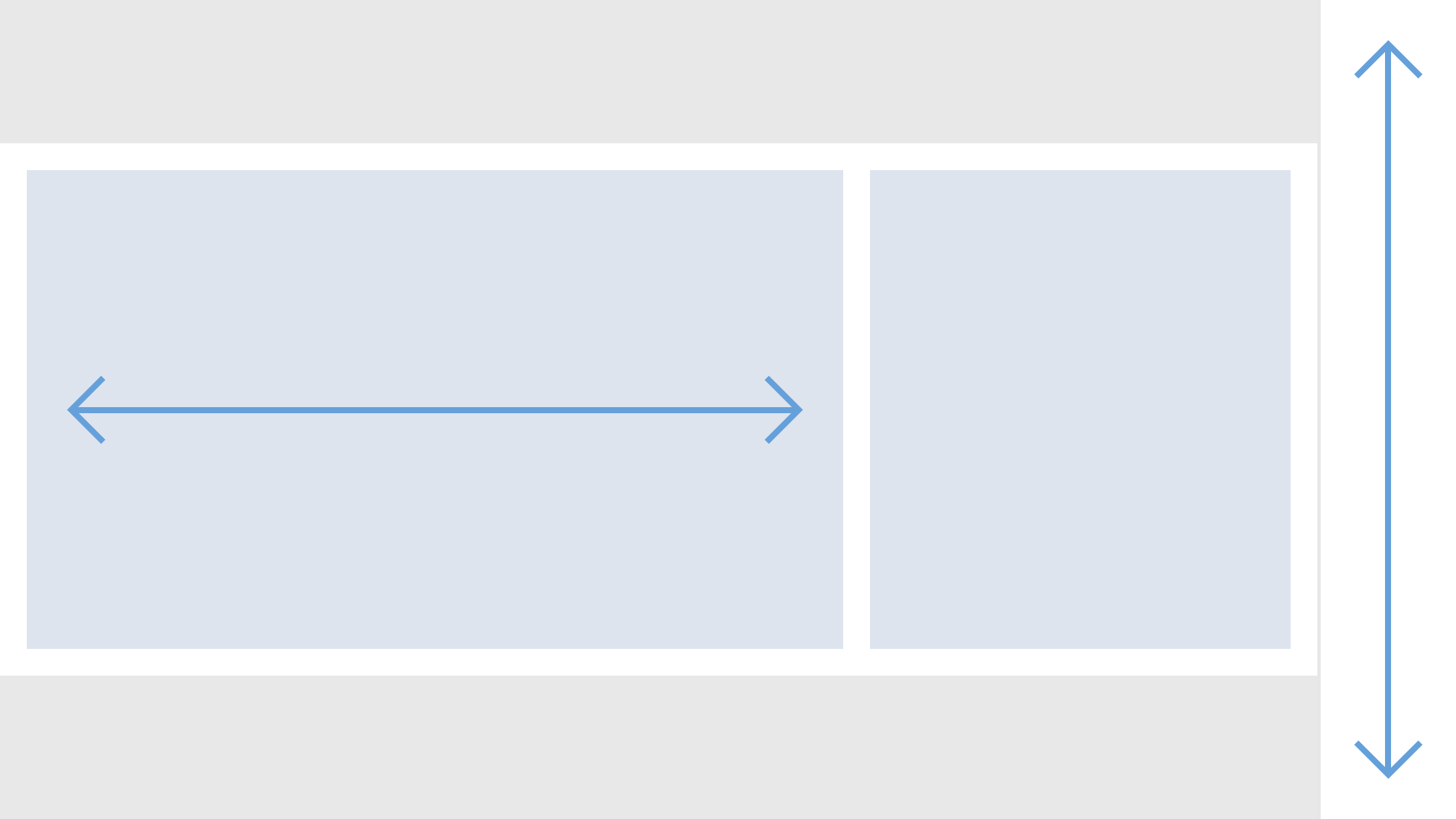
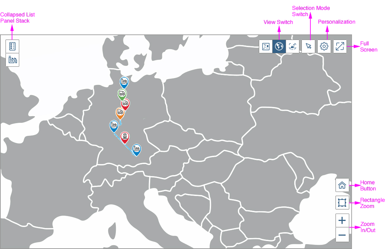
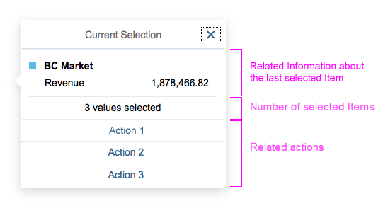
Components
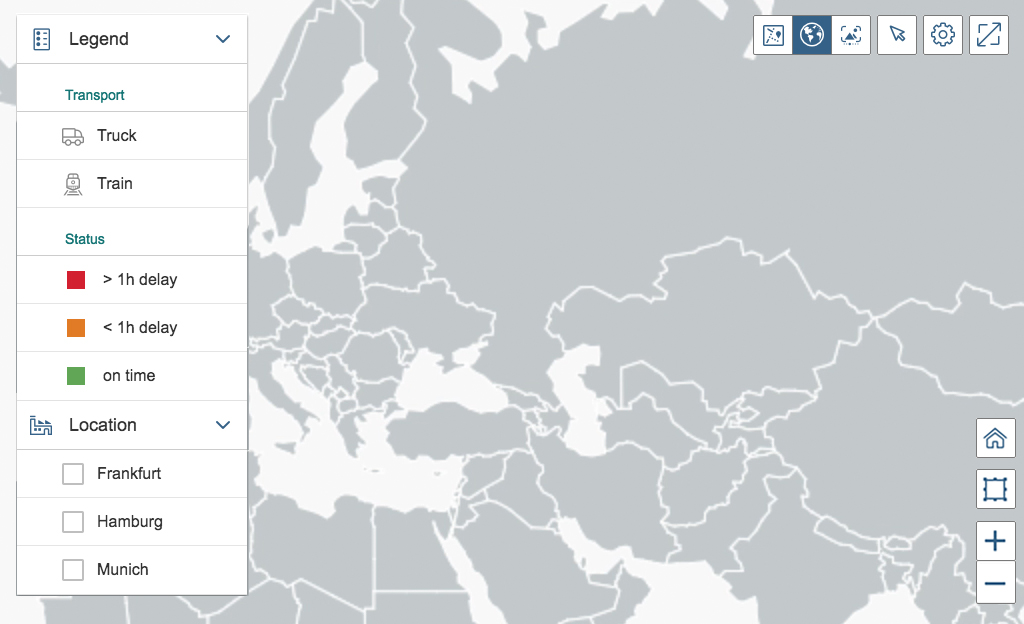
1. Title and/or variant management: The title provides a short, meaningful summary of the content of the chart. Use the variant management control only if the user needs to save and load different filter settings and views of the chart.
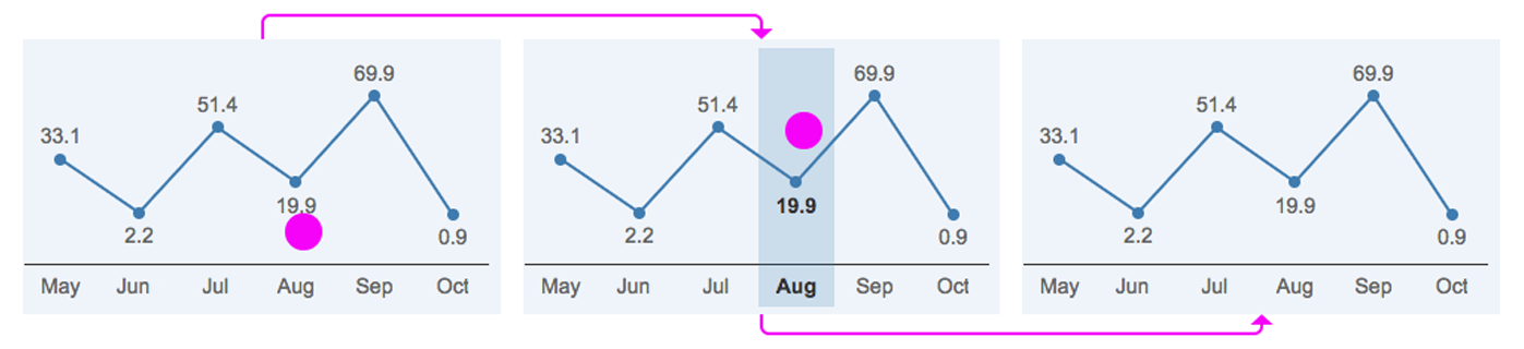
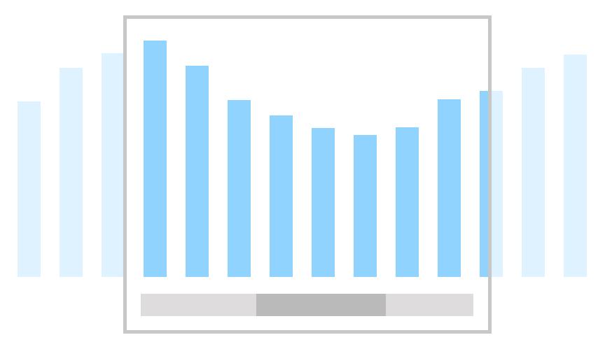
2. Breadcrumb: The interactive breadcrumb offers a history of the drilldowns made by the user, providing the possibility to return to the previous views of the chart.
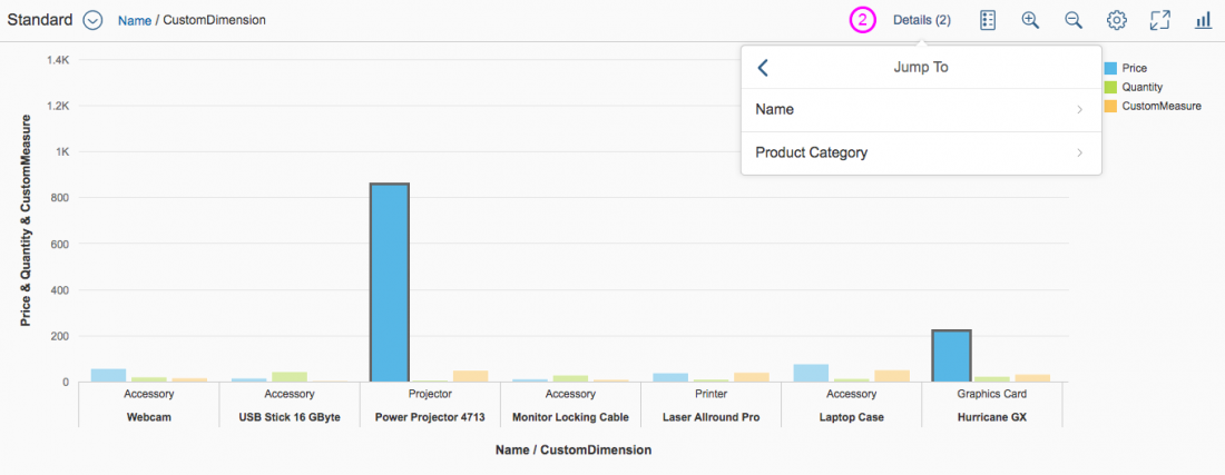
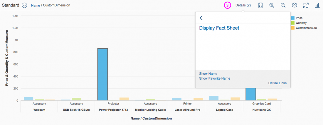
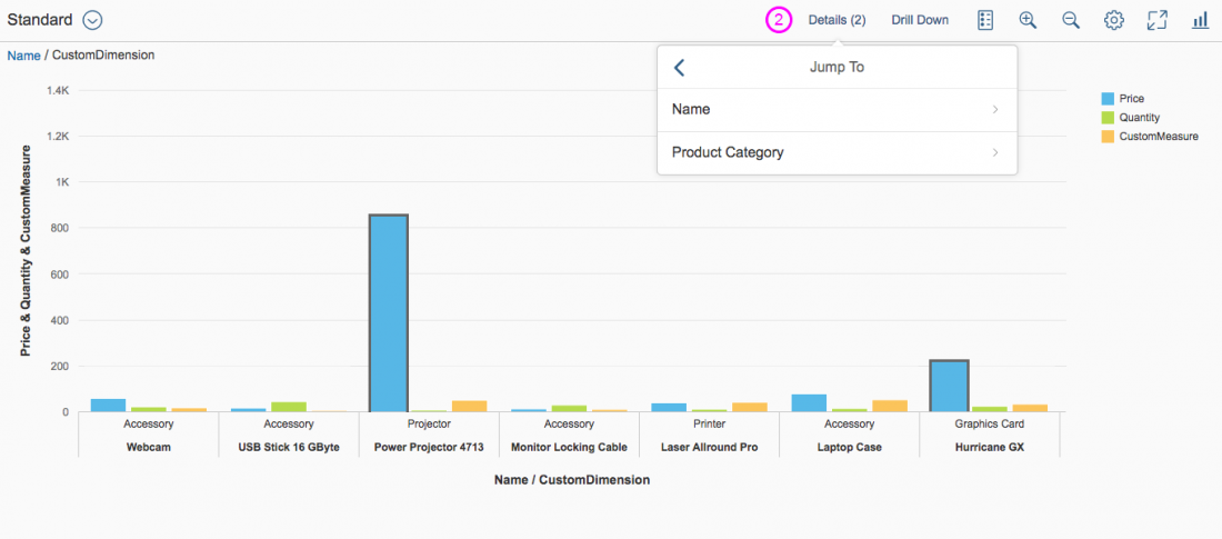
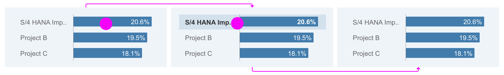
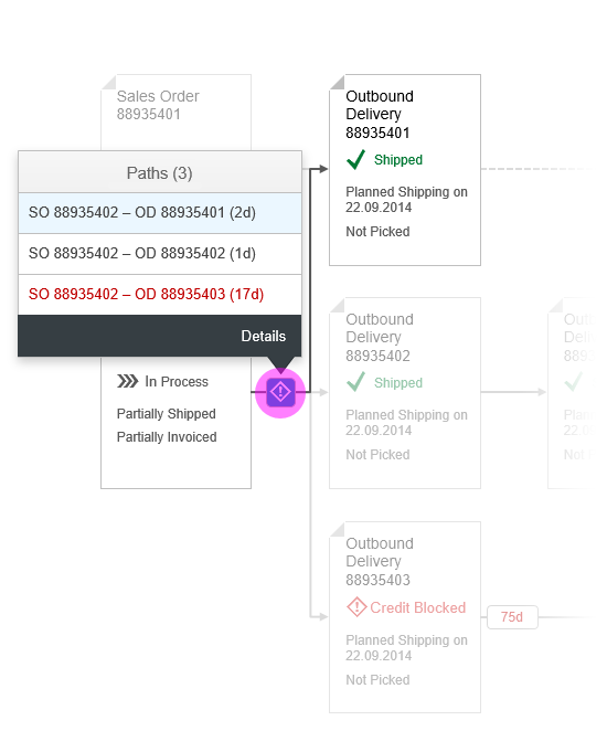
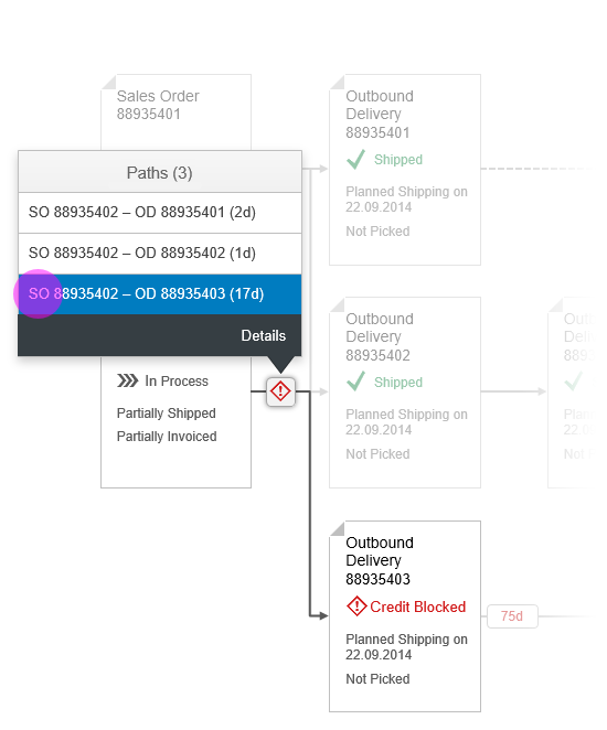
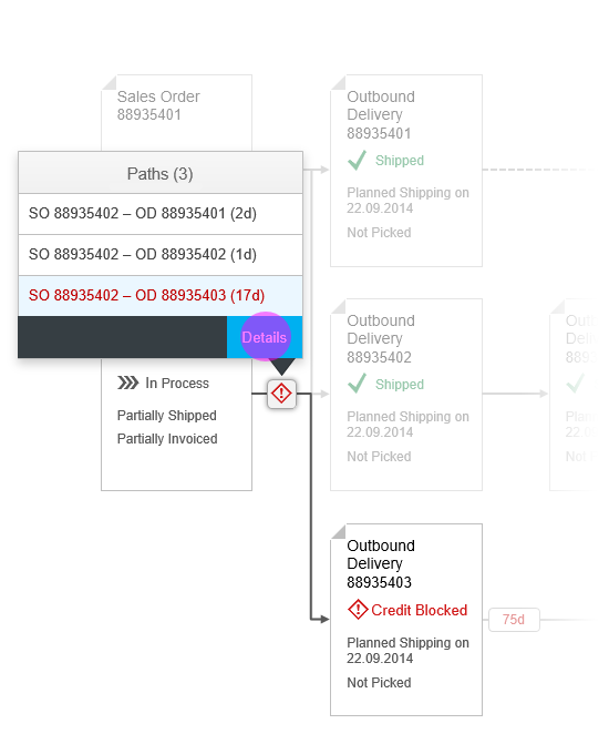
3. Drill/Details buttons: There are two possibilities to drill down in the chart:
- The Drill up/down arrow icon buttons that come by default with the chart.
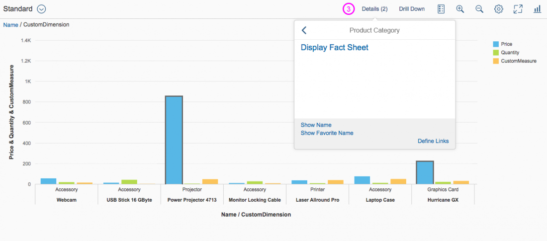
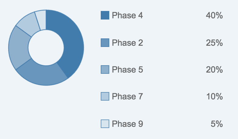
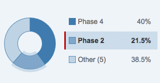
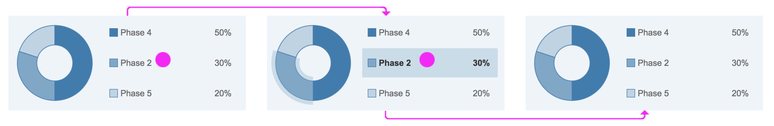
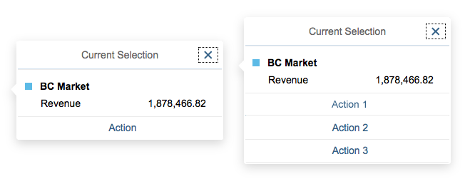
- The Drill Down/Details button (recommended) – When no data points are selected the, Drill Down button shows a list with possible dimensions. If one or more data points are selected, this button offers a popover summarizing the selected data points and navigation to detailed information, as well as a drilldown.
4. Legend: The icon button toggles the legend on and off.
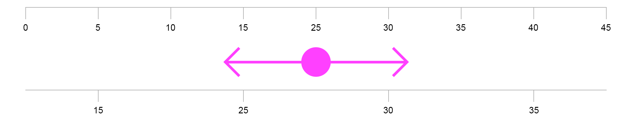
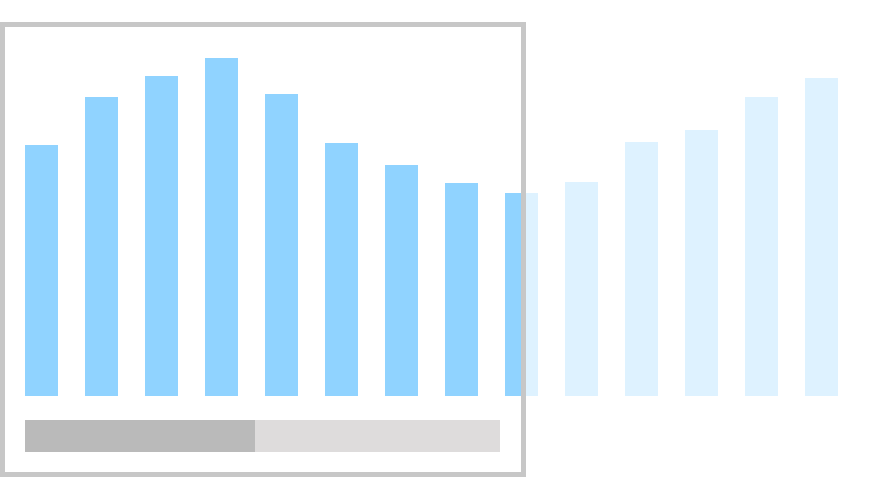
5. Zoom in/out – The two icon buttons zoom in and out. Zooming increases or decreases the data points and this way offers more or less data points on one view.
6. Download – This button downloads the current view of the chart.
7. Chart personalization – In some cases a personalization dialog might be necessary to offer chart dimension visibility or sorting and filtering of data points. For more information, see the P13n-Dialog.
8. Full screen: The icon button toggles the full screen view.
9. Chart type switch: The icon button offers a popover with different available chart types.
10. Tooltip: Shows information about the data point on hover.

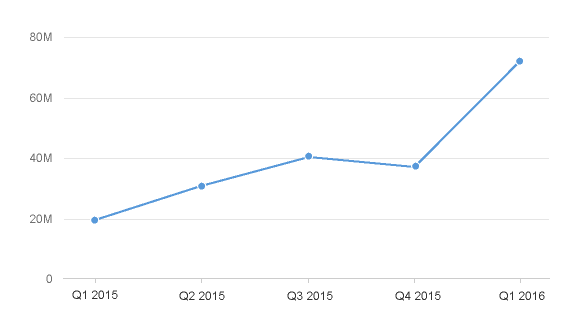
Smart chart components
Behavior and Interaction
Selection
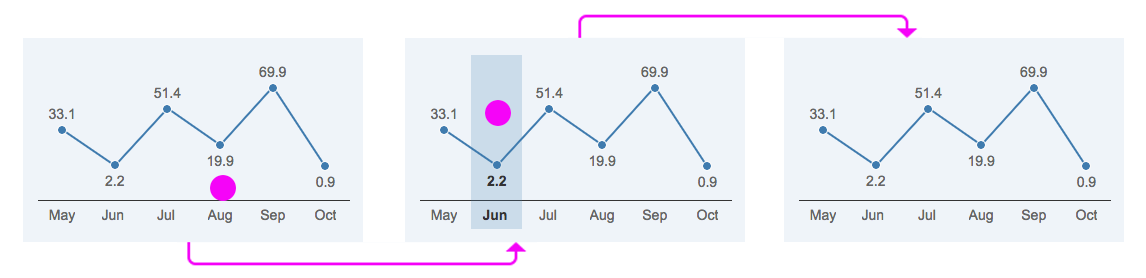
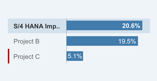
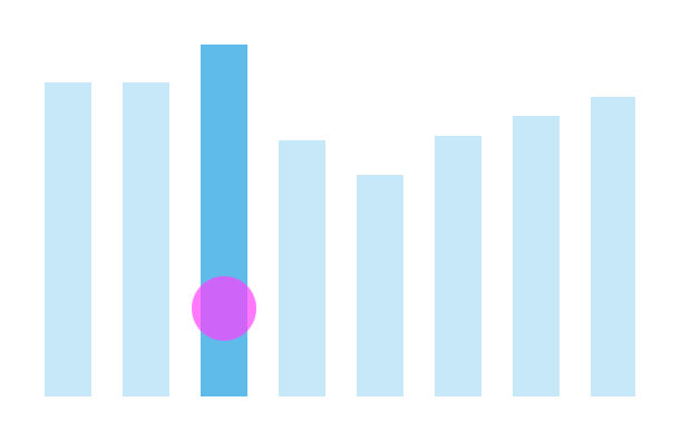
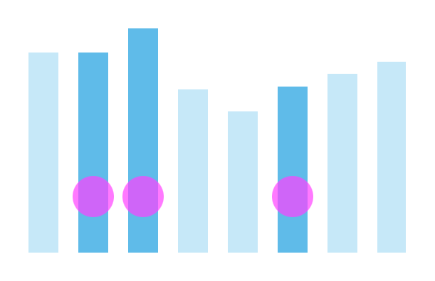
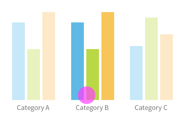
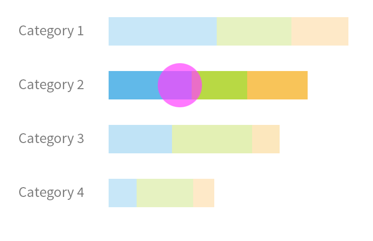
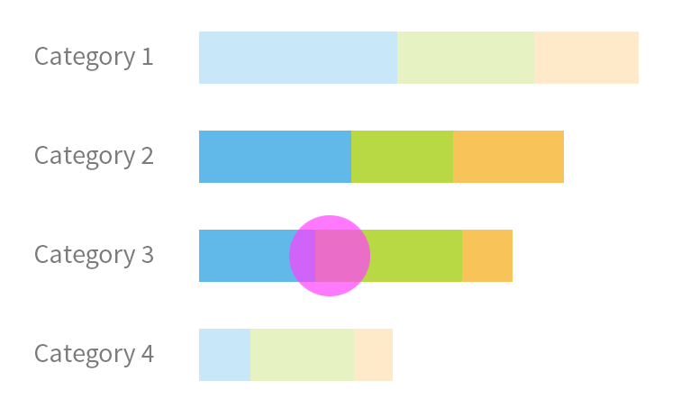
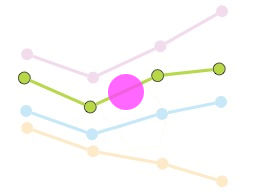
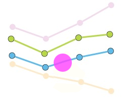
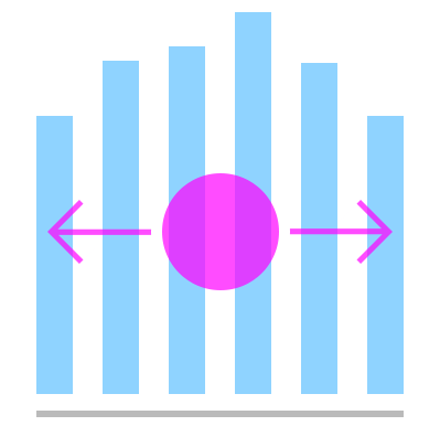
Data points can be selected by clicking or dragging the mouse. Single or multiselection are both possible. Data points, labels, and legend items can be selected. Clicking into the background deselects all data points. For more information, see the chart selection.
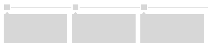
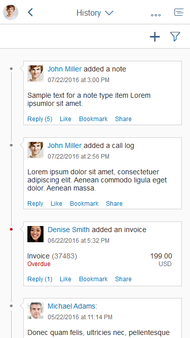
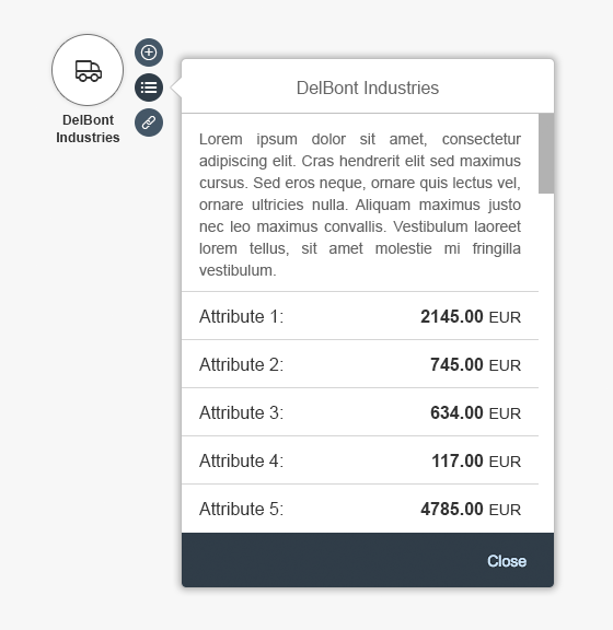
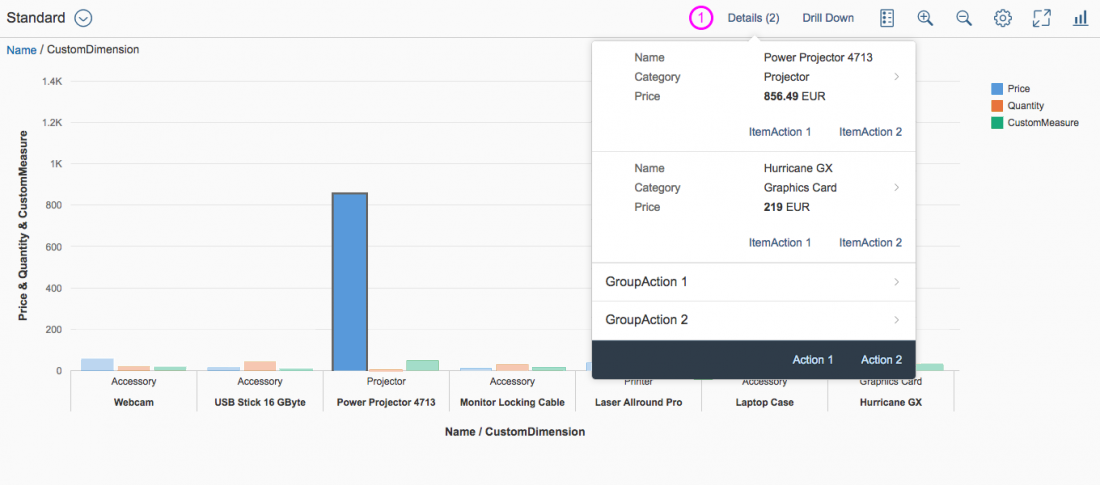
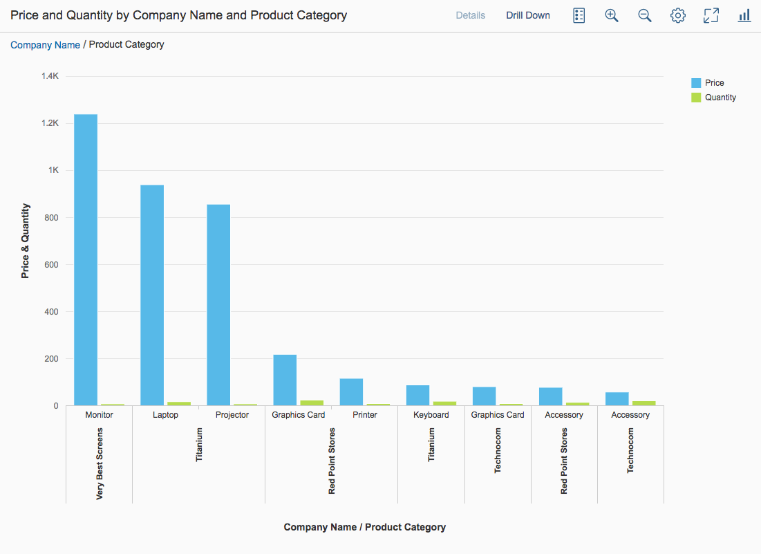
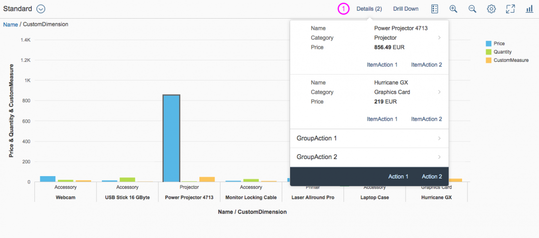
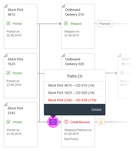
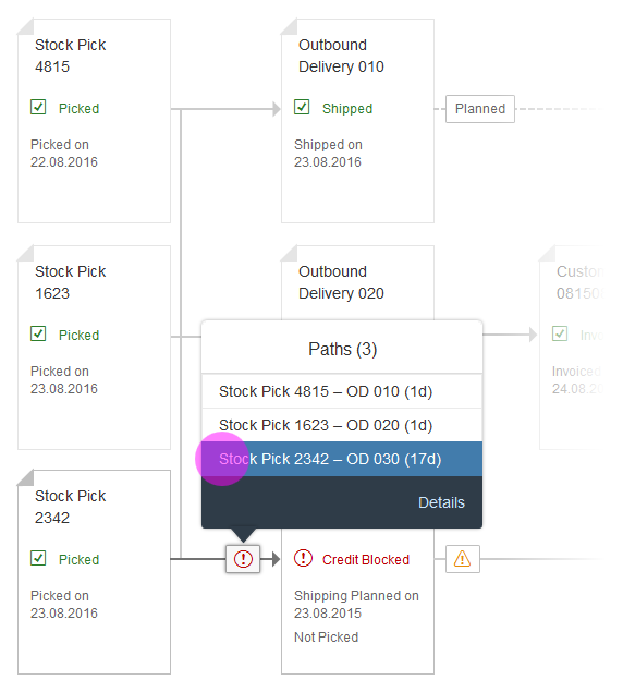
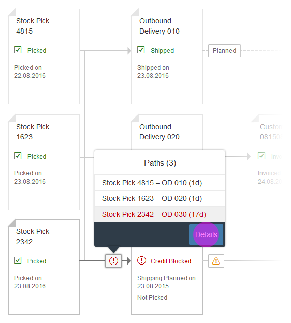
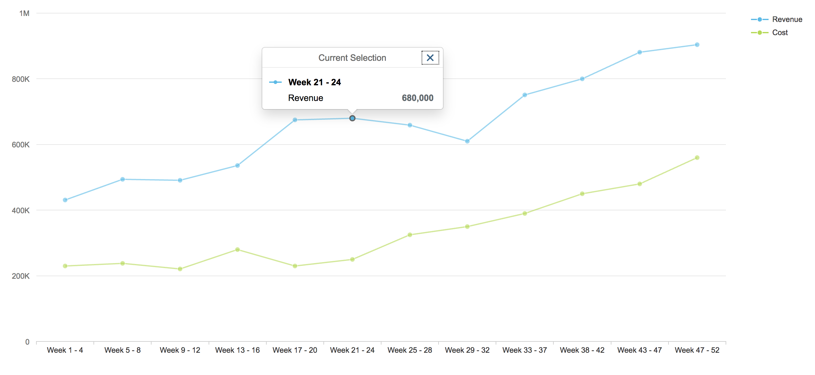
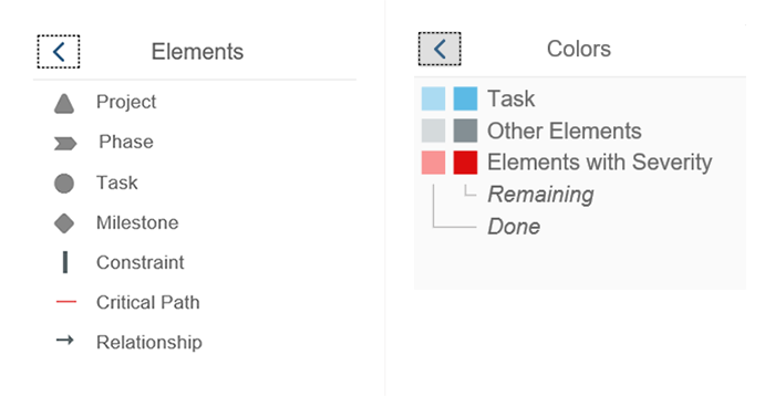
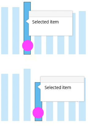
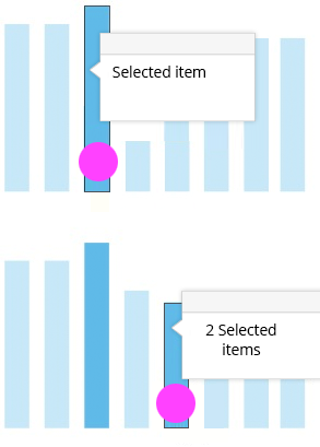
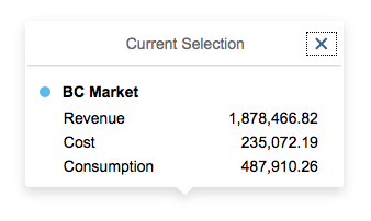
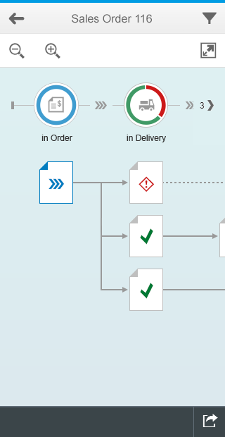
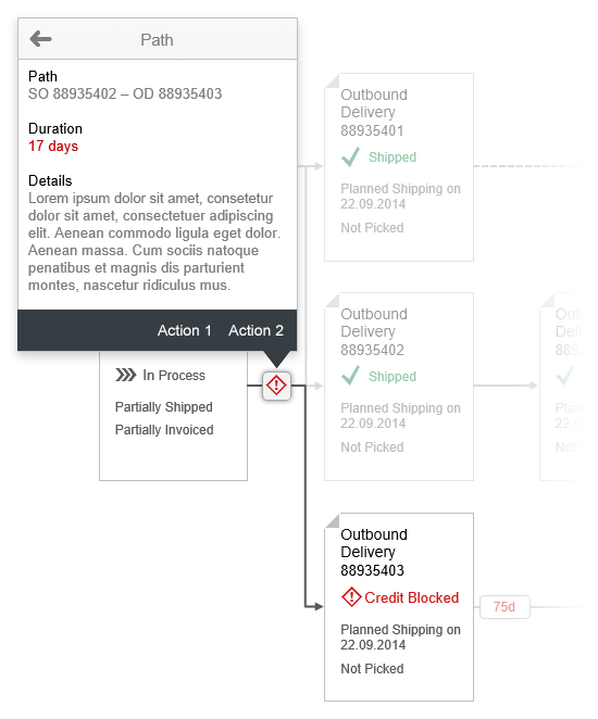
Details
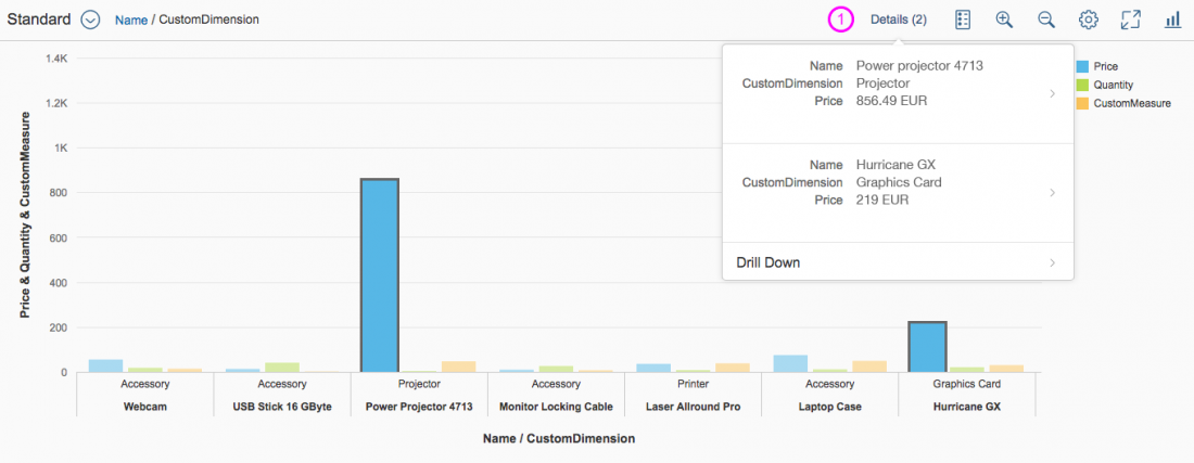
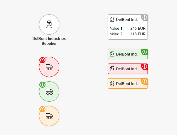
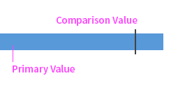
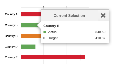
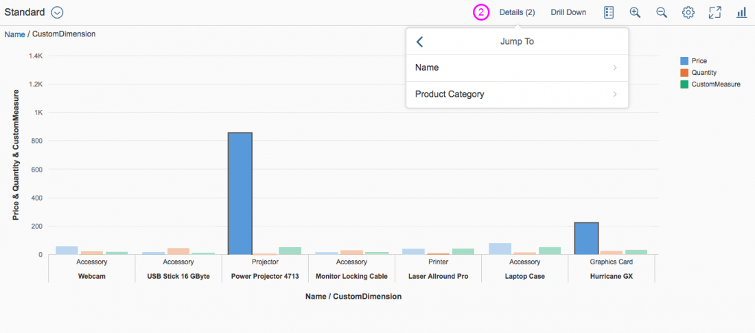
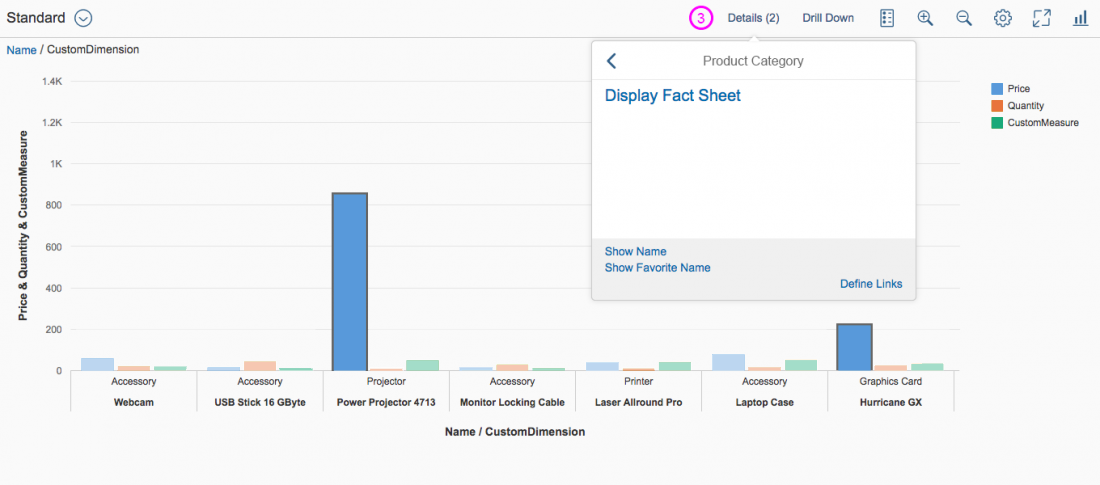
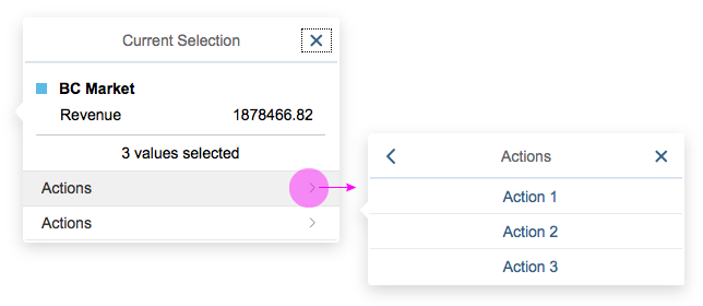
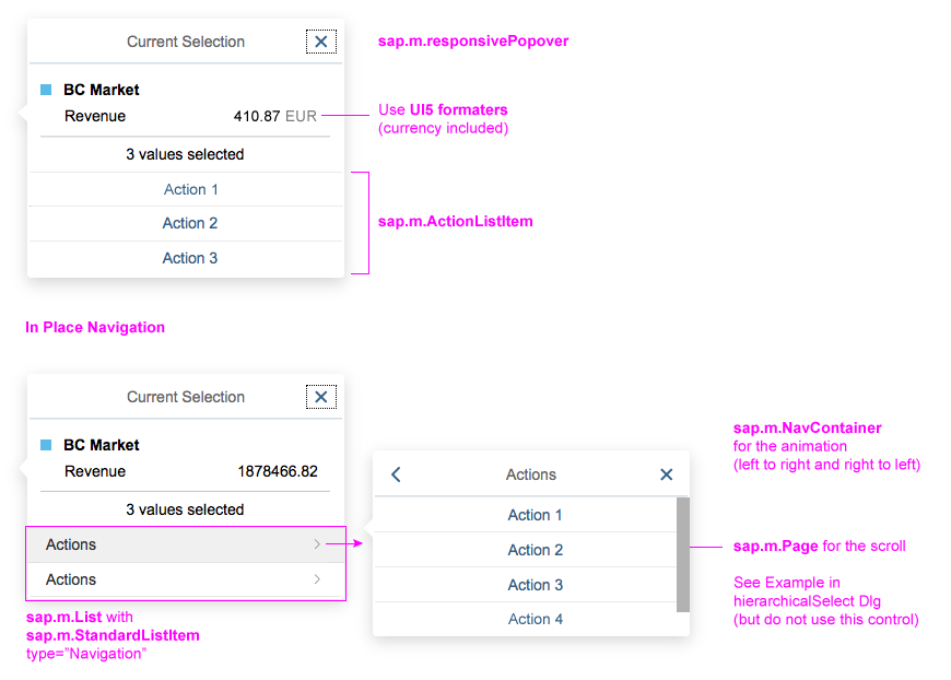
The details popover gives detailed information for each selection made in the chart. The number of selections is shown in brackets.
- The Details button shows all detailed information on all selections.
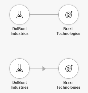
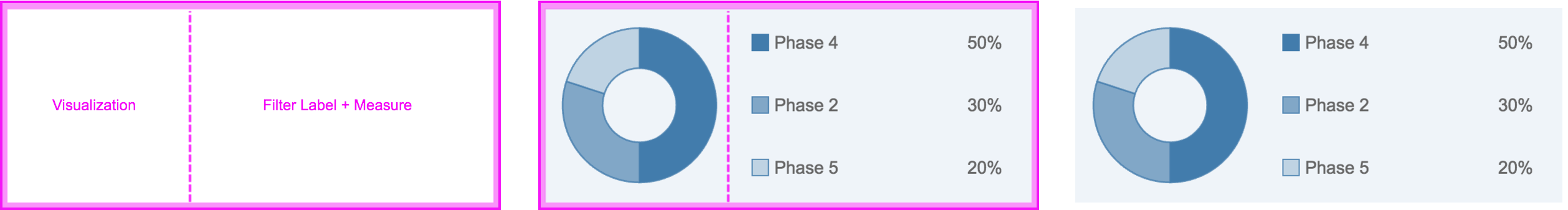
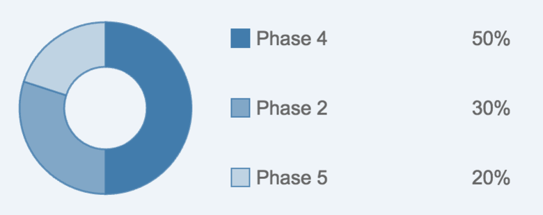
- Clicking on an item/selection in the popover shows the semantic navigation (smart links) related to the selection. In the example below, the information is divided into two groups.
- The semantic navigation information for the selected group (Name) is shown.
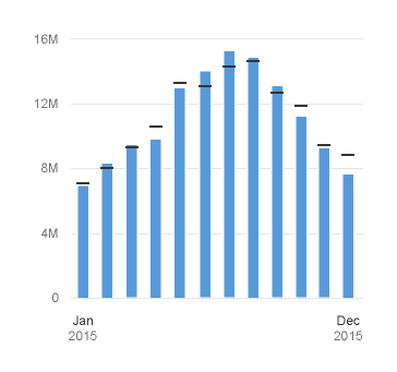
Smart Chart - Details popover interaction
Resources
Want to dive deeper? Follow the links below to find out more about related controls, the SAPUI5 implementation, and the visual design.
Elements and Controls
- Toolbar (guidelines)
- Personalization Settings (guidelines)
- Variant Management (guidelines)
- Breadcrumb (guidelines)
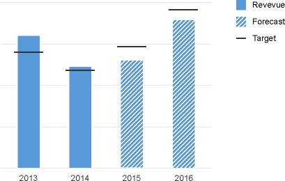
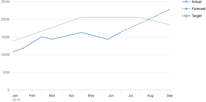
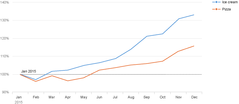
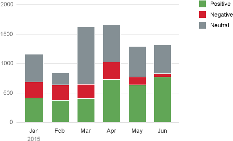
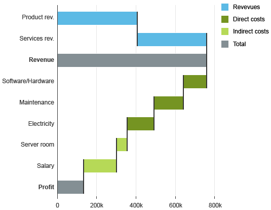
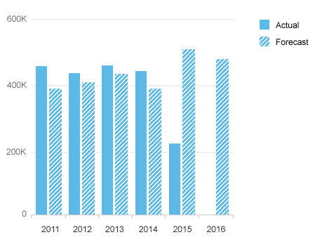
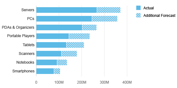
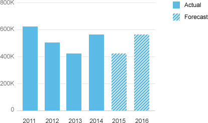
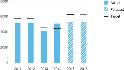
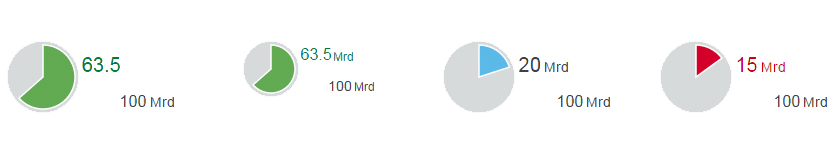
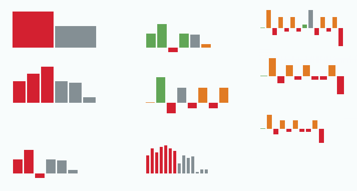
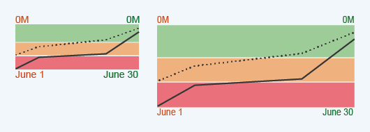
- VizFrame Charts (guidelines)


 Your feedback has been sent to the SAP Fiori design team.