
- SAPUI5 Version 1.122
- SAPUI5 Version 1.120
- SAPUI5 Version 1.118
- SAPUI5 Version 1.116
- SAPUI5 Version 1.114
- SAPUI5 Version 1.112
- SAPUI5 Version 1.110
- SAPUI5 Version 1.108
- SAPUI5 Version 1.106
- SAPUI5 Version 1.104
- SAPUI5 Version 1.102
- SAPUI5 Version 1.100
- SAPUI5 Version 1.98
- SAPUI5 Version 1.96
- SAPUI5 Version 1.94
- SAPUI5 Version 1.92
- SAPUI5 Version 1.90
- SAPUI5 Version 1.88
- SAPUI5 Version 1.86
- SAPUI5 Version 1.84
- SAPUI5 Version 1.82
- SAPUI5 Version 1.80
- SAPUI5 Version 1.78
- SAPUI5 Version 1.76
- SAPUI5 Version 1.74
- SAPUI5 Version 1.72
- SAPUI5 Version 1.70
- SAPUI5 Version 1.68
- SAPUI5 Version 1.66
- SAPUI5 Version 1.64
- SAPUI5 Version 1.62
- SAPUI5 Version 1.60
- SAPUI5 Version 1.58
- SAPUI5 Version 1.56
- SAPUI5 Version 1.54
- SAPUI5 Version 1.52
- SAPUI5 Version 1.50
- SAPUI5 Version 1.48
- SAPUI5 Version 1.46
- SAPUI5 Version 1.44
- SAPUI5 Version 1.42
- SAPUI5 Version 1.40
- SAPUI5 Version 1.38
- SAPUI5 Version 1.36
- SAPUI5 Version 1.34
- SAPUI5 Version 1.32
- SAPUI5 Version 1.30
- SAPUI5 Version 1.28
- SAPUI5 Version 1.26
- Latest SAPUI Version 1.124
- SAPUI5 Version 1.122
- SAPUI5 Version 1.120
- SAPUI5 Version 1.118
- SAPUI5 Version 1.116
- SAPUI5 Version 1.114
- SAPUI5 Version 1.112
- SAPUI5 Version 1.110
- SAPUI5 Version 1.108
- SAPUI5 Version 1.106
- SAPUI5 Version 1.104
- SAPUI5 Version 1.102
- SAPUI5 Version 1.100
- SAPUI5 Version 1.98
- SAPUI5 Version 1.96
- SAPUI5 Version 1.94
- SAPUI5 Version 1.92
- SAPUI5 Version 1.90
- SAPUI5 Version 1.88
- SAPUI5 Version 1.86
- SAPUI5 Version 1.84
- SAPUI5 Version 1.82
- SAPUI5 Version 1.80
- SAPUI5 Version 1.78
- SAPUI5 Version 1.76
- SAPUI5 Version 1.74
- SAPUI5 Version 1.72
- SAPUI5 Version 1.70
- SAPUI5 Version 1.68
- SAPUI5 Version 1.66
- SAPUI5 Version 1.64
- SAPUI5 Version 1.62
- SAPUI5 Version 1.60
- SAPUI5 Version 1.58
- SAPUI5 Version 1.56
- SAPUI5 Version 1.54
- SAPUI5 Version 1.52
- SAPUI5 Version 1.50
- SAPUI5 Version 1.48
- SAPUI5 Version 1.46
- SAPUI5 Version 1.44
- SAPUI5 Version 1.42
- SAPUI5 Version 1.40
- SAPUI5 Version 1.38
- SAPUI5 Version 1.36
- SAPUI5 Version 1.34
- SAPUI5 Version 1.32
- SAPUI5 Version 1.30
- SAPUI5 Version 1.28
- SAPUI5 Version 1.26
Overview Page – List Card
Intro
Lists with Different Flavors
List cards display a set of items or links in a list format. The overview page supports three types of list card: list card, bar chart list card, and link list card. You can also show icons and images. For general information on cards, see Cards.
Overview Page - List Cards
List cards are a type of object group card, and display a set of items in a vertical list. List cards use the sap.m.List container in the content area.
Navigation
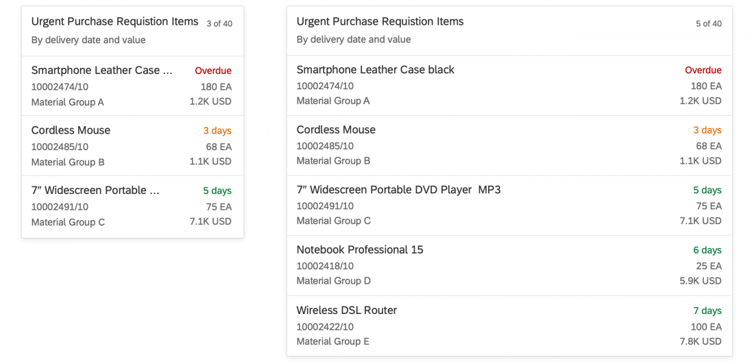
Clicking the header area of a list card opens the parent application, which uses the same filter as the annotated card, and shows a list of all the objects returned for the result set. The counter indicates how many items are showing on the card in relation to the total number of relevant items: [Items on Card] of [Total Items], as in 5 of 40.
Clicking a list item (row) on the card opens the detail view for that specific item in the same parent application. Only aggregate list items in exceptional cases.
Because the header area and line items are based on the same result set, they must always link to the same target application. You can also integrate a view switch inside the content area of a card.
List Item Types
Two different list item types are available:
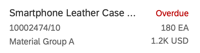
- The standard list item always shows 3 pieces of information and inherits the properties of the SAPUI5 control sap.m.StandardListItem.
You can also show an (optional) icon or image on the left. - The extended list item can show up to 6 pieces of information and inherits the properties of the SAPUI5 control sap.m.ObjectListItem.
In addition, you can display the data on the right-hand side in semantic colors.
You can only use one type of list item on any given card.
Standard list item
Extended list item
Size of a List Card
The fixed card layout defines a specific size. The height of list cards can vary, depending on the number of text fields. Show no more than five standard list items and no more than three extended list items on one card. To see the full result set, the user needs to navigate to the parent app.
In the resizable card layout, users can see more content/insights by resizing the cards.
Overview Page - Bar Chart List Cards
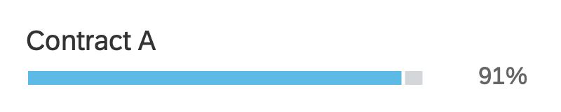
Bar chart list cards are a type of object group card, and display a set of items in a vertical list. Unlike list cards, bar chart list cards are embedded in another component: the comparison micro chart. This allows you to display negative values and use semantic colors.
Navigation
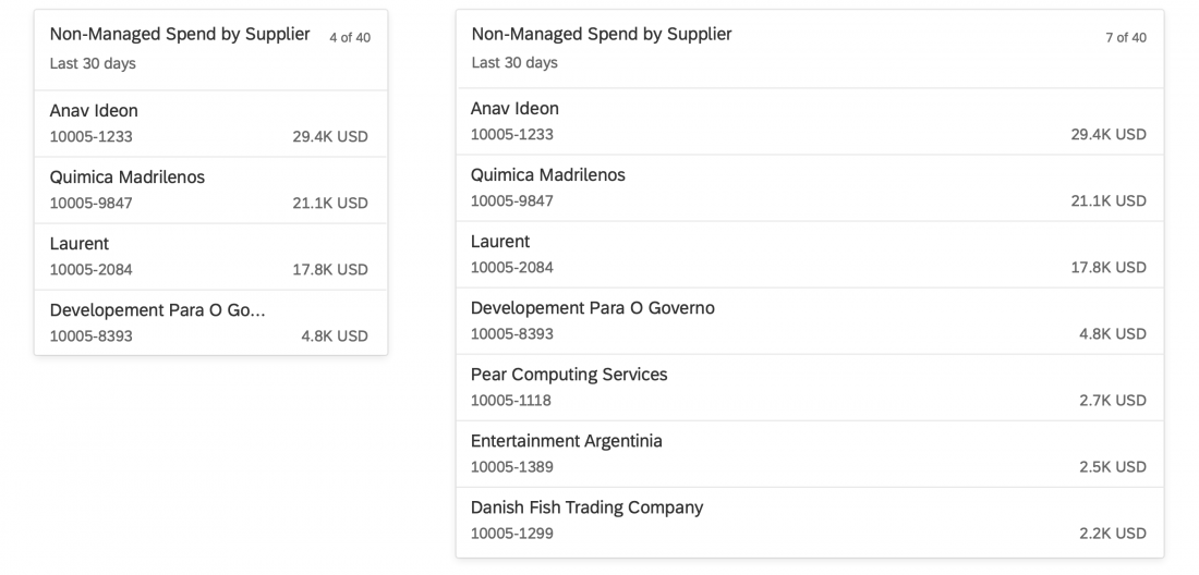
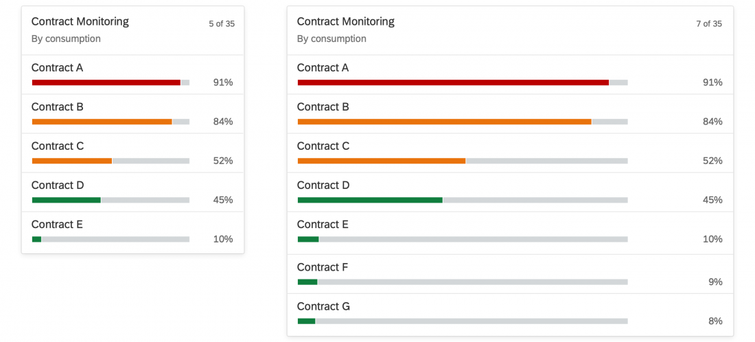
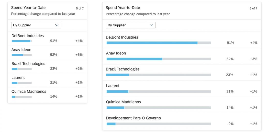
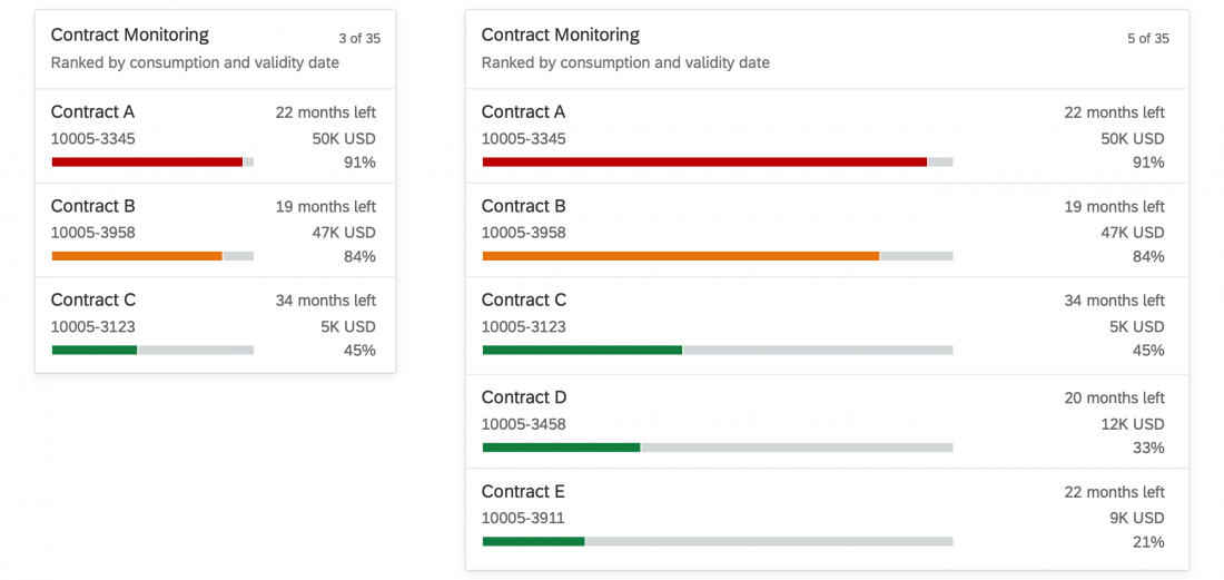
Clicking the header area of a list card opens the parent application, which uses the same filter as the annotated card, and shows a list of all the objects returned for the result set. The counter indicates how many items are showing on the card in relation to the total number of relevant items: [Items on Card] of [Total Items], as in 5 of 35.
Clicking a list item (row) on the card opens the detail view for that specific item in the same parent application. Only aggregate list items in exceptional cases.
Because the header area and line items are based on the same result set, they must always link to the same target application. You can also integrate a view switch inside the content area of a card.
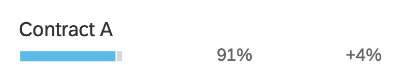
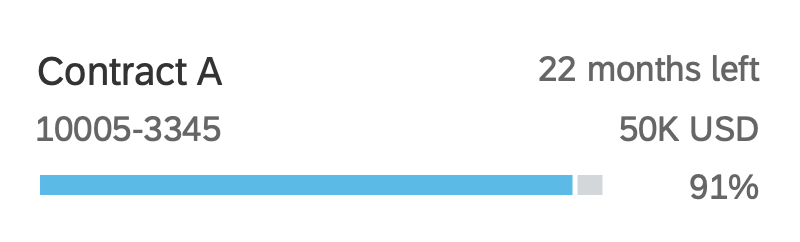
Bar Chart List Item Types
Three different list item types are available:
- The standard list item always shows 3 pieces of information.
- The condensed list item can show up to 4 pieces of information.
- The extended list item can show up to 6 pieces of information.
You can only use one type of list item on any given card.
Standard list item
Condensed list item
Extended list item
Size of a Bar Chart List Card
The fixed card layout defines a specific size. The height can vary, depending on the number of text fields. Show no more than five standard/condensed list items and no more than three extended list items on one card. To see the full result set, the user needs to navigate to the parent app.
In the resizable card layout, users can see more content/insights by resizing the cards.
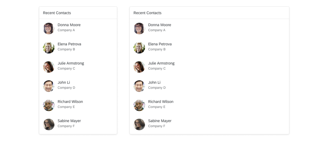
Overview Page - Link List Cards (List Variant)
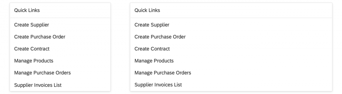
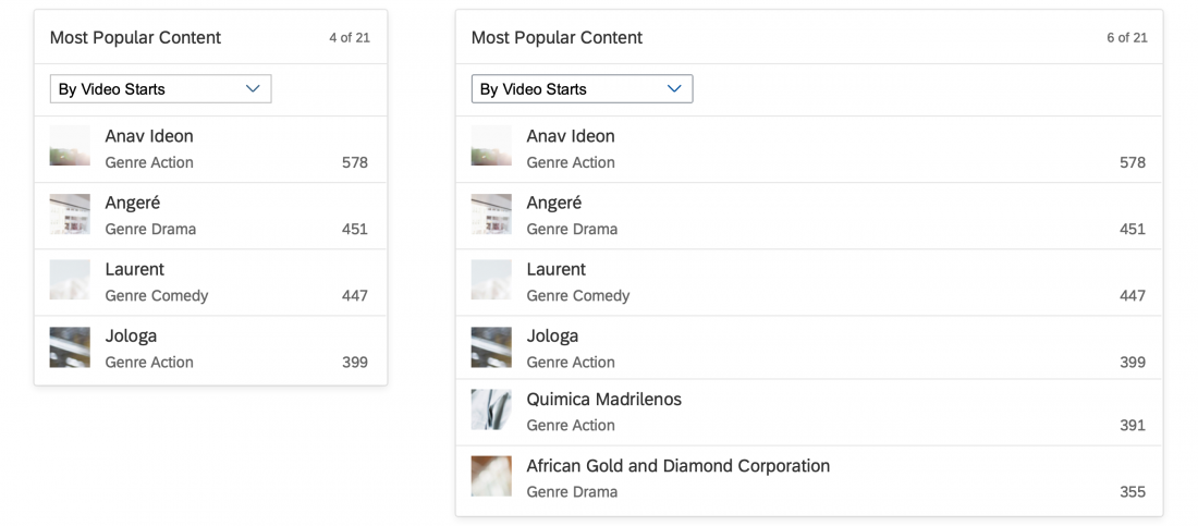
The list variant shows a collection of links that can navigate to a target or open a popover with additional information. You can also show an optional subtitle below the link with a description or additional information. The link text and subtitle are each limited to one line.
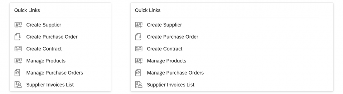
You can display an icon or image before each link. For example, you might want to include app icons for set of links to recently-used apps, or images for a list of recent contacts. Use icons and images consistently:
- If you opt to use icons, show an icon before every link.
- If you include images, use a placeholder for images that are not available.
Variant Type: Image
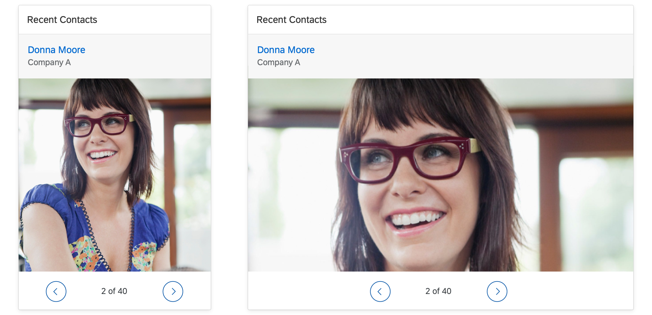
Overview page - Link list card (image variant)
The image variant uses the sap.m.Carousel control to display one or more images. If the carousel contains only one image, the Previous and Next icons and the paging indicator are not visible. The link and an optional subtitle are displayed above the carousel. The link text and subtitle are each limited to one line.
Size of a Link List Card
In the fixed card layout, link list cards with the variant type “list” can have a maximum of 6 links. There is no maximum limit for cards with the variant type “image”.
In the resizable card layout, there is no maximum limit. Users can see more links by resizing the cards.
Resources
Want to dive deeper? Follow the links below to find out more about the SAP Fiori overview page.
Elements and Controls
- Overview Page (SAP Fiori Element) (guidelines)
- Overview Page – Card (guidelines)
- Overview Page – UI Text Guidelines (guidelines)
 Your feedback has been sent to the SAP Fiori design team.