
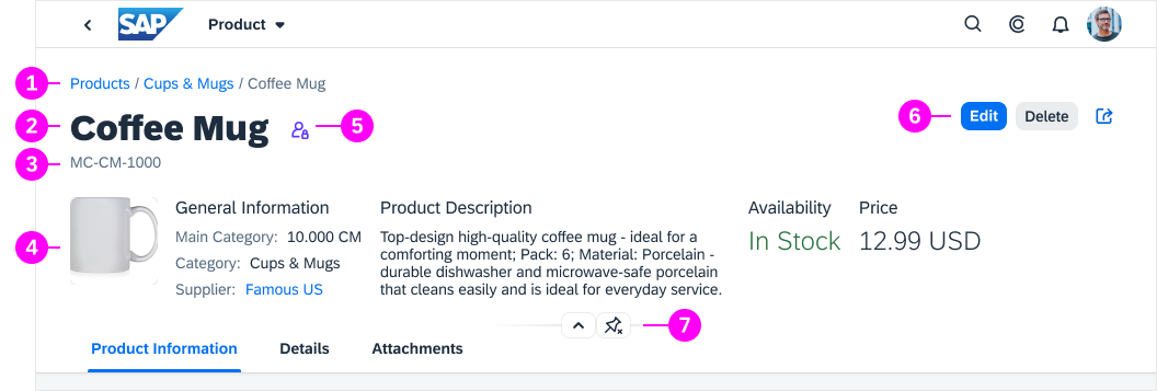
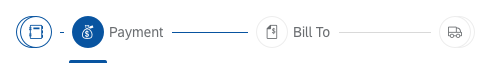
Object Page Floorplan
Intro
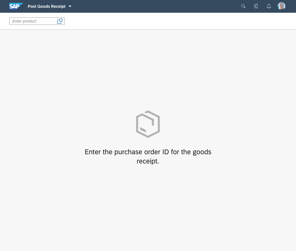
The object page floorplan is used to display and categorize all relevant information about an object. Categorized content can be accessed quickly using anchor or tab navigation, and users can switch from display to edit mode to change the content. To create a new object, users can switch to create mode.
The object page floorplan comes with a flexible, responsive layout and a dynamic page header that can be adapted to display simple and complex business objects. This allows you to adjust the layout to a wide range of use cases.
Object page floorplan
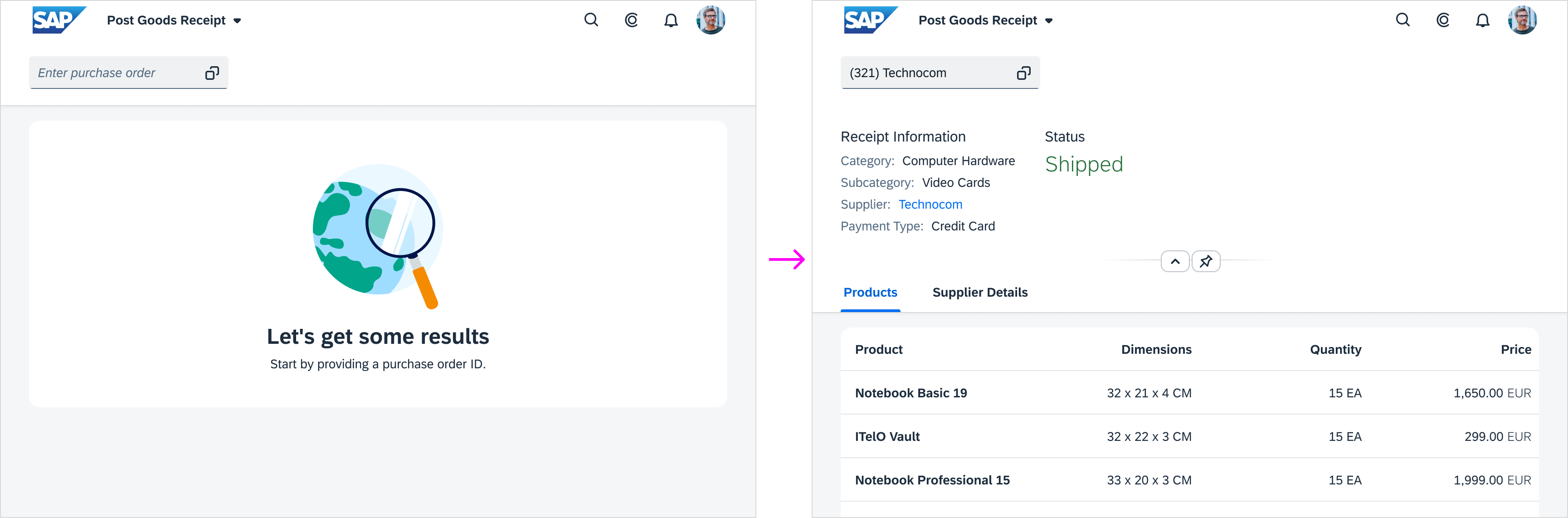
When to Use
Use the object page floorplan if:
- Users need to display, create, or edit an object.
- Users need to get an overview of an object and interact with different parts of the object.
- You need to structure your content into different sections.
- You have a page with one section and editable header content.
Do not use the object page floorplan if: |
Use instead: |
|
List report floorplan |
|
Wizard floorplan |
|
Initial page floorplan |
|
Analytical list page |
|
Dynamic Page Layout page |
Components
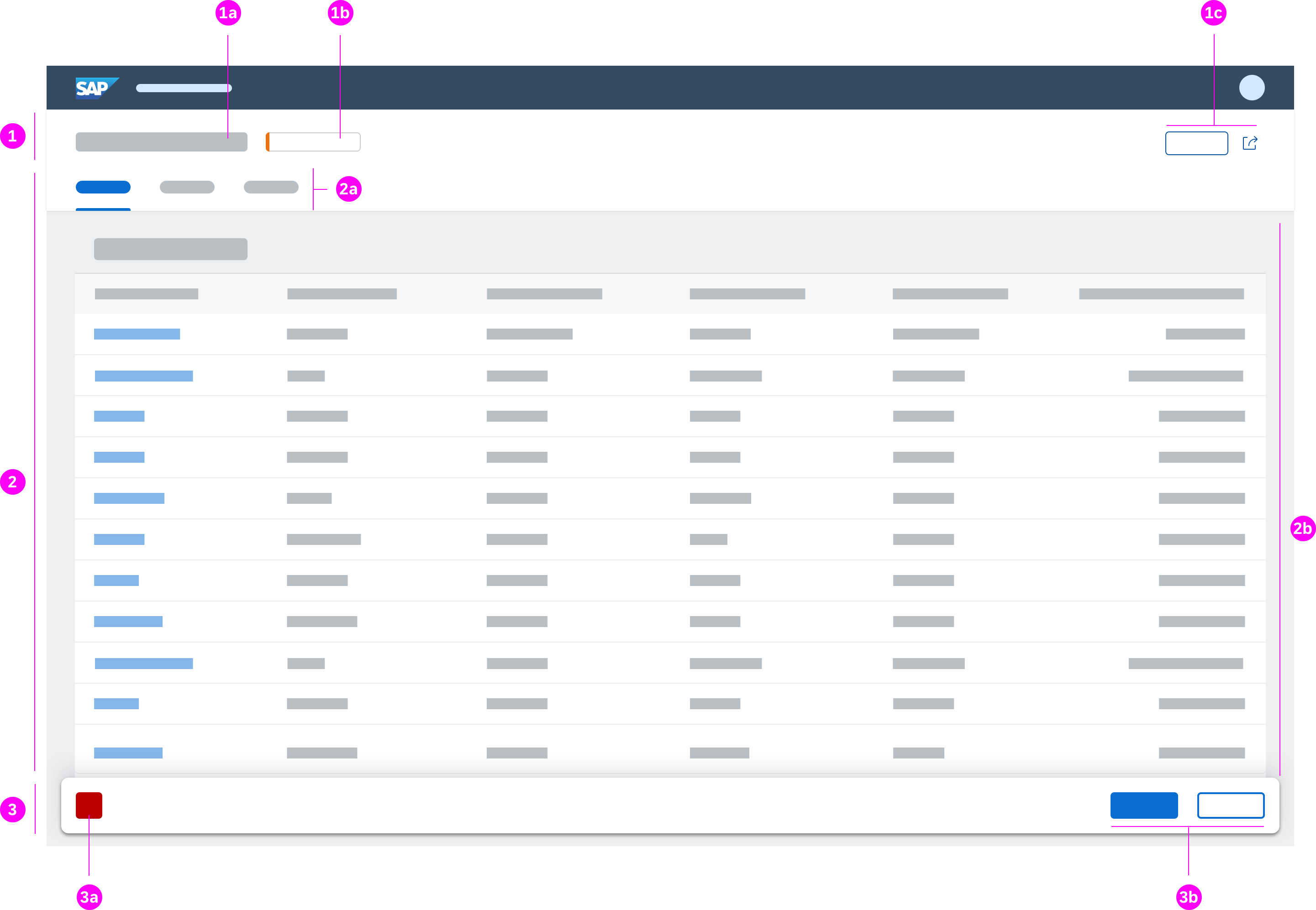
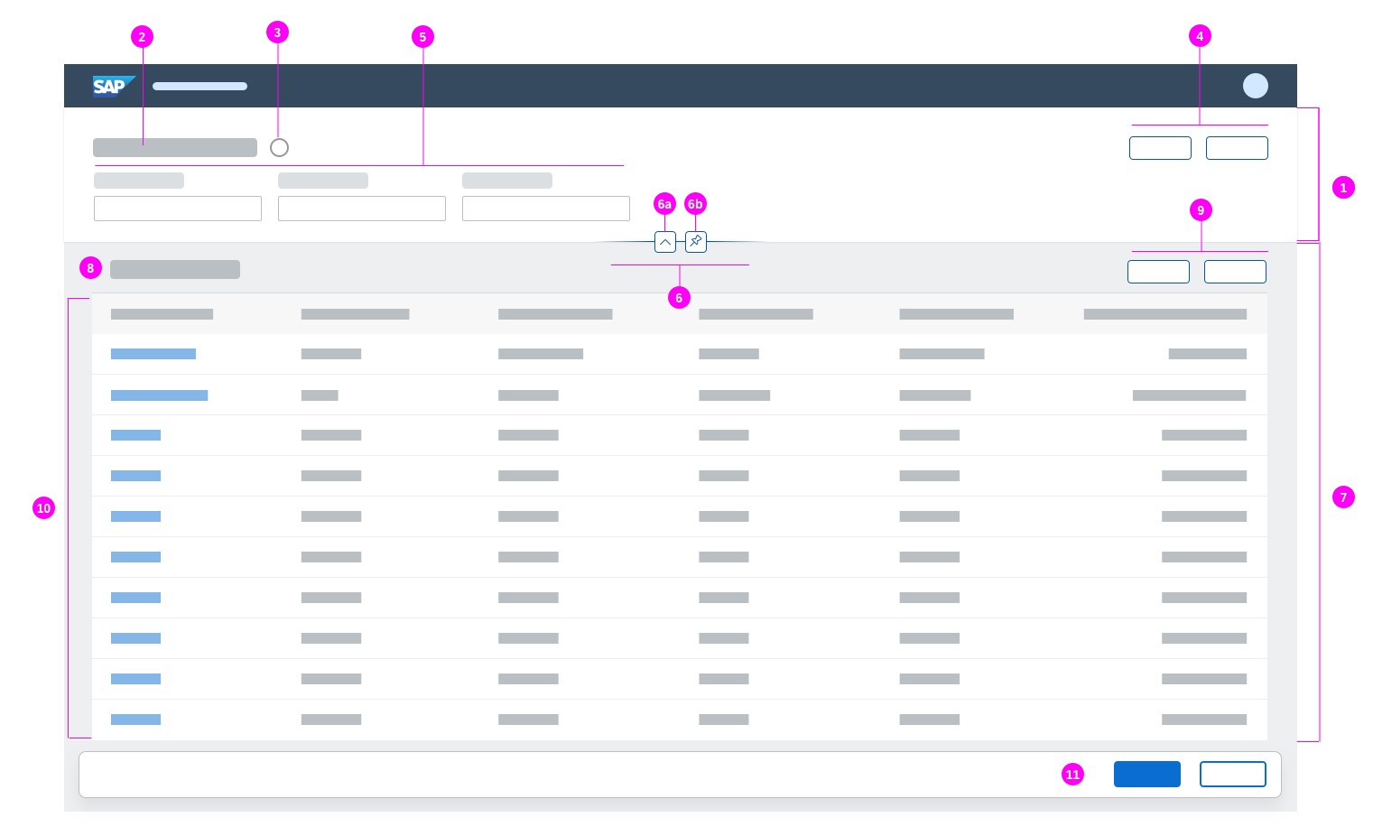
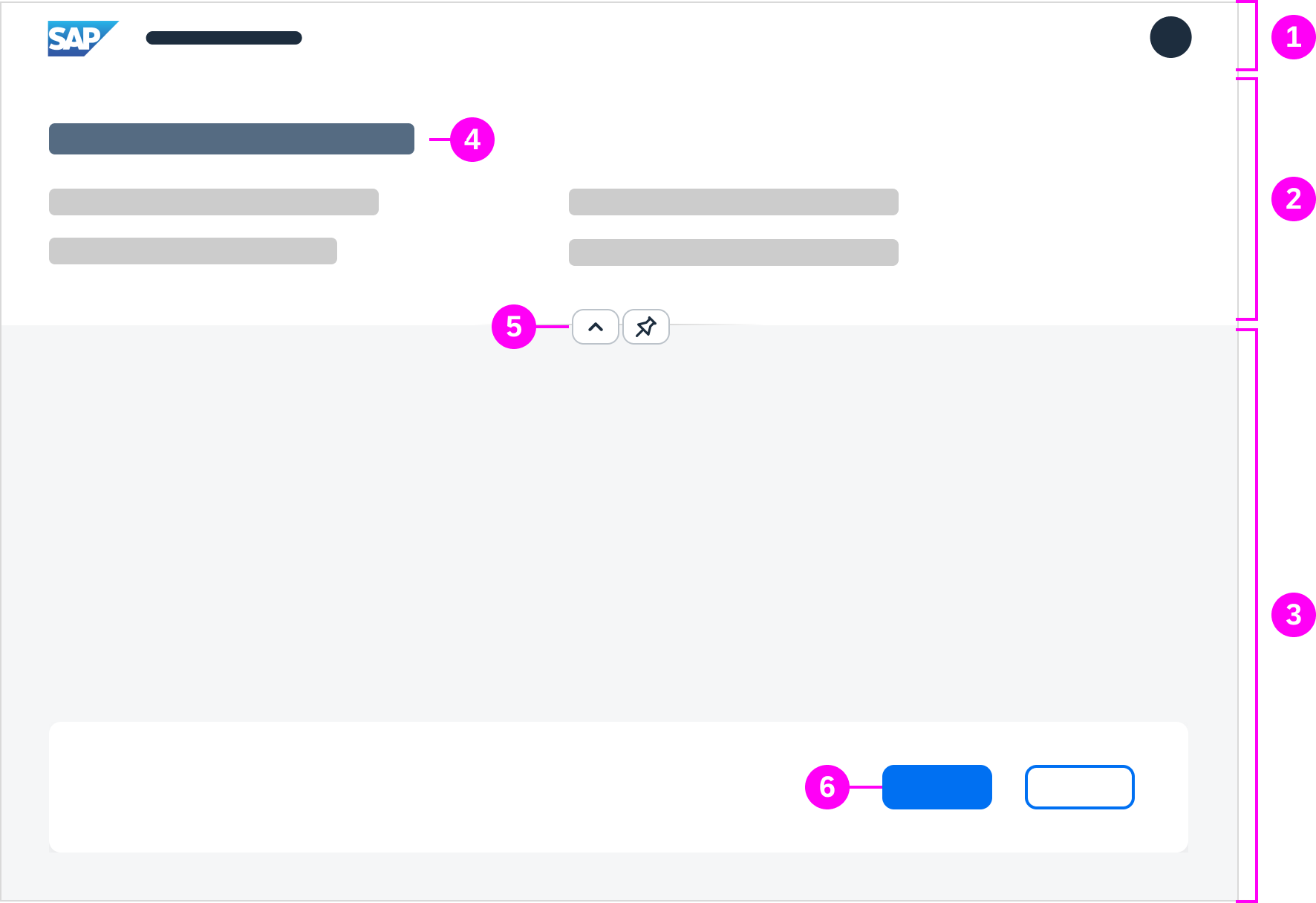
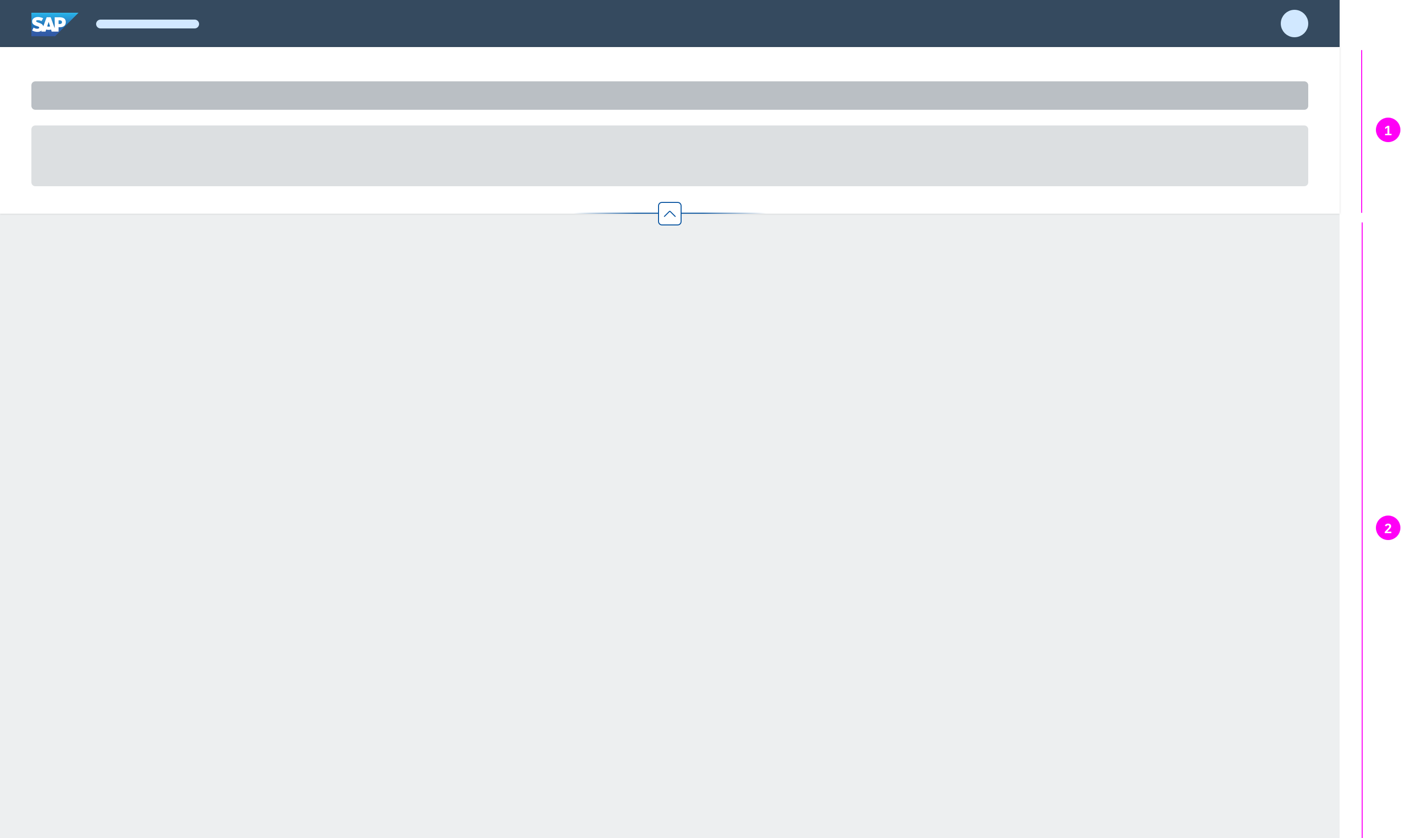
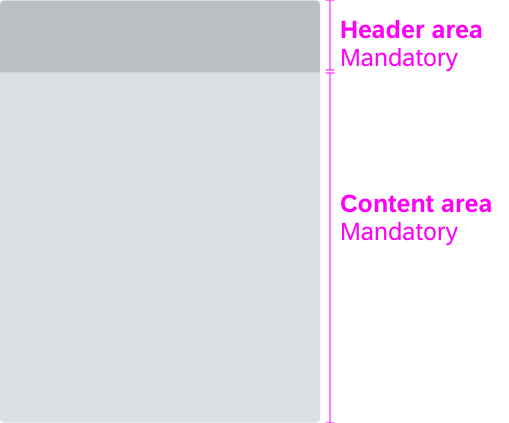
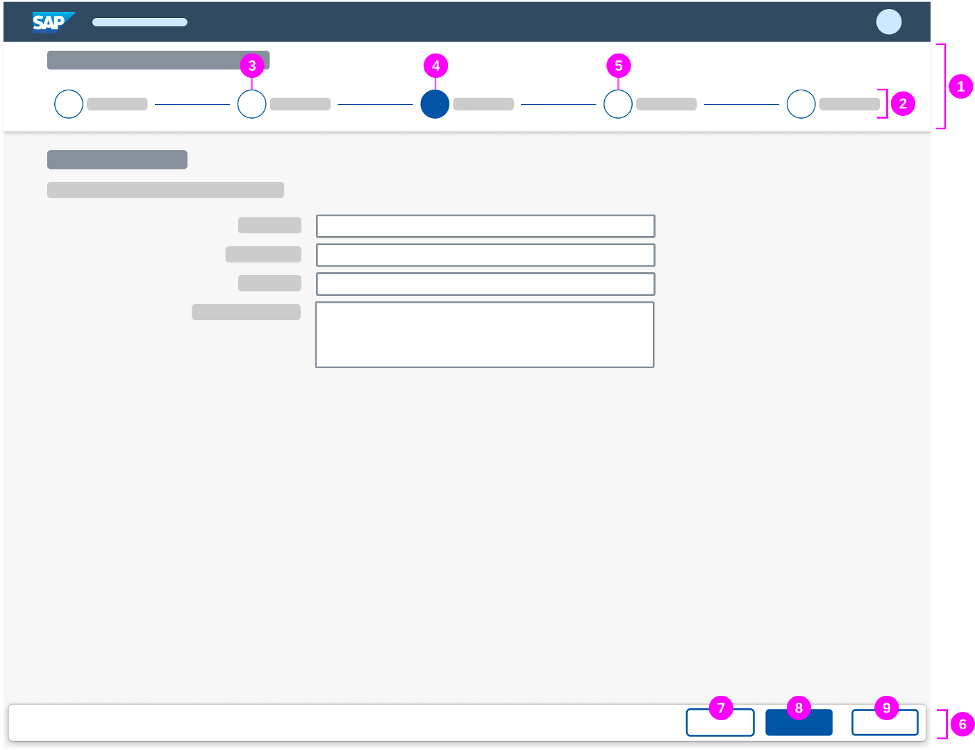
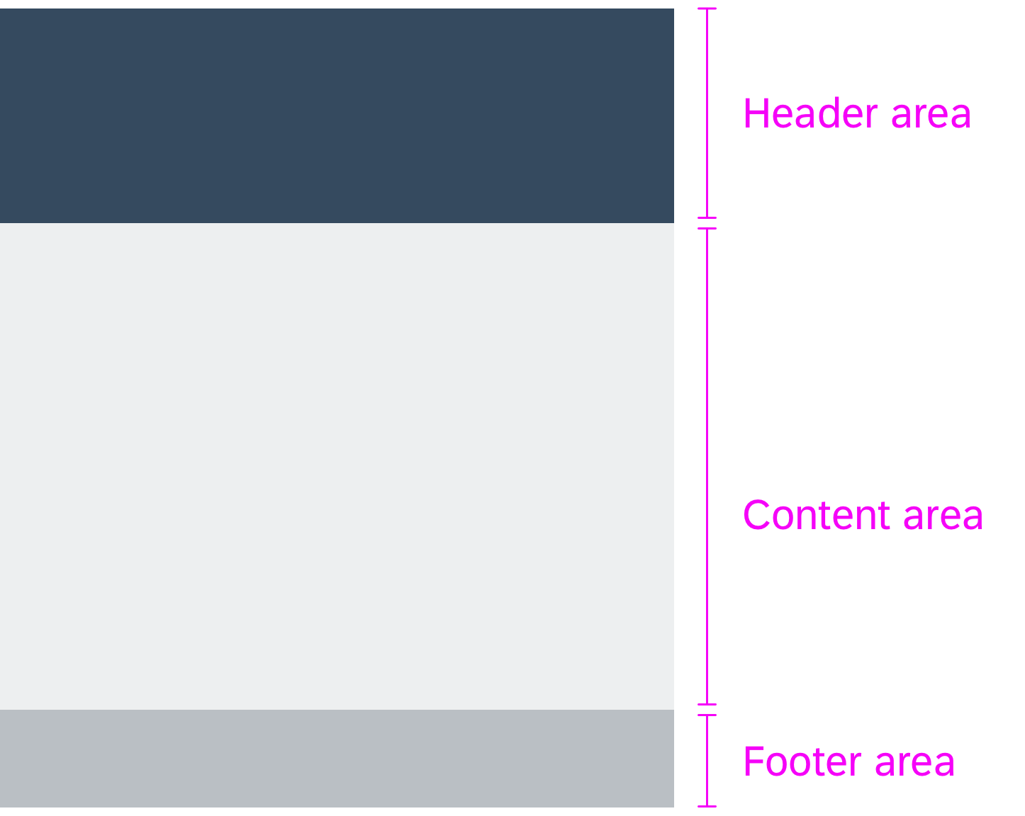
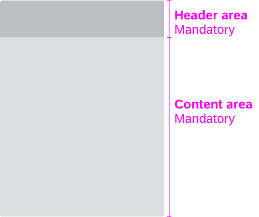
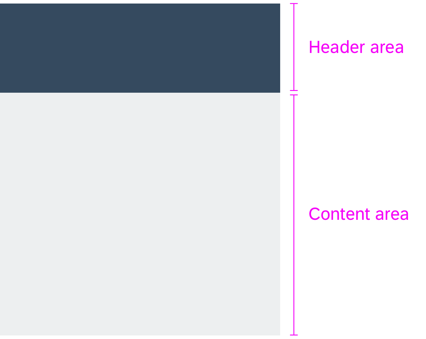
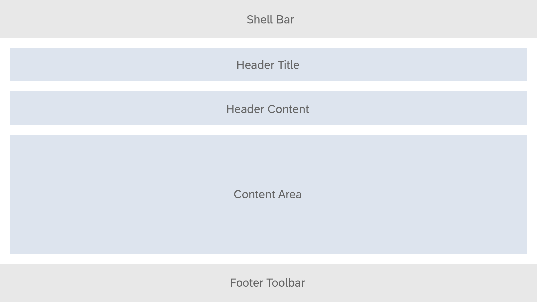
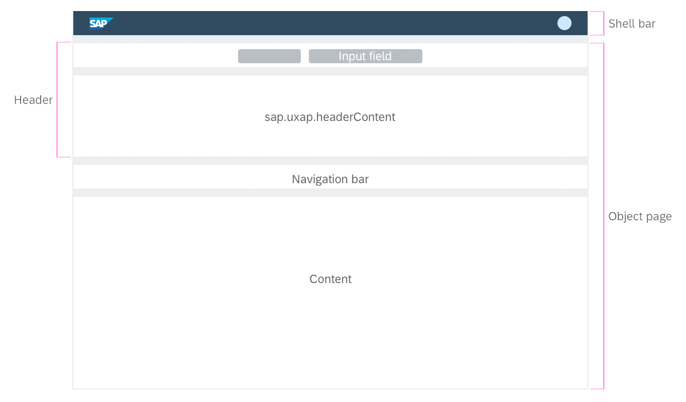
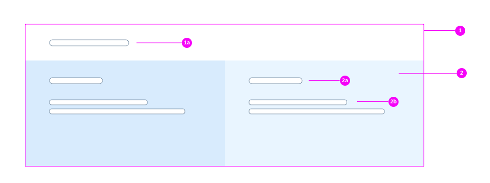
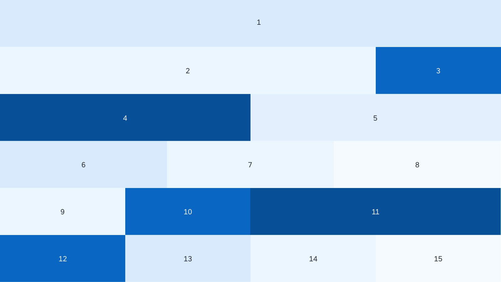
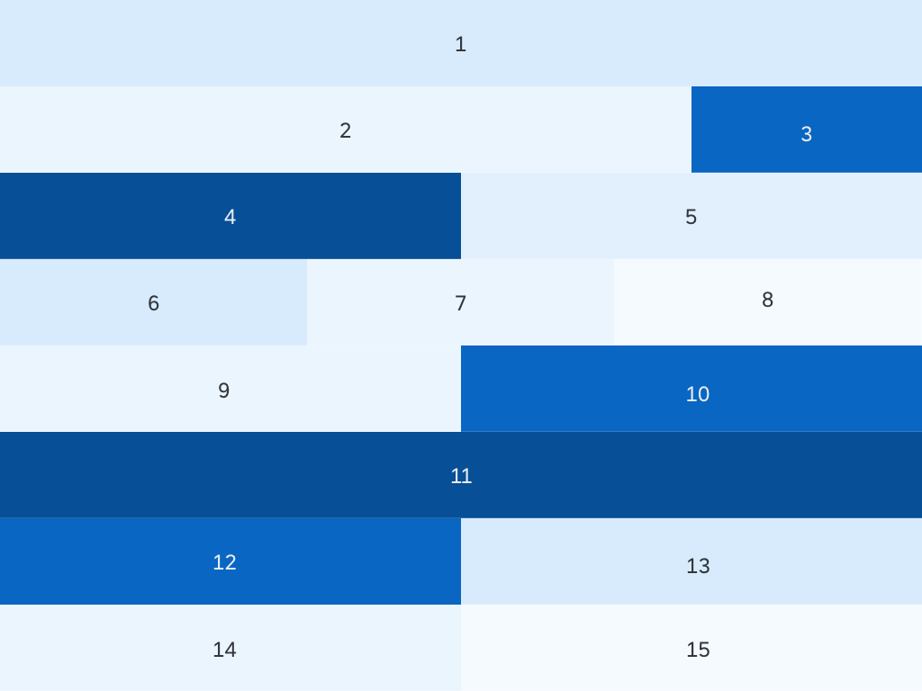
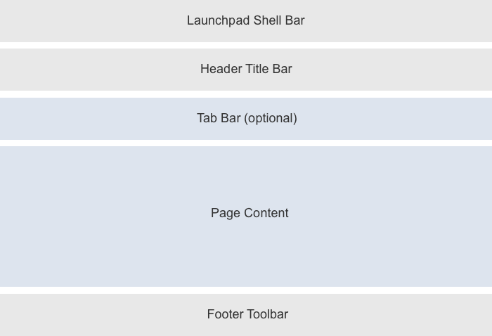
The object page consists of the following elements:
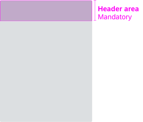
- Dynamic page header (mandatory)
- Navigation bar (optional)
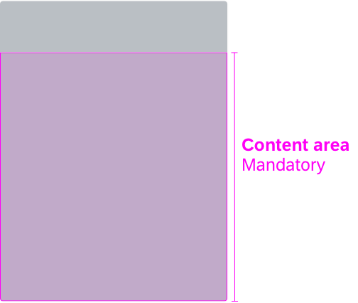
- Content area (mandatory)
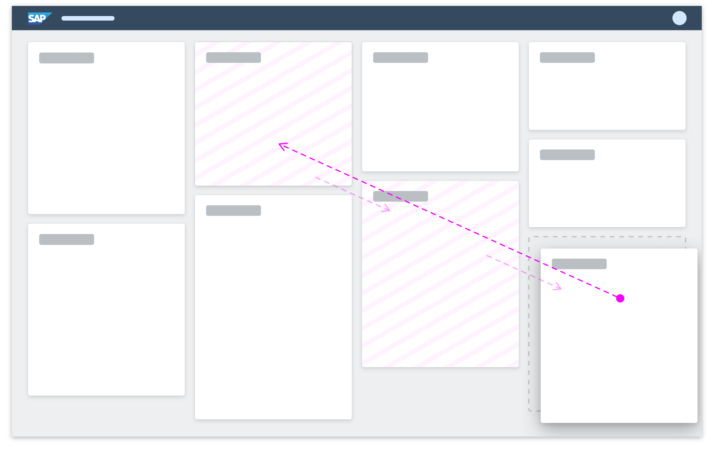
The image below provides an overview of the object page components.

Schematic visualization of the object page
- Dynamic page header
- Navigation bar
- Content area
- Shell bar
- Breadcrumbs
- Global actions
- Header content
- Footer toolbar
The following sections explain these components in more detail.
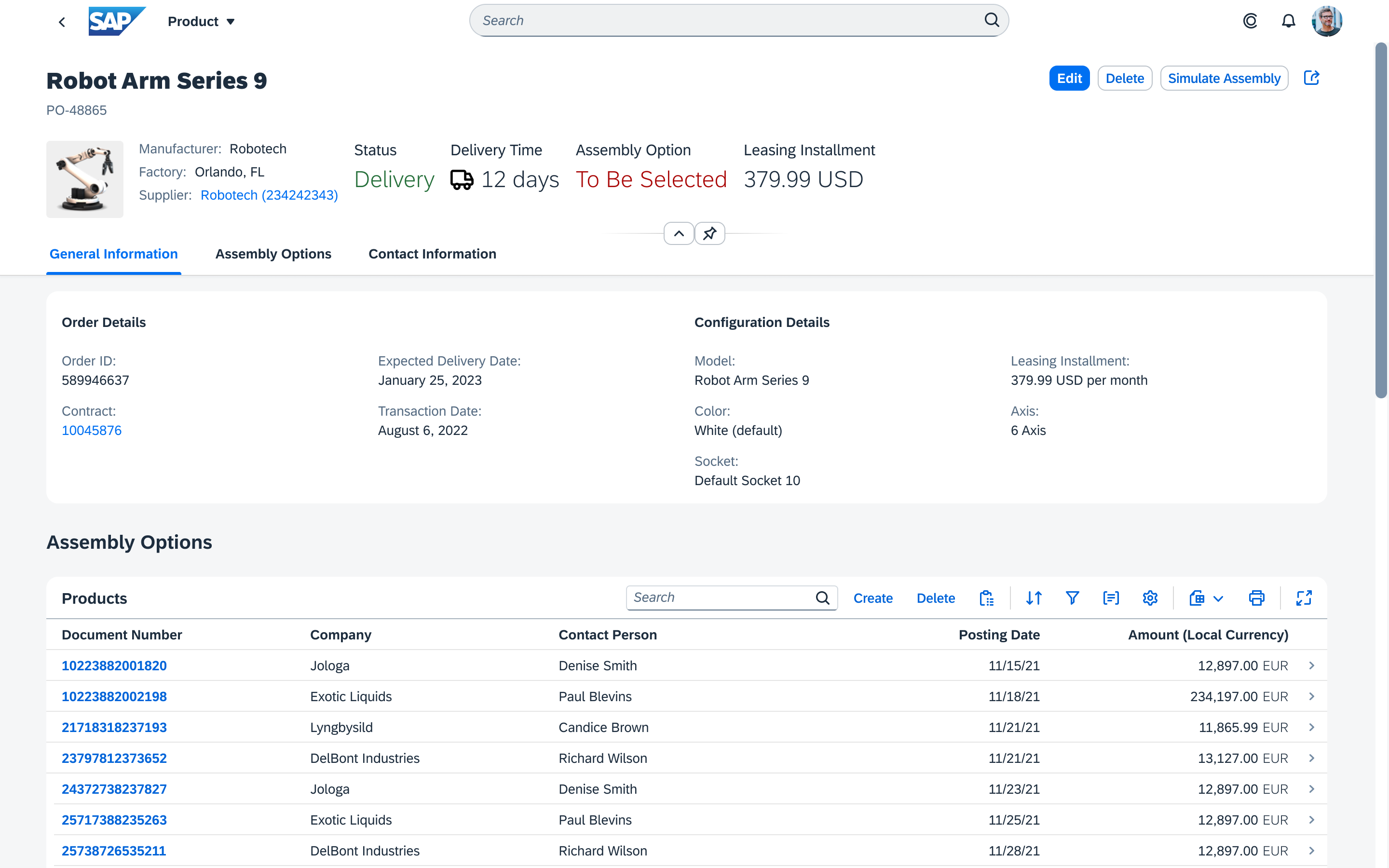
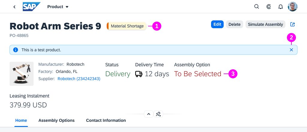
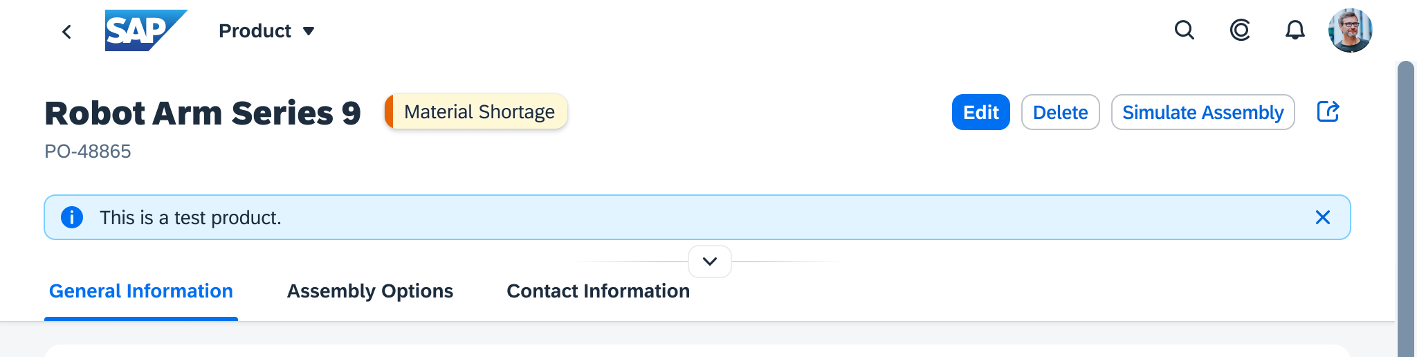
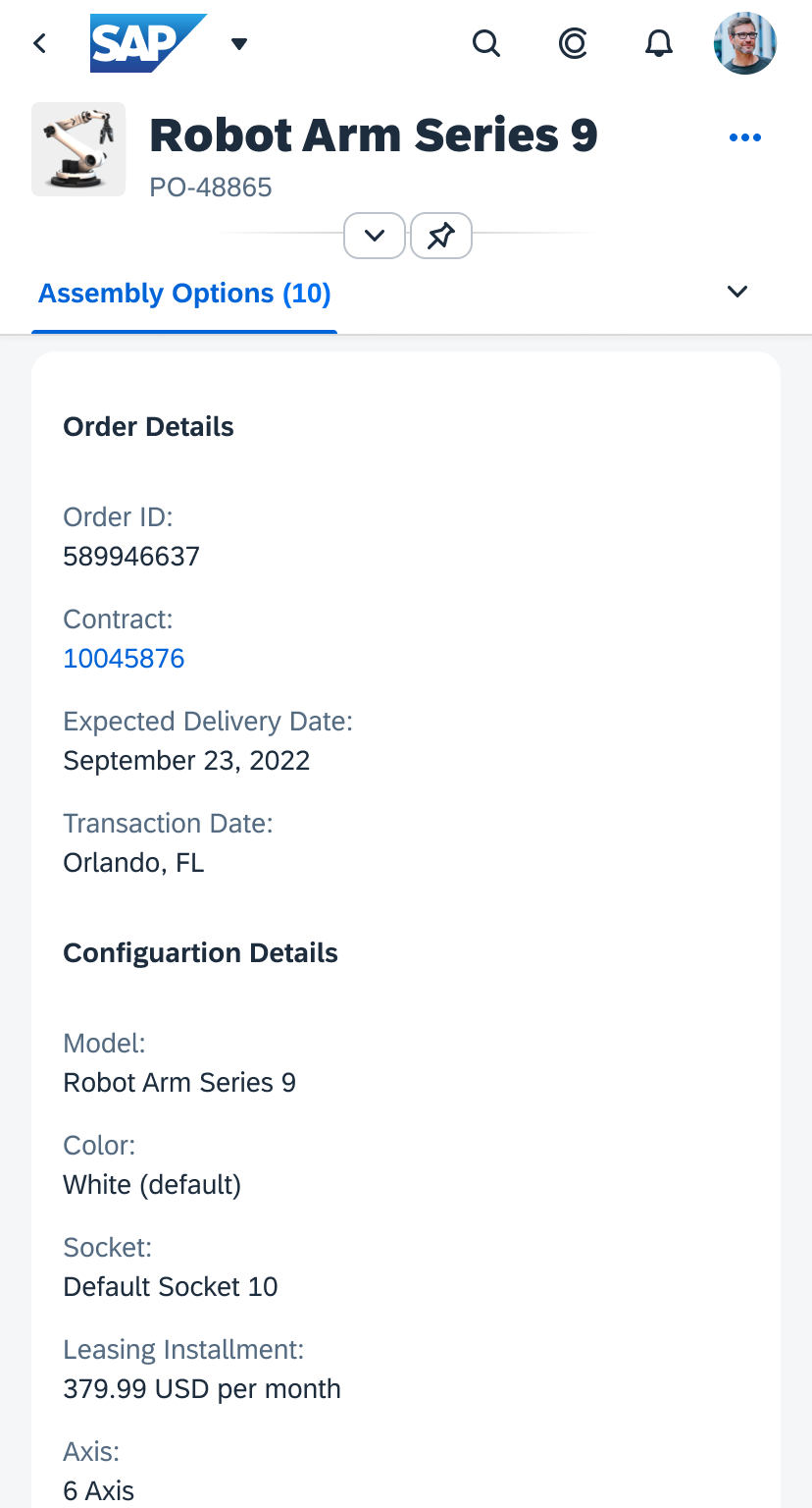
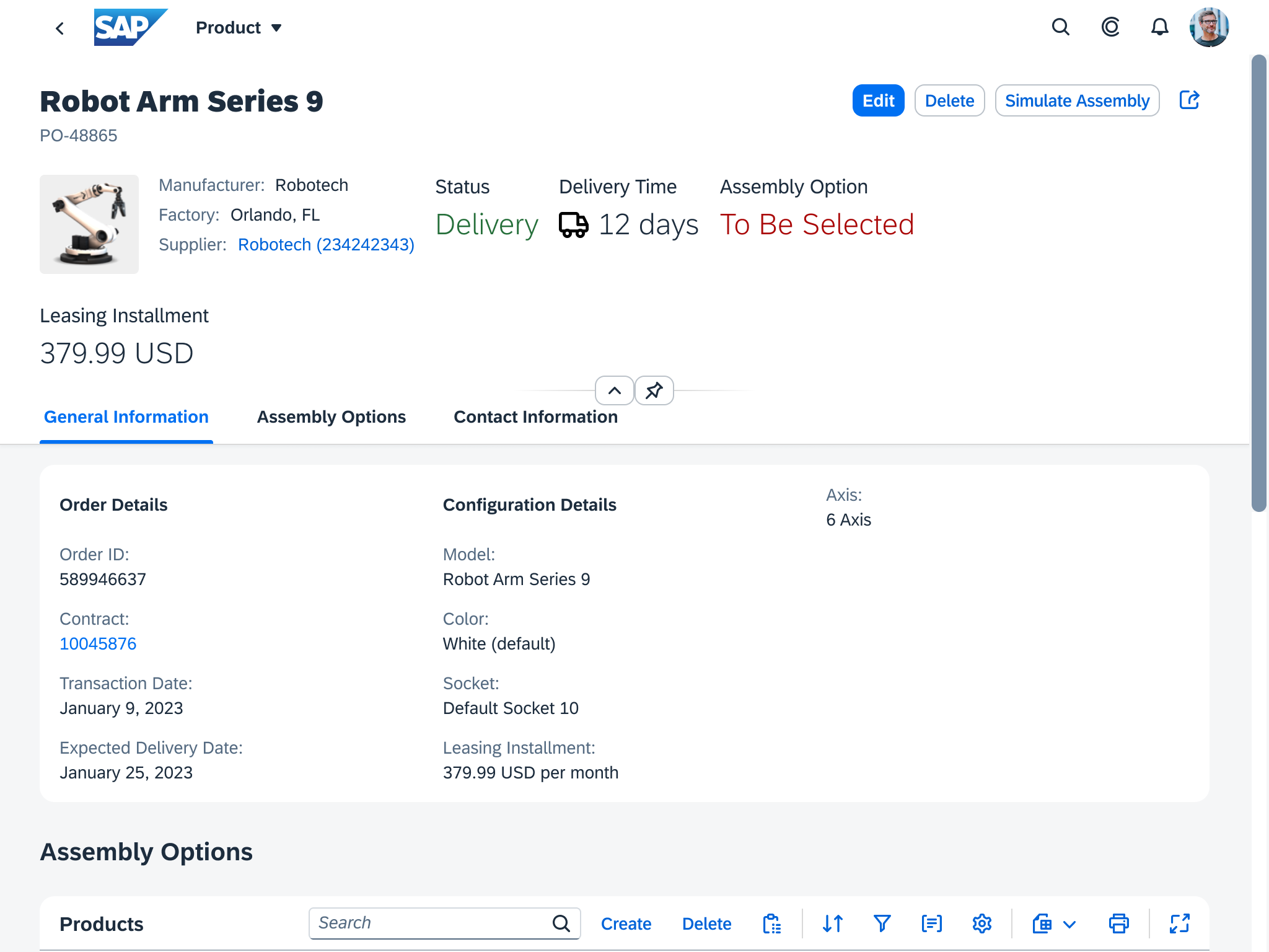
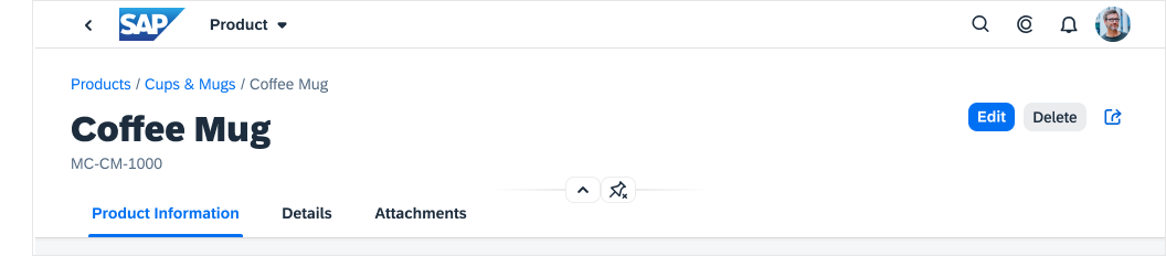
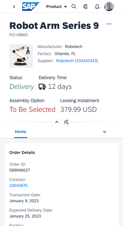
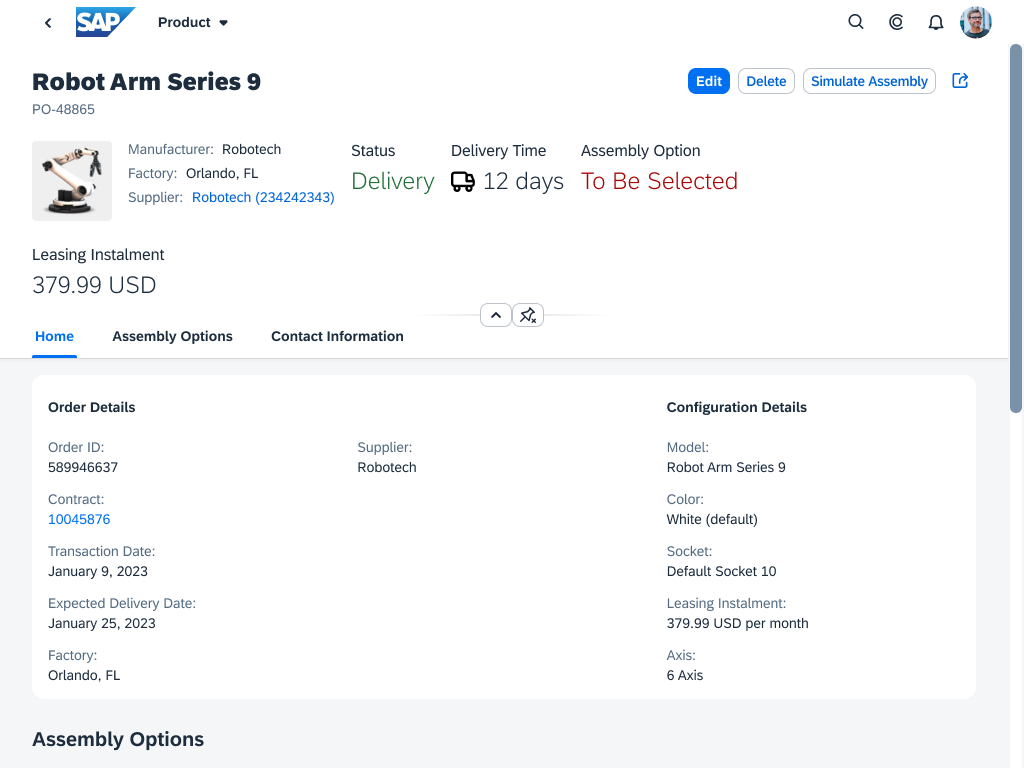
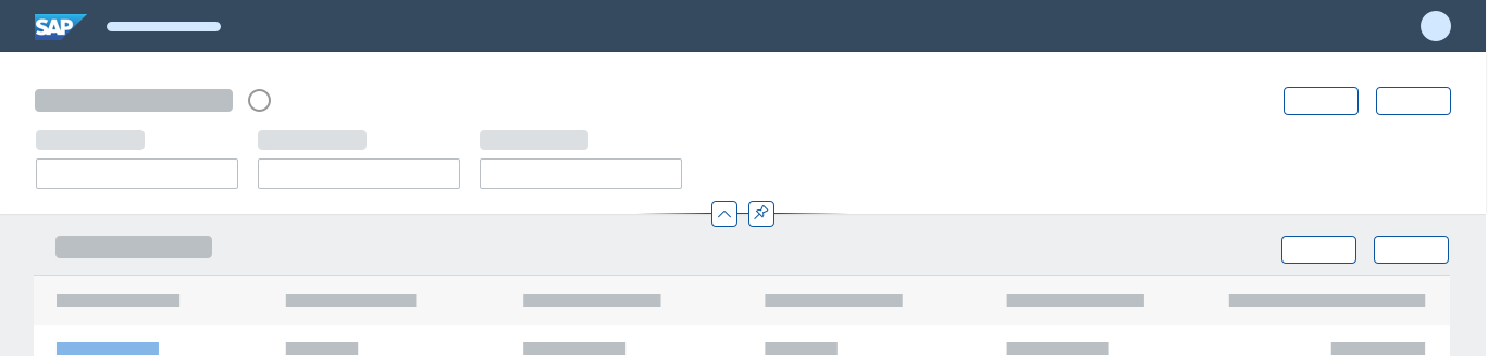
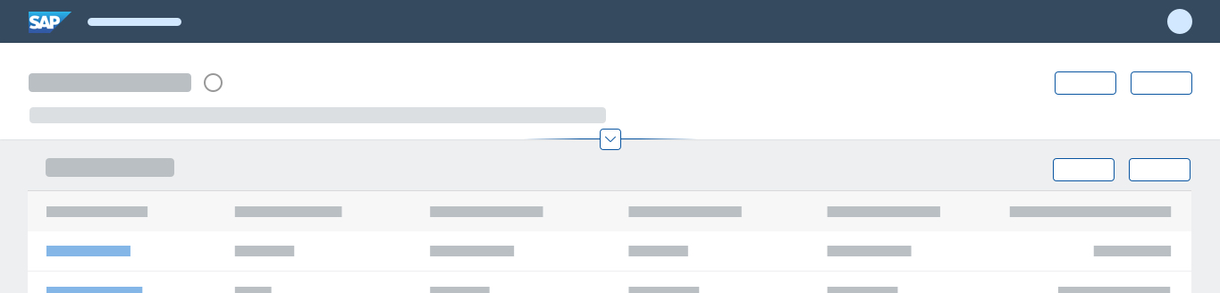
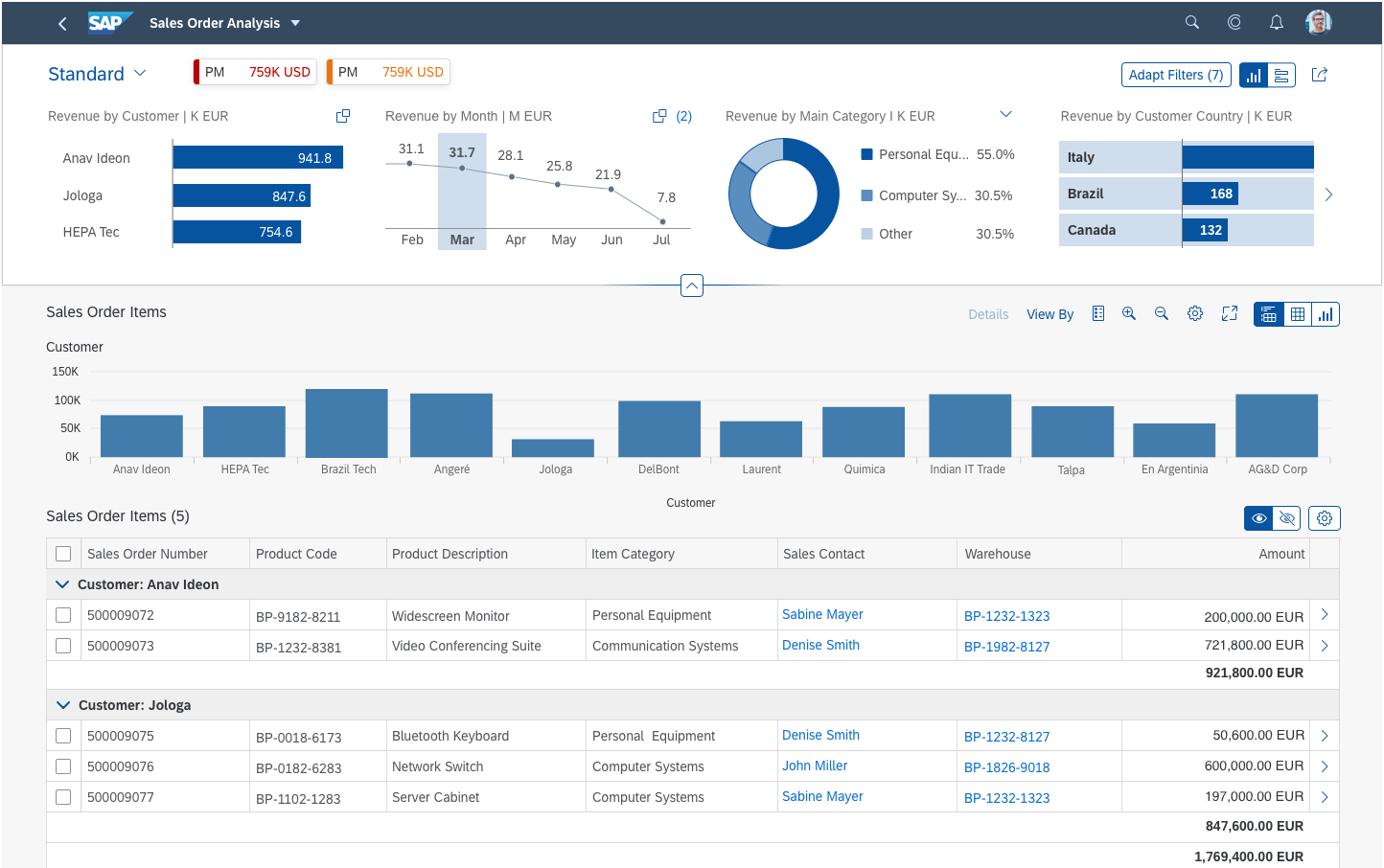
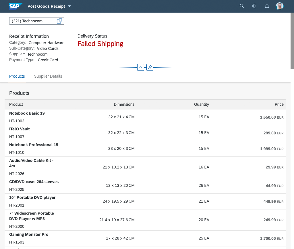
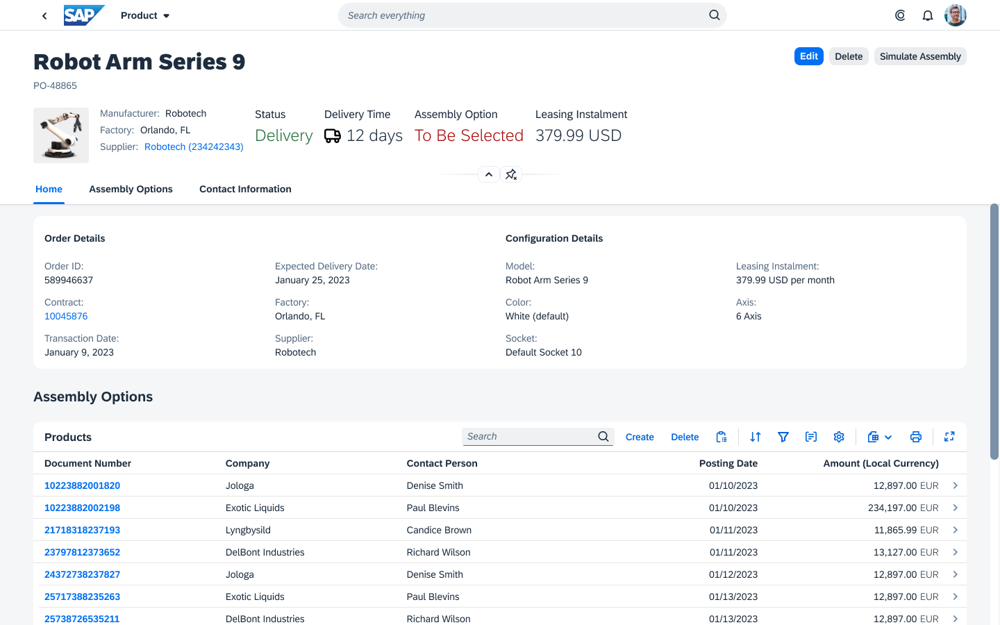
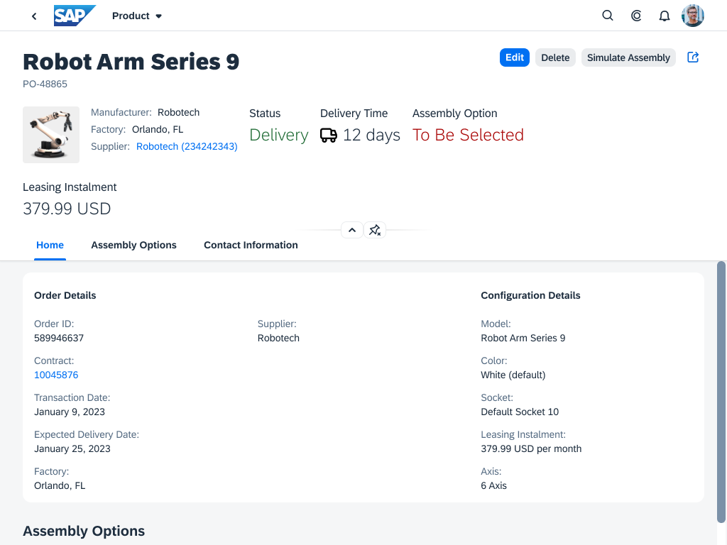
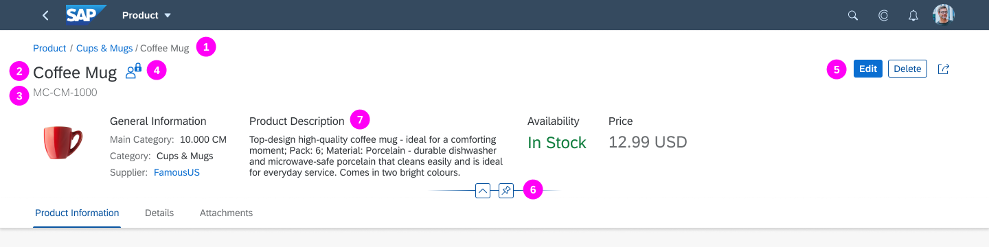
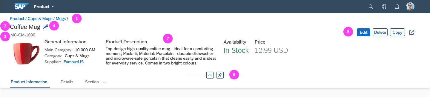
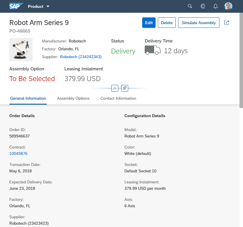
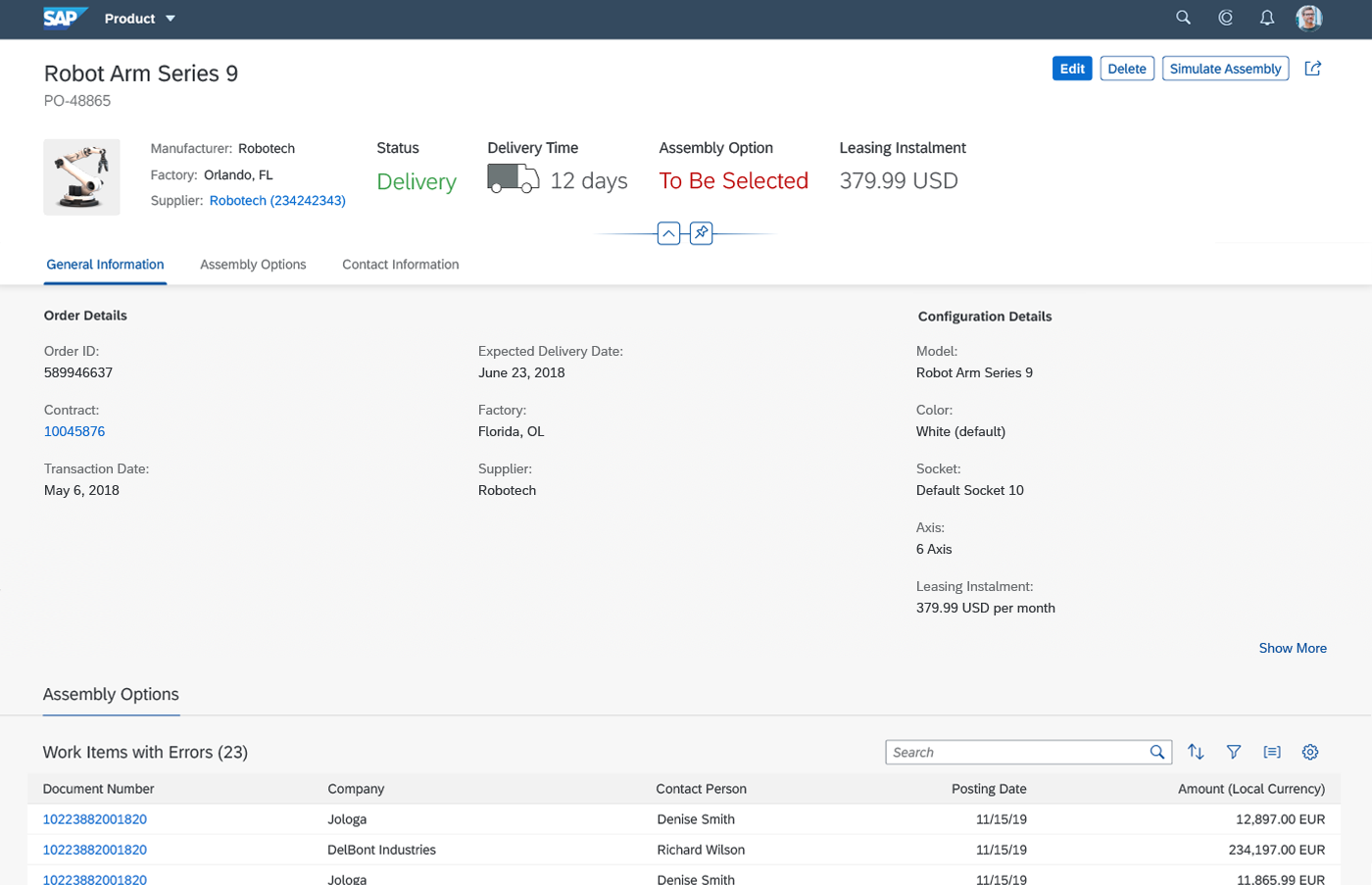
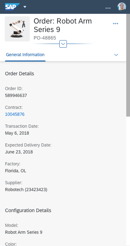
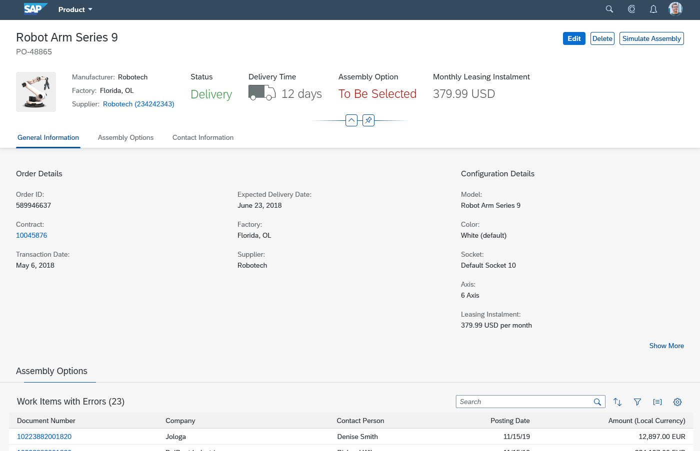
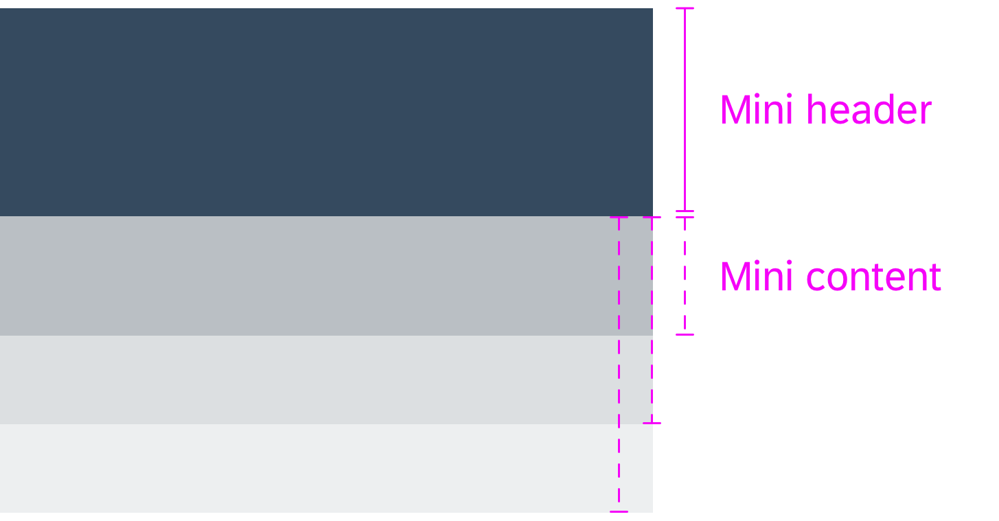
Dynamic Page Header (mandatory)
The dynamic page header contains key information about the object and provides the user with the necessary context. The header initially expands in display mode. It also contains global actions for the object, such as Edit or Delete.
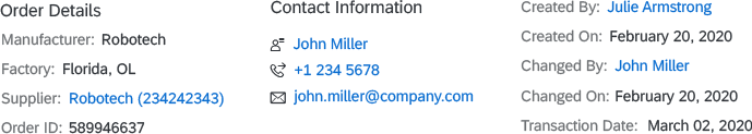
The header consists of the following elements:
- Breadcrumbs (optional)
- Title (mandatory)
- Subtitle (optional)
- Header content (optional)
- Object marker (optional)
- Header toolbar with global actions (optional)
- Visual indicator for header features (mandatory if the header can be collapsed and expanded)
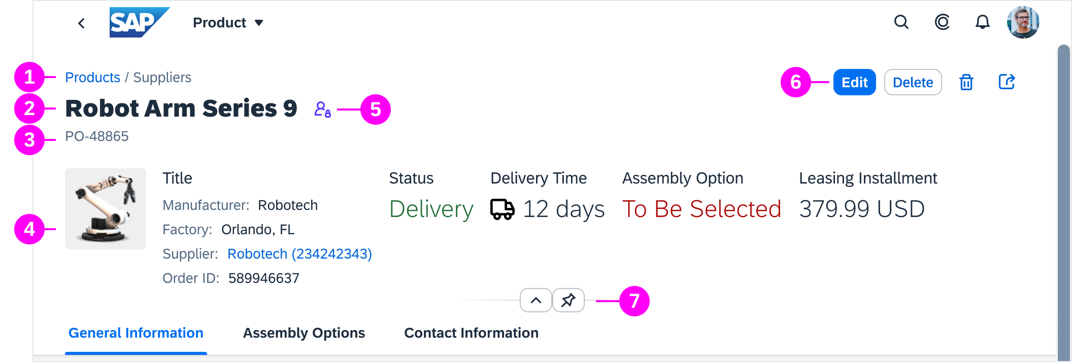
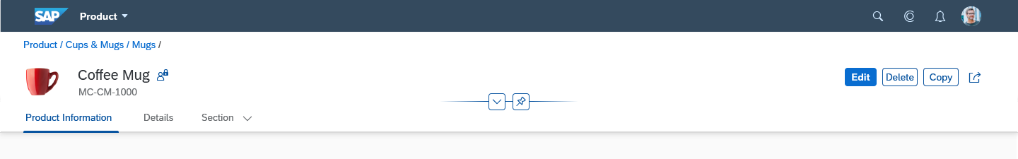
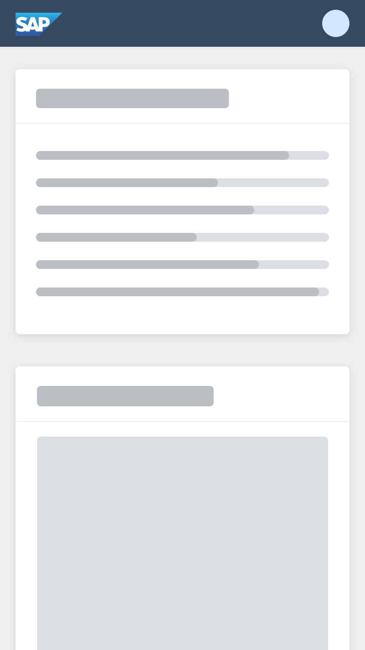
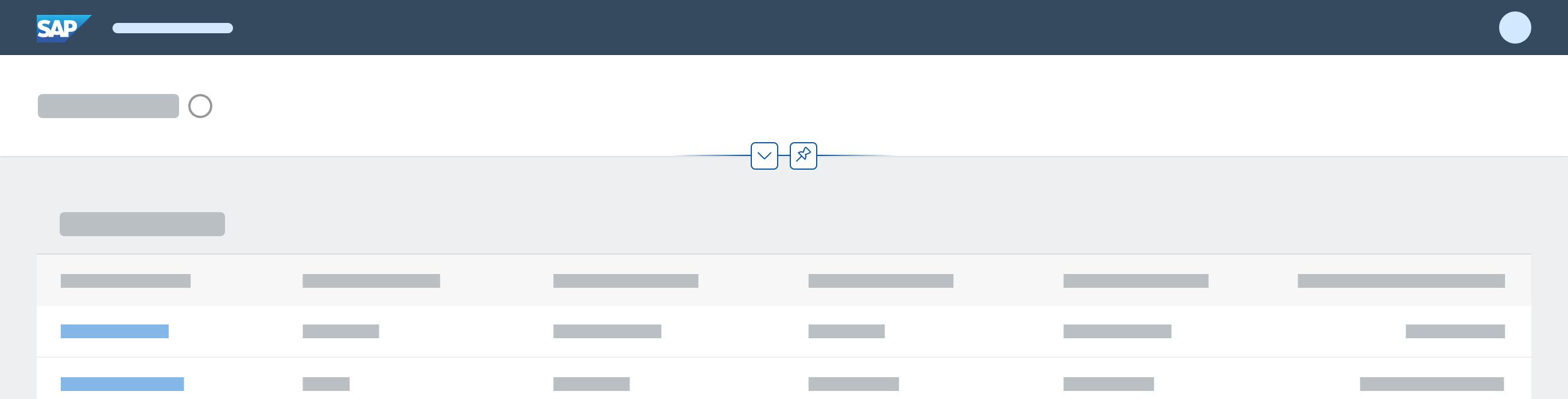
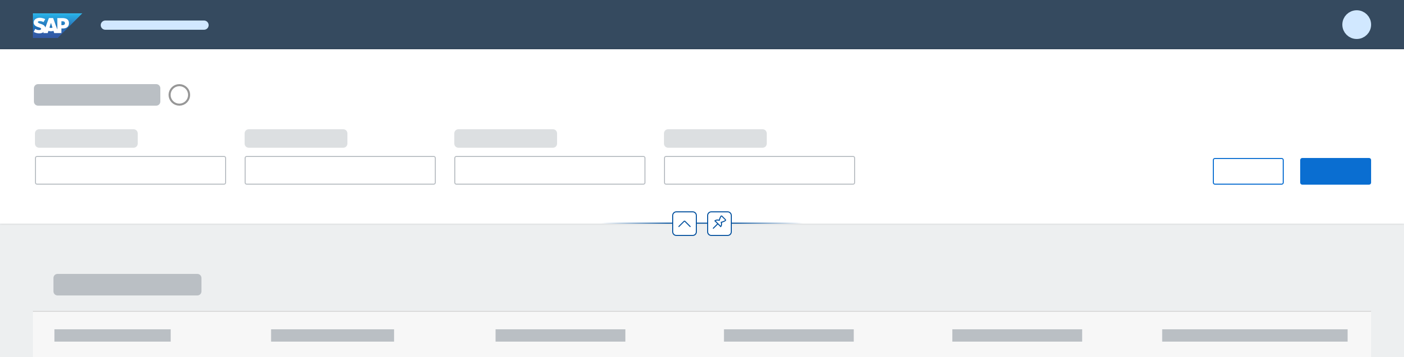
Object page with expanded dynamic page header
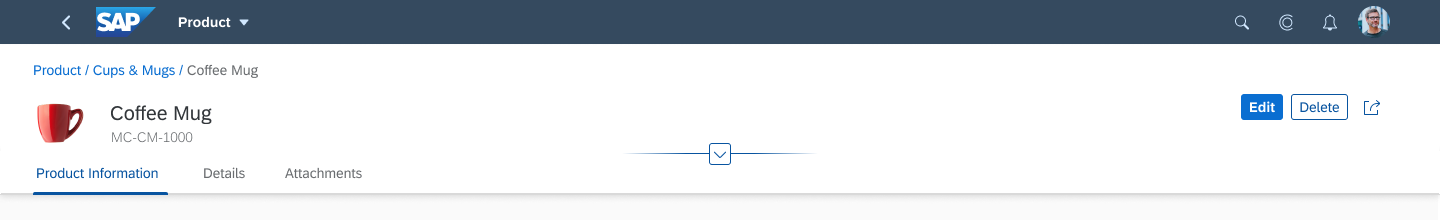
Object page with collapsed dynamic page header
If the object page is used in the flexible column layout, it can also contain layout actions.
Please note:
- To display images and placeholders in the header, use the avatar control.
- The subtitle is now below the title. (In the former object page header it was next to the title.)
For more information, see the Dynamic Page Header section for the dynamic page layout.
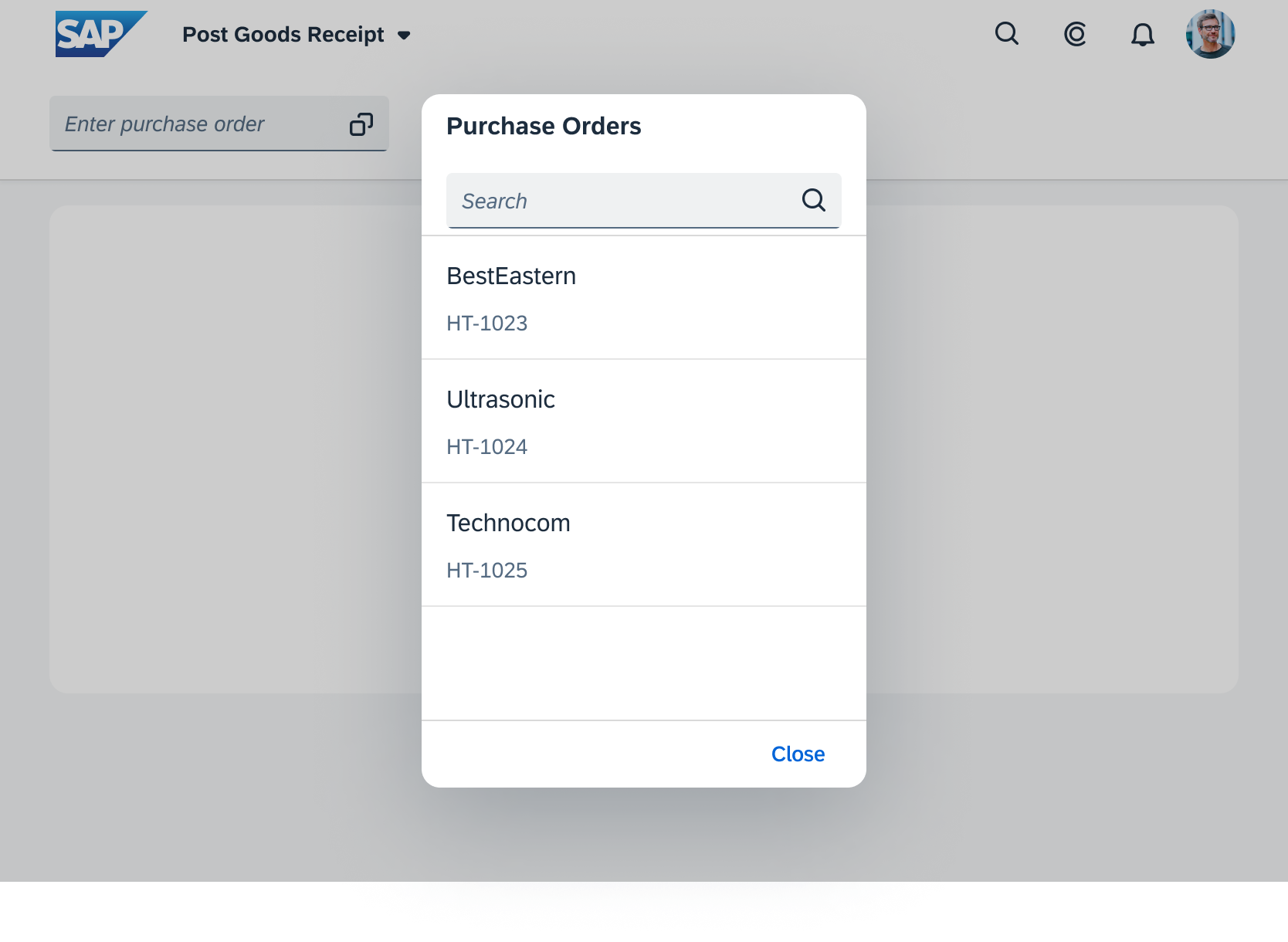
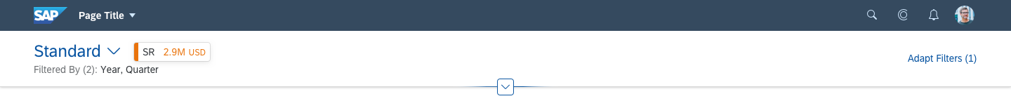
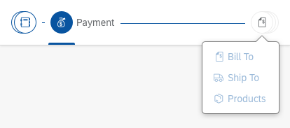
Breadcrumbs
A breadcrumb is displayed above the object title. Limit the breadcrumb to the drilldown levels within the object page.
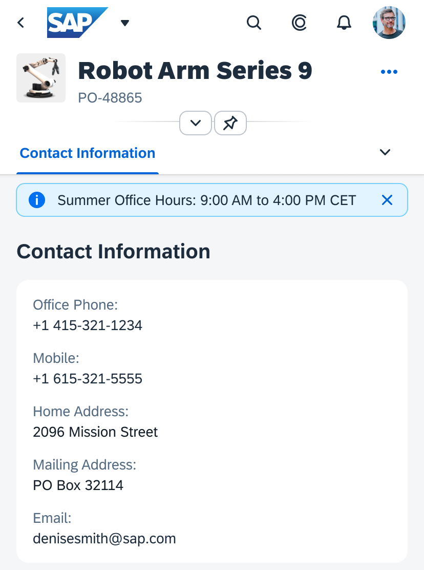
Header Content (optional)
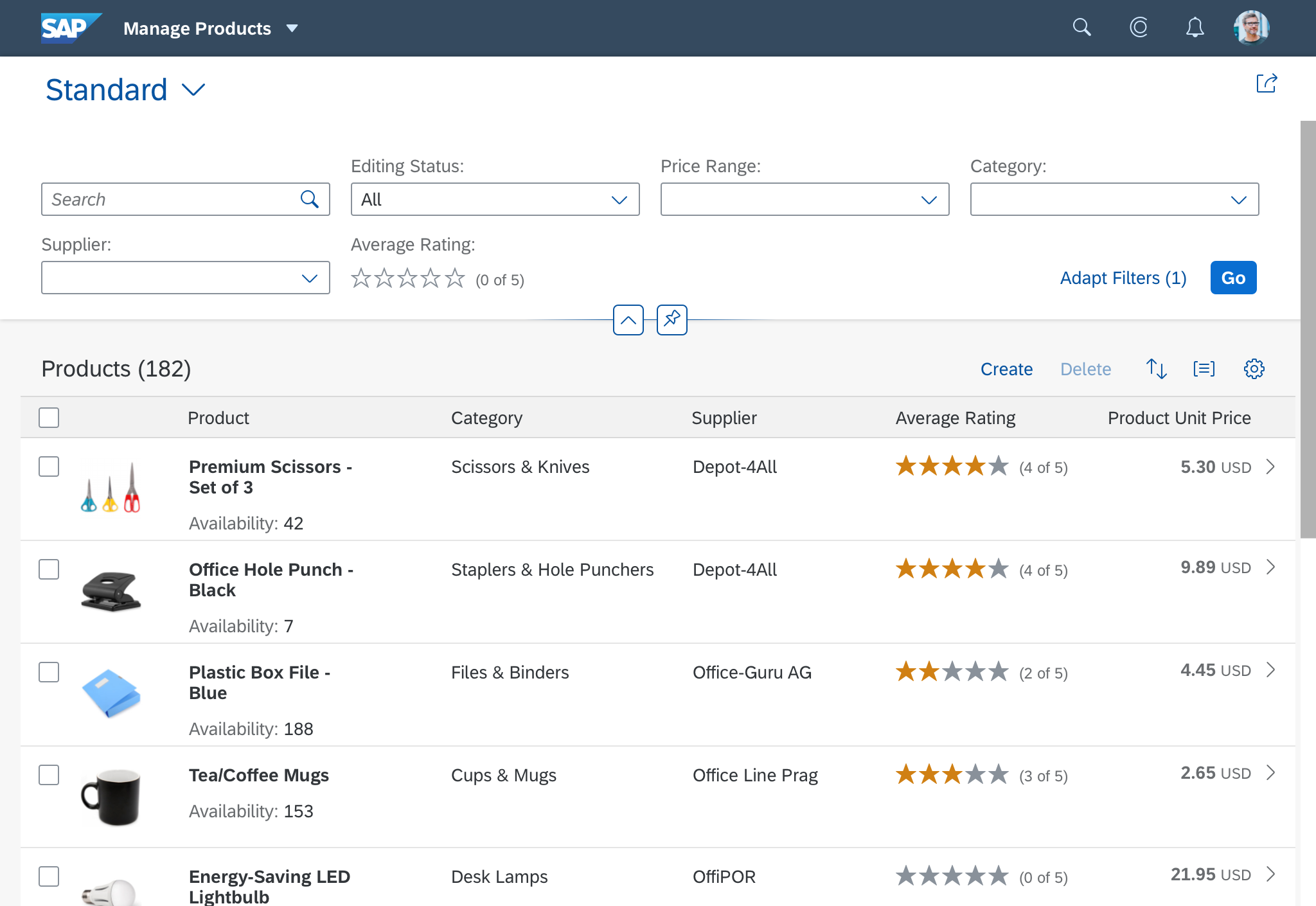
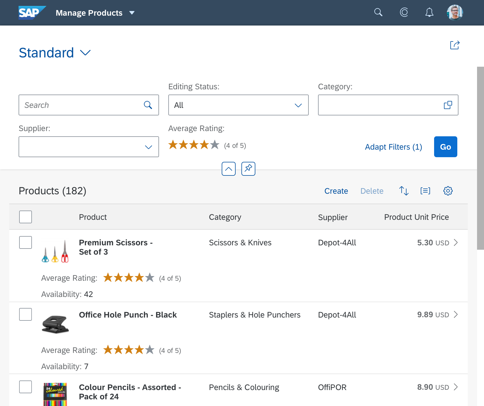
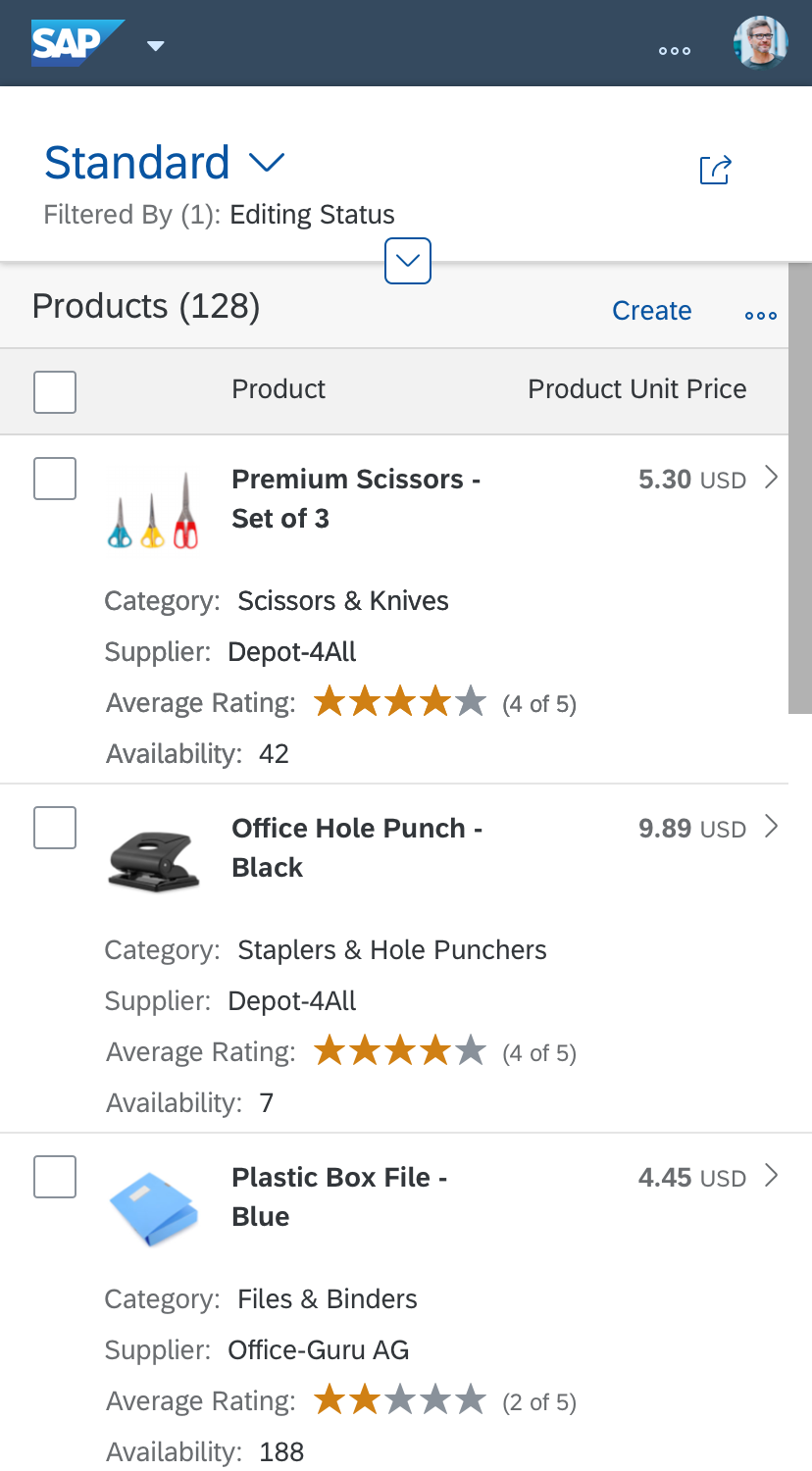
The header content displays app-specific contextual information. You build the content using containers, called facets.
The facets are arranged inline with a left float. Each facet adapts its size to the content and makes optimal use of the space without truncating the texts. If the facets do not all fit on one line, those on the right wrap to the line below.
The header content is hidden by scrolling down the page or clicking the collapse indicator.
There are several types of header facets for different kinds of data. The facets must be implemented by the app team for standalone object pages. For SAP Fiori elements, they are predefined.
The following header facets are available:
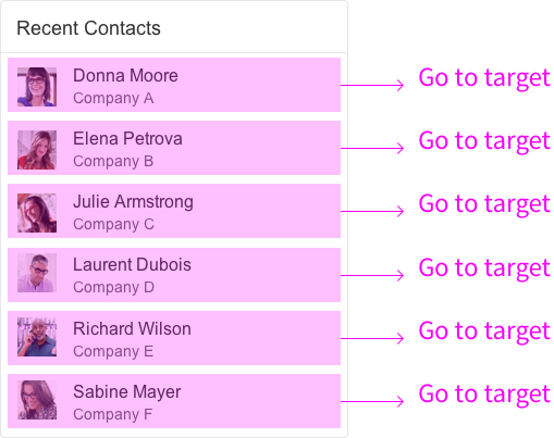
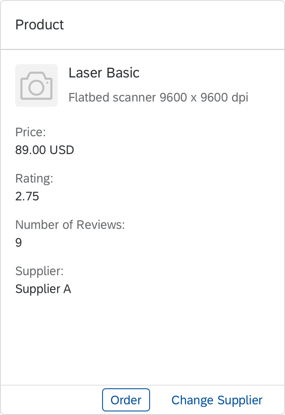
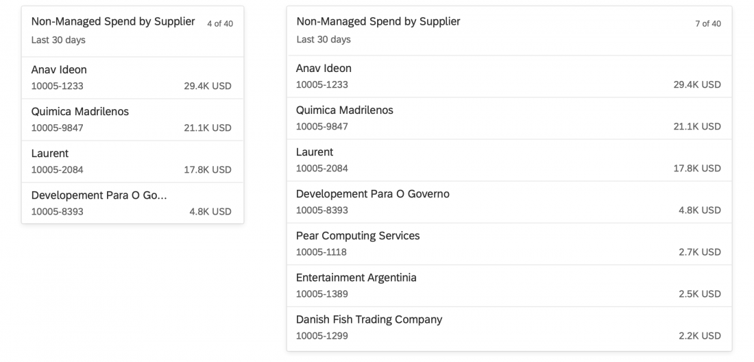
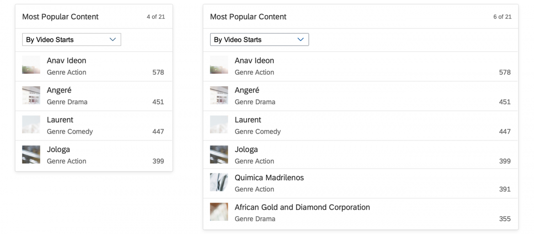
Form Facet (Dataset)
You can use the form facet to display datasets.
A form facet consists of:
- Title (optional)
- Label-text pair (no more than 5 in a group)
- The labels can be invisible, but need to have a text for accessibility purposes.
- The labels can be icons, but need to have a text for accessibility purposes.
- Each text can hold a link.
Header facet - Form facets
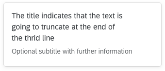
Plain Text Facet
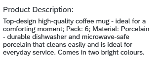
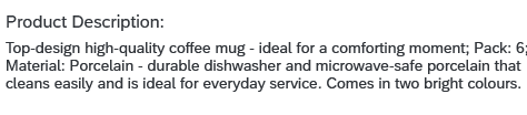
You can use the plain text facet to display a continuous text in the header.
A plain text facet consists of:
- Title (optional)
- Text
You can have links inline in the continuous text. They can navigate to another page or open a quick view. The text can contain more than one link, with different actions.
The default width of the facet is 320 px. The width of the facet doesn’t adapt to its content, but when the headline is broader than the facet width, the header wraps. You can also set a specific width to make optimal use of the given space.
Header facet - Plain text facet with default width
Header facet - Plain text facet with custom width
Image Facet
You can use the image facet to show a picture of the object or a user profile. The header can have either one image facet or no image facet. The position of the image facet is fixed to the left. The image can have a press event. The default press event enlarges the image. When the header collapses, the image facet moves to the left of the title and becomes smaller.
Header facet – Image facet specification
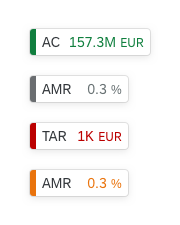
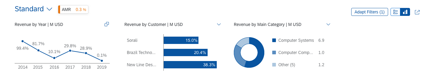
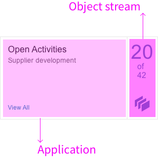
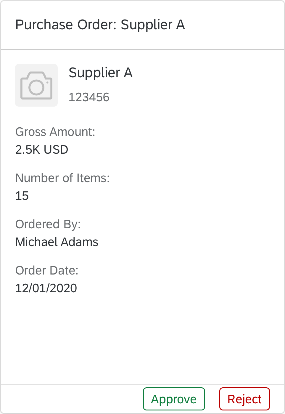
Key Value Facet
You can use the key value facet to highlight important data or KPIs.
A key value facet contains:
- Title (mandatory)
- Text or number in a larger font size
If the key value facet is used with a text, such as a status, you can also display an icon to the right of the text. This icon must only be used as a visual cue for the text it relates to, and not to add more information.

Header facet – Key value facets with KPIs and a status
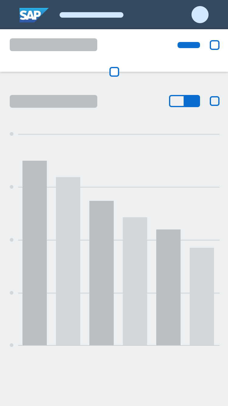
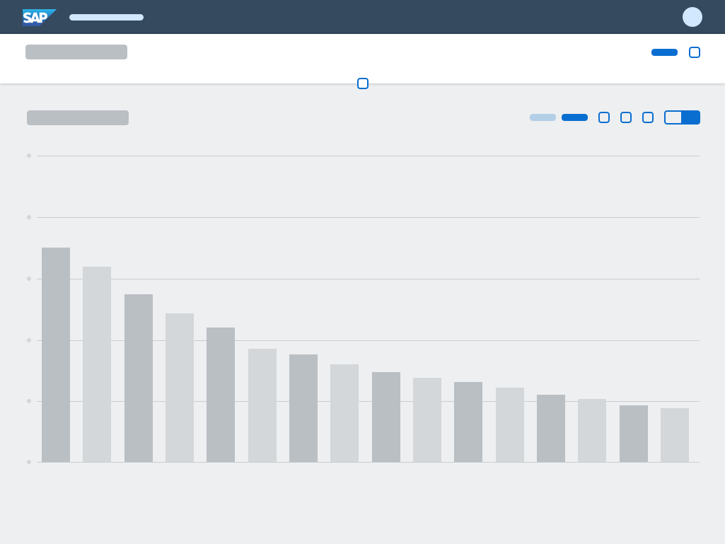
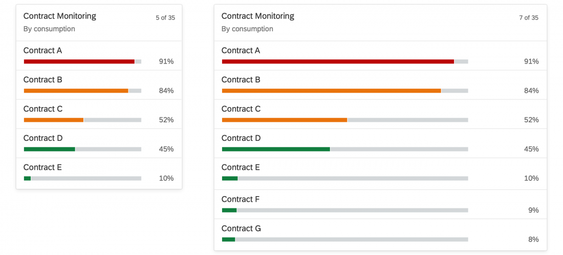
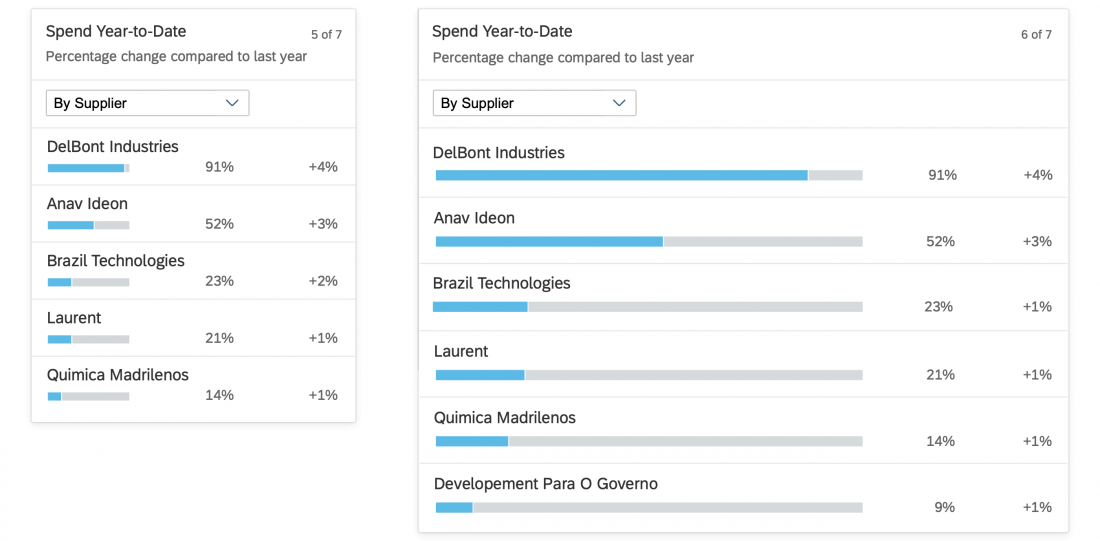
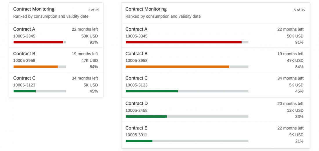
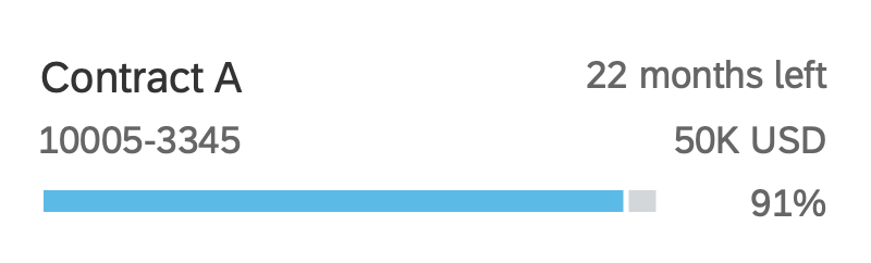
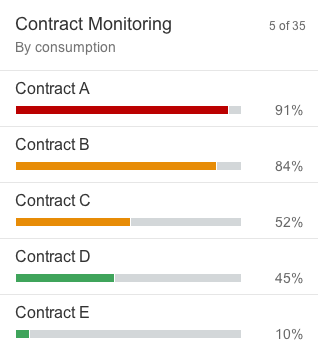
Micro Chart Facet
A micro chart facet consists of:
- Title (mandatory)
- Subtitle (optional)
- Micro chart (mandatory)
- Footer text (optional)
To display the unit used in the micro chart, use the footer.
The following micro charts can be used in the micro chart facet:
The micro chart facet can have a click event on the chart itself. This can lead to a page with a bigger chart or open a quick view, for example.
For more information, see Micro Charts.
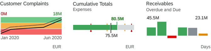
Header facet – Micro chart facets
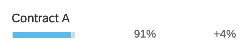
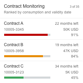
Progress Indicator Facet
A progress indicator facet consists of:
- Title (mandatory)
- Subtitle (optional)
- Progress indicator
- Footer text (optional)
For more information, see Progress Indicator.
Header facet - Progress indicator facet
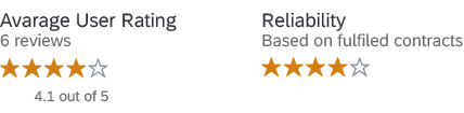
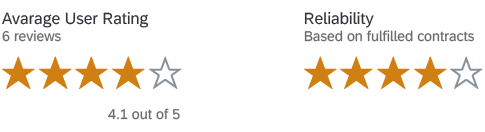
Rating Indicator Facet
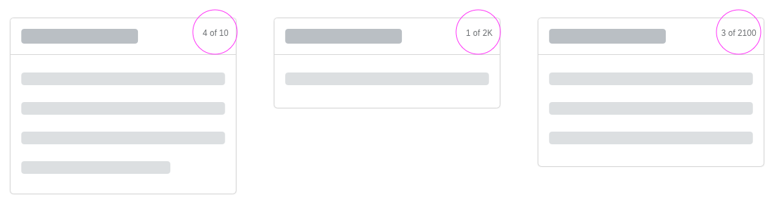
You can use the rating indicator facet to display a single rating value or an aggregated rating (such as an average rating for a product). The facet structure is slightly different in each case.
Single rating value:
The single rating consists of:
- Title (mandatory)
- Subtitle (optional): Displays supplementary texts
- Rating indicator

Rating indicator facet - Single rating
Aggregated rating:
The aggregated rating consists of:
- Title (mandatory)
- Subtitle (optional): Indicates the amount of data being aggregated.
- Rating indicator
- Footer text (mandatory): Displays the exact aggregation value. Use the format “<average rating> out of <maximum rating>”. For the average rating, use the exact value with one decimal place.

Rating indicator facet - Aggregated rating
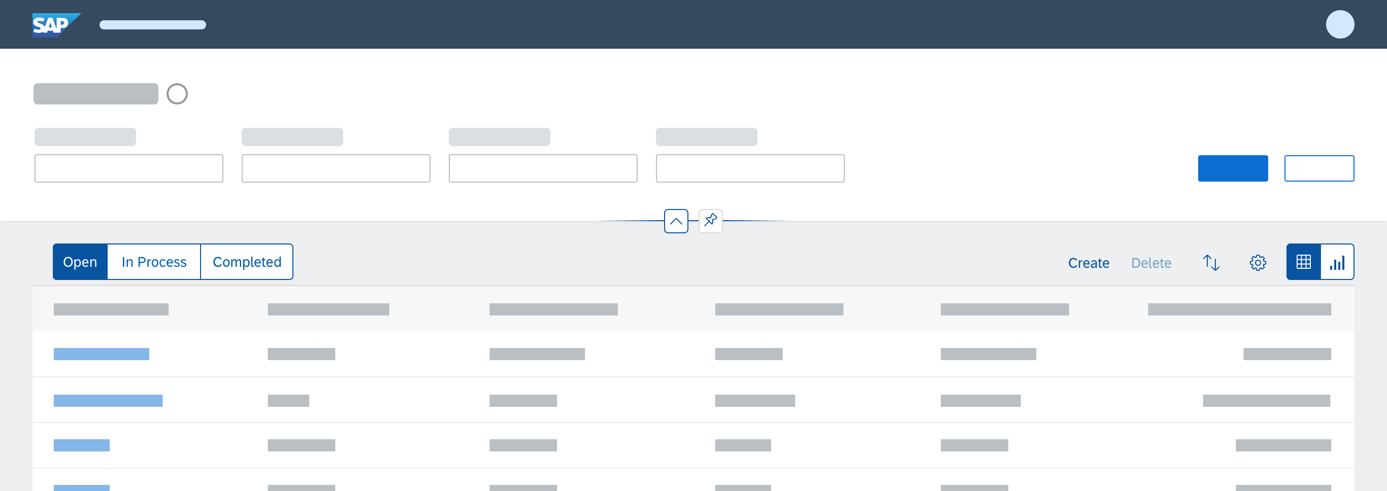
Navigation Bar
You can only have several sections in the object page layout and there are two ways to structure it:
Anchor Bar Navigation
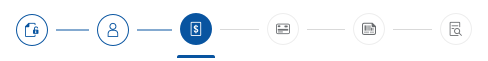
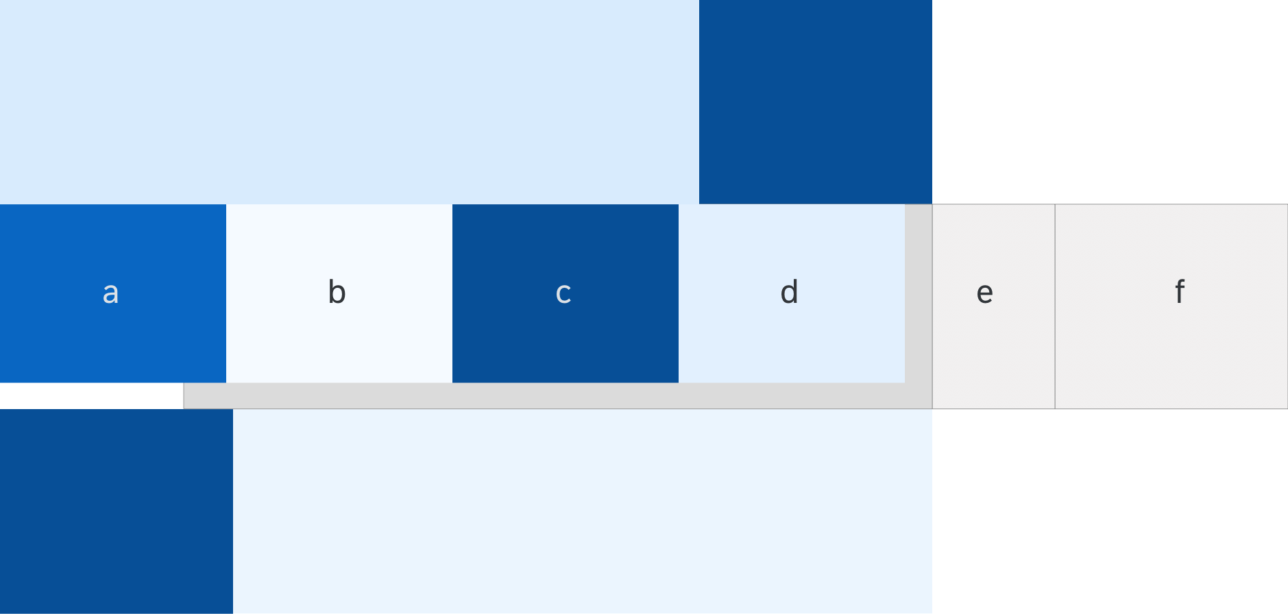
The anchor bar is the default navigation control for the object page. It consists of a series of anchor links, which are arranged horizontally at the top of the page. The anchors represent sections or subsections of the page. Clicking a link makes the screen scroll to the corresponding section of the page and the anchor bar remains visible.
Use tab bar navigation if your page covers different topics that each have complex content, such as long tables or lists.
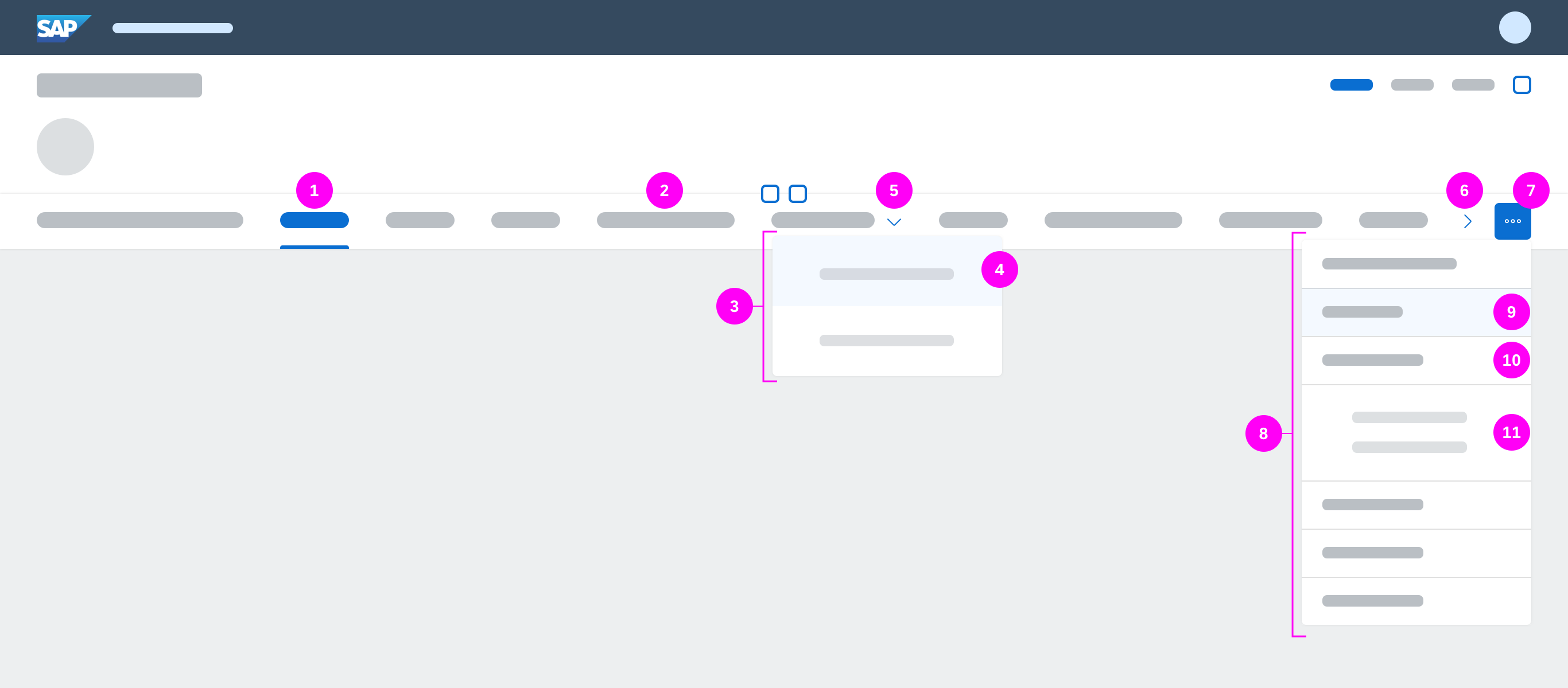
Object page – Anchor bar navigation
- Active anchor
- Inactive anchor
- Subsection dropdown
- Subsection
- Subsection dropdown indicator
- Overflow carousel button
- Overflow menu button
- Overflow menu dropdown
- Section (hover) in overflow menu
- Section in overflow menu
- Subsection in overflow menu
Overflow
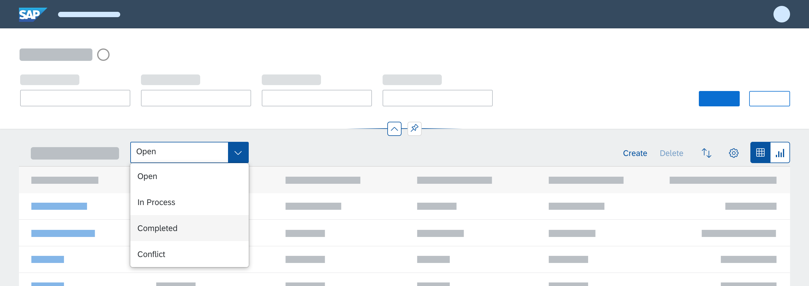
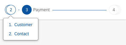
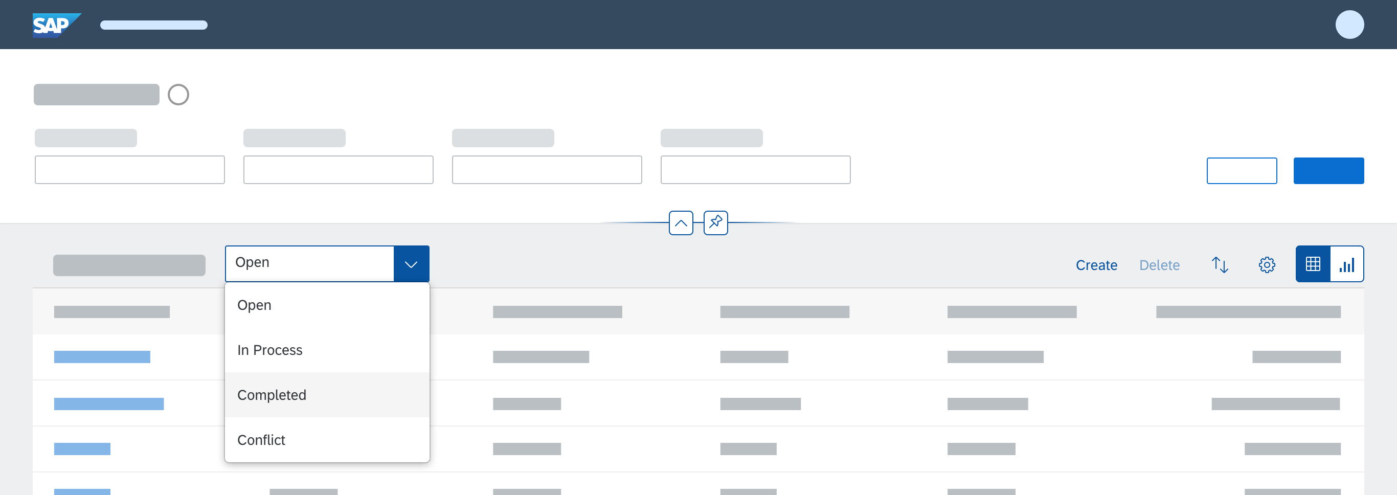
If there are more anchors than the screen can accommodate, the remaining anchors move into an overflow menu. The overflow button on the right of the navigation bar () opens a hierarchical dropdown list of all sections and subsections. When the user scrolls down the page, the anchor links scroll horizontally to ensure that the active anchor is always visible.
You might also see a small right arrow on the anchor bar. This arrow allows you to scroll horizontally to reveal any hidden content, and only appears when you hover over the overflow menu. In the meantime, this arrow has been replaced by the overflow menu button, but is still supported technically for legacy reasons.
Responsiveness
On small screens, the anchor bar becomes a dropdown list. The text field of the dropdown list shows the section currently selected. Clicking the dropdown menu opens a hierarchical list with all the sections and subsections of the page.
Behavior and Interaction
| Click / Select: | Action: |
| Anchor link | Scrolls page directly to the content of the selected section (not to the title). |
| Arrow next to section anchor with several subsections | Opens the submenu. |
| Item in the overflow list | Scrolls the page to the content of the respective section or subsection (not to the title). |
| Keyboard left and right arrows | Move between anchor links. |
| Fade area to the left or right of the anchor bar | Causes an overflow arrow button to appear (compact mode only). The overflow arrow button is always visible in cozy mode. |
| Overflow scroll button (right arrow) | Scrolls the anchors horizontally to bring anchors that are hidden in the overflow into view. |
| Overflow menu button () | Displays a hierarchical dropdown list with all the sections and subsections of the page. |
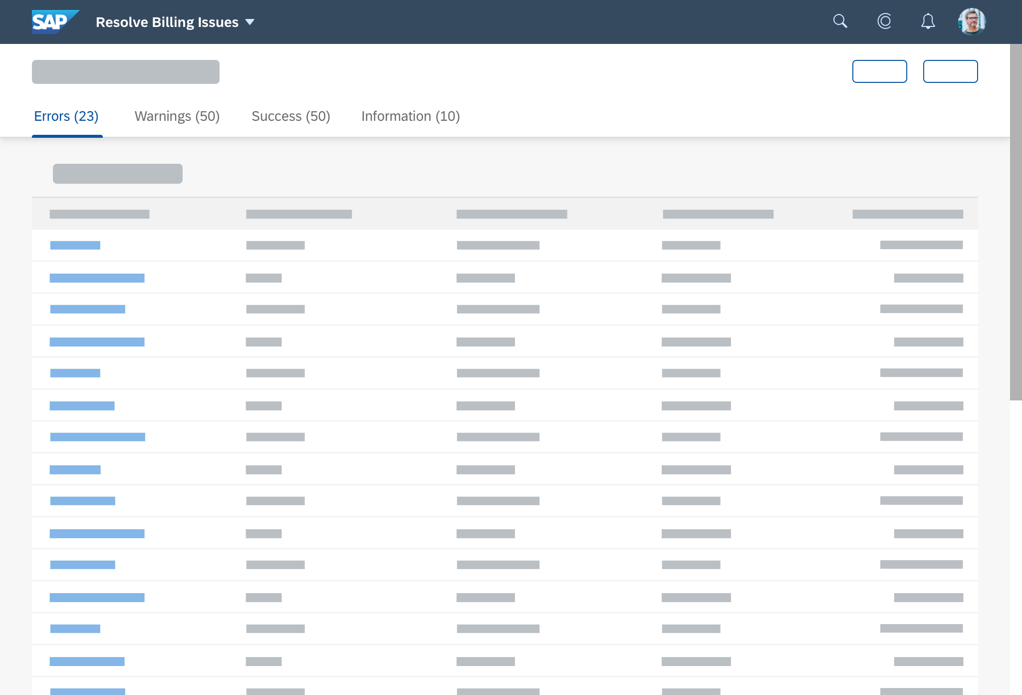
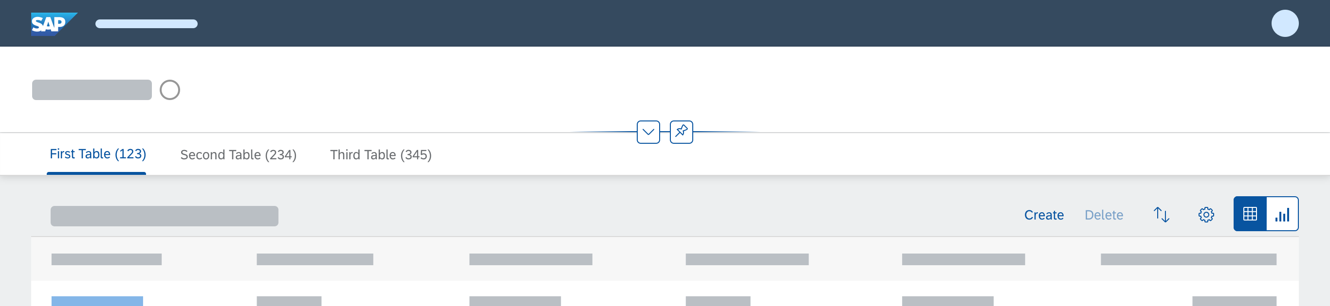
Tab Bar Navigation
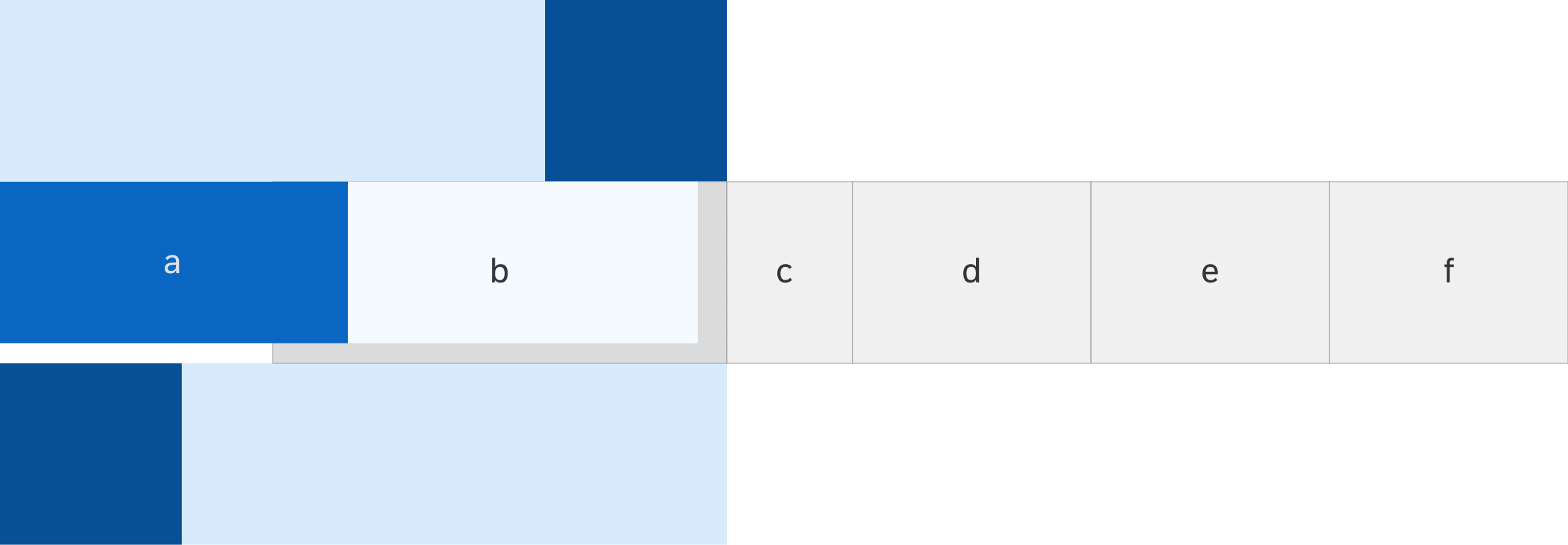
As an alternative to the anchor bar, you can also use the tab bar for navigation. The tab bar works in a similar way to the icon tab bar, but is not the same control. The tab bar navigation for the object page is a variant of the anchor bar, and is handled by the object page floorplan.
The tabs are a series of links arranged horizontally at the top of the page which link to subpages. Clicking a link displays the corresponding subpage below and the tabs remain visible.
Use tab bar navigation if your page covers different topics that each have complex content, such as long tables or lists.

Object page – Tab navigation
- Anchor/tab bar navigation
- First section
- Second section
If you set the tab bar property (useIconTabBar = “true”), the navigation bar displays tabs instead of anchors. The object page only supports text-only tabs; icon tabs and icon/text tabs are not available. The object page sections and subsections are reflected in the tab navigation: sections of the object page become the tabs, and subsections become the internal content of the tab. The tabs can have an item counter, which is displayed in parentheses next to the title of the tab.
On small screens, the tab bar uses the same horizontal carousel overflow pattern as the icon tab bar. This differs from the dropdown approach used for the anchor bar.
If the content of a section contains a control, for example a table, then we recommend to always display it, even if the control title and tab title are identical. This makes it easier for the user to orientate themselves.
Subnavigation
To make it easier to reach specific content on a long tab page, tabs can have subnavigation. Subnavigation is optional, but the default state is set to “true” and a dropdown arrow is shown next to the tab. Clicking on the dropdown arrow displays a dropdown menu with the subsection anchors for that tab. Applications can decide which tabs are enabled for anchor subnavigation by setting their property to “true”.
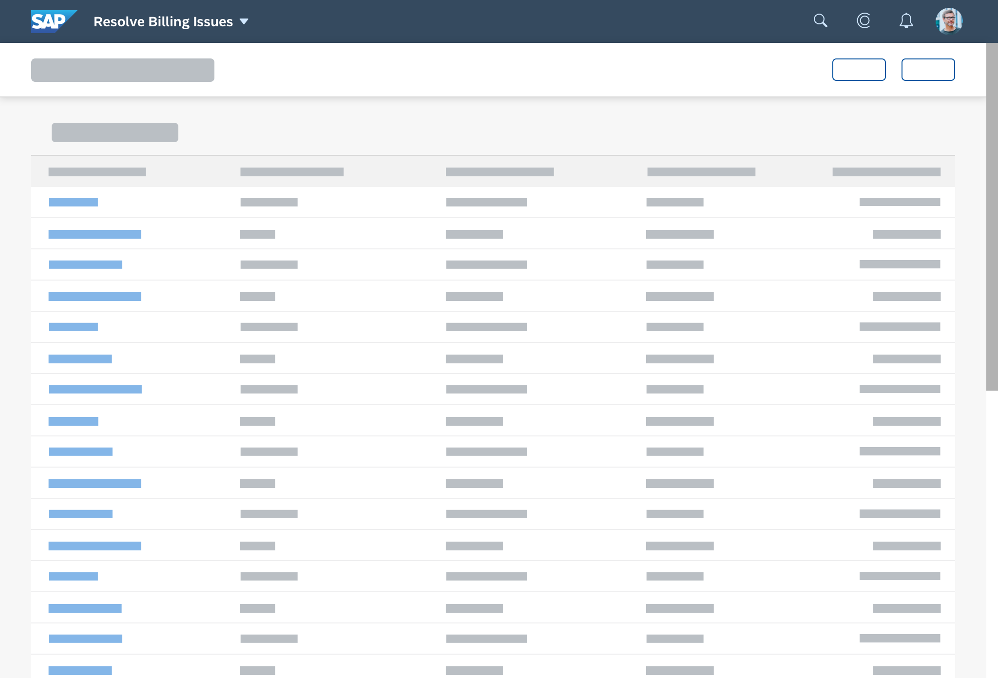
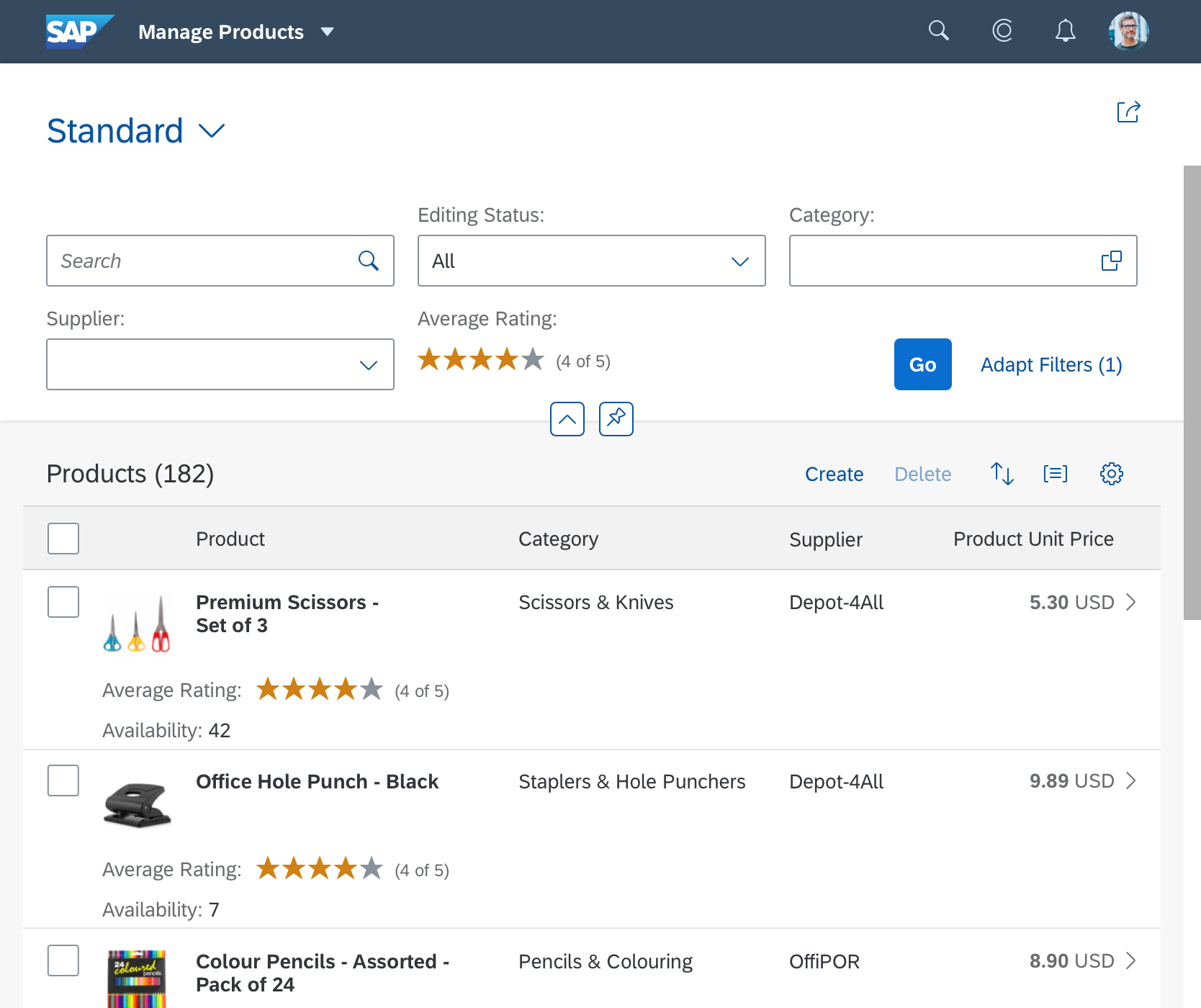
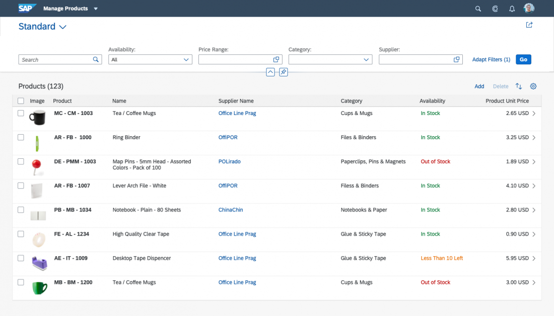
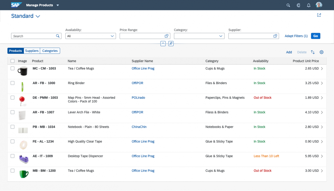
Content Area
The object page content consists of sections and subsections arranged in a column layout.
Sections
Sections are containers for subsections. They provide the basic structure for navigation and are directly reflected in the navigation bar.
The first section doesn’t have a title.
All the following sections consist of:
- Title with item counter (counter is optional)
- Subsections
Sections cannot contain controls.
If a section contains only one subsection, the title of the subsection is used as the name of the section. In this case, there is no subsection submenu in the anchor bar.
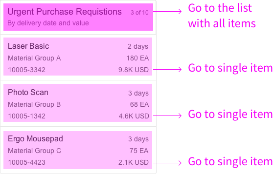
Sections can only contain subsections, not content. Because of this, the object page only provides toolbars for local actions at the subsection level.
Subsections
Subsections are containers for actual content.
A subsection consists of:
- Title with item counter (counter is optional)
- Toolbar with actions (optional)
- Content
- Mixable related content (optional)
- Controls inside subsection (optional)
If the subsection contains a table or a chart and the title is the same, you have the option to hide the subsection title.
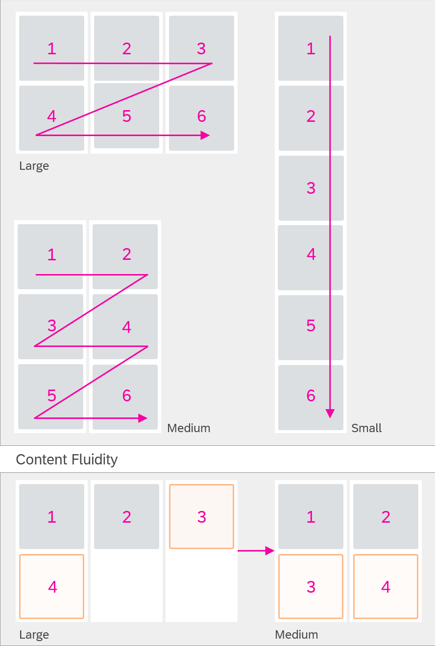
Subsection content is arranged according to the column layout approach for the respective screen size.
Subsections have a progressive disclosure mechanism to show and hide content. App developers can specify which content is shown initially, but the user can always choose to display everything by selecting the toggle button Show More / Show Less at the bottom right of the subsection.
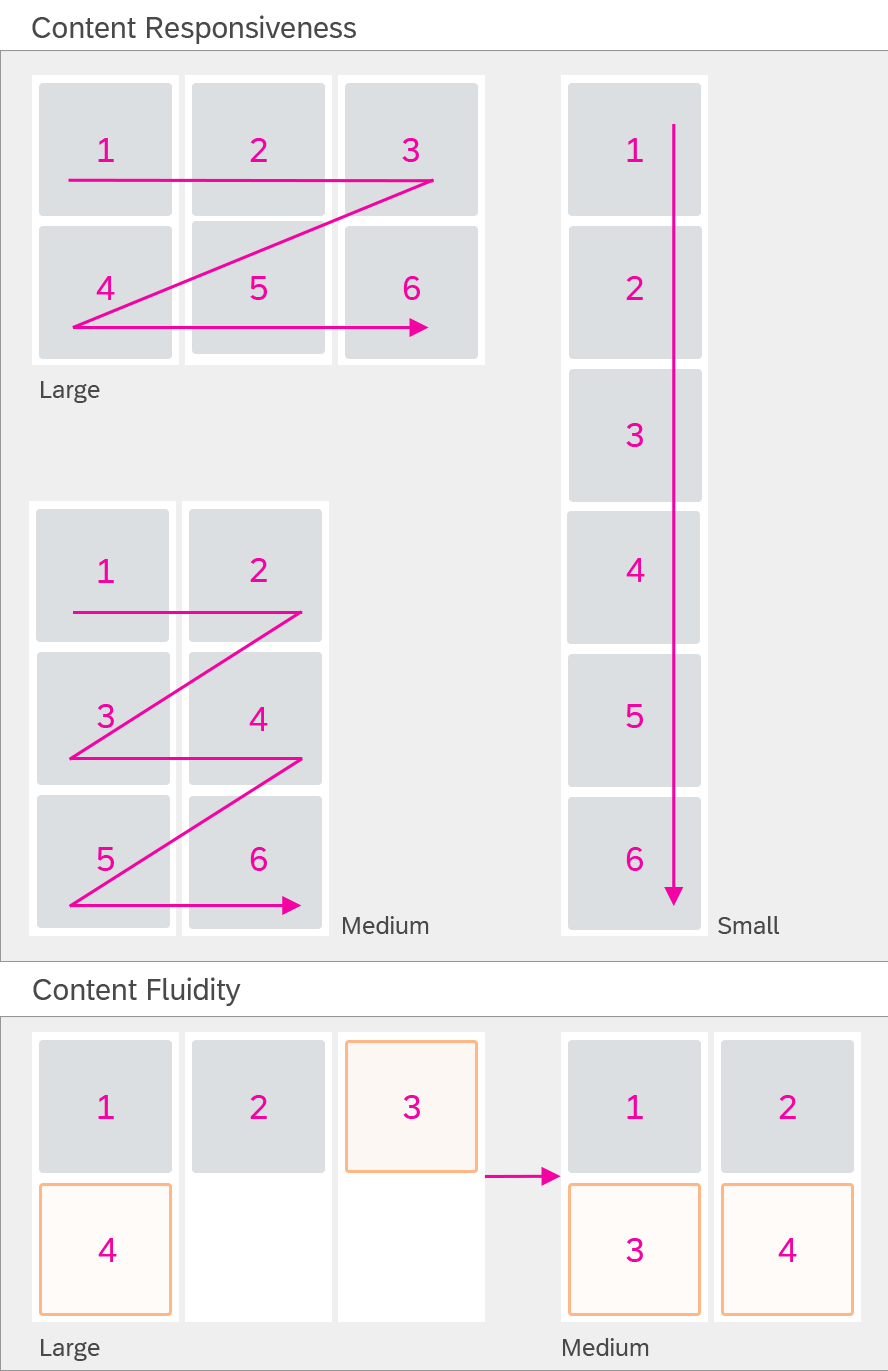
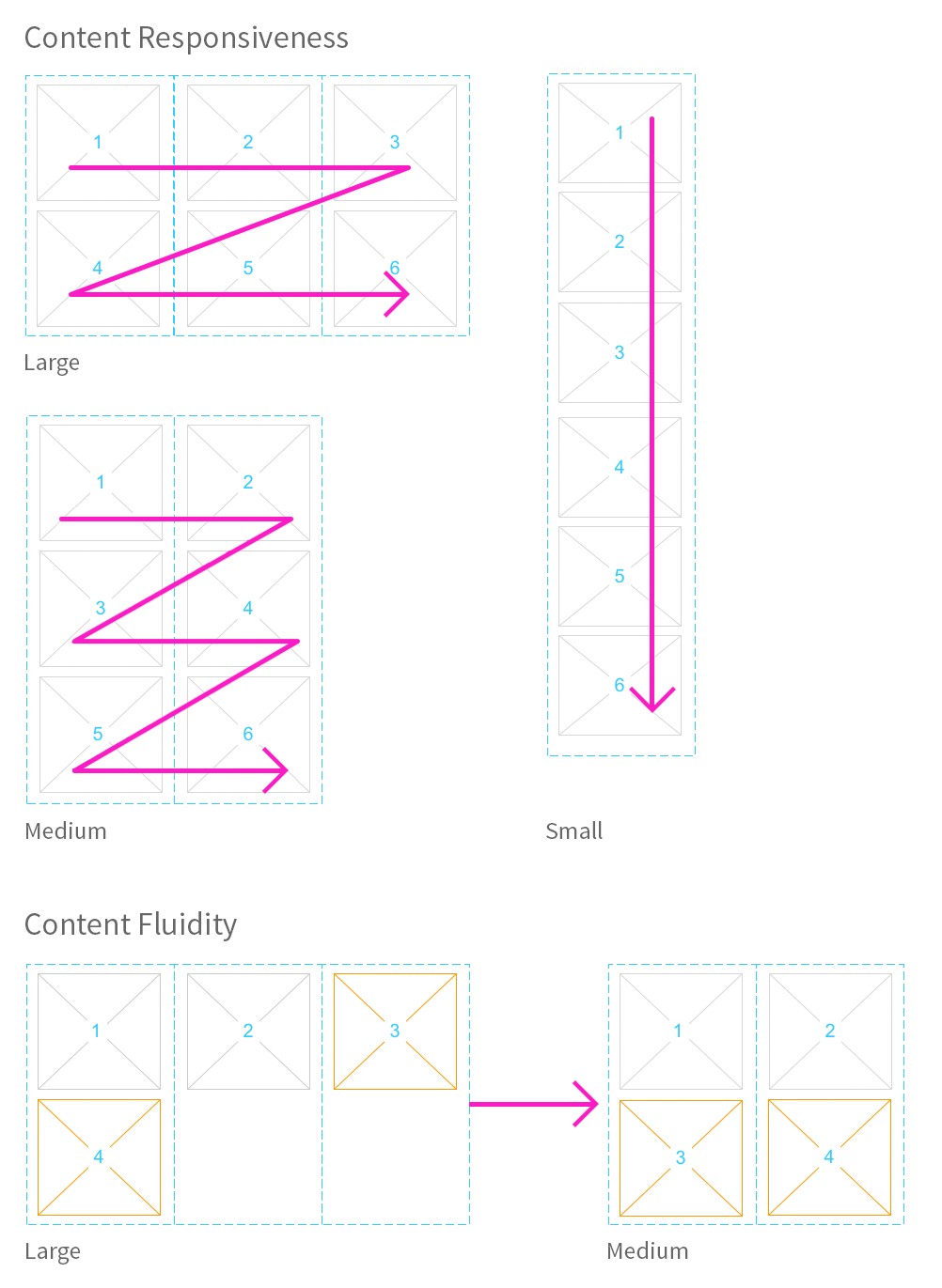
Responsiveness
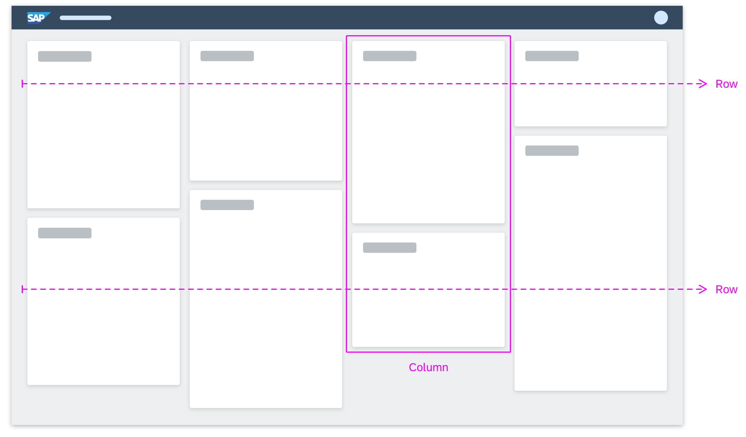
The content blocks in a subsection display in a row. The width of the row depends on the column layout for the respective screen size. If there is not enough space to display a content block, it wraps to the line below.
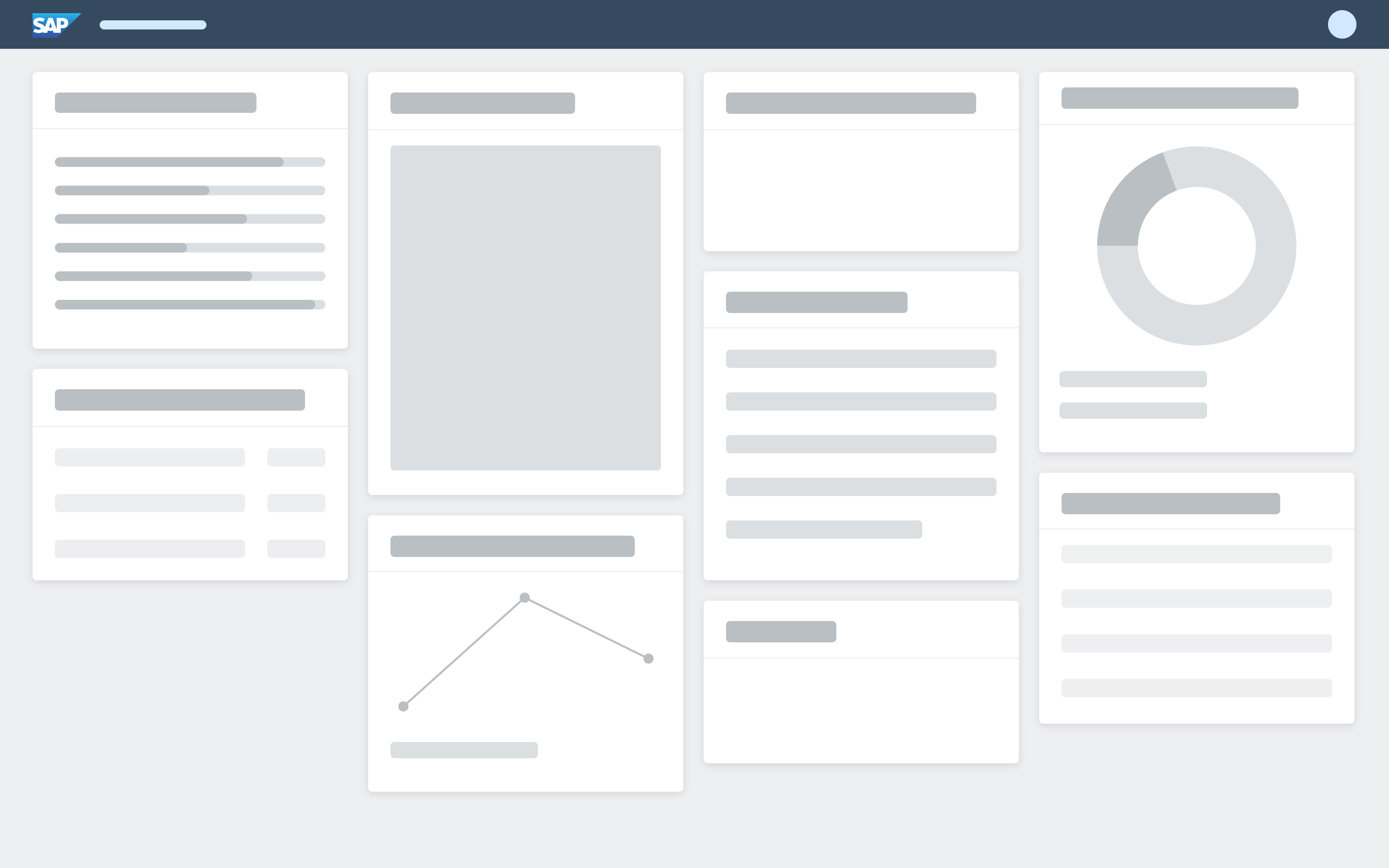
Object page – Content responsiveness
Forms
Forms follow the standard layout of the object page:
- Extra large: 4 columns / 6 columns
- Large: 3 columns
- Medium: 2 columns
- Small: 1 column
Forms are located within subsections. They follow the column design of the object page, whereby each form group is arranged into a column. The title of the form is given by the subsection header. To improve access to the different forms we recommend always using one subsection per form, rather than placing multiple forms into one subsection.
If you need to perform any actions, you can use the subsection header. If you need action at group level, you can use a group header. To prevent confusion, we recommend inserting actions only in one place, depending on the use case.
Use top-aligned labels for form fields. Top-aligned labels are known to reduce completion times and are the best approach for forms requiring localization or long labels. Using top-aligned labels also avoids issues with the spacing between the label and form field, which can occur with left- and right-aligned labels.
If you are using the object page without object page blocks, you can use the column layout for forms, which automatically distributes form groups across the columns in the object page.
You can enable users to show and hide forms, groups or label-value field pairs using the Show More / Show Less toggle button.
SAP Fiori elements provide an option to show or hide fields on small screen devices based on their importance.
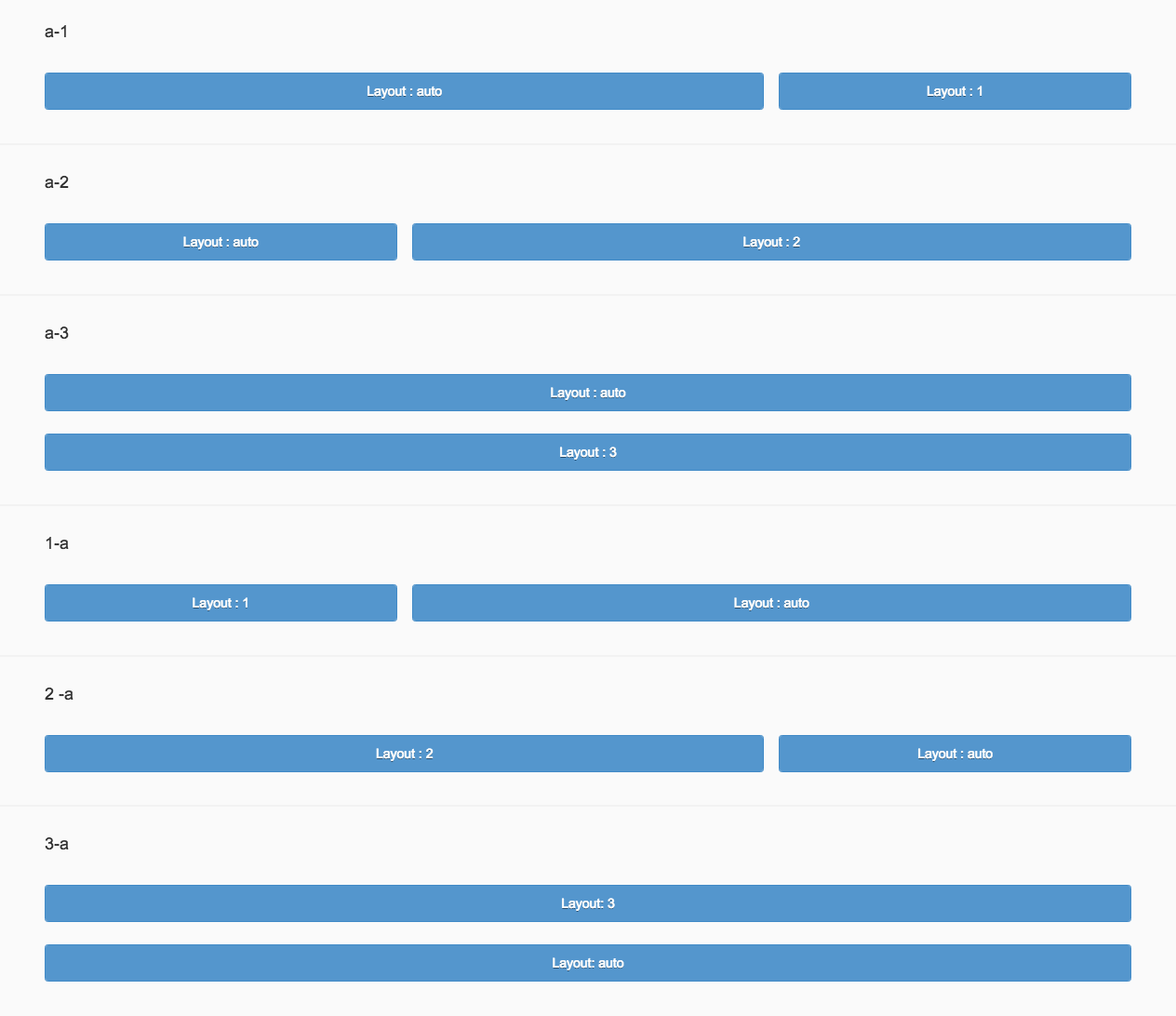
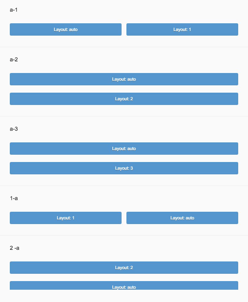
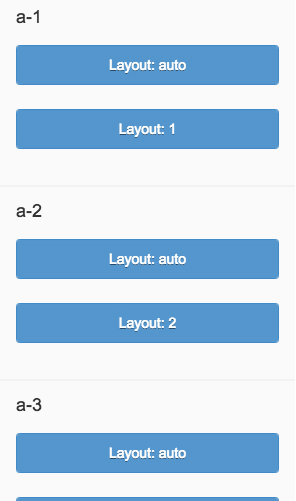
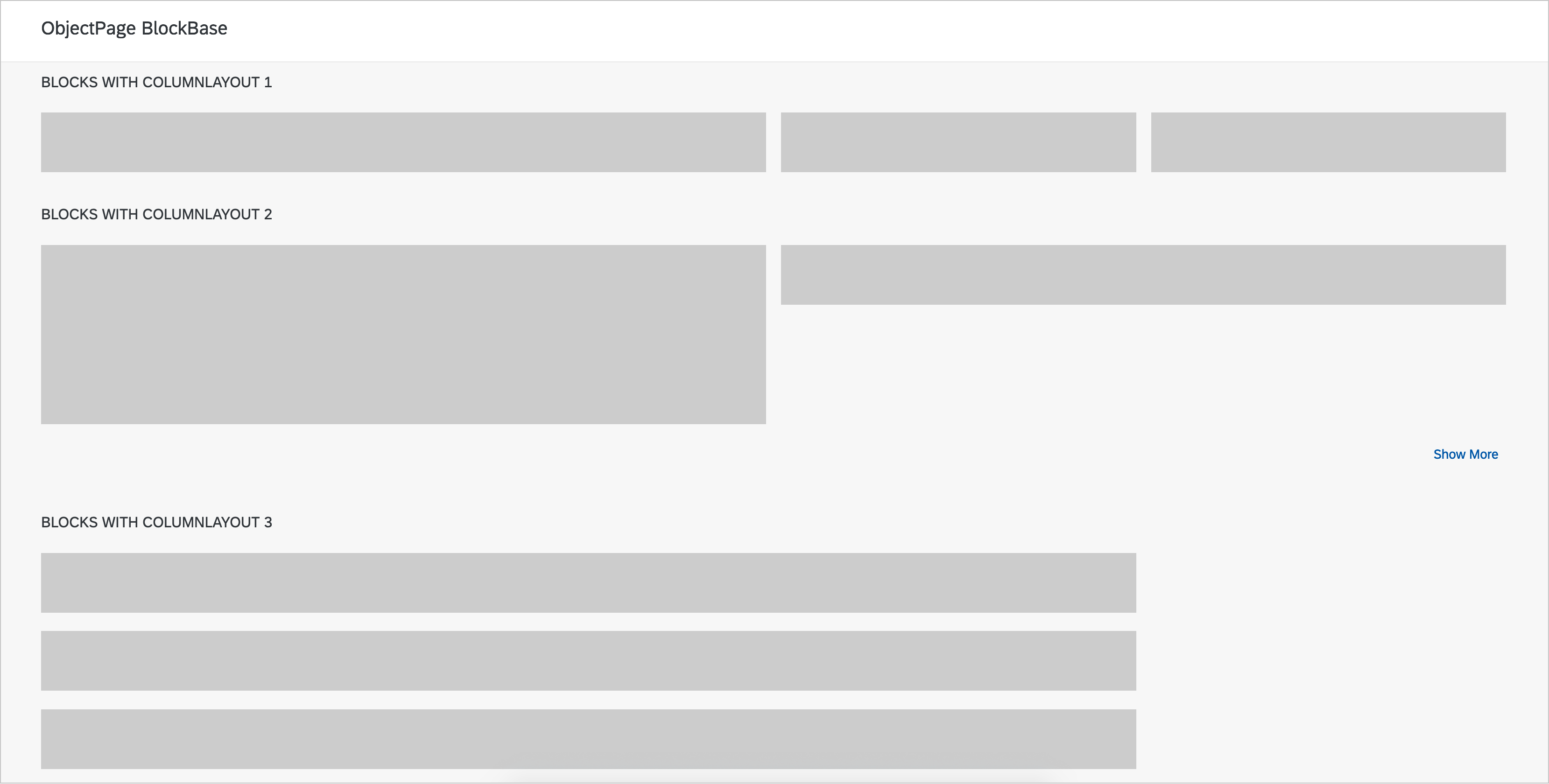
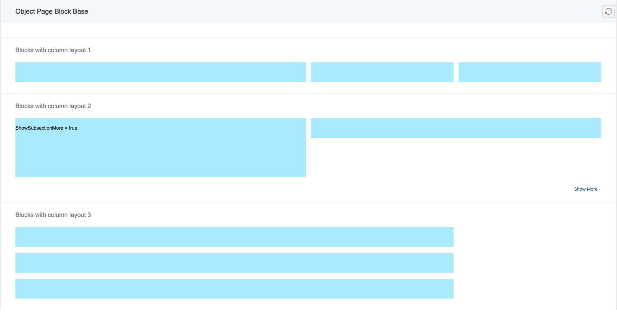
Blocks
Layout blocks allow content to be aligned within the columns as follows:
- Layout 1: Occupies the maximum available horizontal space of one column.
- Layout 2: Occupies the horizontal space of only two columns. If there is only one column available, it occupies one column.
- Layout 3: Occupies the horizontal space of three columns. If there is only one column available, it occupies one column. If there are only two columns available, it occupies two columns.
To show and hide blocks, you can use a Show More / Show Less toggle button. Do not use the panel container in the object page content area.

Object page – Block base
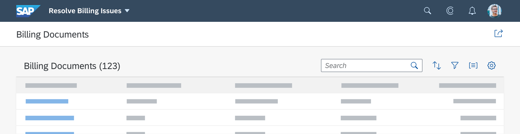
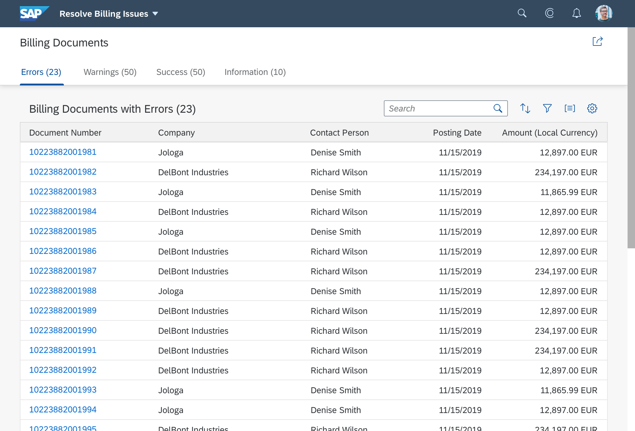
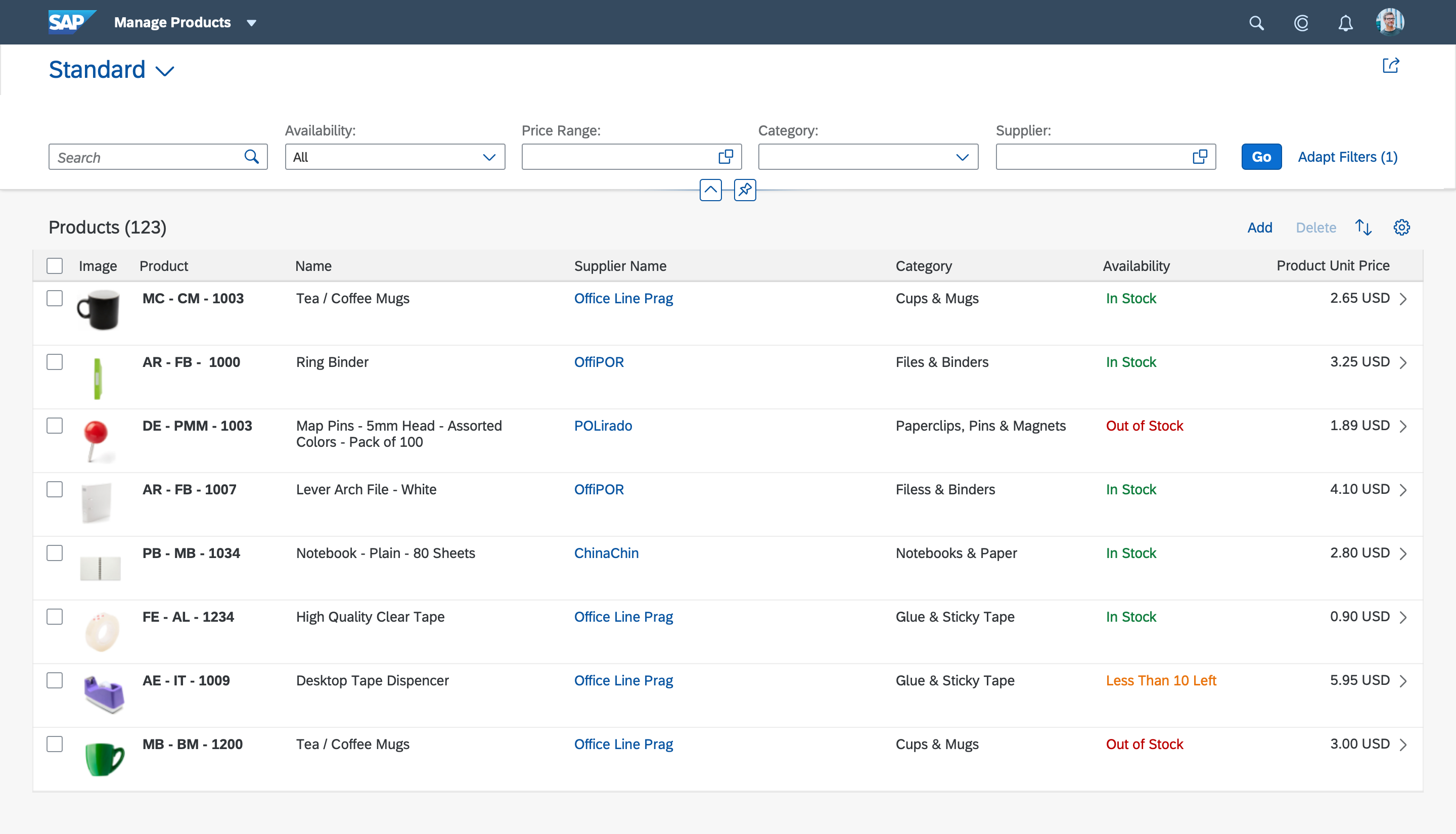
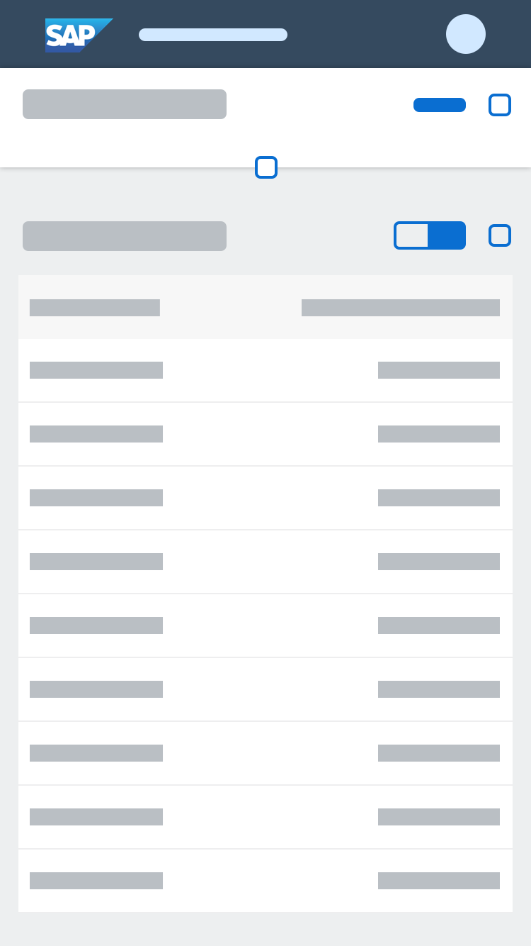
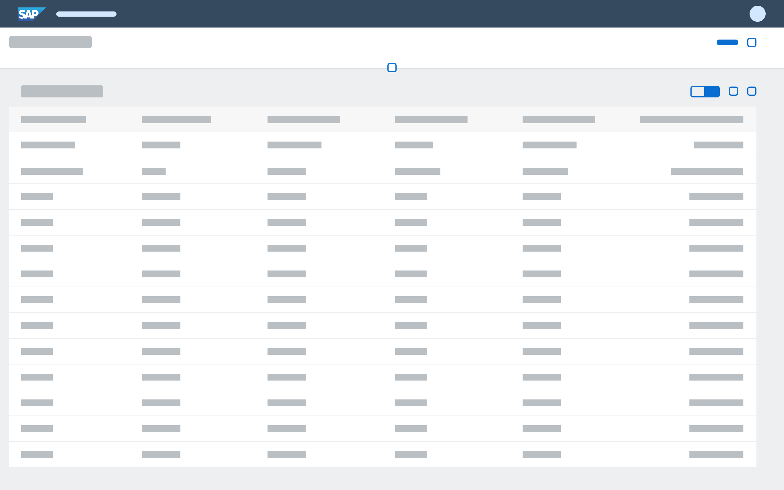
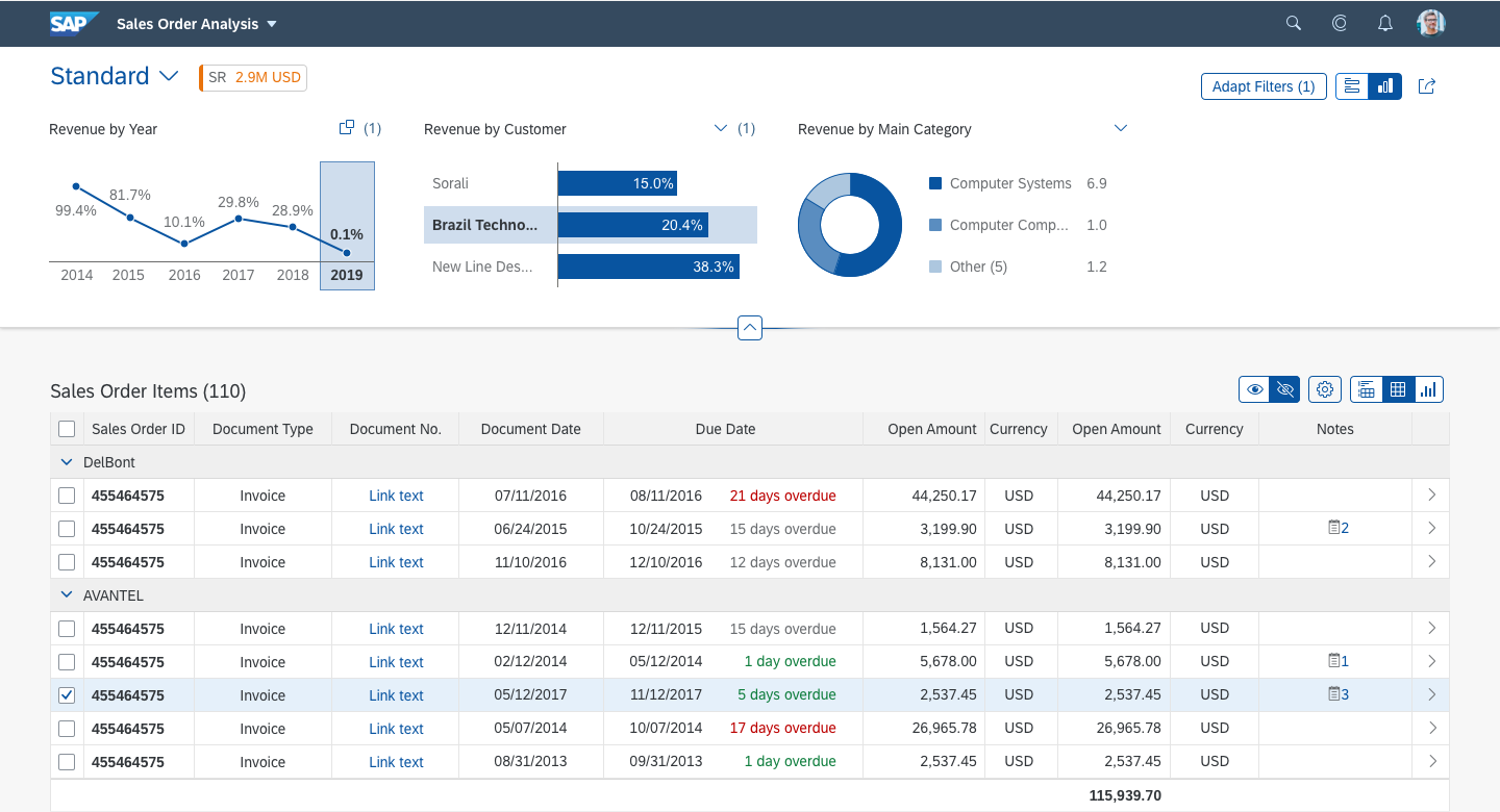
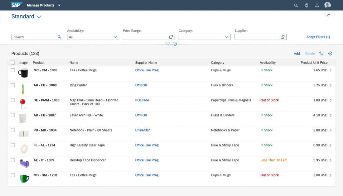
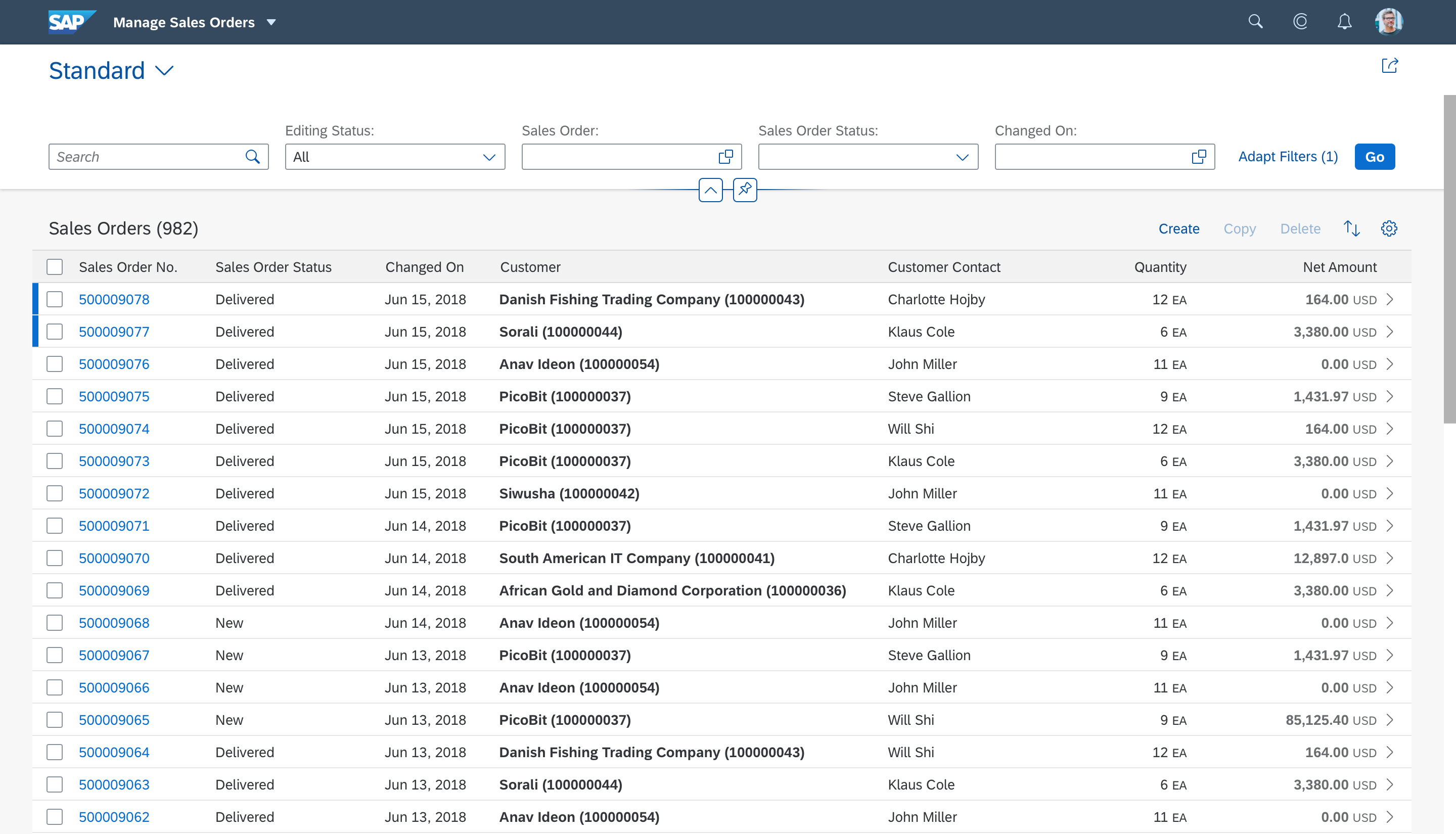
Tables
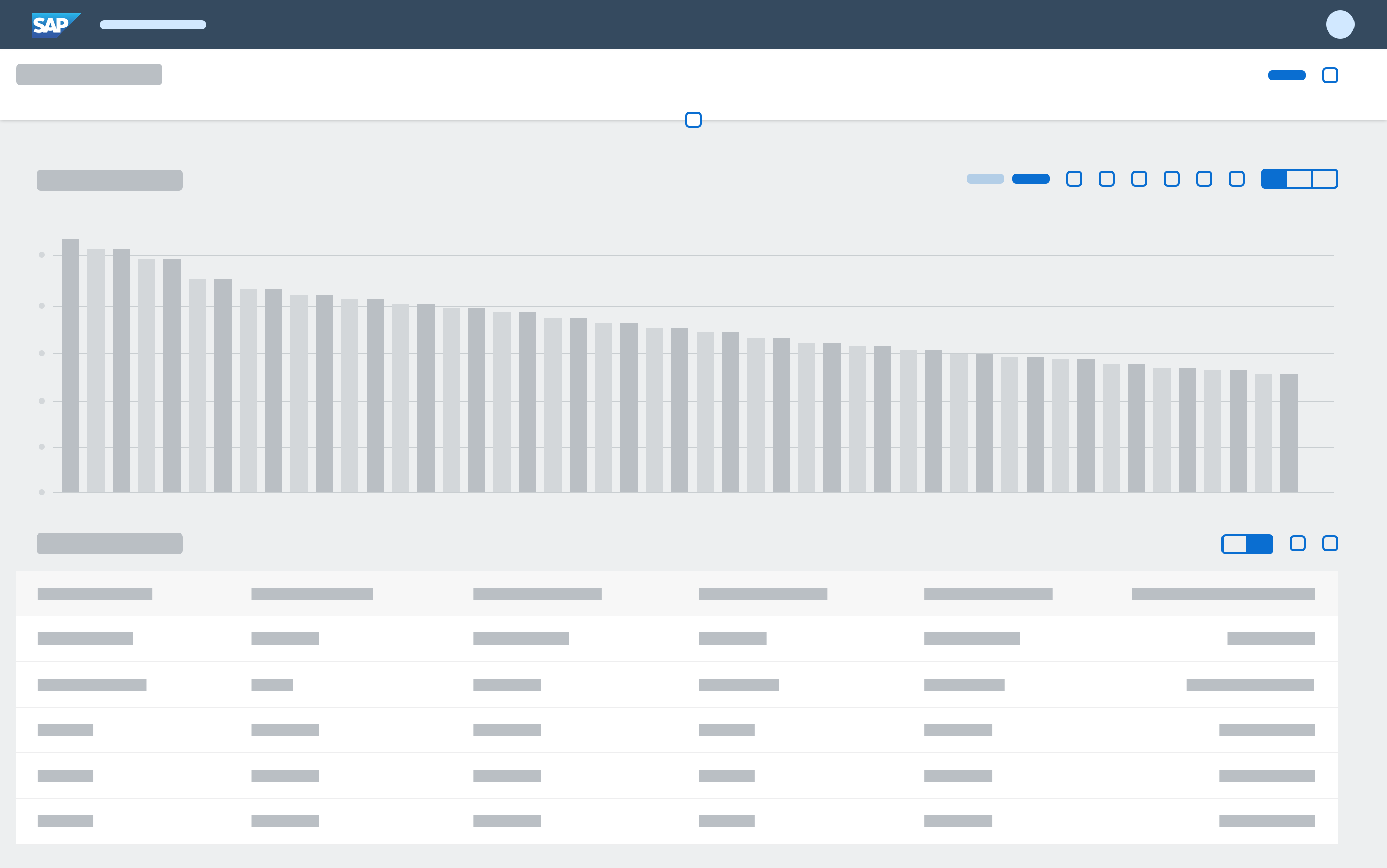
When a section or subsection contains one table and no other content, remove the redundant table title so the section or subsection title serves as the table title. In the subsection, also reduce the vertical space.
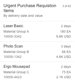
Grid tables in sections must have at least 4 rows, and the maximum number of rows visible will depend on the window size. To prevent any need for the user to scroll to access the horizontal scrollbar, keep the table within the screen size limitations. This may not be possible in all use cases, for example, if the table contains a large data volume, then you must use two scrollbars.
In an object page with anchor bars, use no more than 4 grid tables to prevent cognitive overload. (Consider using different sections between multiple tables to ease the burden, except for table comparison use cases.) To include more than 4 grid tables, place them in individual tabs.
To embed analytical tables or tree tables in an object page, use an object page with tabs and place each table in its own tab. If you are using a scrollable object page without tabs, use responsive or grid tables instead, and offer navigation to another page with the respective table type.
Depending on the number of table items, use one of the following loading behaviors:
| Number of Table Items: | Use: |
| Up to 20 | Items can be displayed right away |
| Up to 100 | Lazy loading |
| More than 50-100 but less than 200 | Tab navigation |
| More than 200 or tab approach is unsuitable | Navigation to another page |
If a table is expected to have more than 20 items, use one of the 3 options below for long tables.
For all three options, we recommend providing a search, and if feasible, sort and filtering for the table in the object page. Avoid grouping.
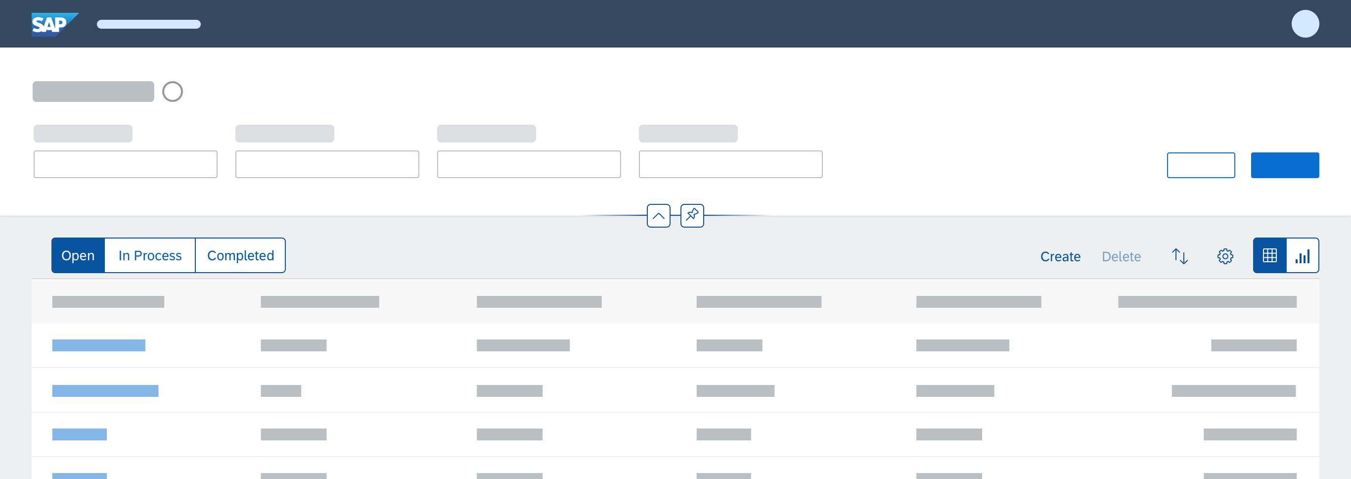
1. Lazy Loading Behavior (“More” button)
If you expect up to 100 items, use the More button of the responsive table. The initial number of items shown depends on the height of the rows. We recommend initially showing 10 items, but not more than 20. If there is more than one table in the object page, only use this option for tables with up to 50 expected items.
2. Tab Navigation
If you expect to have more than 50 to 100 items, but fewer than 200, using the object page with tab navigation instead of anchor navigation also solves the problems associated with long tables. To enable the scroll-to-load behavior, the table must be the only or last element within a tab.
3. Navigation to Another Page
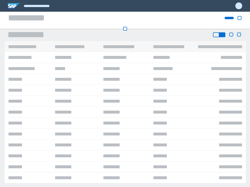
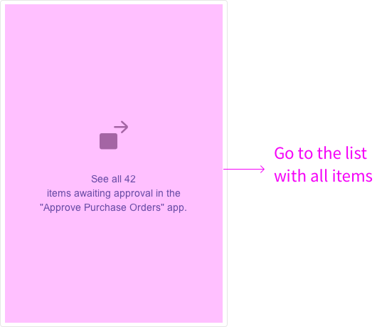
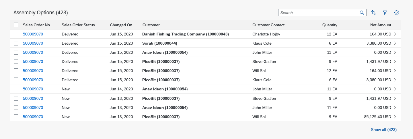
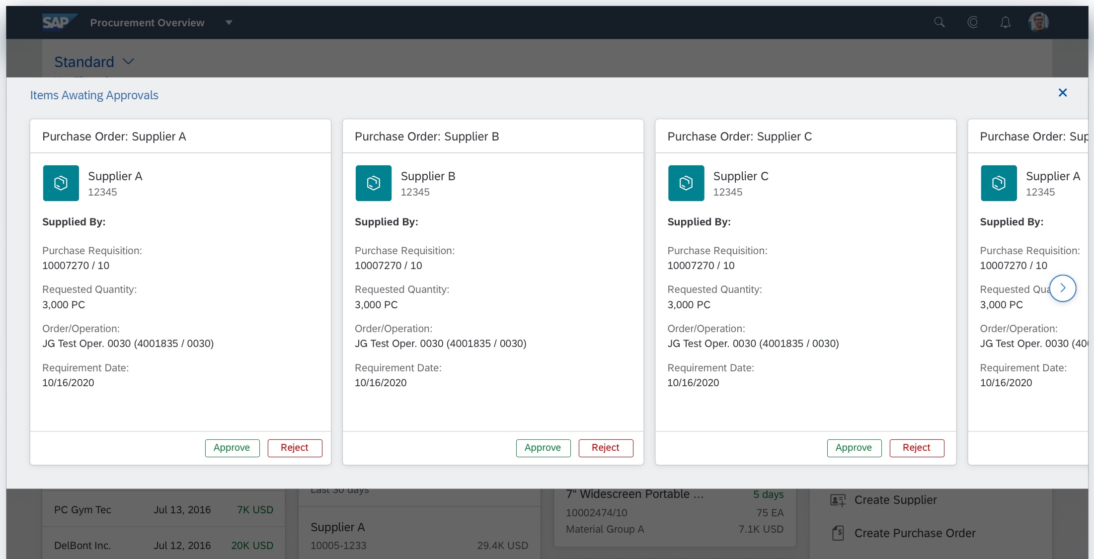
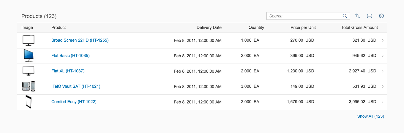
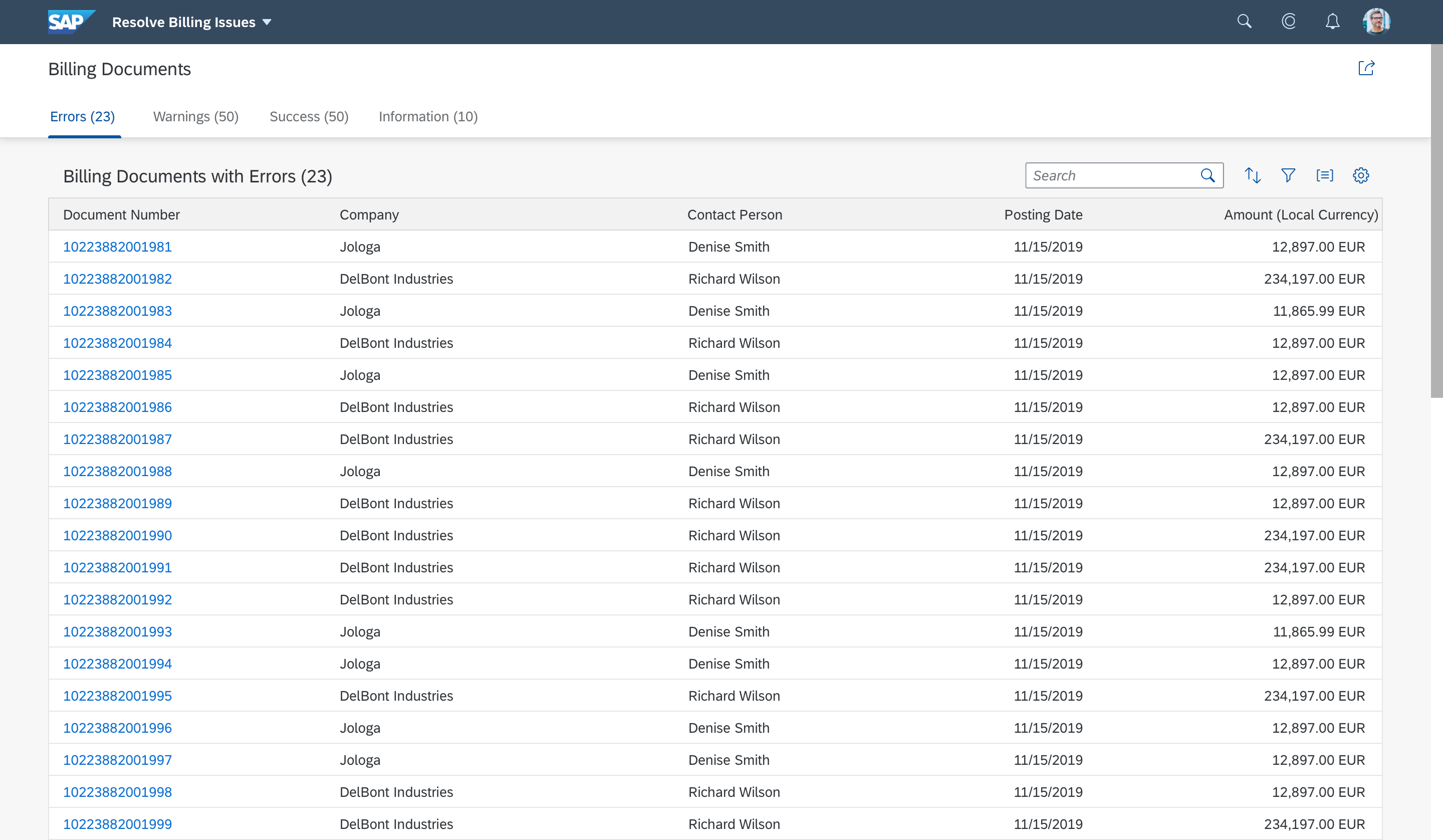
For tables with more than 200 items, or when the tab approach is unsuitable, restrict the size of the table in the object page to a reasonable number of items. We recommend showing a preview of only 10 items, but not more than 20. This can be achieved using predefined filters and/or by sorting the table. If necessary, you can also set a fixed number of items (such as the top 10). To enable the user to work with the entire table, offer navigation to a separate page, such as a list report, subobject page, or dynamic page with the respective table type. To do this, place a right-aligned link below the table with the label Show All (x), where x represents the total number of items in the table.
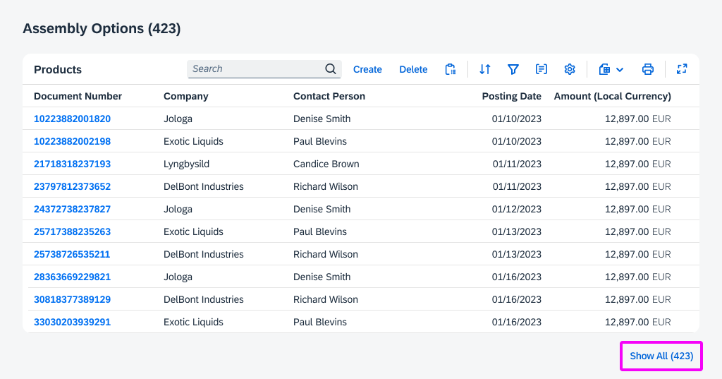
Table with navigation to a separate list report
Representation of Child Pages
In object pages with drilldown navigation, child pages are represented in two ways:
- Breadcrumbs: A breadcrumb is displayed above the object title. Limit the breadcrumb to the drilldown levels within the object page.
- Paging buttons: Up and down arrows in the layout action area allow the user to navigate between subitems without going back to the original list.
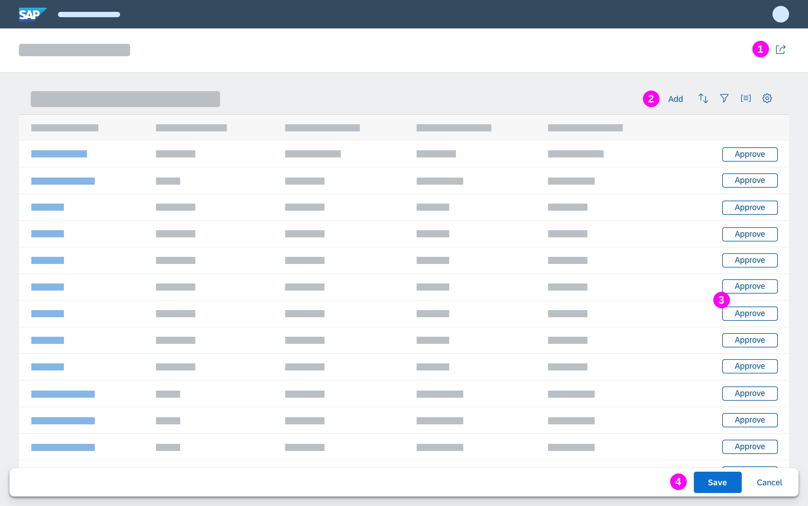
Footer Toolbar
The footer toolbar is used for closing and finalizing actions in:
- Edit and create mode, for example, Save, Post, Accept, Reject, and Activate
- Display mode, for example, Approve, Accept, and Reject
Behavior and Interaction
The basic layout of the object page in terms of header, navigation, and content remains the same in all modes (display, edit, create).
Initial Focus
When the object page is loaded, set the initial focus as follows:
- If the object page is in display mode, set the focus on the first section.
- If the object page is in edit mode, set the focus on the first empty mandatory field.
- If there are no mandatory fields, set the focus on the first editable element or first action.
Edit
The object page can contain a mixture of editable and read-only content.
Use the same content layout for both display and edit mode – content should not change location when the user switches between display and edit modes.
For global and local editing guidelines, see Object Handling (Create, Edit, Delete).
There are two ways of editing header content depending on whether you’re implementing Global Edit or Partial Edit, both of which are explained below.
Editing header content in Global Edit mode
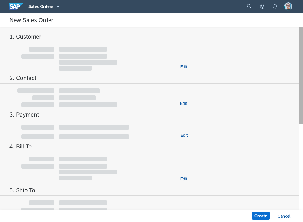
Because the header snaps on scroll, there are no editable forms in the header itself, so if you’re dealing with editable header content, a temporary “Header” section is generated above all the other sections of the page where the header content can be edited. The same principle applies if your object page only has one section and there is editable content in the header, except a temporary navigation bar should be generated as well. Any changes made to the header are not reflected until the user saves them.
When there is editable content in the header, the title bar information and all editable fields from the header container move from the header to the temporary “Header” section and non-editable content displays as read-only. You can leave out header content that doesn’t make sense in edit mode (for example, aggregated values that are calculated from several sources, KPIs, or micro charts). If only a few fields in the header are editable, and they match an existing section, they are moved to that section. In this case, no editable header section appears. The header container in edit mode can also contain independent facets that are not included in the header content in display mode which provide information to assist editing.
Please note, the temporary “Header” section for editing header content doesn’t come out of the box for freestyle applications – it needs to be implemented manually, so it’s sometimes better to avoid having editable header content and move it into object page sections instead.
Editing header content in Partial Edit mode
The user can edit the header content separately by pressing the Edit Header button.
If there are only a few elements to edit, the partial edit triggers a dialog.
If there are too many elements to fit in a dialog, the partial edit triggers a subpage. The subpage contains all editable information from the header. However, it differs from the “Header” section in global edit mode in that it has no action buttons in the toolbar, no navigation, and no breadcrumbs.
Create and Edit Subobjects
The following options are available for creating or editing subobjects:
- Navigation to a subobject page
- Inline create or inline edit in a table
- Dialog containing the fields of the object
To enable users to create subobjects inline, offer an Add or Create button on the table toolbar. Clicking the button creates a row at the top of the table. Pressing Ctrl+Enter has the same effect.
If the subobject has less than 8 fields, use a dialog or the inline create/edit option (no separate page for the subobject). Exceptions can apply if additional content for the subobject is available but not part of the edit process, or if other apps need to offer deep links to the subobject page.
Edit Actions in Display Mode (freestyle apps only)
The standard flow is to switch to edit mode for edit and delete actions. However, in some cases, it can be helpful to offer certain edit actions in display mode as well.
You can offer edit actions in display mode if:
- Switching to edit mode would inconvenience the user. This is especially true if the change is small and quick, and switching to edit mode would take longer than making the change.
- The change does not impact a critical flow or result in technical inconsistencies.
Examples: Adding a comment, uploading a file
Do not offer edit actions in display mode if:
- The change has a critical impact on business data/follow-on processes.
- The change requires a finalizing action.
Example: Deleting a sales order item would affect the entire sales order and dependent data.
When offering delete actions in display mode, always show a delete confirmation dialog. For more information, see:
Unsaved Changes
If draft handling has been implemented, documents are automatically saved as draft versions in the background. An editing icon to the right of the object title indicates that a draft version exists. In other words, either the current user or another user has made changes, but not yet actively saved the document (“unsaved changes”). Do not show the editing icon for unsaved changes if draft handling is not supported.
Selecting the editing icon invokes a popover with more information about the unsaved changes. This normally states:
- Who made the changes
- When the last changes were made
The popover closes when the user clicks outside the popover or clicks the (Close) icon.
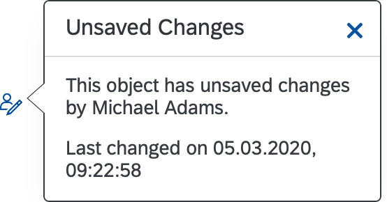
Unsaved changes popover
Create
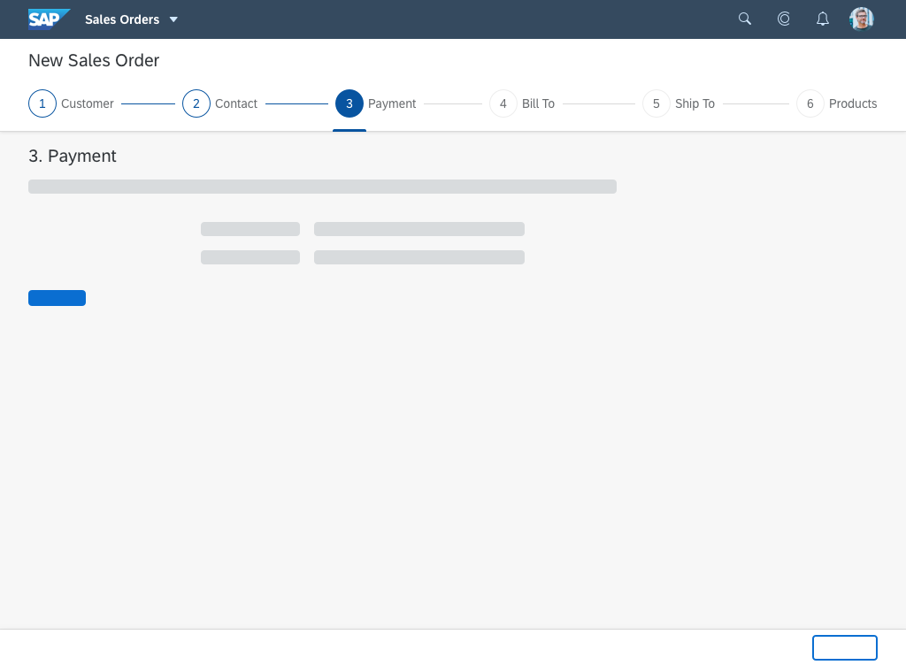
Create mode is similar to edit mode, except that the user creates a new object and defines a title for it. Until the new object title is known, display the placeholder text “New ” (for example, New Purchase Order). Replace the placeholder text with the actual name or ID of the new object as soon as this has been entered or generated.
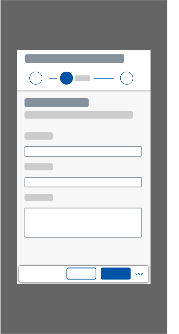
Consider using the wizard floorplan instead of the object page floorpan if:
- You need to guide the user through a series of steps when a new object is created.
- You need a progressive disclosure approach for the creation process.
- The creation process is not linear, but can have different paths, depending on the information selected.
- The user is not familiar with the creation task.
Loading Behaviour
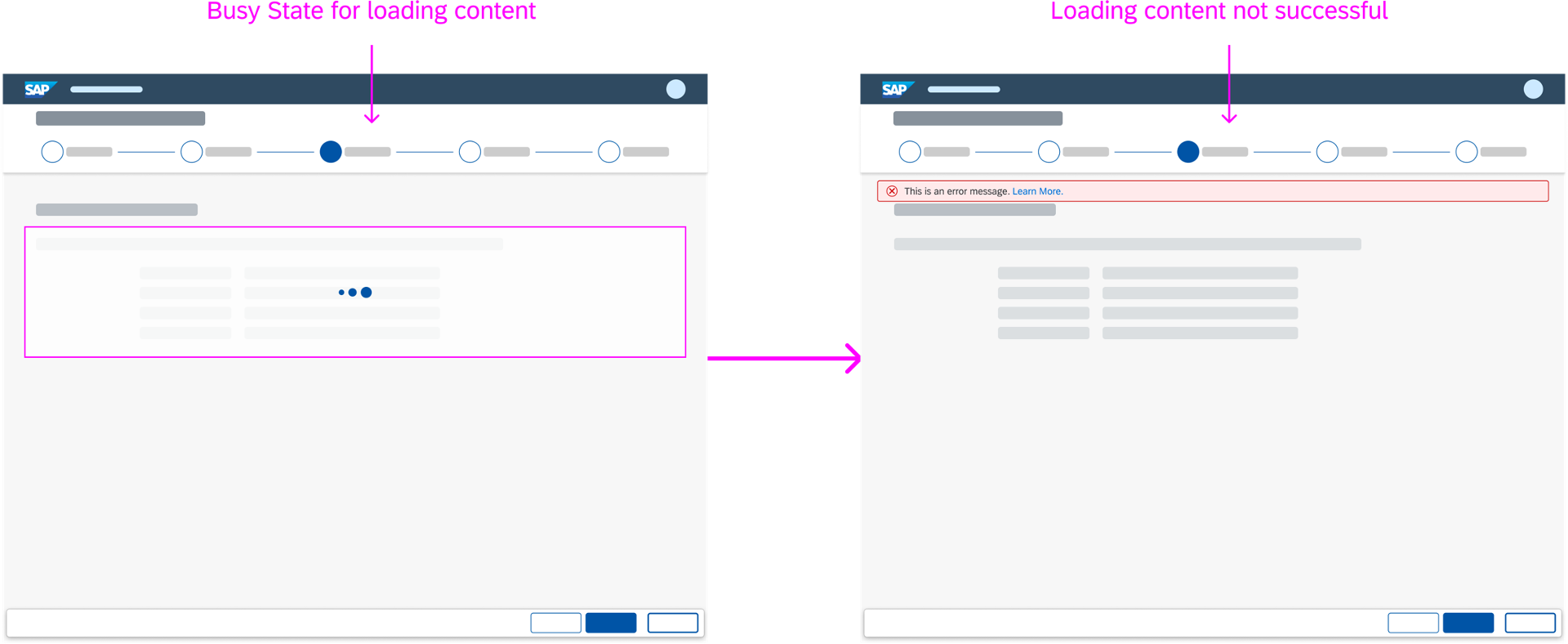
The object page loads in a “growing” mode. This means that the object page loads section by section to show users some content before the whole page is loaded. Scrolling down the page triggers loading for the sections below. Hidden items in sections are only loaded (and rendered) by clicking the Show More button for the section.
If loading takes a long time, a busy indicator is shown on top of the section or item until the content is loaded and visible.
SAP Fiori elements uses a skeleton template with generic placeholders. For more information, see Placeholder Loading.
Busy indicators for sections still loading
Message Handling
In Display Mode
The following controls can provide messages to users in the object page in display mode:
- Generic tag
- Message strip
- Object status
Generic Tag
The generic tag displays KPIs and situations.
Message Strip
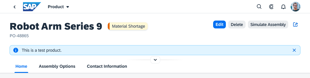
You can place a message strip in the header or in a section in the content area:
Object page with different messaging options
- Header:
Show the message strip in the header if the information relates to the whole object.
Place the message strip between the object page title and the header content. When the header is collapsed, it remains visible.
- Content area section:
Show the message strip in the content area section if the information relates to a specific section.
Place the message strip at the top of the section above the section title.
Use a single message strip with a single message per area. Do not stack several message strips together.
A message strip can display:
- A call to action, such as a task that the user must perform
- Temporary information that the user needs to know
- An issue that is not related to a form field
- The object status if the object status control is too small to convey the information.
For a brief status text, use the object status control.
If you decide to display both the message strip and the object status control, they should not repeat the same information.
- Brief guidance on how to use or read the page.
If the object page requires multiple hints for the user, consider using SAP Companion instead.
Object Status
The object status displays a brief description of the object status.
Object page with message strip and collapsed header
Object page with message strip in a section
In Edit Mode
In edit mode, use the message popover to help validate forms and tables as a single object.
Responsiveness
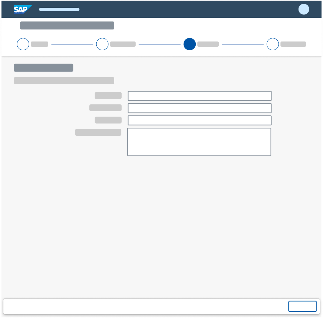
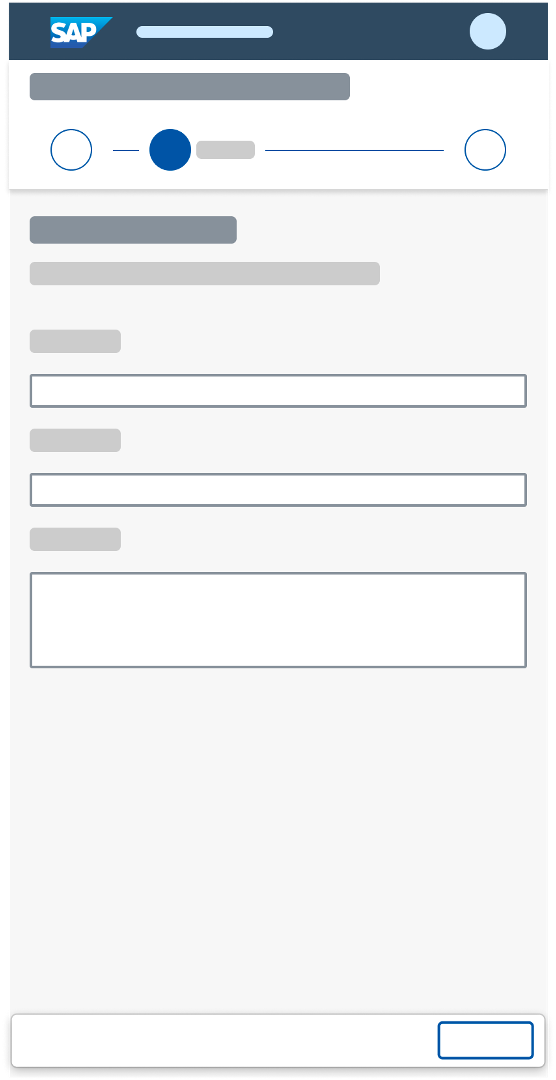
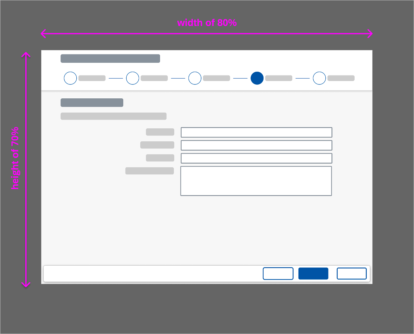
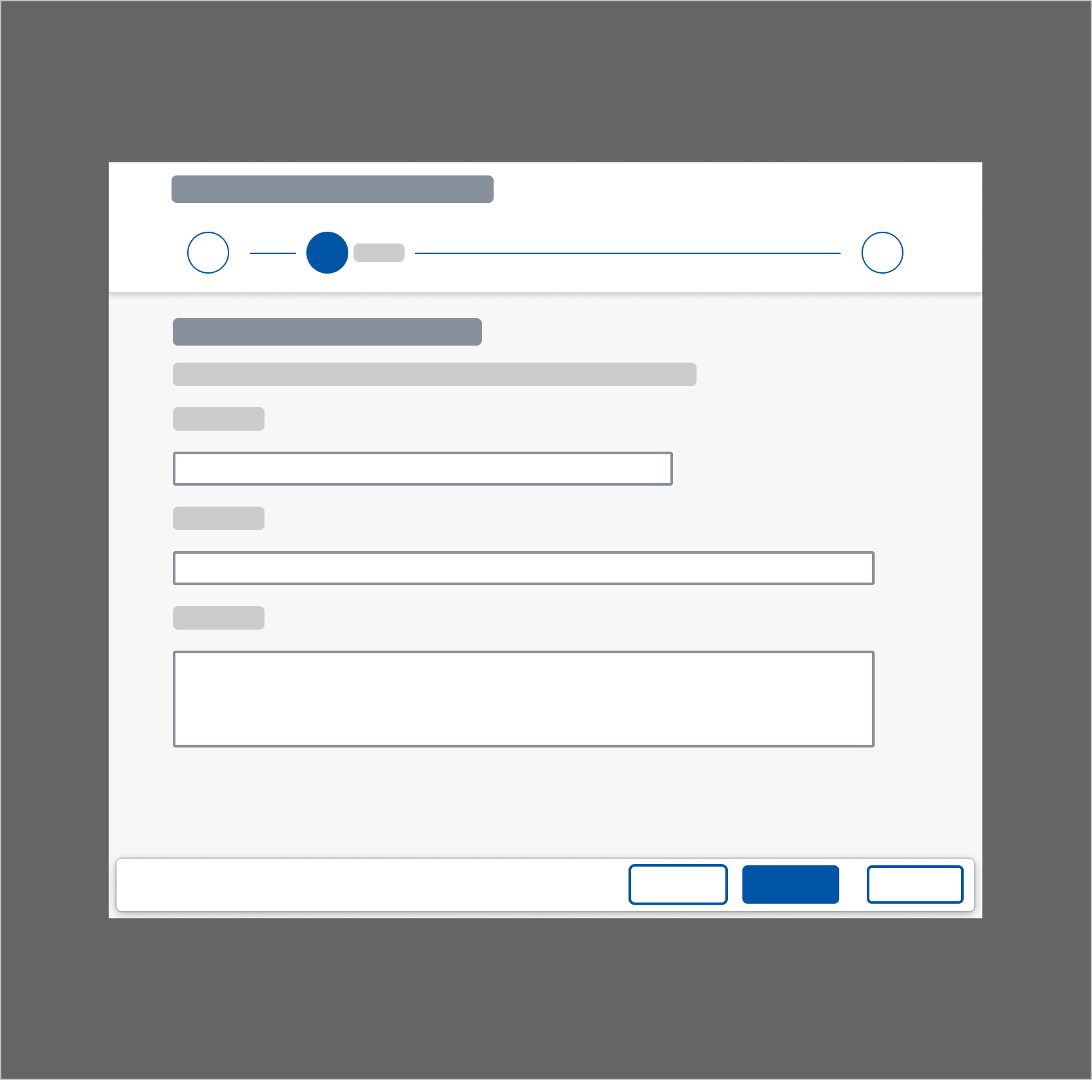
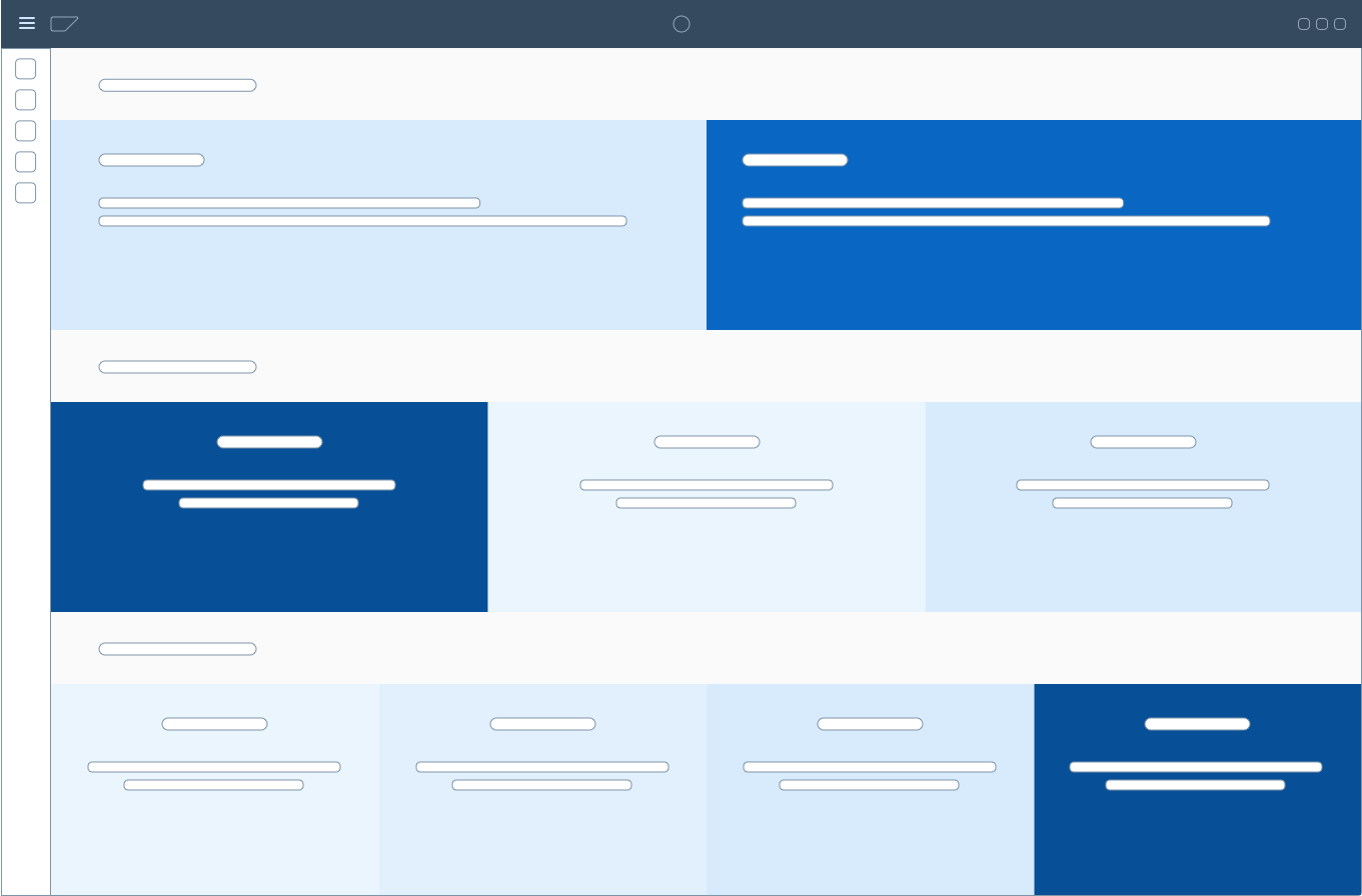
The object page floorplan is responsive and supports all SAP FIori screen sizes: small (S), medium (M), large (L), and extra large (XL). The layout for size XL contains four columns.
Object page – Size S
Object page – Size L
Object page - Size XL
The default layout for size L (desktop) contains three columns. If you want to display two content elements that require an equal amount of space, you can also use an optional two-column layout (for example, two tables next to each other). Do not use the two-column layout with forms.
Object page layout – Size L
The layout for size M (tablet) contains two columns.
Object page layout – Size M
The layout for size S (smartphone) contains one column.
Object page layout – Size S
Guidelines
Dynamic Page Header
Use the header to set the context. Ensure that it is clearly structured and contains only essential information. Too much information impedes the main purpose of providing clear context.
Actions
Arrange the actions in the header toolbar with care, and consider what matters most to the user:
- Highlight actions that are common or most important.
- Differentiate between secondary and generic actions.
- Use either a text button or an icon for an action, but not both.
- Use icons only for generic actions (such as for Share). For all business actions, use text buttons.
- Place the most important actions on the left (actions go into the overflow from right to left).
- Establish a coherent visual approach.
For more information, see Action Placement.
Image Facet
If you intend to use images in the object header, consider the following:
- How will the user manage the images?
- How will the system block people without permission from editing images?
- How will these images be reflected in other floorplans if they are part of the object?
- If there are a large number of items, how would a user be able to manage images without having to navigate from page to page?
- Will the organization be able to manage the images?
Tab Navigation
If you have a complex object page, use the tab navigation approach. This can be useful when a complex object page has performance issues in a flat view, or in response to a specific user preference.
Content Area
- Avoid using the object page as a universal container for masses of information. Use the object page in accordance with the SAP Fiori principles: role-based, coherent, simple, and adaptive.
- Give your users quick and easy access to the information they need to complete their task(s). Use a progressive disclosure strategy to keep your interface clean. You can always provide additional information on request.
- Only present your users with information that makes sense for their industry, role, activity, and task.
Dynamic Side Content
You can offer dynamic side content alongside the object page under the following conditions:
- Use the side panel only for contextual content. Do not place finalizing or global actions in the side panel. This is because opening the side panel occupies the whole right side of the screen. There is no way to show it only below the header and anchor bar.
- Do not place object information in the side panel. This information should always be in the content area of the object page.
Standard Naming Conventions
For all objects, follow the standard conventions for action buttons, the object name, and the title in the shell bar. For more information, see:
Resources
Want to dive deeper? Follow the links below to find out more about related controls, the SAPUI5 implementation, and the visual design.
Elements and Controls
- Dynamic Page – Header (guidelines)
- Action Placement (guidelines)
- Form / Simple Form (guidelines)
- SAP Fiori Elements – Object Page Header (guidelines)
- SAP Fiori Elements – Object Page Content Area (guidelines)
- SAP Fiori Elements – Object Page Footer Bar (guidelines)
Implementation
- Object Page Floorplan (SAPUI5 samples)
- List Report and Object Page (developer guide)
- SAP Fiori Elements Feature Map


 Your feedback has been sent to the SAP Fiori design team.