
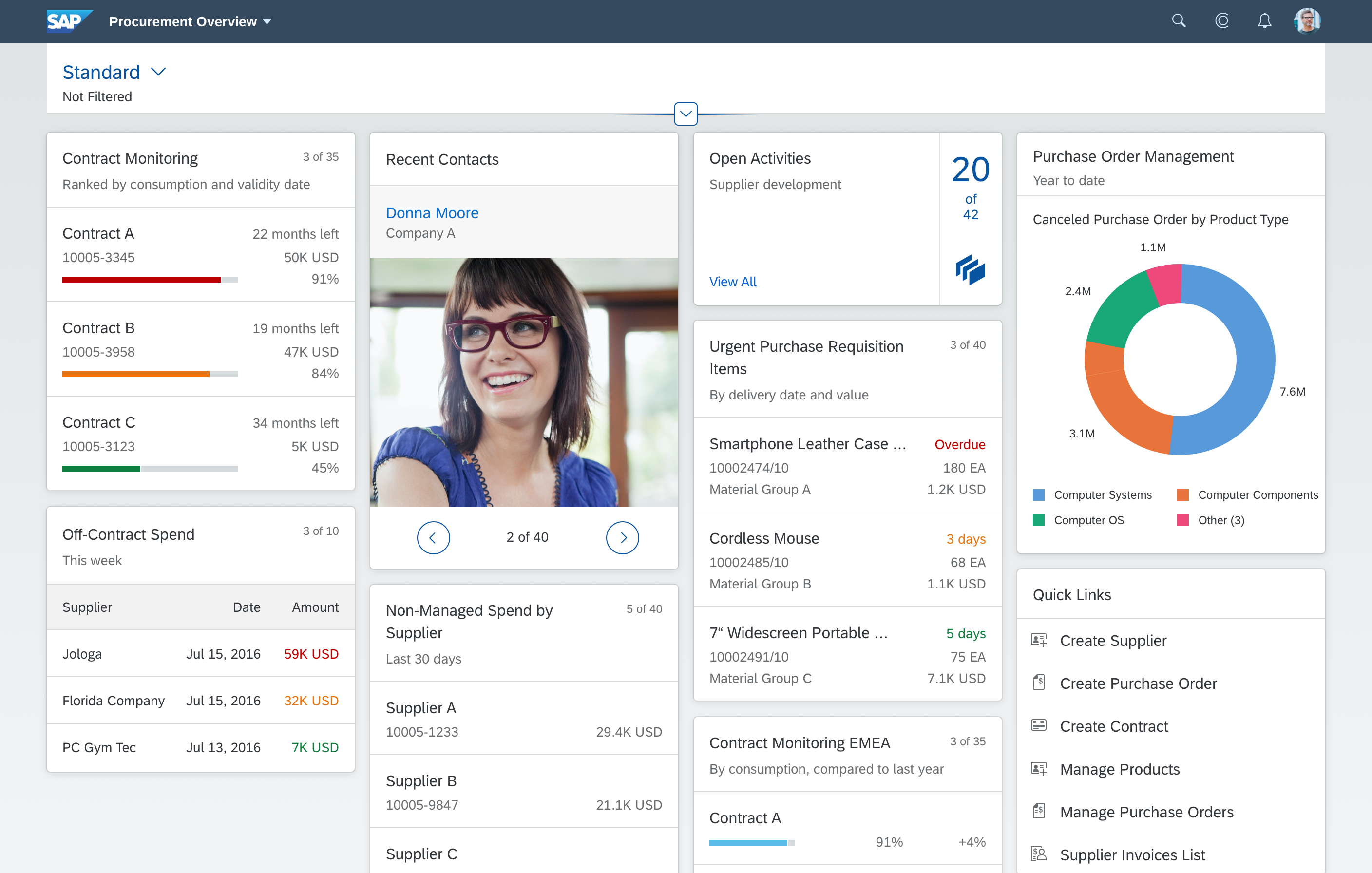
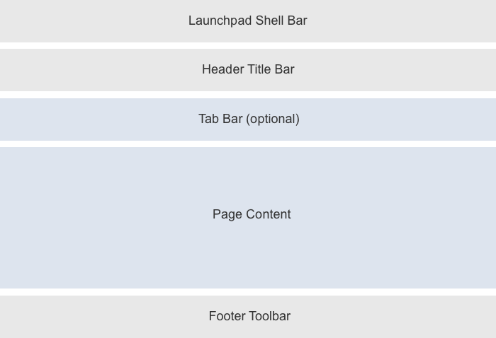
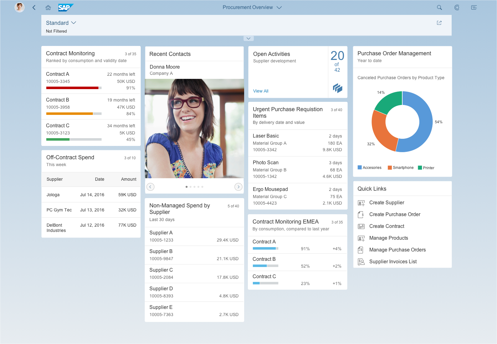
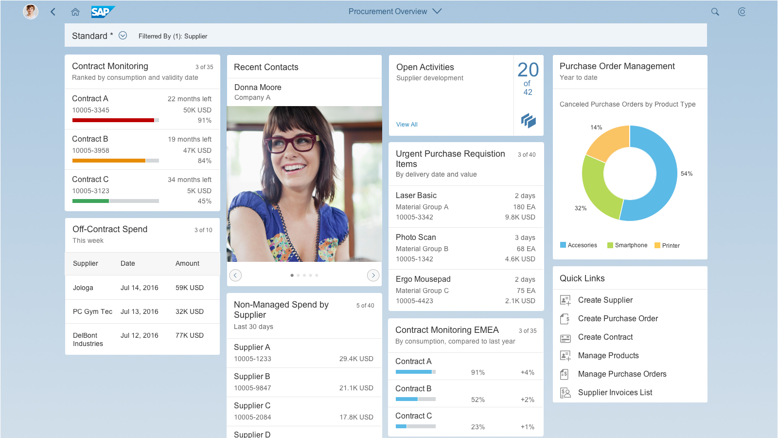
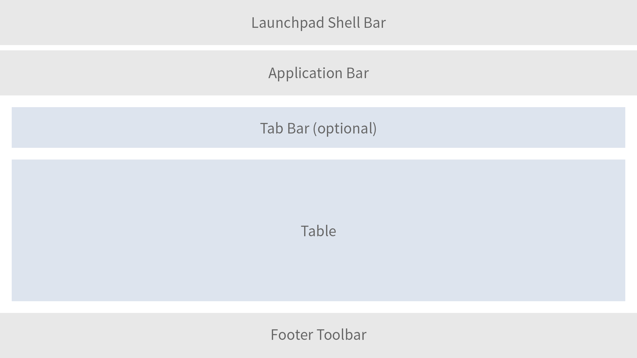
Overview Page – Fixed Card Layout
Self-Contained Cards
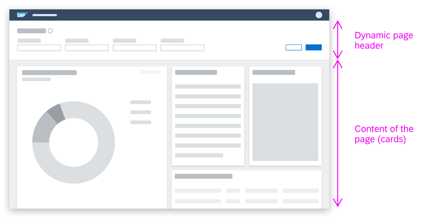
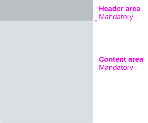
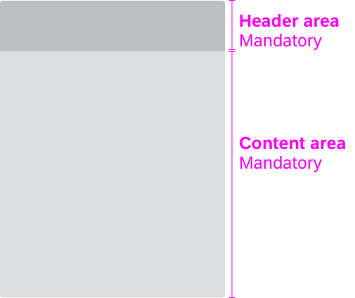
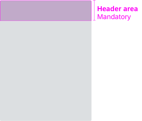
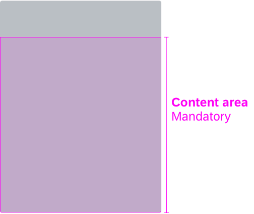
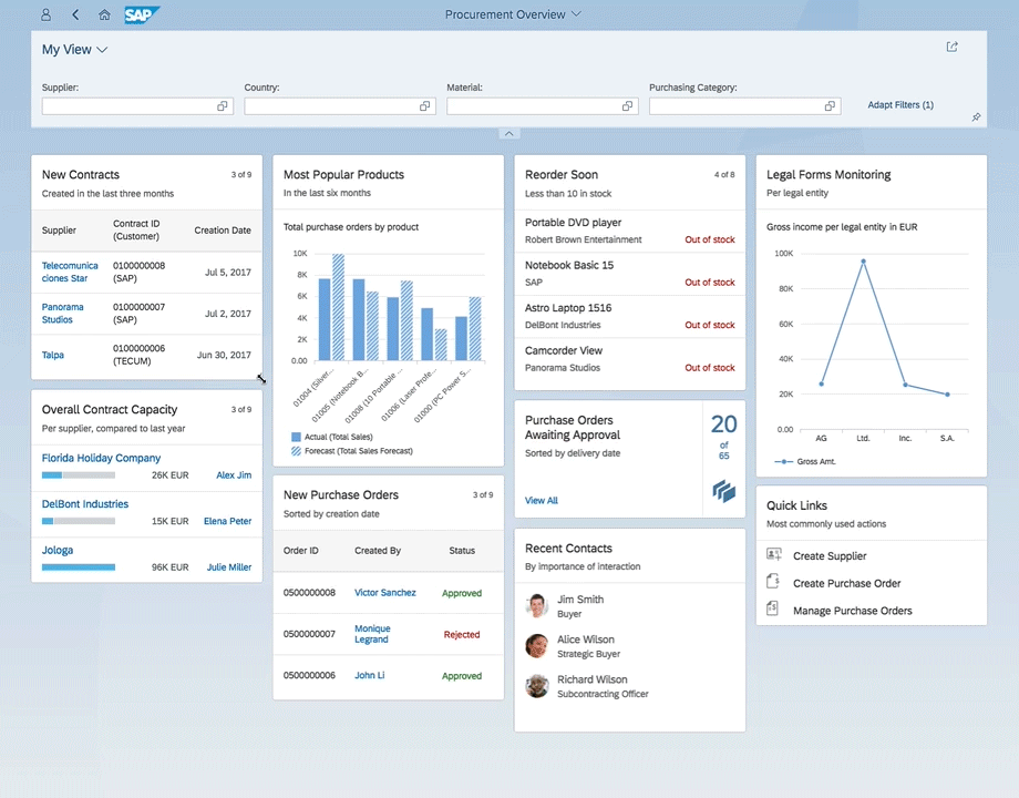
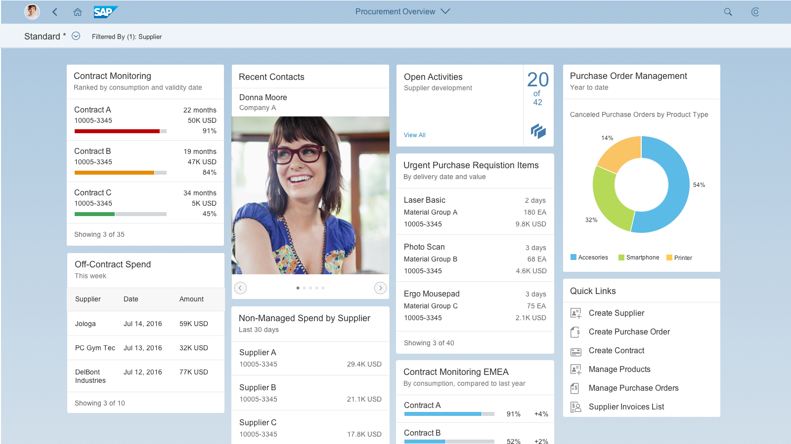
The fixed card layout is a layout for the overview page. It comes with predefined card characteristics that support automatic, easy and fast card design. The cards have a fixed width, and the height is determined by the card type and the embedded control.
The cards are ordered in responsive and collapsible columns. The number of columns is also fixed to keep the focus on the middle of the screen and show the set of cards in a compact display (a kind of letterboxing). For more information, see Responsiveness.
Before you start designing cards for an overview page, see the best practices.
At a Glance
-
Easy and fast card design using predefined card framework
-
Fixed card width and predefined height
-
Arbitrary card order
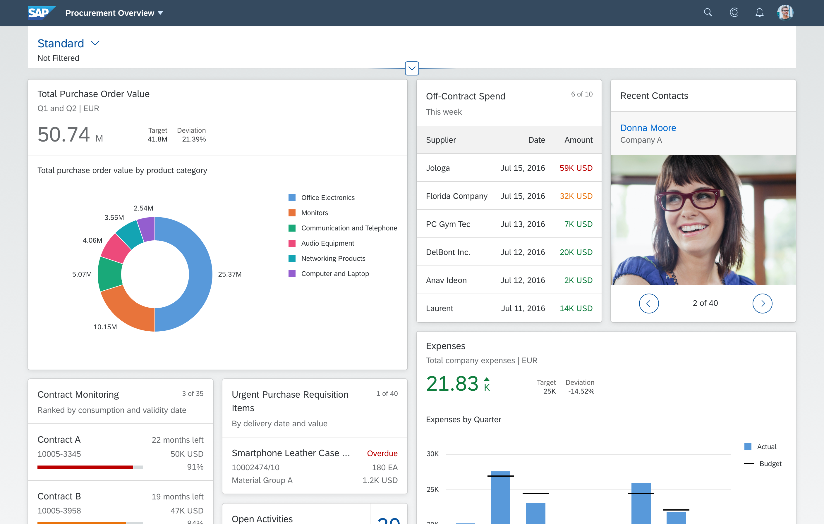
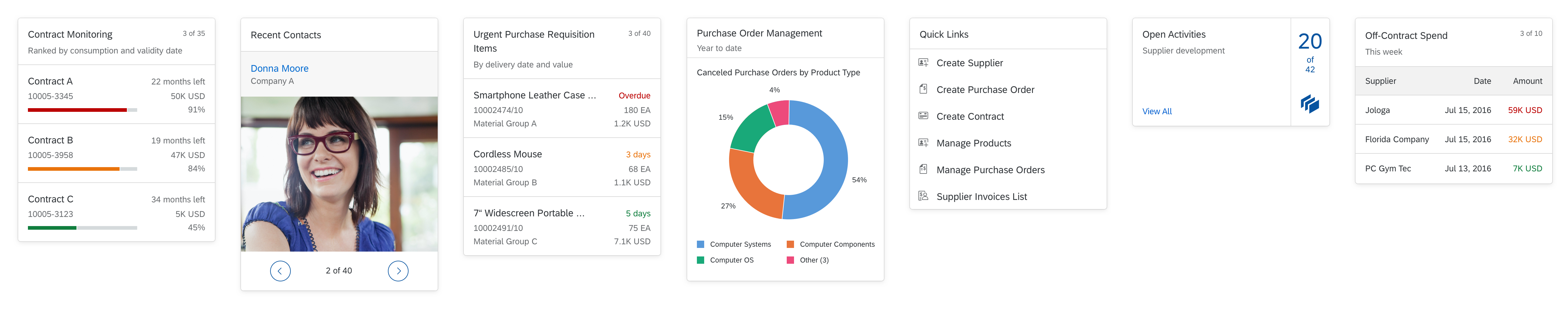
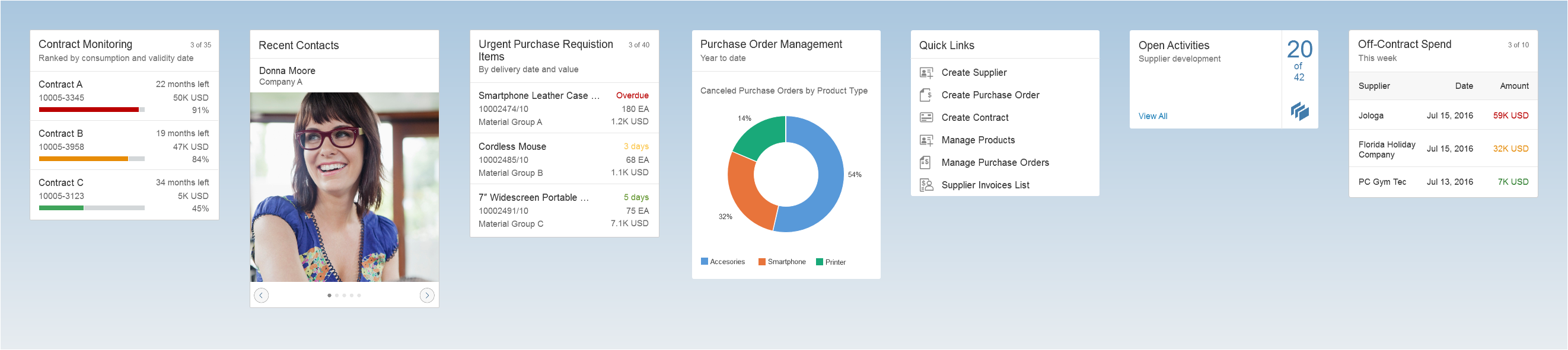
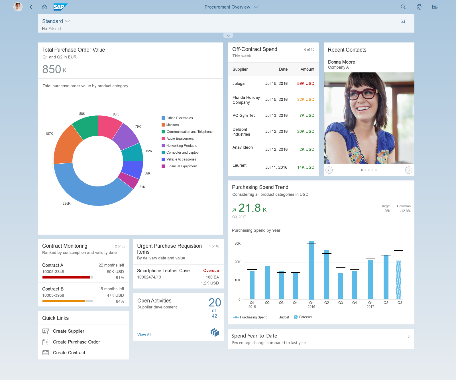
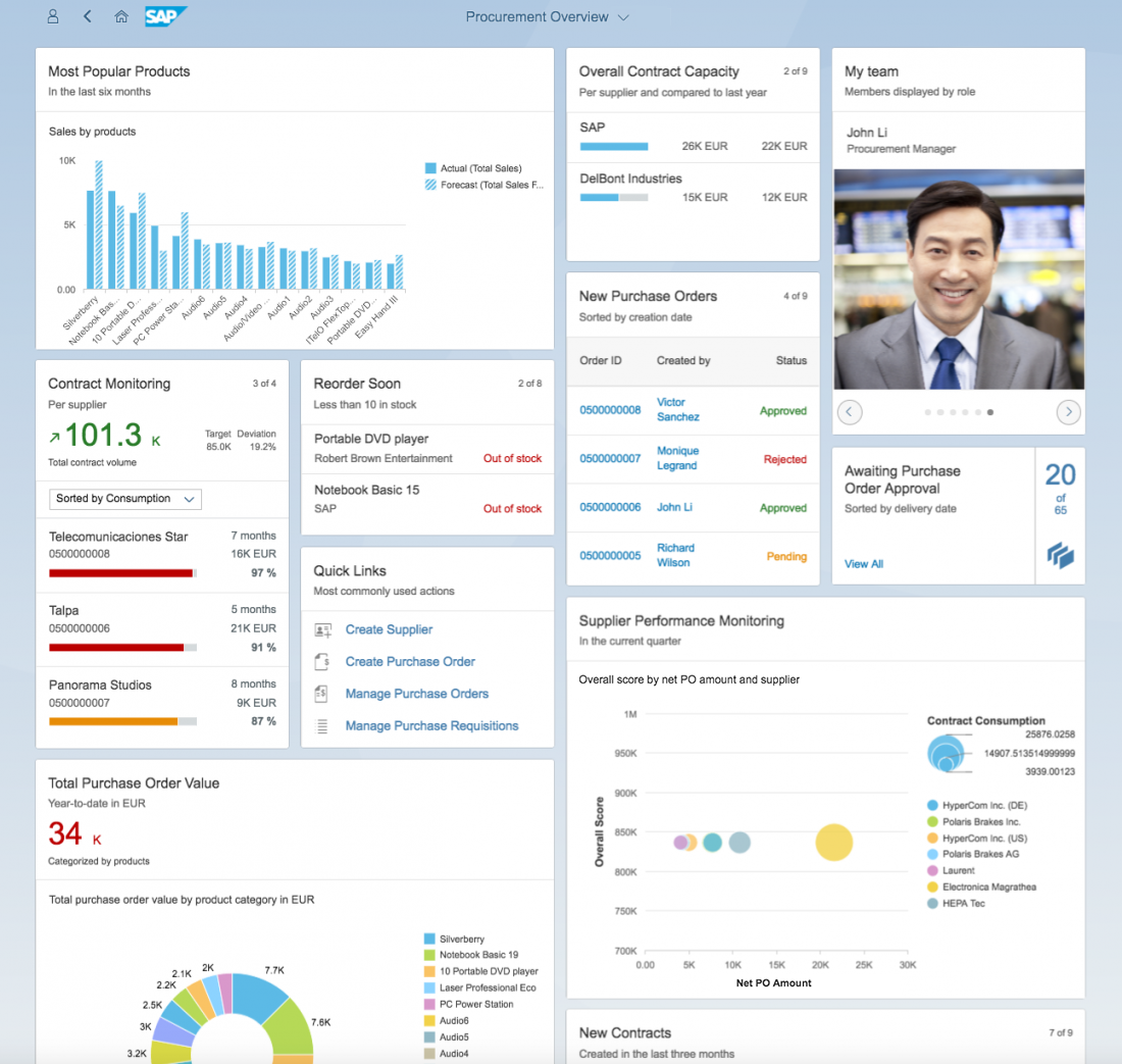
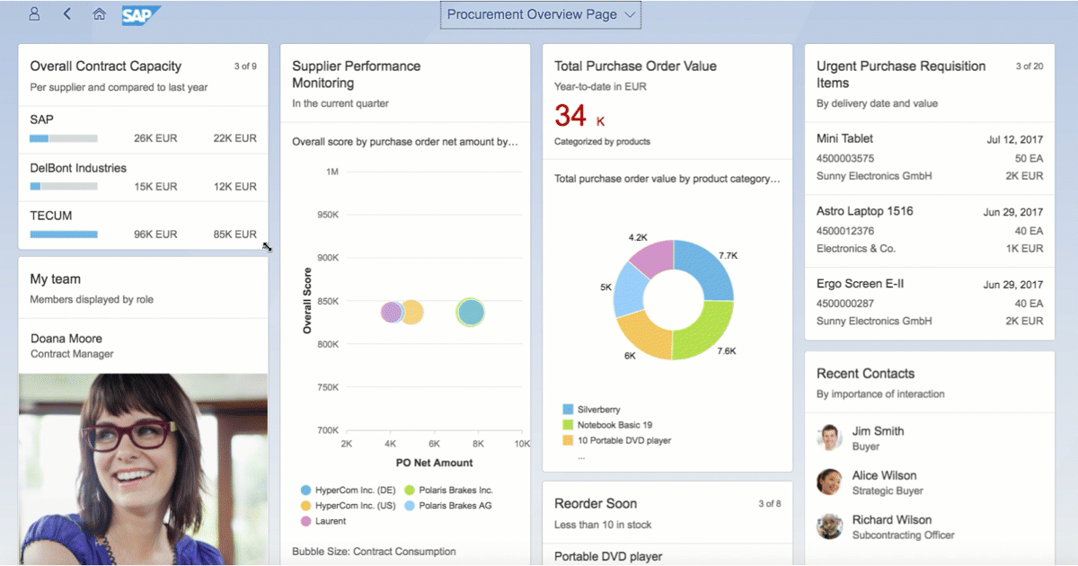
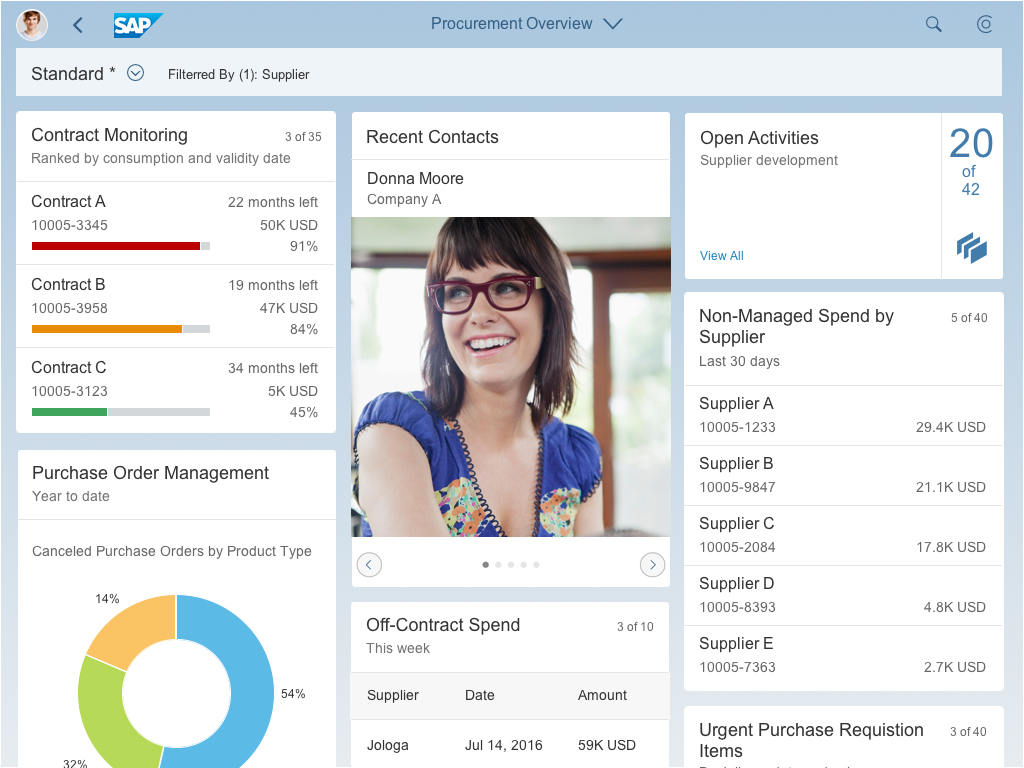
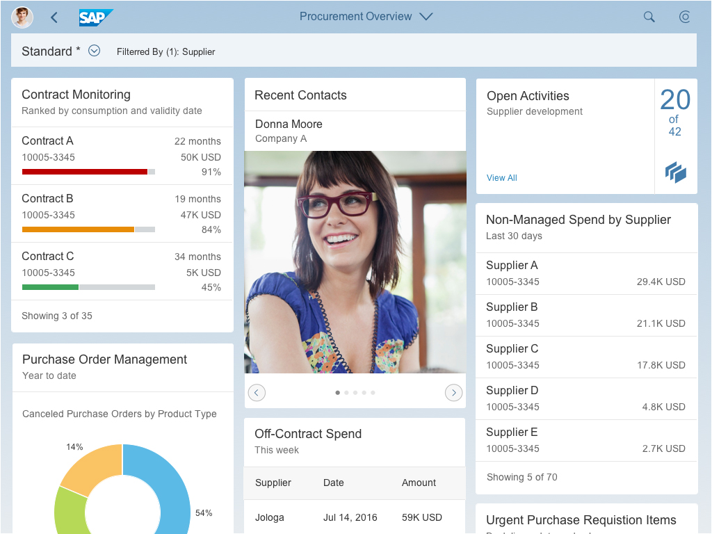
Overview page – Fixed card layout
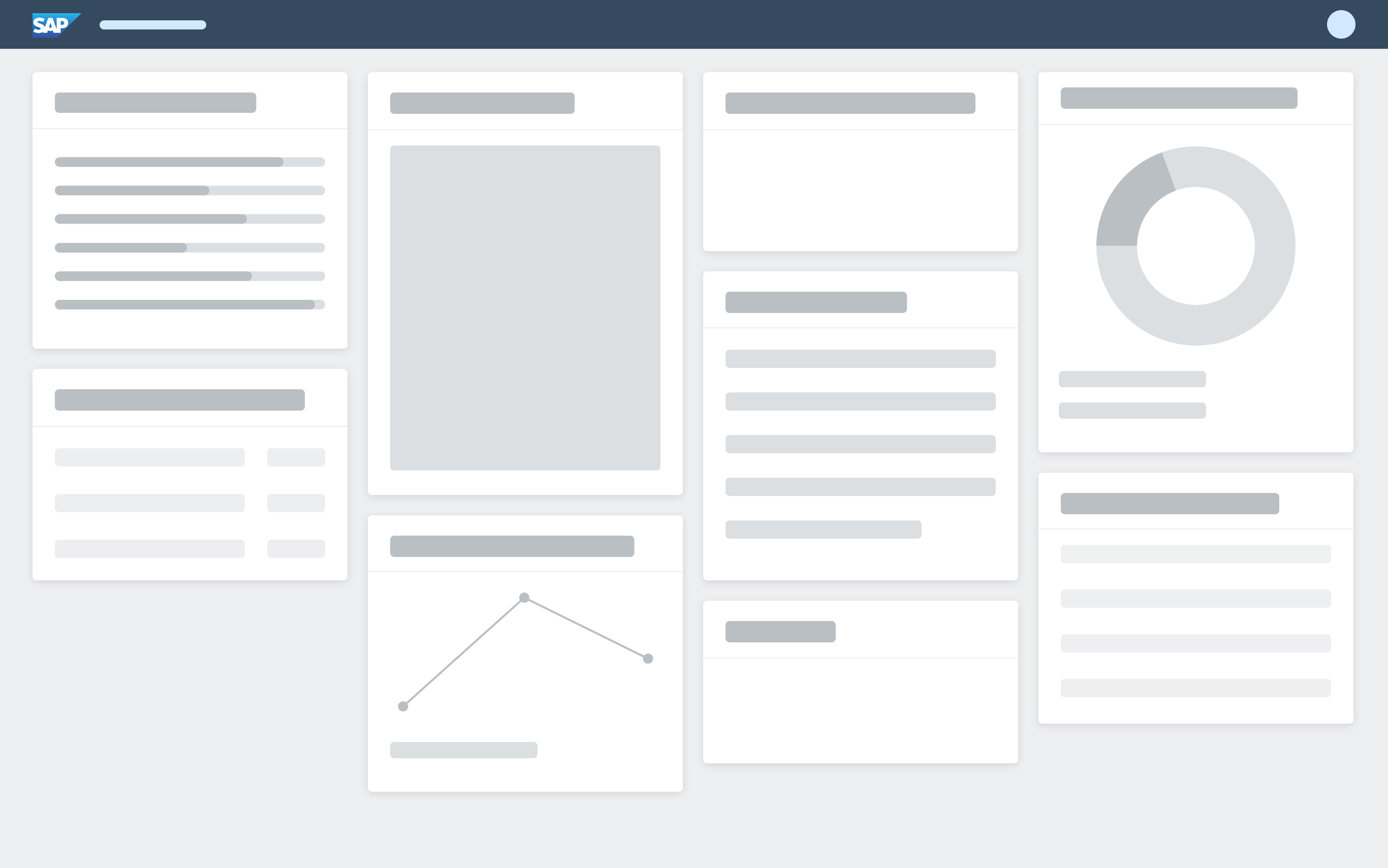
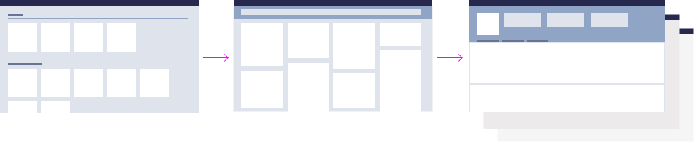
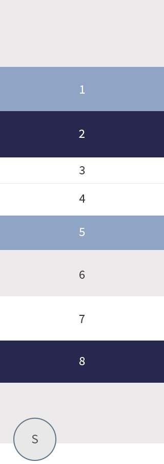
Fixed Card Sizes
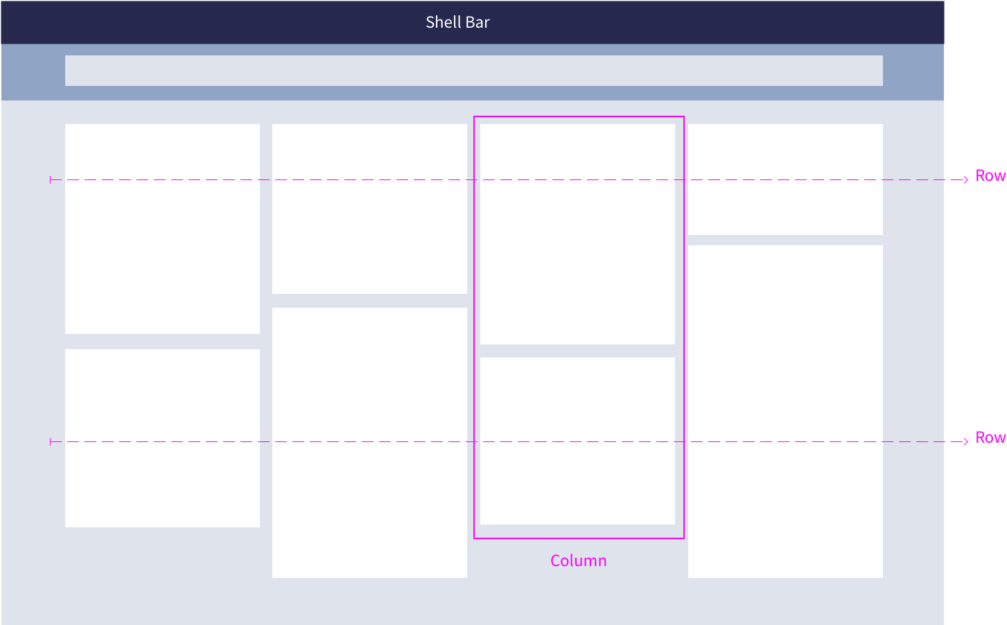
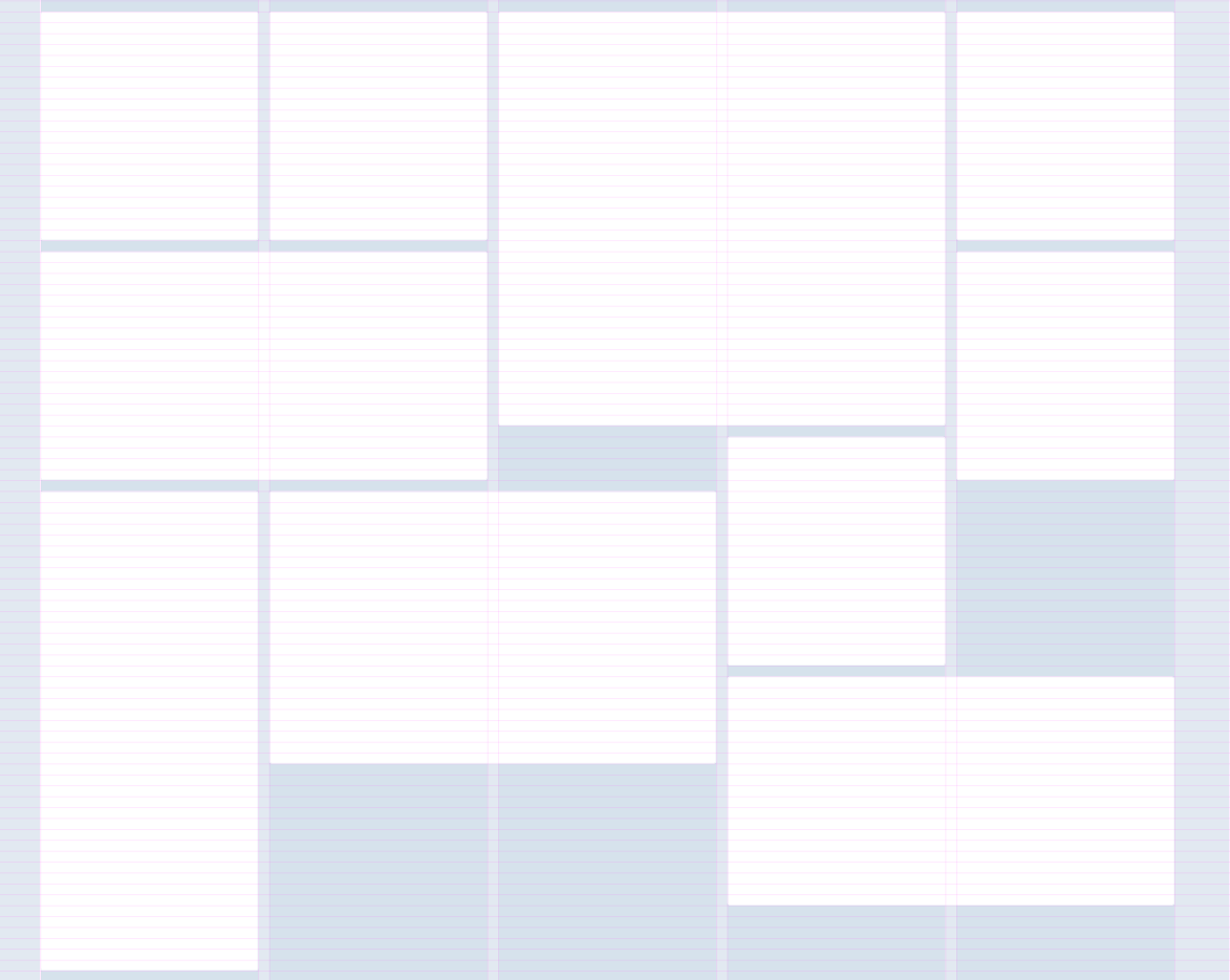
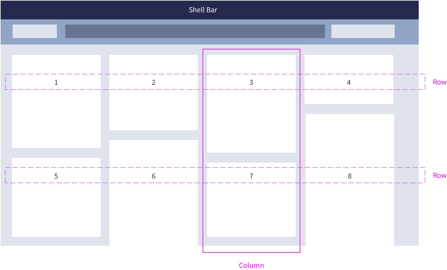
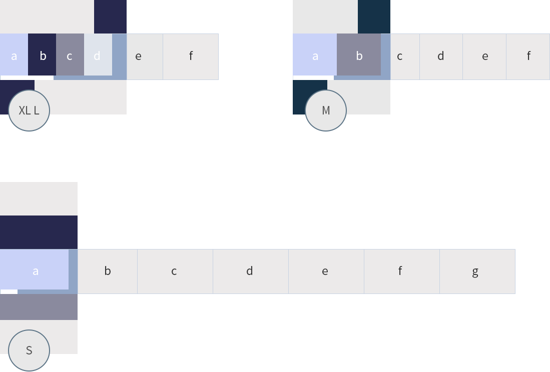
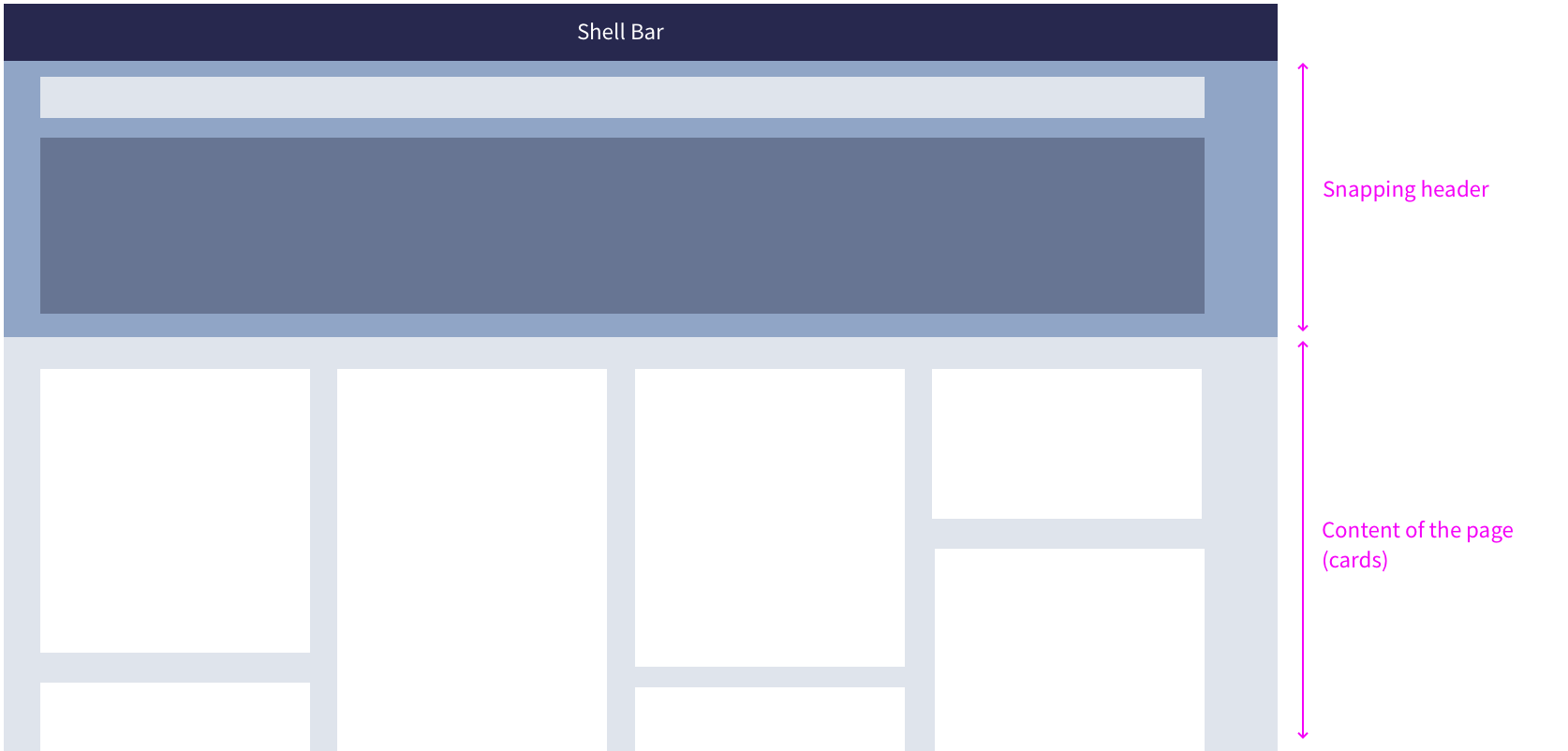
Grid
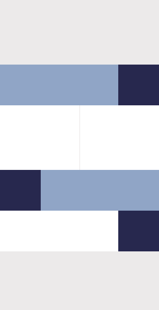
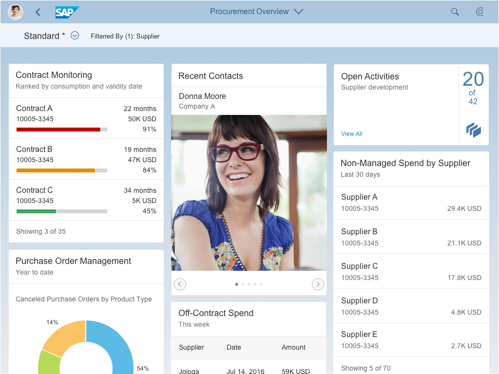
The grid is based on rows and columns. The spacing of 1 rem between the cards is always stable. Furthermore, there is a minimum width of 20 rem per card (corresponding to the column width). The columns with the cards adapt to the available screen real estate (also see Responsiveness).
Based on the underlying grid, users can rearrange the cards (see Rearranging Cards – Behavior).
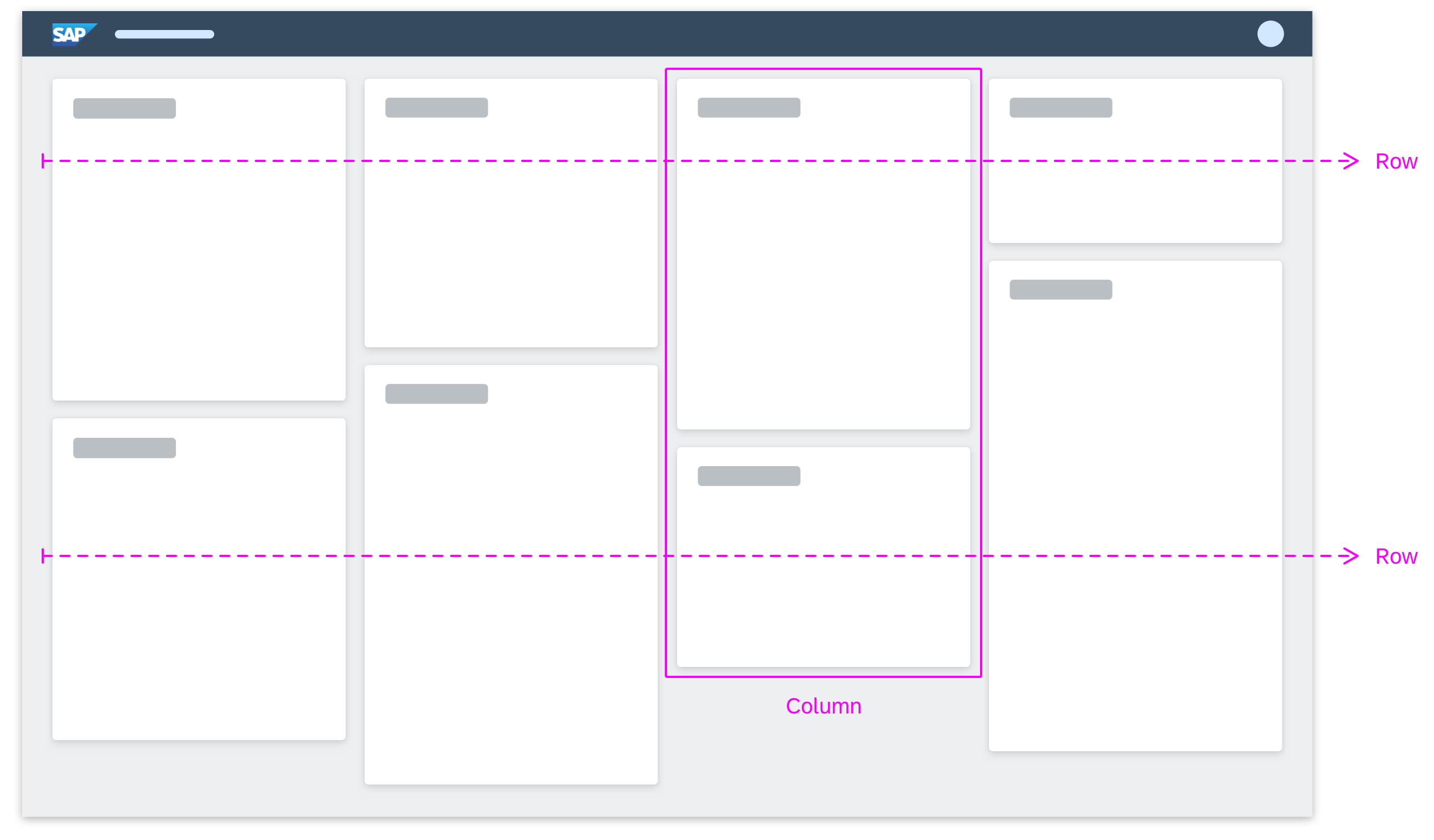
Fixed card layout – Grid
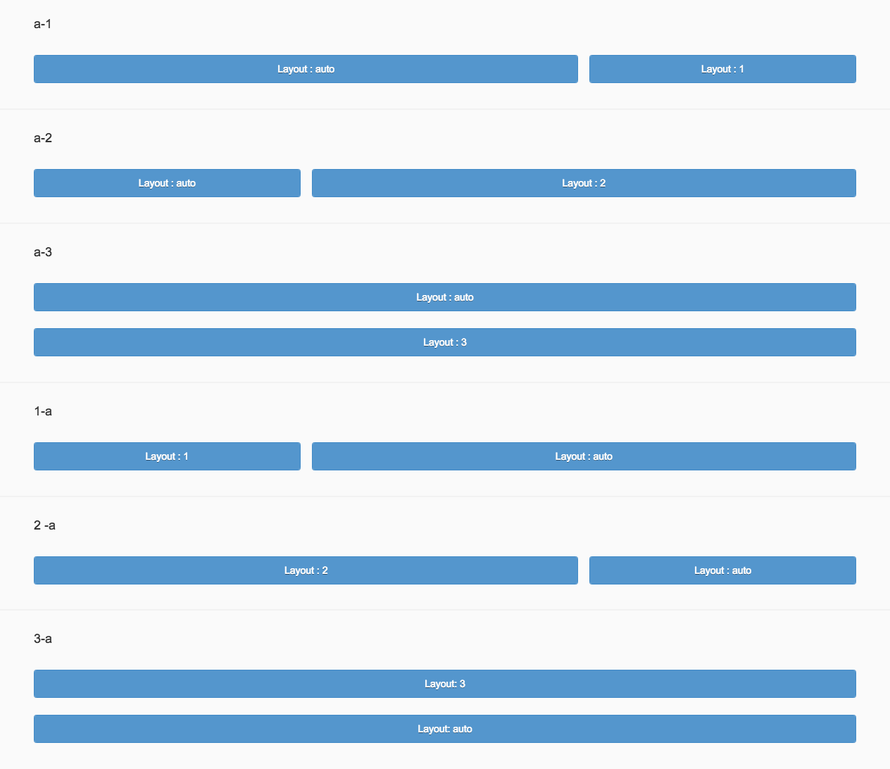
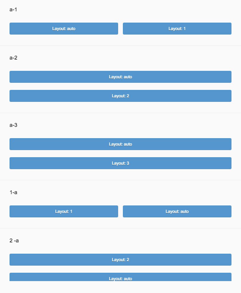
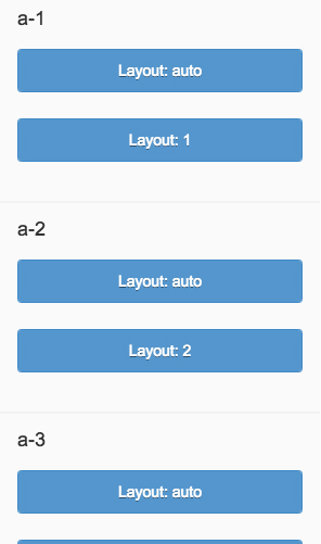
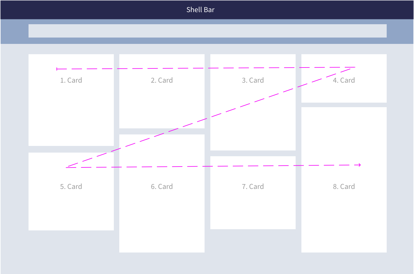
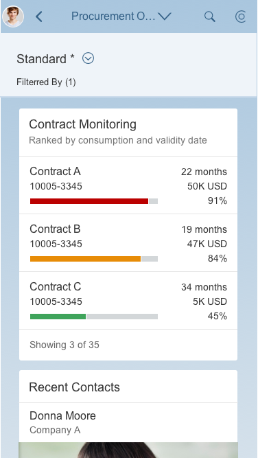
The cards are arranged as a “Z” flow: cards are ordered from left to right, starting with the first card on the top left of the page. For example, if a 5-column layout is reduced to 4-column layout, the fifth card drops to the next row, assuming the leftmost position underneath the first card.
There is no limit on the number of cards included. However, be careful not to overwhelm your users.
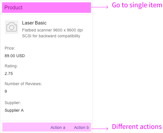
For general information on cards, see Cards.
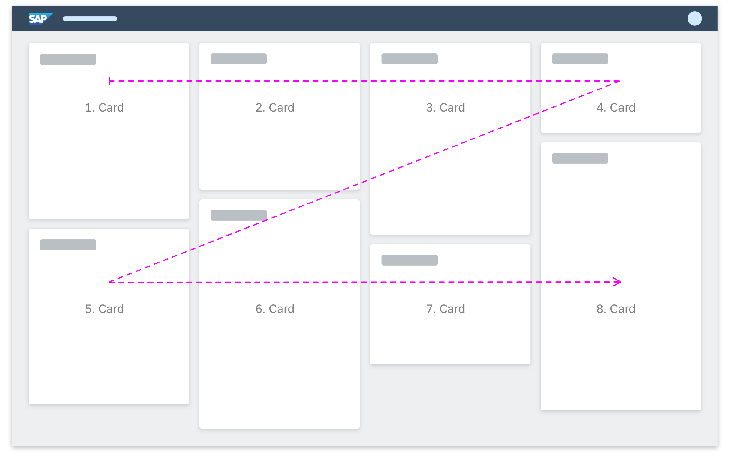
Fixed card layout – Z flow
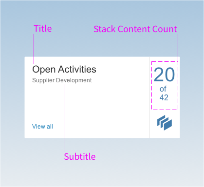
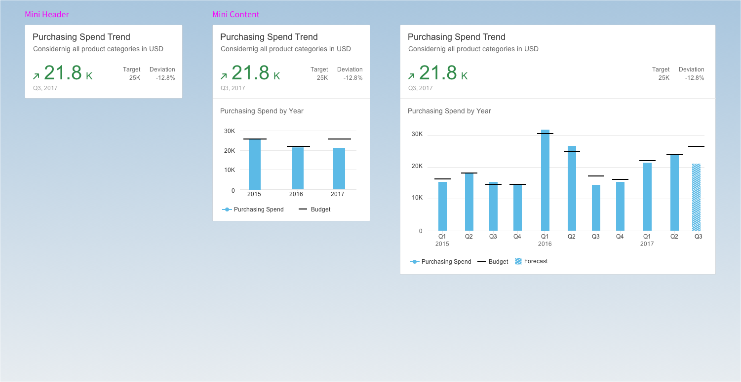
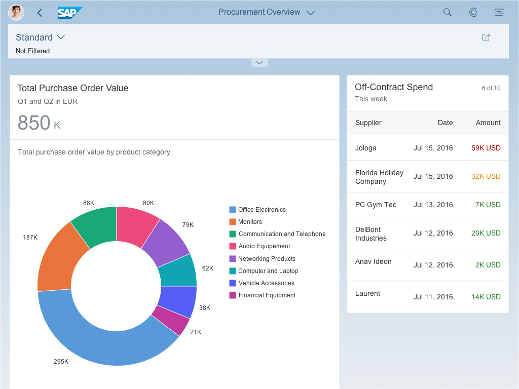
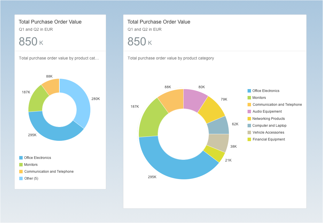
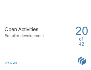
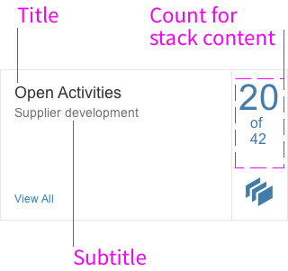
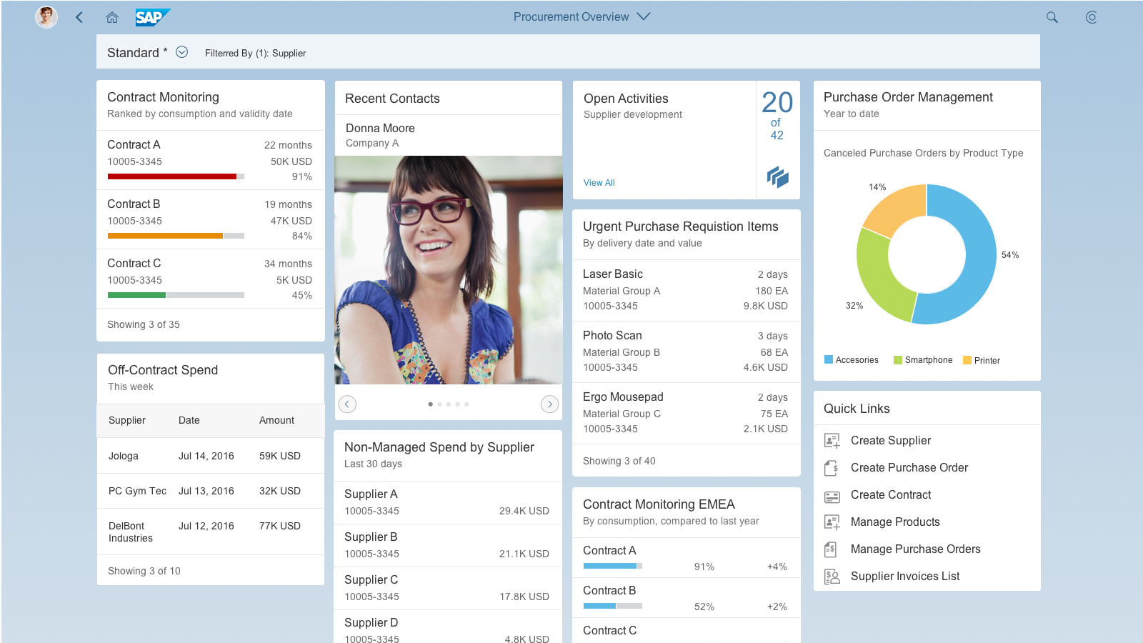
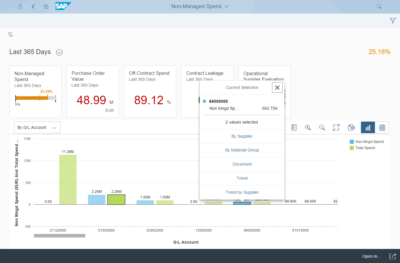
The card size is determined by the predefined card characteristics and maximum content for a given card type. As a result, the card types differ in height. The stack card and corresponding quick view card are handled independently.
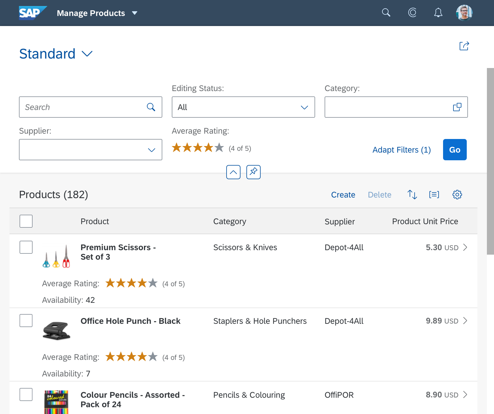
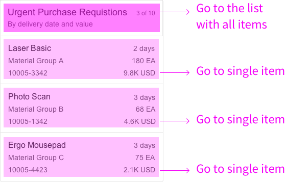
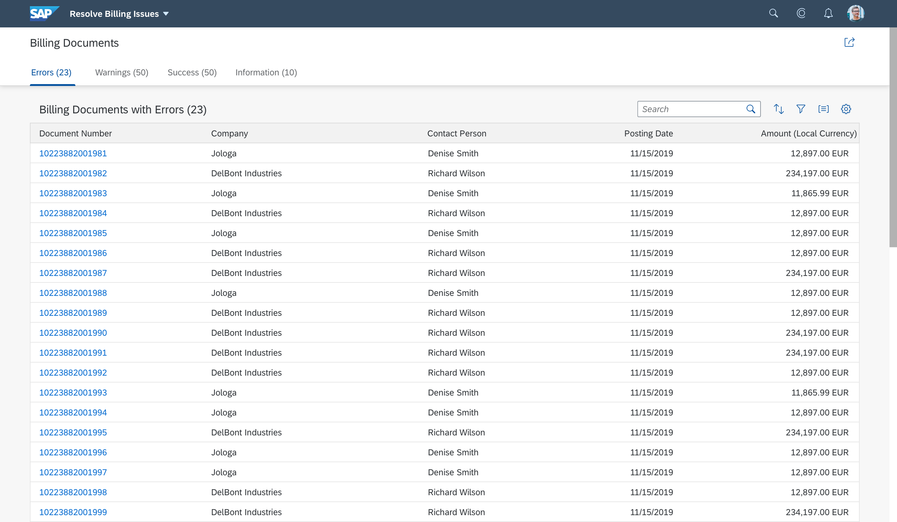
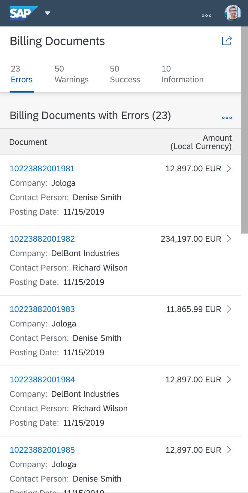
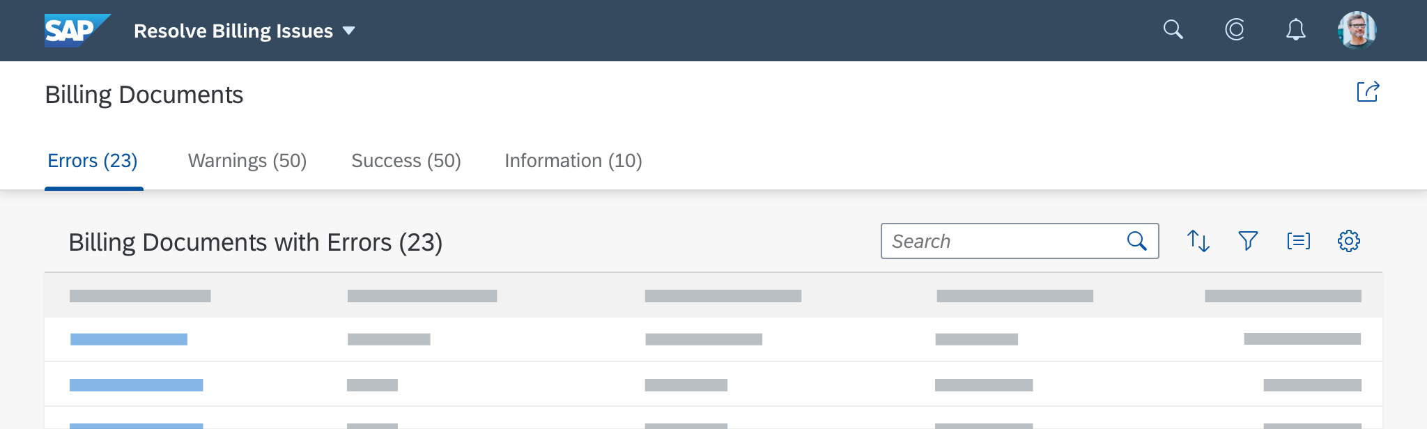
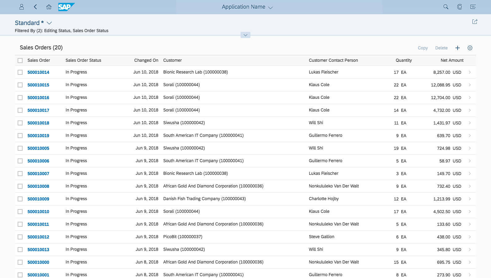
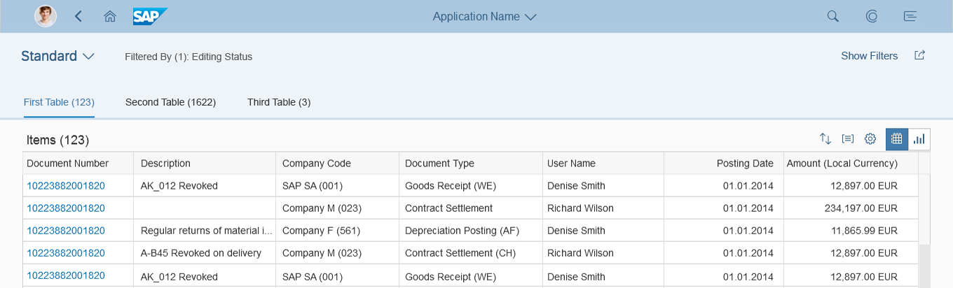
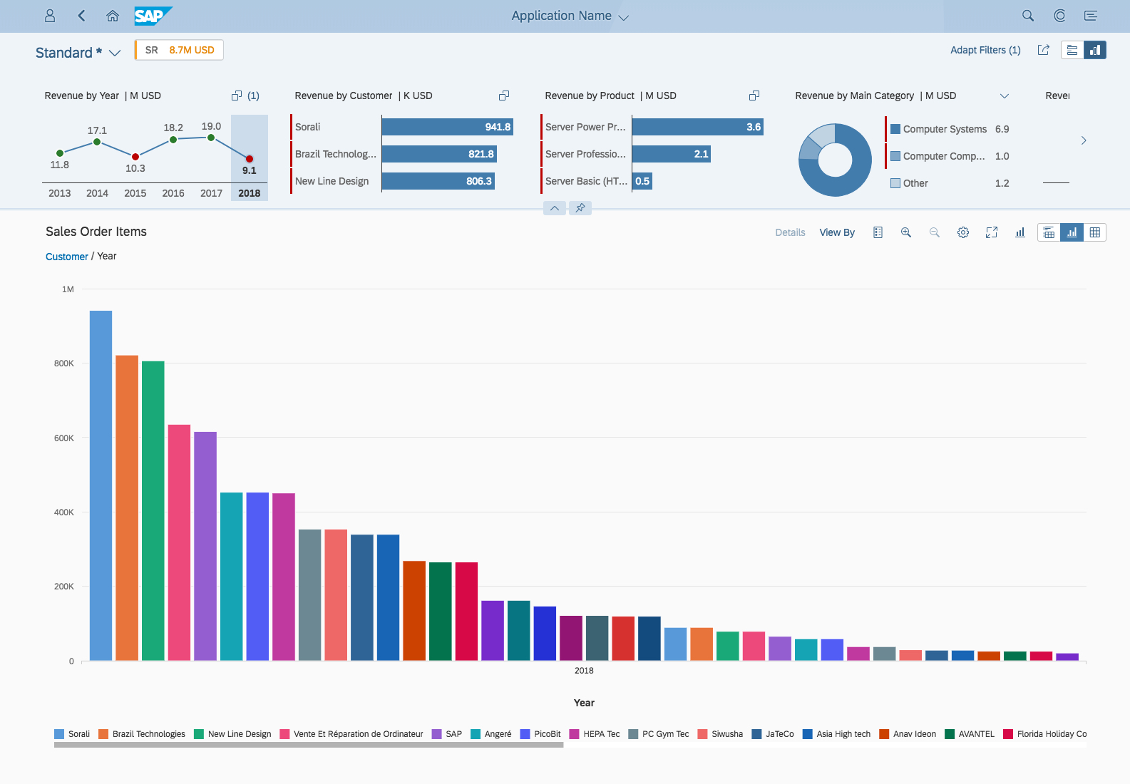
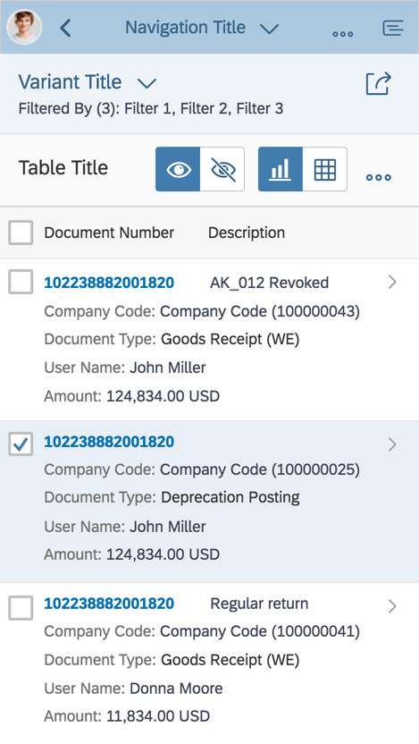
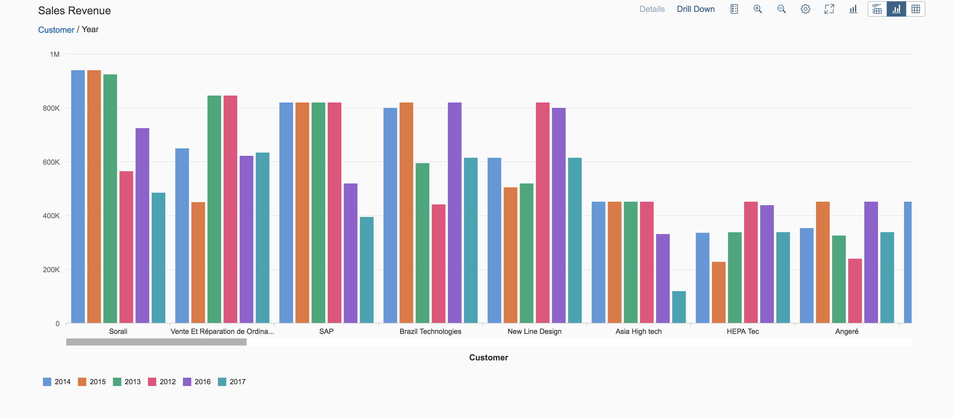
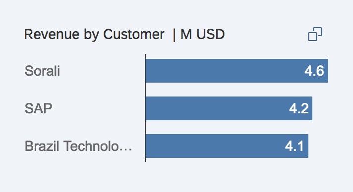
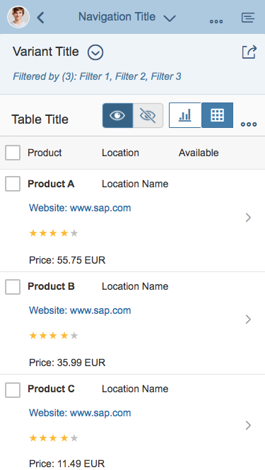
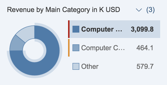
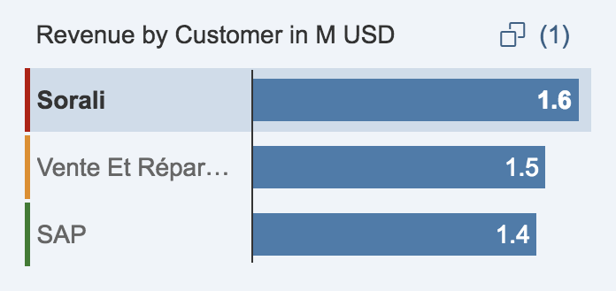
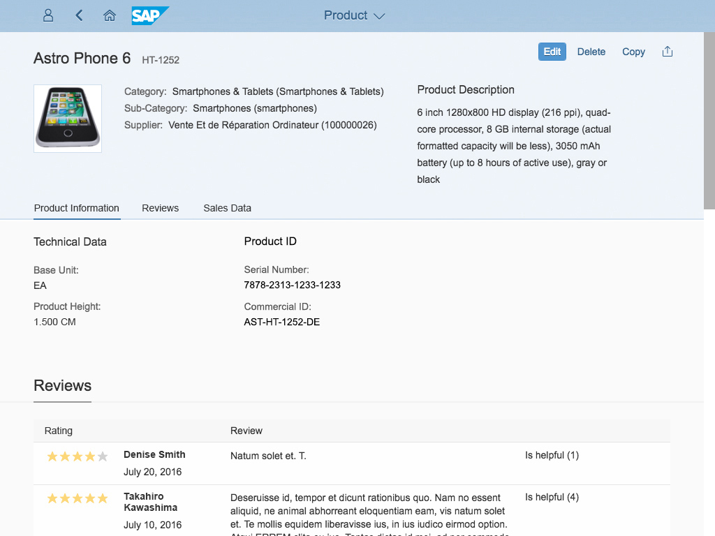
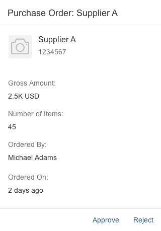
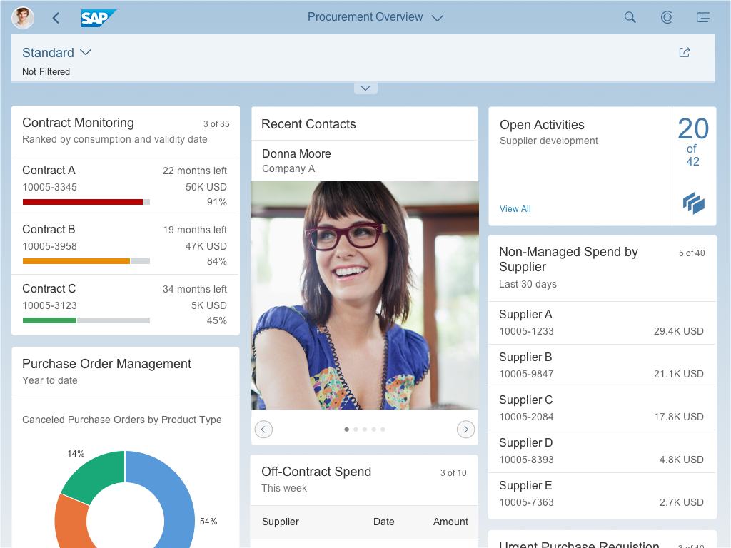
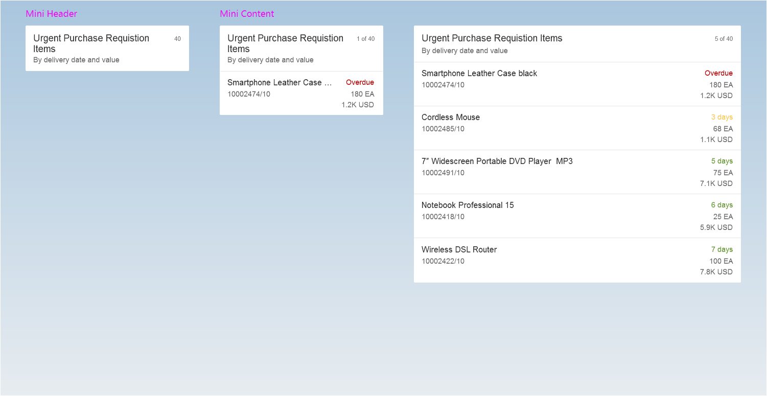
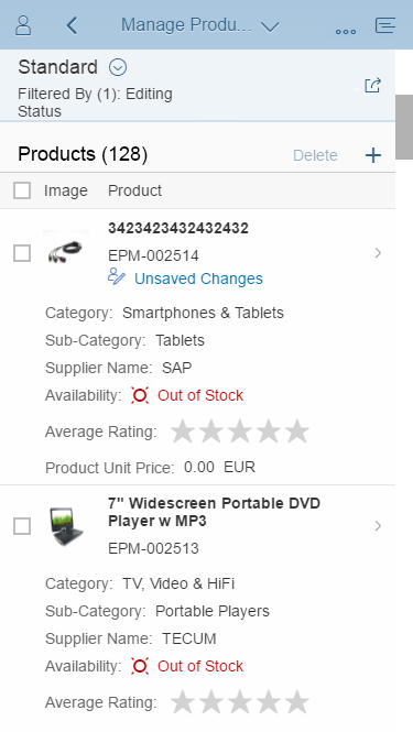
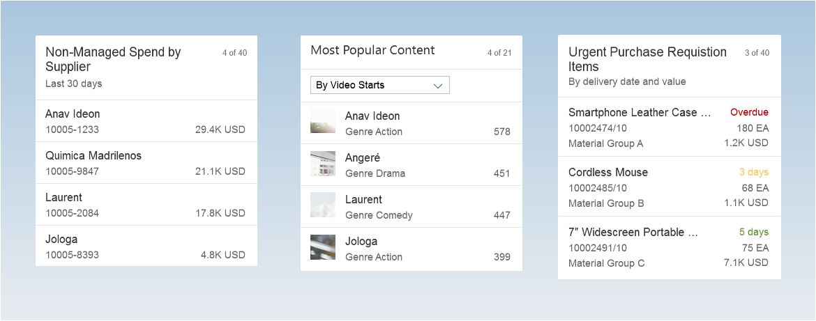
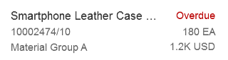
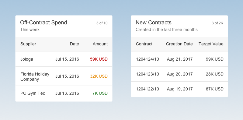
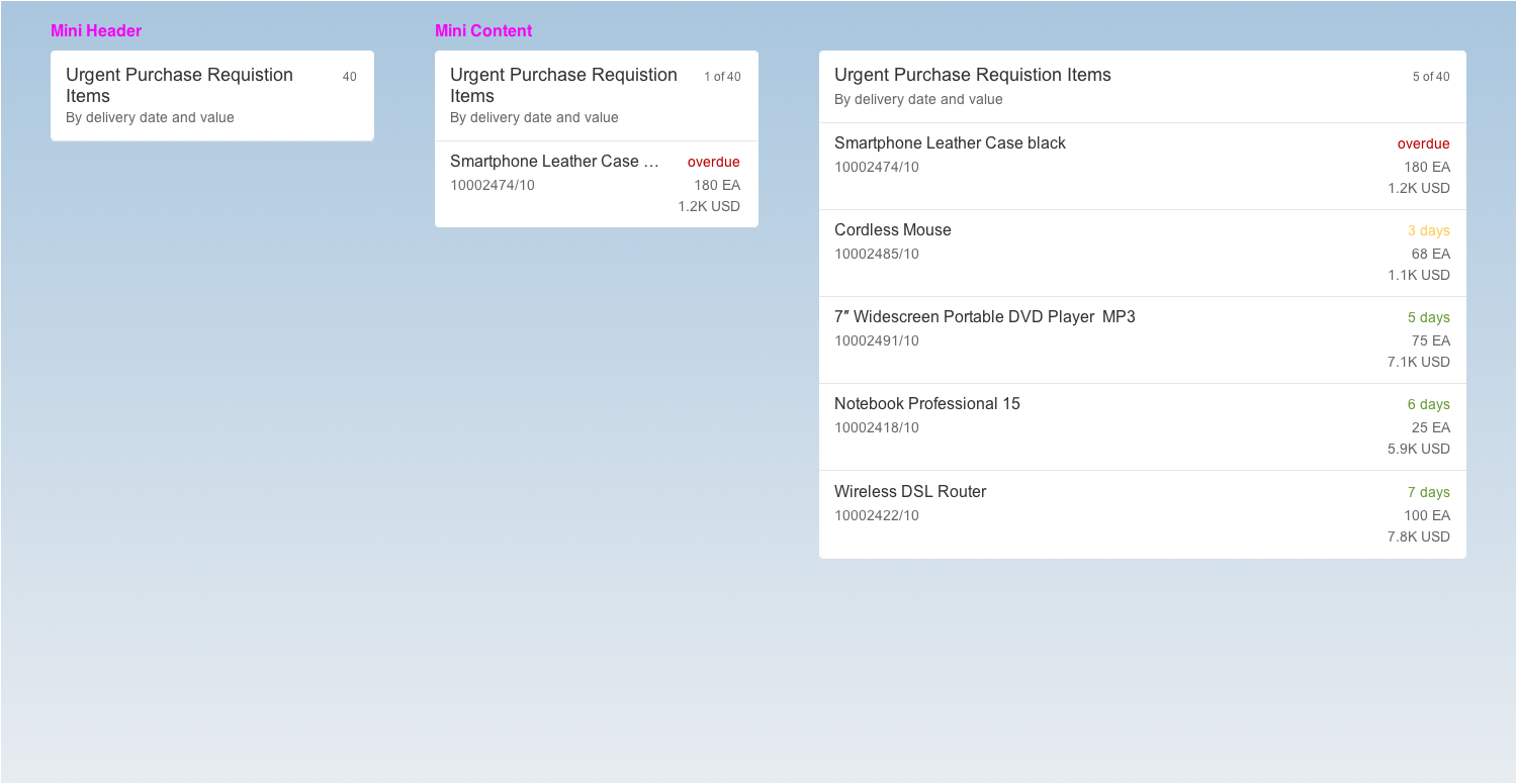
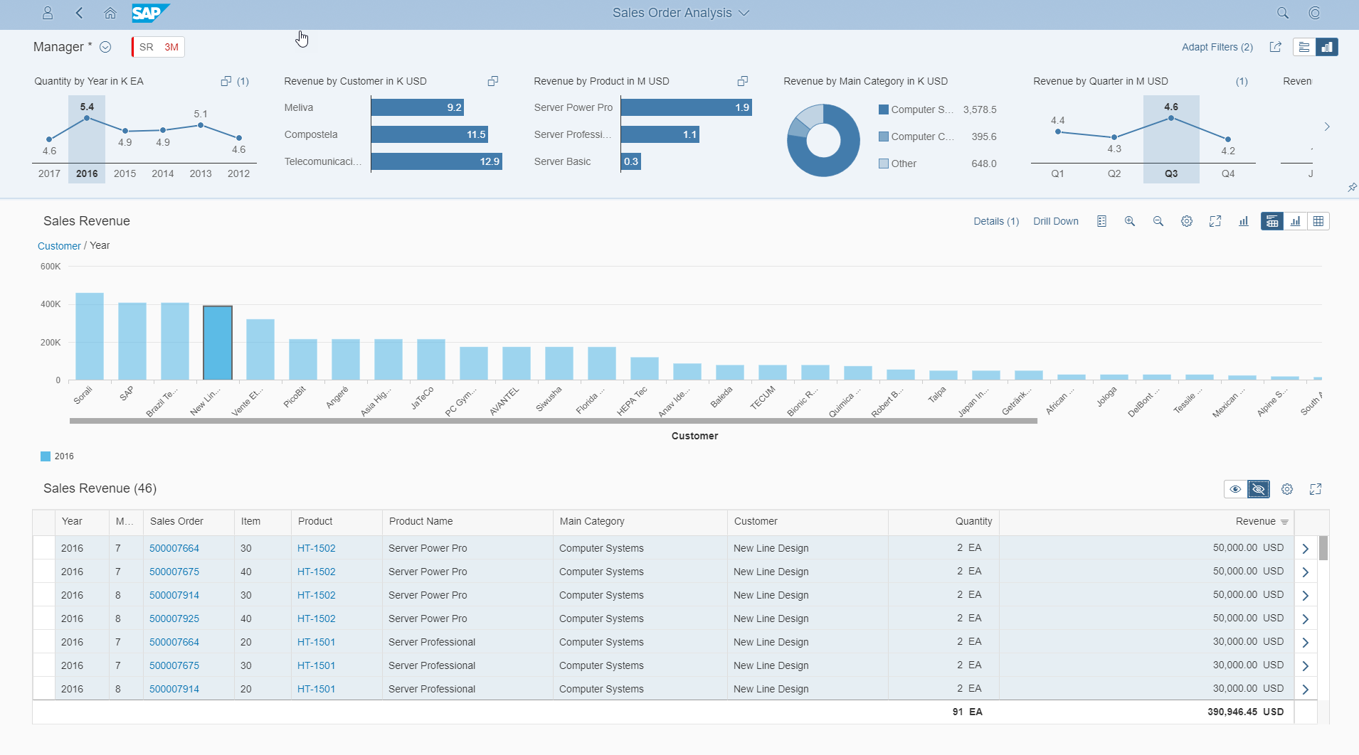
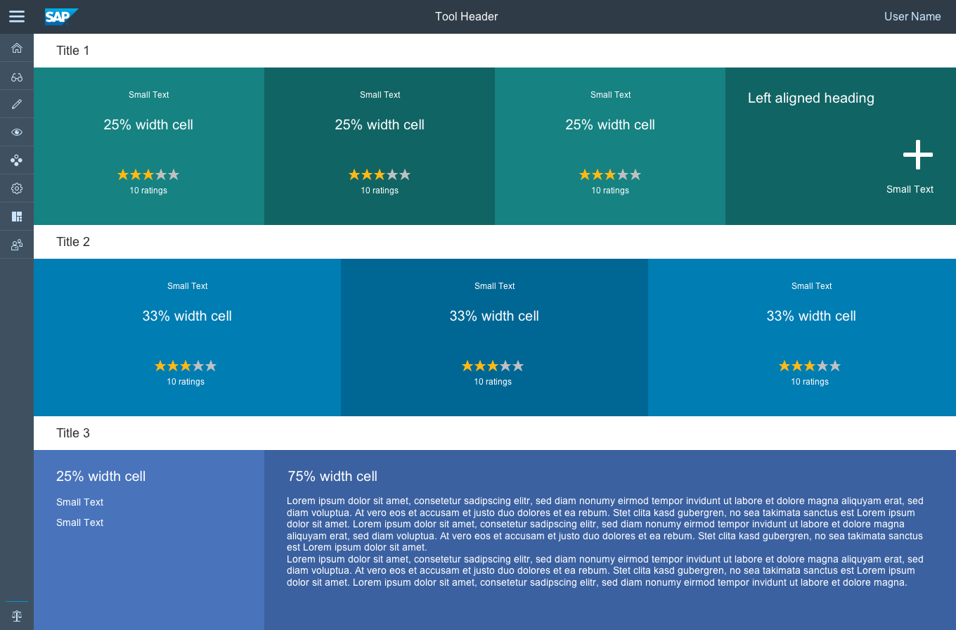
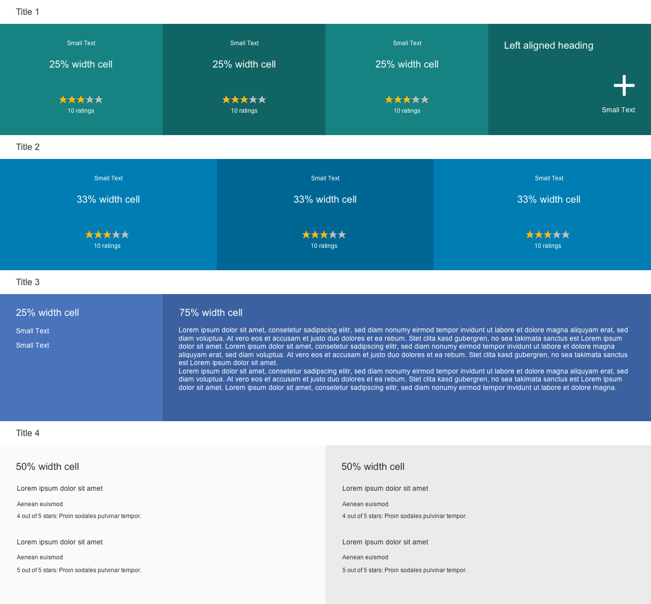
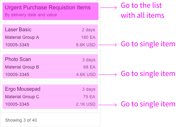
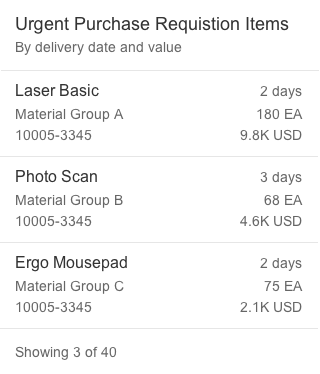
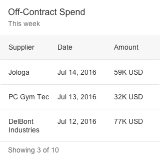
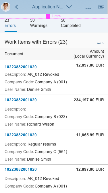
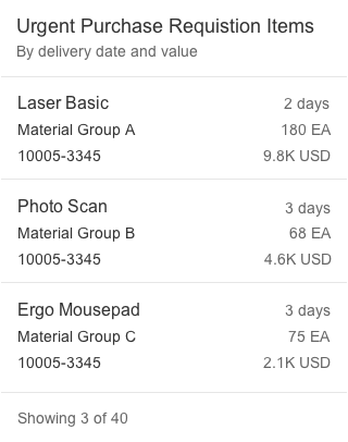
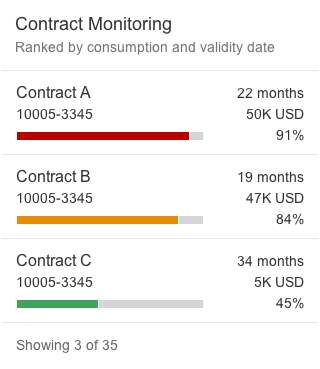
List Card
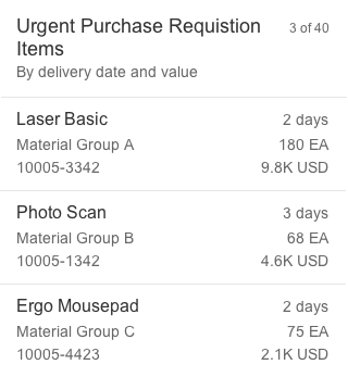
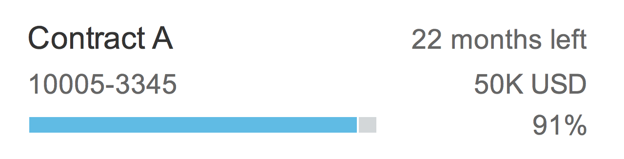
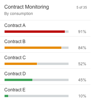
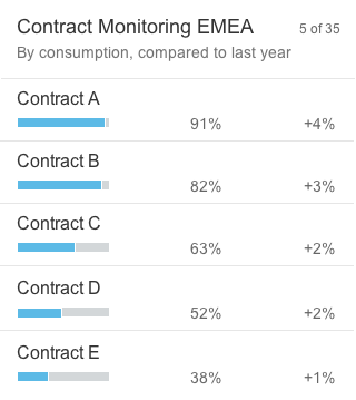
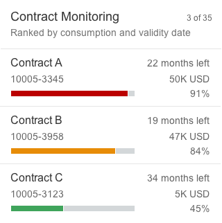
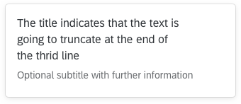
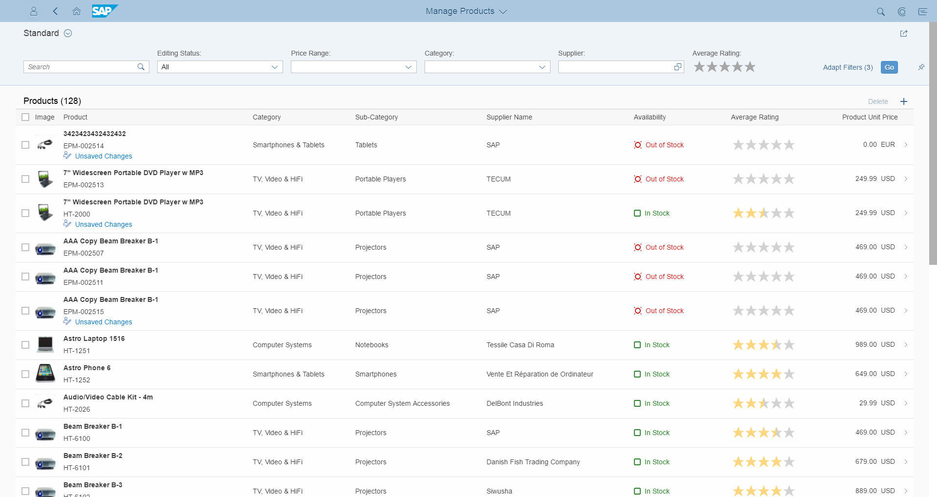
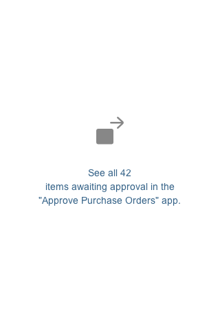
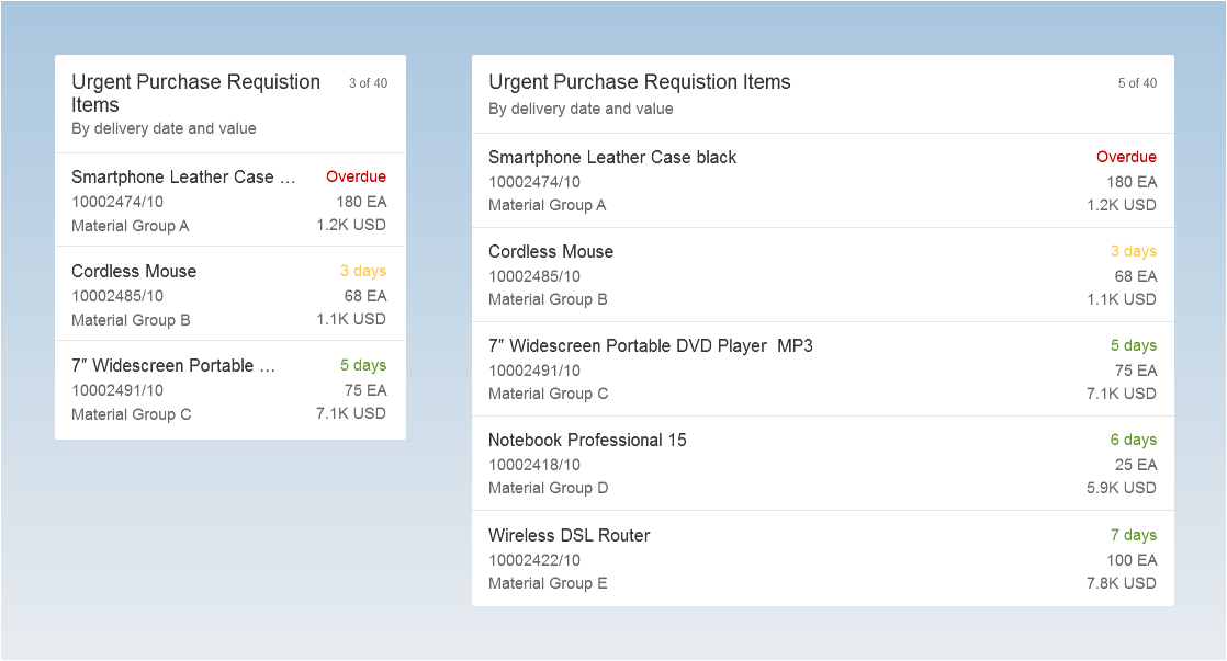
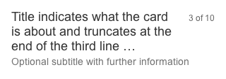
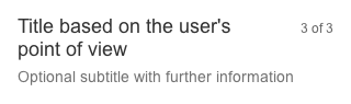
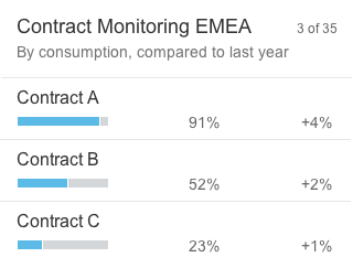
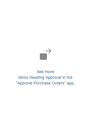
The height of list cards can vary, depending on the number of text fields. Show no more than five standard list items and no more than three extended list items on one card. To see the full result set, the user needs to navigate to the parent app.

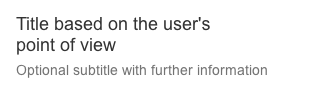
Standard list item
Extended list item
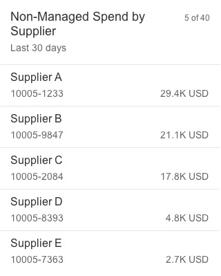
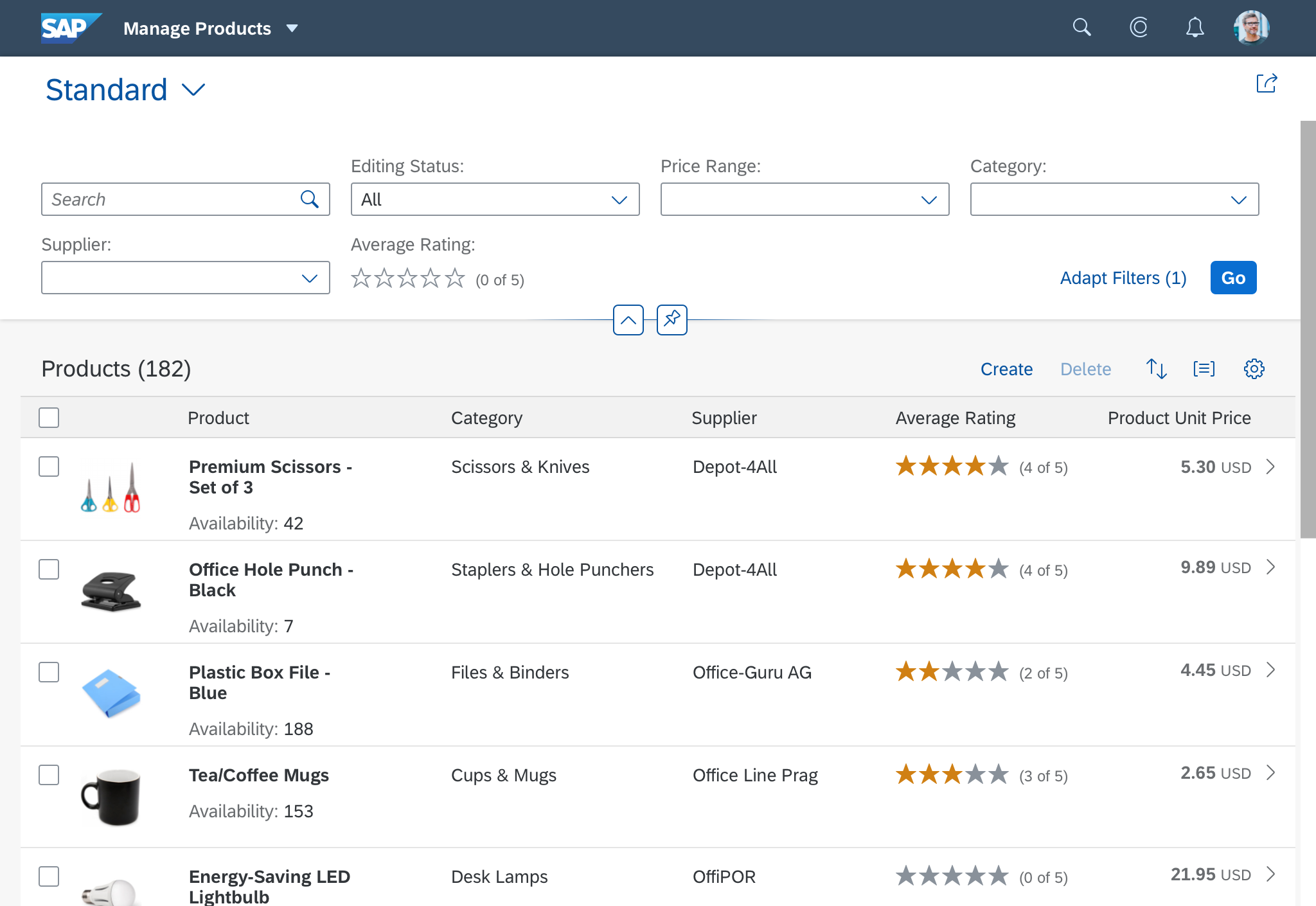
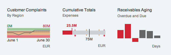
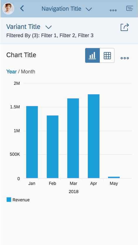
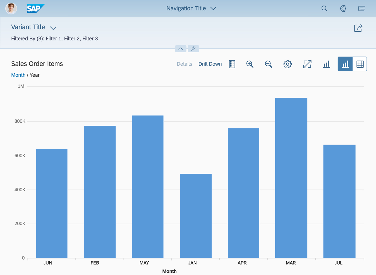
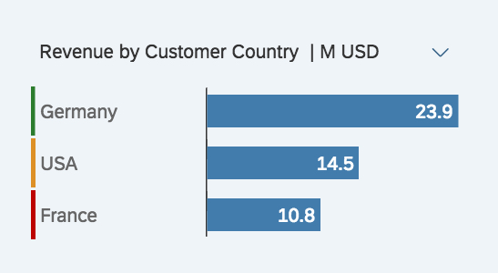
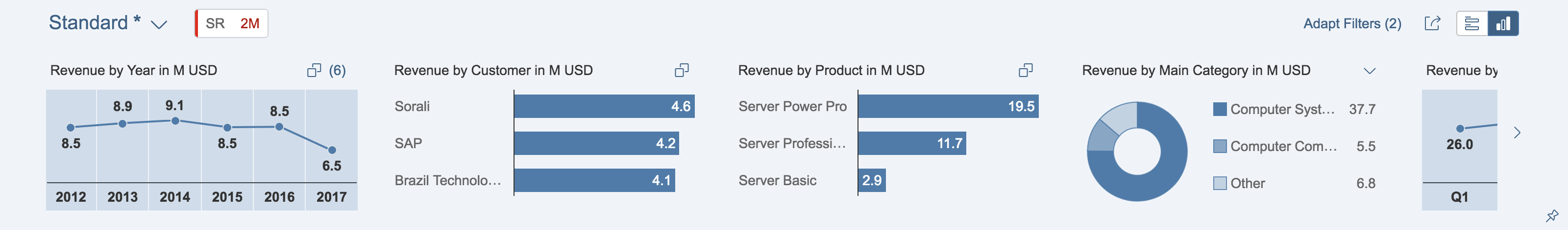
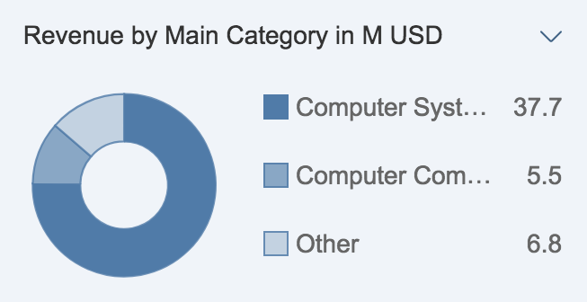
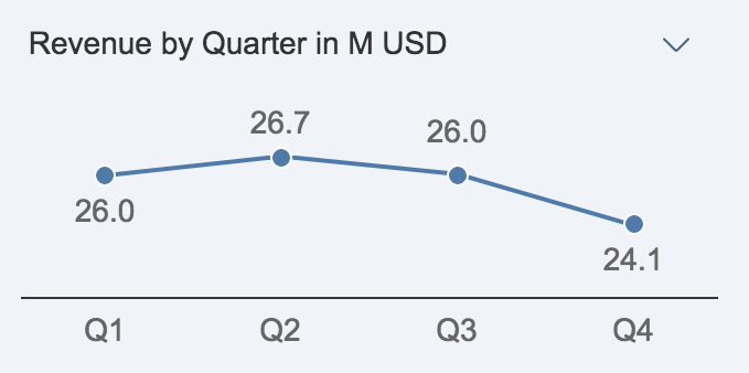
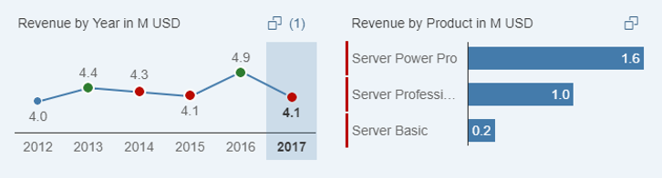
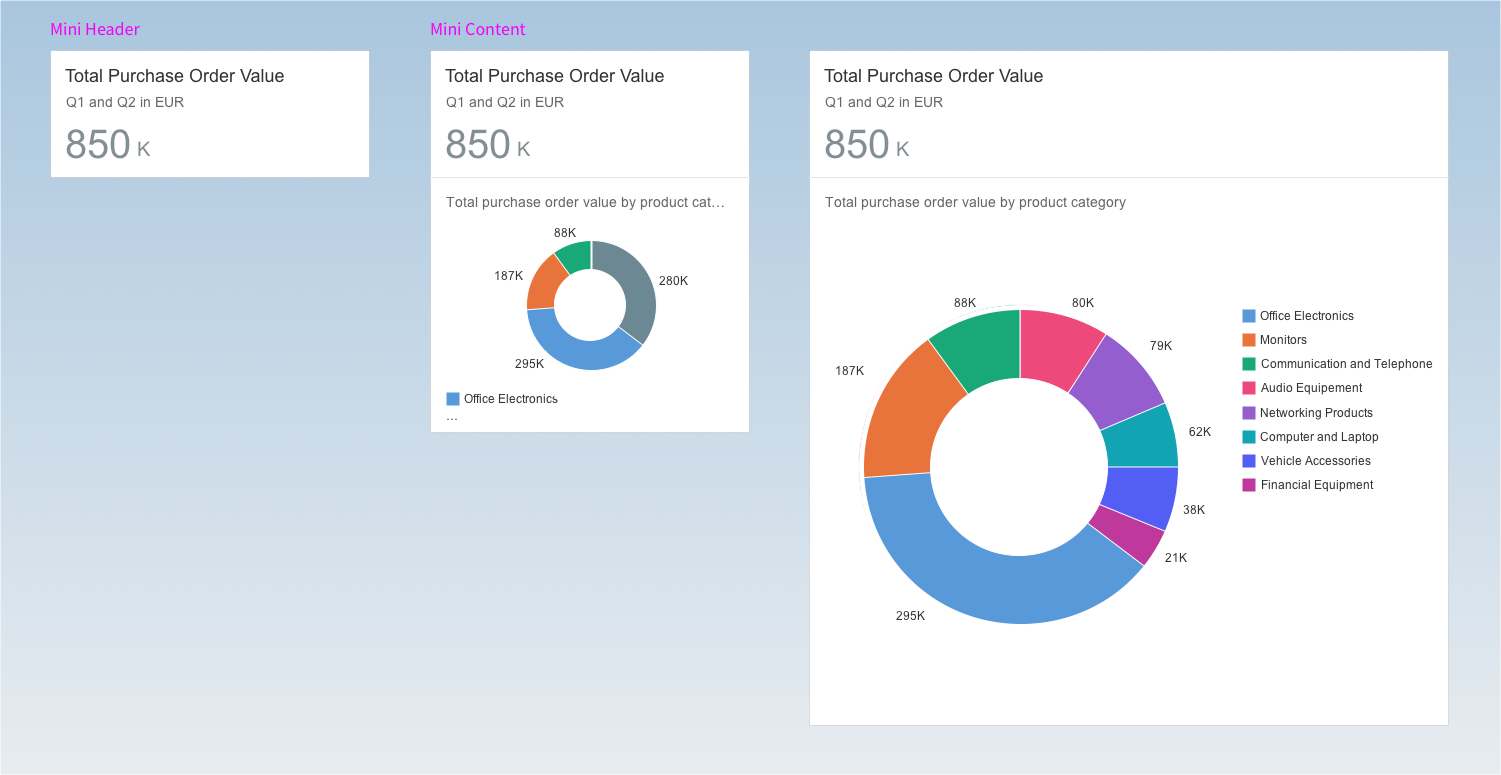
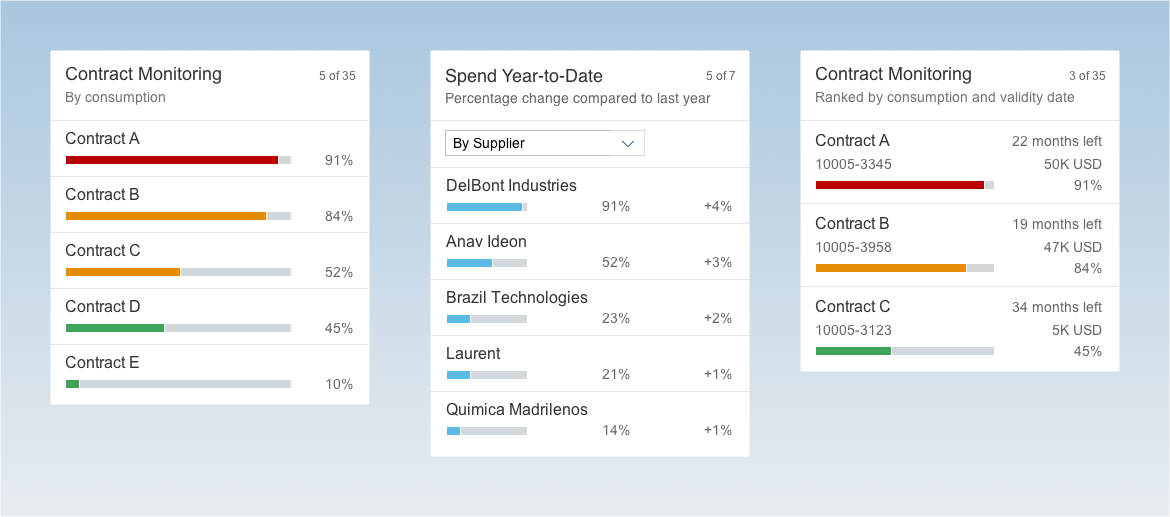
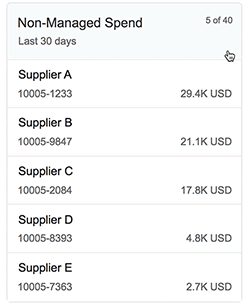
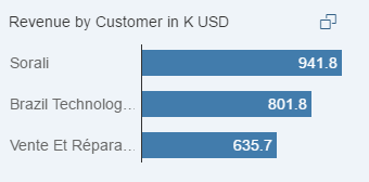
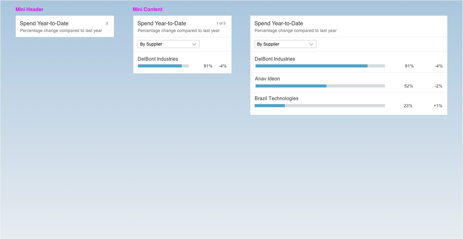
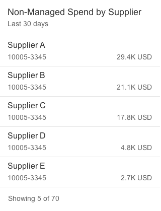
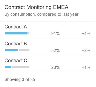
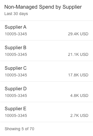
Bar Chart List Card
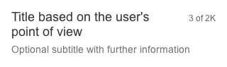
The height of bar chart list cards can vary, depending on the number of text fields. Show no more than five standard/condensed list items and no more than three extended list items on one card. To see the full result set, the user needs to navigate to the parent app.
Standard list item
Condensed list item
Extended list item
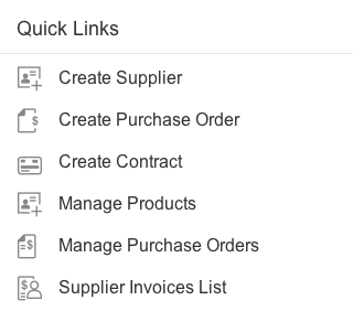
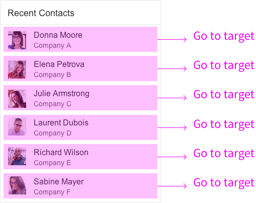
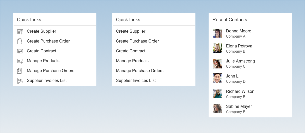
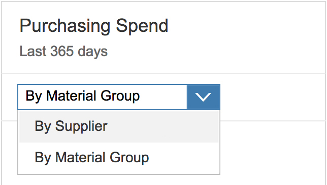
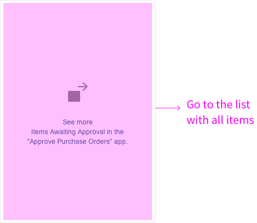
Link List Card (Variant Type “List”)
The link list card with the variant type “list” is limited to a maximum of six links. There is no limit to the number of links for the variant type “image”.


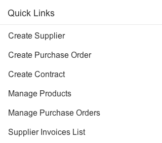
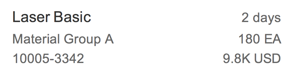
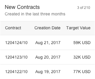
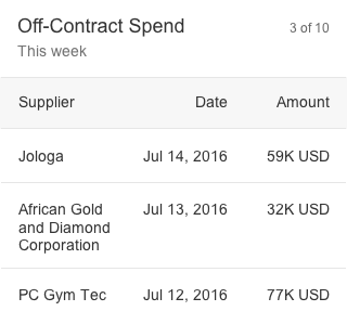
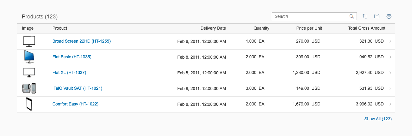
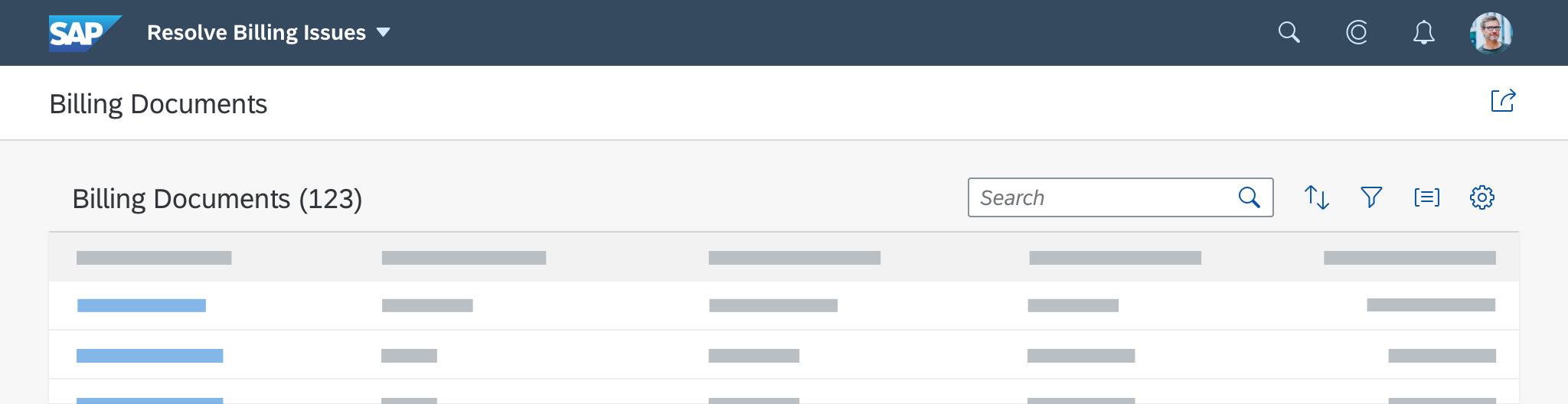
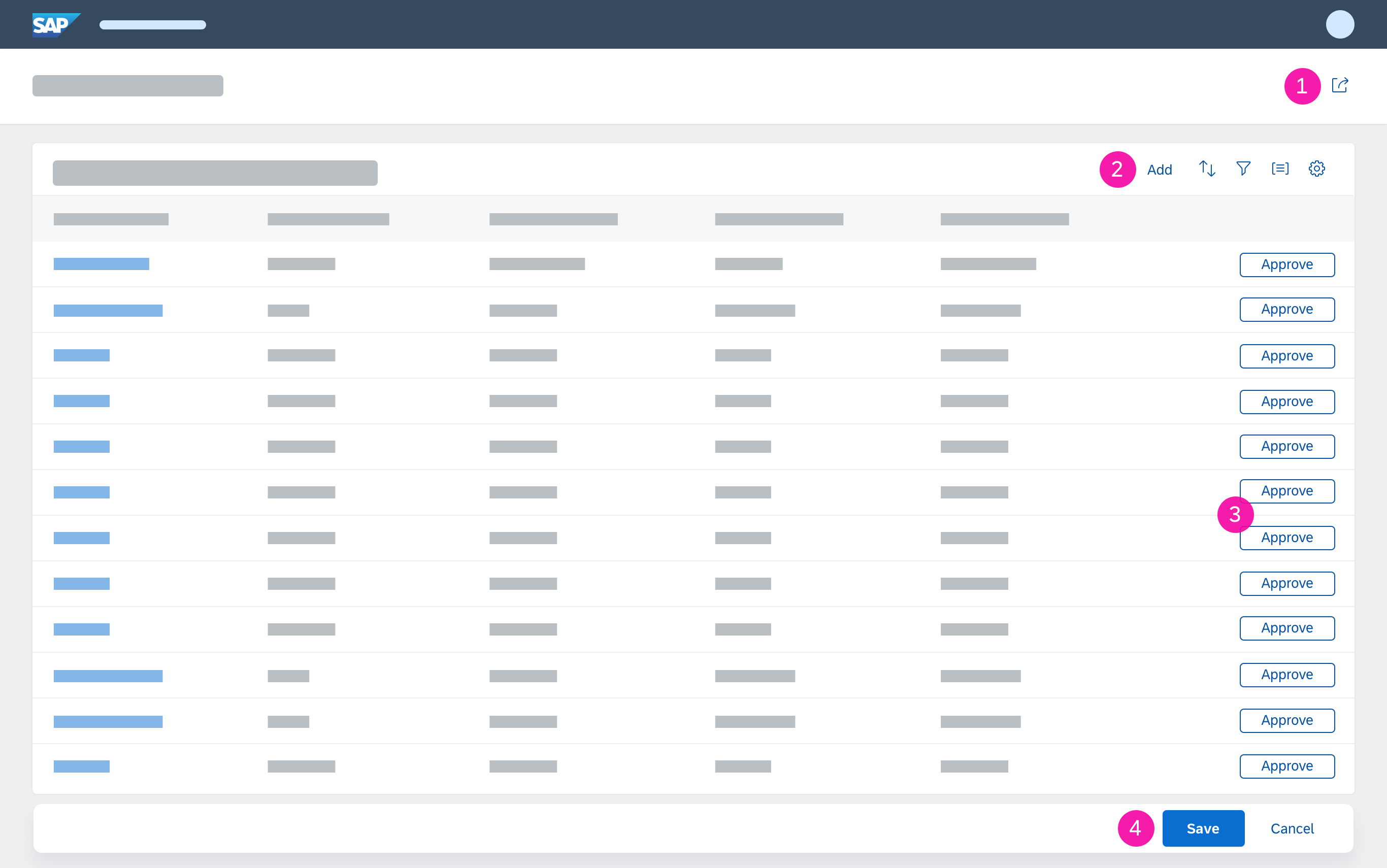
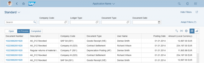
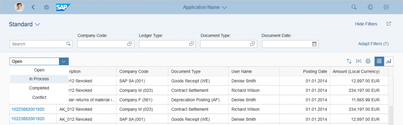
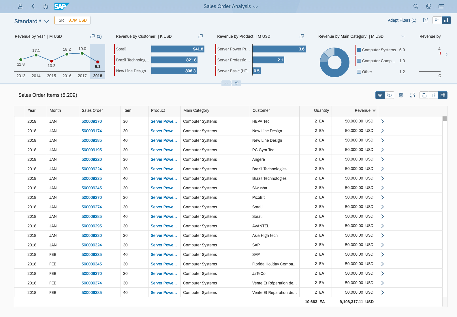
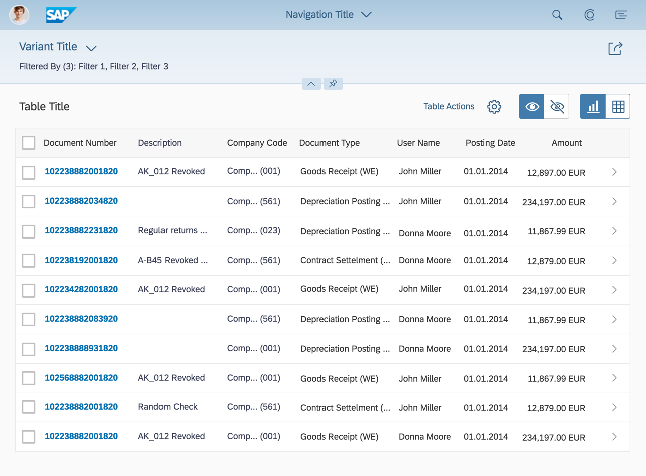
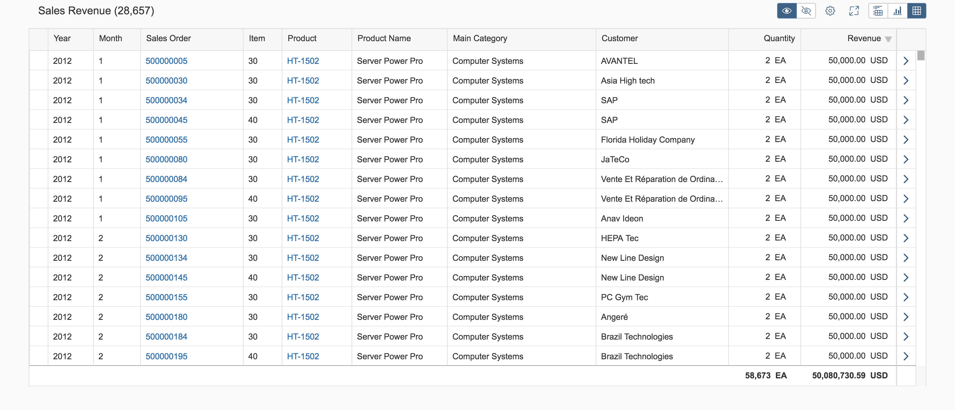
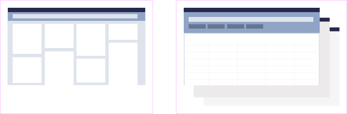
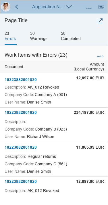
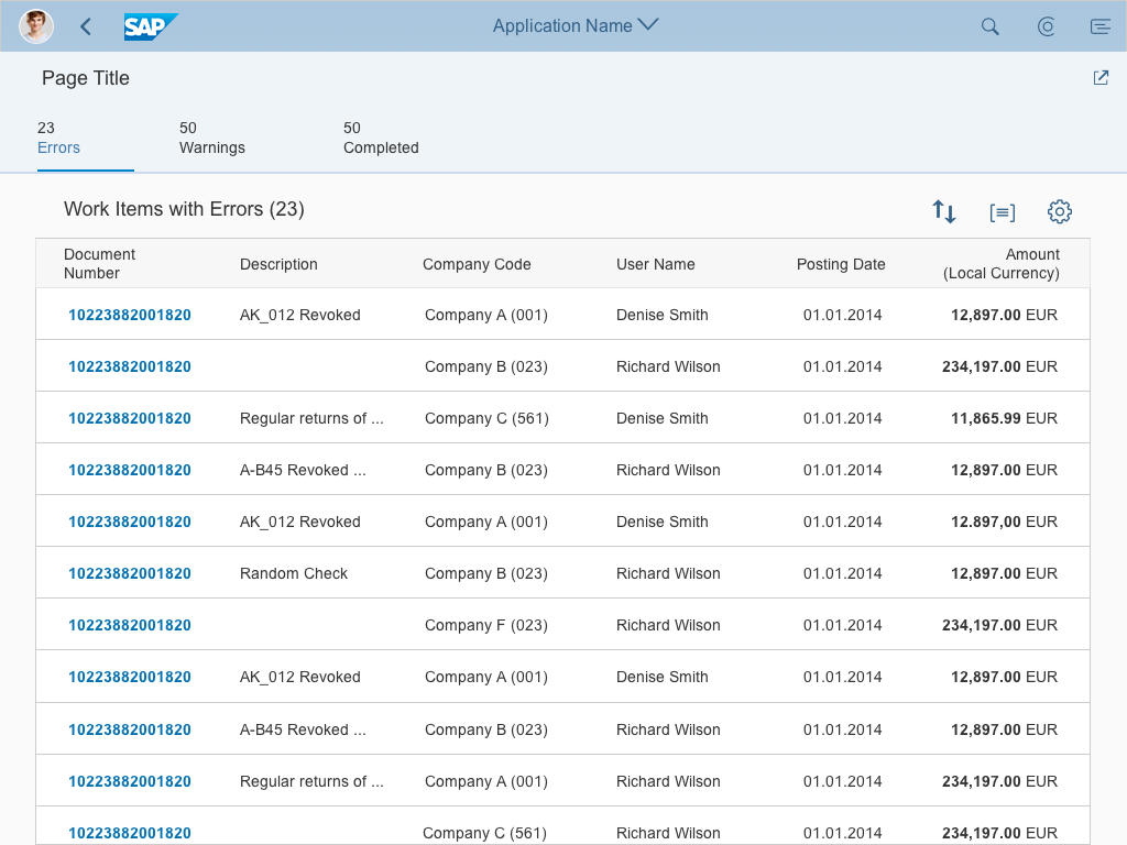
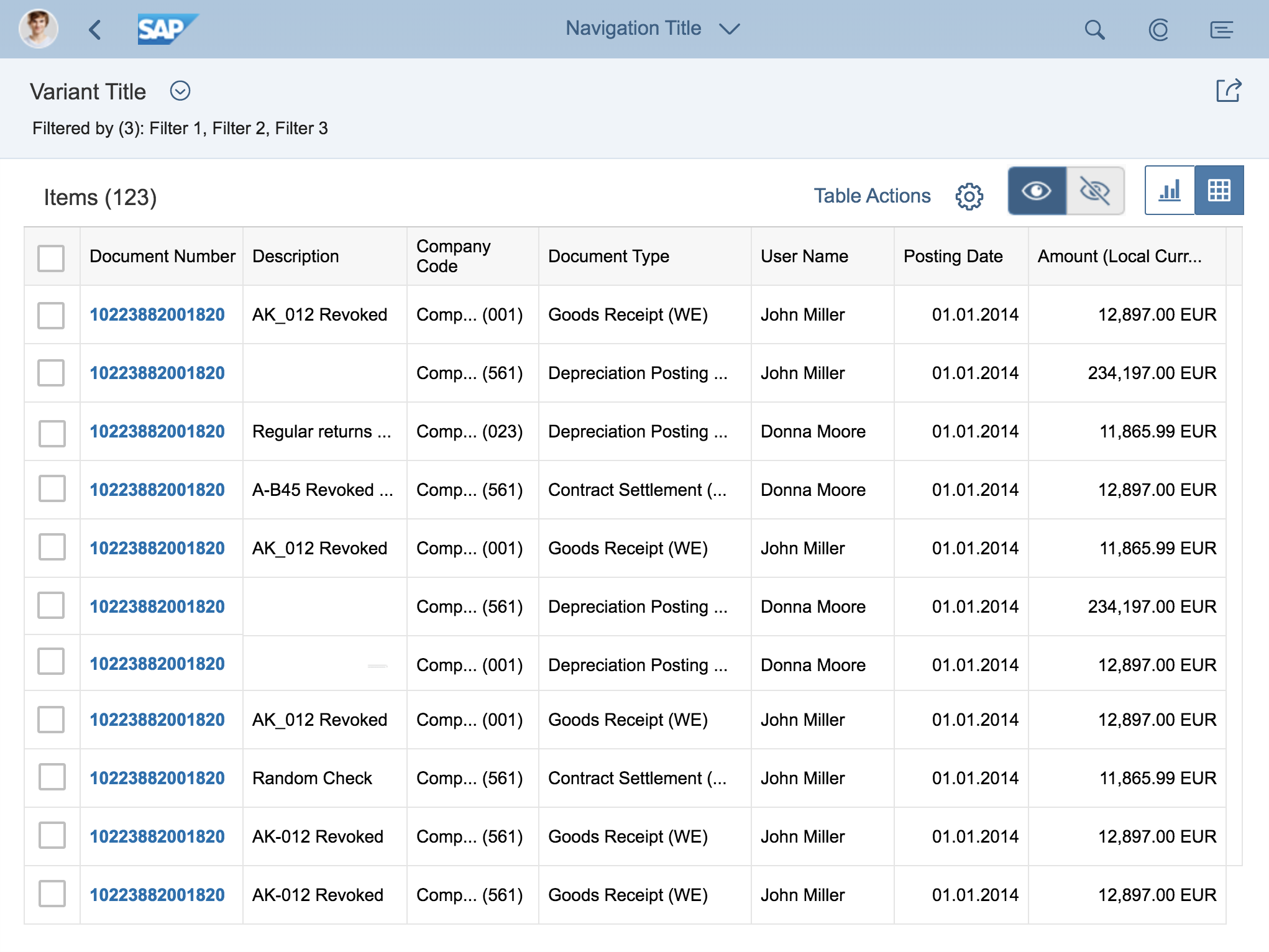
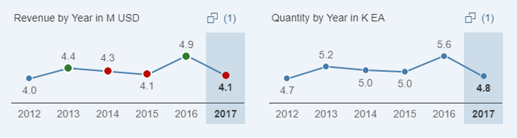
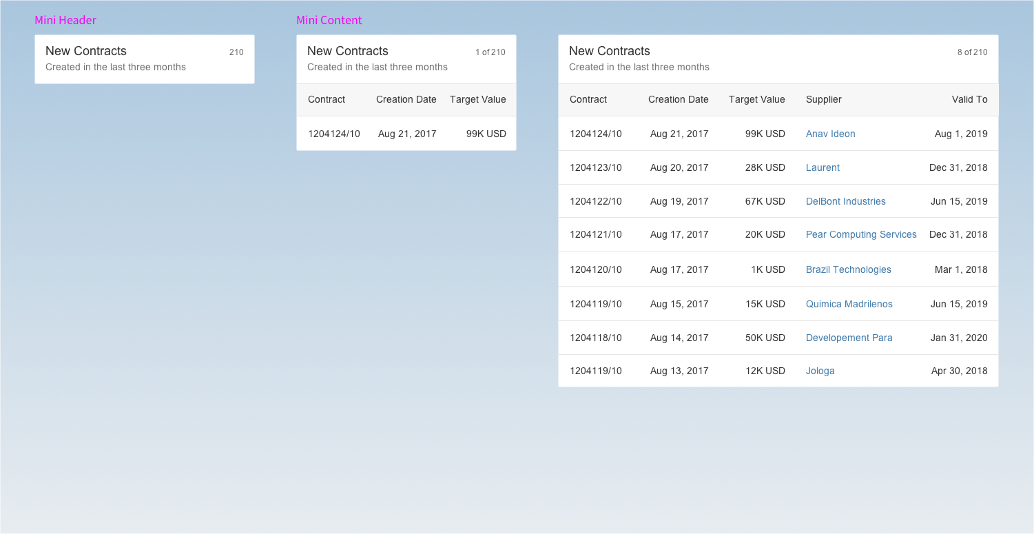
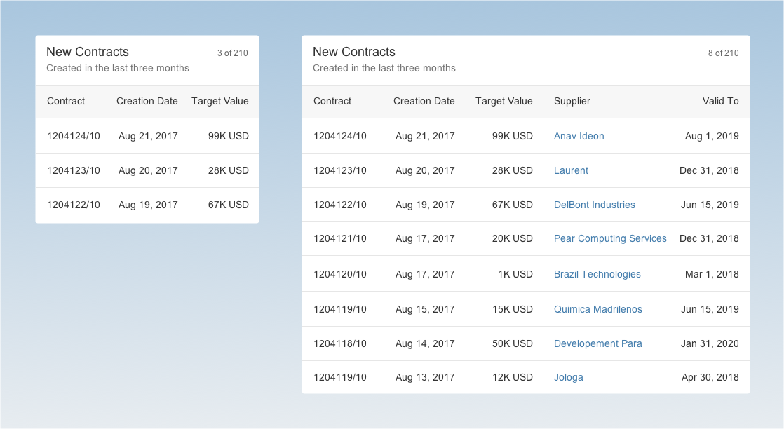
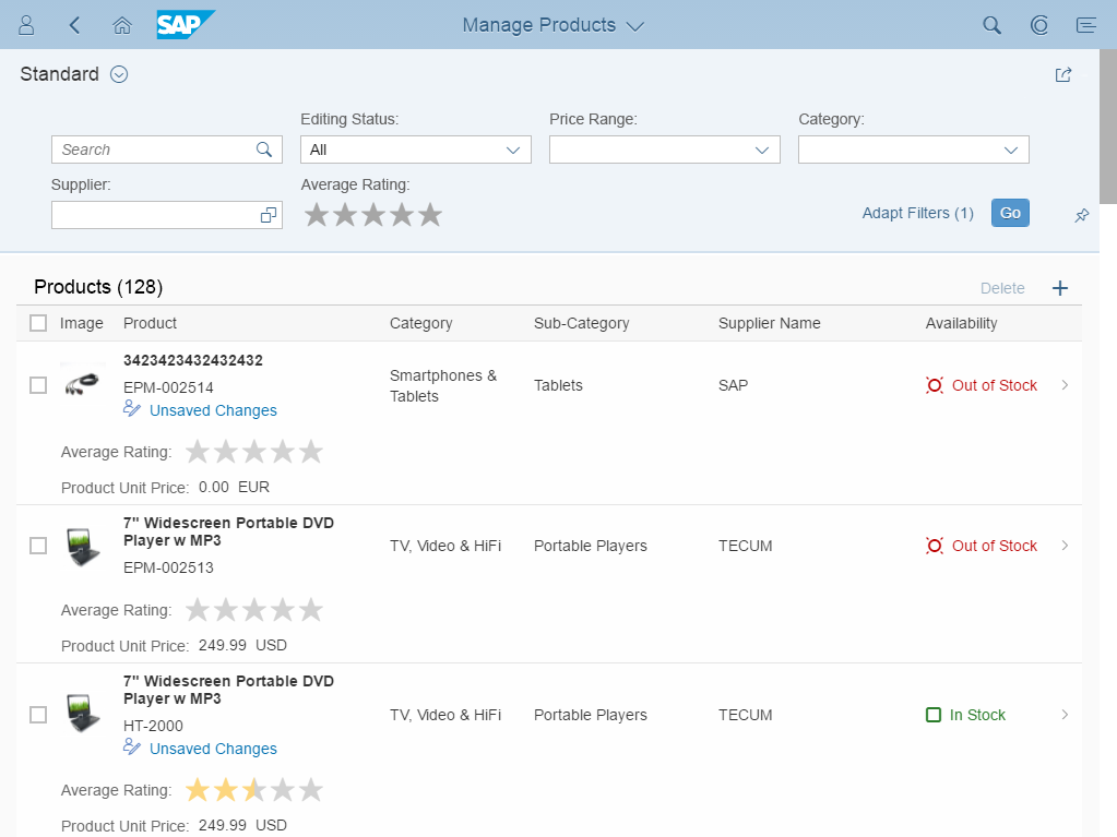
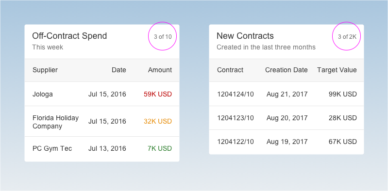
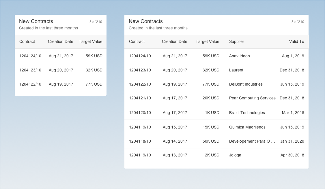
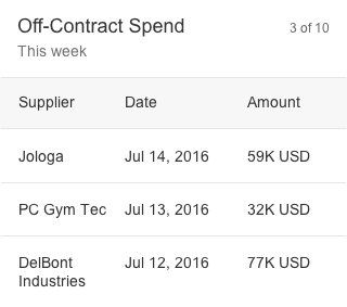
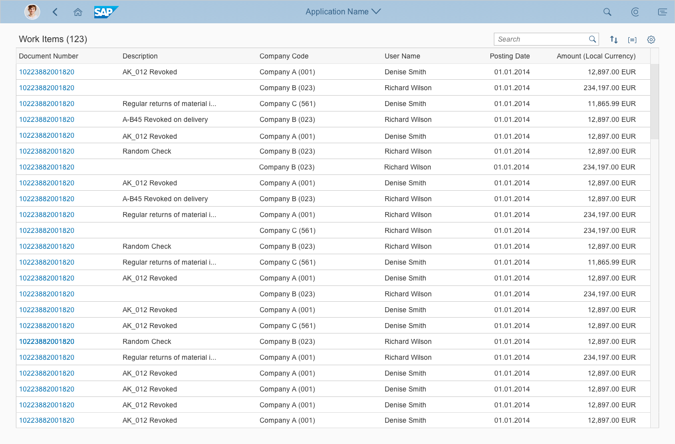
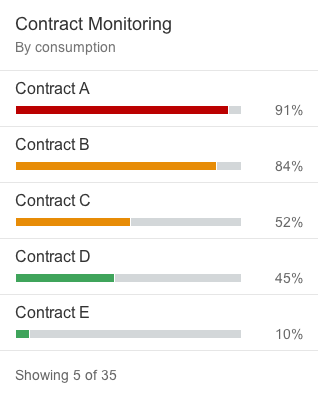
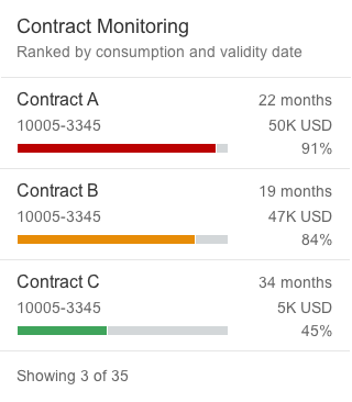
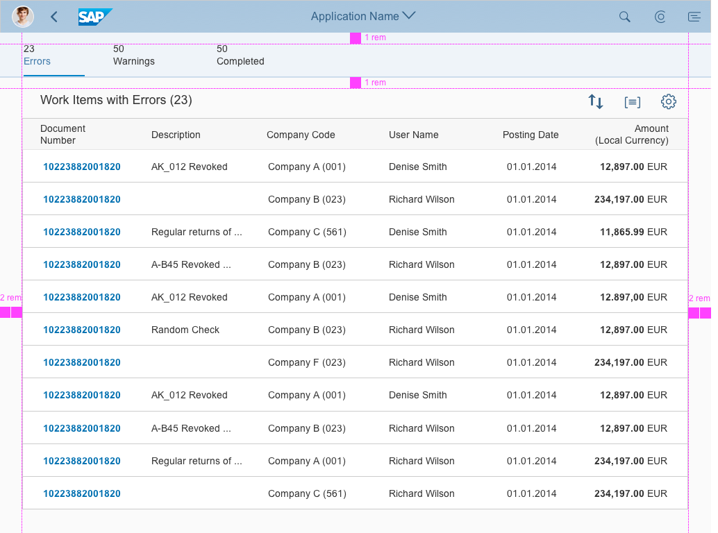
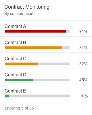
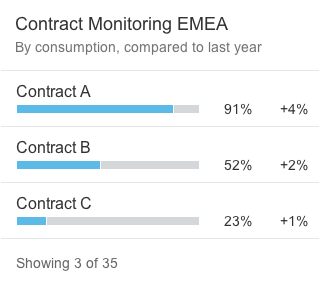
Table Card
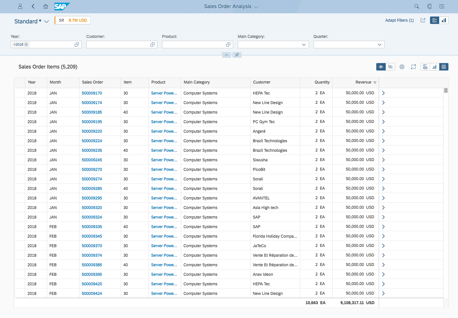
The height of table cards can vary, depending on the number of table cells. Tables are limited to a maximum of 3 columns and 3 rows, with a maximum of 3 lines of text per row. To see the full result set, the user needs to navigate to the parent app.
Drag and Drop
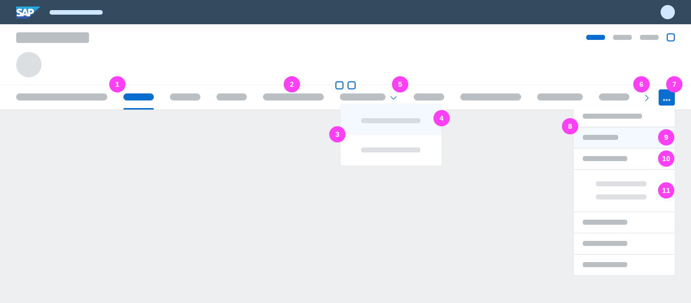
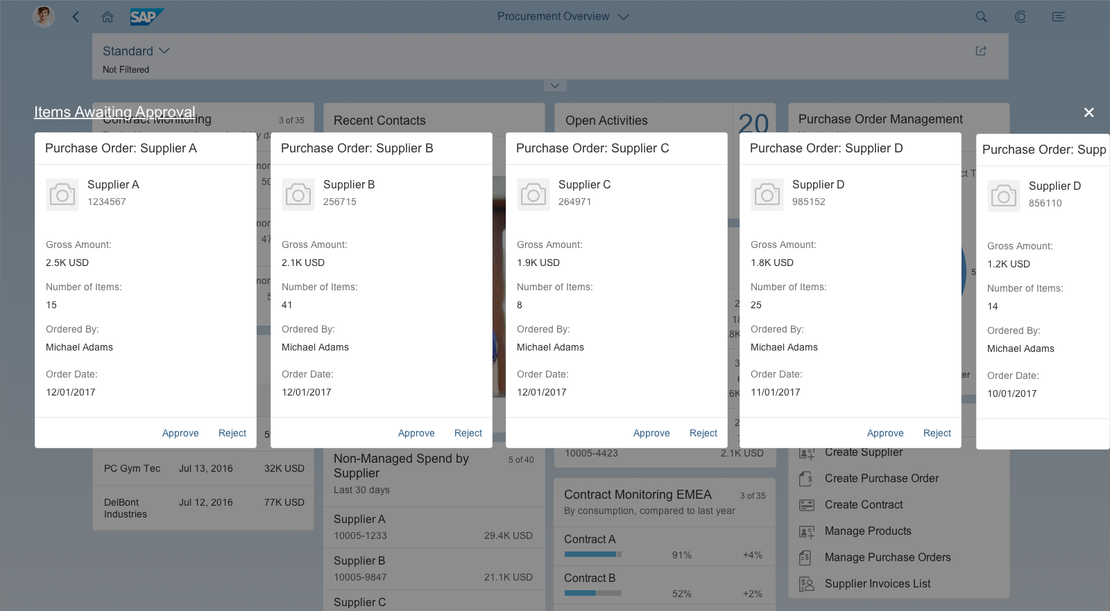
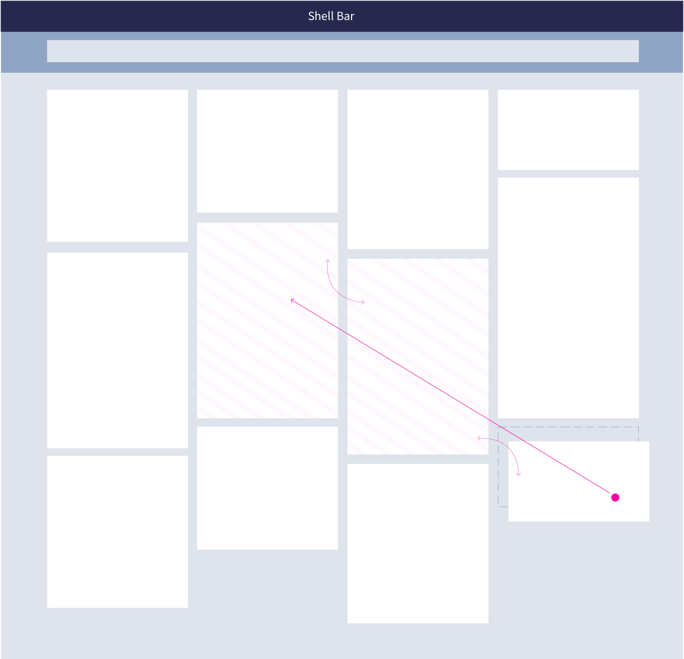
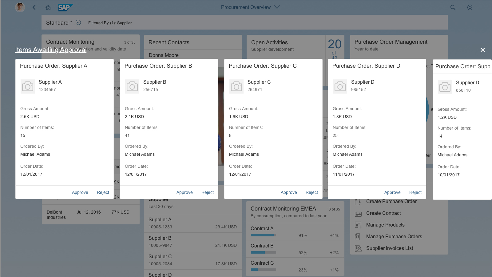
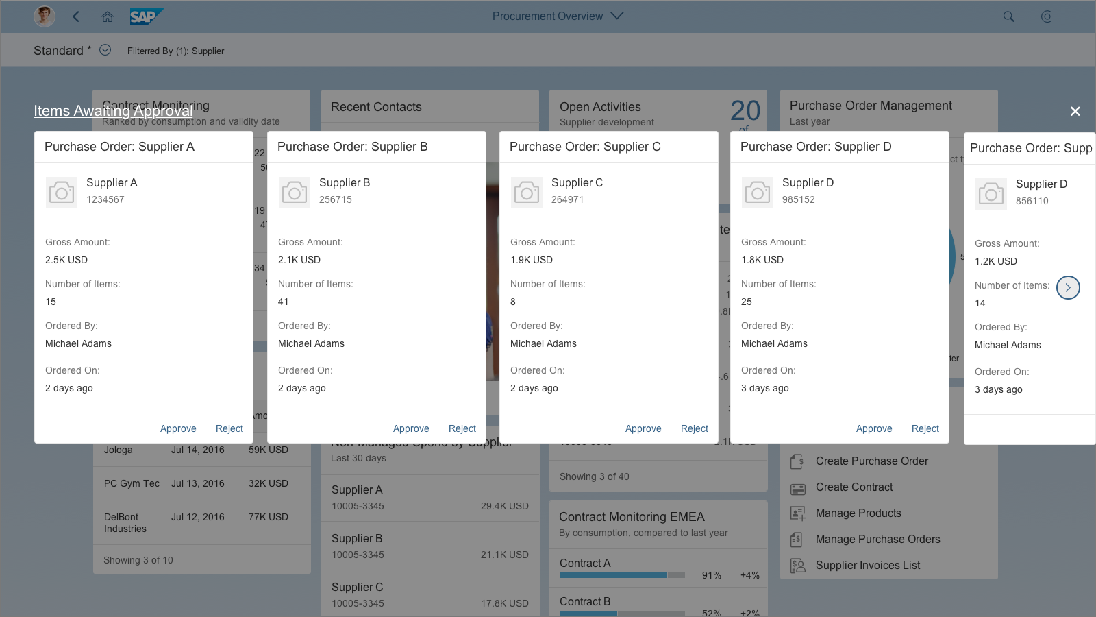
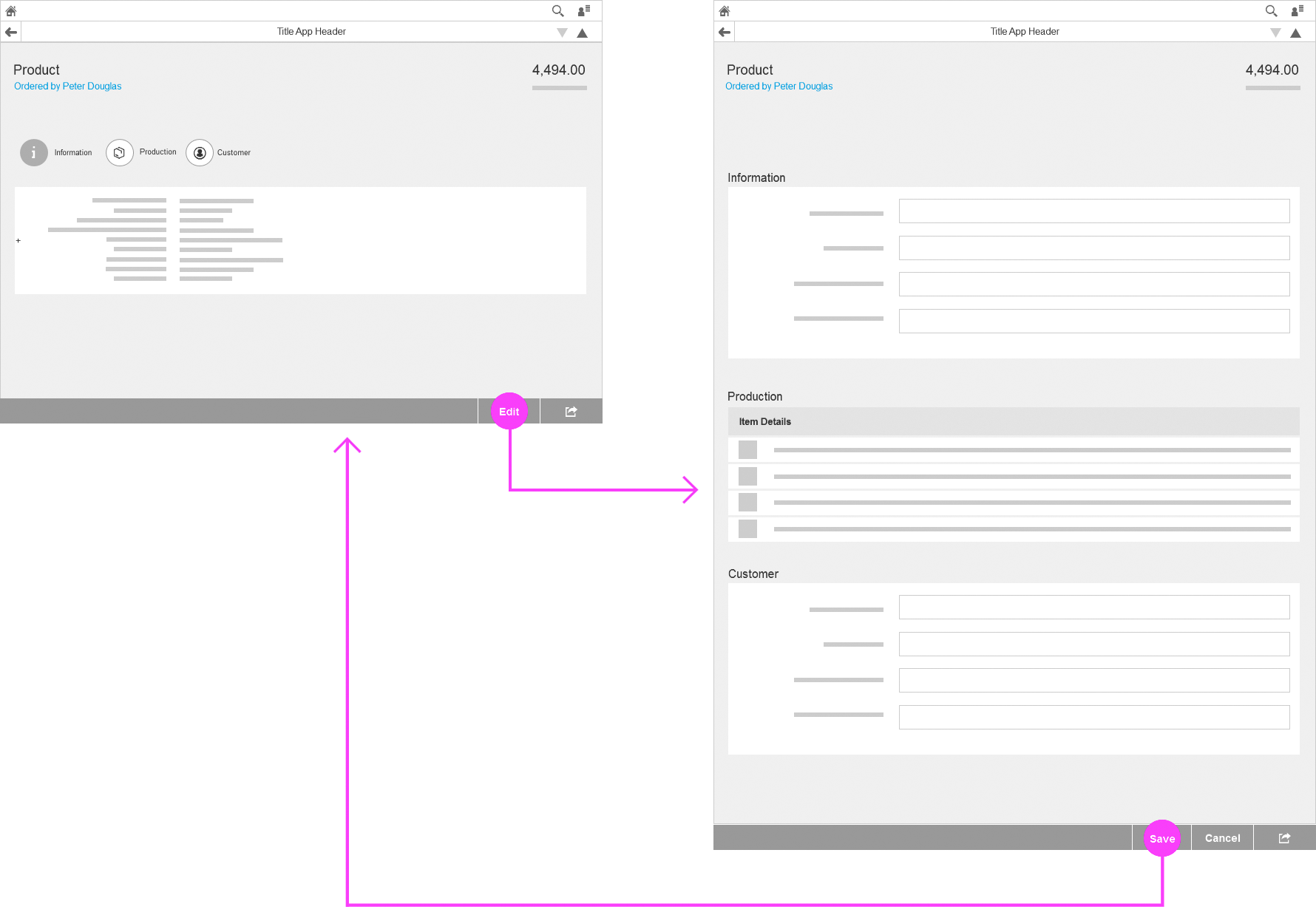
Users can reposition cards on the overview page by dragging them to a different location. As the user drags a card, it swaps places with any cards in its path. As soon as a neighbouring card is touched, the position of that card becomes the new target location for the card being dragged. A dashed line offers a preview of the new position.
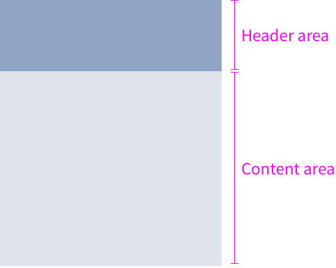
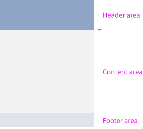
To drag a card, the user has to long press on a card instead of just clicking. It doesn’t matter where the cursor is positioned – cards can be dragged from both the header and content areas. The mouse cursor also changes to indicate that the card can be dragged. Releasing the mouse or lifting the finger from the touch surface completes the move. To avoid gaps, cards always snap to the next free space in the row, or to the start of the next row.
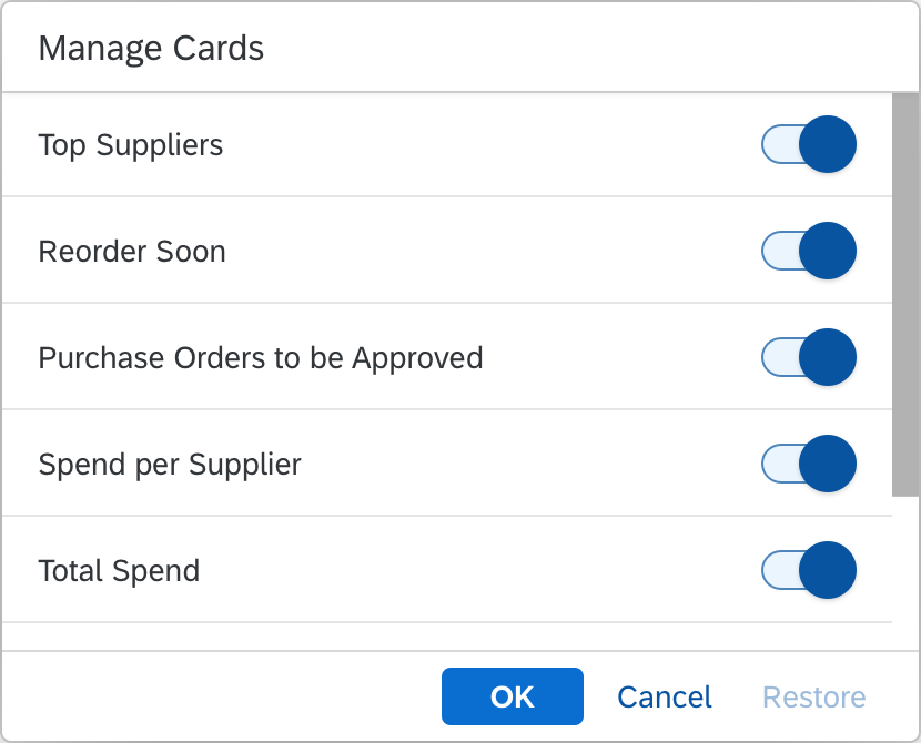
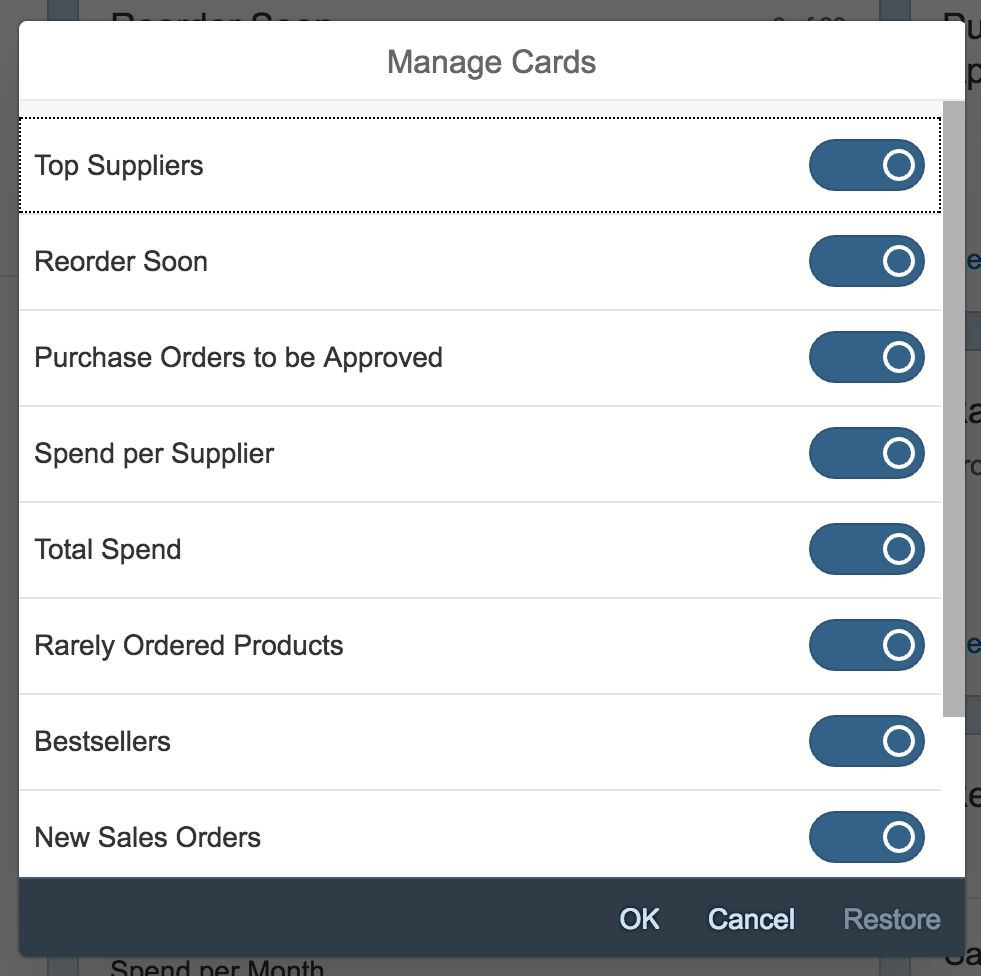
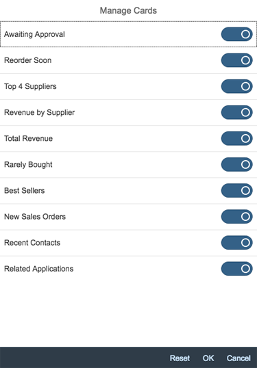
In addition, users can personalize their own overview page by hiding cards.
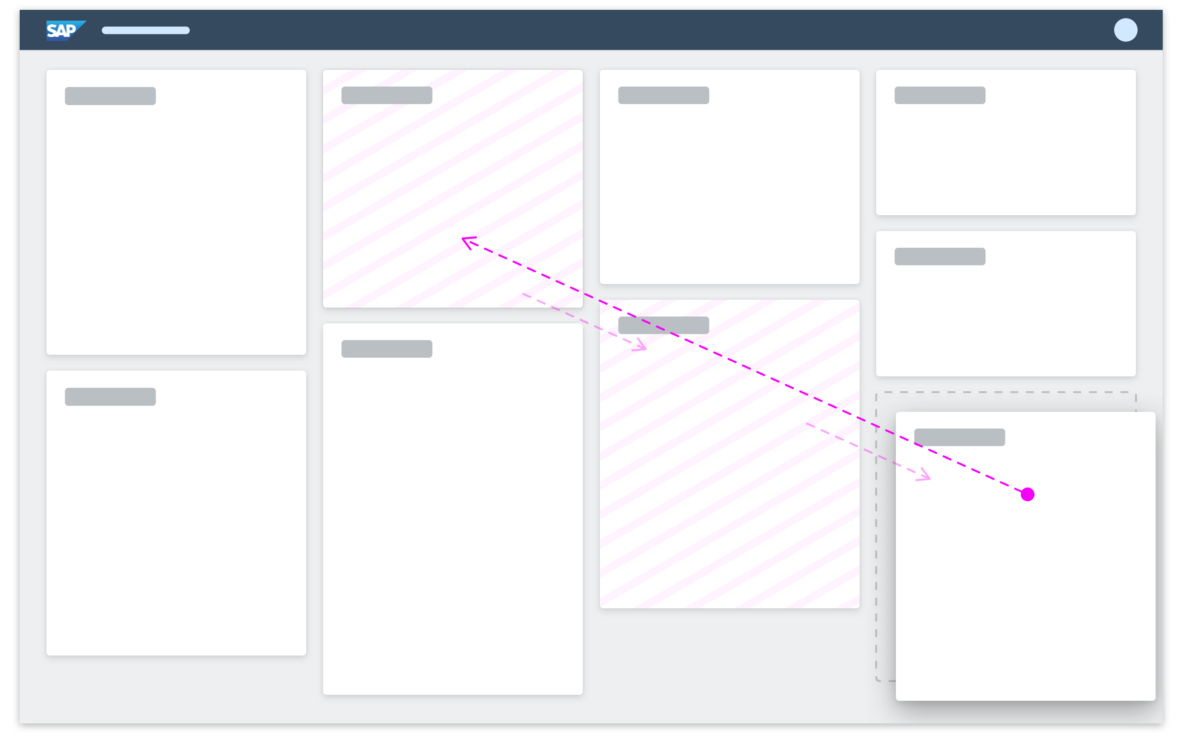
Fixed card layout – Drag and drop
Getting Started
In the fixed card layout, you can’t influence the amount of information on each card. However, you can define the card order. Before you design your overview page, take a look at the best practices, which outline how to best use cards for an optimal user experience.
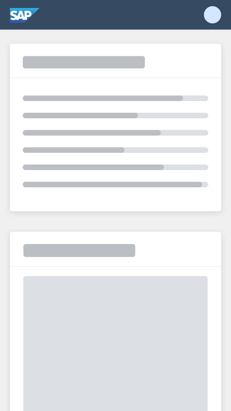
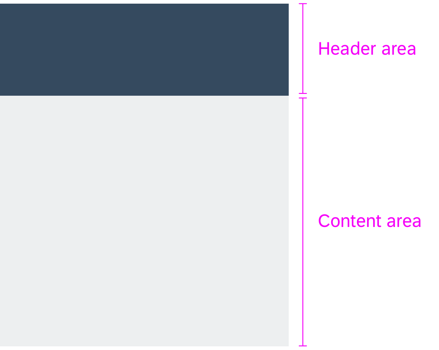
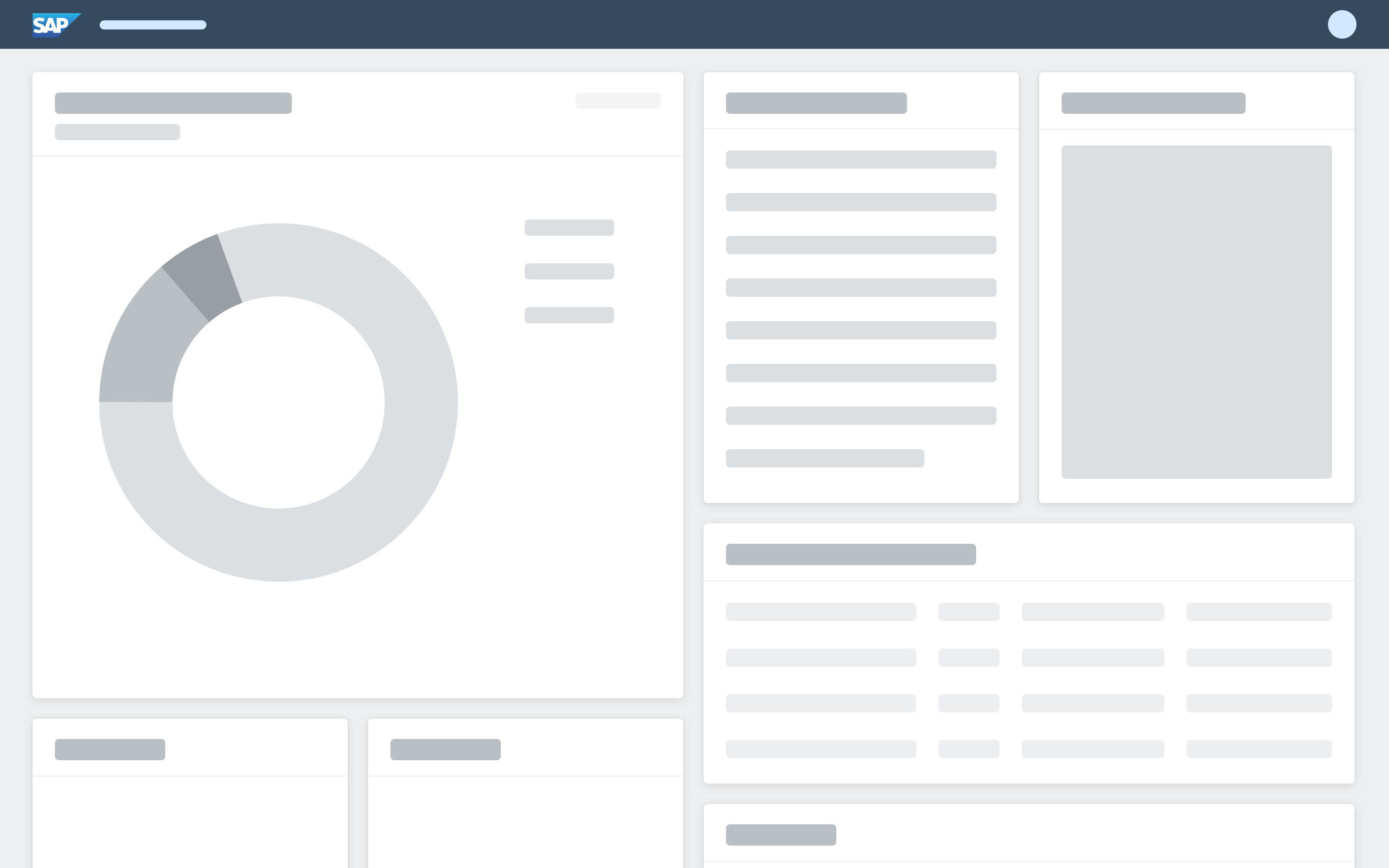
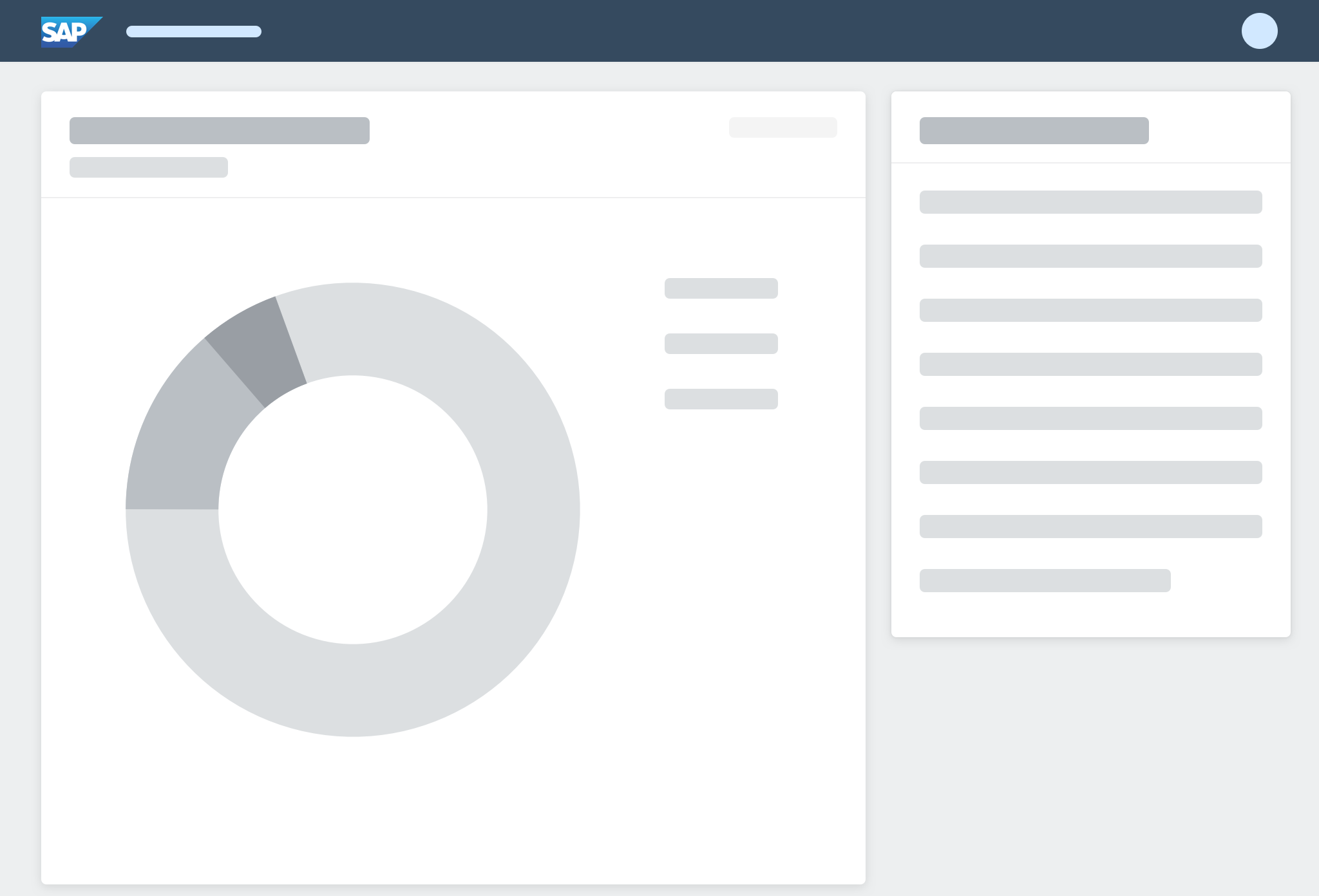
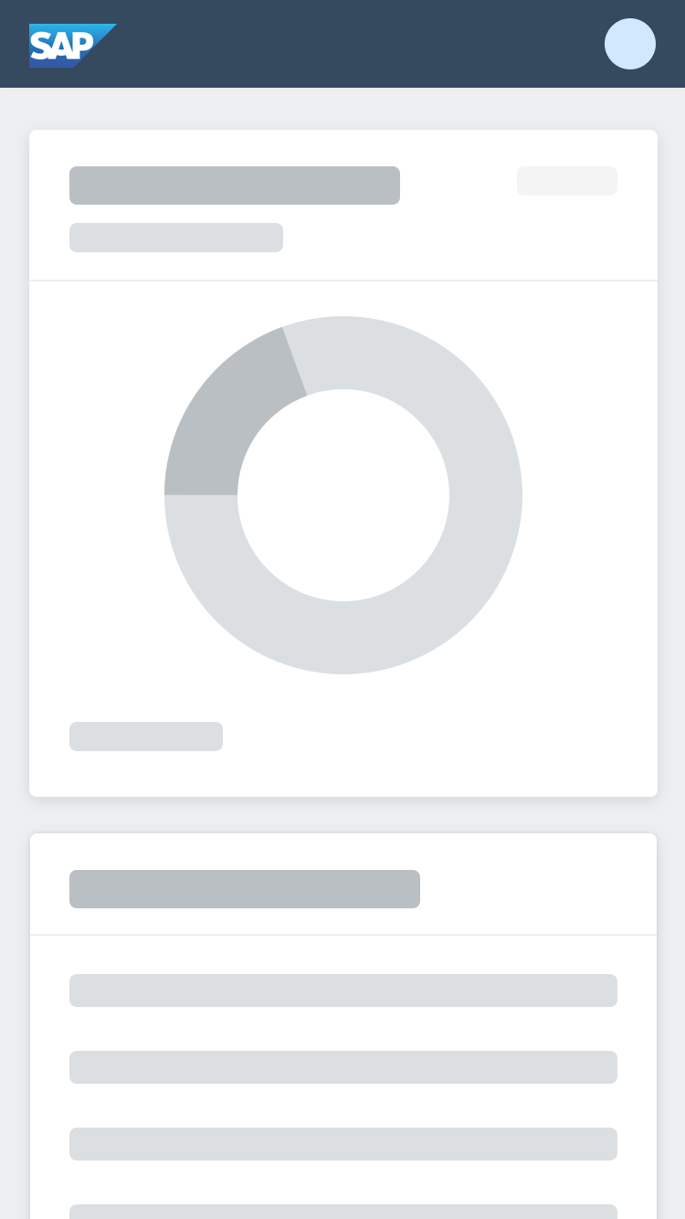
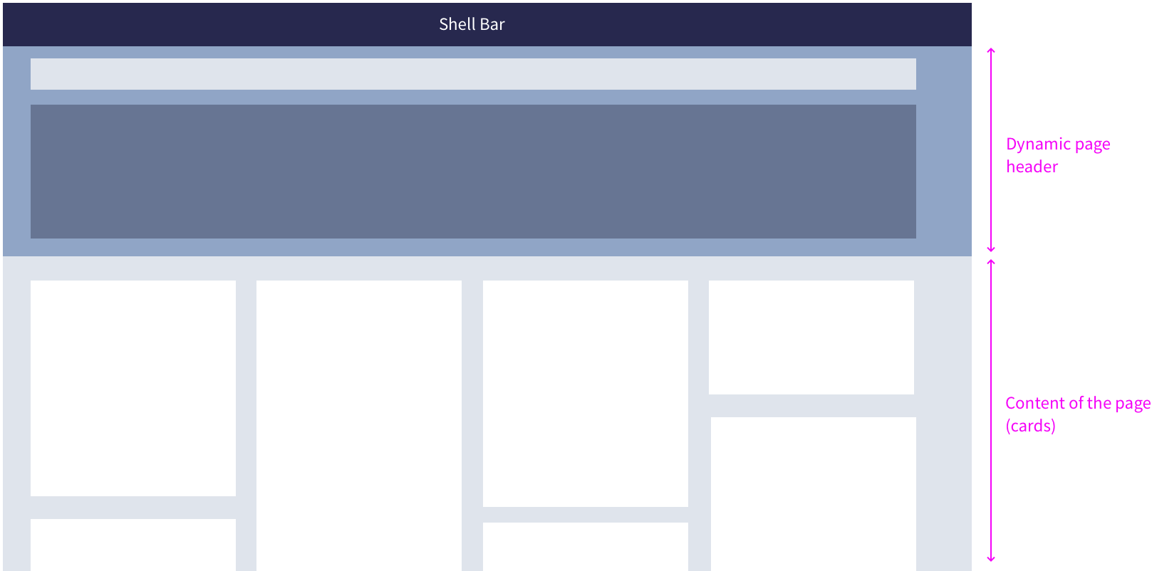
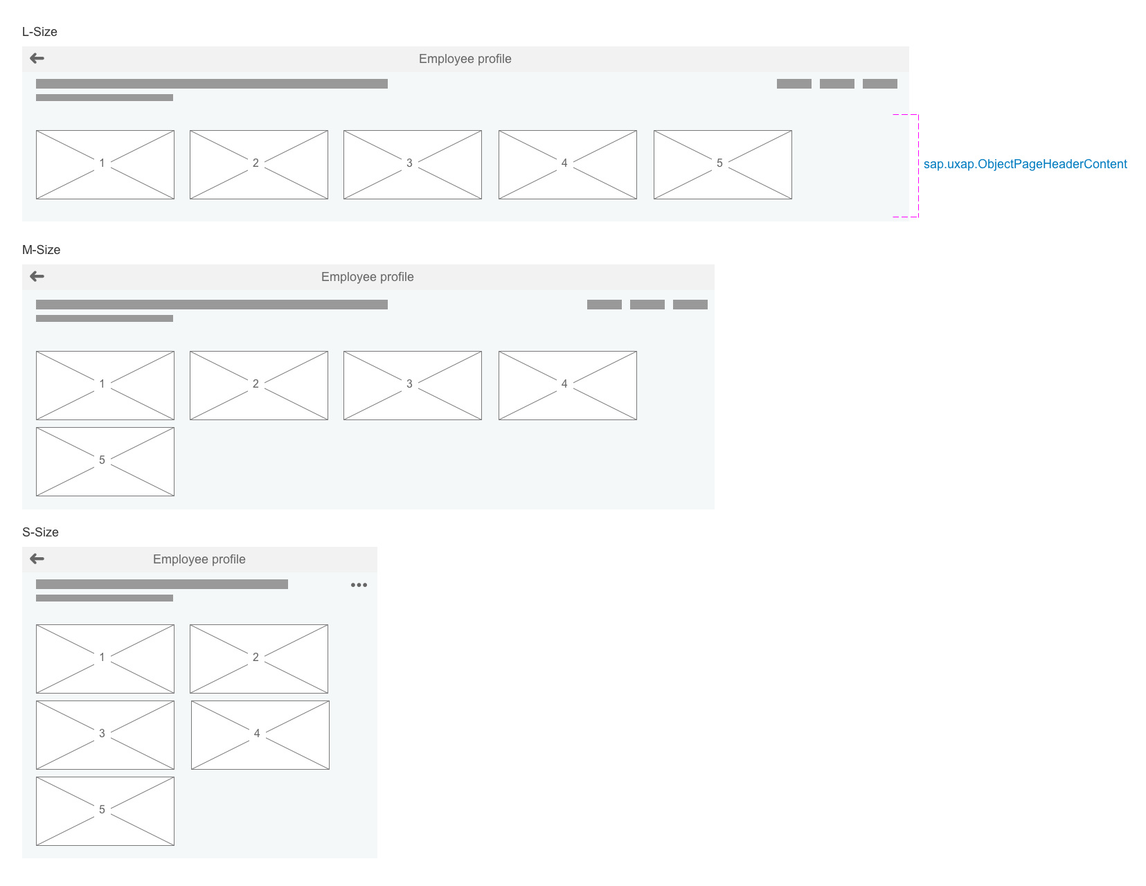
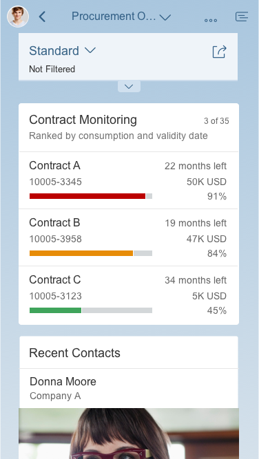
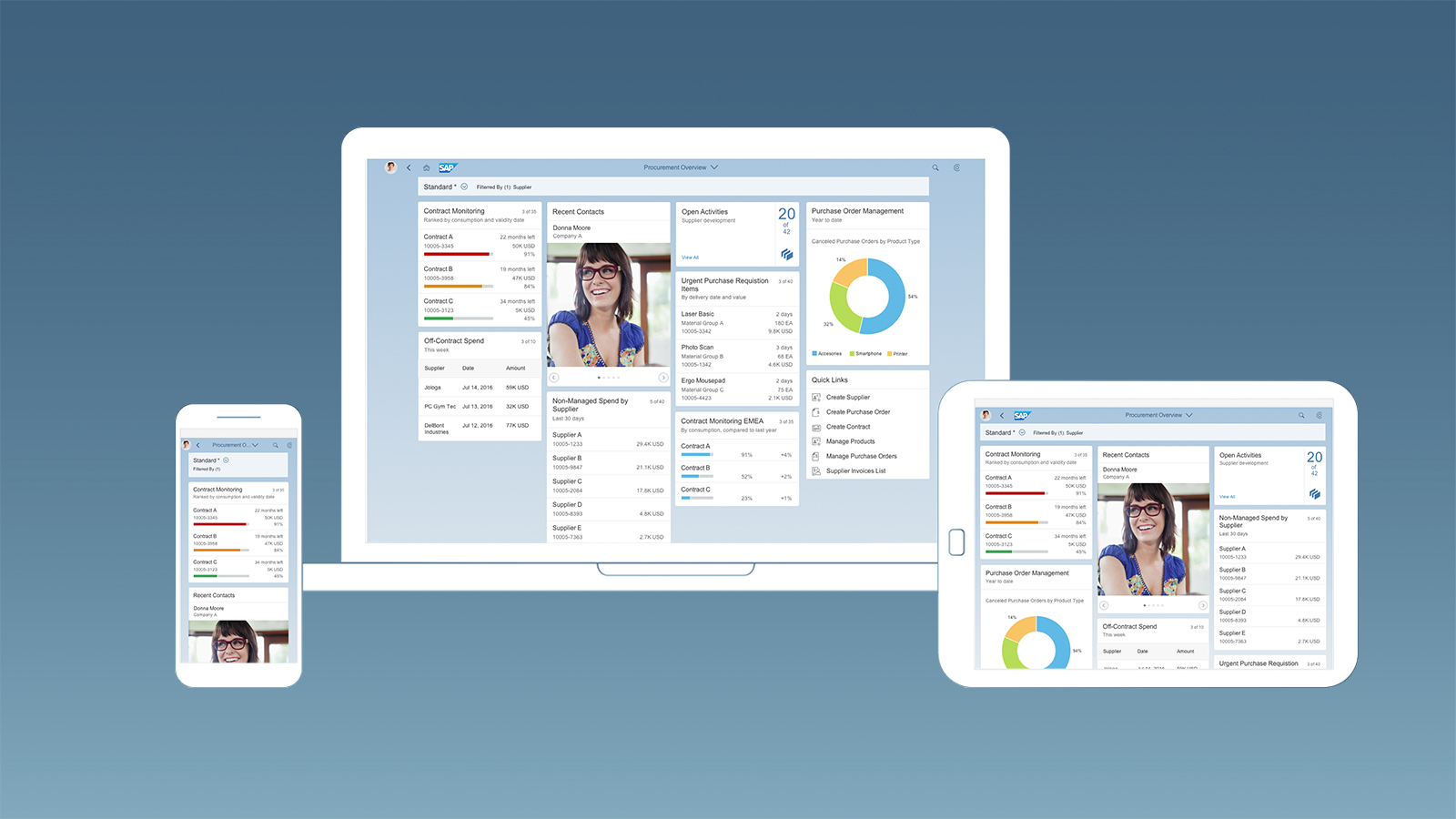
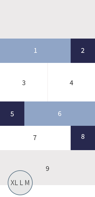
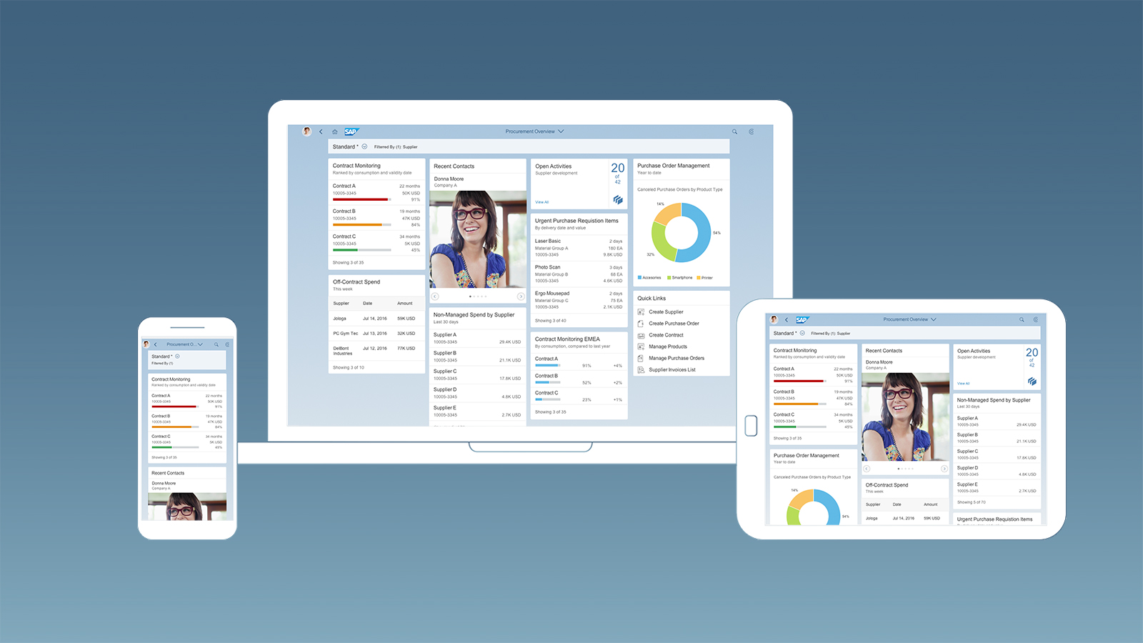
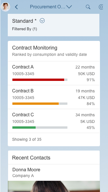
The fixed card layout uses padding on both sides. The cards are displayed inside collapsible columns, making the page fully responsive. When the user resizes the browser or uses a smaller screen, the columns containing the cards collapse. To view all the cards, the user just scrolls down. In this way, the layout can accommodate typical laptop screens, larger desktop monitors, and mobile devices.
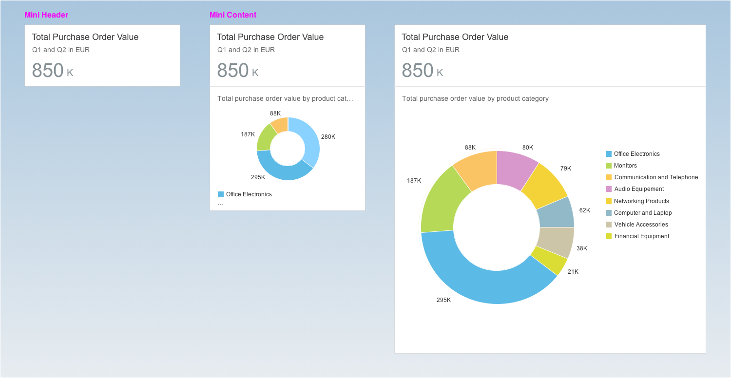
The width of the cards is tied to the column width. Breakpoints for the different screen resolutions determine whether the column width is 20 or 25 rem. The cards inside the columns adapt their width and content automatically. By contrast, the height of the cards is flexible, and depends on the content and type of card (see Card Sizes per Type).
- Phone: 1 column
- Tablet (portrait): 2 columns
- Laptop / tablet (landscape): 3 columns
- Large desktop: 4 columns
- Extended monitor: 5 columns (maximum)
Fixed card layout – Size S

Fixed card layout – Size M
Fixed card layout – Size L
Elements and Controls
- Introduction to SAP Fiori Elements (guidelines)
- Overview Page (guideline)
- Overview Page – UI Text Guidelines (guidelines)
Implementation
- No links


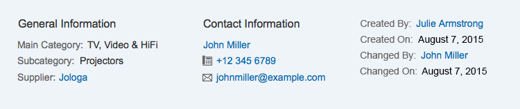


")
")
")
")


 Your feedback has been sent to the SAP Fiori design team.