
SAPUI5 is the main framework for developing SAP Fiori web applications. Check out this 2-minute video below for a quick overview.
Archives
SAP Fiori on SAPUI5
SAPUI5 Development Toolkit for HTML 5
The SAPUI5 Development Toolkit (SDK) is the primary resource for SAPUI5 development. And it’s helpful for designers, too.
If you’re designing SAP Fiori apps that will be built with SAPUI5, you can try out UI control samples and check the available properties in the corresponding API documentation. You’ll also find the latest SAPUI5 features, full documentation on developing apps with SAP Fiori elements, demo apps, tutorials, and more.
Design Stencils for Adobe XD
You can use this stencil set to create high-fidelity SAP Fiori designs using Adobe XD.
For more information about SAP Fiori design stencils and other tool options, see Design Stencils.
Prerequisites
To use the SAP Fiori stencils, you need to install SAP’s 72 font family and the SAP icon font on your machine.
These fonts are provided as part of the stencil download package. See Download and Installation below.
Download & Installation
- Install the Adobe XD software.
- Download and unpack the ZIP file in the download box.
- Install font 72.*
- Choose the folder Font 72 / 72_Desktop.
- Double-click each .ttf file and click Install.
- Install the SAP icon font.
- Remove any former versions of the SAP icon font.
- Choose the folder Icon Fonts / …final icon package / Fonts
- Double-click the SAP-icons.ttf file, and click Install.
- Optional: Install the SAP Business Suite icon font.
- Remove any former versions of the SAP Business Suite icon font.
- Choose the folder Icon Fonts / …final icon package / Fonts
- Double-click the BusinessSuiteInAppSymbols.ttf file, and click Install.
- Open the Adobe XD stencil file and save it as a duplicate.
The duplicate is your working document for visualizing your SAP Fiori app. All the available stencils are now available as assets in the sidebar on the left, including character styles, and components (stencils).
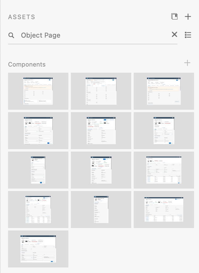
Searching for an object page in the asset panel
*The 72 font download is made available under the Apache 2.0 license.
Design Stencils for Axure RP (Mac and Windows)
Intro
You can use this stencil set to create high-fidelity SAP Fiori designs using Axure RP.
For more information about SAP Fiori design stencils in general and other tool options, see Design Stencils.
Prerequisites
- Axure RP 9 is required to use the stencils.
- To use the SAP Fiori stencils, you need to install SAP’s 72 font family and the SAP icon font on your machine. These fonts are provided as part of the stencil download package. See Download & Installation below.
Download & Installation
- Install the Axure RP software.
- Download the design stencil set: Download the ZIP file and unzip it.
- Install font 72.
- Choose the folder Font 72 / 72_Desktop.
- Double-click each .ttf file and click Install.
- Open Axure RP and change the default font within Axure RP to font 72 by using the Widget Style Manager (Project / Widget Style Manager / Default / change font to “72”).
- Install the SAP icon font.
- Remove any former versions of the SAP icon font.
- Choose the folder Icon Fonts / …final icon package / Fonts
- Double-click the SAP-icons.ttf file, and click Install.
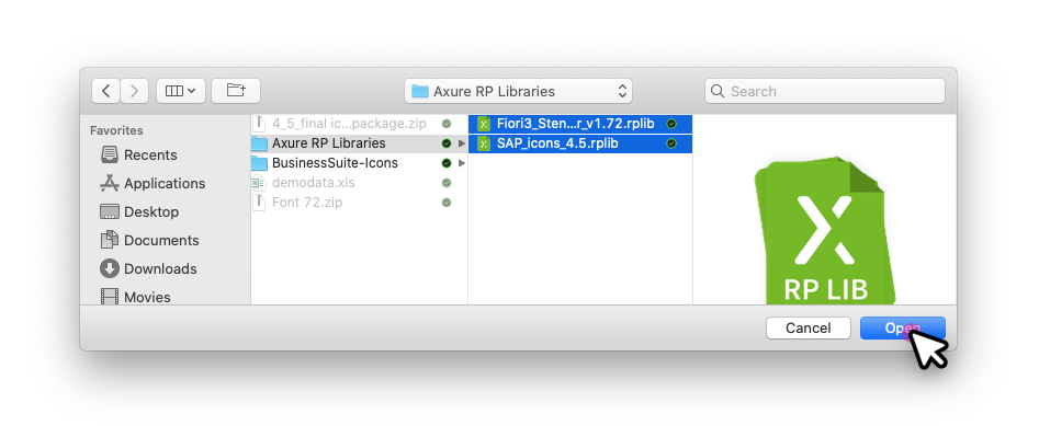
- Load the libraries in Axure RP: Open Axure RP and load the libraries for the stencils and icon font (tutorial).
- Optional: Install and load the SAP Business Suite icon font.
Loading libraries (1)
Loading libraries (2)
Loading libraries (3)
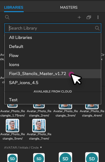
All the available stencils are now displayed in the library panel on the left and you can easily pull the stencil you need to your canvas board.
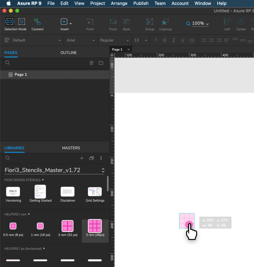
Pulling a stencil to the canvas board
Embedding Fonts into HTML Exports (Optional)
You can use a simplified method to embed fonts in Axure RP. These include:
- SAP-icons
- SAP-icons-TnT
- BusinessSuiteInAppSymbols
- 72
Tip: You can browse the three icon fonts in the Icon Explorer.
Online Usage
Follow the steps below:
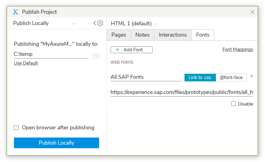
- In Axure RP, choose Publish and Generate HTML Files….
- In the subsequent dialog, open the other options (settings wheel) and choose the Fonts tab. If the tab is empty, choose Add Font.
- Under WEB FONTS, enter a font label, such as all SAP fonts (or similar).
- Choose Link to .css file and enter the following URL:
https://experience.sap.com/files/prototypes/public/fonts/all_fonts.css
You can now export your mock-ups, and everyone with internet access sees all icons and the 72 font right away.
These settings are saved only for your current Axure RP project. Repeat this procedure for every Axure RP project you want to share with others.
Offline Usage
If you are heading to usability tests with new or re-imaged laptops, or if you don’t have an internet connection, you’ll need to make sure that all icon fonts used in your prototype are installed on the devices. Alternatively, you can just use the fonts package:
- In Axure RP, choose Publish and Generate HTML Files….
- In the subsequent dialog, open the other options (settings wheel) and choose the Fonts tab. If the tab is empty, choose Add Font.
- Under WEB FONTS, enter a font name, such as all SAP fonts (or similar).
- Choose Link to .css file and enter the following URL:
all_fonts.css
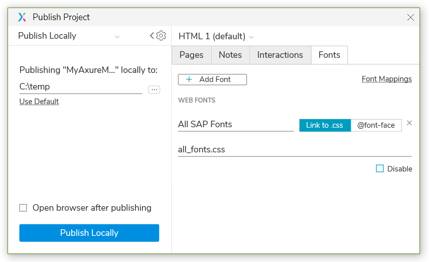
- Download the following file:
https://experience.sap.com/files/prototypes/public/fonts/all_fonts.zip - Unpack the file to the directory to which you also generate your HTML files (where the index.html is).
All icons are now available offline, without installing fonts.
SAP Business Suite Icon Font (Optional)
The SAP Business Suite Icon Font (BusinessSuiteInAppSymbols) contains application-specific icons primarily used in SAP S/4HANA apps.
Important! To use this font in your app, it must be registered as a custom font in sap.ui.core.IconPool.
Procedure
To add Business Suite icons to your Axure RP mockup, proceed as follows:
- Remove any former versions of the SAP Business Suite icon font.
- In the download files for the standard SAP Fiori design stencils, unpack the ZIP file IconHTMLTemplate_InAppSymbols_….zip.
- Open the Fonts folder and install the BusinessSuiteInAppSymbols.ttf file.
- Load the widget library BusinessSuiteIcons_…rplib file into Axure’s Libraries panel.
SAP Fiori Design Stencils
Intro
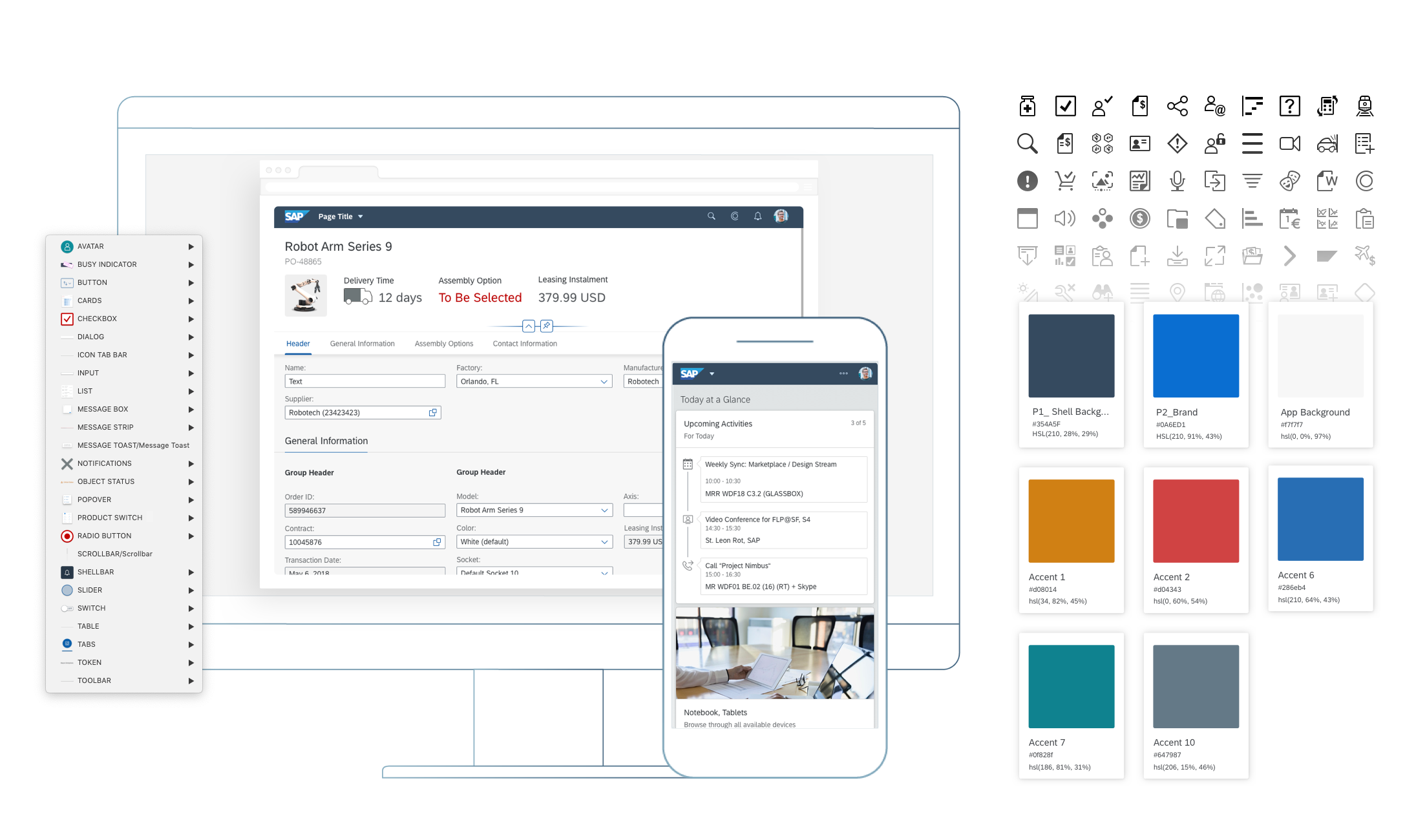
Design stencils are ready-to-use, high-fidelity drafts of SAP Fiori UI components. You can use them to visualize SAP Fiori apps and to get a realistic impression of your final design.
Stencil sets are available for Sketch, Axure RP, and Adobe XD.
What’s In the Stencil Set?
The SAP Fiori design stencils include:
- Patterns for foundation topics, such as shadow levels, grid, colors, and more
- Page types (floorplans)
- Controls
- Helper tools, such as rem squares or px spacings to build your app according to the current specifications and implementations. We’ve also included interaction tools, such as like cursors and touch visualizations.
The following stencil sizes are available for your mockups:
- S (414 px)
- M (600 px and 834 px)
- L (1024 px)
- XL (1440 px)
In addition, each stencil set includes download files for:
- Font 72, the standard typeface for SAP Fiori apps
- The standard SAP icon font and the SAP Business Suite icon font
Download Stencils
You can download stencil packages for your preferred tool (Sketch, Axure RP, or Adobe XD).
For download and installation instructions, see the pages below for each tool.
Download Font 72
Font 72 is SAP’s proprietary typeface, and is the standard typeface for SAP Fiori apps. You can download the font separately here, or download one of the tool-based stencil sets above, which all include the font.
Procedure
- Download the desktop and web font families.
- Unpack the ZIP files 72_Desktop / 72_Web.
- Double-click each .ttf file and click Install.
The 72 font download is made available under the Apache 2.0 license.
Download Icon Font
SAP Icon Font
To use the stencils, you need to install the standard SAP icon font. You’ll also need to install this font locally if you want to display SAP Fiori icons in other applications, such as PowerPoint. For more information about the SAP icon font, see Iconography.
The SAP icon font is also included in the stencil sets for Axure RP and Sketch.
Procedure
- Remove any former versions of the SAP icon font.
- Download and unpack the ZIP file sap-icons_… .zip .
- Double-click the SAP-icons.ttf file, and click Install.
SAP Business Suite Icon Font (Optional)
In some application areas, you may also need to use the SAP Business Suite Icon Font (BusinessSuiteInAppSymbols). This icon font contains application-specific icons primarily used in SAP S/4HANA apps.
Important: To use the SAP Business Suite icon font in your app, it must be registered as a custom font in sap.ui.core.IconPool.
Procedure
- Download and unpack the ZIP file BusinessSuiteInAppSymbols_...zip.
- Install the SAP Business Suite icon font: Double-click the BusinessSuiteInAppSymbols.ttf file and click Install.
Related Links
Other Resources
Design Stencils for Sketch (Mac)
You can use this stencil set to create high-fidelity SAP Fiori designs using Sketch.
For more information about SAP Fiori design stencils in general and other tool options, see Design Stencils.
Prerequisites
To use the SAP Fiori stencils, you need to install SAP’s 72 font family and the SAP icon font on your machine.
These fonts are provided as part of the stencil download package. See Download and Installation below.
Download and Installation
- Install the Sketch software.
- Download and unpack the ZIP file.
- Save the the Fiori3_Stencils_Master.sketch file to a dedicated folder on your machine.
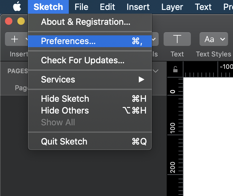
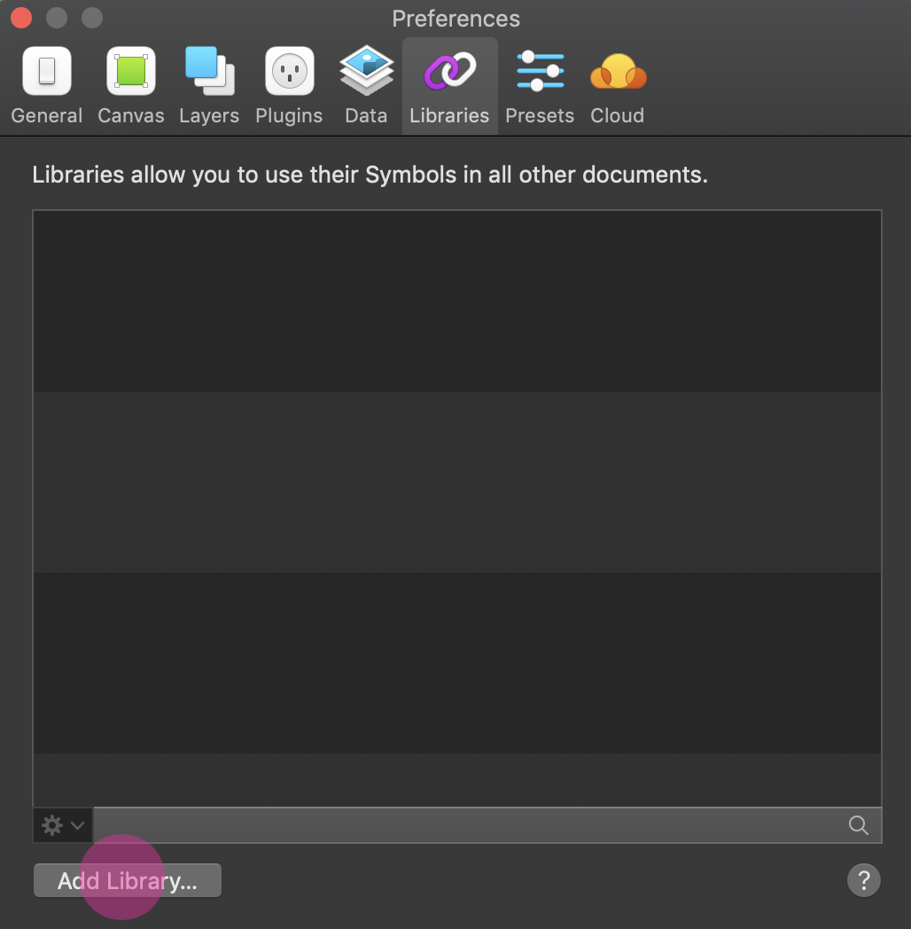
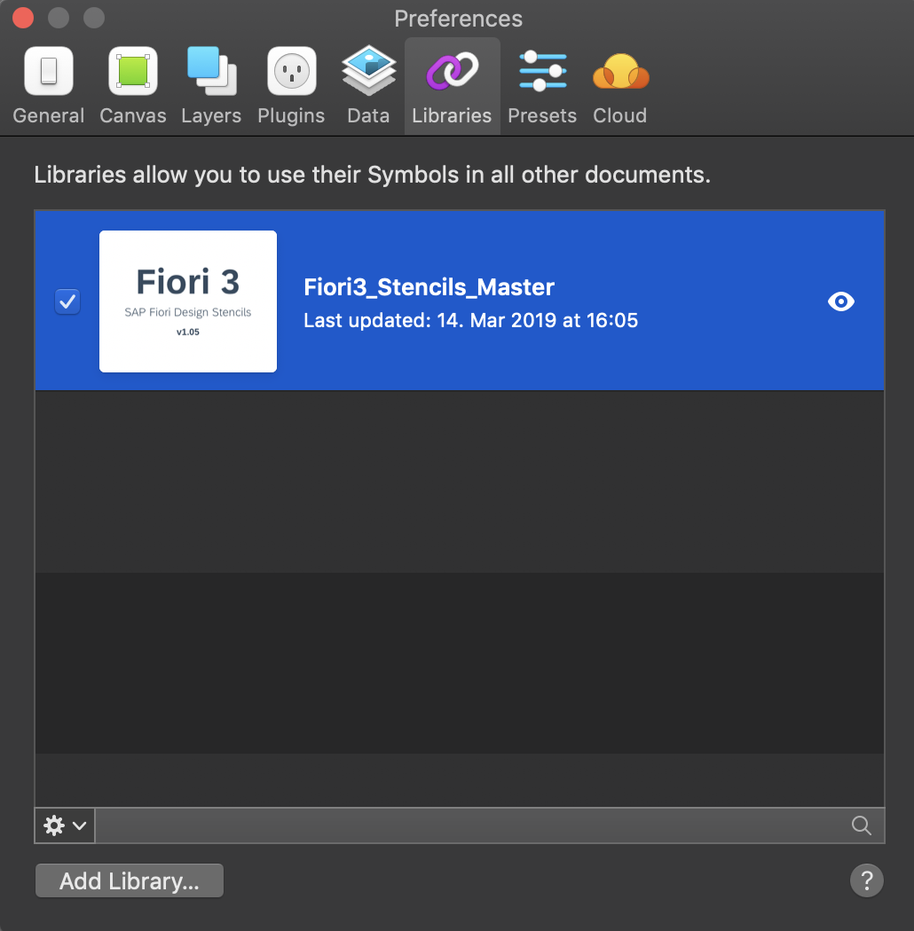
When you download an updated version in future, make sure that the new file replaces the existing file. This enables Sketch to identify the update automatically. - Use the SAP Fiori master file as a library within your own Sketch file. To do so, open Sketch, go to Sketch / Preferences / Libraries, and add the library to the list.
- Install font 72.*
- Choose the folder Font 72 / 72_Desktop.
- Double-click each .ttf file and click Install.
- Install the SAP icon font.
- Remove any former versions of the SAP icon font.
- Choose the folder Icon Fonts / …final icon package / Fonts
- Double-click the SAP-icons.ttf file and click Install.
- Optional: Install the SAP Business Suite icon font.
- Remove any former versions of the SAP Business Suite icon font.
- Choose the folder Icon Fonts / …final icon package / Fonts
- Double-click the BusinessSuiteInAppSymbols.ttf file and click Install.
*The 72 font download is made available under the Apache 2.0 license.
Using the Sketch Stencils
Symbols
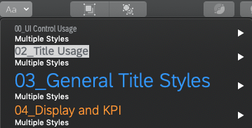
All the available stencils are now available as “symbols” within your file in the Symbols menu. To use a stencil, pull it to your canvas board.
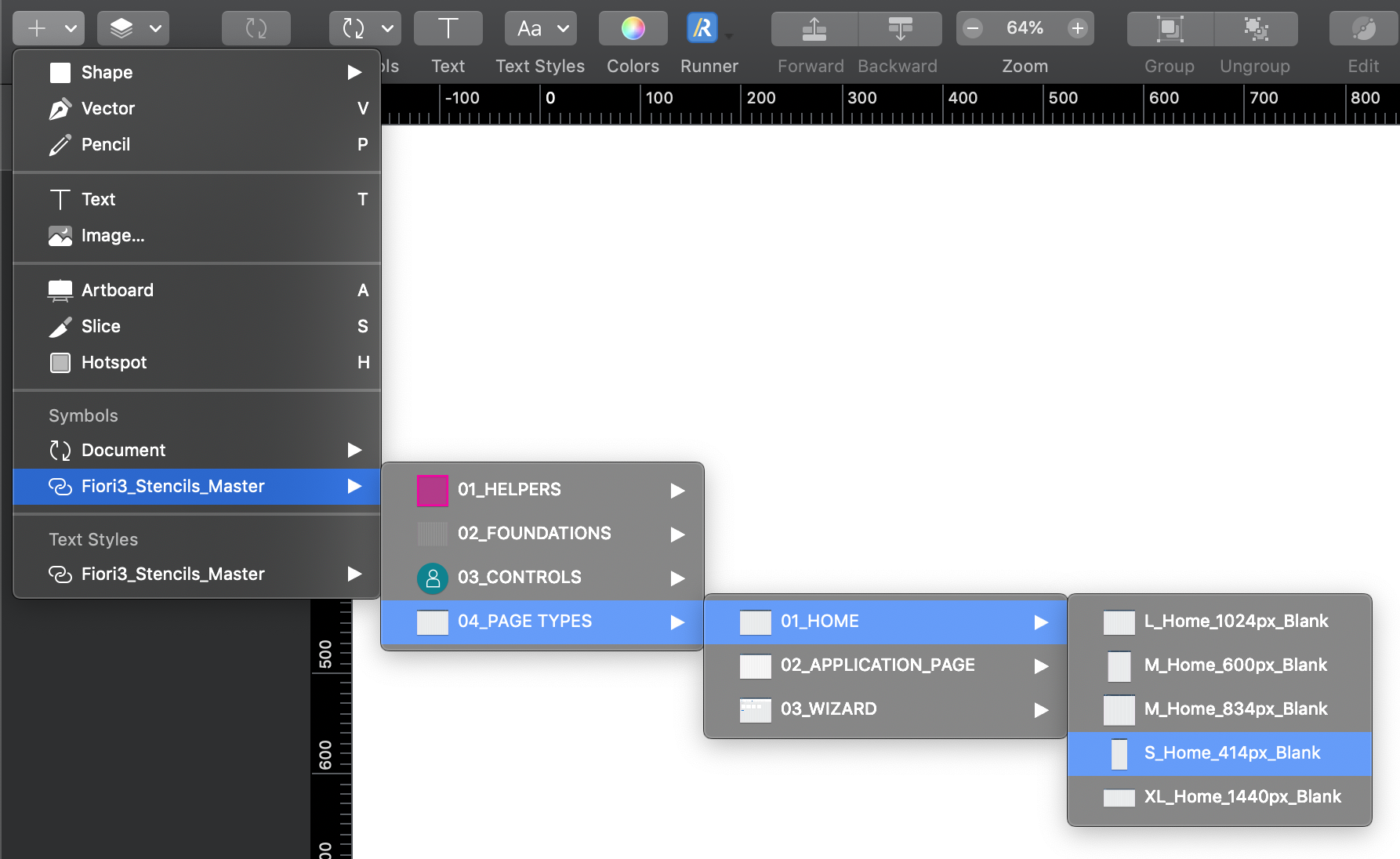
Adding a symbol/stencil to the canvas board (1)
Text and Layer Styles
In addition, you can choose from all appearances (text styles and layer styles) that are offered in the Insert menu or in the navigation panel on the right of your Sketch file.
Text style popup
Top Tips
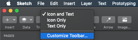
Customize your Sketch toolbar
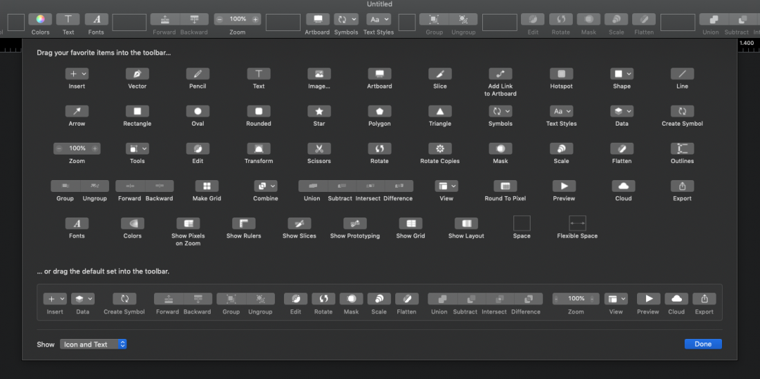
Customize your toolbar within Sketch based on your personal preferences. To do this, right-click on the toolbar in Sketch and choose Customize Toolbar…. You can now pull any menu you want to the highlighted empty boxes.
Recommended menus for working effectively:
- Artboard
- Symbols
- Text Styles
Stay up-to-date
Always download updated files to a specific folder. As soon as a new version is released, put it into your stencil folder by overwriting the old file. This ensures that your working files files are updated to the latest version (find the hint in the top right of Sketch).
Don’t change symbols
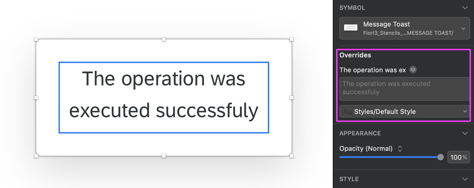
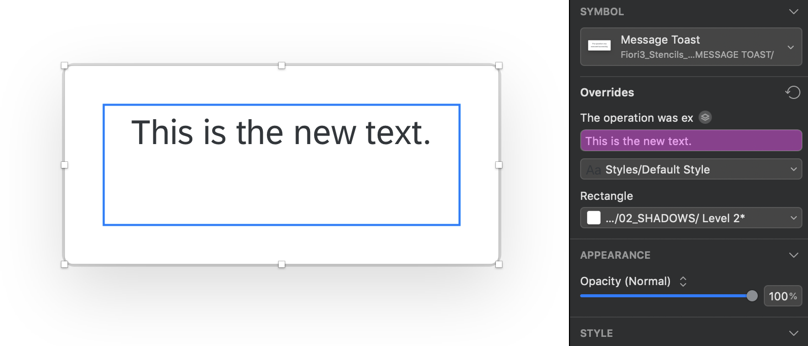
Don’t overwrite symbols within the original document. This changes the symbol in all the places where a symbol is consumed. Instead, change the symbol using the Overrides panel on the right. In the Overrides panel you can change all elements within the object you selected.
Let symbols be symbols
Don’t detach elements from symbols. This ensures that your file stays up-to-date with the latest symbols from the SAP Fiori stencil set for Sketch.
User Research Method Cards
User research helps you to better understand end user needs, expectations, and typical working processes as you follow SAP’s design-led development process. This easy-to-use card deck provides an overview of the 14 most commonly practiced user research methods at SAP and how to apply them. Most of the methods can be used both physically and virtually.
User research is frequently confused with usability testing, which is just one of the methods. While there are similarities between the methods, each one has its own goals, strengths, and weaknesses. The card deck gives you guidance on how to select the right method for your needs.
User Research Within Design-Led Development
Ideally, user research is practiced in all the three phases of SAP’s design-led development process: Discover, Design, and Deliver. The graphic below shows which of the 14 user research methods are typically used in each phase.
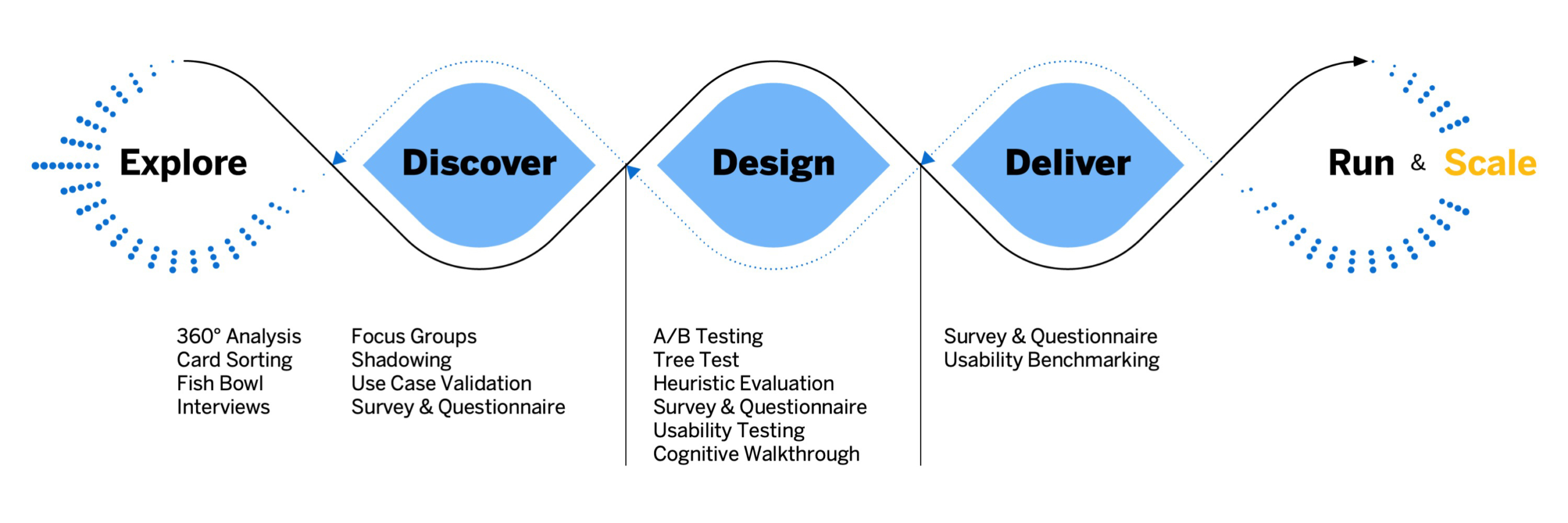
User research methods along the design-led development process
During the Discover phase, user research focuses on learning about the stakeholder and end user requirements. This includes their responsibilities, tasks and activities, typical use cases, workflows, and other software and resources they need to perform their jobs.
Once you have a sufficient understanding of their needs, you move on to the Design phase, where the research focus shifts to getting end user feedback about design ideas and artifacts. Here, different methods are available for validating high-fidelity and low-fidelity prototypes. In the Deliver phase, usability benchmarking and surveys help to evaluate the product.
Download
Download the card deck with the 14 most commonly practiced user research methods at SAP.

UI Text Guidelines for SAP Fiori Apps
This page contains product-specific UI text guidelines for SAP Fiori. It is split into two parts:
- General guidelines that affect multiple floorplans or UI elements
- Guidelines for specific floorplans or UI elements
About this guideline
The SAP Fiori UI text guidelines are not exhaustive. They build on the other writing guidelines at SAP, and cover only specific conventions for SAP Fiori applications. The guidelines have evolved on an as-needed basis to clarify questions that have arisen during SAP Fiori app development, or to reiterate points that recur in SAP Fiori app design reviews.
The guidelines are based on US English, the primary source language at SAP. There are no specific SAP Fiori text guidelines for other languages.
Finding your way
See the content overview at the beginning of each section to navigate. You can also return to the start of each section at any time using the anchors in the header area.
General Guidelines
Content Overview
Abbreviatons
Using abbreviations
Limit the use of abbreviations as much as possible to avoid unnecessary abbreviations appearing on the desktop, where space is often sufficient.
Test your screens on all three device types (smartphone, tablet, and desktop) to ensure that you see the labels live in each case. Optimize as required and as far as space allows.
Abbreviating “Quantity”
Do not use the abbreviated form Qty. Abbreviations in other languages do not work. If there is enough space on the screen, spell out the full word.
Application names
General rules
Ensure that the title of app (initial screen) matches the title on the tile.
Do not use the tile subtitle for explanations. Use the subtitle only for differentiating information.
Background: Explanations are often redundant, and will typically be truncated in some target languages.
Don't
Don't use the tile subtitles for hints or explanations
Do
You can use tile subtitles to differentiate between similar apps
Transactional or hybrid apps
If the user can make changes to the data on the database, start the app name with a verb.
Exceptions:
For employee self-service apps, start the name with My.
If the key focus of the app is to process items assigned to the user, start the name with My.
For approval apps, start the name with Approve.
Use the plural for the business object, as the user can generally process more than one object within the app.
Examples:
Create Billing Documents
My Timesheet
My Open Worklists
Approve Supplier Invoices
Analytical apps
Use a noun-based name and avoid the word “analysis” (to avoid unnecessary repetition across all analytical apps).
Exception: If your app offers analytical data that is specific to the current user, you may start the name with My.
Use the plural for the business object where it makes sense.
Examples:
Journal Entries
Liquidity Forecast
Cash Flow
Cash Flow Analysis
If your app also allows users to take action after analyzing the data (hybrid app), use the naming guidelines for transactional/hybrid apps.
Overview page
Use a noun-based name.
Do not use the term “Overview Page”. This is just the name of the floorplan. However, it’s fine to use “Overview” on its own.
Examples:
Quality Engineer Overview
My Sales Overview
Quality Technician Overview Page
Formatting
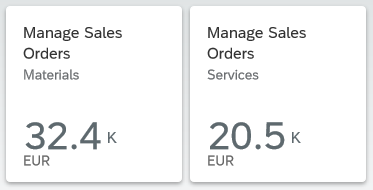
Currencies
Use the three-letter currency code instead of the currency symbol. This prevents ambiguity when multiple currencies share the same symbol.
Example:
EUR
USD
€
$
Singular/plural form
If the value you are describing is an item count that can be 1 or more, formulate the UI texts as follows:
- For labels and titles: Always use the plural, even if the field or list can contain just one item. This typically applies for list headings, table titles, column headings, icon tabs, and form fields.
- In descriptive or explanatory texts, such as messages: Differentiate between singular and plural cases, depending on the value.
Do not use parentheses “(s)” to express the plural. It will not work in all languages.
Examples:
Open Items [column heading in a table]
Copies [field label in a form]
Your subscription is due to expire in 1 day [message, singular case]
Your subscription is due to expire in 3 days [message, plural case]
Your subscription is due to expire in 1 day(s)
Case
Unless otherwise specified for individual UI elements, use title case for all SAP Fiori user interface short texts (labels, headings, value help texts, and so on), and sentence case for all messages and explanations.
Exceptions:
Always use sentence case for:
- Relative times
- Values and statuses that start with a number
Examples:
4 days ago
4 items left
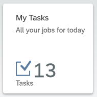
Consider using sentence case if a text is very long, making it difficult to read in title case.
For example, you might have a long status text, or long subtitles in the cards on an overview page.
Examples:
Material damaged in transit (status)
Sorted by turnover and region (card subtitle)
Status texts in a table column
If you opt to use sentence case for a certain text type, use it consistently in your context (for example, all subtitles for the cards on an overview page, or all the labels for a set of radio buttons or checkboxes).
Hyphenation
Do not use a hyphen for email.
OData service
Hyphenate OData service in German.
Example:
DE: OData-Service
Text wrap
Do not add manual hyphens to wrap texts (for example, on tiles or in column headings).
Punctuation
Colon
Colons after field labels
Place a colon after the field label if the field label and value are visually separate and do not form a running phrase or sentence.
Examples:
Description: Laser Jet Printer
Valid From: 09/13/2013
Forwarded by Joe Bloggs
For form fields, the colon is added automatically by the UI control. For other field labels, the colon must be added manually by the app development team.
Do not add a colon after titles (for example, in an object page header).
Colon as a separator
Use a colon to separate concatenated texts that would otherwise be hard to translate.
Note: If possible, avoid concatenated texts in the first place.
Example:
Search In: Sales Orders
Here, this format ensures that the verb comes at the beginning in all languages, and is never truncated.
Ellipsis (…)
Only use the ellipsis in the following cases:
- The user is waiting for the system to do something.
Note: In SAP Fiori, this is normally depicted by a graphical busy state, rather than a text. Check with your UX designer. - A menu item leads to a set of further menu options.
In this case, do not leave a space between the last letter and the ellipsis. Also, remember to capitalize the last word before the ellipsis, even if it is a short preposition.
Exception:
Use the ellipsis if you offer a browse button for selecting files.
Example:
Browse… (for example, in a file selection dialog)
Do not use the ellipsis for placeholders (input prompts) in entry fields. These are texts that show for empty field values, but disappear as soon as the user starts typing or selects a value.
Examples:
Search
www.example.com/
Search…
Enter a numeric key…
Period
Many SAP Fiori apps use texts from back-end systems that were written without an ending period, based on the ABAP guidelines. To avoid changing (and retranslating) a large number of legacy texts, we have adopted the following approach for SAP Fiori:
Use periods at the end of complete sentences:
- If your sentence is written out in full with all its grammatical components, use a period.
Rule of thumb: Add a period if your text is obviously incorrect without one.
Examples:
You don’t have authorization to view this page.
To start, enter your filter settings.
- If your sentence is incomplete, written in short form (implicit sentence), or very short, leave out the period.
Rule of thumb: The text does not look “wrong” without a period.
Examples:
Leave request created
No matching items found
Exception: Do not use a period for placeholders (input prompt texts).
Reason: This avoids a mixture of prompt texts with and without periods on one page.
Examples:
Enter an alphanumeric key
Enter a 3-digit code.
Punctuation in buttons and labels
Avoid using hyphens, colons, or parentheses in button texts. Use a preposition instead.
Examples:
Material Number for Receipt
Material Number – Receipt
Quotation marks
Only use quotation marks if you really need them. Note that numerical values are often easier to read without quotes.
Example:
Purchase order 12345678 was deleted.
If your string includes text variables, use double quotation marks to set off the inserted text from the rest of the text.
Example:
We can’t find the product “Printer XYZ”.
Titles
Avoid using quotation marks for concatenated title texts with text variables. Use a colon instead. If in doubt, check with your translation team.
Note: If possible, avoid concatenated texts in the first place.
Example:
Select: Products
Select “Products”
Slash
If you are using a slash to separate entirely distinct concepts, include a space before and after the slash. In this case, all the text before the slash belongs to one concept, and all the text after the slash belongs to another.
Example:
Insurance Type / Tax Rate
Amount in Local Currency / Due Date
Amount in Local Currency/Due Date
This is typically the case in SAP Fiori if:
- You have two adjacent field labels in a form.
Adjacent field labels in a form ('Postal Code' and 'City')
- You have two labels in a table column header.
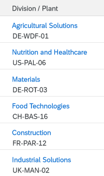
Two values in one column ('Division' and 'Plant')
- You are using the slash to separate items shown on one line.
Note: This is an exception. Normally, SAP Fiori uses commas to separate listed items.

Items in a breadcrumb
If all the texts separated by a slash (or slashes) qualify a term that precedes or follows, do not include a space before and after the slash
Example:
Plan/Actual Costs (both Plan and Actual relate to costs)
Configure Rules and Approved List of Suppliers/Manufacturers (list contains both suppliers and manufacturers)
Configure Rules and Approved List of Suppliers / Manufacturers (Manufacturers is not a standalone concept here)
Note: Even if you can use a slash to avoid redundancy (as in First/Last Name), we still recommend writing out both labels in full in forms and column headers (First Name / Last Name) – space permitting.
Exception: Tile Subtitles
In tile subtitles, space is very limited. You may need to leave out spaces before and after a slash even if the concepts are distinct.
However, you should be sure that the text can’t be misunderstood, especially if you are using compound terms.
Also bear in mind that if space is already tight in English, there may still not be space for the translated text.
Symbols
Do not use ampersands (&) in SAP Fiori apps or app names.
You can use other common symbols, such as %, but avoid more technical or mathematical symbols, such as ∑, <, >, =.
Exception: The use of an ampersand or other symbol is a widely-accepted standard in your business domain. For example, the short form S&OP is commonly used for sales and operations planning.
Avoid using symbols that can have multiple meanings (for example # can be a number, a metadata tag, or a phone extension number).
Bear in mind that symbols can be difficult to translate.
Examples:
% Confirmed
Due in less than 5 days
SWIFT Code: DEUTDE8L875
Due in < 5 days
SWIFT # DEUTDE8L875
Word Choice
Aborting an action
| Action | Description |
| Cancel | Standard term for aborting an action without saving any changes. |
Actions for requests
| Action | Description |
| Approve | Grant permission (for example, for budget or vacation). |
| Reject | Refuse permission. |
| Accept | Accept invitations. |
| Decline | Decline invitations. |
| Forward | Forward a request to a manager or decision-maker. |
Completing an action
(Finalizing action on the footer toolbar)
| Action | Description |
| Create | Save a new object to the database. It doesn’t matter how the object was created (from scratch, or by adapting a copy of an existing object). Create is used in both cases. |
| OK | Confirm settings that may or may not have been changed (for example, filter settings for a table). |
| Save | Standard action for saving changes to existing objects when no workflow is being triggered. |
| Save and Next <Qualifier> | Continue to the next screen or object (for example, in a workflow with sequence of activities).
Include a qualifier. While “Next” works as a standalone label in English, this is not the case for many other languages. Examples: |
| Submit | Submit to a workflow (for example, for manager approval). |
| Send | Send a request to another person, especially in employee apps (for example, a vacation request). |
| Next <Qualifier> | Continue to the next screen or object (for example, in a workflow with sequence of activities).
Include a qualifier. While “Next” works as a standalone label in English, this is not the case for many other languages. Examples: |
| Finish | Trigger the completion of a workflow or process.
Examples: |
Navigation actions
| Action | Description |
| Back | Go back to the previous screen. |
| Next <Qualifier> | Continue to the next screen or object (for example, in a workflow with a sequence of activities, or when navigating to the next image in a carousel).
Include a qualifier. While “Next” works as a standalone label in English, this is not the case for many other languages. Examples: |
| Previous <Qualifier> | Navigate back to the last object or image (for example, the previous image in a carousel).
Include a qualifier. While “Previous” works as a standalone label in English, this is not the case for many other languages. Examples: |
Contact details
| Label | Description |
| Phone | Landline phone |
| Mobile | Cell phone |
| Email address |
Creating an object or item
(also see the naming guidelines on the Manage Objects page)
| Action | Description |
| Add | Add an existing item to a list.
Example: |
| Create | Create a new object (either from scratch, or by adapting a copy of an existing object).
Example: |
| Create and New | Create an object from scratch and return to the create screen to add another new object. |
| New <Object> | Title of an object until the name has been defined (for example, on an object page or “create” dialog).
Example: |
| Copy |
Create a new object or item based on an existing one. In this case, the user adapts the core data copied from an existing object.
Do not use Duplicate. |
| Copy of <Object> | Title of new object until the name has been defined.
Example: |
Country
Do not use the label Country for politically controversial territories, such as “Taiwan”, or special regions like “Hong Kong”. This affects all values or selection lists that may contain such territories. An alternative label might be Country/Region, depending on your context.
Exporting content
Use the following standard labels for download icons in a toolbar:
- Export to PDF
- Export to Spreadsheet
Do not refer to specific products.
Example:
Export to Excel
Global actions
Use the following standard labels for the global actions toolbar:
| Action | Description |
| Copy | Copy the current object to create a new object. |
| Edit | Make changes to an existing object. |
| Delete | Delete the current object. |
| Share | Tooltip text for the share icon. |
Local actions – Table toolbar
Use the following labels for standard actions in the table toolbar:
| Action | Description |
| Add | Add an existing object or item to a list. |
| Copy | Copy the selected object to create a new object. |
| Create | Create a new object or item. |
| Edit | Make changes to the selected object. |
| Delete | Delete the selected object. |
| Sort | Tooltip text for the icon. |
| Filter | Tooltip text for the icon. |
| Group | Tooltip text for the icon. |
Navigation
| Action | Description |
| Back | Go back to the previous screen. |
| Open [app] | Open an SAP Fiori app. Note: In the SAP Fiori environment, use the term “open” rather than “launch”. |
| Open in <App Name> | Open the current item in another app. |
| Open In… | Show a list of apps in which the current item can be opened. |
“No data” texts
When no data is available for the selection or filter criteria entered by the user, SAPUI5 displays a “No data” text by default. Replace the “No data” text with a more specific text:
- Where appropriate, refer to the business object handled by your app.
- If the user needs to change a setting to see data, offer a hint.
There are no rigid standard texts, since the the exact formulation you use will depend on where the “No data” text appears, and the logic of your application.
Examples:
No matching products found (for example, in a master list)
No products found. Try adjusting your search and filter settings. (for example, when no items are found for the selected filter criteria in a list report table)
Object administration
For object admin data, use the following standard labels:
- Created By
- Created On
- Changed By
- Changed On
Exceptions:
- If your app family has consistently used different labels (such as Last Changed By or Last Changed On), consider using the existing labels for new apps to avoid inconsistencies.
- If you are showing a relative date (such as Today or Yesterday), or a mixture of relative and absolute dates, use the labels Created and Changed instead of Created On and Changed On.
Translation
To ensure translatability, the label and value placeholder must be in one text string.
Example:
“Created By: <variable for name>”
What about combined date/time fields?
- In many apps, the date is the main reference point, even if both the date and time are shown. In this case, use the field labels Created On and Changed On.
- If the time is an important reference point for users, include both elements in the label:
Created On / Created At (or shorten to Created On/At)
Changed On / Changed At (or shorten to Changed On/At) - If users need to scan the exact times, consider using a separate field for the time to make scanning easier:
Created At
Changed At - Do not use Created At and Changed At as labels for joint fields where the date comes first.
“Please”
Use “please” judiciously:
- Do not use “please” unless you would also use it naturally in a spoken conversation.
- Consider using “please” if you are inconveniencing the user.
- Base your decision on your target group and language.
Removing and deleting items
| Action | Description |
| Delete | Delete the object or item itself. Use “Delete” if the object or item has already been actively saved.
Example: |
| Discard | Discard a draft for a new object, or a draft version containing changes to an existing object. Use “Discard” if the object or item has not yet been actively saved by the user.
Example: |
| Remove | Remove the reference to an item.
Example: |
Setting favorites
The tooltip label for the Favorite icon ( ) depends on how the app handles favorites:
| Action | Description |
| Mark as Favorite | Flag an item as a favorite without adding it to a list of favorites. |
| Add to Favorites | Flag an item as a favorite and add it to a list of favorites that the user can call up independently. |
For more information, see Flag and Favorite and Object Marker.
Showing more information
| Action | Description |
| Show Details | Show more information within the same page or dialog (for example, a message long text within a message dialog). |
| View Details (Charts) | Display additional information about a chart. |
| Show More | Expand a list or screen area. |
| Show Less | Collapse a list or screen area. |
| Show All | Show all the items in a list. |
Signing in and out
With SAP Fiori 2.0 (SAPUI5 version 1.40), Log On and Log Out were replaced by Sign In and Sign Out in the SAP Fiori launchpad.
Validity period
For a validity period, use the labels Valid From and Valid To.
If you have only one label for both values, use the label Valid From/To.
Writing for SAP CoPilot
As we develop more and more applications with built-in intelligence, the language we use to support and guide users takes on even greater significance. The voice of our digital assistant, SAP CoPilot, is key to making explanations and recommendations helpful and easy to consume.
Follow the guidelines below whenever you write texts for SAP CoPilot.
- Use conversational language (write as you would speak).
This makes it easier for the users to relate to SAP CoPilot. Conversational style is easier for most users to understand and conveys messages better. Conversational style can also include acknowledging phrases, such as OK, Thanks, Got it. They help to make a conversation more fluid and natural. - Use active voice and address the user directly.
- Use brief, precise, clear, and simple language.
- Be relevant.
- Don’t state the obvious.
- Avoid ambiguity.
- Use familiar and consistent words.
- Do not use abbreviations.
- Be polite, positive, and helpful.
- Never penalize the user.
- Take care with humor. Remember that we are talking to business users who need to get a job done. Do not upset them with amusing answers, especially when they make mistakes. Humorous expressions may not be understood in all cultures and do not translate well.
Guidelines for Specific Floorplans or UI Elements
Content Overview
Action
Button
Formulate button texts as actions, starting with a verb, and keep them as short as possible.
Examples:
Approve Order
Simulate Payment Run
Payment Run
Display Elements
Tooltip
Use tooltips only to show the labels for elements that have no text, such as icons.
Use title case.
Icon Buttons
If the icon represents an action, formulate the tooltip as an action, starting with a verb.
Exception: Standard labels used across the IT industry, such as Settings.
Describe the action that will be triggered by pressing the button. For example, Expand Header, Collapse Header.
If the icon button is a toggle button that merely changes its state (same icon button, “on” or “off” state), always use the positive action for the label. For example, Pin Header for both pinned and unpinned states.
Do not use tooltips if:
- A text label already exists. Do not create (redundant) tooltips for field labels that are written out in full and visible on the desktop.
- You want to abbreviate a text label. Instead, write the label out in full and ask development/UX to allow enough space for texts in all languages to avoid truncation. Always aim for a responsive solution that will allow users to view the full text on all devices.
- You want to provide an explanation. Use the Web Assistant instead.
Examples:
Share
Export to Spreadsheet
Maximize
Minimize
Displays the orders you have already processed (Additional tooltip for “Completed” label)
For more information, see Using Tooltips.
Messages
SAP Fiori uses a variety of messaging elements for different purposes. This section covers general guidelines for SAP Fiori messages, as well as text guidelines for specific message types.
General message guidelines
| Topic | Guideline |
| “Please” | Avoid overusing “please” in message texts. For example, it’s often not necessary when asking users to correct their entries.
Examples: |
| Singular/plural | Use separate strings for singular and plural cases. Do not use “(s)”. |
| Semicolons | Do not use semicolons to separate phrases in a message text. Instead, use two separate sentences ending with periods.
Although semicolons are not incorrect, you are unlikely to see semicolons in modern mobile app interfaces. |
| Variables | Use a single string for messages, including variables. This is necessary to enable translators to change the word order for other languages.
If you need to set off text variables in messages, use double quotation marks. Do not use text variables. This can lead to grammatical errors in other languages. Examples: Before using variables, consider using distinct error messages for each use case. This often allows you to write a friendlier text that is easier to read and translate than a text designed for reuse. |
Form field validation
Instruct the user what to do to correct the error. Avoid generic error messages.
Examples:
Select a supplier
Invalid entry
Enter a valid value
If a value for a required field is missing, use the standard formulation:
<Field Label> is a required field (*).
Example:
Email is a required field (*).
For more information, see Form Field Validation.
Message box
(message/confirmation prompt)
| Topic | Guideline |
| Heading | For message dialogs, use only the standard headings: Error, Warning, Information, Success
For confirmation dialogs, use the imperative of the action being confirmed. If the verb alone would be ambiguous, add a qualifier. Special Case: Confirming Deletion |
| Message text | Avoid showing system or configuration details in a message short text. Move technical information to the long text.
Do not repeat the short text in the long text. Otherwise, the text shows twice when the long text is expanded. Confirmation prompts: If your target user is likely to see the message frequently, use a short form that’s easy to scan. Examples: Confirmation prompts: If the confirmation dialog allows the user to enter a note, use sentence style for the input prompt. Success messages: Do not use “successfully.” |
| Buttons | Use action verbs for buttons in all dialogs that involve a decision with a specific action.
Exception: If naming the action takes up too much space, formulate the message as a statement, and use the OK/Cancel buttons. Also consider translation. If the mobile use case is critical for your application, always test on a mobile device. Error messages: Use Close instead of OK as the button text for closing an error message.Use OK if the user is just acknowledging a piece of information or a group of settings. Do not combine questions with OK/Cancel buttons. Avoid Yes/No buttons. |
For more information, see Message Box.
Object Page
Headings
Use title case for the headings in anchors or tabs.
Avoid repeating the section/anchor heading in a subsection heading.
Exception: If you need explicit subsection headers, and the only meaningful term for a subsection is the same as the overall section name, use the same term. Do not use different terms for exactly the same concept. Instead, think about framing your content differently so that the concept for an overall section doesn’t overlap too much with the concept for an individual subsection.
If different apps in your app family group data in similar ways, consider aligning the section headings.
Tables
Column headings
| Topic | Guideline |
| Column headings with multiple labels | If a table column contains multiple values, use a slash to separate the labels in the column heading. Include a space before and after the slash.
Examples: |
| Singular vs. plural | Use the singular in the column heading if there is only one entry per table row.
Examples: |
Table content
| Topic | Guideline |
| Blank/empty fields | Leave fields without a value blank.
Examples: |
| Table fields with “null” values | If the back end returns a “null” value for a table field, also leave the field blank. In most use cases, it will not be critical for end users to know exactly why a field is not filled (“null” value that is never supplied by the back-end system, or “empty” value that might be filled later).
In exceptional cases only: If it is critical for your use case to distinguish between “null” and “empty” values, you can consider showing a text for either “null” values or “empty” values. Examples:
If you are likely to have several “empty” and “null” value fields in your table, we strongly recommend leaving all the fields blank. This makes the table much easier to scan and helps users recognize fields that are actually populated. |
User input
Input field
| Topic | Guideline |
| Placeholder |
Only offer placeholder text (input prompt) if you need to provide an additional hint. Do not repeat the label in the placeholder text. Never use placeholders instead of labels. Use sentence case. Do not use a period or ellipsis at the end of the text. Use a consistent style for all input prompts on one page (the style may vary, depending on your use case). For URL or email address placeholders, use the domain example.com. Examples: |
| Showing a previous value | If you need to indicate the previous value for a field, add the following text after the field value:
Previously: <Old Value> Note: This is not a standard feature for forms, but may be required for some use cases. Example: |
Wizard floorplan
Wizard steps
If you are using the wizard floorplan, formulate the texts for each step as follows:
Use a noun for the name of the step (for example, Customer). This text appears in 3 places:
- The header of the walkthrough screen (showing all steps)
- The heading for each step on the walkthrough screen
- The heading for each section on the summary screen
Offer an explanatory text for each step in the walkthrough screen (sap.m.text). Phrase this text as an instruction (for example, Enter the payment details.)
Note: This explanatory text does not show in the wizard summary.
What’s New in Guideline Version 1.86
This article provides an overview of the updates to the SAP Fiori web design guidelines with guideline version 1.86.
Get Started
| Topic | Update | Topic Link |
Best Practices for Designing SAP Fiori Apps New! |
Are you new to the design process and unsure how to begin? This new article will provide you with all the basic info you need to get off to a good start.
You can find this article on the Get Started overview page. |
Best Practices for Designing SAP Fiori Apps |
Foundation
| Topic | Update | Topic Link |
Accessibility |
Additional information on what needs to be provided at application level to support accessibility:
|
Accessibility |
Design-Led Development Process |
The article has been updated to reflect the new process: Explore – Discover – Design – Deliver – Run & Scale. | Design-Led Development Process |
Quartz Dark Colors |
The lighter information text color #C0E0FA / rgb(192, 224, 250) is no longer available. | Quartz Dark Colors – Semantic Colors |
Quartz Light Colors |
The color for information texts #053B70 / rgb(5, 59, 112) is no longer available. | Quartz Light Colors – Semantic Foreground Colors |
Designing Intelligent Systems
| Topic | Update | Topic Link |
Designing Intelligent Systems |
Updated general advice on how to approach design for intelligent systems. | Designing Intelligent Systems |
Recommendations |
New section on content recommendations. This outlines the motivation and criteria for offering additional content artifacts (such as documents, files, links, or videos) to support the user’s decision-making process. | Recommendations |
General Concepts
| Topic | Update | Topic Link |
Which Selection Control Should I Use |
This article has been fully revised to incorporate feedback from designers. | Selection Controls – Overview |
Layouts, Floorplans, & Frameworks
Layouts
| Topic | Update | Topic Link |
Comparison Pattern |
The expand/collapse header and pin/unpin header features work as described in the dynamic page article. | Comparison Pattern – Header Area |
Floorplans
| Topic | Update | Topic Link |
Analytical List Page |
Updated guidance for the initial focus. | Analytical List Page – Initial Focus |
Initial Page |
Guidance on initial focus was added. | Initial Page – Initial Focus |
List Report |
Updated guidance for the initial focus. | List Report – Initial Focus |
Object Page |
Section on the rating indicator facet was updated.
Freestyle object pages: Developer hint on responsiveness in the content area. |
Object Page Floorplan |
SAP Fiori Elements (New)
| Topic | Update | Topic Link |
SAP Fiori Elements New! |
A new section of the guidelines about how to design apps developed with Fiori Elements, including:
|
SAP Fiori Elements Overview |
UI Elements
| Topic | Update | Topic Link |
Checkbox |
Information on edit and display modes added. | Checkbox – Properties |
Form/Simple Form |
Article sections restructured and information on the column layout added to Responsiveness section. | Form/Simple Form – Responsiveness |
Icon Tab Bar |
New section for the recently added “Badge” feature. | Icon Tab Bar – Badge |
Image |
Provide each image with an alternative text containing a description of the visual content. | Image – Guidelines |
Smart Field New! |
Comprehensive article on the smart field service available for OData version 2.
|
Smart Field |
Value Help Dialog |
Refreshed design to improve user efficiency. The guideline article has been fully revised. | Value Help Dialog |
View Settings |
Behavior and Interaction / Filtering: “Show Selected Only” section added. Users can toggle the display to show all filters or only the filters that have been selected. | View Settings – Show Selected Only |
Services and Resources
| Topic | Update | Topic Link |
SAP Fiori Design Stencils |
Download for SAP icon font updated to version 4.8. | SAP Fiori Design Stencils – Overview |
Sketch |
What’s New in Sketch Stencil Version 1.86 | Design Stencils for Sketch |
Axure RP |
What’s New in Axure RP Stencil Version 1.86 | Design Stencils for Axure RP |
Adobe XD |
What’s New in Adobe XD Stencil Version 1.86 | Design Stencils for Adobe XD |
User Research Method Cards New! |
Not sure which user research method to use? You can now download a card deck that provides an overview of the 14 most commonly practiced user research methods at SAP and when to apply them. | User Research Method Cards |
About Guideline Updates
With each new guideline version, we deliver two types of update:
- Updates to reflect new or changed UI controls available with SAPUI5.
- Ongoing updates on how to best apply the SAP Fiori design (such as overarching concepts, floorplans, and additional decision support). These updates are introduced with a given guideline version, but are not necessarily dependent on a specific SAPUI5 version.
Note: Our policy is to update only the latest guideline version. If you are working with an earlier SAPUI5 release, also consider checking out the most recent guideline version to get the latest general guidance.
Design Stencils for Adobe XD
You can use this stencil set to create high-fidelity SAP Fiori designs using Adobe XD.
For more information about SAP Fiori design stencils and other tool options, see Design Stencils.
Prerequisites
To use the SAP Fiori stencils, you need to install SAP’s 72 font family and the SAP icon font on your machine.
These fonts are provided as part of the stencil download package. See Download and Installation below.
Download & Installation
- Install the Adobe XD software.
- Download and unpack the ZIP file in the download box.
- Install font 72.*
- Choose the folder Font 72 / 72_Desktop.
- Double-click each .ttf file and click Install.
- Install the SAP icon font.
- Remove any former versions of the SAP icon font.
- Choose the folder Icon Fonts / …final icon package / Fonts
- Double-click the SAP-icons.ttf file, and click Install.
- Optional: Install the SAP Business Suite icon font.
- Remove any former versions of the SAP Business Suite icon font.
- Choose the folder Icon Fonts / …final icon package / Fonts
- Double-click the BusinessSuiteInAppSymbols.ttf file, and click Install.
- Open the Adobe XD stencil file and save it as a duplicate.
The duplicate is your working document for visualizing your SAP Fiori app. All the available stencils are now available as assets in the sidebar on the left, including character styles, and components (stencils).
Searching for an object page in the asset panel
*The 72 font download is made available under the Apache 2.0 license.
Design Stencils for Axure RP (Mac and Windows)
Intro
You can use this stencil set to create high-fidelity SAP Fiori designs using Axure RP.
For more information about SAP Fiori design stencils in general and other tool options, see Design Stencils.
Prerequisites
- Axure RP 9 is required to use the stencils.
- To use the SAP Fiori stencils, you need to install SAP’s 72 font family and the SAP icon font on your machine. These fonts are provided as part of the stencil download package. See Download & Installation below.
Download & Installation
- Install the Axure RP software.
- Download the design stencil set: Download the ZIP file and unzip it.
- Install font 72.
- Choose the folder Font 72 / 72_Desktop.
- Double-click each .ttf file and click Install.
- Open Axure RP and change the default font within Axure RP to font 72 by using the Widget Style Manager (Project / Widget Style Manager / Default / change font to “72”).
- Install the SAP icon font.
- Remove any former versions of the SAP icon font.
- Choose the folder Icon Fonts / …final icon package / Fonts
- Double-click the SAP-icons.ttf file, and click Install.
- Load the libraries in Axure RP: Open Axure RP and load the libraries for the stencils and icon font (tutorial).
- Optional: Install and load the SAP Business Suite icon font.
Loading libraries (1)
Loading libraries (2)
Loading libraries (3)
All the available stencils are now displayed in the library panel on the left and you can easily pull the stencil you need to your canvas board.
Pulling a stencil to the canvas board
Embedding Fonts into HTML Exports (Optional)
You can use a simplified method to embed fonts in Axure RP. These include:
- SAP-icons
- SAP-icons-TnT
- BusinessSuiteInAppSymbols
- 72
Tip: You can browse the three icon fonts in the Icon Explorer.
Online Usage
Follow the steps below:
- In Axure RP, choose Publish and Generate HTML Files….
- In the subsequent dialog, open the other options (settings wheel) and choose the Fonts tab. If the tab is empty, choose Add Font.
- Under WEB FONTS, enter a font label, such as all SAP fonts (or similar).
- Choose Link to .css file and enter the following URL:
https://experience.sap.com/files/prototypes/public/fonts/all_fonts.css
You can now export your mock-ups, and everyone with internet access sees all icons and the 72 font right away.
These settings are saved only for your current Axure RP project. Repeat this procedure for every Axure RP project you want to share with others.
Offline Usage
If you are heading to usability tests with new or re-imaged laptops, or if you don’t have an internet connection, you’ll need to make sure that all icon fonts used in your prototype are installed on the devices. Alternatively, you can just use the fonts package:
- In Axure RP, choose Publish and Generate HTML Files….
- In the subsequent dialog, open the other options (settings wheel) and choose the Fonts tab. If the tab is empty, choose Add Font.
- Under WEB FONTS, enter a font name, such as all SAP fonts (or similar).
- Choose Link to .css file and enter the following URL:
all_fonts.css
- Download the following file:
https://experience.sap.com/files/prototypes/public/fonts/all_fonts.zip - Unpack the file to the directory to which you also generate your HTML files (where the index.html is).
All icons are now available offline, without installing fonts.
SAP Business Suite Icon Font (Optional)
The SAP Business Suite Icon Font (BusinessSuiteInAppSymbols) contains application-specific icons primarily used in SAP S/4HANA apps.
Important! To use this font in your app, it must be registered as a custom font in sap.ui.core.IconPool.
Procedure
To add Business Suite icons to your Axure RP mockup, proceed as follows:
- Remove any former versions of the SAP Business Suite icon font.
- In the download files for the standard SAP Fiori design stencils, unpack the ZIP file IconHTMLTemplate_InAppSymbols_….zip.
- Open the Fonts folder and install the BusinessSuiteInAppSymbols.ttf file.
- Load the widget library BusinessSuiteIcons_…rplib file into Axure’s Libraries panel.
Design Stencils for Sketch (Mac)
You can use this stencil set to create high-fidelity SAP Fiori designs using Sketch.
For more information about SAP Fiori design stencils in general and other tool options, see Design Stencils.
Prerequisites
To use the SAP Fiori stencils, you need to install SAP’s 72 font family and the SAP icon font on your machine.
These fonts are provided as part of the stencil download package. See Download and Installation below.
Download and Installation
- Install the Sketch software.
- Download and unpack the ZIP file.
- Save the the Fiori3_Stencils_Master.sketch file to a dedicated folder on your machine.
When you download an updated version in future, make sure that the new file replaces the existing file. This enables Sketch to identify the update automatically. - Use the SAP Fiori master file as a library within your own Sketch file. To do so, open Sketch, go to Sketch / Preferences / Libraries, and add the library to the list.
- Install font 72.*
- Choose the folder Font 72 / 72_Desktop.
- Double-click each .ttf file and click Install.
- Install the SAP icon font.
- Remove any former versions of the SAP icon font.
- Choose the folder Icon Fonts / …final icon package / Fonts
- Double-click the SAP-icons.ttf file and click Install.
- Optional: Install the SAP Business Suite icon font.
- Remove any former versions of the SAP Business Suite icon font.
- Choose the folder Icon Fonts / …final icon package / Fonts
- Double-click the BusinessSuiteInAppSymbols.ttf file and click Install.
*The 72 font download is made available under the Apache 2.0 license.
Using the Sketch Stencils
Symbols
All the available stencils are now available as “symbols” within your file in the Symbols menu. To use a stencil, pull it to your canvas board.
Adding a symbol/stencil to the canvas board (1)
Text and Layer Styles
In addition, you can choose from all appearances (text styles and layer styles) that are offered in the Insert menu or in the navigation panel on the right of your Sketch file.
Text style popup
Top Tips
Customize your Sketch toolbar
Customize your toolbar within Sketch based on your personal preferences. To do this, right-click on the toolbar in Sketch and choose Customize Toolbar…. You can now pull any menu you want to the highlighted empty boxes.
Recommended menus for working effectively:
- Artboard
- Symbols
- Text Styles
Stay up-to-date
Always download updated files to a specific folder. As soon as a new version is released, put it into your stencil folder by overwriting the old file. This ensures that your working files files are updated to the latest version (find the hint in the top right of Sketch).
Don’t change symbols
Don’t overwrite symbols within the original document. This changes the symbol in all the places where a symbol is consumed. Instead, change the symbol using the Overrides panel on the right. In the Overrides panel you can change all elements within the object you selected.
Let symbols be symbols
Don’t detach elements from symbols. This ensures that your file stays up-to-date with the latest symbols from the SAP Fiori stencil set for Sketch.
SAP Fiori Design Stencils
Intro
Design stencils are ready-to-use, high-fidelity drafts of SAP Fiori UI components. You can use them to visualize SAP Fiori apps and to get a realistic impression of your final design.
Stencil sets are available for Sketch, Axure RP, and Adobe XD.
What’s In the Stencil Set?
The SAP Fiori design stencils include:
- Patterns for foundation topics, such as shadow levels, grid, colors, and more
- Page types (floorplans)
- Controls
- Helper tools, such as rem squares or px spacings to build your app according to the current specifications and implementations. We’ve also included interaction tools, such as like cursors and touch visualizations.
The following stencil sizes are available for your mockups:
- S (414 px)
- M (600 px and 834 px)
- L (1024 px)
- XL (1440 px)
In addition, each stencil set includes download files for:
- Font 72, the standard typeface for SAP Fiori apps
- The standard SAP icon font and the SAP Business Suite icon font
Download Stencils
You can download stencil packages for your preferred tool (Sketch, Axure RP, or Adobe XD).
For download and installation instructions, see the pages below for each tool.
Download Font 72
Font 72 is SAP’s proprietary typeface, and is the standard typeface for SAP Fiori apps. You can download the font separately here, or download one of the tool-based stencil sets above, which all include the font.
Procedure
- Download the desktop and web font families.
- Unpack the ZIP files 72_Desktop / 72_Web.
- Double-click each .ttf file and click Install.
The 72 font download is made available under the Apache 2.0 license.
Download Icon Font
SAP Icon Font
To use the stencils, you need to install the standard SAP icon font. You’ll also need to install this font locally if you want to display SAP Fiori icons in other applications, such as PowerPoint. For more information about the SAP icon font, see Iconography.
The SAP icon font is also included in the stencil sets for Axure RP and Sketch.
Procedure
- Remove any former versions of the SAP icon font.
- Download and unpack the ZIP file sap-icons_… .zip .
- Double-click the SAP-icons.ttf file, and click Install.
SAP Business Suite Icon Font (Optional)
In some application areas, you may also need to use the SAP Business Suite Icon Font (BusinessSuiteInAppSymbols). This icon font contains application-specific icons primarily used in SAP S/4HANA apps.
Important: To use the SAP Business Suite icon font in your app, it must be registered as a custom font in sap.ui.core.IconPool.
Procedure
- Download and unpack the ZIP file BusinessSuiteInAppSymbols_...zip.
- Install the SAP Business Suite icon font: Double-click the BusinessSuiteInAppSymbols.ttf file and click Install.
Related Links
Other Resources
UI Text Guidelines for SAP Fiori Apps
This page contains product-specific UI text guidelines for SAP Fiori. It is split into two parts:
- General guidelines that affect multiple floorplans or UI elements
- Guidelines for specific floorplans or UI elements
About this guideline
The SAP Fiori UI text guidelines are not exhaustive. They build on the other writing guidelines at SAP, and cover only specific conventions for SAP Fiori applications. The guidelines have evolved on an as-needed basis to clarify questions that have arisen during SAP Fiori app development, or to reiterate points that recur in SAP Fiori app design reviews.
The guidelines are based on US English, the primary source language at SAP. There are no specific SAP Fiori text guidelines for other languages.
Finding your way
See the content overview at the beginning of each section to navigate. You can also return to the start of each section at any time using the anchors in the header area.
General Guidelines
Content Overview
Abbreviatons
Using abbreviations
Limit the use of abbreviations as much as possible to avoid unnecessary abbreviations appearing on the desktop, where space is often sufficient.
Test your screens on all three device types (smartphone, tablet, and desktop) to ensure that you see the labels live in each case. Optimize as required and as far as space allows.
Abbreviating “Quantity”
Do not use the abbreviated form Qty. Abbreviations in other languages do not work. If there is enough space on the screen, spell out the full word.
Application names
General rules
Ensure that the title of app (initial screen) matches the title on the tile.
Do not use the tile subtitle for explanations. Use the subtitle only for differentiating information.
Background: Explanations are often redundant, and will typically be truncated in some target languages.
Don't
Don't use the tile subtitles for hints or explanations
Do
You can use tile subtitles to differentiate between similar apps
Transactional or hybrid apps
If the user can make changes to the data on the database, start the app name with a verb.
Exceptions:
For employee self-service apps, start the name with My.
If the key focus of the app is to process items assigned to the user, start the name with My.
For approval apps, start the name with Approve.
Use the plural for the business object, as the user can generally process more than one object within the app.
Examples:
Create Billing Documents
My Timesheet
My Open Worklists
Approve Supplier Invoices
Analytical apps
Use a noun-based name and avoid the word “analysis” (to avoid unnecessary repetition across all analytical apps).
Exception: If your app offers analytical data that is specific to the current user, you may start the name with My.
Use the plural for the business object where it makes sense.
Examples:
Journal Entries
Liquidity Forecast
Cash Flow
Cash Flow Analysis
If your app also allows users to take action after analyzing the data (hybrid app), use the naming guidelines for transactional/hybrid apps.
Overview page
Use a noun-based name.
Do not use the term “Overview Page”. This is just the name of the floorplan. However, it’s fine to use “Overview” on its own.
Examples:
Quality Engineer Overview
My Sales Overview
Quality Technician Overview Page
Formatting
Currencies
Use the three-letter currency code instead of the currency symbol. This prevents ambiguity when multiple currencies share the same symbol.
Example:
EUR
USD
€
$
Singular/plural form
If the value you are describing is an item count that can be 1 or more, formulate the UI texts as follows:
- For labels and titles: Always use the plural, even if the field or list can contain just one item. This typically applies for list headings, table titles, column headings, icon tabs, and form fields.
- In descriptive or explanatory texts, such as messages: Differentiate between singular and plural cases, depending on the value.
Do not use parentheses “(s)” to express the plural. It will not work in all languages.
Examples:
Open Items [column heading in a table]
Copies [field label in a form]
Your subscription is due to expire in 1 day [message, singular case]
Your subscription is due to expire in 3 days [message, plural case]
Your subscription is due to expire in 1 day(s)
Case
Unless otherwise specified for individual UI elements, use title case for all SAP Fiori user interface short texts (labels, headings, value help texts, and so on), and sentence case for all messages and explanations.
Exceptions:
Always use sentence case for:
- Relative times
- Values and statuses that start with a number
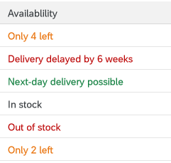
Examples:
4 days ago
4 items left
Consider using sentence case if a text is very long, making it difficult to read in title case.
For example, you might have a long status text, or long subtitles in the cards on an overview page.
Examples:
Material damaged in transit (status)
Sorted by turnover and region (card subtitle)
Status texts in a table column
If you opt to use sentence case for a certain text type, use it consistently across your UI or app.
Hyphenation
Do not use a hyphen for email.
OData service
Hyphenate OData service in German.
Example:
DE: OData-Service
Text wrap
Do not add manual hyphens to wrap texts (for example, on tiles or in column headings).
Punctuation
Colon
Colons after field labels
Place a colon after the field label if the field label and value are visually separate and do not form a running phrase or sentence.
Examples:
Description: Laser Jet Printer
Valid From: 09/13/2013
Forwarded by Joe Bloggs
For form fields, the colon is added automatically by the UI control. For other field labels, the colon must be added manually by the app development team.
Do not add a colon after titles (for example, in an object page header).
Colon as a separator
Use a colon to separate concatenated texts that would otherwise be hard to translate.
Note: If possible, avoid concatenated texts in the first place.
Example:
Search In: Sales Orders
Here, this format ensures that the verb comes at the beginning in all languages, and is never truncated.
Ellipsis (…)
Only use the ellipsis in the following cases:
- The user is waiting for the system to do something.
Note: In SAP Fiori, this is normally depicted by a graphical busy state, rather than a text. Check with your UX designer. - A menu item leads to a set of further menu options.
In this case, do not leave a space between the last letter and the ellipsis. Also, remember to capitalize the last word before the ellipsis, even if it is a short preposition.
Exception:
Use the ellipsis if you offer a browse button for selecting files.
Example:
Browse… (for example, in a file selection dialog)
Do not use the ellipsis for placeholders (input prompts) in entry fields. These are texts that show for empty field values, but disappear as soon as the user starts typing or selects a value.
Examples:
Search
www.example.com/
Search…
Enter a numeric key…
Period
Many SAP Fiori apps use texts from back-end systems that were written without an ending period, based on the ABAP guidelines. To avoid changing (and retranslating) a large number of legacy texts, we have adopted the following approach for SAP Fiori:
Use periods at the end of complete sentences:
- If your sentence is written out in full with all its grammatical components, use a period.
Rule of thumb: Add a period if your text is obviously incorrect without one.
Examples:
You don’t have authorization to view this page.
To start, enter your filter settings.
- If your sentence is incomplete, written in short form (implicit sentence), or very short, leave out the period.
Rule of thumb: The text does not look “wrong” without a period.
Examples:
Leave request created
No matching items found
Exception: Do not use a period for placeholders (input prompt texts).
Reason: This avoids a mixture of prompt texts with and without periods on one page.
Examples:
Enter an alphanumeric key
Enter a 3-digit code.
Punctuation in buttons and labels
Avoid using hyphens, colons, or parentheses in button texts. Use a preposition instead.
Examples:
Material Number for Receipt
Material Number – Receipt
Quotation marks
Only use quotation marks if you really need them. Note that numerical values are often easier to read without quotes.
Example:
Purchase order 12345678 was deleted.
If your string includes text variables, use double quotation marks to set off the inserted text from the rest of the text.
Example:
We can’t find the product “Printer XYZ”.
Titles
Avoid using quotation marks for concatenated title texts with text variables. Use a colon instead. If in doubt, check with your translation team.
Note: If possible, avoid concatenated texts in the first place.
Example:
Select: Products
Select “Products”
Slash
If you are using a slash to separate entirely distinct concepts, include a space before and after the slash. In this case, all the text before the slash belongs to one concept, and all the text after the slash belongs to another.
Example:
Insurance Type / Tax Rate
Amount in Local Currency / Due Date
Amount in Local Currency/Due Date
This is typically the case in SAP Fiori if:
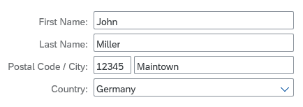
- You have two adjacent field labels in a form.
Adjacent field labels in a form ('Postal Code' and 'City')
- You have two labels in a table column header.
Two values in one column ('Division' and 'Plant')
- You are using the slash to separate items shown on one line.
Note: This is an exception. Normally, SAP Fiori uses commas to separate listed items.
Items in a breadcrumb
If all the texts separated by a slash (or slashes) qualify a term that precedes or follows, do not include a space before and after the slash
Example:
Plan/Actual Costs (both Plan and Actual relate to costs)
Configure Rules and Approved List of Suppliers/Manufacturers (list contains both suppliers and manufacturers)
Configure Rules and Approved List of Suppliers / Manufacturers (Manufacturers is not a standalone concept here)
Note: Even if you can use a slash to avoid redundancy (as in First/Last Name), we still recommend writing out both labels in full in forms and column headers (First Name / Last Name) – space permitting.
Exception: Tile Subtitles
In tile subtitles, space is very limited. You may need to leave out spaces before and after a slash even if the concepts are distinct.
However, you should be sure that the text can’t be misunderstood, especially if you are using compound terms.
Also bear in mind that if space is already tight in English, there may still not be space for the translated text.
Symbols
Do not use ampersands (&) in SAP Fiori apps or app names.
You can use other common symbols, such as %, but avoid more technical or mathematical symbols, such as ∑, <, >, =.
Exception: The use of an ampersand or other symbol is a widely-accepted standard in your business domain. For example, the short form S&OP is commonly used for sales and operations planning.
Avoid using symbols that can have multiple meanings (for example # can be a number, a metadata tag, or a phone extension number).
Bear in mind that symbols can be difficult to translate.
Examples:
% Confirmed
Due in less than 5 days
SWIFT Code: DEUTDE8L875
Due in < 5 days
SWIFT # DEUTDE8L875
Word Choice
Aborting an action
| Action | Description |
| Cancel | Standard term for aborting an action without saving any changes. |
Actions for requests
| Action | Description |
| Approve | Grant permission (for example, for budget or vacation). |
| Reject | Refuse permission. |
| Accept | Accept invitations. |
| Decline | Decline invitations. |
| Forward | Forward a request to a manager or decision-maker. |
Completing an action
(Finalizing action on the footer toolbar)
| Action | Description |
| Create | Save a new object to the database. It doesn’t matter how the object was created (from scratch, or by adapting a copy of an existing object). Create is used in both cases. |
| OK | Confirm settings that may or may not have been changed (for example, filter settings for a table). |
| Save | Standard action for saving changes to existing objects when no workflow is being triggered. |
| Save and Next <Qualifier> | Continue to the next screen or object (for example, in a workflow with sequence of activities).
Include a qualifier. While “Next” works as a standalone label in English, this is not the case for many other languages. Examples: |
| Submit | Submit to a workflow (for example, for manager approval). |
| Send | Send a request to another person, especially in employee apps (for example, a vacation request). |
| Next <Qualifier> | Continue to the next screen or object (for example, in a workflow with sequence of activities).
Include a qualifier. While “Next” works as a standalone label in English, this is not the case for many other languages. Examples: |
| Finish | Trigger the completion of a workflow or process.
Examples: |
Navigation actions
| Action | Description |
| Back | Go back to the previous screen. |
| Next <Qualifier> | Continue to the next screen or object (for example, in a workflow with a sequence of activities, or when navigating to the next image in a carousel).
Include a qualifier. While “Next” works as a standalone label in English, this is not the case for many other languages. Examples: |
| Previous <Qualifier> | Navigate back to the last object or image (for example, the previous image in a carousel).
Include a qualifier. While “Previous” works as a standalone label in English, this is not the case for many other languages. Examples: |
Contact details
| Label | Description |
| Phone | Landline phone |
| Mobile | Cell phone |
| Email address |
Creating an object or item
(also see the naming guidelines on the Manage Objects page)
| Action | Description |
| Add | Add an existing item to a list.
Example: |
| Create | Create a new object (either from scratch, or by adapting a copy of an existing object).
Example: |
| Create and New | Create an object from scratch and return to the create screen to add another new object. |
| New <Object> | Title of an object until the name has been defined (for example, on an object page or “create” dialog).
Example: |
| Copy |
Create a new object or item based on an existing one. In this case, the user adapts the core data copied from an existing object.
Do not use Duplicate. |
| Copy of <Object> | Title of new object until the name has been defined.
Example: |
Country
Do not use the label Country for politically controversial territories, such as “Taiwan”, or special regions like “Hong Kong”. This affects all values or selection lists that may contain such territories. An alternative label might be Country/Region, depending on your context.
Exporting content
Use the following standard labels for download icons in a toolbar:
- Export to PDF
- Export to Spreadsheet
Do not refer to specific products.
Example:
Export to Excel
Global actions
Use the following standard labels for the global actions toolbar:
| Action | Description |
| Copy | Copy the current object to create a new object. |
| Edit | Make changes to an existing object. |
| Delete | Delete the current object. |
| Share | Tooltip text for the share icon. |
Local actions – Table toolbar
Use the following labels for standard actions in the table toolbar:
| Action | Description |
| Add | Add an existing object or item to a list. |
| Copy | Copy the selected object to create a new object. |
| Create | Create a new object or item. |
| Edit | Make changes to the selected object. |
| Delete | Delete the selected object. |
| Sort | Tooltip text for the icon. |
| Filter | Tooltip text for the icon. |
| Group | Tooltip text for the icon. |
Navigation
| Action | Description |
| Back | Go back to the previous screen. |
| Open [app] | Open an SAP Fiori app. Note: In the SAP Fiori environment, use the term “open” rather than “launch”. |
| Open in <App Name> | Open the current item in another app. |
| Open In… | Show a list of apps in which the current item can be opened. |
“No data” texts
When no data is available for the selection or filter criteria entered by the user, SAPUI5 displays a “No data” text by default. Replace the “No data” text with a more specific text:
- Where appropriate, refer to the business object handled by your app.
- If the user needs to change a setting to see data, offer a hint.
There are no rigid standard texts, since the the exact formulation you use will depend on where the “No data” text appears, and the logic of your application.
Examples:
No matching products found (for example, in a master list)
No products found. Try adjusting your search and filter settings. (for example, when no items are found for the selected filter criteria in a list report table)
Object administration
For object admin data, use the following standard labels:
- Created By
- Created On
- Changed By
- Changed On
Exceptions:
- If your app family has consistently used different labels (such as Last Changed By or Last Changed On), consider using the existing labels for new apps to avoid inconsistencies.
- If you are showing a relative date (such as Today or Yesterday), or a mixture of relative and absolute dates, use the labels Created and Changed instead of Created On and Changed On.
Translation
To ensure translatability, the label and value placeholder must be in one text string.
Example:
“Created By: <variable for name>”
What about combined date/time fields?
- In many apps, the date is the main reference point, even if both the date and time are shown. In this case, use the field labels Created On and Changed On.
- If the time is an important reference point for users, include both elements in the label:
Created On / Created At (or shorten to Created On/At)
Changed On / Changed At (or shorten to Changed On/At) - If users need to scan the exact times, consider using a separate field for the time to make scanning easier:
Created At
Changed At - Do not use Created At and Changed At as labels for joint fields where the date comes first.
“Please”
Use “please” judiciously:
- Do not use “please” unless you would also use it naturally in a spoken conversation.
- Consider using “please” if you are inconveniencing the user.
- Base your decision on your target group and language.
Removing and deleting items
| Action | Description |
| Delete | Delete the object or item itself. Use “Delete” if the object or item has already been actively saved.
Example: |
| Discard | Discard a draft for a new object, or a draft version containing changes to an existing object. Use “Discard” if the object or item has not yet been actively saved by the user.
Example: |
| Remove | Remove the reference to an item.
Example: |
Setting favorites
The tooltip label for the Favorite icon ( ) depends on how the app handles favorites:
| Action | Description |
| Mark as Favorite | Flag an item as a favorite without adding it to a list of favorites. |
| Add to Favorites | Flag an item as a favorite and add it to a list of favorites that the user can call up independently. |
For more information, see Flag and Favorite and Object Marker.
Showing more information
| Action | Description |
| Show Details | Show more information within the same page or dialog (for example, a message long text within a message dialog). |
| View Details (Charts) | Display additional information about a chart. |
| Show More | Expand a list or screen area. |
| Show Less | Collapse a list or screen area. |
| Show All | Show all the items in a list. |
Signing in and out
With SAP Fiori 2.0 (SAPUI5 version 1.40), Log On and Log Out were replaced by Sign In and Sign Out in the SAP Fiori launchpad.
Validity period
For a validity period, use the labels Valid From and Valid To.
If you have only one label for both values, use the label Valid From/To.
Writing for SAP CoPilot
As we develop more and more applications with built-in intelligence, the language we use to support and guide users takes on even greater significance. The voice of our digital assistant, SAP CoPilot, is key to making explanations and recommendations helpful and easy to consume.
Follow the guidelines below whenever you write texts for SAP CoPilot.
- Use conversational language (write as you would speak).
This makes it easier for the users to relate to SAP CoPilot. Conversational style is easier for most users to understand and conveys messages better. Conversational style can also include acknowledging phrases, such as OK, Thanks, Got it. They help to make a conversation more fluid and natural. - Use active voice and address the user directly.
- Use brief, precise, clear, and simple language.
- Be relevant.
- Don’t state the obvious.
- Avoid ambiguity.
- Use familiar and consistent words.
- Do not use abbreviations.
- Be polite, positive, and helpful.
- Never penalize the user.
- Take care with humor. Remember that we are talking to business users who need to get a job done. Do not upset them with amusing answers, especially when they make mistakes. Humorous expressions may not be understood in all cultures and do not translate well.
Guidelines for Specific Floorplans or UI Elements
Content Overview
Action
Button
Formulate button texts as actions, starting with a verb, and keep them as short as possible.
Examples:
Approve Order
Simulate Payment Run
Payment Run
Display Elements
Tooltip
Use tooltips only to show the labels for elements that have no text, such as icons.
Use title case.
Icon Buttons
If the icon represents an action, formulate the tooltip as an action, starting with a verb.
Exception: Standard labels used across the IT industry, such as Settings.
Describe the action that will be triggered by pressing the button. For example, Expand Header, Collapse Header.
If the icon button is a toggle button that merely changes its state (same icon button, “on” or “off” state), always use the positive action for the label. For example, Pin Header for both pinned and unpinned states.
Do not use tooltips if:
- A text label already exists. Do not create (redundant) tooltips for field labels that are written out in full and visible on the desktop.
- You want to abbreviate a text label. Instead, write the label out in full and ask development/UX to allow enough space for texts in all languages to avoid truncation. Always aim for a responsive solution that will allow users to view the full text on all devices.
- You want to provide an explanation.
Examples:
Share
Export to Spreadsheet
Maximize
Minimize
Displays the orders you have already processed (Additional tooltip for “Completed” label)
For more information, see Using Tooltips.
Messages
SAP Fiori uses a variety of messaging elements for different purposes. This section covers general guidelines for SAP Fiori messages, as well as text guidelines for specific message types.
General message guidelines
| Topic | Guideline |
| “Please” | Avoid overusing “please” in message texts. For example, it’s often not necessary when asking users to correct their entries.
Examples: |
| Singular/plural | Use separate strings for singular and plural cases. Do not use “(s)”. |
| Semicolons | Do not use semicolons to separate phrases in a message text. Instead, use two separate sentences ending with periods.
Although semicolons are not incorrect, you are unlikely to see semicolons in modern mobile app interfaces. |
| Variables | Use a single string for messages, including variables. This is necessary to enable translators to change the word order for other languages.
If you need to set off text variables in messages, use double quotation marks. Do not use text variables. This can lead to grammatical errors in other languages. Examples: Before using variables, consider using distinct error messages for each use case. This often allows you to write a friendlier text that is easier to read and translate than a text designed for reuse. |
Form field validation
Instruct the user what to do to correct the error. Avoid generic error messages.
Examples:
Select a supplier
Invalid entry
Enter a valid value
If a value for a required field is missing, use the standard formulation:
<Field Label> is a required field (*).
Example:
Email is a required field (*).
For more information, see Form Field Validation.
Message box
(message/confirmation prompt)
| Topic | Guideline |
| Heading | For message dialogs, use only the standard headings: Error, Warning, Information, Success
For confirmation dialogs, use the imperative of the action being confirmed. If the verb alone would be ambiguous, add a qualifier. Special Case: Confirming Deletion |
| Message text | Avoid showing system or configuration details in a message short text. Move technical information to the long text.
Do not repeat the short text in the long text. Otherwise, the text shows twice when the long text is expanded. Confirmation prompts: If your target user is likely to see the message frequently, use a short form that’s easy to scan. Examples: Confirmation prompts: If the confirmation dialog allows the user to enter a note, use sentence style for the input prompt. Success messages: Do not use “successfully.” |
| Buttons | Use action verbs for buttons in all dialogs that involve a decision with a specific action.
Exception: If naming the action takes up too much space, formulate the message as a statement, and use the OK/Cancel buttons. Also consider translation. If the mobile use case is critical for your application, always test on a mobile device. Error messages: Use Close instead of OK as the button text for closing an error message.Use OK if the user is just acknowledging a piece of information or a group of settings. Do not combine questions with OK/Cancel buttons. Avoid Yes/No buttons. |
For more information, see Message Box.
Object Page
Headings
Use title case for the headings in anchors or tabs.
Avoid repeating the section/anchor heading in a subsection heading.
Exception: If you need explicit subsection headers, and the only meaningful term for a subsection is the same as the overall section name, use the same term. Do not use different terms for exactly the same concept. Instead, think about framing your content differently so that the concept for an overall section doesn’t overlap too much with the concept for an individual subsection.
If different apps in your app family group data in similar ways, consider aligning the section headings.
Tables
Column headings
| Topic | Guideline |
| Column headings with multiple labels | If a table column contains multiple values, use a slash to separate the labels in the column heading. Include a space before and after the slash.
Examples: |
| Singular vs. plural | Use the singular in the column heading if there is only one entry per table row.
Examples: |
Table content
| Topic | Guideline |
| Blank/empty fields | Leave fields without a value blank.
Examples: |
| Table fields with “null” values | If the back end returns a “null” value for a table field, also leave the field blank. In most use cases, it will not be critical for end users to know exactly why a field is not filled (“null” value that is never supplied by the back-end system, or “empty” value that might be filled later).
In exceptional cases only: If it is critical for your use case to distinguish between “null” and “empty” values, you can consider showing a text for either “null” values or “empty” values. Examples:
If you are likely to have several “empty” and “null” value fields in your table, we strongly recommend leaving all the fields blank. This makes the table much easier to scan and helps users recognize fields that are actually populated. |
User input
Input field
| Topic | Guideline |
| Placeholder |
Only offer placeholder text (input prompt) if you need to provide an additional hint. Do not repeat the label in the placeholder text. Never use placeholders instead of labels. Use sentence case. Do not use a period or ellipsis at the end of the text. Use a consistent style for all input prompts on one page (the style may vary, depending on your use case). For URL or email address placeholders, use the domain example.com. Examples: |
| Showing a previous value | If you need to indicate the previous value for a field, add the following text after the field value:
Previously: <Old Value> Note: This is not a standard feature for forms, but may be required for some use cases. Example: |
Wizard floorplan
Wizard steps
If you are using the wizard floorplan, formulate the texts for each step as follows:
Use a noun for the name of the step (for example, Customer). This text appears in 3 places:
- The header of the walkthrough screen (showing all steps)
- The heading for each step on the walkthrough screen
- The heading for each section on the summary screen
Offer an explanatory text for each step in the walkthrough screen (sap.m.text). Phrase this text as an instruction (for example, Enter the payment details.)
Note: This explanatory text does not show in the wizard summary.
SAP Fiori Design Stencils
Intro
Design stencils are ready-to-use, high-fidelity drafts of SAP Fiori UI components. You can use them to visualize SAP Fiori apps and to get a realistic impression of your final design.
Stencil sets are available for Sketch, Axure RP, and Adobe XD.
What’s In the Stencil Set?
The SAP Fiori design stencils include:
- Patterns for foundation topics, such as shadow levels, grid, colors, and more
- Page types (floorplans)
- Controls
- Helper tools, such as rem squares or px spacings to build your app according to the current specifications and implementations. We’ve also included interaction tools, such as like cursors and touch visualizations.
The following stencil sizes are available for your mockups:
- S (414 px)
- M (600 px and 834 px)
- L (1024 px)
- XL (1440 px)
In addition, each stencil set includes download files for:
- Font 72, the standard typeface for SAP Fiori apps
- The standard SAP icon font and the SAP Business Suite icon font
Download Stencils
You can download stencil packages for your preferred tool (Sketch, Axure RP, or Adobe XD).
For download and installation instructions, see the pages below for each tool.
Download Font 72
Font 72 is SAP’s proprietary typeface, and is the standard typeface for SAP Fiori apps. You can download the font separately here, or download one of the tool-based stencil sets above, which all include the font.
Procedure
- Download the desktop and web font families.
- Unpack the ZIP files 72_Desktop / 72_Web.
- Double-click each .ttf file and click Install.
The 72 font download is made available under the Apache 2.0 license.
Download Icon Font
SAP Icon Font
To use the stencils, you need to install the standard SAP icon font. You’ll also need to install this font locally if you want to display SAP Fiori icons in other applications, such as PowerPoint. For more information about the SAP icon font, see Iconography.
The SAP icon font is also included in the stencil sets for Axure RP and Sketch.
Procedure
- Remove any former versions of the SAP icon font.
- Download and unpack the ZIP file sap-icons_… .zip .
- Double-click the SAP-icons.ttf file, and click Install.
SAP Business Suite Icon Font (Optional)
In some application areas, you may also need to use the SAP Business Suite Icon Font (BusinessSuiteInAppSymbols). This icon font contains application-specific icons primarily used in SAP S/4HANA apps.
Important: To use the SAP Business Suite icon font in your app, it must be registered as a custom font in sap.ui.core.IconPool.
Procedure
- Download and unpack the ZIP file BusinessSuiteInAppSymbols_...zip.
- Install the SAP Business Suite icon font: Double-click the BusinessSuiteInAppSymbols.ttf file and click Install.
Related Links
Other Resources
Design Stencils for Sketch (Mac)
You can use this stencil set to create high-fidelity SAP Fiori designs using Sketch.
For more information about SAP Fiori design stencils in general and other tool options, see Design Stencils.
Prerequisites
To use the SAP Fiori stencils, you need to install SAP’s 72 font family and the SAP icon font on your machine.
These fonts are provided as part of the stencil download package. See Download and Installation below.
Download and Installation
- Install the Sketch software.
- Download and unpack the ZIP file.
- Save the the Fiori3_Stencils_Master.sketch file to a dedicated folder on your machine.
When you download an updated version in future, make sure that the new file replaces the existing file. This enables Sketch to identify the update automatically. - Use the SAP Fiori master file as a library within your own Sketch file. To do so, open Sketch, go to Sketch / Preferences / Libraries, and add the library to the list.
- Install font 72.*
- Choose the folder Font 72 / 72_Desktop.
- Double-click each .ttf file and click Install.
- Install the SAP icon font.
- Remove any former versions of the SAP icon font.
- Choose the folder Icon Fonts / …final icon package / Fonts
- Double-click the SAP-icons.ttf file and click Install.
- Optional: Install the SAP Business Suite icon font.
- Remove any former versions of the SAP Business Suite icon font.
- Choose the folder Icon Fonts / …final icon package / Fonts
- Double-click the BusinessSuiteInAppSymbols.ttf file and click Install.
*The 72 font download is made available under the Apache 2.0 license.
Using the Sketch Stencils
Symbols
All the available stencils are now available as “symbols” within your file in the Symbols menu. To use a stencil, pull it to your canvas board.
Adding a symbol/stencil to the canvas board (1)
Text and Layer Styles
In addition, you can choose from all appearances (text styles and layer styles) that are offered in the Insert menu or in the navigation panel on the right of your Sketch file.
Text style popup
Top Tips
Customize your Sketch toolbar
Customize your toolbar within Sketch based on your personal preferences. To do this, right-click on the toolbar in Sketch and choose Customize Toolbar…. You can now pull any menu you want to the highlighted empty boxes.
Recommended menus for working effectively:
- Artboard
- Symbols
- Text Styles
Stay up-to-date
Always download updated files to a specific folder. As soon as a new version is released, put it into your stencil folder by overwriting the old file. This ensures that your working files files are updated to the latest version (find the hint in the top right of Sketch).
Don’t change symbols
Don’t overwrite symbols within the original document. This changes the symbol in all the places where a symbol is consumed. Instead, change the symbol using the Overrides panel on the right. In the Overrides panel you can change all elements within the object you selected.
Let symbols be symbols
Don’t detach elements from symbols. This ensures that your file stays up-to-date with the latest symbols from the SAP Fiori stencil set for Sketch.
Design Stencils for Axure RP (Mac and Windows)
Intro
You can use this stencil set to create high-fidelity SAP Fiori designs using Axure RP.
For more information about SAP Fiori design stencils in general and other tool options, see Design Stencils.
Prerequisites
- Axure RP 9 is required to use the stencils.
- To use the SAP Fiori stencils, you need to install SAP’s 72 font family and the SAP icon font on your machine. These fonts are provided as part of the stencil download package. See Download & Installation below.
Download & Installation
- Install the Axure RP software.
- Download the design stencil set: Download the ZIP file and unzip it.
- Install font 72.
- Choose the folder Font 72 / 72_Desktop.
- Double-click each .ttf file and click Install.
- Open Axure RP and change the default font within Axure RP to font 72 by using the Widget Style Manager (Project / Widget Style Manager / Default / change font to “72”).
- Install the SAP icon font.
- Remove any former versions of the SAP icon font.
- Choose the folder Icon Fonts / …final icon package / Fonts
- Double-click the SAP-icons.ttf file, and click Install.
- Load the libraries in Axure RP: Open Axure RP and load the libraries for the stencils and icon font (tutorial).
- Optional: Install and load the SAP Business Suite icon font.
Loading libraries (1)
Loading libraries (2)
Loading libraries (3)
All the available stencils are now displayed in the library panel on the left and you can easily pull the stencil you need to your canvas board.
Pulling a stencil to the canvas board
Embedding Fonts into HTML Exports (Optional)
You can use a simplified method to embed fonts in Axure RP. These include:
- SAP-icons
- SAP-icons-TnT
- BusinessSuiteInAppSymbols
- 72
Tip: You can browse the three icon fonts in the Icon Explorer.
Online Usage
Follow the steps below:
- In Axure RP, choose Publish and Generate HTML Files….
- In the subsequent dialog, open the other options (settings wheel) and choose the Fonts tab. If the tab is empty, choose Add Font.
- Under WEB FONTS, enter a font label, such as all SAP fonts (or similar).
- Choose Link to .css file and enter the following URL:
https://experience.sap.com/files/prototypes/public/fonts/all_fonts.css
You can now export your mock-ups, and everyone with internet access sees all icons and the 72 font right away.
These settings are saved only for your current Axure RP project. Repeat this procedure for every Axure RP project you want to share with others.
Offline Usage
If you are heading to usability tests with new or re-imaged laptops, or if you don’t have an internet connection, you’ll need to make sure that all icon fonts used in your prototype are installed on the devices. Alternatively, you can just use the fonts package:
- In Axure RP, choose Publish and Generate HTML Files….
- In the subsequent dialog, open the other options (settings wheel) and choose the Fonts tab. If the tab is empty, choose Add Font.
- Under WEB FONTS, enter a font name, such as all SAP fonts (or similar).
- Choose Link to .css file and enter the following URL:
all_fonts.css
- Download the following file:
https://experience.sap.com/files/prototypes/public/fonts/all_fonts.zip - Unpack the file to the directory to which you also generate your HTML files (where the index.html is).
All icons are now available offline, without installing fonts.
SAP Business Suite Icon Font (Optional)
The SAP Business Suite Icon Font (BusinessSuiteInAppSymbols) contains application-specific icons primarily used in SAP S/4HANA apps.
Important! To use this font in your app, it must be registered as a custom font in sap.ui.core.IconPool.
Procedure
To add Business Suite icons to your Axure RP mockup, proceed as follows:
- Remove any former versions of the SAP Business Suite icon font.
- In the download files for the standard SAP Fiori design stencils, unpack the ZIP file IconHTMLTemplate_InAppSymbols_….zip.
- Open the Fonts folder and install the BusinessSuiteInAppSymbols.ttf file.
- Load the widget library BusinessSuiteIcons_…rplib file into Axure’s Libraries panel.
Design Stencils for Adobe XD
You can use this stencil set to create high-fidelity SAP Fiori designs using Adobe XD.
For more information about SAP Fiori design stencils and other tool options, see Design Stencils.
Prerequisites
To use the SAP Fiori stencils, you need to install SAP’s 72 font family and the SAP icon font on your machine.
These fonts are provided as part of the stencil download package. See Download and Installation below.
Download & Installation
- Install the Adobe XD software.
- Download and unpack the ZIP file in the download box.
- Install font 72.*
- Choose the folder Font 72 / 72_Desktop.
- Double-click each .ttf file and click Install.
- Install the SAP icon font.
- Remove any former versions of the SAP icon font.
- Choose the folder Icon Fonts / …final icon package / Fonts
- Double-click the SAP-icons.ttf file, and click Install.
- Optional: Install the SAP Business Suite icon font.
- Remove any former versions of the SAP Business Suite icon font.
- Choose the folder Icon Fonts / …final icon package / Fonts
- Double-click the BusinessSuiteInAppSymbols.ttf file, and click Install.
- Open the Adobe XD stencil file and save it as a duplicate.
The duplicate is your working document for visualizing your SAP Fiori app. All the available stencils are now available as assets in the sidebar on the left, including character styles, and components (stencils).
*The 72 font download is made available under the Apache 2.0 license.
SAP Fiori Design Stencils
Intro
Design stencils are ready-to-use, high-fidelity drafts of SAP Fiori UI components. You can use them to visualize SAP Fiori apps and to get a realistic impression of your final design.
Stencil sets are available for Sketch, Axure RP, and Adobe XD.
What’s In the Stencil Set?
The SAP Fiori design stencils include:
- Patterns for foundation topics, such as shadow levels, grid, colors, and more
- Page types (floorplans)
- Controls
- Helper tools, such as rem squares or px spacings to build your app according to the current specifications and implementations. We’ve also included interaction tools, such as like cursors and touch visualizations.
The following stencil sizes are available for your mockups:
- S (414 px)
- M (600 px and 834 px)
- L (1024 px)
- XL (1440 px)
In addition, each stencil set includes download files for:
- Font 72, the standard typeface for SAP Fiori apps
- The standard SAP icon font and the SAP Business Suite icon font
Download Stencils
You can download stencil packages for your preferred tool (Sketch, Axure RP, or Adobe XD).
For download and installation instructions, see the pages below for each tool.
Download Font 72
Font 72 is SAP’s proprietary typeface, and is the standard typeface for SAP Fiori apps. You can download the font separately here, or download one of the tool-based stencil sets above, which all include the font.
Procedure
- Download the desktop and web font families.
- Unpack the ZIP files 72_Desktop / 72_Web.
- Double-click each .ttf file and click Install.
The 72 font download is made available under the Apache 2.0 license.
Download Icon Font
SAP Icon Font
To use the stencils, you need to install the standard SAP icon font. You’ll also need to install this font locally if you want to display SAP Fiori icons in other applications, such as PowerPoint. For more information about the SAP icon font, see Iconography.
The SAP icon font is also included in the stencil sets for Axure RP and Sketch.
Procedure
- Remove any former versions of the SAP icon font.
- Download and unpack the ZIP file sap-icons_… .zip .
- Double-click the SAP-icons.ttf file, and click Install.
SAP Business Suite Icon Font (Optional)
In some application areas, you may also need to use the SAP Business Suite Icon Font (BusinessSuiteInAppSymbols). This icon font contains application-specific icons primarily used in SAP S/4HANA apps.
Important: To use the SAP Business Suite icon font in your app, it must be registered as a custom font in sap.ui.core.IconPool.
Procedure
- Download and unpack the ZIP file BusinessSuiteInAppSymbols_...zip.
- Install the SAP Business Suite icon font: Double-click the BusinessSuiteInAppSymbols.ttf file and click Install.
Related Links
Other Resources
What’s New in Guideline Version 1.84
This article provides an overview of the updates to the SAP Fiori web design guidelines with guideline version 1.84.
Foundation
| Topic | Update | Topic Link |
Iconography |
Several resource and documentation links added. | Iconography – Resources |
Quartz Light ColorsQuartz Dark Colors |
Semantic colors: “Information text” color added. | Quartz Light – Semantic Colors Quartz Dark – Semantic Colors |
Typography |
Headlines and font styles for UI controls:
|
Typography – Headlines and Font Styles for UI Controls |
General Concepts
| Topic | Update | Topic Link |
Formatting Numbers |
Entire article reviewed and restructured. Some new examples. | Formatting Numbers |
Manage Objects – Create, Edit, Delete |
Article revised and simplified to provide:
Further examples will be added in upcoming guideline versions. |
Manage Objects: Create, Edit, Delete |
SAP Fiori Launchpad – Notifications |
Various smaller updates to reflect the latest behavior and interactions. | Notifications |
SAP Fiori Launchpad – Tile |
Notation for tile dimensions adapted:
|
Tile |
Layouts, Floorplans, & Frameworks
Floorplans
| Topic | Update | Topic Link |
Analytical List Page |
New section on the initial app focus. | Analytical List Page – Initial Focus |
List Report Floorplan |
New section on the initial app focus. | List Report Floorplan – Initial Focus |
Overview Page |
New section on the initial app focus. | Overview Page – Initial Focus |
Wizard Floorplan |
Anchor and Tab Bar Navigation: Addition of the tab mode as an alternative to the anchor bar. New section on the initial app focus. |
Wizard Floorplan |
Worklist Floorplan |
New section on the initial app focus. | Worklist Floorplan – Initial Focus |
UI Elements
| Topic | Update | Topic Link |
Generic Tag |
The error state for KPIs pops up when the KPI cannot be properly displayed. | Generic Tag – Generic Tag for KPIs |
Progress Indicator |
Text truncation: Long texts in the progress indicator truncate. The full text is available in an information popover. | Progress Indicator – Text Truncation |
Smart Link New! |
The smart link topic has been re-introduced to the guideline (last included for version 1.52). Content has been adapted to reflect the latest behavior. | Smart Link |
Standard List Item |
Components: Section reworked, title information added. Examples: Examples of standard list items added. |
Standard List Item |
Tree Table |
Add Items: The shortcut CTRL+ENTER triggers the Add and Create buttons. | Tree Table – Add Items |
Services and Resources
| Topic | Update | Topic Link |
SAP Fiori Design Stencils |
SAP Fiori Design Stencils – Overview | |
Sketch |
What’s New in Sketch Stencil Version 1.84 | Design Stencils for Sketch |
Axure RP |
What’s New in Axure RP Stencil Version 1.84 | Design Stencils for Axure RP |
Adobe XD |
What’s New in Adobe XD Stencil Version 1.84 | Design Stencils for Adobe XD |
About Guideline Updates
With each new guideline version, we deliver two types of update:
- Updates to reflect new or changed UI controls available with SAPUI5 versions 1.83 and 1.84.
- Ongoing updates on how to best apply the SAP Fiori design (such as overarching concepts, floorplans, and additional decision support). These updates are introduced with a given guideline version, but are not necessarily dependent on a specific SAPUI5 version.
Note: Our policy is to update only the latest guideline version. If you are working with an earlier SAPUI5 release, also consider checking out the most recent guideline version to get the latest general guidance.
Design Stencils for Adobe XD
You can use this stencil set to create high-fidelity SAP Fiori designs using Adobe XD.
For more information about SAP Fiori design stencils and other tool options, see Design Stencils.
Prerequisites
To use the SAP Fiori stencils, you need to install SAP’s 72 font family and the SAP icon font on your machine.
These fonts are provided as part of the stencil download package. See Download and Installation below.
Download & Installation
- Install the Adobe XD software.
- Download and unpack the ZIP file in the download box.
- Install font 72.*
- Choose the folder Font 72 / 72_Desktop.
- Double-click each .ttf file and click Install.
- Install the SAP icon font.
- Remove any former versions of the SAP icon font.
- Choose the folder Icon Fonts / …final icon package / Fonts
- Double-click the SAP-icons.ttf file, and click Install.
- Optional: Install the SAP Business Suite icon font.
- Remove any former versions of the SAP Business Suite icon font.
- Choose the folder Icon Fonts / …final icon package / Fonts
- Double-click the BusinessSuiteInAppSymbols.ttf file, and click Install.
- Open the Adobe XD stencil file and save it as a duplicate.
The duplicate is your working document for visualizing your SAP Fiori app. All the available stencils are now available as assets in the sidebar on the left, including character styles, and components (stencils).
*The 72 font download is made available under the Apache 2.0 license.
Design Stencils for Axure RP (Mac and Windows)
Intro
You can use this stencil set to create high-fidelity SAP Fiori designs using Axure RP.
For more information about SAP Fiori design stencils in general and other tool options, see Design Stencils.
Prerequisites
- Axure RP 9 is required to use the stencils.
- To use the SAP Fiori stencils, you need to install SAP’s 72 font family and the SAP icon font on your machine. These fonts are provided as part of the stencil download package. See Download and Installation below.
Download & Installation
- Install the Axure RP software.
- Download the design stencil set: Download the ZIP file and unzip it.
- Install font 72.
- Choose the folder Font 72 / 72_Desktop.
- Double-click each .ttf file and click Install.
- Open Axure RP and change the default font within Axure RP to font 72 by using the Widget Style Manager (Project / Widget Style Editor / Default / change font to “72”).
- Install the SAP icon font.
- Remove any former versions of the SAP icon font.
- Choose the folder Icon Fonts / …final icon package / Fonts
- Double-click the SAP-icons.ttf file, and click Install.
- Load the libraries in Axure RP: Open Axure RP and load the libraries for the stencils and icon font (tutorial).
- Optional: Install and load the SAP Business Suite icon font.
Loading libraries (1)
Loading libraries (2)
Loading libraries (3)
All the available stencils are now displayed in the library panel on the left and you can easily pull the stencil you need to your canvas board.
Pulling a stencil to the canvas board
Embedding Fonts into HTML Exports (Optional)
You can use a simplified method to embed fonts in Axure RP. These include:
- SAP-icons
- SAP-icons-TnT
- BusinessSuiteInAppSymbols
- 72
Tip: You can browse the three icon fonts in the Icon Explorer.
Online Usage
Follow the steps below:
- In Axure RP, choose Publish and Generate HTML Files….
- In the subsequent dialog, open the other options (settings wheel) and choose the Fonts tab. If the tab is empty, choose Add Font.
- Under WEB FONTS, enter a font label, such as all SAP fonts (or similar).
- Choose Link to .css file and enter the following URL:
https://experience.sap.com/files/prototypes/public/fonts/all_fonts.css
You can now export your mock-ups, and everyone with internet access sees all icons and the 72 font right away.
These settings are saved only for your current Axure RP project. Repeat this procedure for every Axure RP project you want to share with others.
Offline Usage
If you are heading to usability tests with new or re-imaged laptops, or if you don’t have an internet connection, you’ll need to make sure that all icon fonts used in your prototype are installed on the devices. Alternatively, you can just use the fonts package:
- In Axure RP, choose Publish and Generate HTML Files….
- In the subsequent dialog, open the other options (settings wheel) and choose the Fonts tab. If the tab is empty, choose Add Font.
- Under WEB FONTS, enter a font name, such as all SAP fonts (or similar).
- Choose Link to .css file and enter the following URL:
all_fonts.css
- Download the following file:
https://experience.sap.com/files/prototypes/public/fonts/all_fonts.zip - Unpack the file to the directory to which you also generate your HTML files (where the index.html is).
All icons are now available offline, without installing fonts.
SAP Business Suite Icon Font (Optional)
The SAP Business Suite Icon Font (BusinessSuiteInAppSymbols) contains application-specific icons primarily used in SAP S/4HANA apps.
Important! To use this font in your app, it must be registered as a custom font in sap.ui.core.IconPool.
Procedure
To add Business Suite icons to your Axure RP mockup, proceed as follows:
- Remove any former versions of the SAP Business Suite icon font.
- In the download files for the standard SAP Fiori design stencils, unpack the ZIP file IconHTMLTemplate_InAppSymbols_….zip.
- Open the Fonts folder and install the BusinessSuiteInAppSymbols.ttf file.
- Load the widget library BusinessSuiteIcons_…rplib file into Axure’s Libraries panel.
Design Stencils for Sketch (Mac)
You can use this stencil set to create high-fidelity SAP Fiori designs using Sketch.
For more information about SAP Fiori design stencils in general and other tool options, see Design Stencils.
Prerequisites
To use the SAP Fiori stencils, you need to install SAP’s 72 font family and the SAP icon font on your machine.
These fonts are provided as part of the stencil download package. See Download and Installation below.
Download and Installation
- Install the Sketch software.
- Download and unpack the ZIP file.
- Save the the Fiori3_Stencils_Master.sketch file to a dedicated folder on your machine.
When you download an updated version in future, make sure that the new file replaces the existing file. This enables Sketch to identify the update automatically.’
More information: Stay up-to-date. - Use the SAP Fiori master file as a library within your own Sketch file. To do so, open Sketch, go to Sketch / Preferences / Libraries, and add the library to the list.
- Install font 72.*
- Choose the folder Font 72 / 72_Desktop.
- Double-click each .ttf file and click Install.
- Install the SAP icon font.
- Remove any former versions of the SAP icon font.
- Choose the folder Icon Fonts / …final icon package / Fonts
- Double-click the SAP-icons.ttf file and click Install.
- Optional: Install the SAP Business Suite icon font.
- Remove any former versions of the SAP Business Suite icon font.
- Choose the folder Icon Fonts / …final icon package / Fonts
- Double-click the BusinessSuiteInAppSymbols.ttf file and click Install.
*The 72 font download is made available under the Apache 2.0 license.
Using the Sketch Stencils
Symbols
All the available stencils are now available as “symbols” within your file in the Symbols menu. To use a stencil, pull it to your canvas board.
Adding a symbol/stencil to the canvas board (1)
Text and Layer Styles
In addition, you can choose from all appearances (text styles and layer styles) that are offered in the Insert menu or in the navigation panel on the right of your Sketch file.
Text style popup
Top Tips
Customize your Sketch toolbar
Customize your toolbar within Sketch based on your personal preferences. To do this, right-click on the toolbar in Sketch and choose Customize Toolbar…. You can now pull any menu you want to the highlighted empty boxes.
Recommended menus for working effectively:
- Artboard
- Symbols
- Text Styles
Stay up-to-date
Always download updated files to a specific folder. As soon as a new version is released, put it into your stencil folder by overwriting the old file. This ensures that your working files files are updated to the latest version (find the hint in the top right of Sketch).
Don’t change symbols
Don’t overwrite symbols within the original document. This changes the symbol in all the places where a symbol is consumed. Instead, change the symbol using the Overrides panel on the right. In the Overrides panel you can change all elements within the object you selected.
Let symbols be symbols
Don’t detach elements from symbols. This ensures that your file stays up-to-date with the latest symbols from the SAP Fiori stencil set for Sketch.
What’s New in Guideline Version 1.82
This article provides an overview of the updates to the SAP Fiori web design guidelines with guideline version 1.82.
Designing Intelligent Systems
| Topic | Update | Topic Link |
Explainable AI |
Level 1 – Explanation Indicator: Examples added for explanation indicator styles.
Level 2 – Simple Explanation: Updated guidance and examples for the explanation popover. Level 3 – Extended Explanation: New section on the explanation page content. Responsiveness: Updated guidance on responsiveness for extended explanations. |
Explainable AI |
Situation Handling |
Guideline adapted to reflect the change in action label for closing a situation (formerly “Dismiss”, now “Close”). | Situation Handling |
General Concepts
| Topic | Update | Topic Link |
Action Placement |
Enhanced examples for the header toolbar and footer toolbar. | Action Placement |
Layouts, Floorplans, & Frameworks
Layouts
| Topic | Update | Topic Link |
Dynamic Page |
Dynamic Page Header: More info on the three interaction patterns added (snap on scroll, snap on click, and pin/unpin).
Responsiveness: Advice on text length in collapsed mode added. |
Dynamic Page |
Floorplans
| Topic | Update | Topic Link |
List Report Floorplan |
New sections with examples and top tips. | List Report – Examples List Report – Top Tips |
UI Elements
| Topic | Update | Topic Link |
| Button | You can now display badges on buttons. | Button – Badge |
| Date Picker | New info on highlighting special days. | Date Picker – Components |
| Grid List | Add Items: Shortcut to trigger Add and Create buttons added. | Grid List – Add Items |
HTML New! |
The HTML control allows app teams to display rich text or embed freestyle HTML in their applications. This helps to cover use cases that would otherwise not be possible with standard SAP Fiori controls. | HTML |
Icon Tab Bar |
Tabs as Process Steps: Warning concerning the overflow behavior of the tab bar from SAPUI5 version 1.80. The issue will be fixed soon.
Nested Tabs: To enable nested tabs, the maxNestingLevel can be adjusted. Changing the Order of Tabs: A visual indicator helps when repositioning tabs. |
Icon Tab Bar |
Input Field |
Tabular autocomplete: Column headers are now “sticky”. | Input Field – Tabular Autocomplete |
List |
Add Items: Shortcut to triggerAdd and Create buttons added. | List – Add Items |
Message Strip |
Accessibility: Screen reader notification text added. | Message Strip – Accessibility |
Multi-Input Field |
Grouping: Column headers are now “sticky”. | Multi-Input Field – Grouping |
Planning Calendar |
View switch: Now with additional 1 Month view (half-column style).
Appointments: Two appointment types were added (large and automatic). |
Planning Calendar – Components |
Responsive Table |
Actions: Outdated info removed. Shortcut CTRL+Enter to trigger Add and Create buttons added. | Responsive Table – Actions |
Smart Table New! |
New, fully-revised article:
|
Smart Table |
Time Picker |
Style: Description of the five basic value states (regular, information, success, warning, and error) added. | Time Picker |
Services and Resources
| Topic | Update | Topic Link |
SAP Fiori Design Stencils |
Updated download files for:
|
SAP Fiori Design Stencils – Overview |
Sketch |
What’s New in Sketch Stencil Version 1.82 | Design Stencils for Sketch |
Axure RP |
What’s New in Axure RP Version 1.82 | Design Stencils for Axure RP |
Adobe XD |
What’s New in Adobe XD Version 1.82 | Design Stencils for Adobe XD |
About Guideline Updates
With each new guideline version, we deliver two types of update:
- Updates to reflect new or changed UI controls available with SAPUI5 versions 1.81 and 1.82.
- Ongoing updates on how to best apply the SAP Fiori design (such as overarching concepts, floorplans, and additional decision support). These updates are introduced with a given guideline version, but are not necessarily dependent on a specific SAPUI5 version.
Note: Our policy is to update only the latest guideline version. If you are working with an earlier SAPUI5 release, also consider checking out the most recent guideline version to get the latest general guidance.
Design Stencils for Axure RP (Mac and Windows)
Intro
You can use this stencil set to create high-fidelity SAP Fiori designs using Axure RP.
For more information about SAP Fiori design stencils in general and other tool options, see Design Stencils.
Prerequisites
- Axure RP 9 is required to use the stencils.
- To use the SAP Fiori stencils, you need to install SAP’s 72 font family and the SAP icon font on your machine. These fonts are provided as part of the stencil download package. See Download and Installation below.
Download & Installation
- Install the Axure RP software.
- Download the design stencil set: Download the ZIP file and unzip it.
- Install font 72.
- Choose the folder Font 72 / 72_Desktop.
- Double-click each .ttf file and click Install.
- Open Axure RP and change the default font within Axure RP to font 72 by using the Widget Style Manager (Project / Widget Style Editor / Default / change font to “72”).
- Install the SAP icon font.
- Remove any former versions of the SAP icon font.
- Choose the folder Icon Fonts / …final icon package / Fonts
- Double-click the SAP-icons.ttf file, and click Install.
- Load the libraries in Axure RP: Open Axure RP and load the libraries for the stencils and icon font (tutorial).
- Optional: Install and load the SAP Business Suite icon font.
Loading libraries (1)
Loading libraries (2)
Loading libraries (3)
All the available stencils are now displayed in the library panel on the left and you can easily pull the stencil you need to your canvas board.
Pulling a stencil to the canvas board
Embedding Fonts into HTML Exports (Optional)
You can use a simplified method to embed fonts in Axure RP. These include:
- SAP-icons
- SAP-icons-TnT
- BusinessSuiteInAppSymbols
- 72
Tip: You can browse the three icon fonts in the Icon Explorer.
Online Usage
Follow the steps below:
- In Axure RP, choose Publish and Generate HTML Files….
- In the subsequent dialog, open the other options (settings wheel) and choose the Fonts tab. If the tab is empty, choose Add Font.
- Under WEB FONTS, enter a font label, such as all SAP fonts (or similar).
- Choose Link to .css file and enter the following URL:
https://experience.sap.com/files/prototypes/public/fonts/all_fonts.css
You can now export your mock-ups, and everyone with internet access sees all icons and the 72 font right away.
These settings are saved only for your current Axure RP project. Repeat this procedure for every Axure RP project you want to share with others.
Offline Usage
If you are heading to usability tests with new or re-imaged laptops, or if you don’t have an internet connection, you’ll need to make sure that all icon fonts used in your prototype are installed on the devices. Alternatively, you can just use the fonts package:
- In Axure RP, choose Publish and Generate HTML Files….
- In the subsequent dialog, open the other options (settings wheel) and choose the Fonts tab. If the tab is empty, choose Add Font.
- Under WEB FONTS, enter a font name, such as all SAP fonts (or similar).
- Choose Link to .css file and enter the following URL:
all_fonts.css
- Download the following file:
https://experience.sap.com/files/prototypes/public/fonts/all_fonts.zip - Unpack the file to the directory to which you also generate your HTML files (where the index.html is).
All icons are now available offline, without installing fonts.
SAP Business Suite Icon Font (Optional)
The SAP Business Suite Icon Font (BusinessSuiteInAppSymbols) contains application-specific icons primarily used in SAP S/4HANA apps.
Important! To use this font in your app, it must be registered as a custom font in sap.ui.core.IconPool.
Procedure
To add Business Suite icons to your Axure RP mockup, proceed as follows:
- Remove any former versions of the SAP Business Suite icon font.
- In the download files for the standard SAP Fiori design stencils, unpack the ZIP file IconHTMLTemplate_InAppSymbols_….zip.
- Open the Fonts folder and install the BusinessSuiteInAppSymbols.ttf file.
- Load the widget library BusinessSuiteIcons_…rplib file into Axure’s Libraries panel.
Design Stencils for Adobe XD
You can use this stencil set to create high-fidelity SAP Fiori designs using Adobe XD.
For more information about SAP Fiori design stencils and other tool options, see Design Stencils.
Prerequisites
To use the SAP Fiori stencils, you need to install SAP’s 72 font family and the SAP icon font on your machine.
These fonts are provided as part of the stencil download package. See Download and Installation below.
Download & Installation
- Install the Adobe XD software.
- Download and unpack the ZIP file in the download box.
- Install font 72.*
- Choose the folder Font 72 / 72_Desktop.
- Double-click each .ttf file and click Install.
- Install the SAP icon font.
- Remove any former versions of the SAP icon font.
- Choose the folder Icon Fonts / …final icon package / Fonts
- Double-click the SAP-icons.ttf file, and click Install.
- Optional: Install the SAP Business Suite icon font.
- Remove any former versions of the SAP Business Suite icon font.
- Choose the folder Icon Fonts / …final icon package / Fonts
- Double-click the BusinessSuiteInAppSymbols.ttf file, and click Install.
- Open the Adobe XD stencil file and save it as a duplicate.
The duplicate is your working document for visualizing your SAP Fiori app. All the available stencils are now available as assets in the sidebar on the left, including character styles, and components (stencils).
*The 72 font download is made available under the Apache 2.0 license.
Design Stencils for Sketch (Mac)
You can use this stencil set to create high-fidelity SAP Fiori designs using Sketch.
For more information about SAP Fiori design stencils in general and other tool options, see Design Stencils.
Prerequisites
To use the SAP Fiori stencils, you need to install SAP’s 72 font family and the SAP icon font on your machine.
These fonts are provided as part of the stencil download package. See Download and Installation below.
Download and Installation
- Install the Sketch software.
- Download and unpack the ZIP file.
- Save the the Fiori3_Stencils_Master.sketch file to a dedicated folder on your machine.
When you download an updated version in future, make sure that the new file replaces the existing file. This enables Sketch to identify the update automatically.’
More information: Stay up-to-date. - Use the SAP Fiori master file as a library within your own Sketch file. To do so, open Sketch, go to Sketch / Preferences / Libraries, and add the library to the list.
- Install font 72.*
- Choose the folder Font 72 / 72_Desktop.
- Double-click each .ttf file and click Install.
- Install the SAP icon font.
- Remove any former versions of the SAP icon font.
- Choose the folder Icon Fonts / …final icon package / Fonts
- Double-click the SAP-icons.ttf file and click Install.
- Optional: Install the SAP Business Suite icon font.
- Remove any former versions of the SAP Business Suite icon font.
- Choose the folder Icon Fonts / …final icon package / Fonts
- Double-click the BusinessSuiteInAppSymbols.ttf file and click Install.
*The 72 font download is made available under the Apache 2.0 license.
Using the Sketch Stencils
Symbols
All the available stencils are now available as “symbols” within your file in the Symbols menu. To use a stencil, pull it to your canvas board.
Adding a symbol/stencil to the canvas board (1)
Text and Layer Styles
In addition, you can choose from all appearances (text styles and layer styles) that are offered in the Insert menu or in the navigation panel on the right of your Sketch file.
Text style popup
Top Tips
Customize your Sketch toolbar
Customize your toolbar within Sketch based on your personal preferences. To do this, right-click on the toolbar in Sketch and choose Customize Toolbar…. You can now pull any menu you want to the highlighted empty boxes.
Recommended menus for working effectively:
- Artboard
- Symbols
- Text Styles
Stay up-to-date
Always download updated files to a specific folder. As soon as a new version is released, put it into your stencil folder by overwriting the old file. This ensures that your working files files are updated to the latest version (find the hint in the top right of Sketch).
Don’t change symbols
Don’t overwrite symbols within the original document. This changes the symbol in all the places where a symbol is consumed. Instead, change the symbol using the Overrides panel on the right. In the Overrides panel you can change all elements within the object you selected.
Let symbols be symbols
Don’t detach elements from symbols. This ensures that your file stays up-to-date with the latest symbols from the SAP Fiori stencil set for Sketch.
Design Stencils for Axure RP (Mac and Windows)
Intro
You can use this stencil set to create high-fidelity SAP Fiori designs using Axure RP.
For more information about SAP Fiori design stencils in general and other tool options, see Design Stencils.
Prerequisites
- Axure RP 9 is required to use the stencils.
- To use the SAP Fiori stencils, you need to install SAP’s 72 font family and the SAP icon font on your machine. These fonts are provided as part of the stencil download package. See Download and Installation below.
Download & Installation
- Install the Axure RP software.
- Download the design stencil set: Download the ZIP file and unzip it.
- Install font 72.
- Choose the folder Font 72 / 72_Desktop.
- Double-click each .ttf file and click Install.
- Open Axure RP and change the default font within Axure RP to font 72 by using the Widget Style Manager (Project / Widget Style Editor / Default / change font to “72”).
- Install the SAP icon font.
- Remove any former versions of the SAP icon font.
- Choose the folder Icon Fonts / …final icon package / Fonts
- Double-click the SAP-icons.ttf file, and click Install.
- Load the libraries in Axure RP: Open Axure RP and load the libraries for the stencils and icon font (tutorial).
- Optional: Install and load the SAP Business Suite icon font.
Loading libraries (1)
Loading libraries (2)
Loading libraries (3)
All the available stencils are now displayed in the library panel on the left and you can easily pull the stencil you need to your canvas board.
Pulling a stencil to the canvas board
Embedding Fonts into HTML Exports (Optional)
You can use a simplified method to embed fonts in Axure RP. These include:
- SAP-icons
- SAP-icons-TnT
- BusinessSuiteInAppSymbols
- 72
Tip: You can browse the three icon fonts in the Icon Explorer.
Online Usage
Follow the steps below:
- In Axure RP, choose Publish and Generate HTML Files….
- In the subsequent dialog, open the other options (settings wheel) and choose the Fonts tab. If the tab is empty, choose Add Font.
- Under WEB FONTS, enter a font label, such as all SAP fonts (or similar).
- Choose Link to .css file and enter the following URL:
https://experience.sap.com/files/prototypes/public/fonts/all_fonts.css
You can now export your mock-ups, and everyone with internet access sees all icons and the 72 font right away.
These settings are saved only for your current Axure RP project. Repeat this procedure for every Axure RP project you want to share with others.
Offline Usage
If you are heading to usability tests with new or re-imaged laptops, or if you don’t have an internet connection, you’ll need to make sure that all icon fonts used in your prototype are installed on the devices. Alternatively, you can just use the fonts package:
- In Axure RP, choose Publish and Generate HTML Files….
- In the subsequent dialog, open the other options (settings wheel) and choose the Fonts tab. If the tab is empty, choose Add Font.
- Under WEB FONTS, enter a font name, such as all SAP fonts (or similar).
- Choose Link to .css file and enter the following URL:
all_fonts.css
- Download the following file:
https://experience.sap.com/files/prototypes/public/fonts/all_fonts.zip - Unpack the file to the directory to which you also generate your HTML files (where the index.html is).
All icons are now available offline, without installing fonts.
SAP Business Suite Icon Font (Optional)
The SAP Business Suite Icon Font (BusinessSuiteInAppSymbols) contains application-specific icons primarily used in SAP S/4HANA apps.
Important! To use this font in your app, it must be registered as a custom font in sap.ui.core.IconPool.
Procedure
To add Business Suite icons to your Axure RP mockup, proceed as follows:
- Remove any former versions of the SAP Business Suite icon font.
- In the download files for the standard SAP Fiori design stencils, unpack the ZIP file IconHTMLTemplate_InAppSymbols_….zip.
- Open the Fonts folder and install the BusinessSuiteInAppSymbols.ttf file.
- Load the widget library BusinessSuiteIcons_…rplib file into Axure’s Libraries panel.
Design Stencils for Sketch (Mac)
You can use this stencil set to create high-fidelity SAP Fiori designs using Sketch.
For more information about SAP Fiori design stencils in general and other tool options, see Design Stencils.
Prerequisites
To use the SAP Fiori stencils, you need to install SAP’s 72 font family and the SAP icon font on your machine.
These fonts are provided as part of the stencil download package. See Download and Installation below.
Download and Installation
- Install the Sketch software.
- Download and unpack the ZIP file.
- Save the the Fiori3_Stencils_Master.sketch file to a dedicated folder on your machine.
When you download an updated version in future, make sure that the new file replaces the existing file. This enables Sketch to identify the update automatically (more information here). - Use the SAP Fiori master file as a library within your own Sketch file. To do so, open Sketch, go to Sketch / Preferences / Libraries, and add the library to the list.
- Install font 72.*
- Choose the folder Font 72 / 72_Desktop.
- Double-click each .ttf file and click Install.
- Install the SAP icon font.
- Remove any former versions of the SAP icon font.
- Choose the folder Icon Fonts / …final icon package / Fonts
- Double-click the SAP-icons.ttf file and click Install.
- Optional: Install the SAP Business Suite icon font.
- Remove any former versions of the SAP Business Suite icon font.
- Choose the folder Icon Fonts / …final icon package / Fonts
- Double-click the BusinessSuiteInAppSymbols.ttf file and click Install.
*The 72 font download is made available under the Apache 2.0 license.
Using the Sketch Stencils
Symbols
All the available stencils are now available as “symbols” within your file in the Symbols menu. To use a stencil, pull it to your canvas board.
Adding a symbol/stencil to the canvas board (1)
Text and Layer Styles
In addition, you can choose from all appearances (text styles and layer styles) that are offered in the Insert menu or in the navigation panel on the right of your Sketch file.
Text style popup
Top Tips
Customize your Sketch toolbar
Customize your toolbar within Sketch based on your personal preferences. To do this, right-click on the toolbar in Sketch and choose Customize Toolbar…. You can now pull any menu you want to the highlighted empty boxes.
Recommended menus for working effectively:
- Artboard
- Symbols
- Text Styles
Stay up to date
Always download updated files to a specific folder. As soon as a new version is released, put it into your stencil folder by overwriting the old file. This ensures that your working files files are updated to the latest version (find the hint in the top right of Sketch).
Don’t change symbols
Don’t overwrite symbols within the original document. This changes the symbol in all the places where a symbol is consumed. Instead, change the symbol using the Overrides panel on the right. In the Overrides panel you can change all elements within the object you selected.
Let symbols be symbols
Don’t detach elements from symbols. This ensures that your file stays up-to-date with the latest symbols from the SAP Fiori stencil set for Sketch.
What’s New in Guideline Version 1.80
This article provides an overview of the updates to the SAP Fiori web design guidelines with guideline version 1.80.
General – Icon Updates
The following icon updates are being implemented across all standard SAP Fiori controls:
Remove/Close Icon
The Remove/Close icon has been updated to comply with SAP’s Product Standard for UX Consistency.
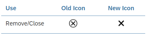
Message Icons
In response to user feedback, we have also updated some of the message icons.
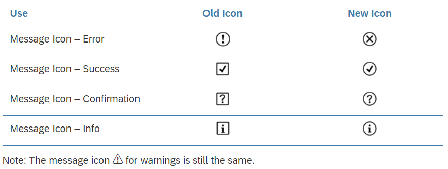
General Concepts
| Topic | Update | Topic Link |
Mass Editing |
We recommend using specific texts wherever possible for the mass editing variants:
|
Mass Editing |
Layouts, Floorplans, & Frameworks
Layouts
| Topic | Update | Topic Link |
Dynamic Page Layout |
Desktop-centric tables: A new developer hint was added for the property fitContent. |
Dynamic Page Layout |
Floorplans
| Topic | Update | Topic Link |
Object Page Floorplan |
Form Facet: Label-text pair was added.
Create and Edit Subobjects: New guidance on creating subobjects inline. Forms: Information on how to use the |
Object Page Floorplan |
Tool Development
| Topic | Update | Topic Link |
Side Navigation |
The article has been fully restructured for easier understanding. | Side Navigation |
UI Elements
| Topic | Update | Topic Link |
Button |
New feature added for showing the keyboard shortcut for an action. | Button Shortcut |
Label |
Label Placement section added. | Label Placement |
Services and Resources
| Topic | Update | Topic Link |
SAP Fiori Design Stencils |
SAP Fiori Design Stencils – Overview | |
Sketch |
What’s New in Sketch Stencil Version 1.80 | Design Stencils for Sketch |
Axure RP |
What’s New in Axure RP Version 1.80 | Design Stencils for Axure RP |
Adobe XD |
What’s New in Adobe XD Version 1.80 | Design Stencils for Adobe XD |
About Guideline Updates
With each new guideline version, we deliver two types of update:
- Updates to reflect new or changed UI controls available with SAPUI5 versions 1.79 and 1.80.
- Ongoing updates on how to best apply the SAP Fiori design (such as overarching concepts, floorplans, and additional decision support). These updates are introduced with a given guideline version, but are not necessarily dependent on a specific SAPUI5 version.
Note: Our policy is to update only the latest guideline version. If you are working with an earlier SAPUI5 release, also consider checking out the most recent guideline version to get the latest general guidance.
Design Stencils for Adobe XD
You can use this stencil set to create high-fidelity SAP Fiori designs using Adobe XD.
For more information about SAP Fiori design stencils and other tool options, see Design Stencils.
Prerequisites
To use the SAP Fiori stencils, you need to install SAP’s 72 font family and the SAP icon font on your machine.
These fonts are provided as part of the stencil download package. See Download and Installation below.
Download & Installation
- Install the Adobe XD software.
- Download and unpack the ZIP file in the download box.
- Install font 72.*
- Choose the folder Font 72 / 72_Desktop.
- Double-click each .ttf file and click Install.
- Install the SAP icon font.
- Remove any former versions of the SAP icon font.
- Choose the folder Icon Fonts / …final icon package / Fonts
- Double-click the SAP-icons.ttf file, and click Install.
- Optional: Install the SAP Business Suite icon font.
- Remove any former versions of the SAP Business Suite icon font.
- Choose the folder Icon Fonts / …final icon package / Fonts
- Double-click the BusinessSuiteInAppSymbols.ttf file, and click Install.
- Open the Adobe XD stencil file and save it as a duplicate.
The duplicate is your working document for visualizing your SAP Fiori app. All the available stencils are now available as assets in the sidebar on the left, including colors, character styles, and components (stencils).
*The 72 font download is made available under the Apache 2.0 license.
SAP Fiori Design Stencils
Intro
Design stencils are ready-to-use, high-fidelity drafts of SAP Fiori UI components. You can use them to visualize SAP Fiori apps and to get a realistic impression of your final design.
Stencil sets are available for Sketch, Axure RP, and Adobe XD.
What’s In the Stencil Set?
The SAP Fiori design stencils include:
- Patterns for foundation topics, such as shadow levels, grid, colors, and more
- Page types (floorplans)
- Controls
- Helper tools, such as rem squares or px spacings to build your app according to the current specifications and implementations. We’ve also included interaction tools, such as like cursors and touch visualizations.
The following stencil sizes are available for your mockups:
- S (414 px)
- M (600 px and 834 px)
- L (1024 px)
- XL (1440 px)
In addition, each stencil set includes download files for:
- Font 72, the standard typeface for SAP Fiori apps
- The standard SAP icon font and the SAP Business Suite icon font
Download Stencils
You can download stencil packages for your preferred tool (Sketch, Axure RP, or Adobe XD).
For download and installation instructions, see the pages below for each tool.
Download Font 72
Font 72 is SAP’s proprietary typeface, and is the standard typeface for SAP Fiori apps. You can download the font separately here, or download one of the tool-based stencil sets above, which all include the font.
Procedure
- Download the desktop and web font families.
- Unpack the ZIP files 72_Desktop / 72_Web.
- Double-click each .ttf file and click Install.
The 72 font download is made available under the Apache 2.0 license.
Download Icon Font
SAP Icon Font
To use the stencils, you need to install the standard SAP icon font. You’ll also need to install this font locally if you want to display SAP Fiori icons in other applications, such as PowerPoint. For more information about the SAP icon font, see Iconography.
The SAP icon font is also included in the stencil sets for Axure RP and Sketch.
Procedure
- Remove any former versions of the SAP icon font.
- Download and unpack the ZIP file sap-icons_… .zip .
- Double-click the SAP-icons.ttf file, and click Install.
SAP Business Suite Icon Font (Optional)
In some application areas, you may also need to use the SAP Business Suite Icon Font (BusinessSuiteInAppSymbols). This icon font contains application-specific icons primarily used in SAP S/4HANA apps.
Important: To use the SAP Business Suite icon font in your app, it must be registered as a custom font in sap.ui.core.IconPool.
Procedure
- Download and unpack the ZIP file BusinessSuiteInAppSymbols_...zip.
- Install the SAP Business Suite icon font: Double-click the BusinessSuiteInAppSymbols.ttf file and click Install.
Related Links
Other Resources
What’s New in Guideline Version 1.78
This article provides an overview of the updates to the SAP Fiori web design guidelines with guideline version 1.78.
General Concepts
| Topic | Update | Topic Link |
App Finder |
Behavior and Interaction: New Adding Apps to a Page section for SAP Fiori launchpad spaces. | App Finder – Adding Apps to a Page |
SAP Fiori Launchpad Spaces |
Sections: Now with info on the Recently Added Apps section for apps selected in the app finder. | SAP Fiori Launchpad Spaces – Recently Added Apps |
Layouts, Floorplans, & Frameworks
Layouts
| Topic | Update | Topic Link |
Letterboxing |
Added guidance on when to apply letterboxing to an application, and when to enable it for a single page. | Letterboxing – Guidelines |
Floorplans
| Topic | Update | Topic Link |
List Report Floorplan |
Working Modes: New section on handling cases where user edits impact the filter results.
Table/Chart Actions: From version 1.78, users can add/create new items at list report level using a dialog. |
List Report Floorplan
|
Object Page Floorplan |
The default width of the plain text facet is now 320 px (formerly 300 px).
Key value facet: Title is mandatory. Subsections: Option to hide the subsection title if it contains a table or chart with the same title. |
Object Page Floorplan |
Frameworks
| Topic | Update | Topic Link |
Block Layout
|
Both articles have been reworked and adapted to SAP Fiori 3. | Block Layout Side Navigation |
UI Elements
| Topic | Update | Topic Link |
Avatar |
An avatar can now have an optional badge with an icon. | Avatar – Badge |
Color Picker
|
Info added: Default color prior to user selection is white, but can be adapted by the app team. | Color Picker – Layout Color Picker Popover – Layout |
Dynamic Date |
A new time period “Today -X/+Y” is now available in the dynamic date range. This allows users to include X days before today, and Y days after today. | Dynamic Date |
Filter Bar |
Intro: Added info on filter bar vs. smart filter bar.
Live Update/Manual Update: Live update mode is no longer recommended as default for all use cases. Instead, optimize the default mode for your specific use case. |
Filter Bar |
Flexible Grid New! |
New guideline for the existing flexible (css) grid control. This allows you to divide a layout into multiple columns and rows in which you can place UI elements. | Flexible Grid |
Footer Toolbar |
A section on app-specific actions was added.
The Styles section was updated to cover the different button styles. |
Footer Toolbar |
Infobar |
New section on active and non-active infobar states. | Infobar – States |
Icon Tab Bar |
Responsiveness: New overflow behavior.
New section on hierarchies, with sub-tabs and nesting. |
Icon Tab Bar |
Form/Simple Form
|
Article updated to reflect the new position of the asterisk for a mandatory field (now after the label instead of before it). | Form/Simple Form – Guidelines Input Field – Required Label – Types UI Element States – Required |
Micro Process Flow |
New guideline: Always replace the default icons with icons that fit your use case. Do not use the former status icons. | Micro Process Flow |
Multi-Combo Box |
Reviewing tokens: Single tokens that exceed the width of the input field are truncated. | Multi-Combo Box – Reviewing Tokens |
Multi-Input Field |
Reviewing tokens: Single tokens that exceed the width of the input field are truncated. | Multi-Input Field – Reviewing Tokens |
Responsive Table |
Responsiveness: Auto pop-in mode now also allows you to hide columns (instead of moving all columns to the pop-in). | Responsive Table – Responsiveness |
Rich Text Editor |
Responsiveness: Updated info on the use of the rich text editor on mobile devices.
New Mobile Theme section outlining the limitations of the TinyMCE mobile theme. |
Rich Text Editor |
Search (Field) |
3 search properties were added for cases where a search is triggered after the user changes the value of a field. | Search Properties |
Smart Filter Bar |
Article was renamed from “Smart Filter Bar Annotations” to “Smart Filter Bar”.
A Guidelines section was added and numerous cross-references updated. Live update mode is no longer recommended as default for all use cases. |
Smart Filter Bar |
Table Toolbar |
Components: Now includes an image showing all possible toolbar components in the correct order.
Guidelines: New section for the Maximize/Minimize button. |
Table Toolbar |
Toolbar Overview |
Additional guidance on the button styles used in toolbars.
Types: Tree toolbar was added. |
Toolbar Overview |
Tree Toolbar New! |
New article for the toolbar that appears above a tree or tree table. | Tree Toolbar |
Services and Resources
| Topic | Update | Topic Link |
SAP Fiori Design Stencils |
SAP Fiori Design Stencils – Overview | |
Sketch |
What’s New in Sketch Stencil Version 1.78 | Design Stencils for Sketch |
Axure RP |
What’s New in Axure RP Stencil Version 1.78 | Design Stencils for Axure RP |
Adobe XD |
What’s New in Adobe XD Stencil Version 1.78 | Design Stencils for Adobe XD |
About Guideline Updates
With each new guideline version, we deliver two types of update:
- Updates to reflect new or changed UI controls available with SAPUI5 versions 1.77 and 1.78.
- Ongoing updates on how to best apply the SAP Fiori design (such as overarching concepts, floorplans, and additional decision support). These updates are introduced with a given guideline version, but are not necessarily dependent on a specific SAPUI5 version.
Note: Our policy is to update only the latest guideline version. If you are working with an earlier SAPUI5 release, also consider checking out the most recent guideline version to get the latest general guidance.
What’s New in Guideline Version 1.76
This article provides an overview of the updates to the SAP Fiori web design guidelines with guideline version 1.76.
Foundation
| Topic | Update | Topic Link |
Accessibility in SAP Fiori New! |
This new article provides an overview of key accessibility requirements. Learn what comes out of the box with the SAPUI5 framework, and what you need to consider when you design and develop SAP Fiori apps. | Accessibility in SAP Fiori |
Belize Colors |
3 indication colors were added (indication colors 6, 7, and 8). | Belize Colors – Indication Colors |
Quartz Dark ColorsQuartz Light Colors |
Labels for primary colors 1,3, and 4 have been updated to better explain their use.
3 indication colors were added (indication colors 6, 7, and 8). |
Quartz Dark Colors |
Designing Intelligent Systems
| Topic | Update | Topic Link |
User Feedback New! |
This new article takes a conceptual look at incorporating a user feedback loop to improve the software. It outlines the feedback cycle, and explores the different parameters for collecting feedback. It also contains a useful set of basic questions to help you get started. | User Feedback |
General Concepts
| Topic | Update | Topic Link |
How To Use Semantic Colors / Industry-Specific Colors |
3 new industry-specific colors (indication colors) are now available. | How To Use Semantic Colors / Industry-Specific Colors |
Mass Editing |
New section on mass editing in SAP Fiori elements. | Mass Editing with SAP Fiori Elements |
SAP Fiori Launchpad – Overview |
New section on launchpad spaces. | SAP Fiori Launchpad Overview – Spaces |
SAP Fiori Launchpad Spaces New! |
As of SAPUI5 version 1.75, you can use the new launchpad spaces.
A space serves as an entry point for a business role and is set to replace the launchpad home page with a later release. |
SAP Fiori Launchpad Spaces |
Layouts, Floorplans, and Frameworks
Layouts
| Topic | Update | Topic Link |
Dynamic Page Layout |
Pinning the header content: As soon as the header takes up more than 60% of the screen real estate, the header is collapsed automatically.
Header title components: Input field was added (used for initial page floorplan). |
Dynamic Page Layout |
Flexible Column Layout |
Recommendation added: when the user resizes the screen, set the scroll position to the item currently open in the details column. | Flexible Column Layout – Scroll Position |
Floorplans
| Topic | Update | Topic Link |
List Report Flooprlan |
The guidance for variant management was adapted to allow a second variant at control level for specific cases only.
Guidelines: New section on sticky behavior. |
List Report Floorplan |
Worklist Floorplan |
Updated guidance: Ensure sticky behavior for the tab bar, table toolbar, and table columns. | Worklist Floorplan – Page Content |
UI Elements
| Topic | Update | Topic Link |
Analytical Table |
Highlighted items: You can now use the extended color set to highlight rows, including industry-specific colors (indication colors).
Additional guidelines for actions:
|
Analytical Table |
Chart Toolbar |
The article has been adapted to reflect the latest guidelines for buttons and action placement. | Chart Toolbar |
Combo Box |
Additonal information on selecting a value:
|
Combo Box |
Filter Bar |
Collapsed filter bar: Status text “Filtered By: None” changed to “Not Filtered”. | Filter Bar |
Grid List |
Highlighted items: You can now use the extended color set to highlight rows, including industry-specific colors (indication colors).
Additional guidelines for actions:
|
Grid List |
Grid Table |
Highlighted items: You can now use the extended color set to highlight rows, including industry-specific colors (indication colors).
Additional guidelines for actions:
|
|
Link |
New link type “link with icon” was added. | Link – Link with Icon |
List |
Enabling/disabling actions: Enable actions that are independent of the selected items.
Highlighted items: You can now use the extended color set to highlight rows, including industry-specific colors (indication colors). |
|
Multi-Combo Box |
Selecting a value: Developer hint added for the showitems API.
Filtering the option list: The type-ahead feature is not available for Android devices. |
Multi-Combo Box |
Multi-Input Field |
Adding a token: The type-ahead feature is not available for Android devices. | Multi-Input Field |
Object Display Components |
This article has been fully revised, and now offers more comprehensive guidance for the object status. | Object Display Components |
Responsive Table |
Responsiveness: New auto pop-in behavior.
Highlighted items: You can now use the extended color set to highlight rows, including industry-specific colors (indication colors). Additional guidelines for actions:
|
Responsive Table |
Table Toolbar |
The article has been adapted to reflect the latest guidelines for buttons and action placement. It now also includes an overview images with all possible actions in the correct order. | Table Toolbar |
Tree |
Highlighted items: You can now use the extended color set to highlight rows, including industry-specific colors (indication colors).
Enabling/disabling actions: Enable actions that are independent of the selected items. |
Tree |
Tree Table |
Highlighted items: You can now use the extended color set to highlight rows, including industry-specific colors (indication colors).
Additional guidelines for actions:
|
Tree Table |
View Settings Dialog |
Additional guidance on usage. We recommend using individual dialogs for sort/filter/group instead of the combined dialog. | View Settings Dialog – Usage |
Services and Resources
| Topic | Update | Topic Link |
SAP Fiori Design Stencils |
SAP Fiori Design Stencils – Overview | |
Sketch |
What’s New in Sketch Stencil Version 1.76 | Design Stencils for Sketch – Download |
Axure RP |
What’s New in Axure RP Stencil Version 1.76 | Design Stencils for Axure RP – Download |
Adobe XD New! |
As of release 1.76, we also provide design stencils for Adobe XD. Available stencils |
Design Stencils for Adobe XD – Download |
About Guideline Updates
With each new guideline version, we deliver two types of update:
- Updates to reflect new or changed UI controls available with SAPUI5 versions 1.75 and 1.76.
- Ongoing updates on how to best apply the SAP Fiori design (such as overarching concepts, floorplans, and additional decision support). These updates are introduced with a given guideline version, but are not necessarily dependent on a specific SAPUI5 version.
Note: Our policy is to update only the latest guideline version. If you are working with an earlier SAPUI5 release, also consider checking out the most recent guideline version to get the latest general guidance.
Design Stencils for Axure RP (Mac and Windows)
Intro
You can use this stencil set to create high-fidelity SAP Fiori designs using Axure RP.
For more information about SAP Fiori design stencils in general and other tool options, see Design Stencils.
Prerequisites
- Axure RP 9 is required to use the stencils.
- To use the SAP Fiori stencils, you need to install SAP’s 72 font family and the SAP icon font on your machine. These fonts are provided as part of the stencil download package. See Download and Installation below.
Download & Installation
- Install the Axure RP software.
- Download the design stencil set: Download the ZIP file and unzip it.
- Install font 72.
- Choose the folder Font 72 / 72_Desktop.
- Double-click each .ttf file and click Install.
- Open Axure RP and change the default font within Axure RP to font 72 by using the Widget Style Manager (Project / Widget Style Editor / Default / change font to “72”).
- Install the SAP icon font.
- Remove any former versions of the SAP icon font.
- Choose the folder Icon Fonts / …final icon package / Fonts
- Double-click the SAP-icons.ttf file, and click Install.
- Load the libraries in Axure RP: Open Axure RP and load the libraries for the stencils and icon font (tutorial).
- Optional: Install and load the SAP Business Suite icon font.
Loading libraries (1)
Loading libraries (2)
Loading libraries (3)
All the available stencils are now displayed in the library panel on the left and you can easily pull the stencil you need to your canvas board.
Pulling a stencil to the canvas board
Embedding Fonts into HTML Exports (Optional)
You can use a simplified method to embed fonts in Axure RP. These include:
- SAP-icons
- SAP-icons-TnT
- BusinessSuiteInAppSymbols
- 72
Tip: You can browse the three icon fonts in the Icon Explorer.
Online Usage
Follow the steps below:
- In Axure RP, choose Publish and Generate HTML Files….
- In the subsequent dialog, open the other options (settings wheel) and choose the Fonts tab. If the tab is empty, choose Add Font.
- Under WEB FONTS, enter a font label, such as all SAP fonts (or similar).
- Choose Link to .css file and enter the following URL:
https://experience.sap.com/files/prototypes/public/fonts/all_fonts.css
You can now export your mock-ups, and everyone with internet access sees all icons and the 72 font right away.
These settings are saved only for your current Axure RP project. Repeat this procedure for every Axure RP project you want to share with others.
Offline Usage
If you are heading to usability tests with new or re-imaged laptops, or if you don’t have an internet connection, you’ll need to make sure that all icon fonts used in your prototype are installed on the devices. Alternatively, you can just use the fonts package:
- In Axure RP, choose Publish and Generate HTML Files….
- In the subsequent dialog, open the other options (settings wheel) and choose the Fonts tab. If the tab is empty, choose Add Font.
- Under WEB FONTS, enter a font name, such as all SAP fonts (or similar).
- Choose Link to .css file and enter the following URL:
all_fonts.css
- Download the following file:
https://experience.sap.com/files/prototypes/public/fonts/all_fonts.zip - Unpack the file to the directory to which you also generate your HTML files (where the index.html is).
All icons are now available offline, without installing fonts.
SAP Business Suite Icon Font (Optional)
The SAP Business Suite Icon Font (BusinessSuiteInAppSymbols) contains application-specific icons primarily used in SAP S/4HANA apps.
Important! To use this font in your app, it must be registered as a custom font in sap.ui.core.IconPool.
Procedure
To add Business Suite icons to your Axure RP mockup, proceed as follows:
- Remove any former versions of the SAP Business Suite icon font.
- In the download files for the standard SAP Fiori design stencils, unpack the ZIP file IconHTMLTemplate_InAppSymbols_….zip.
- Open the Fonts folder and install the BusinessSuiteInAppSymbols.ttf file.
- Load the widget library BusinessSuiteIcons_…rplib file into Axure’s Libraries panel.
Related Links
Design Stencils for Sketch (Mac)
You can use this stencil set to create high-fidelity SAP Fiori designs using Sketch.
For more information about SAP Fiori design stencils in general and other tool options, see Design Stencils.
Prerequisites
To use the SAP Fiori stencils, you need to install SAP’s 72 font family and the SAP icon font on your machine.
These fonts are provided as part of the stencil download package. See Download and Installation below.
Download and Installation
- Install the Sketch software.
- Download and unpack the ZIP file.
- Save the the Fiori3_Stencils_Master.sketch file to a dedicated folder on your machine.
When you download an updated version in future, make sure that the new file replaces the existing file. This enables Sketch to identify the update automatically (more information here). - Use the SAP Fiori master file as a library within your own Sketch file. To do so, open Sketch, go to Sketch / Preferences / Libraries, and add the library to the list.
- Install font 72.*
- Choose the folder Font 72 / 72_Desktop.
- Double-click each .ttf file and click Install.
- Install the SAP icon font.
- Remove any former versions of the SAP icon font.
- Choose the folder Icon Fonts / …final icon package / Fonts
- Double-click the SAP-icons.ttf file and click Install.
- Optional: Install the SAP Business Suite icon font.
- Remove any former versions of the SAP Business Suite icon font.
- Choose the folder Icon Fonts / …final icon package / Fonts
- Double-click the BusinessSuiteInAppSymbols.ttf file and click Install.
*The 72 font download is made available under the Apache 2.0 license.
Using the Sketch Stencils
Symbols
All the available stencils are now available as “symbols” within your file in the Symbols menu. To use a stencil, pull it to your canvas board.
Adding a symbol/stencil to the canvas board (1)
Text and Layer Styles
In addition, you can choose from all appearances (text styles and layer styles) that are offered in the Insert menu or in the navigation panel on the right of your Sketch file.
Text style popup
Top Tips
Customize your Sketch toolbar
Customize your toolbar within Sketch based on your personal preferences. To do this, right-click on the toolbar in Sketch and choose Customize Toolbar…. You can now pull any menu you want to the highlighted empty boxes.
Recommended menus for working effectively:
- Artboard
- Symbols
- Text Styles
Stay up to date
Always download updated files to a specific folder. As soon as a new version is released, put it into your stencil folder by overwriting the old file. This ensures that your working files files are updated to the latest version (find the hint in the top right of Sketch).
Don’t change symbols
Don’t overwrite symbols within the original document. This changes the symbol in all the places where a symbol is consumed. Instead, change the symbol using the Overrides panel on the right. In the Overrides panel you can change all elements within the object you selected.
Let symbols be symbols
Don’t detach elements from symbols. This ensures that your file stays up-to-date with the latest symbols from the SAP Fiori stencil set for Sketch.
Related Links
SAP Fiori Design Stencils
Intro
Design stencils are ready-to-use, high-fidelity drafts of SAP Fiori UI components. You can use them to visualize SAP Fiori apps and to get a realistic impression of your final design.
Stencil sets are available for Sketch and Axure RP.
What’s In the Stencil Set?
The SAP Fiori design stencils include:
- Patterns for foundation topics, such as shadow levels, grid, colors, and more
- Page types (floorplans)
- Controls
- Helper tools, such as rem squares or px spacings to build your app according to the current specifications and implementations. We’ve also included interaction tools, such as like cursors and touch visualizations.
The following stencil sizes are available for your mockups:
- S (414 px)
- M (600 px and 834 px)
- L (1024 px)
- XL (1440 px)
In addition, each stencil set includes download files for:
- Font 72, the standard typeface for SAP Fiori apps
- The standard SAP icon font and the SAP Business Suite icon font
Download Stencils
You can download stencil packages for your preferred tool (Sketch or Axure RP).
For download and installation instructions, see the pages below for each tool.
Download Font 72
Font 72 is SAP’s proprietary typeface, and is the standard typeface for SAP Fiori apps. You can download the font separately here, or download one of the tool-based stencil sets above, which all include the font.
Procedure
- Download the desktop and web font families.
- Unpack the ZIP files 72_Desktop / 72_Web.
- Double-click each .ttf file and click Install.
The 72 font download is made available under the Apache 2.0 license.
Download Icon Font
SAP Icon Font
To use the stencils, you need to install the standard SAP icon font. You’ll also need to install this font locally if you want to display SAP Fiori icons in other applications, such as PowerPoint. For more information about the SAP icon font, see Iconography.
The SAP icon font is also included in the stencil sets for Axure RP and Sketch.
Procedure
- Remove any former versions of the SAP icon font.
- Download and unpack the ZIP file sap-icons_… .zip .
- Double-click the SAP-icons.ttf file, and click Install.
SAP Business Suite Icon Font (Optional)
In some application areas, you may also need to use the SAP Business Suite Icon Font (BusinessSuiteInAppSymbols). This icon font contains application-specific icons primarily used in SAP S/4HANA apps.
Important: To use the SAP Business Suite icon font in your app, it must be registered as a custom font in sap.ui.core.IconPool.
Procedure
- Download and unpack the ZIP file BusinessSuiteInAppSymbols_...zip.
- Install the SAP Business Suite icon font: Double-click the BusinessSuiteInAppSymbols.ttf file and click Install.
Related Links
Other Resources
Design Stencils for Axure RP (Mac and Windows)
Intro
You can use this stencil set to create high-fidelity SAP Fiori designs using Axure RP.
For more information about SAP Fiori design stencils in general and other tool options, see Design Stencils.
Prerequisites
- Axure RP 9 is required to use the stencils.
- To use the SAP Fiori stencils, you need to install SAP’s 72 font family and the SAP icon font on your machine. These fonts are provided as part of the stencil download package. See Download and Installation below.
Download & Installation
- Install the Axure RP software.
- Download the design stencil set: Download the ZIP file and unzip it.
- Install font 72.
- Choose the folder Font 72 / 72_Desktop.
- Double-click each .ttf file and click Install.
- Open Axure RP and change the default font within Axure RP to font 72 by using the Widget Style Manager (Project / Widget Style Editor / Default / change font to “72”).
- Install the SAP icon font.
- Remove any former versions of the SAP icon font.
- Choose the folder Icon Fonts / …final icon package / Fonts
- Double-click the SAP-icons.ttf file, and click Install.
- Load the libraries in Axure RP: Open Axure RP and load the libraries for the stencils and icon font (tutorial).
Loading libraries (1)
Loading libraries (2)
Loading libraries (3)
All the available stencils are now displayed in the library panel on the left and you can easily pull the stencil you need to your canvas board.
Pulling a stencil to the canvas board
Embedding Font 72 (Optional)
You can use OpenUI5 resources to make font 72 available as an embedded web font in Axure RP web prototypes.
Note that only the styles appearing within the currently implemented design are available as web fonts.
Procedure
- Choose Publish / Generate HTML Files… and select Web Fonts in the dialog menu.
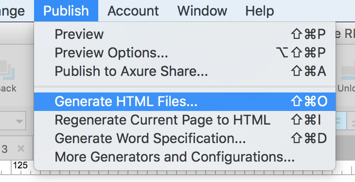
- Add the regular font file by pressing the green “+” button. Name the file “72-Regular”.
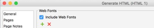
- Select the @font-face radio button.

- Paste the following code that specifies the web font format linked to the font provided by OpenUI5:
font-family: '72-Regular';

src: url('fonts/72-Regular.woff') format('woff'),

url('fonts/72-Regular.woff2') format('woff2'),url('https://openui5nightly.hana.ondemand.com/resources/sap/ui/core/themes/sap_belize/fonts/72-Regular.woff') format('woff'),url('https://openui5nightly.hana.ondemand.com/resources/sap/ui/core/themes/sap_belize/fonts/72-Regular.woff2') format('woff2'),

local('72-Regular');
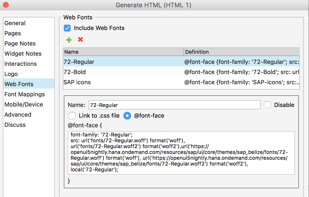
- Add the bold font file by pressing the green “+” button again. Name the file “72-Bold”.
- Select the @font-face radio button and add the following code:
font-family: '72-Bold';

src: url('fonts/72-Bold.woff') format('woff'),

url('fonts/72-Bold.woff2') format('woff2'),url('https://openui5nightly.hana.ondemand.com/resources/sap/ui/core/themes/sap_belize/fonts/72-Bold.woff') format('woff'),

url('https://openui5nightly.hana.ondemand.com/resources/sap/ui/core/themes/sap_belize/fonts/72-Bold.woff2') format('woff2'),

local('72-Bold');
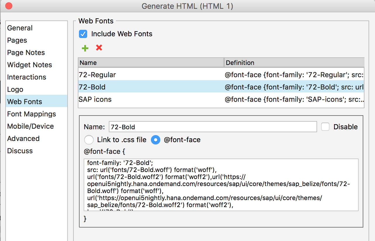
- Map the default font to the 72 embedded font. This will ensure that you generate the correct CSS with the 72 font family.
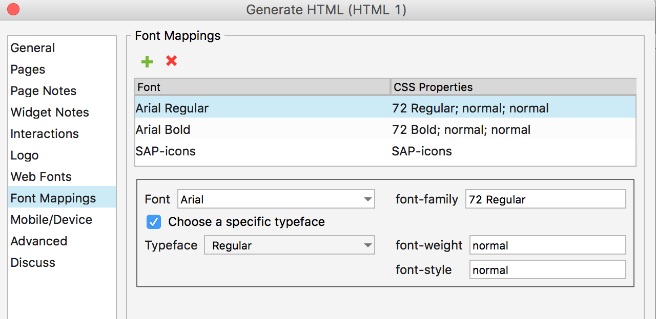
Embedding the SAP Icon Font (Optional)
The process for embedding the SAP icon font is the same as for font 72 above. However, in steps 3 and 4 you need to select the @icon-font “SAP icons” radio button and add the following code:
font-family: 'SAP-icons';

src: url('fonts/SAP-icons.woff') format('woff'),

url('fonts/SAP-icons.woff2') format('woff2'),url('https://openui5nightly.hana.ondemand.com/resources/sap/ui/core/themes/sap_belize/fonts/SAP-icons.woff') format('woff'),

url('https://openui5nightly.hana.ondemand.com/resources/sap/ui/core/themes/sap_belize/fonts/SAP-icons.woff2') format('woff2'),

local('SAP-icons');
For more information on font mapping in Axure RP, see Web Fonts and Font Mapping on the Axure RP website.
Related Links
Design Stencils for Sketch (Mac)
You can use this stencil set to create high-fidelity SAP Fiori designs using Sketch.
For more information about SAP Fiori design stencils in general and other tool options, see Design Stencils.
Prerequisites
To use the SAP Fiori stencils, you need to install SAP’s 72 font family and the SAP icon font on your machine.
These fonts are provided as part of the stencil download package. See Download and Installation below.
Download and Installation
- Install the Sketch software.
- Download and unpack the ZIP file.
- Save the the Fiori3_Stencils_Master.sketch file to a dedicated folder on your machine.
When you download an updated version in future, make sure that the new file replaces the existing file. This enables Sketch to identify the update automatically (more information here). - Use the SAP Fiori master file as a library within your own Sketch file. To do so, open Sketch, go to Sketch / Preferences / Libraries, and add the library to the list.
- Install font 72.*
- Choose the folder Font 72 / 72_Desktop.
- Double-click each .ttf file and click Install.
- Install the SAP icon font.
- Remove any former versions of the SAP icon font.
- Choose the folder Icon Fonts / …final icon package / Fonts
- Double-click the SAP-icons.ttf file and click Install.
*The 72 font download is made available under the Apache 2.0 license.
Using the Sketch Stencils
Symbols
All the available stencils are now available as “symbols” within your file in the Symbols menu. To use a stencil, pull it to your canvas board.
Adding a symbol/stencil to the canvas board (1)
Text and Layer Styles
In addition, you can choose from all appearances (text styles and layer styles) that are offered in the Insert menu or in the navigation panel on the right of your Sketch file.
Text style popup
Top Tips
Customize your Sketch toolbar
Customize your toolbar within Sketch based on your personal preferences. To do this, right-click on the toolbar in Sketch and choose Customize Toolbar…. You can now pull any menu you want to the highlighted empty boxes.
Recommended menus for working effectively:
- Artboard
- Symbols
- Text Styles
Stay up to date
Always download updated files to a specific folder. As soon as a new version is released, put it into your stencil folder by overwriting the old file. This ensures that your working files files are updated to the latest version (find the hint in the top right of Sketch).
Don’t change symbols
Don’t overwrite symbols within the original document in the symbols page. This changes the symbol in all the places where a symbol is consumed. Instead, change the symbol using the Overrides panel on the right. In the Overrides panel you can change all elements within the object you selected.
Let symbols be symbols
Don’t detach elements from symbols. This ensures that your file stays up-to-date with the latest symbols from the SAP Fiori stencil set for Sketch.
SAP Fiori Design Stencils
Intro
Design stencils are ready-to-use, high-fidelity drafts of SAP Fiori UI components. You can use them to visualize SAP Fiori apps and to get a realistic impression of your final design.
Stencil sets are available for Sketch and Axure RP.
What’s In the Stencil Set?
The SAP Fiori design stencils include:
- Patterns for foundation topics, such as shadow levels, grid, colors, and more
- Page types (floorplans)
- Controls
- Helper tools, such as rem squares or px spacings to build your app according to the current specifications and implementations. We’ve also included interaction tools, such as like cursors and touch visualizations.
The following stencil sizes are available for your mockups:
- S (414 px)
- M (600 px and 834 px)
- L (1024 px)
- XL (1440 px)
In addition, each stencil set includes download files for:
- Font 72, the standard typeface for SAP Fiori apps
- The standard SAP icon font
Download Stencils
You can download stencil packages for your preferred tool (Sketch or Axure RP).
For download and installation instructions, see the pages below for each tool.
Download Font 72
Font 72 is SAP’s proprietary typeface, and is the standard typeface for SAP Fiori apps. You can download the font separately here, or download one of the tool-based stencil sets above, which all include the font.
Procedure
- Download the desktop and web font families.
- Unpack the ZIP files 72_Desktop / 72_Web.
- Double-click each .ttf file and click Install.
The 72 font download is made available under the Apache 2.0 license.
Download Icon Font
SAP Icon Font
To use the stencils, you need to install the standard SAP icon font. You’ll also need to install this font locally if you want to display SAP Fiori icons in other applications, such as PowerPoint. For more information about the SAP icon font, see Iconography.
The SAP icon font is also included in the stencil sets for Axure RP and Sketch.
Procedure
- Remove any former versions of the SAP icon font.
- Download and unpack the ZIP file sap-icons_… .zip .
- Double-click the SAP-icons.ttf file, and click Install.
Related Links
Other Resources
What’s New in Guideline Version 1.74
This article provides an overview of the updates to the SAP Fiori web design guidelines with the guideline version 1.74.
Foundation
| Topic | Update | Topic Link |
Quartz Dark Colors New! |
SAP Quartz Dark is an additional SAP Fiori theme designed for low-light environments. | Quartz Dark Colors |
Theming |
SAP Quartz Dark theme was added. | Theming |
Layouts, Floorplans, and Frameworks
| Topic | Update | Topic Link |
Flexible Column Layout |
Multi-selection in master-detail scenarios: You can now use a “navigated” indicator to show which item is currently open in the master list. | Flexible Column Layout – Navigation Indicator |
List Report Floorplan |
Additional guidance on filters: Always provide default values for mandatory filter fields. | List Report – Header Content – Filters |
Responsive Spacing System
|
Explains how responsive padding and style sheet classes are used to control padding between elements that are common to all SAP Fiori interfaces. | Responsive Spacing System |
UI Elements
| Topic | Update | Topic Link |
Analytical Table |
Multi-selection plug-in: improved messaging when the number of items selected exceeds the limit.
Multi-selection in master-detail scenarios: You can now use a “navigated” indicator to show which item is currently open. |
Analytical Table – Multiple Selection |
Avatar |
sap.f.avatar moved to the sap.m.library. | Avatar |
Avatar Group New! |
New control for visualizing a group of people, such as a team or project team. | Avatar Group |
Busy Dialog |
Components: You can also give the busy dialog a title if you need to provide more context. | Busy Dialog – Components |
Button |
This article now also covers the menu button (the former menu button article has been retired).
A new toolbar rule has been added to the menu button guidelines (button styling). |
Button |
Calendar New! |
New guideline article for the existing calendar control. | Calendar |
Color Palette |
You can now opt to display the user’s 5 most recent colors.
Existing options are also described in more detail (select the default color, open a color picker dialog). |
Color Palette – Components |
Color Palette Popover |
You can now opt to display the user’s 5 most recent colors. | Color Palette Popover – Components |
Date Range Selection |
Added option for users to confirm the date using OK/Cancel buttons. | Date Range Selection – Date Range Picker |
Date/Time Picker |
Where relevant, offer an option to select a timezone. | Date/Time Picker – Time Zone |
Filter Bar |
Additional guidance for default values: Always provide default values for mandatory filter fields.
The section on filter/input controls has been revised. Always use the simplest input control that will work for your use case. |
Filter Bar |
Grid Table |
Multi-selection plug-in: improved messaging when the number of items selected exceeds the limit.
Multi-selection in master-detail scenarios: You can now use a “navigated” indicator to show which item is currently open. |
Grid Table – Multiple Selection |
List |
Swipe is now available in both directions and can reveal different actions per direction.
Multi-selection in master-detail scenarios: You can now use a “navigated” indicator to show which item is currently open. |
List |
Message Popover |
Messages in the list are now grouped by the section and subsection on the UI.
The message button no longer shows a count. It’s now a semantic button that indicates the message type of the most critical message in the list. |
Message Popover |
Message View |
Messages in the view are now grouped by the section and subsection on the UI. | Message View |
Responsive Table |
The responsive table now shows a specific “no data” text if a user has hidden all columns.
Multi-selection in master-detail scenarios: You can now use a “navigated” indicator to show which item is currently open. Responsiveness: No matter how the table is configured, at least one column stays in tabular layout, even on narrow screens. Added “highlight” indicator at line item level. Additional hint on when not to use “merge duplicates”. |
Responsive Table |
Standard List Item |
New Components section was added to the article. | Standard List Item – Components |
Time Picker |
Where relevant, offer an option to select a timezone. | Time Picker – Time Zone |
Tree |
Multi-selection in master-detail scenarios: You can now use a “navigated” indicator to show which item is currently open.
Added “highlight” indicator at line item level. |
Tree |
Tree Table |
Multi-selection plug-in: improved messaging when the number of items selected exceeds the limit.
Multi-selection in master-detail scenarios: You can now use a “navigated” indicator to show which item is currently open. |
Tree Table |
Value Help Dialog |
Updated guidance: The advanced search should be collapsed when the user opens the value help dialog. | Value Help Dialog – Advanced Search |
Services and Resources
| Topic | Update | Topic Link |
SAP Fiori Design Stencils |
The design stencils have been updated to reflect SAPUI5 version 1.74, and several new stencils have been added: | SAP Fiori Design Stencils – Overview |
About Guideline Updates
With each new guideline version, we deliver two types of update:
- Updates to reflect new or changed UI controls available with the latest SAPUI5 release.
- Ongoing updates on how to best apply the SAP Fiori design (such as overarching concepts, floorplans, and additional decision support). These updates are introduced with a given guideline version, but are not necessarily dependent on a specific SAPUI5 version.
Note: Our policy is to update only the latest guideline version. If you are working with an earlier SAPUI5 release, also consider checking out the most recent guideline version to get the latest general guidance.
Overview Page – UI Text Guidelines
Texts for the overview page include:
The sections below describe the guidelines for each of these texts.
Note: These guidelines do not cover the texts for imported elements shown on the card body, such as tables or graphics.
Basics
- Ensure that the card texts on the overview page are easy to read. Users need to grasp the information on each card at a glance.
- Be clear. If necessary, provide context for the information you are showing, such as an explanation or filter criteria.
- Be consistent. When you work on an overview page, always consider the texts for each card in the context of the overview page as a whole.
- Bear in mind that other languages may need more space.
Guidelines by Text Type
The page title appears on the launchpad tile and in the application header for the overview page itself. Where possible, use the same text for both.
Guidelines
- Use a noun-based name (for example, “Procurement Center”).
- Use title case.
- Choose a name that best fits your use case and the conventions in your business.
For example, do your users think in terms of the role, or the business area? What terms are they most familiar with? Look for a name that fits for all the cards you are including. Also consider the terms already used in your application area. - Do not use the term “Overview Page”. This is just the name of the floorplan. However, it’s OK to use “Overview” on its own.
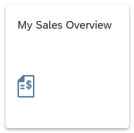
Launchpad tile an overview page
Overview page title in the launchpad shell bar
The title is the top element on all cards and is always required. The title for a stack of cards is also used as the heading for the detail view.
Guidelines
- Use title case.
- Be concise. Aim for one-line texts, which are easier to scan. If you need more space, try not to exceed 2 lines.

Concise title (eyecatcher)
- Don’t overload the title with too much information.
If the title is short, consider including qualifying information in the title.
If the title is longer, or the qualifying information is more complex, use a subtitle for the qualifier. - Recommended: Use a consistent pattern across all the cards on your overview page.

Titles can also include qualifiers - if they are not too long
The subtitle is optional. You can use it to qualify the title, offer an explanation, or show a status. The use of the subtitle can differ, depending on the card type.
Guidelines
- Use title case.
Exception: Use sentence style for longer explanations, or statuses involving time periods or numbers. - If you have a mixture of subtitles in sentence style and title case, consider changing them all to sentence style.

Subtitle with simple qualifier

Explantory subtitle (sentence style)

Subtitle with relative time period (sentence style)
- If your subtitle contains multiple qualifiers, separate them with commas.

Multiple qualifiers
- If you need to qualify amounts (unit, currency), use the following format:
(<Unit> <Currency>) - If the subtitle contains multiple qualifiers, place the currency at the end. Use | to separate the preceding qualifier from the currency. Do not write “in <Currency” (for example, “in EUR”), as this doesn’t translate well in all languages.

Subtitle with scaling factor and currency
Actions can appear at the bottom of the quick view card.
Guidelines
The action buttons on cards follow the same text conventions as all other action buttons:
- Use title case.
- Start with a verb.
- Keep the text as short as possible.
Resources
Want to dive deeper? Follow the links below to find out more about related resources.
What’s New in Guideline Version 1.72
This article provides an overview of the updates to the SAP Fiori web design guidelines with the guideline version 1.72. For updates in releases 1.64 – 1.70, please switch to the respective version.
Updates for SAP Fiori 3
The SAP Fiori Design Guidelines now incorporate core elements of SAP Fiori 3: product-wide UX consistency rules, designing for intelligent systems, and the new Quartz Light theme.
Key SAP Fiori 3 updates include:
UX Consistency
- Quartz Light Colors
- Theming
- Typography
- Iconography
- Action Placement
- Terminology for Common Actions
- New SAP Fiori Launchpad Shell Bar
- Launchpad Settings
Designing Intelligent Systems
Fully-Revised Design Stencils
We’ve completely revised the entire stencil set to reflect SAP Fiori 3. In addition to Axure RP stencils, we now also offer Sketch design stencils for Mac users.
All topics in the following sections have been updated to reflect the SAP Fiori 3 design and the Quartz Light theme:
- Foundation
- SAP Fiori Launchpad
- Layouts and Floorplans
In upcoming releases, we will successively update the content for the General Concepts and UI Elements sections.
Foundation
| Topic | Update | Topic Link |
Content Density (Cozy and Compact) |
Additional section on metrics, moved from the former Grid Layout article (now retired). Measurements for cozy mode were updated. |
Content Density (Cozy and Compact) |
Multi-Device Support |
Additional responsive grid section, moved from the former Grid Layout article (now retired). | Multi-Device Support |
SAP Fiori
|
This article now also covers the overall SAP Fiori Design System and SAP Fiori 3. | SAP Fiori |
Layouts, Floorplans, and Frameworks
| Topic | Update | Topic Link |
Grid Layout |
This article has been retired. The content has been moved to the Content Density and Multi-Device Support articles. |
UI Elements
Topic |
Update |
Topic Link |
Analytical Table |
Multi-selection plug-in: Added recommended boundaries for setting selection limits. | Analytical Table |
Avatar |
The avatar can now be used to display non-interactive icons.
A new “placeholder” background color is available for decorative images in the content area. You can now display images with a transparent background. |
Avatar |
Button |
This article has been fully revised to reflect the UX consistency product standard and the different button styles in SAP Fiori 3. | Button |
Combo Box |
The value state message can now wrap longer texts. | Combo Box – Styles |
Formatted Text |
The formatted text control allows you to format longer texts using HTML tags. Note: This new article describes an existing control (available since SAPUI5 version 1.38). |
Formatted Text |
Grid List |
Responsiveness: Additional info on layout options (grid box layout, responsive column layout, custom layout).
Drag and drop: Adapt the size of the drop indicator when dropping items from outside the grid list. New section on designing for performance. |
Grid List |
Grid Table |
Multi-selection plug-in: Added recommended boundaries for setting selection limits. | Grid Table |
List |
New section on designing for performance. | List |
Input Field |
The value state message can now wrap longer texts. | Input Field |
Responsive Table |
New section on designing for performance.
Column headers: Use controls that support wrapping and enable hyphenation. |
Responsive Table |
Table Select Dialog |
New section on resizing and dragging. | Table Select Dialog |
Tree |
New section on designing for performance. | Tree |
Tree Table |
Multi-selection plug-in: Added recommended boundaries for setting selection limits. | Tree Table |
Services and Resources
| Topic | Update | Topic Link |
SAP Fiori Design Stencils |
The design stencils have been fully revised to reflect the SAP Fiori 3 design and the new Quartz Light theme. | SAP Fiori Design Stencils – Overview |
for Sketch |
Overview of stencils available for Sketch | Design Stencils for Sketch – Download |
for Axure RP |
Overview of stencils available for Axure RP | Design Stencils for Axure RP – Download |
About Guideline Updates
With each new guideline version, we deliver two types of update:
- Updates to reflect new or changed UI controls available with the latest SAPUI5 release.
- Ongoing updates on how to best apply the SAP Fiori design (such as overarching concepts, floorplans, and additional decision support). These updates are introduced with a given guideline version, but are not necessarily dependent on a specific SAPUI5 version.
Note: Our policy is to update only the latest guideline version. If you are working with an earlier SAPUI5 release, also consider checking out the most recent guideline version to get the latest general guidance.
SAP Fiori Design Stencils
Design Stencils (Axure RP)
Design stencils are ready-to-use drafts of SAP Fiori floorplans and UI elements. For high-fidelity mockups, you can use Axure RP with the extended SAP Fiori design stencil set. The download package also includes the SAP icon font and SAP’s proprietary typeface “72”.
For more information on installing the “72” typeface, see the installation steps in the Getting Started section.
Variants
The following variants are available for your Axure RP mockups:
- Compact: Desktop (L)
- Cozy: Tablet (M), Smartphone (S)
- Image version: Shows different states of the control as an image, such as “Regular” and “Hover”.
- Interactive version: Shows interaction built in Axure RP. Most interactions are based on dynamic panels.
Note: The design stencils are high-fidelity mockups and do not represent the exact visual design.
Getting Started
Installation Steps
- Install the Axure RP software: If you are new to Axure RP, first get a license for the software, and install Axure RP on your computer.
- Download the design stencils: Download the ZIP file from the download box on this page and unzip it.
- Install the font “72”: Choose the folder Font 72 / 72_Desktop. Double-click each .ttf file and click Install.
- Change the default font within Axure RP to “72” using the Widget Style Manager (see images below).
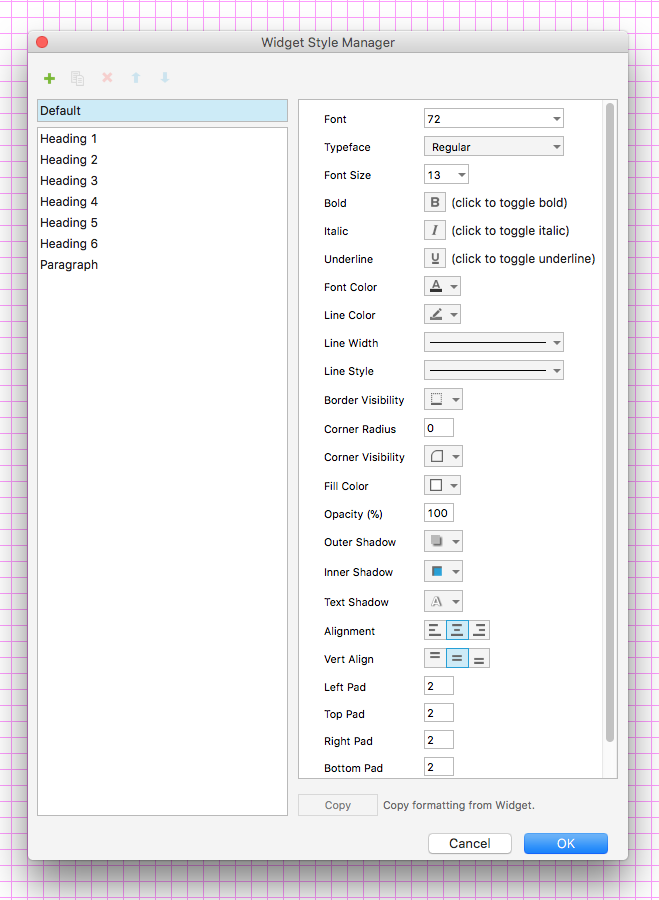
- Remove former versions of the SAP icon font: If you have an earlier version of the SAP icon font installed on your computer, remove it first to avoid any technical errors.
- Install the SAP icon font: Unzip the icon font ZIP file and double-click the SAP-icons.ttf file, which is located inside the fonts folder. Click Install.
- Optional: Install the Visual Business icon font: If you plan to use map container stencils, install the vis icons, which are also included in the package.
- Load the libraries in Axure RP: Open Axure RP and load the new libraries (find a tutorial here).
- Optional: Embed font 72.
- Optional: Embed the SAP icon font.
- Congratulations! You’re done! Enjoy working with the stencils.
Embedding Font “72” for Prototyping
You can load the “72” font from the OpenUI5 resources for use in prototypes. To make font “72” available as an embedded web font in Axure RP web prototypes, follow the procedure below.
Note that only the styles appearing within the currently implemented design are available as web fonts.
Procedure
- Choose Publish / Generate HTML Files… and select Web Fonts in the dialog menu.
- Add the regular font file by pressing the green “+” button. Name the file “72-Regular”.
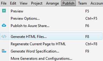
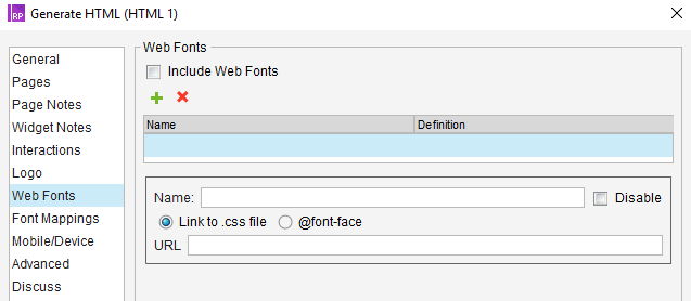
- Select the @font-face radio button.
- Paste the following code that specifies the web font format linked to the font provided by OpenUI5:
font-family: '72-Regular';

src: url('fonts/72-Regular.woff') format('woff'),

url('fonts/72-Regular.woff2') format('woff2'),url('https://openui5nightly.hana.ondemand.com/resources/sap/ui/core/themes/sap_belize/fonts/72-Regular.woff') format('woff'),url('https://openui5nightly.hana.ondemand.com/resources/sap/ui/core/themes/sap_belize/fonts/72-Regular.woff2') format('woff2'),

local('72-Regular');
- Add the bold font file by pressing the green “+” button again. Name the file “72-Bold”.
- Select the @font-face radio button and add the following code:
font-family: '72-Bold';

src: url('fonts/72-Bold.woff') format('woff'),

url('fonts/72-Bold.woff2') format('woff2'),url('https://openui5nightly.hana.ondemand.com/resources/sap/ui/core/themes/sap_belize/fonts/72-Bold.woff') format('woff'),

url('https://openui5nightly.hana.ondemand.com/resources/sap/ui/core/themes/sap_belize/fonts/72-Bold.woff2') format('woff2'),

local('72-Bold');
-
Map the default font to the “72” embedded font. This will ensure that you generate the correct CSS with the “72” font family.
Embedding the SAP Icon Font (Optional)
The process for embedding the SAP icon font is the same as for font 72 above. However, in steps 3 and 4 you need to select the @icon-font “SAP icons” radio button and add the following code:
font-family: ‘SAP-icons’;
src: url(‘fonts/SAP-icons.woff’) format(‘woff’),
url(‘fonts/SAP-icons.woff2’) format(‘woff2’),url(‘https://openui5nightly.hana.ondemand.com/resources/sap/ui/core/themes/sap_belize/fonts/SAP-icons.woff‘) format(‘woff’),
url(‘https://openui5nightly.hana.ondemand.com/resources/sap/ui/core/themes/sap_belize/fonts/SAP-icons.woff2‘) format(‘woff2’),
local(‘SAP-icons’);
For more information on font mapping in Axure RP, see Web Fonts and Font Mapping on the Axure RP website.
Design Stencils (Microsoft Powerpoint®)
The Microsoft PowerPoint® design stencils are ready-to-use drafts of the most essential SAP Fiori floorplans and UI elements.
We provide a limited set of Microsoft PowerPoint® stencils: the stencils are targeted at product owners and other non-design roles. You can use them for quickly visualizing your first design ideas. Only common floorplans and UI elements are available. The stencils come in two variants:
- Compact: Desktop (L)
- Cozy: Tablet (M), Smartphone (S)
The design stencils do not represent the exact visual design.
Design Stencils
Design Stencils (Axure RP)
Design stencils are ready-to-use drafts of SAP Fiori floorplans and UI elements. For high-fidelity mockups, you can use Axure RP with the extended SAP Fiori design stencil set. The download package also includes the SAP icon font and SAP’s proprietary typeface “72”.
For more information on installing the “72” typeface, see the installation steps in the Getting Started section.
Variants
The following variants are available for your Axure RP mockups:
- Compact: Desktop (L)
- Cozy: Tablet (M), Smartphone (S)
- Image version: Shows different states of the control as an image, such as “Regular” and “Hover”.
- Interactive version: Shows interaction built in Axure RP. Most interactions are based on dynamic panels.
Note: The design stencils are high-fidelity mockups and do not represent the exact visual design.
Getting Started
Installation Steps
- Install the Axure RP software: If you are new to Axure RP, first get a license for the software, and install Axure RP on your computer.
- Download the design stencils: Download the ZIP file from the download box on this page and unzip it.
- Install the font “72”: Choose the folder Font 72 / 72_Desktop. Double-click each .ttf file and click Install.
- Change the default font within Axure RP to “72” using the Widget Style Manager (see images below).
- Remove former versions of the SAP icon font: If you have an earlier version of the SAP icon font installed on your computer, remove it first to avoid any technical errors.
- Install the SAP icon font: Unzip the icon font ZIP file and double-click the SAP-icons.ttf file, which is located inside the fonts folder. Click Install.
- Optional: Install the Visual Business icon font: If you plan to use map container stencils, install the vis icons, which are also included in the package.
- Load the libraries in Axure RP: Open Axure RP and load the new libraries (find a tutorial here).
- Optional: Embed font 72.
- Optional: Embed the SAP icon font.
- Congratulations! You’re done! Enjoy working with the stencils.
Embedding Font “72” for Prototyping
You can load the “72” font from the OpenUI5 resources for use in prototypes. To make font “72” available as an embedded web font in Axure RP web prototypes, follow the procedure below.
Note that only the styles appearing within the currently implemented design are available as web fonts.
Procedure
- Choose Publish / Generate HTML Files… and select Web Fonts in the dialog menu.
- Add the regular font file by pressing the green “+” button. Name the file “72-Regular”.
- Select the @font-face radio button.
- Paste the following code that specifies the web font format linked to the font provided by OpenUI5:
font-family: '72-Regular';

src: url('fonts/72-Regular.woff') format('woff'),

url('fonts/72-Regular.woff2') format('woff2'),url('https://openui5nightly.hana.ondemand.com/resources/sap/ui/core/themes/sap_belize/fonts/72-Regular.woff') format('woff'),url('https://openui5nightly.hana.ondemand.com/resources/sap/ui/core/themes/sap_belize/fonts/72-Regular.woff2') format('woff2'),

local('72-Regular');
- Add the bold font file by pressing the green “+” button again. Name the file “72-Bold”.
- Select the @font-face radio button and add the following code:
font-family: '72-Bold';

src: url('fonts/72-Bold.woff') format('woff'),

url('fonts/72-Bold.woff2') format('woff2'),url('https://openui5nightly.hana.ondemand.com/resources/sap/ui/core/themes/sap_belize/fonts/72-Bold.woff') format('woff'),

url('https://openui5nightly.hana.ondemand.com/resources/sap/ui/core/themes/sap_belize/fonts/72-Bold.woff2') format('woff2'),

local('72-Bold');
-
Map the default font to the “72” embedded font. This will ensure that you generate the correct CSS with the “72” font family.
Embedding the SAP Icon Font (Optional)
The process for embedding the SAP icon font is the same as for font 72 above. However, in steps 3 and 4 you need to select the @icon-font “SAP icons” radio button and add the following code:
font-family: ‘SAP-icons’;
src: url(‘fonts/SAP-icons.woff’) format(‘woff’),
url(‘fonts/SAP-icons.woff2’) format(‘woff2’),url(‘https://openui5nightly.hana.ondemand.com/resources/sap/ui/core/themes/sap_belize/fonts/SAP-icons.woff‘) format(‘woff’),
url(‘https://openui5nightly.hana.ondemand.com/resources/sap/ui/core/themes/sap_belize/fonts/SAP-icons.woff2‘) format(‘woff2’),
local(‘SAP-icons’);
For more information on font mapping in Axure RP, see Web Fonts and Font Mapping on the Axure RP website.
Brief Introduction to Axure RP
Wireframing. Prototyping. Documentation.
You can use the Axure RP tool to:
- Make low-fi and hi-fi wireframes with dynamic interactions, or build fast mockups without interactions.
- Save time by using masters and widgets/stencils.
- Visualize interactive mockups for all form factors (desktop, tablet, and smartphone) using adaptive views. Interactive prototypes can be tested on all devices.
- Create a prototype without any coding. Axure RP can be used by designers, or by anyone needing a proof of concept.
If you are looking for an easy way to learn Axure RP, take a look at the tutorials at www.axure.com/learn.
Your Feedback
We would like to improve the usability of the SAP Fiori Design Axure Stencils. If you have experience with these Stencils for making Fiori App Mockups and would like to give us feedback, please contact us via Email. We will then set up a one-on-one interview with you.
Thank you in advance for your support!
Design Stencils (Microsoft Powerpoint®)
The Microsoft PowerPoint® design stencils are ready-to-use drafts of the most essential SAP Fiori floorplans and UI elements.
We provide a limited set of Microsoft PowerPoint® stencils: the stencils are targeted at product owners and other non-design roles. You can use them for quickly visualizing your first design ideas. Only common floorplans and UI elements are available. The stencils come in two variants:
- Compact: Desktop (L)
- Cozy: Tablet (M), Smartphone (S)
The design stencils do not represent the exact visual design.
What’s New in Guideline Version 1.70
This article provides an overview of the updates to the SAP Fiori web design guidelines with the guideline version 1.70.
Layouts, Floorplans, and Frameworks
Layouts
| Topic | Update | Topic Link |
Object Page Floorplan
|
Content Area – Blocks If you need to show and hide blocks, use a Show More / Show Less toggle button (not a panel container).Global Edit Don’t add navigation in edit mode if there’s no anchor bar in display mode and the header contains only a few editable fields. |
Object Page Floorplan |
UI Elements
| Topic | Update | Topic Link |
Avatar |
Initials can now have 3 letters.
You can replace the icon avatar with a custom icon. Use this option to display the most suitable icon for your use case. You can now set the placeholder background color to one of 10 accent colors, or let the system assign it randomly. An optional border is now available. |
Avatar |
Breadcrumb |
App teams can now define the style of the separator between the breadcrumb links. | Breadcrumb – Styles |
Date Picker |
The month and year views can now be used separately as a month picker and year picker.
An additional year ranges view has been added to help select a year more quickly. You can now add a footer toolbar to the date picker. However, this is not recommended for most use cases. |
Date Picker |
| Grid List | Only use grid list items for the grid list, and not other types of list item (such as the standard list item).
In multiple selection mode, users can now use Shift+click to select a range. |
Grid List |
List |
In multiple selection mode, users can now use Shift+click to select a range. | List – Selection Mode |
Panel |
Usage: Panels are not allowed in the content area of an object page. | Panel – Usage |
Quick View |
You can now define a fallback icon that is displayed when the intended image or icon can’t be loaded. | Quick View – Layout |
Responsive Table |
In multiple selection mode, users can now use Shift+click to select a range. | Responsive Table – Select |
Search |
Section on responsiveness was updated to reflect improved support for tablet and phone. | Search – Responsiveness |
Select |
The dropdown area has now a maximum width of 600 px to avoid over-wide dropdowns.
Text within the option list can now wrap to multiple lines. |
Select – Width |
Select Dialog |
You now have the option to let users resize and drag the dialog.
New feature for remembered selection: In single-select dialogs, clicking the remembered item again closes the dialog. The user no longer needs to click Cancel. |
Select Dialog |
Single Planning Calendar |
The single planning calendar now offers a month view.
You now have the option to set working hours, hide non-working hours, and let users toggle between working hours and the full day view. |
Single Planning Calendar |
Switch |
Article was reworked to reflect the new switch type that can be built with sap.m.text + sap.m.objectstatus.
Note that for localization reasons, text is not allowed inside the switch. |
Switch |
Tree |
In multiple selection mode, users can now use Shift+click to select a range. | Tree – Selection Modes |
About Guideline Updates
With each new guideline version, we deliver two types of update:
- Updates to reflect new or changed UI controls available with the latest SAPUI5 release.
- Ongoing updates on how to best apply the SAP Fiori design (such as overarching concepts, floorplans, and additional decision support). These updates are introduced with a given guideline version, but are not necessarily dependent on a specific SAPUI5 version.
Note: Our policy is to update only the latest guideline version. If you are working with an earlier SAPUI5 release, also consider checking out the most recent guideline version to get the latest general guidance.
SAP Fiori Design Stencils
Design Stencils (Axure RP)
Design stencils are ready-to-use drafts of SAP Fiori floorplans and UI elements. For high-fidelity mockups, you can use Axure RP with the extended SAP Fiori design stencil set. The download package also includes the SAP icon font and SAP’s proprietary typeface “72”.
For more information on installing the “72” typeface, see the installation steps in the Getting Started section.
Variants
The following variants are available for your Axure RP mockups:
- Compact: Desktop (L)
- Cozy: Tablet (M), Smartphone (S)
- Image version: Shows different states of the control as an image, such as “Regular” and “Hover”.
- Interactive version: Shows interaction built in Axure RP. Most interactions are based on dynamic panels.
Note: The design stencils are high-fidelity mockups and do not represent the exact visual design.
Getting Started
Installation Steps
- Install the Axure RP software: If you are new to Axure RP, first get a license for the software, and install Axure RP on your computer.
- Download the design stencils: Download the ZIP file from the download box on this page and unzip it.
- Install the font “72”: Choose the folder Font 72 / 72_Desktop. Double-click each .ttf file and click Install.
- Change the default font within Axure RP to “72” using the Widget Style Manager (see images below).
- Remove former versions of the SAP icon font: If you have an earlier version of the SAP icon font installed on your computer, remove it first to avoid any technical errors.
- Install the SAP icon font: Unzip the icon font ZIP file and double-click the SAP-icons.ttf file, which is located inside the fonts folder. Click Install.
- Optional: Install the Visual Business icon font: If you plan to use map container stencils, install the vis icons, which are also included in the package.
- Load the libraries in Axure RP: Open Axure RP and load the new libraries (find a tutorial here).
- Optional: Embed font 72.
- Optional: Embed the SAP icon font.
- Congratulations! You’re done! Enjoy working with the stencils.
Embedding Font “72” for Prototyping
You can load the “72” font from the OpenUI5 resources for use in prototypes. To make font “72” available as an embedded web font in Axure RP web prototypes, follow the procedure below.
Note that only the styles appearing within the currently implemented design are available as web fonts.
Procedure
- Choose Publish / Generate HTML Files… and select Web Fonts in the dialog menu.
- Add the regular font file by pressing the green “+” button. Name the file “72-Regular”.
- Select the @font-face radio button.
- Paste the following code that specifies the web font format linked to the font provided by OpenUI5:
font-family: '72-Regular';

src: url('fonts/72-Regular.woff') format('woff'),

url('fonts/72-Regular.woff2') format('woff2'),url('https://openui5nightly.hana.ondemand.com/resources/sap/ui/core/themes/sap_belize/fonts/72-Regular.woff') format('woff'),url('https://openui5nightly.hana.ondemand.com/resources/sap/ui/core/themes/sap_belize/fonts/72-Regular.woff2') format('woff2'),

local('72-Regular');
- Add the bold font file by pressing the green “+” button again. Name the file “72-Bold”.
- Select the @font-face radio button and add the following code:
font-family: '72-Bold';

src: url('fonts/72-Bold.woff') format('woff'),

url('fonts/72-Bold.woff2') format('woff2'),url('https://openui5nightly.hana.ondemand.com/resources/sap/ui/core/themes/sap_belize/fonts/72-Bold.woff') format('woff'),

url('https://openui5nightly.hana.ondemand.com/resources/sap/ui/core/themes/sap_belize/fonts/72-Bold.woff2') format('woff2'),

local('72-Bold');
-
Map the default font to the “72” embedded font. This will ensure that you generate the correct CSS with the “72” font family.
Embedding the SAP Icon Font (Optional)
The process for embedding the SAP icon font is the same as for font 72 above. However, in steps 3 and 4 you need to select the @icon-font “SAP icons” radio button and add the following code:
font-family: ‘SAP-icons’;
src: url(‘fonts/SAP-icons.woff’) format(‘woff’),
url(‘fonts/SAP-icons.woff2’) format(‘woff2’),url(‘https://openui5nightly.hana.ondemand.com/resources/sap/ui/core/themes/sap_belize/fonts/SAP-icons.woff‘) format(‘woff’),
url(‘https://openui5nightly.hana.ondemand.com/resources/sap/ui/core/themes/sap_belize/fonts/SAP-icons.woff2‘) format(‘woff2’),
local(‘SAP-icons’);
For more information on font mapping in Axure RP, see Web Fonts and Font Mapping on the Axure RP website.
Design Stencils (Microsoft Powerpoint®)
The Microsoft PowerPoint® design stencils are ready-to-use drafts of the most essential SAP Fiori floorplans and UI elements.
We provide a limited set of Microsoft PowerPoint® stencils: the stencils are targeted at product owners and other non-design roles. You can use them for quickly visualizing your first design ideas. Only common floorplans and UI elements are available. The stencils come in two variants:
- Compact: Desktop (L)
- Cozy: Tablet (M), Smartphone (S)
The design stencils do not represent the exact visual design.
Design Stencils for Axure RP (Mac and Windows)
Intro
Axure RP design stencils are available for the main SAP Fiori controls and patterns.
For more information about SAP Fiori design stencils in general and other tool options, see Design Stencils.
Prerequisites
To use the SAP Fiori stencils, you need to install SAP’s 72 font family and the SAP icon font on your machine.
These fonts are provided as part of the stencil download package. See Download and Installation below.
Download & Installation
Standard SAP Fiori Deisgn Stencils
- Install the Axure RP software.
- Download the design stencil set: Download the ZIP file and unzip it.
- Install font 72.
- Choose the folder Font 72 / 72_Desktop.
- Double-click each .ttf file and click Install.
- Open Axure RP and change the default font within Axure RP to font 72 by using the Widget Style Manager (Project / Widget Style Editor / Default / change font to “72”).
- Install the SAP icon font.
- Remove any former versions of the SAP icon font.
- Choose the folder Icon Fonts / …final icon package / Fonts
- Double-click the SAP-icons.ttf file, and click Install.
- Load the libraries in Axure RP: Open Axure RP and load the libraries for the stencils and icon font (tutorial).
- Optional: Embed font 72 as a web font for Axure RP web prototypes
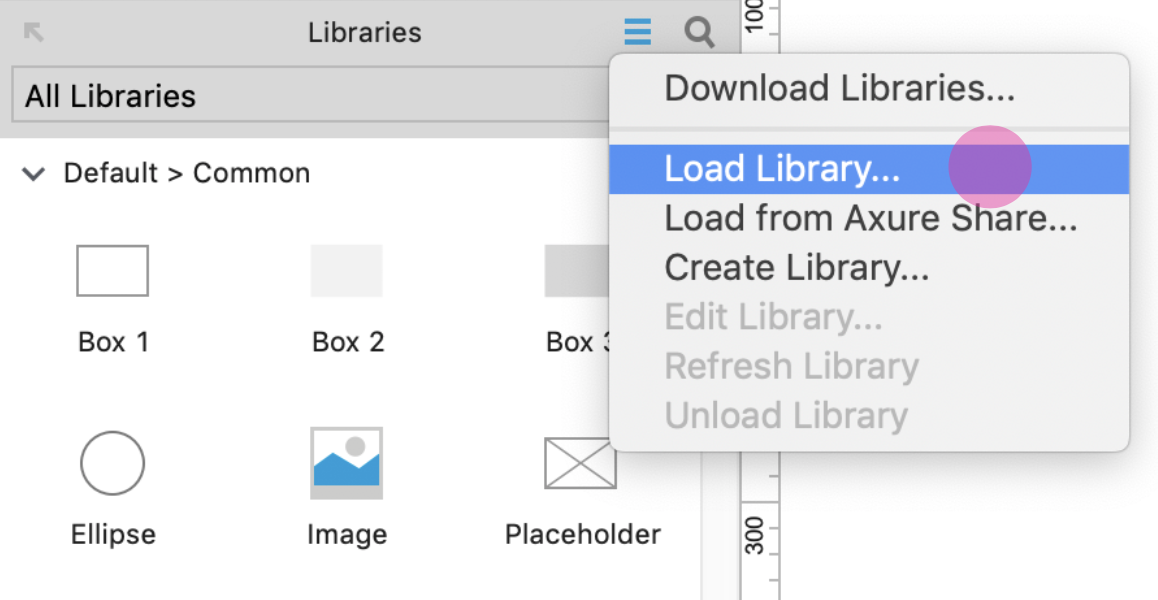
Loading libraries (1)
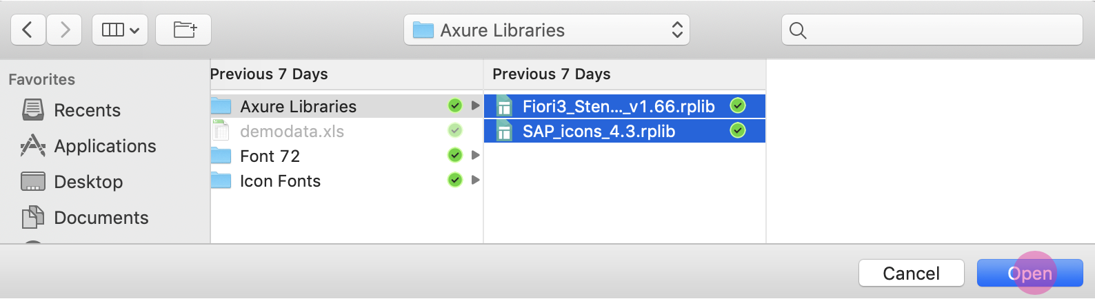
Loading libraries (2)
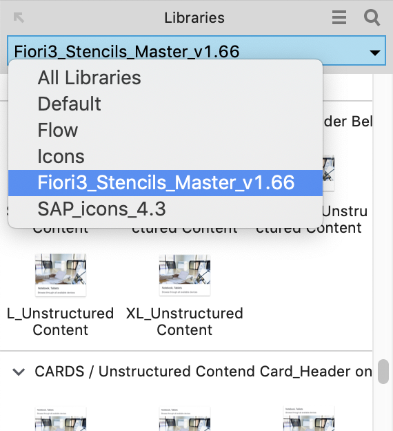
Loading libraries (3)
All the available stencils are now displayed in the library panel on the left and you can easily pull the stencil you need to your canvas board.
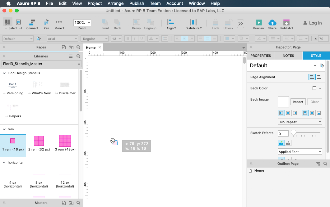
Pulling a stencil to the canvas board
Embedding Font 72 (Optional)
You can use OpenUI5 resources to make font 72 available as an embedded web font in Axure RP web prototypes.
Note that only the styles appearing within the currently implemented design are available as web fonts.
Procedure
- Choose Publish / Generate HTML Files… and select Web Fonts in the dialog menu.
- Add the regular font file by pressing the green “+” button. Name the file “72-Regular”.
- Select the @font-face radio button.
- Paste the following code that specifies the web font format linked to the font provided by OpenUI5:
font-family: '72-Regular';

src: url('fonts/72-Regular.woff') format('woff'),

url('fonts/72-Regular.woff2') format('woff2'),url('https://openui5nightly.hana.ondemand.com/resources/sap/ui/core/themes/sap_belize/fonts/72-Regular.woff') format('woff'),url('https://openui5nightly.hana.ondemand.com/resources/sap/ui/core/themes/sap_belize/fonts/72-Regular.woff2') format('woff2'),

local('72-Regular');
- Add the bold font file by pressing the green “+” button again. Name the file “72-Bold”.
- Select the @font-face radio button and add the following code:
font-family: '72-Bold';

src: url('fonts/72-Bold.woff') format('woff'),

url('fonts/72-Bold.woff2') format('woff2'),url('https://openui5nightly.hana.ondemand.com/resources/sap/ui/core/themes/sap_belize/fonts/72-Bold.woff') format('woff'),

url('https://openui5nightly.hana.ondemand.com/resources/sap/ui/core/themes/sap_belize/fonts/72-Bold.woff2') format('woff2'),

local('72-Bold');
- Map the default font to the 72 embedded font. This will ensure that you generate the correct CSS with the 72 font family.
For more information on font mapping in Axure RP, see Web Fonts and Font Mapping on the Axure RP website.
Top Tips
To learn about using Axure RP, see the tutorials at www.axure.com/learn.
What’s New in Guideline Version 1.68
This article provides an overview of the updates to the SAP Fiori web design guidelines with the guideline version 1.68.
Foundation
| Topic | Update | Topic Link |
| Belize Colors | “Colors” article for Belize renamed to “Belize Colors”.
New color usage section. Updated resource links and corrections to some color values. |
Belize Colors |
| Quartz Light Colors New! | New article on the Quartz Light theme introduced with Fiori 3. | Quartz Light Colors |
| Theming | The article has been fully revised and now contains more background information, including:
|
Theming |
| Typography | Language Stack and Fallback to System Font: Added the font stack theme parameter to show what fonts are actually used as fallback and to explain the subset version.
Headlines and Font Styles for UI Controls: |
Typography |
SAP Fiori Launchpad
| Topic | Update | Topic Link |
| Launchpad Shell Bar | Image updates to reflect the new Quartz Light theme. | Launchpad Shell Bar |
Layouts, Floorplans, and Frameworks
Layouts
| Topic | Update | Topic Link |
Flexible Column Layout |
Correction: The flexible column layout is supported by Fiori elements only if draft handling is used. Scenarios without draft handling are not supported. | Flexible Column Layout – SAP Fiori Elements |
Floorplans
| Topic | Update | Topic Link |
Analytical List Page
|
Visual Filter Bar: Additional guidance on choosing suitable filter bar elements based on the number of datasets and filter values. | Analytical List Page – Tips for Design Gates – Visual Filter Bar |
List Report Floorplan |
Enhanced guidelines for table/chart actions:
|
List Report Floorplan – Table/Chart Actions |
Worklist Floorplan |
Enhanced guidelines for table/chart actions (as for list report above) | Worklist Floorplan – Table Actions |
UI Elements
| Topic | Update | Topic Link |
Analytical Table |
Additional options for multiple selection to work around existing limitations.
The icon for Add and Create actions has been replaced by a text button. |
Analytical Table |
Dialog |
Additional guidance in the Usage section: Don’t display floorplans inside dialogs. | Dialog |
| Grid Table | Additional options for multiple selection to work around existing limitations.
The icon for Add and Create actions has been replaced by a text button. |
Grid Table |
| Header Toolbar | The icon for Add and Create actions has been replaced by a text button. | Header Toolbar |
List |
The icon for Add and Create actions has been replaced by a text button. | List |
Responsive Table |
The icon for Add and Create actions has been replaced by a text button. | Responsive Table |
Select Dialog |
Text for the positive finalizing action was changed from OK to Select. | Select Dialog |
Standard List Item |
The standard list item control now supports wrapping for the title and description texts. | Standard List Item – Responsiveness |
Table Select Dialog |
Text for the positive finalizing action was changed from OK to Select. | Table Select Dialog |
Table Toolbar |
The icon for Add and Create actions has been replaced by a text button. | Table Toolbar |
Tree |
Additional options for multiple selection to work around existing limitations.
Updated guidelines for hierarchy maintenance (drag and drop, filtering, sorting). The icon for Add and Create actions has been replaced by a text button. |
Tree |
Tree Table |
Additional options for multiple selection to work around existing limitations.
Updated guidelines for hierarchy maintenance (drag and drop, filtering, sorting). The icon for Add and Create actions has been replaced by a text button. |
Tree Table |
View Settings Dialog |
Guidelines: Information added on giving users the option not to sort, filter, or group items. Use the standard texts: (Not Sorted) (Not Filtered) (Not Grouped) |
View Settings Dialog – Guidelines |
Visual Filter Bar |
Filter Title Area: Option to replace the value help with a select popover was added.
Guidelines – Chart Types: Recommended charts for different scenarios were added. Guidelines: Filter Selection and Scaling Factor sections were added. |
Visual Filter Bar |
About Guideline Updates
With each new guideline version, we deliver two types of update:
- Updates to reflect new or changed UI controls available with the latest SAPUI5 release.
- Ongoing updates on how to best apply the SAP Fiori design (such as overarching concepts, floorplans, and additional decision support). These updates are introduced with a given guideline version, but are not necessarily dependent on a specific SAPUI5 version.
Note: Our policy is to update only the latest guideline version. If you are working with an earlier SAPUI5 release, also consider checking out the most recent guideline version to get the latest general guidance.
SAP Fiori Design Stencils
Design Stencils (Axure RP)
Design stencils are ready-to-use drafts of SAP Fiori floorplans and UI elements. For high-fidelity mockups, you can use Axure RP with the extended SAP Fiori design stencil set. The download package also includes the SAP icon font and SAP’s proprietary typeface “72”.
For more information on installing the “72” typeface, see the installation steps in the Getting Started section.
Variants
The following variants are available for your Axure RP mockups:
- Compact: Desktop (L)
- Cozy: Tablet (M), Smartphone (S)
- Image version: Shows different states of the control as an image, such as “Regular” and “Hover”.
- Interactive version: Shows interaction built in Axure RP. Most interactions are based on dynamic panels.
Note: The design stencils are high-fidelity mockups and do not represent the exact visual design.
Getting Started
Installation Steps
- Install the Axure RP software: If you are new to Axure RP, first get a license for the software, and install Axure RP on your computer.
- Download the design stencils: Download the ZIP file from the download box on this page and unzip it.
- Install the font “72”: Choose the folder Font 72 / 72_Desktop. Double-click each .ttf file and click Install.
- Change the default font within Axure RP to “72” using the Widget Style Manager (see images below).
- Remove former versions of the SAP icon font: If you have an earlier version of the SAP icon font installed on your computer, remove it first to avoid any technical errors.
- Install the SAP icon font: Unzip the icon font ZIP file and double-click the SAP-icons.ttf file, which is located inside the fonts folder. Click Install.
- Optional: Install the Visual Business icon font: If you plan to use map container stencils, install the vis icons, which are also included in the package.
- Load the libraries in Axure RP: Open Axure RP and load the new libraries (find a tutorial here).
- Optional: Embed font 72.
- Optional: Embed the SAP icon font.
- Congratulations! You’re done! Enjoy working with the stencils.
Embedding Font “72” for Prototyping
You can load the “72” font from the OpenUI5 resources for use in prototypes. To make font “72” available as an embedded web font in Axure RP web prototypes, follow the procedure below.
Note that only the styles appearing within the currently implemented design are available as web fonts.
Procedure
- Choose Publish / Generate HTML Files… and select Web Fonts in the dialog menu.
- Add the regular font file by pressing the green “+” button. Name the file “72-Regular”.
- Select the @font-face radio button.
- Paste the following code that specifies the web font format linked to the font provided by OpenUI5:
font-family: '72-Regular';

src: url('fonts/72-Regular.woff') format('woff'),

url('fonts/72-Regular.woff2') format('woff2'),url('https://openui5nightly.hana.ondemand.com/resources/sap/ui/core/themes/sap_belize/fonts/72-Regular.woff') format('woff'),url('https://openui5nightly.hana.ondemand.com/resources/sap/ui/core/themes/sap_belize/fonts/72-Regular.woff2') format('woff2'),

local('72-Regular');
- Add the bold font file by pressing the green “+” button again. Name the file “72-Bold”.
- Select the @font-face radio button and add the following code:
font-family: '72-Bold';

src: url('fonts/72-Bold.woff') format('woff'),

url('fonts/72-Bold.woff2') format('woff2'),url('https://openui5nightly.hana.ondemand.com/resources/sap/ui/core/themes/sap_belize/fonts/72-Bold.woff') format('woff'),

url('https://openui5nightly.hana.ondemand.com/resources/sap/ui/core/themes/sap_belize/fonts/72-Bold.woff2') format('woff2'),

local('72-Bold');
-
Map the default font to the “72” embedded font. This will ensure that you generate the correct CSS with the “72” font family.
Embedding the SAP Icon Font (Optional)
The process for embedding the SAP icon font is the same as for font 72 above. However, in steps 3 and 4 you need to select the @icon-font “SAP icons” radio button and add the following code:
font-family: ‘SAP-icons’;
src: url(‘fonts/SAP-icons.woff’) format(‘woff’),
url(‘fonts/SAP-icons.woff2’) format(‘woff2’),url(‘https://openui5nightly.hana.ondemand.com/resources/sap/ui/core/themes/sap_belize/fonts/SAP-icons.woff‘) format(‘woff’),
url(‘https://openui5nightly.hana.ondemand.com/resources/sap/ui/core/themes/sap_belize/fonts/SAP-icons.woff2‘) format(‘woff2’),
local(‘SAP-icons’);
For more information on font mapping in Axure RP, see Web Fonts and Font Mapping on the Axure RP website.
Design Stencils (Microsoft Powerpoint®)
The Microsoft PowerPoint® design stencils are ready-to-use drafts of the most essential SAP Fiori floorplans and UI elements.
We provide a limited set of Microsoft PowerPoint® stencils: the stencils are targeted at product owners and other non-design roles. You can use them for quickly visualizing your first design ideas. Only common floorplans and UI elements are available. The stencils come in two variants:
- Compact: Desktop (L)
- Cozy: Tablet (M), Smartphone (S)
The design stencils do not represent the exact visual design.
What’s New in Guideline Version 1.66
This article provides an overview of the updates to the SAP Fiori web design guidelines with the guideline version 1.66.
Foundation
| Topic | Update | Topic Link |
| Colors | New color palette for indication colors. | Colors |
SAP Fiori Launchpad
| Topic | Update | Topic Link |
| Enterprise Search | New section on creating search models. | Creation of Search Models |
| Launchpad Overview | With Fiori 3, the viewport has been removed.
Notifications and the functions from the former Me Area are now accessed from the shell bar, via the new user menu. |
SAP Fiori Launchpad Overview |
| Launchpad Home Page | Viewport section was removed. | SAP Fiori Launchpad Home Page |
| Launchpad Shell Bar | New shell structure for Fiori 3.
The shell bar now supports consistent placement of all components across all SAP products. |
Launchpad Shell Bar |
| Launchpad Services | The Me Area has been replaced by the user menu. | SAP Fiori Launchpad Services |
| Notifications | Notifcations are now accessed via the shell bar. | Notifications |
General Concepts
| Topic | Update | Topic Link |
| How to Use Semantic Colors / Industry-Specific Colors | New section on industry-specific colors.
You can use industry-specific colors if the meanings associated with the standard semantic colors differ from the conventions for your business. |
How to Use Semantic Colors / Industry-Specific Colors |
| Wrapping and Truncating Text | If a text, title, or label wraps in the middle of a word, there are now at least 3 characters before and after wrapping. This prevents just one or two characters from “hanging” at the start or end of a line. | Wrapping and Truncating Text |
Layouts, Floorplans, and Frameworks
| Topic | Update | Topic Link |
| Comparison Pattern New! |
New page layout for displaying information from multiple items side by side. | Comparison Pattern |
| Dynamic Page Layout | Responsiveness: On smartphones, you can now show a summary line instead of the expand/collapse header feature to save vertical space. | Dynamic Page Layout – Responsiveness |
| Flexible Column Layout | Additional guidance on the interaction when the user:
|
Flexible Column Layout – Content Interaction |
| List Report Floorplan | New Search section was added.
Header Content section was revised. Images were adapted to reflect that the live update mode (without the Go button) is the default mode for the filter bar. |
List Report Floorplan |
| Object Page Floorplan | Key value facet: Larger value texts are now possible using new properties for the object status and object number (freestyle object pages only).
The Contacts section was removed. From release 1.66, contacts can be displayed using the grid list. Tables: Guidance was added on embedding analytical tables, grid tables, or tree tables within an object page. To avoid multiple vertical scroll bars, these tables should always have their own tab on the object page. |
Object Page Floorplan |
| Tool Development: Tool Header | This article has been fully revised to reflect the current implementation version available in the Demo Kit, changes based on Fiori 3 concepts, and tool-specific requirements of the product standard for UX consistency. | Tool Header |
UI Elements
| Topic | Update | Topic Link |
| Analytical Table (ALV)
|
Row highlighting:
Enabling/disabling actions: Additional guidance on when to enable/disable toolbar buttons, based on the current selection. |
Analytical Table (ALV) |
| Avatar | The fallback behavior for missing images has been updated. | Avatar – Fallback Behavior for Missing Images |
| Carousel | The carousel can now display more than one item at a time. | Carousel |
| Combo Box | Suggestions can now be grouped. | Combo Box |
| Date Picker | Responsiveness: Clicking the icon now opens the full screen popover, while clicking the in the input area opens the regular popover. | Date Picker |
| Delta Micro Chart | The delta micro chart control now supports different sizes for improved responsiveness (L, M, S, XS). | Delta Micro Chart – Responsiveness |
| Filter Bar | Images were adapted to reflect that the live update mode (without the Go button) is the default mode for the filter bar. | Filter Bar |
| Harvey Ball Micro Chart | The Harvey Ball micro chart control now supports different sizes for improved responsiveness (L, M, S, XS). | Harvey Ball Micro Chart – Responsiveness |
| Grid List New! |
The grid list is an alternative view to a list or table. Instead of being displayed in rows, items are shown using images, charts, object cards, or other formats that benefit from more height (but less width). You can use a grid list to display a set of contact cards, for example. | Grid List |
| Grid Table | Row highlighting:
Enabling/disabling actions: Additional guidance on when to enable/disable toolbar buttons, based on the current selection. |
Grid Table |
| Input Field | It is now possible to group suggestions.
Information on autocomplete has been consolidated in the Autocomplete Suggestions section. |
Input Field |
| Label | Additional note on hyphenation: If hyphenation is switched on, it is applied for all languages. | Label – Hyphenation |
| List | Row highlighting:
Enabling/disabling actions: Additional guidance on when to enable/disable toolbar buttons, based on the current selection. |
List |
| Multi-Input Field | New section on grouping suggestions in multi-input fields. | Multi-Input Field – Grouping |
| Object Display Components | Inverted visualization is now available for the object status.
A larger font can be used for the object status and object number in headers. |
Object Display Components |
| Radial Micro Chart | The radial micro chart control now supports different sizes for improved responsiveness (L, M, S, XS). | Radial Micro Chart – Responsiveness |
| Responsive Table | Row highlighting:
Enabling/disabling actions: Additional guidance on when to enable/disable toolbar buttons, based on the current selection. Numbers and units: Option to display the unit of measurement in the column header (in certain cases). |
Responsive Table |
| Select | Value state texts can now be displayed within the select dropdown.
A read-only option is now supported. |
Select |
| Single Planning Calendar | Responsiveness: The control is now responsive, and cozy density mode is supported.
Drag and drop is now available. App developers can now create a custom view with a specific number of columns. Images were updated to reflect the latest visual design for appointments. |
Single Planning Calendar |
| Table Toolbar | Additional guidance on when to enable/disable toolbar buttons, based on the current selection. | Table Toolbar – Guidelines |
| Text | Information on wrapping and hyphenation is now consolidated under “Responsiveness”.
Note on hyphenation: If hyphenation is switched on, it is applied for all languages. |
Text |
| Tile | Note on hyphenation: If hyphenation is switched on, it is applied for all languages. | Tile – Texts in the Header Area |
| Title | Information on wrapping and hyphenation is now consolidated under “Responsiveness”.
Note on hyphenation: If hyphenation is switched on, it is applied for all languages. |
Title |
| Toolbar Overview | Additional explanations in the Styles and Order of Buttons sections. | Toolbar Overview |
| Tree | Row highlighting:
Enabling/disabling actions: Additional guidance on when to enable/disable toolbar buttons, based on the current selection. |
Tree |
| Tree Table |
|
Tree Table |
About Guideline Updates
With each new guideline version, we deliver two types of update:
- Updates to reflect new or changed UI controls available with the latest SAPUI5 release.
- Ongoing updates on how to best apply the SAP Fiori design (such as overarching concepts, floorplans, and additional decision support). These updates are introduced with a given guideline version, but are not necessarily dependent on a specific SAPUI5 version.
Note: Our policy is to update only the latest guideline version. If you are working with an earlier SAPUI5 release, also consider checking out the most recent guideline version to get the latest general guidance.
Design Stencils
Design Stencils (Axure RP)
Design stencils are ready-to-use drafts of SAP Fiori floorplans and UI elements. For high-fidelity mockups, you can use Axure RP with the extended SAP Fiori design stencil set. The download package also includes the SAP icon font and SAP’s proprietary typeface “72”.
For more information on installing the “72” typeface, see the installation steps in the Getting Started section.
Variants
The following variants are available for your Axure RP mockups:
- Compact: Desktop (L)
- Cozy: Tablet (M), Smartphone (S)
- Image version: Shows different states of the control as an image, such as “Regular” and “Hover”.
- Interactive version: Shows interaction built in Axure RP. Most interactions are based on dynamic panels.
Note: The design stencils are high-fidelity mockups and do not represent the exact visual design.
Getting Started
Installation Steps
- Install the Axure RP software: If you are new to Axure RP, first get a license for the software, and install Axure RP on your computer.
- Download the design stencils: Download the ZIP file from the download box on this page and unzip it.
- Install the font “72”: Choose the folder Font 72 / 72_Desktop. Double-click each .ttf file and click Install.
- Change the default font within Axure RP to “72” using the Widget Style Manager (see images below).
- Remove former versions of the SAP icon font: If you have an earlier version of the SAP icon font installed on your computer, remove it first to avoid any technical errors.
- Install the SAP icon font: Unzip the icon font ZIP file and double-click the SAP-icons.ttf file, which is located inside the fonts folder. Click Install.
- Optional: Install the Visual Business icon font: If you plan to use map container stencils, install the vis icons, which are also included in the package.
- Load the libraries in Axure RP: Open Axure RP and load the new libraries (find a tutorial here).
- Congratulations! You’re done! Enjoy working with the stencils.
Embedding Font “72” for Prototyping
You can load the “72” font from the OpenUI5 resources for use in prototypes. To make font “72” available as an embedded web font in Axure RP web prototypes, follow the procedure below.
Note that only the styles appearing within the currently implemented design are available as web fonts.
Procedure
- Choose Publish / Generate HTML Files… and select Web Fonts in the dialog menu.
- Add the regular font file by pressing the green “+” button. Name the file “72-Regular”.
- Select the @font-face radio button.
- Paste the following code that specifies the web font format linked to the font provided by OpenUI5:
font-family: '72-Regular';

src: url('fonts/72-Regular.woff') format('woff'),

url('fonts/72-Regular.woff2') format('woff2'),url('https://openui5nightly.hana.ondemand.com/resources/sap/ui/core/themes/sap_belize/fonts/72-Regular.woff') format('woff'),url('https://openui5nightly.hana.ondemand.com/resources/sap/ui/core/themes/sap_belize/fonts/72-Regular.woff2') format('woff2'),

local('72-Regular');
- Add the bold font file by pressing the green “+” button again. Name the file “72-Bold”.
- Select the @font-face radio button and add the following code:
font-family: '72-Bold';

src: url('fonts/72-Bold.woff') format('woff'),

url('fonts/72-Bold.woff2') format('woff2'),url('https://openui5nightly.hana.ondemand.com/resources/sap/ui/core/themes/sap_belize/fonts/72-Bold.woff') format('woff'),

url('https://openui5nightly.hana.ondemand.com/resources/sap/ui/core/themes/sap_belize/fonts/72-Bold.woff2') format('woff2'),

local('72-Bold');
-
Map the default font to the “72” embedded font. This will ensure that you generate the correct CSS with the “72” font family.
For more information on font mapping in Axure RP, see Web Fonts and Font Mapping on the Axure RP website.
Brief Introduction to Axure RP
Wireframing. Prototyping. Documentation.
You can use the Axure RP tool to:
- Make low-fi and hi-fi wireframes with dynamic interactions, or build fast mockups without interactions.
- Save time by using masters and widgets/stencils.
- Visualize interactive mockups for all form factors (desktop, tablet, and smartphone) using adaptive views. Interactive prototypes can be tested on all devices.
- Create a prototype without any coding. Axure RP can be used by designers, or by anyone needing a proof of concept.
If you are looking for an easy way to learn Axure RP, take a look at the tutorials at www.axure.com/learn.
Your Feedback
We would like to improve the usability of the SAP Fiori Design Axure Stencils. If you have experience with these Stencils for making Fiori App Mockups and would like to give us feedback, please contact us via Email. We will then set up a one-on-one interview with you.
Thank you in advance for your support!
Design Stencils (Microsoft Powerpoint®)
The Microsoft PowerPoint® design stencils are ready-to-use drafts of the most essential SAP Fiori floorplans and UI elements.
We provide a limited set of Microsoft PowerPoint® stencils: the stencils are targeted at product owners and other non-design roles. You can use them for quickly visualizing your first design ideas. Only common floorplans and UI elements are available. The stencils come in two variants:
- Compact: Desktop (L)
- Cozy: Tablet (M), Smartphone (S)
The design stencils do not represent the exact visual design.
Overview Page – UI Text Guidelines
Texts for the overview page include:
The sections below describe the guidelines for each of these texts.
Note: These guidelines do not cover the texts for imported elements shown on the card body, such as tables or graphics.
Basics
- Ensure that the card texts on the overview page are easy to read. Users need to grasp the information on each card at a glance.
- Be clear. If necessary, provide context for the information you are showing, such as an explanation or filter criteria.
- Be consistent. When you work on an overview page, always consider the texts for each card in the context of the overview page as a whole.
- Bear in mind that other languages may need more space.
Guidelines by Text Type
The page title appears on the launchpad tile and in the application header for the overview page itself. Where possible, use the same text for both.
Guidelines
- Use a noun-based name (for example, “Procurement Center”).
- Use title case.
- Choose a name that best fits your use case and the conventions in your business.
For example, do your users think in terms of the role, or the business area? What terms are they most familiar with? Look for a name that fits for all the cards you are including. Also consider the terms already used in your application area. - Do not use the term “Overview Page”. This is just the name of the floorplan. However, it’s OK to use “Overview” on its own.
Launchpad tile for overview page
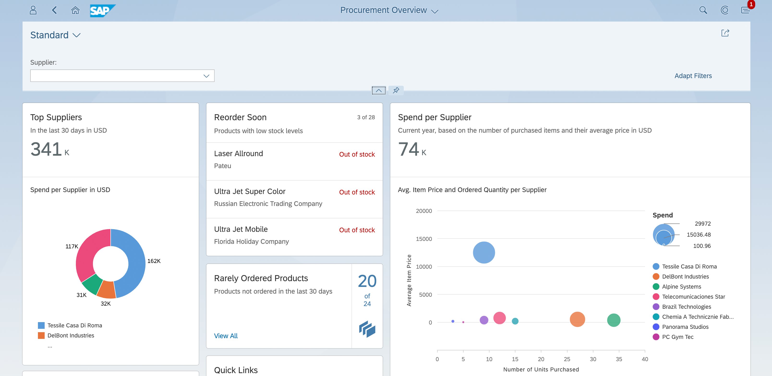
Overview page title in the launchpad shell bar
The title is the top element on all cards and is always required. The title for a stack of cards is also used as the heading for the detail view.
Guidelines
- Use title case.
- Be concise. Aim for one-line texts, which are easier to scan. If you need more space, try not to exceed 2 lines.

Concise title (eyecatcher)
- Don’t overload the title with too much information.
If the title is short, consider including qualifying information in the title.
If the title is longer, or the qualifying information is more complex, use a subtitle for the qualifier. - Recommended: Use a consistent pattern across all the cards on your overview page.

Titles can also include qualifiers - if they are not too long
The subtitle is optional. You can use it to qualify the title, offer an explanation, or show a status. The use of the subtitle can differ, depending on the card type.
Guidelines
- Use title case.
Exception: Use sentence style for longer explanations, or statuses involving time periods or numbers. - If you have a mixture of subtitles in sentence style and title case, consider changing them all to sentence style.

Subtitle with simple qualifier

Explantory subtitle (sentence style)

Subtitle with relative time period (sentence style)
- If your subtitle contains multiple qualifiers, separate them with commas.

Multiple qualifiers
- If you need to qualify amounts (unit, currency), use the following format:
(<Unit> <Currency>) - Place this information at the end of the subtitle.

Subtitle with scaling factor and currency
Actions can appear at the bottom of the quick view card.
Guidelines
The action buttons on cards follow the same text conventions as all other action buttons:
- Use title case.
- Start with a verb.
- Keep the text as short as possible.
Resources
Want to dive deeper? Follow the links below to find out more about related resources.
Overview Page – UI Text Guidelines
Texts for the overview page include:
The sections below describe the guidelines for each of these texts.
Note: These guidelines do not cover the texts for imported elements shown on the card body, such as tables or graphics.
Basics
- Ensure that the card texts on the overview page are easy to read. Users need to grasp the information on each card at a glance.
- Be clear. If necessary, provide context for the information you are showing, such as an explanation or filter criteria.
- Be consistent. When you work on an overview page, always consider the texts for each card in the context of the overview page as a whole.
- Bear in mind that other languages may need more space.
Guidelines by Text Type
The page title appears on the launchpad tile and in the application header for the overview page itself. Where possible, use the same text for both.
Guidelines
- Use a noun-based name (for example, “Procurement Center”).
- Use title case.
- Choose a name that best fits your use case and the conventions in your business.
For example, do your users think in terms of the role, or the business area? What terms are they most familiar with? Look for a name that fits for all the cards you are including. Also consider the terms already used in your application area. - Do not use the term “Overview Page”. This is just the name of the floorplan. However, it’s OK to use “Overview” on its own.
Launchpad tile for overview page
Overview page title in the launchpad shell bar
The title is the top element on all cards and is always required. The title for a stack of cards is also used as the heading for the detail view.
Guidelines
- Use title case.
- Be concise. Aim for one-line texts, which are easier to scan. If you need more space, try not to exceed 2 lines.
Concise title (eyecatcher)
- Don’t overload the title with too much information.
If the title is short, consider including qualifying information in the title.
If the title is longer, or the qualifying information is more complex, use a subtitle for the qualifier. - Recommended: Use a consistent pattern across all the cards on your overview page.
Titles can also include qualifiers - if they are not too long
The subtitle is optional. You can use it to qualify the title, offer an explanation, or show a status. The use of the subtitle can differ, depending on the card type.
Guidelines
- Use title case.
Exception: Use sentence style for longer explanations, or statuses involving time periods or numbers. - If you have a mixture of subtitles in sentence style and title case, consider changing them all to sentence style.
Subtitle with simple qualifier
Explantory subtitle (sentence style)
Subtitle with relative time period (sentence style)
- If your subtitle contains multiple qualifiers, separate them with commas.
Multiple qualifiers
- If you need to qualify amounts (unit, currency), use the following format:
(<Unit> <Currency>) - Place this information at the end of the subtitle.
Subtitle with scaling factor and currency
Actions can appear at the bottom of the quick view card.
Guidelines
The action buttons on cards follow the same text conventions as all other action buttons:
- Use title case.
- Start with a verb.
- Keep the text as short as possible.
Resources
Want to dive deeper? Follow the links below to find out more about related resources.
Design Stencils
Design Stencils (Axure RP)
Design stencils are ready-to-use drafts of SAP Fiori floorplans and UI elements. For high-fidelity mockups, you can use Axure RP with the extended SAP Fiori design stencil set. The download package also includes the SAP icon font and SAP’s proprietary typeface “72”.
For more information on installing the “72” typeface, see the installation steps in the Getting Started section.
Variants
The following variants are available for your Axure RP mockups:
- Compact: Desktop (L)
- Cozy: Tablet (M), Smartphone (S)
- Image version: Shows different states of the control as an image, such as “Regular” and “Hover”.
- Interactive version: Shows interaction built in Axure RP. Most interactions are based on dynamic panels.
Note: The design stencils are high-fidelity mockups and do not represent the exact visual design.
Getting Started
Installation Steps
- Install the Axure RP software: If you are new to Axure RP, first get a license for the software, and install Axure RP on your computer.
- Download the design stencils: Download the ZIP file from the download box on this page and unzip it.
- Install the font “72”: Choose the folder Font 72 / 72_Desktop. Double-click each .ttf file and click Install.
- Change the default font within Axure RP to “72” using the Widget Style Manager (see images below).
- Remove former versions of the SAP icon font: If you have an earlier version of the SAP icon font installed on your computer, remove it first to avoid any technical errors.
- Install the SAP icon font: Unzip the icon font ZIP file and double-click the SAP-icons.ttf file, which is located inside the fonts folder. Click Install.
- Optional: Install the Visual Business icon font: If you plan to use map container stencils, install the vis icons, which are also included in the package.
- Load the libraries in Axure RP: Open Axure RP and load the new libraries (find a tutorial here).
- Congratulations! You’re done! Enjoy working with the stencils.
Embedding Font “72” for Prototyping
You can load the “72” font from the OpenUI5 resources for use in prototypes. To make font “72” available as an embedded web font in Axure RP web prototypes, follow the procedure below.
Note that only the styles appearing within the currently implemented design are available as web fonts.
Procedure
- Choose Publish / Generate HTML Files… and select Web Fonts in the dialog menu.
- Add the regular font file by pressing the green “+” button. Name the file “72-Regular”.
- Select the @font-face radio button.
- Paste the following code that specifies the web font format linked to the font provided by OpenUI5:
font-family: '72-Regular';

src: url('fonts/72-Regular.woff') format('woff'),

url('fonts/72-Regular.woff2') format('woff2'),url('https://openui5nightly.hana.ondemand.com/resources/sap/ui/core/themes/sap_belize/fonts/72-Regular.woff') format('woff'),url('https://openui5nightly.hana.ondemand.com/resources/sap/ui/core/themes/sap_belize/fonts/72-Regular.woff2') format('woff2'),

local('72-Regular');
- Add the bold font file by pressing the green “+” button again. Name the file “72-Bold”.
- Select the @font-face radio button and add the following code:
font-family: '72-Bold';

src: url('fonts/72-Bold.woff') format('woff'),

url('fonts/72-Bold.woff2') format('woff2'),url('https://openui5nightly.hana.ondemand.com/resources/sap/ui/core/themes/sap_belize/fonts/72-Bold.woff') format('woff'),

url('https://openui5nightly.hana.ondemand.com/resources/sap/ui/core/themes/sap_belize/fonts/72-Bold.woff2') format('woff2'),

local('72-Bold');
-
Map the default font to the “72” embedded font. This will ensure that you generate the correct CSS with the “72” font family.
For more information on font mapping in Axure RP, see Web Fonts and Font Mapping on the Axure RP website.
Brief Introduction to Axure RP
Wireframing. Prototyping. Documentation.
You can use the Axure RP tool to:
- Make low-fi and hi-fi wireframes with dynamic interactions, or build fast mockups without interactions.
- Save time by using masters and widgets/stencils.
- Visualize interactive mockups for all form factors (desktop, tablet, and smartphone) using adaptive views. Interactive prototypes can be tested on all devices.
- Create a prototype without any coding. Axure RP can be used by designers, or by anyone needing a proof of concept.
If you are looking for an easy way to learn Axure RP, take a look at the tutorials at www.axure.com/learn.
Your Feedback
We would like to improve the usability of the SAP Fiori Design Axure Stencils. If you have experience with these Stencils for making Fiori App Mockups and would like to give us feedback, please contact us via Email. We will then set up a one-on-one interview with you.
Thank you in advance for your support!
Design Stencils (Microsoft Powerpoint®)
The Microsoft PowerPoint® design stencils are ready-to-use drafts of the most essential SAP Fiori floorplans and UI elements.
We provide a limited set of Microsoft PowerPoint® stencils: the stencils are targeted at product owners and other non-design roles. You can use them for quickly visualizing your first design ideas. Only common floorplans and UI elements are available. The stencils come in two variants:
- Compact: Desktop (L)
- Cozy: Tablet (M), Smartphone (S)
The design stencils do not represent the exact visual design.
What’s New in Guideline Version 1.62
This article provides an overview of the topics that have been added or changed with the guideline version 1.62.
With each new guideline version, we deliver two types of update:
- Updates to reflect new or changed UI controls available with the corresponding SAPUI5 version (SAPUI5 Version 1.62).
- Ongoing updates on how to best apply the SAP Fiori design (such as overarching concepts, floorplans, and additional decision support). These updates are introduced with a given guideline version, but are not necessarily dependent on a specific SAPUI5 version.
Note: Our policy is to update only the latest guideline version. If you are working with an earlier SAPUI5 release, also consider checking out the most recent guideline version to get the latest general guidance.
General Concepts
Action Placement
Additional guidance: Use only one emphasized button per toolbar and never mix emphasized and semantic buttons.
For more information, see Action Placement.
Wrapping and Truncating Text
Additional hint not to use tooltips to show the full text when a text is truncated.
For more information, see Wrapping and Truncating Text – Use of Truncation.
UI Elements
Updates for Multiple UI Elements
Button Style
Use only one emphasized button per toolbar and never mix emphasized and semantic buttons.
For more information, see:
Updates for Individual UI Elements
Form / Simple Form
- A new Input Assistance section indicates how to offer system recommendations.
- All images have been updated to reflect the new font “72” and the updated label color for display mode (#666666).
For more information, see Form / Simple Form.
Generic Tag New!
The generic tag displays complementary information related to the current page, such as KPIs and situations.
For more information, see Generic Tag.
Input Field
- The autocomplete behavior has been enhanced.
- A new Input Assistance section indicates how to offer system recommendations.
For more information, see Input Field.
Multi-Combo Box
When the multi-combo box is used for filtering, the user can select or deselect all items using the keyboard shortcuts Ctrl+A / Ctrl+Shift+A.
For more information, see Multi-Combo Box in a Filter Scenario.
Multi-Input Field
The autocomplete behavior has been enhanced.
For more information, see Multi-Input Field.
Progress Indicator
You can now use the new “information” value state with the progress indicator.
For more information, see Progress Indicator – Styles.
Select
The select control can now display icons in front of each option. This can help users identify options more easily.
For more information, see Select – Option List.
Select Dialog
Correction: “Column list items” was removed as an option for the content area. Column list items are not supported for the select dialog.
For more information, see Select Dialog.
Single Planning Calendar New!
The single planning calendar is a new control for scheduling. It displays the calendar of a single person or resource over a day, work week, or week. Users can view the details of appointments, create new appointments, and delete appointments.
Tile
The tile header and subtitle now support language-specific hyphenation.
For more information, see Tile.
Toolbar Overview
Additional information on the use of emphasized and semantic buttons.
For more information, see Toolbar Overview – Styles and Toolbar Overview – Order of Buttons.
What’s New in Guideline Version 1.60
This article provides an overview of the topics that have been added or changed with the guideline version 1.60.
With each new guideline version, we deliver two types of update:
- Updates to reflect new or changed UI controls available with the corresponding SAPUI5 version (SAPUI5 Version 1.60).
- Ongoing updates on how to best apply the SAP Fiori design (such as overarching concepts, floorplans, and additional decision support). These updates are introduced with a given guideline version, but are not necessarily dependent on a specific SAPUI5 version.
Note: Our policy is to update only the latest guideline version. If you are working with an earlier SAPUI5 release, also consider checking out the most recent guideline version to get the latest general guidance.
Foundation
Colors
A new semantic color has been added for the “information” value state.
For more information, see Colors – Semantic Colors.
General Concepts
Export to Spreadsheet
The guideline for the triggering button has been enhanced. With the updated design, users can export the table with the default settings, or open a dialog to set specific export parameters.
This feature is relevant for the following UI elements:
- Responsive Table
- Analytical Table
- Grid Table
- Tree Table
- Tree
- List
For more information, see Export to Spreadsheet – Menu Button.
How to Use Semantic Colors
A section was added to explain the use of the new semantic color for “information”.
For more information, see How to Use Semantic Colors – Information.
Situation Handling
Article was revised to provide clearer guidance on the purpose and usage of the situations concept.
For more information, see Situation Handling.
UI Element States
A section was added to explain the use of the new value state for “information”.
For more information, see UI Element States.
Layouts, Floorplans, and Frameworks
Layouts
Dynamic Page Layout
- We have replaced the term “visual indicator” with the term “expand/collapse header feature”.
- The expand/collapse header feature is no longer mandatory (to allow for cases where the feature is obsolete).
For more information, see Dynamic Page Layout.
Flexible Column Layout
Behavior and Interaction: Updated guidance for apps that start with one or more full screen pages.
For more information, see Flexible Column Layout.
UI Elements
Updates for Multiple UI Elements
New “Information” Value State
You can now use the new “information” value state with the following controls:
Micro Charts – Improved Responsiveness
Responsiveness for the following micro charts has been improved:
Updates for Individual UI Elements
Color Palette New!
Lets users pick between 2 and 15 predefined colors.
For more information, see Color Palette.
Color Palette Popover New!
Lets users pick from between 2 and 15 predefined colors, or specify any other color using a color picker.
For more information, see Color Palette Popover.
Color Picker Popover New!
Offers a color picker within a popover.
For more information, see Color Picker Popover.
Column Micro Chart
Column micro charts now support bar labels.
For more information, see Column Micro Chart.
Filter Bar
A section was added on the options for saving new filter variants.
For more information, see Saving a New Variant.
Gantt Chart
- You can now connect shapes in a Gantt chart to represent the relationship between two activities.
For more information, see Relationship Creation. - A new setting for creating ad hoc lines was added to the settings for the global toolbar.
Grid Table
- Paste: Apps can now catch the browser paste event and get the clipboard data (for example, to add new rows).
For more information, see Paste.
Icon Tab Bar
The guidance for the use of semantic colors was updated.
For more information, see Icon Tab Bar – Colors.
Line Micro Chart
- The line micro chart now supports up to 3 lines.
- You can now display a label for the threshold value.
For more information, see Line Micro Chart.
Multi-Combo Box
- The multi-combo box now supports a two-column layout and grouping in the option list.
- Overflow handling for tokens was added.
For more information, see Multi-Combo Box – Reviewing Tokens.
Multi-Input Field
Overflow handling for tokens was added.
For more information, see Multi-Input Field – Reviewing Tokens.
Responsive Table
- Responsiveness can now be defined for the parent container, and not only based on the screen-width.
For more information, see Responsiveness. - Paste: Apps can now catch the browser paste event and get the clipboard data (for example, to add new rows).
For more information, see Paste.
Search
A default delay has been built into the live search to improve performance and enhance the user experience.
For more information, see Search – Types.
Services and Resources
Design Stencils
- Minor updates to the Axure RP stencils to reflect release 1.60
For more information, see Design Stencils.
Design Stencils
Design Stencils (Axure RP)
Design stencils are ready-to-use drafts of SAP Fiori floorplans and UI elements. For high-fidelity mockups, you can use Axure RP with the extended SAP Fiori design stencil set. The download package also includes the SAP icon font and SAP’s proprietary typeface “72”.
For more information on installing the “72” typeface, see the installation steps in the Getting Started section.
Variants
The following variants are available for your Axure RP mockups:
- Compact: Desktop (L)
- Cozy: Tablet (M), Smartphone (S)
- Image version: Shows different states of the control as an image, such as “Regular” and “Hover”.
- Interactive version: Shows interaction built in Axure RP. Most interactions are based on dynamic panels.
Note: The design stencils are high-fidelity mockups and do not represent the exact visual design.
Getting Started
Installation Steps
- Install the Axure RP software: If you are new to Axure RP, first get a license for the software, and install Axure RP on your computer.
- Download the design stencils: Download the ZIP file from the download box on this page and unzip it.
- Install the font “72”: Choose the folder Font 72 / 72_Desktop. Double-click each .ttf file and click Install.
- Change the default font within Axure RP to “72” using the Widget Style Manager (see images below).
- Remove former versions of the SAP icon font: If you have an earlier version of the SAP icon font installed on your computer, remove it first to avoid any technical errors.
- Install the SAP icon font: Unzip the icon font ZIP file and double-click the SAP-icons.ttf file, which is located inside the fonts folder. Click Install.
- Optional: Install the Visual Business icon font: If you plan to use map container stencils, install the vis icons, which are also included in the package.
- Load the libraries in Axure RP: Open Axure RP and load the new libraries (find a tutorial here).
- Congratulations! You’re done! Enjoy working with the stencils.
Embedding Font “72” for Prototyping
You can load the “72” font from the OpenUI5 resources for use in prototypes. To make font “72” available as an embedded web font in Axure RP web prototypes, follow the procedure below.
Note that only the styles appearing within the currently implemented design are available as web fonts.
Procedure
- Choose Publish / Generate HTML Files… and select Web Fonts in the dialog menu.
- Add the regular font file by pressing the green “+” button. Name the file “72-Regular”.
- Select the @font-face radio button.
- Paste the following code that specifies the web font format linked to the font provided by OpenUI5:
font-family: '72-Regular';

src: url('fonts/72-Regular.woff') format('woff'),

url('fonts/72-Regular.woff2') format('woff2'),url('https://openui5nightly.hana.ondemand.com/resources/sap/ui/core/themes/sap_belize/fonts/72-Regular.woff') format('woff'),url('https://openui5nightly.hana.ondemand.com/resources/sap/ui/core/themes/sap_belize/fonts/72-Regular.woff2') format('woff2'),

local('72-Regular');
- Add the bold font file by pressing the green “+” button again. Name the file “72-Bold”.
- Select the @font-face radio button and add the following code:
font-family: '72-Bold';

src: url('fonts/72-Bold.woff') format('woff'),

url('fonts/72-Bold.woff2') format('woff2'),url('https://openui5nightly.hana.ondemand.com/resources/sap/ui/core/themes/sap_belize/fonts/72-Bold.woff') format('woff'),

url('https://openui5nightly.hana.ondemand.com/resources/sap/ui/core/themes/sap_belize/fonts/72-Bold.woff2') format('woff2'),

local('72-Bold');
-
Map the default font to the “72” embedded font. This will ensure that you generate the correct CSS with the “72” font family.
For more information on font mapping in Axure RP, see Web Fonts and Font Mapping on the Axure RP website.
Brief Introduction to Axure RP
Wireframing. Prototyping. Documentation.
You can use the Axure RP tool to:
- Make low-fi and hi-fi wireframes with dynamic interactions, or build fast mockups without interactions.
- Save time by using masters and widgets/stencils.
- Visualize interactive mockups for all form factors (desktop, tablet, and smartphone) using adaptive views. Interactive prototypes can be tested on all devices.
- Create a prototype without any coding. Axure RP can be used by designers, or by anyone needing a proof of concept.
If you are looking for an easy way to learn Axure RP, take a look at the tutorials at www.axure.com/learn.
Your Feedback
We would like to improve the usability of the SAP Fiori Design Axure Stencils. If you have experience with these Stencils for making Fiori App Mockups and would like to give us feedback, please contact us via Email. We will then set up a one-on-one interview with you.
Thank you in advance for your support!
Design Stencils (Microsoft Powerpoint®)
The Microsoft PowerPoint® design stencils are ready-to-use drafts of the most essential SAP Fiori floorplans and UI elements.
We provide a limited set of Microsoft PowerPoint® stencils: the stencils are targeted at product owners and other non-design roles. You can use them for quickly visualizing your first design ideas. Only common floorplans and UI elements are available. The stencils come in two variants:
- Compact: Desktop (L)
- Cozy: Tablet (M), Smartphone (S)
The design stencils do not represent the exact visual design.
SAPUI5 Development
Do you want to find out more about SAP Fiori reference apps and SAPUI5? Check out the links below.
SAP Fiori Reference Apps
The SAP Fiori reference apps show best practices with respect to design, technology, implementation, test, selected product standards, and more.
SAPUI5 Samples
This app contains samples for all the available controls (Blue Crystal theme).
SAPUI5 Development Toolkit for HTML5 – Demo Kit
This is the toolkit for SAPUI5. It provides you with all information you need for developing apps.
Contact Us

Contact Us
Do you have design-related questions that you would like to discuss with us?
You are welcome to use the experience.sap.com forum to ask design questions and post your design ideas.
We look forward to hearing from you!
Design Stencils
Design Stencils (Axure RP)
Design stencils are ready-to-use drafts of SAP Fiori floorplans and UI elements. For high-fidelity mockups, you can use Axure RP with the extended SAP Fiori design stencil set. The download package also includes the SAP icon font and SAP’s proprietary typeface “72”.
For more information on installing the “72” typeface, see the installation steps in the Getting Started section.
Variants
The following variants are available for your Axure RP mockups:
- Compact: Desktop (L)
- Cozy: Tablet (M), Smartphone (S)
- Image version: Shows different states of the control as an image, such as “Regular” and “Hover”.
- Interactive version: Shows interaction built in Axure RP. Most interactions are based on dynamic panels.
Note: The design stencils are high-fidelity mockups and do not represent the exact visual design.
Getting Started
Installation Steps
- Install the Axure RP software: If you are new to Axure RP, first get a license for the software, and install Axure RP on your computer.
- Download the design stencils: Download the ZIP file from the download box on this page and unzip it.
- Install the font “72”: Choose the folder Font 72 / 72_Desktop. Double-click each .ttf file and click Install.
- Change the default font within Axure RP to “72” using the Widget Style Manager (see images below).
- Remove former versions of the SAP icon font: If you have an earlier version of the SAP icon font installed on your computer, remove it first to avoid any technical errors.
- Install the SAP icon font: Unzip the icon font ZIP file and double-click the SAP-icons.ttf file, which is located inside the fonts folder. Click Install.
- Optional: Install the Visual Business icon font: If you plan to use map container stencils, install the vis icons, which are also included in the package.
- Load the libraries in Axure RP: Open Axure RP and load the new libraries (find a tutorial here).
- Congratulations! You are done! Enjoy working with the stencils.
Brief Introduction to Axure RP
Wireframing. Prototyping. Documentation.
You can use the Axure RP tool to:
- Make low-fi and hi-fi wireframes with dynamic interactions, or build fast mockups without interactions.
- Save time by using masters and widgets/stencils.
- Visualize interactive mockups for all form factors (desktop, tablet, and smartphone) using adaptive views. Interactive prototypes can be tested on all devices.
- Create a prototype without any coding. Axure RP can be used by designers, or by anyone needing a proof of concept.
If you are looking for an easy way to learn Axure RP, take a look at the tutorials at www.axure.com/learn.
Your Feedback
We would like to improve the usability of the SAP Fiori Design Axure Stencils. If you have experience with these Stencils for making Fiori App Mockups and would like to give us feedback, please contact us via Email. We will then set up a one-on-one interview with you.
Thank you in advance for your support!
Design Stencils (Microsoft Powerpoint®)
The Microsoft PowerPoint® design stencils are ready-to-use drafts of the most essential SAP Fiori floorplans and UI elements.
We provide a limited set of Microsoft PowerPoint® stencils: the stencils are targeted at product owners and other non-design roles. You can use them for quickly visualizing your first design ideas. Only common floorplans and UI elements are available. The stencils come in two variants:
- Compact: Desktop (L)
- Cozy: Tablet (M), Smartphone (S)
The design stencils do not represent the exact visual design.
What’s New in Guideline Version 1.58
This article provides an overview of the topics that have been added or changed with the guideline version 1.58.
With each new guideline version, we deliver two types of update:
- Updates to reflect new or changed UI controls available with the corresponding SAPUI5 version (SAPUI5 Version 1.58).
- Ongoing updates on how to best apply the SAP Fiori design (such as overarching concepts, floorplans, and additional decision support). These updates are introduced with a given guideline version, but are not necessarily dependent on a specific SAPUI5 version.
Note: Our policy is to update only the latest guideline version. If you are working with an earlier SAPUI5 release, also consider checking out the most recent guideline version to get the latest general guidance.
General Concepts
How To Use Semantic Colors New!
This article explains how to apply the four semantic colors used in SAP Fiori:
- Bad / error
- Warning / critical
- Good / positive
- Neutral
For more information, see How To Use Semantic Colors.
Message Handling
Message popover: A new section was added on how to direct users to the field on the UI that triggered a message.
For more information, see Message Handling – Navigation to the Corresponding Field on the UI.
Selection Controls – Overview New!
This overview article helps you choose which selection control to use, based on the type of selection, how an item is identified, and the number of items in the selection list.
For more information, see Selection Controls – Overview.
Wrapping and Truncating Text New!
This article outlines best practices for deciding whether to let texts wrap or truncate (or use a combination of both) when space is limited.
For more information, see Wrapping and Truncating Text.
UI Elements
Analytical Table (ALV)
- The following controls are now allowed in UI tables:
- Multi-input field
- Bullet micro chart
- Comparison micro chart
- Stacked bar micro chart
- Truncation vs. wrapping in column headers: To ensure consistent row heights, use truncation if necessary. Never wrap.
- Handling table titles: Use a table title only if the title of the table is not indicated in the surrounding area.
- Item count: Do not show an item count for zero items.
For more information, see Analytical Table (ALV).
Bullet Chart
- New section on negative values.
- Links to SAPUI5 samples were added.
For more information, see Bullet Chart.
Calculation Builder New!
The calculation builder can be used to create complex expressions that combine numeric constants and variables with arithmetic and logical operators. The expressions can be entered using a visual editor or a text editor with three available layout options.
For more information, see Calculation Builder.
Combo Box
App teams can now define the method for filtering the object list as the user types.
For more information, see Combo Box.
Export to Spreadsheet
To ensure that the data is exported as it is displayed on the screen, you can now define key value pairs to overwrite coded back-end values with human-readable texts.
For more information, see Export to Spreadsheet – Exporting Readable Texts.
Form / Simple Form
- The list of UI elements that can be placed in a form was updated.
- Additional guidance on aligning amounts.
For more information, see Form / Simple Form.
Grid Table
- The following controls are now allowed in UI tables:
- Multi-input field
- Bullet micro chart
- Comparison micro chart
- Stacked bar micro chart
- Truncation vs. wrapping in column headers: To ensure consistent row heights, use truncation if necessary. Never wrap.
- Handling table titles: Use a table title only if the title of the table is not indicated in the surrounding area.
- Item count: Do not show an item count for zero items.
For more information, see Grid Table.
List
- Scrolling: The toolbar and filter info bar can now be set to “sticky”.
- Additional guideline references for custom list items.
For more information, see List.
Network Graph
- The network graph has been enhanced with two new layout algorithms offering different structure possibilities.
- The visuals of the control have been completely redone to fit the standard SAP Fiori semantic color palette.
For more information, see Network Graph.
Message Popover
You can now offer a navigation link for a message in the message popover. This allows you to direct the user to the field on the UI that triggered the issue.
For more information, see Message Popover – Navigation to Field.
Micro Charts
- Bullet micro charts, comparison micro charts, and stacked bar micro charts can now be embedded in the cells of grid tables, analytical tables, and tree tables.
- Additional guidance on truncation: Never truncate numeric labels.
For more information, see Micro Chart.
Multi-Combo Box
- Additional guidance on when not to use the multi-combo box.
- New section on reviewing tokens: If there are too many tokens to display in the input field, clicking on the [n] More link displays a popover with all the selected tokens.
- App teams can now define the method for filtering the object list as the user types.
- The user’s entry auto-completes if the characters entered so far match an item in the filtered list.
For more information, see Multi-Combo Box.
Multi-Input Field
- New section on reviewing tokens: If there are too many tokens to display in the input field, clicking on the [n] More link displays a popover with all the selected tokens.
- App teams can now define the method for filtering the object list as the user types.
- The multi-input control can now be embedded in an analytical table, grid table, or tree table in condensed mode.
For more information, see Multi-Input Field.
Responsive Table
- Handling table titles: Use a table title only if the title of the table is not indicated in the surrounding area.
- Additional information on padding: Padding is not provided by the responsive table itself. Any space around a table comes from the surrounding container.
- Flag and favorite: Place the flag or favorite marker in the first column.
- Adding items: When adding or editing a row, the maximum number of columns permitted in a dialog is now 8 (not 10). This has been aligned with the guidance for dialogs.
- Item count: Do not show an item count for zero items.
Select Dialog
You can opt to show a Clear button that lets users clear all selected items.
For more information, see Select Dialog.
Switch
The guidance on the use of inline labels has changed. Going forward, we no longer allow inline labels. Although inline labels are often short in English (On/Off, Yes/No), they can be too long to fit in the switch in some other languages, resulting in truncation. The new guidance is to use a label next to the switch instead.
For more information, see Switch.
T-Account New!
The T-account is a new control for accounting applications. It allows you to display debit and credit entries for specific ledger accounts in T-account format. Multiple related T-accounts for a journal entry line item can be displayed on one page.
For more information, see T-Account.
Table Select Dialog
- The column headers and info toolbar in the table select dialog are now sticky.
- You can now decide whether or not to show the Clear button that clears all selected items.
For more information, see Table Select Dialog.
Toolbar Overview
- The menu button was added to the list of controls that can overflow.
- Details were added about the property for grouping items in the overflow.
For more information, see Toolbar Overview.
Tree
- The toolbar and filter info bar can now be set to “sticky”.
- Handling table titles: Use a table title only if the title of the table is not indicated in the surrounding area.
- Item count: Do not show an item count for zero items.
For more information, see Tree.
Tree Table
- The following controls are now allowed in UI tables:
- Multi-input field
- Bullet micro chart
- Comparison micro chart
- Stacked bar micro chart
- Truncation vs. wrapping in column headers: To ensure consistent row heights, use truncation if necessary. Never wrap.
- Item count: Do not show an item count for zero items.
For more information, see Tree Table.
Services and Resources
Design Stencils
Article updates:
- Added information on how to embed font 72.
Updates to stencils for floorplans and layouts:
- Analytical List Page (update)
- Dynamic Page (update)
- Flexible Column Layout (update)
- Initial Page (update)
- Launchpad – New Tile Sizes (update)
- List Report Floorplan (update)
- Object Page Floorplan (update)
- Object Page Floorplan – Header Facets (update)
- Overview Page Floorplan (update)
Update to stencils for UI elements:
- Calculation Builder New!
- Calendar // Date Picker (update)
- Micro Chart – New Tile Sizes (update)
- Color Palette New!
- Date/Time Picker (update)
- Input Field (update)
- Message Popover (update)
- Multi Combobox (update)
- Multi Input (update)
- Network Graph (update)
- Planning Calendar (update)
- Rich Text Editor (update)
- Responsive Table – Groups New!
- Time Picker (update)
- T-Account New!
- Visual Filter Bar (update)
For more information, see Design Stencils.
What’s New in Guideline Version 1.56
This article provides an overview of the topics that have been added or changed with the guideline version 1.56.
With each new guideline version, we deliver two types of update:
- Updates to reflect new or changed UI controls available with the corresponding SAPUI5 version (SAPUI5 Version 1.56).
- Ongoing updates on how to best apply the SAP Fiori design (such as overarching concepts, floorplans, and additional decision support). These updates are introduced with a given guideline version, but are not necessarily dependent on a specific SAPUI5 version.
Note: Our policy is to update only the latest guideline version. If you are working with an earlier SAPUI5 release, also consider checking out the most recent guideline version to get the latest general guidance.
General Concepts
SAP Fiori Launchpad
Launchpad Shell Bar
Users can now open apps in “lean mode”. This avoids inconsistent behavior when working with different tabs or windows in parallel, and improves peformance. In lean mode, the shell only shows contextual services for the app. General features (such as the enterprise search, notifications, and functionality in the Me Area) are switched off.
For more information, see Launchpad Shell Bar – Lean Mode.
SAP Fiori Launchpad Services
Under Settings – User Activities, users can now switch tracking of their usage data on or off, and clear their usage history. If tracking is deactivated, they no longer see the Recent Activity and Frequently Used lists in the Me Area.
For more information, see SAP Fiori Launchpad Services – User Activities in Settings Dialog
Tile
Customers can now opt to also use the smaller (smartphone) tile size on desktop/tablet devices (key user setting).
For more information, see Tile – Responsiveness.
Other General Concepts
Export to Spreadsheet New!
“Export to Spreadsheet” is a utility for exporting data from an app to a spreadsheet. You can use it to enable users to work with the app data in common spreadsheet applications.
For more information, see Export to Spreadsheet.
Manage Objects – Create, Edit, Delete
Better differentiation between “Add” and “Create” cases:
- Add: Add an existing object
- Create: Create a brand new object on the database
For more information, see Manage Objects – Naming Guidelines.
UI Element States New!
This article provides an overview of the different states that can apply to UI elements:
- Control states (such as “enabled” or “hidden”)
- Value states (such as “error” or “warning”)
- Visual states (such as “hovered” or “pressed”)
- Additional states (such as “required”)
The article describes the purpose of each state, how it behaves, and how it should be used. There’s also guidance on how the different states can be combined.
For more information, see UI Element States.
Layouts, Floorplans, and Frameworks
Layouts
Dynamic Page (Layout + SAP Fiori Elements)
- Enhancements for expand/collapse header feature and pin.
- Updated floorplan examples.
For more information, see Dynamic Page Layout.
Flexible Column Layout
- Additional hints on Back navigation. For details, see Navigation.
- New section: Content Padding Inside Columns.
Floorplans
Analytical List Page (SAP Fiori Element)
- Article images were updated to reflect the change in the header layout (pin available for freezing the expanded state of the header).
- An example of filter title truncation was added to the Visual Filter Bar section.
- From SAPUI5 version 1.56, users can apply filtering at table level. For details, see Table-Only View.
- The recommended format for chart titles in the visual filter bar has changed. For details, see Using Interactive Charts.
For more information, see Analytical List Page (SAP Fiori Element).
Initial Page Floorplan
With SAPUI5 version 1.56, the initial page layout is based on an object page with the dynamic header. Please use this layout for all new apps. The former layout is deprecated.
For more information, see Initial Page Floorplan.
Object Page Floorplan
- The dynamic header in the object page is now mandatory and should be used instead of the old object page header.
- Header information and object page header facets are now described as part of the object page article.
- SAP Fiori elements: do not use the current “page variant” implementation for object pages.
For more information, see Object Page Floorplan.
UI Elements
Analytical Table (ALV)
- Guidelines were added for “no data” texts in empty tables.
- Enhanced sort guidelines, including the sort order for the object status.
- Guidelines were added on sorting aggregated columns. For details, see Aggregate under View Settings.
- New section on exporting table data to a spreadsheet using the export to spreadsheet function.
For more information, see Analytical Table.
Area Micro Chart
- The area micro chart now supports the colors from the vizFrame chart palettes.
- The responsiveness of the labels has been updated. For details, see the Components section.
For more information, see Area Micro Chart.
Combo Box
You can now use the layout options of the form to display the unit of measurement next to the combo box control.
For more information, see Combo Box – Unit of Measurement.
Date/Time Picker
- The time picker now also has sliders for minutes and seconds, and not just for hours.
- You can set step intervals for the values offered on the sliders for minutes and seconds.
For more information, see Date/Time Picker.
Form / Simple Form
- Layout: New column layout option for balancing the content of form groups across multiple columns.
- Guidelines: New section on label alignment (labels above values vs. right-aligned labels next to the values).
- Guidelines: New section on adding units of measurement after an input control.
For more information, see Form / Simple Form.
Grid Table
- Sort guidelines were added, including the sort order for the object status.
- New section on exporting table data to a spreadsheet using the export to spreadsheet function.
For more information, see Grid Table.
Icon Tab Bar
- Behavior and Interaction: You can now drag and drop tabs from the tab bar to the overflow menu and vice versa (see Changing the Order of Tabs).
- Styles: To save space and reduce visual noise, you can now force the icon tab bar into a compact mode, or let it react dynamically to the application’s global density setting (see Tab Density).
For more information, see Icon Tab Bar.
List
- Improved guidelines for “no data” texts in empty lists.
- New section on exporting list data to a spreadsheet using the export to spreadsheet function.
For more information, see List.
Mask Input
You can now use the layout options of the form to display the unit of measurement next to the mask input control.
For more information, see Mask Input – Unit of Measurement.
Message View
If there is only one message to display, the message view control no longer navigates automatically to the message details. This feature was removed with SAPUI5 version 1.56 in response to user feedback.
Micro Chart
- All the micro charts now support the colors from the vizFrame chart palettes.
- Information and guidelines were added for the “No data” visualization.
For more information, see Micro Chart and the individual micro chart articles:
Multi-Combo Box
You can now use the layout options of the form to display the unit of measurement next to the multi-combo box.
For more information, see Multi-Combo Box – Unit of Measurement.
Multi-Input Field
- Guidelines: Recommendation to show an error message if the user selects an item that has already been selected.
- Guidelines: You can now use the layout options of the form to display the unit of measurement next to the multi-input field.
For more information, see Multi-Input Field – Guidelines.
Planning Calendar
- The working and non-working days can now differ for each row in the planning calendar to reflect different schedules. For details, see List Item.
- Users can copy and paste appointments within the planning calendar using keyboard combinations.
- Drag and drop can now also be used to move appointments between rows, create new appointments, and change the duration of an appointment.
For more information, see Planning Calendar.
Popover
Behavior and Interaction: A new “setBlocked” property is available to prevent users from performing actions while the popover is closing.
For more information, see Closing a Popover.
Responsive Table
- The table toolbar, column headers, and filter info bar can now stick to the top during scrolling (recommended). However, this is subject to certain limitations. For more information, see Scroll.
- Column alignment: Secondary information in a column should always follow the alignment of the primary information.
- Property information for the “highlight” feature was added/corrected in different sections.
- Offer actions for multiple items in the table header (set to “sticky”), rather than in the footer toolbar.
- Sort guidelines were added:
- Default sort settings
- Sort order for different data points, including the object status
- New section on exporting table data to a spreadsheet using the export to spreadsheet function.
For more information, see Responsive Table.
Select
You can now use the layout options of the form to display the unit of measurement next to the select.
For more information, see Select – Unit of Measurement.
Select Dialog
You can now disable the growing feature (recommended).
For more information, see Select Dialog – Guidelines – Content.
Slider / Range Slider
You can now define custom values as labels, and map these labels to the scale for the range slider. This allows you to use descriptive values, such as dates.
For more information, see Slider – Custom Values and Range Slider – Custom Values.
Table Select Dialog
- A Reset button is now available for clearing the entries in a multi-select dialog.
- You can now disable the growing feature (recommended).
- The info bar showing the selected items is now “sticky”, and no longer scrolls away when the user scrolls down the list.
For more information, see Table Select Dialog.
Tree
- Guidelines were added for “no data” texts in empty trees. For details, see the content formatting section.
- New section on exporting tree data to a spreadsheet using the export to spreadsheet function.
For more information, see Tree.
Tree Table
- Sort guidelines were added, including the sort order for the object status.
- Guidelines added for “no data” texts in empty tree tables.
- New section on exporting table data to a spreadsheet using the export to spreadsheet function.
For more information, see Tree Table.
Services and Resources
Design Stencils
Floorplans and Layouts
- Launchpad (update)
UI Elements
- Chart (update)
- Chart // Micro Chart (Update)Date/Time Picker (update)
- Dynamic Side Content (update)
- Form (update)
- Micro Process Flow New!
- Object Page (update)
- Panel New!
- Value Help Dialog (update)
- Visual Filter Bar (update)
For more information, see Design Stencils.
Design Stencils
Design Stencils (Axure RP)
Design stencils are ready-to-use drafts of SAP Fiori layouts, patterns and controls. You are welcome to use the design stencils to visualize your SAP Fiori app ideas in Axure RP. They are easy to use and give you a realistic impression of your final design. The download package also includes the SAPUI5 icon font and SAP’s proprietary typeface “72”.
For more information on installing the “72” typeface, see the installation steps in the Getting Started section.
Variants
The following variants are available for your Axure RP mockups:
- Compact: Desktop (L)
- Cozy: Tablet (M), Smartphone (S)
- Image version: Shows different states of the control as an image, such as “Regular” and “Hover”.
- Interactive version: Shows interaction built in Axure RP. Most interactions are based on dynamic panels.
Note: The design stencils are high-fidelity mockups and do not represent the exact visual design.
Getting started
Installation Steps
- Install the Axure RP software: If you are new to Axure RP, first get a license for the software, and install Axure RP on your computer.
- Download the design stencils: Download the ZIP file from the download box on this page and unzip it.
- Install the font “72”: Choose the folder Font 72 / 72_Desktop. Double-click each .ttf file and click Install.
- Change the default font within Axure RP to “72” via the Widget Style Manager (see images below).
- Remove former versions of the SAP icon font: If you have an earlier version of the SAP icon font installed on your computer, remove it first to avoid any technical errors.
- Install the SAP icon font: Unzip the icon font ZIP file and double-click the SAP-icons.ttf file, which is located inside the fonts folder. Click Install.
- Optional: Install the Visual Business icon font: If you plan to use map container stencils, install the vis icons, which are also included in the package.
- Load the libraries in Axure RP: Open Axure RP and load the new libraries (find a tutorial here).
- Congratulations! You are done! Enjoy working with the stencils.
Brief Introduction to Axure RP
Wireframing. Prototyping. Documentation.
You can use the Axure RP tool to:
- Make low-fi and hi-fi wireframes with dynamic interactions, or build fast mockups without interactions.
- Save time by using masters and widgets/stencils.
- Visualize interactive mockups for all form factors (desktop, tablet, and smartphone) using adaptive views. Interactive prototypes can be tested on all devices.
- Create a prototype without any coding. Axure RP can be used by designers, or by anyone needing a proof of concept.
If you are looking for an easy way to learn Axure RP, take a look at the tutorials at www.axure.com/learn.
Your Feedback
We would like to improve the usability of the SAP Fiori Design Axure Stencils. If you have experience with these Stencils for making Fiori App Mockups and would like to give us feedback, please contact us via Email. We will then set up a one-on-one interview with you.
Thank you in advance for your support!
Design Stencils (Microsoft Powerpoint®)
The Microsoft PowerPoint® design stencils are ready-to-use drafts of the most essential SAP Fiori floorplans and UI elements.
We provide a limited set of Microsoft PowerPoint® stencils: the stencils are targeted at product owners and other non-design roles. You can use them for quickly visualizing your first design ideas. Only common floorplans and UI elements are available. The stencils come in two variants:
- Compact: Desktop (L)
- Cozy: Tablet (M), Smartphone (S)
The design stencils do not represent the exact visual design.
Design Stencils
Design Stencils (Axure RP)
Design stencils are ready-to-use drafts of SAP Fiori layouts, patterns and controls. You are welcome to use the design stencils to visualize your SAP Fiori app ideas in Axure RP. They are easy to use and give you a realistic impression of your final design. The download package also includes the SAPUI5 icon font.
Variants
The following variants are available for your Axure RP mockups:
- Compact: Desktop (L)
- Cozy: Tablet (M), Smartphone (S)
- Image version: Shows different states of the control as an image, such as “Regular” and “Hover”.
- Interactive version: Shows interaction built in Axure RP. Most interactions are based on dynamic panels.
Note: The design stencils are high-fidelity mockups and do not represent the exact visual design.
Getting started
Installation Steps
- Install the Axure RP software: If you are new to Axure RP, first get a license for the software, and install Axure RP on your computer.
- Download the design stencils: Download the ZIP file from the download box on this page and unzip it.
- Remove former versions of the SAP icon font: If you have an earlier version of the SAP icon font installed on your computer, remove it first to avoid any technical errors.
- Install the SAP icon font: Unzip the icon font ZIP file and double-click the SAP-icons.ttf file, which is located inside the fonts folder. Click Install.
- Optional: Install the Visual Business icon font: If you plan to use map container stencils, install the vis icons, which are also included in the package.
- Load the libraries in Axure RP: Open Axure RP and load the new libraries.
- Congratulations! You are done! Enjoy working with the stencils.
Brief Introduction to Axure RP
Wireframing. Prototyping. Documentation.
You can use the Axure RP tool to:
- Make low-fi and hi-fi wireframes with dynamic interactions, or build fast mockups without interactions.
- Save time by using masters and widgets/stencils.
- Visualize interactive mockups for all form factors (desktop, tablet, and smartphone) using adaptive views. Interactive prototypes can be tested on all devices.
- Create a prototype without any coding. Axure RP can be used by designers, or by anyone needing a proof of concept.
If you are looking for an easy way to learn Axure RP, take a look at the tutorials at www.axure.com/learn.
Your Feedback
We would like to improve the usability of the SAP Fiori Design Axure Stencils. If you have experience with these Stencils for making Fiori App Mockups and would like to give us feedback, please contact us via Email. We will then set an hour meeting for a one-on-one interview with you.
Thank you in advance for your support!
Design Stencils (Microsoft Powerpoint®)
The Microsoft PowerPoint® design stencils are ready-to-use drafts of the most essential SAP Fiori floorplans and UI elements.
We provide a limited set of Microsoft PowerPoint® stencils: the stencils are targeted at product owners and other non-design roles. You can use them for quickly visualizing your first design ideas. Only common floorplans and UI elements are available. The stencils come in two variants:
- Compact: Desktop (L)
- Cozy: Tablet (M), Smartphone (S)
The design stencils do not represent the exact visual design.
What’s New in Guideline Version 1.54?
This article provides an overview of the topics that have been added or changed with the guideline version 1.54. The content is based on the controls available with SAPUI5 version 1.54.
Foundation
Typography New!
This article has been fully revised to describe “72”, SAP’s proprietary typeface that is now part of SAP Fiori.
For more information, see Typography.
General Concepts
Formatting Data
SAPUI5 now provides a formatter for rendering comma-separated lists correctly in different locales.
For more information, see Formatting Data – Comma-Separated Lists.
Form Field Validation
Additional section on error prevention.
For more information, see Form Field Validation.
Manage Objects
To distinguish more clearly between the labels of the triggering button and the finalizing action, the column Label of Finalizing Action was added to the table under Naming Guidelines.
For more information, see Manage Objects – Naming Guidelines.
Message Handling
Updated guidance on:
- Best practices for preventing error situations
- Best practices for visualizing errors
- When not to use the message popover control (in dialogs, popovers, or partial editing areas)
For more information, see Message Handling.
Layouts, Floorplans & Frameworks
Layouts
Dynamic Page Layout
- Dynamic page can now also be used for the object page and initial page (replacing the snapping header)
- The width for global actions is no longer limited.
For more information, see Dynamic Page (Layout + SAP Fiori Elements).
Floorplans
General: Floorplan Implementations in SAP Fiori Elements
As of release 1.54, the following floorplan articles contain only general guidelines for all implementations:
- List report floorplan
- Object page floorplan
- Worklist floorplan
These guidelines also apply for implementations using SAP Fiori elements. However, the exact features supported by the SAP Fiori elements implementation are no longer included in the design guidelines.
For the latest information on SAP Fiori elements, see the documentation and SAP Community wiki.
You can still refer to the corresponding floorplan articles for guideline version 1.52, which include the main features of the SAP Fiori elements implementation. However, this content will no longer be updated.
Analytical List Page
- Setting the visual filter bar as the default is no longer mandatory.
- There doesn’t always have to be a 1:1 relationship between visual and compact filters:
a) Every visual filter must have a corresponding compact filter.
b) You don’t need a visual filter for every compact filter (there can be a reduced set of visual filters) - Synchronization between visual filters is mandatory.
For more information, see Analytical List Page.
Initial Page Floorplan
As of SAPUI5 version 1.54 the initial page layout can be implemented using the object page with the dynamic header. We recommend using this layout for all new apps.
If you’ve already started using the former full screen layout, you can continue to do so for release 1.54. With guideline version 1.56, the former initial page layout will be deprecated.
For more information, see Initial Page Floorplan – Structure.
Object Page Floorplan
The object page now uses the dynamic page header instead of the snapping header.
For more information, see Object Page Floorplan – Header.
Wizard Floorplan
There is now a visual indicator for optional steps.
For more information, see Wizard Floorplan.
Tool Development
Info Label New!
The info label is a non-interactive, text-based control for highlighting a characteristic of an object or item (such as a state, type, quantity, or condition). You can use it in tables, headers, custom tiles, and display forms.
Note: This control has been designed specifically for the tool landscape for the SAP Cloud Platform. It is not intended for use in regular SAP Fiori applications.
For more information, see Info Label.
UI Elements
Analytical Table (ALV)
- New sections have been added for:
- Context menus in the analytical table (see Behavior and Interaction and Guidelines)
- The use of tables in object pages
- Displaying errors: Use additional row highlighting to draw attention to modified items with errors (see Item States)
For more information, see Analytical Table (ALV).
Chart – Reference Lines
All images have been updated to reflect the new visual design of the reference lines labels.
For more information, see Chart – Reference Lines.
Checkbox
- Wrapping: Long checkbox labels can now wrap within the content holder.
- Forms: A new “display only” property has been added for forms.
- Usage: Checkboxes always require confirmation before they take effect. This has now been made clearer in the article.
For more information, see Checkbox.
Choosing the Correct Chart Type
For each chart type, you can now also see the relevant charts (new “Use” row in each section).
For more information, see Choosing the Correct Chart Type.
Date Picker
App teams can now set the predefined focus date “today” to another date. This can help reduce the number of clicks needed to create events.
For more information, see Date Picker.
Dialog
It is now mandatory to emphasize the main action in the footer of a dialog. However, you should never emphasize Cancel.
For more information, see Dialog.
Form / Simple Form
- A new Error Prevention section has been added under Guidelines.
- Smart forms are no longer included (also see Smart Controls below).
For more information, see Form / Simple Form.
Grid Table
- New sections have been added for:
- Context menus in the grid table (see Behavior and Interaction and Guidelines)
- The use of tables in object pages
- Text examples for empty tables have been updated.
- Displaying errors: Use additional row highlighting to draw attention to modified items with errors (see Item States).
For more information, see Grid Table.
Group Feed Component
To avoid confusion between the similar group feed and timeline controls, the two controls are now covered in separate guideline articles:
Group Feed Component (new article): Social timeline with built-in SAP Jam integration.
Timeline (existing article): Flexible timeline control that can also be configured to include collobaration features, but does not come with collaboration platform integration out of the box.
Icon Tab Bar
Users working in a desktop environment can now reorder tabs at runtime using drag and drop. This works directly on the tab bar and in the overflow menu.
For more information, see Icon Tab Bar – Changing the Order of Tabs.
Input Field
- Types: Examples for usage of mask input were added.
- Properties: “Required” property was added.
- Guidelines: Use a maximum of 4 columns.
For more information, see Input Field.
List
- You can now offer a context menu for each row in the list.
- Drag and drop is now supported for lists.
For more information, see List.
Mask Input
- Components: Additional clarification on the use of mask input vs. label and placeholder texts.
- Behavior and Interaction: Updated image gallery for entering text.
For more information, see Mask Input.
Menu Button
- New section on width and truncation.
- Examples were added for different menu button styles (positive, negative, emphasised, transparent, ghost).
For more information, see Menu Button.
Message Page
You can now apply rich text formatting to the message text and description. This allows you to give users more comprehensive information in an easily consumable format (for example, in a bulleted list).
For more information, see Message Page.
Micro Chart
- The article now includes more information on choosing the correct chart type.
- The two options for handling responsiveness (automatic or using the size property) are explained in more detail.
For more information, see Micro Chart.
Micro Process Flow New!
The micro process flow control enables you to visualize the state of individual items in a linear workflow, and is suitable for embedding into a list or a table.
For more information, see Micro Process Flow.
Object Display Components
- The object status now has a click event, and can be used as a link.
- The “title” property for the object status should no longer be used.
- References to the (deprecated) object header have been removed. This has been replaced by the dynamic page header.
For more information, see Object Display Components.
Planning Calendar
- Drag and drop is now enabled for the planning calendar.
- You can now configure the header to snap to top when the user scrolls down.
For more information, see Planning Calendar.
Popover
The Layout section now includes information about the different placement types and the modal mode of the popover.
For more information, see Popover.
Progress Indicator
The Usage section has been enhanced.
For more information, see Progress Indicator.
Radial Micro Chart
The Usage section now goes into more detail on when to use the radial micro chart, and when a progress indicator or status indicator would be better.
For more information, see Radial Micro Chart.
Responsive Table
- New sections have been added for:
- Context menus in the responsive table (see Behavior and Interaction and Guidelines)
- Drag and drop (see Behavior and Interaction and Guidelines)
- The use of tables in object pages
- Displaying errors: Use additional row highlighting to draw attention to modified items with errors (see Item States)
- Empty tables: Examples for “no data” texts have been updated (see Content Formatting).
- Filtering: Addtional developer hint about the new list formatter that can be used for the filter info bar (see View Settings – Sort, Filter, Group)
- Grouping: A standard text was defined for blank groups: (Not Available). See View Settings – Sort, Filter, Group.
For more information, see Responsive Table.
Rich Text Editor
- The order of the actions in the toolbar of the rich text editor has changed.
- Users can now insert, edit, and remove links.
- Users can now insert and edit images.
- The interaction for applying text and background colors has been enhanced.
For more information, see Rich Text Editor.
Smart Controls
As of guideline release 1.54, the SAP Fiori Design Guidelines contain only general guidelines for all implementations. These guidelines also apply for implementations using smart controls.
You can still use the smart controls, but the exact features supported by the smart controls will no longer be updated in the design guidelines.
| Guideline articles for smart controls (Up to guideline release 1.52) |
General design guidelines for all implementations (All guideline releases) |
| Smart Chart | Chart (VizFrame) Chart Toolbar |
| Smart Filter Bar Annotations | Filter Bar |
| Form / Simple Form / Smart Form | Form / Simple Form |
| Smart Link | Link Popover |
| Smart Table | Responsive Table Grid Table Analytical Table Tree Table |
Status Indicator
- A new Layout section was added, describing the use of either a shape or a shape and label.
- Responsiveness: Examples were added for the different sizes (S, M, L, XL).
- The Types section has been enhanced and improved.
- Guidelines:
- The status indicator can also be embedded in a micro process flow.
- Additional guidance on creating new shapes
- Guidance on the animation duration.
For more information, see Status Indicator.
Step Input
- You can now show a description or unit next to the input field.
- You can now adjust the calculation mode for larger steps (available via the keyboard Page Up and Page Down keys).
For more information, see Step Input.
Switch
Usage: Better differentiation between the usage of the switch and checkbox controls
Time Picker
- You can now set a predefined time as the initial value – users can always overwrite it manually.
- It is now possible to switch off the mask input. However, this only makes sense for rare use cases (such as time formatting in Korea).
For more information, see Time Picker.
Toolbar Overview
- Actions and Layout: Updated examples for placement of actions
- Styles: New toolbar style property.
For more information, see Toolbar Overview.
Tree
- New sections have been added for:
- Context menus in the tree (see Behavior and Interaction and Guidelines)
- Drag and drop (see Behavior and Interaction and Guidelines)
- Displaying errors: Use additional row highlighting to draw attention to modified items with errors (see Item States).
For more information, see Tree.
Tree Table
New sections have been added for:
- Context menus in the tree table (see Behavior and Interaction and Guidelines)
- The use of tables in object pages
For more information, see Tree Table.
Value Help Dialog
- Usage: Don’t use the value help dialog if there are only a few selection options.
- Components: Updated information on the basic search and advanced search.
For more information, see Value Help Dialog.
Variant Management
A new Components section was added, including more detailed explanations of the different types of views (default view, standard filters, favorite views, public views).
For more information, see Variant Management.
Services and Resources
Design Stencils
“72”, SAP’s proprietary typeface, is now part of the (internal) stencil download packages for Axure RP and PowerPoint. To install the “72” typeface, see the installation steps.
For more information, see Design Stencils.
What’s New in Guideline Version 1.52?
This article provides an overview of the topics that have been added or changed with the guideline version 1.52. The content is based on the controls available with SAPUI5 version 1.52.
General Concepts
SAP Fiori Launchpad
SAP CoPilot New!
We have added a new article on the design of SAP CoPilot. The content reflects SAP CoPilot version 1802.
For more information, see SAP CoPilot.
Other General Concepts
Manage Objects with Subpages – Global Flow
Incorporated feedback after usability testing, including:
- Line item indication (highlight)
- Cancel button on subpage
For more information, see Manage Objects with Subpages – Global Flow.
Message Handling
- New section: Handling of State Messages
- New section: Handling of Transient Messages
For more information, see Message Handling.
Situation Handling New!
Maybe your system can already identify situations that affect a user’s current task (like a change in the market that could impact the demand for a product). But can you incorporate this in your apps? The Situation Handling article introduces the concept of situations, and explains how to bring issues to the attention of users as they work, and then guide them towards a solution.
For more information, see Situation Handling.
Layouts, Floorplans & Frameworks
Layouts
Dynamic Page Layout
We’ve made several changes to simplify and enhance the guideline:
- Additional information on placement of layout actions
- Additional mandatory element: visual indicator for expanding/collapsing the header area
- The subtitle is now below the title, rather than next to it
- Additional information on responsiveness for the title, KPI, and global actions area.
- Revised introduction, explaining how the dynamic page and semantic page relate to each other.
- Developer hint on how to prevent the user from collapsing the header unintentionally.
For more information, see Dynamic Page (Layout + SAP Fiori Elements).
Flexible Column Layout (Layout + SAP Fiori Elements)
- Close and Enter Full Screen / Exit Full Screen actions: These actions are displayed as the last actions in the layout section (or in the global actions toolbar if there is no layout section).
- Two columns (master-detail mode): Only start with two columns if the flexible column layout is used when opening the app.
- SAP Fiori Elements: From SAPUI5 version 1.50, SAP Fiori elements supports starting the application with two columns.
- New section: Footer Toolbar
- New section: Overlapping Header
- New section: Empty Details Column
- New section: Usage After One or Several Pages
For more information, see Flexible Column Layout (Layout + SAP Fiori Elements).
Floorplans
Analytical List Page
- Partial support of responsiveness (KPIs are excluded)
- Incorporated feedback from the guideline feedback program
- Semantic colors in the visual filter bar
For more information, see Analytical List Page.
List Report (Floorplan + SAP Fiori Element)
For more information, see List Report (Floorplan + SAP Fiori Element).
Overview Page (SAP Fiori Element)
- The content has been restructured to make it easier to consume. Key subsections have been moved into separate articles.
- All images have been updated to reflect the latest status.
- List cards can now show images and icons on the left.
The following articles are now available:
Main article:
Related subarticles:
Tool Development
Side Navigation
Additional guideline added: set the initially displayed item to “selected”
For more information, see Side Navigation.
UI Elements
Analytical Card
- Formatting for amounts in tooltips
- New chart for analytical cards: vertical waterfall chart
- You can now show a line chart with both a time axis and another color dimension
For more information, see Analytical Card.
Analytical Table (ALV)
- Update: Always left-align status information
- Additional guidelines for row actions: use the row action column only for navigation/deletion (as for responsive table)
- Do not use alternate row coloring
- New drag and drop feature
For more information, see Analytical Table (ALV).
Area Micro Chart
The article has been restructured and contains additional information on the layout and components of the chart
For more information, see Area Micro Chart.
Busy Indicator
You now have the option of setting the busy indicator for actions in table rows.
For more information, see Busy Indicator.
Chart – Color Palettes
The qualitative and the sequential color palettes for the VizFrame charts have been updated. The main reason for the change was to improve accessibility.
All images in the chart articles have been updated to reflect the new color palettes.
For more information, see Chart – Color Palettes.
Chart – Reference Lines
The article now includes guidance and examples for using multiple reference lines, reference lines that vary over time, and reference lines with different colors.
For more information, see Reference Lines.
Column Micro Chart
New Components section with additional information on bars and labels.
For more information, see Column Micro Chart.
Comparison Micro Chart
The example chart images now shows both the normal view and the wide view.
For more information, see Comparison Micro Chart.
Feed and Notes
Applications can now define actions that users can perform on individual feed posts. The two most typical actions are edit and delete. Other actions can be introduced as required by the use case.
For more information, see Feed and Notes – Actions on Feed List Items.
Filter Bar / Smart Filter Bar
Additional section to clarify the difference between the filter bar in the sap.m.page and the filter bar in the dynamic page.
For more information, see Filter Bar / Smart Filter Bar.
Gantt Chart
- Responsiveness: Additional information on the condensed mode.
- App-specific options for the chart settings.
- New section on resizing shapes.
For more information, see Gantt Chart.
Grid Table
- Update: Always left-align status information
- Additional guidelines for row actions: use the row action column only for navigation/deletion (as for responsive table)
- Do not use alternate row coloring
- New drag and drop feature
For more information, see Grid Table.
Message View
- Updated Filtering section: Filtering is offered if there are multiple message (severity) types, but hidden if all messages are of the same type.
- Automatic navigation to the message details if there is only one message to display.
- Updated images for navigation to the second page of a message view and transient message handling.
For more information, see Message View.
P13n Dialog
- We added a guideline on opening the P13n dialog from the toolbar using individual buttons (separate buttons for Sort / Filter / Group / Column Settings). Each button opens the P13n dialog with just the corresponding tab. No other tabs are displayed.
- Images were updated.
For more information, see P13n Dialog.
Planning Calendar
- Updated text for the date picker
- Updated images for planning calendar elements and the interaction with the date picker
For more information, see Planning Calendar.
Process Flow
- New section on editing the content for a node.
- Guidelines on naming the UI texts for a node.
For more information, see Process Flow.
Range Selector New!
The range selector enables the user to select a range of data points in a dataset. The control gives a visual preview of the dataset in the form of a chart.
For more information, see Range Selector.
Responsive Table
- Update: Always left-align status information
- New pop-in layout with additional options for pop-in design (see Reponsiveness and Guidelines/Responsiveness)
- Do not use alternate row coloring
For more information, see Responsive Table.
Responsive Table – Content Formatting Cheat Sheet
The article has been updated to reflect the change in the alignment of status information (now left-aligned).
For more information, see Responsive Table – Content Formatting Cheat Sheet.
Select
New mobile experience: Option list opens in full screen with title bar and Close action
- Images for size S updated
- New section: Full Screen Title Bar on Size S
For more information, see Select.
Smart Table
- Updated information on “no data” texts for emtpy tables
- Updated links to visual design specifications
- Updated information about exporting to a spreadsheet
- Updated property description for responsiveness with sap.m.Table
For more information, see Smart Table.
Treemap Chart New!
Treemaps are one of the most compact and space-efficient options for displaying hierarchies. They are also great for comparing the proportions for categories based on their size. If there is a correlation between the color and size in the tree structure, the user is able to see patterns that would be difficult to spot in other charts.
For more information, see Treemap Chart.
Tree Table
- Additional guidelines for row actions: use the row action column only for navigation/deletion (as for responsive table)
- Update: Always left-align status information
- New drag and drop feature
For more information, see Tree Table.
Variant Management
- In response to user feedback, we now call variants “views” on the user interface itself. The dialogs Variants, Manage Variants, and Save Variant have been renamed to My Views, Manage Views, and Save View respectively. This change affects the UI only. To describe the SAPUI5 control in the design guidelines and technical documentation, we still speak of “variants” and “variant management”.
- Explanations and images across the article have been revised.
- Updated Add to Favorites section.
For more information, see Variant Management.
View Settings Dialog
- Updated guidance for the toolbar buttons that trigger the dialog (Sort, Filter, Group, Columns). If the user presses one of these buttons, the dialog should only show the corresponding tab.
- Updated images: icons on the toolbar, icons and titles in dialogs
For more information, see View Settings Dialog.
What’s New in Guideline Version 1.48?
This article provides an overview of the topics that have been added or changed with the guideline version 1.48. The content is based on the controls available with SAPUI5 version 1.48.
Foundation
Animation
With SAPUI5 release 1.48, the Animation article is deprecated. Please see the new Motion Design article instead.
Motion Design New!
This article describes the new motion design language for SAP Fiori 2.0, and replaces the former Animation article.
Check out our new principles for animations and micro interactions.
For more information, see Motion Design.
General Concepts
SAP Fiori Launchpad
Overview
Images have been replaced in order to show navigation menu icon and new links area.
Images of the Me Area have been adapted to reflect the latest UI.
For more information, see SAP Fiori Launchpad – Overview.
App Finder
The interaction for adding and removing tiles has changed. There are no OK and Cancel buttons any more. Users can add and remove tiles directly using the checkbox in the Add to Groups popover.
For more information, see App Finder.
Home Page
- Updates to the Behavior and Interaction section.
- New sections for link area personalization and tab personalization.
- Drag & drop support for apps in the tab bar.
- Numerous images have been updated.
For more information, see SAP Fiori Launchpad Home Page.
Me Area New!
The Me Area is now described in more detail in a dedicated article. It explains the structure of the Me Area, its main components and functions, and the options for app designers.
For more information, see Me Area.
Shell Bar
New guidelines have been added for the page title.
There is a new section about optional actions in the shell bar. The shell bar can now offer more actions in the top right corner.
We have added more information about the navigation hierarchy in the navigation menu, with examples for each floorplan.
For more information, see Launchpad Shell Bar.
Tile
A new Visual Representation section was added under Layout to explain the difference between tiles and links.
For more information, see Tile.
Other General Concepts
Manage Objects – Create, Edit, Delete
A new section explains the influence of the different modes (create, edit, display, copy) on the texts for the triggering action, object name, and the title in the shell bar.
For more information, see Manage Objects – Create, Edit, Delete.
Message Handling
Updated Data Loss section, including quick confirmation scenarios.
For more information, see Message Handling.
SAP Fiori Elements, Floorplans & Frameworks
Overview – Layouts, Floorplans, and Frameworks
The article has been restructured to make it clearer and easier to understand, and user feedback has been incorporated.
For more information, see Overview – Layouts, Floorplans, and Frameworks.
Layouts
Dynamic Page Layout
- As of release 1.48, the dynamic page layout replaces the full screen layout. The full screen layout has been deprecated.
- The page can now be opened in collapsed mode. This makes sense for cases where filters are already set and content is shown directly. This is often the case in the overview page floorplan, for example.
- The dynamic page layout is responsive, and has been optimized for use within the flexible column layout. Each column can contain its own dynamic page layout with a different floorplan, based on the use case.
- We have made further enhancements to the guideline article (feedback incorporated, changed wording).
For more information, see Dynamic Page Layout.
Flexible Column Layout
The following terms were changed:
- “Panel” has been replaced by “column”
- “Toggle” has been replaced by “layout arrow”
Additional guidance has been added to the section Two Columns (Master-Detail Mode).
For more information, see Flexible Column Layout.
Full Screen Layout
As of SAPUI5 release 1.48, the full screen layout is deprecated. Please use the dynamic page layout instead for all upcoming applications.
Split-Screen Layout / Master List
As of SAPUI5 release 1.48, the split screen layout is deprecated.
Freestyle applications
Please use the flexible column layout instead for all upcoming freestyle applications, combined with one or more dynamic pages. Both parts are fully responsive and offer additional features, such as a 3-column mode for showing further details, and the option to collapse/expand the header. They can be used in all floorplans.
SAP Fiori elements
The 2-column layout is not yet supported for SAP Fiori elements.
Floorplans
Analytical List Page New!
Visual filter bar:
- VizFrame charts have been replaced by interactive charts, which overcome the limitations of the VizFrame charts.
- Value help is now available for selecting values other than the top and bottom three, without switching to the compact filter.
ALP now consumes the standard analytical card control.
For more information, see Analytical List Page.
Introduction to SAP Fiori Elements
A new section has been added for mandatory adjustments to default texts.
For more information, see Introduction to SAP Fiori Elements.
List Report
- The usage section has been adapted (additional guidance related to tabs and segmented buttons).
- “Sort by” with object status: Information has been added on what happens automatically and what the app has to do.
- Information was added about using the SAP Fiori element without variant management (including app-specific title texts).
- The navigation indicator is now also available with tree tables.
- Information was added about multiple views in the SAP Fiori element (segmented button, tabs)
- Support for the progress indicator is now also available in UI tables in the SAP Fiori element.
- The article now covers support for break-outs in tree tables.
- Information was added about the default behavior of the expand/collapse state of the header content in the SAP Fiori element.
- A table has been added to the end of the article comparing the features of the freestyle list report and the SAP Fiori element.
For more information, see List Report (Floorplan + SAP Fiori Element).
Object Page
A visual design section was added at the end of the article.
For more information, see Object Page (Floorplan + SAP Fiori Element).
Overview Page
- The counter information (for example, Showing 3 of 35) in list cards, table cards, and bar chart list cards has moved from the footer area into the header area. This has been done to better align it with the navigation to all items. As a result, the title in the header area is able to wrap to a maximum of 3 lines.
- The placeholder card within object stream has a new text: See all [total] [items] in the “[app name]” app, where [items] must be replaced by a more specific text.
- Users can now share variants.
- Cards can be refreshed at predefined intervals.
- The overview page now consumes the collapsed mode of the dynamic page by default.
For more information, see Overview Page (SAP Fiori Element).
Frameworks
Analysis Path Framework
Users now have the option to view and also select hierarchical data in a tree table, where data is structured in rows and columns and grouped into nodes.
For more information, see Analysis Path Framework.
Tool Development
Tool Header
The article has been updated to cover a new horizontal navigation variant that is available with release 1.48.
- New Navigation Container section under Components.
- New Horizontal Navigation section under Guidelines.
For more information, see Tool Header.
UI Elements
Analytical Card
A new property is available for the scatter plot chart: You can now change the marker size (bubble size).
For more information, see Analytical Card.
Analytical Table (ALV)
The analytical table now supports the following additional features:
- Progress indicator
- Rating indicator
- Row highlighting
For more information, see Analytical Table (ALV).
Dialog
The usage section was updated: Use a dialog only if the object has a small number of fields. If you have more than 10 fields, use an object page instead.
For more information, see Dialog.
Dynamic Date New!
The dynamic date is a smart control which is currently only available in the smart filter bar. On input, it offers the user suggestions for fixed or dynamic dates. It also contains a value help control for choosing between different time periods and defining them further.
For more information, see Dynamic Date.
Dynamic Side Content
Usage of the dynamic side content control was adapted:
- The option to implement dynamic side content above the main content was removed.
- Usage of the dynamic side content in the list report floorplan was added.
- The dynamic side content control is currently not available in SAP Fiori elements.
- The dynamic side content control should not be used for master-detail scenarios.
For more information, see Dynamic Side Content.
Feed and Notes
A new Styles section on divider lines between feed posts has been added.
For more information, see Feed and Notes.
Form
All images have been updated. Form field labels are now followed by a colon again by default.
For more information, see Form.
Form Field Validation
All images have been updated. Form field labels are now followed by a colon again by default.
For more information, see Form Field Validation.
Grid Table
The grid table now supports the following additional features:
- Progress indicator
- Rating indicator
- Row highlighting
For more information, see Grid Table.
Label
All images have been updated. Form field labels are now followed by a colon again by default.
For more information, see Label.
Line Micro Chart New!
The line micro chart is a basic type of chart, which displays information as a series of data points connected by a line. The chart is often used to visualize a trend over time.
For more information, see Line Micro Chart.
P13n Dialog
The section Behavior and Interaction – Filter – Option has been updated:
- Corrected operators
- Operators added for boolean values
- Additonal information about operators for “exclude” values
For more information, see P13n Dialog.
PDF Viewer New!
The PDF Viewer allows you to display and download PDF files consistently across all platforms and devices, either within a modal dialog or embedded directly in your page.
For more information, see PDF Viewer.
Process Flow
- The order of the zooming buttons has been corrected.
- A Highlight Path section has been added. In particular, highlighted paths should never be combined with selected paths.
- More guidance and examples have been added for aggregated notes.
For more information, see Process Flow.
Responsive Table
Guidelines for several object identifiers have been added.
For more information, see Responsive Table.
Rich Text Editor New!
The rich text editor is a complex control for data input and editing. It allows users to format the text and insert different types of elements within the text. Since SAPUI5 version 1.48, the rich text editor can also use a toolbar built with SAPUI5 controls (as well as with the native TinyMCE toolbar).
For more information, see Rich Text Editor.
Smart Chart
- Description of the drilldown feature under Components was adapted.
- Various images have been updated.
For more information, see Smart Chart.
Text Area
A new text area counter allows you to limit the number of symbols allowed within the text area.
For more information, see Text Area.
Timeline
Major updates were made to the control and guideline with release 1.48.
Enhanced grouping functionality
- New grouping functions (group by day, week, month, or quarter; custom grouping function)
- Grouping works for all layouts (horizontal, vertical, single- and double-sided)
- Groups can be expanded or collapsed
- Infinite scrolling is now supported (users no longer need to click a button to load more posts)
Filtering: Time range filter added
- Full filter and sorting support for model binding
- Double-sided timeline for both orientations (vertical, horizontal)
The text for a post can now be cropped by number of lines instead of number of characters
For more information, see Timeline.
Tree
Indentation for trees has been improved.
Custom tree items are now available.
For more information, see Tree.
Tree Table
The tree table now supports the following additional features:
- Progress indicator
- Row highlighting
For more information, see Tree Table.
Upload Collection
- Improvement: When using clickable values, the label is no longer included in the hyperlink.
- More information has been added on editing additional object attributes.
- Minor change: When renaming, the button texts OK/Cancel have been changed to Rename/Cancel.
For more information, see Upload Collection.
Visual Filter Bar New!
The visual filter bar offers a unique way of filtering large data sets through visualizations. This helps the user to recognize facts and situations, while reducing the number of interaction steps needed to gain insights or to identify significant single instances.
The visual filter bar enables users to combine measures or item counts with filter values. The visual filter becomes even more powerful if you match measures to the filter dimension instead of just item counts. Ideally, the filters depend on each other.
For more information, see Visual Filter Bar.
Services and Resources
Design Stencils
Changes to the article:
- The Getting Started section has been updated with a new subsection, Installation Steps.
- A new section on the SAP Business Suite icon font has been added.
Items added or updated in the stencils / download package:
Launchpad
- SAP Fiori Launchpad (update)
- Me Area (update)
- SAP CoPilot (update)
Floorplans
- Analytical List Page (update)
- Flexible Column Layout (update)
- Overview Page (update)
- Overview Page – Custom Cards (update)
UI Elements
- Comparison Micro Chart (update)
- Harvey Balls Micro Chart (update)
- Line Micro Chart New!
- Map Container (with specific icon font included) New!
- Navigation Menu New!
- Planning Calendar (update + two new stencils)
- Stacked Bar Micro Chart New!
Fonts
- Business Suite Icon Font (including stencils for the icon set + the icon font zip file) New!
- SAP Icon Font (update to version 3.8)
For more information, see Design Stencils.
What’s New in Guideline Version 1.50?
This article provides an overview of the topics that have been added or changed with the guideline version 1.50. The content is based on the controls available with SAPUI5 version 1.50.
Guideline Design
Guideline Navigation
You can now create direct links to individual sections of a guideline page. Just hover over a heading until you see the link icon. Then click on the icon to see the URL for the section, which is selected and ready to copy.
Foundation
General Concepts
SAP Fiori Launchpad
Enterprise Search
A new Configuration section has been added:
- Options for switching the personalized search on or off (user settings, system-wide configuration)
- Options available to development teams for fine-tuning the enterprise search
For more information, see Enterprise Search.
Other General Concepts
Flag and Favorite
Layout:
A new Custom List Item section describes the options for adding a flag or favorite indicator to a custom list.
For more information, see Flag and Favorite.
Navigation
The article has been updated to reflect the new flexible column layout. References to the (deprecated) split-screen layout have been removed.
For more information, see Navigation.
Manage Simple Objects
- This article now includes guidelines for “create” pages. With version 1.50, the former Create Page article is being deprecated.
- Updated images for master-detail pattern to the new flexible column layout.
For more information, see Manage Simple Objects.
Mass Editing
Guidelines:
- Added reference links for when to use the select or value help dialog
- Guidance on restoring content when the user interrupts selection of a new value by pressing Cancel.
For more information, see Mass Editing.
Layouts, Floorplans & Frameworks
SAP Fiori Elements
Introduction to SAP Fiori Elements
- The content has been revised to incorporate user feedback.
- A new Usage section has been added.
For more information, see Introduction to SAP Fiori Elements.
Layouts
Dynamic Page Layout – Semantic Page
The position of the draft indicator in the footer toolbar has changed. It is now on the right, before the finalizing actions.
For more information, see Dynamic Page Layout – Semantic Page.
Floorplans
Overview Page (SAP Fiori Element)
- Structure / Dynamic Page: The share menu is available in the header title.
- Card Types: Smart links are now supported in the table cards.
For more information, see Overview Page (SAP Fiori Element).
Worklist
The entire article has been revised and aligned with the article for the list report floorplan.
For more information, see Worklist Floorplan.
Wizard
- The Layout section has been updated to reflect the new flexible column layout. References to the (deprecated) split-screen layout have been removed.
- Behavior and Interaction: Now also mentions draft handling.
For more information, see Wizard Floorplan.
Frameworks
SAP Smart Business Framework
An example was added to show the interaction for a “threshold popover” when clicking on tiles with micro charts.
For more information, see SAP Smart Business Framework.
UI Elements
3D Viewport New!
You can use the 3D viewport control display simple and complex 3D objects in SAP Fiori. It also offers basic user interaction with the 3D environment and its objects.
For more information, see 3D Viewport.
Analytical Card
- The donut chart can now show absolute values (by default) or relative values (%).
- It is now possible to have only header navigation in analytical cards.
For more information, see Analytical Card.
Analytical Table (ALV)
- Behavior & Interaction / Select: Updated guideline and image for non-selection mode.
- Guidelines: A new Selection section was added.
- Handling checkboxes in multi-selection tables
- Developer hint for the Select All checkbox
For more information, see Analytical Table (ALV).
Feed and Notes
Responsiveness / Guidelines:
Hint added about the width of feed input or feed list items. They should not stretch across large or very large screens (L or XL).
For more information, see Analytical Table (ALV).
Grid Table
Guidelines: A new Selection section was added.
- Handling checkboxes in multi-selection tables
- Developer hint for the Select All checkbox
For more information, see Grid Table.
Interactive Bar Chart
- Layout: A new semantic colors section was added.
- All images have been updated to reflect the new visual design available with SAPUI5 release 1.50.
For more information, see Interactive Bar Chart.
Interactive Donut Chart
- Layout: A new semantic colors section was added.
- All images have been updated to reflect the new visual design available with SAPUI5 release 1.50.
For more information, see Interactive Donut Chart.
Interactive Line Chart
- Layout: A new semantic colors section was added.
- All images have been updated to reflect the new visual design available with SAPUI5 release 1.50.
For more information, see Interactive Line Chart.
Line Chart New!
This new article for the line chart in the VizFrame library describes the line chart in more detail, including:
- When to use the line chart
- Default color palette
- Popover with details for a data point
- Selecting and using the right axes
- How to represent missing values
For more information, see Line Chart.
List
Behavior and Interaction / Mode: A developer hint has been added for the Select All checkbox.
For more information, see List.
Network Graph New!
Network graph visualization is a method for displaying large, complex datasets in a spatial context (for example, a global supply chain). Records are displayed as nodes, and connectors (lines) show the relationships between them. Using network graphs can highlight important data dependencies that might otherwise be overlooked.
For more information, see Network Graph.
Planning Calendar
Components: A new Planning Calendar Legend section has been added.
For more information, see Planning Calendar.
Popover
The Closing a Popover section now contains hints on how to control the closing behavior (for example, if a popover displays on top of a navigable table).
For more information, see Popover.
Process Flow
- In addition to the fixed node layout, the process flow now offers a freestyle layout, which starts off with an empty node container. This gives applications the freedom to tailor the flows specific to their use cases.
- New section on editing the content for a node.
- Guidelines on naming the UI texts for a node.
For more information, see Process Flow.
Progress Indicator
The Styles section has been updated to include the display state of the progress indicator.
For more information, see Progress Indicator.
Responsive Table
The following parts of the Guidelines section were updated:
- A new Selection section describes the different selection modes.
- Table Title: Additional development hint on accessibility when tables do not have a title.
- Content Formatting: New images have been added for formatting the link text for the object identifier.
For more information, see Responsive Table.
Smart Table
You now have the option to aggregate amount columns with different currencies. Users then see a popover with subtotals per currency.
For more information, see Smart Table.
Status Indicator New!
The status indicator is a new control that shows values as fill levels within a pictogram (icon). By using a pictogram that fits the context, you can help users understand the meaning of the status at a glance, without referring back to labels.
For more information, see Status Indicator.
Timeline
New guidance was added on when to use the single-sided and double-sided layouts for optimal width.
For more information, see Timeline.
Tree
A developer hint has been added on the implications of using CTRL+A to select all items.
For more information, see Tree.
Tree Table
A new Selection section was added under Guidelines:
- Handling checkboxes in multi-selection tables
- Developer hint for the Select All checkbox
For more information, see Tree Table.
Upload Collection
The upload collection control now supports folder hierarchies, similar to a file browser or popular web storage providers. Folders can be created, deleted or renamed.
For more information, see Upload Collection.
Variant Management
The favorites popover only shows standard variants and variants created by the user. Shared variants created by other users are not shown.
For more information, see Variant Management.
Visual Filter Bar
Images have been updated to reflect the implementation status for SAPUI5 version 1.50.
- Images have been updated to reflect the implementation status for SAPUI5 version 1.50.
- Added user options for the visual filter dialog
- Added refresh behavior for the live/manual update
- Added do/don’t examples for visual filter selections
For more information, see Visual Filter Bar.
Services and Resources
Design Stencils
The following items have been added or updated in the stencils download package:
Launchpad
- SAP Fiori Launchpad (update)
Floorplans
- Analytical List Page (update)
- Full Screen (Removed) -> deprecated
- Overview Page (update)
- Overview Page – Table Card, Quick View Card (update)
- Split Screen (Removed) -> deprecated
- Wizard (update)
UI Elements
- Button (update)
- Form (update)
- Filter Bar (update)
- Planning Calendar Legend New!
- Process Flow (update)
- Quick Confirmation Popover New!
- Quick View (update)
- Slider New!
- Smart Link New!
- Status Indicator New!
- Upload Collection (update)
- Variant Management (update)
- Visual Filter Bar (update)
Fonts
- SAP Icon Font (update to version 3.9)
For more information, see Design Stencils.
Design Stencils
Design Stencils (Axure RP)
Design stencils are ready-to-use drafts of SAP Fiori layouts, patterns and controls. You are welcome to use the design stencils to visualize your SAP Fiori app ideas in Axure RP. They are easy to use and give you a realistic impression of your final design. The download package also includes the SAPUI5 icon font.
Variants
The following variants are available for your Axure RP mockups:
- Compact: Desktop (L)
- Cozy: Tablet (M), Smartphone (S)
- Image version: Shows different states of the control as an image, such as “Regular” and “Hover”.
- Interactive version: Shows interaction built in Axure RP. Most interactions are based on dynamic panels.
Note: The design stencils are high-fidelity mockups and do not represent the exact visual design.
Getting started
Installation Steps
- Install the Axure RP software: If you are new to Axure RP, first get a license for the software, and install Axure RP on your computer.
- Download the design stencils: Download the ZIP file from the download box on this page and unzip it.
- Remove former versions of the SAP icon font: If you have an earlier version of the SAP icon font installed on your computer, remove it first to avoid any technical errors.
- Install the SAP icon font: Unzip the icon font ZIP file and double-click the SAP-icons.ttf file, which is located inside the fonts folder. Click Install.
- Optional: Install the Visual Business icon font: If you plan to use map container stencils, install the vis icons, which are also included in the package.
- Load the libraries in Axure RP: Open Axure RP and load the new libraries.
- Congratulations! You are done! Enjoy working with the stencils.
Brief Introduction to Axure RP
Wireframing. Prototyping. Documentation.
You can use the Axure RP tool to:
- Make low-fi and hi-fi wireframes with dynamic interactions, or build fast mockups without interactions.
- Save time by using masters and widgets/stencils.
- Visualize interactive mockups for all form factors (desktop, tablet, and smartphone) using adaptive views. Interactive prototypes can be tested on all devices.
- Create a prototype without any coding. Axure RP can be used by designers, or by anyone needing a proof of concept.
If you are looking for an easy way to learn Axure RP, take a look at the tutorials at www.axure.com/learn.
Your Feedback
We would like to improve the usability of the SAP Fiori Design Axure Stencils. If you have experience with these Stencils for making Fiori App Mockups and would like to give us feedback, please contact us via Email. We will then set an hour meeting for a one-on-one interview with you.
Thank you in advance for your support!
Design Stencils (Microsoft Powerpoint®)
The Microsoft PowerPoint® design stencils are ready-to-use drafts of the most essential SAP Fiori floorplans and UI elements.
We provide a limited set of Microsoft PowerPoint® stencils: the stencils are targeted at product owners and other non-design roles. You can use them for quickly visualizing your first design ideas. Only common floorplans and UI elements are available. The stencils come in two variants:
- Compact: Desktop (L)
- Cozy: Tablet (M), Smartphone (S)
The design stencils do not represent the exact visual design.
Design Stencils
Design Stencils (Axure RP)
Design stencils are ready-to-use drafts of SAP Fiori layouts, patterns and controls. You are welcome to use the design stencils to visualize your SAP Fiori app ideas in Axure RP. They are easy to use and give you a realistic impression of your final design. The download package also includes the SAPUI5 icon font.
Variants
The following variants are available for your Axure RP mockups:
- Compact: Desktop (L)
- Cozy: Tablet (M), Smartphone (S)
- Image version: Shows different states of the control as an image, such as “Regular” and “Hover”.
- Interactive version: Shows interaction built in Axure RP. Most interactions are based on dynamic panels.
Note: The design stencils are high-fidelity mockups and do not represent the exact visual design.
Brief Introduction to Axure RP
Wireframing. Prototyping. Documentation.
You can use the Axure RP tool to:
- Make low-fi and hi-fi wireframes with dynamic interactions, or build fast mockups without interactions.
- Save time by using masters and widgets/stencils.
- Visualize interactive mockups for all form factors (desktop, tablet, and smartphone) using adaptive views. Interactive prototypes can be tested on all devices.
- Create a prototype without any coding. Axure RP can be used by designers, or by anyone needing a proof of concept.
If you are looking for an easy way to learn Axure RP, take a look at the tutorials at www.axure.com/learn.
How do I load the stencils in Axure RP?
To load the SAP Fiori design stencils, please follow the instructions on the Axure RP website: http://www.axure.com/support/reference/widget-libraries (section: Loading and Unloading Libraries).
Your Feedback
We would like to improve the usability of the SAP Fiori Design Axure Stencils. If you have experience with these Stencils for making Fiori App Mockups and would like to give us feedback, please contact us via Email. We will then set an hour meeting for a one-on-one interview with you.
Thank you in advance for your support!
Design Stencils (Microsoft Powerpoint®)
The Microsoft PowerPoint® design stencils are ready-to-use drafts of the most essential SAP Fiori floorplans and UI elements.
We provide a limited set of Microsoft PowerPoint® stencils: the stencils are targeted at product owners and other non-design roles. You can use them for quickly visualizing your first design ideas. Only common floorplans and UI elements are available. The stencils come in two variants:
- Compact: Desktop (L)
- Cozy: Tablet (M), Smartphone (S)
The design stencils do not represent the exact visual design.
What’s New in Guideline Version 1.46?
This article provides an overview of the topics that have been added or changed with the guideline version 1.46. The content is based on the controls available with SAPUI5 version 1.46.
Foundation
Get Started
New to the design guidelines? You’ve come to the right place! This page has been updated to include a comprehensive overview of the most important guideline topics. This update also includes two new articles: SAP Fiori and A Beginner’s Guide to the Design Guidelines that aim to give newbies some background on SAP Fiori and an introduction to using these guidelines.
For more information, see Get Started.
SAP Fiori
New article! Curious about the evolution of SAP Fiori? Want to know more about SAP Fiori 2.0? This article gives you an introduction to SAP Fiori, the new user experience for SAP enterprise software.
For more information, see SAP Fiori.
A Beginner’s Guide to the Design Guidelines
New article! If this is your first visit, or if you’re curious to learn more about the purpose of the SAP Fiori Design guidelines, this article is for you. You’ll find out how the guidelines fit into the larger scheme of SAPUI5 technology, what advantages using the guidelines bring you, and find valuable resources.
For more information, see A Beginner’s Guide to the Design Guidelines.
Letterboxing
While in the past letterboxing could be switched on or off for an entire application only, apps now have the flexibility to change the width at runtime for different views. Note: This should only be used in specific cases.
For more information, see letterboxing.
General Concepts
SAP Fiori Launchpad
Home Page
- A new group transparency now helps to better differentiate which groups are hidden on the launchpad home page and which are not.
- The functions Hide and Show are now displayed as buttons for better visibility and accessibility. Note: Other functions in edit mode, such as Add Group or Reset, are similarly displayed.
For more information, see SAP Fiori launchpad home page.
App Finder
Responsiveness section: On size S the width of the app box adapts to fit the screen size.
For more information, see SAP Fiori launchpad app finder.
Shell Bar
The navigation menu was extended with the All My Apps” feature. All My Apps provides access to the main assigned applications (apps from the home page and the app finder (catalog only)) from anywhere in SAP Fiori.
For more information, see SAP Fiori launchpad shell bar.
Draft Handling
Based on user feedback, the saving indicator has been placed closer to the finalizing action. Guidelines for draft handling within the flexible layout have also been added.
For more information, see draft handling.
Form Field Validation
Images have been updated to reflect that colons are no longer added automatically to forms.
For more information, see form field validation.
Formatting Numbers
The article now covers formatting numbers as a percentage.
For more information, see formatting numbers.
SAP Fiori Elements, Floorplans & Frameworks
Analysis Path Framework
Users now have the option to view hierarchical data in a tree table, where data is structured in rows and columns and grouped into nodes.
For more information, see analysis path framework.
Flexible Column Layout
New article! The new flexible column layout is a layout control that displays multiple floorplans on a single page. This allows for a faster and more fluid navigation between multiple floorplans compared to the usual page-by-page navigation. The flexible column layout offers different layouts with up to three columns (panels). It behaves responsively, which makes it suitable for mobile devices as well as for desktops.
For more information, see flexible column layout.
List Report (Floorplan + SAP Fiori Element)
Article Merge
The existing articles List Report Floorplan and List Report (SAP Fiori Element) have been merged into a single article: List Report (Floorplan + SAP Fiori Element).
Content Updates:
The following new features are now available with the list report SAP Fiori element:
- Line item navigation for grid tables and analytical tables: You can now place a navigation indicator within an item (as for responsive tables).
- Tree tables are now supported.
- Links can now open a contact Quick View; direct navigation (without pop-up) is also possible.
For more information, see list report (floorplan + SAP Fiori element).
Object Page (SAP Fiori Element)
Usage
- The usage section has been extended to make it clearer when to use the object page and when to use the list report or the analytical page.
Snapping Header
- The snapping header article can now be found directly under the object page (SAP Fiori element) article in the menu navigation.
- New developer hints were added to the form facet, plain text facet, and key value facet.
For more information, see snapping header.
Overview Page
Improved Visual Design
- The width of the smart filter bar is now always aligned with the width of the cards.
- Improvements to spacing on the cards.
For more information, see overview page (SAP Fiori element).
UI Elements
Analytical Card
Axis scaling was added for line, bubble and scatter charts. There are 3 options for scaling: default state, adjust scale, and min-max state.
For more information, see analytical card.
Analytical Table (ALV)
- A new navigation option is available for sap.ui.table.
- Autoresize has been improved for sap.ui.table.
For more information, see analytical table (ALV).
Avatar
New article! The avatar is a new control that uses various display options to represent images, icons and initials.
For more information, see avatar.
Chart (VizFrame)
Chart Types
Two additional chart types now included in the overview: the vertical chart with a categorial axis and the vertical chart with a time axis, and the multiple series (periodic) chart.
For more information, see chart types.
Cumulation (Waterfall Chart)
The section Orientation has been renamed Chart Types and completely rewritten to introduce the waterfall chart with a time series.
For more information, see cumulation (waterfall chart).
Interactive
Combo Box
In a two-column layout, users can now filter for both columns showing only matching entries.
For more information, see combo box.
Form
Images and Guidelines section updated to reflect that colons are no longer added automatically to forms.
For more information, see form.
Grid Table
- A new navigation option is available for sap.ui.table.
- Autoresize has been improved for sap.ui.table.
For more information, see grid table.
Message Box
While it was previously only possible to display plain text when clicking on Show Details, it’s now possible to display formatted text as well, allowing for a better user experience.
For more information, see message box.
Message View
New article! The message view (sap.m.MessageView) control can handle multiple messages within SAP Fiori and makes up the content of the message popover. Applications are now able to use all the features of the message popover inside other containers, such as inside the dialog, with increased flexibility. The message view brings all the features from the message popover with it, such as the connection between the backend short and long text, filtering the messages by severity, and more.
For more information, see message view.
Planning Calendar
A new “month” view has been added to the Calendar View subsection.
For more information, see planning calendar.
Process Flow
Additional information and corrections have been added from the development documentation to give better guidance for implementation.
For more information, see process flow.
Responsive Table
Minor clarifications have been added across the article.
For more information, see responsive table.
Smart Chart
New article! The main purpose of the smart chart is to reduce development effort. However, this comes at the expense of decreased flexibility. The smart chart creates visualisation based on the underlying OData service plus corresponding annotations. It also adds some generic functionality, such as a toolbar, complex personalization settings, variant management, breadcrumb, tooltip, drilldown and zoom capabilities.
For more information, see smart chart.
Smart Table
- Highlighting has been enabled for rows.
- Support for tree tables has been improved.
For more information, see smart table.
Tree Table
- A new navigation option is available for sap.ui.table.
- Autoresize has been improved for sap.ui.table.
For more information, see tree table.
Upload Collection
Drag and drop is now supported for uploading files.
For more information, see upload collection (section Behavior and Interaction, subsection: Uploading Files).
Wizard Floorplan
There is now an additional header above the toolbar with the steps in the wizard. The header lets users know where they are and what they are doing (for example Create Sales Order or Edit Sales Order 4815162342).
For more information, see wizard floorplan.
What’s New in Guideline Version 1.44?
This article provides an overview of the topics that have been added or changed with the guideline version 1.44. The content is based on the controls available with SAPUI5 version 1.44.
Foundation
Design-Led Development
Updated information about the 3 phases (previously 4) of the design-led development process.
For more information, see design-led development.
General Concepts
SAP Fiori Launchpad
Home Page
By default, all groups are displayed in the launchpad home page. These groups are listed in the anchor bar. With SAPUI5 1.44, users can now choose to display a tab bar instead in order to focus on single groups only.
For more information, see SAP Fiori launchpad home page.
App Finder
Updates:
- A side panel was added to the catalog
- Apps in the catalog are represented now in the same format than apps from the User Menu and SAP Menu (exception: custom tiles).
- Searching for apps is now available in the User Menu and SAP menu as well. The search works consistently in all three content areas.
For more information, see SAP Fiori launchpad app finder.
Shell Bar
New visualization of different standalone modes of the shell bar.
For more information, see SAP Fiori launchpad shell bar.
Services
The new Home Page settings dialog allows the user to decide how content is shown in the launchpad (via the anchor bar or the tab bar).
For more information, see SAP Fiori launchpad services.
SAP Fiori Elements, Floorplans & Frameworks
Dynamic Page Layout
New guidelines on keyboard interaction: the snapping header expands automatically as soon as the content of the snapping header comes into focus via the keyboard, such as via tabbing or via group jumps (F6).
For more information, see dynamic page layout.
List Report (SAP Fiori Element)
Updates:
- Line item navigation inside the app (to a related object page per default) can be overridden to define a different new target. This target can also be different depending on app-defined conditions.
- Draft handling is supported (optional, but recommended).
For more information, see list report (SAP Fiori Element).
Manage Objects with Subpages – Global Flow
Edting subitems: After applying changes to a subitem (Apply button), the user is returned to the next level up.
For more information, see manage objects with subpages – global flow.
Multi-Instance Handling
New information about when to use this floorplan.
For more information, see multi-instance handling.
Object Page (Floorplan + SAP Fiori Element)
The table of features for the object page SAP Fiori element has been updated.
For more information, see object page (floorplan + SAP Fiori element).
Overview Page (SAP Fiori Element)
Updates:
- Table cards: All three columns can now show either a data field or a data point.
- Link list cards:
- New visual design for all variants.
- The image variant uses the new carousel control.
- Bar chart list card: This card now uses the comparison micro chart (instead of the progress indicator).
For more information, see overview page (SAP Fiori element).
Wizard Floorplan
- Update on usage: The wizard can now be used in edit scenarios.
- New feature: Quick confirmation popup may be used when user cancels progress (in walkthrough screen).
- New information on behavior and interaction relating to the dynamic page (header and footer toolbar).
For more information, see wizard floorplan.
UI Elements
Analytical Card
Updates:
- Clearer explanation of which KPI header elements are optional and which are mandatory.
- The scaling factor and the unit of measure for the KPI are now shown at the end of the subtitle of the KPI header.
- The scaling factor and the unit of measure are now positioned on the right-hand side of the chart title.
- If the scaling factor and unit of measure are different, they will be visible in the axis titles for the bubble and scatter chart.
- Others section and percentage are now available in the donut chart.
For more information, see analytical card.
Analytical Table (ALV)
Updates:
- New behavior and additional guidelines for column resizing.
- The rating indicator can now be used inside cells.
For more information, see analytical table (ALV).
Carousel
Updates:
- Navigation icons now also found in the paging indicator area.
- If there are more than 8 pages, the paging indicator changes from icons to numbers.
For more information, see carousel.
Chart – Embedding
Additional information about the different types of scrolling patterns and how they affect embedding in an app, page, or frame.
For more information, see chart – embedding.
Dialog
New guidelines on usage, navigating in a dialog, and emphasizing buttons in a dialog.
For more information, see dialog.
Dynamic Side Content
Additional guidelines on using the dynamic side content with the object page and the dynamic page layout, including examples.
For more information, see dynamic side content.
Lightbox
New behavior/interaction: Every image with an attached lightbox control is indicated with a zoom icon on the bottom right.
For more information, see lightbox.
List
Updates:
- Highlighting for rows (error, warning, success, info states) available.
- Group headers are no longer written in all caps, but rather in title case.
For more information, see list.
Micro Chart
The micro chart article has been expanded to include more information about each type of micro chart (as separate subpages).
New articles! The following subpages are new:
- Area micro chart
- Bullet micro chart
- Column micro chart
- Comparison micro chart
- Delta micro chart
- Harvey Ball micro chart
- Radial micro chart
- Stacked bar micro chart
For more information, see micro chart.
Object Header
Update: The object header no longer supports the flat object view floorplan, which has been deprecated.
For more information, see object header.
Output Management
New article! The output management control is a “reusable component”. The control allows the user to manage the output process of a business document (such as a sales order). It gives the user the possibility to evaluate the output history for a specific business document and offers interaction on those. The output control collects and validates all output parameters, creates the output documents, and outputs them.
For more information, see output management.
Planning Calendar
New guidelines on how app developers should implement the row header switch.
For more information, see planning calendar.
Range Slider
Update: You can now apply tick marks to the range slider. The tick marks are related to the step property.
For more information, see range slider.
Rating Indicator
Update: Interactive and disabled states are now available.
For more information, see rating indicator.
Slider
Update: Sliders can now be used with text fields or input fields.
For more information, see slider.
Smart Link
Update: Users can now select the related links they want to see in the smart link popover.
For more information, see smart link.
Smart Table
Update: For the responsive table, the keyboard mode adapts accordingly when switching to edit mode.
For more information, see smart table.
Table
Grid Table
Updates:
- New behavior and additional guidelines available for column resizing.
- Rating indicator can now be used inside cells.
For more information, see grid table.
Responsive Table
Updates:
- Highlighting for rows (error, warning, success, info states) available.
- Group headers are no longer written in all caps, but rather in title case.
- Extended guidelines for adding new items.
For more information, see responsive table.
Tree Table
Updates:
- New behavior and additional guidelines for resizing columns.
- Expand to level/collapse now available via the API.
- Rating indicator can now be used inside cells.
For more information, see tree table.
Tree
Updates:
- To show that an item needs attention, a highlight indicator can be shown in front of the item (error, warning, success, info states available).
- Expand to level/collapse now available via the API.
For more information, see tree.
Services and Resources
Design Stencils
The design stencils for Axure RP have been updated to the latest SAPUI5 version 1.44.
For more information, see design stencils.
What’s New in Guideline Version 1.40?
This article provides an overview of the topics that have been added or changed with the guideline version 1.40. The content is based on the controls available with SAPUI5 version 1.40.
Foundation
Colors
- A new visual design language (Belize) was implemented with SAP Fiori 2.0. Check out the most important colors of Belize in this article.
For more information, see colors.
Iconography
- A new visual design language (Belize) was implemented with SAP Fiori 2.0. Check out the new icon style.
For more information, see iconography.
Theming
- A new visual design language (Belize) was implemented with SAP Fiori 2.0. Check out the new light and dark theme flavors. Additionally, a high contrast black theme is provided.
For more information, see theming.
General Concepts
SAP Fiori Launchpad
Overview
With version 1.40 of SAPUI5, the viewport concept was introduced to allow the user to concurrently manage different three different screen areas (the home page, Me Area, and the notifications area). A smoothly animated lateral move mimics the user’s head turning to the left and to the right in a panoramic view.
For more information, see SAP Fiori launchpad overview.
Home Page
New updates and features:
- Anchor bar is only displayed when more than one group is available.
- Edit home page now via the Me Area.
- New floating toolbar available to exit the edit mode from the home page.
- The “global search” has been renamed to “enterprise search” (all guideline versions from version 1.30)
For more information, see SAP Fiori launchpad home page.
Shell Bar
With version 1.40 of SAPUI5, the shell bar and the application bar have now been merged into one bar. Due to this merge, as well as the evolution of the shell bar, some features were moved around and new features were introduced.
- New features include the toggle buttons for the viewports (Me Area, notifications), the CoPilot and the navigation menu.
- The Back button and page title were repositioned to the shell bar.
- The option menu has been removed from the shell bar. Former content such as Contact Support is now accessible via the Me Area.
For more information, see SAP Fiori launchpad shell bar.
Services
Most of the SAP Fiori launchpad services can now be accessed via the Me Area. Save as Tile is now accessible from the applications’ footer toolbar or object header.
For more information, see SAP Fiori launchpad services.
Draft Handling
- New control to represent the editing state: sap.m.objectMarker
- Object marker is now being used in the following controls: upload collection, object list item, and object header
- The section on ‘Actions and Messaging’ was extended with examples and pictures
For more information, see draft handling.
SAP Fiori Elements and Floorplans
Name Change: Smart Templates to SAP Fiori Elements
- The SAP Fiori product management team renamed *smart templates* to *SAP Fiori Elements* for all internal and external communication. Please use the new term SAP Fiori Elements from now on.
For more information, check out the introduction to SAP Fiori Elements.
SAP Fiori Elements: List Report (updated)
- Now based on the dynamic page
- Support for pictures and icons in tables (if responsive table is used)
- Generic Delete action
- and more…
For more information, see list report floorplan.
Object Page: Floorplan + SAP Fiori Elements (updated)
- Now based on the dynamic page
- Footer toolbar is now a floating toolbar
- The former “one toolbar” approach no longer applies. You can now use the header toolbar (global actions) alongside the footer toolbar (finalizing actions) in display, edit, and create modes.
For more information, see object page.
SAP Fiori Elements: Overview Page (updated)
- Now based on the dynamic page layout, with a snapping header, and the option to include variant management and a smart filter bar.
- Revised visual design for stack cards.
For more information, see overview page.
Wizard | sap.m.Wizard (updated)
- New info on how to handle explanatory texts.
- More information about the review screen.
For more information, see wizard.
UI Elements
Analytical Card (updated)
New features:
- New chart types: Combined Column & Line Chart, Scatter Plot Chart
- Chart Title added for describing the Axis Titles
- Time axis support for the line, column, stacked column, bubble and combination charts
- Semantic colors for the charts based on threshold values
- Semantic Pattern is supported for the Line chart, Column chart and Vertical Bullet chart
- View Switch that could be used for filtering, sorting or grouping of the data in the chart
For more information, see analytical card.
Gantt Chart | sap.gantt.GanttChartContainer
New article! You can use the Gantt chart to present time-dependent data in an intuitive graphical manner. It shows the user the sequence in which various activities occur, and the dependencies between these activities.
For more information, see Gantt chart.
Icon Tab Bar | sap.m.IconTabBar (updated)
- New feature: Counters can now be shown in line with text-only tabs.
For more information, see icon tab bar.
Range Slider | sap.m.RangeSlider (updated)
New features:
- Ability to change the value range with adjusting the progress line via drag and drop.
- Ability to use input fields instead of tooltips with the inputsAsTooltips property.
For more information, see range slider.
Step Input | sap.m.StepInput (new)
New article! A new control that allows the user to adjust a value by a predefined step.
For more information, see step input.
Upload Collection | sap.m.UploadCollection (updated)
- New feature: Technical statuses (flag, favorite or current editing status)
For more information, see upload collection.
What’s New in Guideline Version 1.38?
This article provides an overview of the topics that have been added or changed with the guideline version 1.38. The content is based on the controls available with SAPUI5 version 1.38.
General Concepts
Mass Editing
New article! Mass editing allows users to change multiple (homogenous) objects simultaneously. By aggregating all values of each of these facets, users can quickly chose to either keep or overwrite them.
For more information, see mass editing.
Smart Templates, Floorplans & Frameworks
Analysis Path Framework
Updated guidelines:
- Context-sensitive user assistance can be enabled for the APF configuration modeler.
- Users now have the option to choose the smart filter bar to configure global filters with the APF configuration modeler.
For more information, see analysis path framework.
Wizard
Updated guideline: Improved floorplan article based on feedback from the SAP Fiori Design community.
For more information, see wizard floorplan.
UI Elements
Analytical Card
New article! Overview of all VizFrame charts that may be used in the overview page, including correct usage, limitations, and recommendations for the following chart types:
- Line chart
- Bubble chart
- Donut chart
- Column chart
- Stacked column chart
- Vertical bullet chart
For more information, see analytical card.
Charts | sap.viz.ui5.controls.VizFrame
New articles!
- Choosing the correct chart type helps you choose the correct chart type to represent data.
Learn more about the different chart types through new articles on: - Semantic pattern explains how to use patterns like dashes, dots or hatches in order to distinguish between actual, projected, and reference values.
New charts
- Combined column and line with time axis.
- Combined column and line with time axis and dual axis.
New features
- Hatched areas in columns, bars, stacked columns, stacked bars, bullets are now available to represent projected values.
- Ability to display the first and last value on top of a line chart.
- Improve visual design for hierarchies.
For more information, see chart.
Combo Box | sap.m.Combobox
New feature: Improved mobile handling. When the user taps on the dropdown arrow of the combo box, the option list opens in full width.
For more information, see combo box.
Input Field | sap.m.Input
New feature: Ability to add multiple values via copy/paste or drag-and-drop, and information on managing those values via value help dialog.
For more information, see input field.
Map Container | sap.ui.vk.MapContainer
New article! The map container is a predefined feature set for maps. It fits most use cases and makes it easier for app developers to work with maps.
For more information, see map container.
Menu Button | sap.m.MenuButton
New article! The menu button differs visually from a regular button by featuring an expand icon, which triggers a dropdown menu.
For more information, see menu button.
Process Flow | sap.suite.ui.commons.ProcessFlow
New guideline: Information on the features “highlight path” and “business focus”.
For more information, see process flow.
Responsive Table | sap.m.Table
New guideline: When used via keyboard, the responsive table now supports two different modes:
- Navigation (default, as before): For fast navigation around the app, with a short tab chain.
- Edit: For (mass) editing scenarios, with a long tab chain.
For more information, see responsive table.
Upload Collection | sap.m.UploadCollection
New features:
- Uploading a new version
- Clickable attributes
For more information, see upload collection.
Value Help Dialog | sap.ui.comp.valuehelpdialog.ValueHelpDialog
Updated guideline: The value help dialog now allows the user to select multiple values at once via copy and paste from a clipboard.
For more information, see value help dialog.
Variant Management | sap.ui.comp.variants.VariantManagement
New feature: The smart variant management now works as a page variant. It includes filter settings and table layouts in a single variant.
For more information, see variant management.
Range Slider | sap.m.RangeSlider
New article! The range slider is a user interface control that enables the user to select a value range in a predefined numerical interval.
For more information, see range slider.
What’s New in Guideline Version 1.36?
This article provides an overview of the topics that have been added or changed with the guideline version 1.36. The content is based on the controls available with SAPUI5 version 1.36.
General Concepts
Animations
Updated guideline: Discover the rules for motion design inside SAP Fiori.
For more information, see animation.
Enterprise Search (formerly known as global search)
New feature: Search results can now be visualized as pie or bar charts (multiselection is possible).
For more information, see enterprise search.
Using Tooltips
New article! This article explains when and when not to add a tooltip to a control.
For more information, see using tooltips.
Smart Templates, Floorplans & Frameworks
Wizard | sap.m.Wizard
New feature: The header can now show titles for each step.
Updated guideline: Improved content and more example images.
For more information, see wizard floorplan.
UI Elements
Feed and Notes | sap.m.FeedListItem & sap.m.FeedInput
Updated guideline: New section on integrating comments, notes, and feeds into a table.
For more information, see feed input.
Form | sap.ui.layout.form.Form, sap.ui.layout.form.SimpleForm, sap.ui.comp.smartform.SmartForm
New feature: Extra-large breakpoint for extra wide screens.
For more information, see form.
Message Page | sap.m.MessagePage
Updated guideline: Small changes when using the busy state.
For more information, see message page.
Table Overview | sap.m.Table
Updated guideline: The table overview now includes the smart table.
For more information, see table overview.
Time Picker | sap.m.TimePicker
New features:
- Values can now be deleted on mobile devices.
- Time can now be entered via a soft keyboard on mobile devices using the time picker input field.
For more information, see time picker.
Responsive Table | sap.m.Table
Updated guideline: New information on triggering table personalization and view settings.
For more information, see responsive table.
Smart Link | sap.ui.comp.navpopover.SmartLink
Updated guideline: Smart control now described in more detail.
For more information, see smart link.
What’s New in Guideline Version 1.34?
This article provides an overview of the topics that have been added or changed with the guideline version 1.34. The content is based on the controls available with SAPUI5 version 1.34.
General Concepts
Handling Busy States
New article! This article gives an overview of how to handle different busy state use cases within an application.
For more information, see handling busy states.
SAP Fiori Launchpad
Home Page
New feature: Anchor bar.
Additional changes:
- The tile groups are now listed in the anchor bar at the top of the page.
- The group panel no longer exists.
- The tile catalog has moved to the user options menu on the top right.
For more information, see SAP Fiori launchpad home page.
Services
New feature: Usage analysis (can be switched on or off by the user via the user preferences dialog).
For more information, see SAP Fiori launchpad services.
Smart Templates, Floorplans & Frameworks
Multi-Instance Handling
New article! The multi-instance handling floorplan allows users to open multiple documents in a tabular view. After selecting items from a list, the user opens them in a tab container.
For more information, see multi-instance handling.
Tool Development Overview
New article! This article describes controls that provide an SAP Fiori extending framework for components that serve complex use cases in the area of tools and technologies. The purpose of these controls is to ensure that user interfaces in the tools area are consistent, and that applications and tools are implemented with a common design language based on SAP Fiori.
Tool Development – Block Layout
New article! The block layout is used to display texts in a section-based manner. It features horizontal and vertical subdivisions and full-width banners seen frequently in contemporary web design.
For more information, see block layout.
Side Navigation | sap.tnt.SideNavigation
New article! The new side navigation control can be used to display navigation structures with up to two levels. It contains links that change the content in the main area. The side navigation has three visual states: expanded, condensed and collapsed. Depending on the device, two of these states are used per device.
For more information, see side navigation.
Tool Header | sap.tnt.ToolHeader
New article! The new tool header control is a horizontal container at the top of the application. It takes the full width of the screen, floats above the content, and does not scroll. It acts as a container for global elements such as an application menu strip, name and branding of the application, and utility functions.
For more information, see tool header.
Wizard
Improved article showing examples of how the wizard can be used both in split-screen and full screen layouts.
For more information, see wizard floorplan.
UI Elements
Analytical Table | sap.ui.table.AnalyticalTable
Guidelines updated: What to display while loading data.
For more information, see analytical table.
Breadcrumb | sap.m.Breadcrumb
New article! The breadcrumb control provides secondary navigation and indicates the position of a page within the navigation hierarchy.
For more information, see breadcrumb.
Combo Box | sap.m.Combobox
New features:
- Use the combo box with the new two-column layout to display additional information.
- The width of the option list now automatically adapts to its content.
For more information, see combo box.
Contextual Filter | sap.m.toolbar
The exception scenario has been updated to be more comprehensible and visually up to date with SAP Fiori’s visual design.
For more information, see contextual filter.
Grid Table | sap.ui.table.Table
Guidelines updated: What to display while loading data.
For more information, see grid table.
Invisible Text | sap.ui.core.InvisibleText
New article! The invisible text control provides a simple hidden text which can be used by assistive technologies like screen readers to provide context information which is available to sighted users.
For more information, see invisible text.
Map | sap.ui.vbm.AnalyticMap and sap.ui.vbm.GeoMap
New features:
- Clustering: Applications can now cluster visual objects to avoid cluttered screens.
- Direction indicator: A new property was introduced to always show the direction of a route independent of the zoom level.
- Lasso selection is now available.
For more information, see map.
Mask Input | sap.m.MaskInput
New article! This control allows users to easily enter data in a specific format using a fixed-width input (for example: date, time, phone number, credit card number, currency, IP address, and more).
For more information, see mask input.
Message Page | sap.m.MessagePage
Updated guidelines for loading.
For more information, see message page.
Planning Calendar | sap.m.PlanningCalendar
New article! The planning calendar lets the user view different appointments simultaneously and create new events. Appointments for several objects (for example, a team calendar) can be displayed and compared.
For more information, see planning calendar.
Process Flow | sap.suite.ui.commons.ProcessFlow
New guidelines: Some use cases focus on the connections between the nodes just as much as on the nodes themselves. For these cases, we provide clickable labels that can be displayed on each connection which, in turn, provide the user with the necessary information.
For more information, see process flow.
Responsive Table | sap.m.Table
Updated guidelines:
- How to display the infobar while the responsive table is being filtered.
- What to display while loading data.
For more information, see responsive table.
Table Select Dialog | sap.m.TableSelectDialog
New article!
- You can include the components checkbox and switches in the list for the table select dialog.
- Usage recommendation: Use the table select dialog instead of XY.
- Visual design: The visual design has been renewed.
For more information, see table select dialog.
Timeline | sap.suite.ui.commons.Timeline | sap.collaboration.components.feed.Component
New feature: The social timeline now supports the usage of the popular SAP Jam feature “@mention” in all areas where the user is able to post content.
For more information, see timeline.
Upload Collection | sap.m.UploadCollection
New feature: Applications now can introduce their own custom actions and also perform bulk actions (actions that affect multiple objects).
For more information, see upload collection.
Waterfall Chart | sap.viz.ui5.controls.VizFrame
New article! Waterfall charts show how the cumulative value changes from an initial state to a final state by representing the accumulation of successive values.
For more information, see cumulation.
What’s New in Guideline Version 1.32?
This article provides an overview of the topics that have been added or changed with the guideline version 1.32. The content is based on the controls available with SAPUI5 version 1.32.
General Concepts
Action Placement
New article! Information on action placement for global and local actions within the footer toolbar, chart toolbar, table toolbar, table row, and more.
For more information, see action placement.
Draft Handling
The articles Locking and Draft Handling have been merged and improved. Changes include:
- New sections and more detailed information about the editing status.
- More detailed information on displaying statuses.
- New interaction flows, dialogs and states for expired locks.
- New message patterns for multiple items actions.
For more information, see draft handling.
Flag and Favorite
New information on the object header: If you use the responsive object header, both the flag icon and the favorite icon are shown right behind the object title.
For more information, see flag and favorite.
Navigation
The edit and display behavior was extended with a draft version concept. The draft version can be bookmarked for later editing.
For more information, see navigation.
Removing Leading and Trailing Whitespace
New article! This article explains how to manage leading and treading whitespace (blanks) when copying and pasting text into input controls (such as input fields, text areas, and so on).
For more information, see removing leading and trailing whitespace.
SAP Fiori Launchpad
Enterprise Search (formerly known as global search)
New personalized search feature tracks the search interactions of the user to create result rankings that are better suited to the individual needs of the user. Through the new advanced search feature, the extension of the filter dialog enables the user to set up individual filters, such as specific time ranges.
For more information, see enterprise search.
Home Page
New interaction for removing tiles from the home page and for accessing tile actions. In the edit mode, users now have two dedicated icons and clickable areas.
For more information, see SAP Fiori launchpad home page.
Overview
New article! An overview of the SAP Fiori launchpad and its main components.
For more information, see SAP Fiori launchpad overview.
Services
New guidelines for displaying loading information and errors in the user preferences dialog.
For more information, see SAP Fiori launchpad services.
Smart Templates, Floorplans & Frameworks
Master List
New exception added for multiple-item selection: If one of the selected items is in draft mode and the details of this item are displayed, actions are enabled for this item.
New workflows for deleting single or multiple items.
For more information, see master list.
Overview – Floorplans, Smart Templates and Frameworks
Article improvement: In addition to giving an overview of all floorplans used in SAP Fiori, this article now contains an overview of all smart template floorplans, as well as information on the different frameworks used by SAP Fiori.
For more information, see overview – floorplans, smart templates and frameworks.
Introduction to Smart Templates
New article! Smart templates provide a framework for generating UIs at runtime based on metadata annotations and predefined templates for the most used application patterns. The goals are to ensure design consistency, keep apps up to date with evolving design guidelines, and reduce the amount of frontend code for building SAP Fiori apps. The term “smart” refers to the annotations that add semantics and structures to the provided data, and the way in which the templates understand these semantics.
For more information, see introduction to smart templates.
List Report (Smart Template)
New article! The smart template list report floorplan is an instance of the general list report floorplan implemented as a reusable template. The list report floorplan allows users to work with large lists of items and take action.
For more information, see smart template list report.
Object Page (Smart Template)
New article! The object page floorplan allows the user to display, create, or edit an object. This is now the recommended floorplan for representing both simple and complex objects in SAP Fiori. Use the pre-built smart template to speed up development if the supported feature set matches your requirements.
For more information, see smart template object page.
Overview Page (Smart Template)
New article! Based on a specific domain or role, the overview page (OVP) is a new data-driven SAP Fiori app that provides all the information a user needs to view, filter, and react to data in a one-stop-shop page. The OVP employs cards (containers of content) based on smart template technology as a UI framework for organizing large amounts of information on an equal plane within the page.
For more information, see smart template overview page.
UI Elements
Analytical Table | sap.ui.table.AnalyticalTable
New guideline: To avoid problems when scrolling vertically, set all rows to the same height.
For more information, see analytical table.
Feed Input | sap.m.FeedInput and sap.m.FeedListItem
The articles on the feed input and the feed list item have been merged and improved.
A new section on handling multiple types of notes has been added.
For more information, see feed input.
Filter Bar/Smart Filter Bar | sap.ui.comp.filterbar.FilterBar & sap.ui.comp.filterbar.SmartFilterBar
Information on the filter bar and the smart filter bar has been consolidated and improved.
For more information, see filter bar/smart filter bar.
Grid Table | sap.ui.table.Table
New guideline: To avoid problems when scrolling vertically, set all rows to the same height.
For more information, see grid table.
Icon Tab Bar | sap.m.IconTabBar
New information: Text-only tabs are no longer affected by truncation: You now have more freedom and do not have to worry about longer labels and their respective translations. However, you must ensure that these designs remain accessible on smaller screens.
For more information, see icon tab bar.
Map | sap.ui.vbm.GeoMap and sap.ui.vbm.AnalyticMap
Route
New features: A border line can now be added, and routes can be dashed or dotted.
Legend
New feature: Click event on legend now available.
Thumbnail Mode
The map control can now be minimized to a thumbnail, which can be used for tiles on the SAP Fiori launchpad.
For more information about these features, see maps.
Object Display Components | sap.m.ObjectStatus | sap.m.ObjectIdentifier | sap.m.ObjectNumber
Article Object Display Elements was renamed. Merged and improved guidelines for object status, object identifier, and object number.
Updated guidelines for icon usage for the object status.
For more information, see object display components.
Panel | sap.m.Panel
New design property “BackgroundDesign” allows you to set the background color of the panel.
A link to the API of the control was also added.
For more information, see panel.
Process Flow | sap.suite.ui.commons.ProcessFlow
New detailed description of the property FoldedCorners and its effects.
New feature: Aggregation (property: Type=Aggregated) allows you to visualize nodes as a stack.
For more information, see process flow.
Progress Indicator | sap.m.ProgressIndicator
New article! The progress indicator is used as a “meter” or as a mini chart. It indicates the current status of an object.
For more information, see progress indicator.
Responsive Table | sap.m.Table
New examples of behavior and interaction for single selection.
For more information, see responsive table.
Smart Filter Bar Annotations | sap.ui.comp.filterbar.FilterBar & sap.ui.comp.filterbar.SmartFilterBar
New article! Information on configuring additional settings or overwriting settings from the OData service.
For more information, see smart filter bar annotations.
Timeline | sap.suite.ui.commons.Timeline
To be consistent with other controls, the plus button was moved to the right.
New section on refreshing: Subtly make the user aware of new posts by using the message strip.
For more information, see timeline.
Time Picker | sap.m.TimePicker
New article! With the time picker, the user can select a localized time using the 12-hour or the 24-hour clock.
For more information, see time picker.
Toolbar | sap.m.OverflowToolbar
Overflow behavior extended: You can now set prioities and grouping for the actions in the toolbar.
For more information, see toolbar overview.
Tree Table | sap.ui.table.TreeTable
New guideline: To avoid problems when scrolling vertically, set all rows to the same height.
For more information, see tree table.
Upload Collection | sap.m.UploadCollection
Bug fix: Uploads are no longer bundled as one single request. This allows users to cancel individual uploads.
New feature: The headline title can now be changed by the application.
Layout: The use of additional attributes and statuses is described in more detail with updated images.
Styles: Detailed description of the property showSeparators and its effects.
New examples: Concrete do/don’t examples for the use of actions.
For more information, see upload collection.
Value Help Dialog | sap.ui.comp.ValueHelpDialog
New capability: The value help dialog now supports smartphone devices and is fully adaptive (previously only available for tablet and desktop).
For more information, see value help dialog.
VizFrame | sap.viz.ui5.controls.VizFrame
Chart – Color Palettes
- Article improved after incorporating user feedback.
Time Axis
- Design: Responsive rules and the position of the ticker have changed.
- New chart available: Column chart with time axis.
- New time level supported: Quarters are supported and localized.
- Four new zooming levels
- More customization options for labels
- New option to adjust the value axis
For more information, see time axis.
What’s New in Guideline Version 1.30?
This article provides an overview of the topics that have been added or changed with the guideline version 1.30. This is based on the controls available with SAPUI5 1.30.
GENERAL CONCEPTS
Animation
Updated guideline: Discover the rules for motion design inside Fiori
Updated guideline: New guidelines for the About dialog when used in the SAP Fiori Launchpad.
Enterprise Search (formerly known as global search)
- New features: The enterprise search now features improved suggestion handling and performance, a unified search input field, more space for search results, featured search results, and enhanced filter options (for example, facets and filter dialog). Find out more
Form Field Validation
- New article: This article describes how form fields are validated in SAP Fiori. Find out more
‘Create with Reference’ Pattern
- New article: Use the “create with reference” pattern if you want to create a new object that references an existing object. Find out more
‘Copy’ Pattern
- New article: Use the “copy” pattern if you want to create a new object by copying and adapting an existing object. Find out more
Draft Handling
- Updated guideline: Additional interaction flows & draft types:
- New concept to navigate within SAP Fiori without data loss messages
- New interaction flow, dialogs, and “lock expired” state for drafts created by other users
- New column name for the draft state: Editing Status
- Guidelines for selecting multiple draft, locked, and active documents
- Handling of bookmarks
- New feature: New property for the object page header to mark an item as locked.
Flag and Favorite
Object Header: If you use the responsive object header both the flag icon and the favorite icon are shown right behind the object title.
Formatting Data | sap.ui.core.format
New Articles: Consistent rules for data formatting and characteristic data styles make it easy to work with and enable the users to solve seamless workflows with cross-border processes and communication. Formatters offer a comfortable handling between local settings.
Navigation
Edit & Display behavior extended with a draft version concept. The draft version can be bookmarked for later editing.
UI Elements
Analytical Table (ALV) | sap.ui.table.AnalyticalTable
- Responsiveness: The analytical table now also supports tablet devices (previously only available for desktop).
Calendar Date Interval | sap.ui.unified.CalendarDateInterval
New article: The control for the calendar date interval displays a range of days in a single row. Users can select a single day, multiple days, or a range of days.
Charts | sap.viz.ui5.controls.VizFrame
New Charts
- Heat map and its value-based legend
Read more - Donut chart
New Features
- Time axis: Line charts, bubble charts, and scatter plots can now have a horizontal axis for the date and time. The display is fully responsive.
Read more - Dual axes are now supported for bars, columns, line charts and combined charts.
- Bullet chart: You can now display multiple series per category, and customize the colors of all values.
- Display name for categories: You can now distinguish between the ID and display name for each category.
- Selection by API: You can now use an API to select items. This allows you to manage the way data points are selected (for example, per category or per series).
- Bubble & scatter plot: You can now define the range of data to be displayed by default.
- The chart toolbar is now also using the overflow toolbar and consistent in behavior with all other toolbars
Read more
Visual Design
- Tickers on the axis are displayed only when necessary. No tickers are displayed for simple charts.
- The default padding between bars has been reduced to display more bars on the screen.
Accessibility
- Screen reader support
- Keyboard support: The [+] and [-] keys zoom in and out.
Currency | sap.ui.unified.Currency
New article: Use the currency control top display several amounts with different currencies beneath each other. To ensure comparability, the currency control takes care that alle amounts are aligned to the decimal point.
Object Display Elements | sap.m.ObjectStatus | sap.m.ObjectIdentifier | sap.m.ObjectNumber
- Updated guidelines for Object Status, Object Identifier and Object Number combining pages in one.
- Updated guidelines for Object Status icons usage.
Feed and Notes | sap.m.FeedInput & sap.m.FeedListItem
The two articles about sap.m.FeedInput and sap.m.FeedListItem have been merged and cleaned up for better consumption.
A new sections has been added about how to handle multiple types of notes.
Filter Bar | sap.ui.comp.filterbar.FilterBar
New Features:
- Users can now filter the results by entering keywords.
- A screenshot of the filter bar in size S has been added.
- You can now opt to leave out the Go button. In this case, you must ensure that all filters are triggered automatically as soon as a filter value is entered or selected.
- To avoid conflicts, do not use a table filter in conjunction with the filter bar.
Grid Table | sap.ui.table.Table
- Responsiveness: The grid table now also supports tablet devices (previously only available for desktop).
Maps
The map control allows applications to visualize data using geographical or analytical (choropleth) maps. The control is configurable and responsive.
Copy & Paste from Spreadsheets & Text Files | sap.m.MultiInput & sap.m.MultiCombobox
The multi input and multi-combo box controls can now handle paste actions for multiple items (for example, items selected within a column of a spreadsheet or text file).
Timeline | sap.suite.ui.commons.Timeline
- Custom actions can be added next to the social actions
- ‘Show More’ button allows to load bulks of posts sequentially.
Title | sap.m.Title
New Article: The title control is a simple one line text with additional semantic information about the level of the following section in the page for accessibility purposes.
Toolbar | sap.m.OverflowToolbar
- The “…” (overflow) button is now a ToggleButton and can be used to switch the overflow menu on and off.
- An action sheet opens by clicking on the overflow button. In this action sheet all icon buttons are labeled with text and it is possible to overflow some controls.
- Also the behaviore of the overflow on phone has changed
Tree Table | sap.ui.table.TreeTable
- Responsiveness: The tree table now also supports tablet devices (previously only available for desktop).
Upload Collection | sap.m.UploadCollection
- The list items can now show additional attributes and statuses.
- New responsive behavior for narrow containers allows for longer file names.
- UploadCollectionForPendingUpload allows to first build a list of files and then trigger the upload.
Value Help Dialog | sap.ui.comp.ValueHelpDialog
- Responsiveness: The value help dialog now also supports tablet devices (previously only available for desktop).
- Redesign: The dialog now uses an icon tab bar to combine the screen for selecting the items and the screen for defining conditions.
View Settings Dialog | sap.m.ViewSettingsDialog
What’s New in Guideline Version 1.28?
This article provides an overview of the topics that have been added or changed with the guideline version 1.28.
General Concepts
SAP Fiori Launchpad
- Launchpad personalization: The following features have been added:
- Different icon for accessing the personalization mode
- In-place editing, with generic functions for static and dynamic tiles (move, remove, settings)
- Functions to rearrange groups and perform specific group actions (reset, delete)
- User preferences: The design has been renewed. A new API lets stakeholders extend the dialog with global settings (such as a personalized search).
- Save as Tile action: The title is now prefilled, and the user sees a preview of the tile.
Global Search
- Result list: After the top 3 business objects, the result list now shows the apps found by the search. The apps are displayed as a row of tiles.
- Facets: This is a new feature. A separate filter area on the left enables users to filter the search results.
Navigation
- Split-Screen Layout: Navigation for master-detail scenarios has been further clarified.
- Deep Links: Behavior of deep link navigation has been added, with rules for master-detail scenarios.
Locking
- Locks in tables: The guidance on how to display locks in a responsive table has been updated.
- User details: The guidance on how to display the user details in tables has been updated.
- Feature: The object list item control (sap.m.ObjectListItem) has a new property for setting the state of a list item to “locked” (property: markLocked).
Floorplans
List Report Floorplan
- Filter bar: The visual design has changed to a transparent background.
- Table toolbar: The order of the actions in the toolbar has been corrected (sort, filter, group).
UI Elements
Chart | sap.viz.ui5.controls.VizFrame
Zoom
- Feature: Charts are now zoomable. In other words, the 24/48 px limitation no longer applies. If necessary, a chart can display an entire dataset, and users can zoom in to see more details, or interact using click or touch controls.
- Accessibility: Users can zoom using buttons on the chart toolbar, but also using CTRL + mouse wheel, or the pinch and spread gestures.
- Advantage: This zooming feature also solves the problem of overlapping bubbles in bubble charts.
Legend
- Position: The legend can now also be displayed at the bottom of a chart.
- Responsiveness: When the legend is displayed on the right, it now moves to the bottom on small screens.
Popovers
- Behavior: Labels in popovers no longer truncate, but wrap instead.
- Position: Popovers are better positioned, depending on the type of chart.
Icon Tab Bar | sap.m.IconTabBar
- Tabs in the Object View Floorplan: There is now specific guidance on which tabs to use.
Message Page | sap.m.MessagePage
- New control: The message page control replaces the empty page, and shows an icon, a message text, and an optional tagline.
- Use cases: More use cases can be covered. For example, you can now display an error page.
- Flexible: The control allows you to change the icon, and the two text lines can also be used for links.
Message Popover | sap.m.MessagePopover
- New control: The message popover can handle multiple messages (for example, if an action involves several validations).
- Usability: Users can attend to messages at their own pace. The message popover can be accessed at any time from the footer toolbar.
- Automated: Messages are handled by the message manager. This means much less manual work for development.
Multi Input | sap.m.multiinput
- New property: The multi input control now supports a multiline mode (property: enableMultiLineMode). If you enable this mode, the control expands and displays hidden tokens. If you disable this mode, the control displays the last token and a counter for the hidden tokens.
Object Header (Responsive) | sap.m.ObjectHeader
- Feature: You can now make better use of the screen real estate by turning on the responsive flag. This will distribute your attributes and status evenly on the screen in 1 to 4 columns, depending on the screen size.
If you enable the responsive mode, the flagged/favorite icons are no longer part of the status area, but right next to the title. - Recommendation: Set the responsive flag for the object header to “true”. If you are building a full-screen app, turn on the FullScreenOptimized flag as well.
- Visual design: The layout of the object header has been updated. The attributes and status are now distributed differently.
Overflow Toolbar | sap.m.OverflowToolbar
- Replacement: The overflow toolbar replaces the scaffolding toolbar.
- Overflow: The toolbar provides automatic overflow behavior.
- Order of buttons: The order of the buttons has been changed slightly.
Table Toolbar | sap.m.OverflowToolbar
- New article: The guideline for the table toolbar is now available.
- Generic actions: The article provides information about generic actions, such as Search, Add, Sort, Filter, and Group.
- Guidelines: The article also covers how to order buttons in the table, UI text guidelines, and much more.
Upload Collection | sap.m.UploadCollection
Although the control itself hasn’t changed much since SAPUI5 1.26, some additional information is now provided:
- File type restriction: We recommend using MIME file types.
- Usage: The guideline provides more examples of when to use the upload collection control.
- Usage: The distinction between the upload collection control and the file uploader (sap.ui.unified.FileUploader) is now clearer .
New articles
Message Handling
General Concept
The messaging guidelines describe how to display various types of message to the user (errors, warnings, success messages, information messages, and confirmation prompts). Different controls are available for the different types of message.
Overview (Toolbar)
UI Element
Toolbars enable the user to change the UI or trigger an action. The table and chart toolbars always appear above the table or chart, and have a transparent background. They are used for global actions that impact the whole table. Please be aware that this toolbar scrolls away. The footer toolbar has a dark background, and appears at the bottom of the page. The footer toolbar remains fixed when scrolling.
Analysis Path Framework
App Type
Analysis Path Framework (APF) is a framework for creating interactive, chart-oriented analytical drilldown applications by configuration. APF-based apps enable the user to view and analyze the data of several key performance indicators (KPIs) from different data sources.
Analytical Table (ALV)
UI Element
An analytical table (also known as ALV or ULV) provides several powerful options for working with the data, including advanced grouping and aggregation.
Charts – Zoom
UI Element
The user of the chart can change the scale of the axis using the zoom feature. When zooming, the scale of the horizontal or vertical axis expands or shrinks.
Checkbox
UI Element
A checkbox lets the user set a binary value (true/false, yes/no, and so on). When the user clicks or taps the checkbox, it toggles between checked and unchecked.
Dialog
UI Element
The sap.m.dialog control interrupts the current application process to prompt the user for information or for a response. It forces the user to make a decision or confirm an action.
Grid Table
UI Element
A grid table holds a set of data, structured in rows and columns. It is a desktop-centric table that allows users to scroll in both directions. It can handle large numbers of items and columns.
Message Box
UI Element
The sap.m.MessageBox is a special dialog for displaying messages. This article outlines how to use this control for different message situations (error, warning, information, success, and confirmation).
Message Page
UI Element
Message pages give feedback to the user if an app or list is empty, or if an error has occurred. The user sees an icon and a short message text. Both the icon and text can be defined individually, depending on the use case.
Message Popover
UI Element
The message popover is a control that can handle multiple messages. When used in combination with a message manager, it automatically displays any messages that are triggered at defined validation points.
Message Toast
UI Element
A toast message is a small, non-disruptive pop-up for success messages that disappears automatically after a few seconds.
Process Flow
UI Element
You can use the process flow control to display flows for different types of object, such as documents or approvals. Document flows can split off into numerous branches, while approval flows are usually straightforward.
Timeline
UI Element
The timeline control shows entries (objects, events, or posts) in chronological order.
What’s New in Guideline Version 1.42?
This article provides an overview of the topics that have been added or changed with the guideline version 1.42. The content is based on the controls available with SAPUI5 version 1.42.
General Concepts
Handling Busy States
Updated guideline: The “flower” animation is no longer used, resulting in improved app performance.
For more information about the loading behavior for apps, see handling busy states.
Mass Editing
Updated guideline: The article now covers mass editing for:
- Dates
- Input fields with value help
- Multi input fields
For more information, see mass editing.
Notification Center
New article! The notification center provides a real-time overview of all notifications from various sources (such as the workflow inbox, or SAP CoPilot).
- The nofication center is part of the SAP Fiori launchpad shell (viewport), so users can access it at any time, regardless of the app they are working on.
- Users can order the notifications, take action, or navigate to the source.
- The 5 latest notifications appear as a preview on the SAP Fiori launchpad.
For more information, see notification center.
SAP Fiori Elements, Floorplans & Frameworks
Dynamic Page Layout | sap.f.DynamicPage
New article! The dynamic page is a new, generic layout control that has been designed to support various floorplans and use cases:
- Fully responsive
- Successor of the full screen layout
- Consistent snapping header concept
- Footer bar for finalizing or closing actions
- Standard layout for SAP Fiori elements (formerly known as smart templates)
For more information, see dynamic page layout.
List Report Floorplan
New feature: The list report floorplan now uses the dynamic page layout:
- The header title contains global actions.
- The header content (filter bar) can be collapsed.
- Finalizing (or closing) actions are located in a footer toolbar.
For more information, see the list report floorplan.
List Report (Smart Templates/SAP Fiori Elements)
New features:
- You can now differentiate between global actions and finalizing (or closing) actions. Finalizing actions are placed on the footer toolbar.
- Cells in the responsive table can now contain smart micro area charts and smart micro bullet charts.
- App-specific actions in the table toolbar can now be enabled or disabled, depending on whether they are relevant for the items currently selected.
For more information, see list report (smart templates / SAP Fiori elements).
Object Page (Floorplan + SAP Fiori Elements)
Updated guideline: The feature list for the object page template (SAP Fiori element) has been updated.
For more information, see object page (floorplan + SAP Fiori elements).
Responsive Splitter | sap.ui.layout.ResponsiveSplitter
New article! The responsive splitter is a new control for the tool landscape for the SAP HANA Cloud Platform. It allows you to structure complex applications by splitting them into separate, resizable areas that can be displayed side-by-side.
For more information, see responsive splitter.
Worklist Floorplan
Updated guideline: The article now includes a new section “Worklist Floorplan with the Dynamic Page Layout”.
For more information, see worklist floorplan.
UI Elements
Header Toolbar | sap.m.Toolbar
New article! The header toolbar is used for global actions that are relevant for the whole page. This toolbar is always visible, and doesn’t scroll away.
For more information, see header toolbar.
Lightbox | sap.m.LightBox
New article! You can now use the lightbox control to let users display an image in its original size.
For more information, see lightbox.
Multi-Combo Box | sap.m.MultiComboBox
New feature: The behavior of the control has been improved for mobile devices.
For more information, see multi-combo box.
Responsive Table | sap.m.Table
Updated guideline:
- A content formatting cheat sheet is now available.
- The introduction explains the term “data point” in greater detail.
- An example has been added in the section Column Header – Best Practices.
- The description for the property “enableBusyIndicator” has been improved.
For more information, see responsive table.
Smart Table | sap.ui.comp.smarttable
New feature: You can now use the GroupBy property to group analytical tables by default.
For more information, see smart table.
Table Overview
Updated guideline: Information relating to the tree control was added.
For more information, see table overview.
Timeline | sap.collaboration.components.feed.Component
New features:
- The control is now fully responsive, allowing it to be used on larger screens.
- The timeline can be grouped into expandable/collapsible sections.
For more information, see timeline.
Toolbar Overview | sap.m.OverflowToolbar
New feature: To improve the usability of all applications, we now distinguish between global actions and finalizing (or closing) actions:
- Global actions for the whole page are placed in the header toolbar.
- Finalizing or closing actions are placed in the footer toolbar.
All toolbar articles reflect the new behavior and include examples.
For more information, see overview toolbar, header toolbar, and footer toolbar.
Tree | sap.m.Tree
New article! A new basic tree control is now available:
- Simple tree with icon, text, and counter per item
- To be used in master lists, dialogs, popovers, and so on
- Supports single selection and multi-selection
- Option to add navigation indicators
For more information, see tree.
Upload Collection | sap.m.UploadCollection
New feature: The upload collection control now allows users to sort and filter the list of attachments.
For more information, see upload collection.
Services and Resources
Design Stencils
The design stencils for Axure RP have been updated to the latest SAPUI5 version 1.42 (including SAPUI5 icon font).
For more information, see design stencils.
 Your feedback has been sent to the SAP Fiori design team.
For more information, see Switch.