
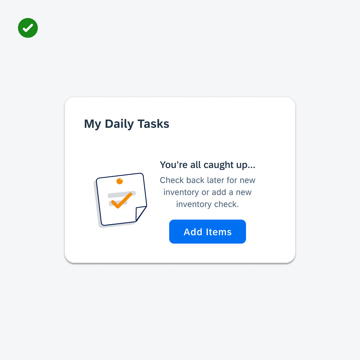
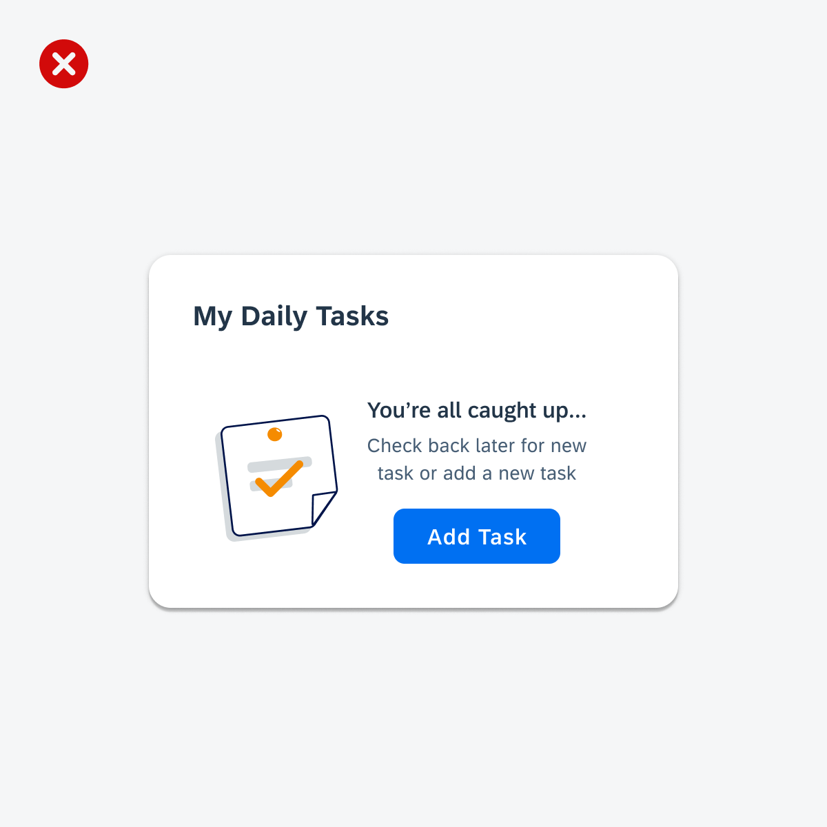
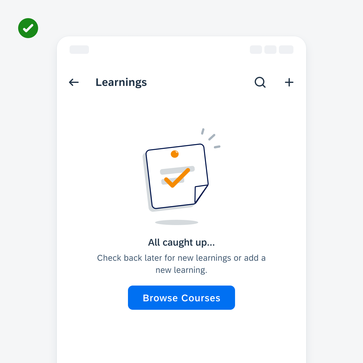
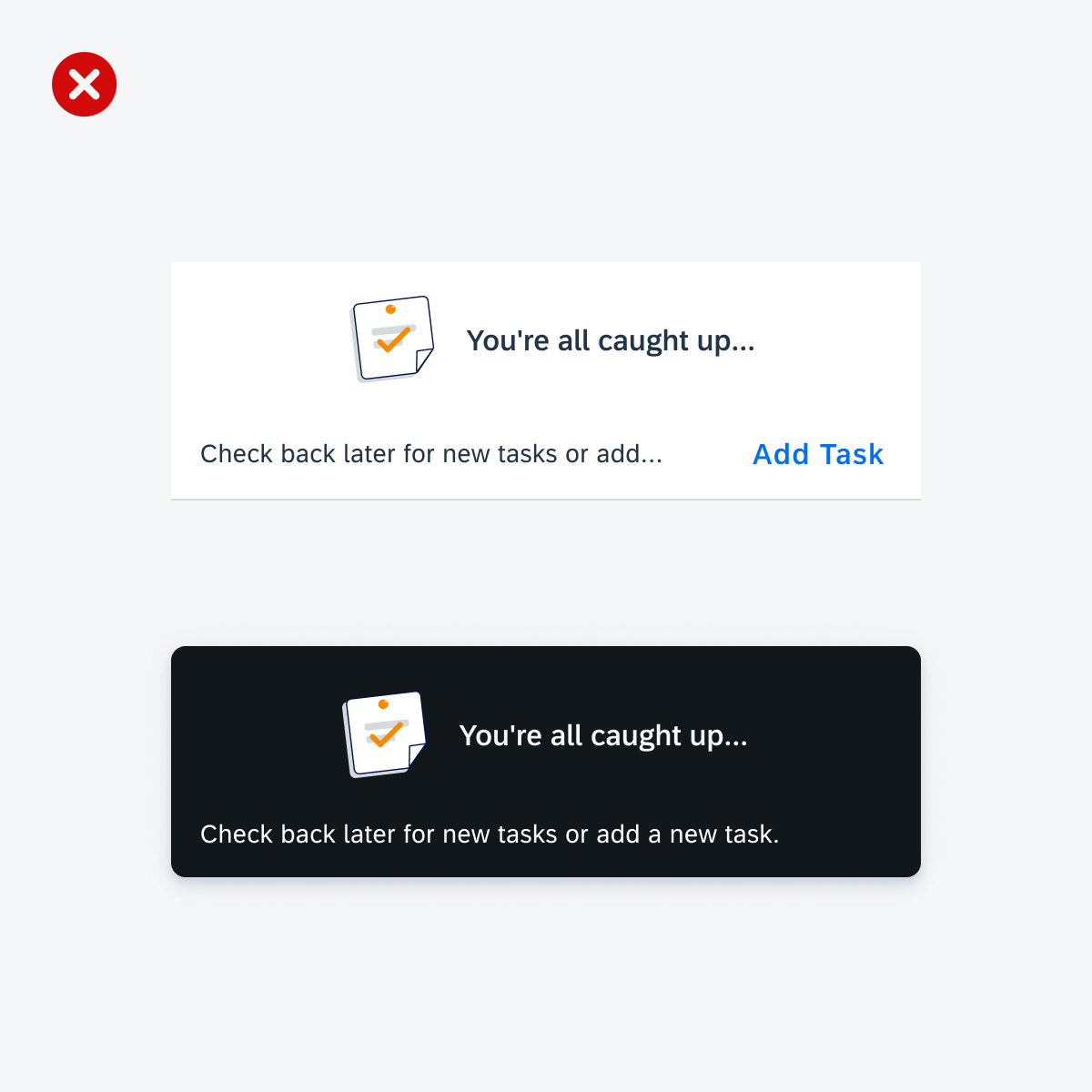
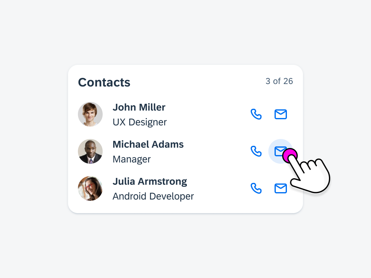
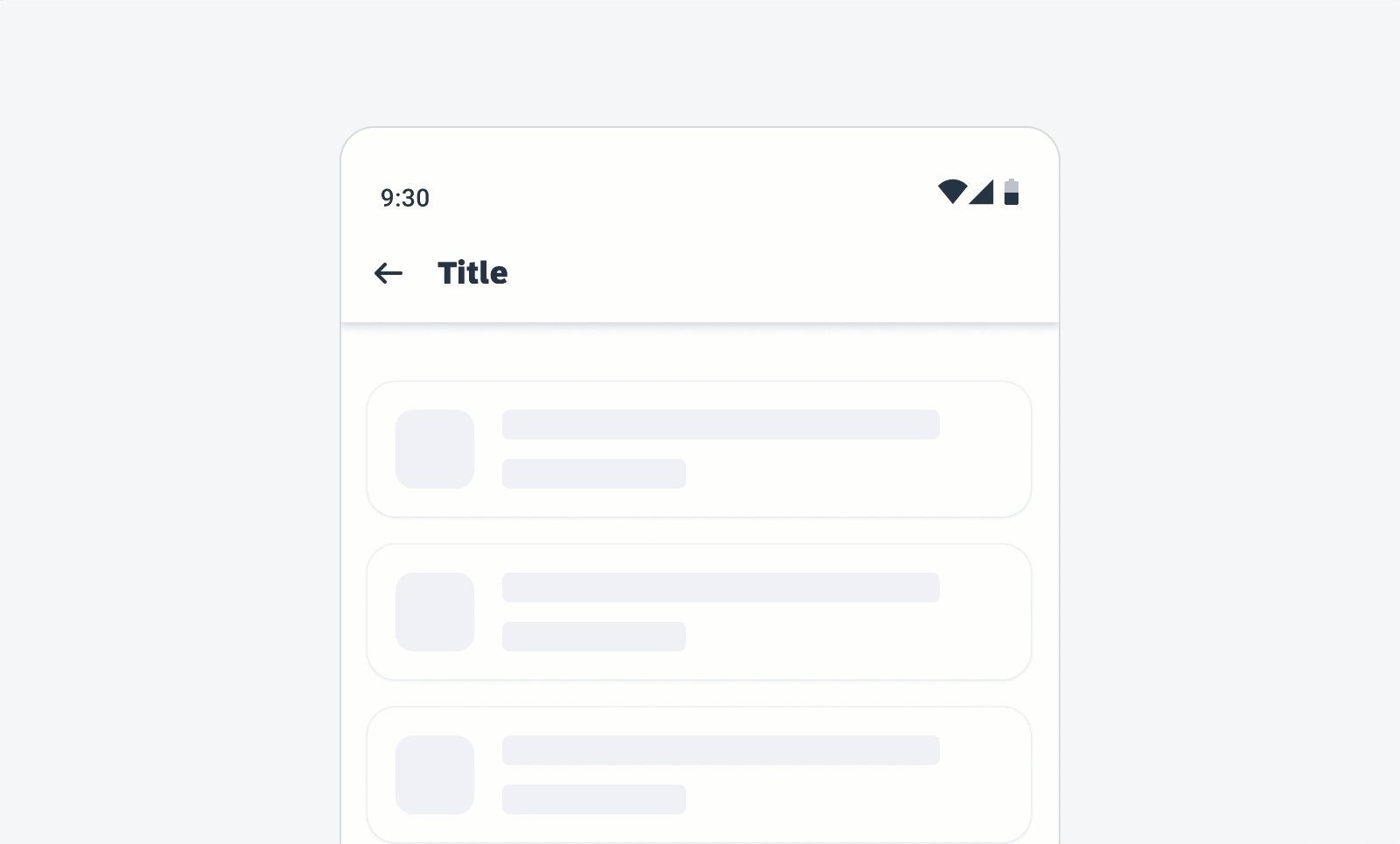
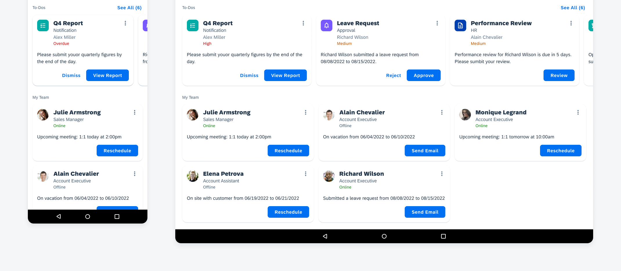
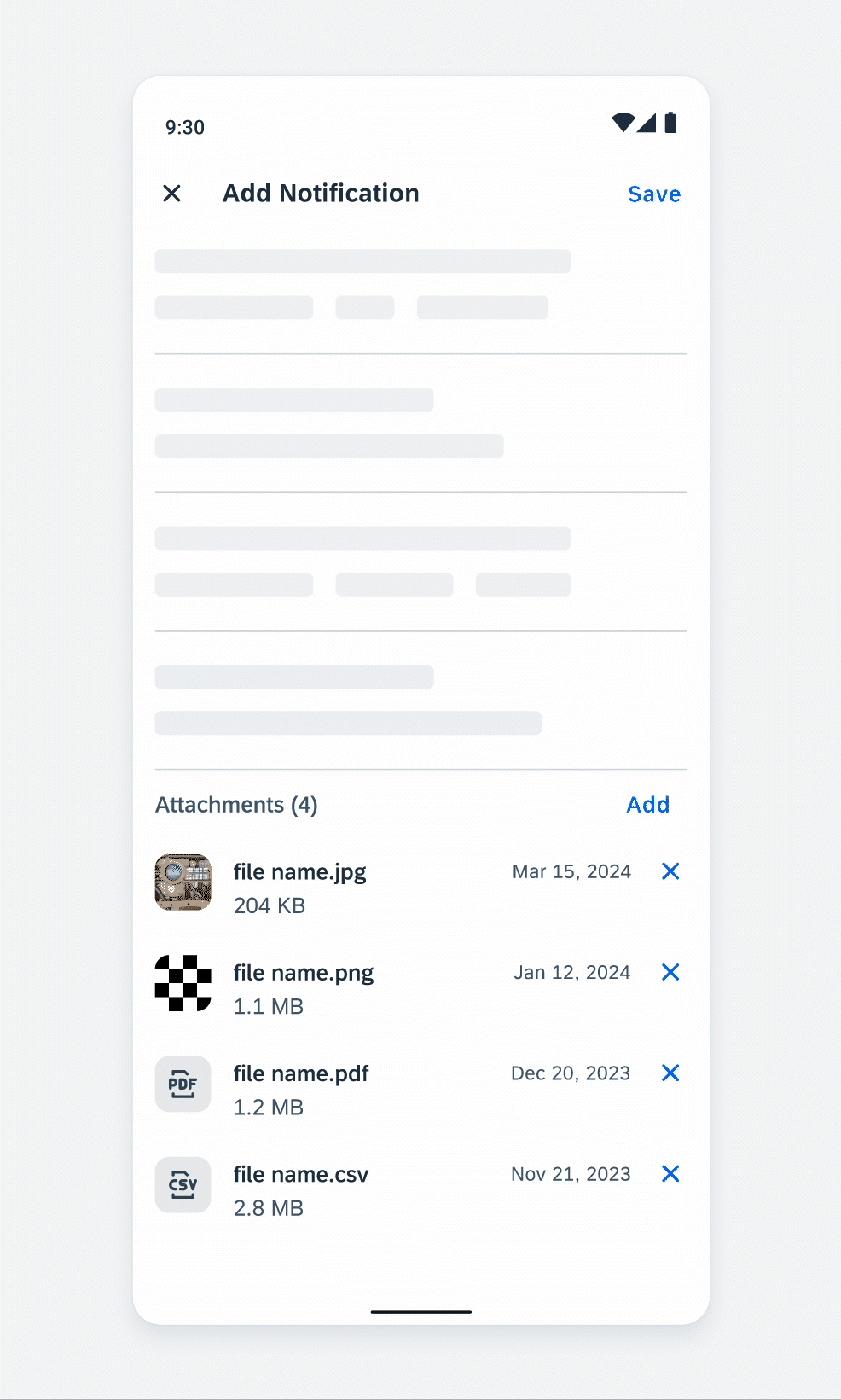
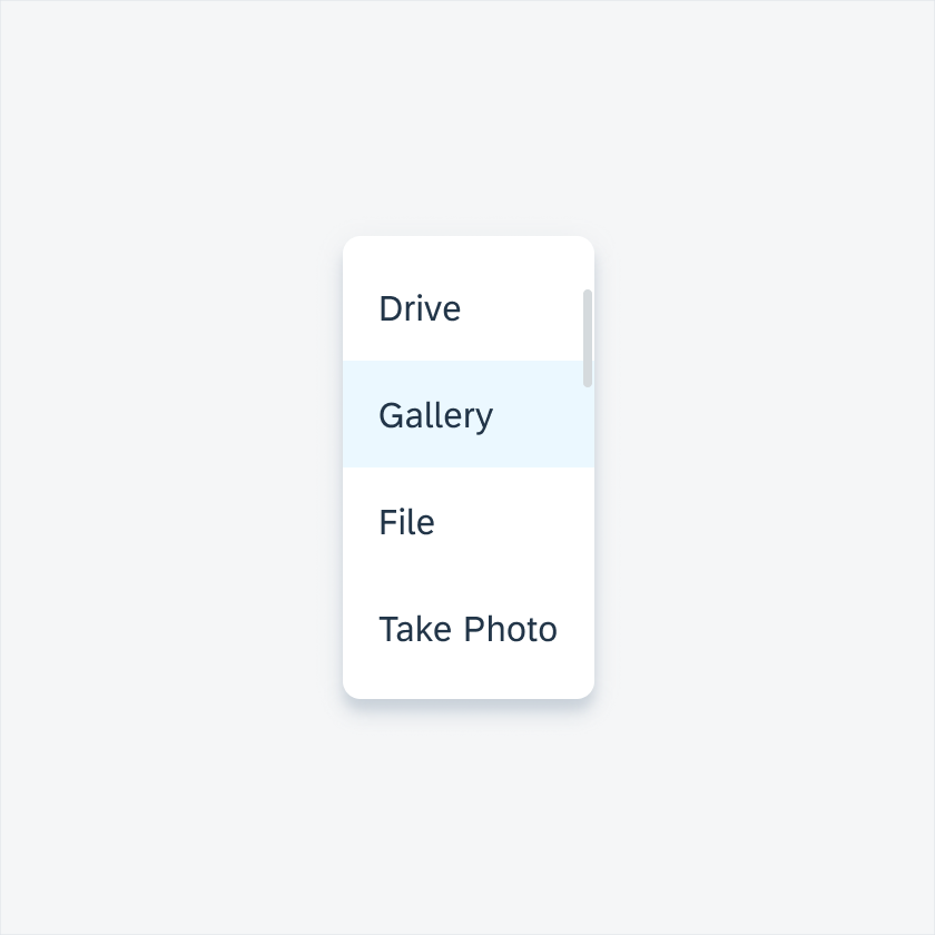
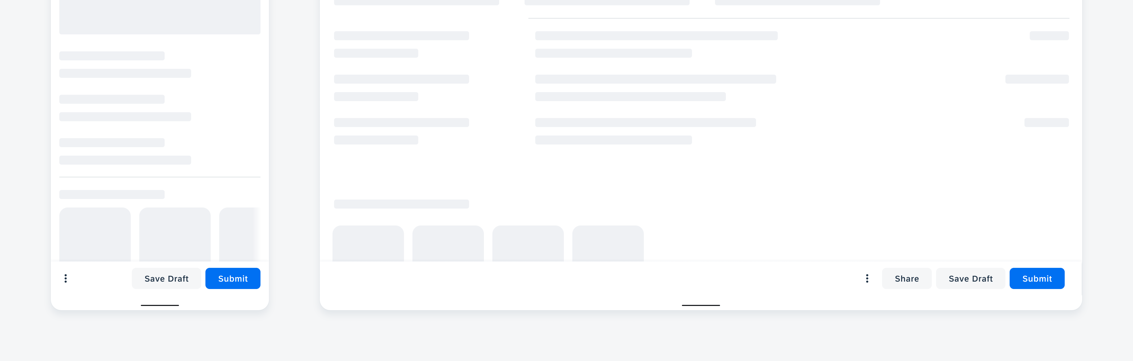
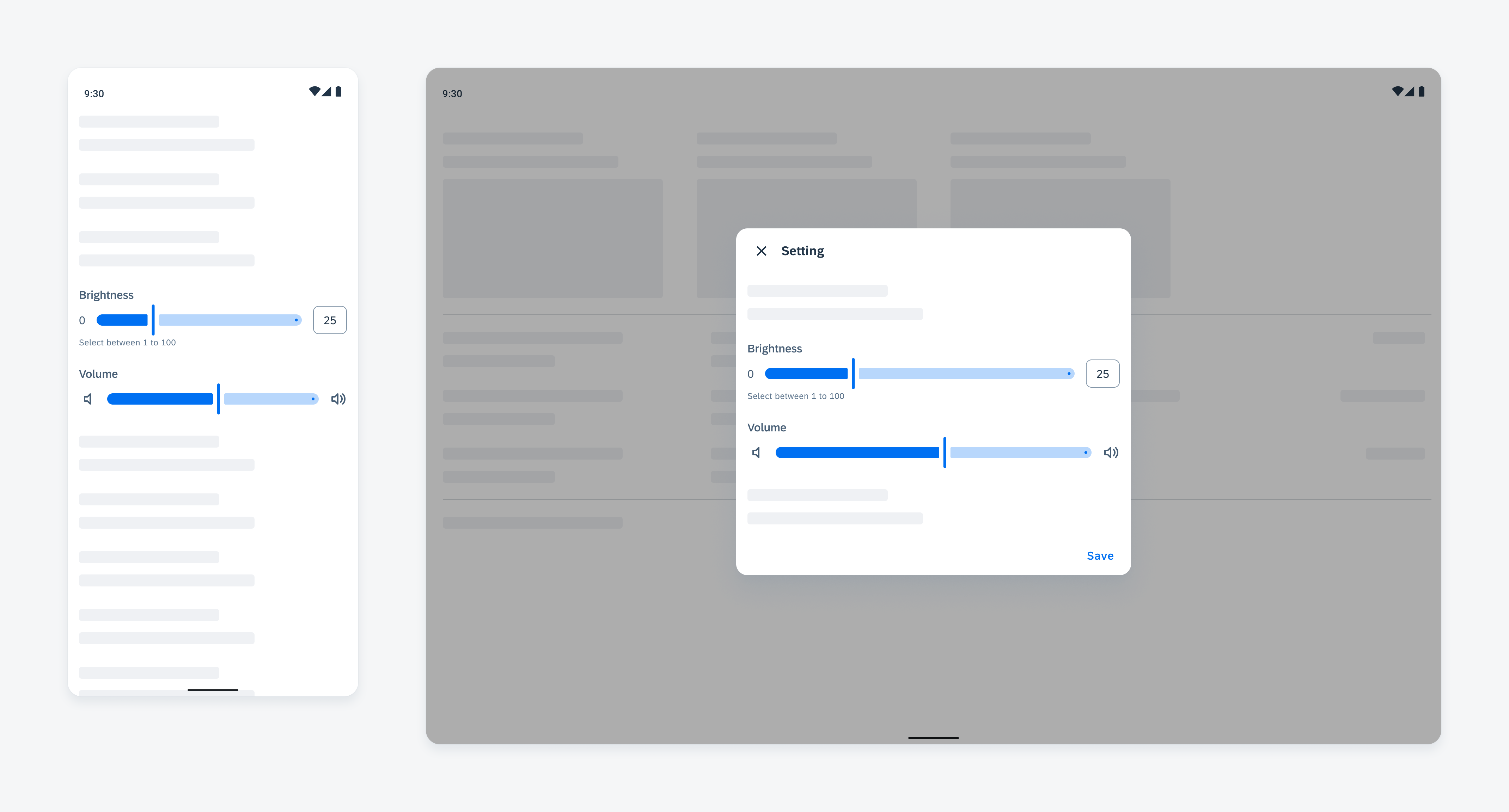
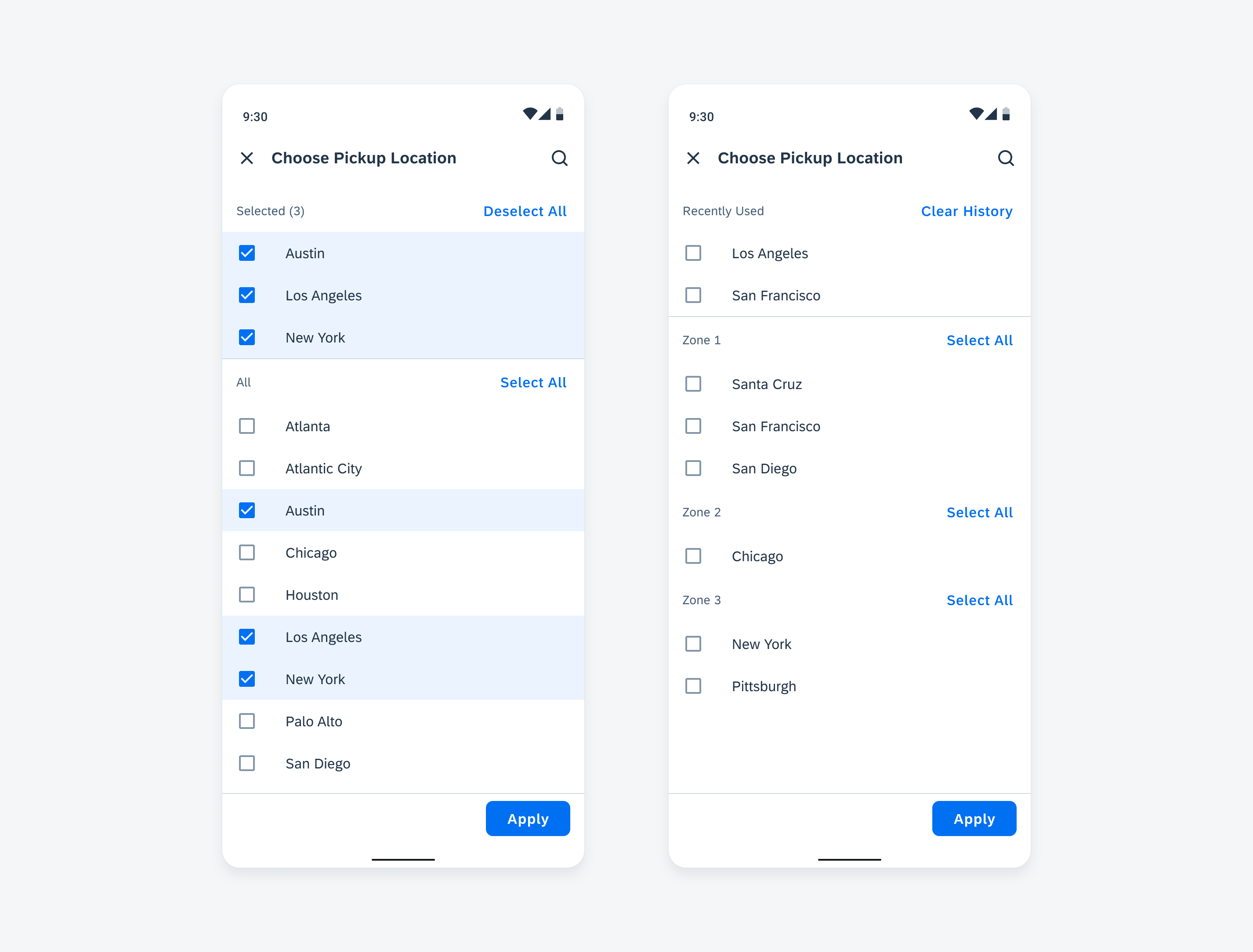
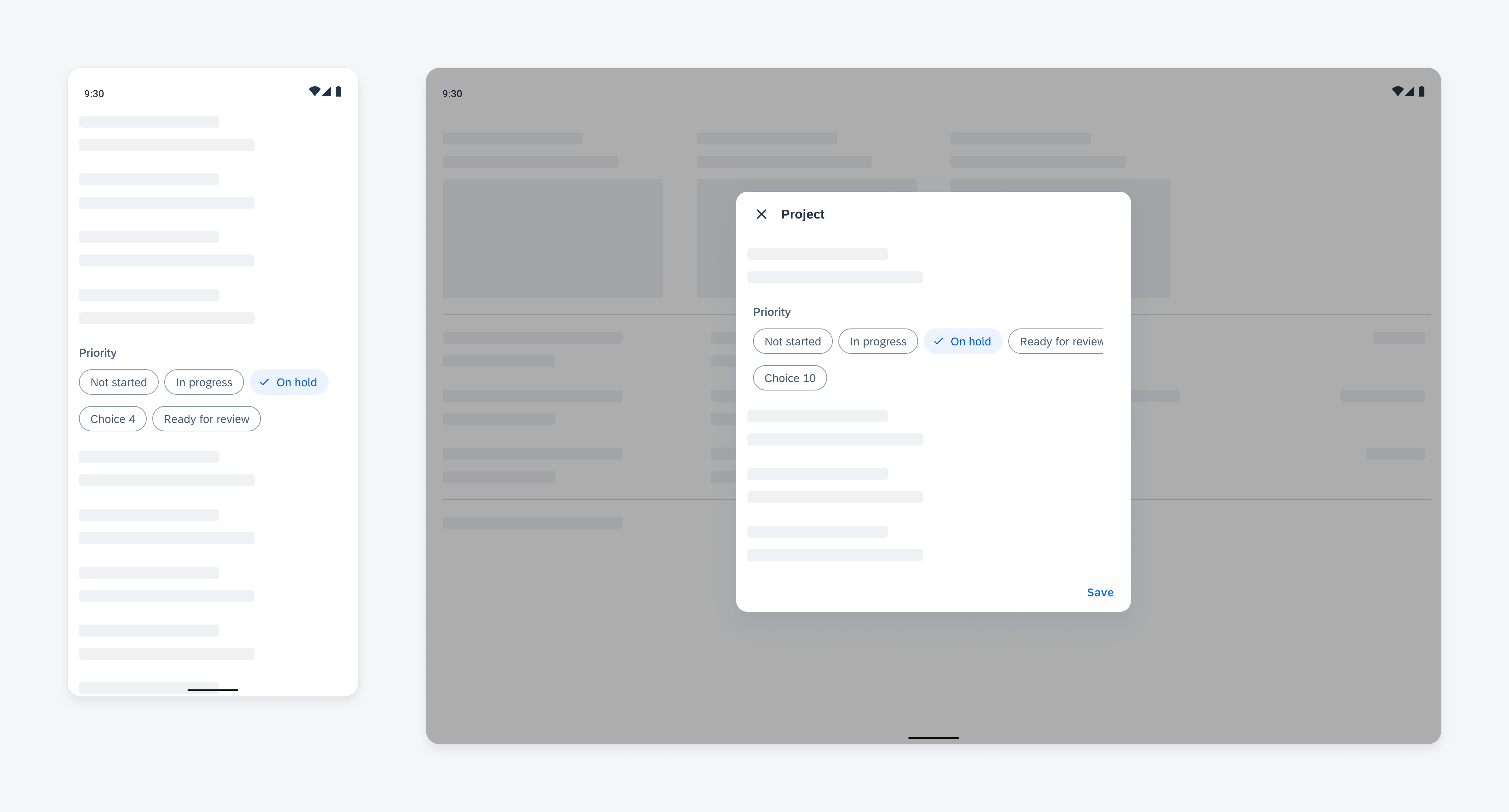
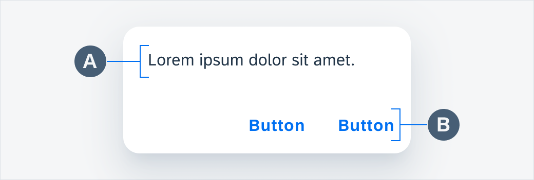
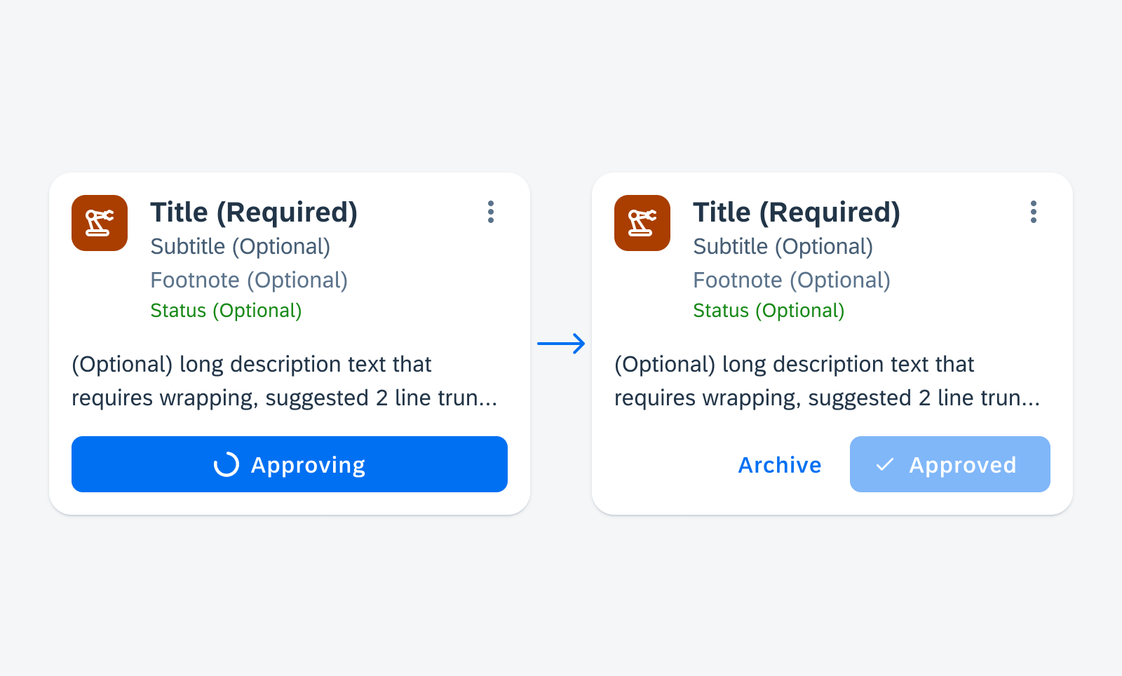
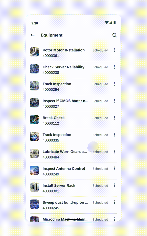
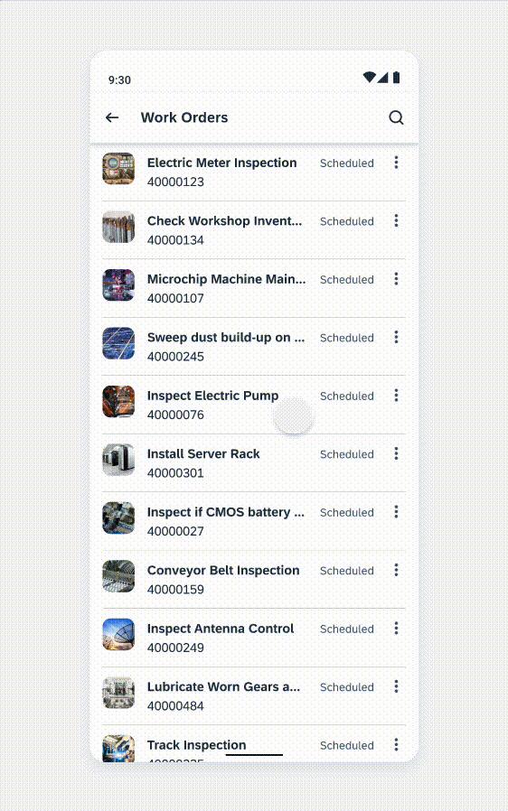
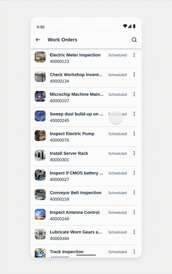
Multi-Message Handling
Multi-message handling helps users manage multiple messages within an app, making it easy for users to take action.
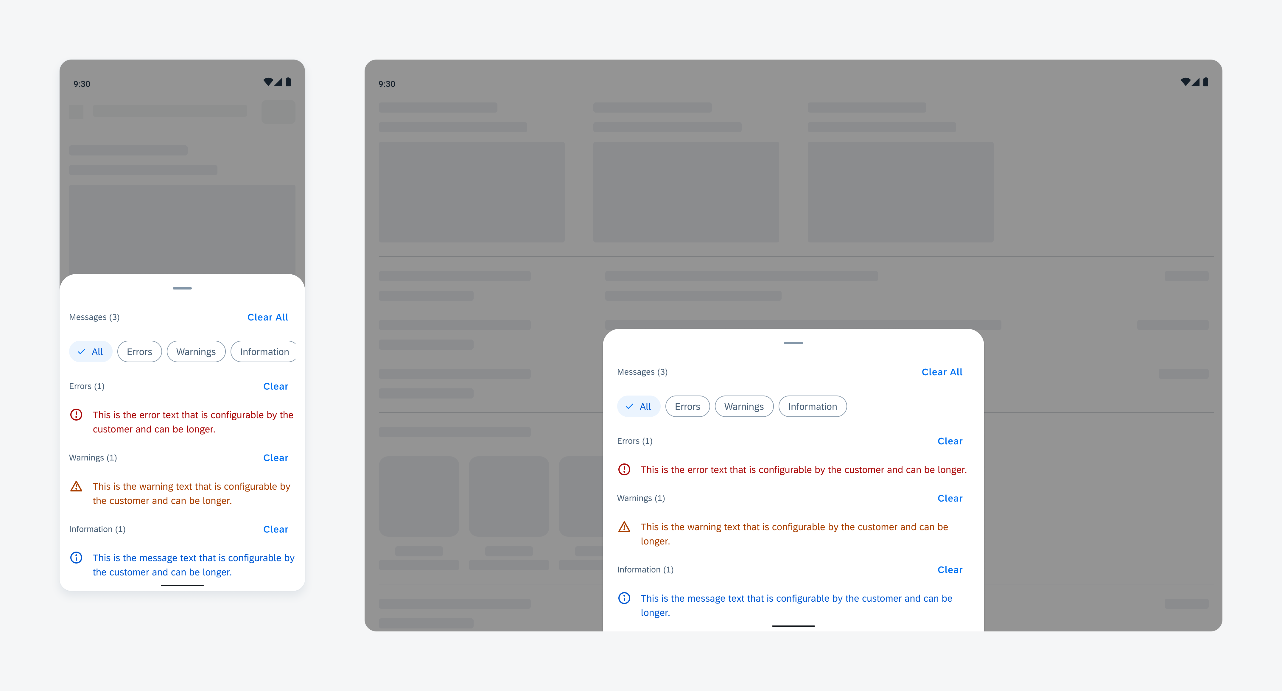
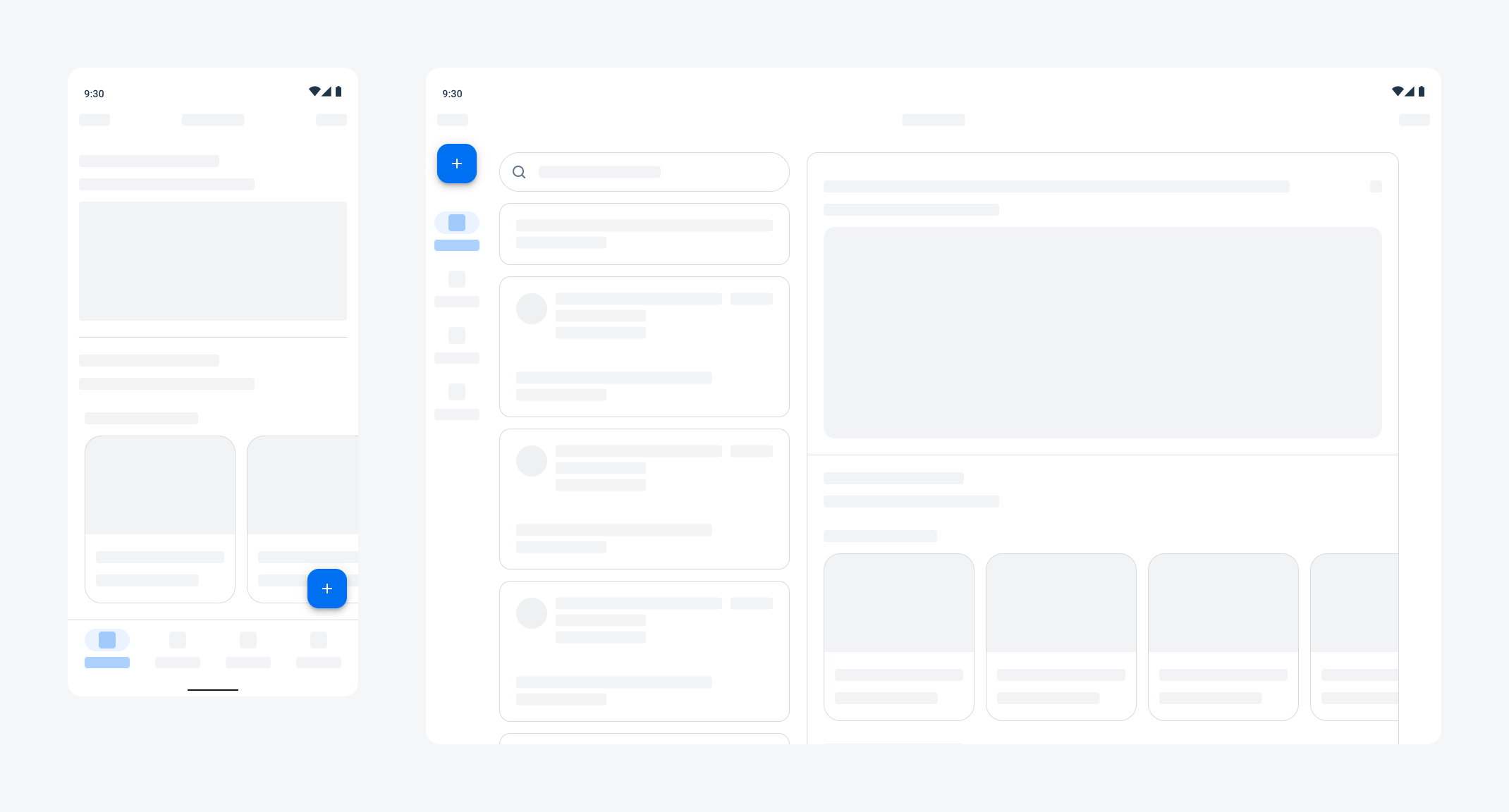
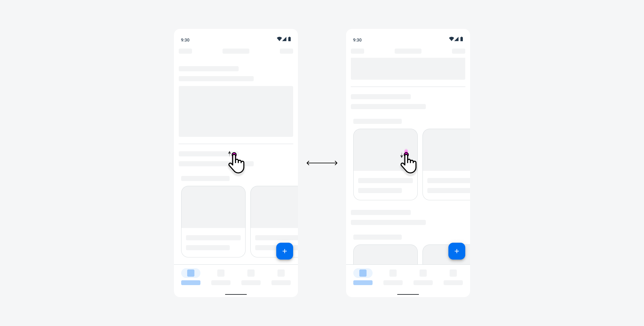
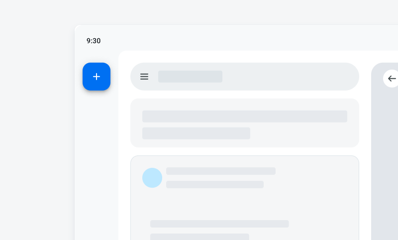
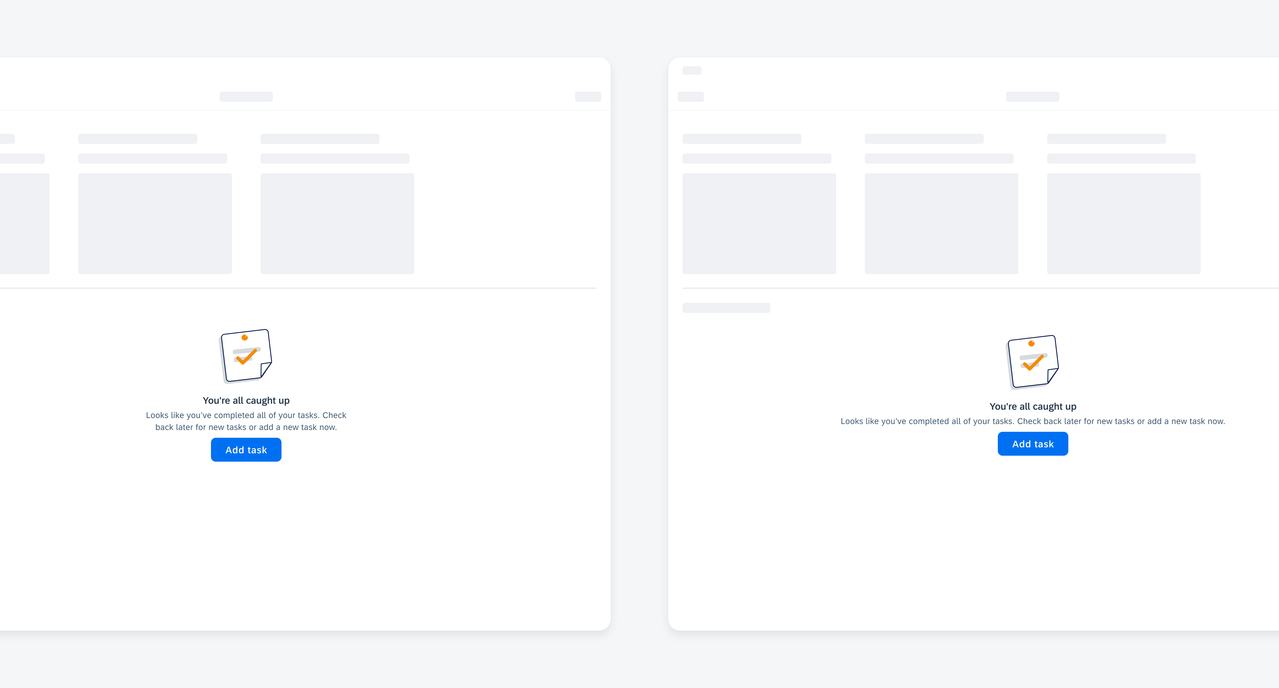
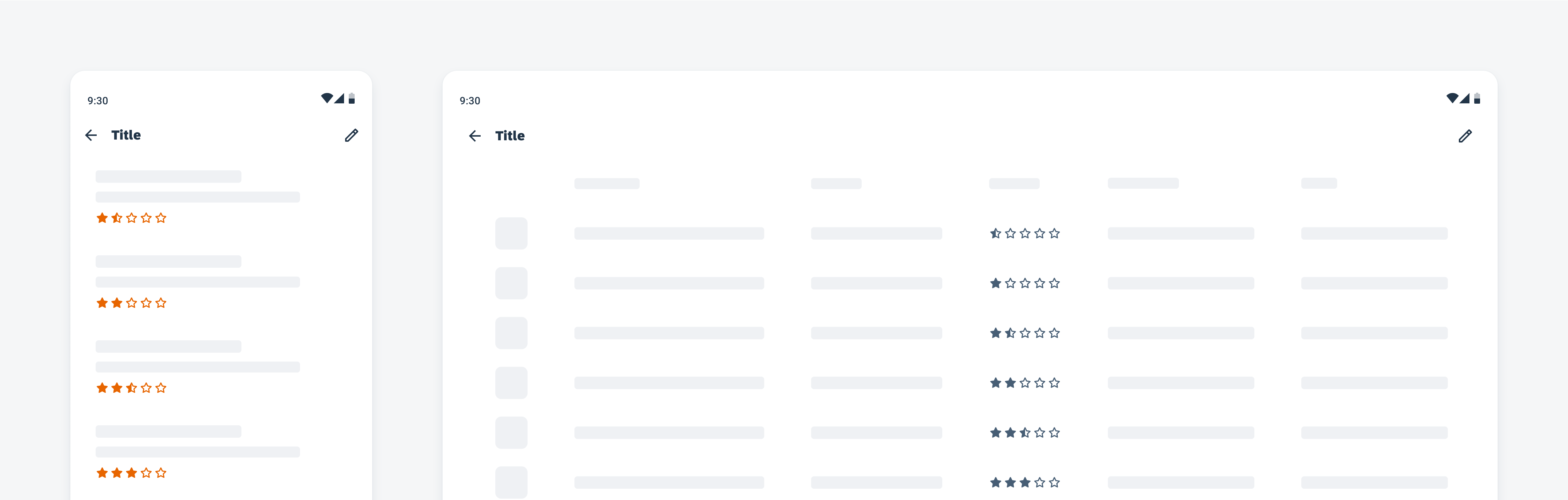
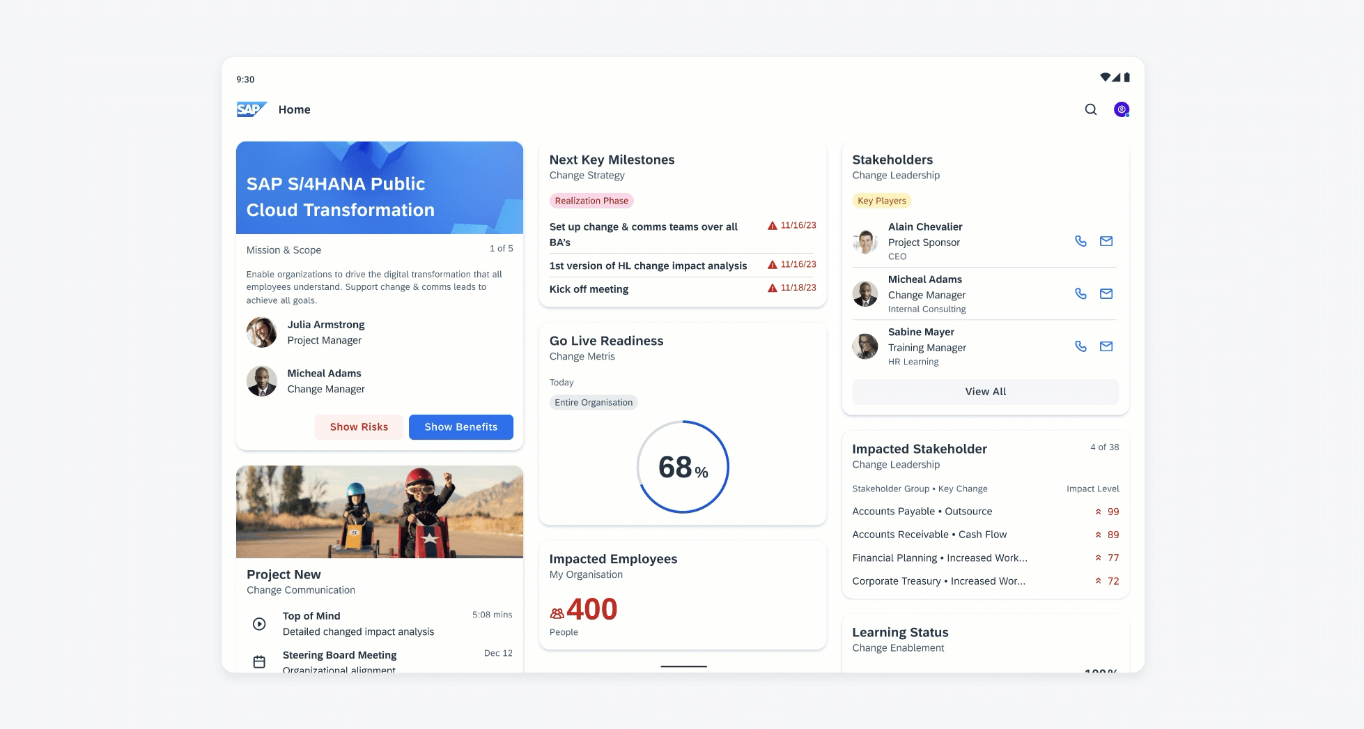
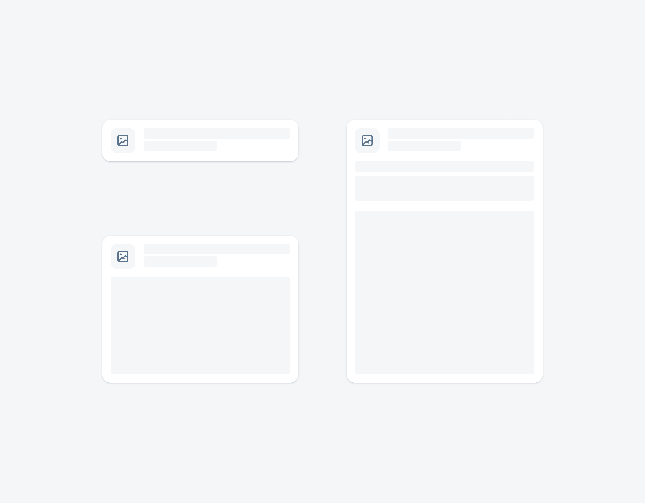
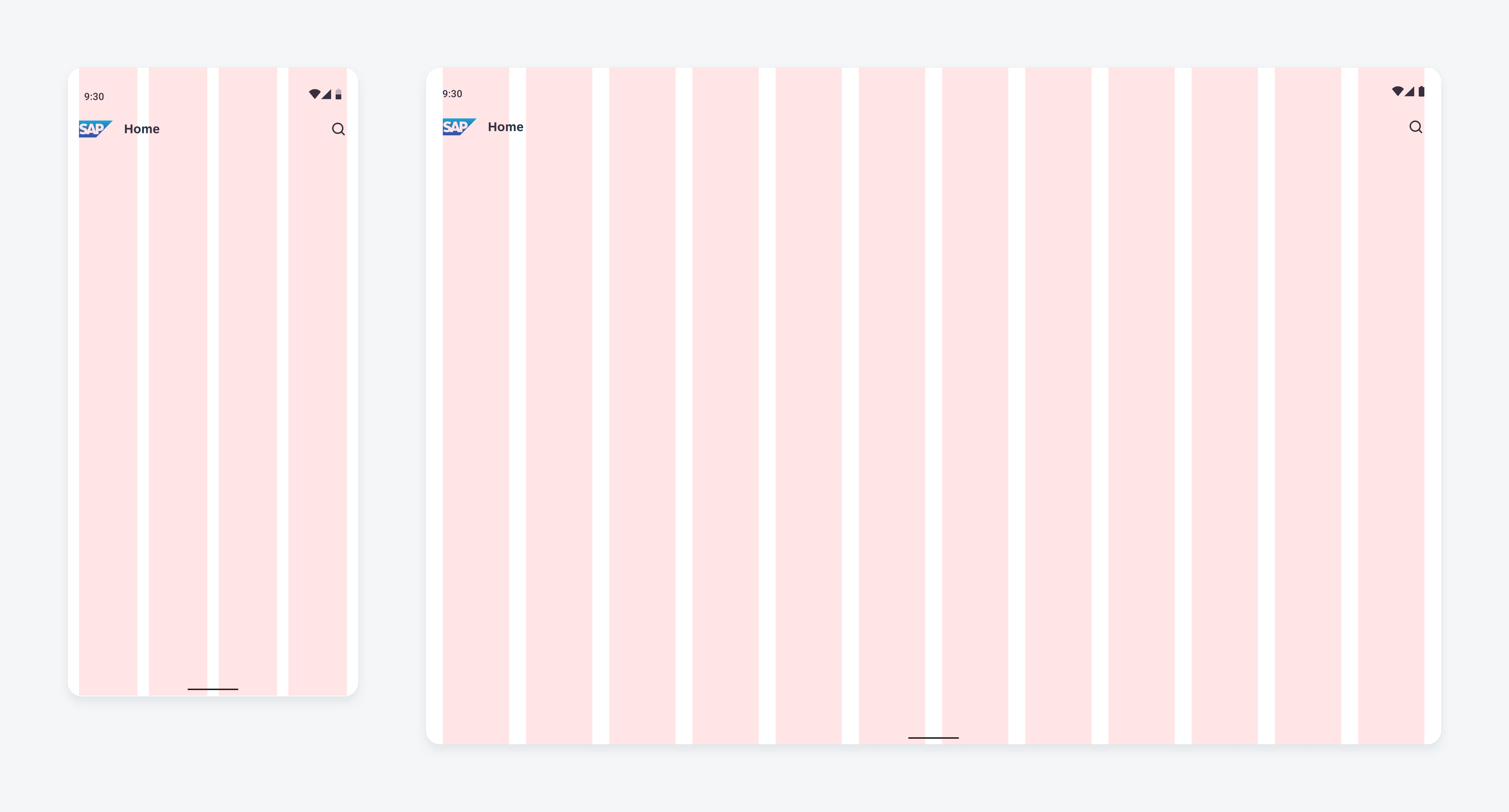
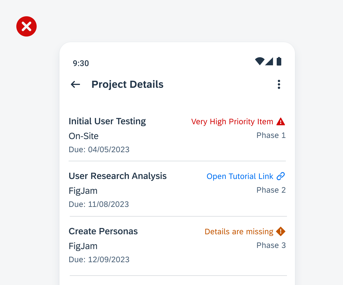
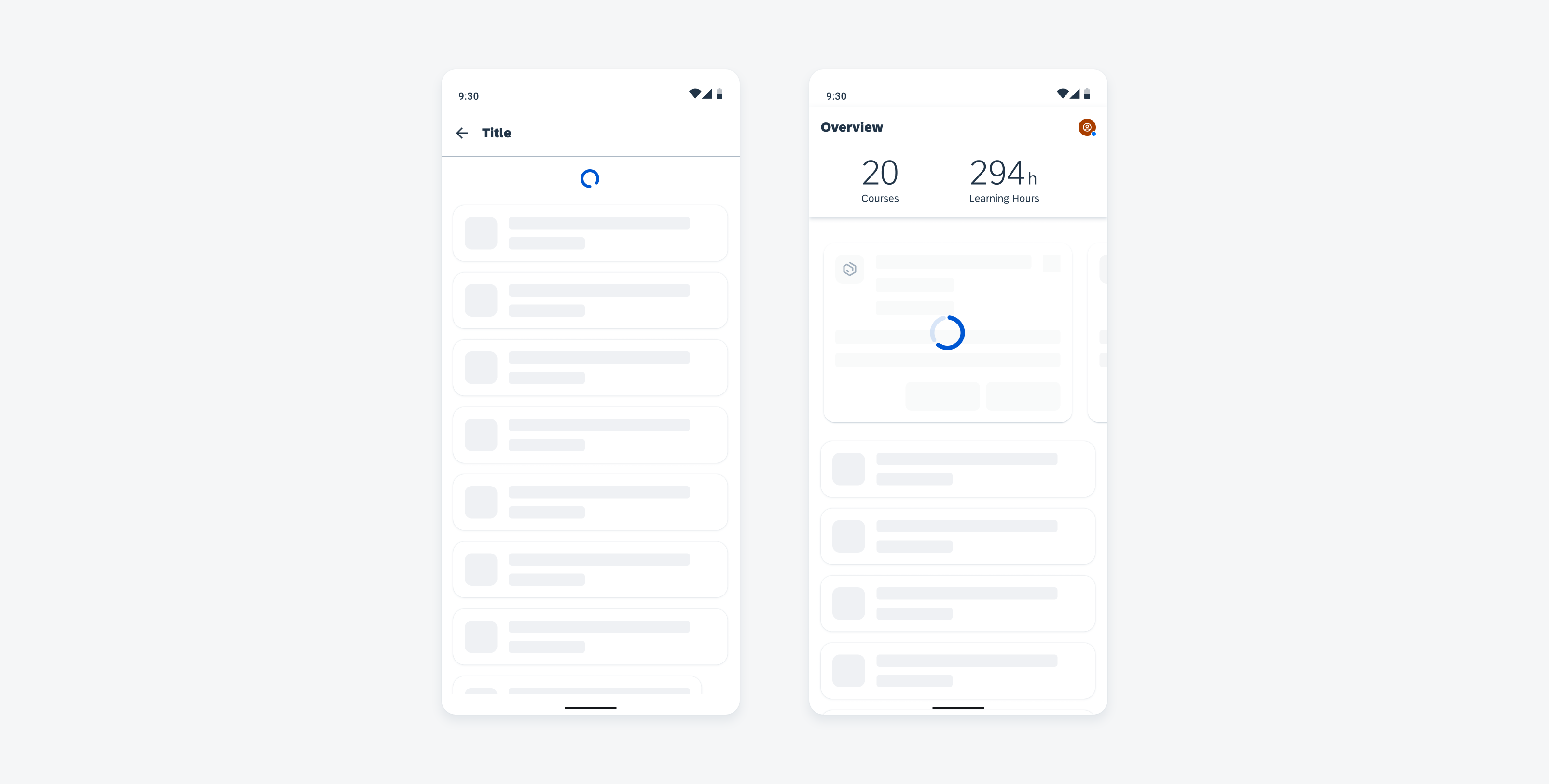
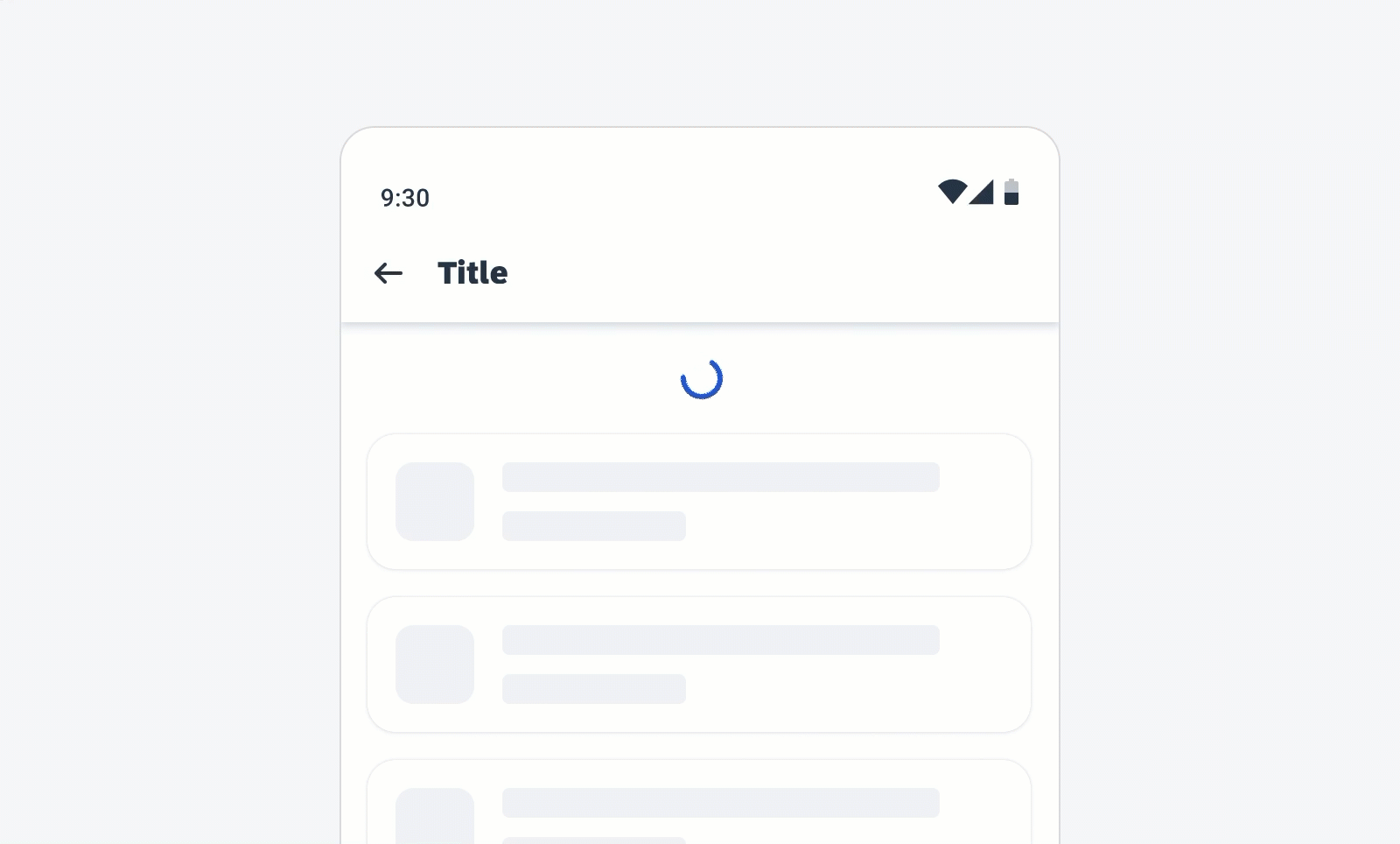
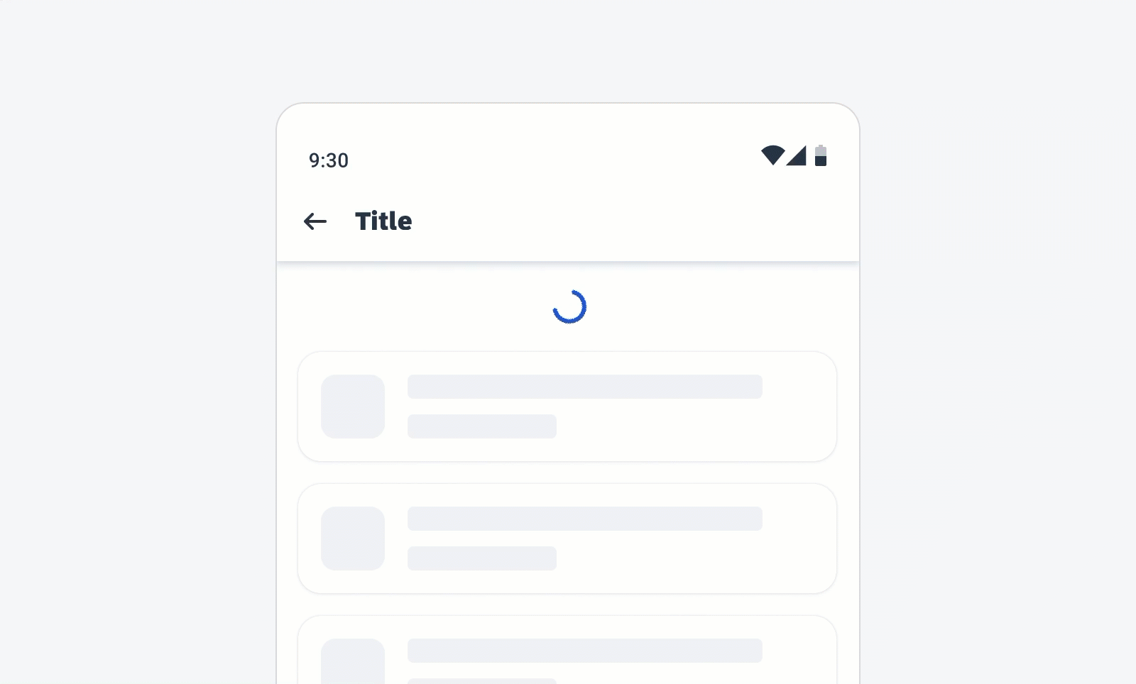
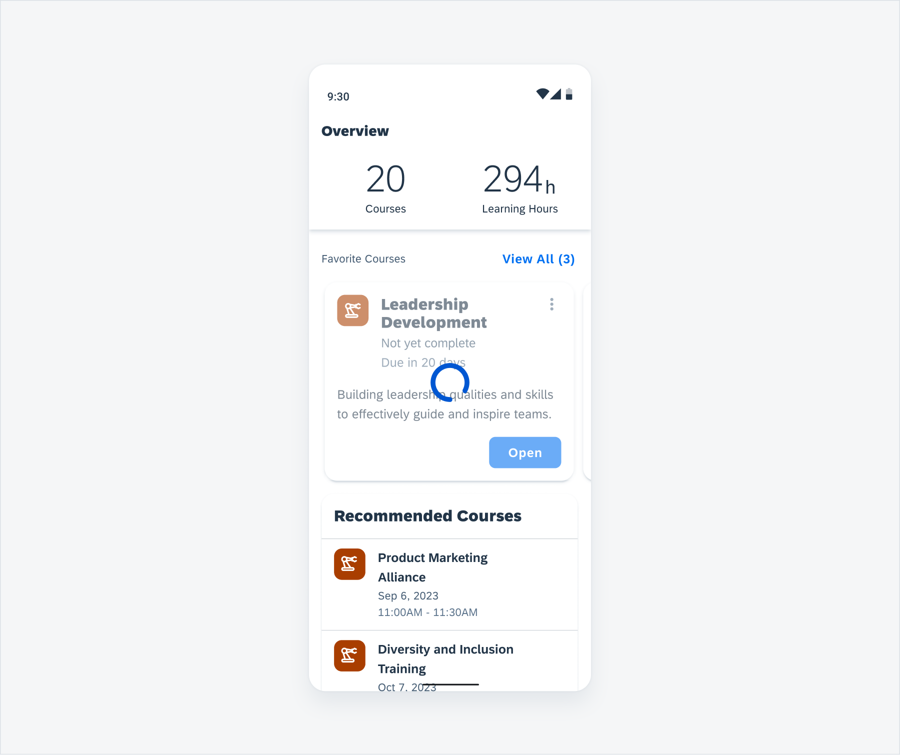
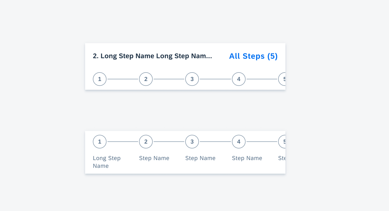
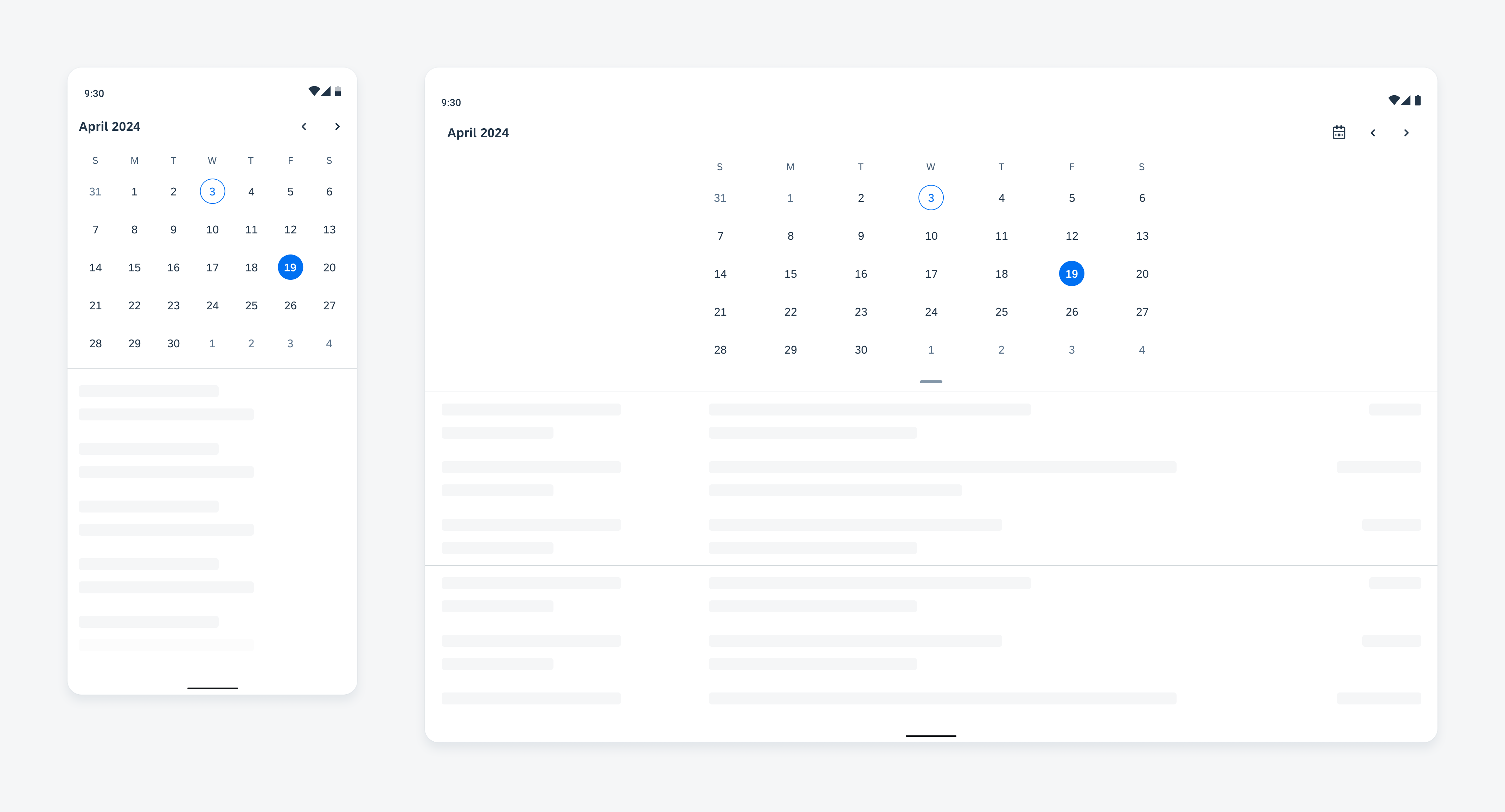
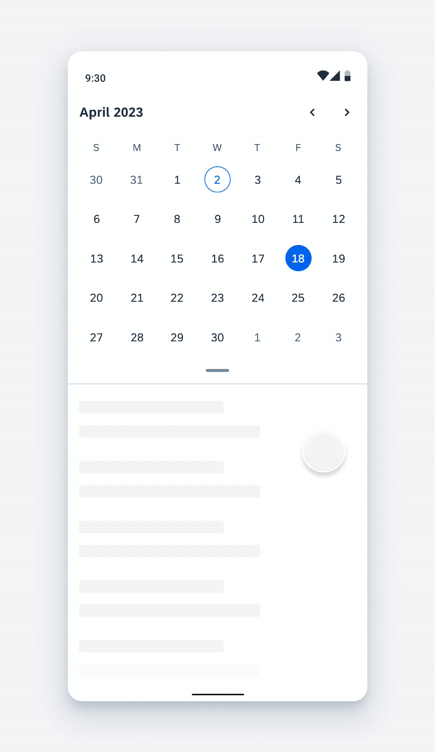
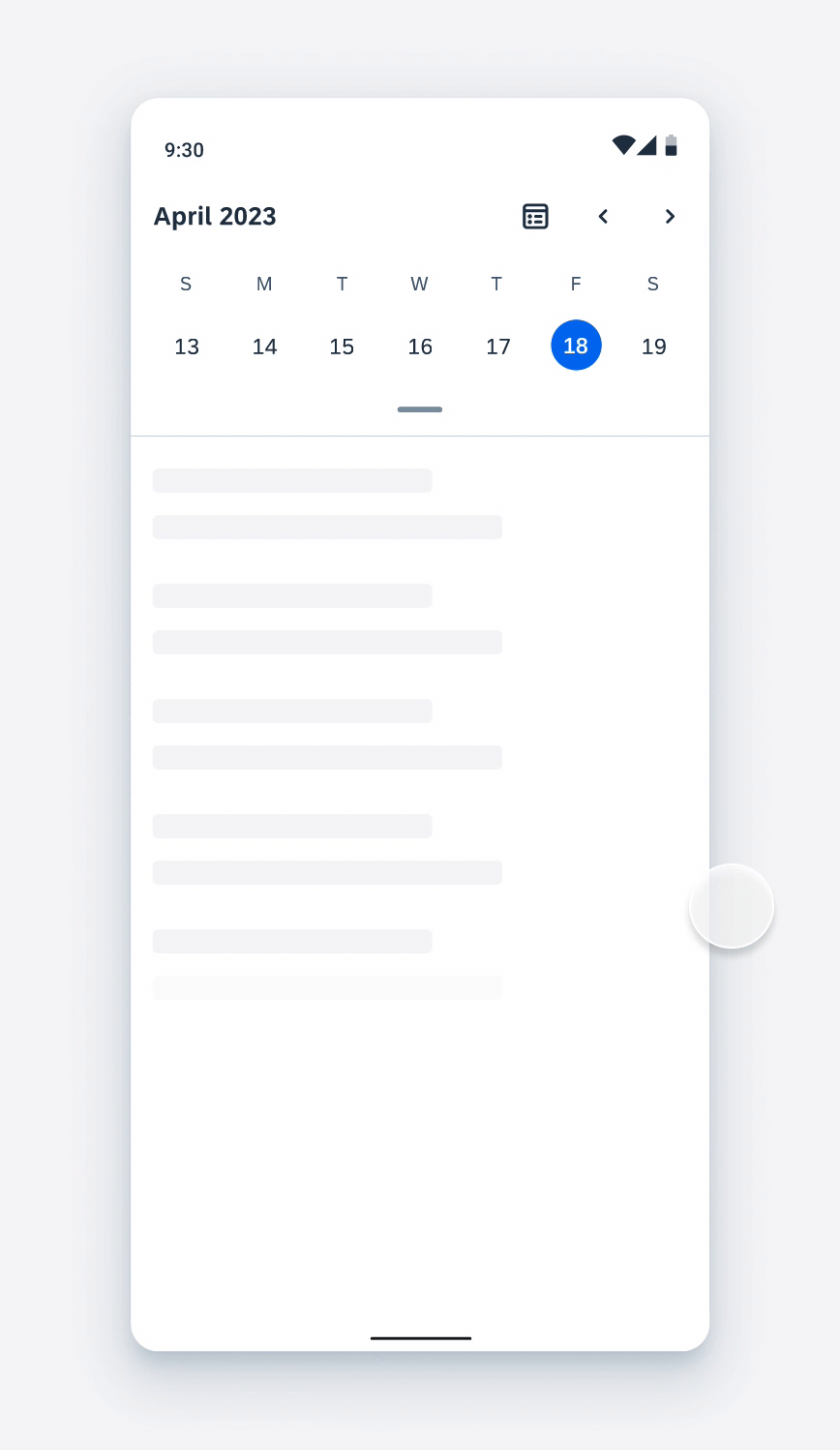
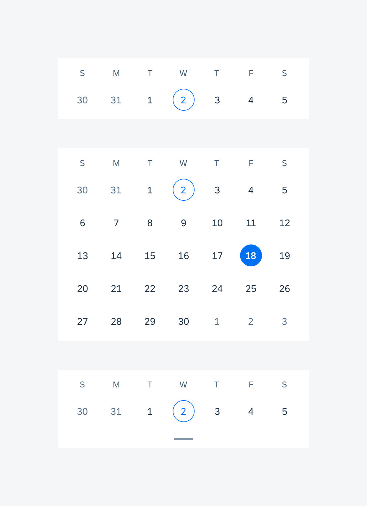
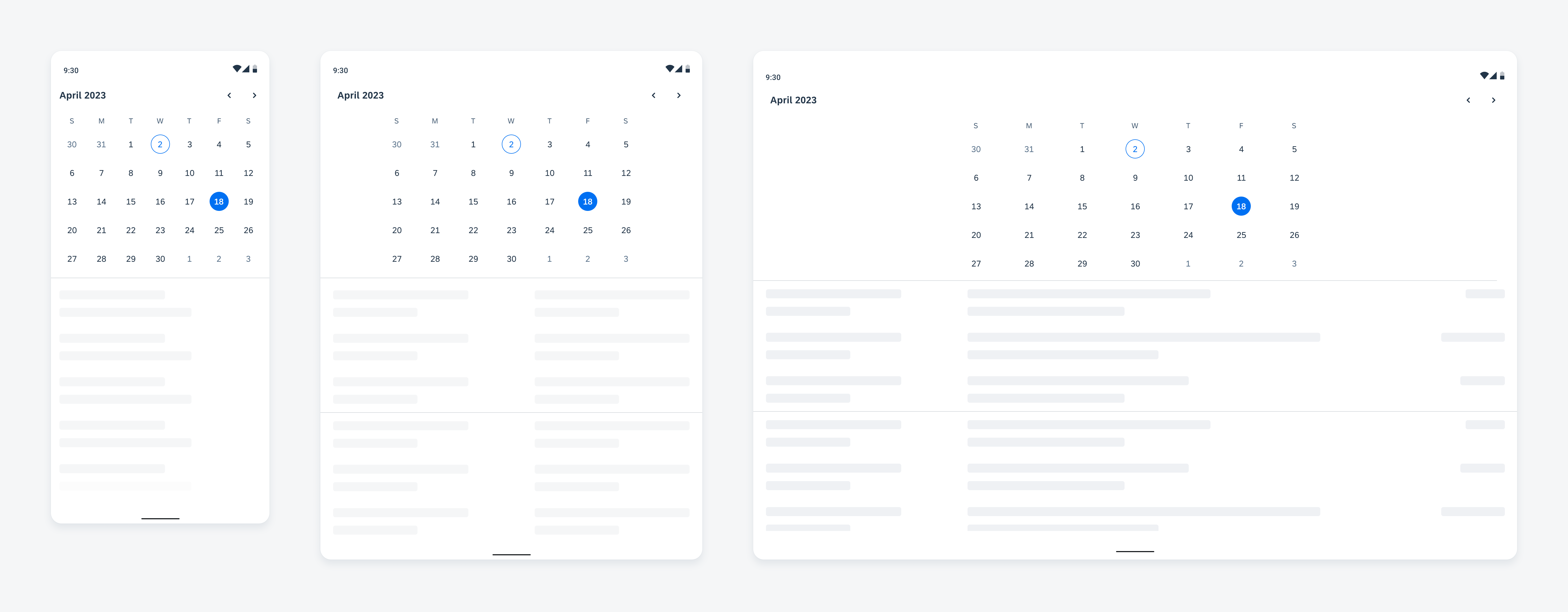
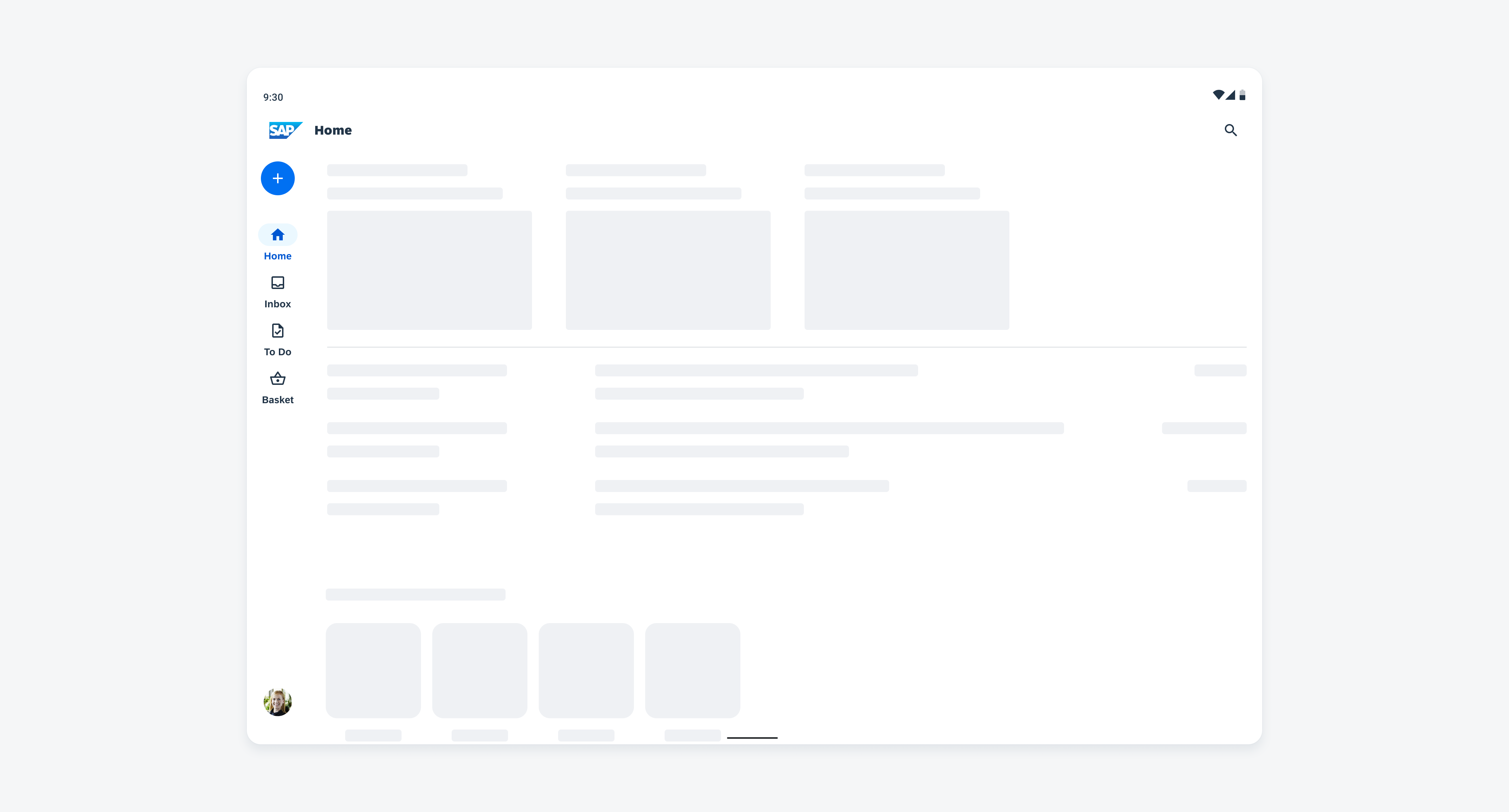
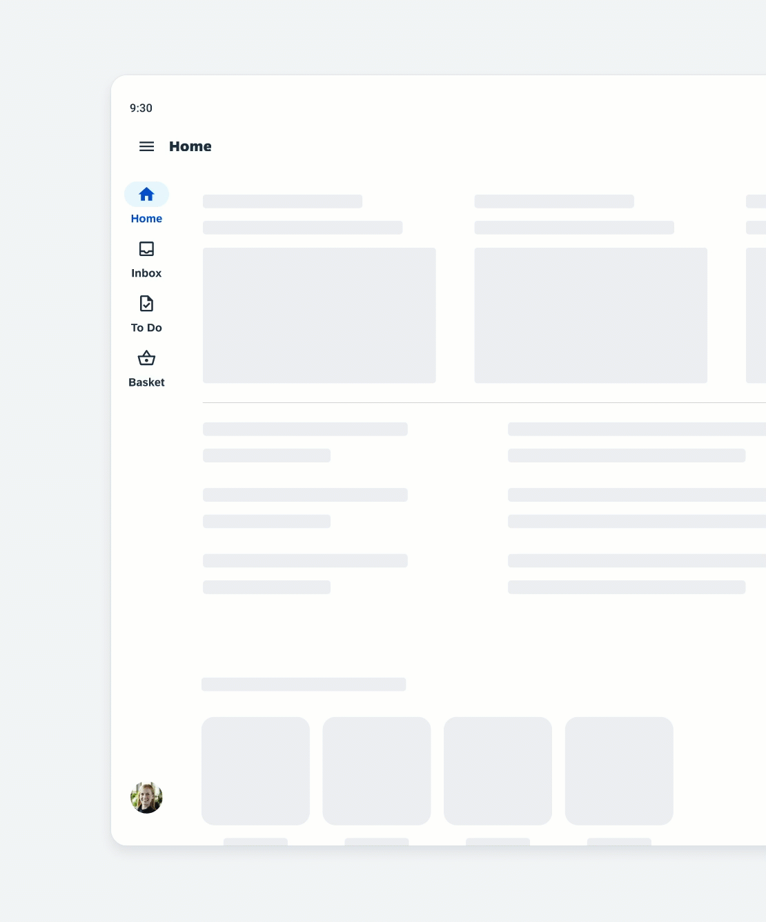
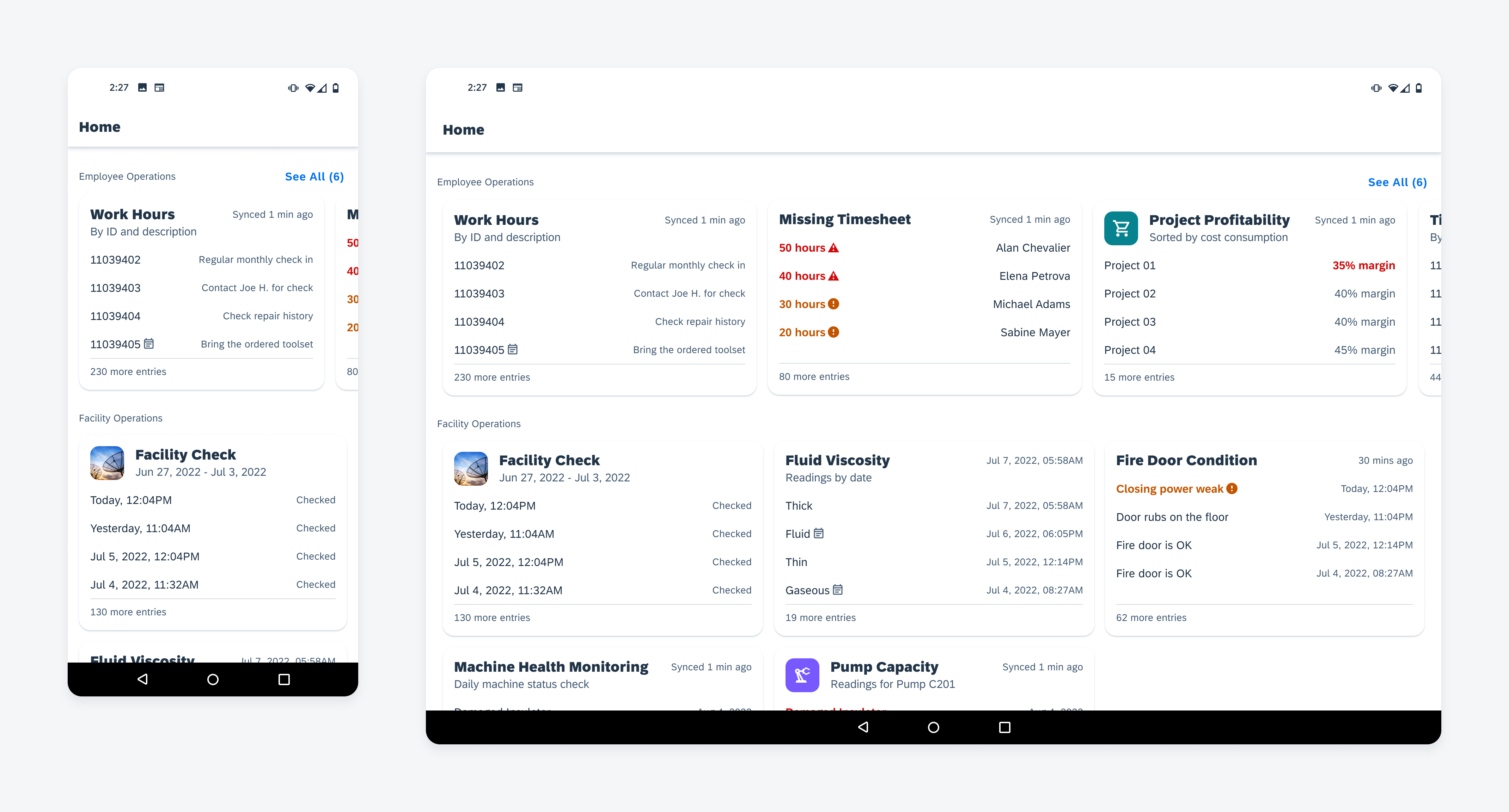
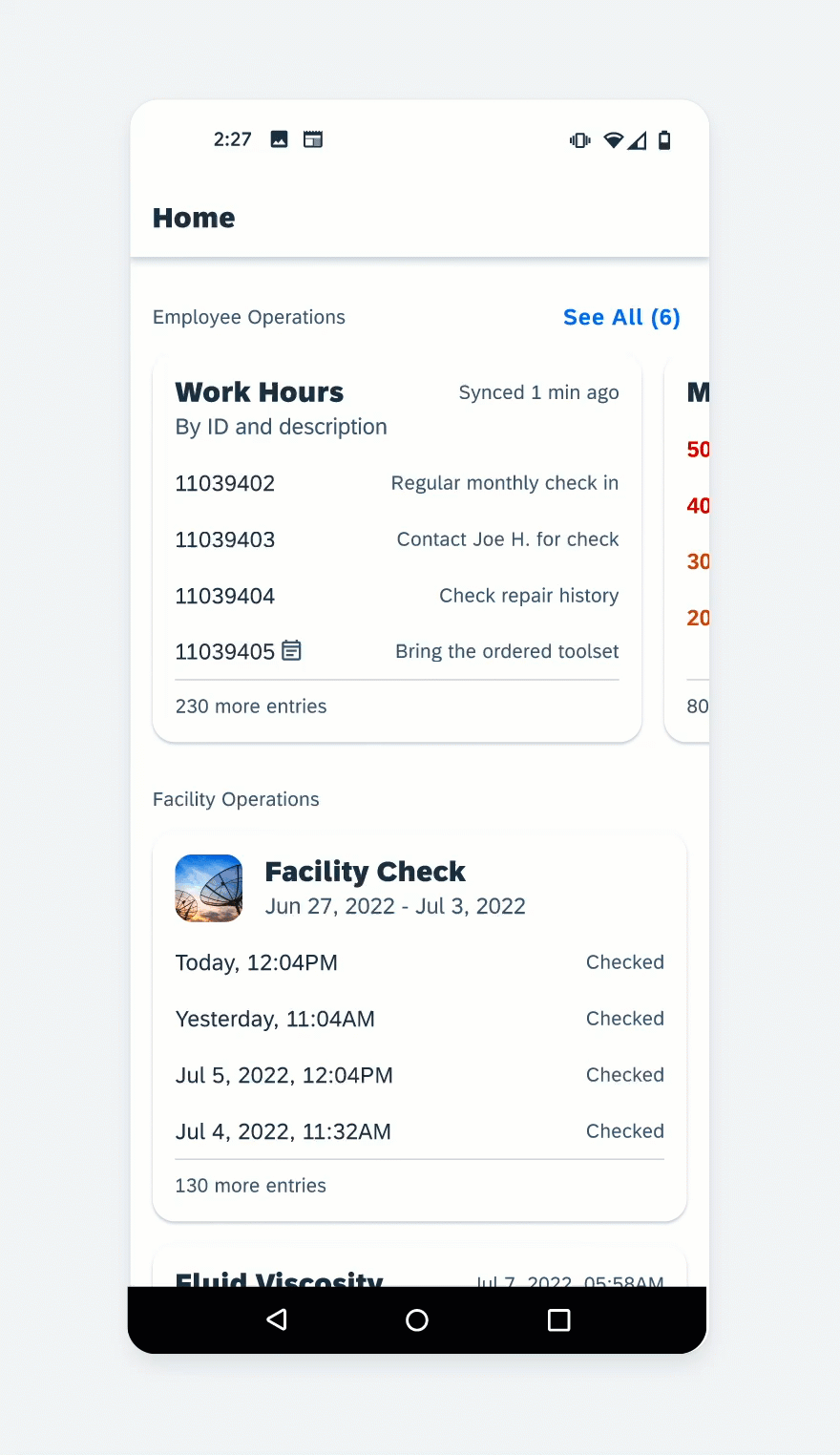
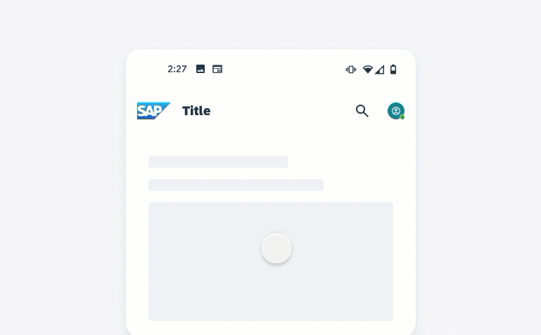
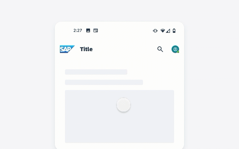
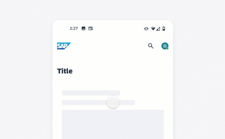
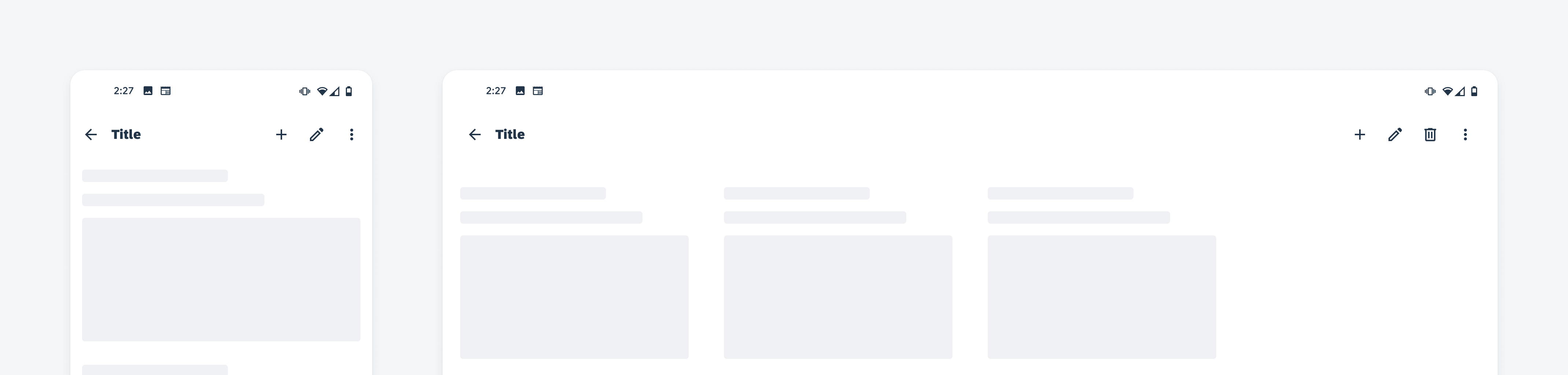
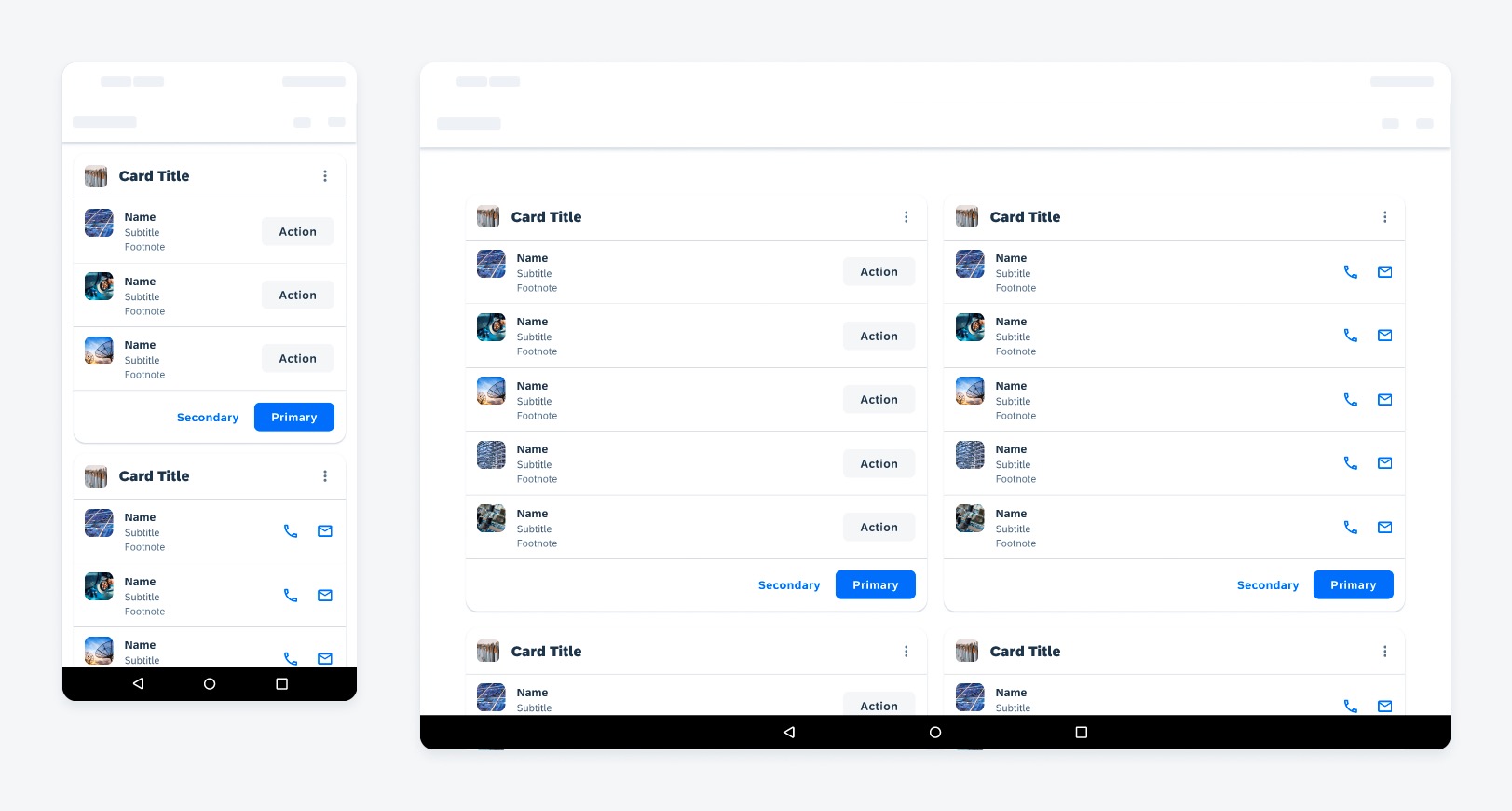
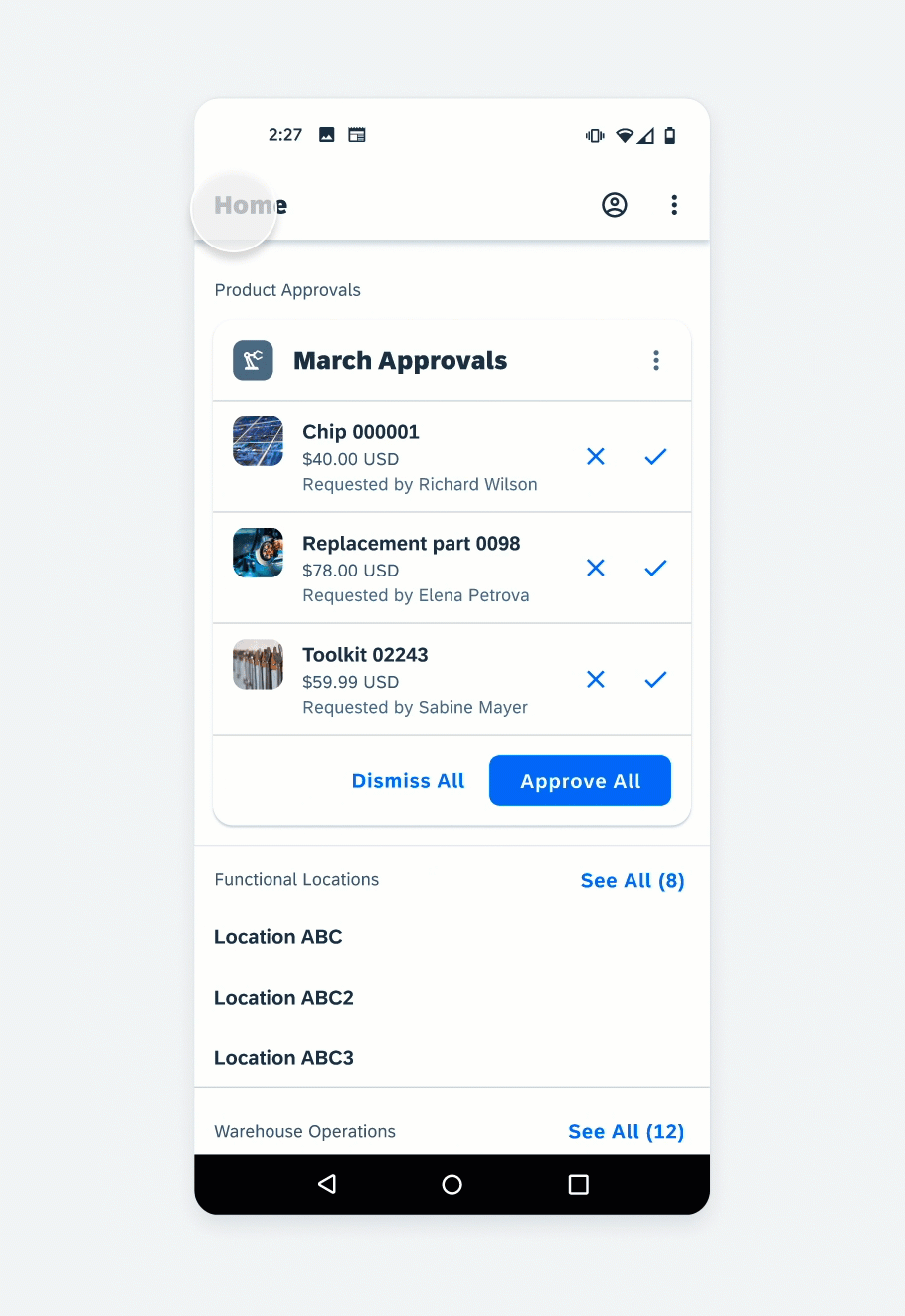
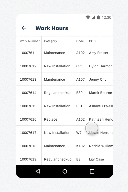
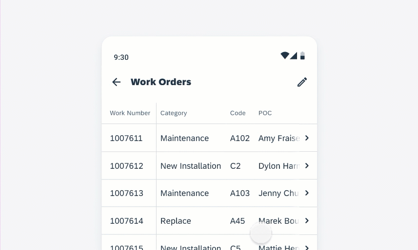
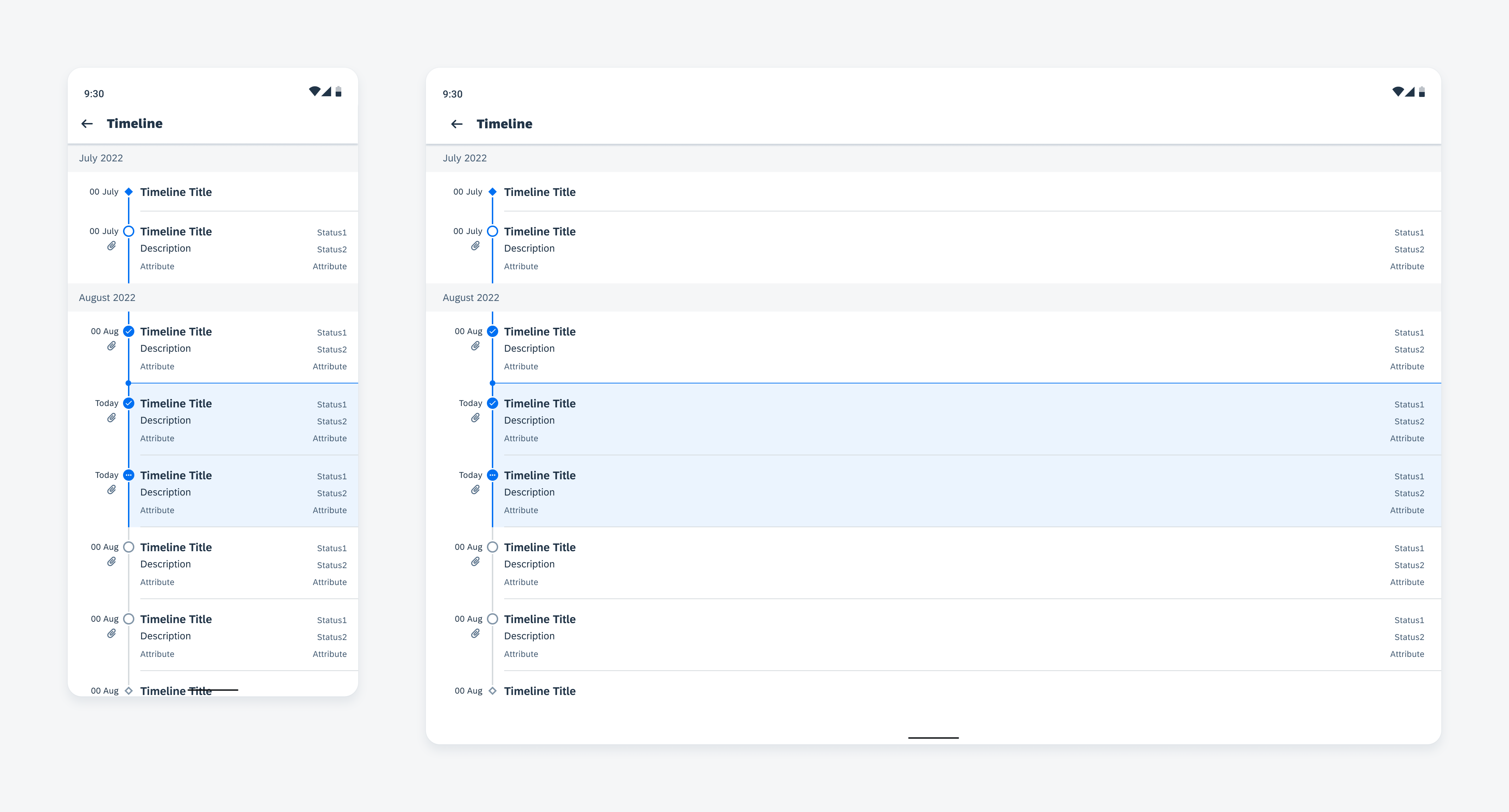
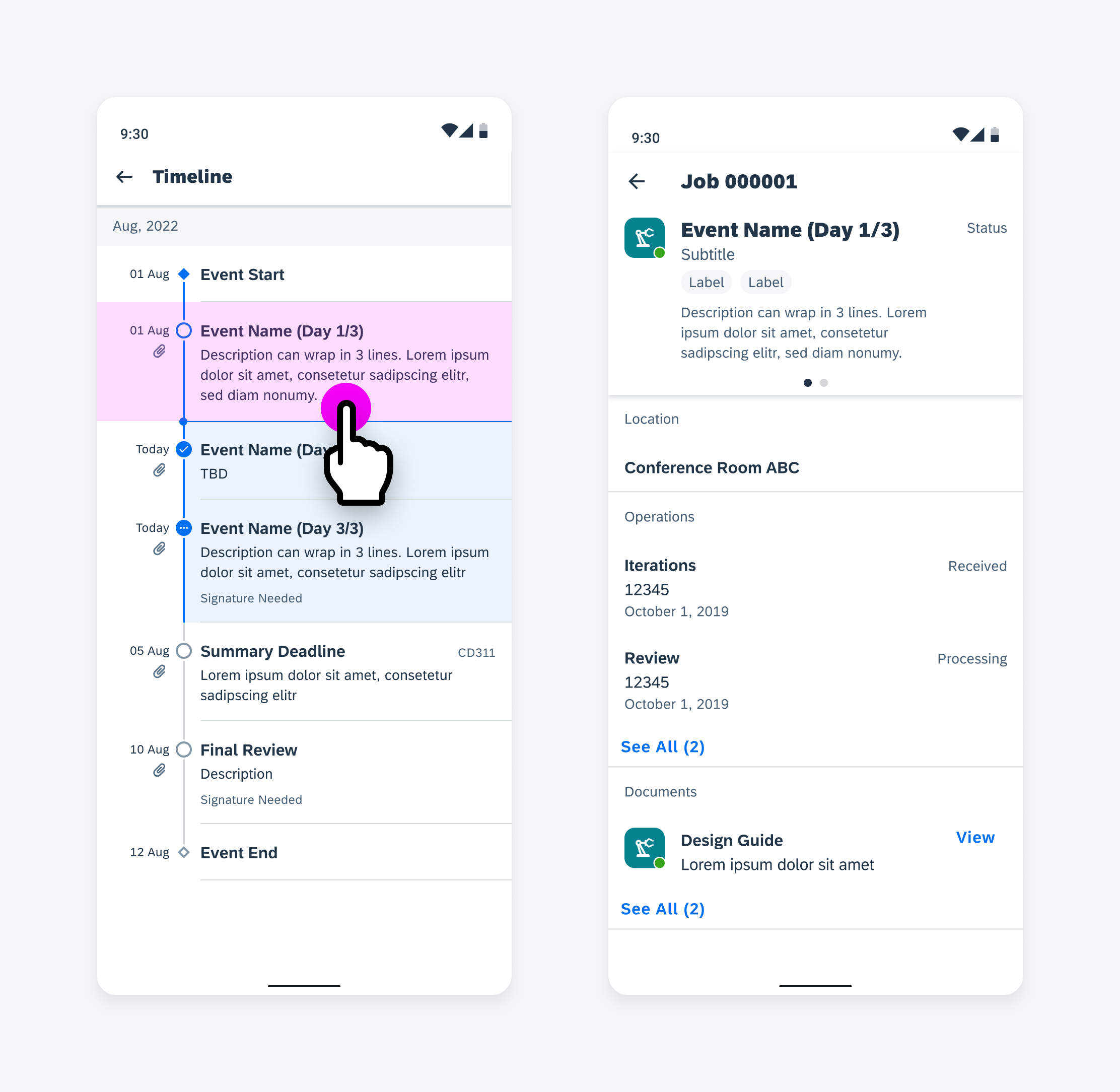
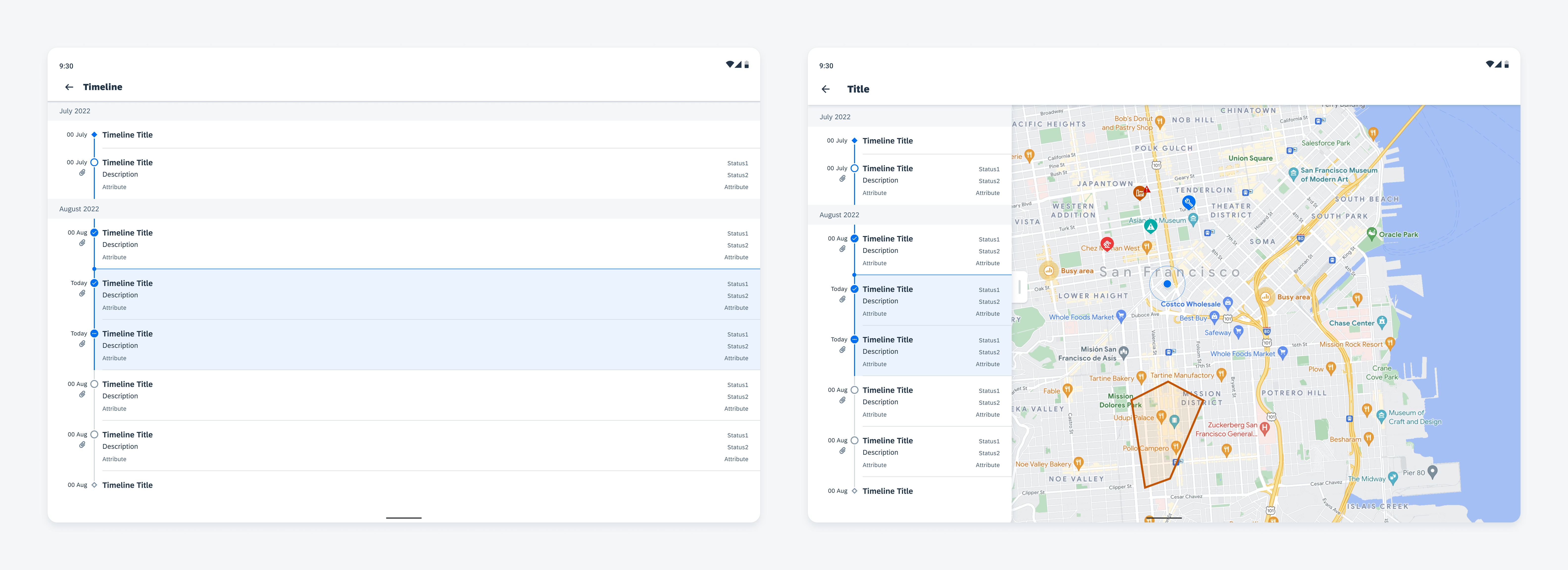
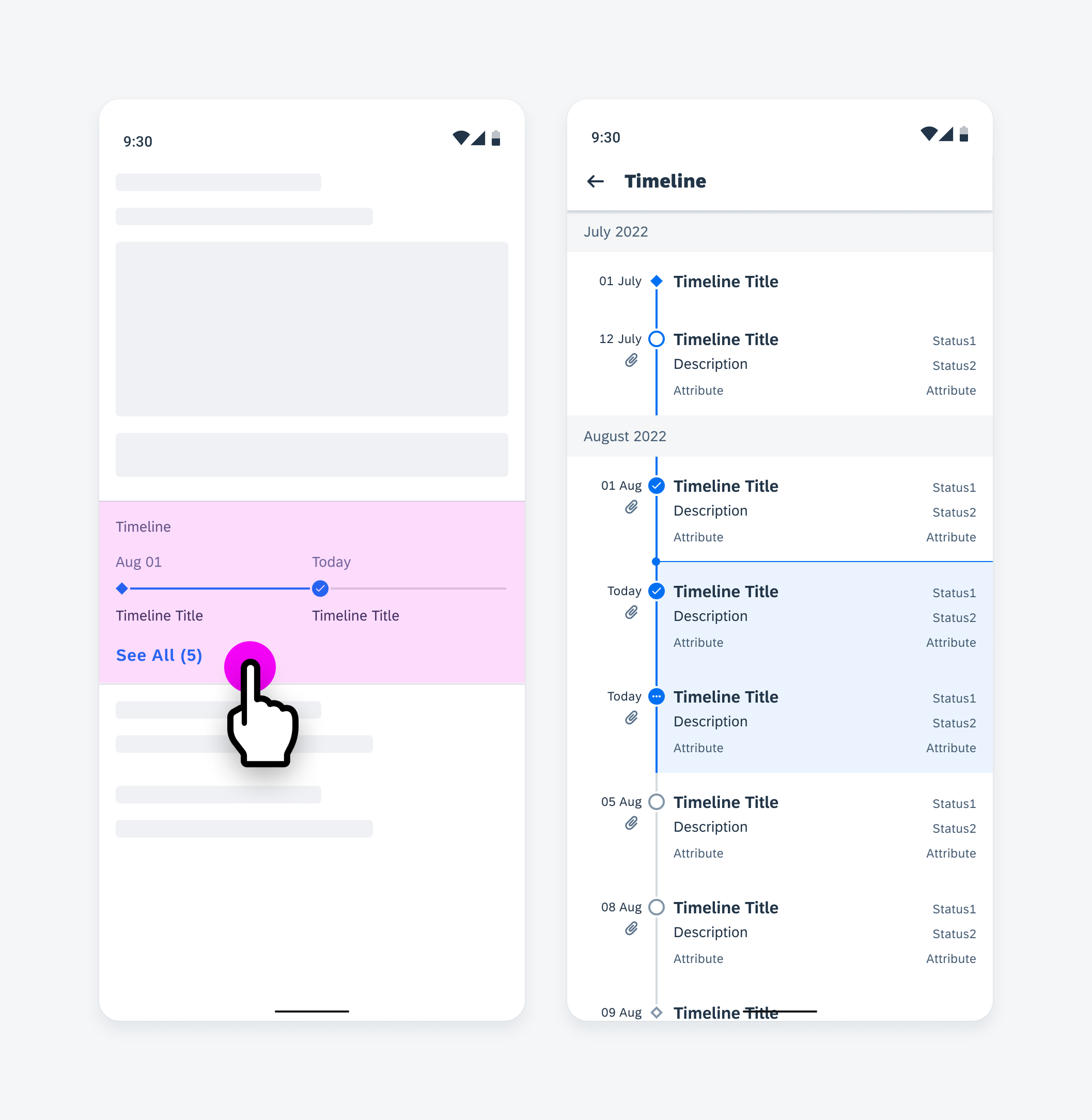
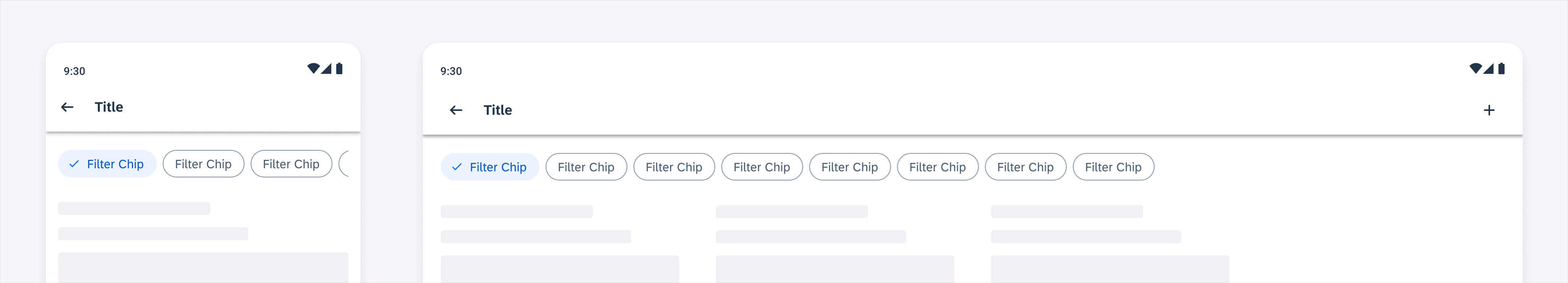
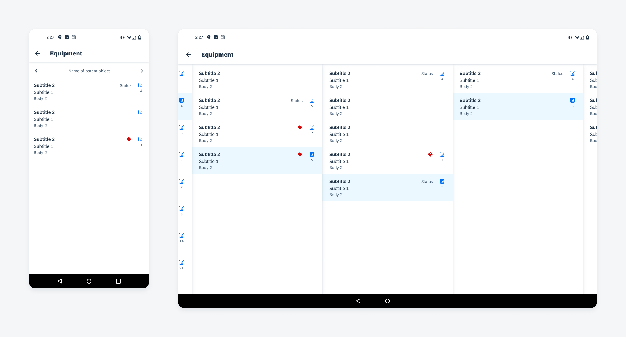
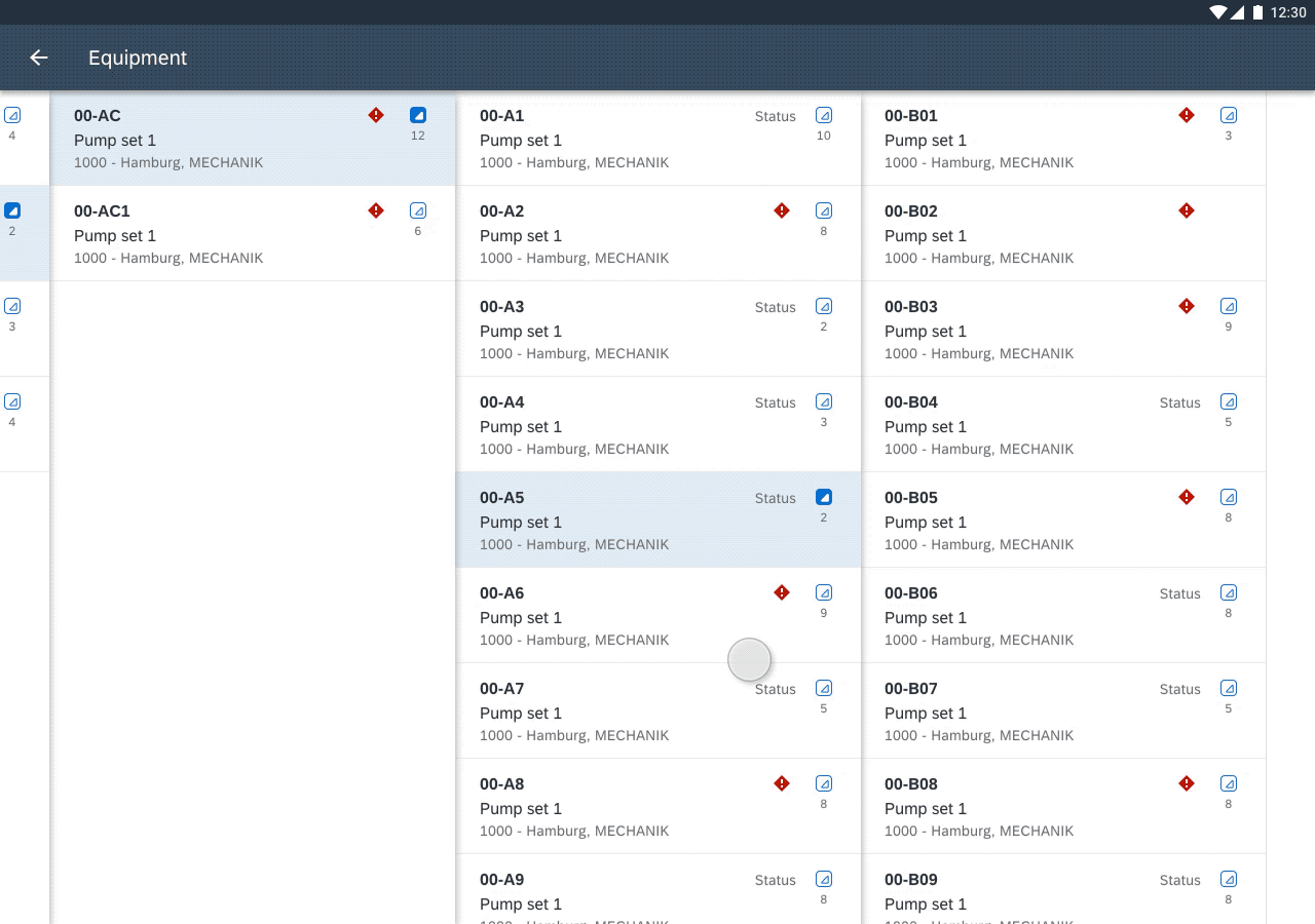
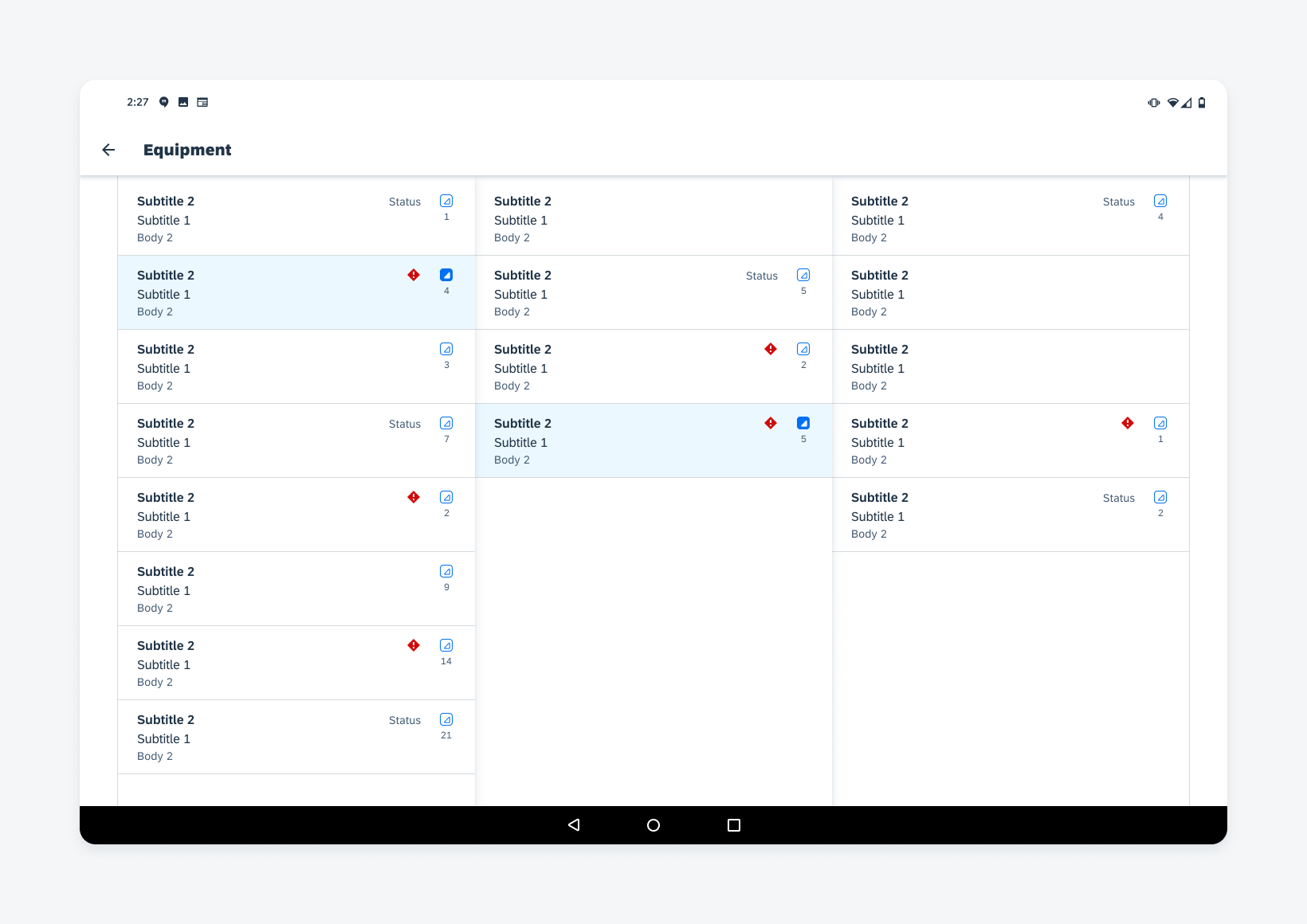
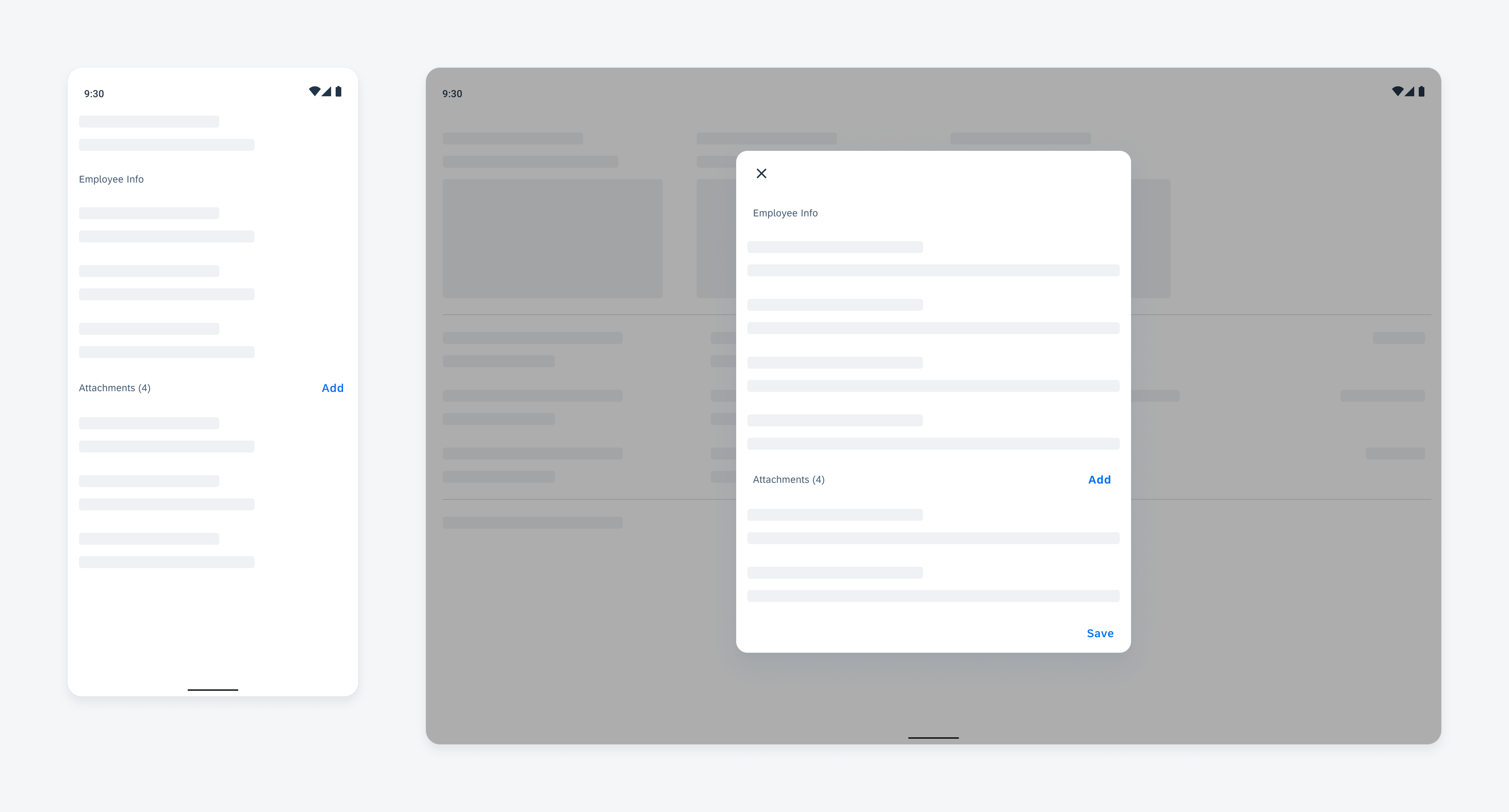
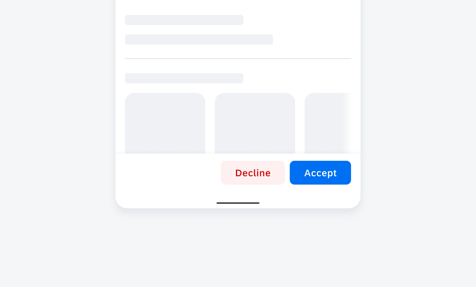
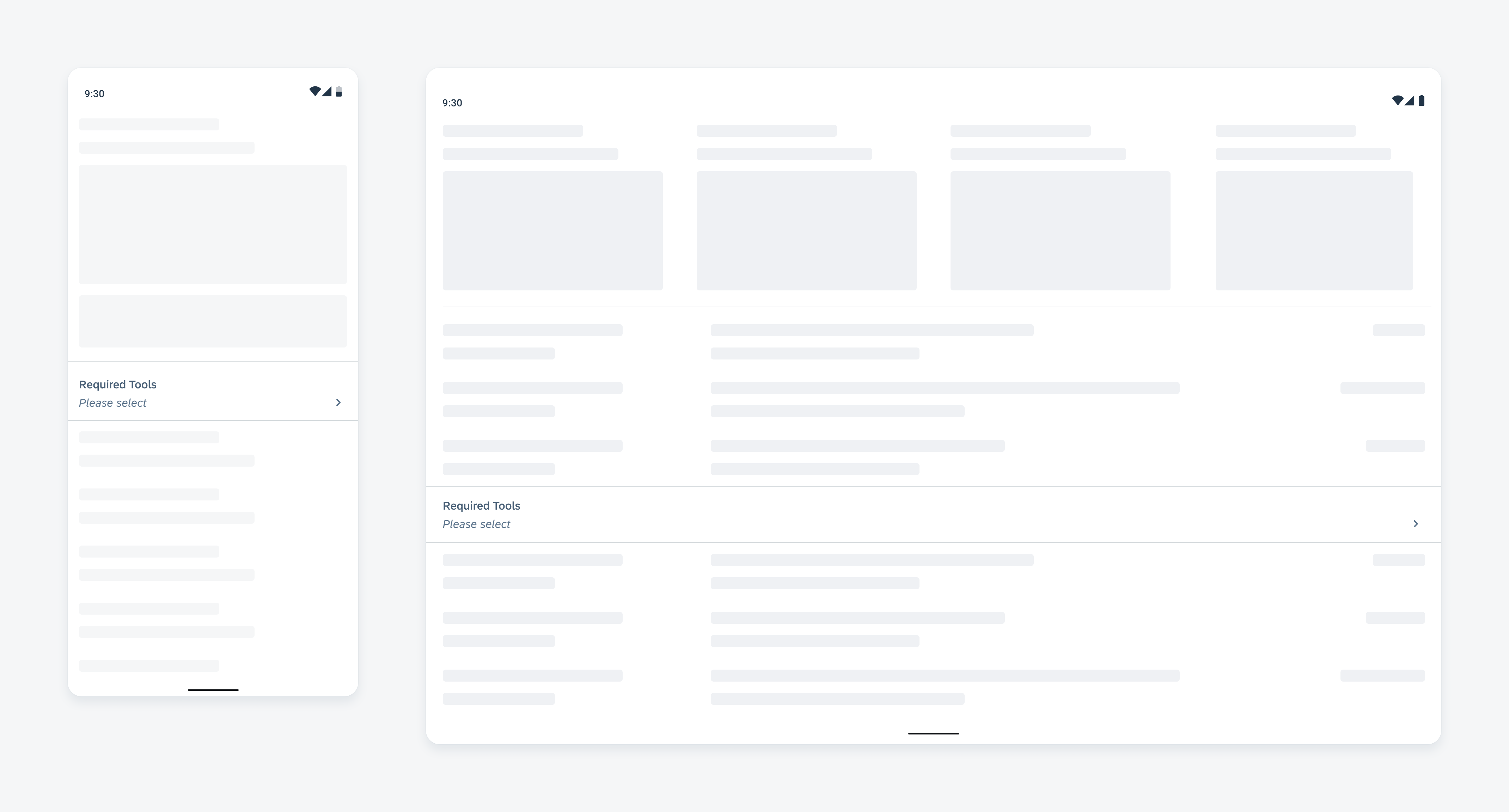
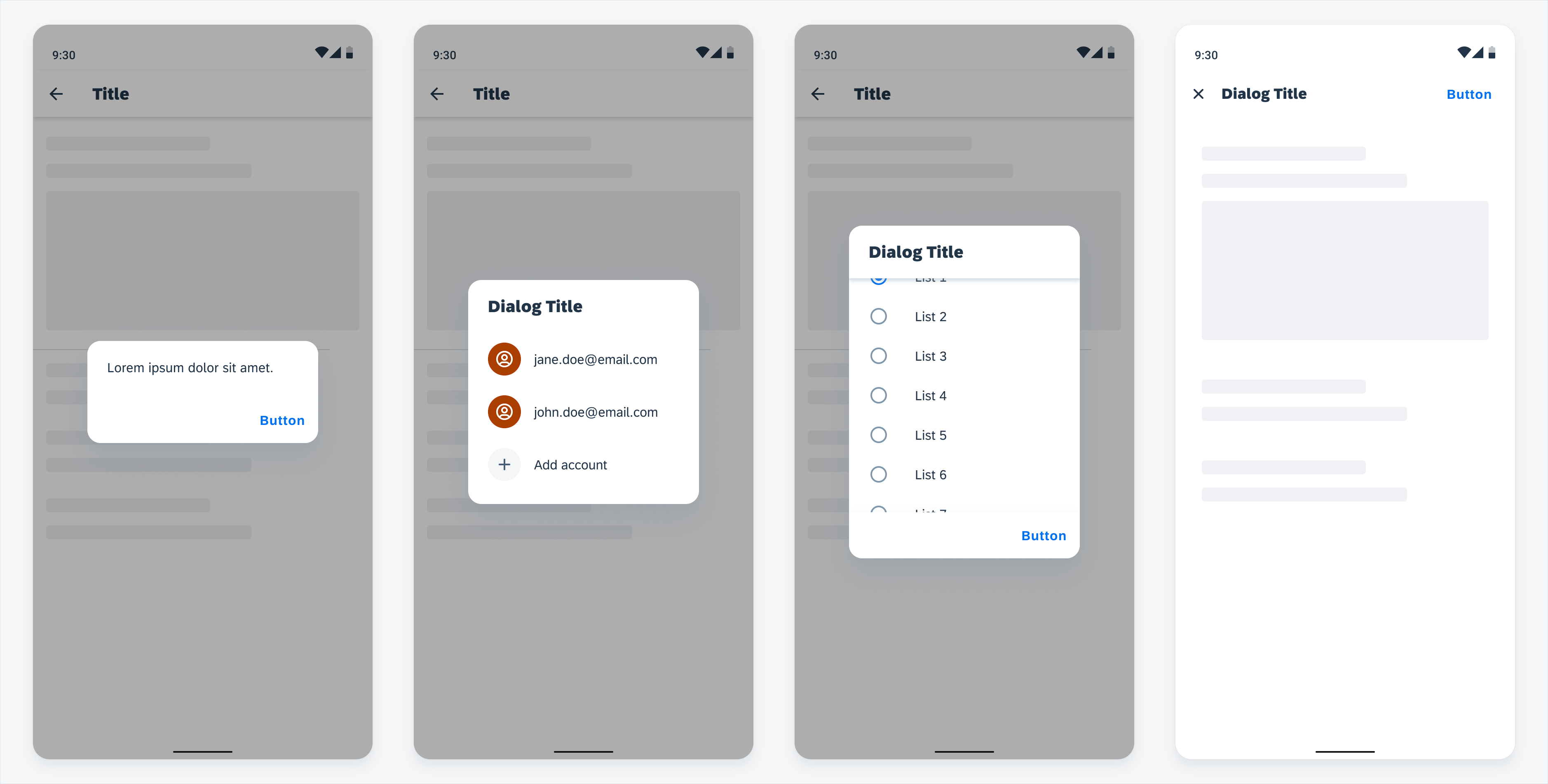
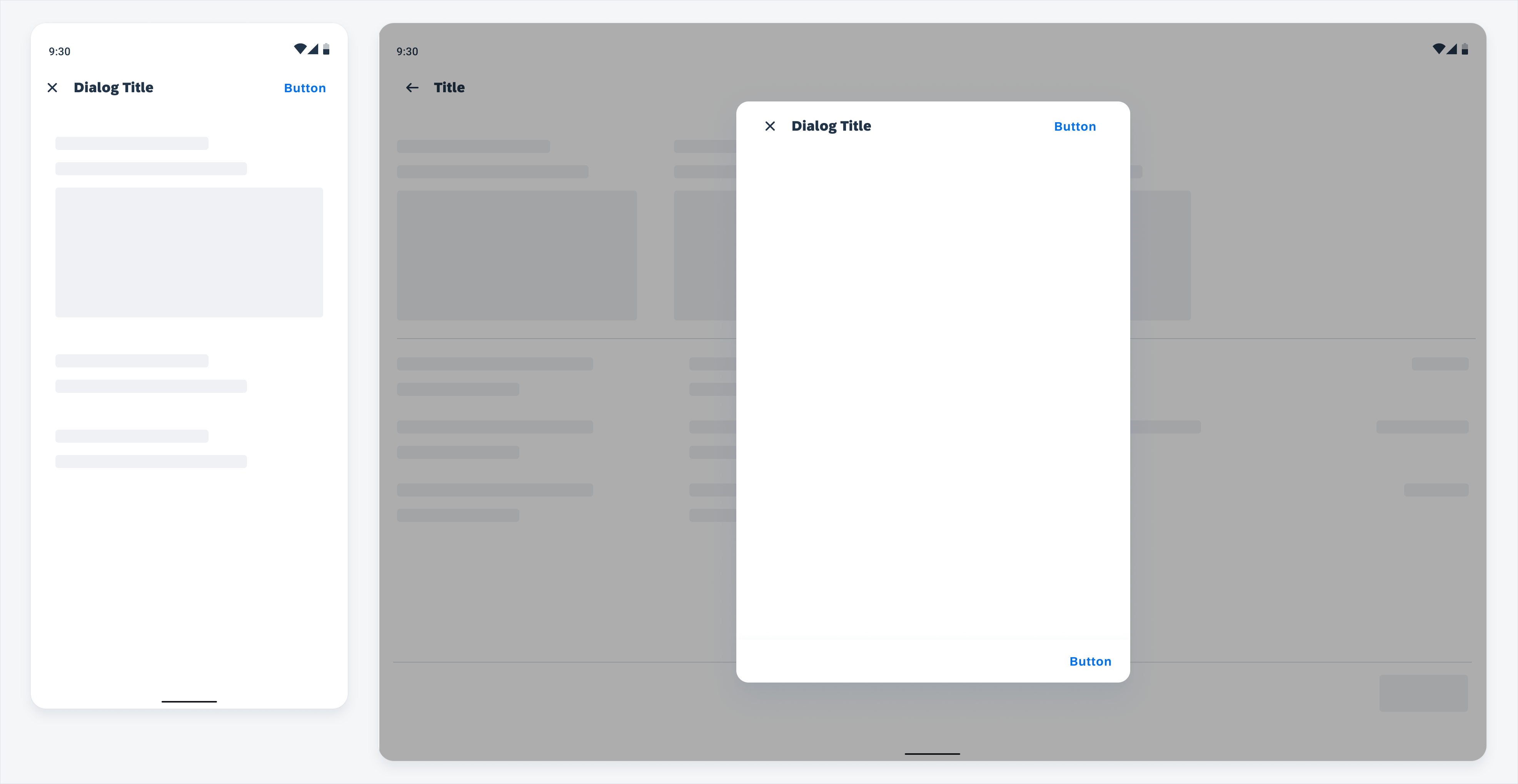
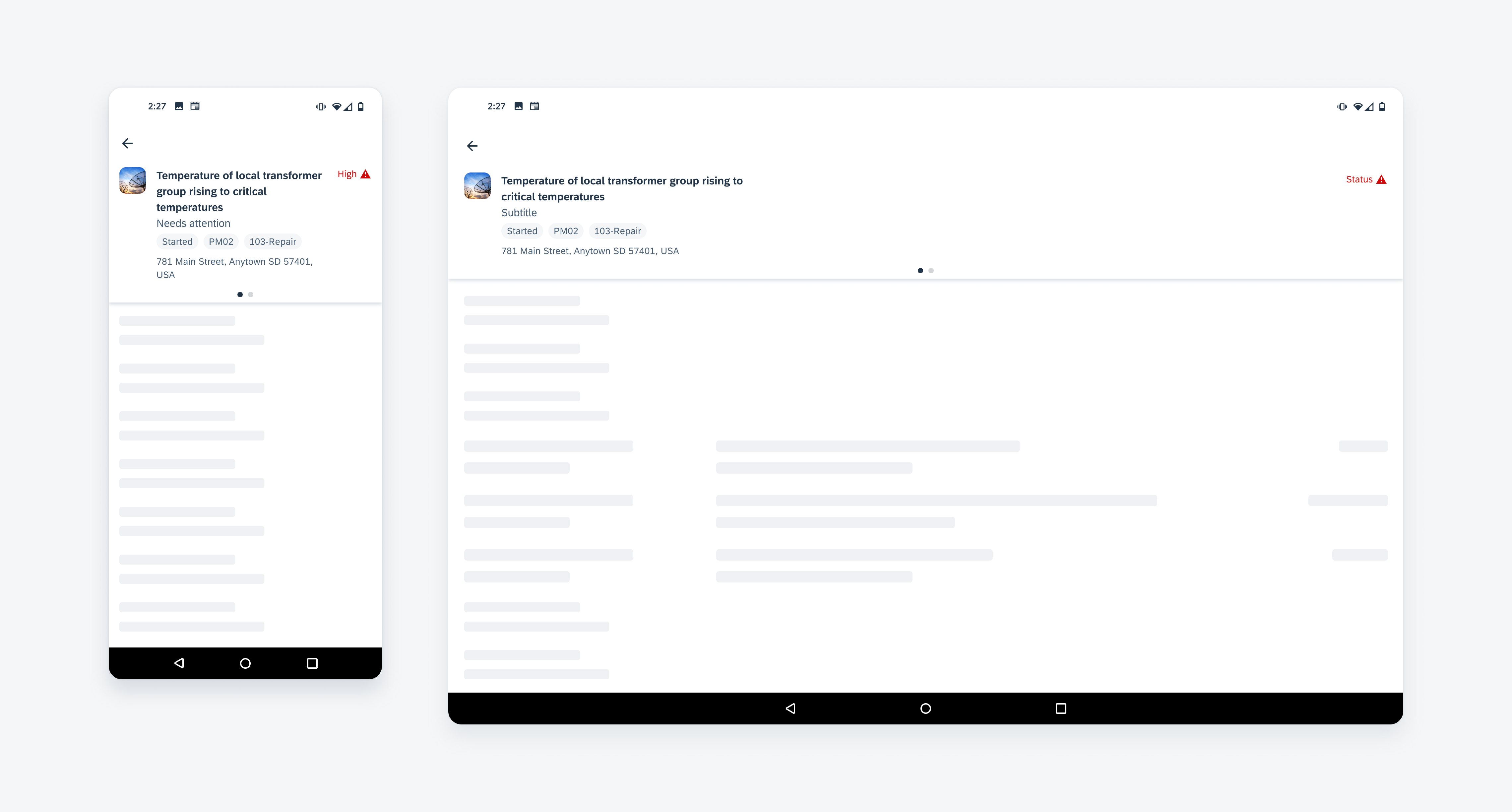
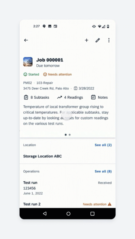
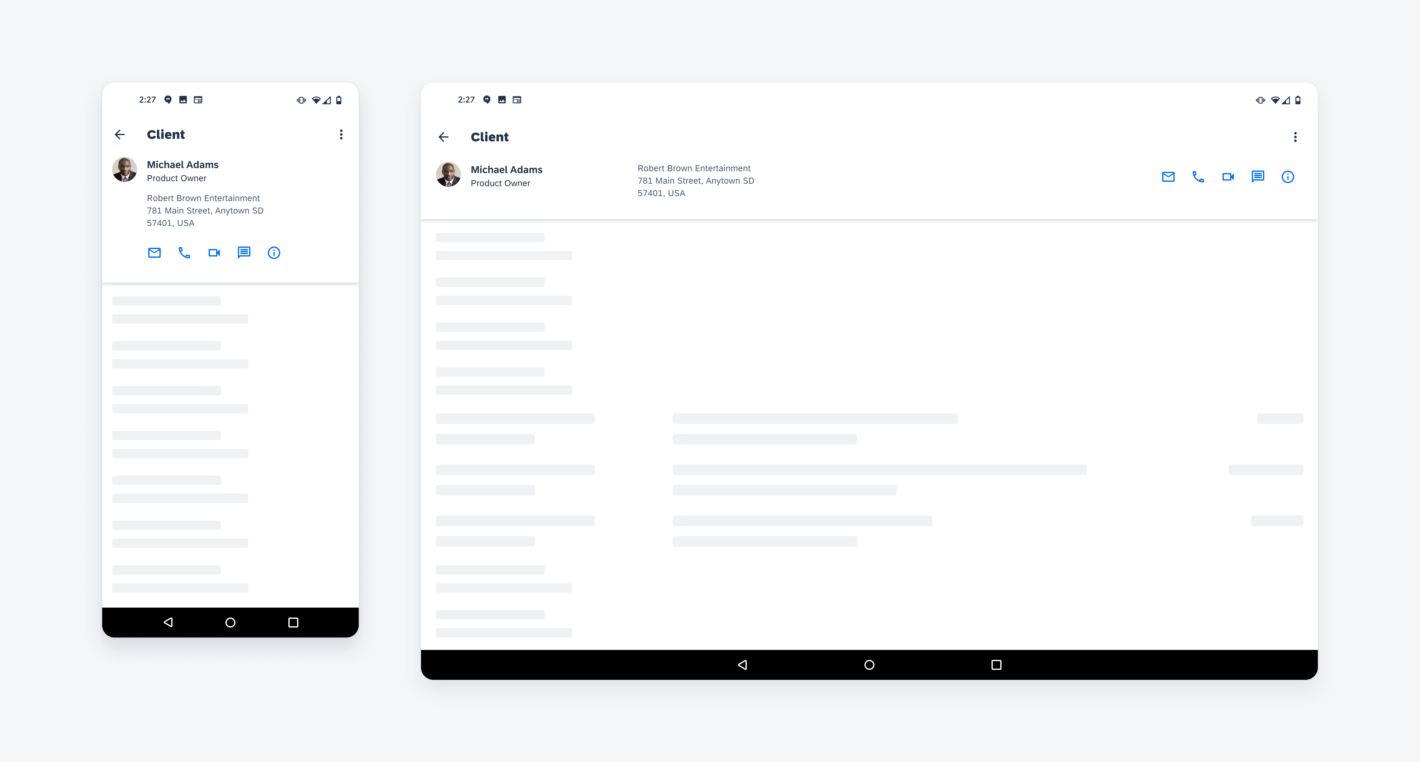
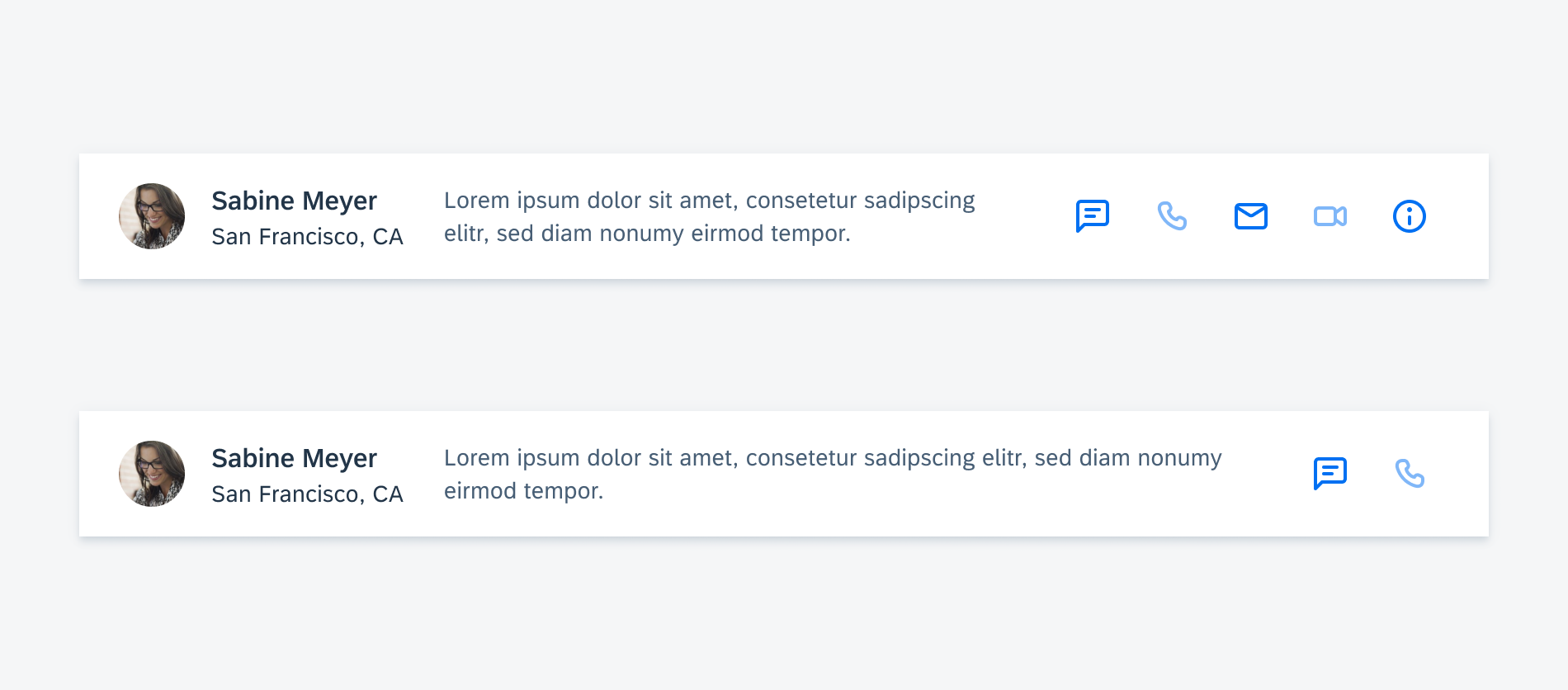
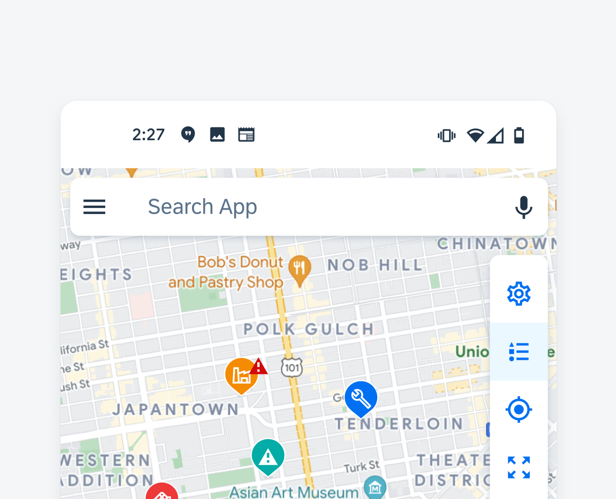
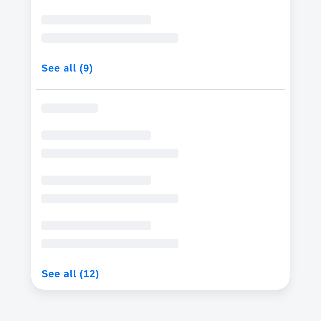
Multi-message handling on compact screen (left) and expanded screen (right)
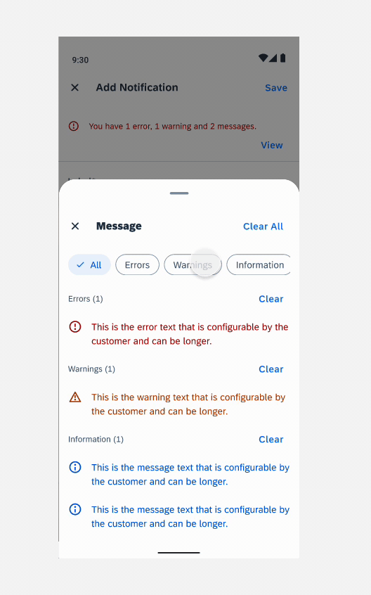
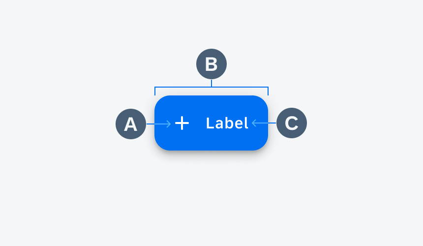
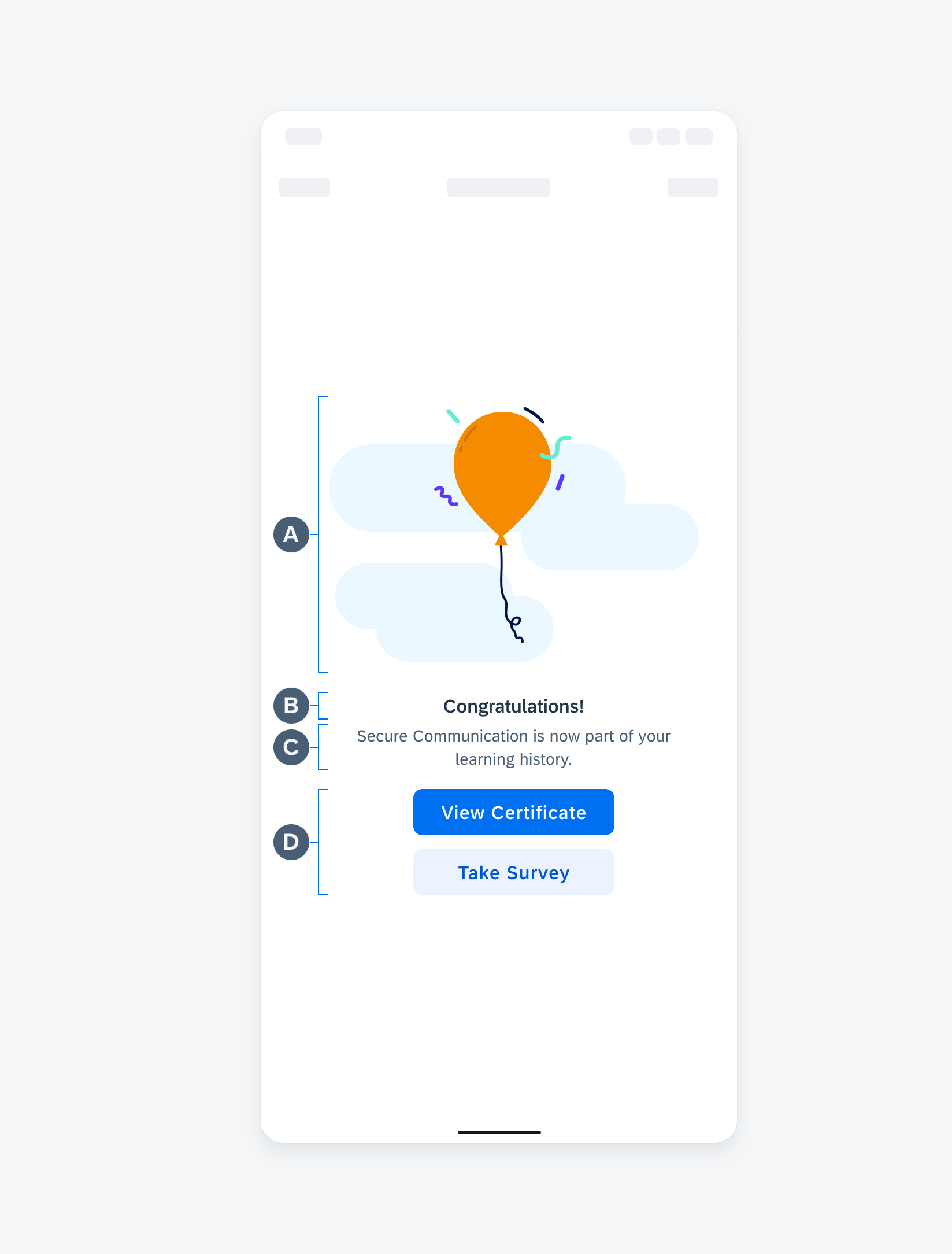
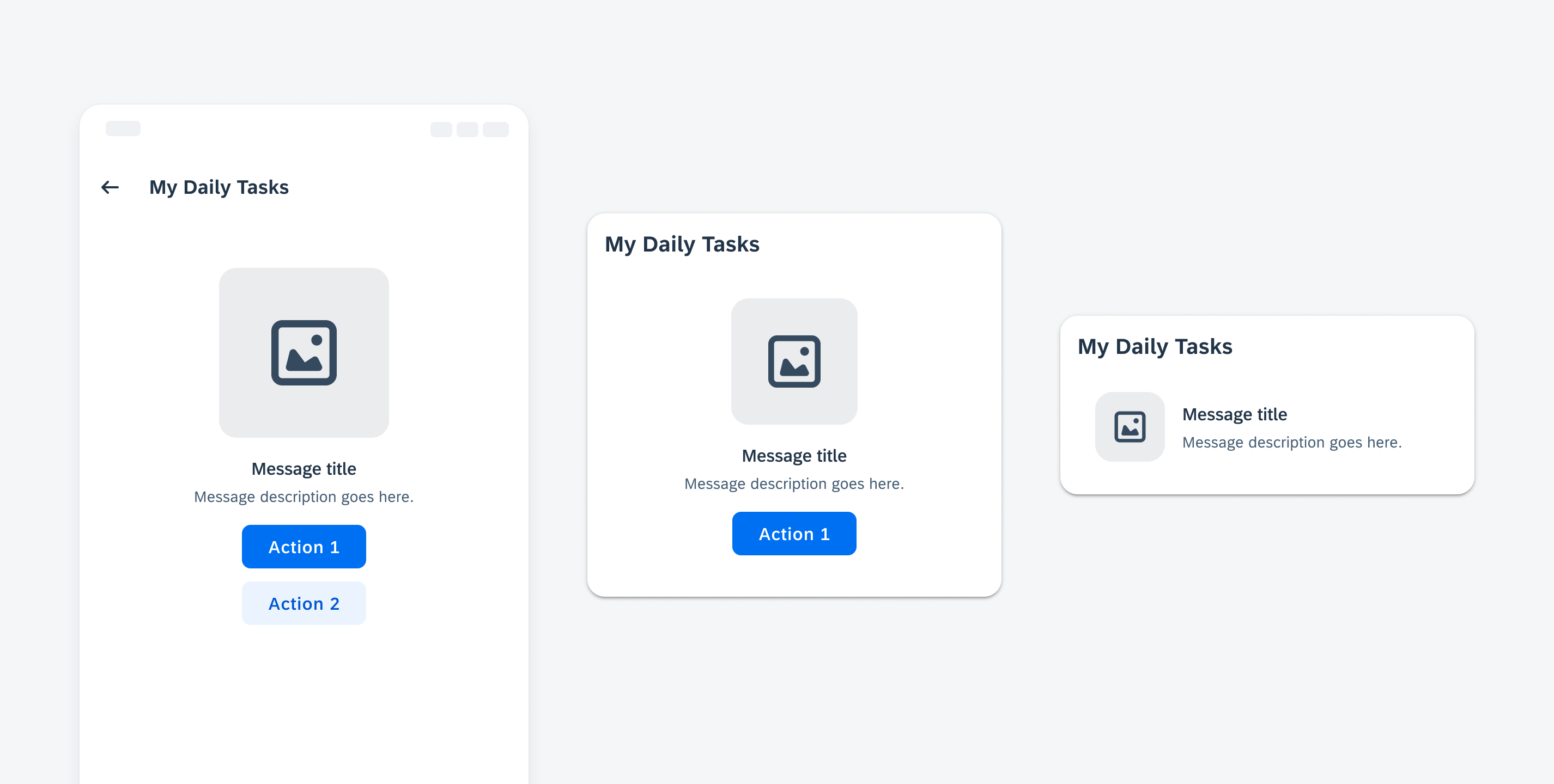
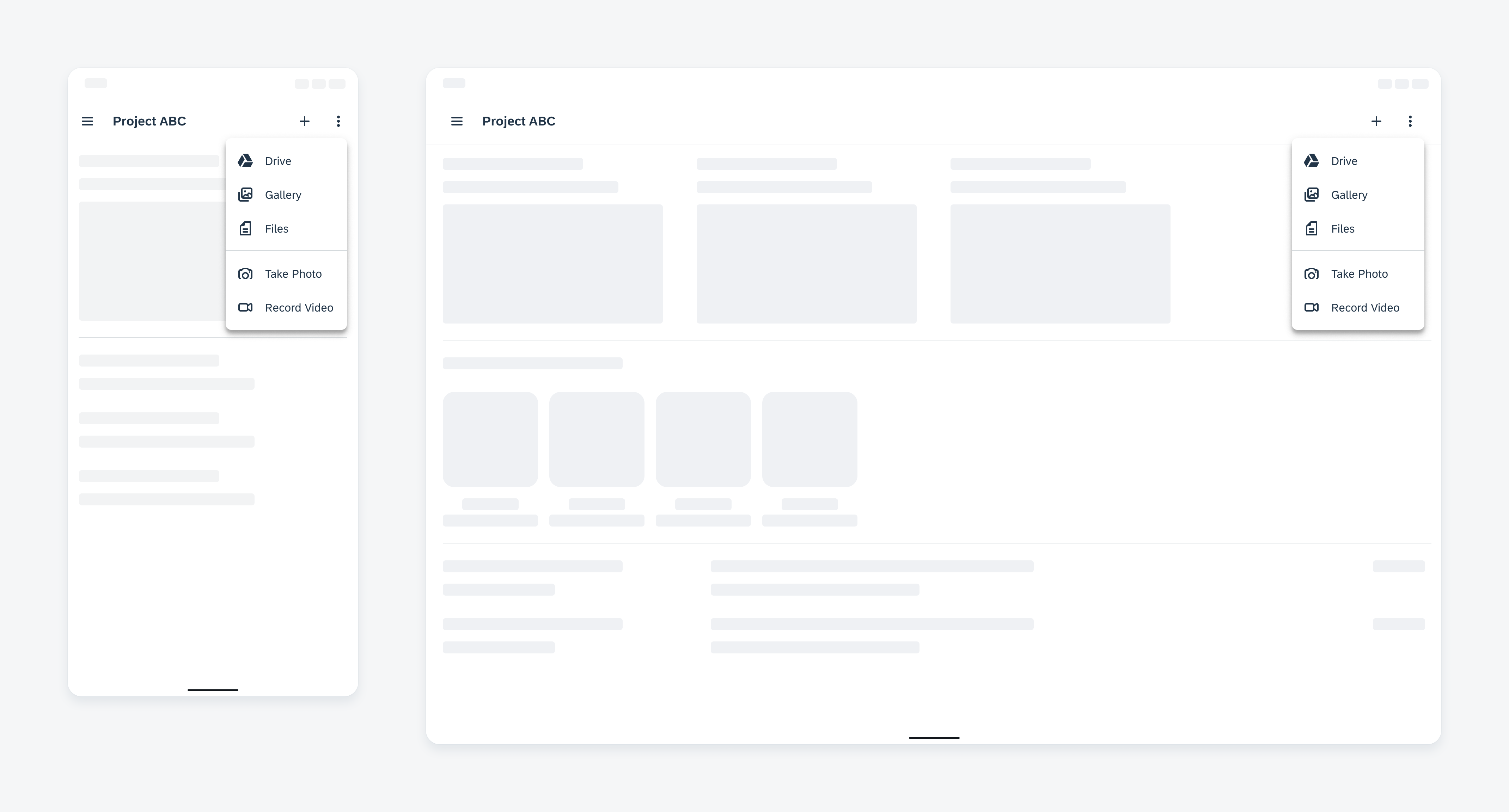
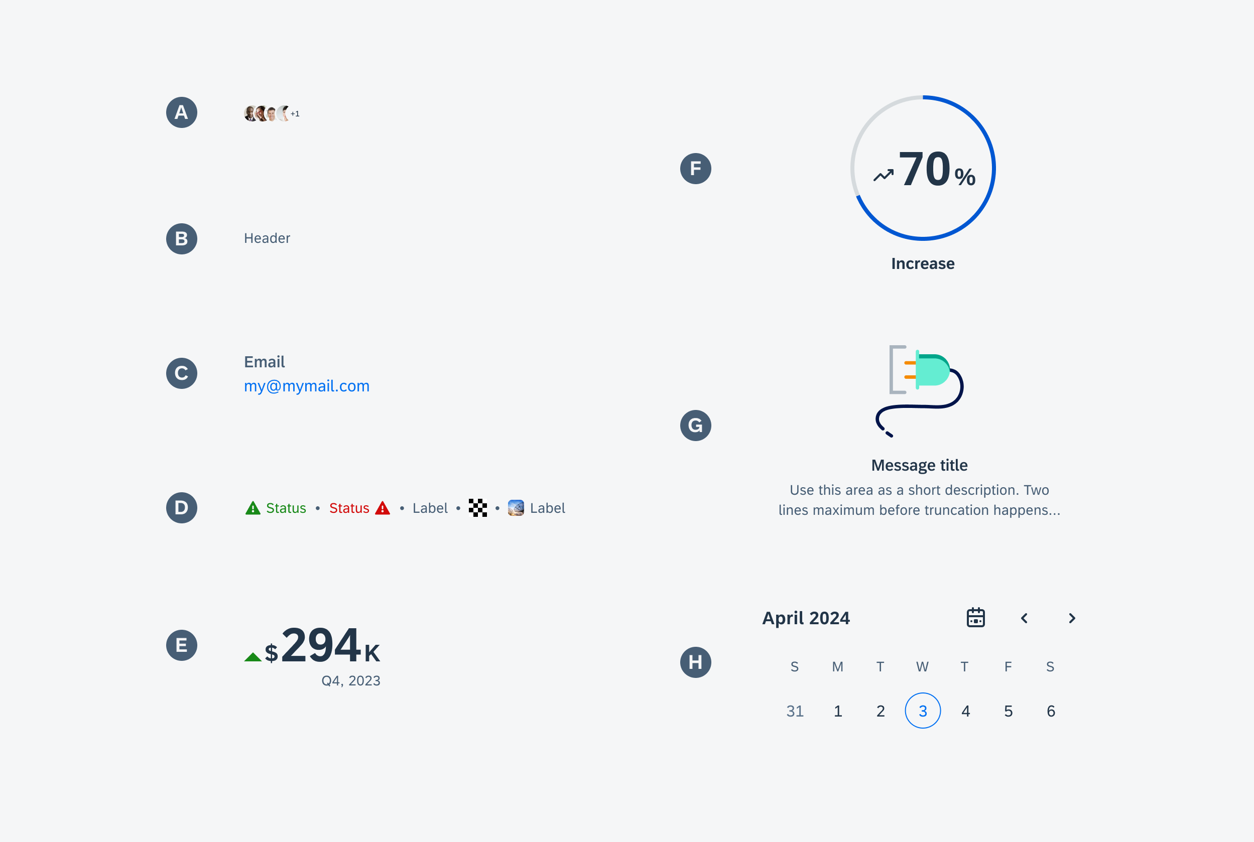
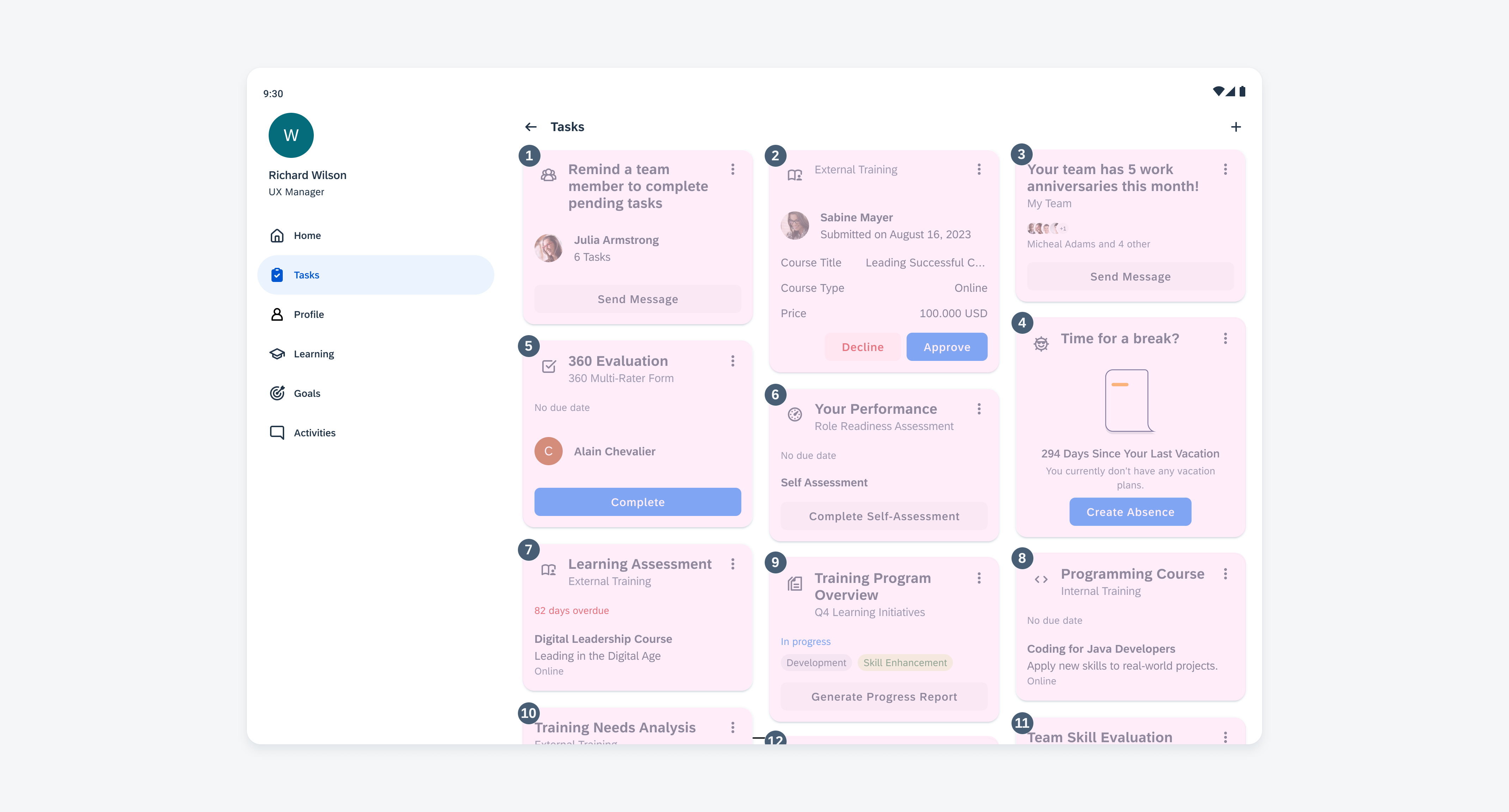
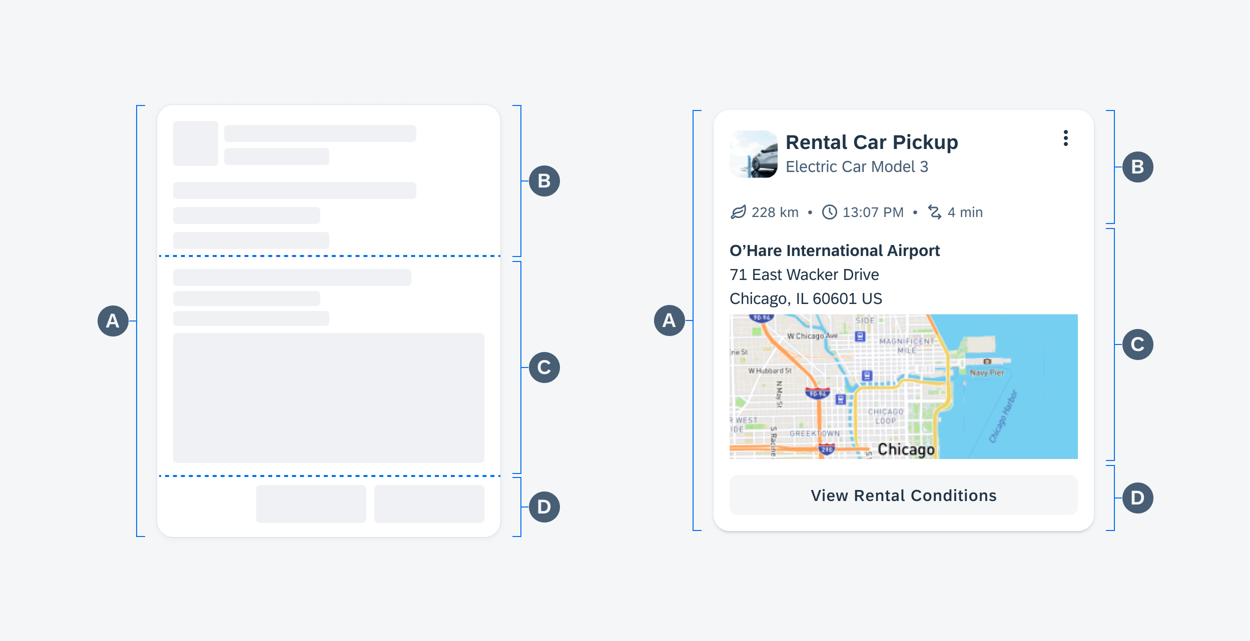
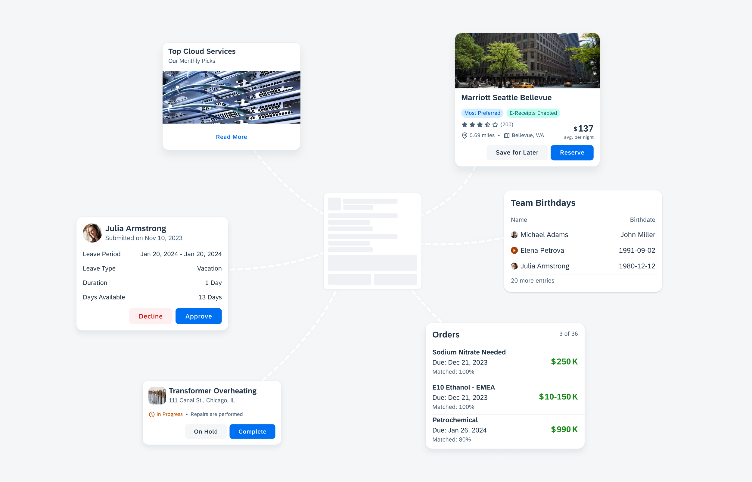
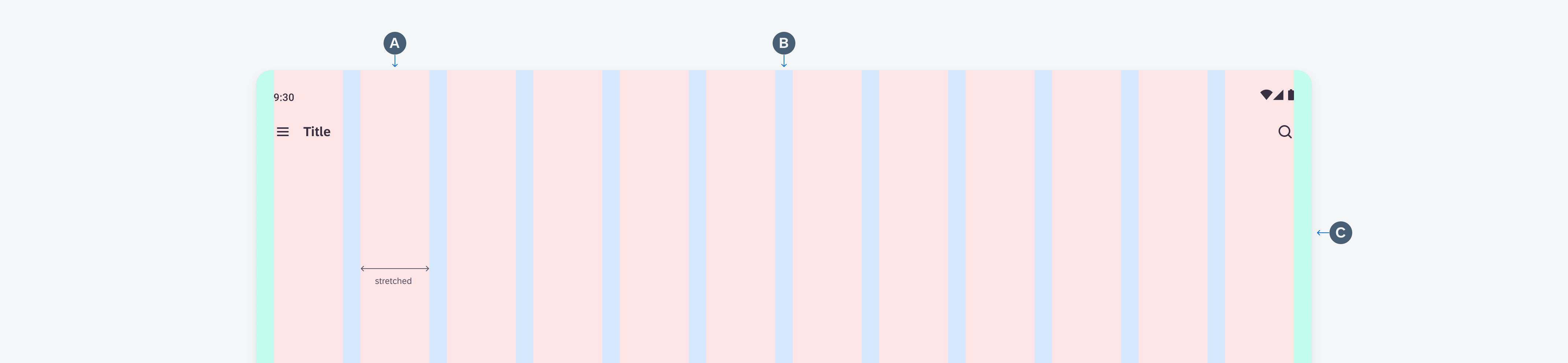
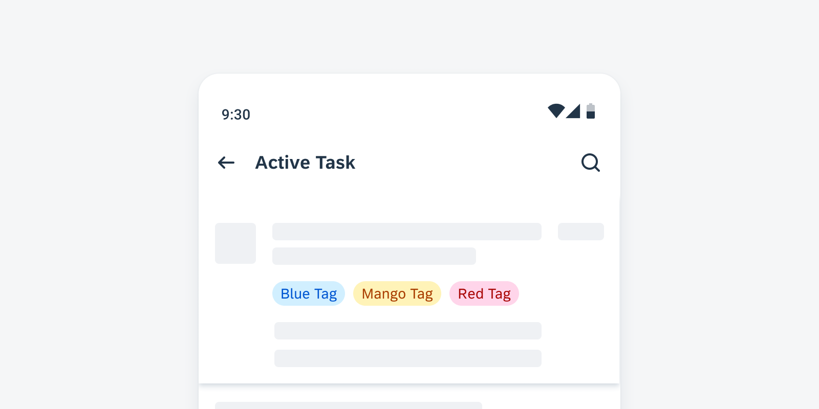
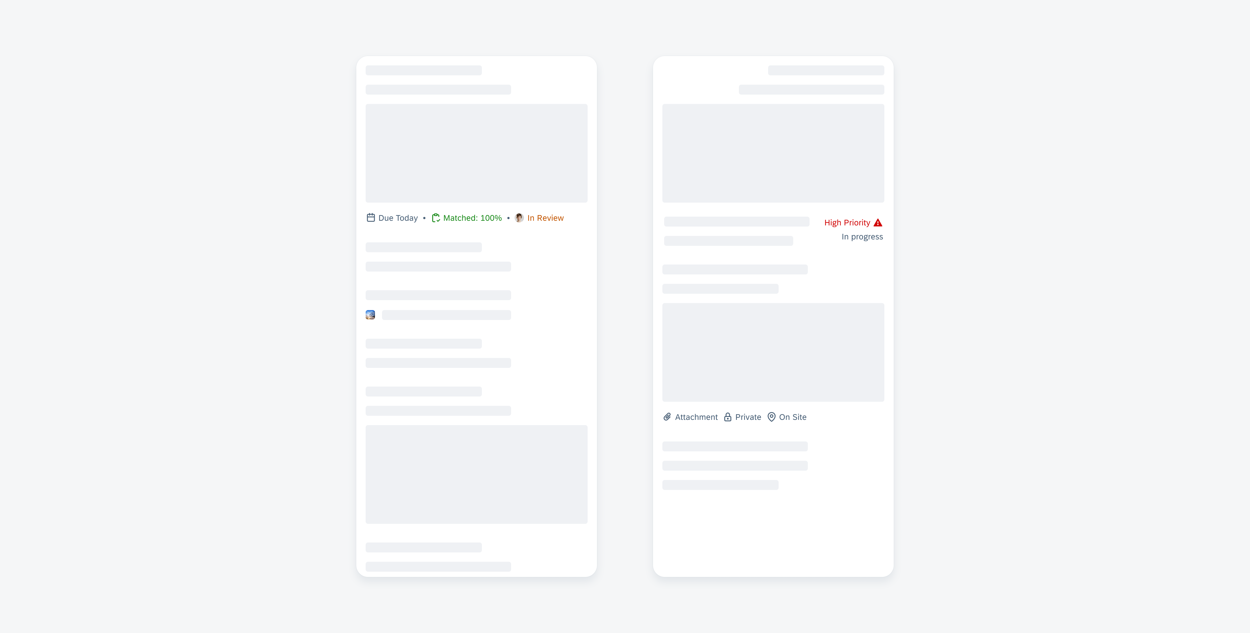
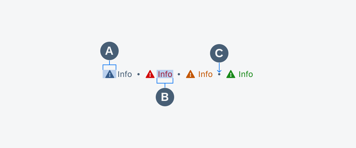
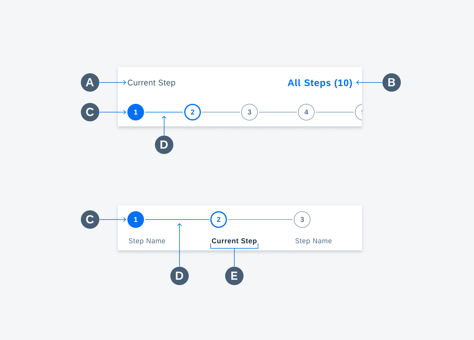
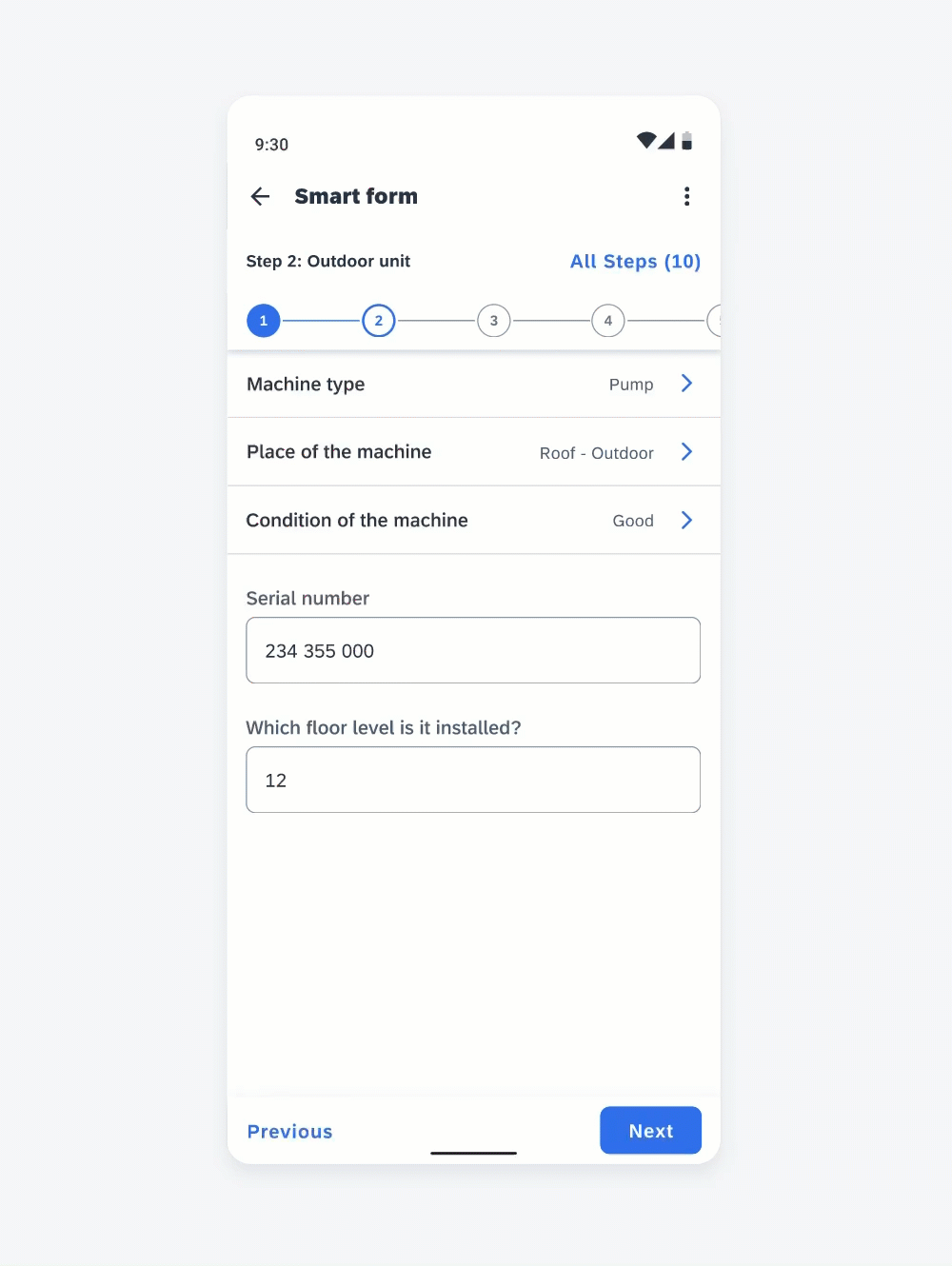
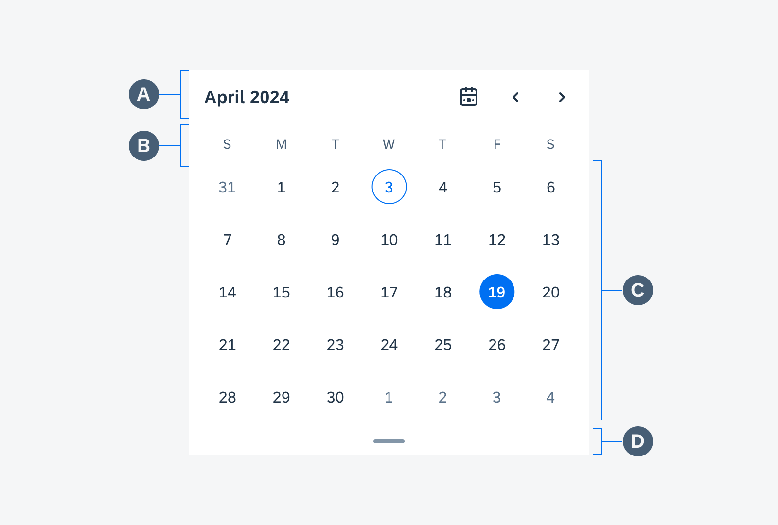
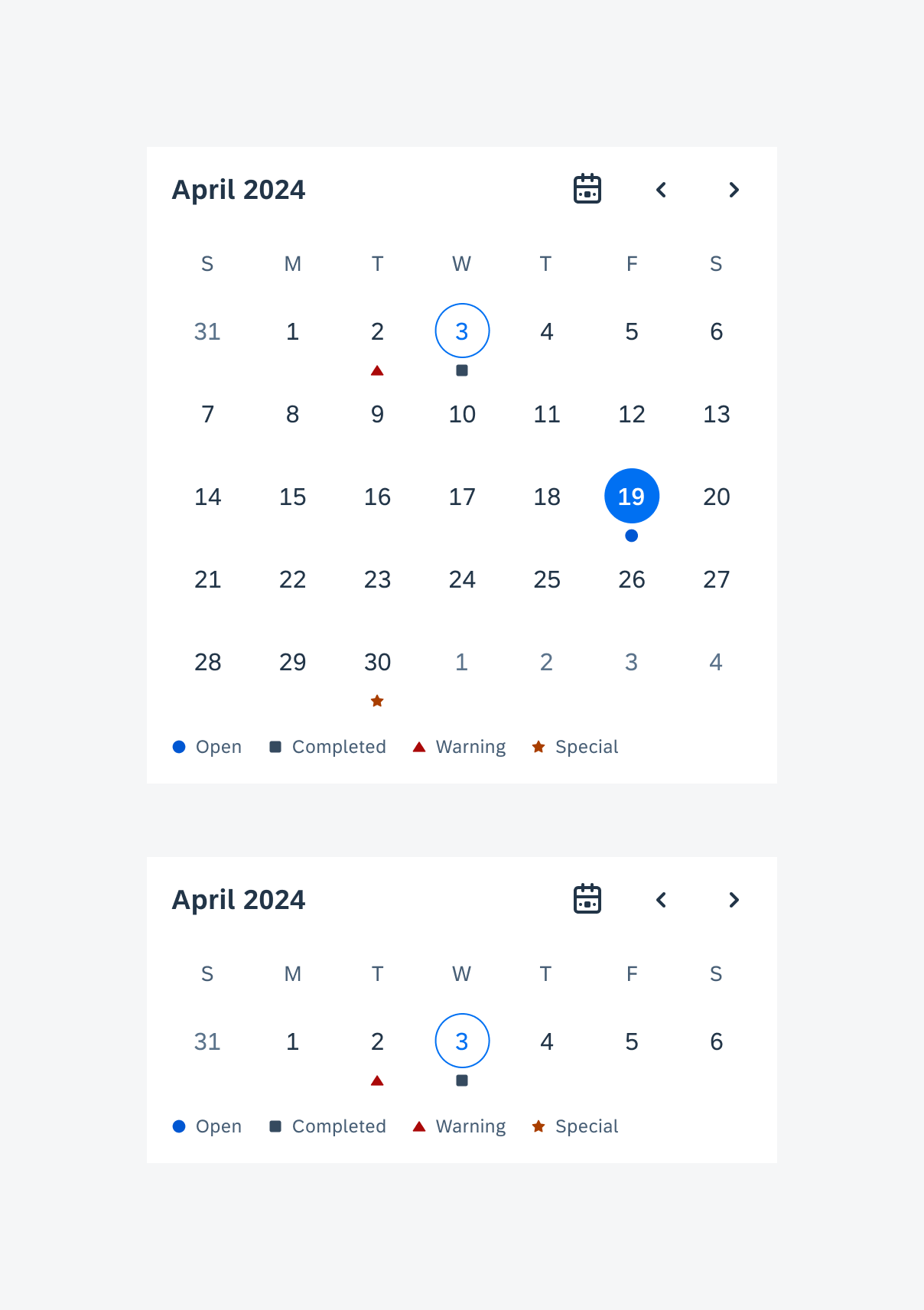
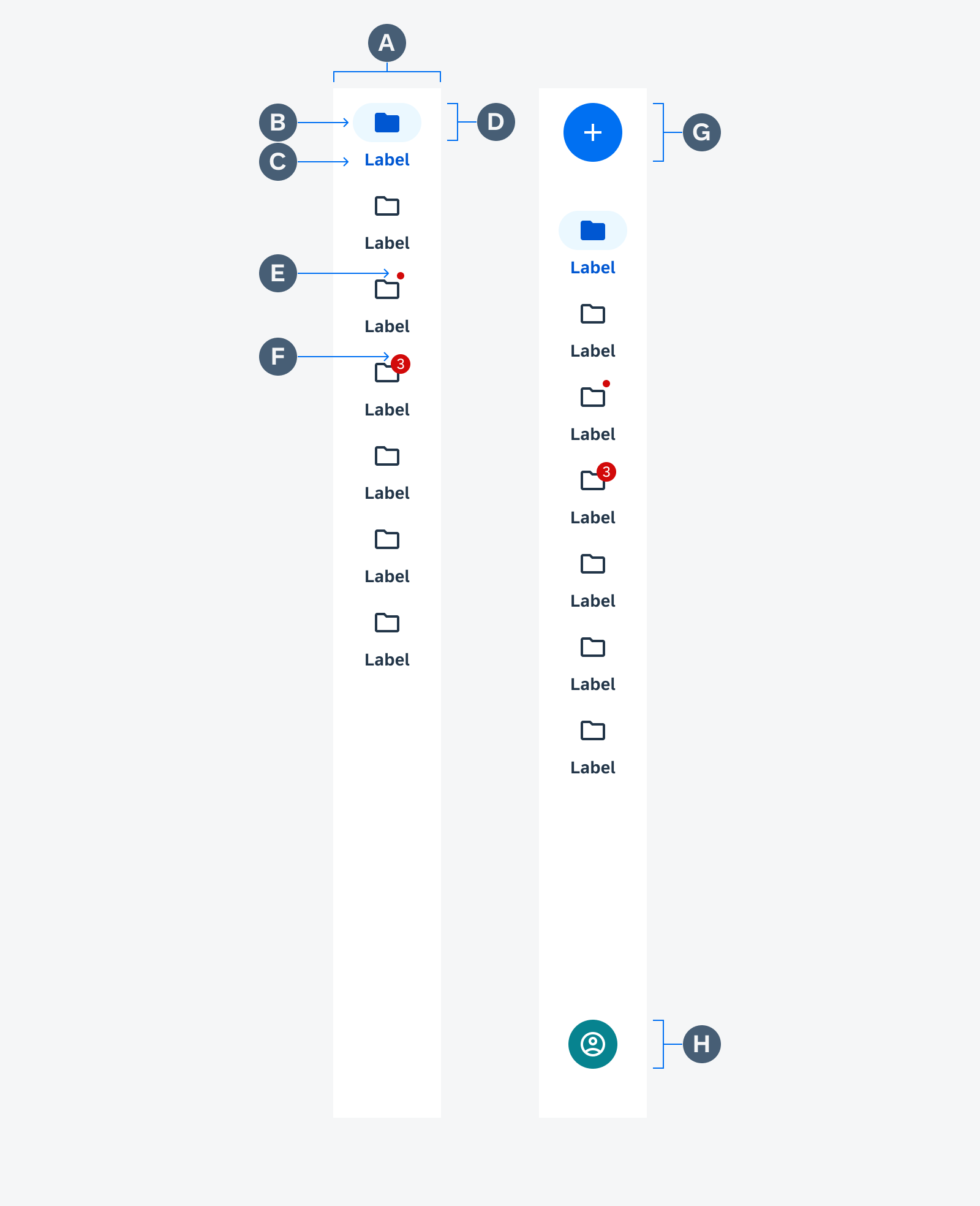
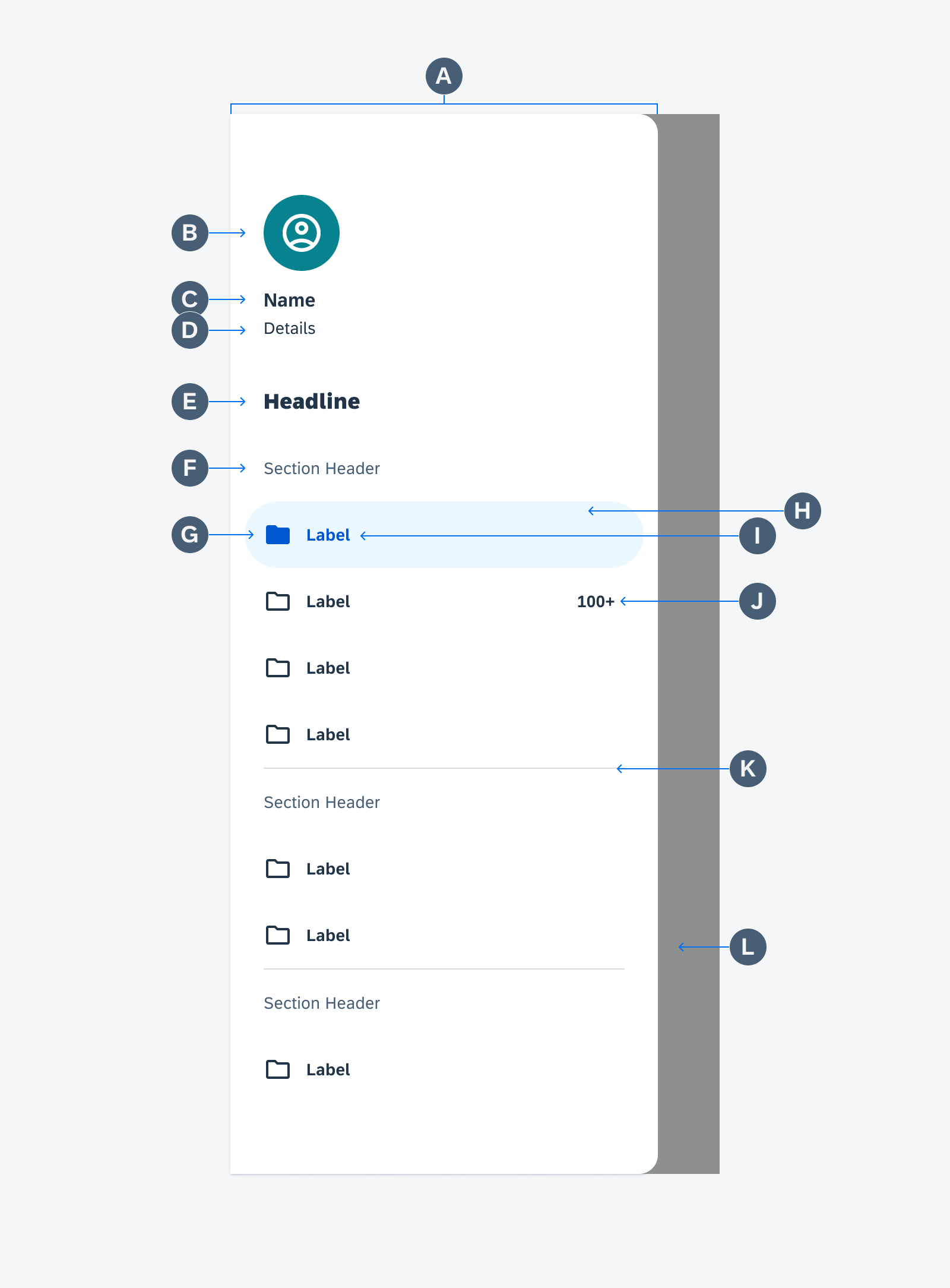
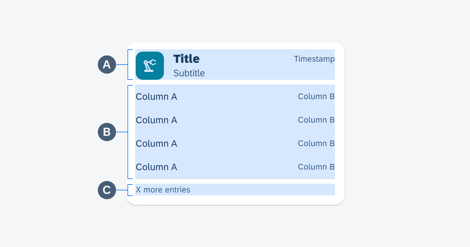
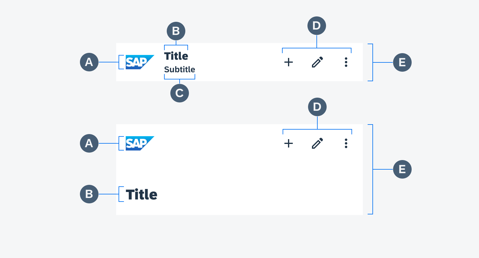
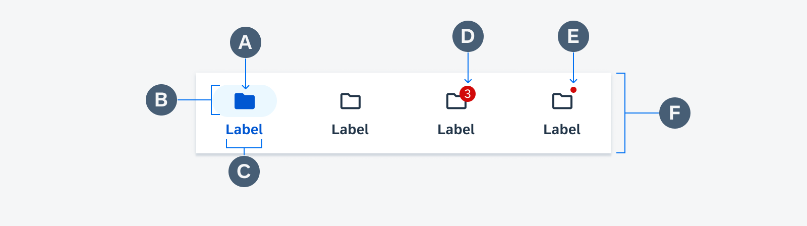
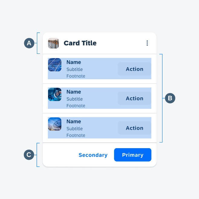
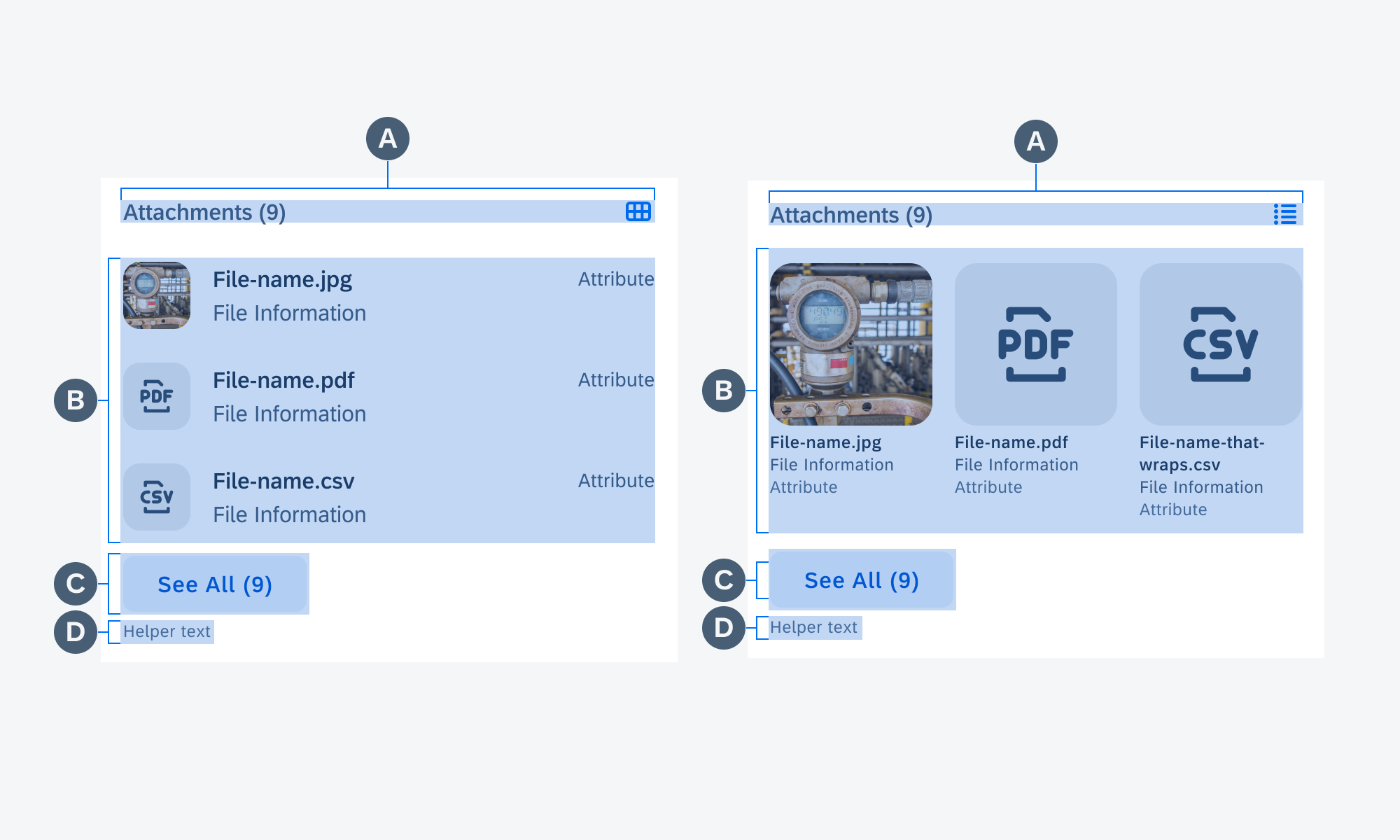
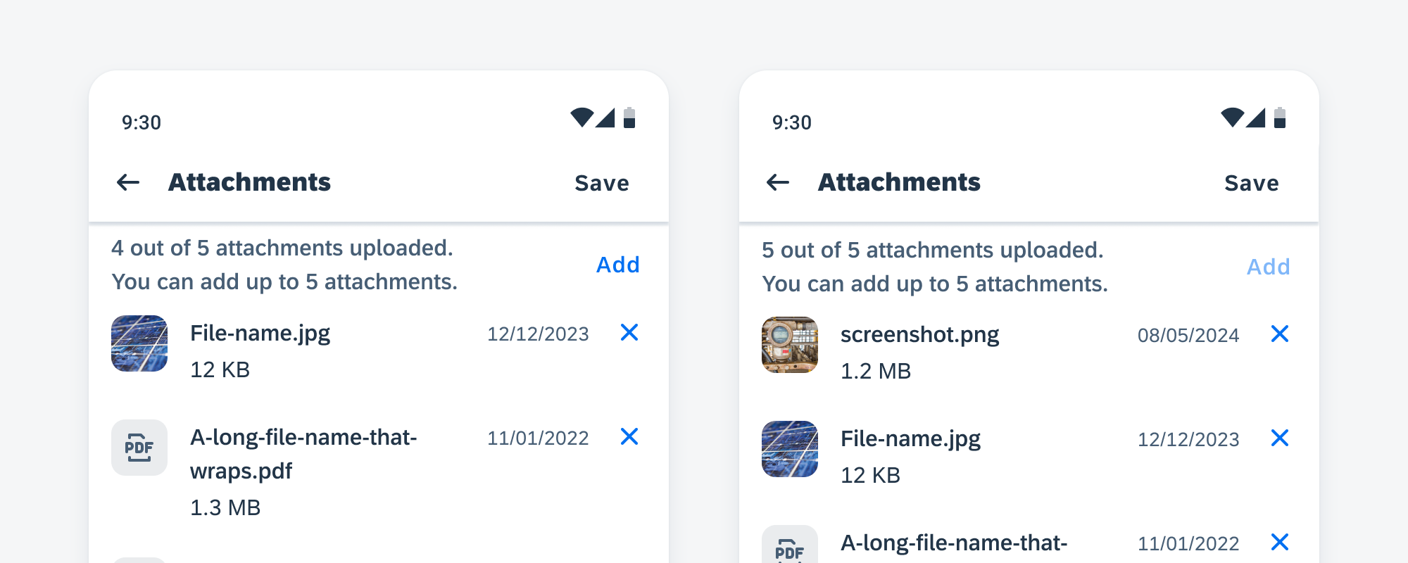
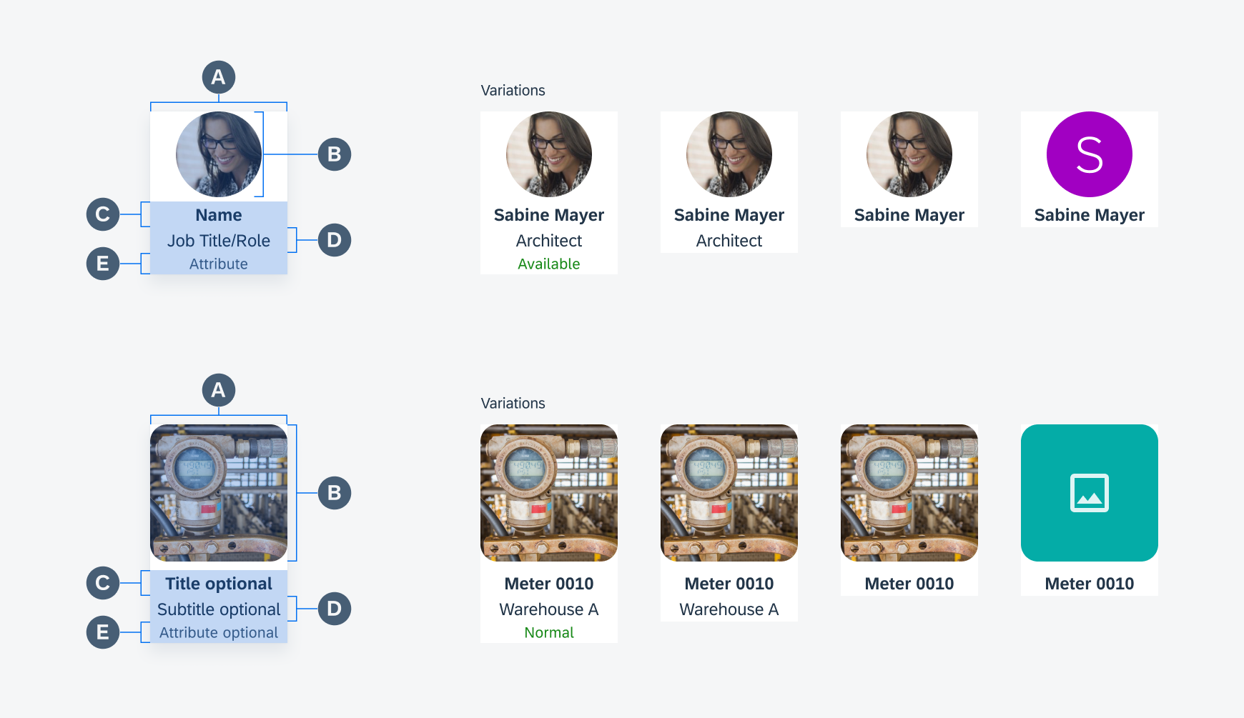
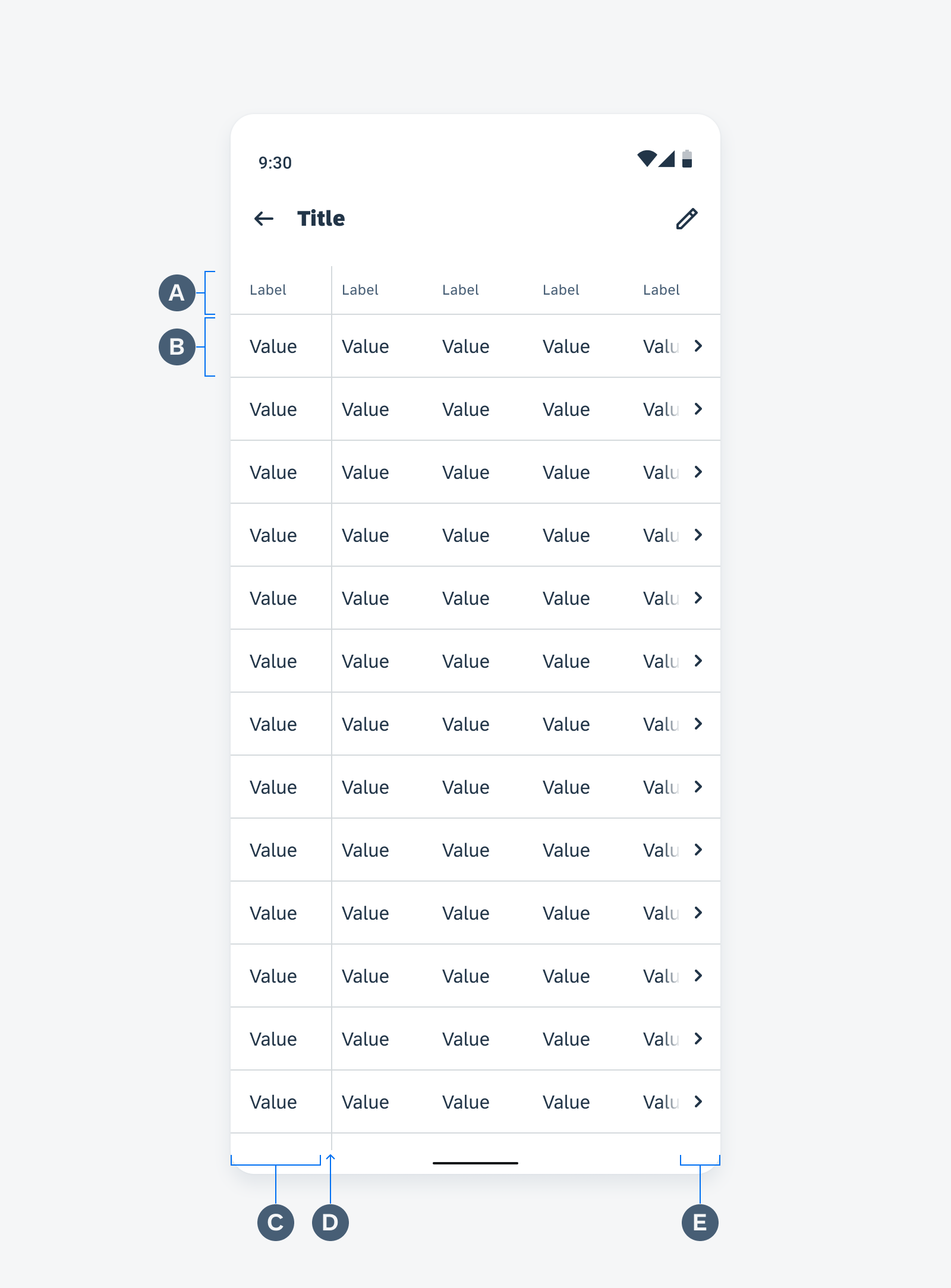
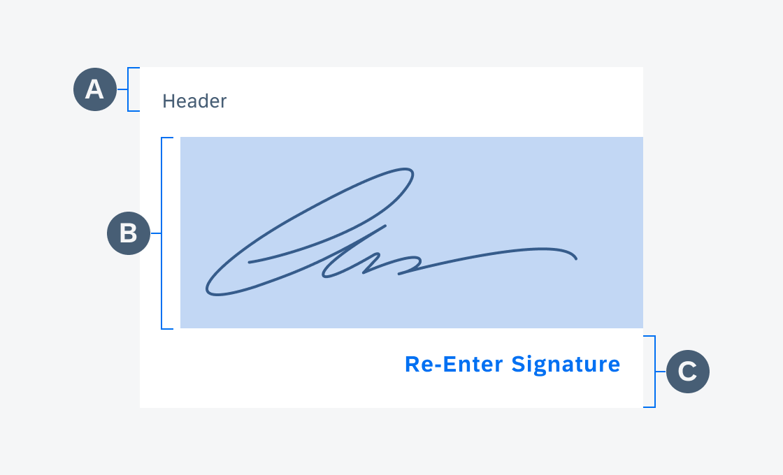
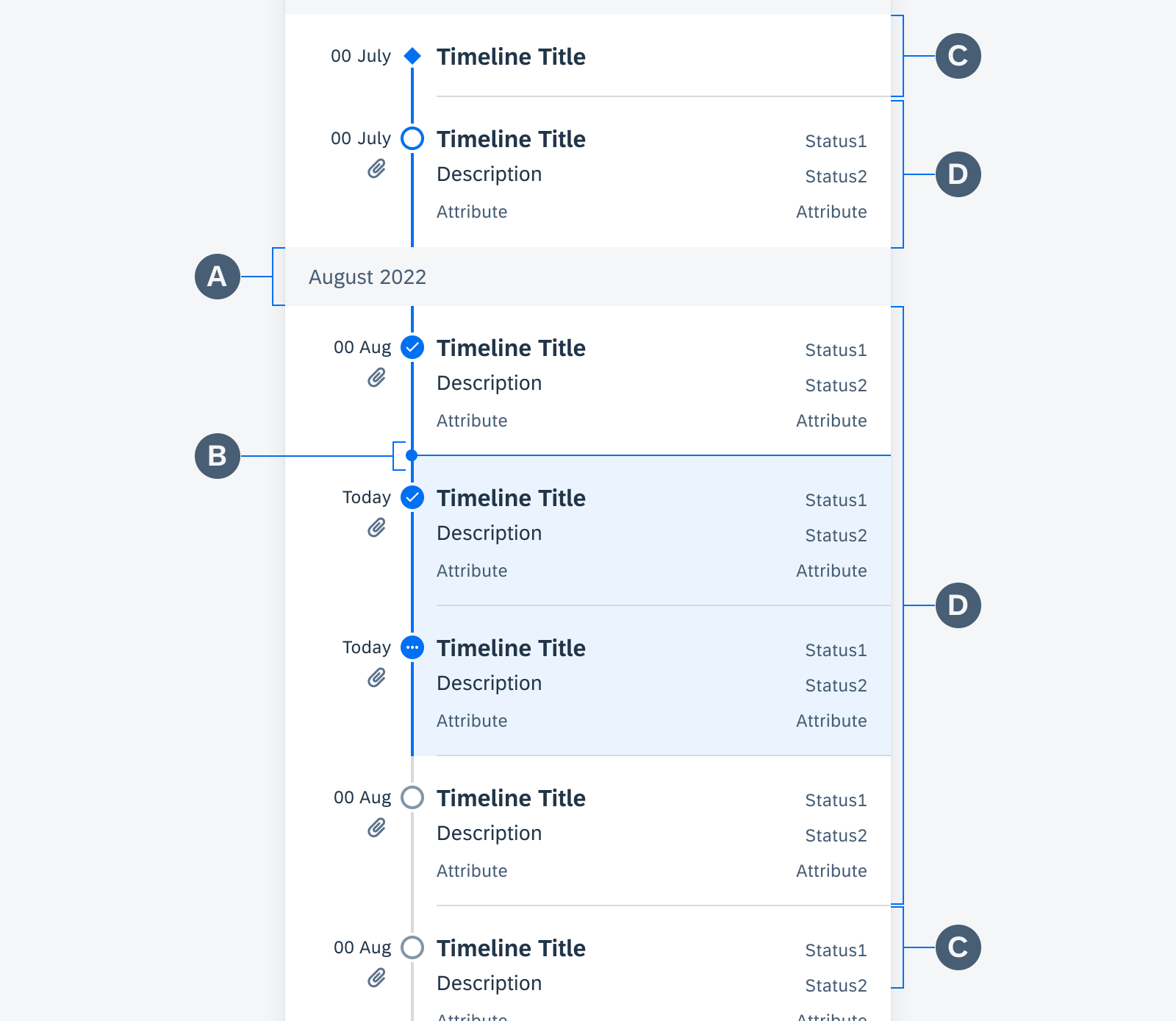
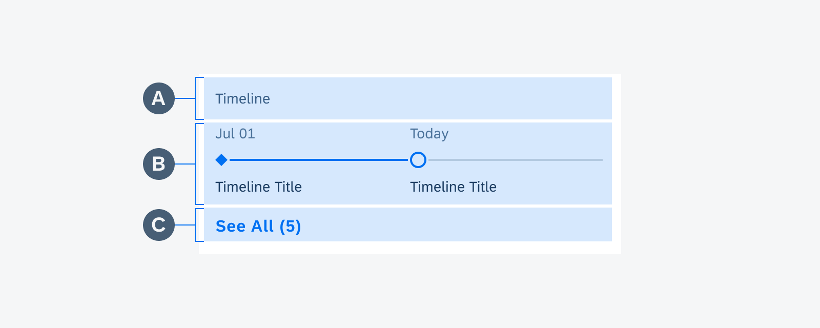
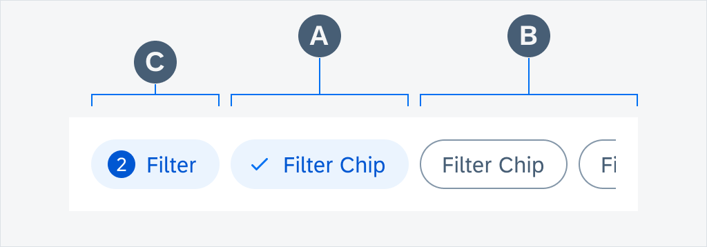
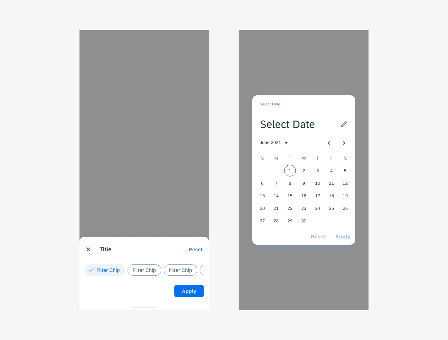
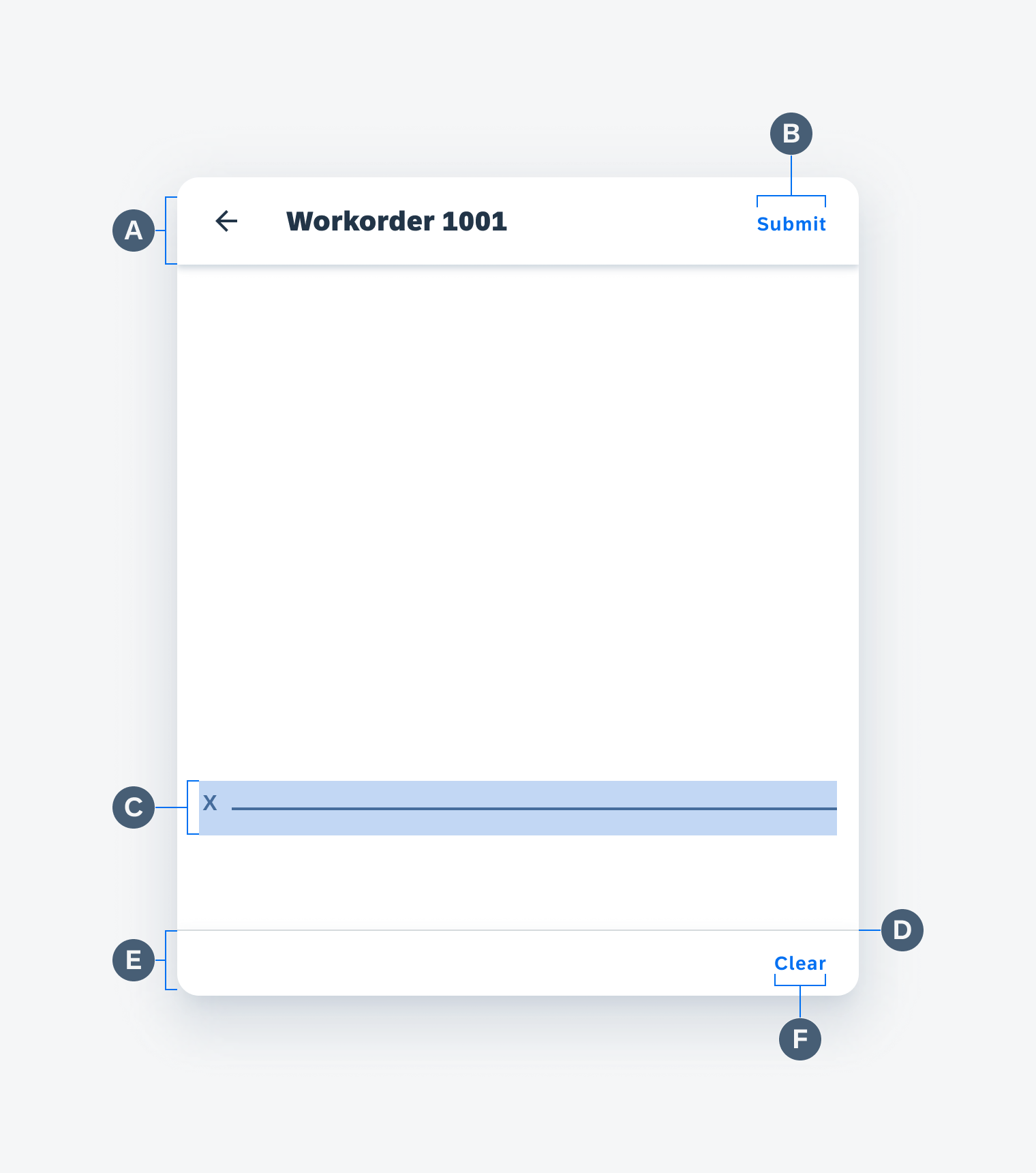
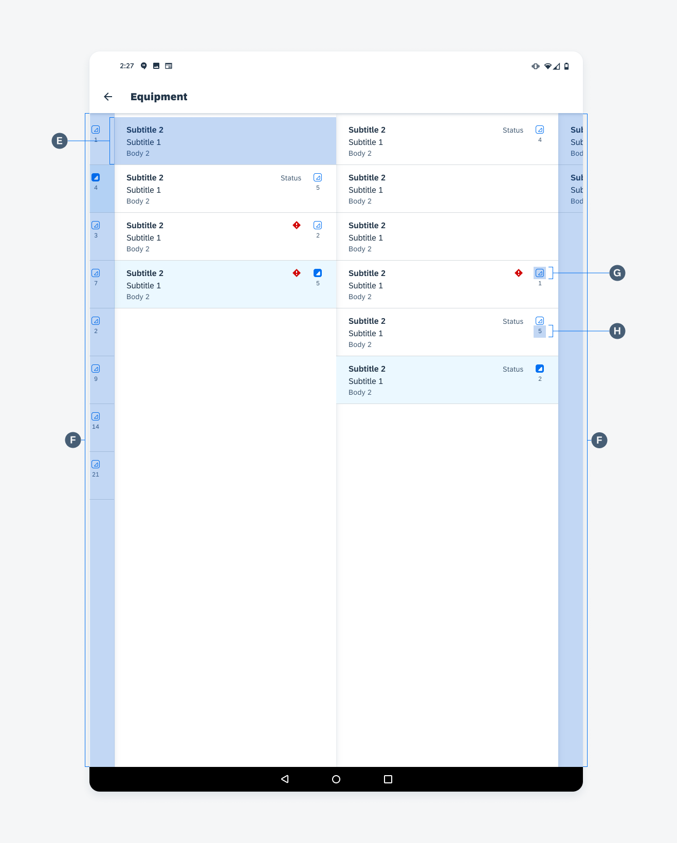
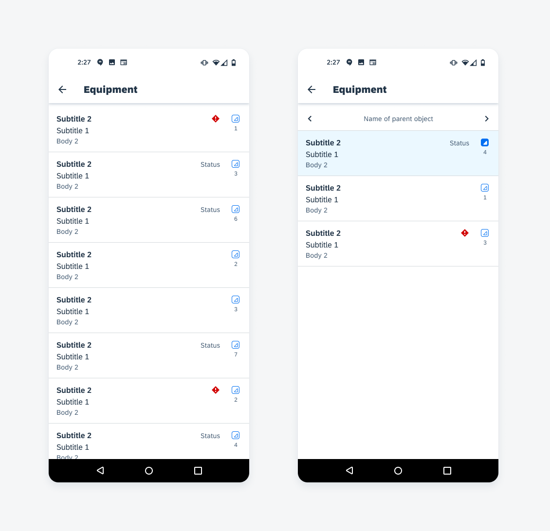
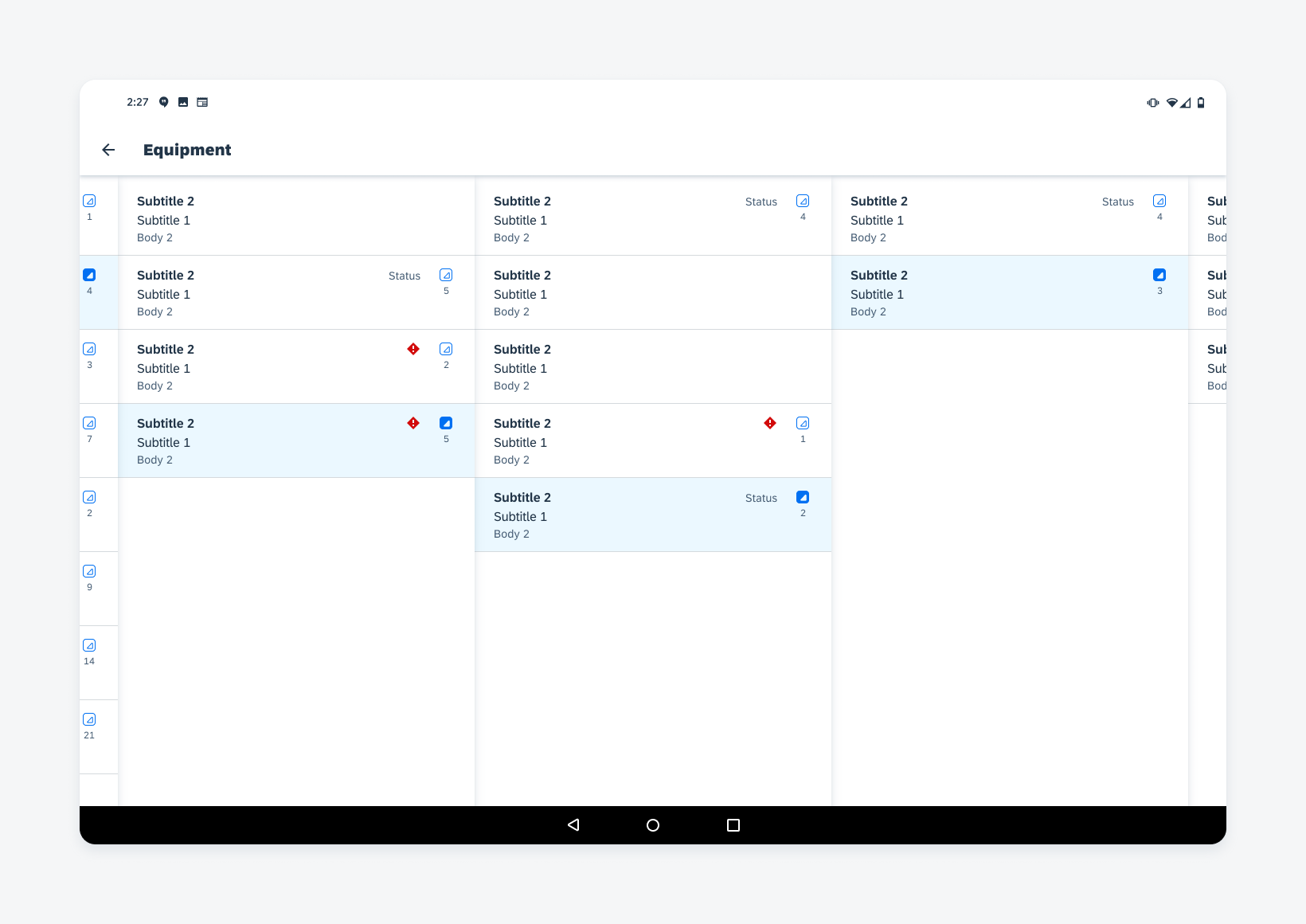
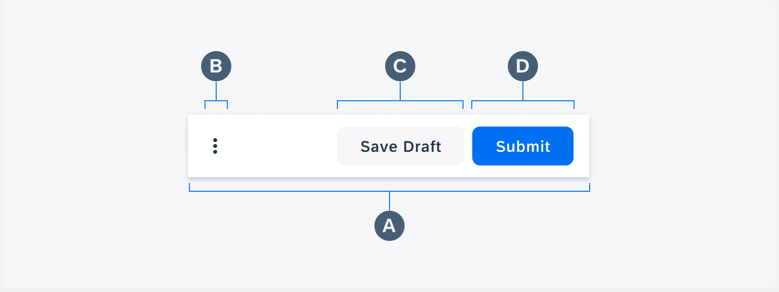
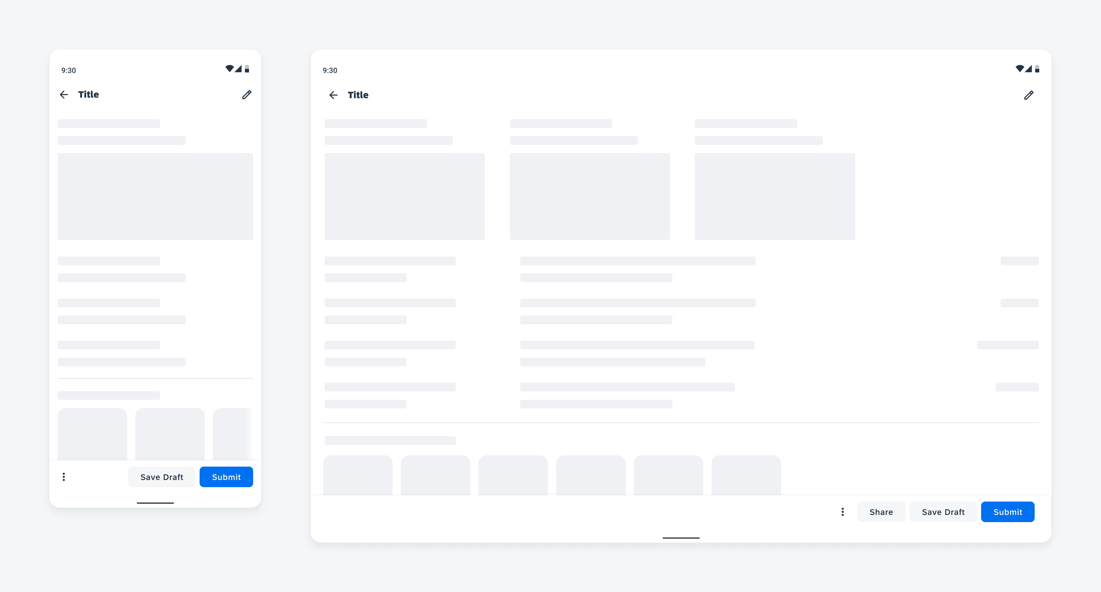
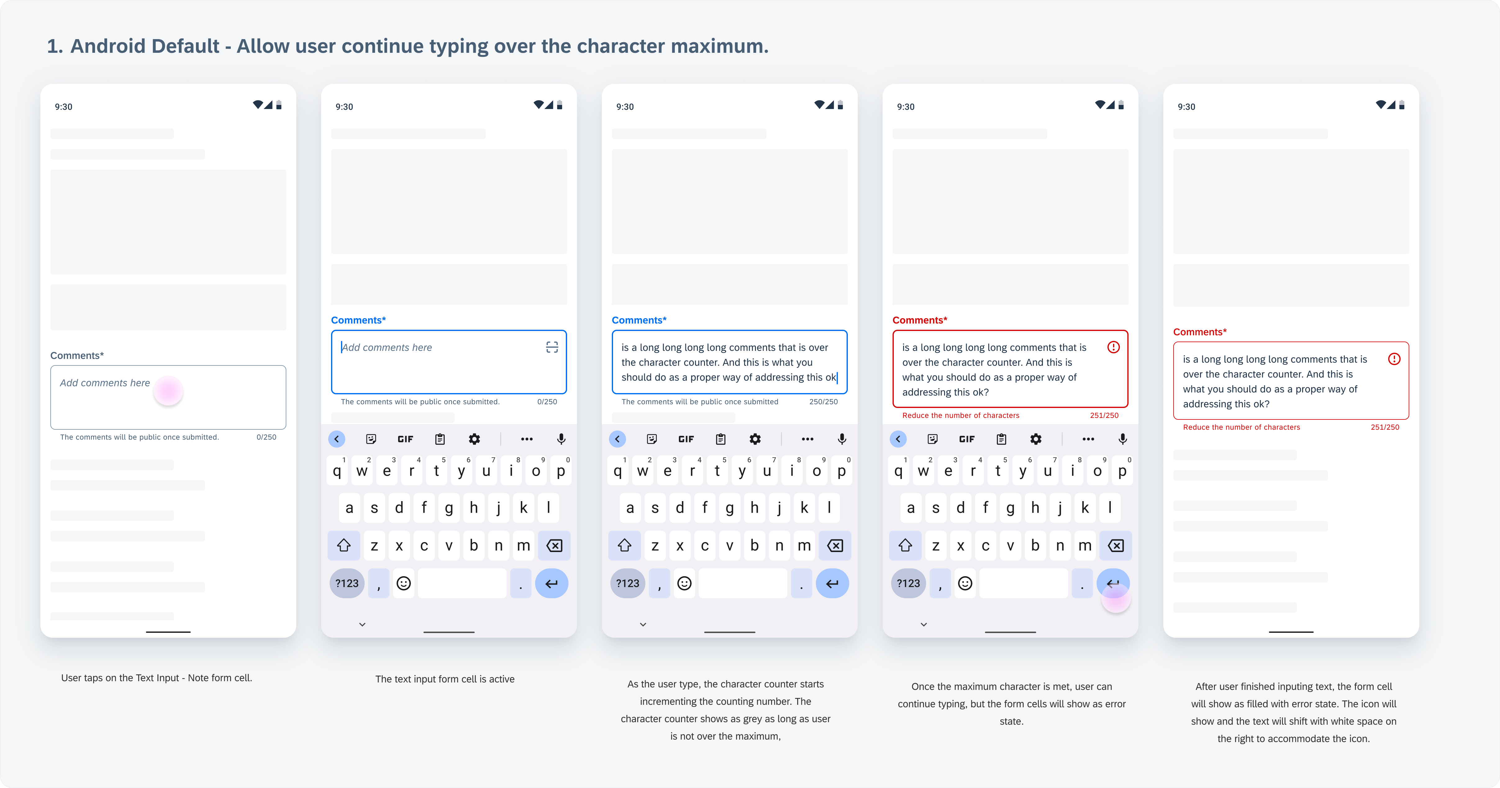
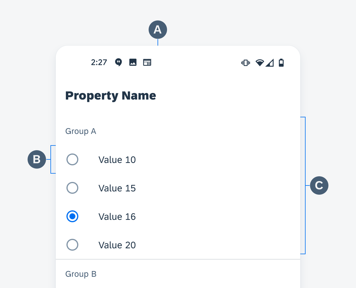
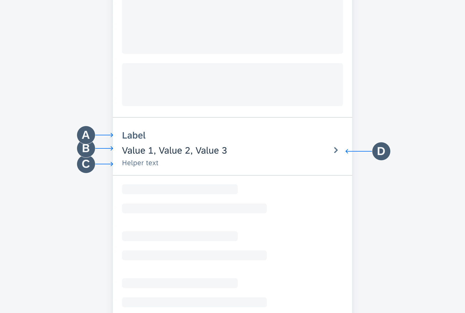
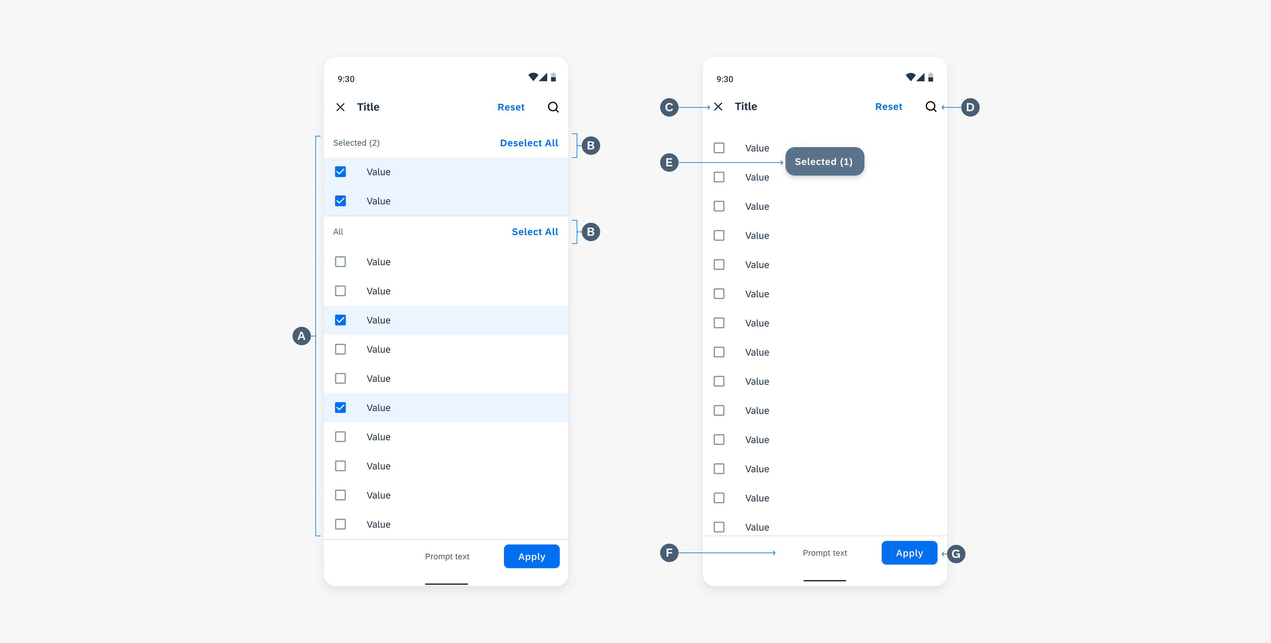
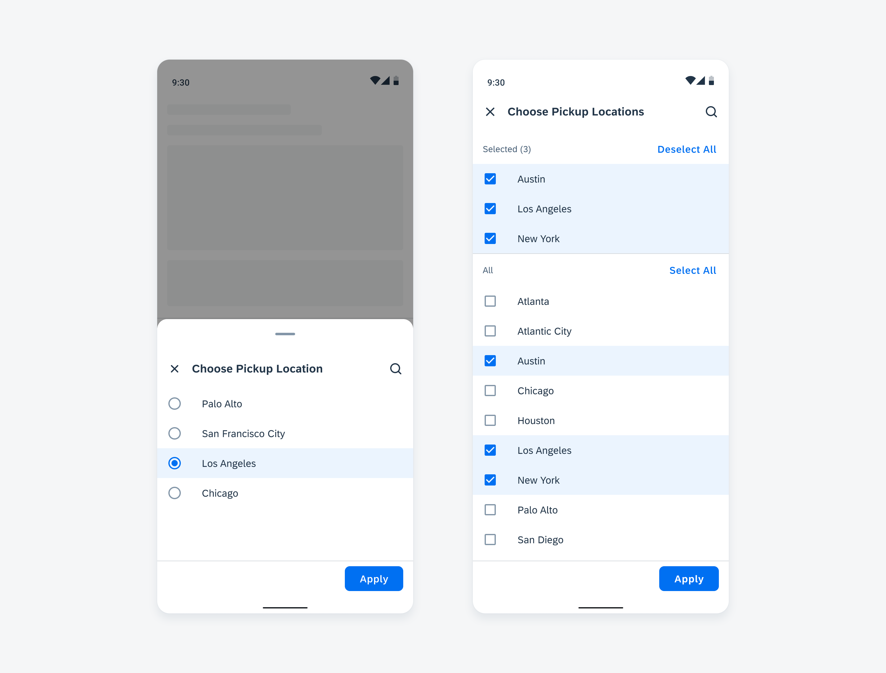
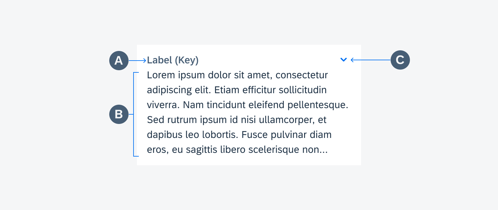
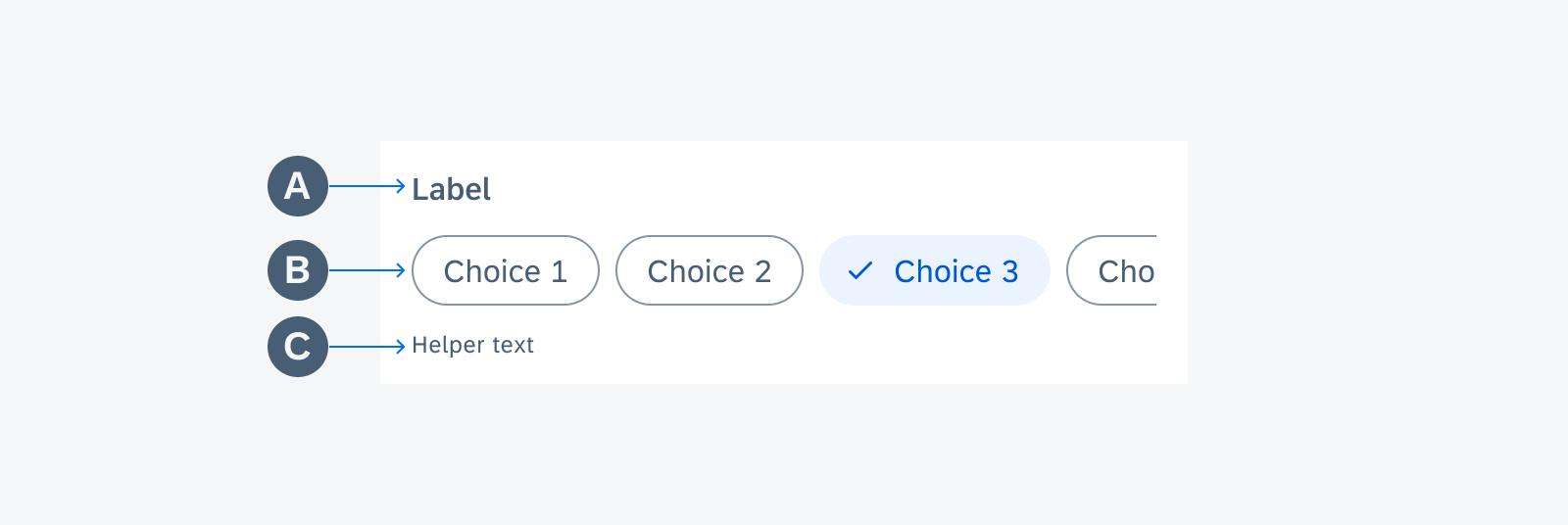
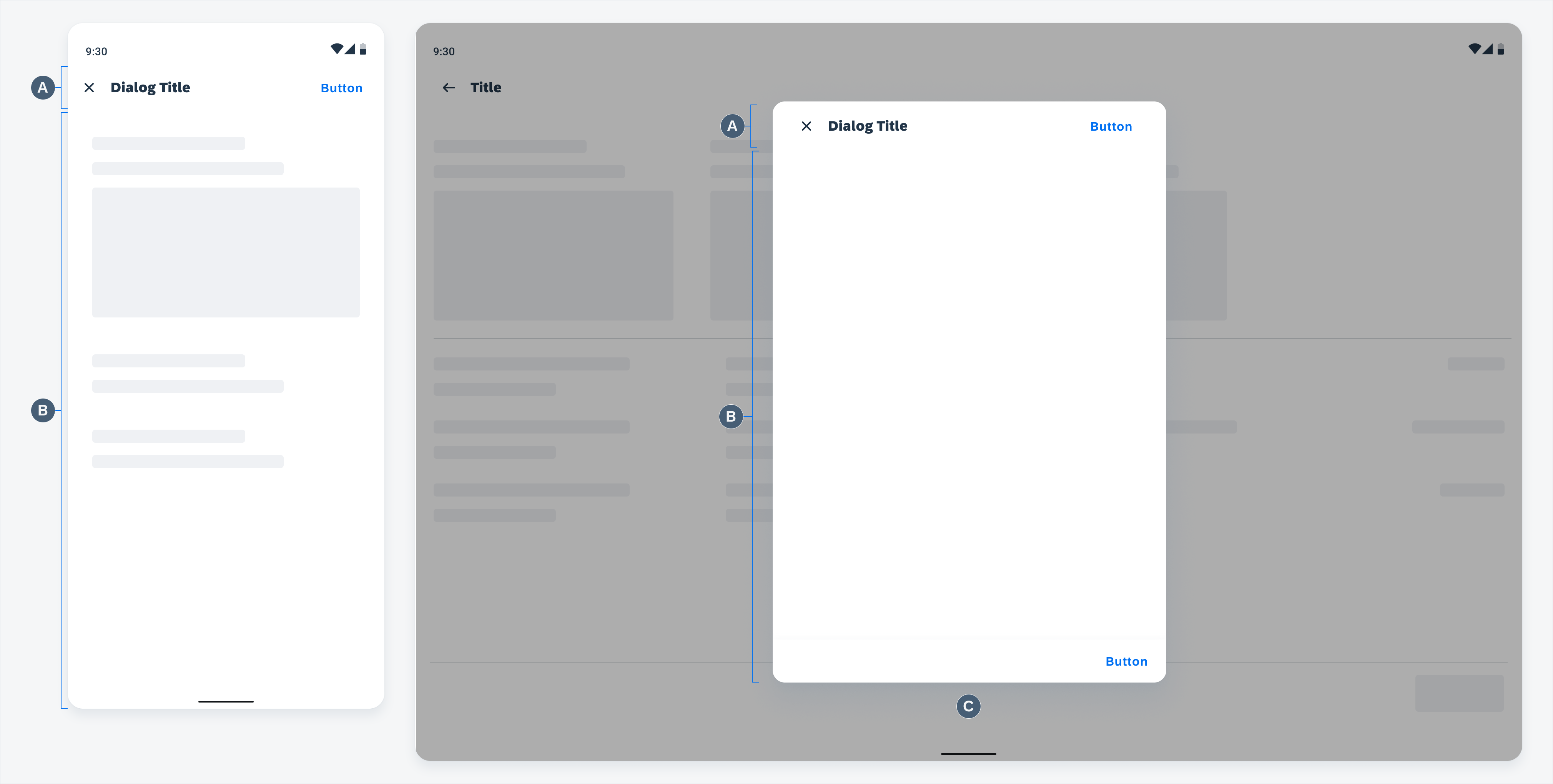
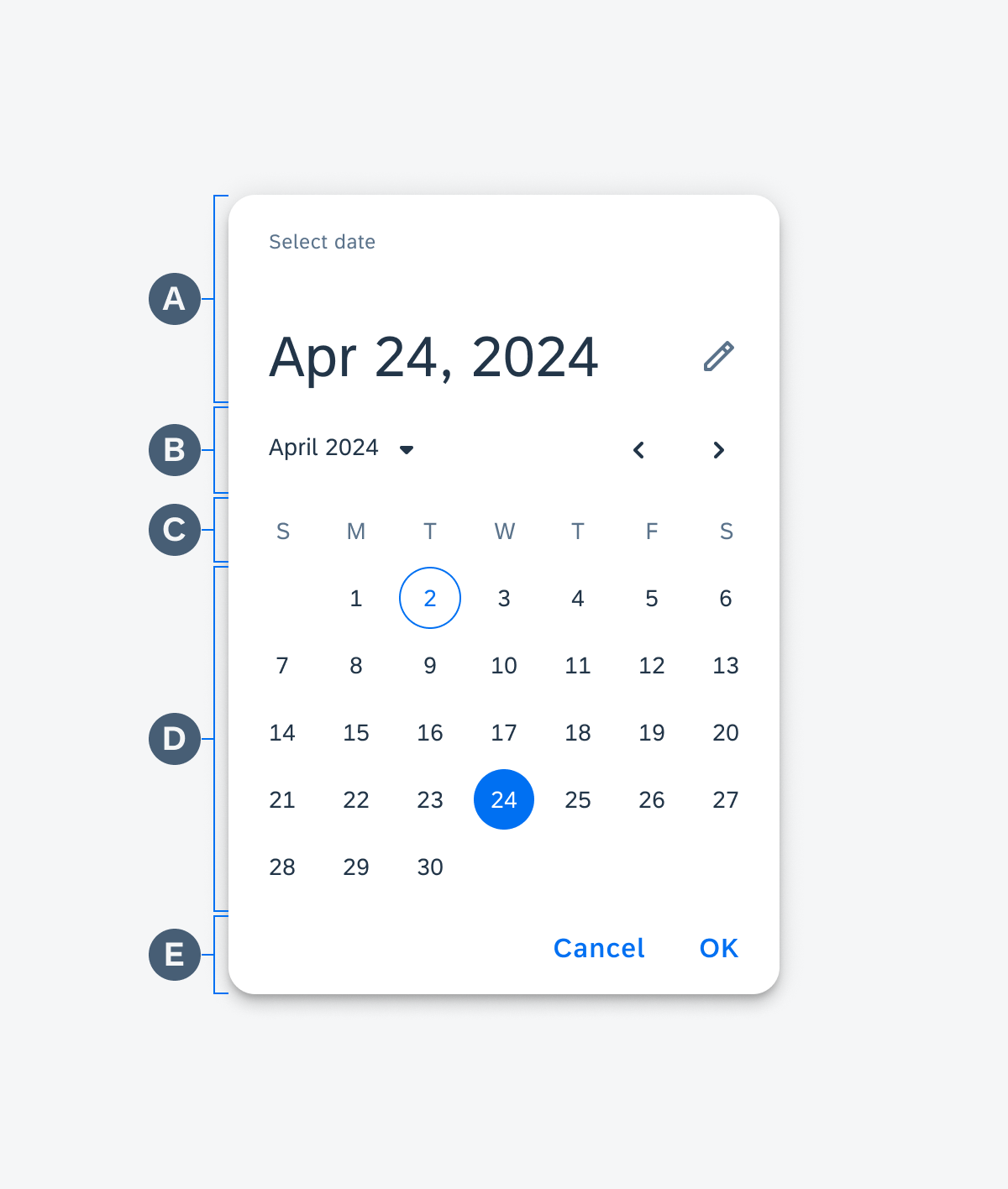
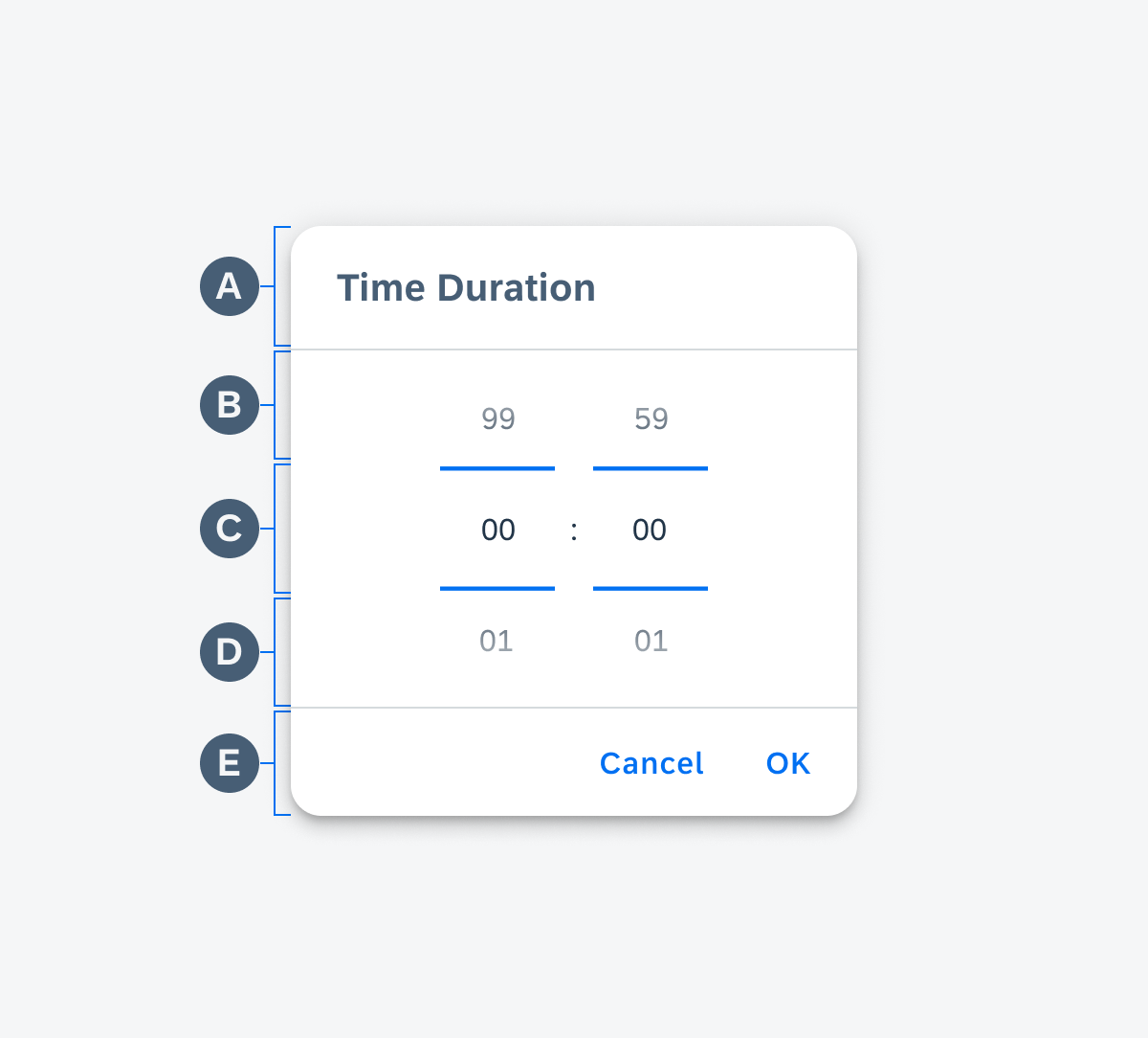
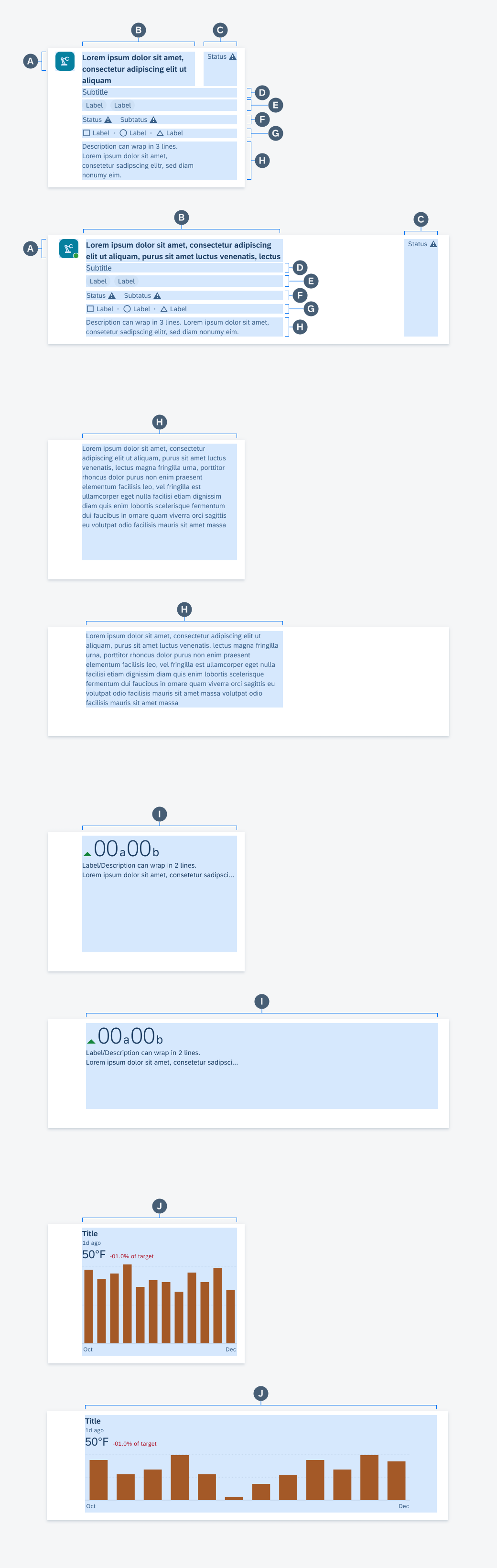
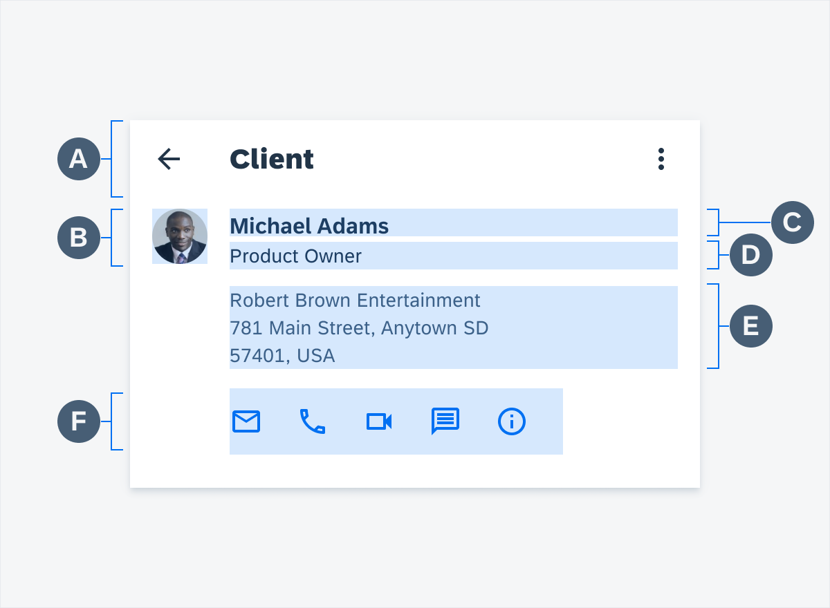
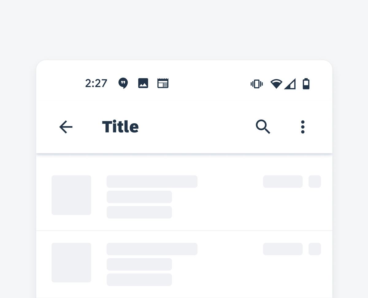
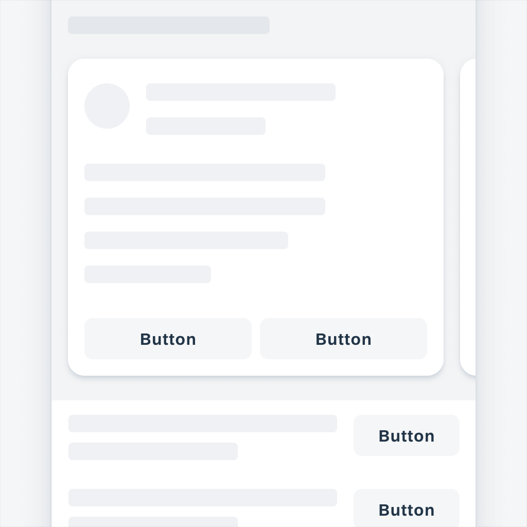
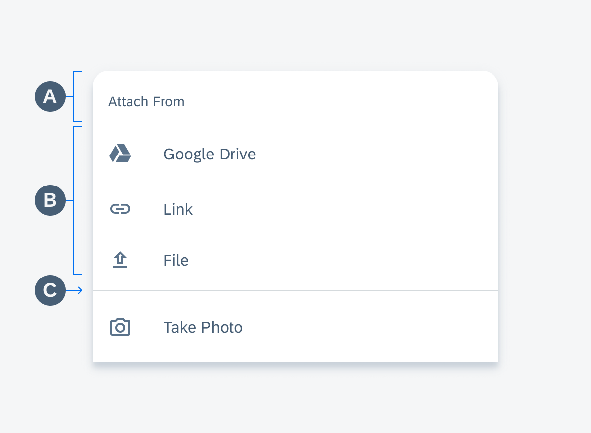
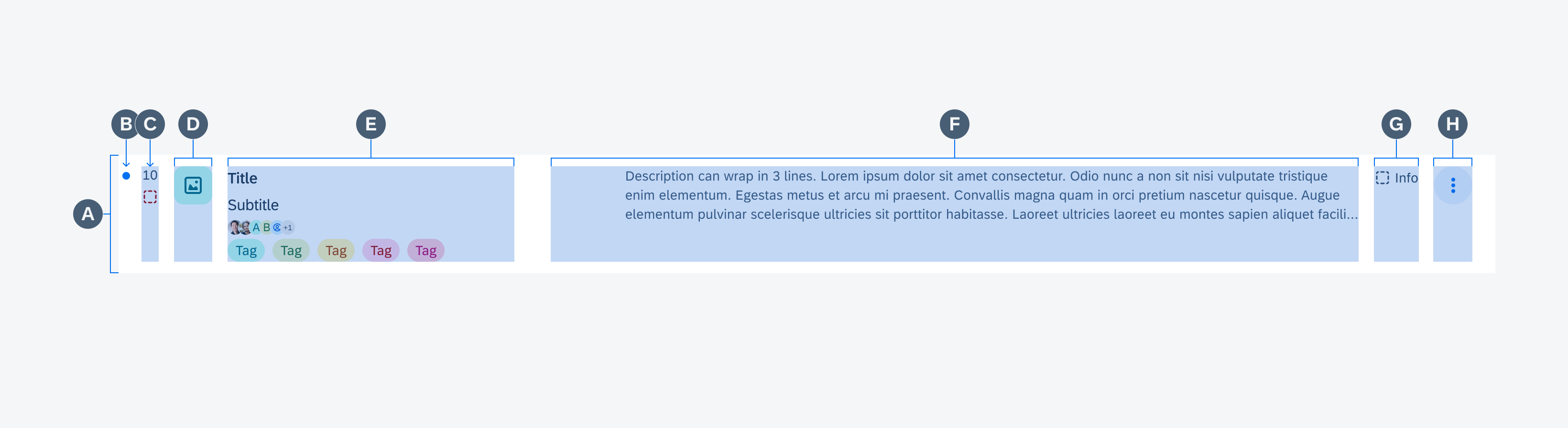
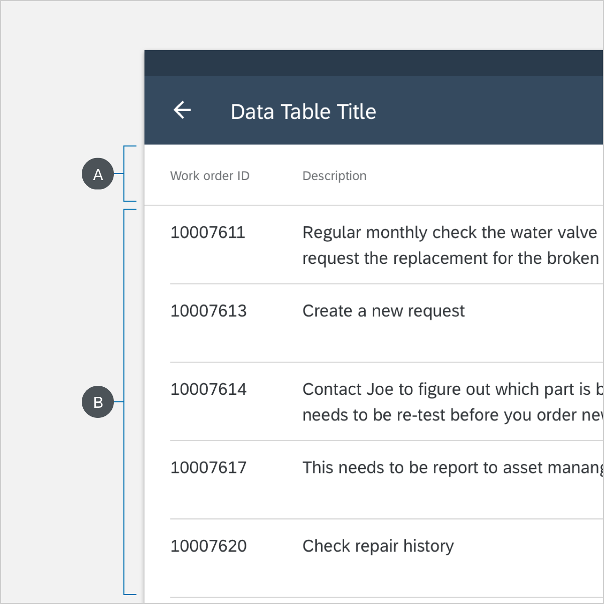
Anatomy
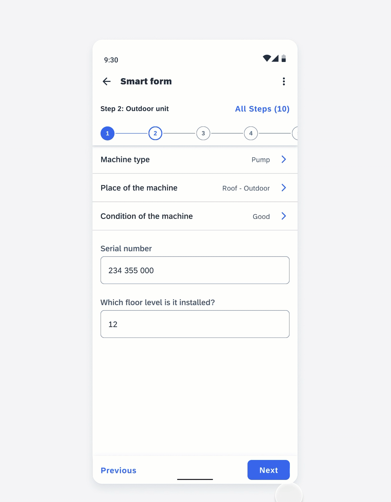
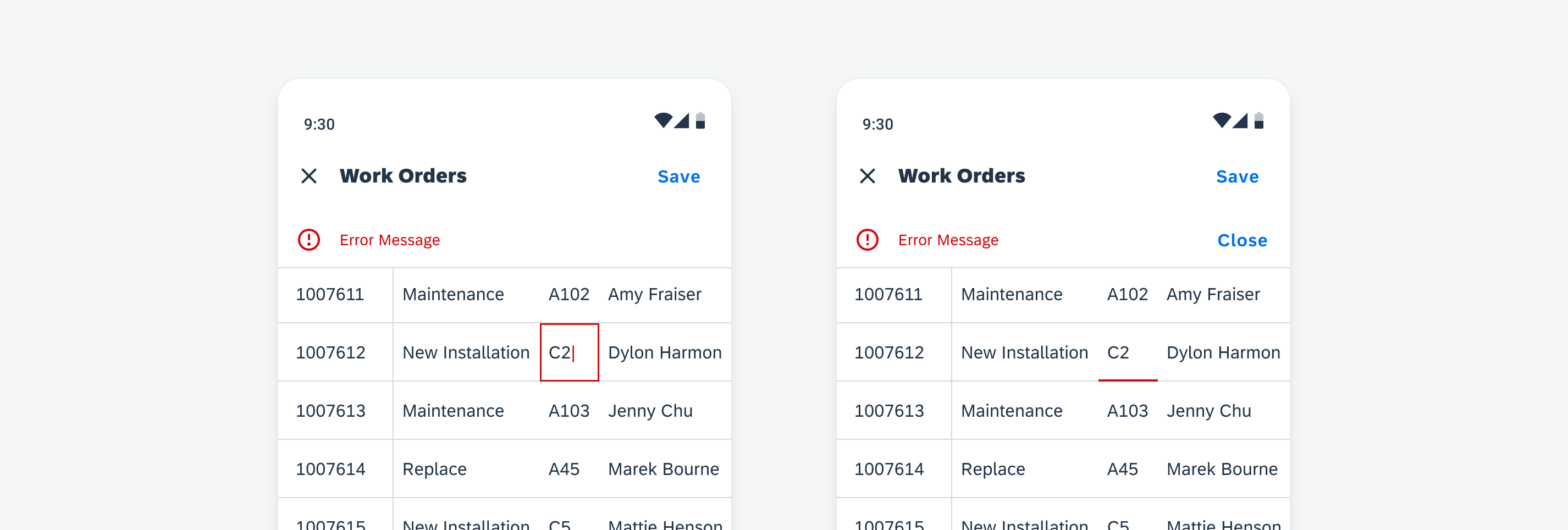
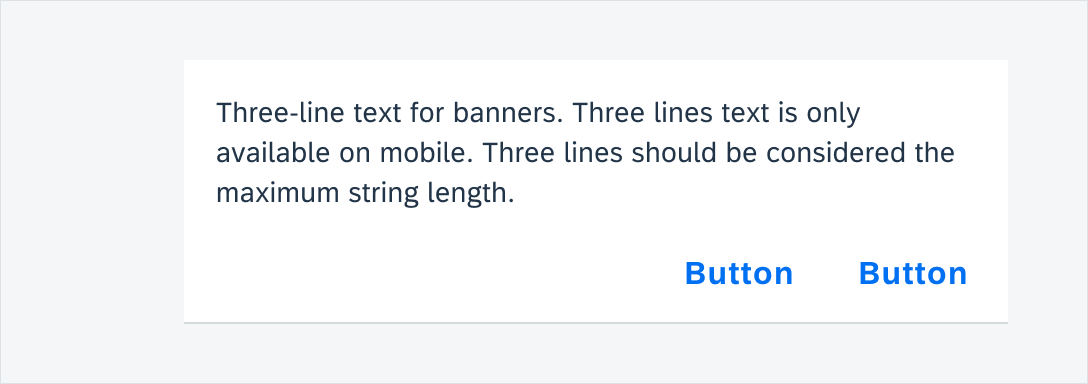
Multi-message handling follows the basic structure of a bottom sheet, prioritizing message components based on their importance. Error messages should appear first to capture the user’s attention.
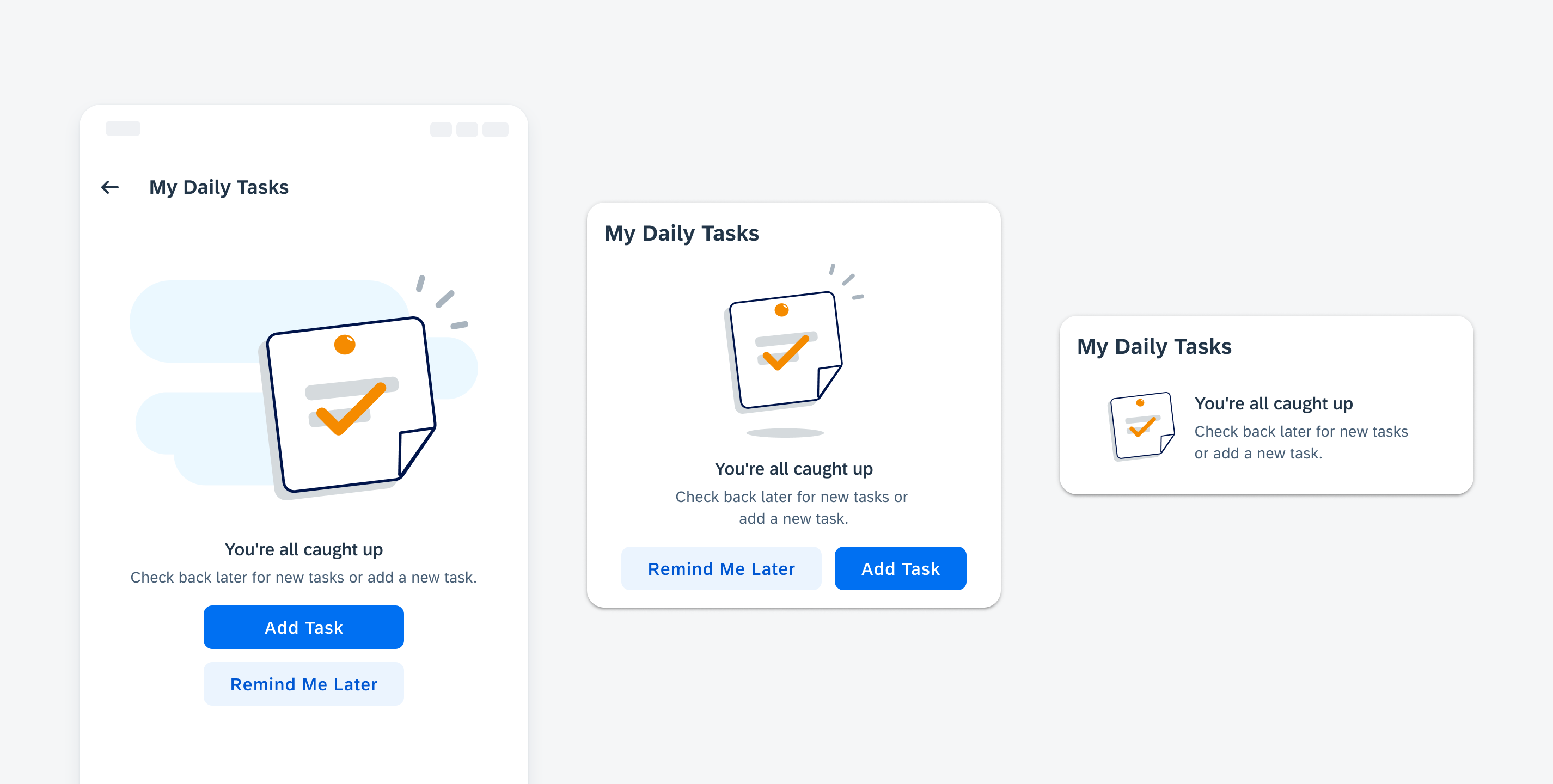
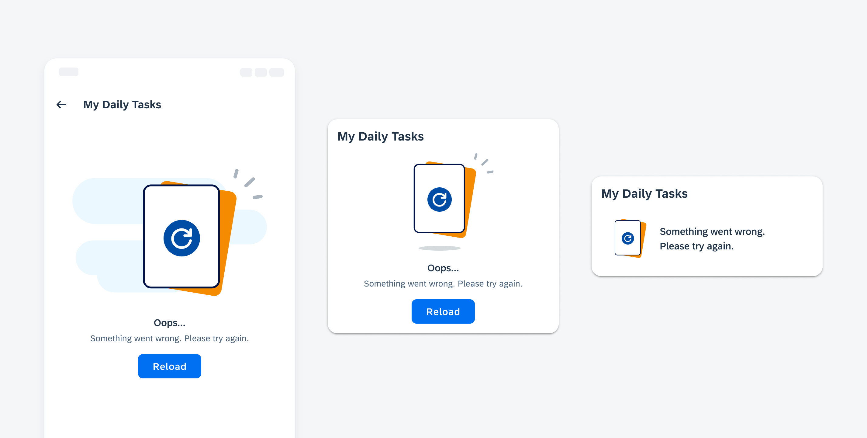
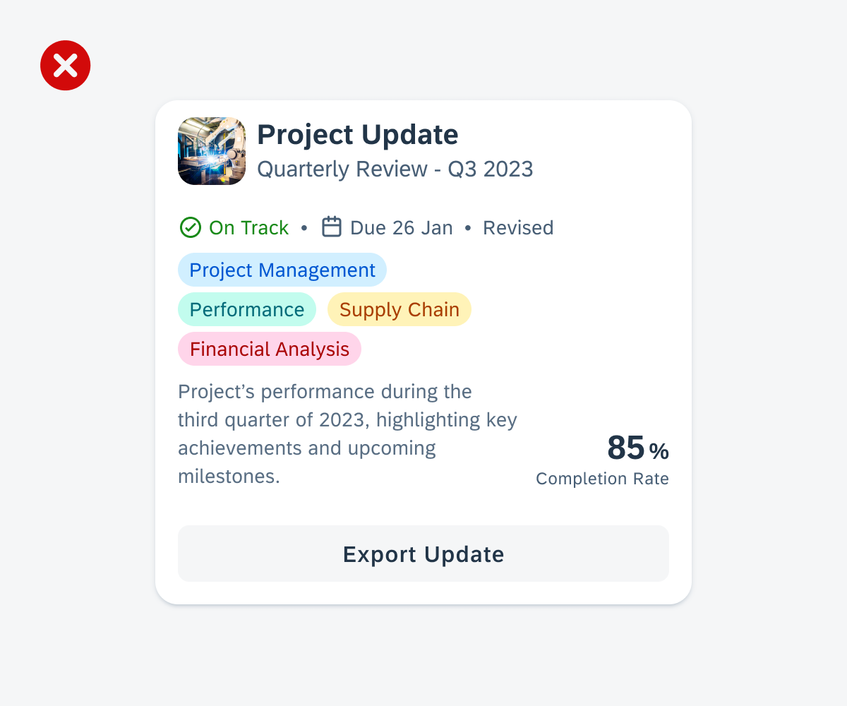
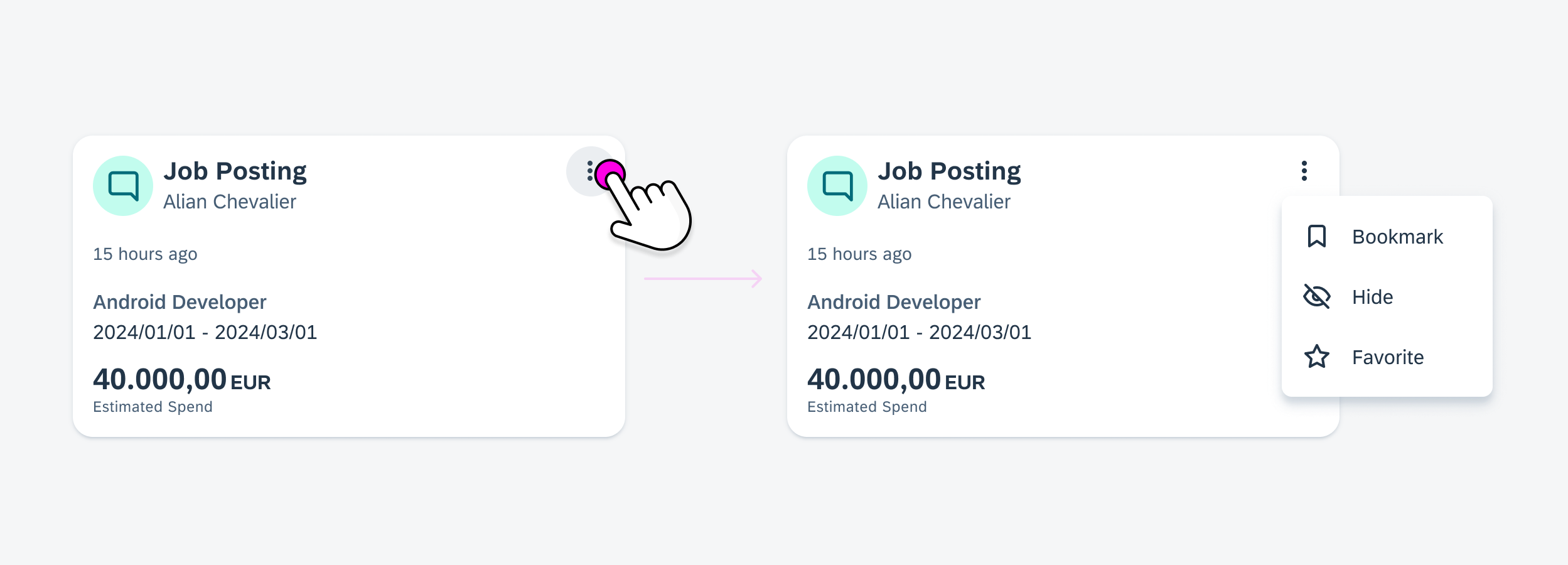
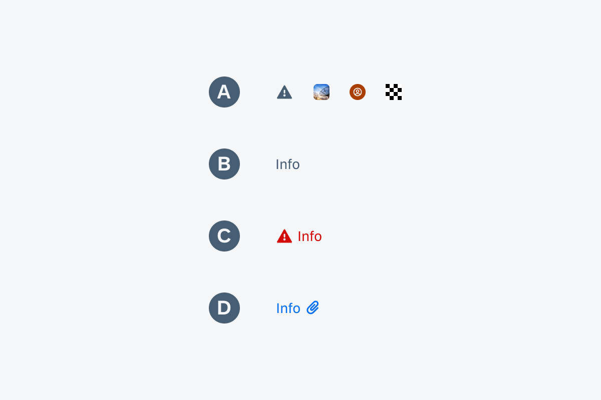
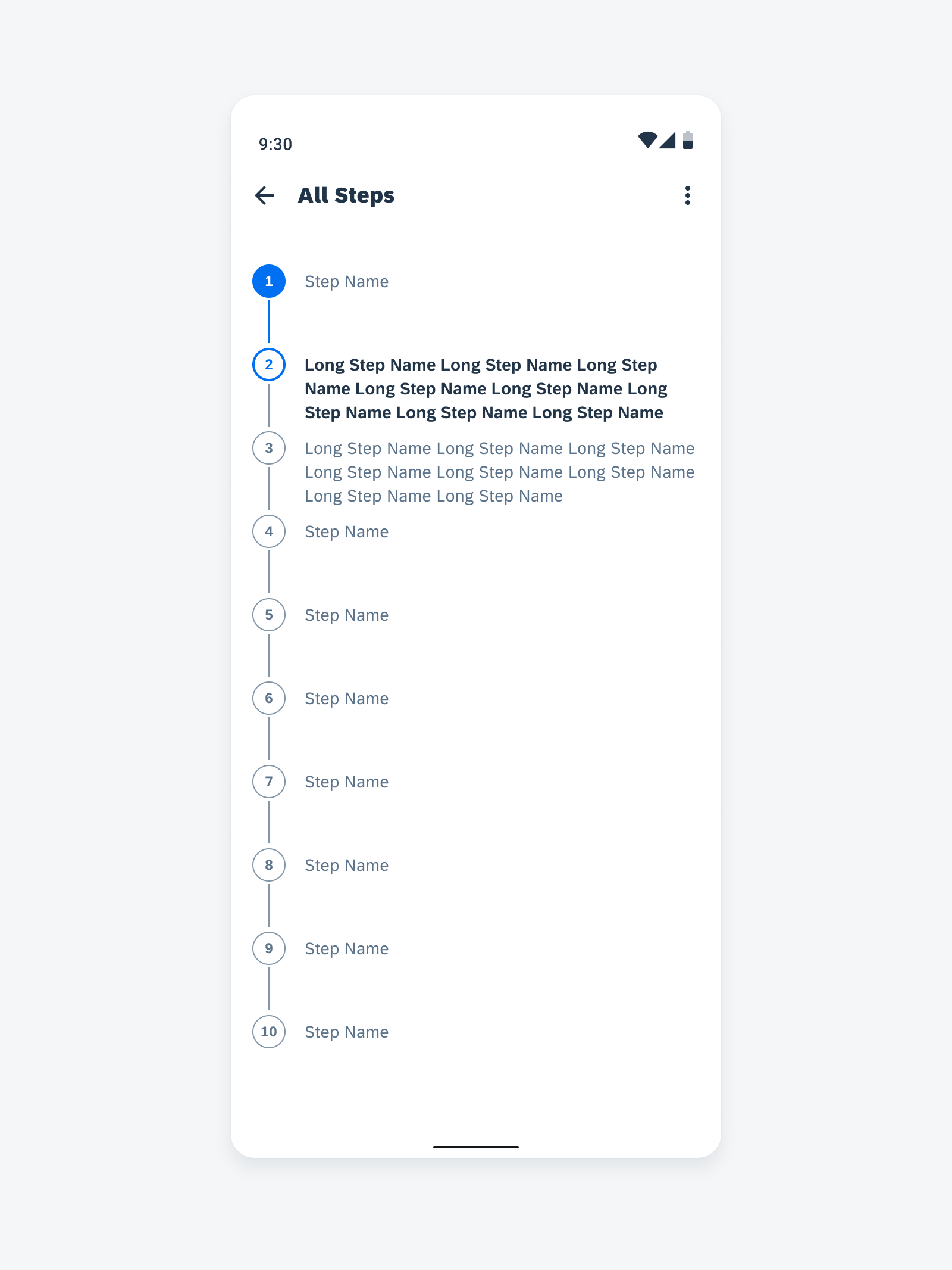
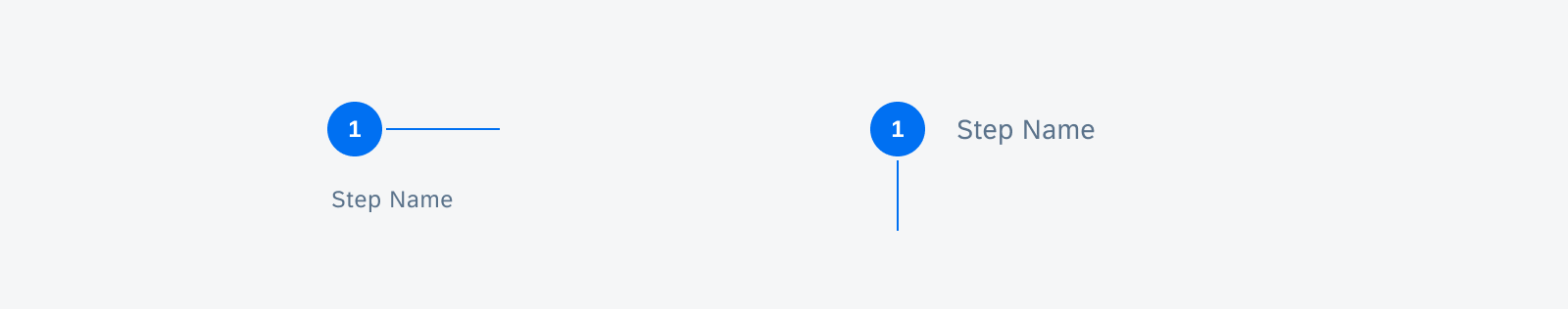
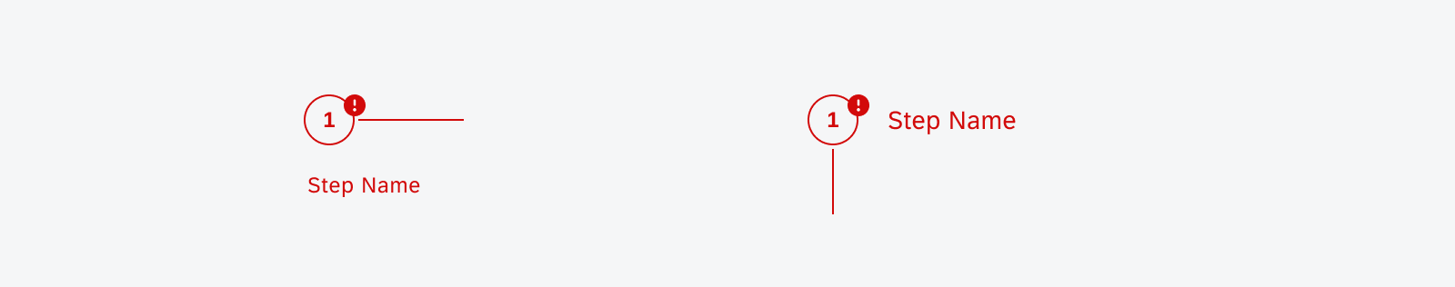
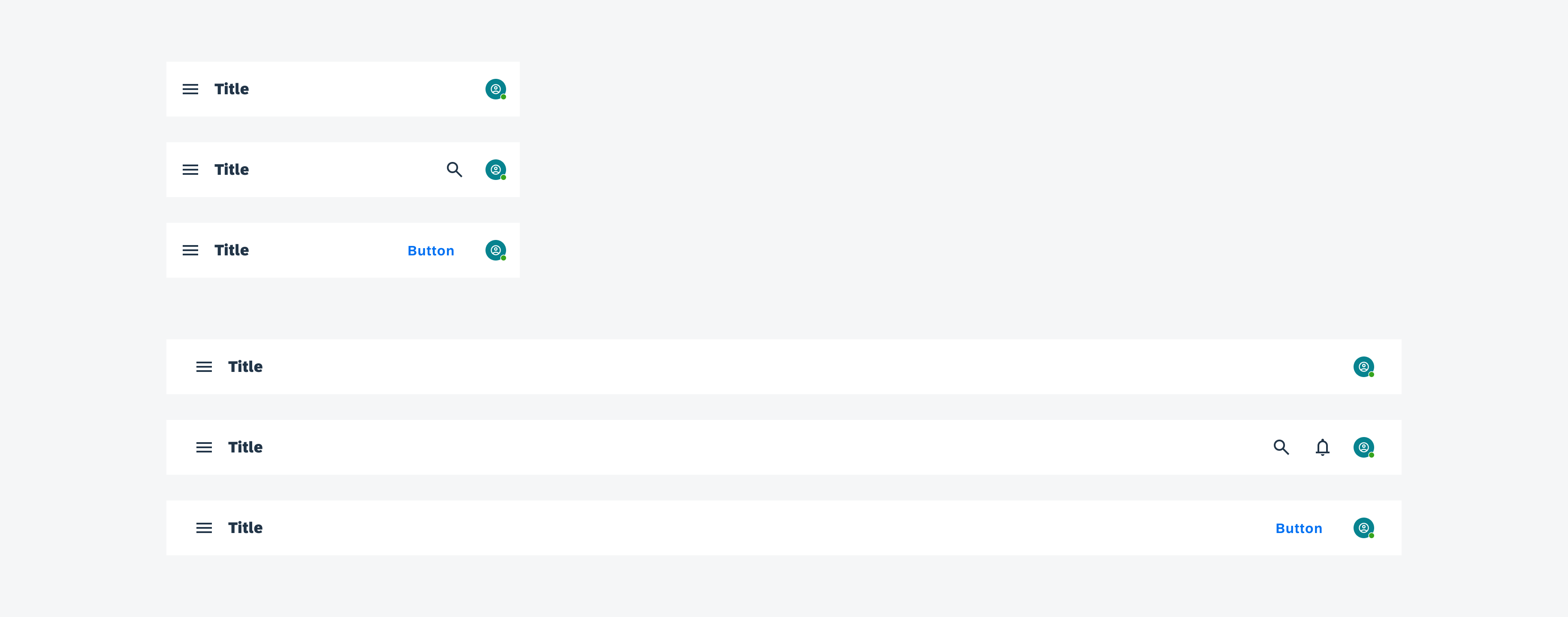
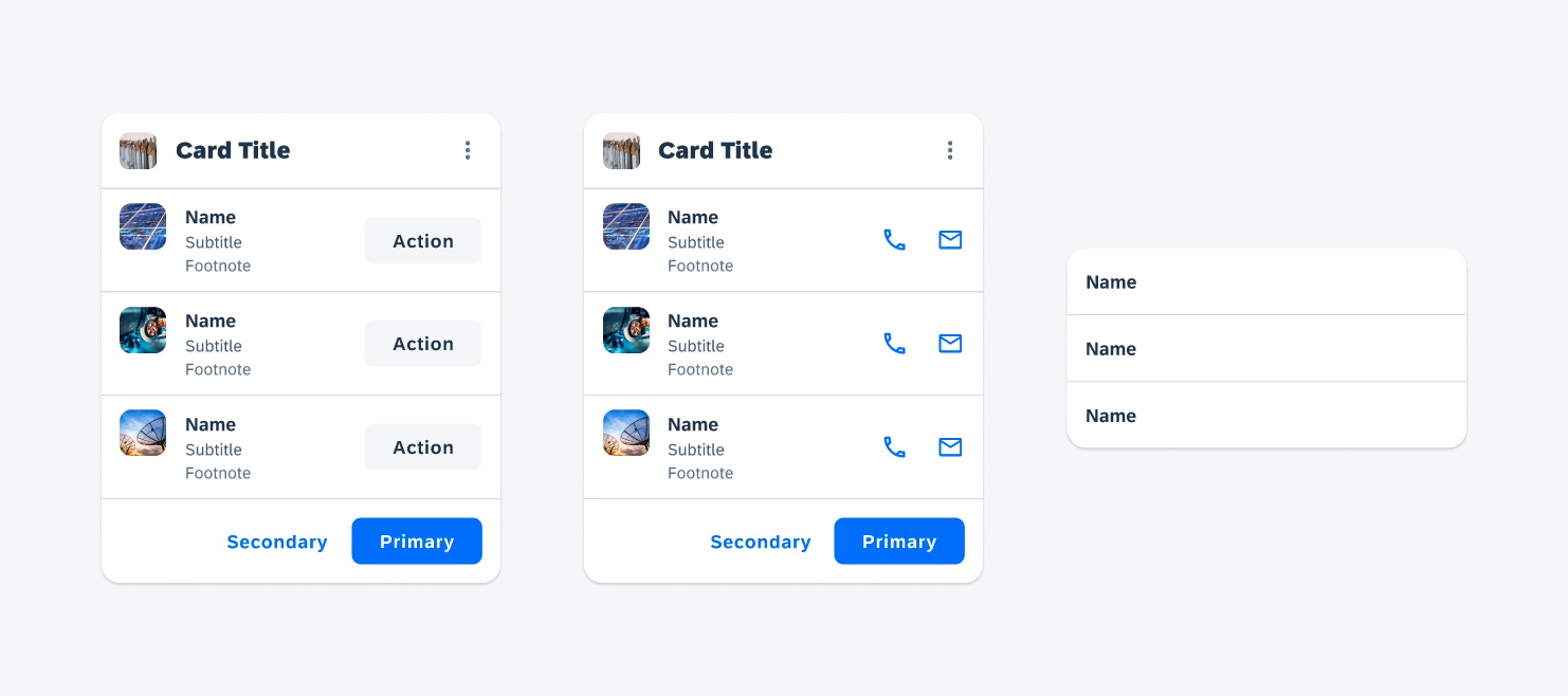
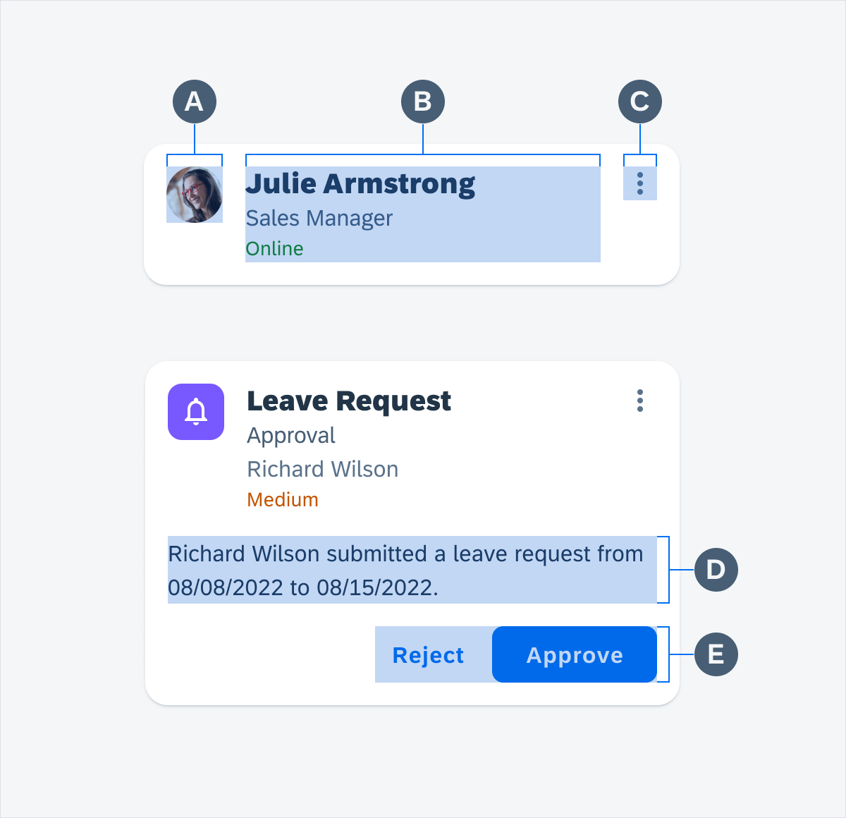
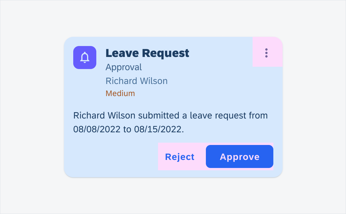
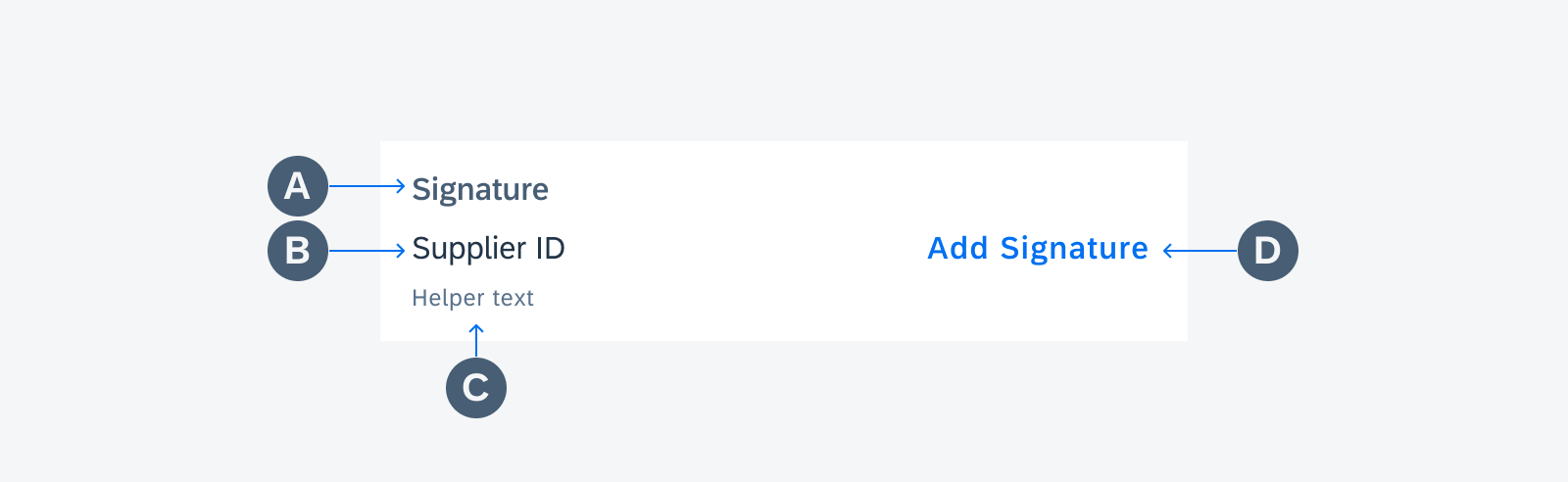
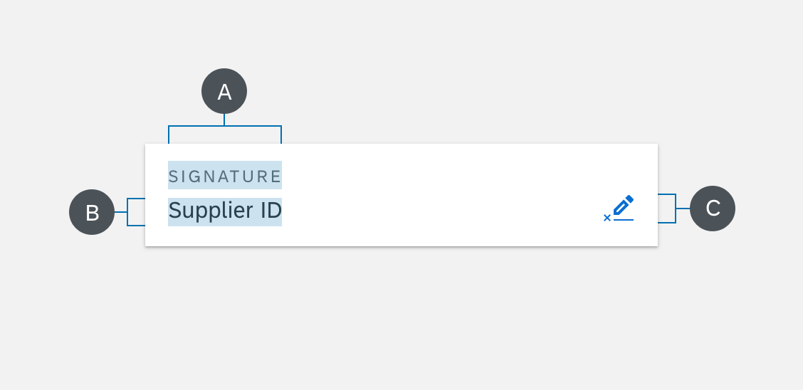
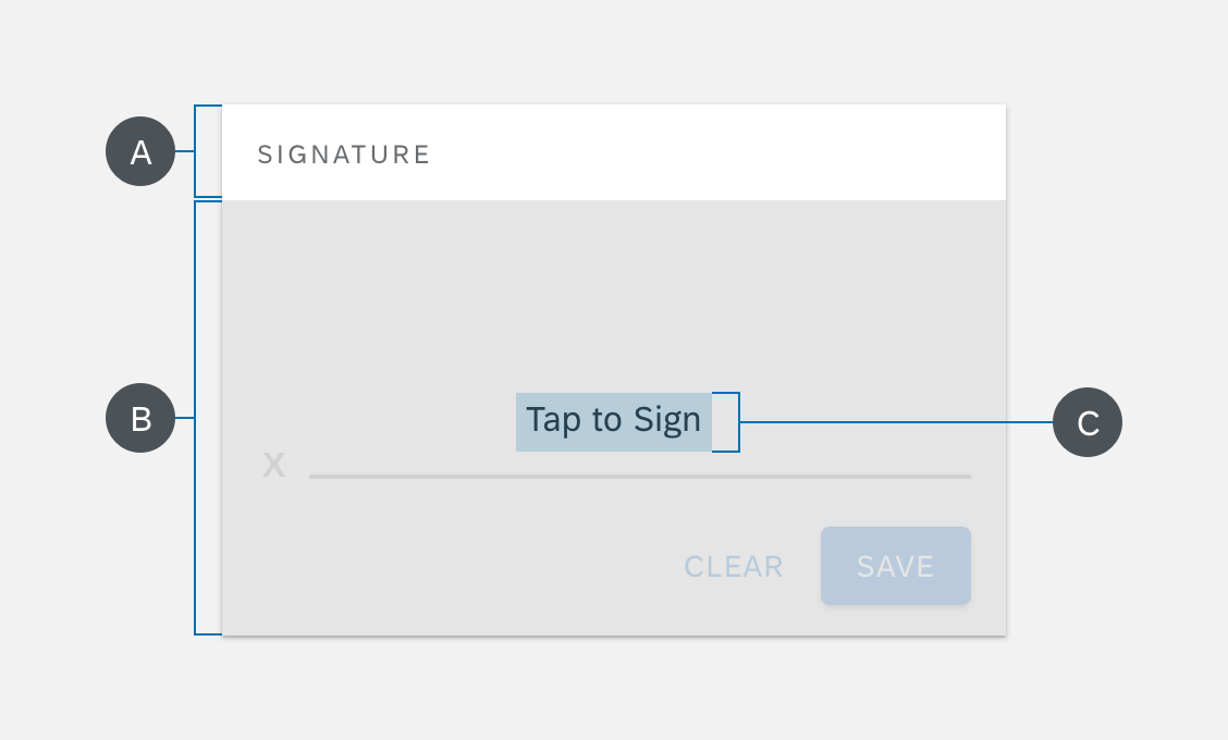
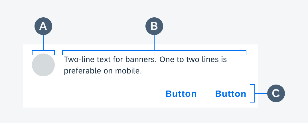
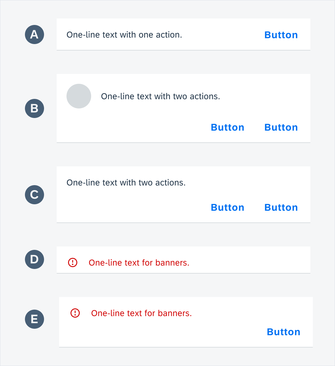
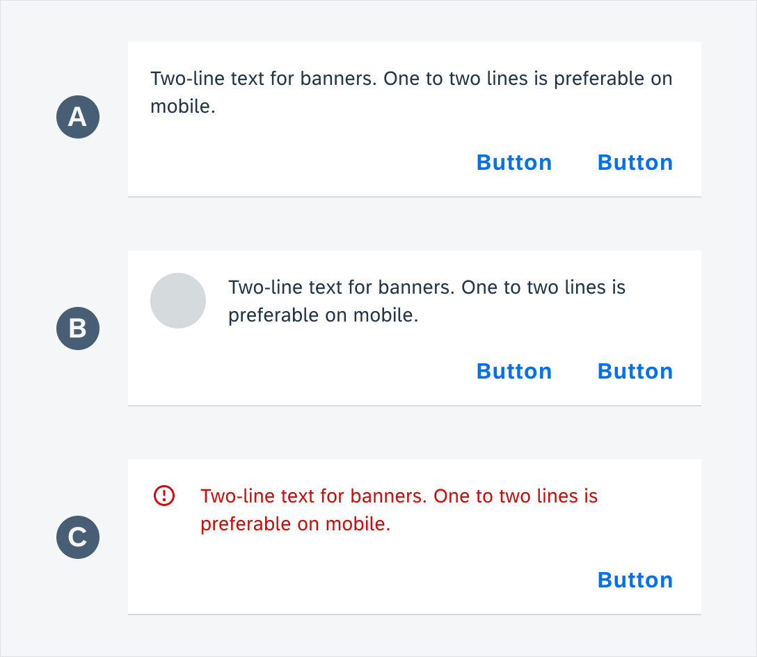
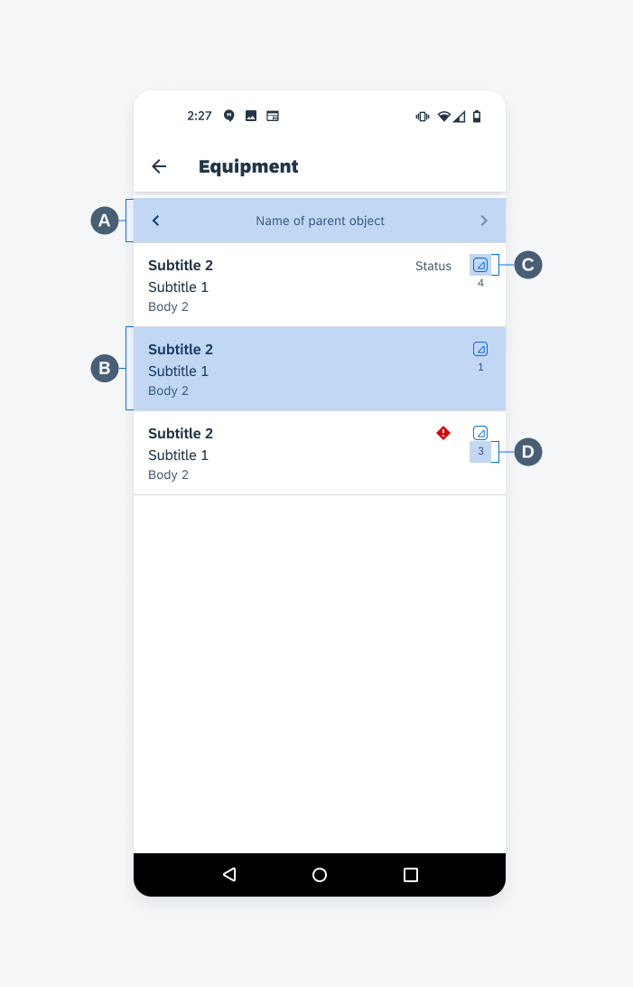
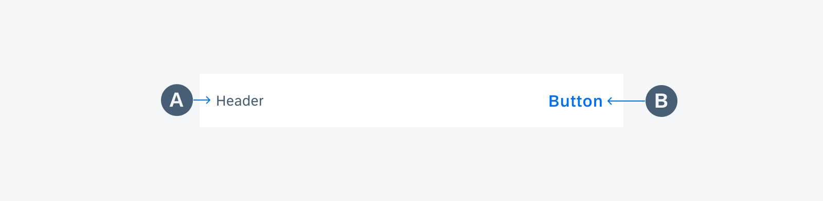
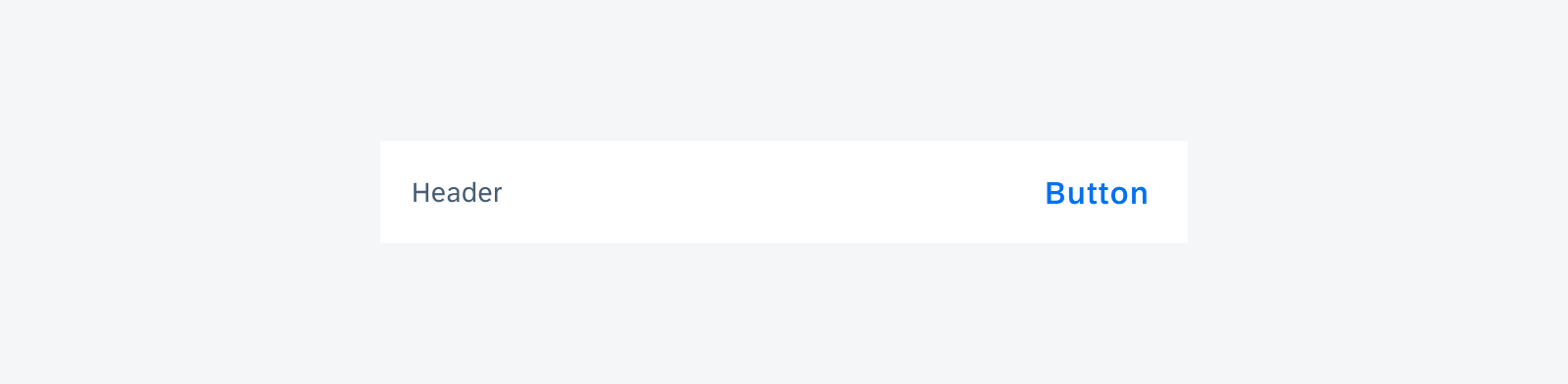
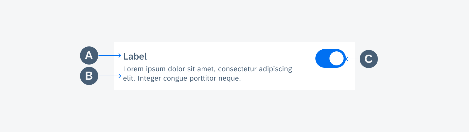
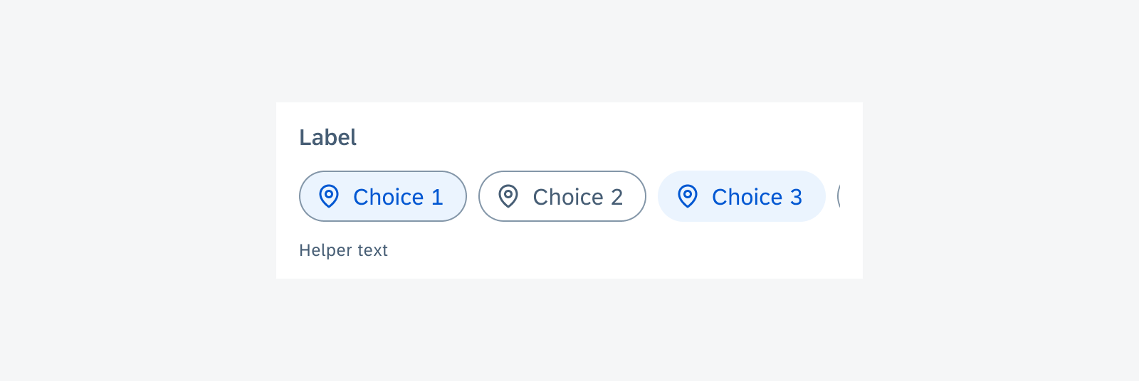
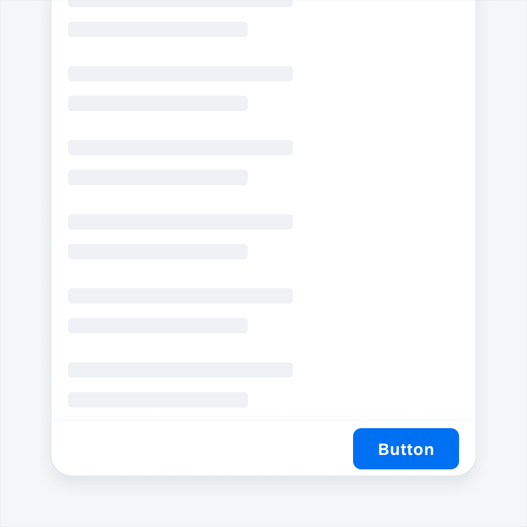
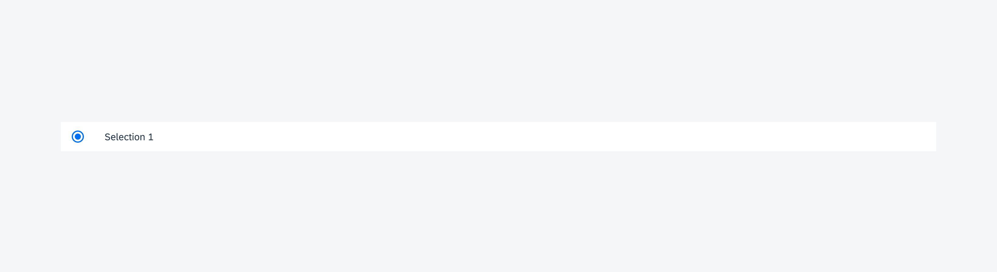
A. Banner
The banner contains:
- Optional icon or image
- Message summary
- Button
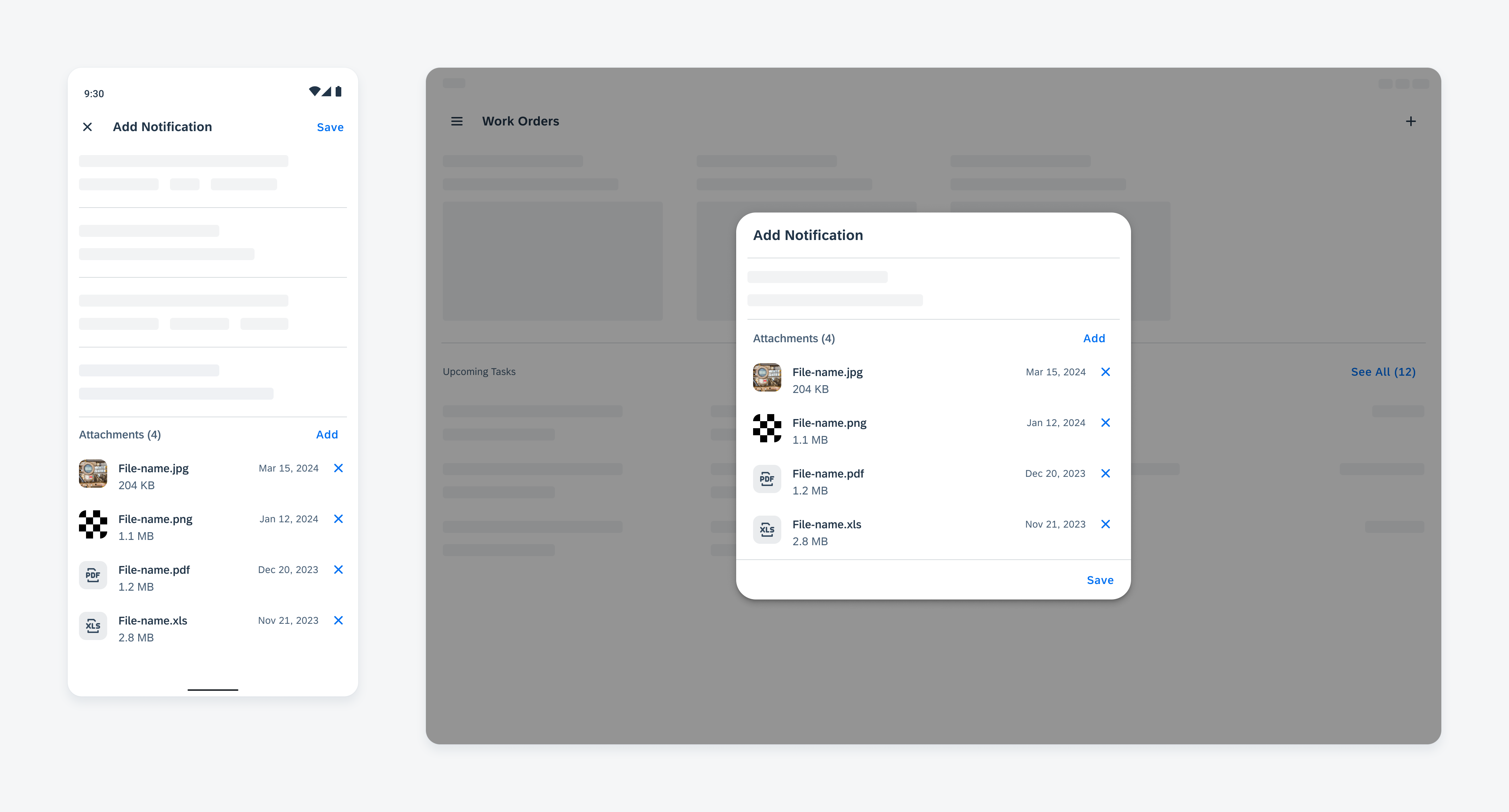
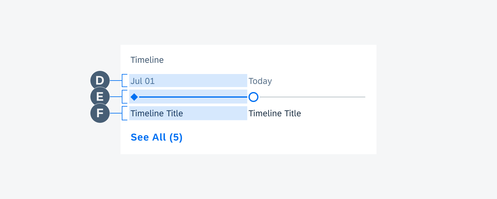
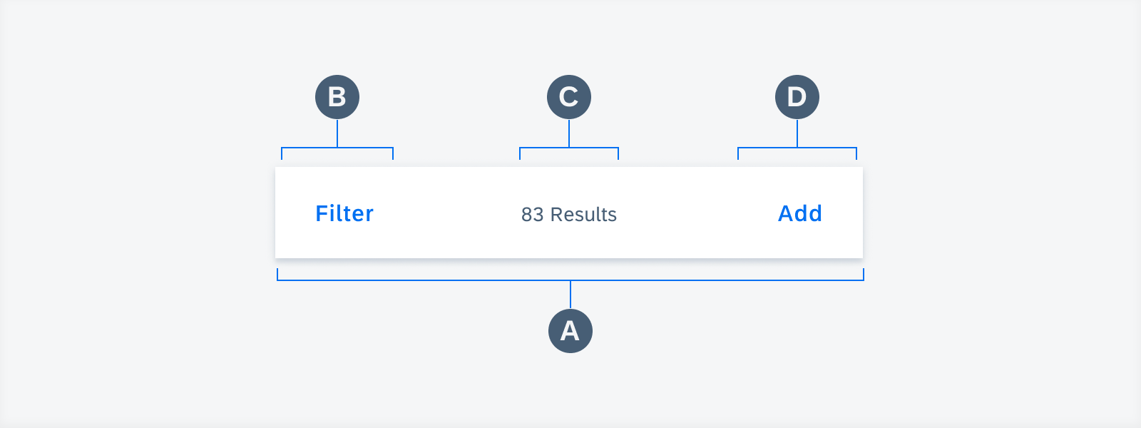
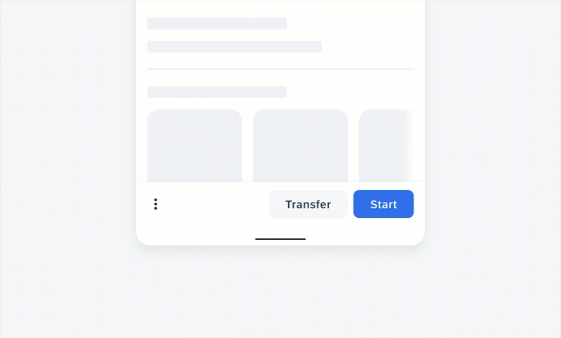
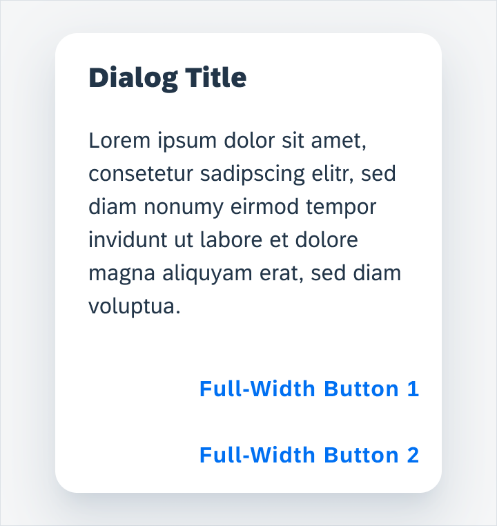
B. Bottom Sheet
The bottom sheet displays message details.
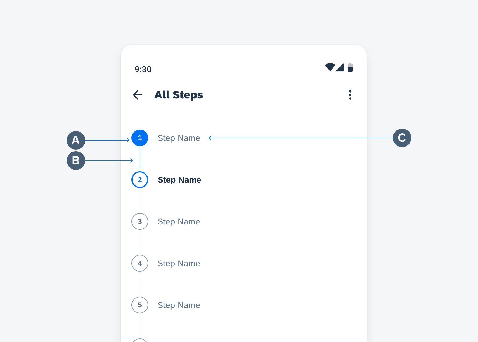
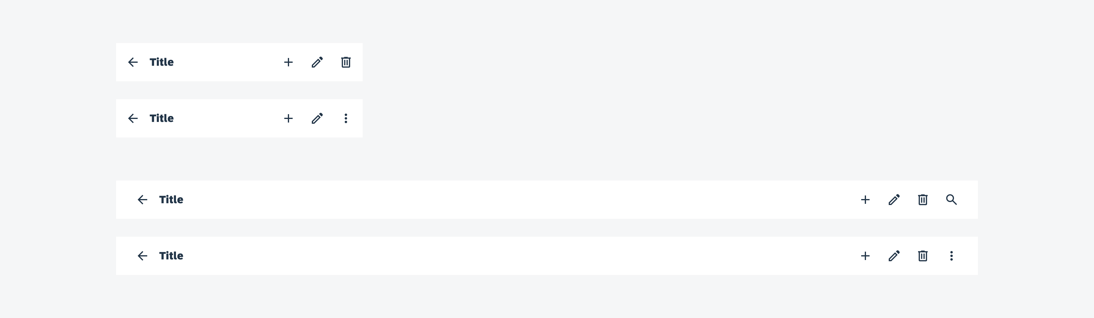
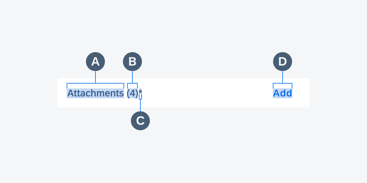
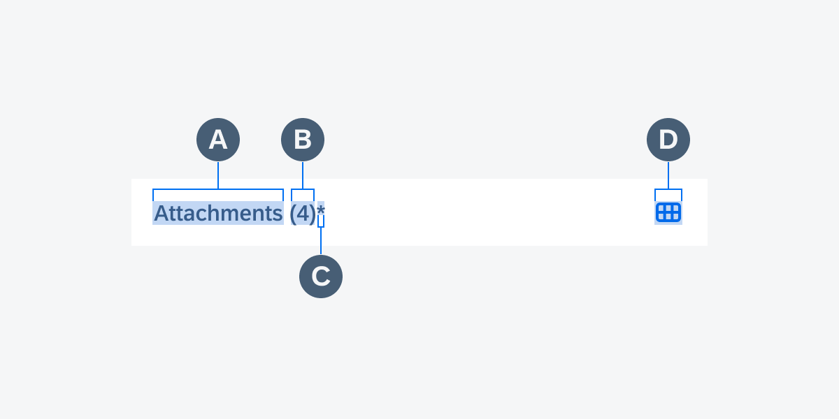
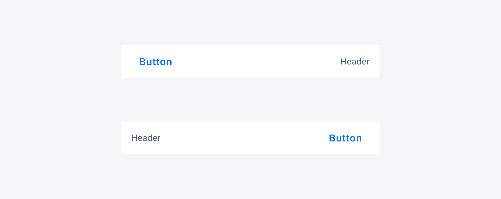
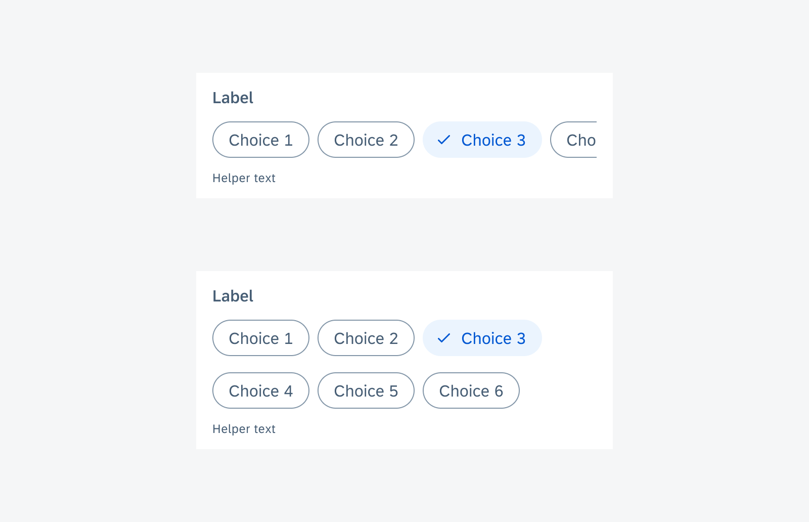
C. Section Header (Optional)
The section header includes a title and action button for additional functions.
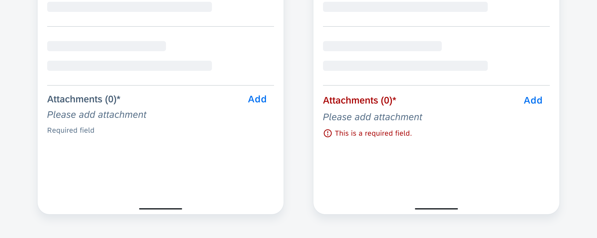
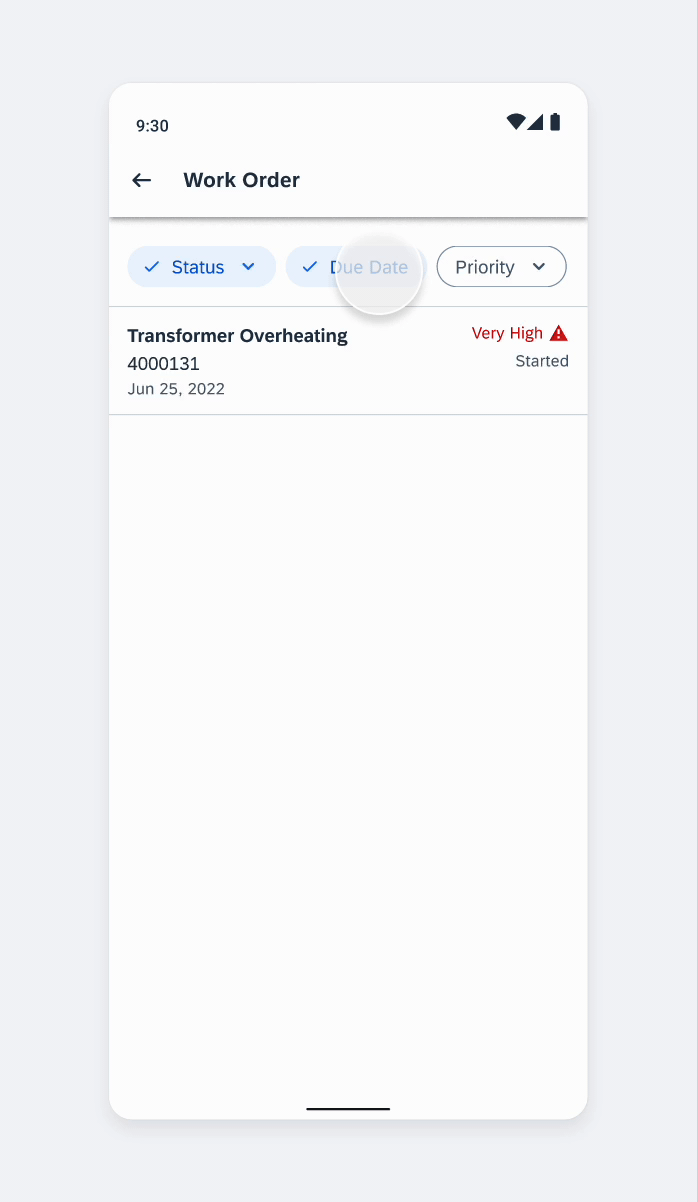
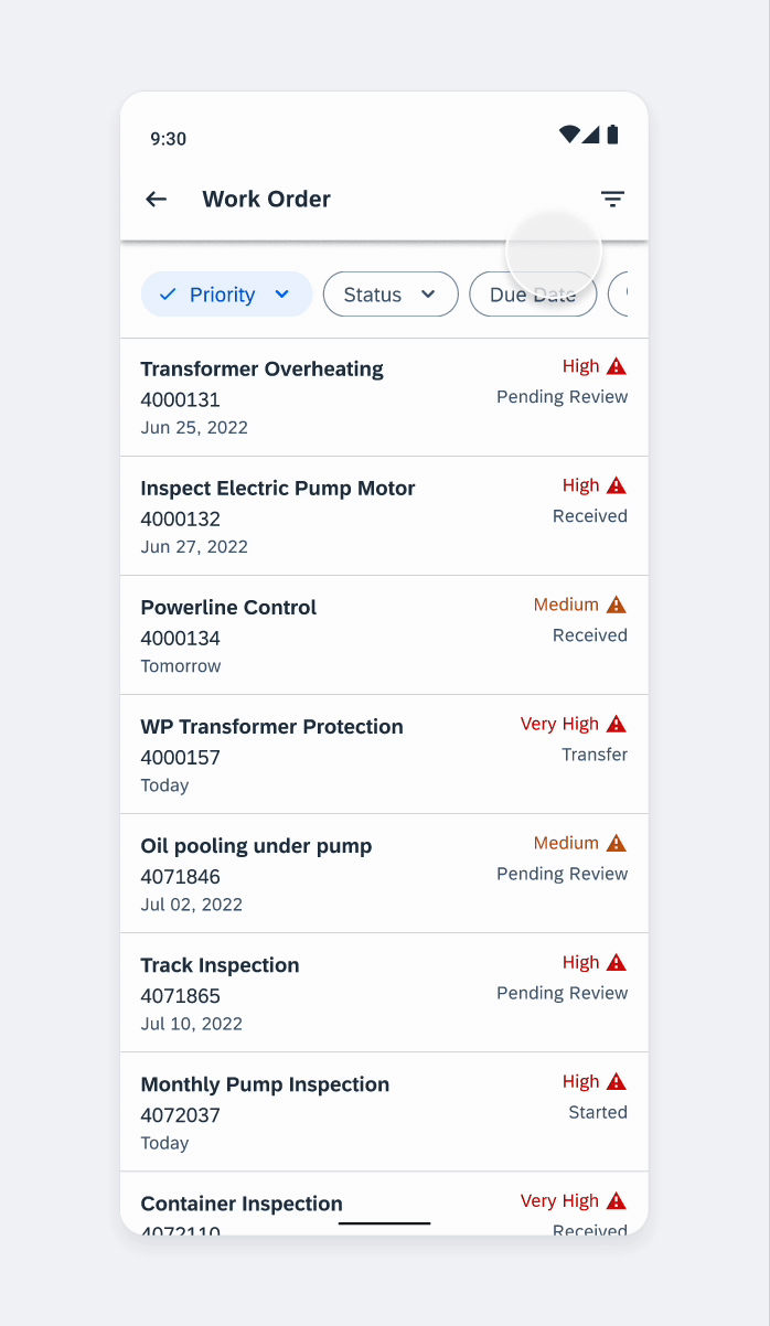
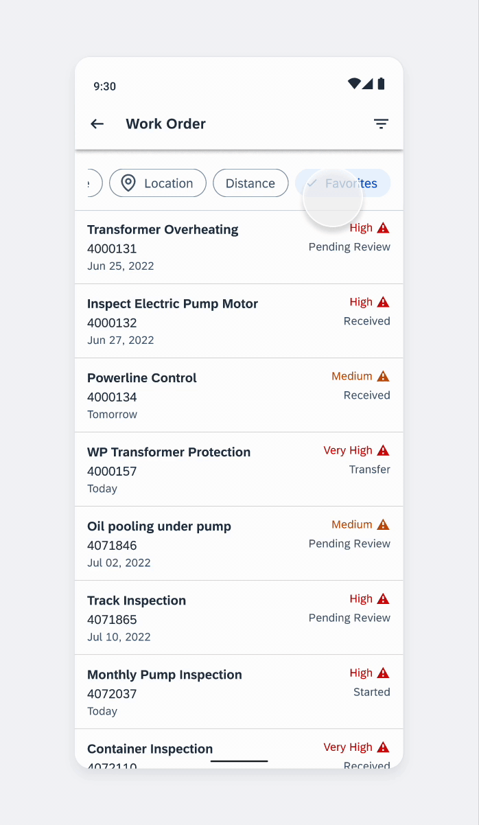
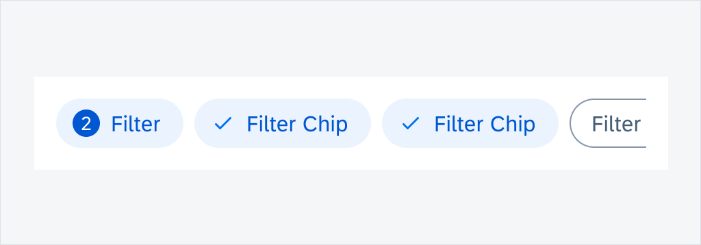
D. Filter Feedback Bar (Optional)
The filter feedback bar allows users to quickly filter messages.
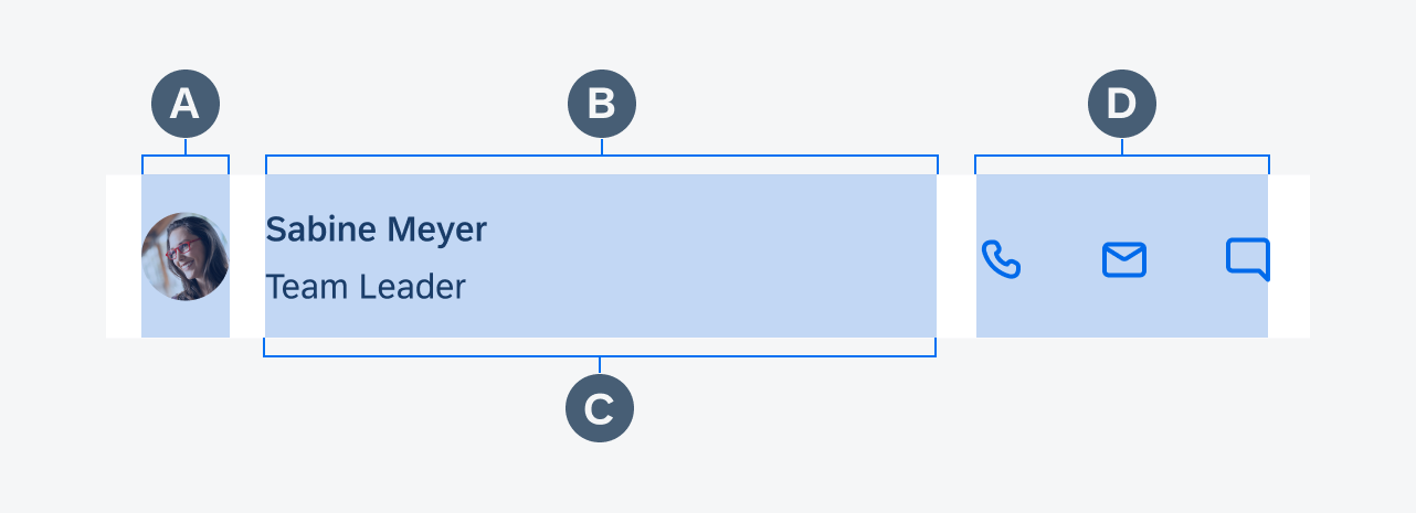
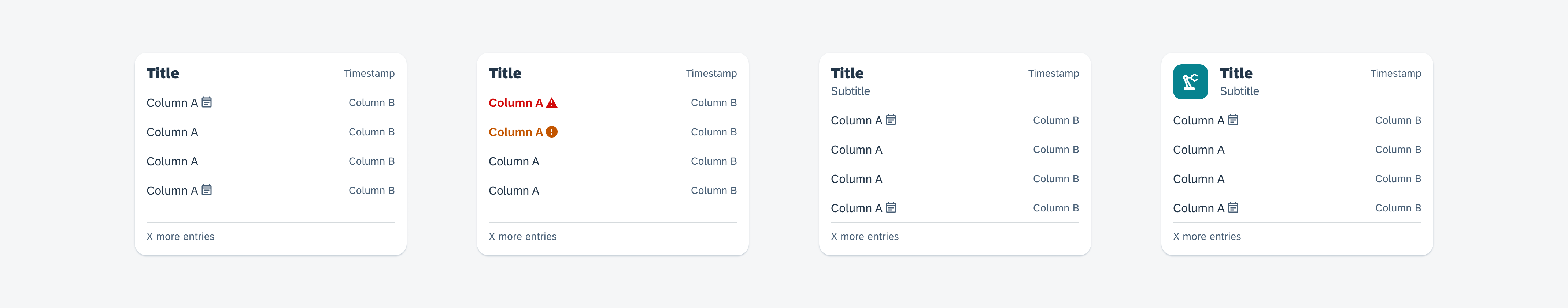
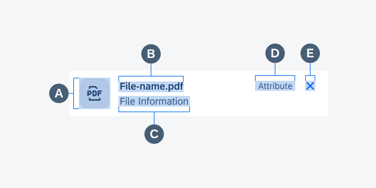
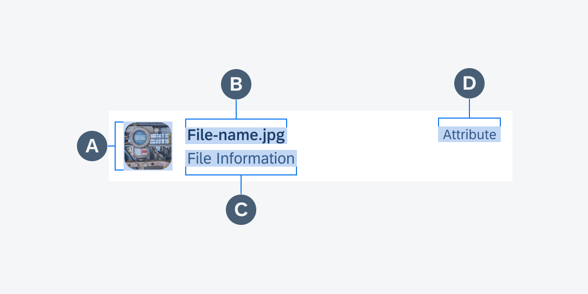
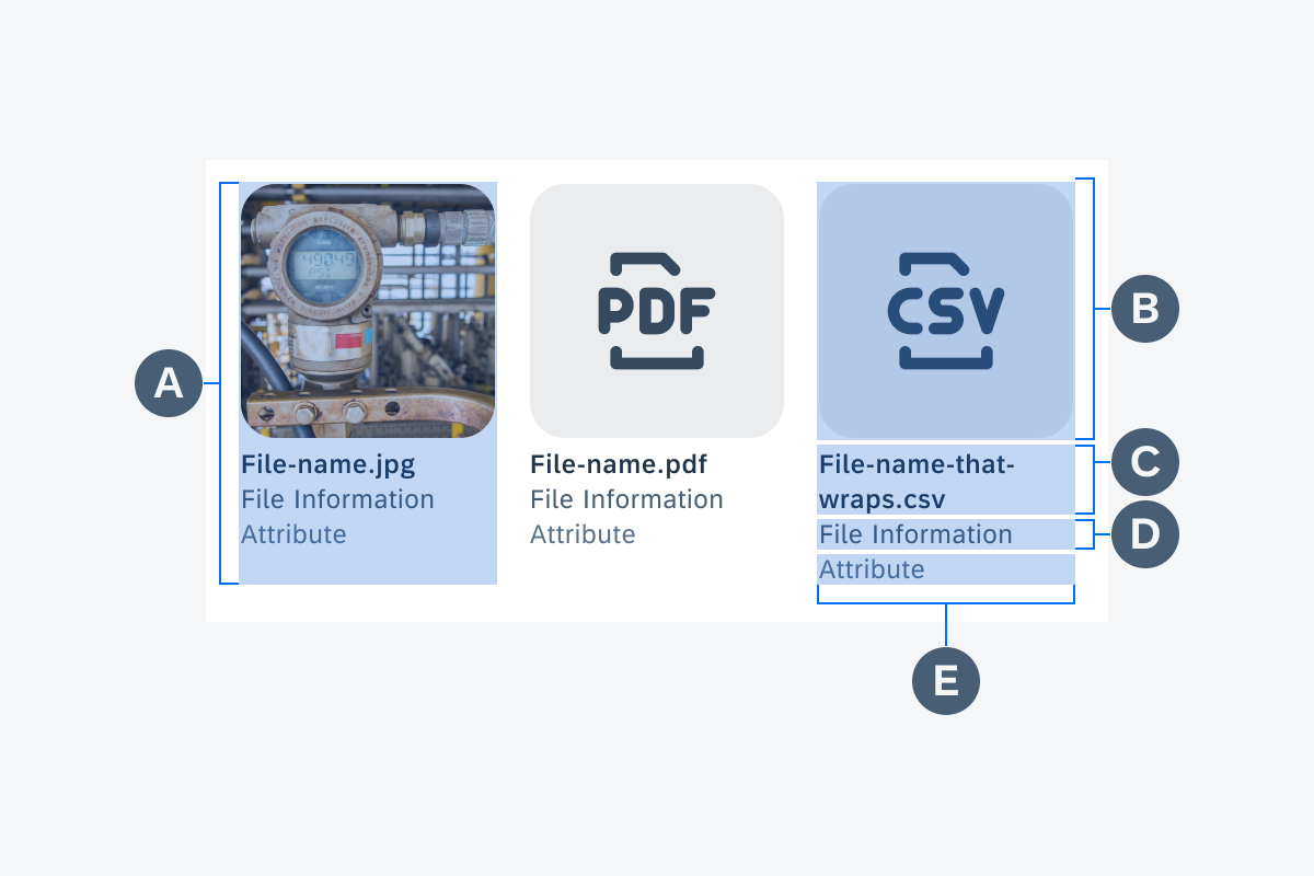
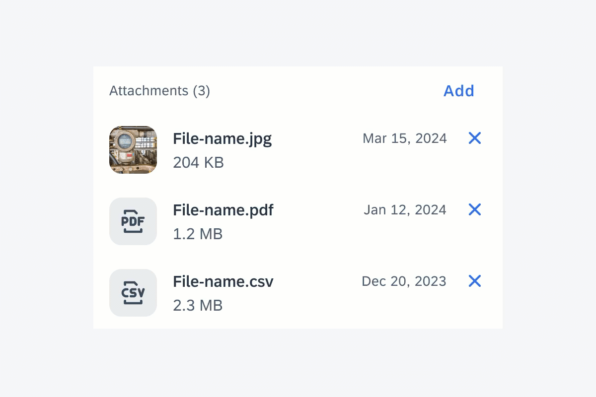
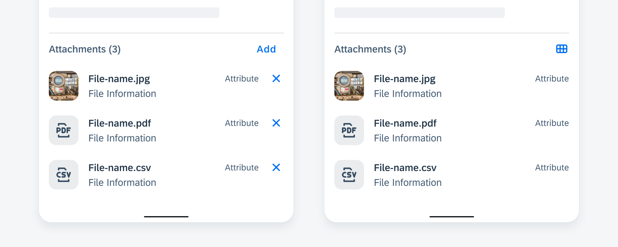
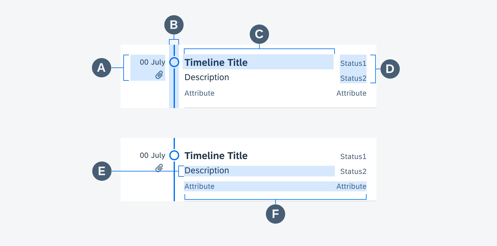
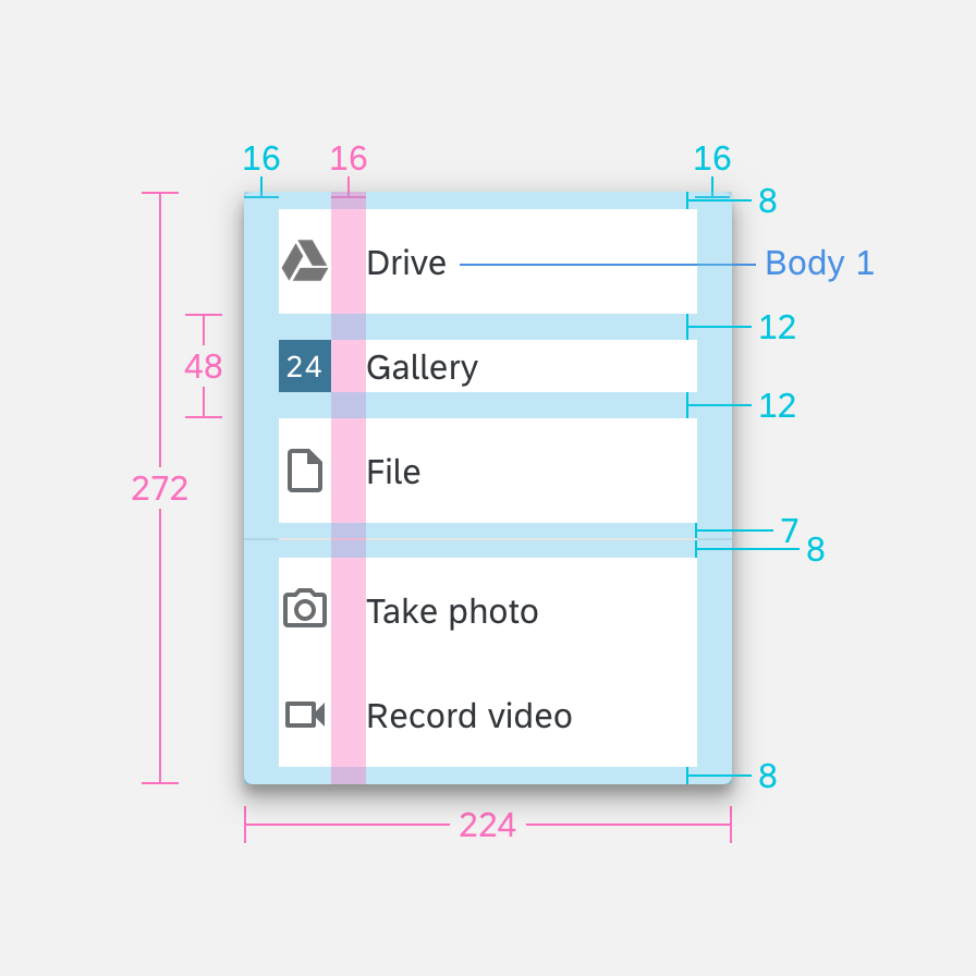
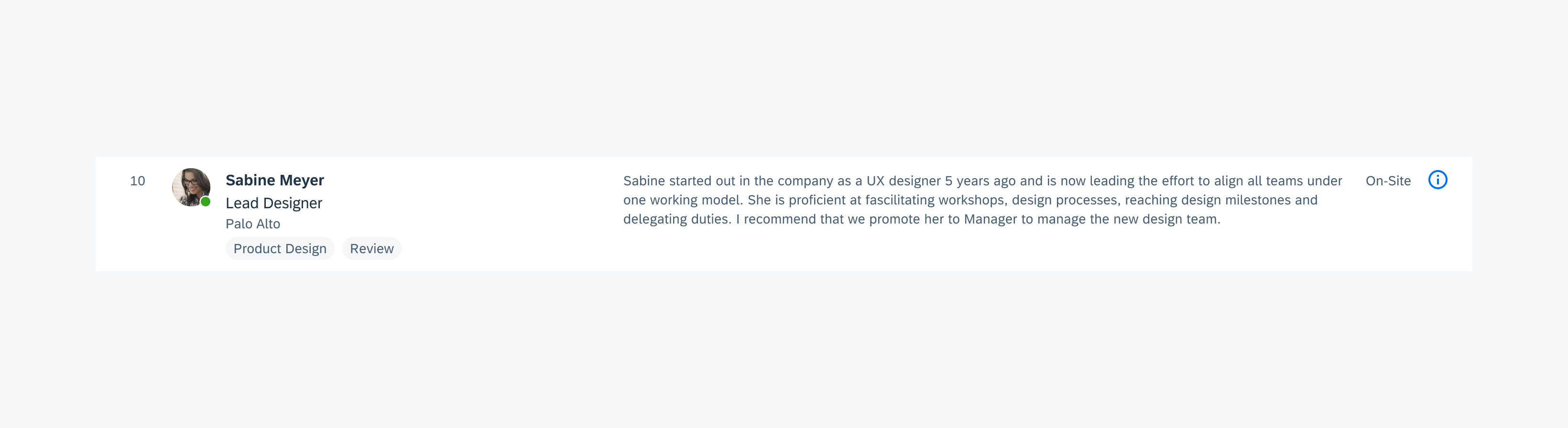
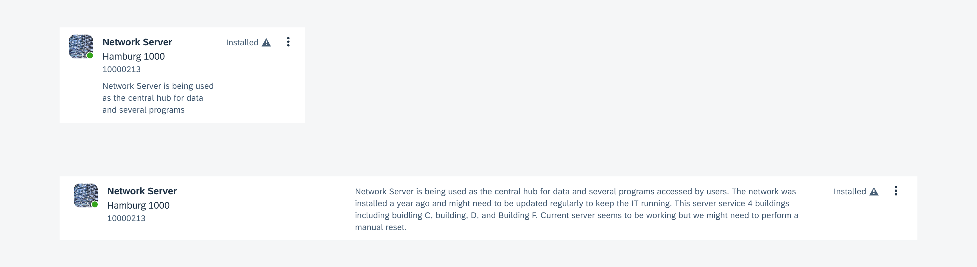
E. Message Item
The message item includes an icon or image, message content, and an optional action button to support user interactions.

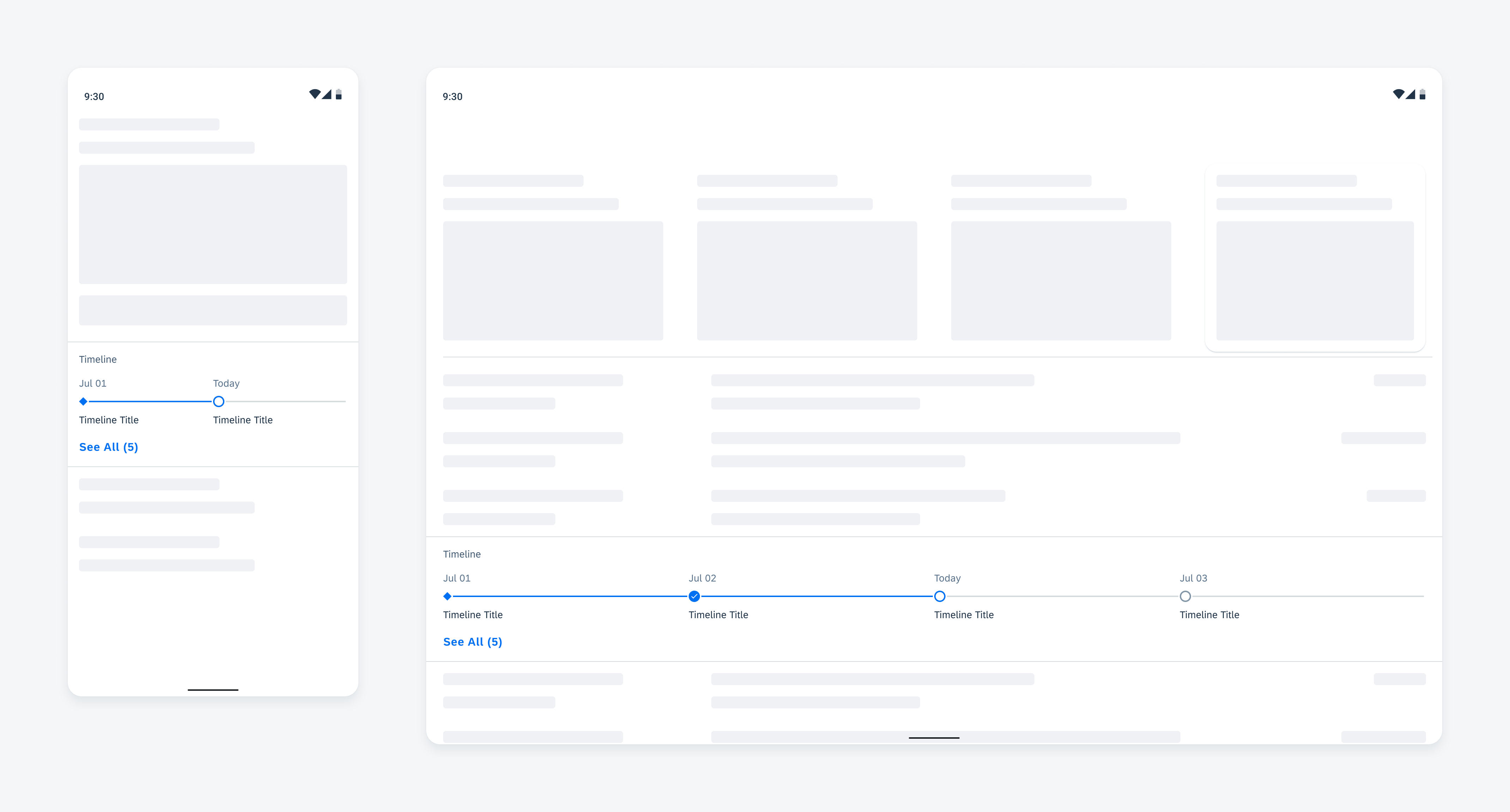
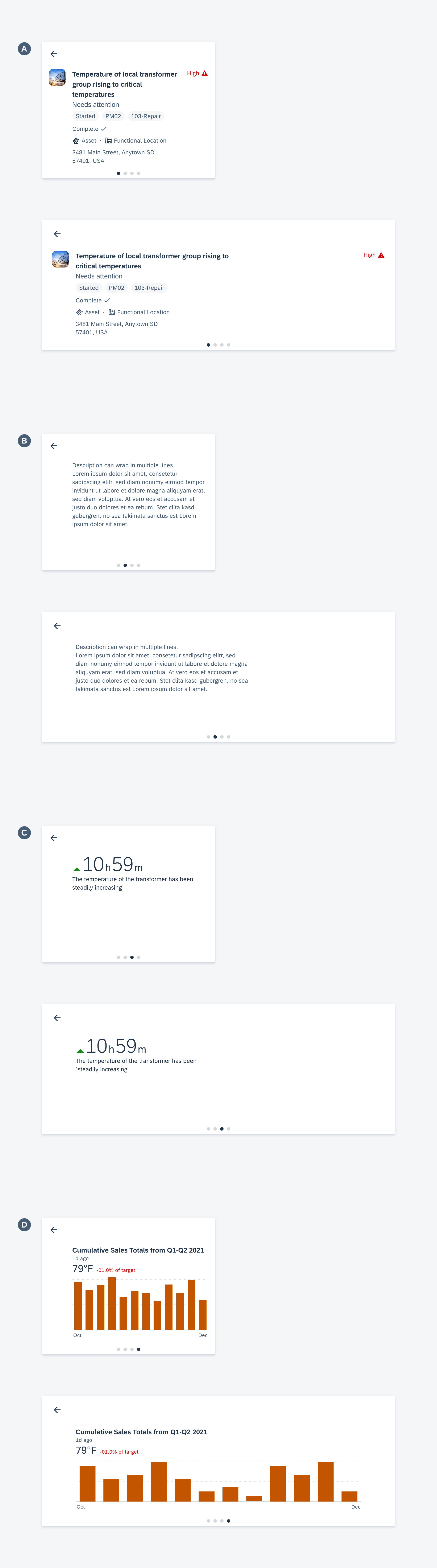
Multi-message handling anatomy
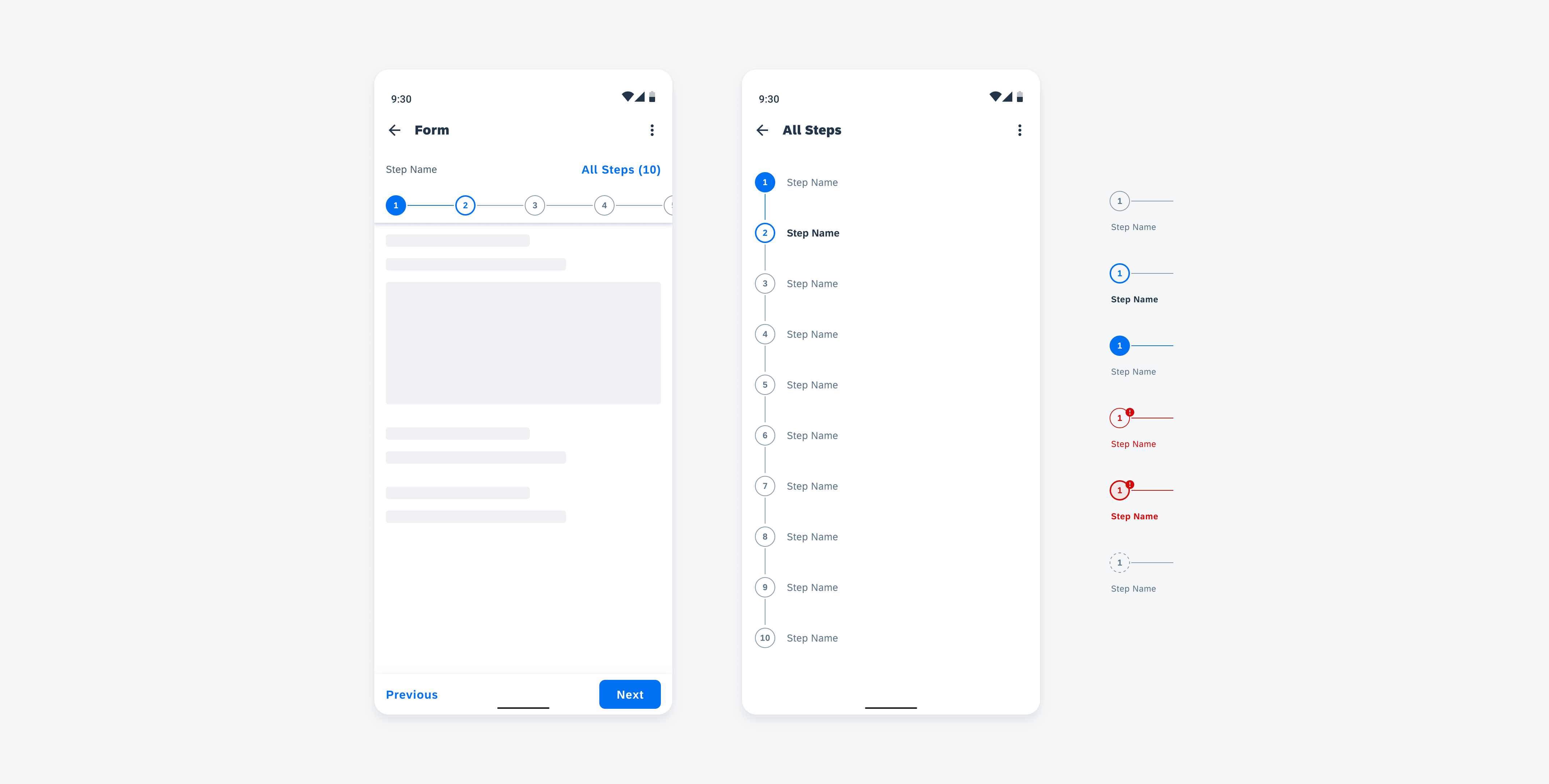
Behavior and Interaction
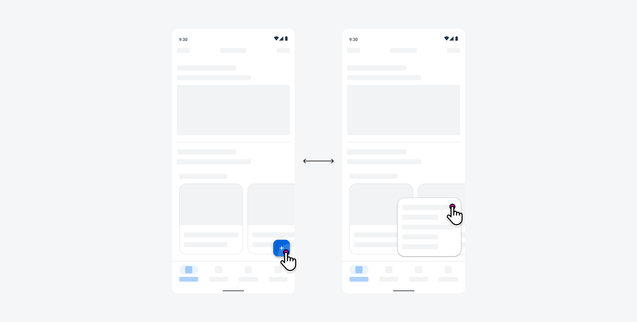
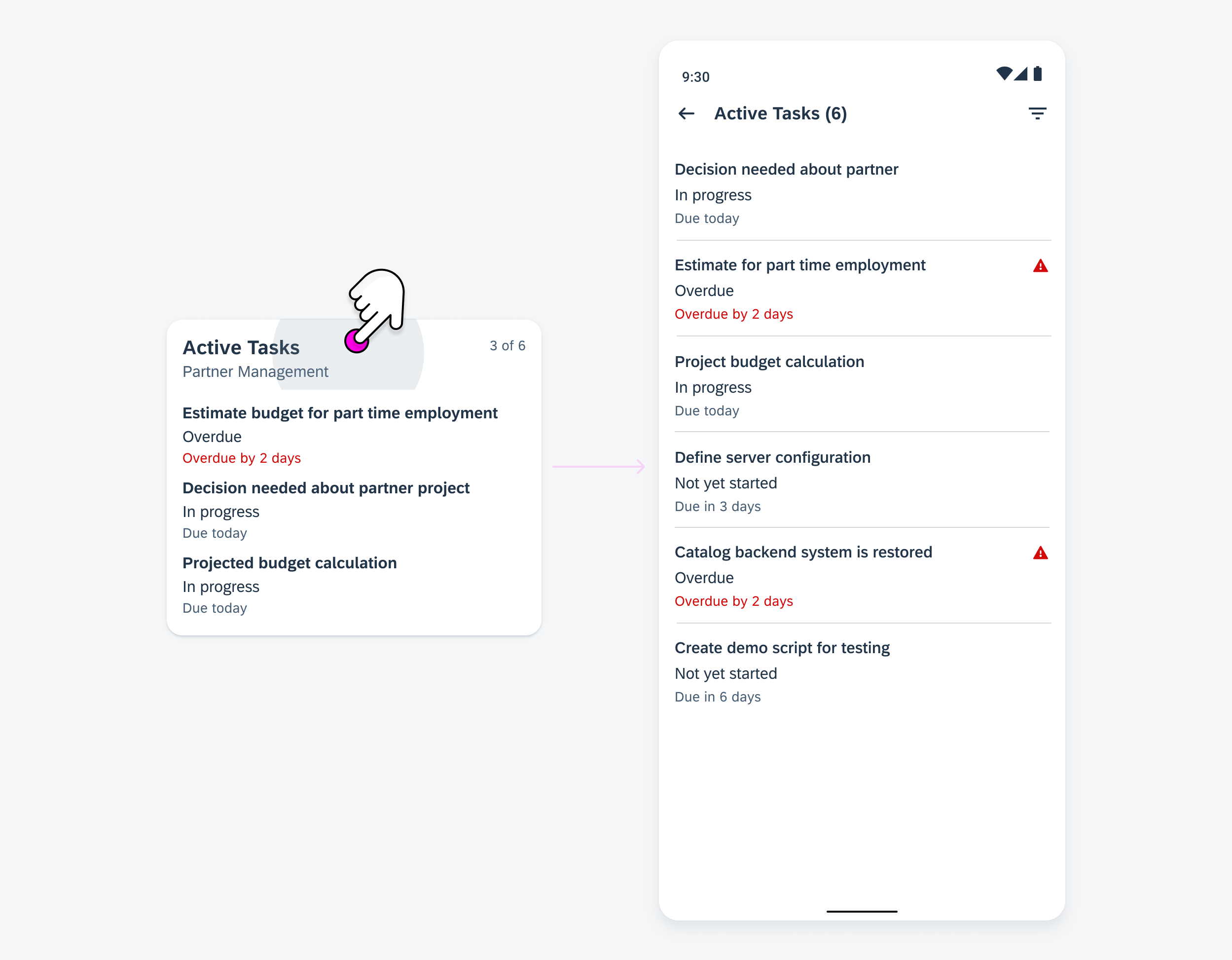
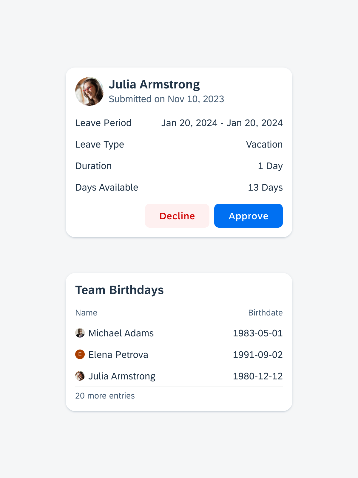
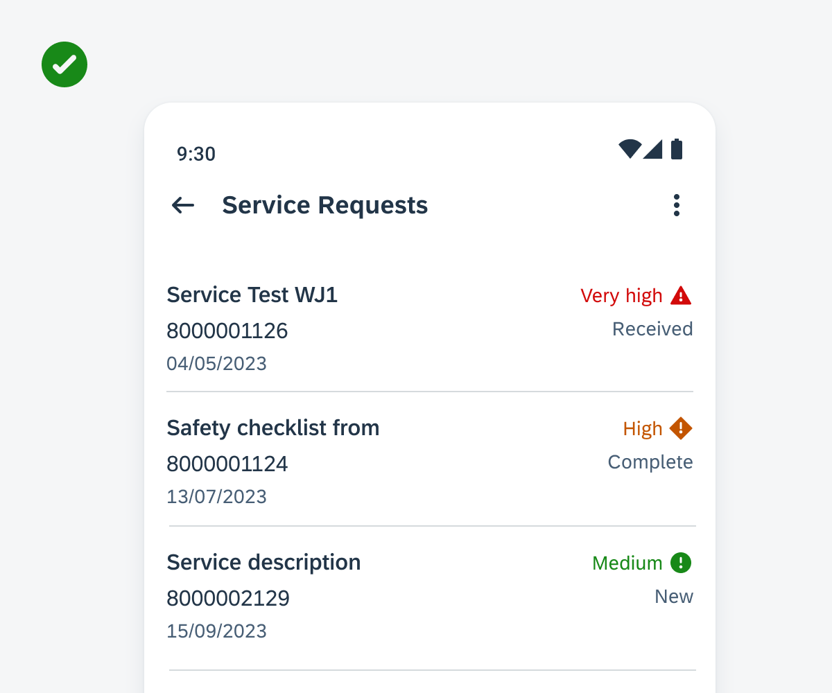
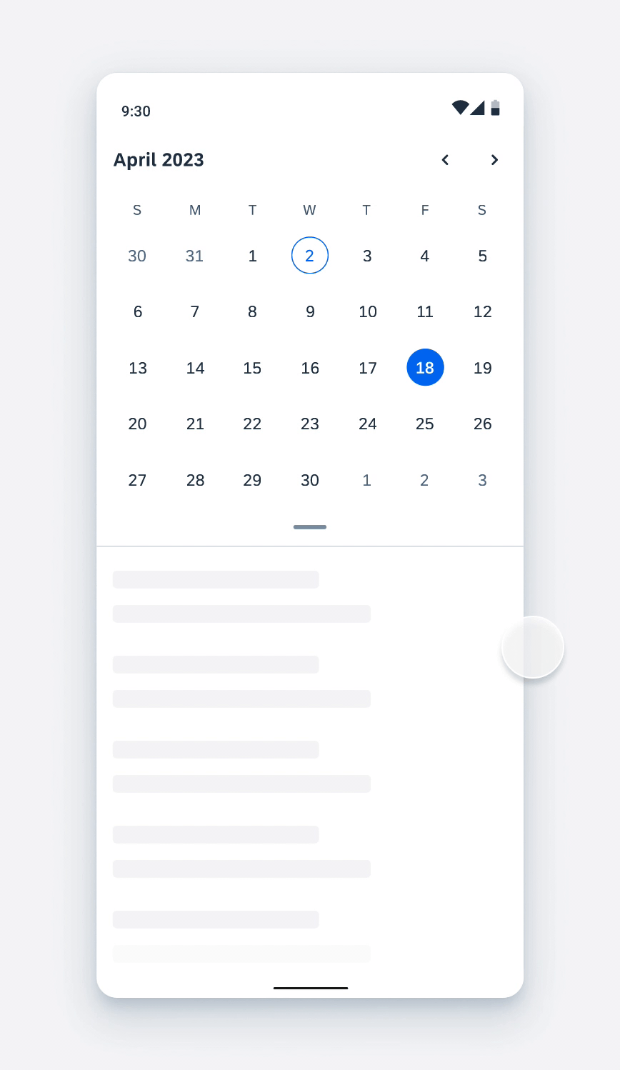
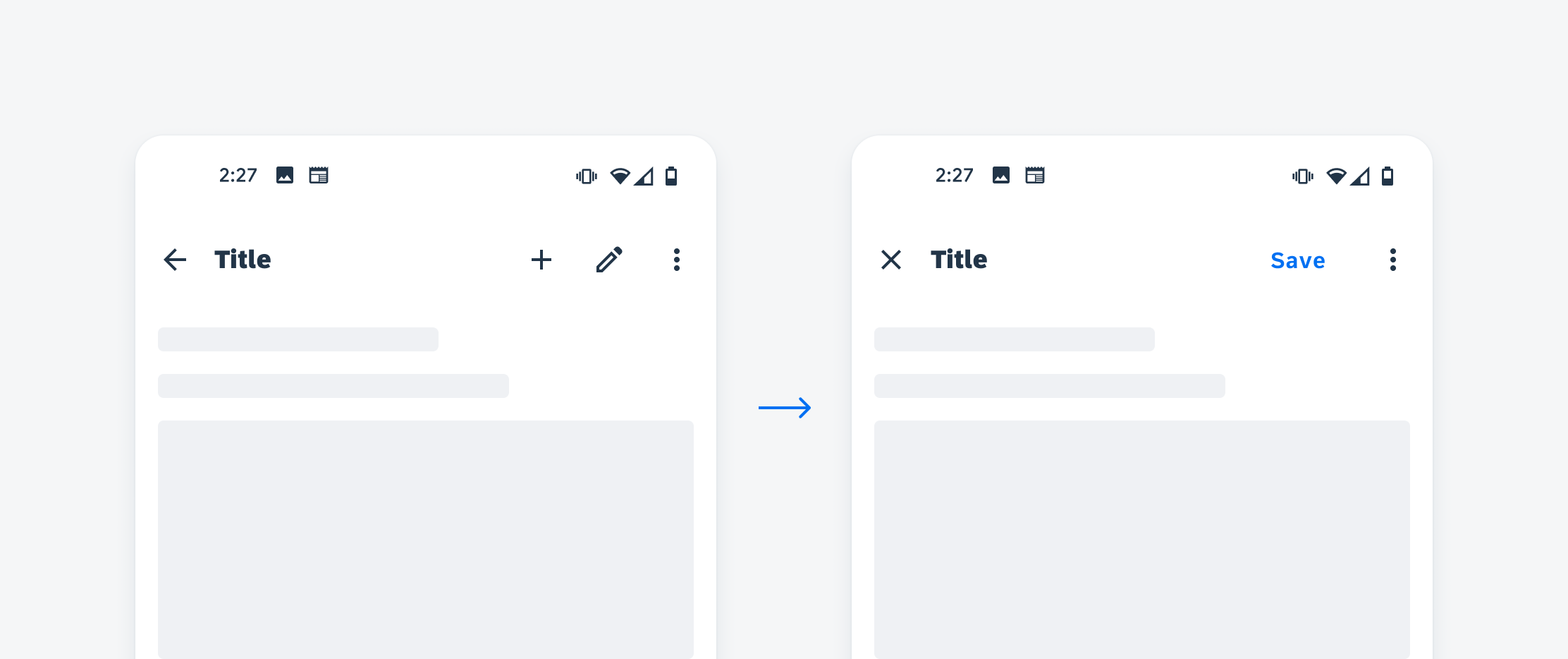
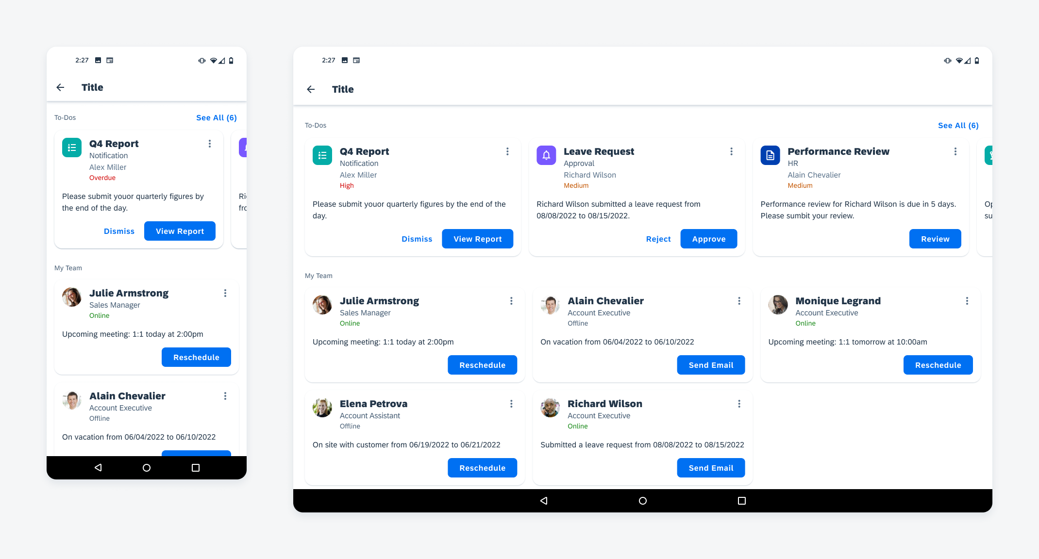
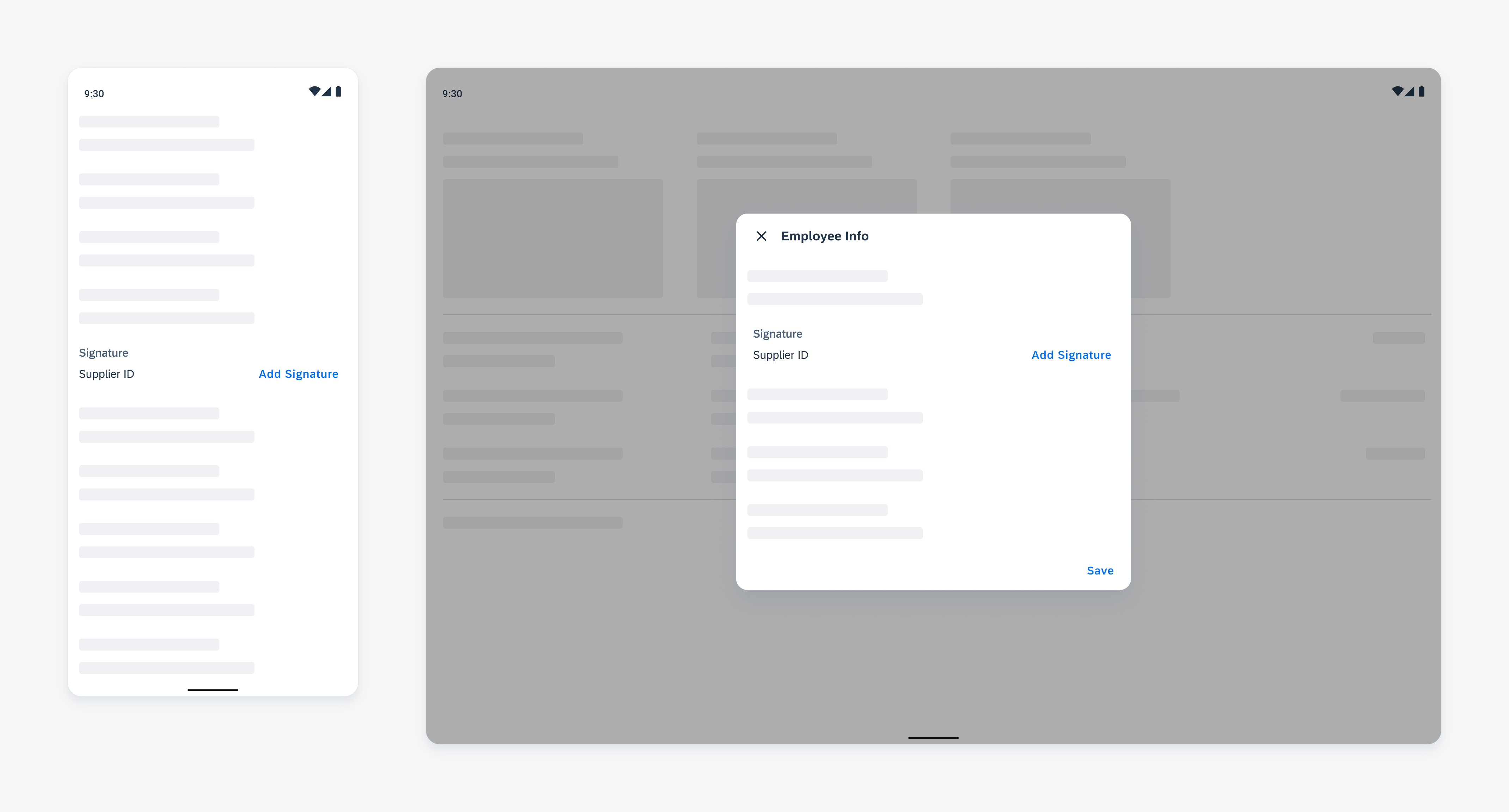
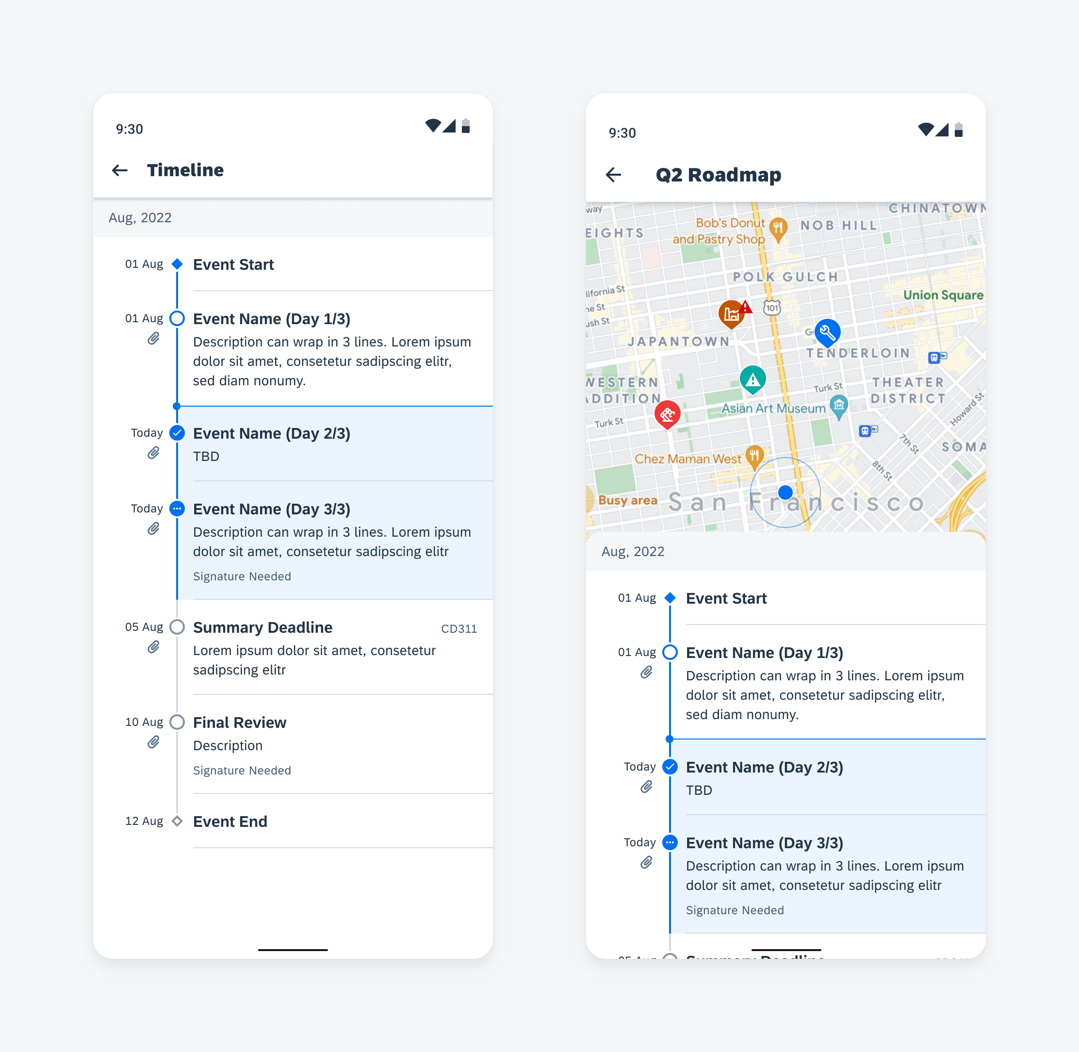
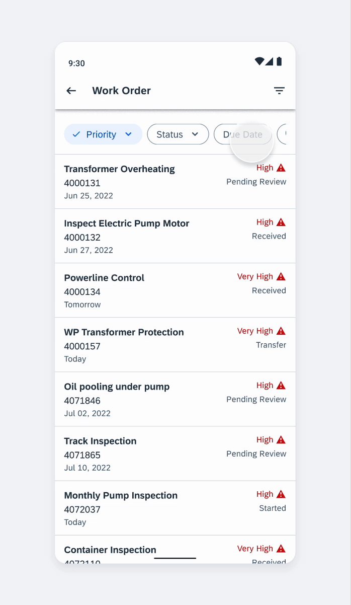
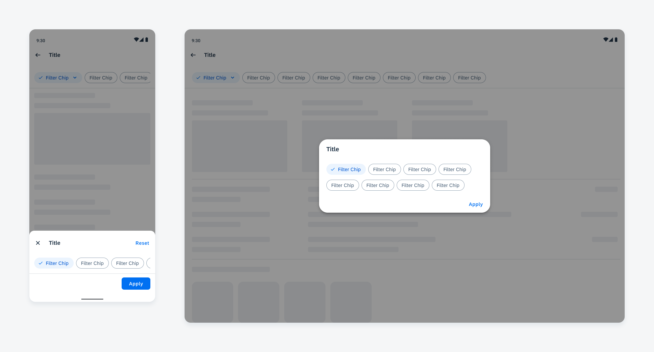
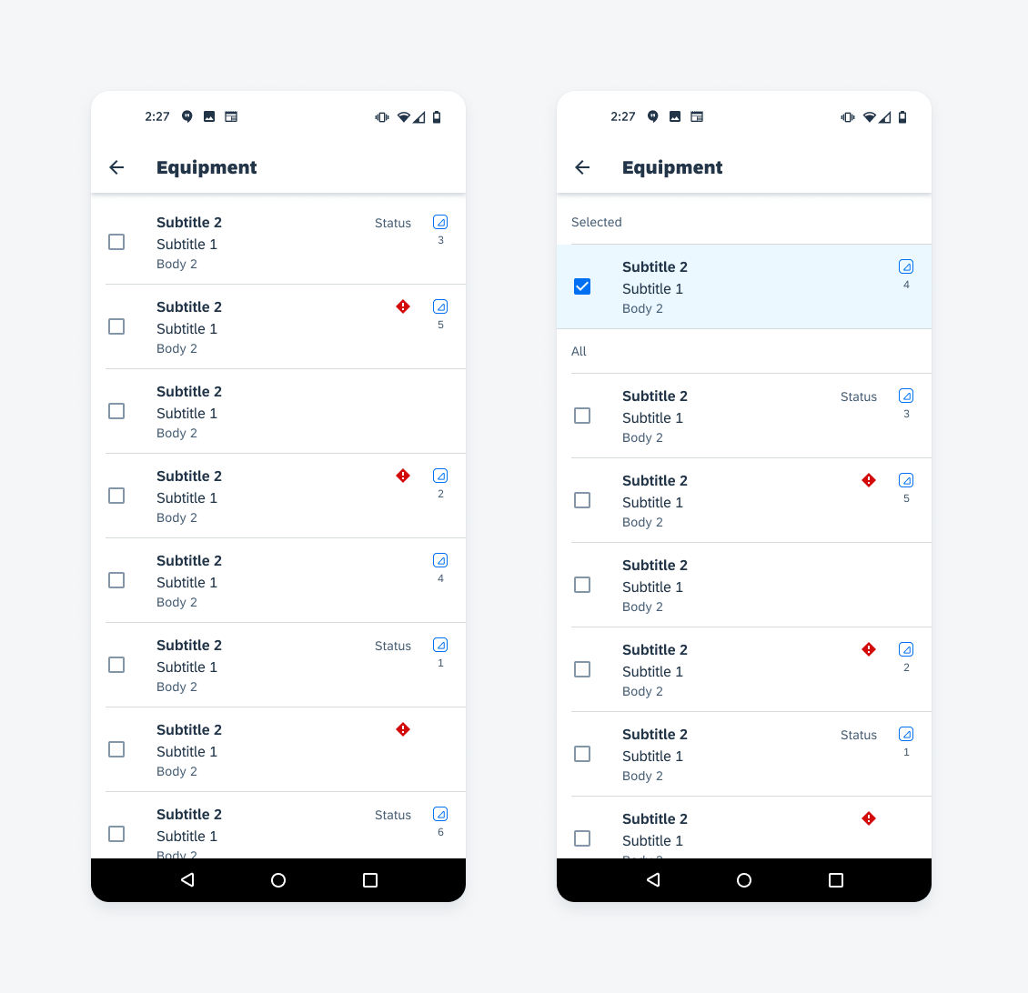
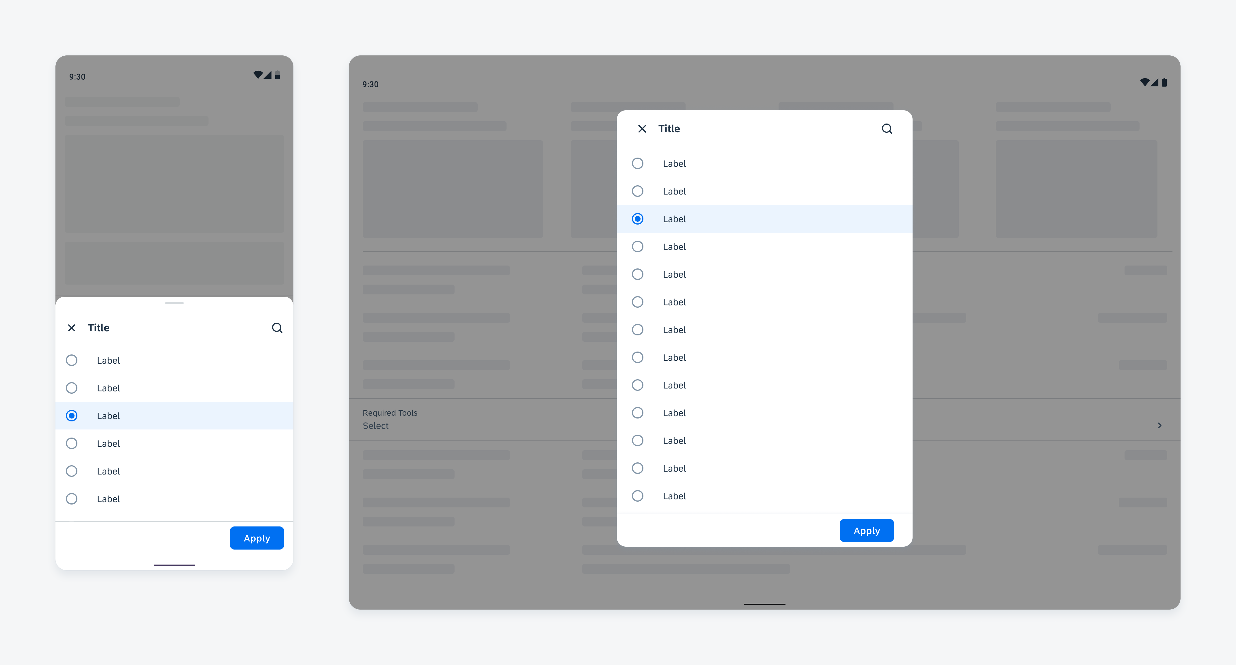
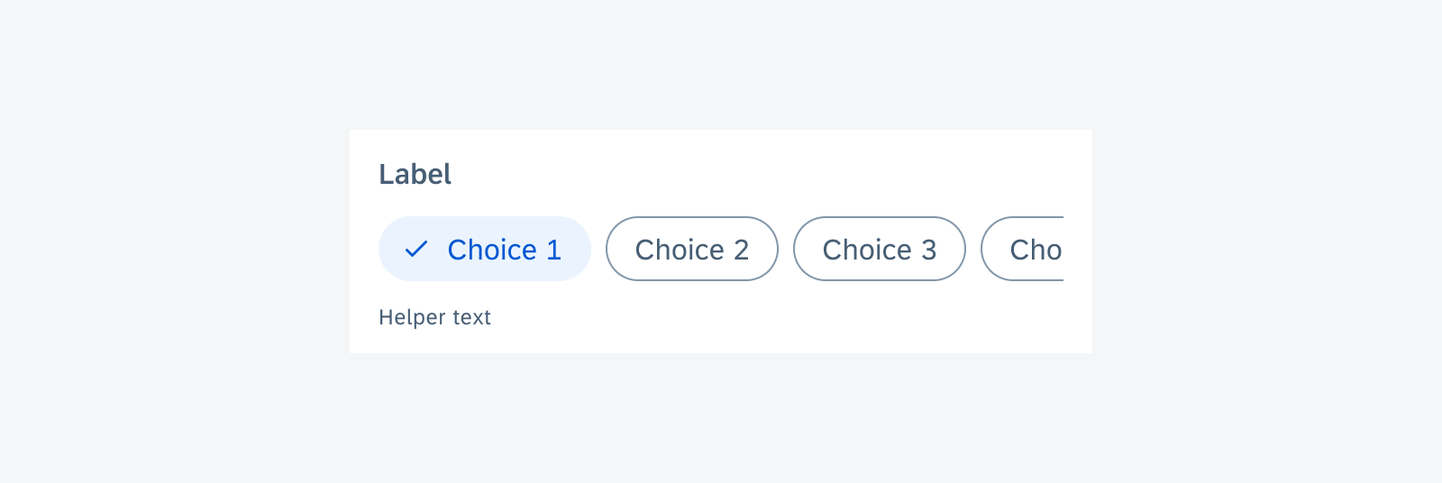
Trigger
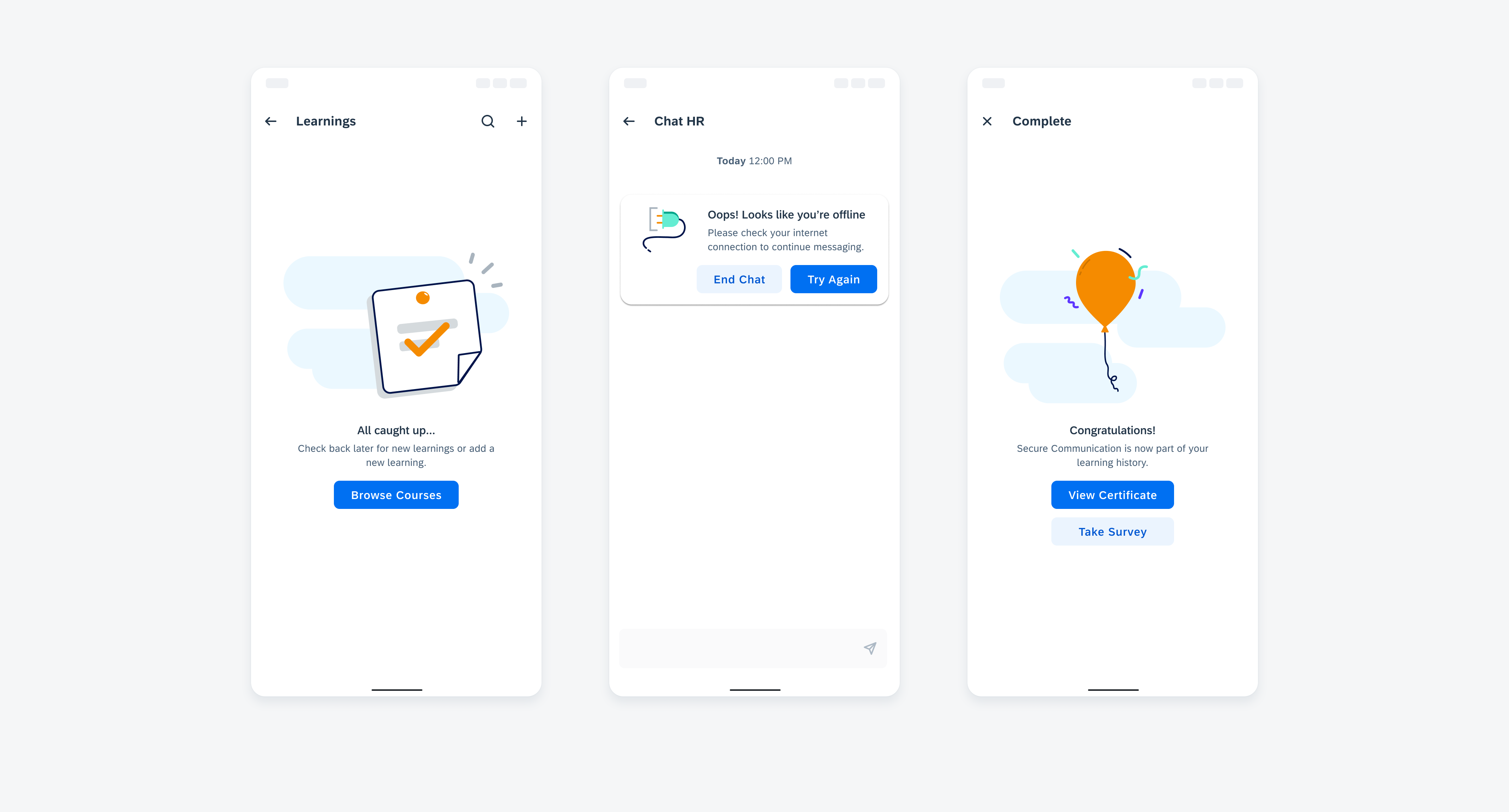
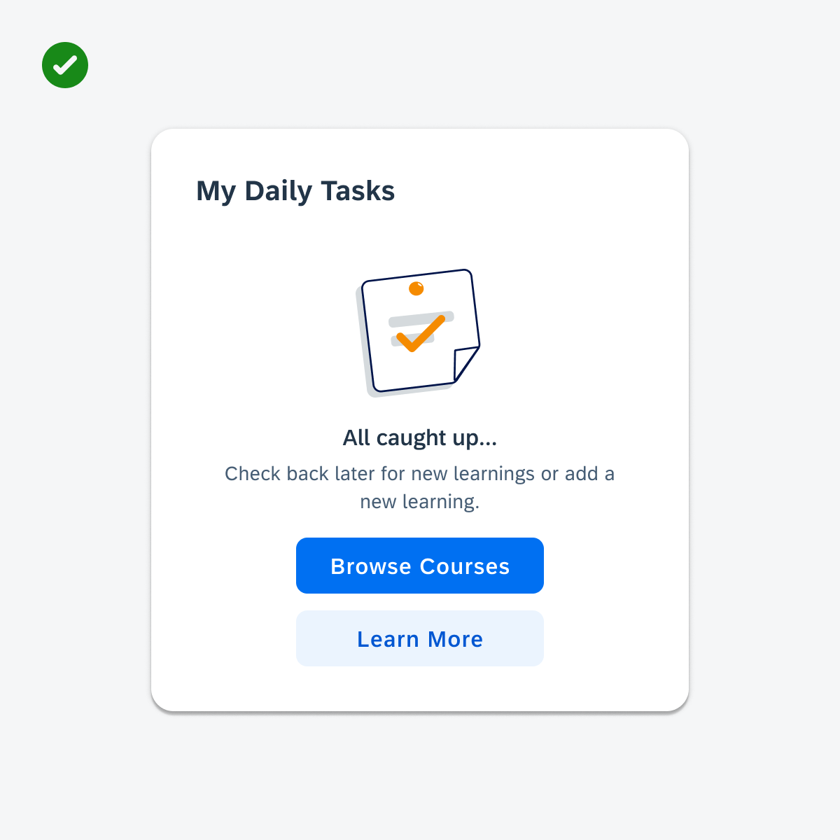
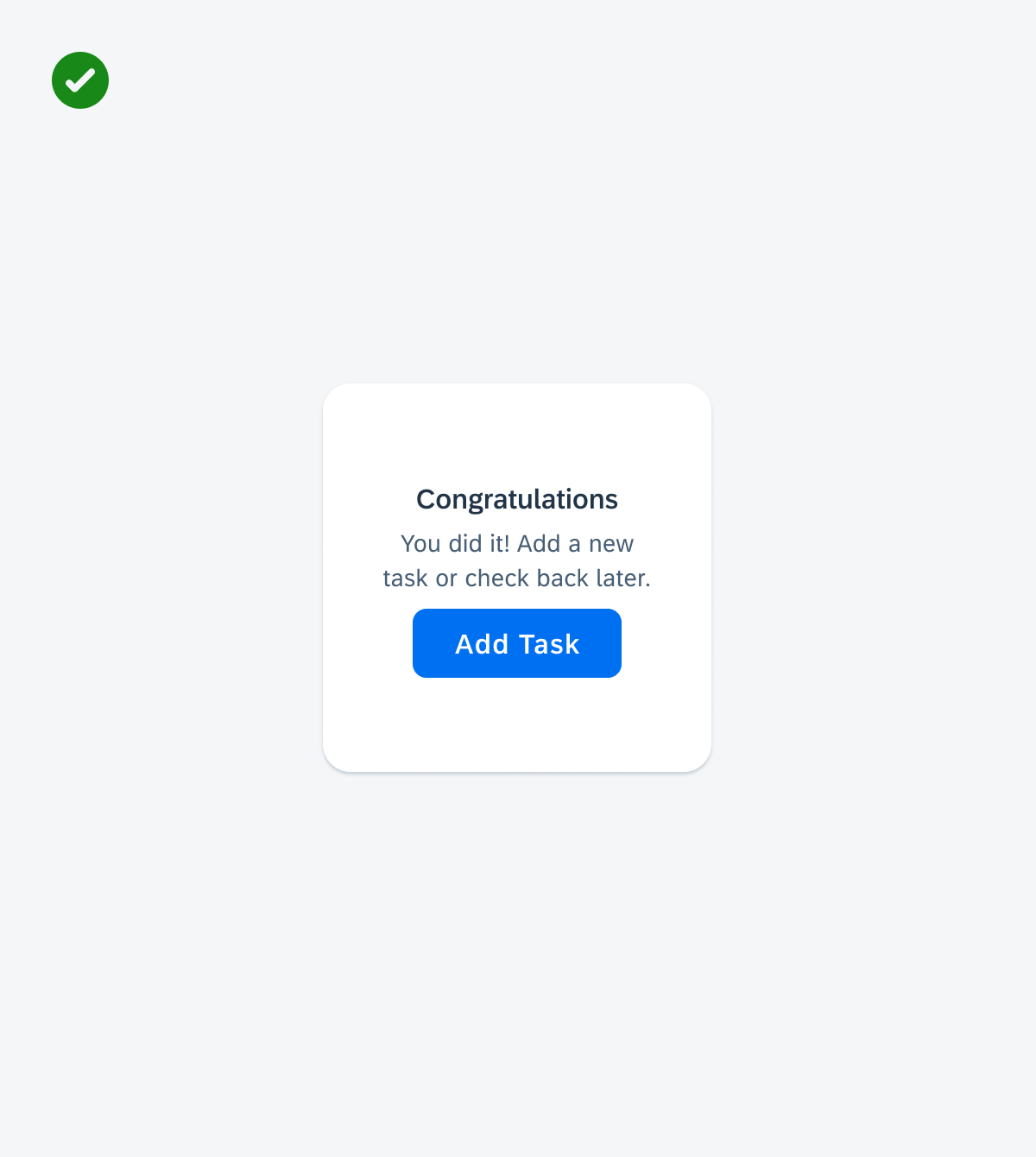
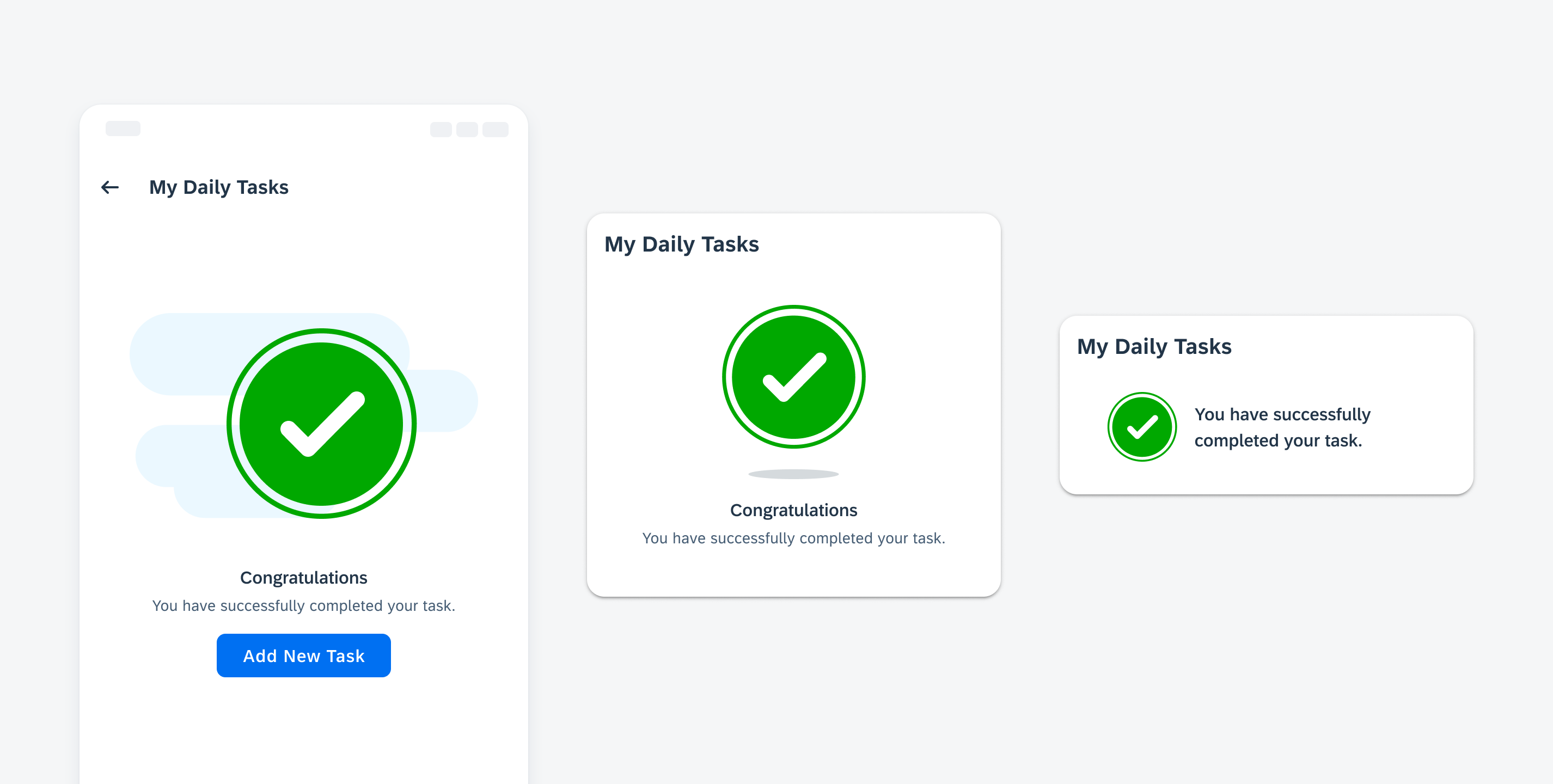
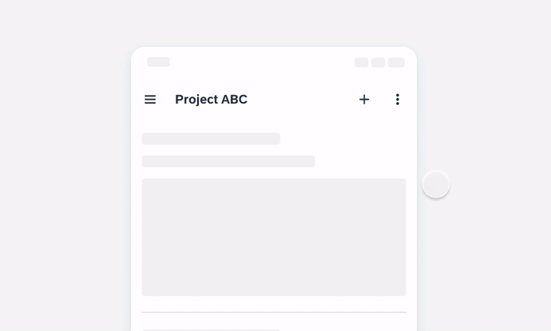
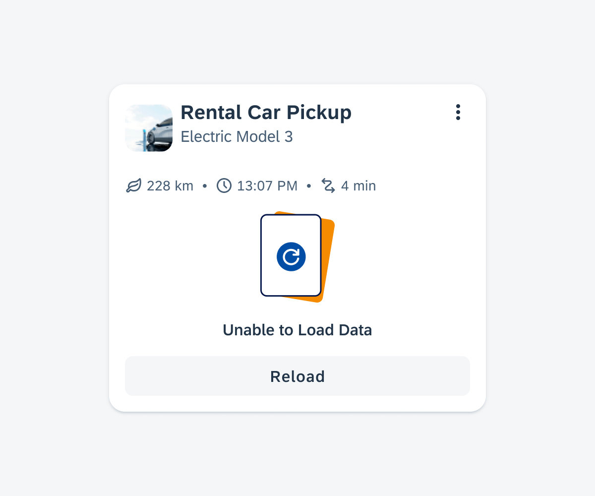
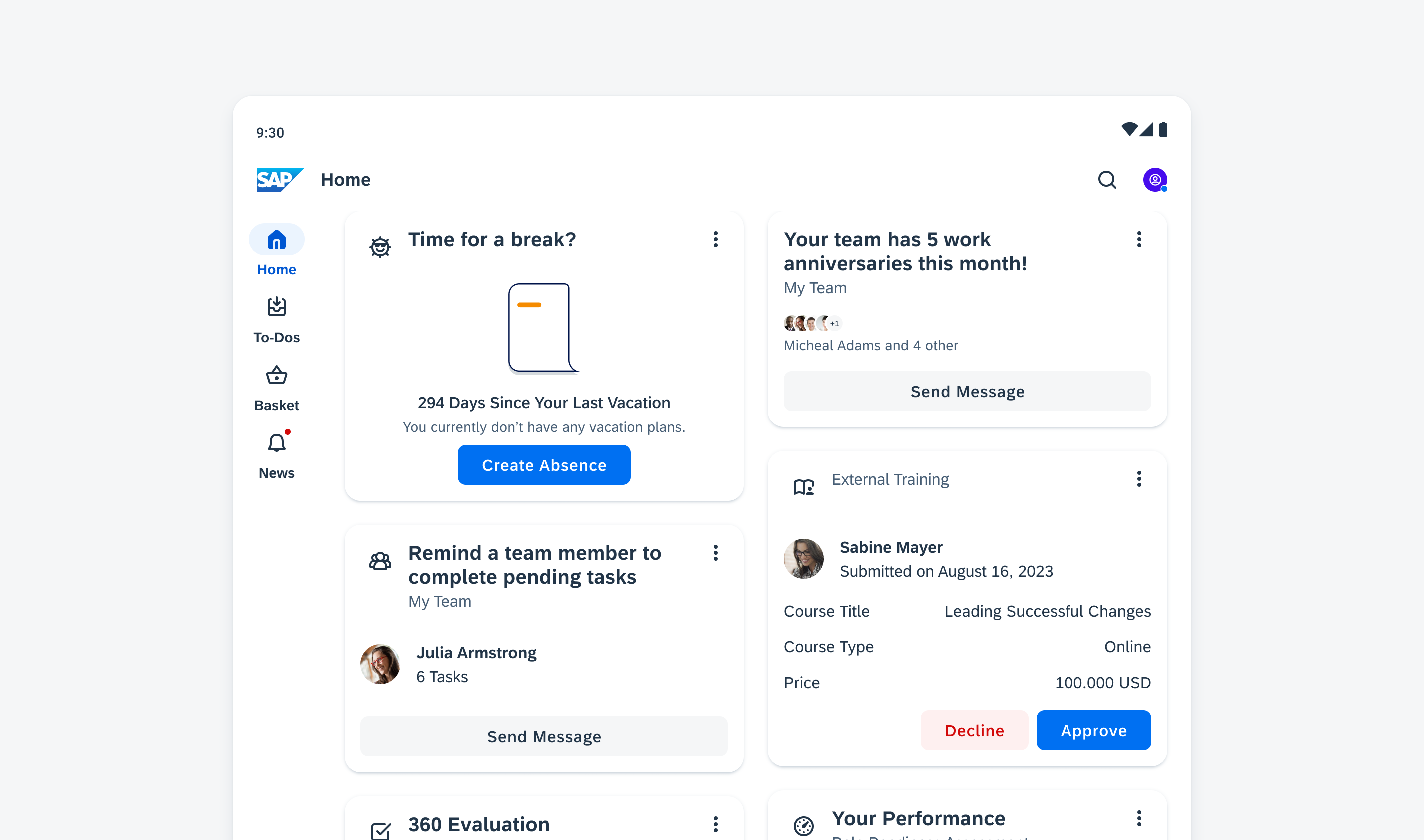
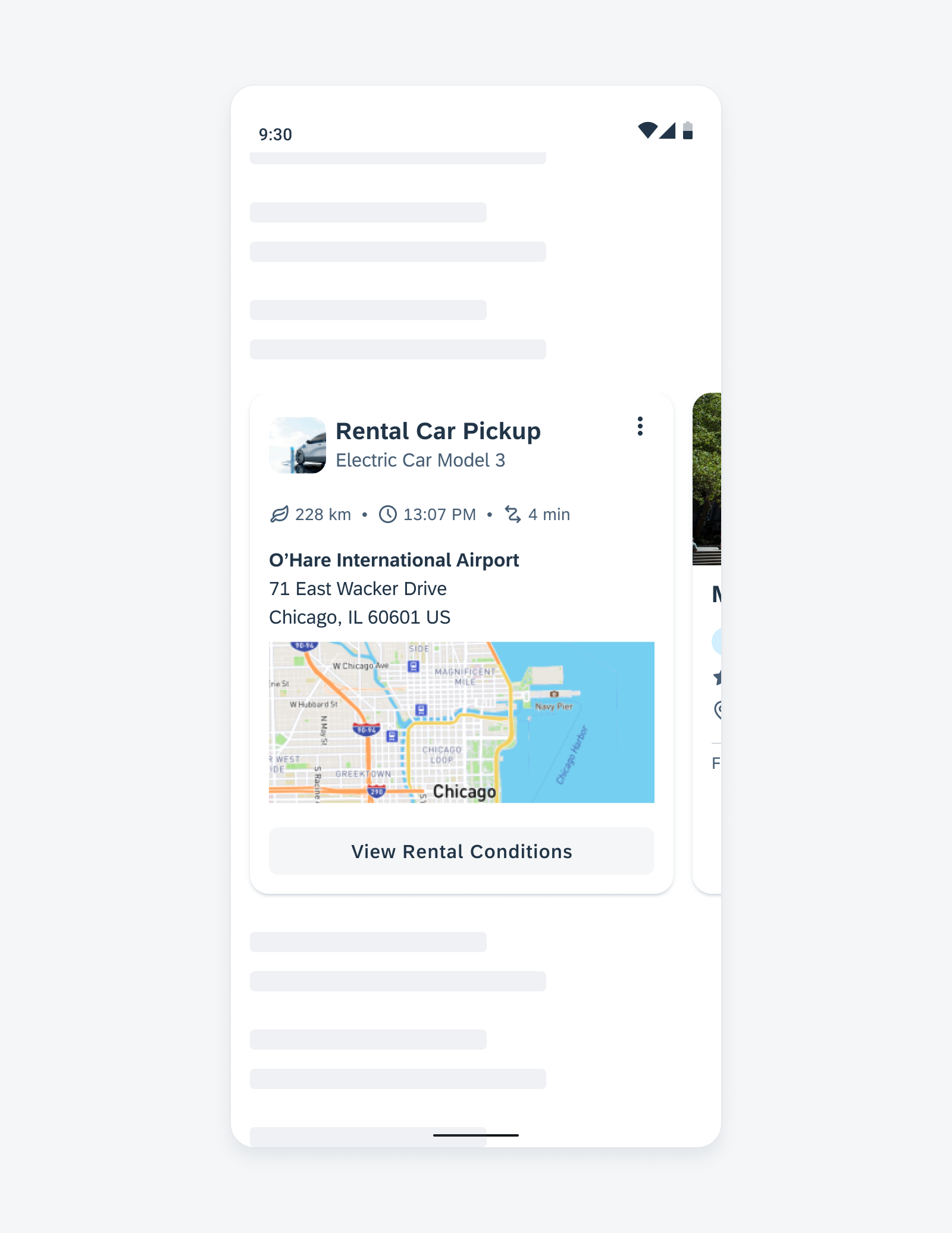
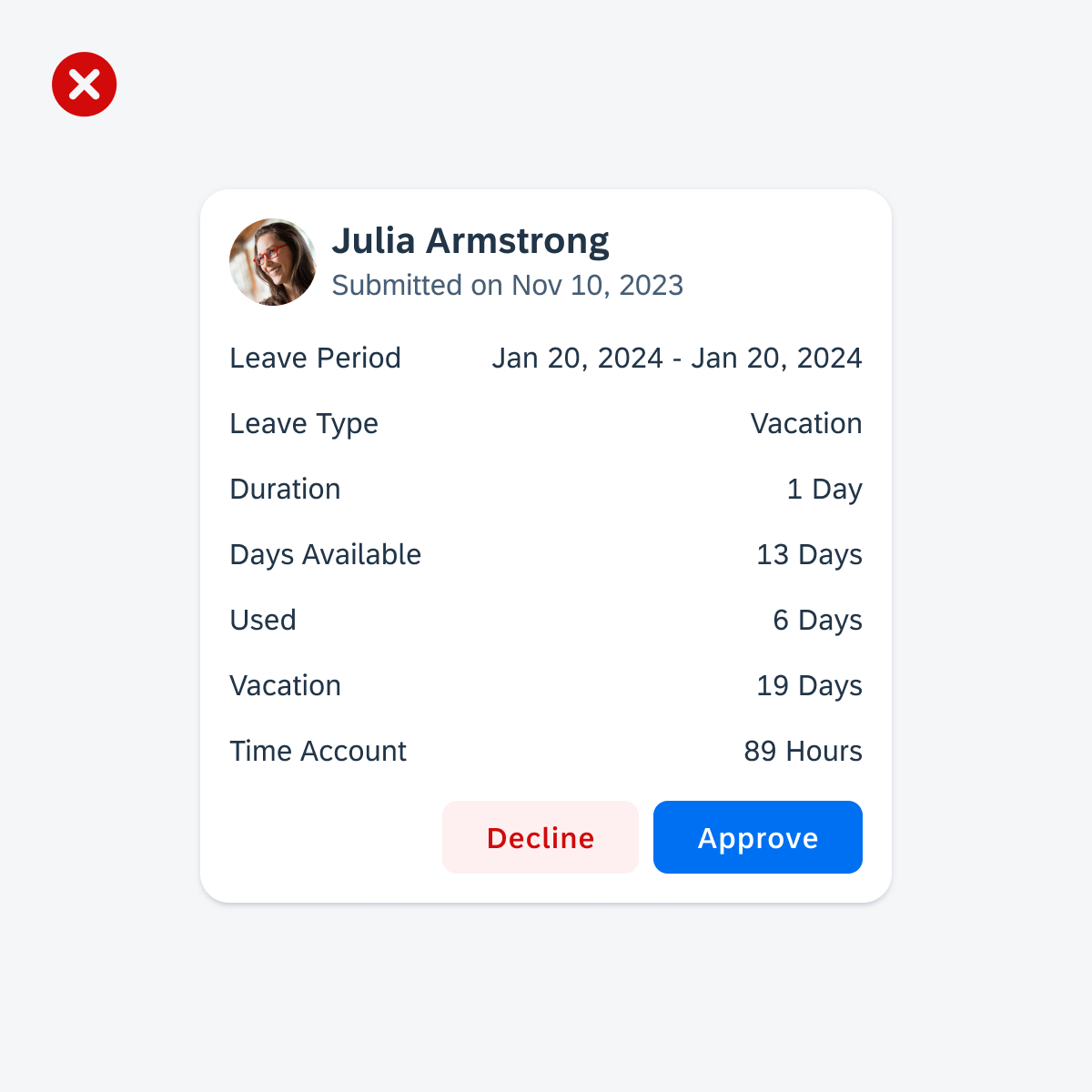
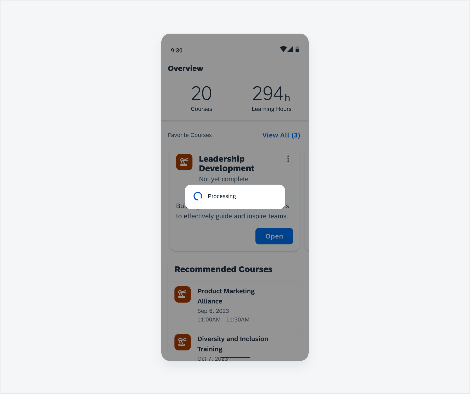
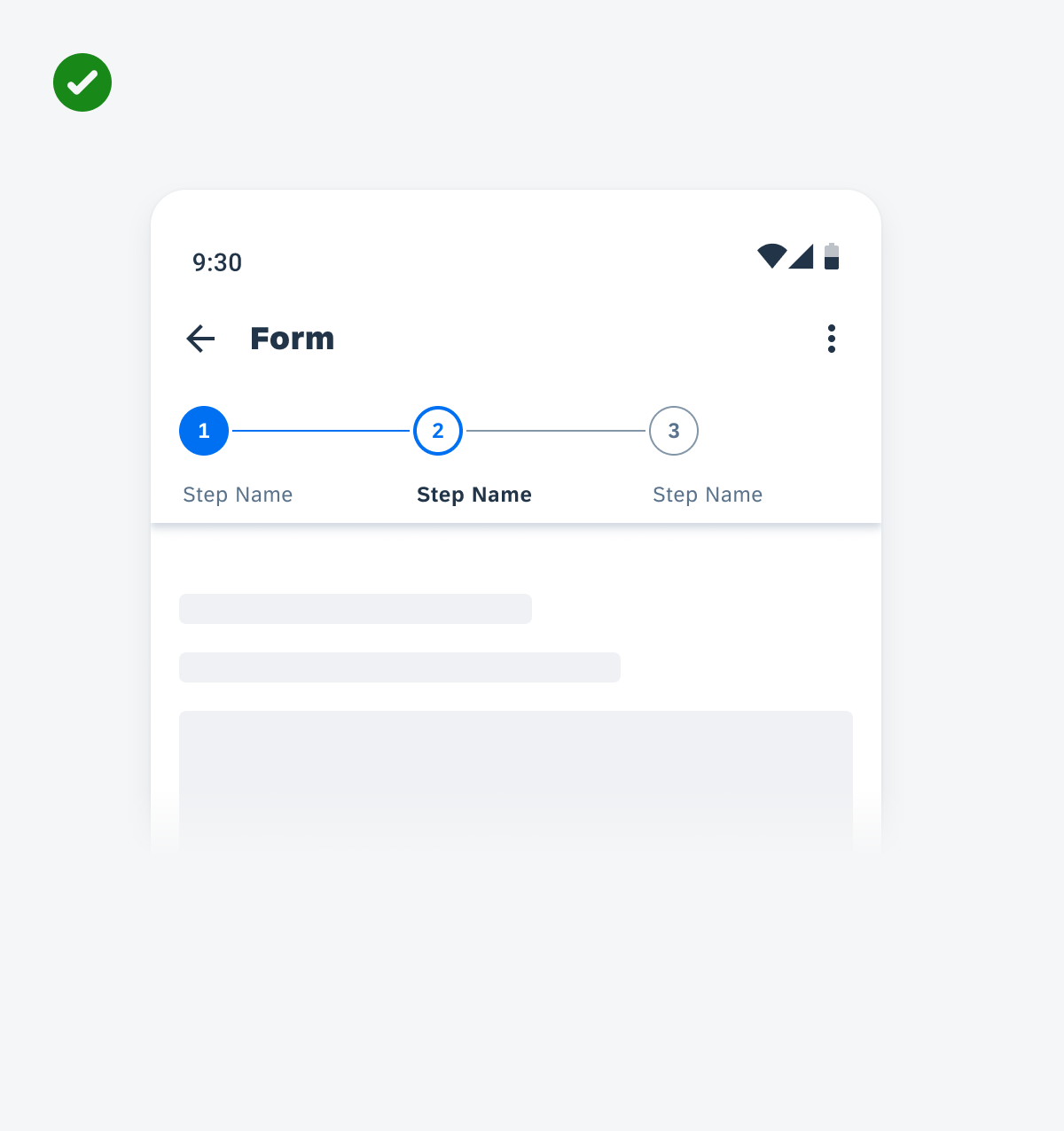
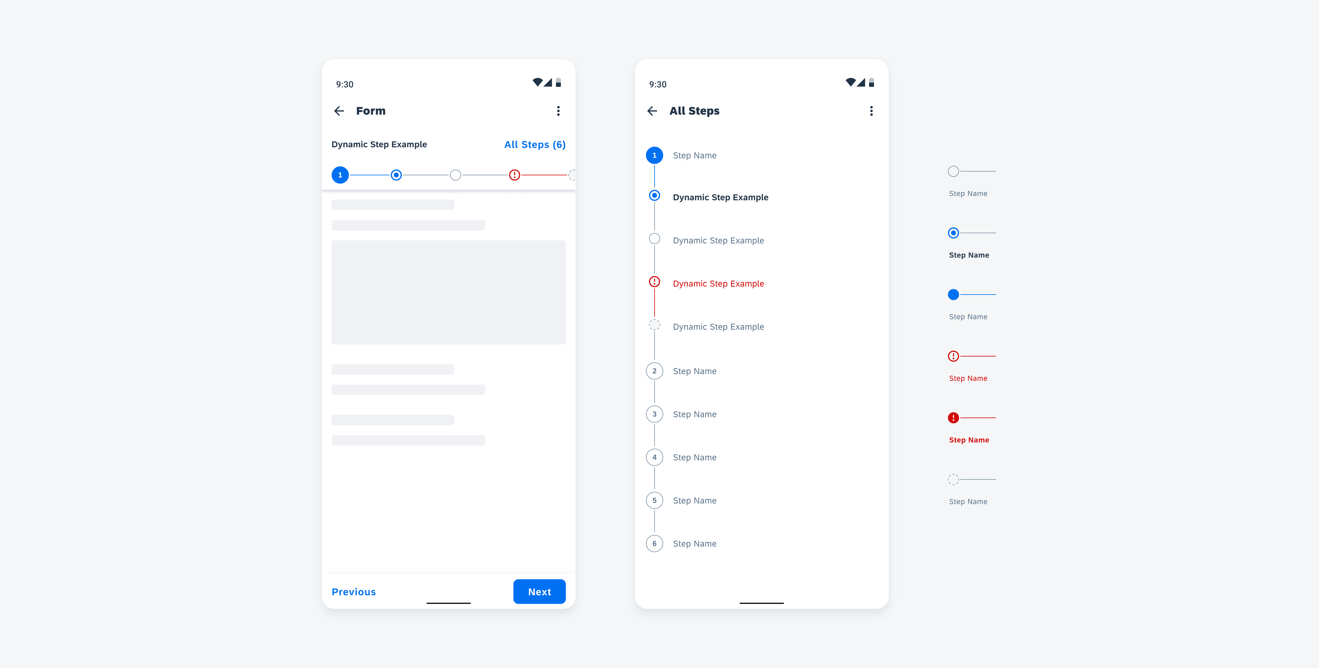
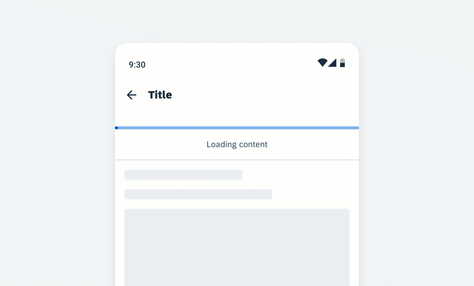
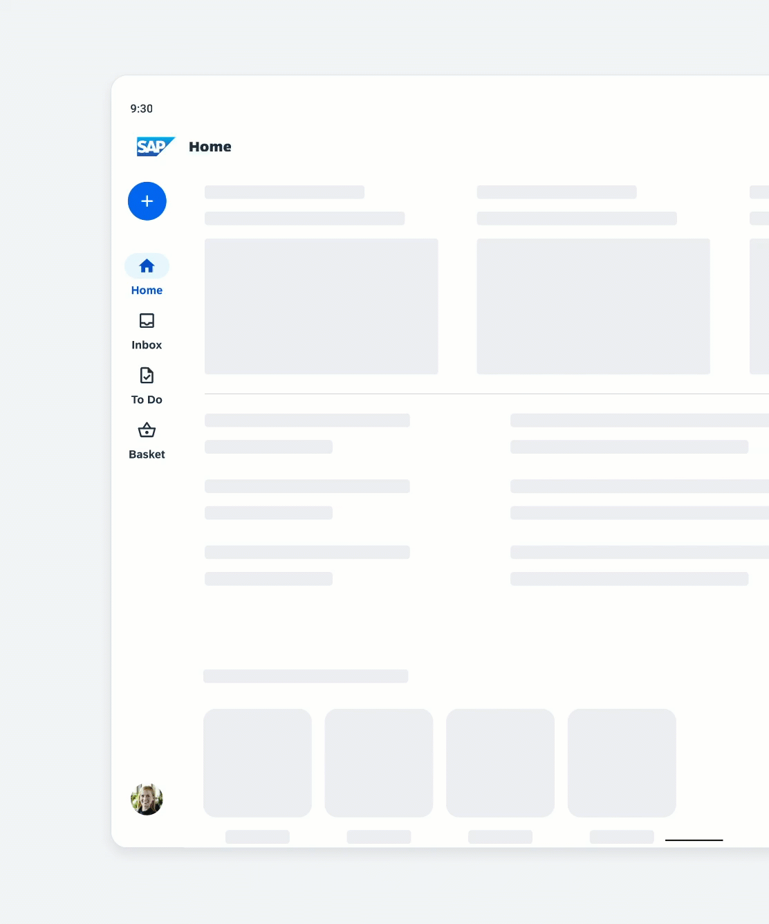
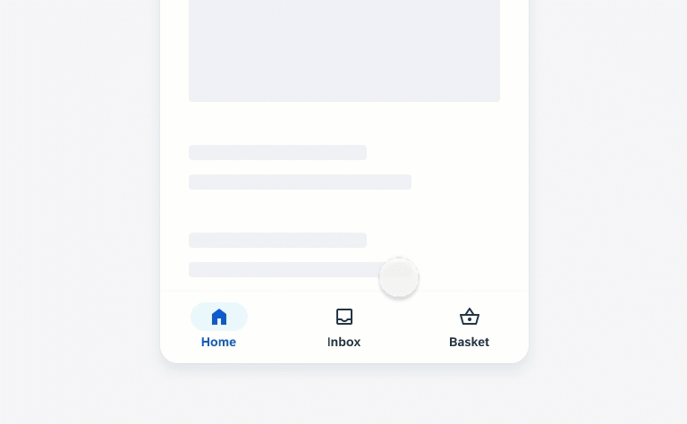
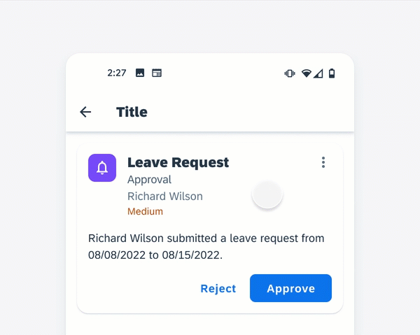
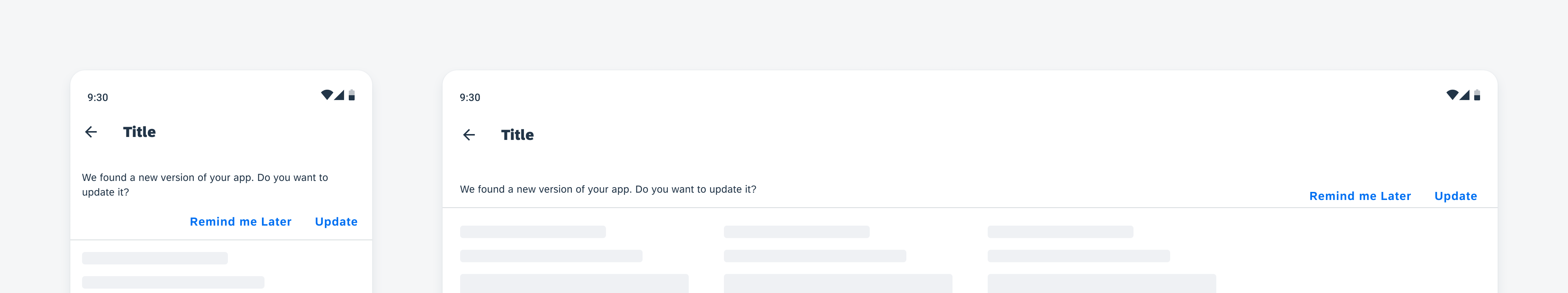
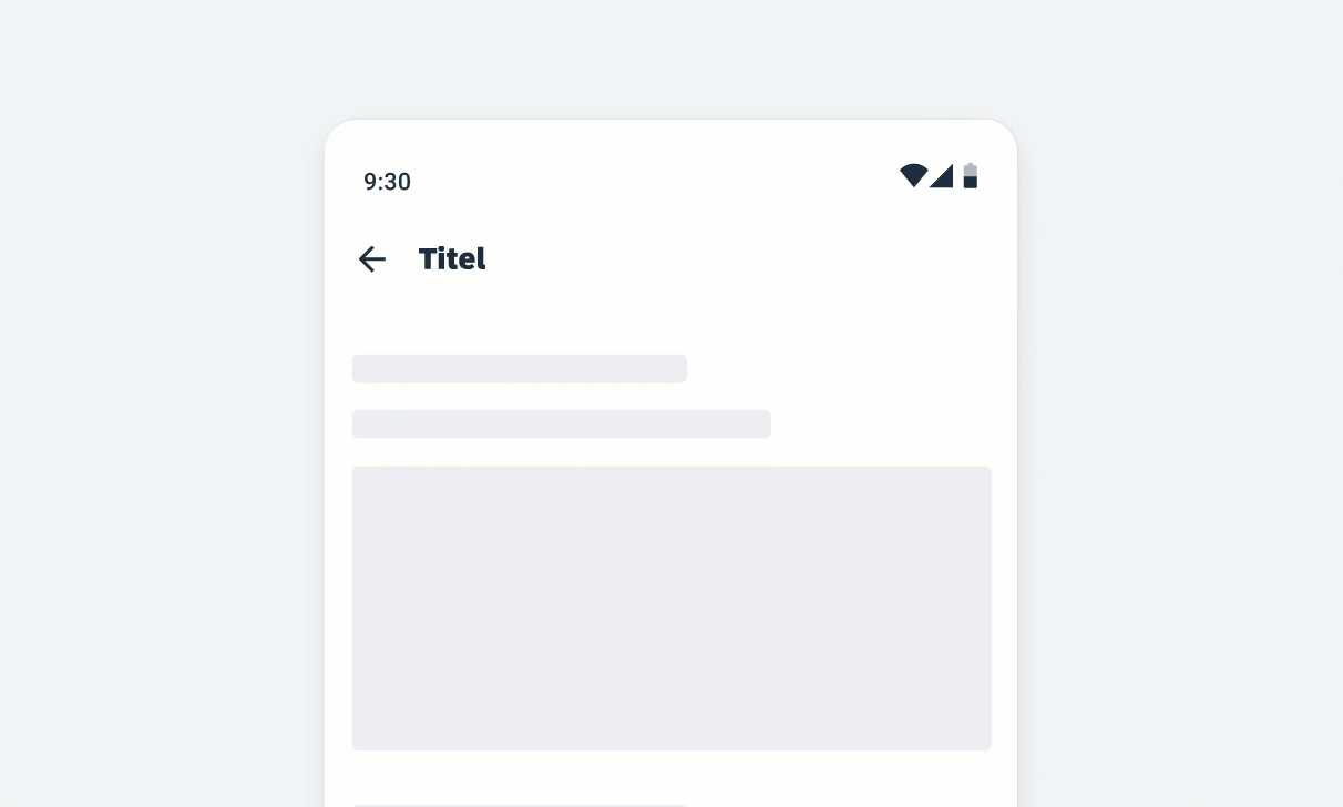
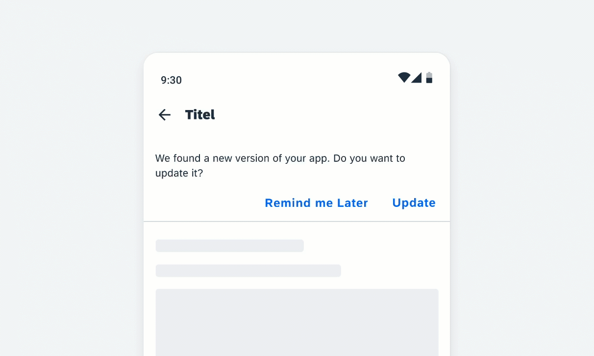
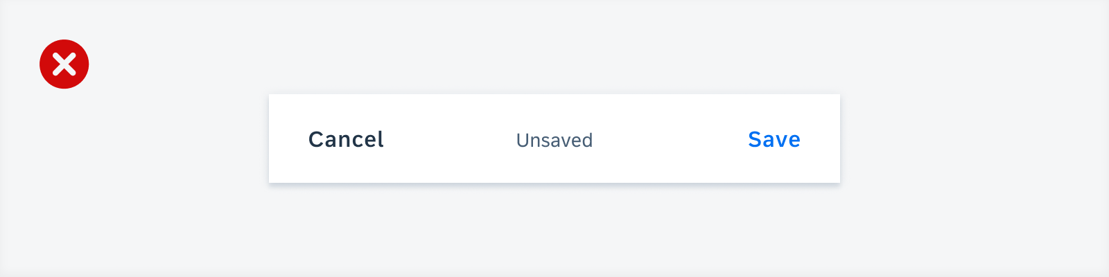
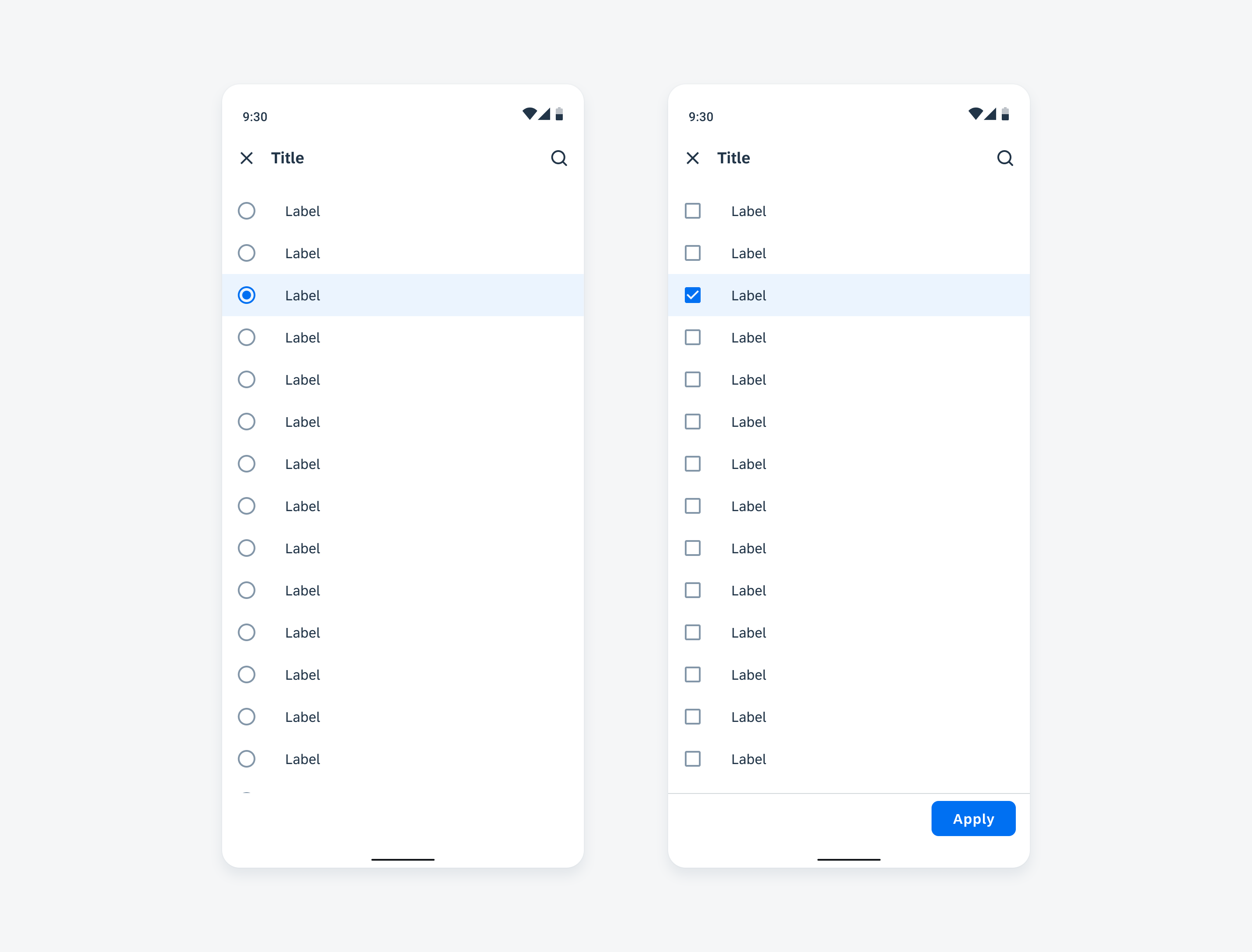
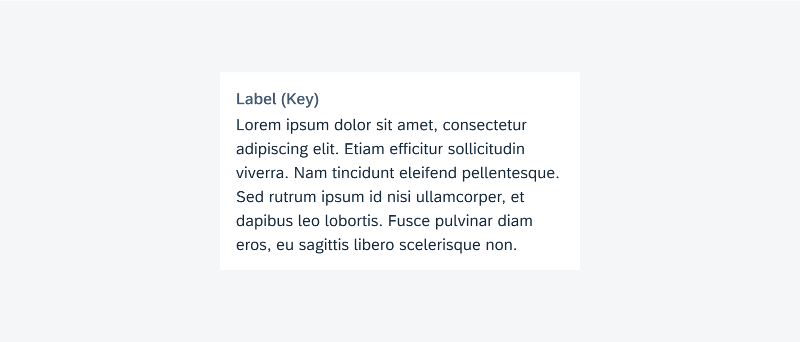
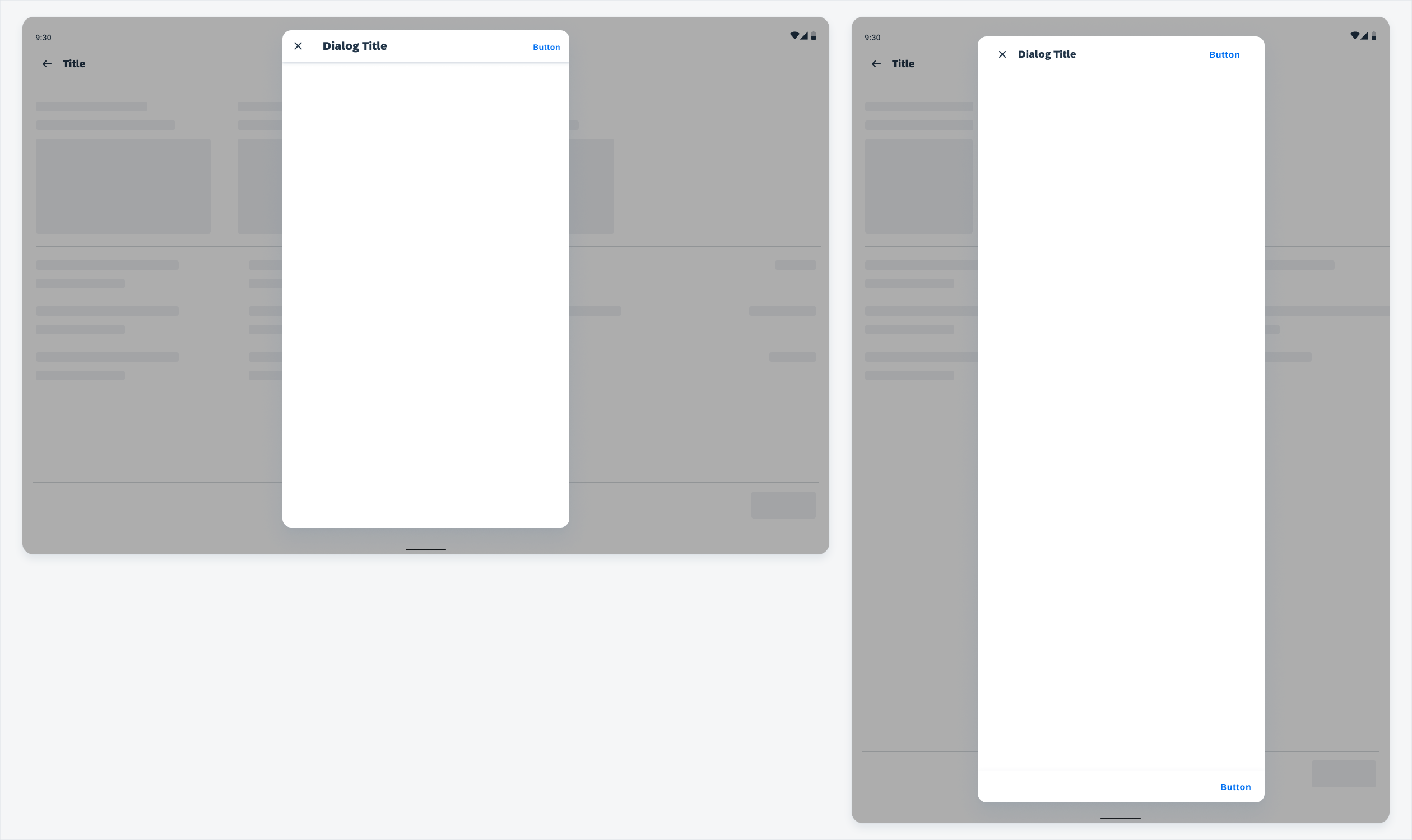
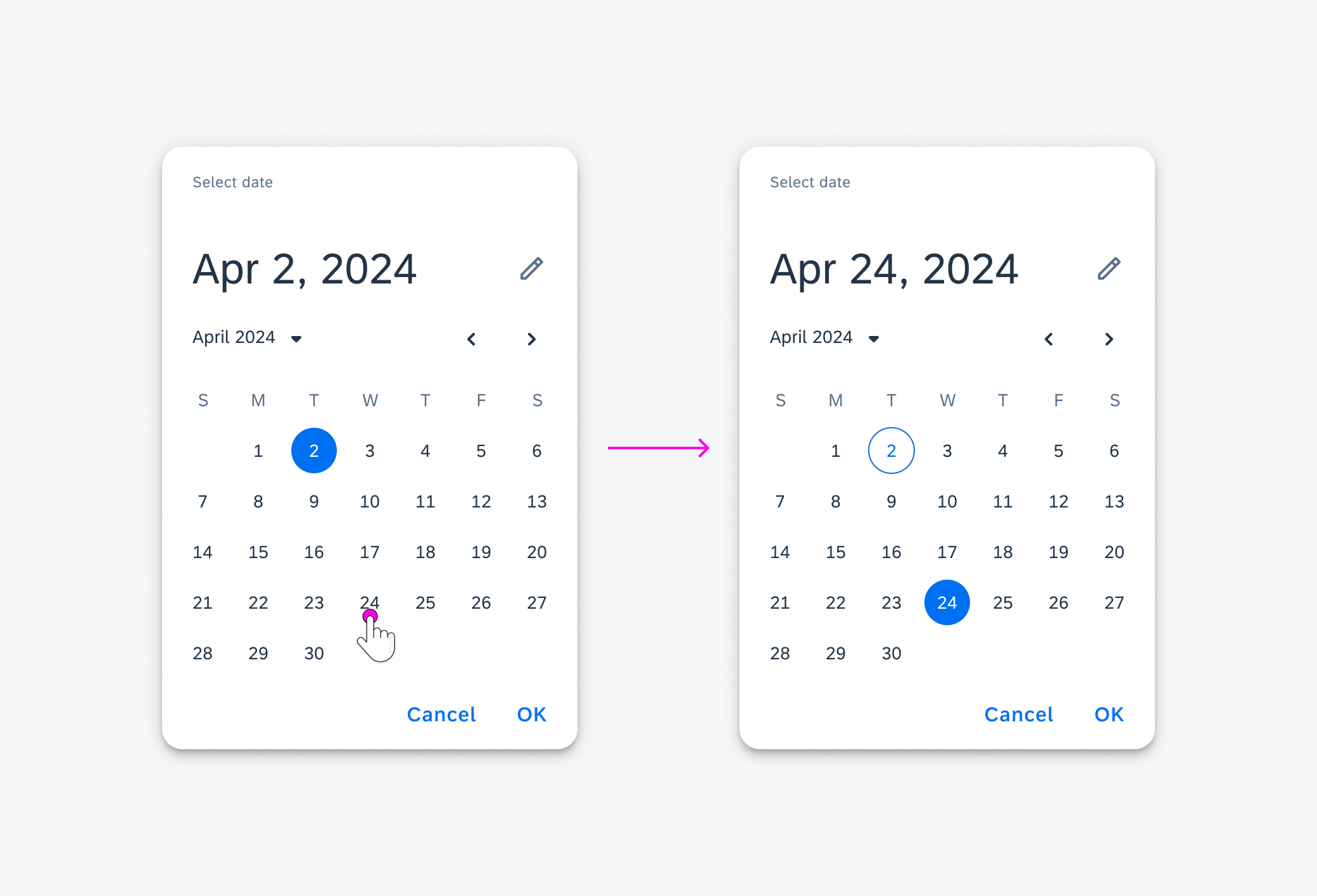
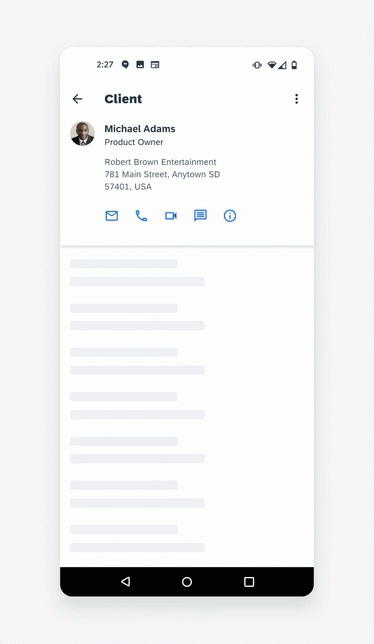
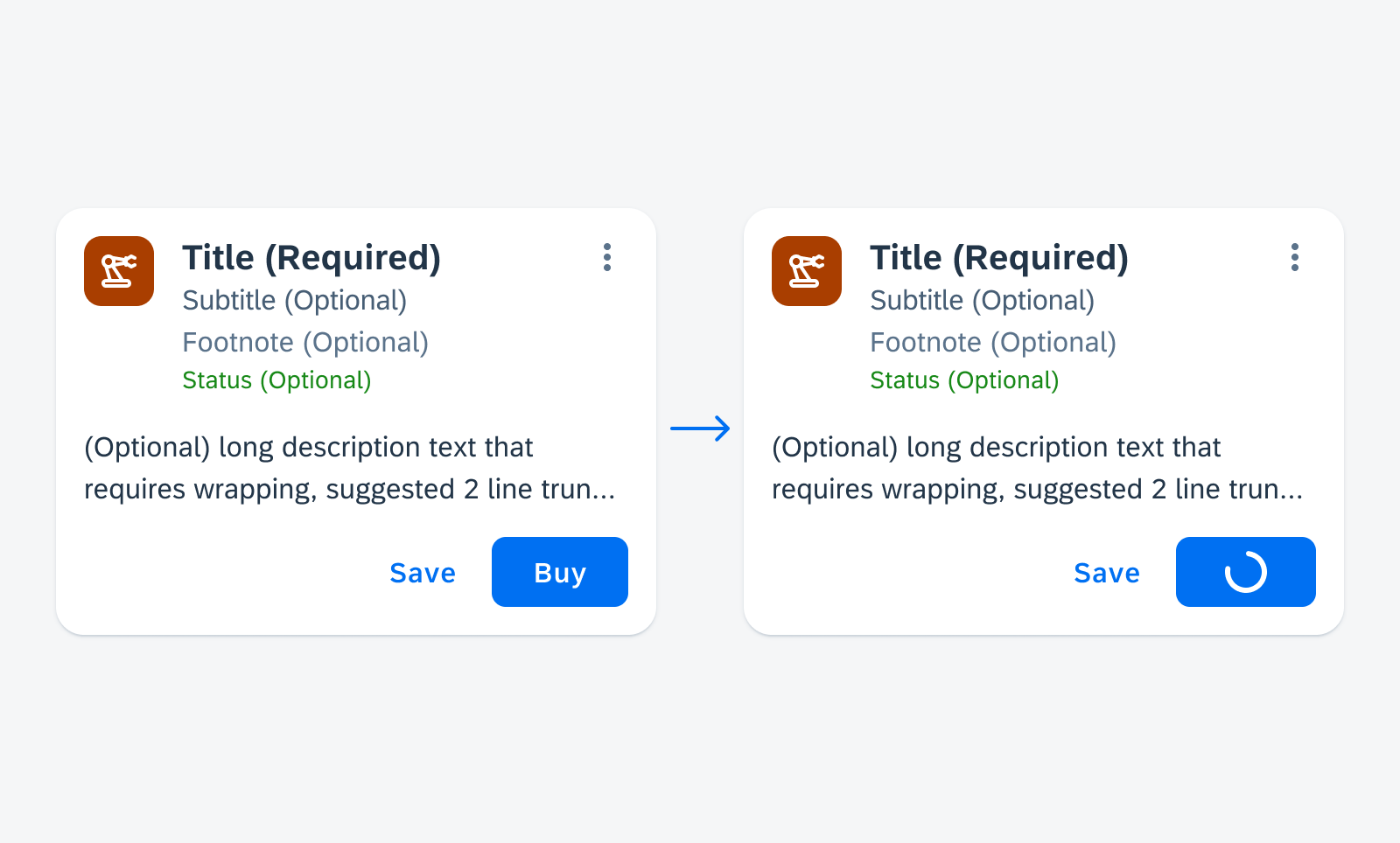
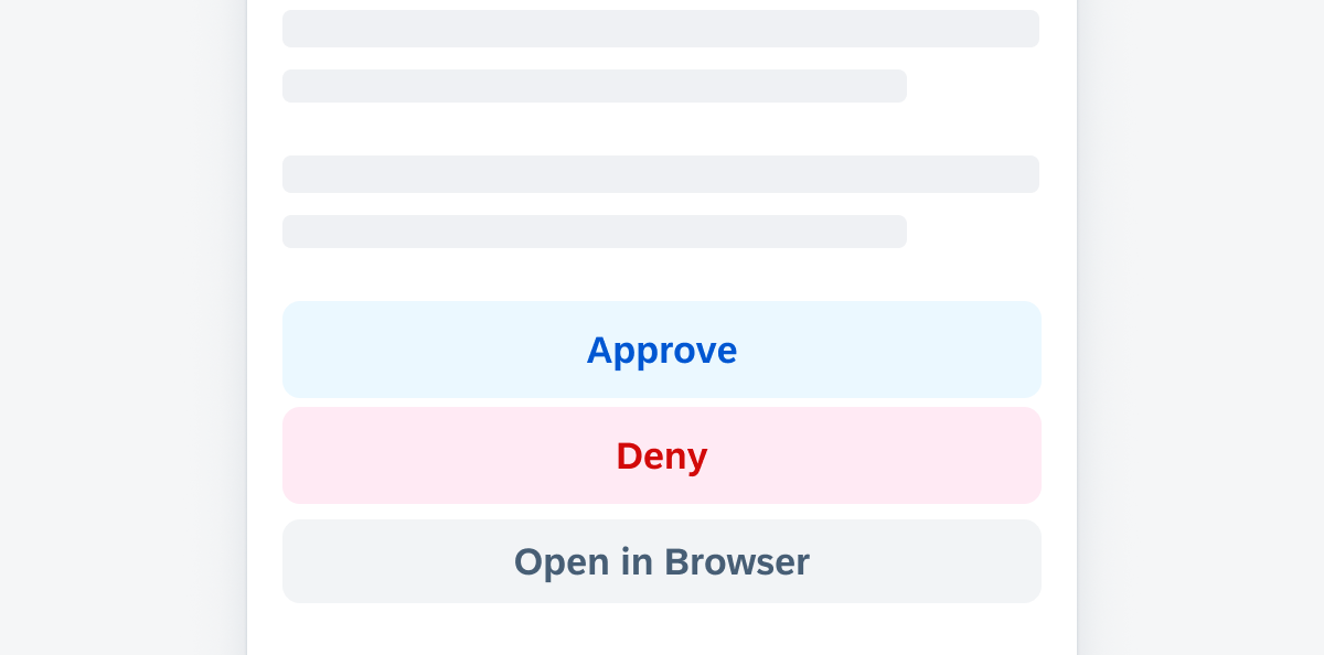
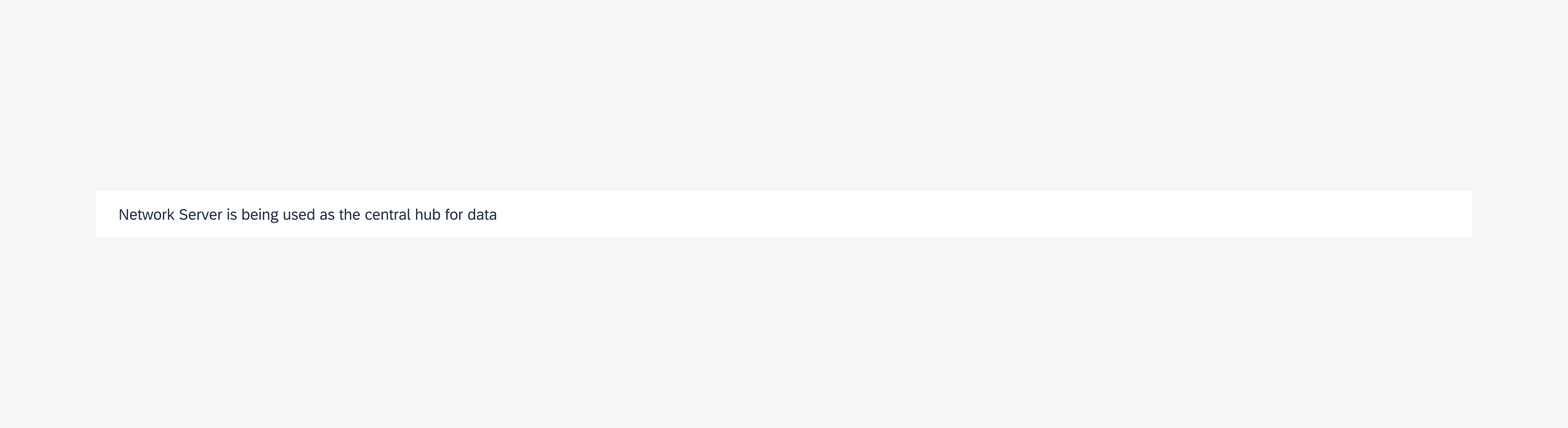
The banner notifies the user of messages. Tapping the banner opens the multi–message handling bottom sheet for detailed viewing and interaction.

Triggering multi-message handling from the banner
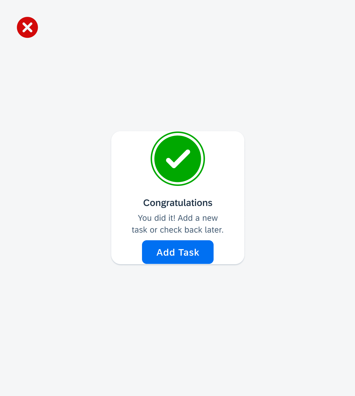
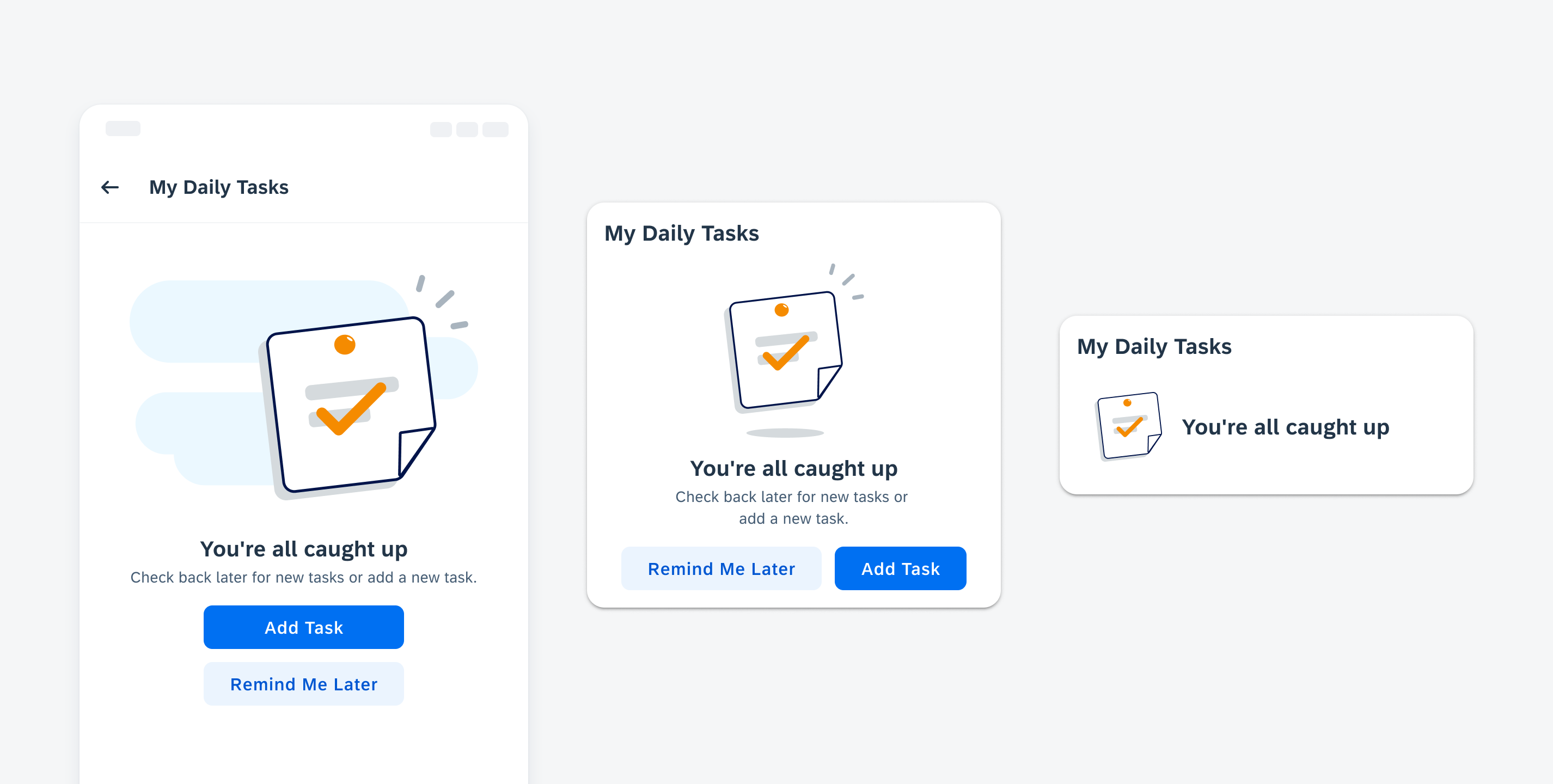
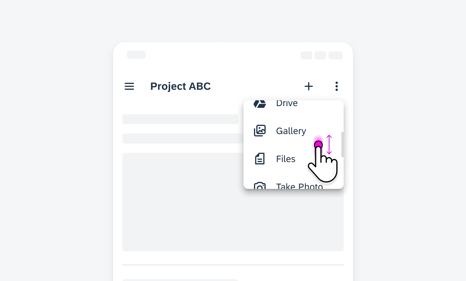
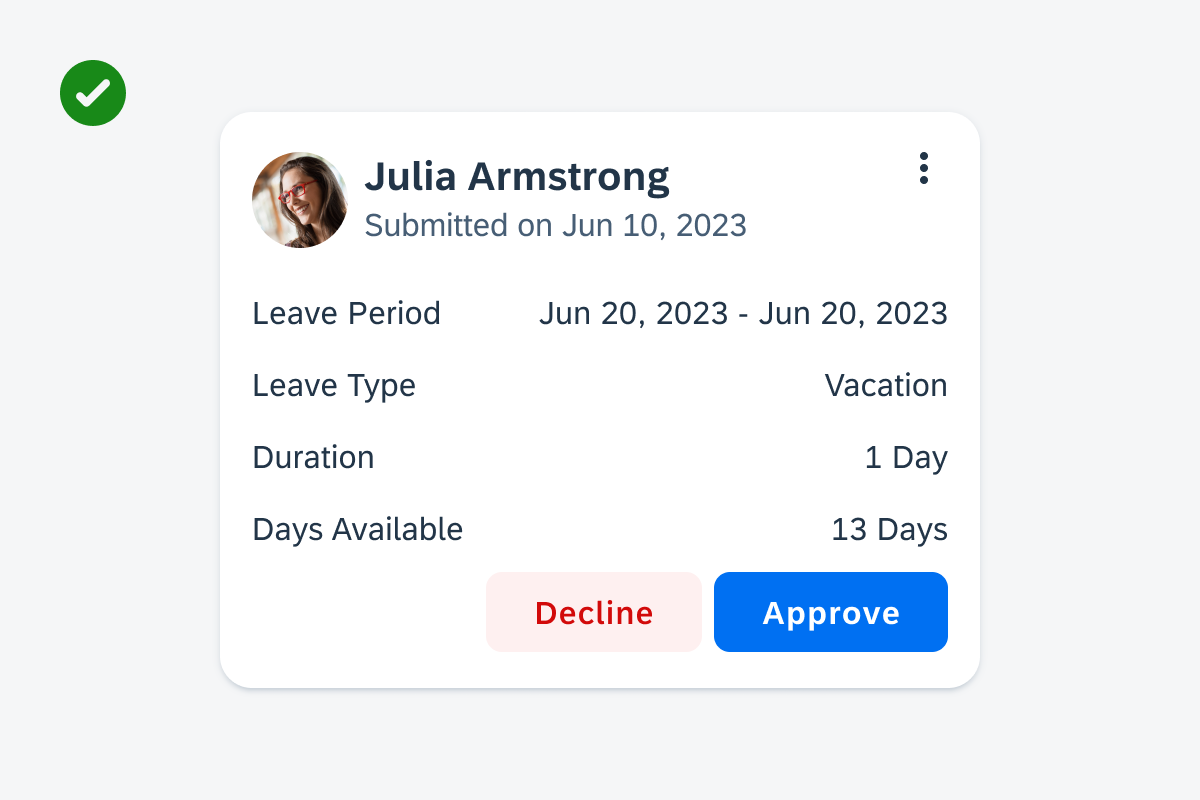
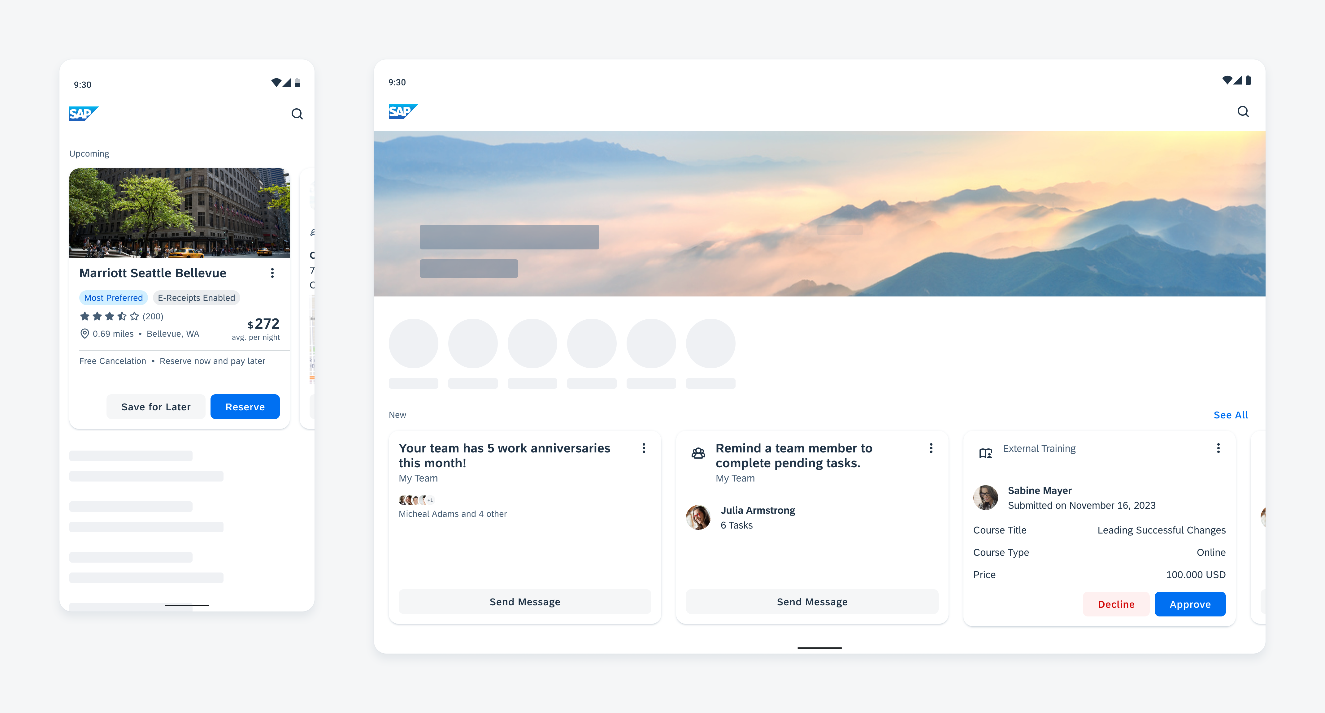
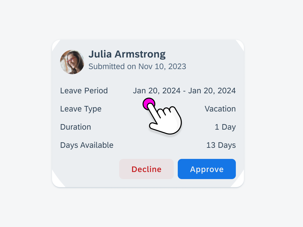
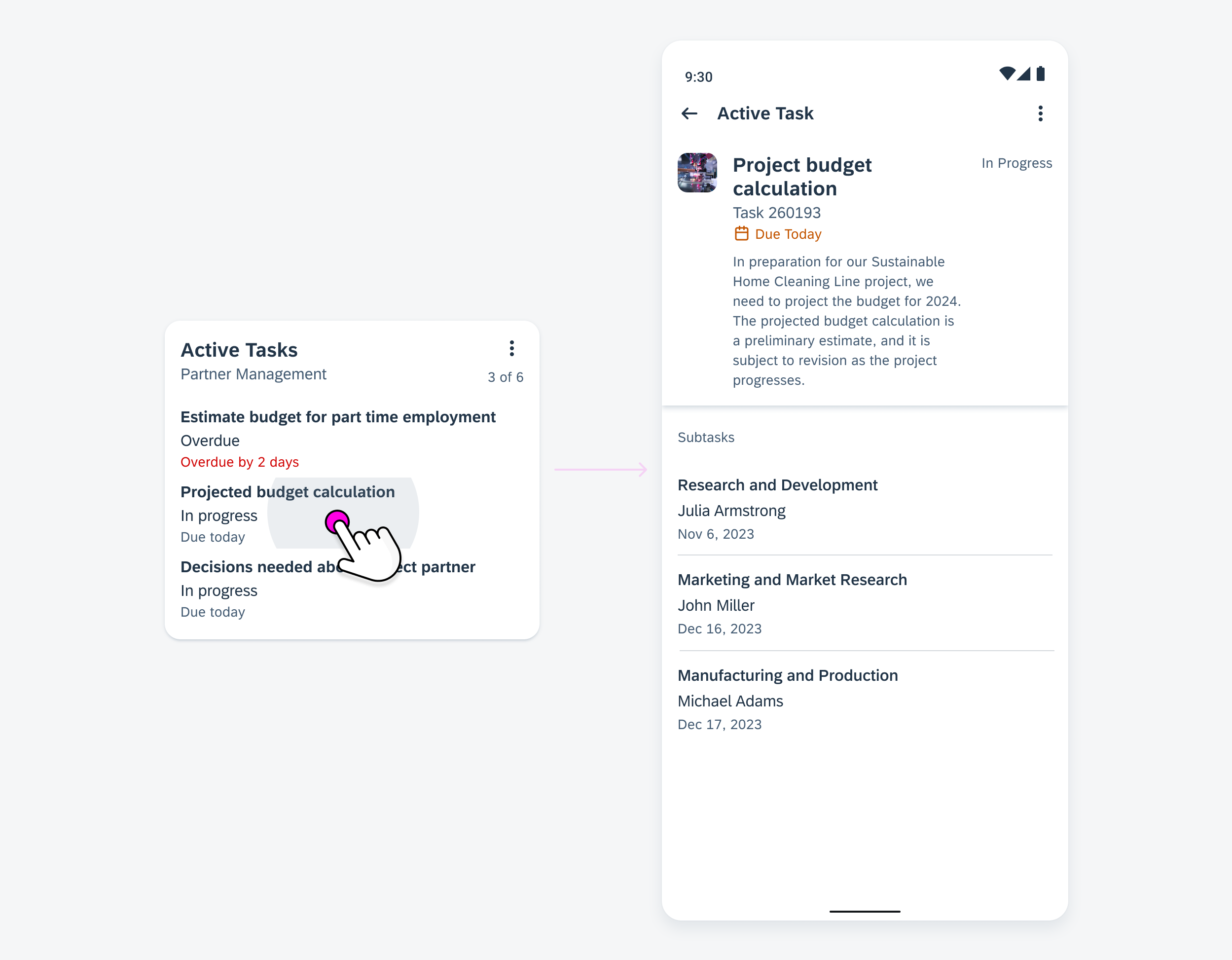
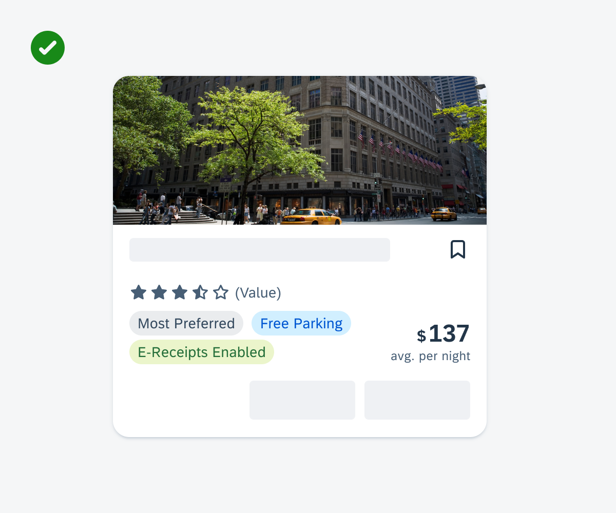
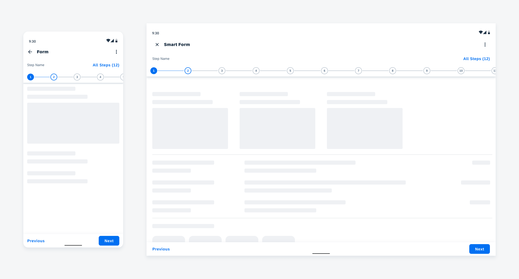
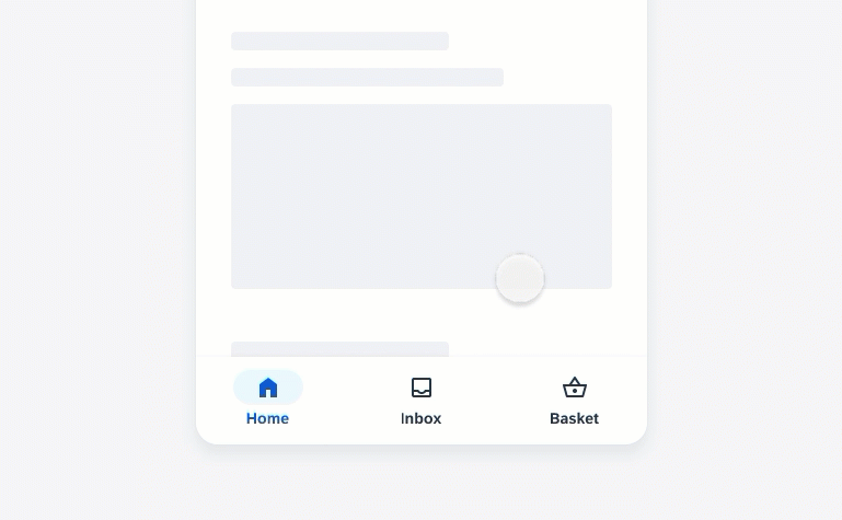
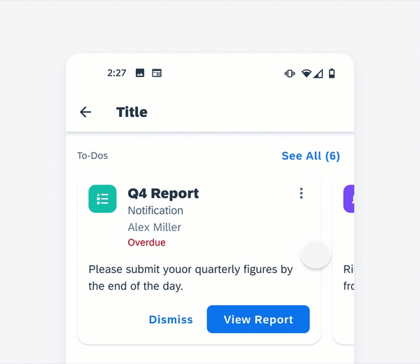
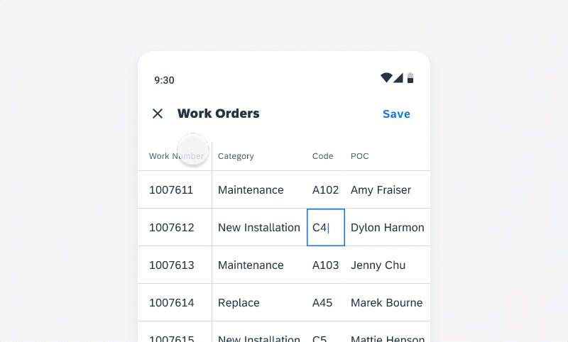
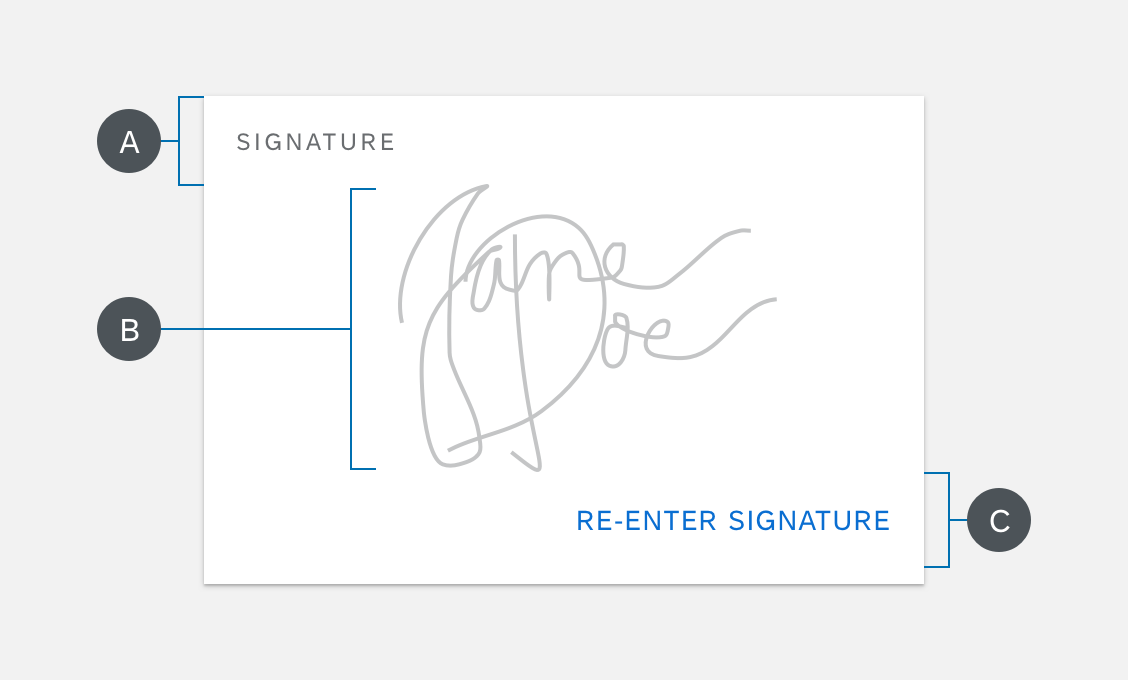
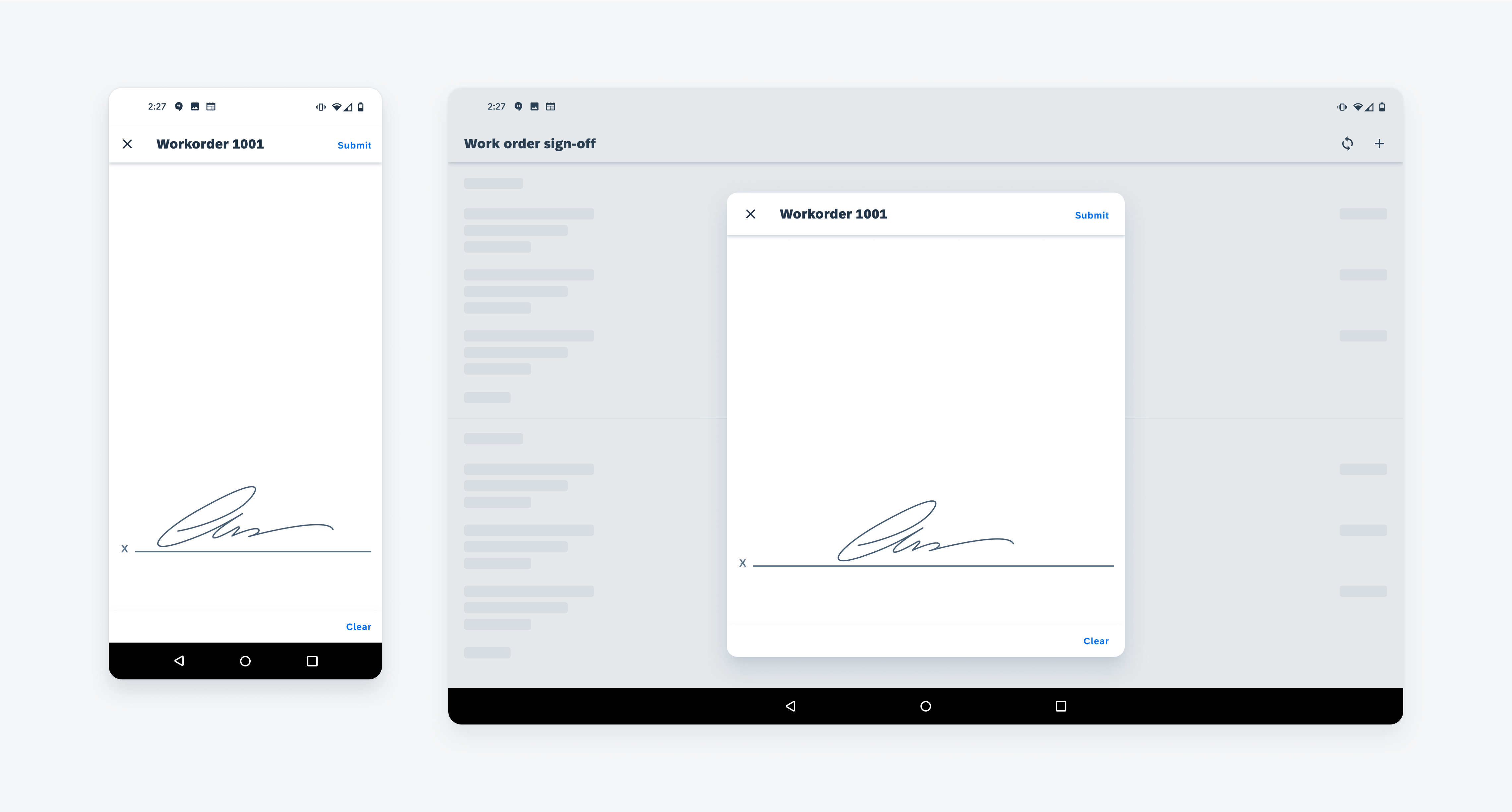
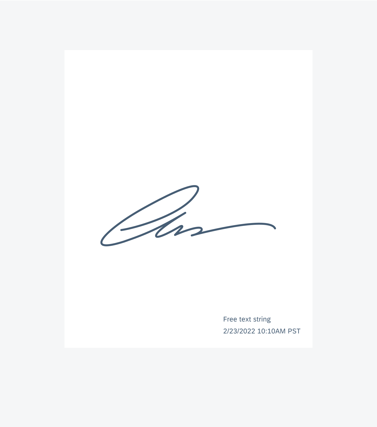
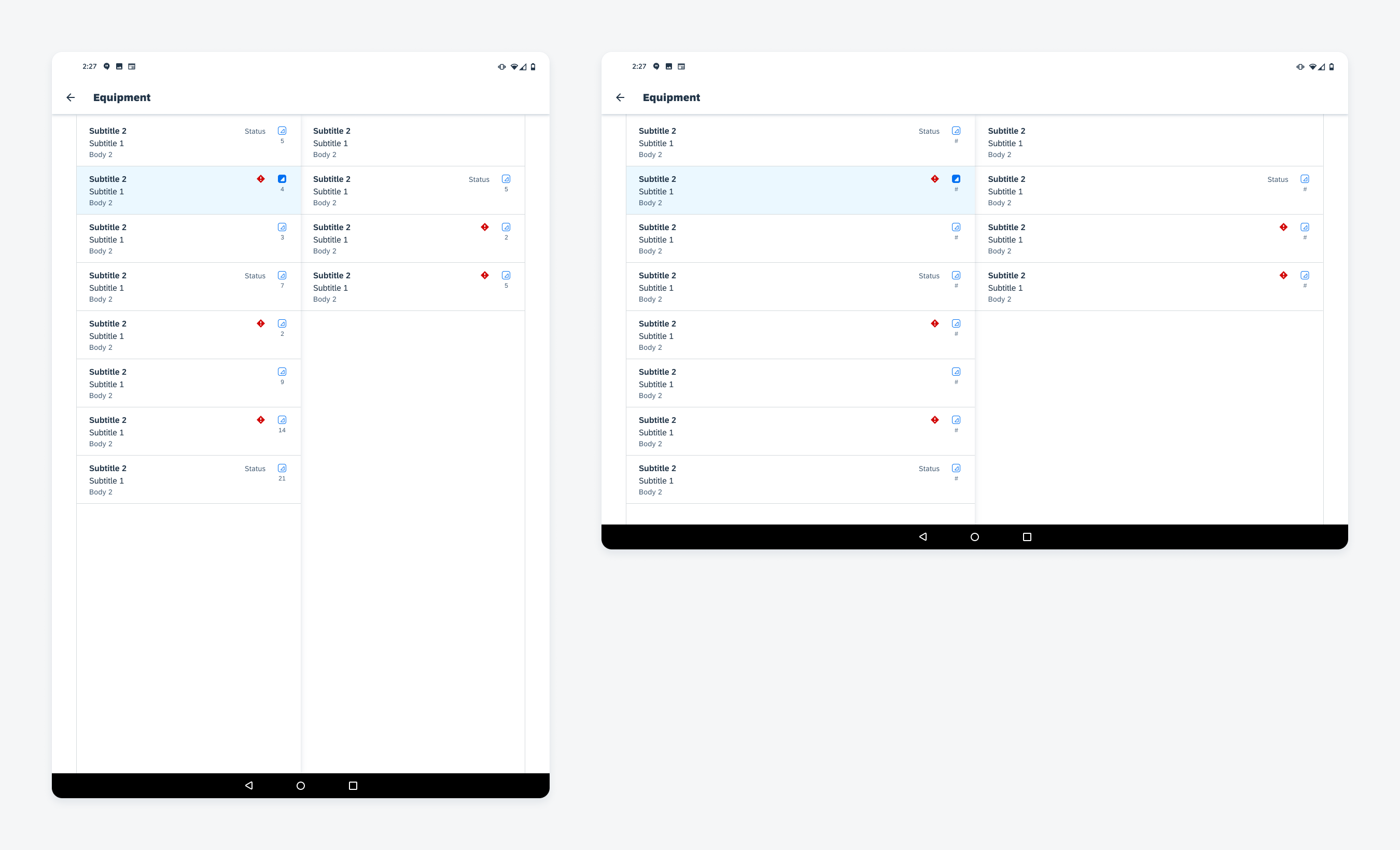
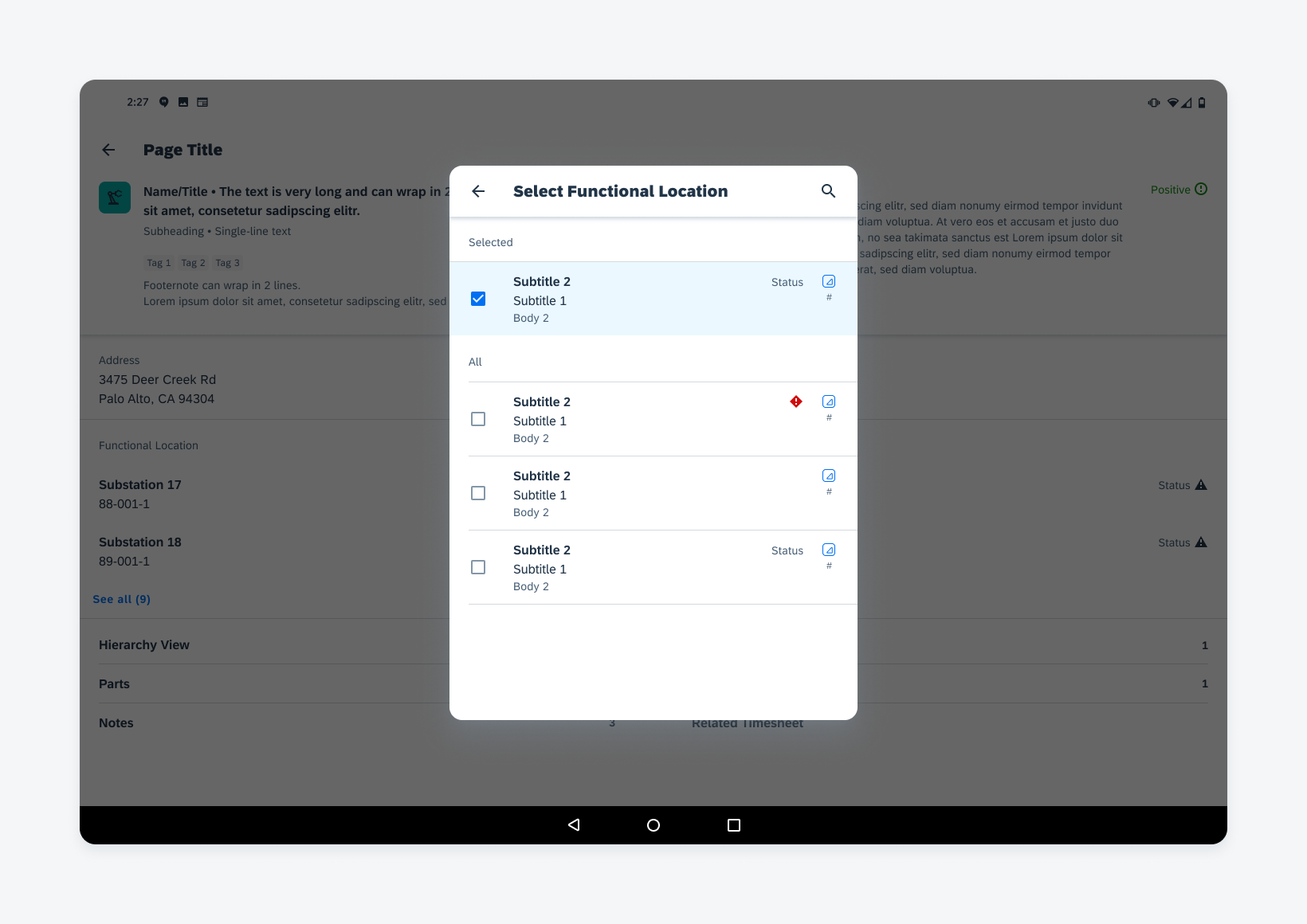
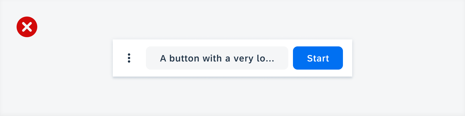
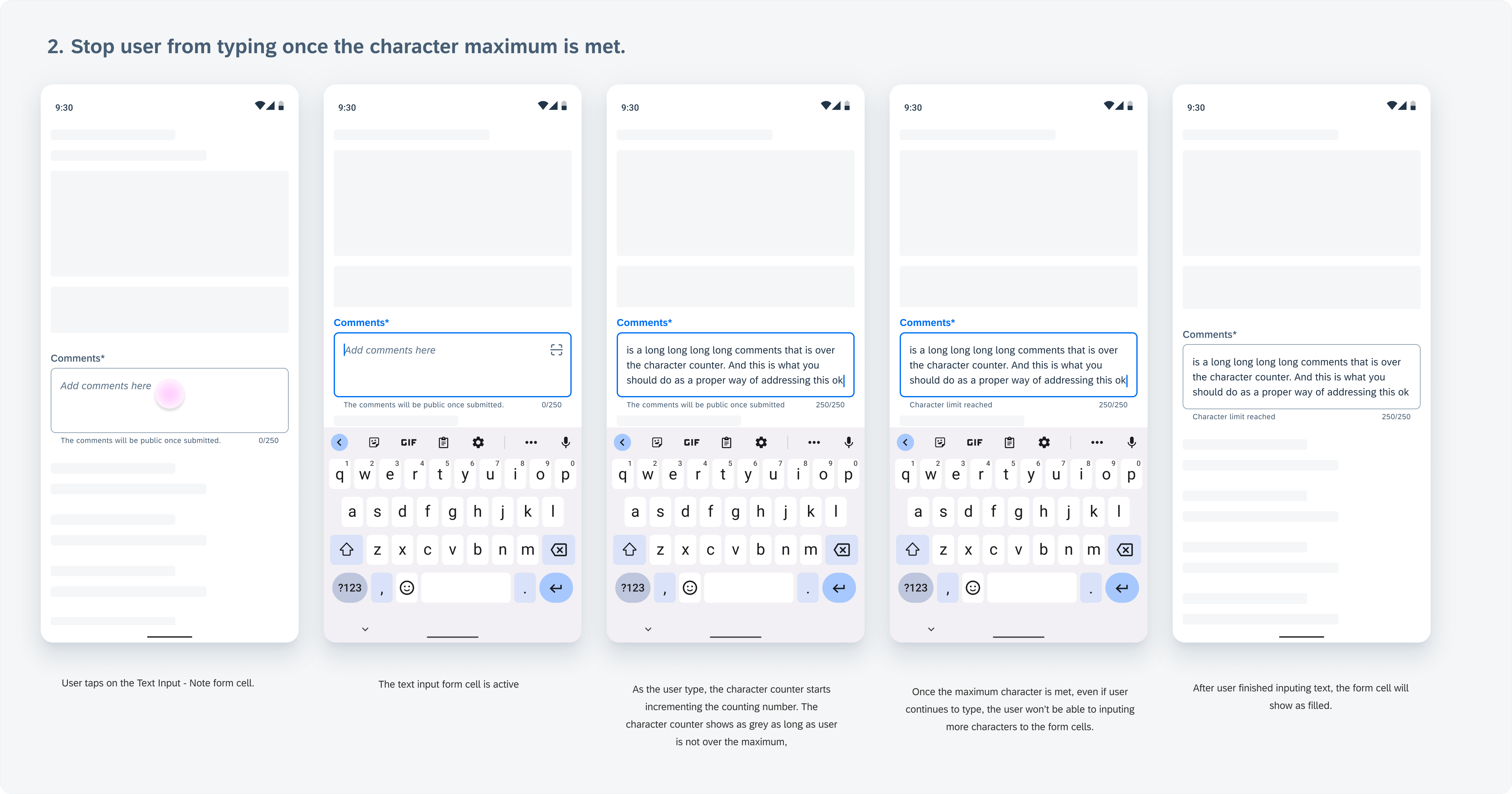
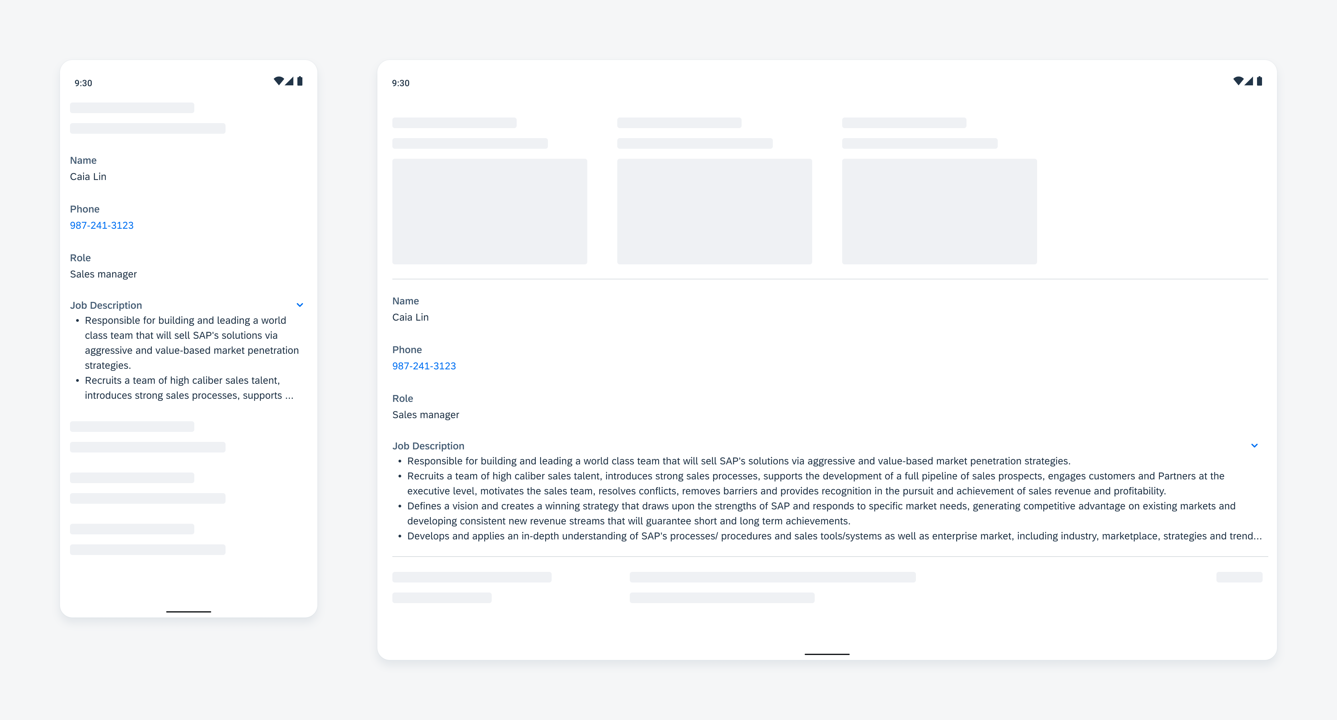
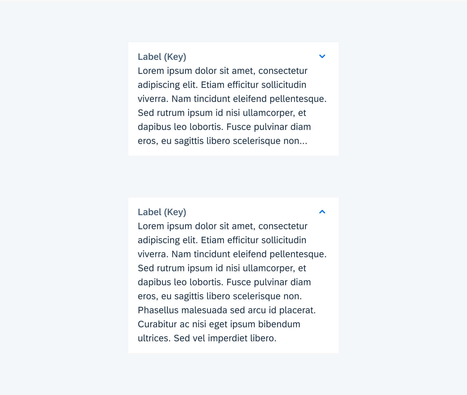
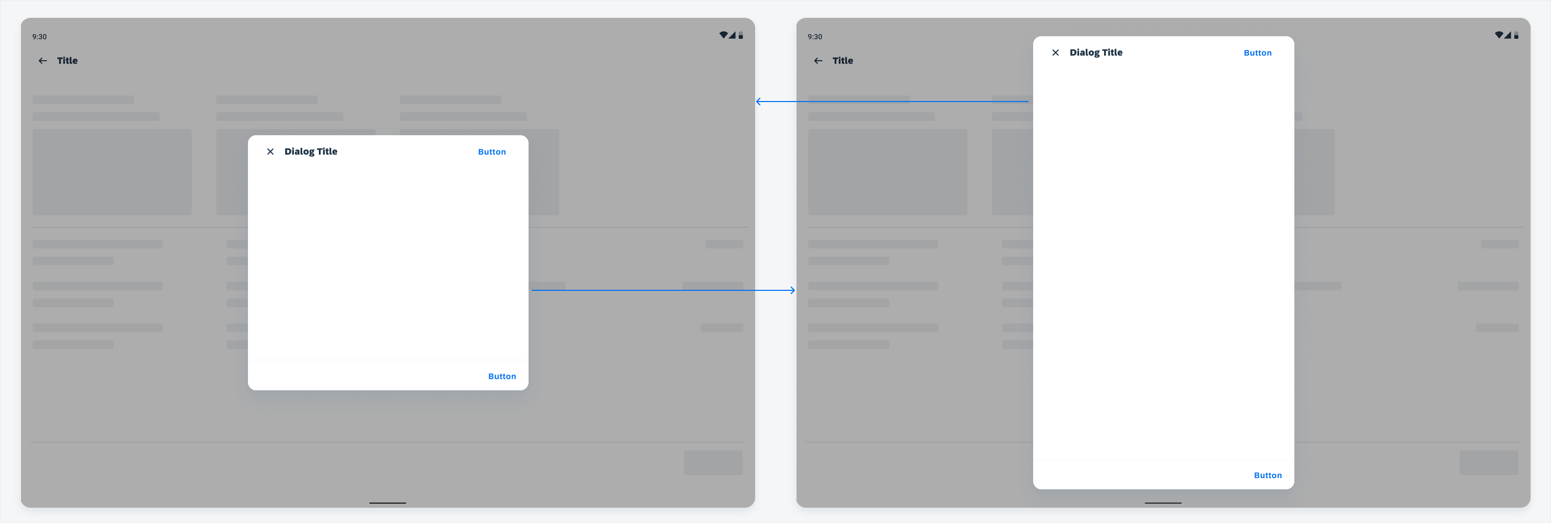
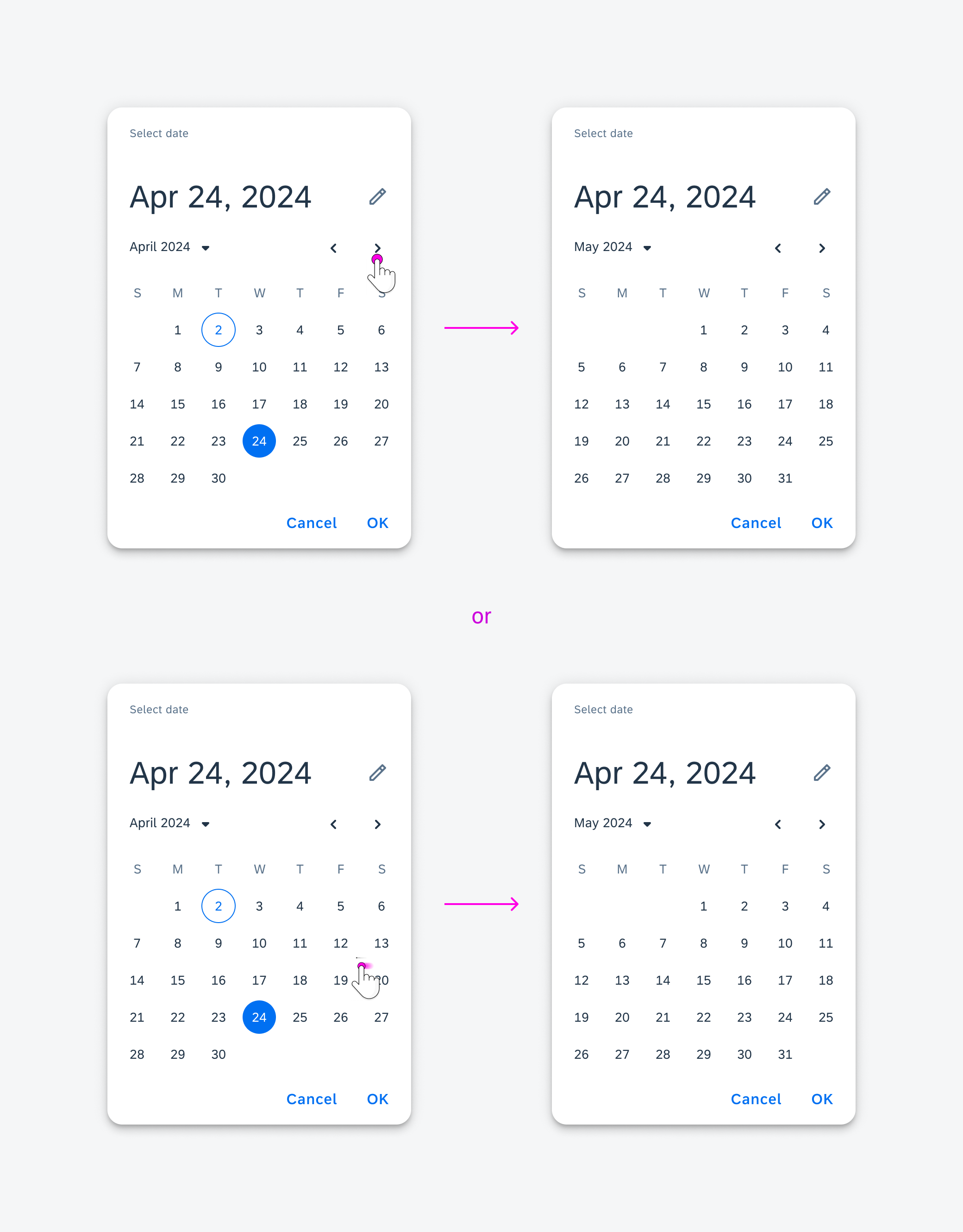
Tap to Scroll
When the bottom sheet is open, tapping a message item automatically scrolls to the related field or section with the error, allowing users to address the issue.

Tapping to auto-scroll allowing users to address the error
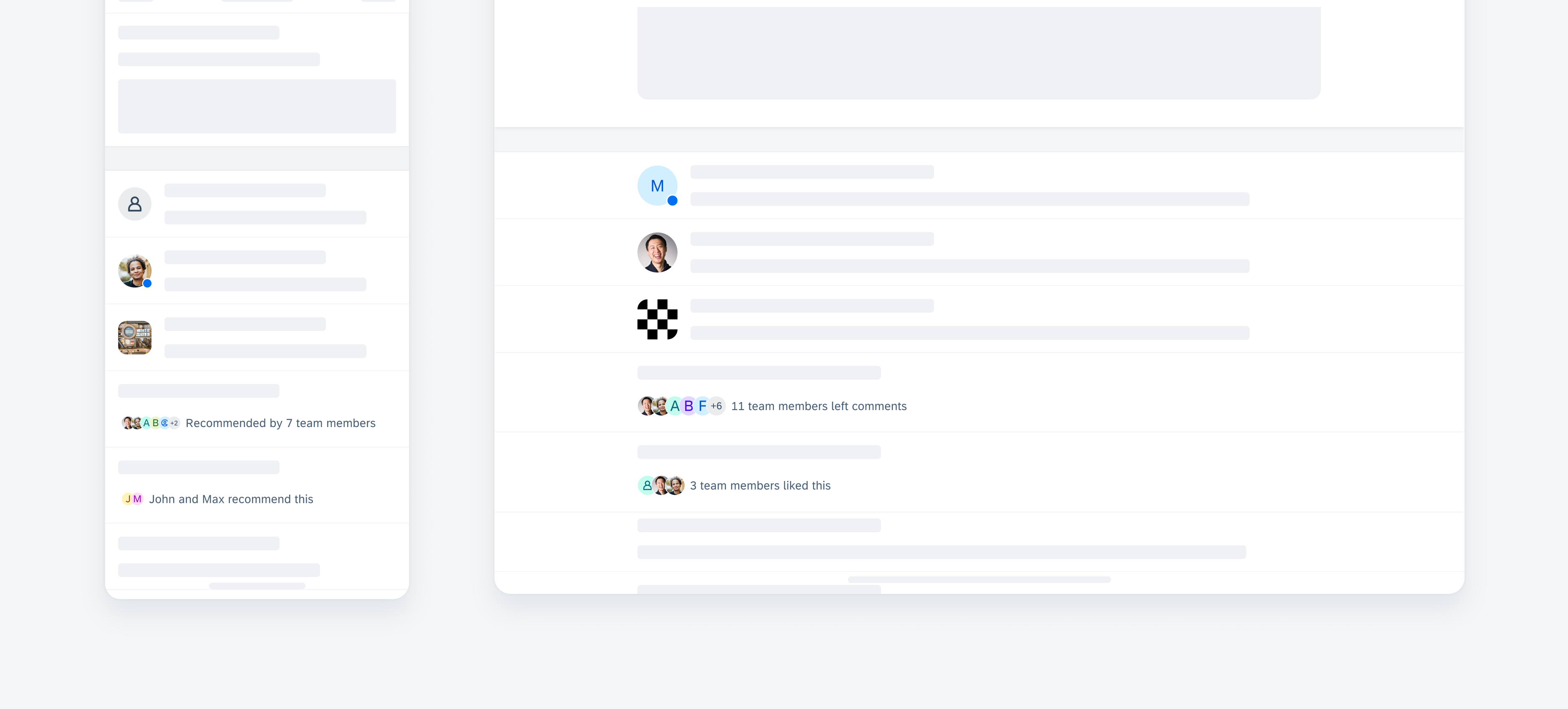
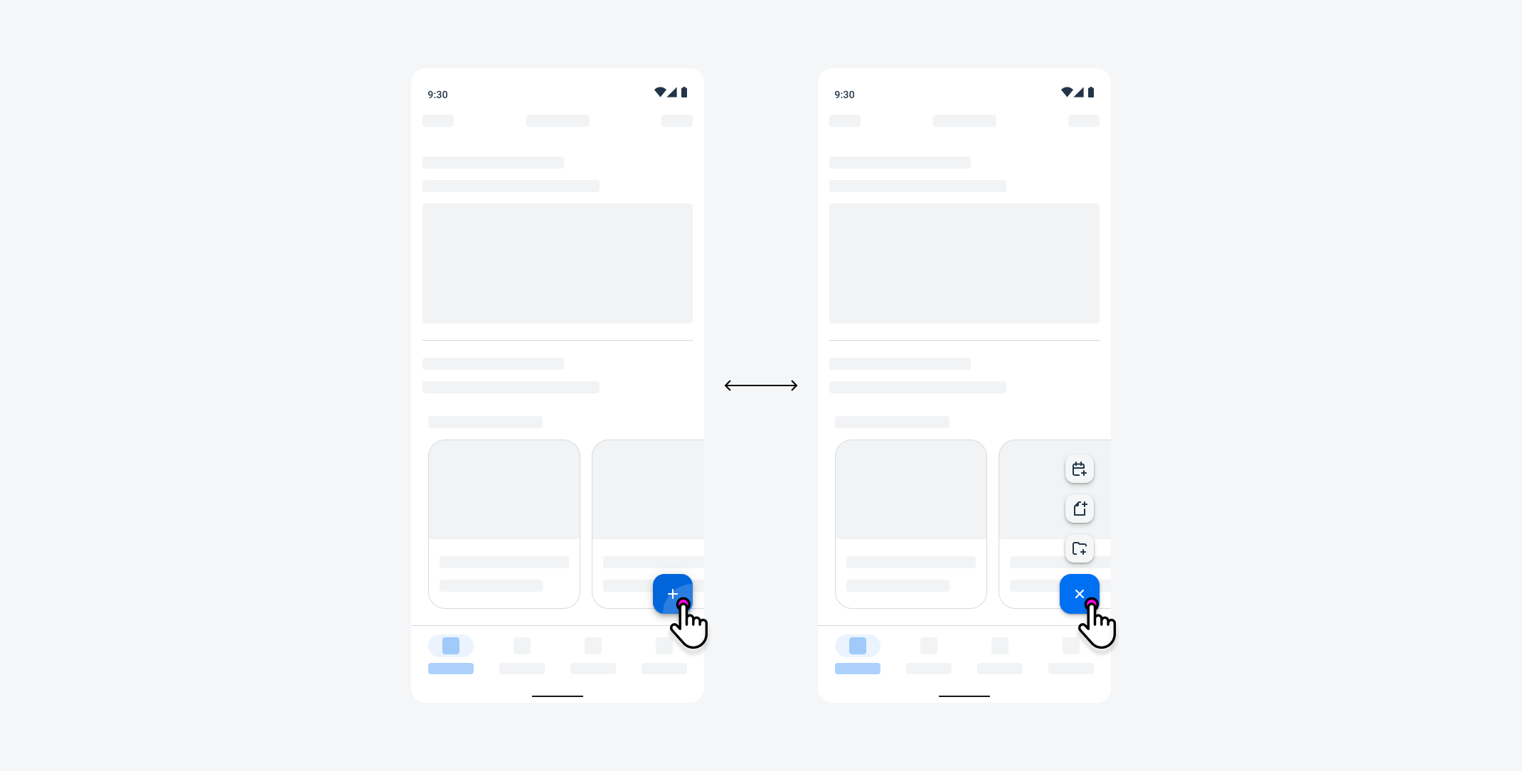
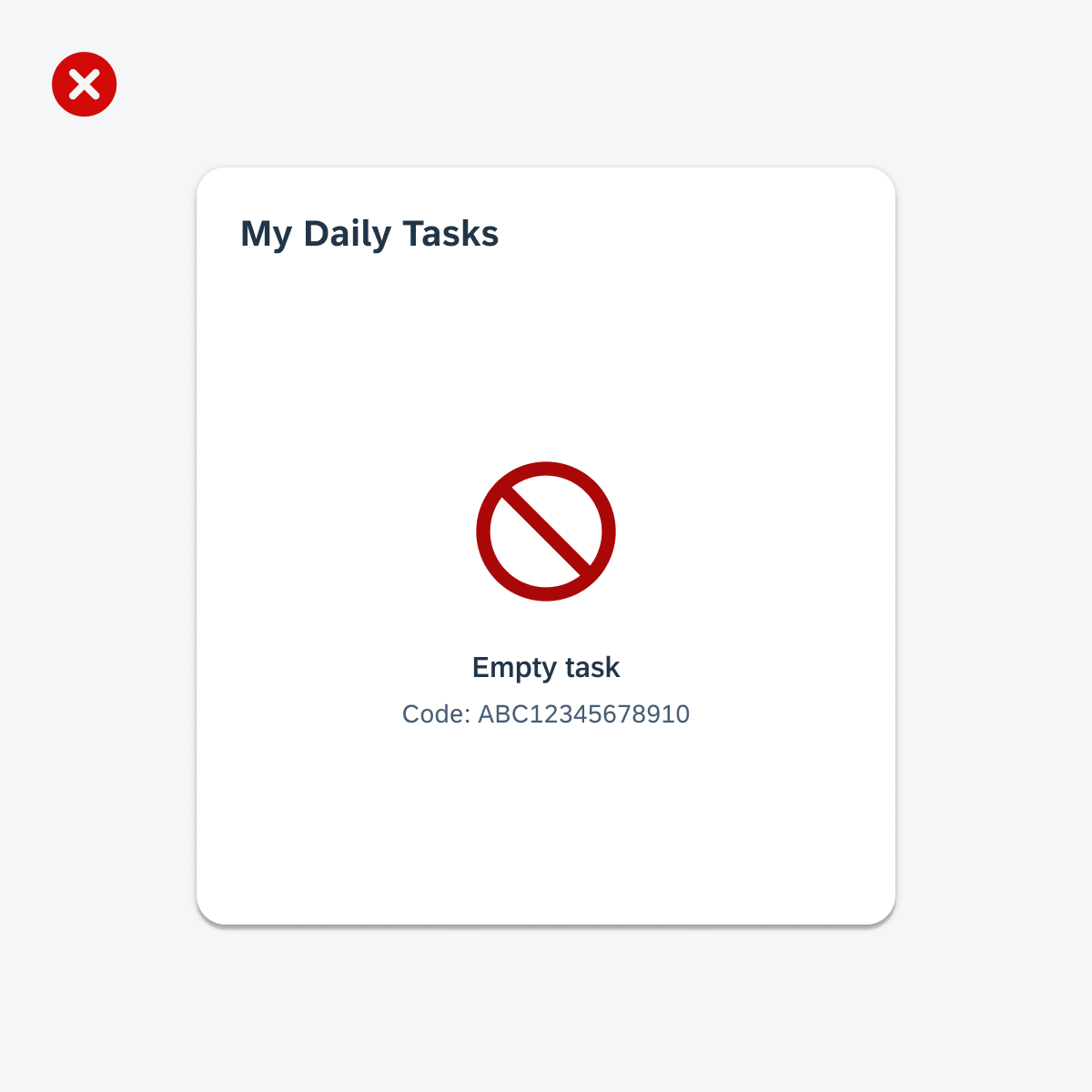
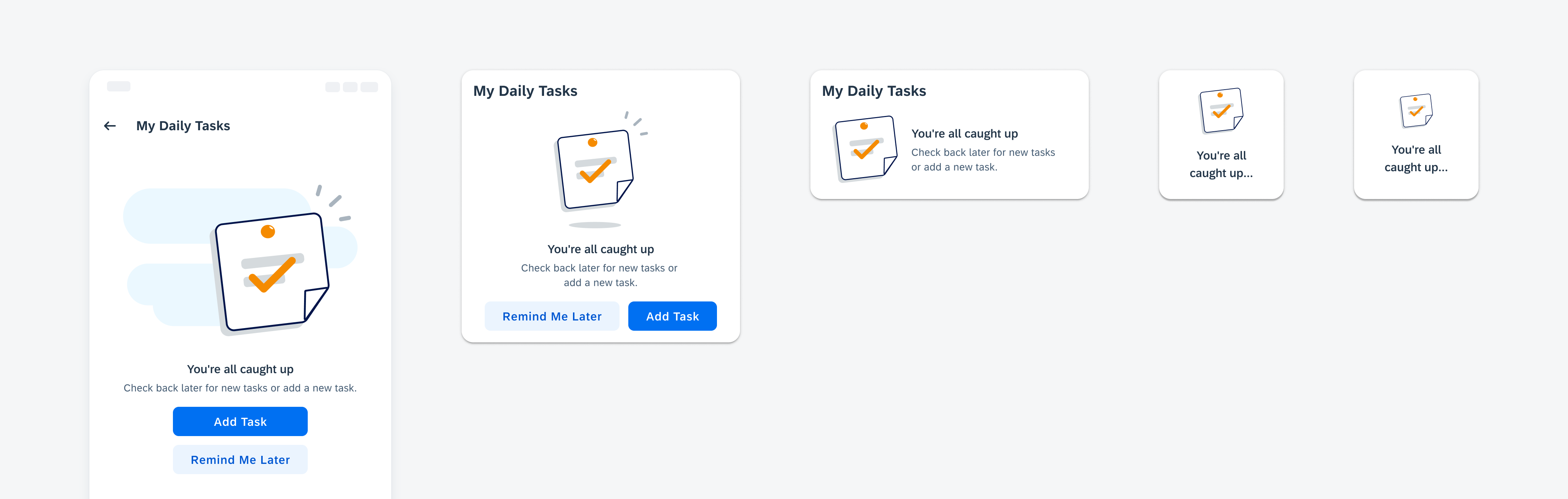
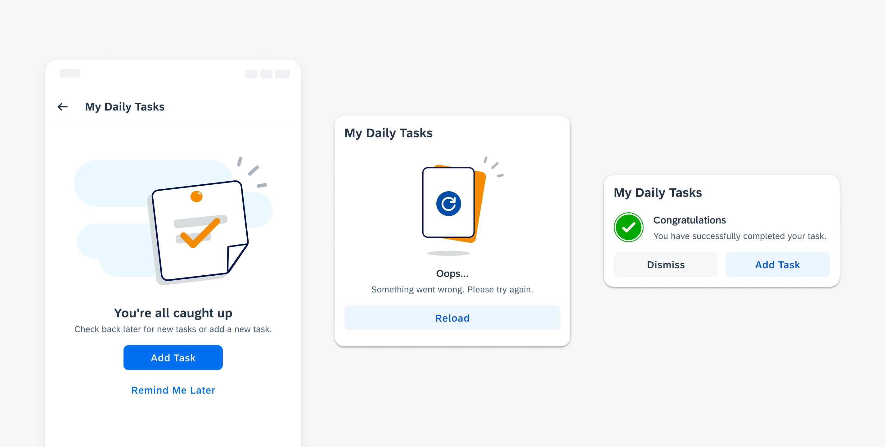
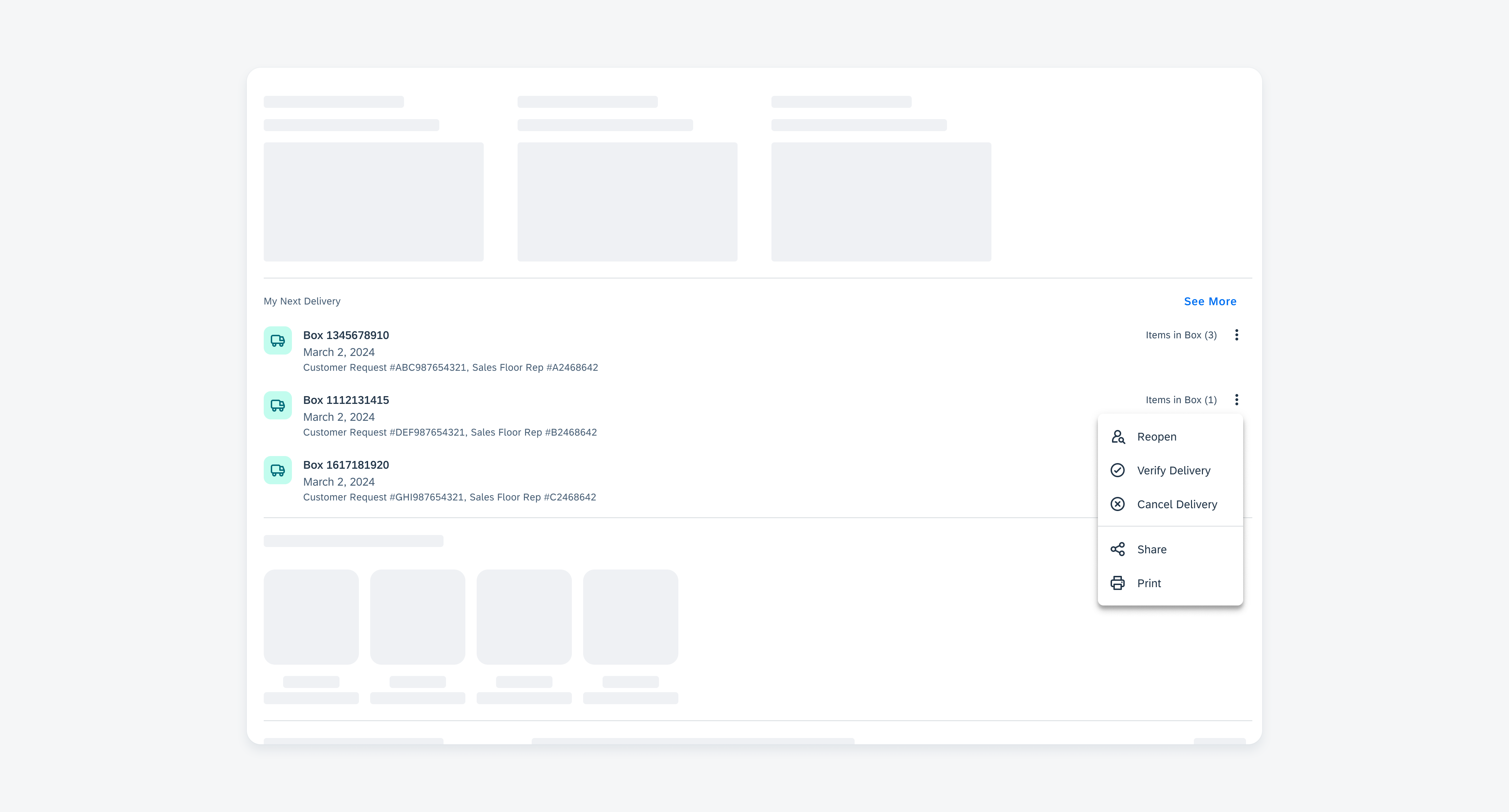
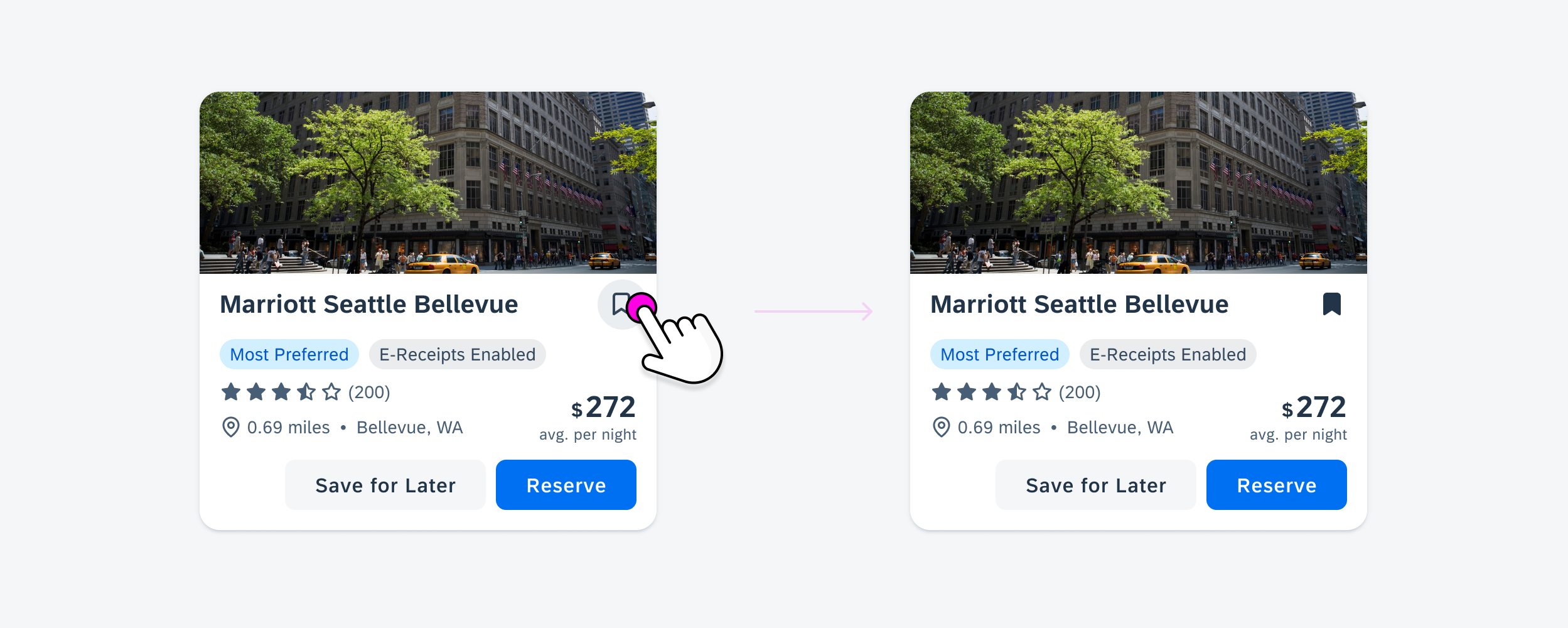
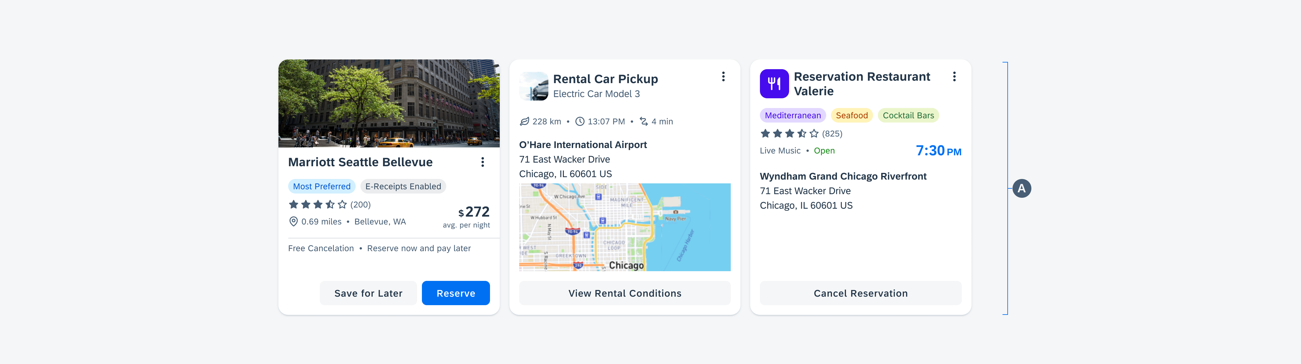
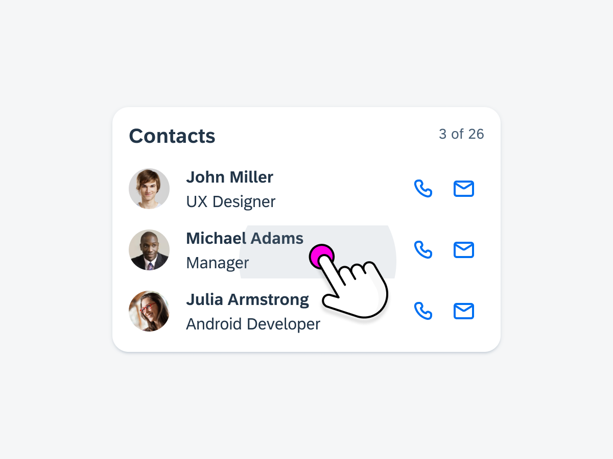
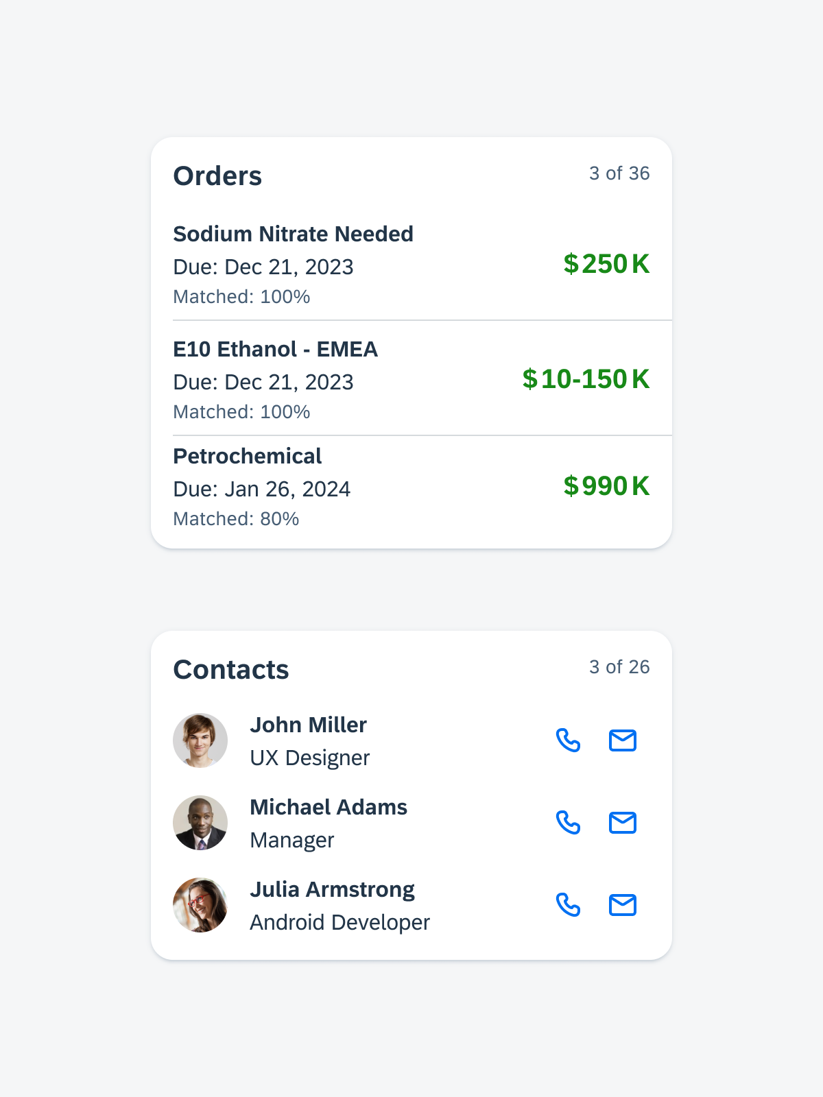
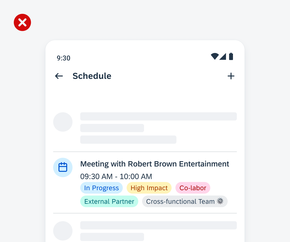
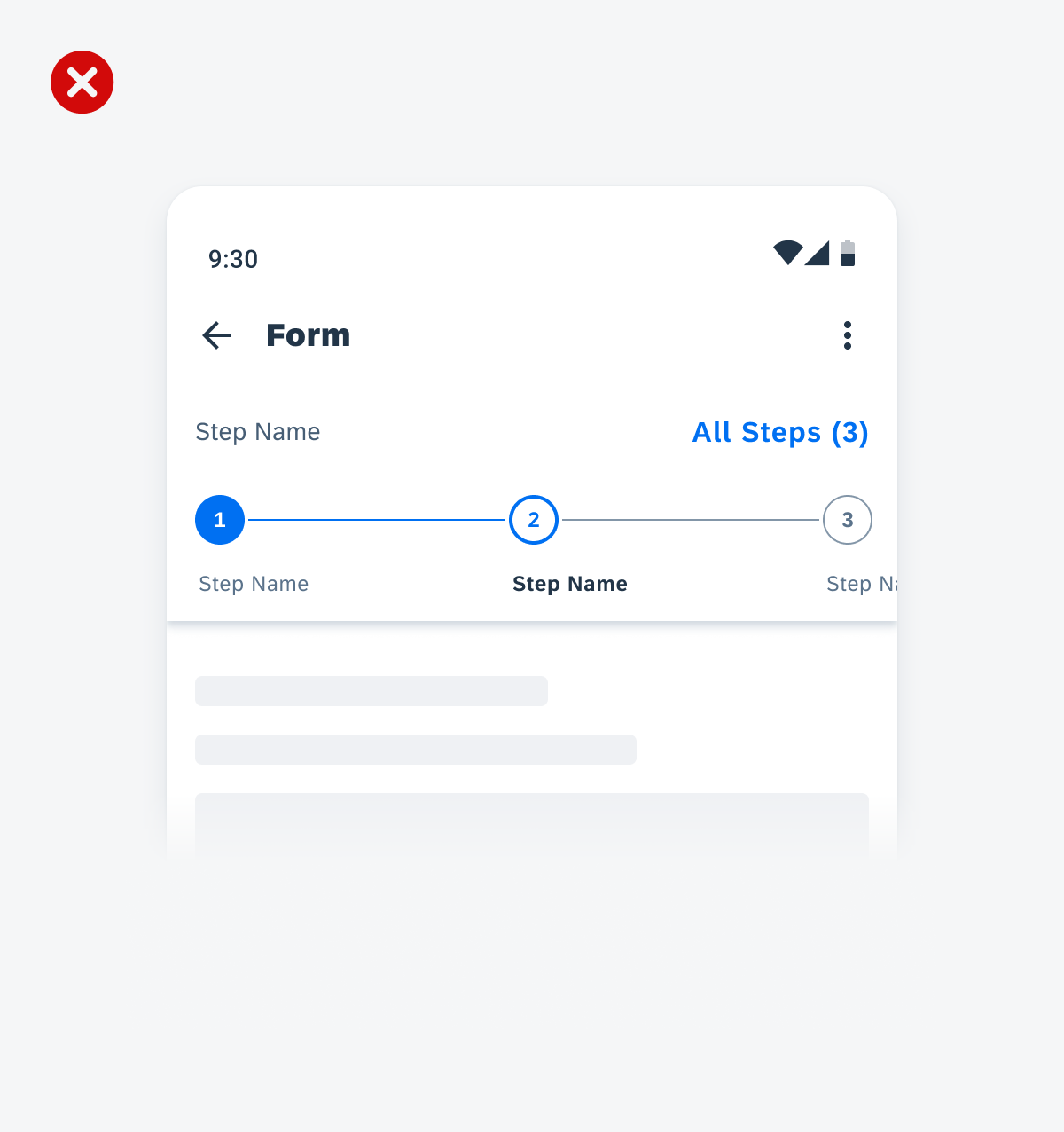
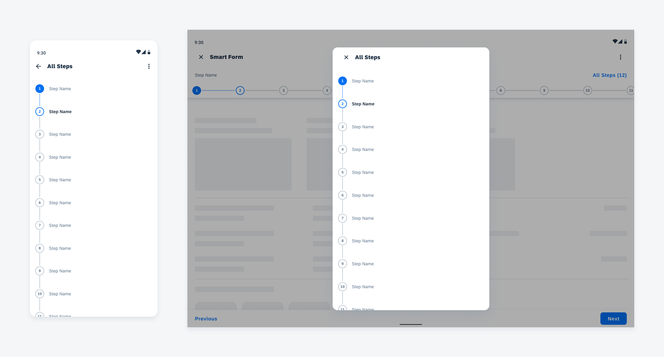
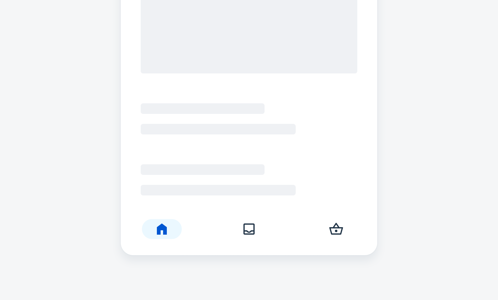
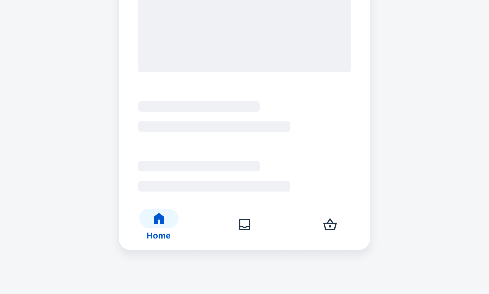
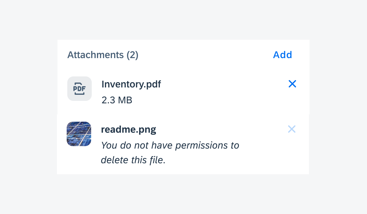
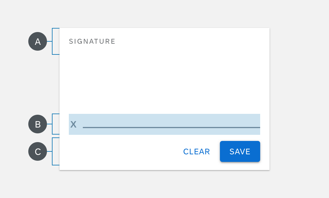
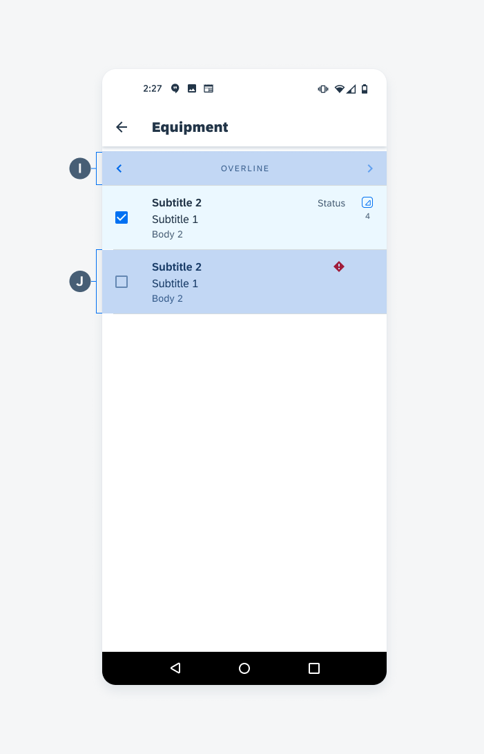
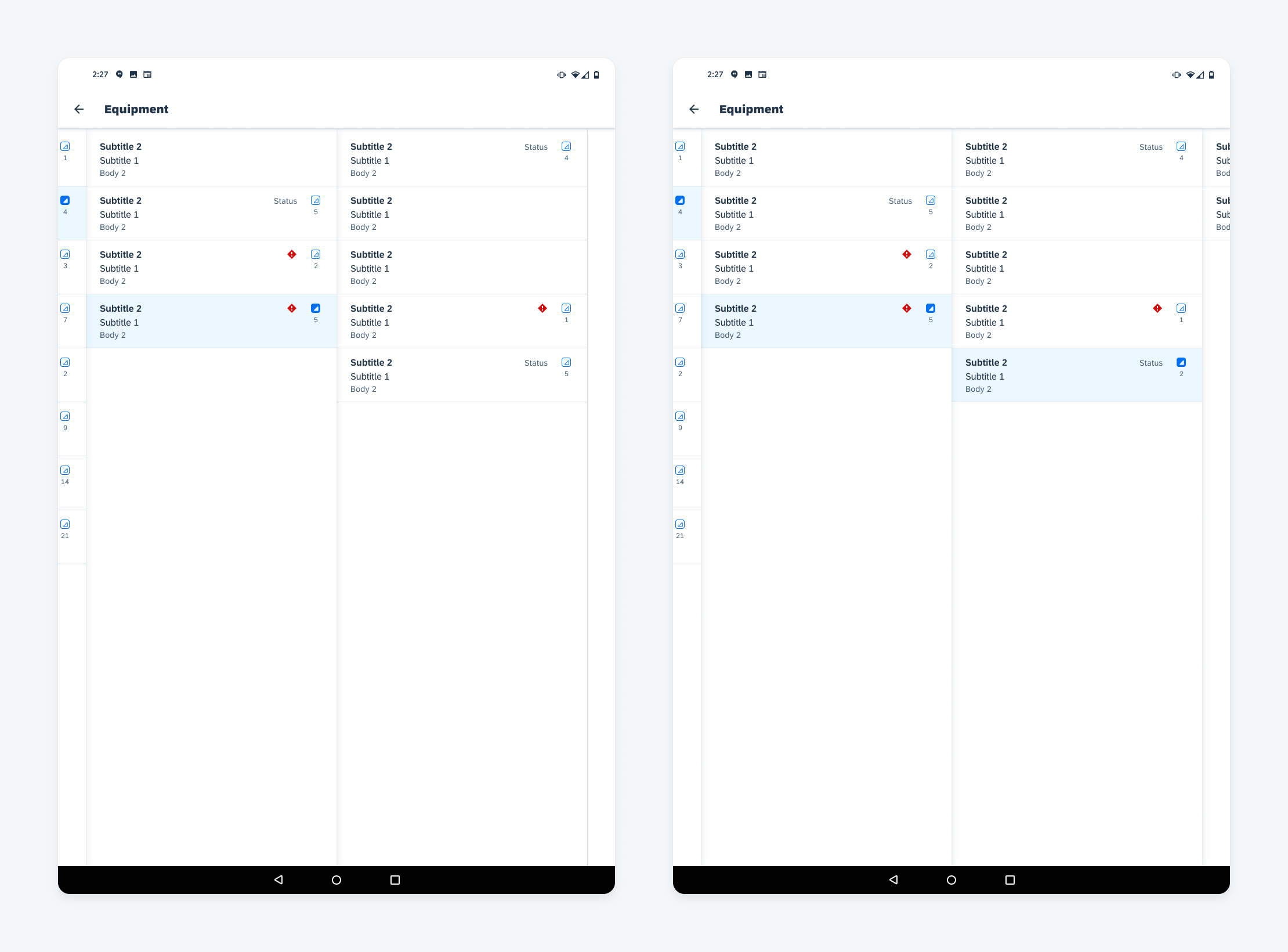
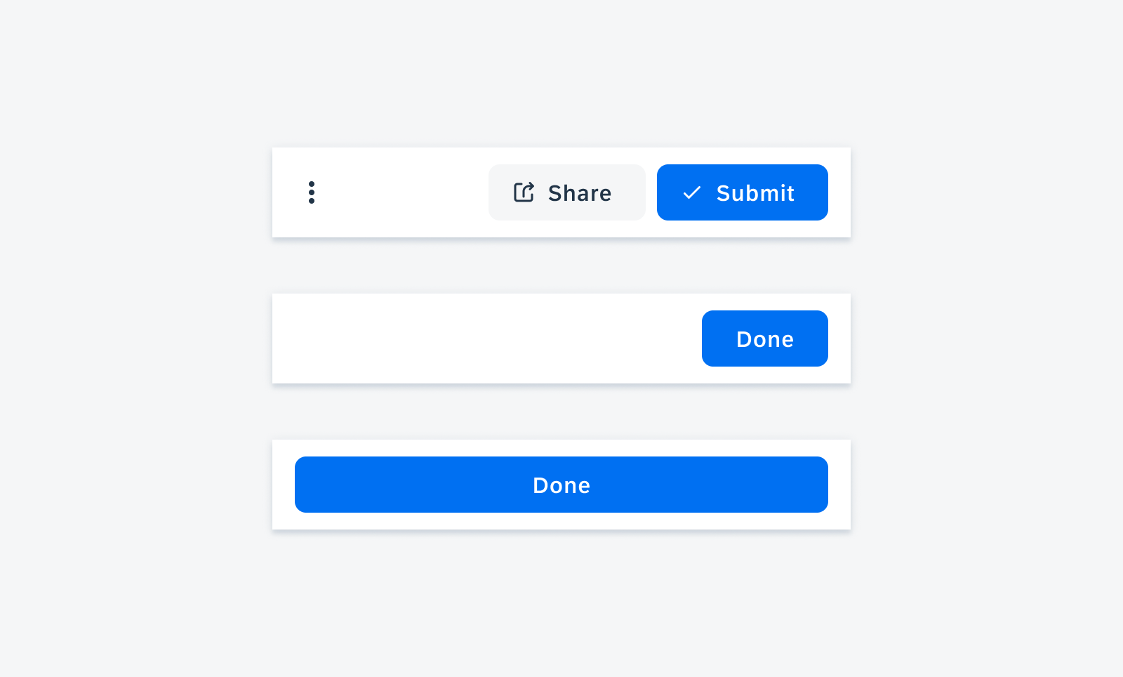
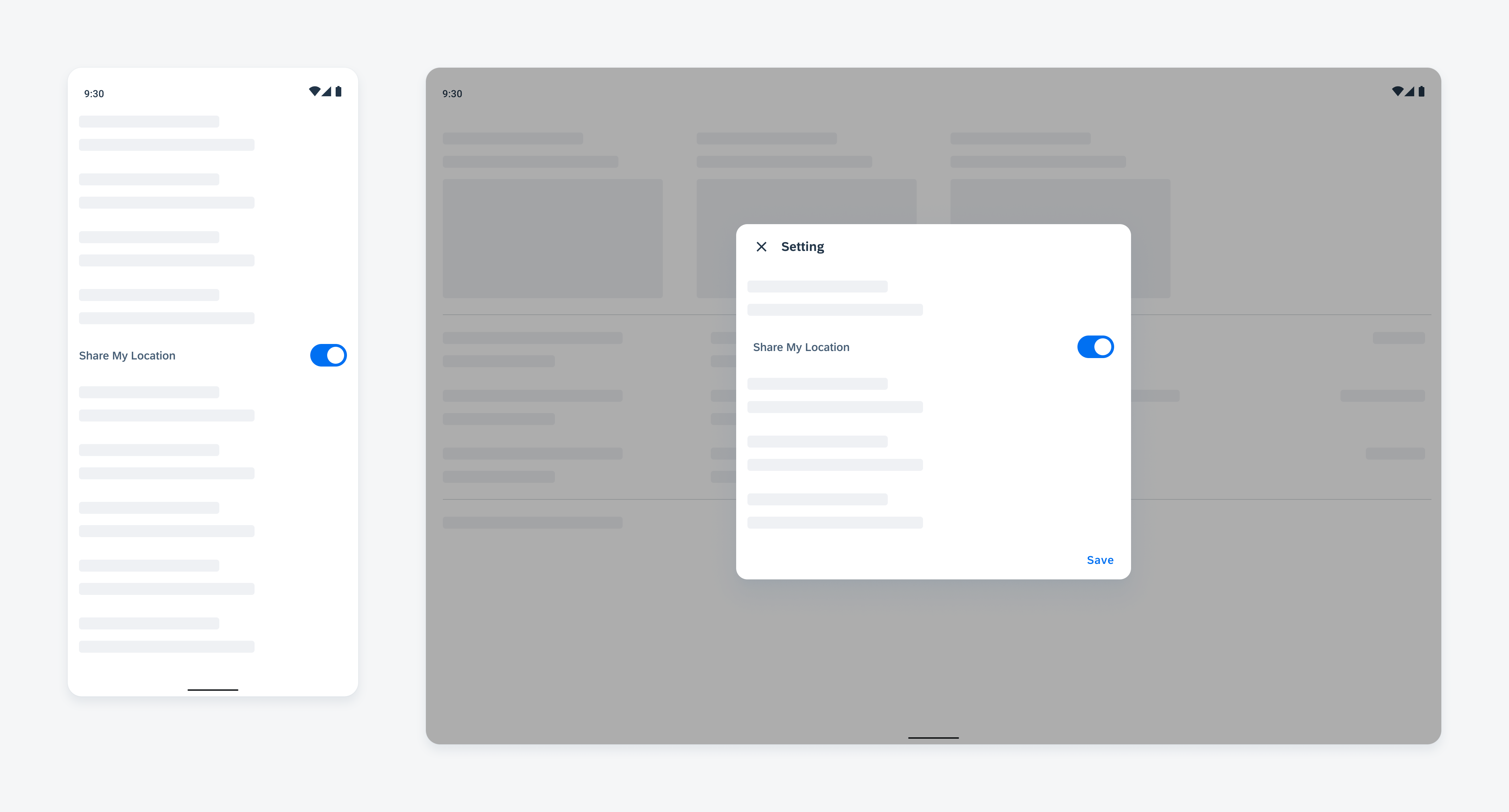
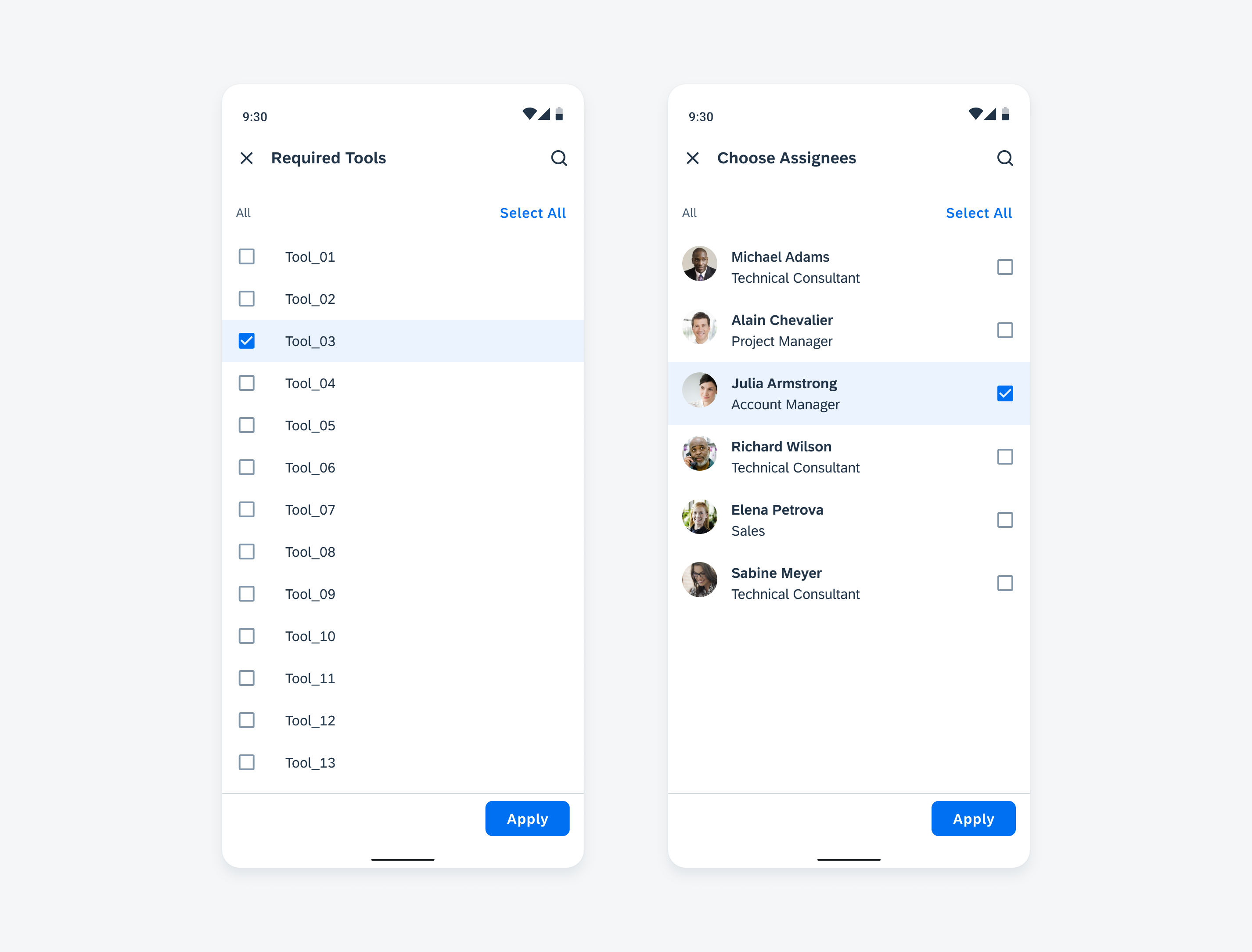
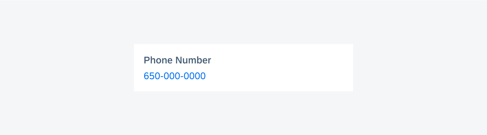
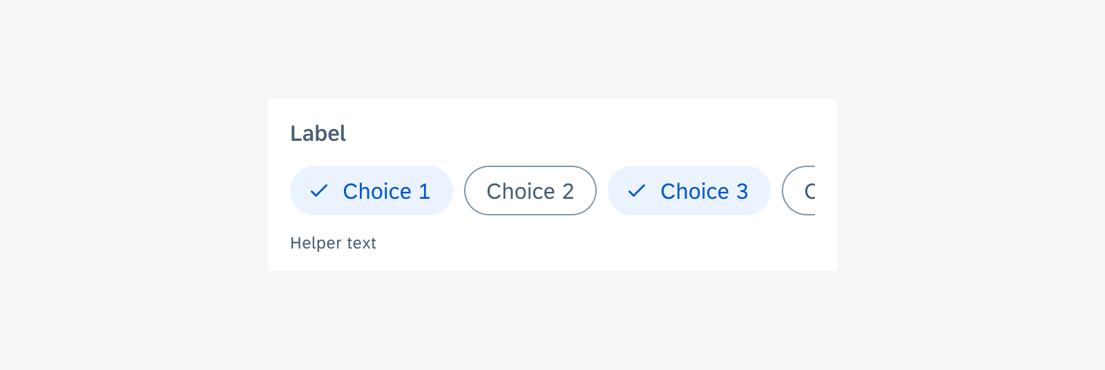
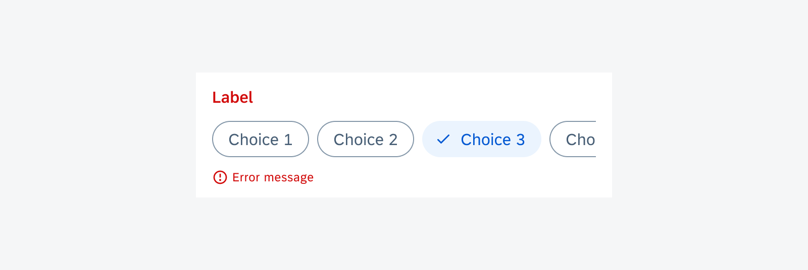
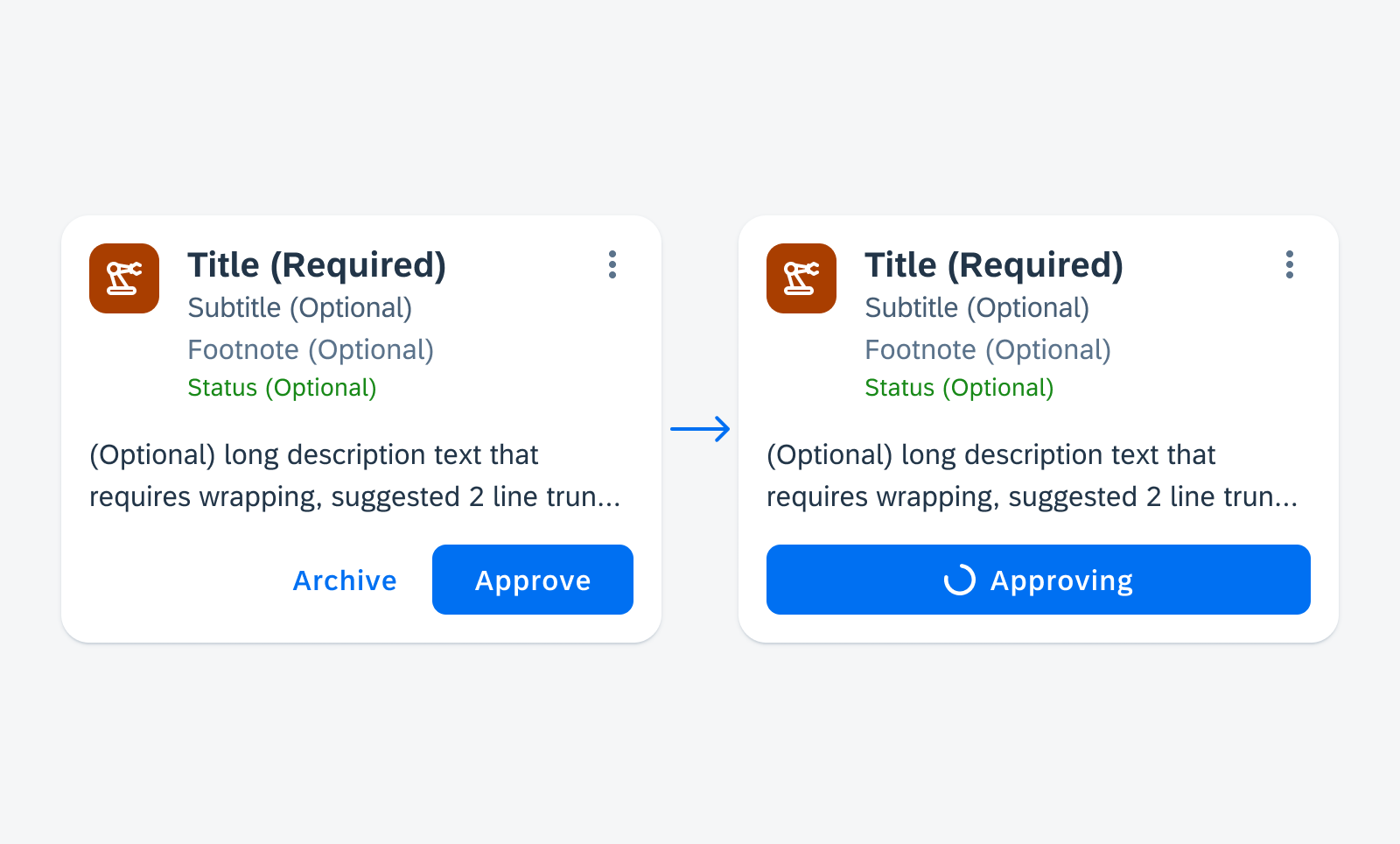
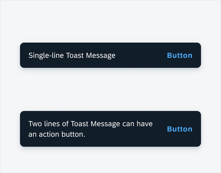
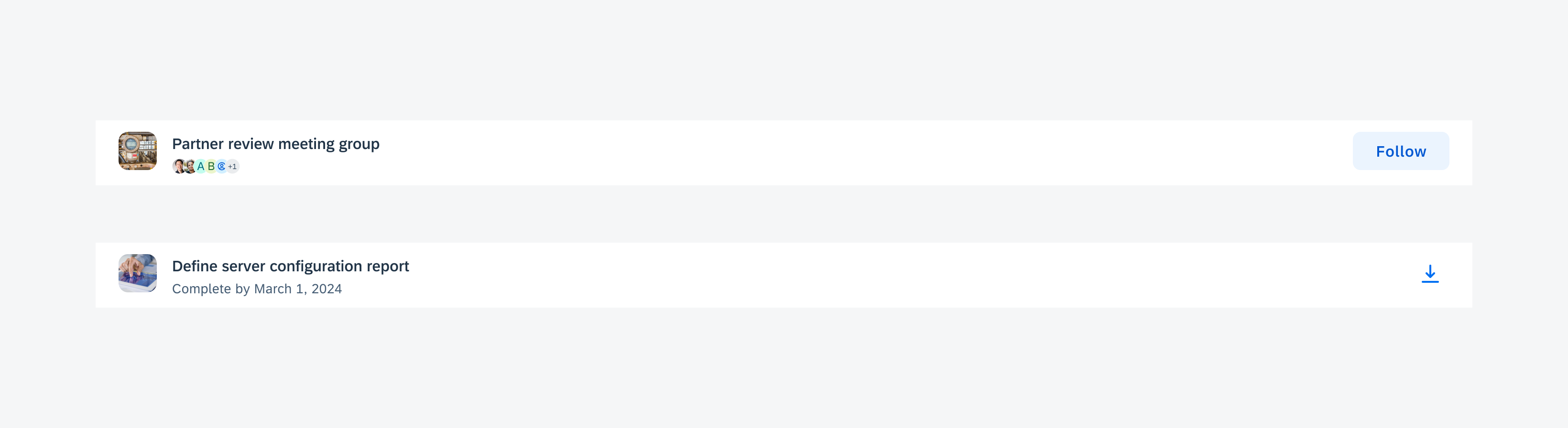
Clear
Tapping the “Clear All” button removes all messages displayed in the bottom sheet.
Tapping the “Clear” button in a section header removes only the messages within that specific section.
“Clear” button in a section header that removes the messages specific to that section
Resources
SAP Fiori for iOS: Error Handling
Related Components/Patterns: Banner, Bottom Sheet, Header, Filter Feedback Bar, Object Cell


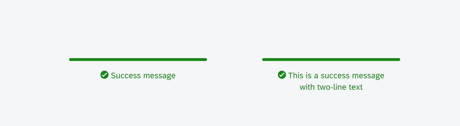
 Your feedback has been sent to the SAP Fiori design team.