
Card Header
FUICardMainHeaderView, FUICardExtHeaderView
Intro
The card header is the uppermost part of the card that provides important information about the card and its related content on the detail page. The optional card header allows for a quick overview of key information, such as a title, subtitle, or status of the card.
Card header examples
When using the card header, only include essential information about the card’s content. The card system offers various components for this purpose. Consider the following aspects when using the card header:
- In the main header, only include a title, subtitle, thumbnail, icon stack, symbol button, and/or a counter.
- In the extended header, only include label items, status, rating controls, tags, text, and/or a KPI.
- For the main header, use a maximum of three rows.
- For the extended header, use a maximum of three rows.
- Use only a symbol button within the card header that directly impacts the card, for example, to favorite, bookmark, or filter the card.
- Make sure that the title on the header image has a good contrast to the image. For example, use a white title on a darker image and a black title on a lighter image.
- Maintain consistent positioning of the components in the card header throughout the app. For example, if one card header contains tags in the first line, all the other cards in your app should have them too.
- Use the counter only if the card body includes list components such as object cells or contact cells.
- Don’t overcrowd the card header with too many elements.
- Don’t place other components, such as a chart or a calendar component, in the card header. Use the card body instead.
- Don’t use the card header to provide more detailed information on the card, use the card body instead.
- Don’t add more than three rows to the main header.
- Don’t add more than three rows to the extended header.

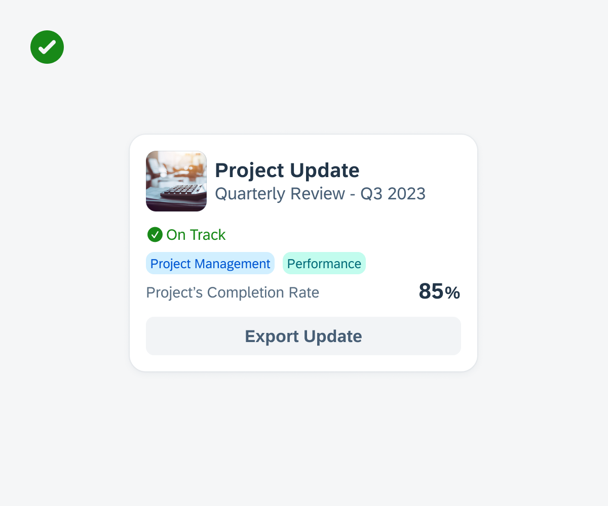
Cards with good title contrast on image

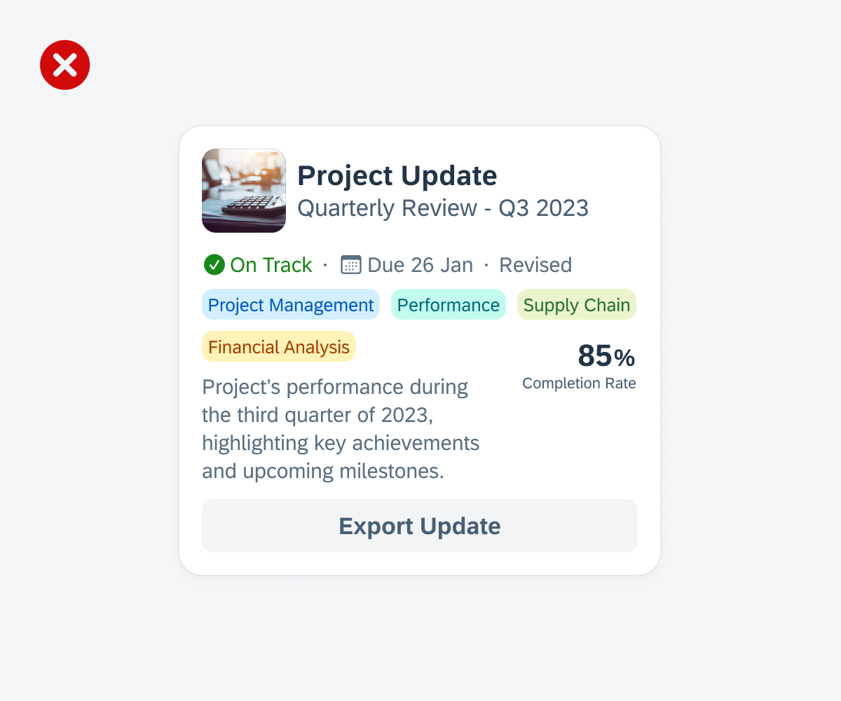
Cards with bad title contrast on image
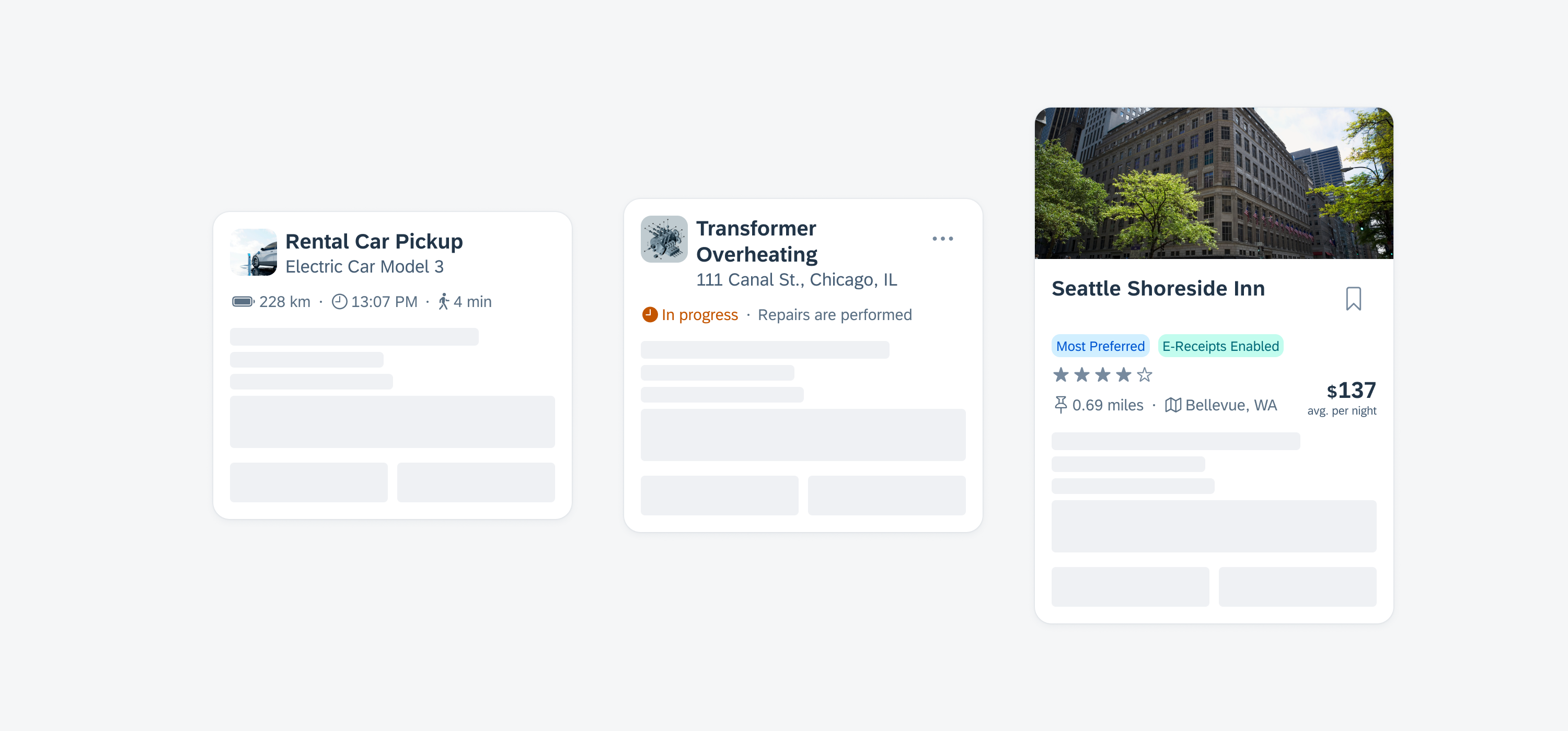
Card with well-balanced content in card header
Card with too many elements in card header
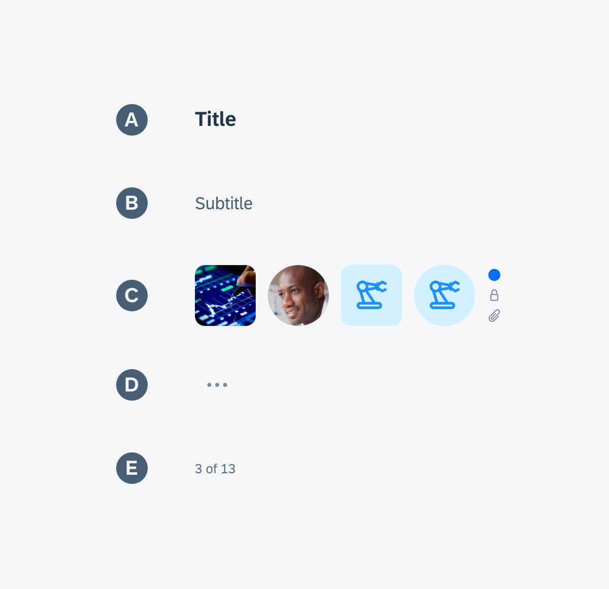
A. Header Container
The header container is the element that holds the header image, main header, and extended header of the card.
B. Header Image (Media)
The header image, also known as “media” in the SDK, is an optional decorative element that allows you to include an image that matches the card context.
C. Main Header
The main header contains essential information about the card, such as a title, subtitle, thumbnail, icon stack, symbol button, and/or a counter. However, these elements, including the main header itself, are optional components.
D. Extended Header
The extended header contains additional elements that provide more information. These elements can be labels, status, rating controls, tags, text, and/or a numeric value in the form of a KPI. You can also combine content within one line, for example, a rating control followed by a label. To visually separate the components, you can add a separator dot between them.
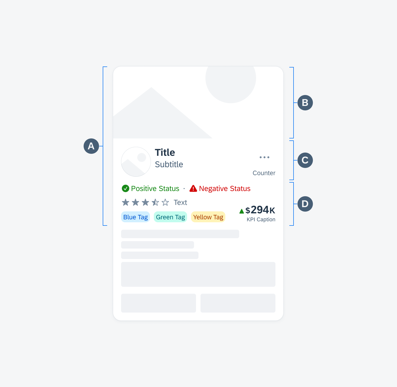
Card header anatomy
Main Header Components
All components in the main header are optional, including the title. If there is already a title in the header image, it is not recommended to duplicate it or use it for other information in the main header. The following components can be placed in the main header:
A. Title
B. Subtitle
C. Left Accessory
D. Symbol Button
E. Text with Counter
Main header components
Extended Header Components
Every element in the extended header is optional. To maintain consistency, it’s advisable to arrange the components in the same order across different rows. For instance, if your card includes a status in the first row, it’s recommended to place the status in the same position for other cards throughout your app. You can also have different components within one line. The following components can be placed in the extended header:
A. Label Items
B. Statuses (Status Row)
C. Rating Control
D. Tags (Tag Bar)
E. Text
F. KPI (Variant for Cards)
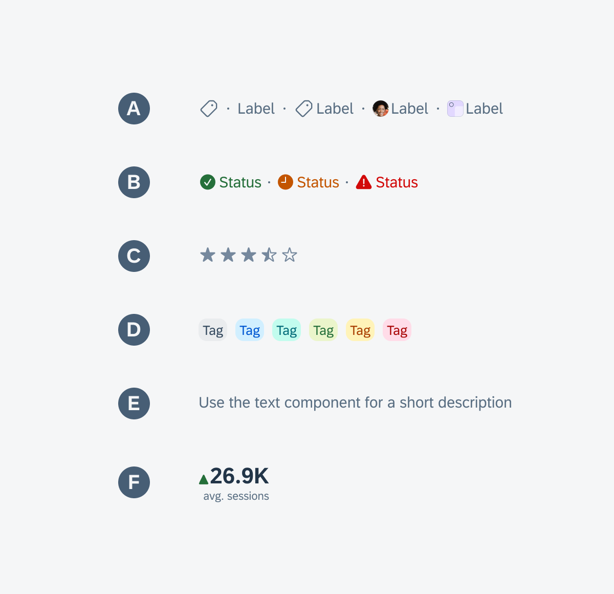
Extended header components
Overflow Menu
Tapping the overflow button opens a menu with host actions that directly impact the card, such as hiding the card. To close the menu, users can tap anywhere on the card or tap the overflow icon again.
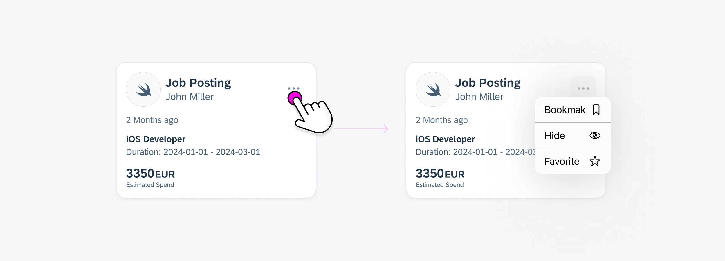
Overflow menu interaction
Action Button
If a card only requires one specific action instead of multiple actions, you can choose to directly place the corresponding icon button on the card. This eliminates the need for the overflow menu.
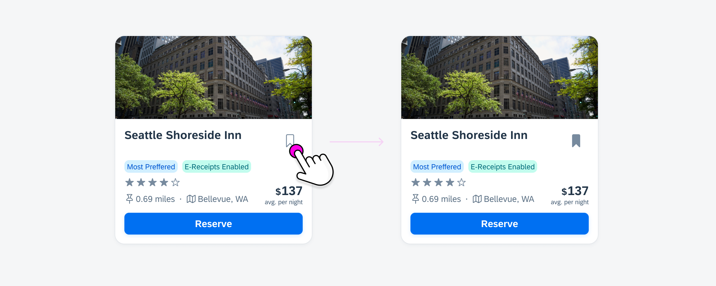
Bookmark interaction
Development: FUICardMainHeaderView, FUICardExtHeaderView
SAP Fiori for Android: Card Header
Related Components/Patterns: Cards Overview, Card Body, Card Footer
 Your feedback has been sent to the SAP Fiori design team.