Slider Form Cell
FUISliderFormCell
Intro
A slider form cell displays a continuous range of values along a track.
With defined minimum and maximum values, a user can use their finger to slide the handle along the slider’s track to select a value between the set minimum and maximum values. A slider form cell is typically found in create and filter modals.
A slider form cell is best used when selecting a precise value that does not matter. If the exact value does matter, we recommend using a picker control.
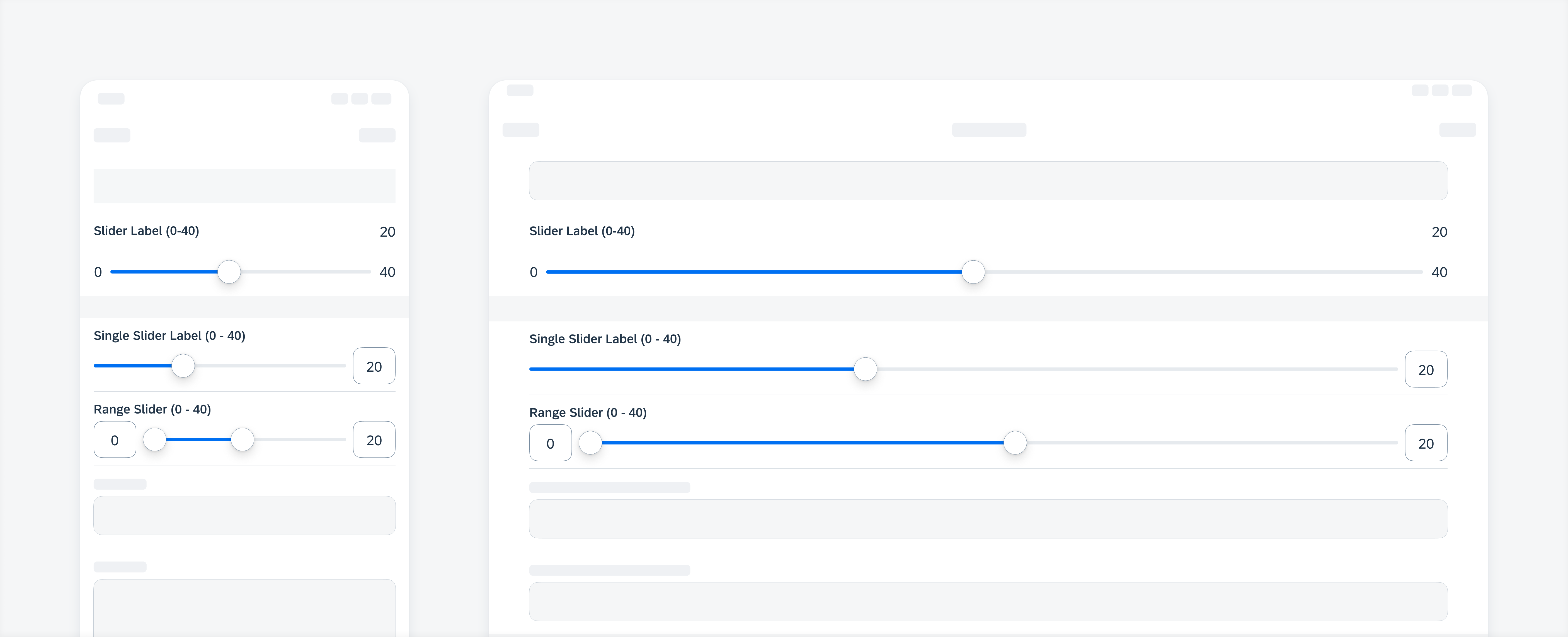
Compact width slider, single slider, range slider (top to bottom) on iPhone (left), regular full-width on iPad (right)
A. Label
Describes the value range of the slider.
B. Slider
Displays the default minimum and maximum values of a slider form cell based on the context and use within the app, while also indicating the selected value.
C. Hint Text (Optional)
Provides additional information about the slider form cell.
D. Handle
Allows users to drag or position said handle to select and indicate the chosen value.
E. Track
Indicates the range of values from which a selection can be made. The tinted or blue area highlights the selected section.
Avoid using long text for minimum and maximum values as they can shorten the track.
F. Value Input Field
Indicates the selected value.
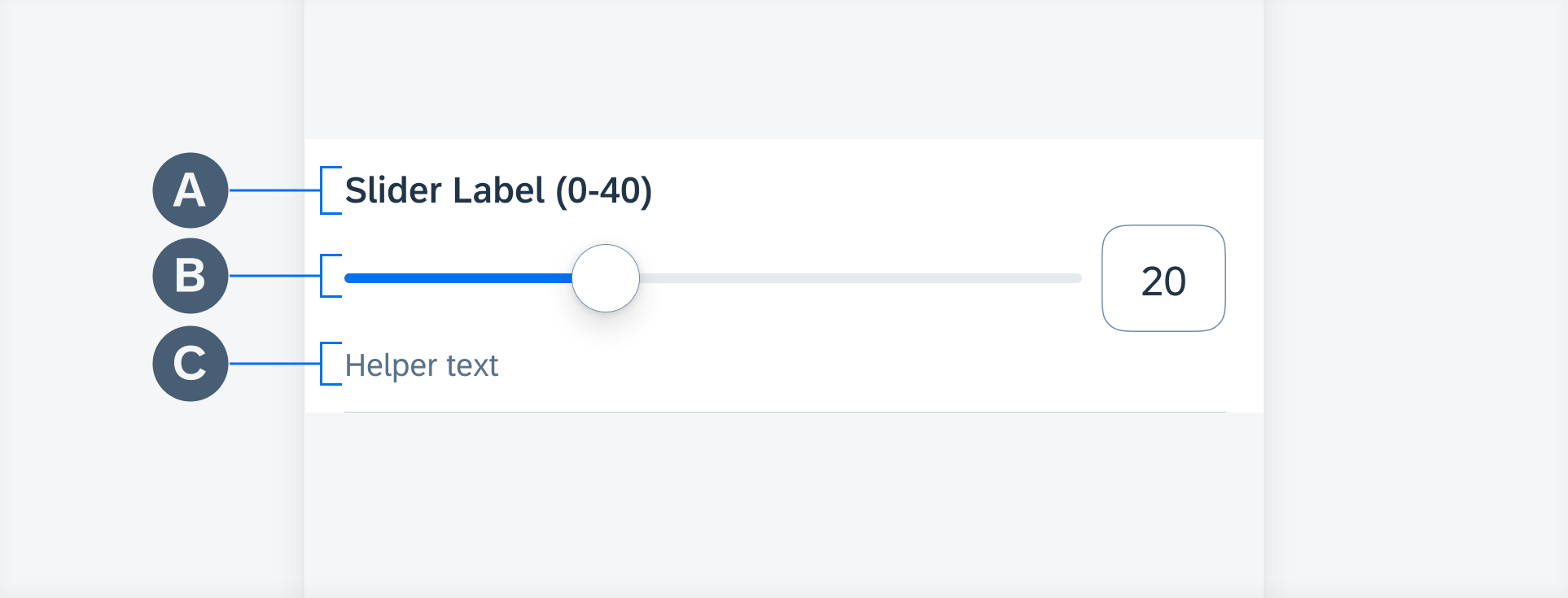
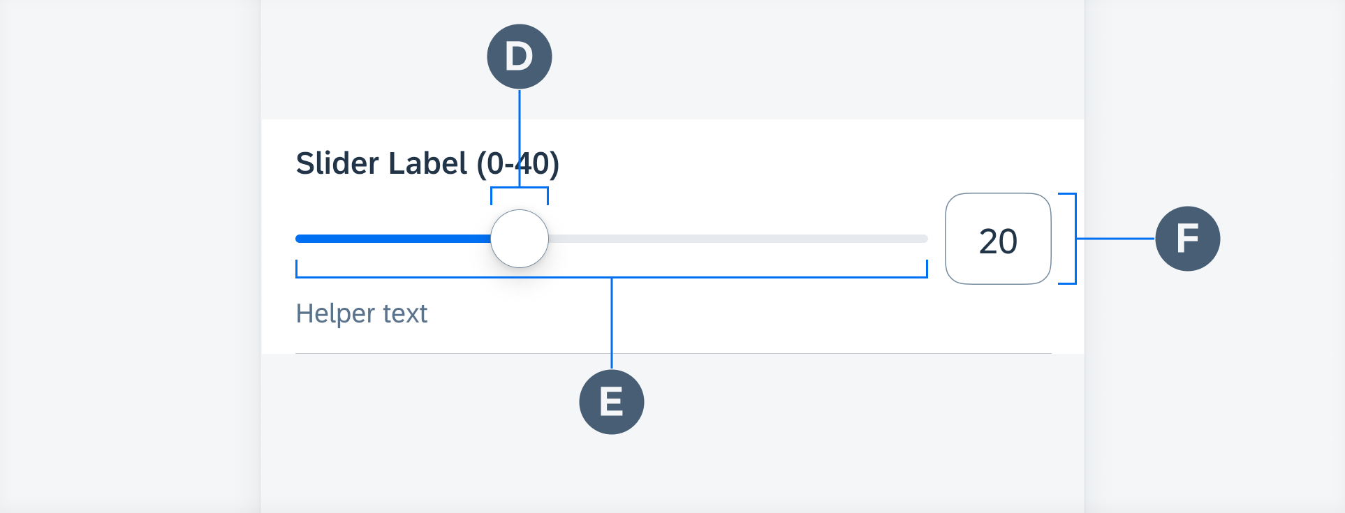
Slider form cell anatomy
A user may also tap on the value input field to open up the keyboard and enter an exact value between the minimum and maximum values.
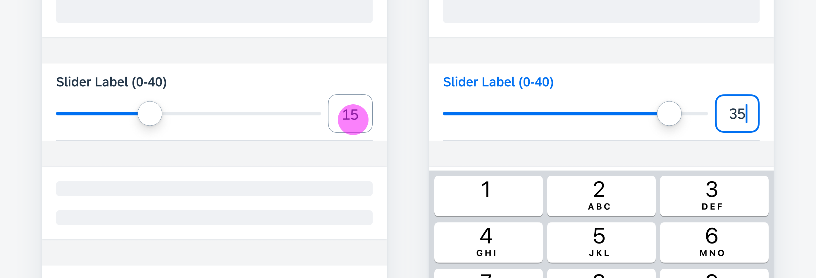
Tapping the value input field to trigger keyboard
Slider
A slider variation allows the user to select a single value between a set range of minimum and maximum.
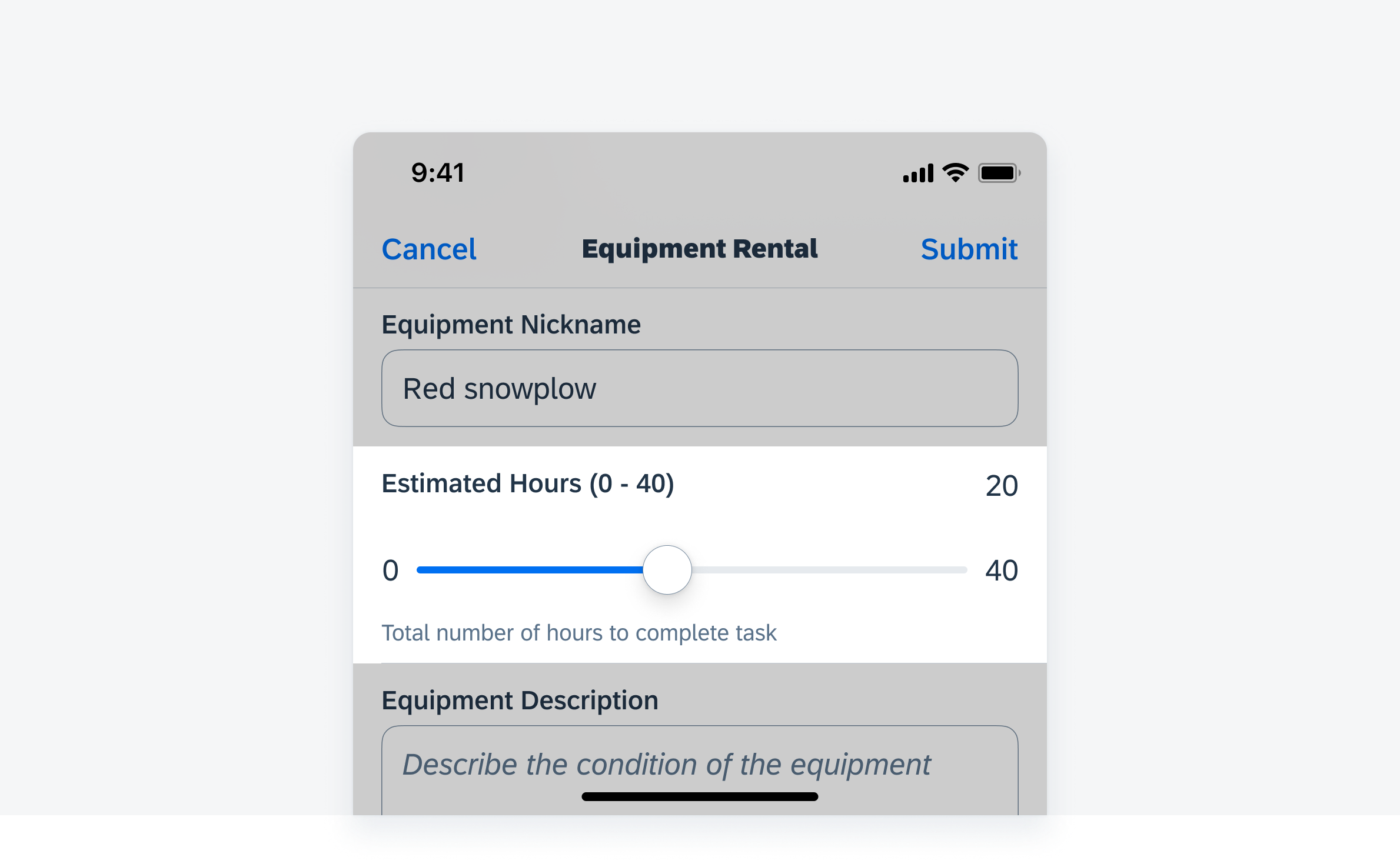
Slider form cell variation
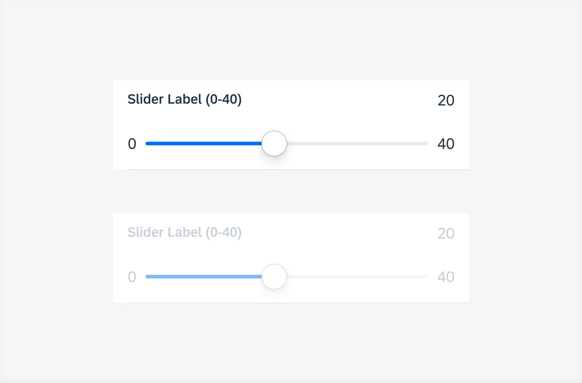
Slider states (top to bottom) – default, disabled
Single Slider
A single slider variation allows the user to select a single value between a given range of values.
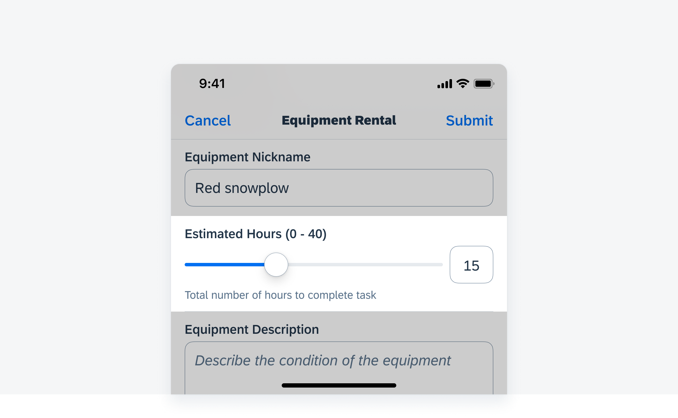
Single slider form cell variation
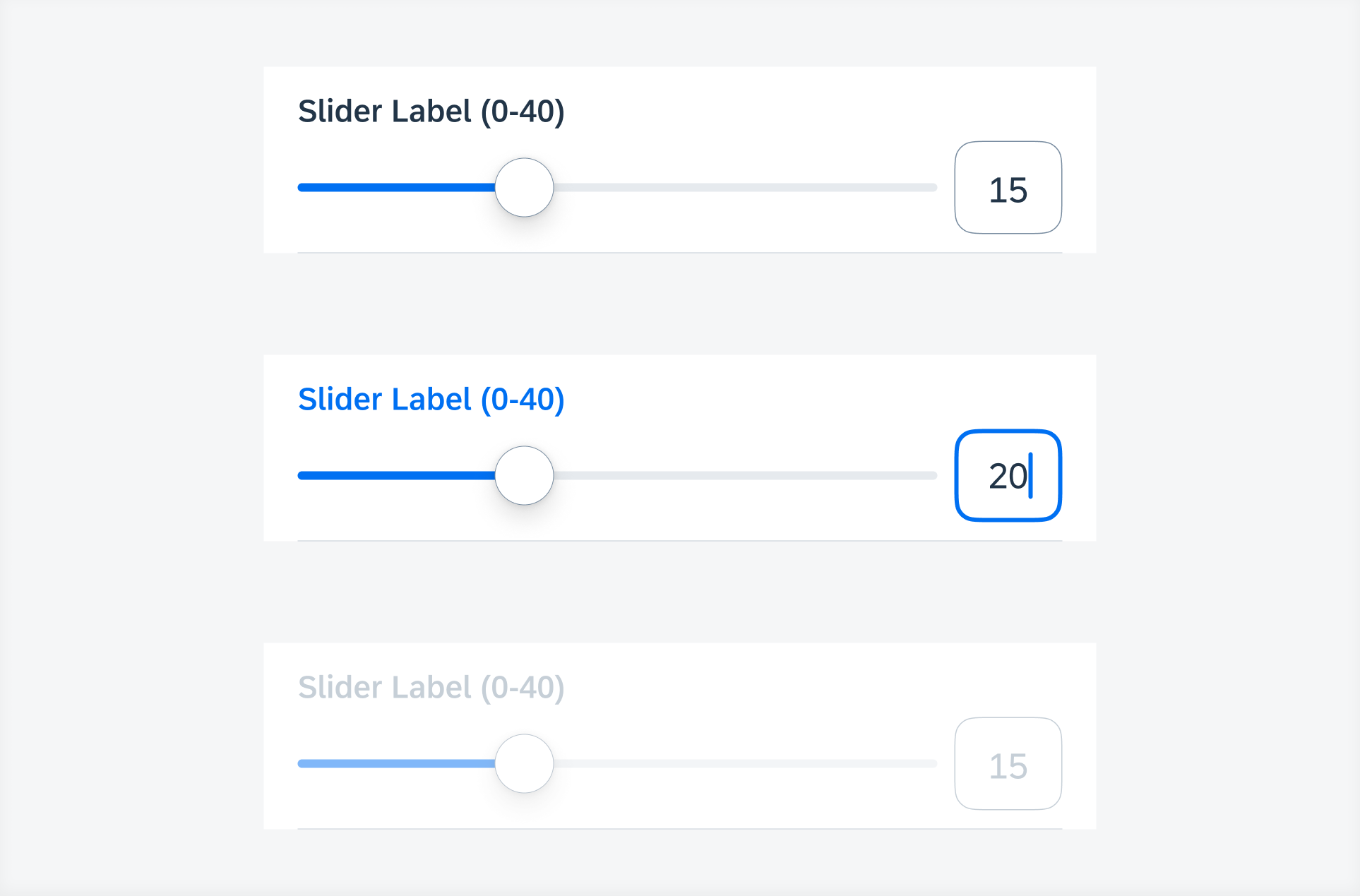
Single slider states (top to bottom) – default, typing, disabled
Range Slider
A range slider variation allows the user to select a range of values between a given range of values.
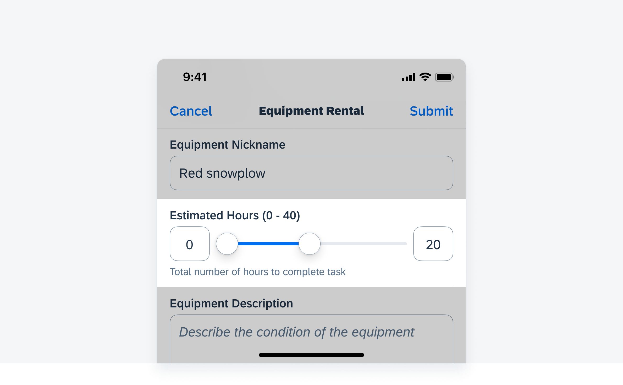
Range slider form cell variation
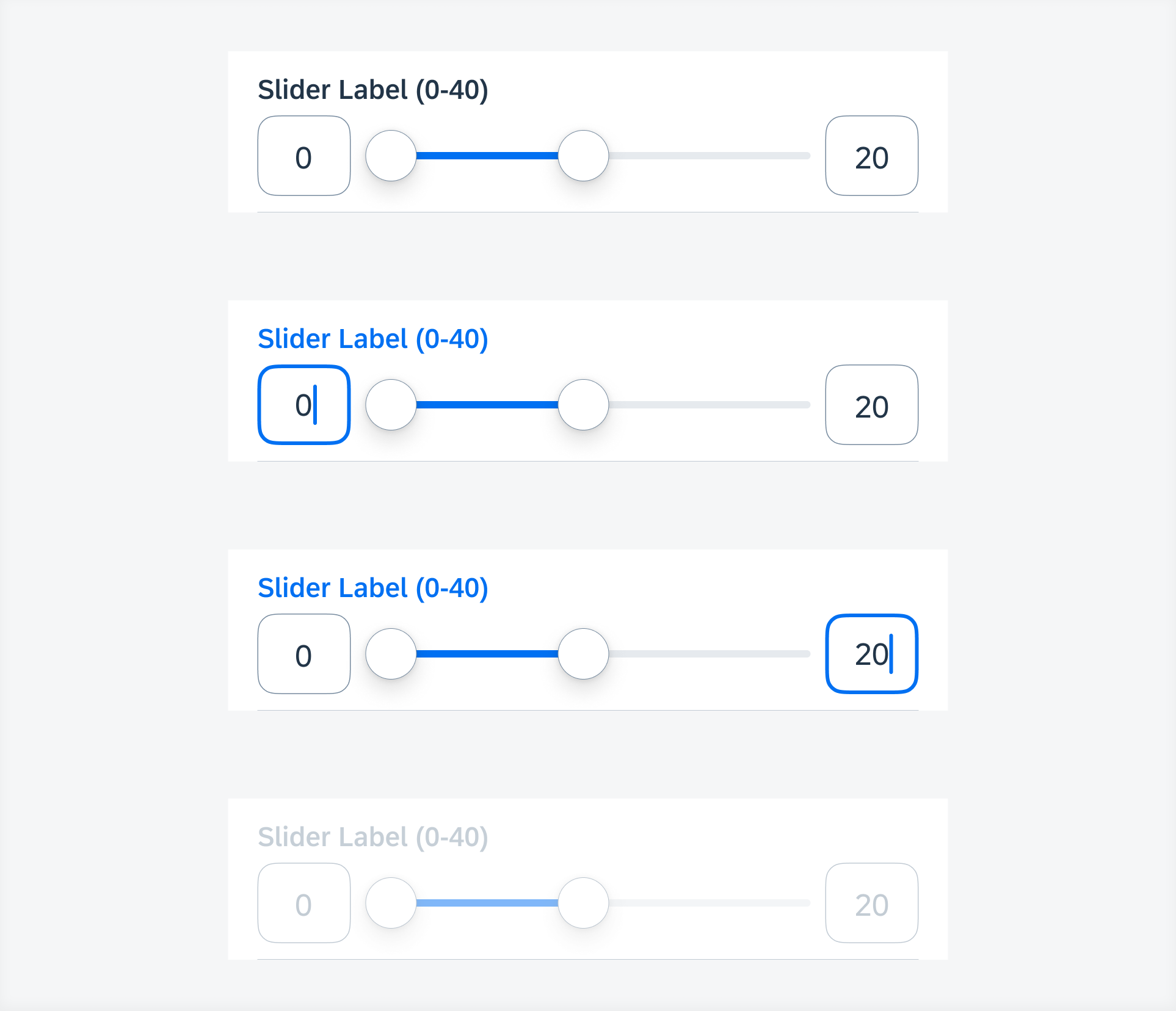
Range slider states (top to bottom) – default, typing (min.), typing (max.), disabled
Development: FUISliderFormCell, FUIRangeSliderFormCell
SAP Fiori for Android: Slider


 Your feedback has been sent to the SAP Fiori design team.