
Consent Forms
FUISinglePageUserConsentForm, FUIMultiPageUserConsentForm
Intro
The consent form pattern is generally used in onboarding scenarios. It stores a digital record of the user’s understanding and permission of the terms of an event, activity, or service that will be performed by the application.
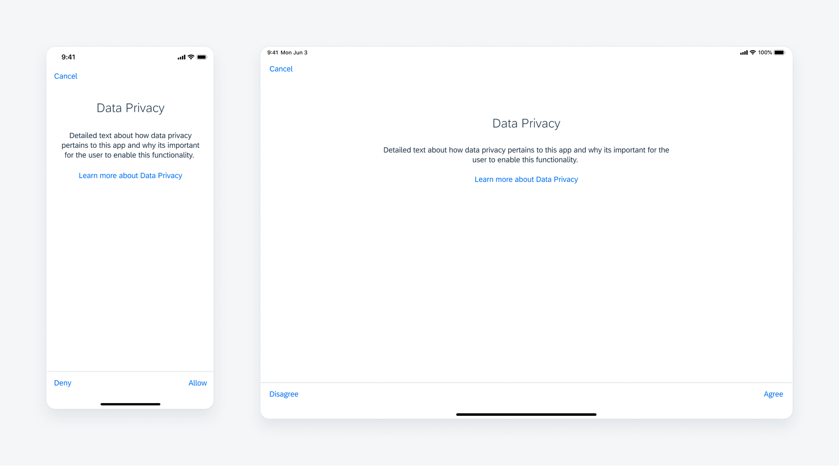
Consent form in compact width (left) and regular width (right)
A. Navigation Bar
The navigation bar contains the consent form action buttons, such as “Cancel”, “Back”, or “Next”.
B. Body Title
The body title should be a concise label that describes the consent form topic.
C. Body Text
The body text should detail how the consent form topic pertains to the app and why it is important for the user to agree to the form.
D. Learn More Link (Optional)
The “Learn More” link gives users more information about the consent form topic.
E. Toolbar with Actions
The toolbar is used for the primary consent form actions.
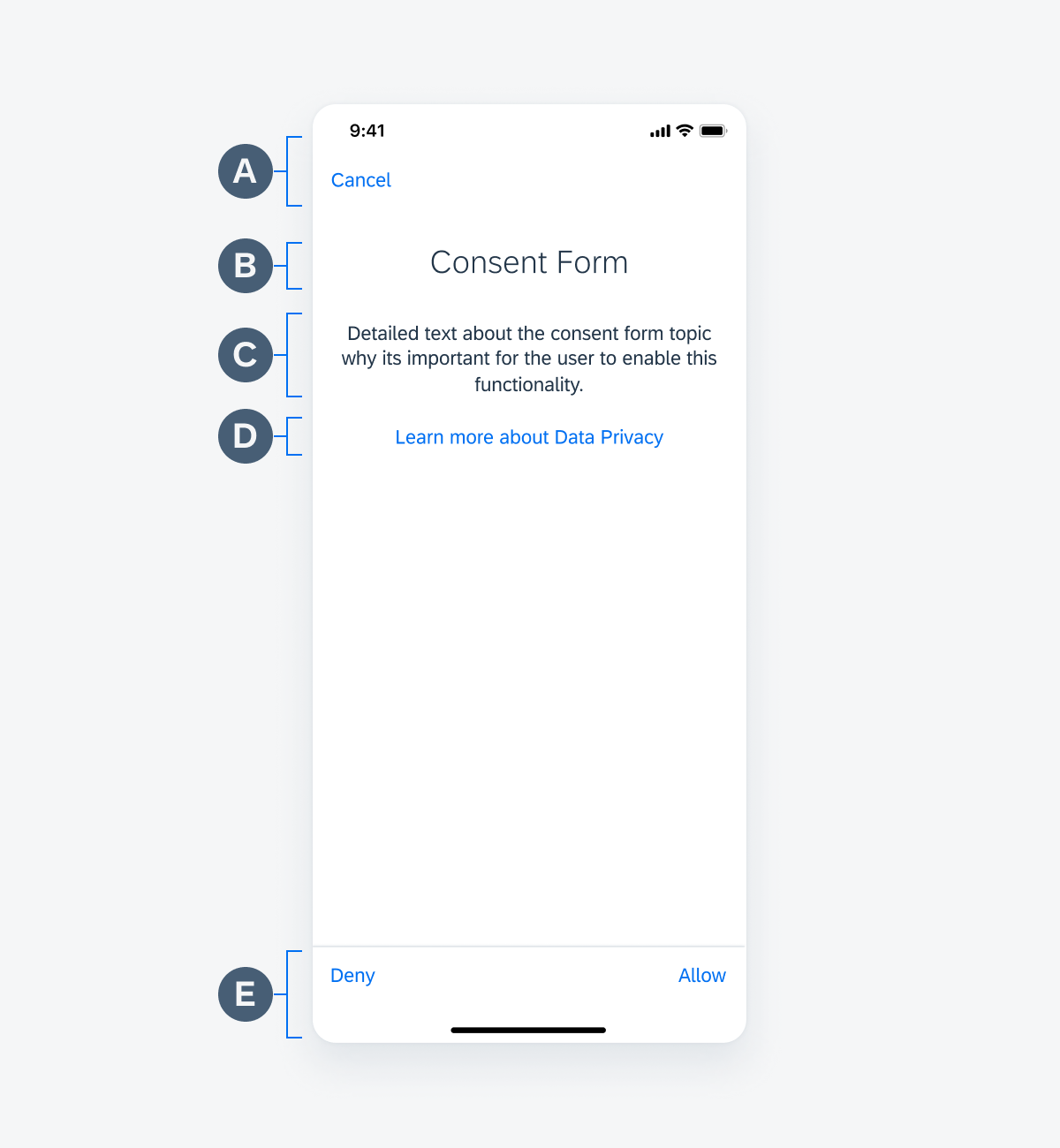
Consent form anatomy
Scroll
By default, the navigation bar or header has the same background color as the screen background. However, when scrolling is enabled, the navigation bar transitions to having a shadow effect on the bottom. This scrolling behavior is applicable to all compact and regular widths as well as any onboarding screen that has a navigation bar that matches colors with the screen view background.
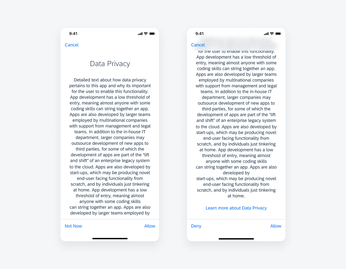
Consent form that has not been scrolled (left) and consent form that has been scrolled (right)
Alerts
The alerts for the consent forms use the standard two-button iOS alert.
Cancel
Optional and mandatory scenarios: if the user taps “Cancel”, they will trigger an alert asking if they want to quit the onboarding process. Choosing “No” will dismiss the alert and continue with the onboarding process.
Deny
Mandatory scenario: if the user taps on “Deny” on a screen that requires consent, they will trigger an alert that says the user must give consent in order to continue with the onboarding process.
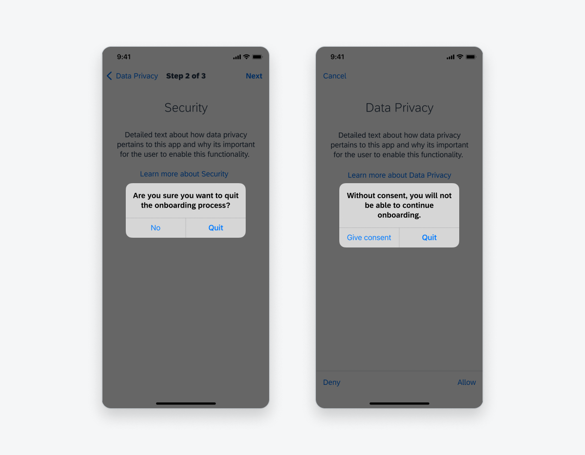
Cancel alert (left) and deny alert (right)
Sequential
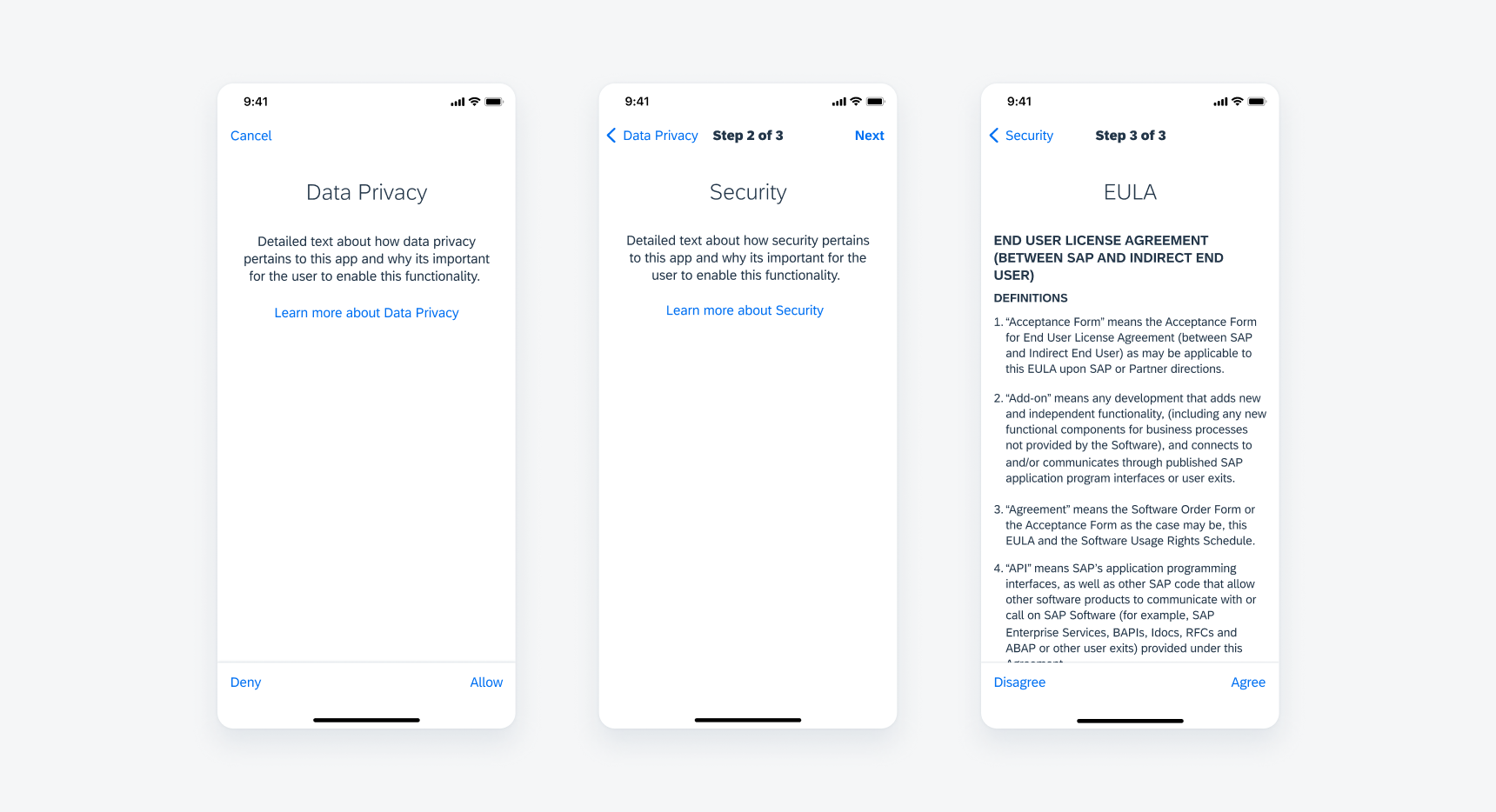
The first step of the sequential form always includes a “Cancel” button in the navigation bar. The first step is a modal that slides up from the bottom of the screen. From step 1, the user must tap “Next” to continue with the next steps.
All subsequent steps have <Back to (Screen Title). They can go back to the previous step by tapping the “Back” navigation in the navigation bar. The following steps are a push. The final step has the toolbar with actions “Not Now” or “Deny” and “Allow”. When the last step is complete, the modal is dismissed and slides down.

Fist step of the sequential form (left), second step (middle) and last step (right)
Form Conditions
Optional
If the user taps on “Not Now” or “Allow”, there is no alert. It simply dismisses the consent form and takes the user to the next step of the onboarding process.
Mandatory
If the user taps on “Deny”, they get an alert saying they must give consent to continue. Tapping “Allow” dismisses the modal and takes them to the next step in the onboarding process.
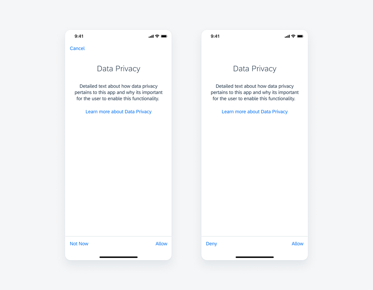
Optional consent form (left) and mandatory consent form (right)
Form Arrangements
Single and sequential forms can be either mandatory or optional. If there are a mix of single and sequential consent forms, the single consent form will be a separate modal and the sequential forms will be presented in a separate modal.
Single
If there are multiple single consent forms, they will all be presented as separate modals (should not be bundled in one modal). There are no titles on the single consent screens.
Sequential
For sequential forms, the navigation bar shows the current and total numbers of the form pages. The action bar doesn’t appear until the user reaches the last page in the form.
Single consent form (left) and sequential consent forms (middle and right)
Development: Onboarding Patterns
Related Components/Patterns: Navigation Bar
 Your feedback has been sent to the SAP Fiori design team.