
Updated: June 16, 2023
Dimension Selector
FUIDimensionSelector
Intro
Do
- Ensure the dimensions of the selector are related to each other.
- Use a dimension selector to switch between views and charts. For example, the dimension selector can be used as a chart time range filter.
- Use the dimension selector in a chart, navigation bar, modal window, or popover.
Don't
- Do not use a dimension selector if the dimensions are not related to each other.
- Do not use a dimension selector to narrow a list. Use a filter instead.
- Do not include more than one dimension selector on the same screen.
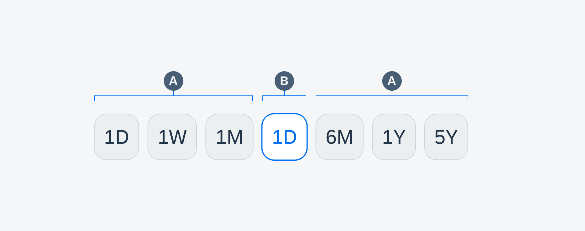
A. Inactive Selector Item
In a dimension selector there is at least one inactive selector item.
B. Active Selector Item
In a dimension selector only one selector item can be active at a time. Tapping on a selected item deselects it.
Dimension selector components
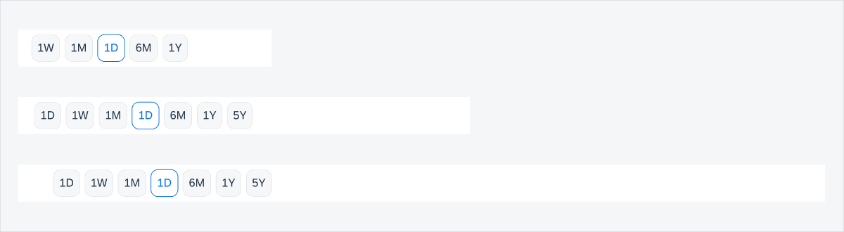
Since the wider buttons are easier to tap, the maximum number of buttons that may appear in a dimension selector is limited to improve usability.
In compact width, we recommend using a maximum of five buttons.
In regular width, we recommend using a maximum of seven buttons.
 Your feedback has been sent to the SAP Fiori design team.