
Chart Content Table View Cell
FUIChartFloorplanTableViewCell
Intro
The chart content table view cell is a full-width view that provides a visual representation of one or more datasets.
This component is designed for when the user needs to view chart data within a workflow in context of a business object, but does not need to drill into individual chart values. This cell does support navigation so users are able to access the chart’s features for more details when needed.
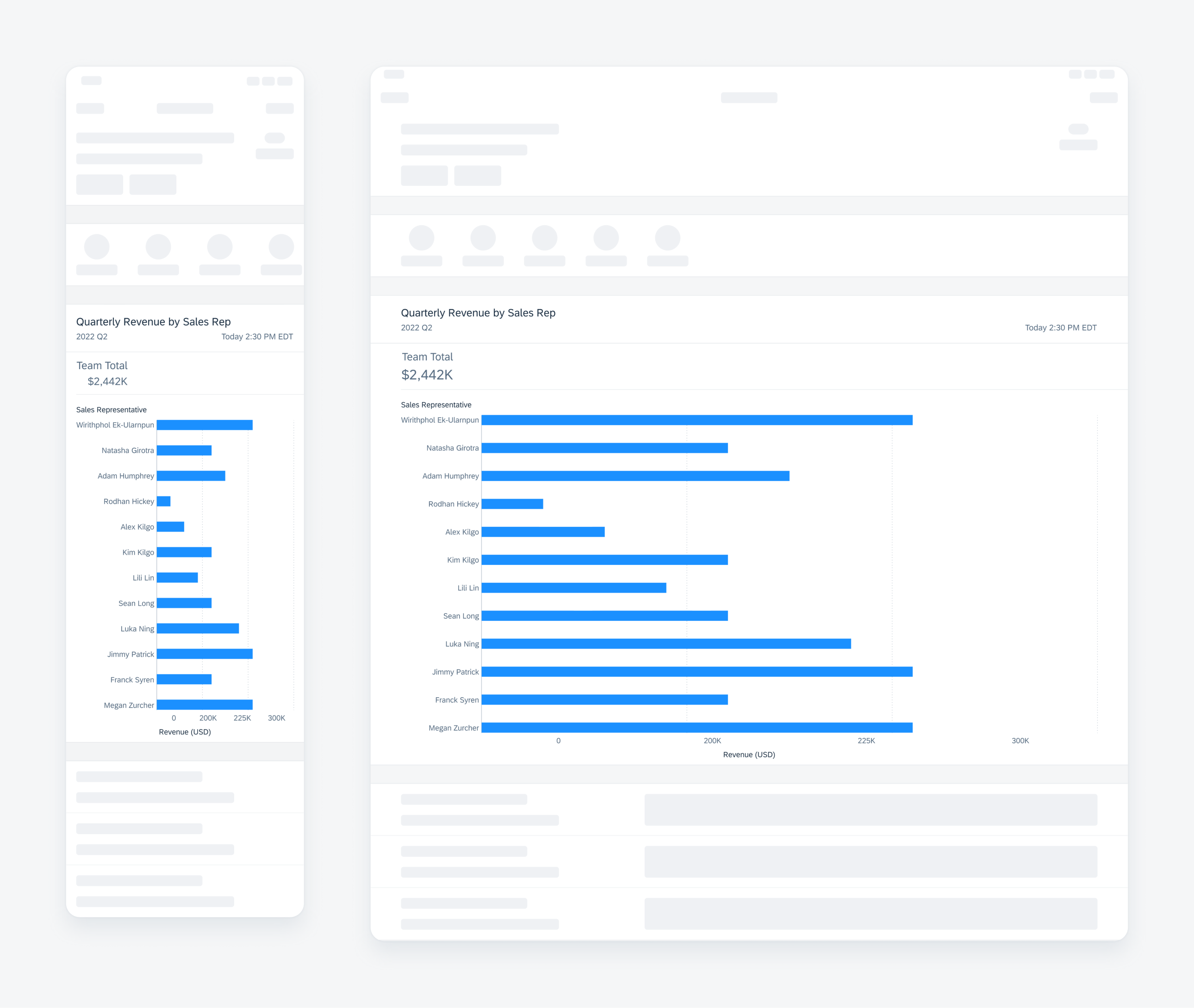
Horizontal bar chart in table view cell on compact (left) and on regular (right)
A. Chart Title
The chart title displays the name of the chart and the series displayed, as well as an optional timestamp.
B. Chart Summary
The chart summary provides high-level details from the chart data, for instance, total sales in dollars ($) for the year.
C. Chart Plot
This is the visual representation of the chart data, and includes chart items, for example, bars, columns, lines, x- and y-axes with titles, axis labels, and gridlines.
If the chart is multi series, then the chart legend should be included at the bottom of the chart plot. The legend explains which colors relate to which data series in the chart plot. For charts with only one series, the legend is not displayed.

Anatomy of bar chart table view cell
Development: FUIChartFloorplanTableViewCell
SAP Fiori for Android: Chart Overview
Related Components/Patterns: Chart Overview
 Your feedback has been sent to the SAP Fiori design team.