
Buttons
FUIButton
Intro
Buttons allow users to perform actions, make decisions or to begin a process. The label of a button communicates the action that it is going to initiate.
Examples of different buttons
Buttons should only be used for actions. Avoid using too many buttons – if users have too many options, it is difficult for them to make a decision.
If you want the user to select one option from a small group or to provide access to specific categories, offer a segmented control instead of a button.
- Use simple buttons for specific actions, such as “Create”, “Edit”, “Save”, “Approve”, “Reject”, “Accept”, “Decline”, “Submit”, “Cancel”.
- Use button labels that are short and meaningful.
- Use commands for all button labels. For example “Save”, “Cancel” or “Edit”.
- Use toggle buttons to activate / deactivate an element or to switch between different state, such as select and selected.
- Use secondary buttons in tint style for positive actions.
- Use secondary buttons in negative style for negative and destructive actions.
- Don’t use green buttons for positive actions.
- Don’t truncate labels in buttons.
A button can consist of a label, a symbol, or a label and a symbol on a filled or unfilled rectangular background with rounded corners.
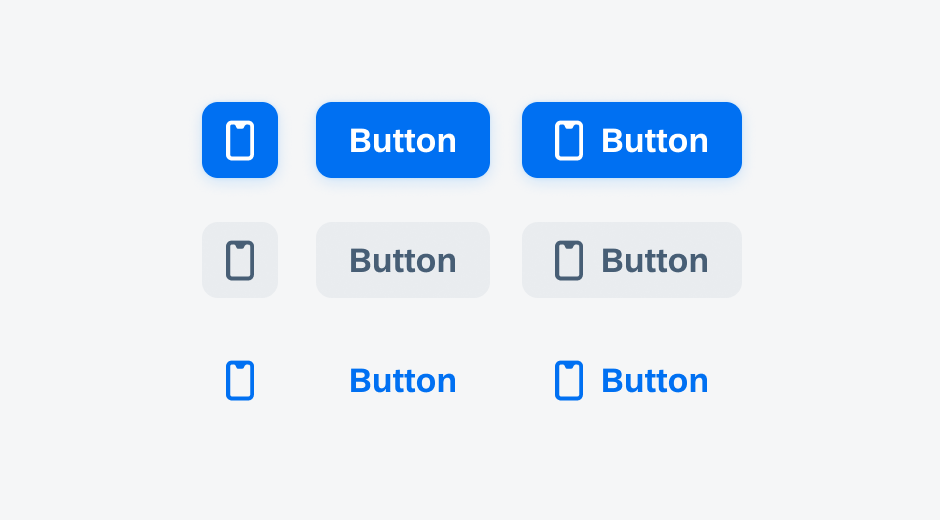
Symbol buttons, label buttons, and label buttons with a symbol
Button States
Buttons have several states that provide feedback on a button’s interaction (see image below).
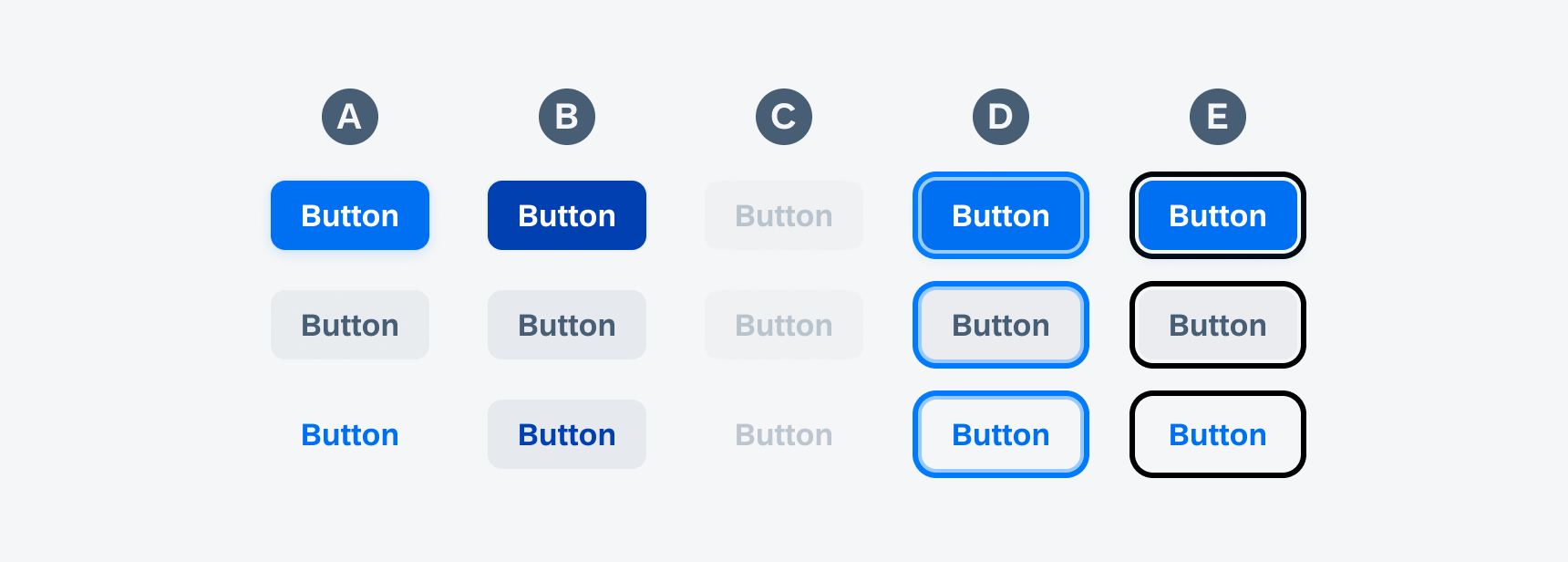
Active, tapped, disabled, keyboard-focused, VoiceOver-focused buttons
A. Active State
Indicates a button’s interactivity.
B. Tap State
Communicates that the button has been pressed.
C. Disabled State
Discloses that the action is available but has been disabled.
D. Keyboard Focus State
Indicates that the button is focused when navigating with a keyboard.
E. VoiceOver Focus State
Indicates that the button is a focus target during VoiceOver interaction.
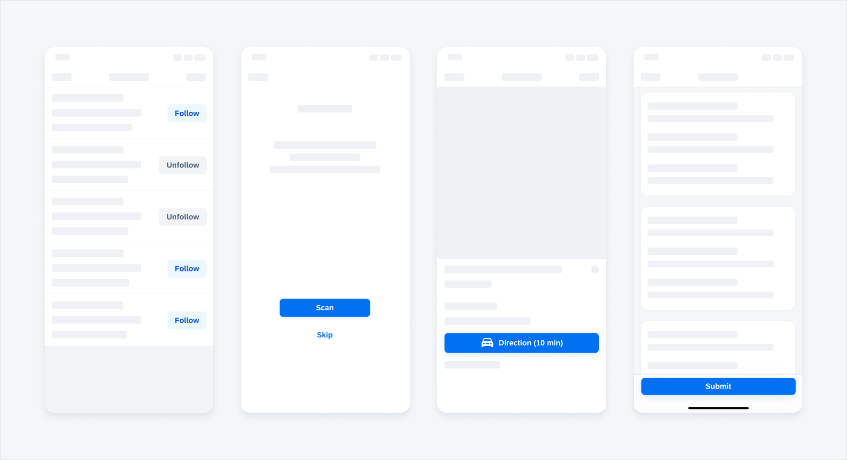
Toggle Button
Toggle buttons change between secondary tint and secondary normal style. These buttons are used when there is a direct action to take on an object that does not require navigation or to switch between different states, such as:
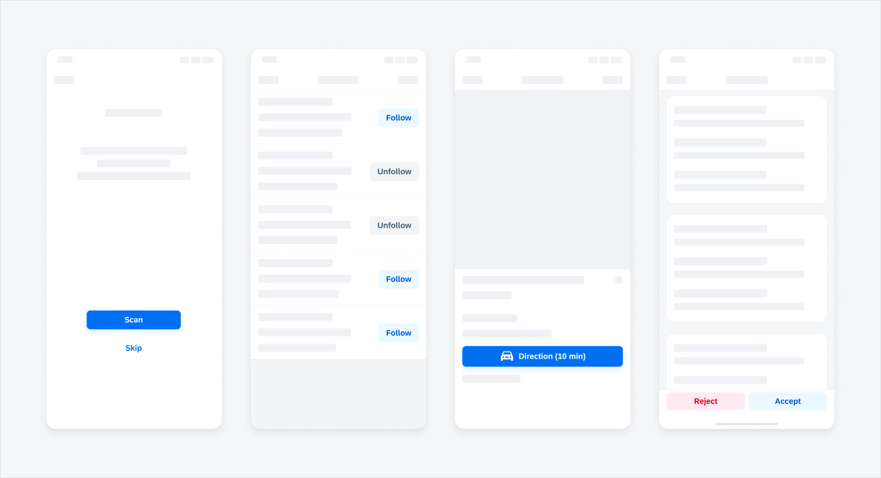
- Follow/Unfollow
- Select/Selected
- Bookmark/Bookmarked
- Favorite/Unfavorite
- Hold/Release
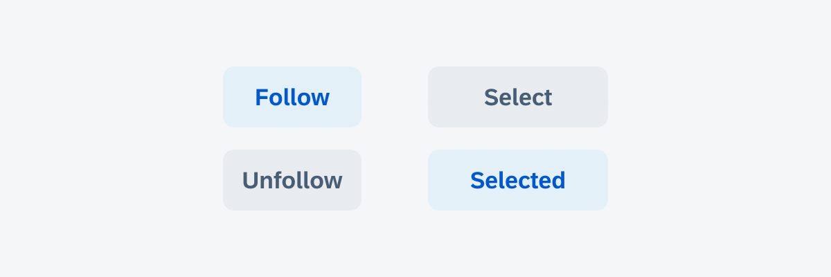
Toggle button behavior examples of "Follow" and "Unfollow" (left) and "Select" and "Selected" (right)
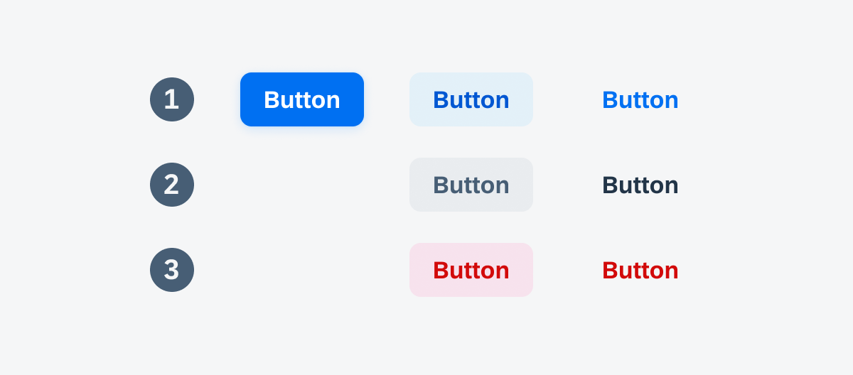
Simple buttons have three different variations based on the priority of each action:
- Primary Button
- Secondary Button
- Tertiary Button
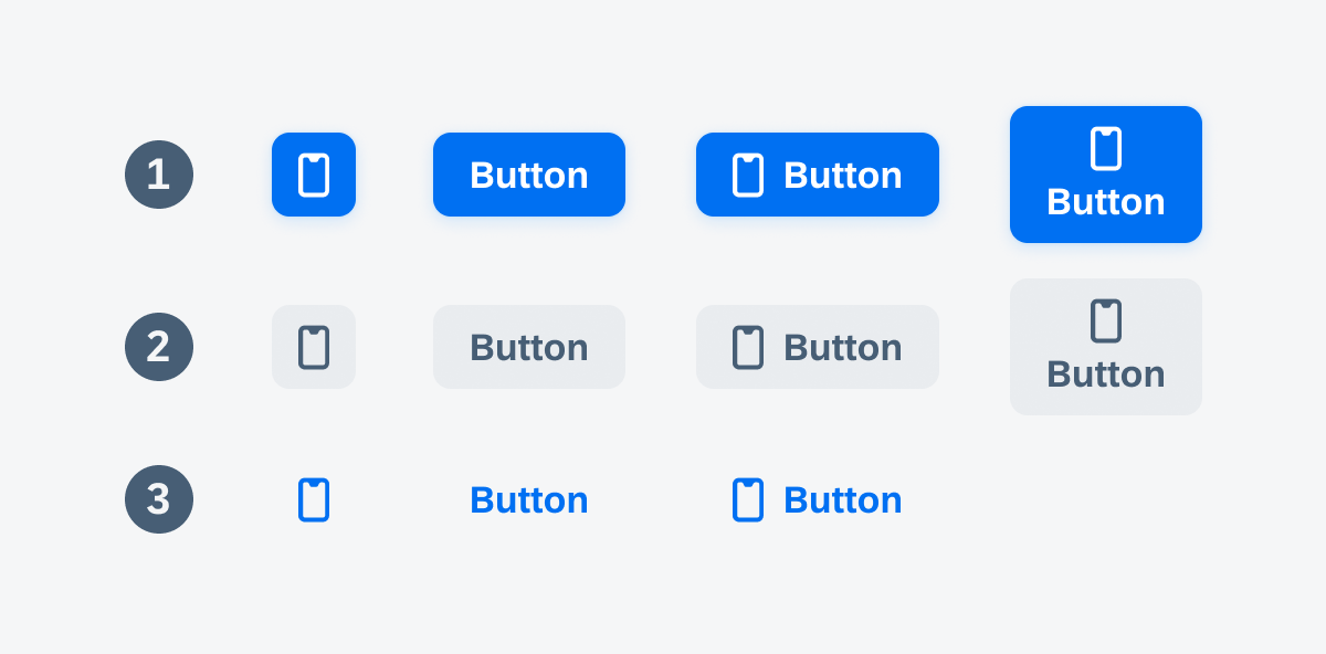
Primary, Secondary, and Tertiary buttons with symbols and labels
Primary Button
Use the primary button for the most important action in the view, for example on a sign-in screen, landing screen, confirmation screen, error screen, or on a screen that has an explicit primary action. A primary button always has a filled style. Note that there can only be one primary action per view.
The following are examples applicable to primary buttons:
- Activate
- Confirm
- Continue
- Create
- Sign in
- Scan
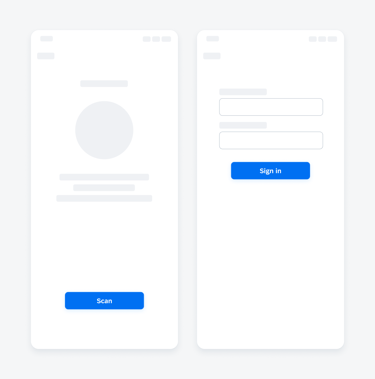
Primary button in a scan (left) and sign-in view (right)
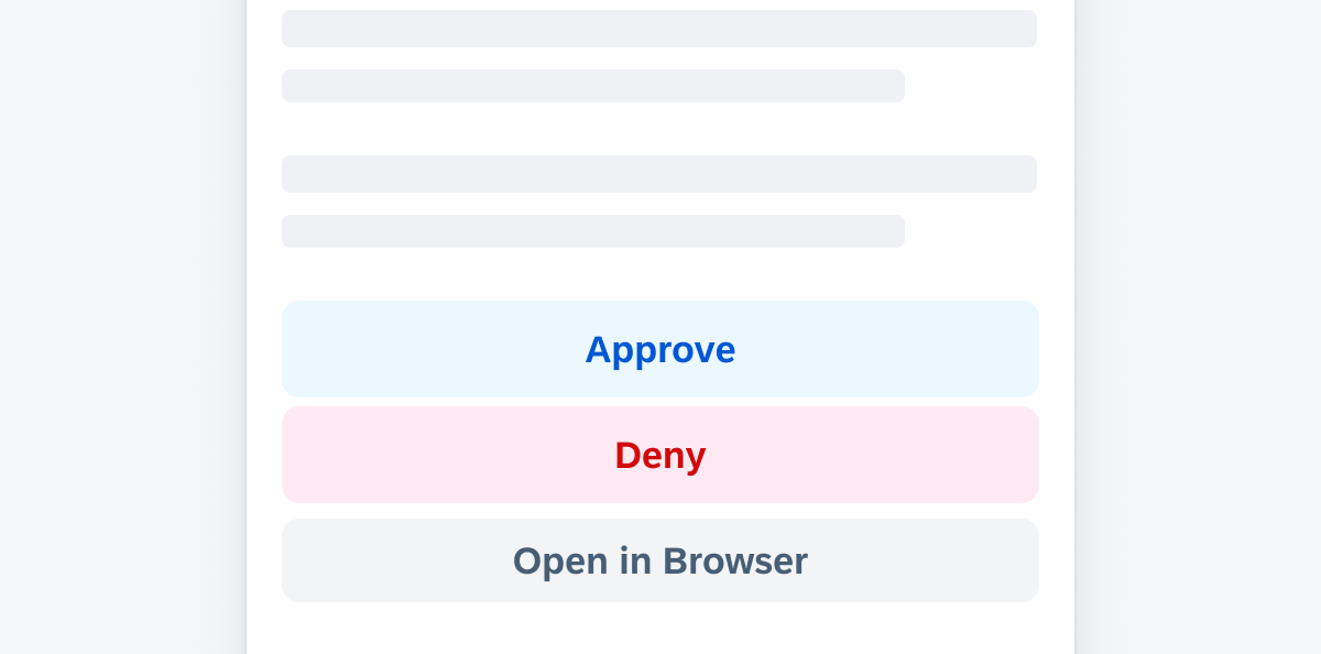
Secondary Button
Use the secondary button when actions are optional or have lower priority.
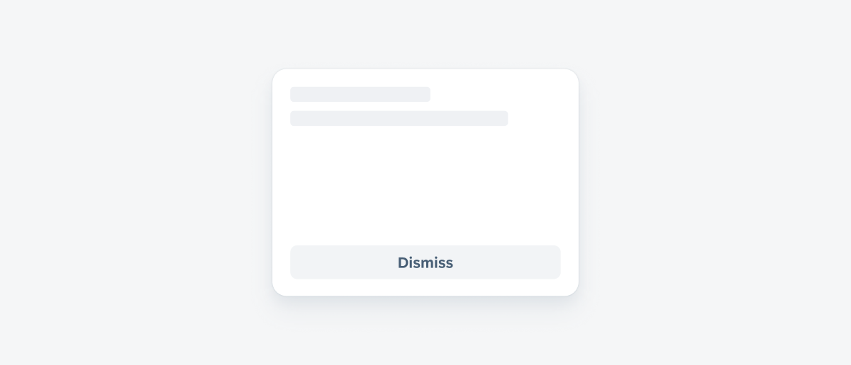
A card showing a secondary "Dismiss" button
Tertiary Button
Use the tertiary button when the action has the lowest priority or it is part of the navigation bar.
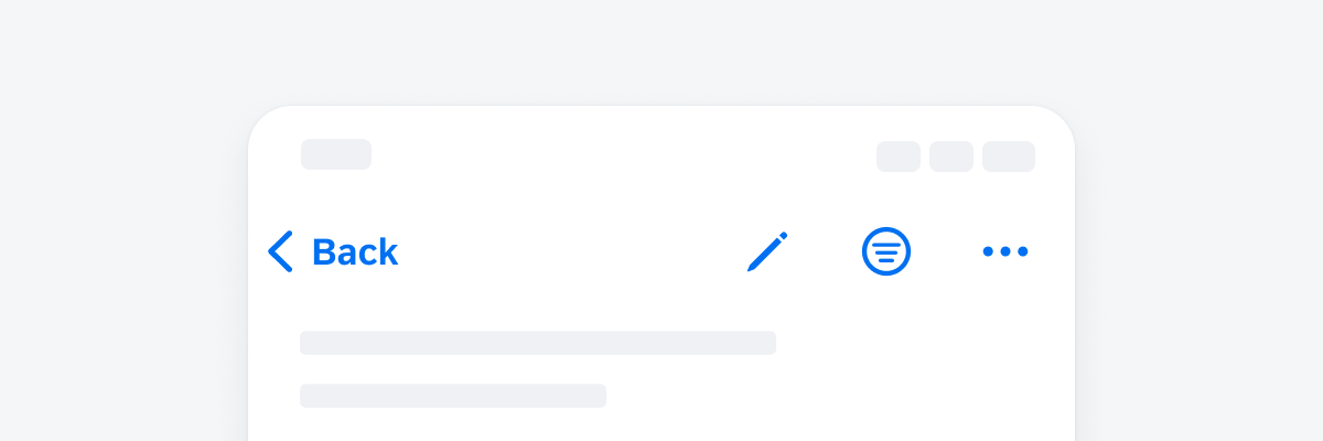
An example of a navigation bar with tertiary symbol buttons
Size Variations
Buttons are by default dynamic in width and are dependent on the container they are placed in, but they can also be set to a fixed width and height. The touch area of a button should not be less than 44pt.
1. Auto Width Buttons
The button container of an auto width button grows automatically to fit the size of the text. Auto width buttons have by default a fixed height of 38pt. We recommend using auto width buttons within components, for example, within the object cell.
2. Standalone Buttons
We recommend buttons with a fixed width of 201pt and 44pt height for standalone pages. Standalone pages usually deal with only one topic and can have one or more actions in focus, such as onboarding or sign-in screens.
3. Full-Width Buttons
For vertical button stacks we recommend using full-width buttons. Full-width buttons automatically fill the entire container with a padding of 16pt on the left and right side of the button.
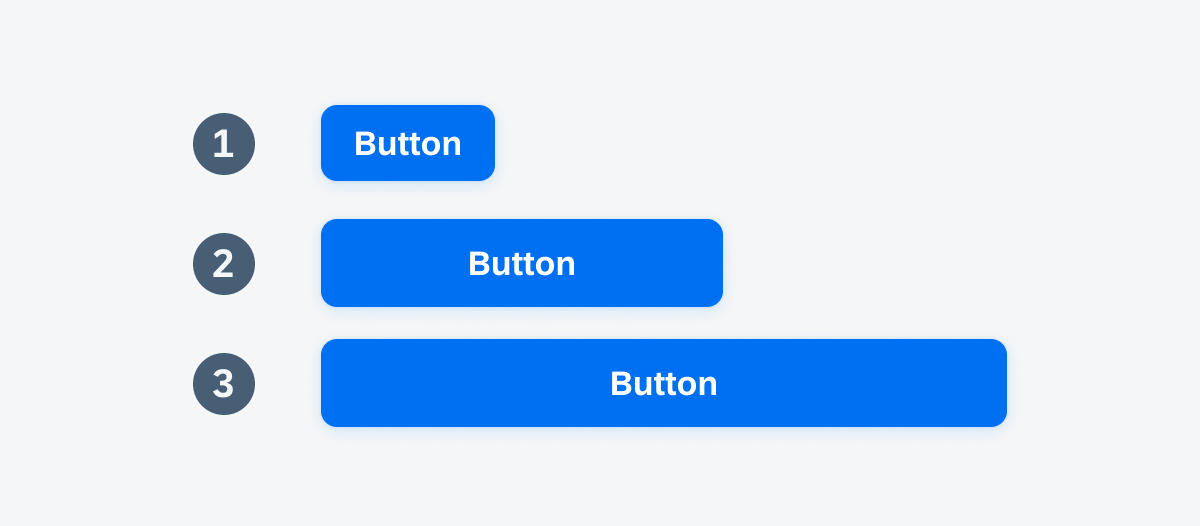
Auto width button (1), standalone button (2), and full-width button (3)
Auto-width buttons, standalone button, full-width button, and full-width button within a toolbar
Button styles are essential design elements that work in tandem with button types, to enhance the user interface. In the Fiori Horizon design, we have three main button styles:
- Tint Style
- Normal Style
- Negative Style
Tint, normal and negative styled buttons
Tint Style
The tint button style can emphasize available actions and encourage users to interact with them. The primary button’s default style is not different from the tint one.
Usage Primary Tint
Use it for primary actions. Only one action on the screen should be styled in primary style.
Usage Secondary Tint
If there are several actions with the same importance, we recommend using secondary tint style. If it is used in combination with negative actions it can be used for the positive action.
Usage Tertiary Tint
Use the tertiary tint style if the action is placed within the navigation bar or if it has the lowest priority compared to other actions on the screen.
Normal Style
The normal button style reflects an intermediate level of visual hierarchy. The neutral button style can be used for actions that have a medium priority.
Usage Secondary Normal
We recommend using secondary normal style if you have multiple buttons within a view and want to visually highlight the priority of the different actions. Tint style always reflect a higher importance than normal style. The usage depends on the context of the app and needs to be decided on app level.
Usage Tertiary Normal
Use tertiary normal for actions with a low importance. However, the usage depends on the context of the app and needs to be decided on app level.
Negative Style
The negative button style indicates destructive actions and warns users to take extra precautions when interacting with the buttons.
Usage Secondary Negative
If there are several actions with the same importance and one or more of them is negative, app designers can style the negative button in secondary negative style.
Usage Tertiary Negative
Use tertiary negative style if if there are several negative actions within the page, for example within several object cells, or if the negative button has the lowest importance.
 Your feedback has been sent to the SAP Fiori design team.