
Preview Table View
FUIObjectTableViewCell
Intro
Preview table views are used to display a preview of a list and are populated with Table View Cells, which include object cells and contact cells.
Multiple preview table views can be stacked in a single-screen layout to provide quick access to different information. They are commonly found in the overview and object screens.
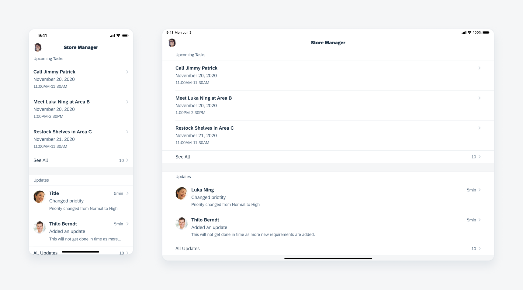
Preview table view in compact width (left) and regular width (right)
A. Section Header
The header includes a group label to describe what the content represents. It is not mandatory to include the header. To view variations of section header usage, see List Picker and Collection View section header.
B. Content Area
This is the area in which the table view cells are inserted.
C. Footer
The footer includes a “See All” label on the left with the number of items in the full list and a chevron icon on the right. The entire footer can be tapped to navigate to the full list. It is not mandatory to include the footer.
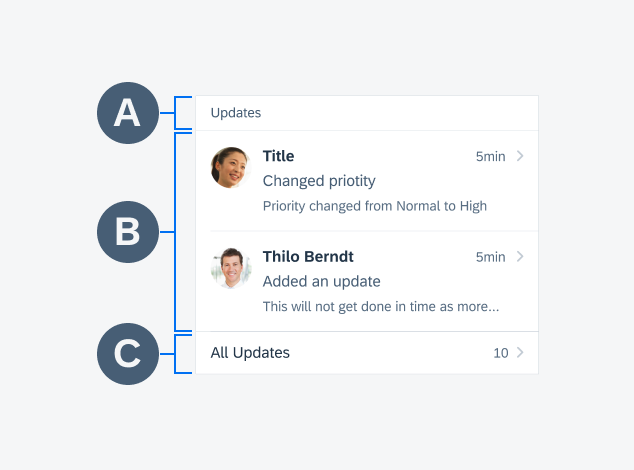
Anatomy of the preview table view
As the preview table view serves to provide a snippet of a large data set, it is recommended that no more than three content cells be displayed. The table cells that are displayed in the preview depend on the default sort and filter of the entire list.
Navigation
Tapping on a single table cell displayed in the preview table view navigates the user to the detail screen of the object. The “See All” cell leads the user to the list report that it is previewing.
Empty State
In cases where the content is generated by user interaction, the preview table view may have an ‘empty state’ until the user starts selecting/creating content to display. A good example of this is creating tasks in a Project Management app.
You can either choose to hide the preview table view entirely or if it is important to guide the user to generate this content, use the empty state of the preview table view with a label clearly communicating that there is no content yet. A quick action button cell maybe used to guide the user to add to the list.
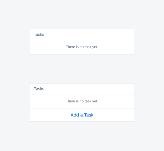
Empty state of the preview table view
Development: FUIObjectTableViewCell
SAP Fiori for Android: Object Cell
Related Components/Patterns: Object Cell, Contact Cell, List Picker, Collection View
 Your feedback has been sent to the SAP Fiori design team.