
What’s New
FUIWhatsNewController
Intro
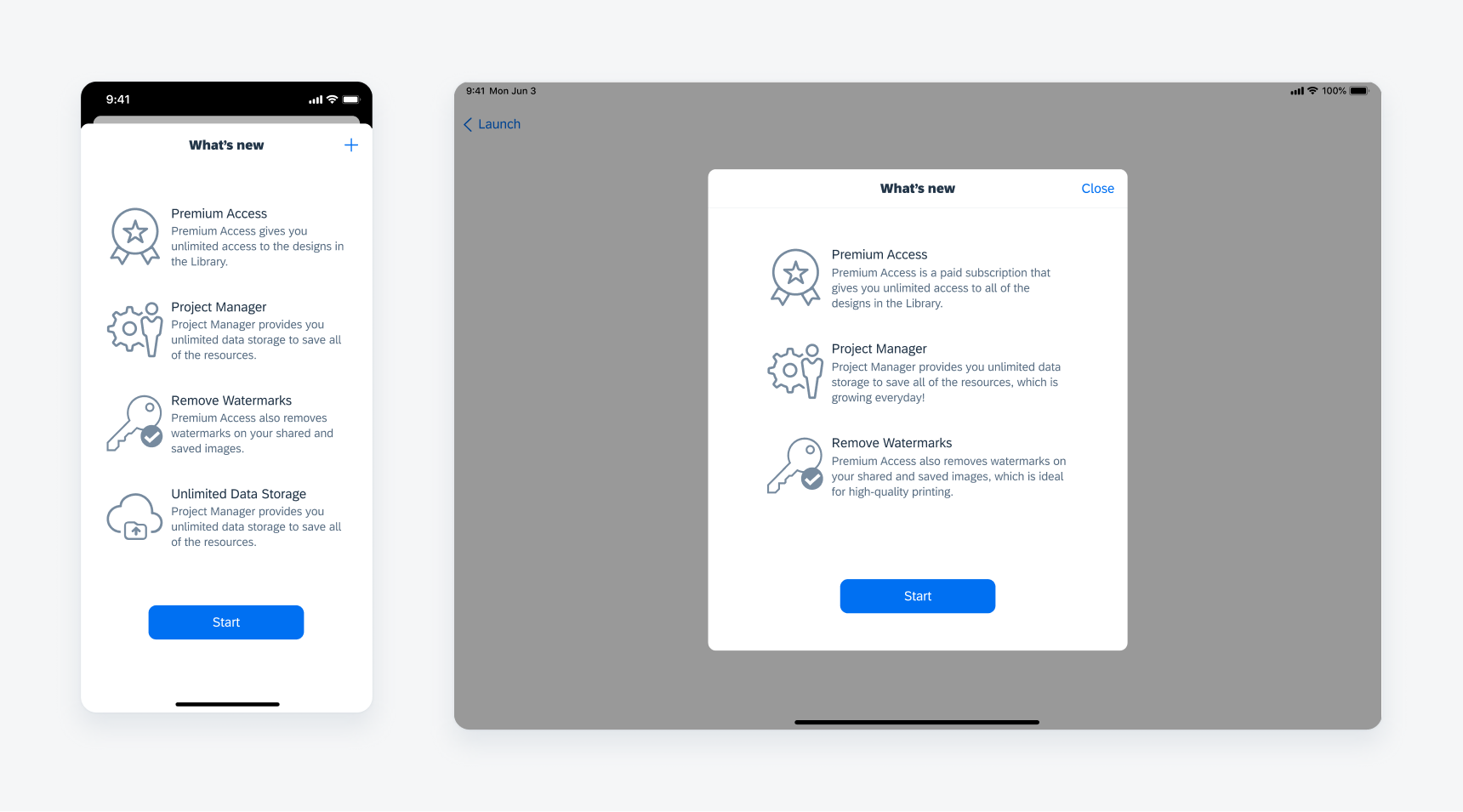
What's new component in compact width (left) and regular width (right)
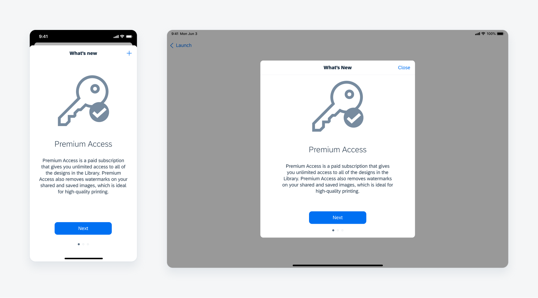
Pop-Up Modal
The component can be shown as a pop-up modal after the user logs in.
What's new component as pop-up modal
From Profile
The component can be found in the profile page menu list.
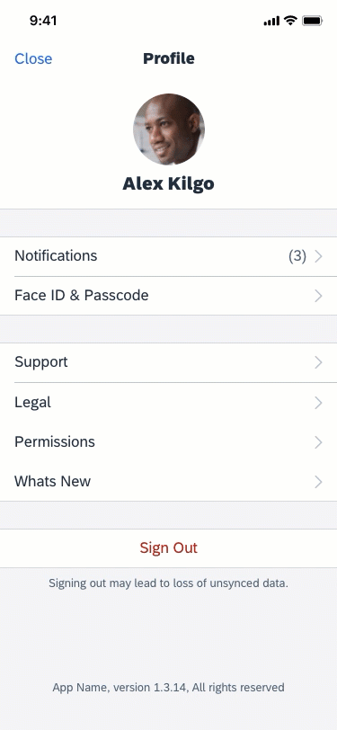
What's new component linked in profile
A. Stacked Modal
The stacked modal navigation bar includes the title and a “Close” button for users to exit the modal.
B. Content
• Image: Optional, however using eye-catching images to show visualized features is recommended.
• Title: Use a clear and concise title to provide users an overview of the feature.
• Description: Explain your feature briefly. The content section is scrollable if the description is too long.
C. Call-To-Action Buttons
• “Next”: Use the “Next” button for the first or middle pages in the multiple page view.
• “Start”: Use the “Start” button for the last page in the multiple page view of or on the single page view.
• From Profile: Don’t use a call-to-action button when want users to open What’s New from the profile page.
D. Page Indicator
The page indicator is used to show the progress of the wizard when there are multiple pages.
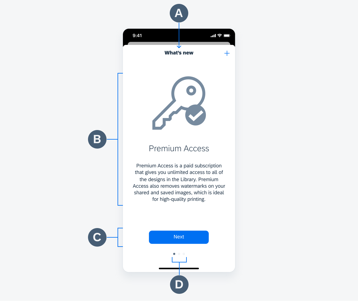
Anatomy of the what's new component
Choose list view if:
- There are three to six updates to be announced.
- You want users to spend less time reading each update.
- You have a short description and/or small images.
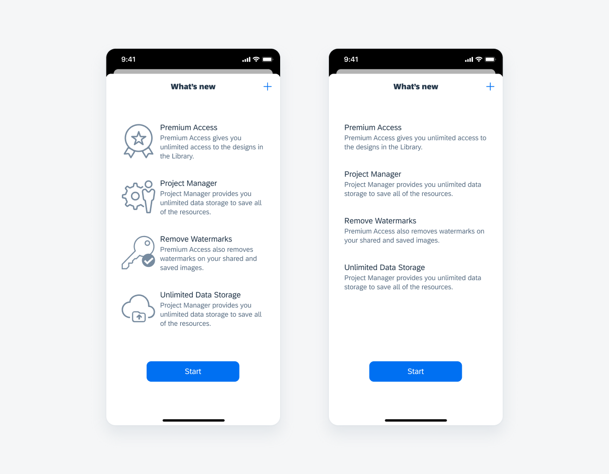
List view with imagse (left) and without images (right)
Choose page view if:
- There are one to four updates to be announced.
- You have a long description and/or big images.
- You want users to spend more time reading each update.
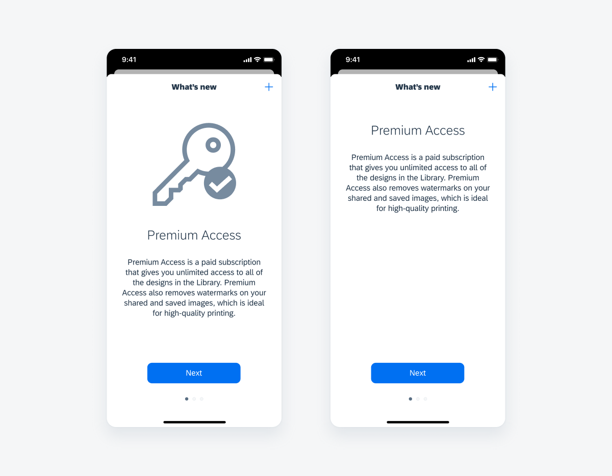
Page view with image (left) and without image (right)
Development: FUIWhatsNewViewController
 Your feedback has been sent to the SAP Fiori design team.