Updated: January 26, 2022

Button Form Cell

FUIButtonFormCell

Intro

A button form cell represents an action that can be taken in a view.

Button form cell on iPhone (left) and on iPad (right)

Usage

Do
Do's for Button Form Cell

Use a button form cell to represent an action within a current view.

Don't
Don'ts for Button Form Cell

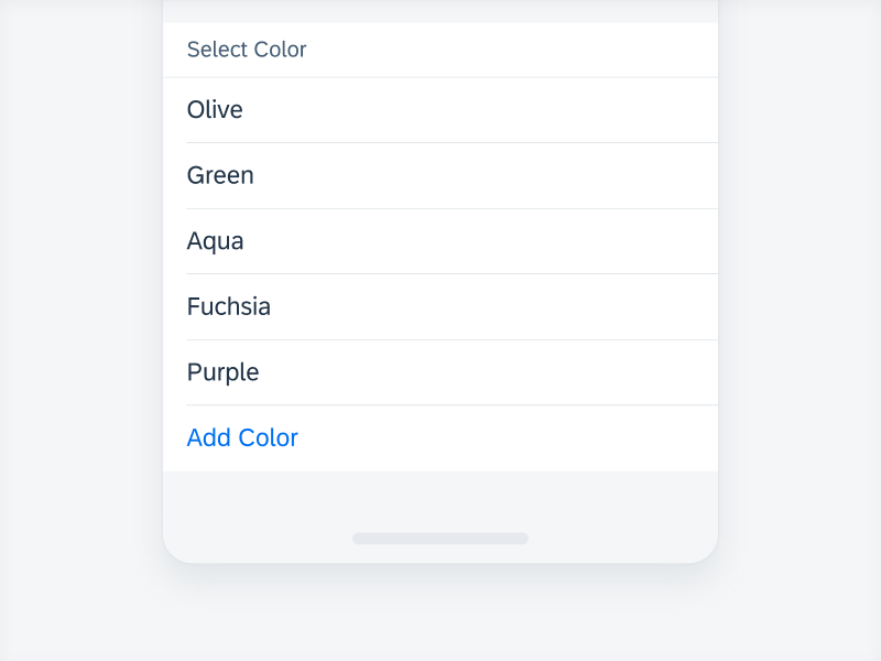
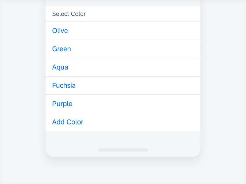
Do not use a button form cell to represent a selection. Use a segmented control form cell or a list picker instead.

Behavior and Interaction

Text Wrapping

A button form cell allows for text wrapping. Texts are not truncated but it is recommended to keep them short and concise.

Text wrapping in compact (left); regular (right)

Variations

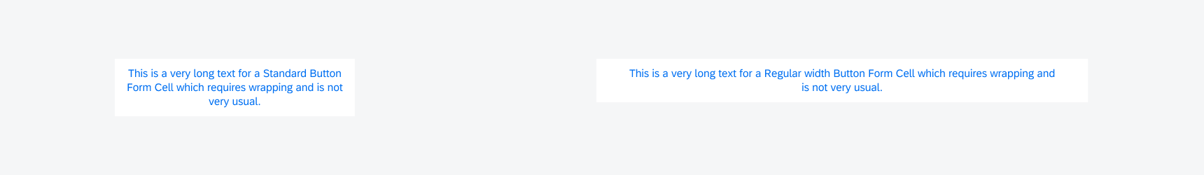
Standard Button Form Cell

A standard button form cell is used for an action within the current view on the screen.

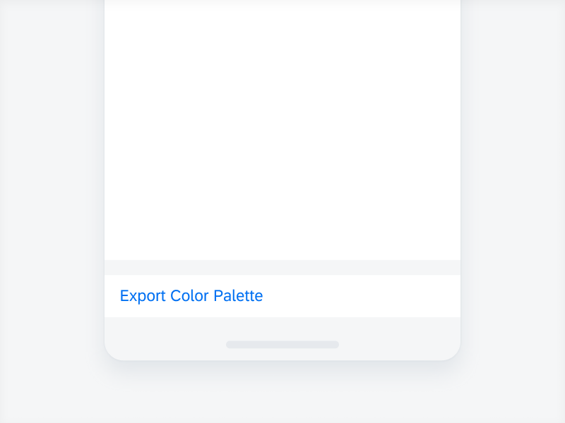
Standard button form cell

Centered Button Form Cell

A centered button form cell is used to represent a global action for the whole window or application. This variation is generally put at the bottom of the view separated in its own section. Examples include Sign In or Save actions.

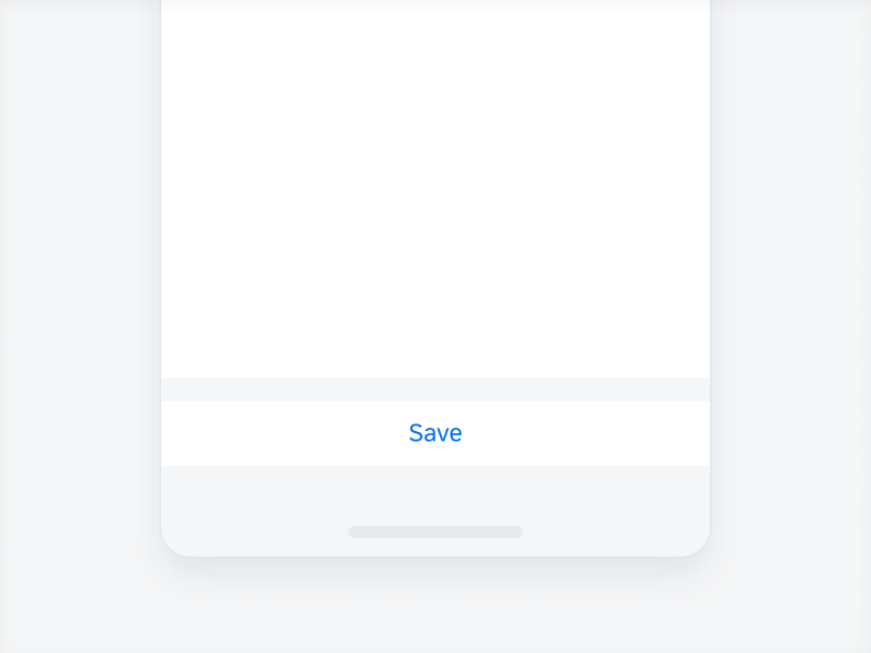
Centered button form cell

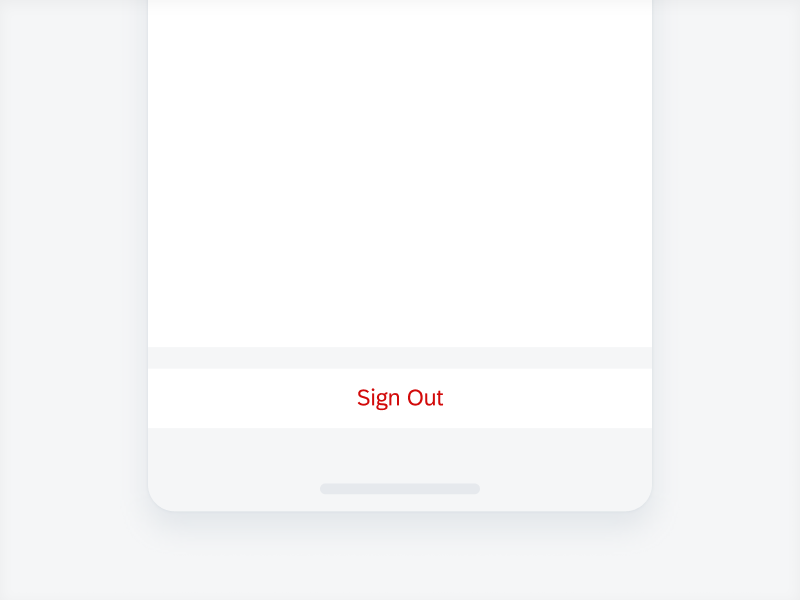
Semantic Button Form Cell

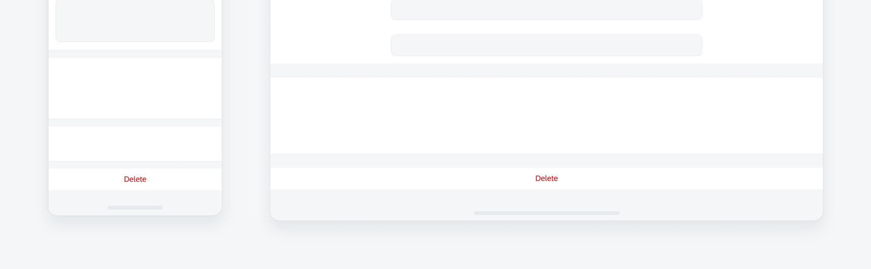
A semantic button form cell is used when the action requires careful attention by the user. Examples that require semantic color include Sign Out and Delete. This variation is usually placed in a separate section.

Semantic button form cell

Specification

Compact Width

The layout margin in compact width is 16pt.

The top and bottom paddings are 11pt.

When using the component in a stack of table view, the first or middle button needs a short hairline to separate it from the button below.

Specs for button form cell in compact width

Regular Width

The layout margin in regular width is generally 20pt. Full-width is 48pt. Regular readable width has a maximum width of 672pt.

The top and bottom paddings are 11pt.

When using the component in a stack of table view, the first or middle button needs a short hairline to separate it from the button below.

Specs for button form cell in regular width

Resources

Development: FUIButtonFormCell
SAP Fiori for Android: Buttons