
Linear Progress Indicator
FUILinearProgressIndicator
Intro
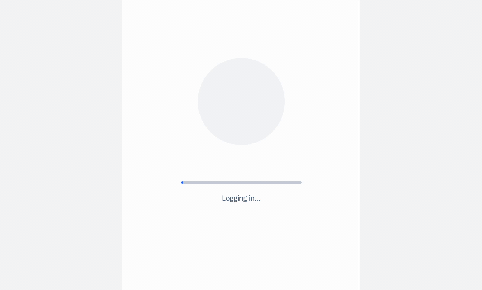
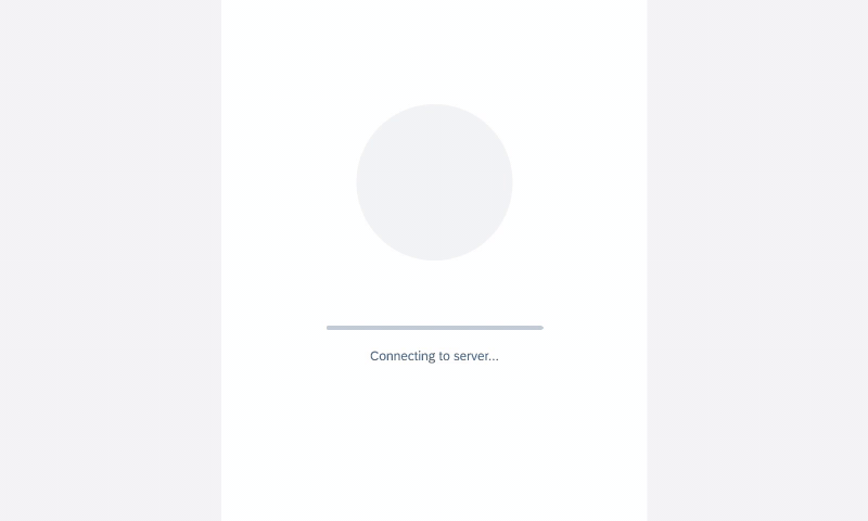
A linear progress indicator informs users about the status of ongoing processes, such as login progress, uploading files, or refreshing content. It communicates an app’s state and indicates available actions, such as whether users can navigate away from the current screen.
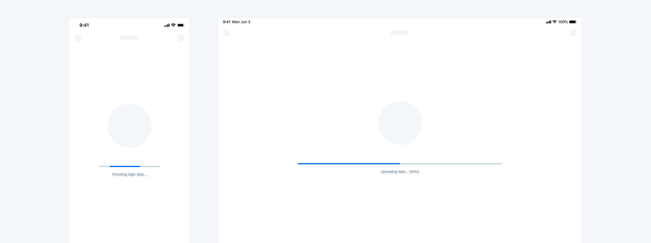
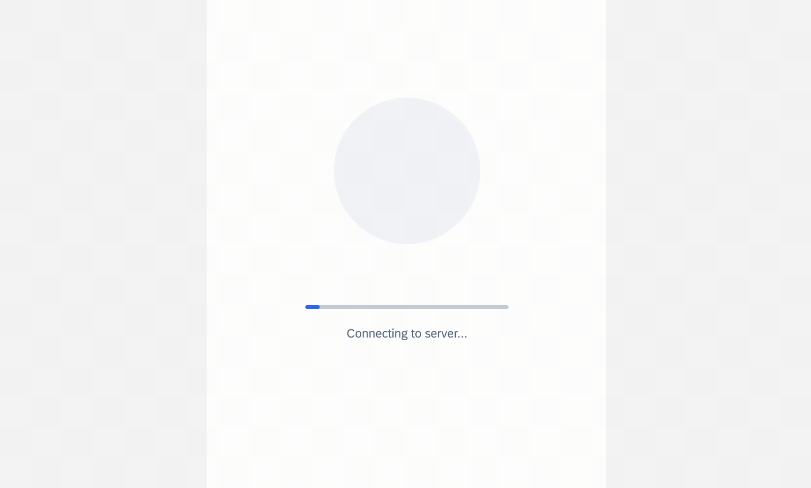
Indeterminate linear progress indicator (left) and determinate linear progress indicator (right)
- Use a linear progress indicator if the wait time takes longer than one second.
- Keep labels short – we recommend one line of text.
- For determinate indicators, include a progress value, for example, 60%, 30/100, etc., at the end of the label.
- It is mandatory to use labels for error and success states.
- Don’t use labels when a loading process takes less than 10 seconds, or when the height or the width is too constrained.
- Try to avoid using a linear progress indicator with two lines of text. Wrapping is not recommended and is only available for compact sizes classes.
- Don’t display a progress value for error and success states.
Active State
A. Indicator
B. Track
C. Label (Optional)
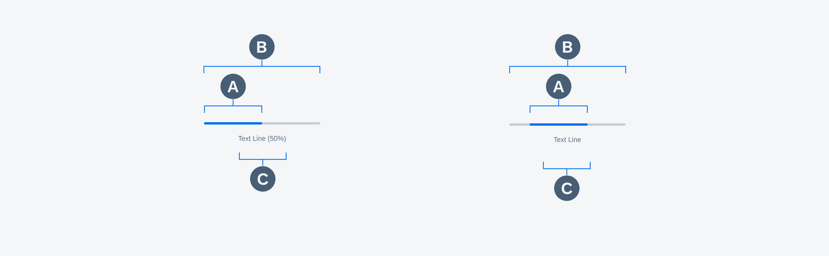
Anatomy of determinate and indeterminate linear progress indicators in active state
Value State
A. Indicator (Hidden by Track)
B. Track
C. Validation Message
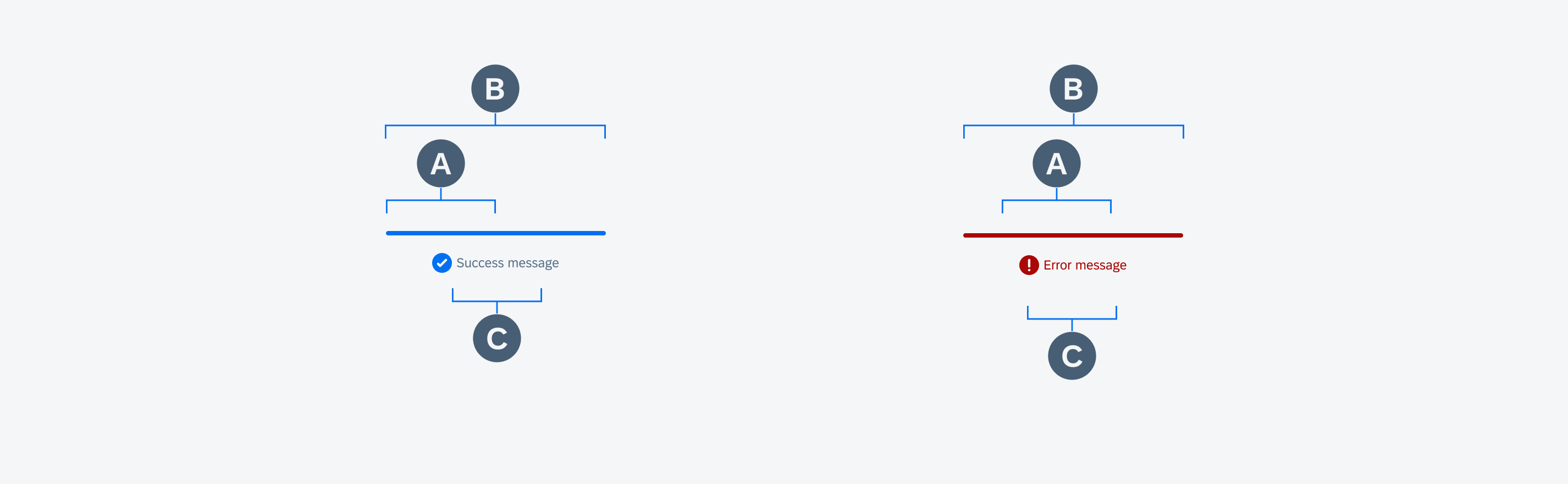
Anatomy of linear progress indicators in error/fail (left) and success state (right)
Text Wrapping (Only for Compact)
Labels are optional and should only be used when the process takes 10 seconds or more. They should be concise and, ideally, not exceed one line of text.
If the length of the text exceeds the available space, the text wraps into the next line and the progress indicator will keep its position on the top. Wrapping is not recommended and is only available for compact size classes. Labels can’t exceed two lines of text.

Text wrapping example of a linear progress indicator
Value States
Success State
The success state appears after the successful completion of a process or request. The indicator turns green and the entire track fills with the success color.
Depending on the use case, you can choose one of the following options for the success indicator:
- Persisting until the user triggers another action, such as closing or changing screens
- Disappearing after 3 seconds
Labels are mandatory for the success message and should be concise. A short information about the completed process or the executed action is sufficient, for example, “Download completed”. One line of text is recommended.
Success state behavior of a linear progress indicator
Error/Fail State
If an error occurs or a process fails, the loading animation stops. The indicator turns red and the entire track fills with the error color.
Labels are mandatory and should always inform the user what kind of error/fail happened and how this issue can be resolved. The message should be as concise as possible. Follow the guideline for indicators with a label.
Error state behavior of a linear progress indicator
Text wrapping is not recommended but is available for compact screens. The label should not exceed two lines. On regular screens, text wrapping is not allowed, and the label can never exceed one line. Keeping the width of the linear progress indicator and label within 672pt in regular size classes is recommended for better readability.
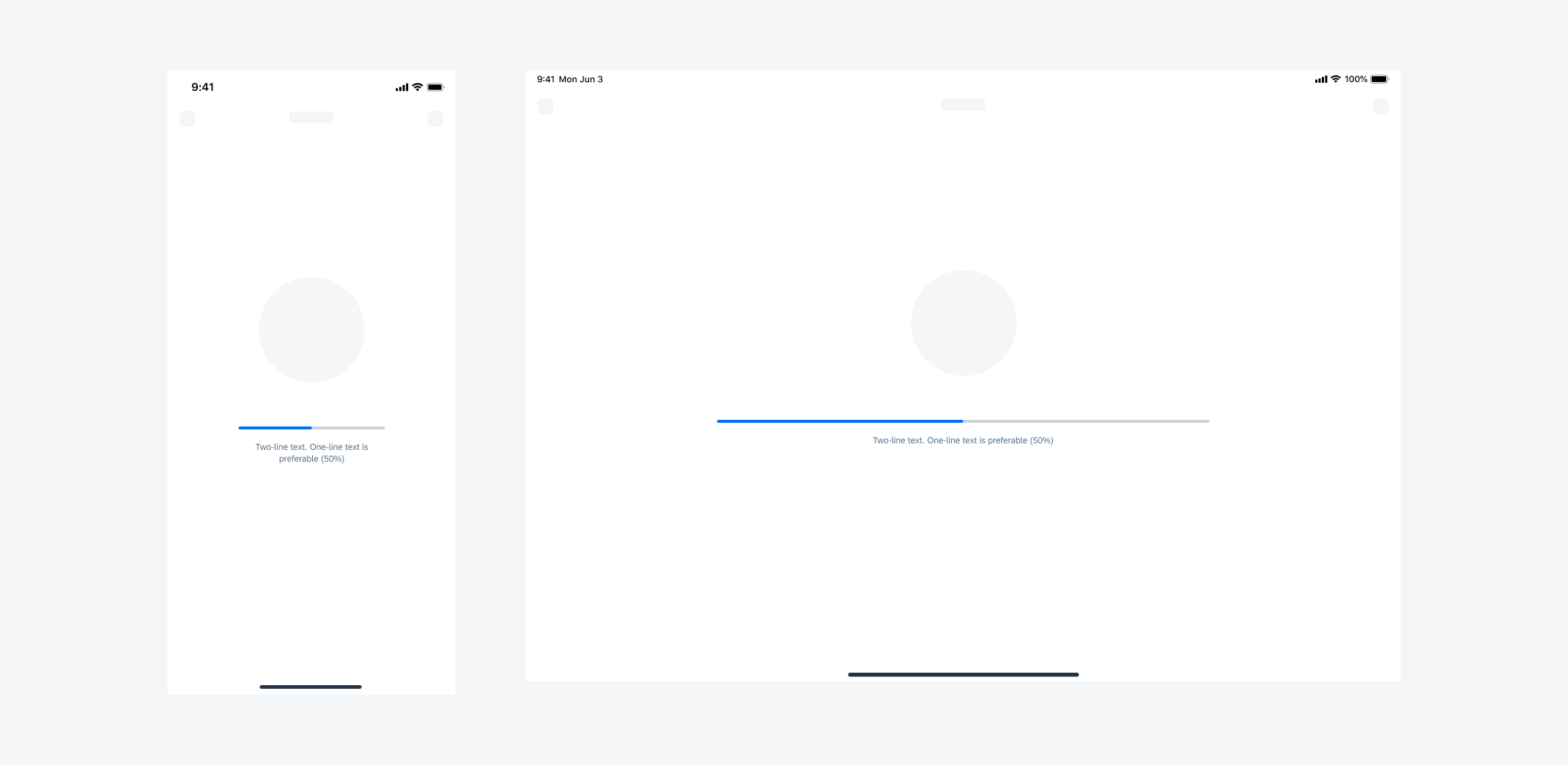
Label text wrapping on compact screen (left) and label text on regular screen (right)
Linear progress indicators display progress by animating an indicator along the length of a fixed, visible track. The behavior of the indicator is dependent on whether the progress of a process is known.
A. Determinate
Determinate linear progress indicators display how long a process will take. They should be used when the process can be completed within a specified amount of time. They fill from 0% to 100% and never decrease in value. For example, downloading/uploading a file of known size.
Determinate linear progress indicator
B. Indeterminate
Indeterminate linear progress indicators express an indefinite waiting time. They should be used when the process completion can’t be determined, or when it is not necessary to indicate how long an activity will take. It conveys that a user’s action, request, or data is being processed.
Indeterminate linear progress indicator
C. Indeterminate to Determinate
The indicator can switch from an indeterminate state to a determinate state. It should be used when an indeterminate process reaches a point where its duration can be determined, and the loading animation can be stopped.
Indeterminate to determinate linear progress indicator
D. Labels
- Labels are optional to communicate the status and progress. If there is nothing to communicate with, having no label is valid.
- Only include labels to give extra context or to provide useful information, for example, what information the progress bar is processing. Avoid using terms such as “loading” that don’t add any value.
- Keep labels short – we recommend one line of text.
- If the label is comprised of one or more sentences, use sentence-style capitalization.
- We recommend including a progress value, for example, 60%, 30/100, at the end of the label for determinate indicators to show how much of the process is already completed, the current progress, and how much is remaining.
- Label content can be changed during the process as needed according to the progress status.
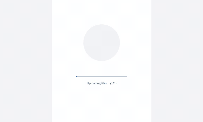
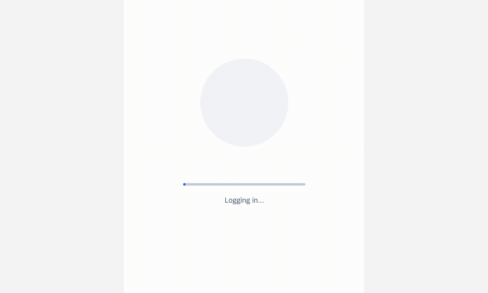
Linear progress indicator with label
Resources
Development: FUILinearProgressIndicator
SAP Fiori for Android: Linear Progress Indicator
Human Interface Guidelines: Progress Indicators
 Your feedback has been sent to the SAP Fiori design team.