
Adaptive Design
SAP Fiori for iOS supports the auto layout and adaptivity concepts that allow you to create a great user experience for all devices on iOS and iPadOS platforms. The concepts provide a mechanism that helps dynamically rearrange and resize content in response to changes in the device’s orientation or when using the app on different screen sizes.
iOS defines two main size classes: regular and compact. These classes apply to both horizontal and vertical space. The regular size class is associated with expansive space, in most cases referring to iPad, while the compact size class is associated with constrained space, in most cases referring to iPhone.
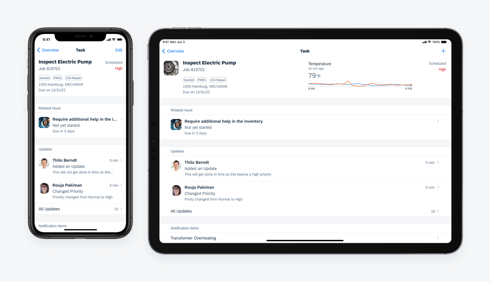
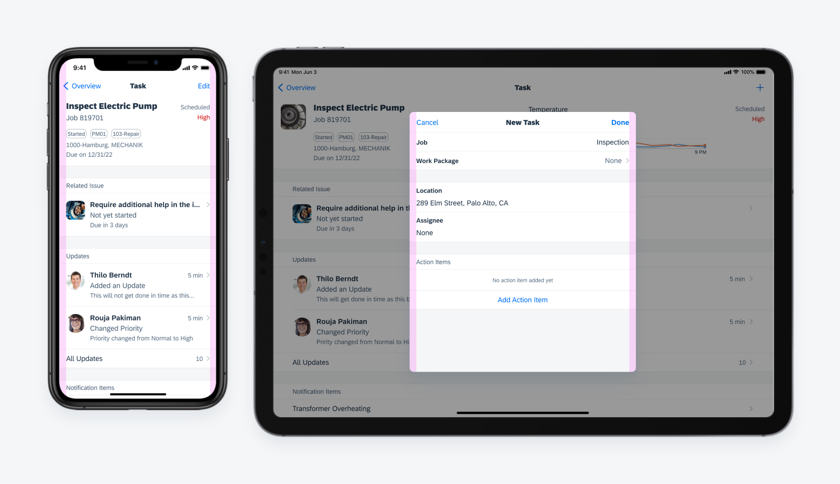
Object details on different devices
The adaptivity concept defines how the UI changes and adapts to different devices and orientations. There are two main size classes: compact and regular. These size classes affect horizontal and vertical space separately.
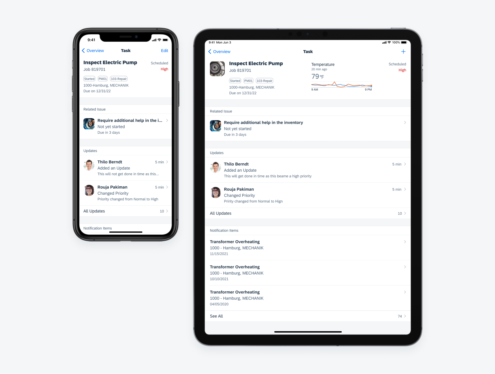
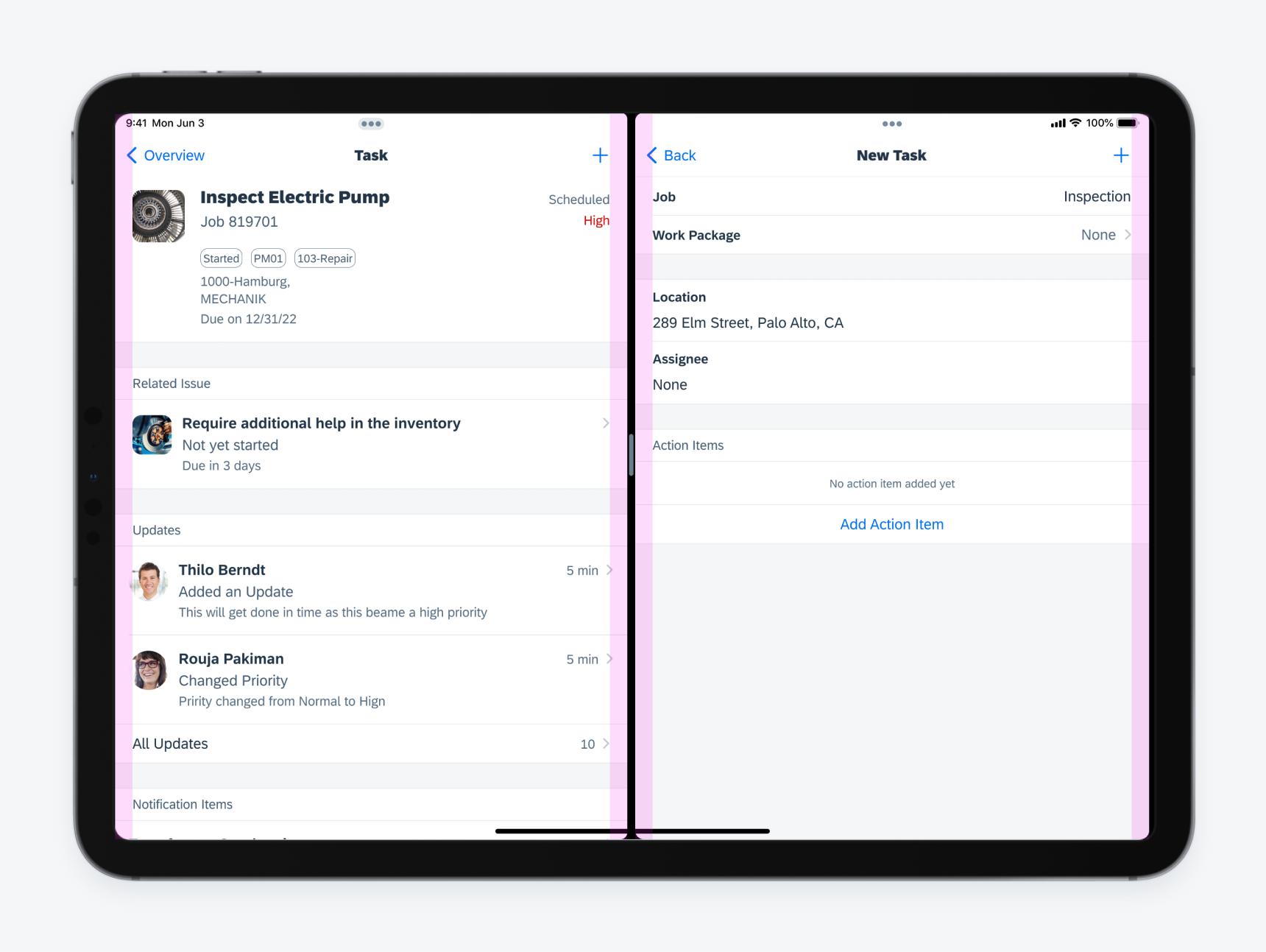
Same design viewed on different devices
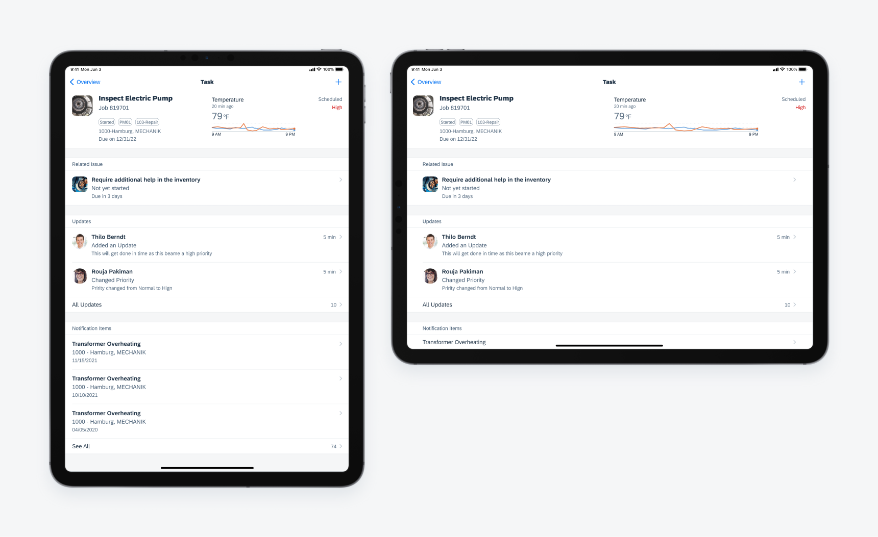
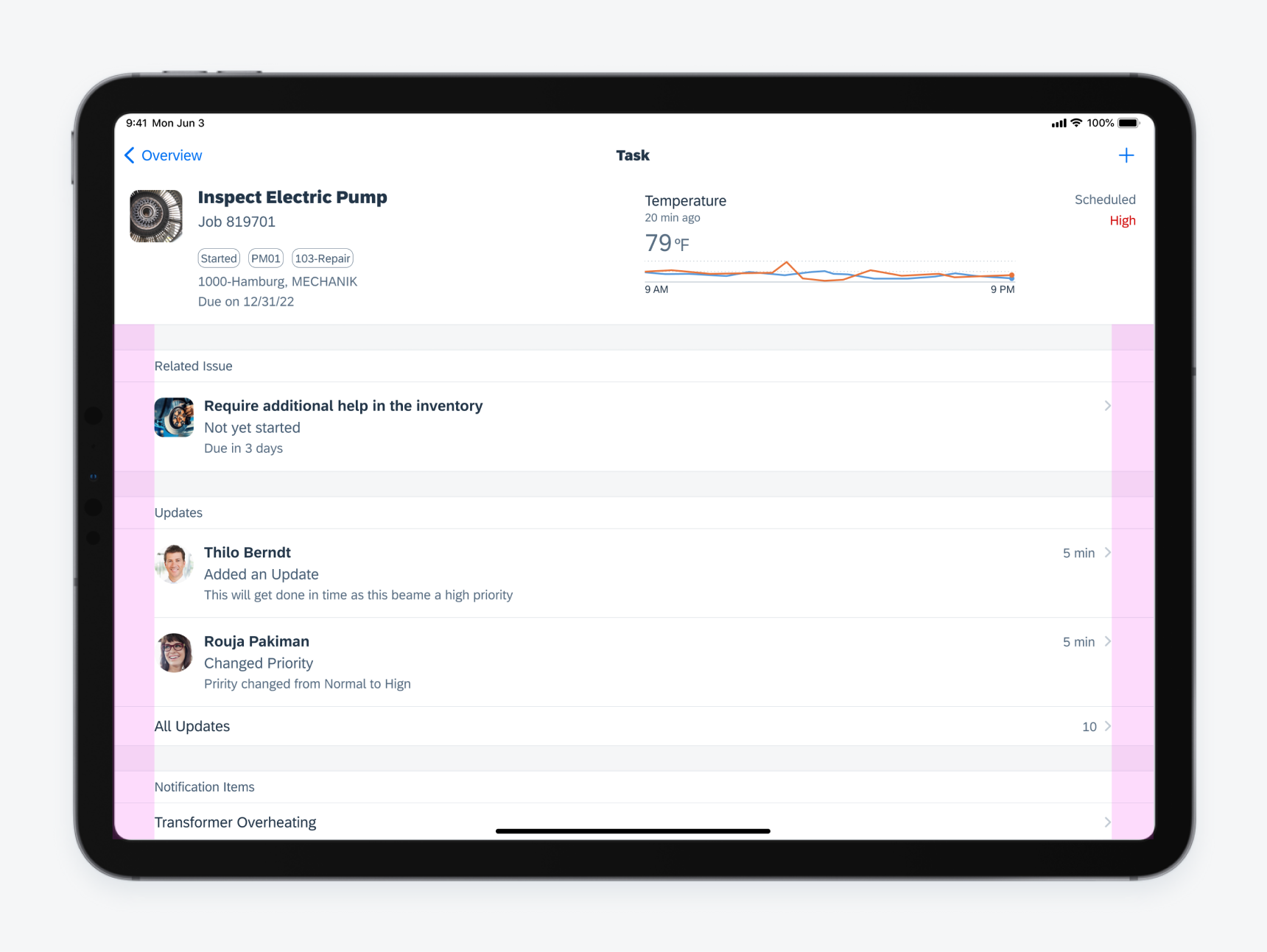
Same design rotated from landscape to portrait
Horizontal Space
There are two main classes for the horizontal space.
- Compact Width
- Regular Width
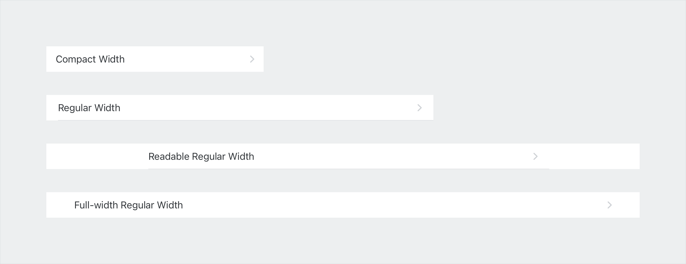
Compact Width
The variant defines that full-width components have 16pt layout margins by default. The spacing between UI elements inside the components can be fixed or flexible with Auto Layout depending on each case.
Compact width layout on iPhone portrait screen (left) and iPad form sheet (right)
Regular Width
This variant defines that full-width components have 20pt layout margins by default. The spacing between UI elements inside the components generally is larger than the compact width variant.
With the expansive horizontal space in regular width, we recommend using two sub-classes: readable width and full-width regular.
Regular width layout on iPad Pro 11" split screen
Readable Regular Width
Readable regular width is an extension of the regular width variant. It sets a maximum inner width of components to 672pt as the largest width for readability. It is the maximum width of content that the user would still feel comfortable reading through.

Readable regular width layout on iPad
Full-Width Regular
Full-width regular is used for containers with at least 768pt width. The layout margin of the container is 48pt.
Full-width regular width layout on iPad
Vertical Space
The height of the UI component adapts to the availability of space of the current screen. There are three variants when applying the main size classes on vertical space.
- Compact Height
- Regular Height – iPhone
- Regular Height – iPad
Compact Height
The compact height layout variant is only available on landscape orientation in a few iPhone devices. Inner paddings and spacings between UI elements need to be decreased and allow more content to show on the screen.
Regular Height – iPhone
This variant is specific to iPhone devices that allows the regular height size class. It is a default height class for all components.
3. Regular Height – iPad
This variant is specific to iPad devices and only applies to some of the components that requires more space.
Object cells and search bars with different vertical layout on iPhone and iPad
iPadOS offers a navigation paradigm to utilize extra horizontal space. See Sidebar.
Modality is a method to present content in a temporary mode. With adaptive design, modality on iPhone and iPad devices adapts to the screen sizes and utilizes the available space.
Full-Screen Modal, Modal Sheet, and Popover
In compact width, popovers are displayed as either full-screen modals or a modal sheets. On the other hand, they appear as a popover window next to the area that activates it.
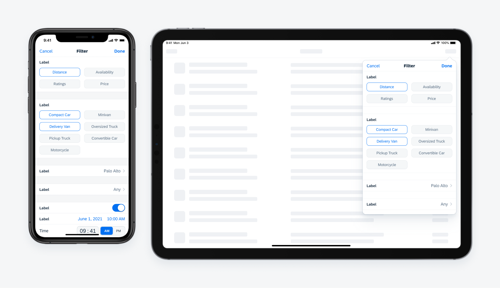
Example of a full-screen modal sheet on iPhone converting to a popover on iPad
Modal Sheets
In compact width, modal sheets slide in on top of the parent page, and the parent page shrinks a little. In regular width, modal sheets stay at the center of the screen as an overlay window together with an overlay layer that dims down the parent page.
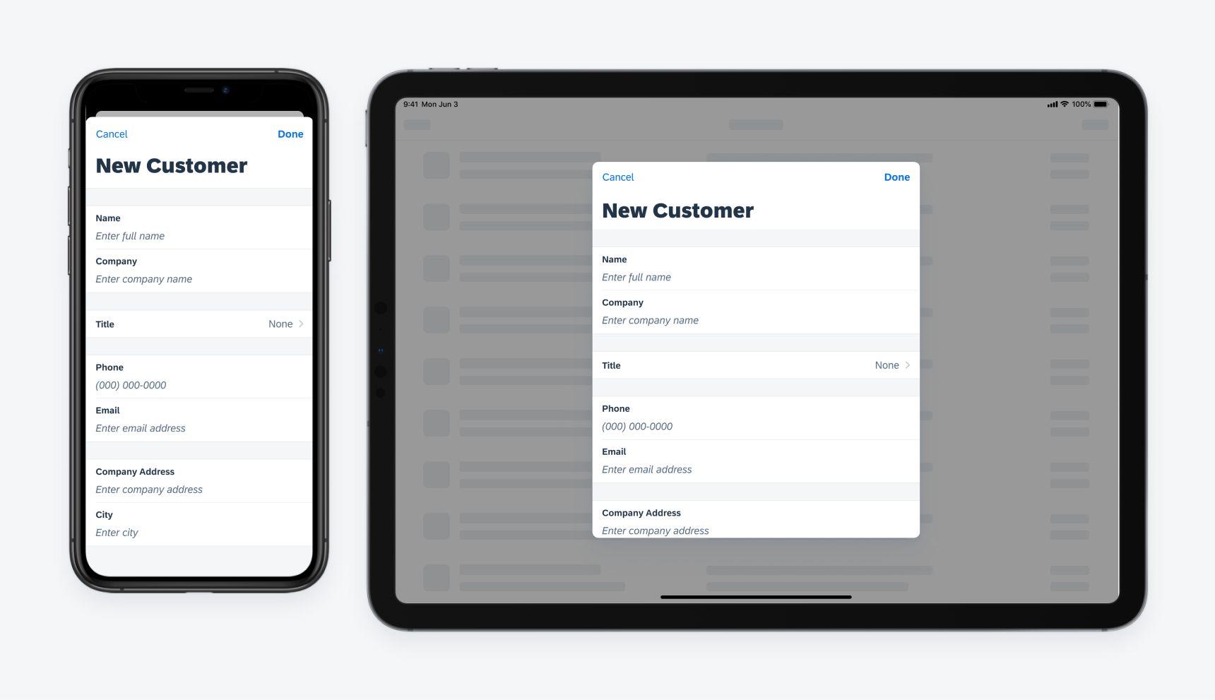
Example of a modal sheet on iPhone converting to a form sheet on iPad
Suggestions
When designing applications in SAP Fiori for iOS, be sure to keep adaptive layout in mind. Designing apps that support adaptive layout can help to save development time down the road and provide users with a coherent and well-considered experience.
Here are some tips:
- Consider how the app design would behave in both portrait and landscape modes early in the design process.
- Design with screen rotation and device size in mind.
- Evaluate how components and floorplans will change based on adaptivity.
 Your feedback has been sent to the SAP Fiori design team.