
Collection View Cell
FUIObjectCollectionViewCell
Intro
The collection view cell is an object within the collection view. It displays content with images to provide a more visual viewing experience.
For guidance on how a collection view cell can be used within the collection view, see Collection View.
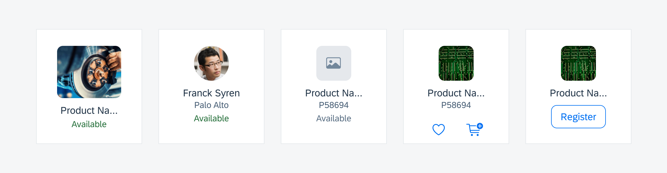
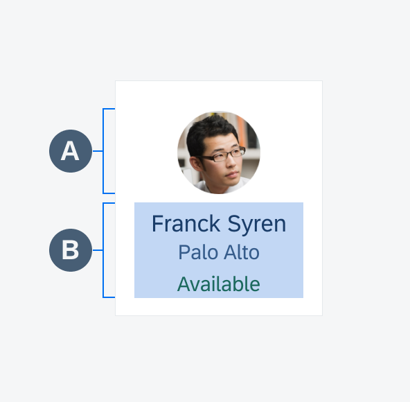
Different collection view cell examples
A. Image View
Collection view cells are meant to be visual, which is why they must include an image.
B. Title (Optional)
The title is used to give more information about the object.
C. Subtitle (Optional)
The subtitle can hold further information about the object.
D. Attribute (Optional)
Attributes, such as the availability status, can be added optionally.
Anatomy of a collection view cell
A single tap on a collection view cell navigate the user to a detailed view of the object. For some cells, such as attachment, the navigation drills down to a preview of the attachment where it can be viewed larger and some quick actions such as “Share” or “Delete” can be performed.

Interaction with a collection view cell
Standard Image
The collection view cell has two fixed sizes when displaying the labels – 110px and 120px.
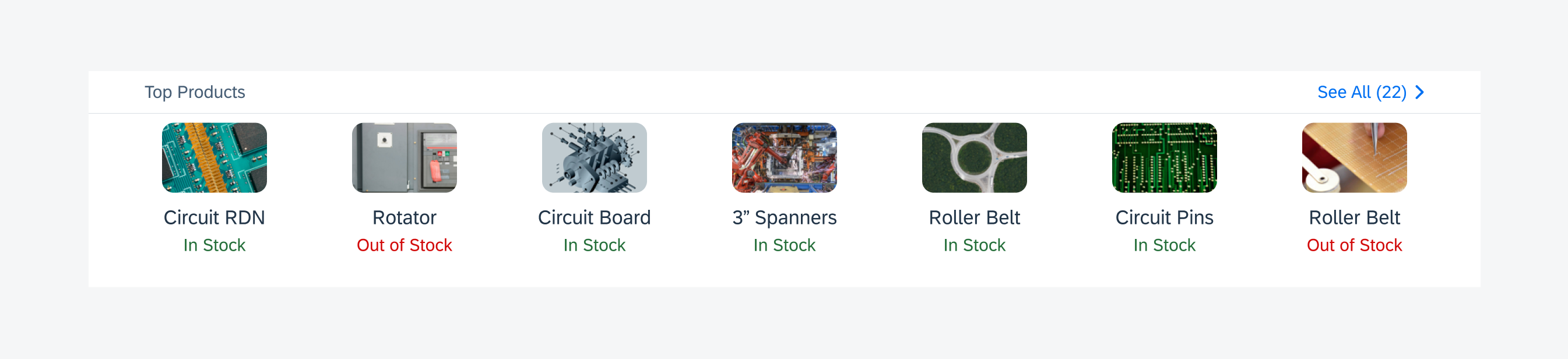
Collection view cells with titles and attributes
Standard Image Without Labels
When no labels are displayed, the size of the collection cell depends on the image view’s size, which must be between 60px x 60px and 110px x 110px. The image view can be circular or rectangular, but when using the rectangular version, keep in mind that its width cannot be smaller than its height.
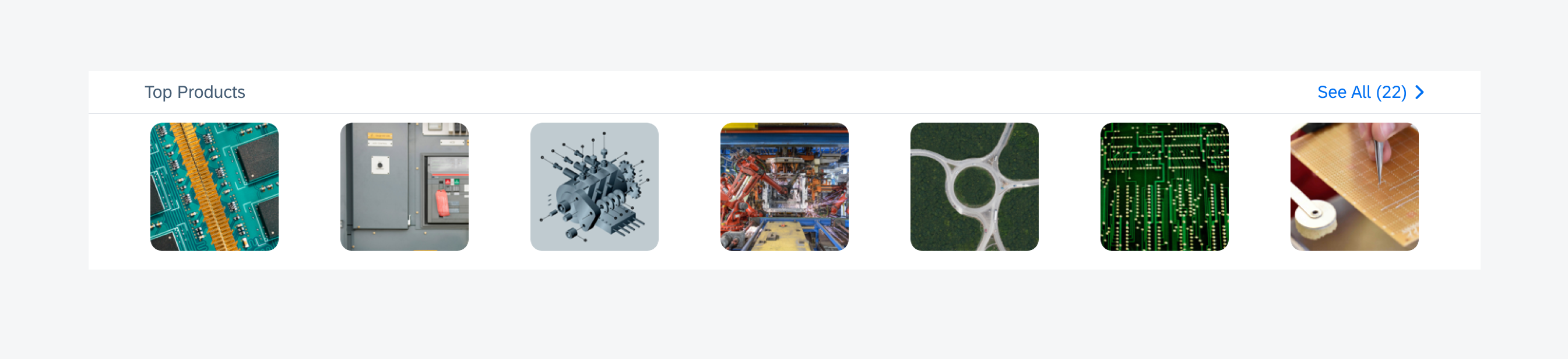
Collection view cells without labels
Profile Image
When showing a collection of people, use the circular profile image. If no profile image is available, initials can be displayed by default.

Collection view cells with profile images
Doctype Icons
Different types of documents can be displayed in the collection view. These doctype icons live within a rectangular image.
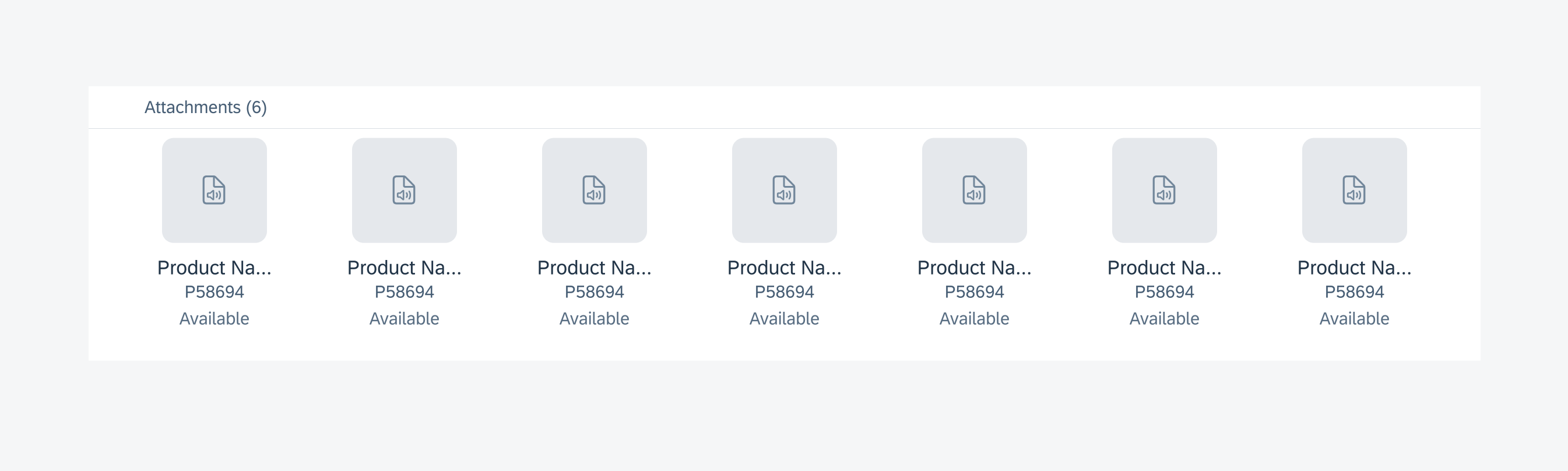
Collection view cells with doctype icons
Icon Actions
For actions that can be easily represented in an icon form, the collection view cell allows for one or two actions. The number of actions used must be consistent across all collection view items.
Collection view cells with icon actions
Button Actions
For more complex actions, use a button action. When using a button action, only one action is allowed.

Collection view cells with action buttons
Development: UICollectionView, FUIObjectCollectionViewCell
SAP Fiori for Android: Collection View
Related Components/Patterns: Collection View
 Your feedback has been sent to the SAP Fiori design team.