
Get Started
Intro
SAP Fiori for Apple OS is an SAP design language adapted specifically for iOS and iPadOS devices. Learn more about the design foundations to understand how you can use it for your own application.
SAP Fiori Design Principles
Learn more about the heart of SAP Fiori Design Language and find out how these design principles can help you create impactful enterprise apps.
Typography
By using native fonts for Apple platforms, our design language connects with native iOS and iPadOS user experience seamlessly.
Colors
Color is an essential element that brings the SAP Fiori brand and delightful user experience together. Colors can guide users through application functionality with consistent use of colors and color semantics. Find out more about SAP Fiori for Apple OS color palette and understand how to use it effectively.
Iconography
The icons from SF symbols give our applications the native experience of the Apple platforms. Consistency in pairings of icons and actions enables an effortless understanding of application functionality. Check out our icon guide.
Navigation
A proper navigation style offers a fast and clear path for users to finish their tasks. Learn more about how to apply a consistent dynamic navigation paradigm to SAP Fiori for Apple OS apps.
Adaptive Design
SAP Fiori for Apple OS apps work on any iOS and iPadOS devices. Learn more about our approach to adaptive design.
Accessibility
SAP Fiori for Apple OS aims to help you create applications that can be used by a wide range of people and to provide an optimal and pleasant experience for every user. Discover how we can make our apps more accessible.
iOS Human Interface
SAP Fiori for Apple OS applies the fundamental design elements from Apple’s iOS Human Interface and brings the simple, beautiful, and fresh UI and UX principles to your SAP Fiori for Apple OS applications. Discover the latest Human Interface guidelines.
Page Types
Page Types define how views and UI components are connected together into pages. Each page type is a template designed for representing different hierarchy of information and data structure.
Patterns
Patterns are common user flows which are fundamental to almost every application. Users require less effort to learn how to operate new applications when they use similar patterns for common tasks.
Augmented Reality: AR Annotations, AR Scanner
Authentication
Consent Forms
Create & Edit
Feedback: Empty State View, Error Handling, Feedback, Offline
Hierarchy
Onboarding: Single-user, Multi-user
Scan: Barcode, OCR, QR
Search
Sort & Filter
Widgets
UI components are building blocks for SAP Fiori for Apple OS applications. Each component serves a unique functional purpose to meet the application requirements.
Controls
Controls are components that the user can interact with for making decisions or providing information. There are several types of different inputs, depending on what the user needs to provide.
Attachment
Button
Filter Feedback
Filter Form Cell
List Picker
Picker
Order Picker
Rating
Search Bar
Segmented Control
Slider
Switch
Text Input
Views
Views are presentations of content. Each view serves a different purpose and offers a unique model to display information. Views can contain different types of content and controls, such as texts, images, charts, buttons, and so on.
Banner
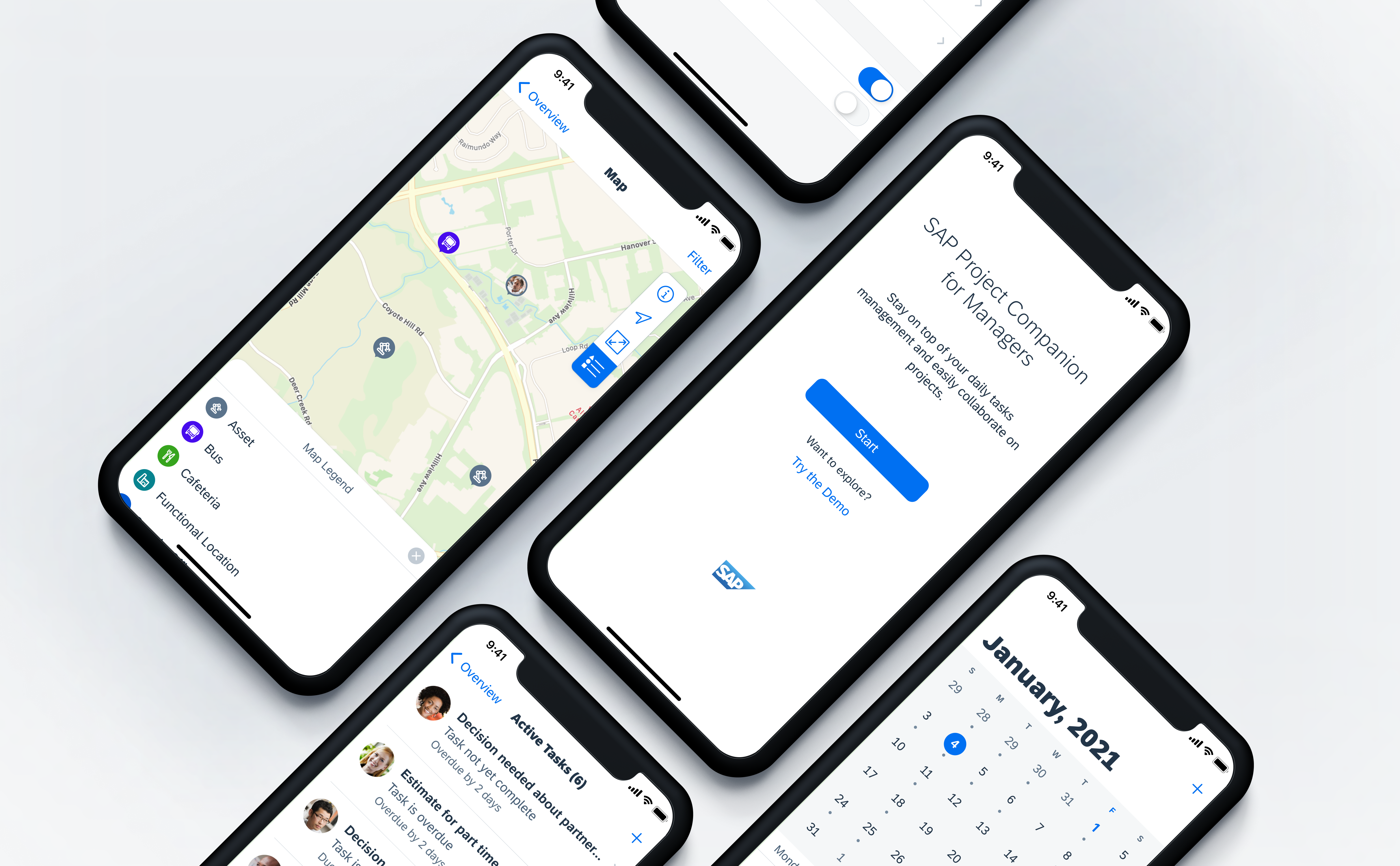
Calendar
Chart
Collection View
Data Table
Headers: KPI Header, Object Header, Profile Header
Hierarchy View
Image Placeholder
KPI
Map View
Cards
Scanner
Segmented Control View
Signature Capture
Table View
Table View Cells: Contact Cell, Object Cell
Timeline View
Timeline Preview
What’s New
SAP Fiori for iOS Design Kit
Download the Design Kit and start designing your own SAP Fiori for iOS applications. Go to Resources
 Your feedback has been sent to the SAP Fiori design team.