Object Card
Intro
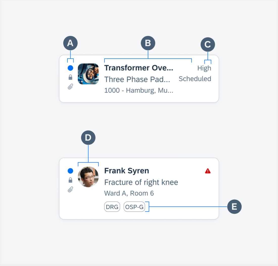
A. Icon Stack (Optional)
A set of up to three vertically stacked icons can be displayed on the far left. These icons indicate something about the object, such as its unread status.
B. Object Labels
This is the main area for text content. It allows for a title, subtitle (optional), and footnote (optional).
C. Attributes (Optional)
If there are attributes, such as a status, they can be displayed on the right of the card. Up to two attributes can be displayed, stacked vertically. The attribute can be in the form of text or icons.
D. Detail Image (Optional)
Just like in the object cell, an image representing the object can be included and be set to either thumbnail (square) or avatar (circular) with all the same sizing properties. Since space is limited in the object card, it is recommended to use a 45-pixel image or smaller.
E. Additional Information (Optional)
If there is additional information such as a rating for the object or tags, it can be included below the object labels.
SAP Fiori for Android: Object Card
Related Components/Patterns: Cards Overview, Object Cell


 Your feedback has been sent to the SAP Fiori design team.