
In-line Validation
FUIInlineValidationTableViewCell, FUIInlineValidationView
Intro
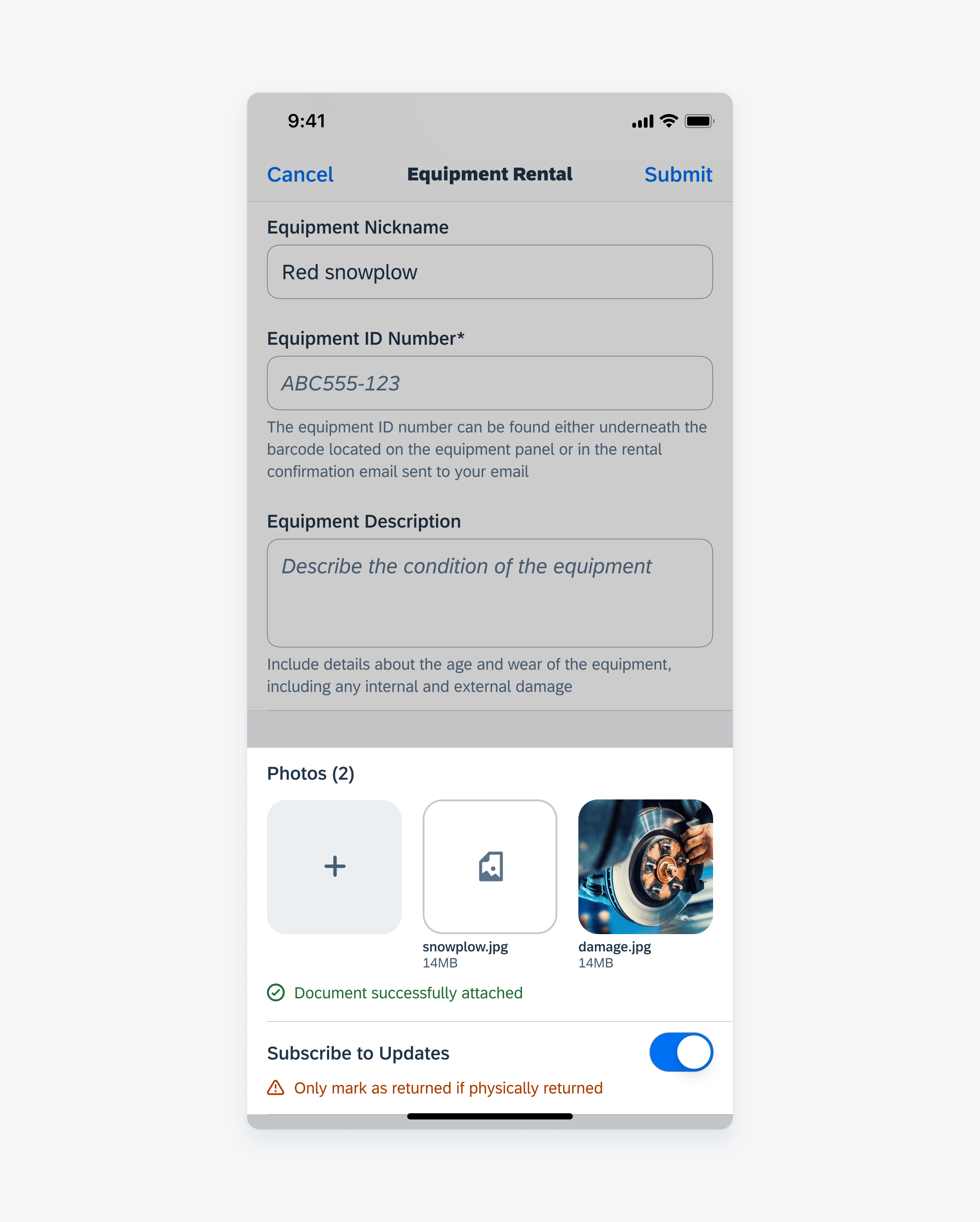
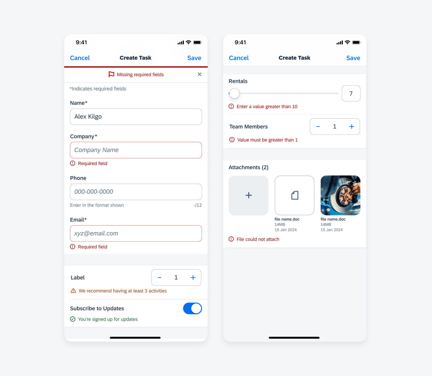
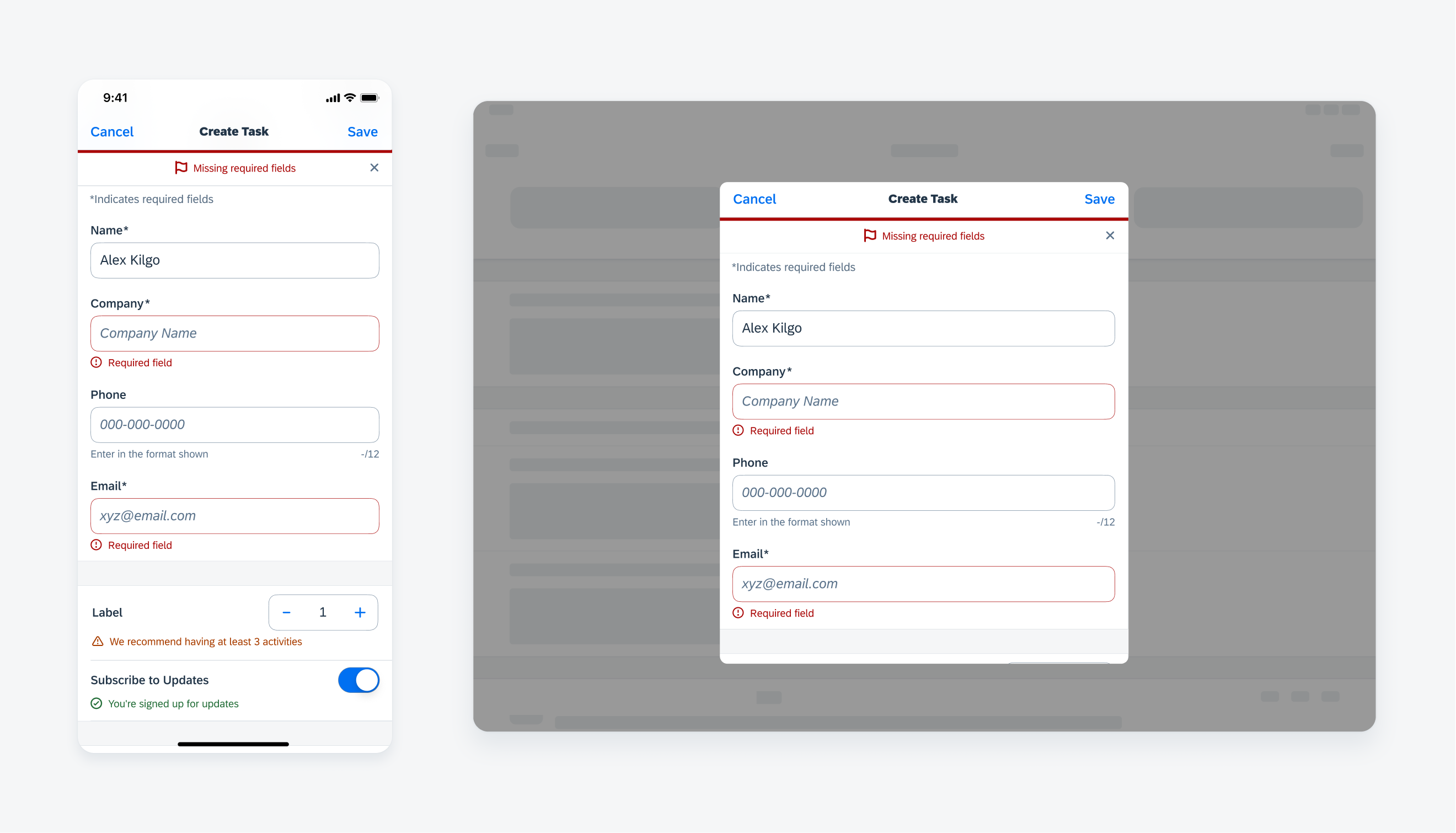
In-line validation provides static information to a user or provides temporary feedback in response to a user’s input and is commonly used with form cells in forms. In-line validation should be placed underneath the relevant form cell and may display hint text, a success message, a warning message, or an error message.
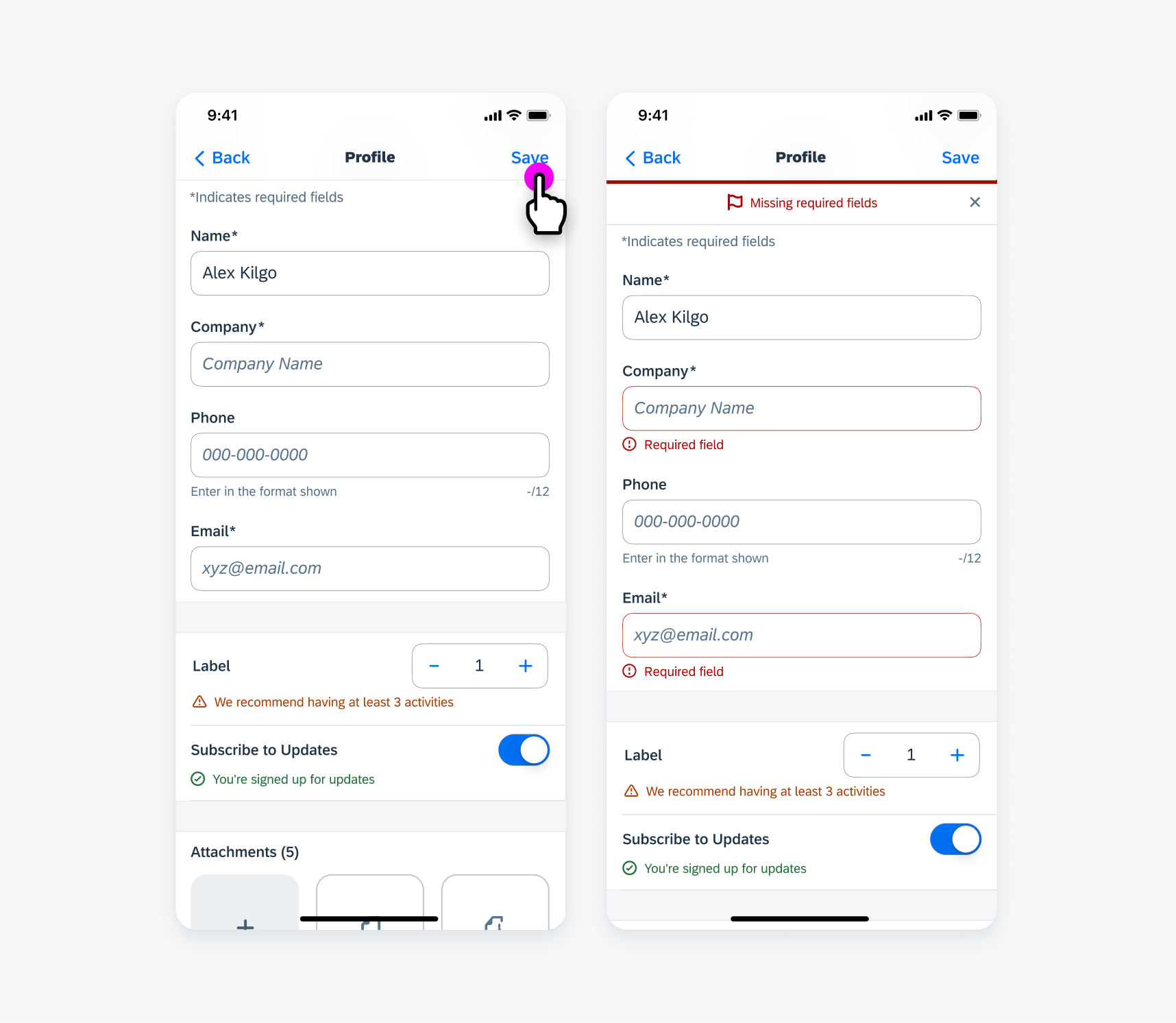
In-line errors in form sheet
A. Icon
Provides a visually accessible cue to the user when user action is required or form feedback is important.
Helper text variation does not have an icon.
B. Text
Provides a succinct and clear message to the user. The message may wrap to a maximum of three lines in certain uses cases, but we recommend limiting the message to one line.
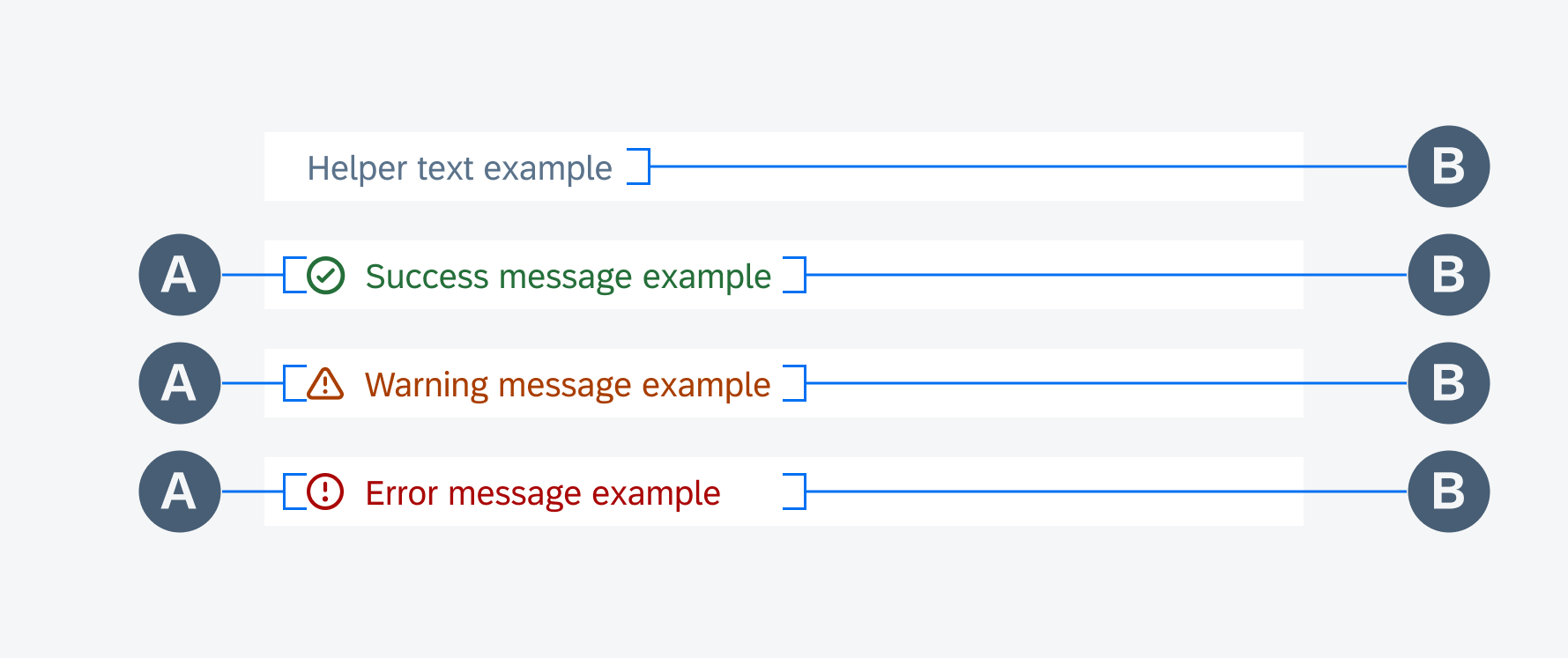
In-line validation anatomy (from top to bottom: helper text, success message, warning message, error message)
Depending on the variation and use case, in-line validation may persist or disappear.
Helper text should persist as it provides contextual information to the user. A success or warning message appears in response to a user’s interaction and may disappear.
An error message similarly appears in response to a user’s interaction but will disappear once the error has been corrected.
In certain use cases, error messages may also be used in conjunction with a page-level error banner.
If there are critical errors, the user may be required to correct the errors before being permitted to proceed with input or form submission.
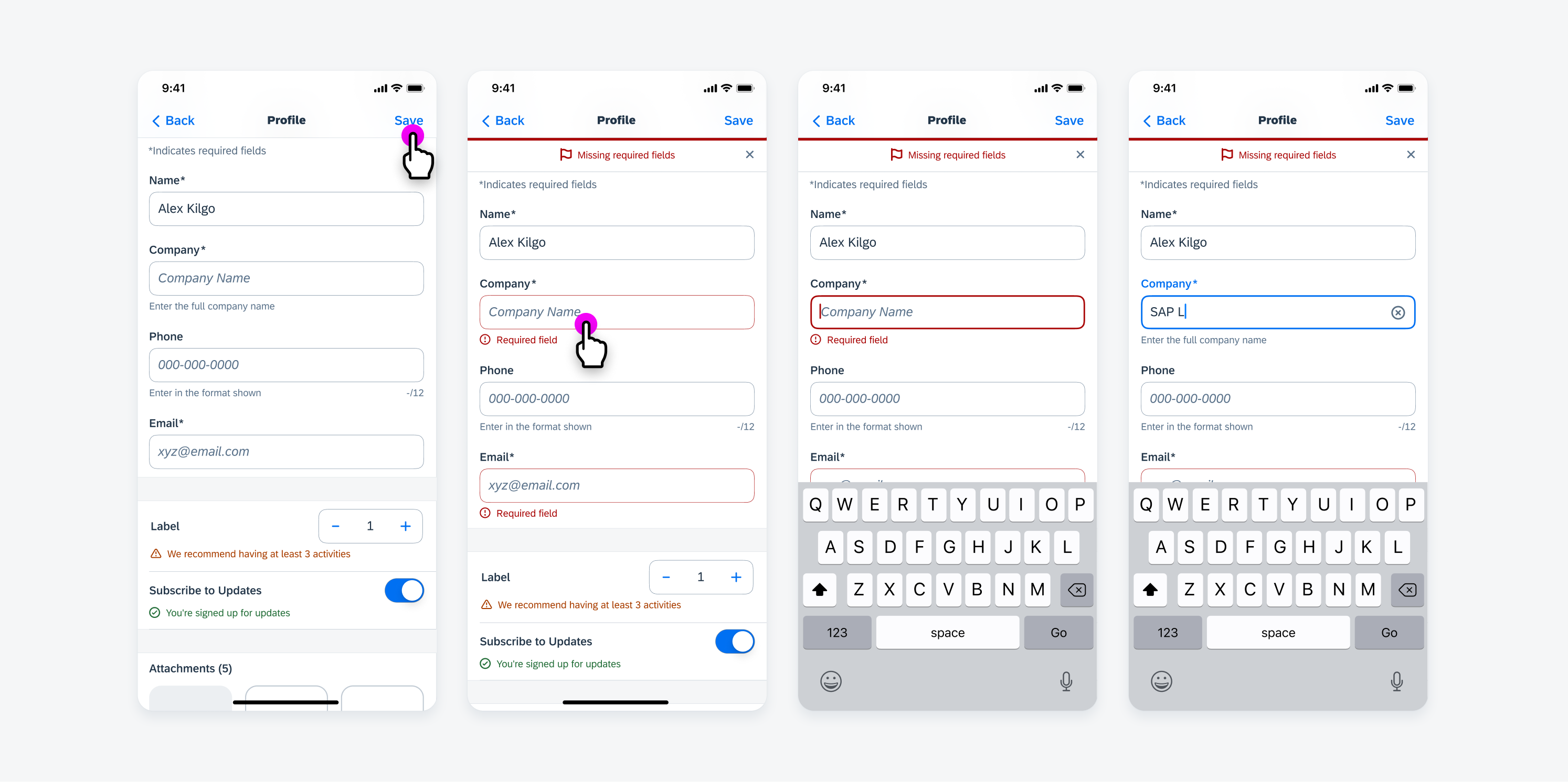
Once an error is resolved, an error message reverts back to helper text
Helper Text
Use helper text to convey contextual information to the user.
There is no icon used with helper text, and the helper text should persist. If there is a success, warning, or error message related to the form cell that needs to be displayed temporarily, the helper text will revert back.
Helper text examples
Success and Warning Message
Use a success or warning message to provide temporary feedback in response to a user’s input.
Success and warning message examples
Error Message
Use an error message to provide temporary feedback in response to a user’s input when user action is required for correction.
An error message provides information about the error and how to correct it.
Error message examples
Resources
Development: FUIInlineValidationTableViewCell, FUIInlineValidationView
Related Components/Patterns: Error Handling
 Your feedback has been sent to the SAP Fiori design team.