
Sidebar
FUISideBar
Intro
A sidebar provides app-level navigation and quick access to users’ favorite or pinned contents. The sidebar is useful if you expect a user to switch between app-level destinations frequently. This component is only available in regular width. If you need app-level navigation on compact width, use a tab bar instead.
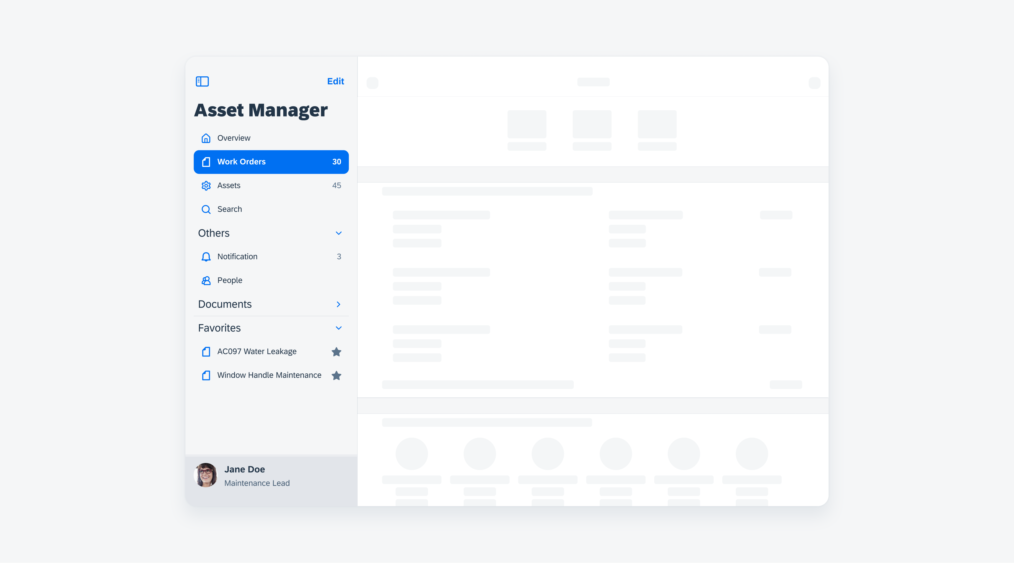
Example of a sidebar in regular width
The primary column contains the sidebar. The sidebar contains a header, a list, a footer, and a vertical divider.
A. Header
B. Destination List
C. Footer
D. Default Cell
E. Active Cell
F. Outlined Group
G. Vertical Divider
Primary Column
The width of the primary column is flexible. The default width is set to 320pt.
Destination List
- Icon: Icons are optional. Icons supplement labels as indicators of a destination.
- Label: Keep text labels concise. When a text label extends beyond the primary column width, truncate it, instead of shrinking or wrapping the text.
- Right accessories: Right accessories are optional; numbers or any icon button can be added. Within an outlined group, don’t mix number and icon button or different icon buttons.
Outlined Group
Related destinations can be grouped together. Grouped items have a heading as a group name.
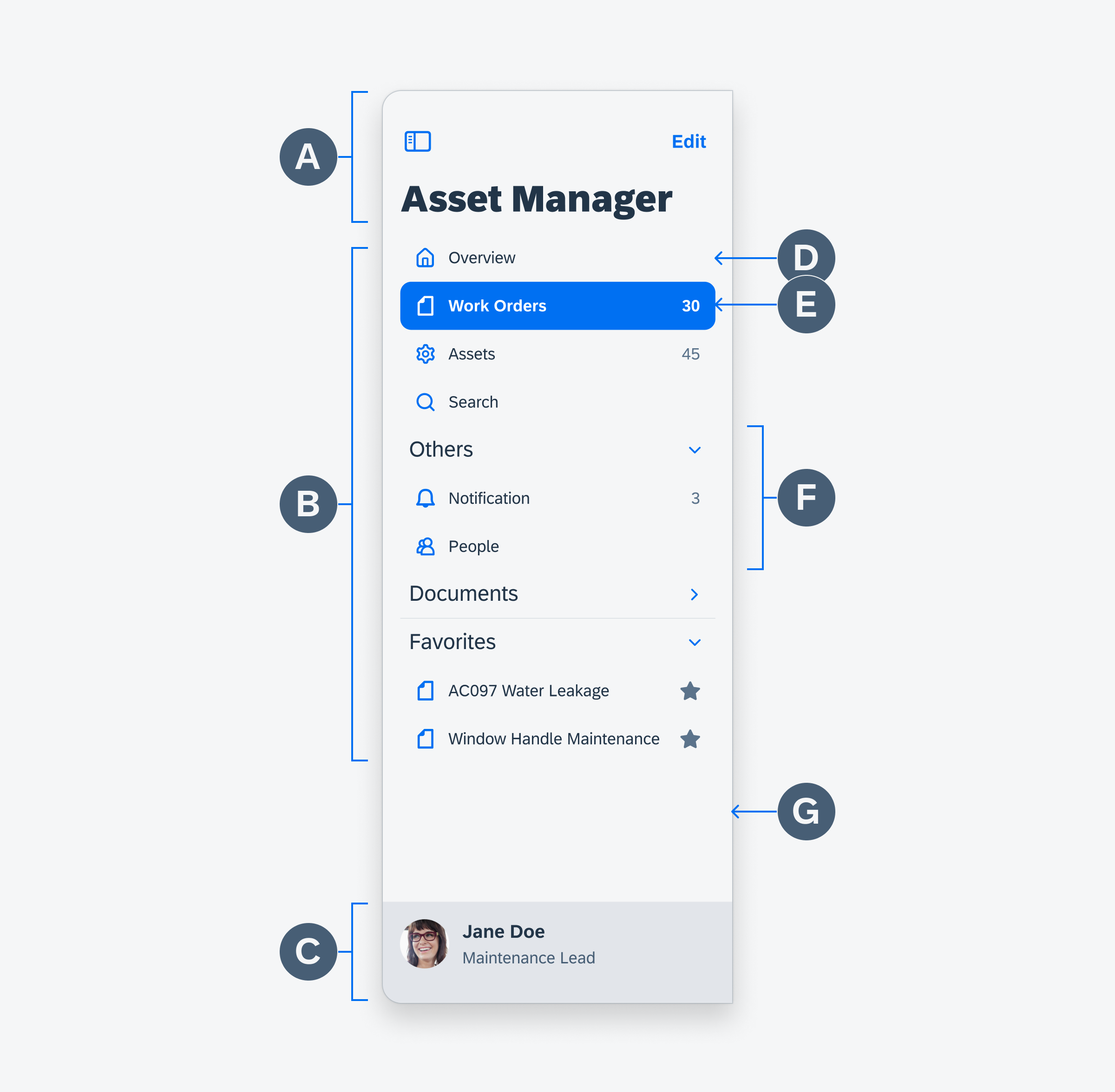
Sidebar anatomy
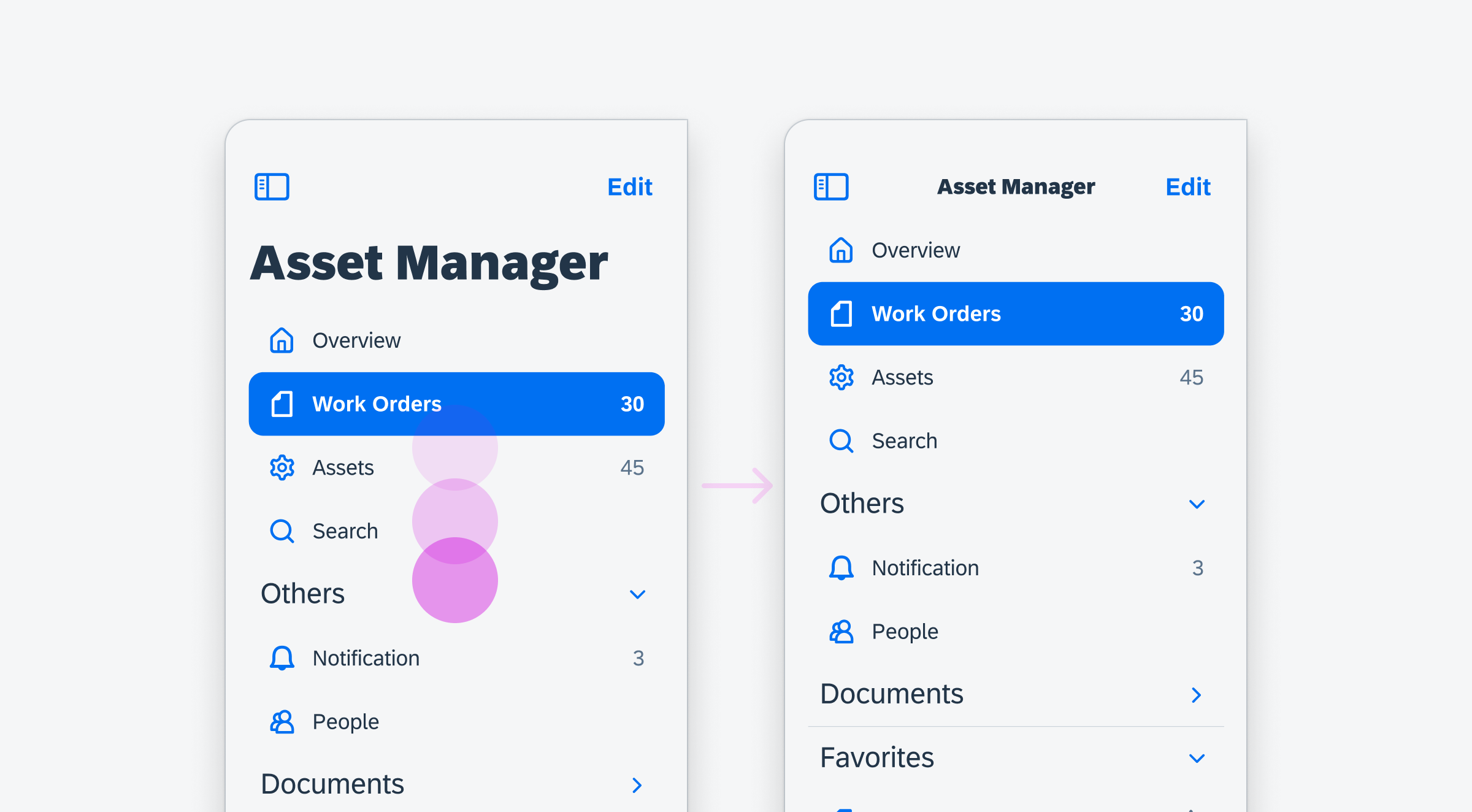
Selection
The current screen is selected and represented in an active state. When the app is first opened, the landing screen, Overview in this example, is an active state by default. Only one cell in the sidebar can be activated at a time.
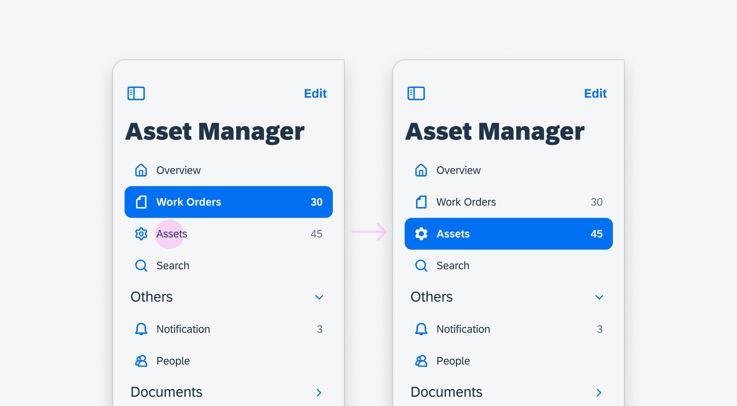
Active work orders cell (left) and active assets cell (right)
Grouping
Destinations in the same category can be grouped together as an outlined group. An outlined group has a header and the list of destinations. The header contains the group name and the chevron. Tapping on a header opens or collapses the destination list below the header.
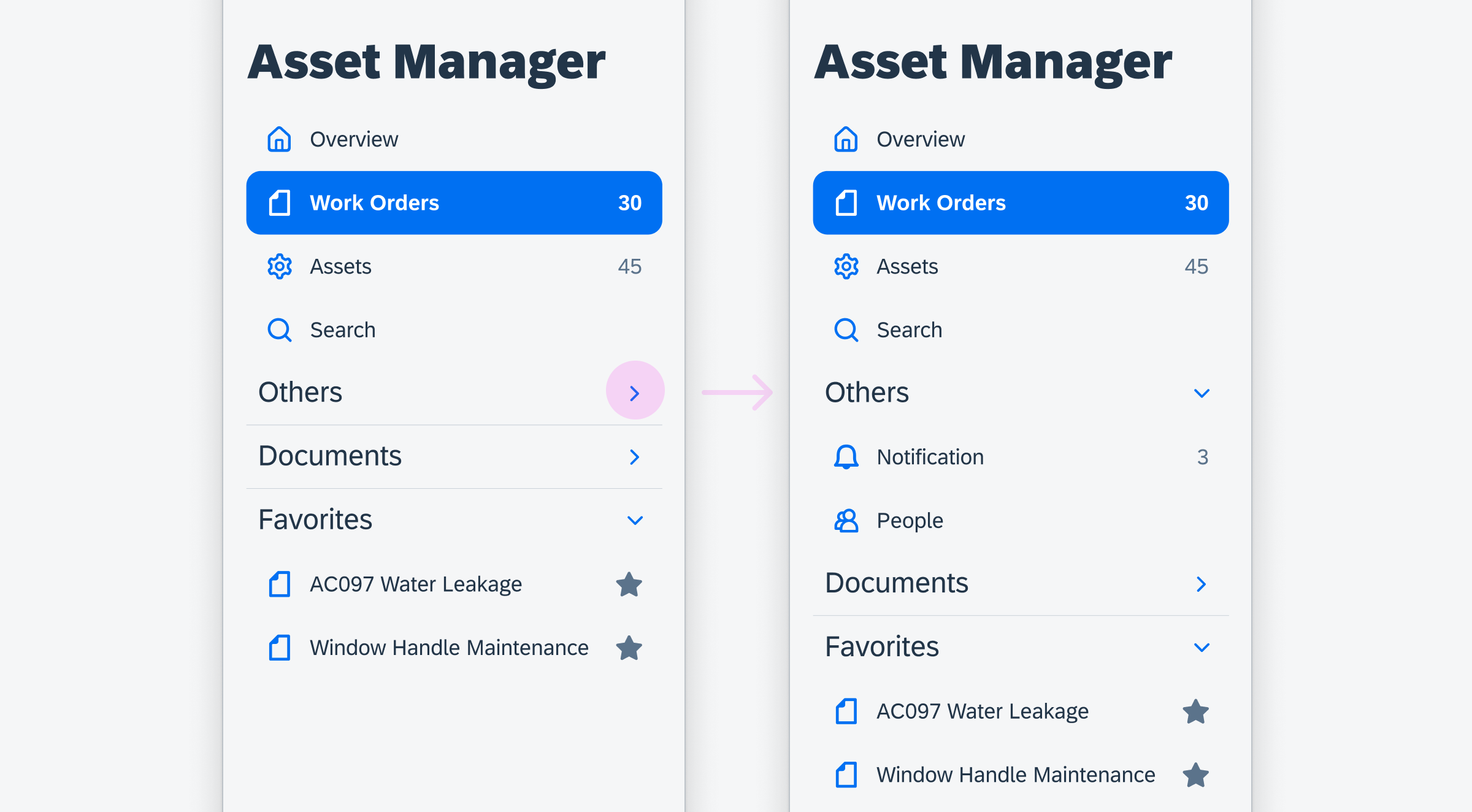
Collapsed group (left) and expanded group (right)
Collapsing and Opening
In landscape mode, the sidebar is visible by default. To create more room for their content, the sidebar can be collapsed by the toggle icon on the top left corner. The user can open the sidebar again by using the built-in edge swipe gesture.
In portrait mode, the sidebar is open by default as an overlay. The sidebar can be collapsed by tapping outside of view. The user can open the sidebar again by the built-in edge swipe gesture.

Collapsing and opening the sidebar
Scrolling
The sidebar is vertically scrollable, if the list of navigation destinations is longer than the height of the area between the header and the footer. When the user scrolls down, the sidebar title switches to collapsed mode and stays fixed.
Vertical scrolling within sidebar
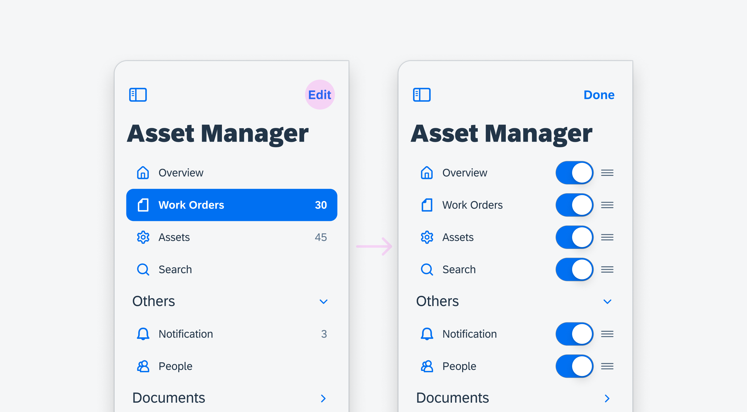
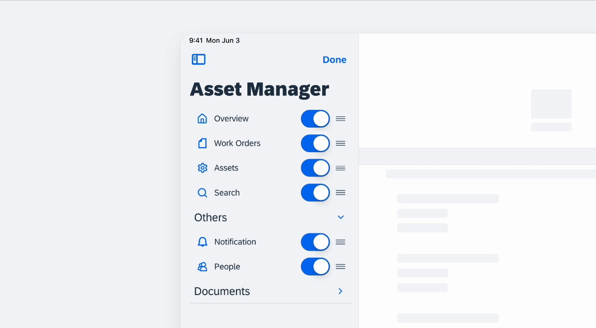
Edit Mode
Users can make changes to the sidebar in edit mode by tapping on the “Edit” button. This allows them to hide or show list items by toggling the switches.
Sidebar in edit mode
List items can be rearranged with the drag handles.
Rearranging list items in the sidebar
Resources
Development: FUISideBar
SAP Fiori for Android: Navigation Drawer
Human Interface Guidelines: Sidebars
Related Foundations: Adaptive Design, Navigation
 Your feedback has been sent to the SAP Fiori design team.