Tab Bar
UITabBar
The tab bar (or: tab view) is a navigation element located at the bottom of a screen. It uses tab items to navigate between mutually exclusive panes of content at the same level of hierarchy within the same view.

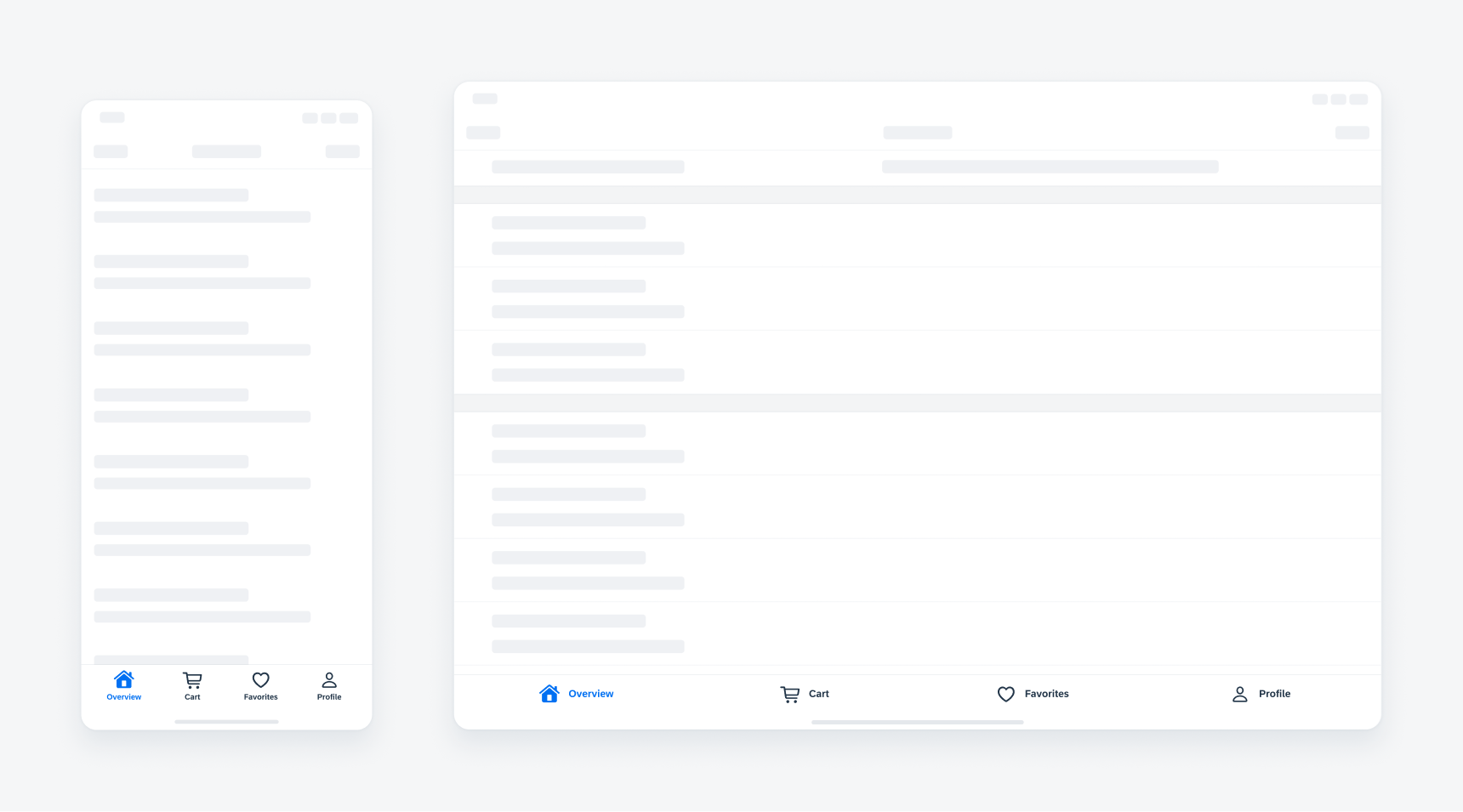
Tab bar in compact width (left) and regular width (right)
A tab bar lets users navigate among different areas of an app. The tab items of the tab bar usually consist of a text label and an icon. This helps the user to quickly classify the content. The label may be omitted only if the icon shown is universally known and understood.
Use it only to enable navigation, not to help users perform actions. If you need to provide controls that act on elements in the current view, use the toolbar component instead.
Make sure the tab bar is visible when users navigate to different areas in your app.
- Keep the label text short and concise (no more than 25 characters long including spaces).
- Use concrete nouns or verbs as tab labels.
- Use a “More” tab as an overflow menu if your iPhone app needs more than five tab items.
- Use a “More” tab as an overflow menu if your iPad app needs more than six tab items.
- Use icon-only tab items only if they can be represented by universally recognized icons, for example, icons for store, search, basket, and profile.
- Use a filled icon for the active tab and default icons (unfilled) for unselected tabs.
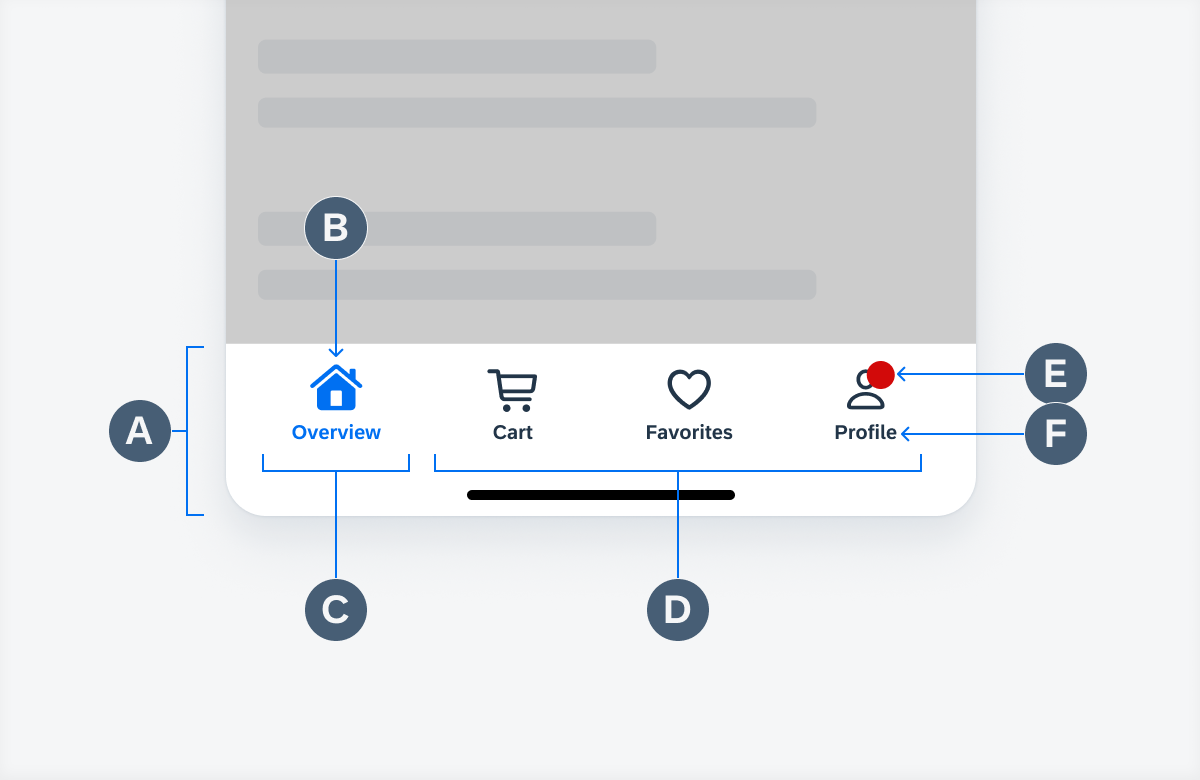
A. Tab Bar Container
The tab bar container contains the active as well as the inactive tab items. The tab bar should always be visible – also when you navigate to different areas in your app.
B. Tab Icon
Tab icons represent the content of its tab. Tab bar icons can appear above tab labels in portrait orientation, whereas in landscape, the icons and labels can appear side by side.
C. Active Tab
The selected, active tab item should always display the filled variant of the icon and be colored in tint color to stand out from the inactive tabs.
D. Inactive Tabs
Inactive tabs display the unfilled variant of the icon.
E. Notification Badge
A red notification badge appears on a tab item if the associated tab has an active notification. The notification badge can also display the number of notifications with white text.
F. Tab Label
The tab label represents the content of the tab. It should be understandable, short and concise.

Tab bar anatomy
When an inactive tab item is selected, it gets active and users are directed to the content of that tab. Navigation between different tabs is visually highlighted by the tint color and a filled icon.
When the content exceeds the screen size and users are able to scroll, the tab bar remains always fixed at the bottom the screen.
Haptic Feedback for Tab Selection
When a specific tab is selected, the user receives haptic feedback through of a slight vibration. The so-called selection feedback generator indicates a change in selection (active / inactive tab).
Haptic Feedback for Notifications
When a new message arrives in one of the existing tabs, the user receives a slightly stronger haptic feedback. The so-called notification feedback generator indicates an incoming notification.
“More” Tab
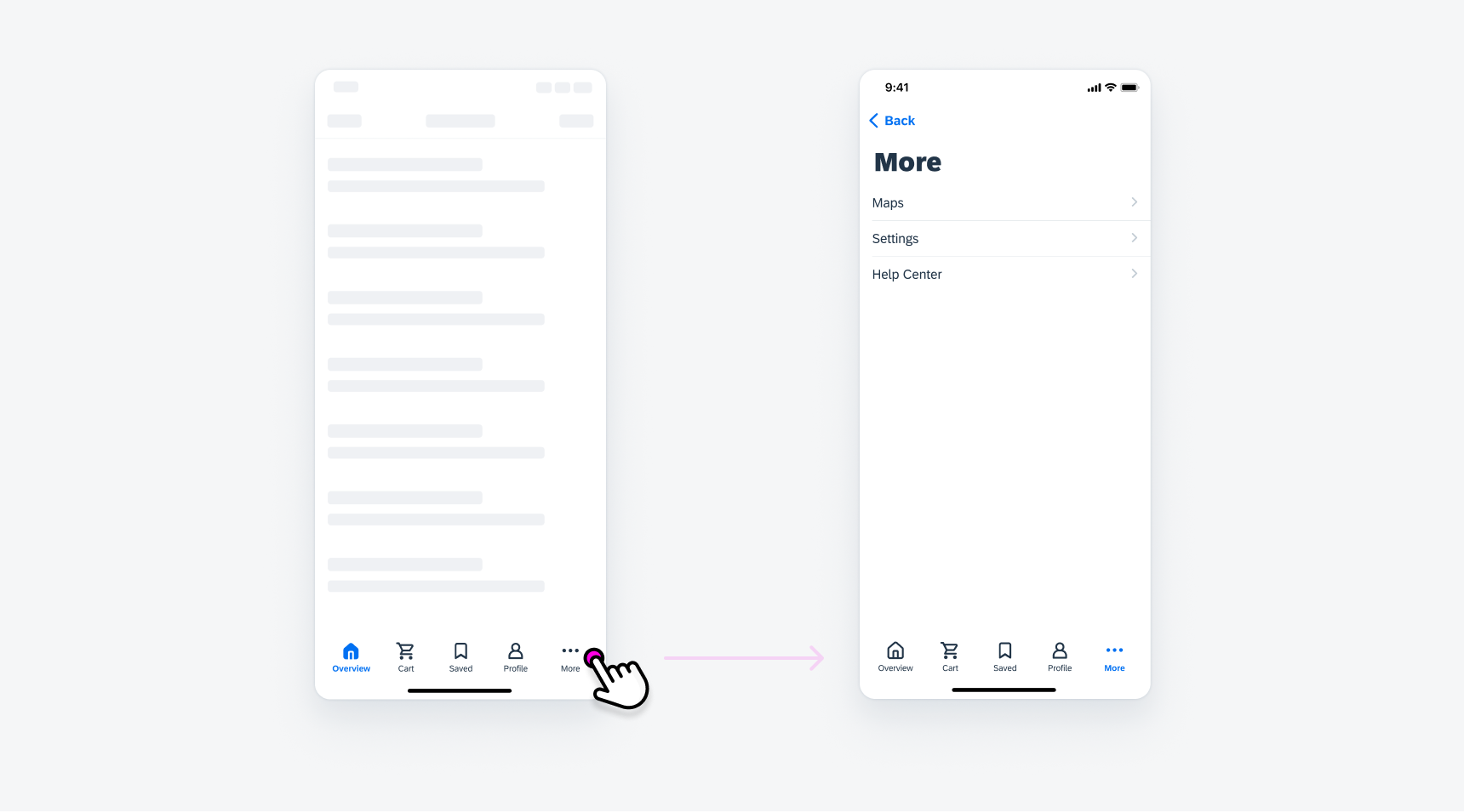
When there is not enough horizontal space to display all tabs, the trailing tab becomes a “More” tab (overflow tab), displaying the remaining items in a list on a separate screen.

Tapping on the "More" tab opens a list with remaining items
The tab bar spacing follows the global layout margins of the iOS size classes. It uses 100% of the screen width and the different tabs are equally distributed across the container of the tab bar.
The number of tab items within the tab bar should be no more than five in compact width and no more than six on regular width.
By default, a tab bar is translucent and has a blur effect. Translucency can help people retain their context by providing a visible reminder of the content that is in the background.
The tab bar hides when a keyboard is on screen.

Tab bar on compact (left) and regular (right)
Development: SAPFiori Reference: UITabBar, FioriSwiftUICore: TabView
SAP Fiori for Android: Navigation Bar

 Your feedback has been sent to the SAP Fiori design team.