Layout Basics
Horizontal Space
Compact Width
The spaces between the left/right window edge and the component are called margins. In compact width layouts, full-width components have 16dp layout margins by default. The spacing between UI elements inside the components can be fixed or flexible with auto layout depending on each use case.
Regular Width
In regular width layouts, full-width components have 20dp layout margins by default. The spacing between UI elements inside the components is generally larger than the compact width variant.
With the expansive horizontal space in regular width, we recommend using two sub-classes: readable width and full-width regular.

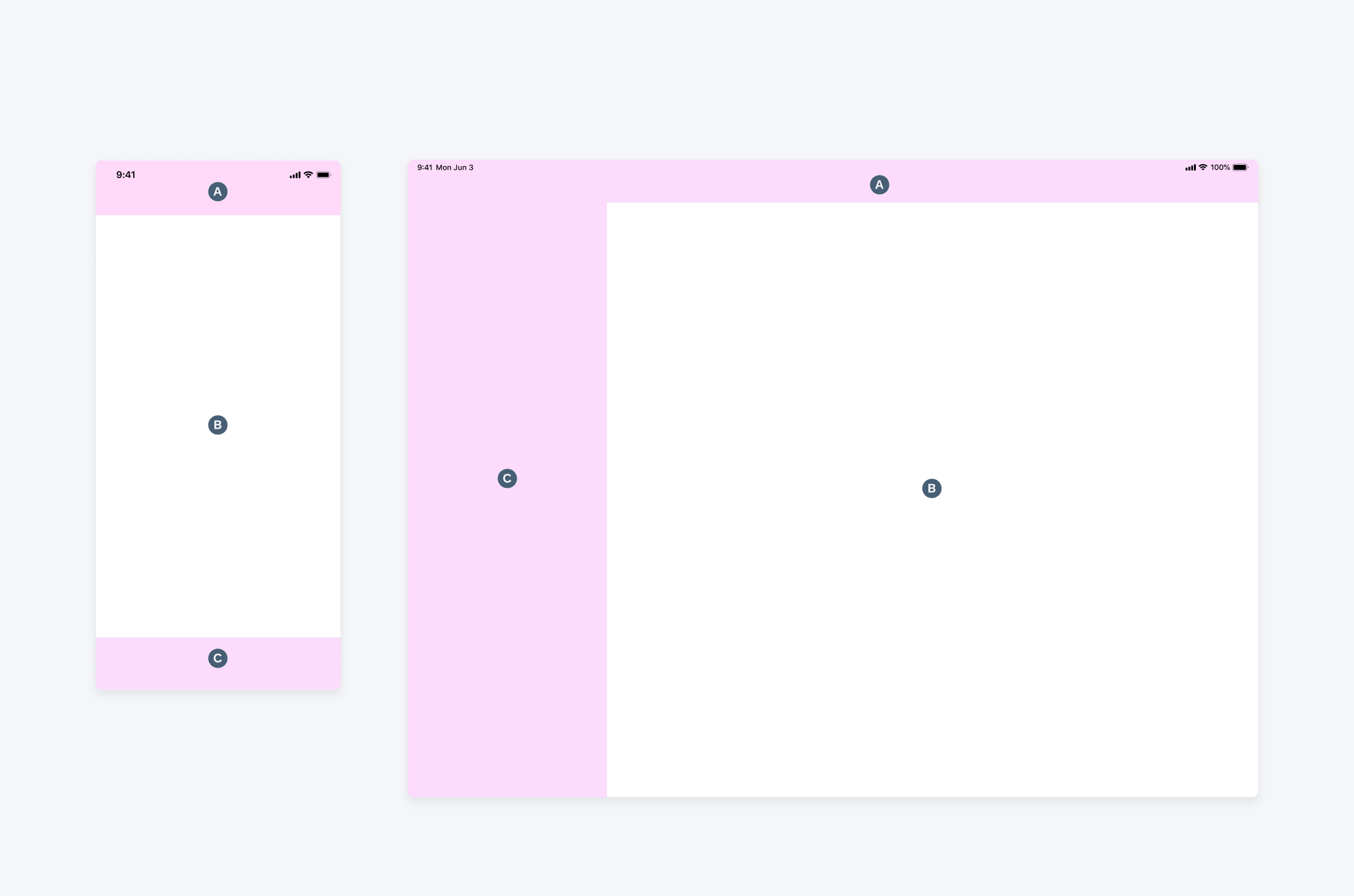
Compact width layout on iPhone and regular width layout on iPad
Vertical Space
The height of a UI component adapts to the availability of space of the current screen. There are three variants when applying the main size classes on vertical space:
- Compact height
- Regular height – iPhone
- Regular height – iPad
Compact Height
The compact height layout variant is only available in landscape orientation on a few iPhone devices. Inner paddings and spacings between UI elements need to be decreased and therefore allow more content to be shown on the screen.
Regular Height – iPhone
The regular height layout variant specific to iPhone devices allows the regular height size class. It is a default height class for all components.
Regular Height – iPad
The regular height layout variant specific to iPad devices only applies to some of the components that require more space.


 Your feedback has been sent to the SAP Fiori design team.