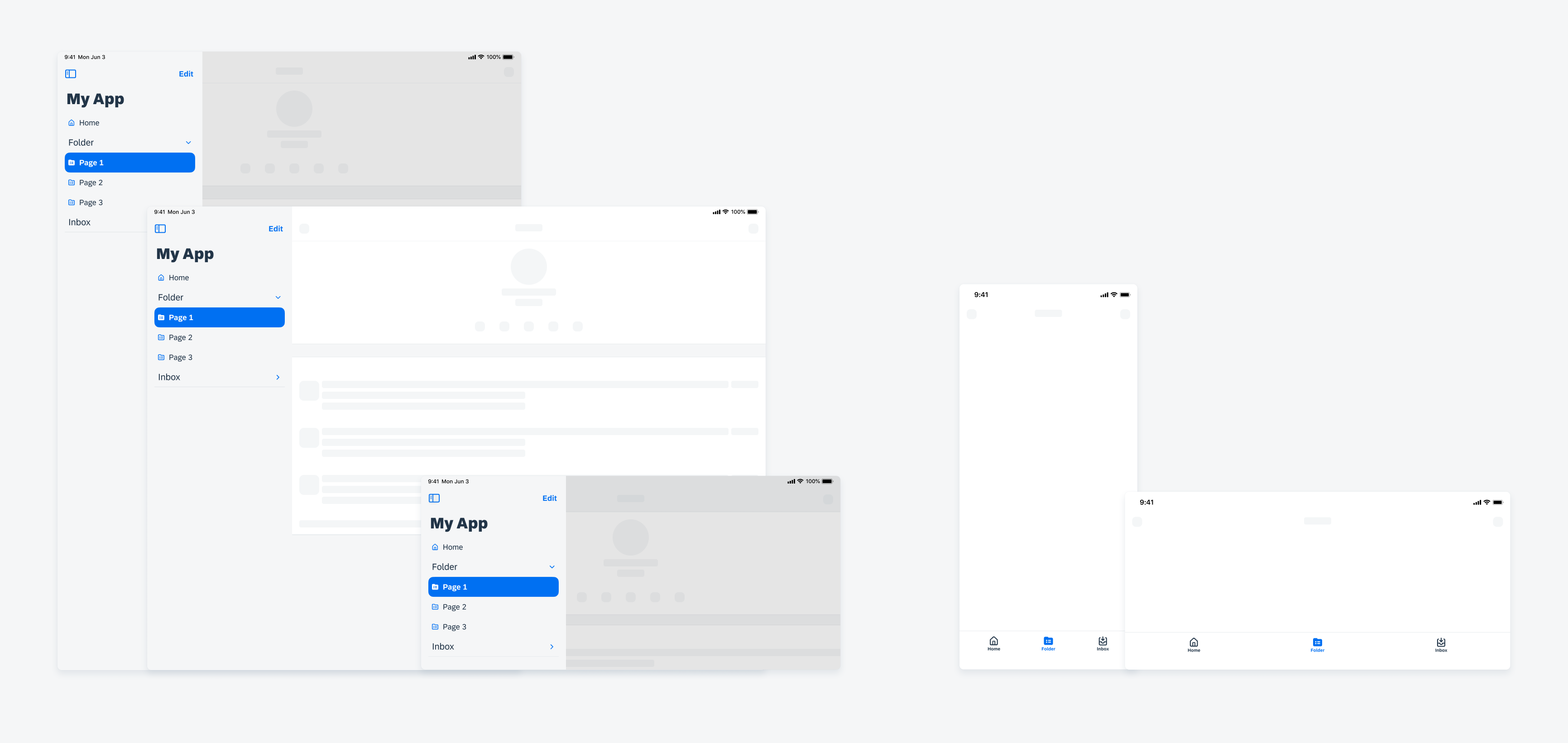
Size Classes
Intro
iOS defines two main size classes: regular and compact. These classes apply to both horizontal and vertical space.
The compact size class is typically associated with smaller iOS devices such as iPhone or split-screen views on iPad, where screen real estate is limited. The regular size class is associated with larger devices such as iPads and full-screen views, providing more spacious layouts to work with. An exception are large iPhones in landscape which use regular size class.
The size class is determined by the current device type, orientation of the device, and the use of slide over or split view.
Note that in 1/2 split view, most iPads use compact size class, but some large iPads, for example, 12.9 inch and 13 inch, use regular.
The Importance of Designing with Size Classes
Due to the dynamic nature of available window space, which can be resized by the user, changed by device orientation, or by multitasking, it is important to use size classes for design instead of focusing on specific devices.
Width and Height Window Size Classes
Available width and height are classified separately, so your app has two size classes – one for width and one for height. Typically, available width holds more significance than available height because vertical scrolling is more common. Therefore, the size class related to the available width is likely more relevant to your app’s UI.


 Your feedback has been sent to the SAP Fiori design team.