Overview Page
Intro
The overview page type is a hub that provides previews of larger bodies of information sourced from different parts of the app. It contains details important to the user and provides quick access to items relevant to the user’s tasks. Use the Overview page if you want to highlight information that matters to the user. This can include data that the user needs to track, or key information for the user’s day-to-day work.

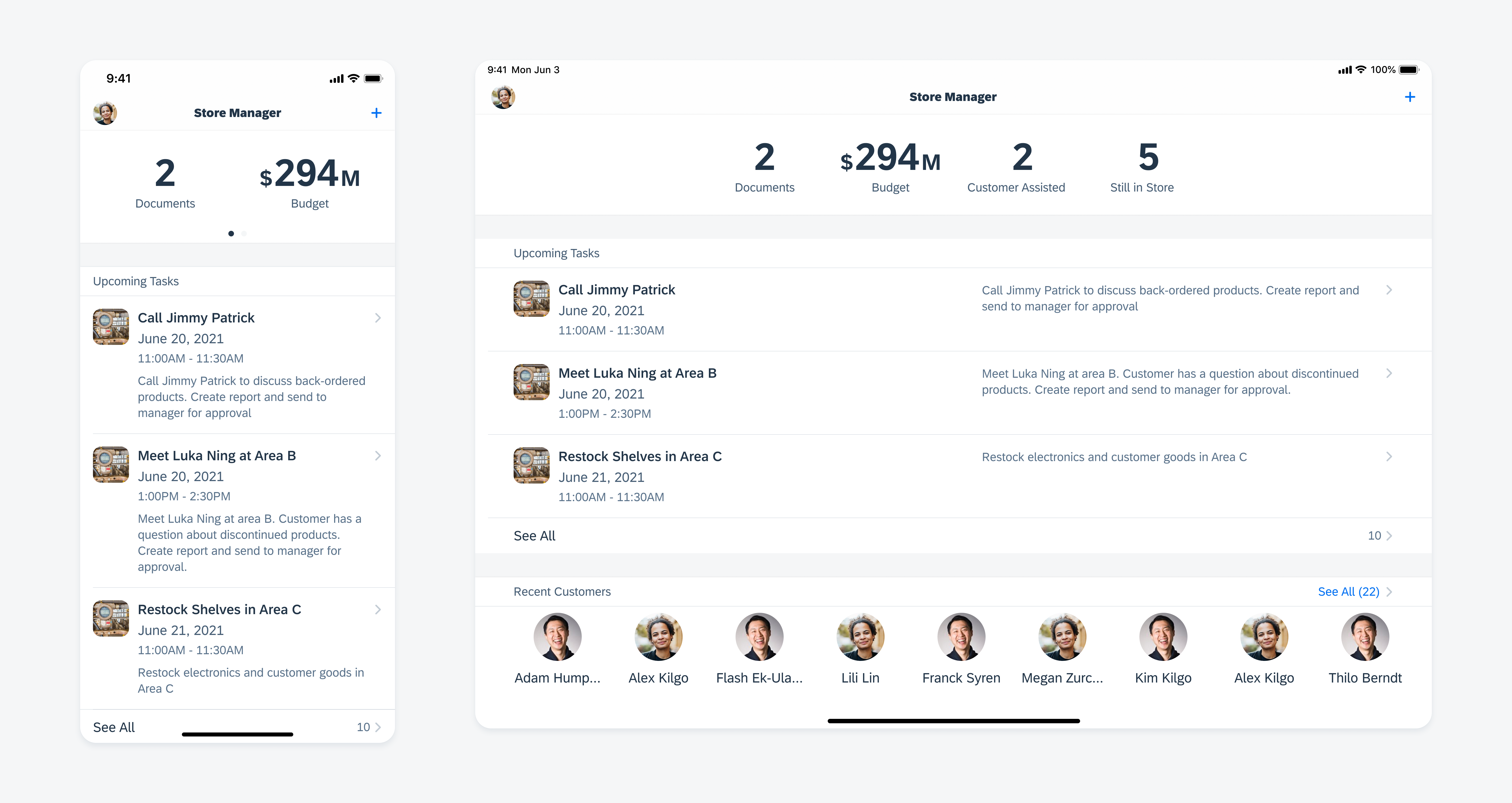
Overview page in compact width (left) and regular width (right)
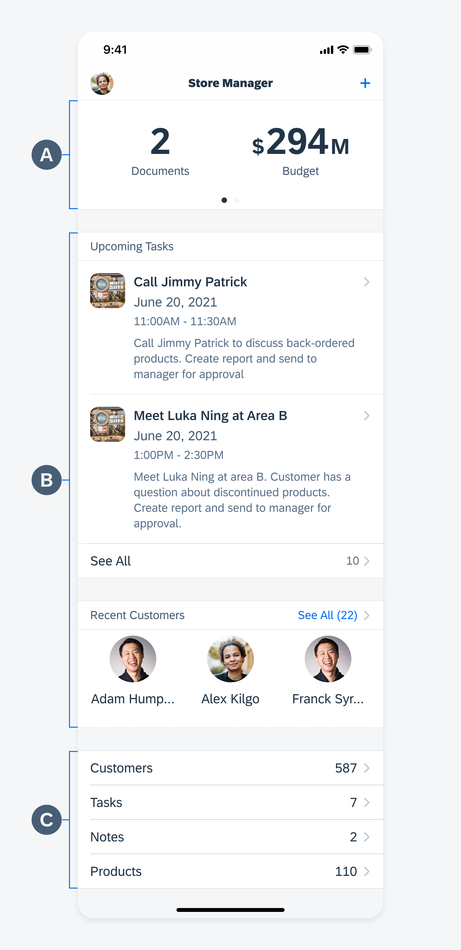
A. Exceptions and Urgent Items or Performance Indicators
Tapping on each number brings the user to a filtered list. You can display up to four numbers in regular width, and three in compact width. If more than three numbers need to be shown in compact width, consider including page controls for the user to swipe for more information. To learn more, see KPI Header.
In some cases, it will be helpful for the users to keep track of their progress or performance. In this example, while it’s important for the user to keep track of daily performance, it’s not critical to always have these metrics visible on screen. As the user scrolls, the header therefore does not stick to the top of the screen, instead making way for other content to fill this valuable space.
B. Previews of Selected Facets
The preview section provides quick access to objects that require attention as well as the most frequently-viewed objects. This section should always be contextually relevant to the user’s needs. Instead of providing previews of all customers, for example, in this example it is more useful for the user to see only recent customers.
C. Facets
The facets provide a menu that contains links to every object in the app. This section is always placed at the bottom of the overview page.

Anatomy of an overview page
Navigation Bar
Actions taken in the overview page are generally global in effect. The user may be able to search within the whole app, for example, or make a change to user settings. Other actions may be included, depending on the use case.

Actions in the navigation bar of an Overview page have global effects
Navigational Structure
Flat Navigation
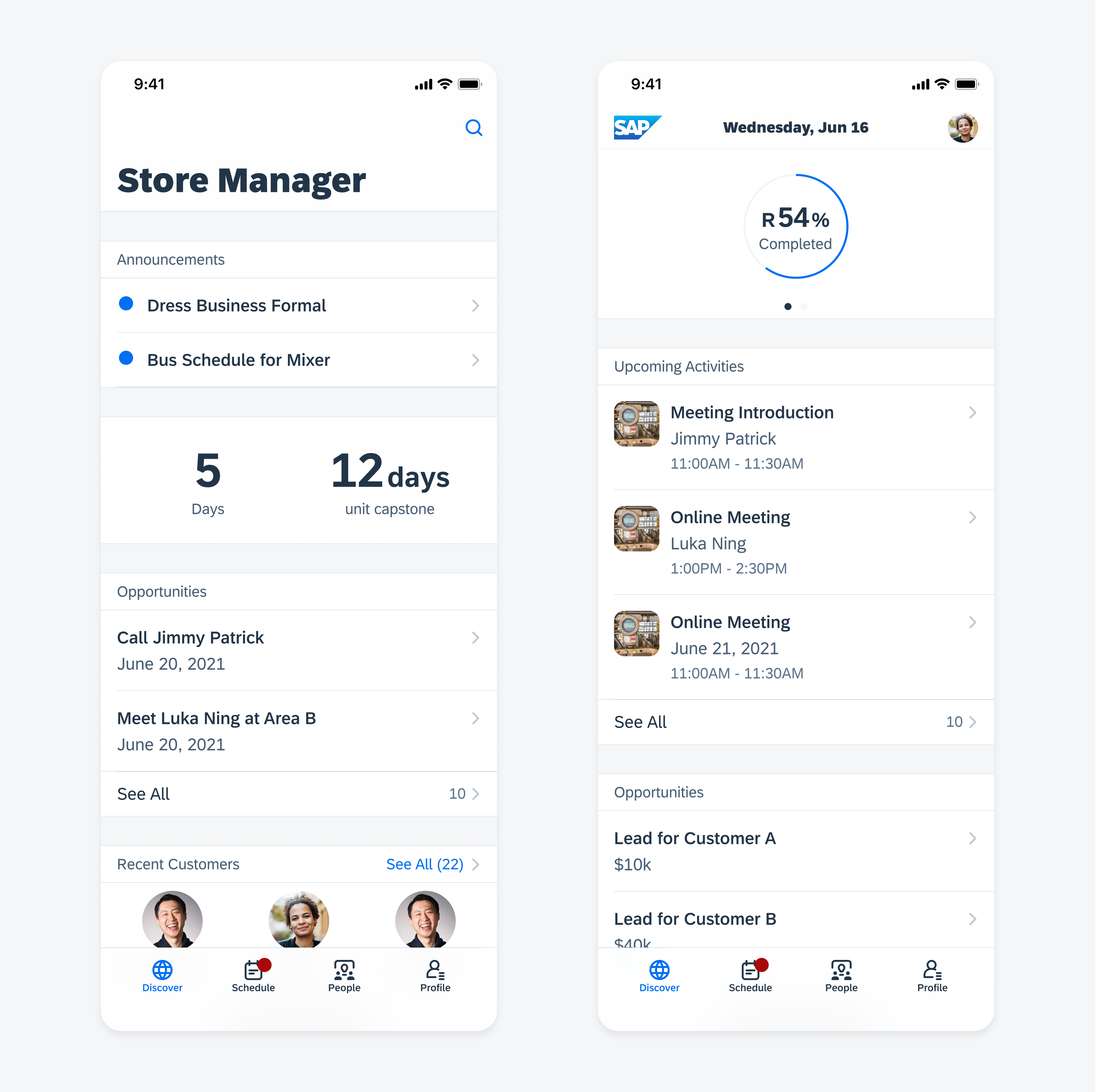
In general, the overview page is most common in apps that use a hierarchical navigation style. When using the overview page within a flat navigation style, make sure the information that is presented to the user is not simply duplicated from other tabs.

Overview pages with a flat navigational structure
Facets
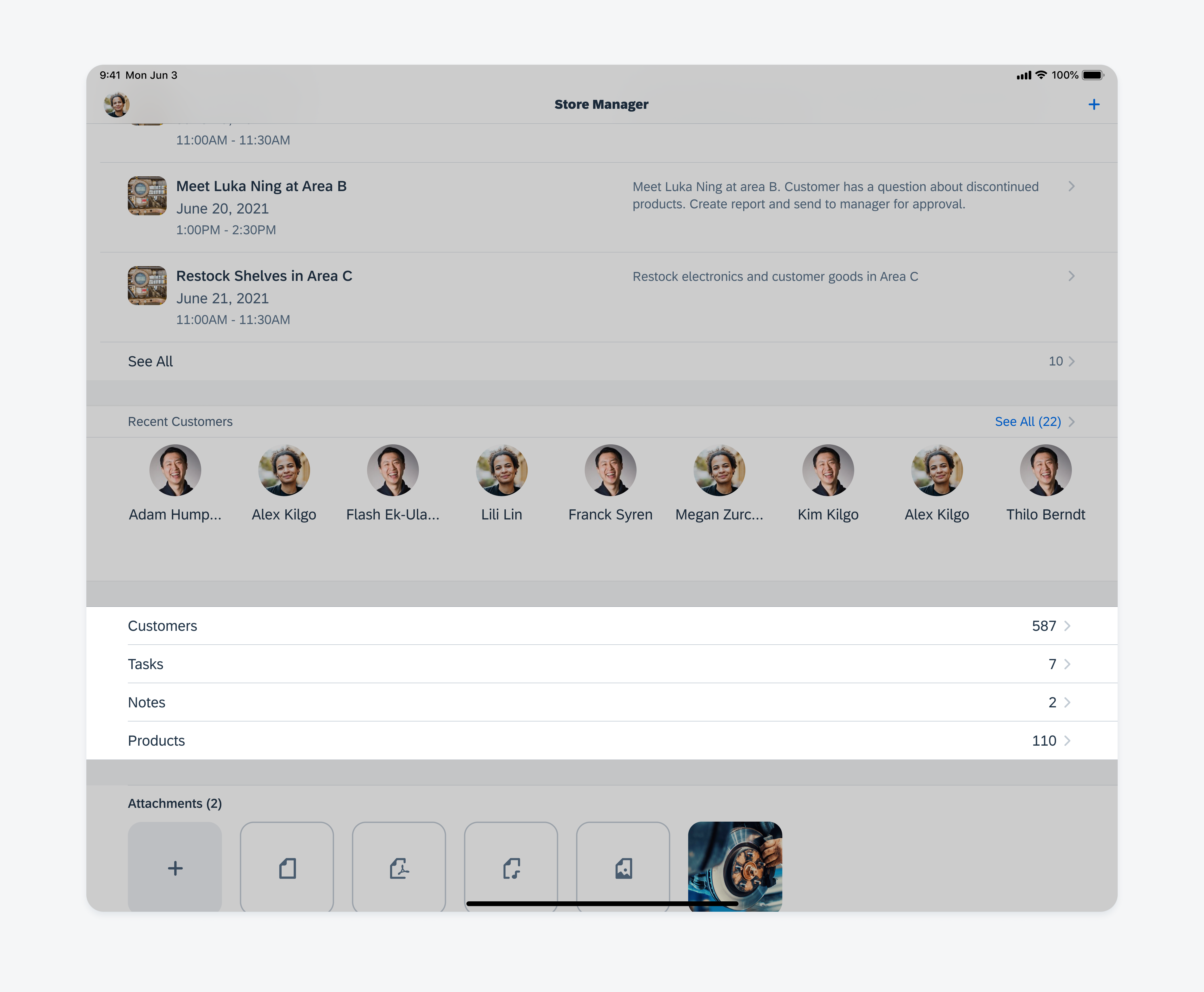
The facet section provides an entry point to every object in the app. Users may have access to full lists of less frequently used objects by tapping on each item. Most frequently used object types should be surfaced in preview table view sections instead of relying on the facet section. This pattern provides the user with more visibility of objects comparing to grouping object in a hamburger menu.

Overview page with a facet section on iPad
Development: Overview Pattern, FUITableViewHeaderFooterView, FUICollectionSectionHeaderFooterView, FUISectionHeaderFooterStyle
Related Components/Patterns: KPI Header, Preview Table View, Collection View

 Your feedback has been sent to the SAP Fiori design team.