
Avatars and Images
FUIImageView
Intro
An avatar is a visual element used to display images. These can be user profiles, user initials, placeholder images, icons, or business-related images, such as product pictures.
Round avatars for profile images and squares for objects
- Use a round avatar to represent a user or profile within table view cells, collection views, or cards.
- Use a round avatar to display user initials or generic icons.
- Use an indicator on the avatar to display a status, for example.
- Use a rounded square avatar (also called a thumbnail) to display an image of an object, such as a product within table view cells, collection views, or cards.
- Use a square avatar (also called thumbnail) to display an icon or a photo of an object.
- Don’t use a round avatar to display an image of an object, such as a product.
- Don’t use a square avatar to represent a user or profile.
- Don’t use the avatar for interactive icons. Instead, use a button with an icon inside.
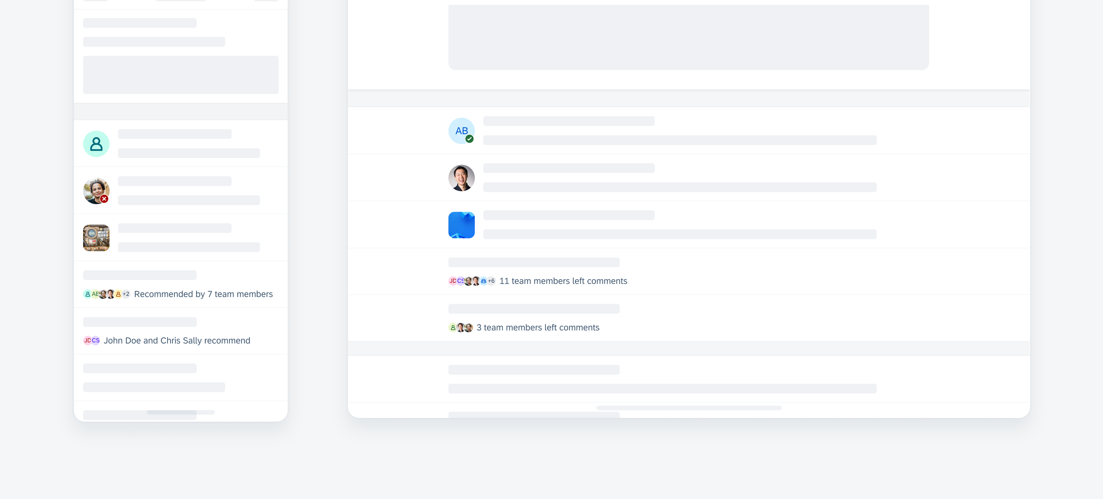
A. Avatar
The avatar generally refers to a round container that contains an image, an icon, or initials. When in a rounded square container, the avatar is considered a thumbnail that usually contains a business-related image, such as a product or an icon.
B. Badge (Optional)
An optional badge can be placed in the bottom right corner on top of the avatar to indicate a status.
C. Avatar Stack
Multiple avatars can be grouped horizontally in an avatar stack. To avoid clutter, we recommend displaying no more than six avatars. The sixth or last avatar can indicate the number of additional avatars.
The avatar stack only supports round avatars with a size of 16pt.
The avatar group supports round avatars with a size of 16dp (default) or 24dp.
D. Label (Optional)
A short label can be displayed together with the avatar group to provide descriptive information. This label can be positioned in various orientations.
Anatomy of avatar (top) and avatar stack (bottom)
Wrapping Behavior
The avatar stack’s label should be short and concise. In cases where the label is longer than the allocated space, it wraps to a new line by default. As a nested component, the wrapping behavior can be overridden by the parent component. If the label gets truncated, the user should still be able to view the full label, for example, by navigating to a detail page or by displaying a tooltip on long press.
Size
The size of an avatar is customizable, The avatar group can display avatars with a size of 16dp or 24dp.
Shape
Depending on the context, the avatar can be round or square with rounded corners.
Color
By default, the avatar uses the SAP Fiori accent color palette. If required, the color theme can be customized or branded colors can be introduced.
Layout
Depending on the use case, one label can be placed before, after, below, or above the avatar stack.
Avatar variations
Avatar stack label variations
Resources
Development: FUIImageView, groupedAvatarsViews
SAP Fiori for Android: Avatars
SAP Fiori for Web: Avatar
Related Components/Patterns: Object Cell
 Your feedback has been sent to the SAP Fiori design team.