
Collection View
FUICollectionItemView, FUICollectionViewTableViewCell, FUICollectionViewLayout
Intro
The collection view is a container that displays items in a grid. It previews a sample of content by presenting it in a highly visual layout and should not be used to display only text. Therefore, a collection view container should be populated with content that contains images to provide a more visual viewing experience.
Collection views are commonly found in the overview, object, and object details floorplans.
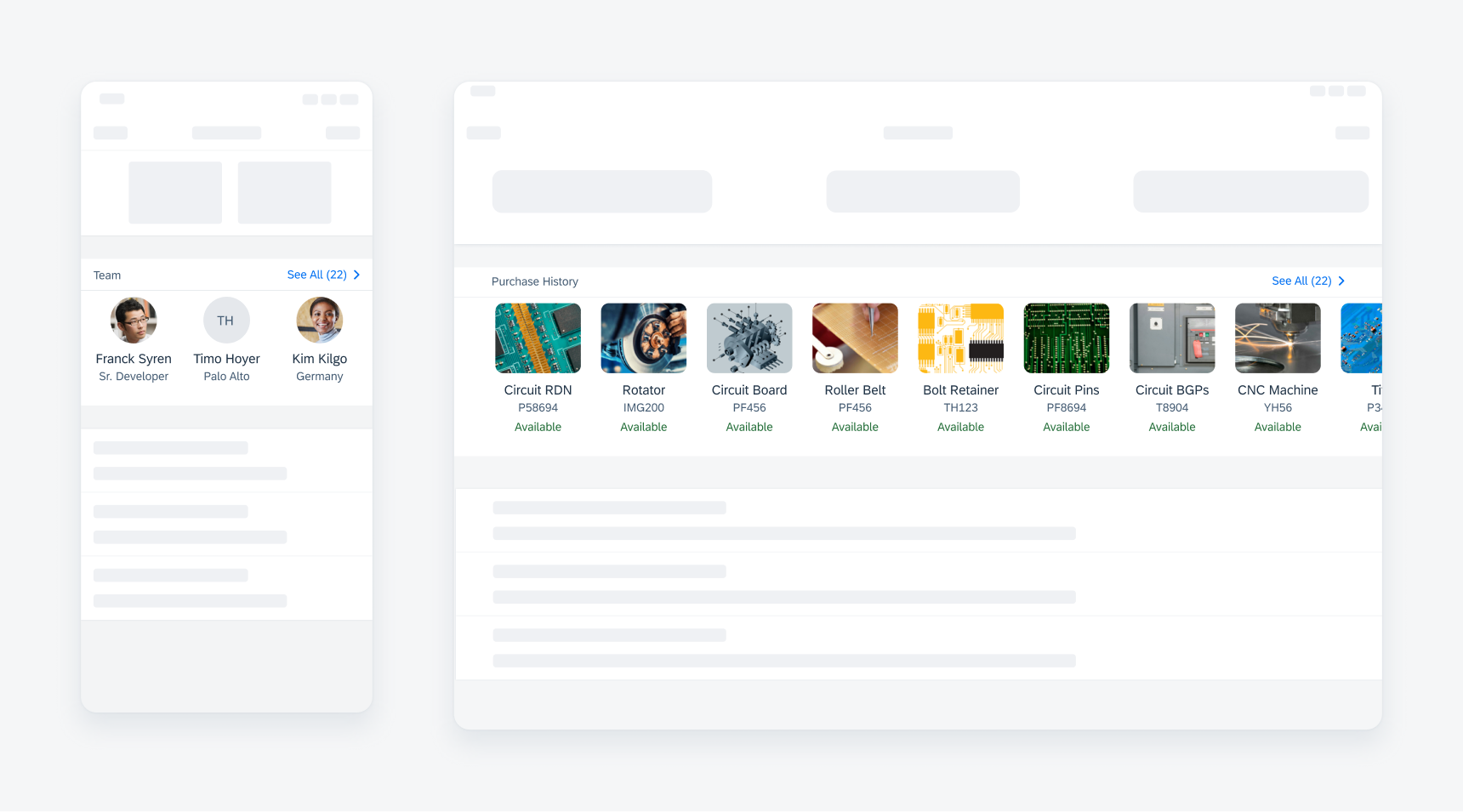
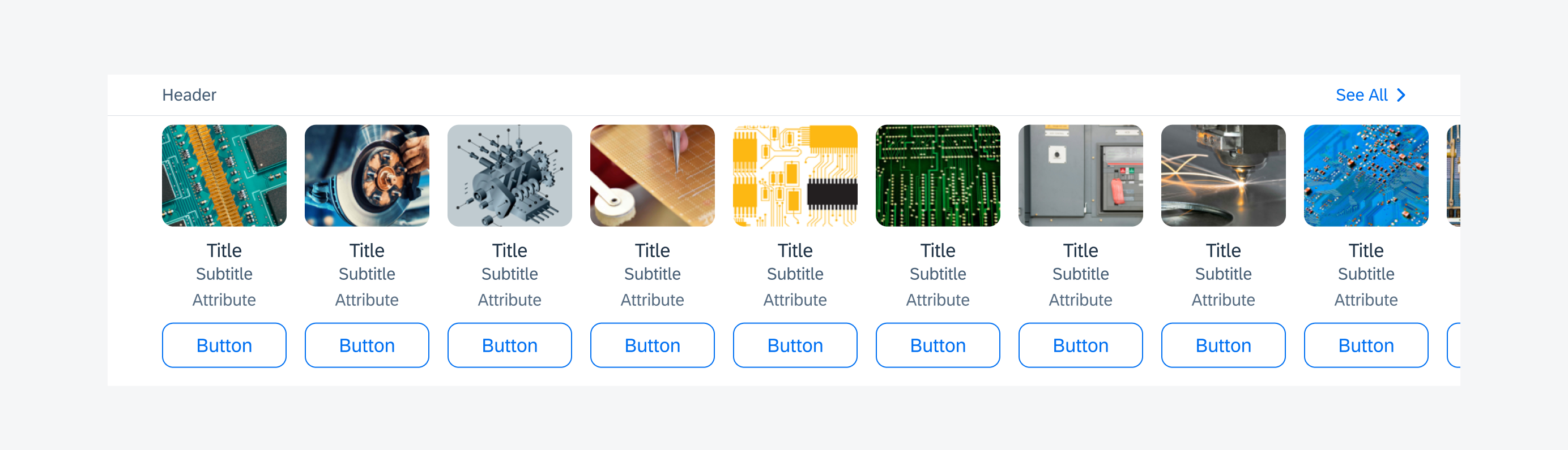
Collection view cell on iPhone and iPad
Empty Collection View
In most cases, the collection view displays a fixed number of predefined collection cells generated by the system, for example, a retail app displaying top 10 featured products. Here, the collection view always has content to display.
However, in cases where the content is generated by user interaction, the collection view may have an ‘Empty State’ until the user starts selecting/creating content to display. A good example of this is displaying attachments in an insurance claim.
You can either choose to hide the collection view entirely or if it is important to guide the user to generate this content, use the empty state of the collection view with a label clearly communicating that there is no content yet. There is no navigation until an cell is added to the collection.
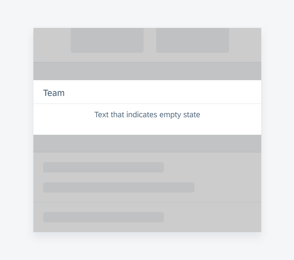
Example of an empty collection view
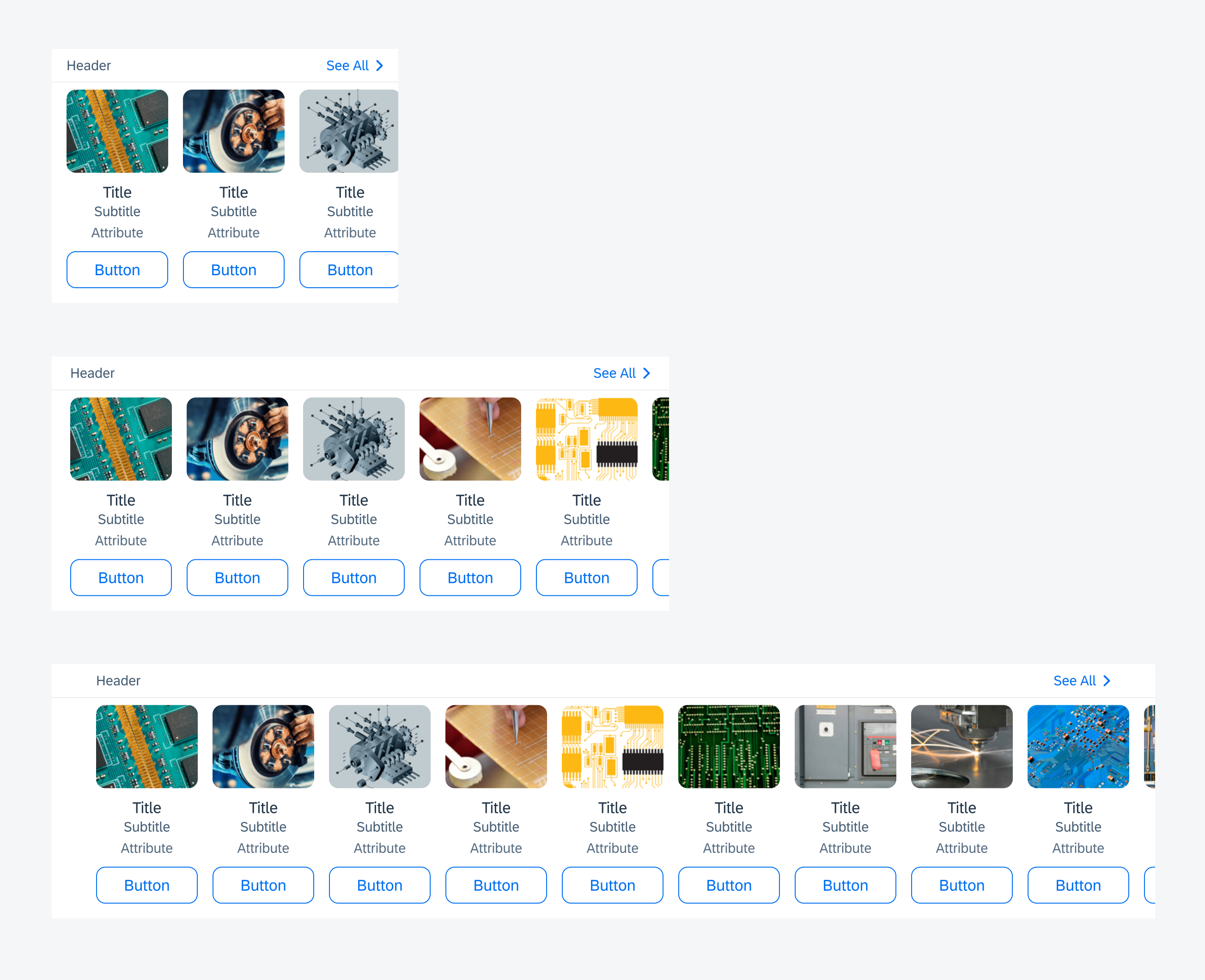
A. Section Header
At the top left of the collection view is the collection header, which describes what the content in the view represents. The collection view header is mandatory. For section header specifications, see Preview Table View.
B. “See All” Label
At the top right of the collection view is the navigational link to drill down and see the full content. The label should include the number of cells in the full list. This link takes the form of a label with a chevron icon. It is normally used when only a subset of the data is being displayed in horizontal scroll and horizontal fit variations.
C. Collection View Cells
This area displays the collection view cells. Collection view cells are a mix of images and short text labels displayed in a collection view.
They allow navigation from single items to a more detailed view of those items.
To learn more, see Collection View Cell.

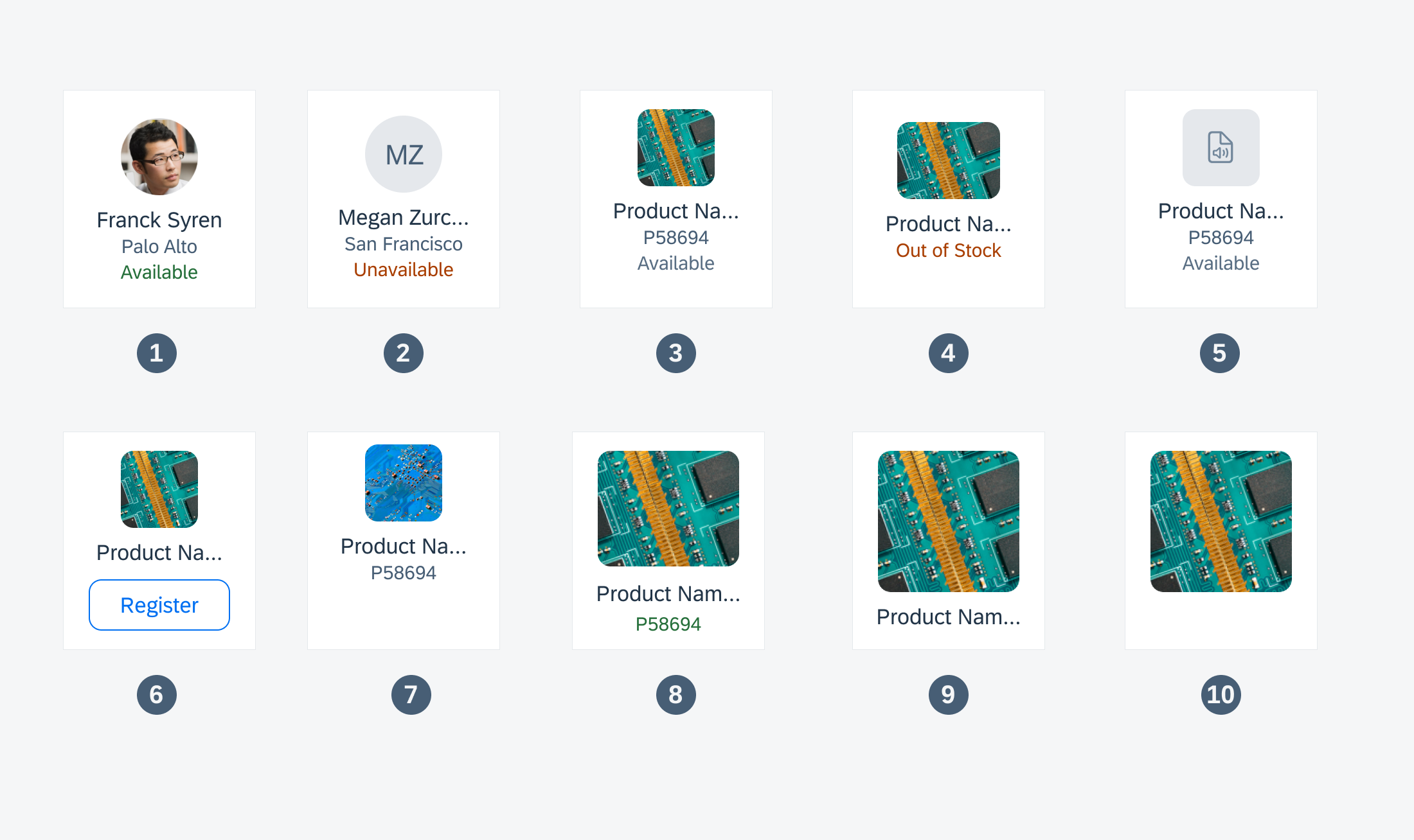
Anatomy of a collection view cell
Different examples of collection view cells:
1) Profile Image
2) Initials
3) Image 60pt x 60pt
4) Image 80pt x 60pt
5) Doctype Icons
6) Button Action
7) Icon Actions
8) Image 110pt x 90pt
9) Image 110pt x100pt
10) Image only
Collection view cells 1-6 are all in size 110px, 7-10 in size 120px.
To learn more, see Collection View Cell.
Examples of collection view cells
The “See All” label navigates to the entire set of data, usually as a list report.
All variations of the collection view are supported in both regular and compact width.
The only difference is the number of collection cells displayed. For horizontal fit and vertical collection views, you must define number of collection cells in landscape and portrait orientation. The padding could vary depending on the number of collection cells.
Several examples of collection views in different sizes
Horizontal Scroll
The horizontal scroll collection view variation allows for content to be displayed in a single horizontal line. It can scroll left and right and should be used when you want users to preview a subset of a list. It is recommended that the number of cells displayed in this variation should not exceed more than 20 and the “See All” label should communicate the total number of cells.
There is a fixed padding of 16px between the collection cells in this container.
Example of a horizontal scroll collection view
Horizontal Fit
The horizontal fit collection view variation allows for content to be displayed in a single horizontal line. The only difference from the horizontal scroll is that this variation does not scroll. It should be used when there is a specific number of cells you want to display. It can also be used if you want to preview a subset of information and the “See All” label should communicate the total number of cells.
The cells in this container can be left-aligned or justified. To set the padding between collection cells, the width of the container and number of cells should be known so that padding between cells can be automatically calculated. A minimum of 6px and a maximum of 65px of padding can be applied.
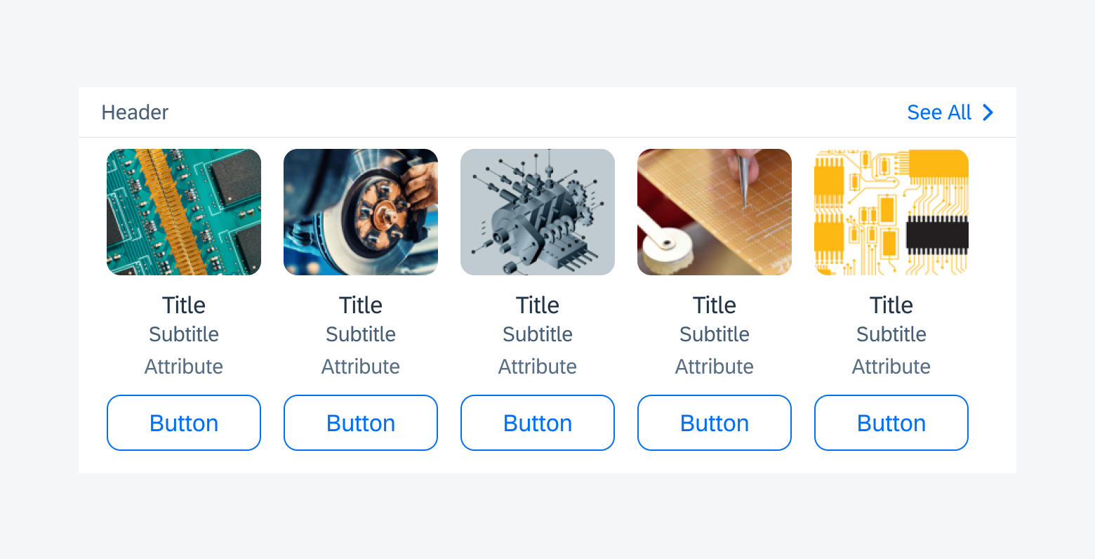
Example of a horizontal fit collection view
Multi-Row
The multi-row collection view allows the collection cell to stack vertically. This variation should be used when all collection cells in the collection are to be displayed; therefore, a “See All” label will not be used.
To get the proper justified alignment, the width of the container and number of collection cells should be known so that horizontal padding between cells can be automatically calculated. A minimum of 6px and a maximum of 65px of padding can be applied. The vertical padding between collection cells is fixed at 16px. If the size of the cells does not fit well in the width, the padding between cells can be set and the cells can be left-aligned rather than justified.
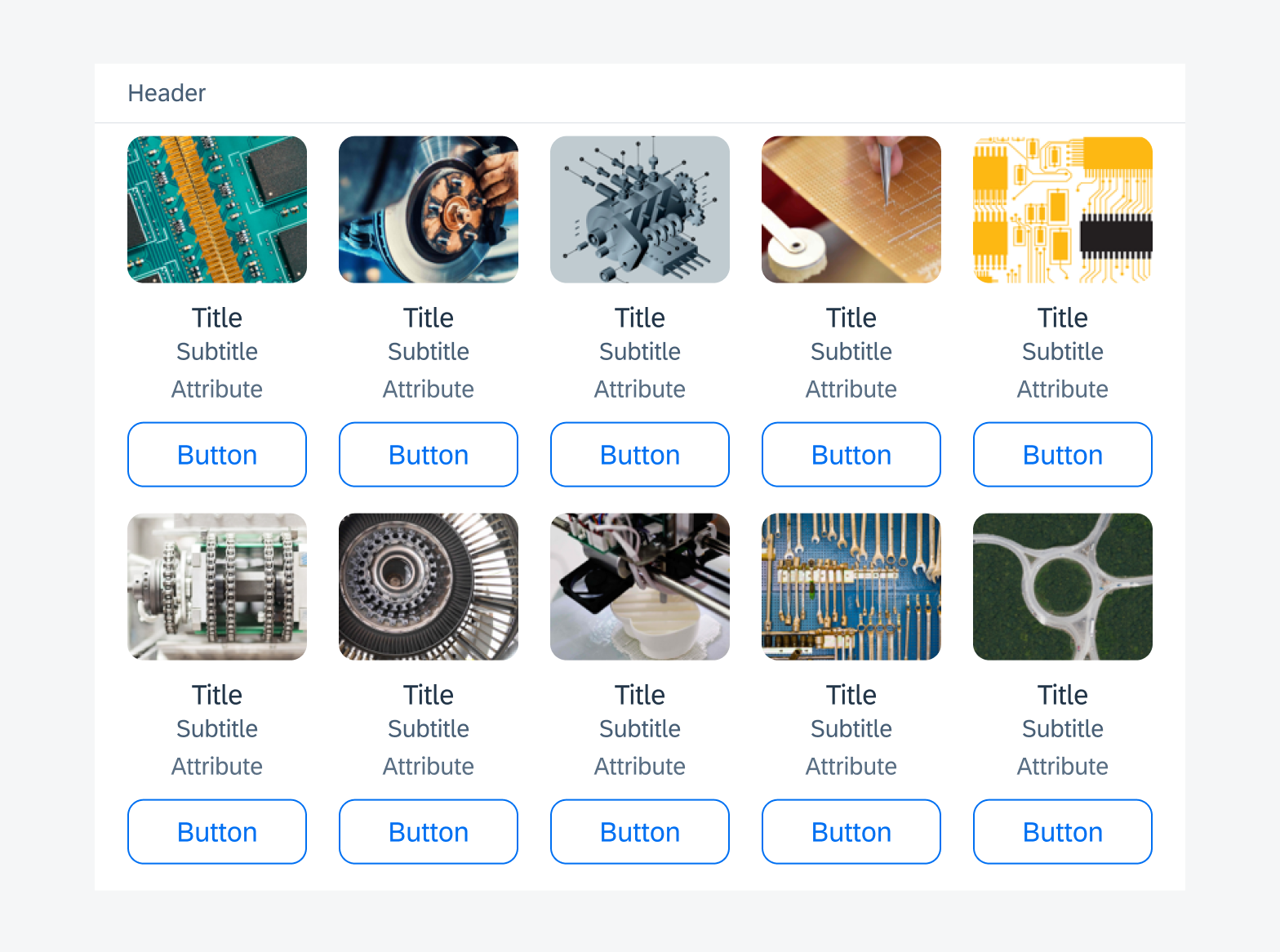
Example of a multi-row collection view
Multi-Column
The multi-column collection view variation allows for table cells to be used in a Collection View so as to display a multi-column grid layout. This variation can either be used to display full content, such as a series of label/value cells, or a subset of information, such as a pre-defined number of object cells set inside a preview table view.
This is the only variation where table view cells, except for the contact cell, are allowed to be used in a collection view.
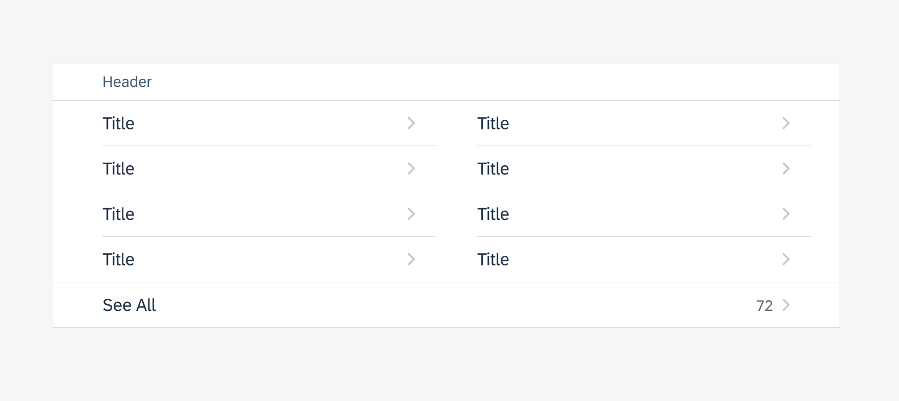
Example of a multi-column collection view
Development: Collection View
SAP Fiori for Android: Collection View
Related Components/Patterns: Collection View Cell
 Your feedback has been sent to the SAP Fiori design team.