Design Kit 24.4
Intro
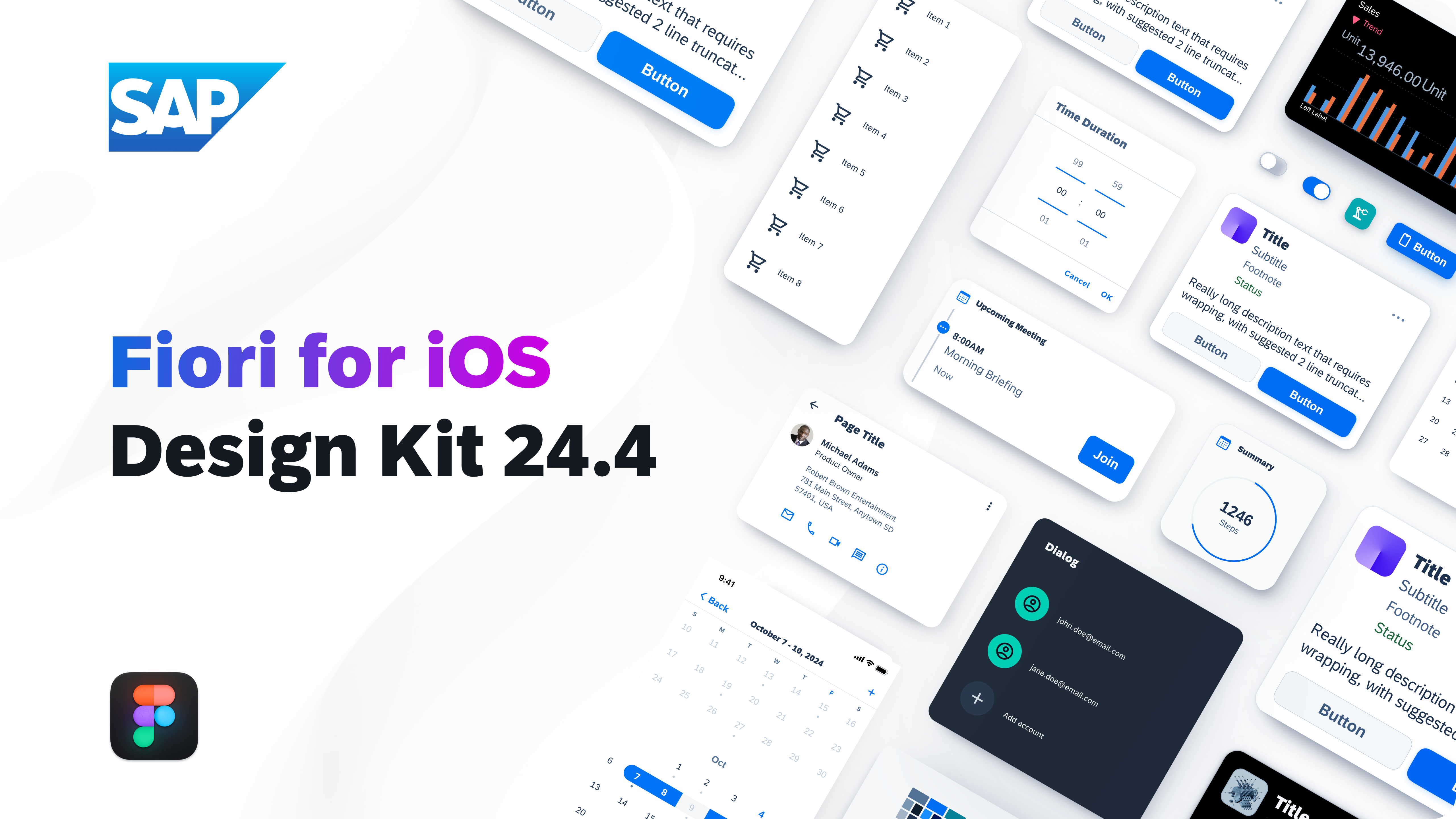
This Figma Design Kit contains SAP Fiori for iOS UI components, patterns, page types, and foundation. It helps accelerate design and development processes and encourages consistency across SAP applications.
Download the 72 font: Desktop | Web
Download the San Francisco font here.
Download SF Symbols here.
Updated design kit! The SAP Fiori for iOS 24.4 Design Kit (formerly known as “UI Kit”) has undergone significant changes:
- Variables: Dark and dark elevated color modes (previously called “Theme”) are removed from the Design Kit. Use the icon next to the “Layer” panel to switch “Color Modes” using color variables. Some components with a variety of “Semantic Color” or “Accent Color” choices use the corresponding variable settings to switch the color.
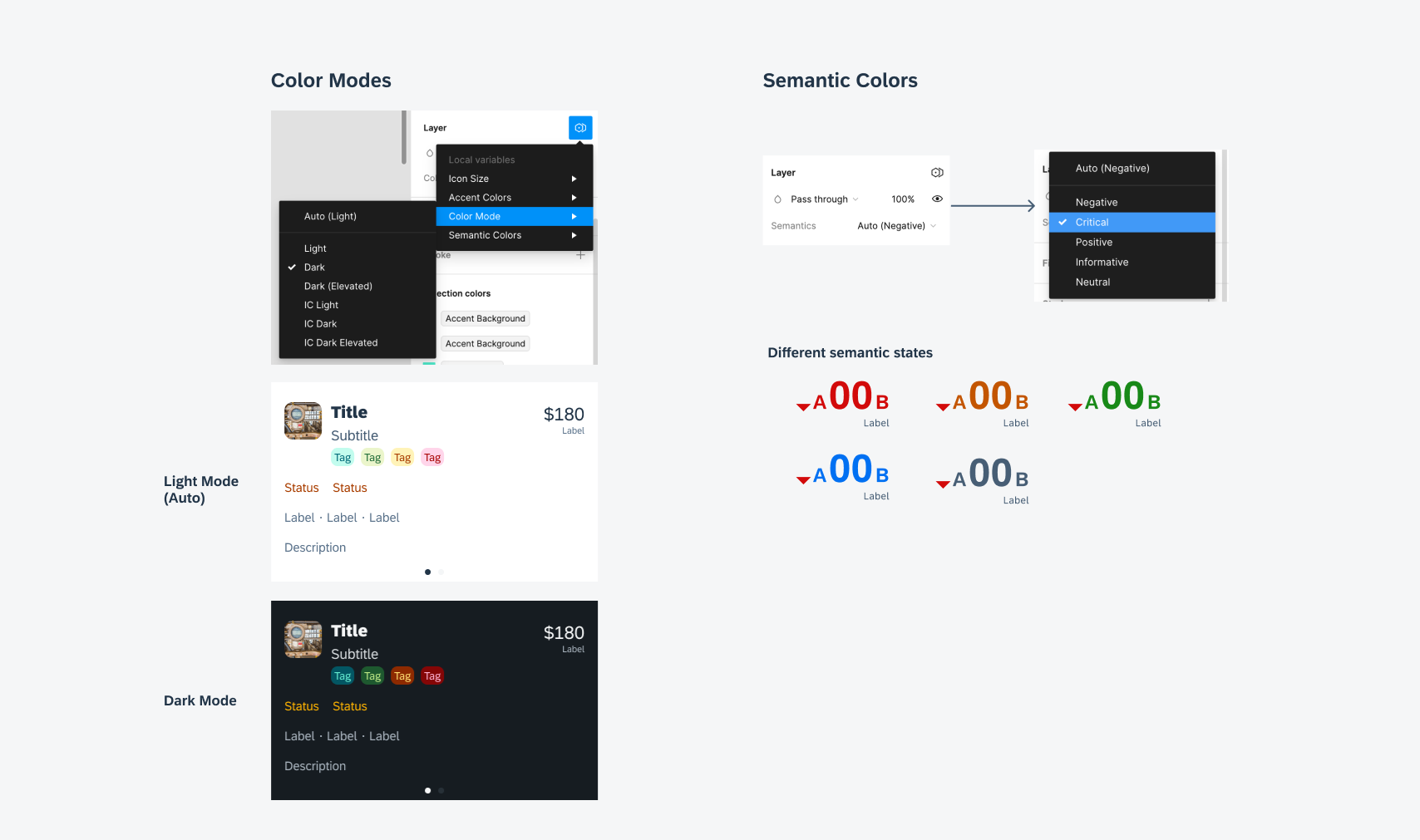
How to use variables for switching color modes
- In-page layout: There are up to four sections on each component page: info card, master component, subcomponents, and example screens. The master component(s) with possible variants are the components that users can use directly in the design. Please avoid directly using subcomponents.
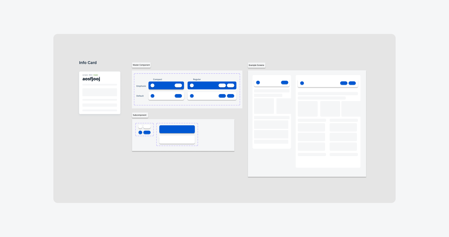
New in-page layout
- Component properties: Most of the components’ properties have been updated with more flexibility. New properties include variants, boolean controls, text swaps, instance swaps, and nested components.
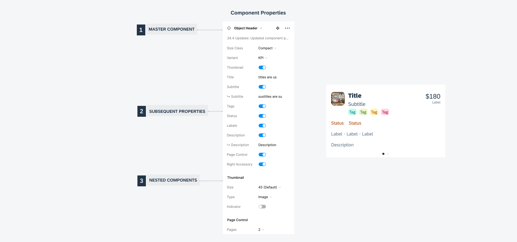
New component properties
- Info card: The info card on every component page has been changed in structure. The following information can be found with the new structure: versions & status, component introduction, new updates & warnings, component structure & properties, additional information (nested components, variable settings, relevant links, technical name, search metadata, etc.).
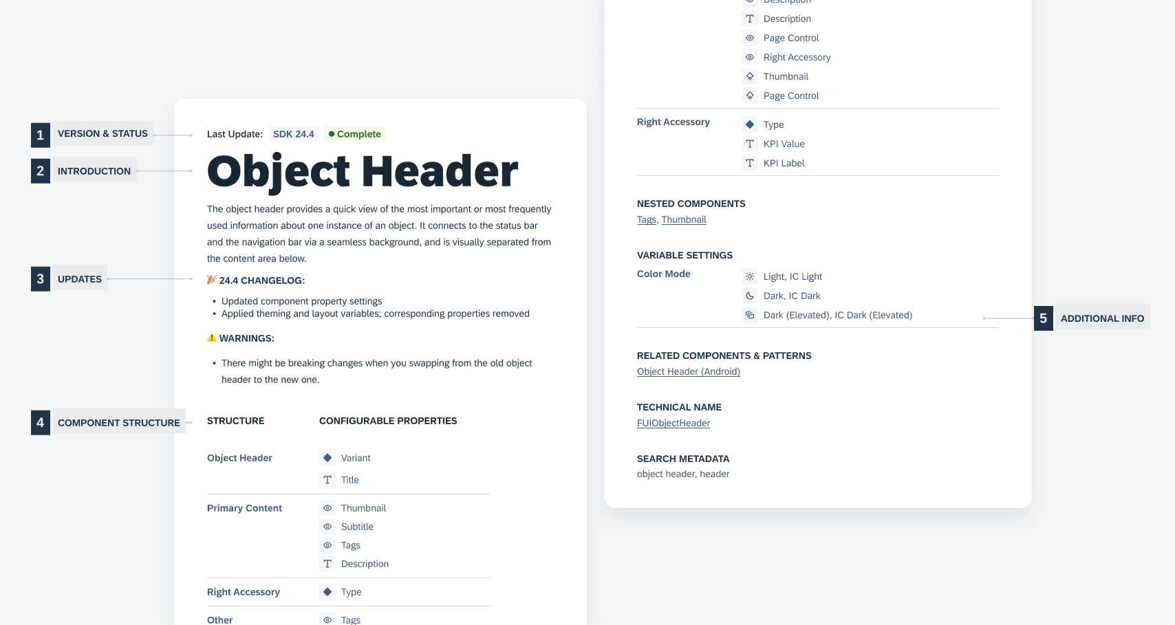
New info card
Foundations:
Updated: Adaptive design, colors, materials and effects
Components:
New: Linear progress indicator
Updated: Carousel layout, data table, masonry layout
Patterns:
Updated: Feedback indicators, illustrated message, single-user onboarding

 Your feedback has been sent to the SAP Fiori design team.