Design Tokens
Intro
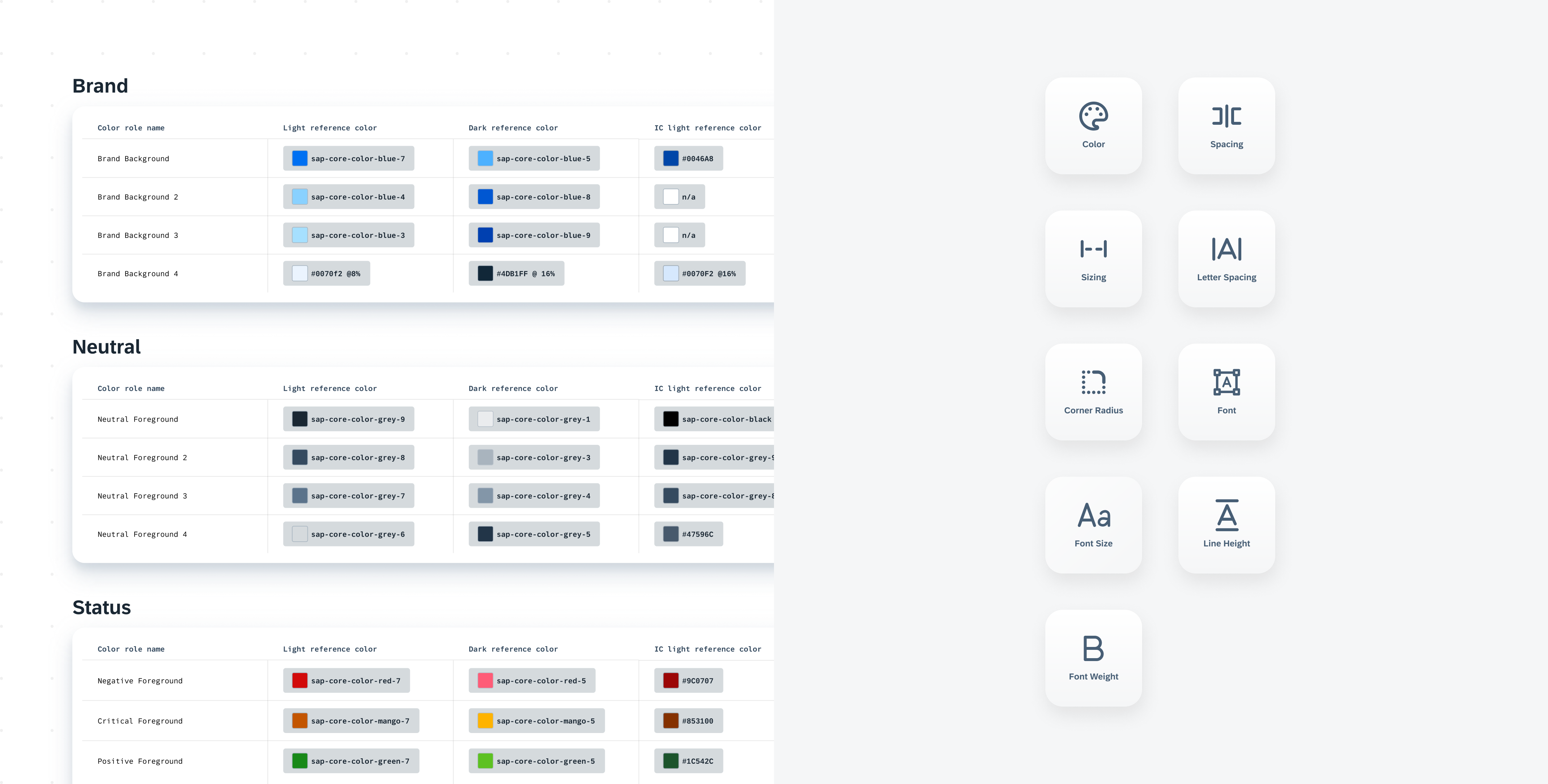
Design tokens are our cross-platform solution to managing color across iOS and Android. Design tokens are stored pieces of UI information such as color, spacing, sizing, and typography that collectively make up our design system’s visual identity. Additionally, design tokens help us to maintain visual consistency, scale design decisions, and are simple to maintain and update.
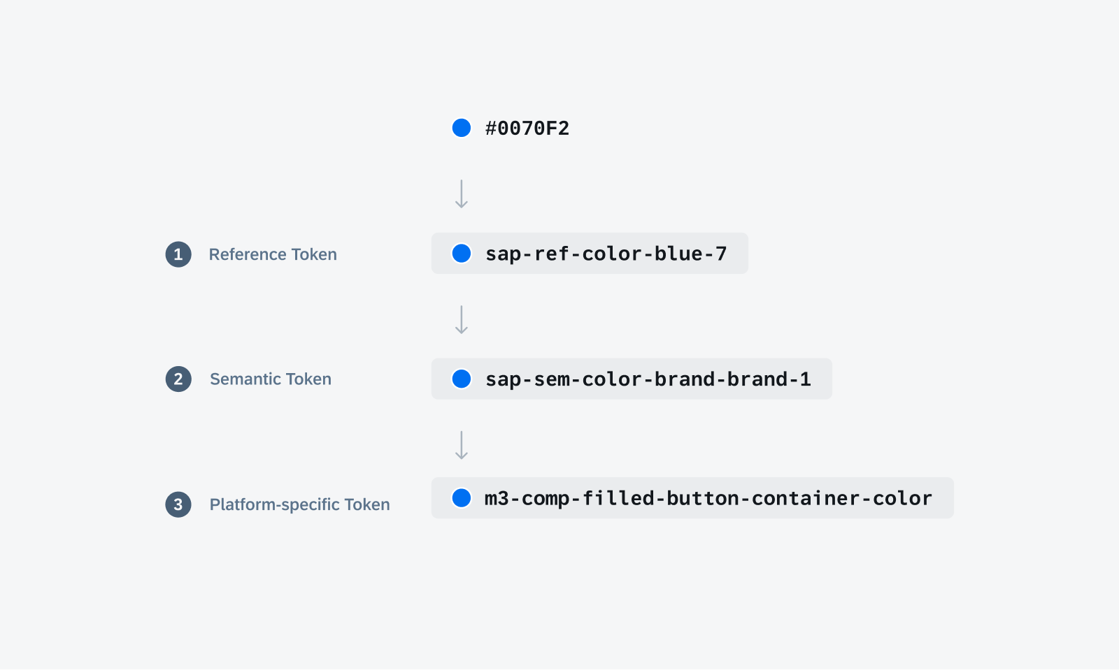
Token hierarchy shows the different levels of design tokens
Reference Tokens
Reference tokens are the foundational elements of a company’s theme by storing the static values of a design decision such as hex code, line height, and typography values. Since the reference token naming does not indicate its usage, they should not be used directly in components and UI elements.
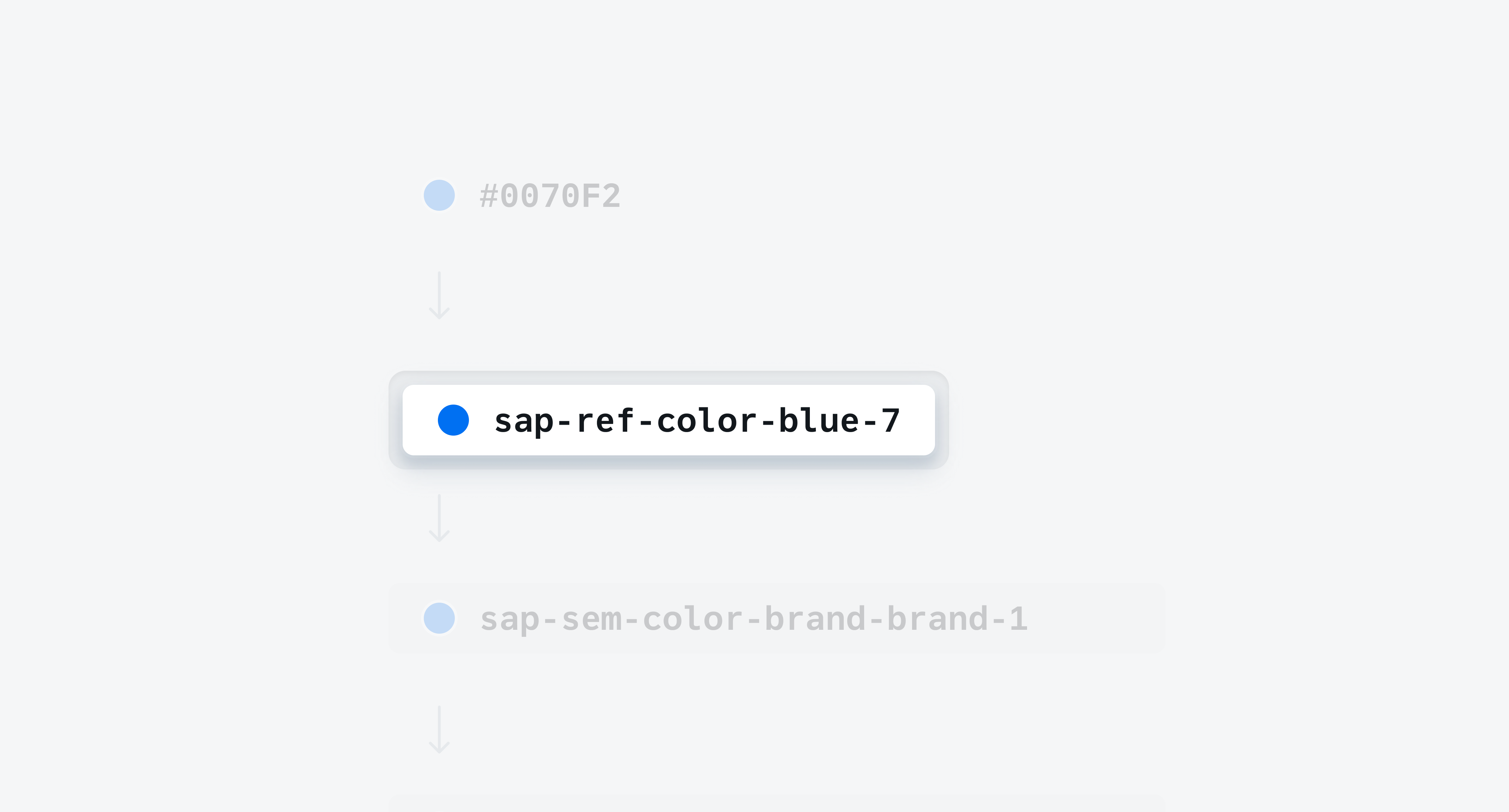
The reference token is used as a foundation for other tokens
Semantic Tokens
Semantic tokens define the specific role by which a referenced token should be used within the UI. This scales the design language throughout a specific theme or context allowing for themeability across the SAP BTP SDK for Android and iOS. Additionally, semantic tokens assign light and dark mode definitions for each semantic definition providing alignment between modes.
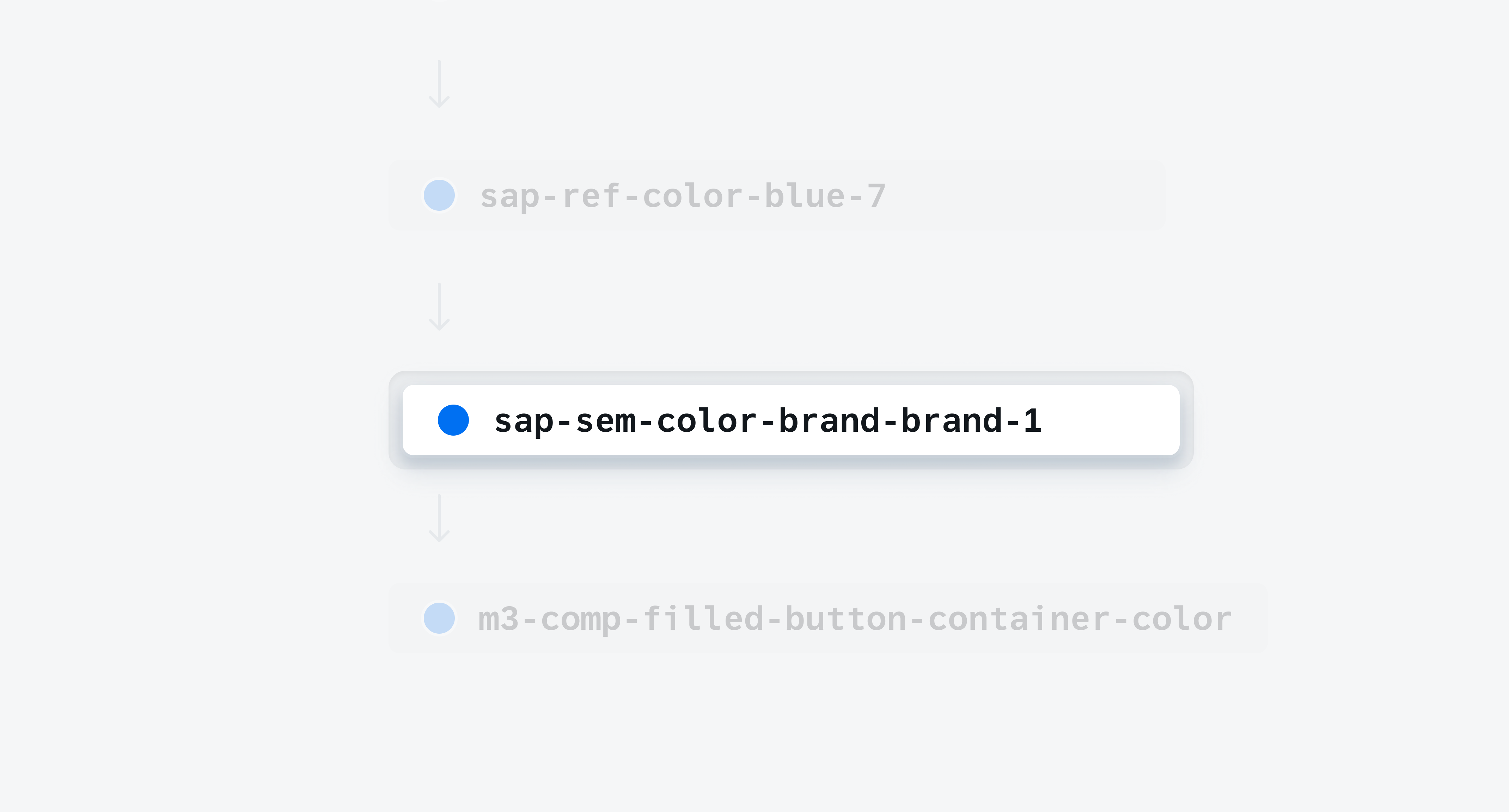
The semantic token is used directly within the UI
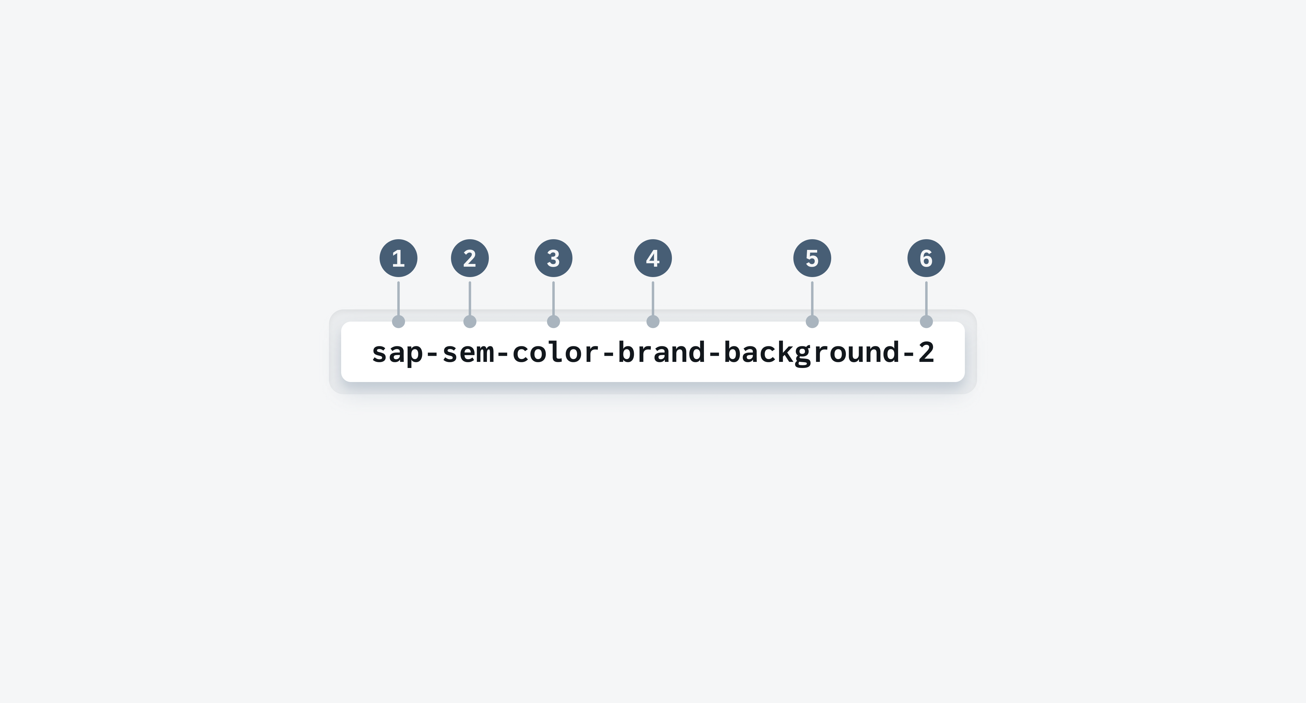
1. Company Name
Company name indicates which company’s design system the token belongs to. In our instance we use “sap” to indicate SAP design token system.
2. Level
Level indicates which level in the token hierarchy the token belongs to. There are two levels in our token hierarchy, reference tokens and semantic tokens.
3. Category
Category indicates the type of token. There are five categories in our token system such as color, spacing, sizing, corner radius, and typography.
4. Group
Group refers only to color tokens and indicates which grouping the token belongs to. There are five groupings in the color token system such as brand, neutral, status, accents, and header.
5. Usage
Usage refers only to color tokens and indicates where in the UI the token should be used. There are three sub-groupings in the color token system that explicitly inform developers and designers on the tokens usage such as background, foreground, and stroke.
6. Scale
Scale indicates the token’s sequence within a category, group, or subgroup. A scale’s number sequence is dependent on the type of token, token group, or subgroup.
Theme
Theme refers to the Horizon reference color palette however this baseline theme can be swapped out to a company’s own. For example, Horizon is the baseline theme for our SDK which includes reference colors Blue, Grey, Mango, Indigo, etc. Swapping our baseline theme would cascade a company’s brand colors down to every aspect of the UI allowing for theming. Design tokens only facilitate this scalability of our design system.
Light and Dark Mode
Each semantic color token definition stores values for both Morning Horizon (light mode) and Evening Horizon (dark mode). Since multiple modes are built-into each color token definition, this helps designers and developers apply color tokens to each UI element consistently across modes.
- Morning (Light)
- Evening (Dark)
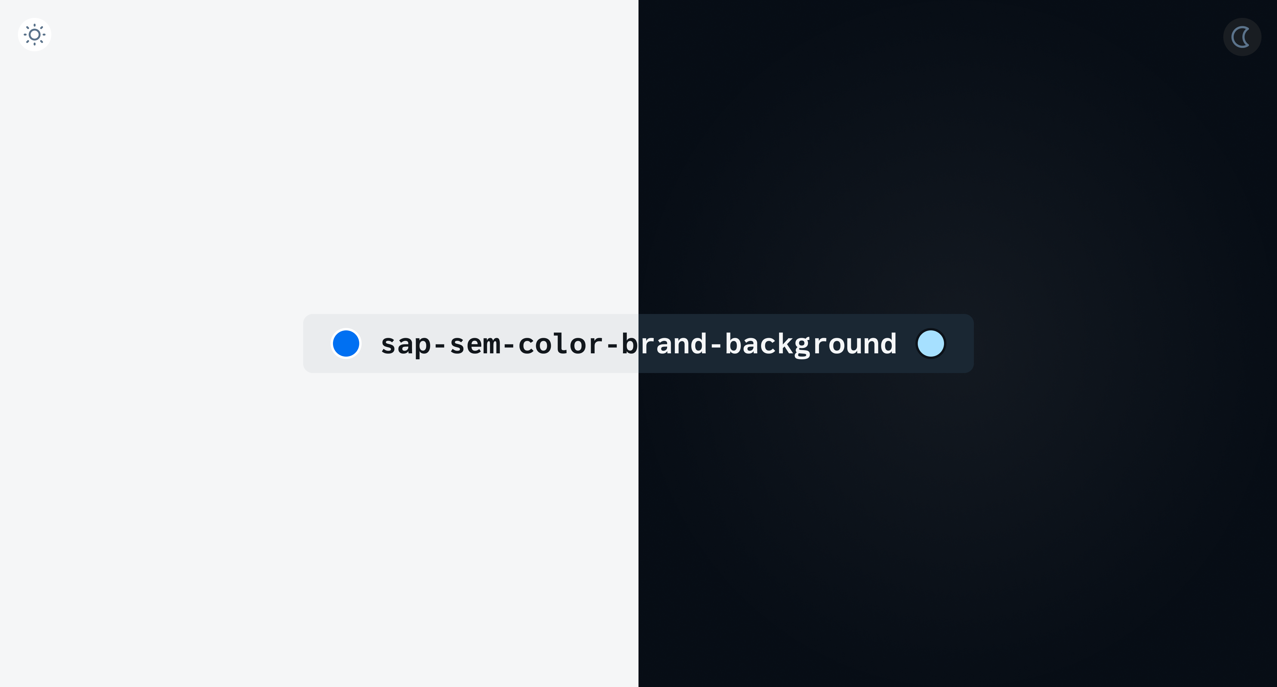
The semantic token stores the value for both light and dark mode
In addition to Morning Horizon (light mode) and Evening Horizon (dark mode), iOS provides accessibility modes such as increased contrast light and dark modes. This gives users the option to toggle the increased contrast mode on their device’s settings.
- Increased Contrast Light
- Increased Contrast Dark
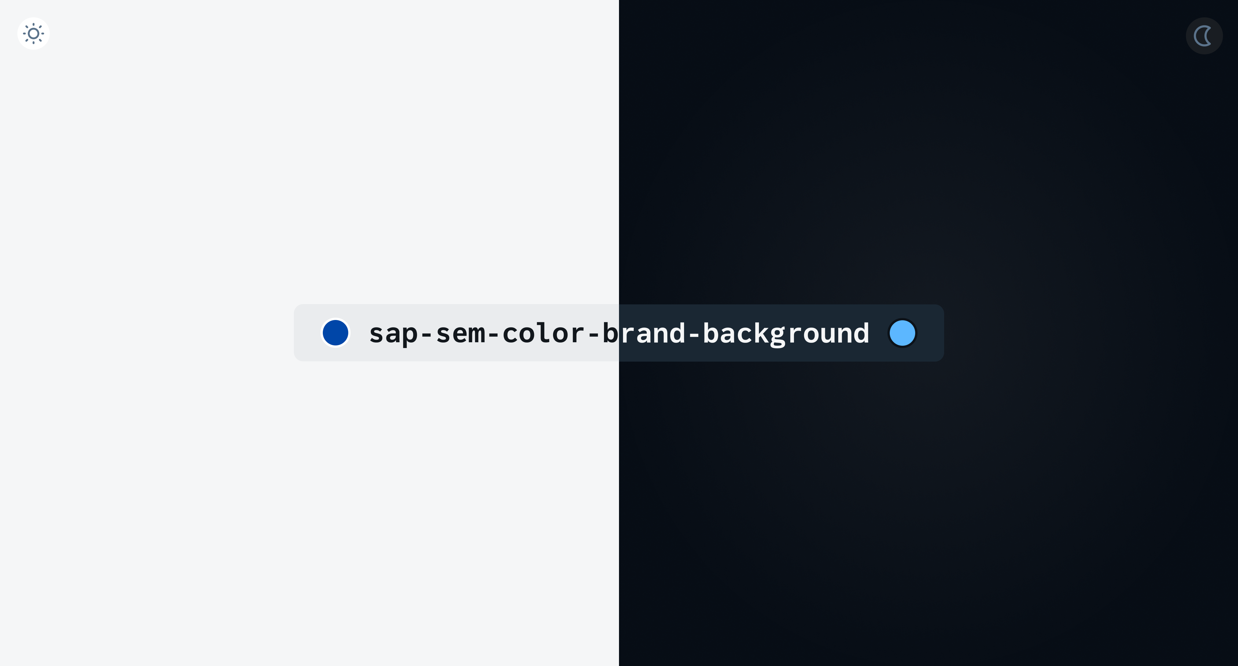
Example: On iOS, semantic tokens also store light and dark increased contrast theme modes
Native OS Mapping
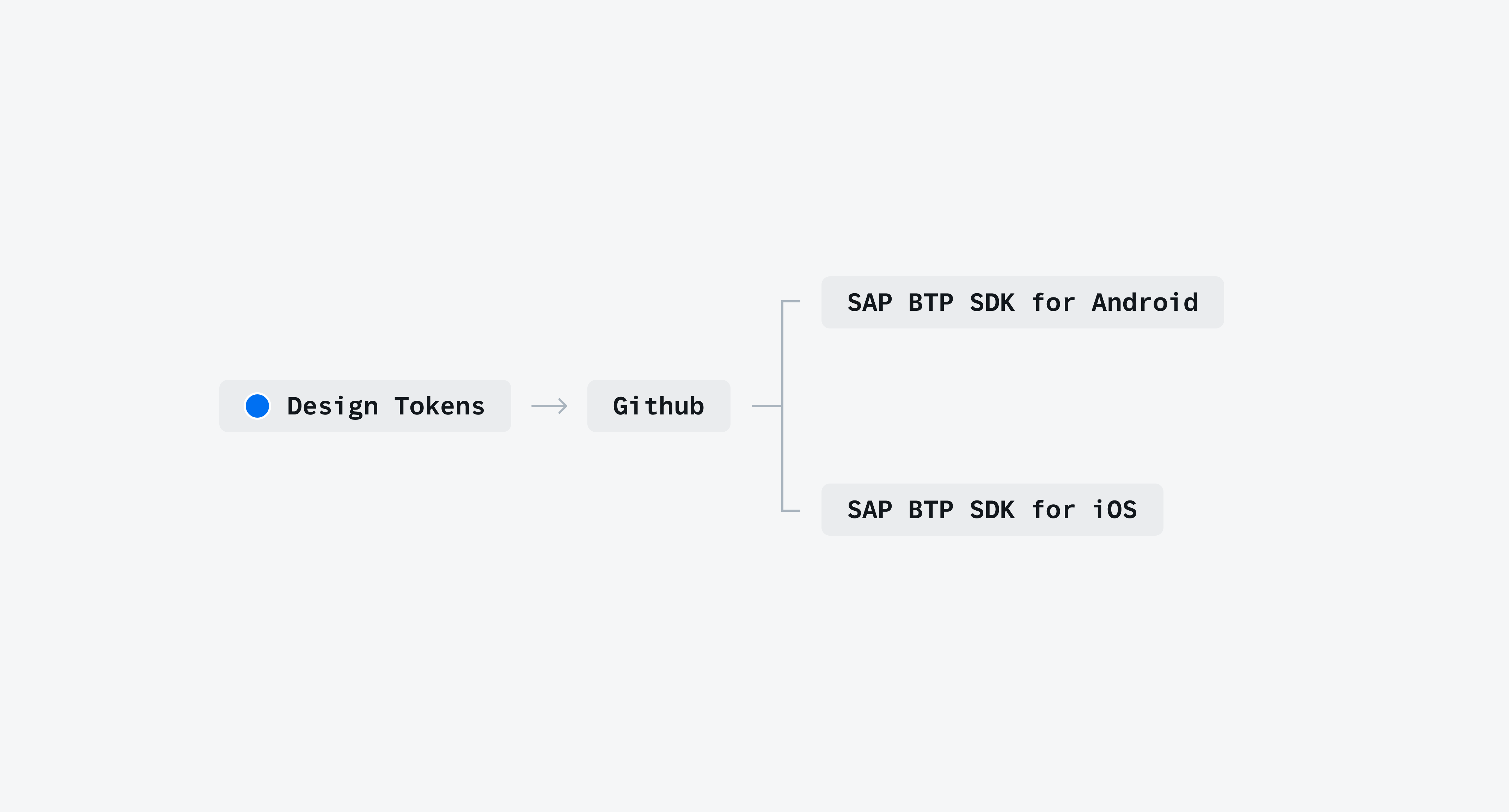
Design tokens map to the native OS APIs. This allows us to implement design tokens across both iOS and Android while preserving the native OS components, behaviors, and interactions. Having a unified workflow would improve the management of all visual assets and better alignment between iOS and Android platforms. Stakeholders would also benefit by making it easier to consume the SDK and our UI Kits.
- Semantic Token (Horizon)
- System Token (Material 3)
- Component Token (Material 3)

 Your feedback has been sent to the SAP Fiori design team.