Error Handling
Intro
Errors are used to communicate to the user that something did not go the way it was intended to in the app. An error could occur either at the app level or at the user level. It’s important to present the appropriate type of error message and when possible, provide instructions to help the user recover quickly from the error state.
Error Banner
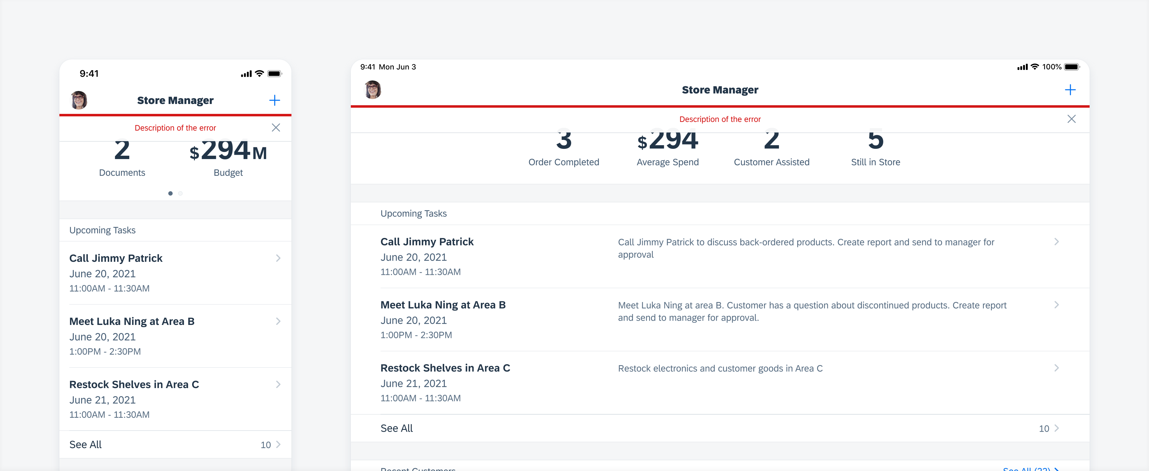
An error banner is used to notify a user when the state of a workflow is disrupted and may require attention. The user can dismiss the error banner by tapping on the “Close” button.
See also Banners.

Banner error message
Full-Page Error Message
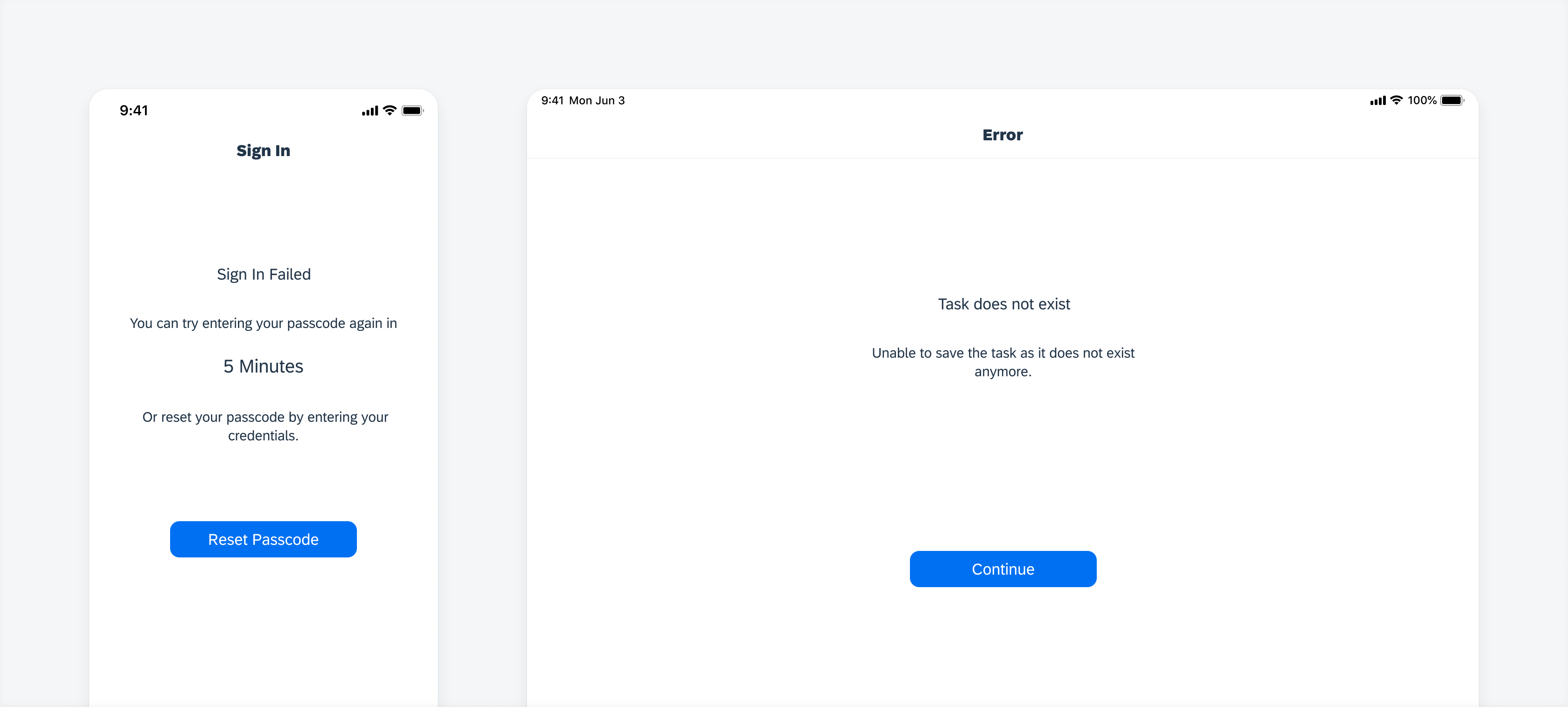
A full-page error is generally used to communicate an error from the server. It blocks the user from viewing the screen and provides a way out for the user from the current workflow. Alway ensure that the error message communicates exactly what has gone wrong and provides a way for the user to continue working.

Full-page error message
Inline Validation
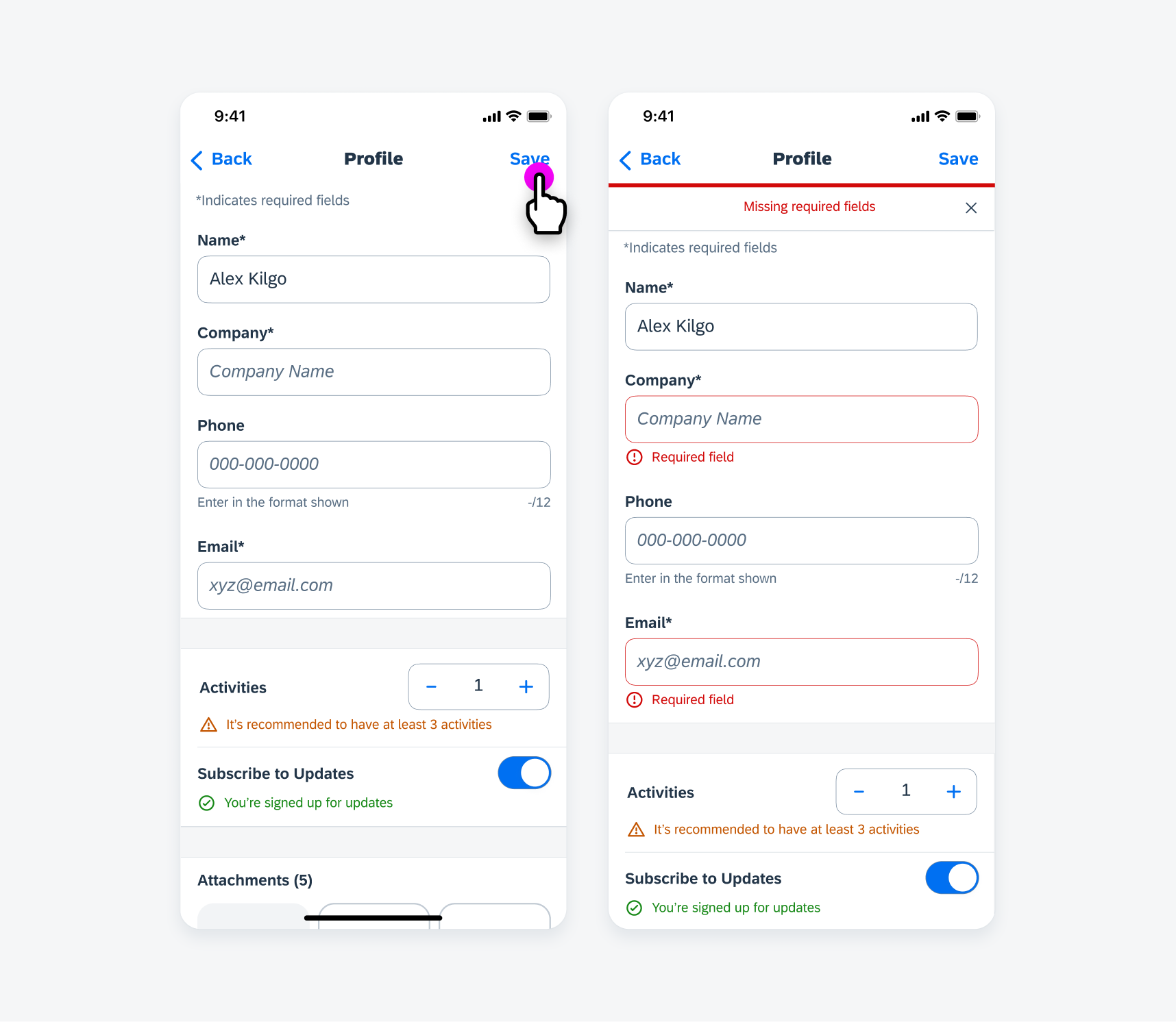
An inline validation message is used only in a form sheet. It’s displayed directly with the input cell and explains the error with suggestions to correct the error.
See also Inline Validation.

Inline error messages in form submission
Multi-Message Handling
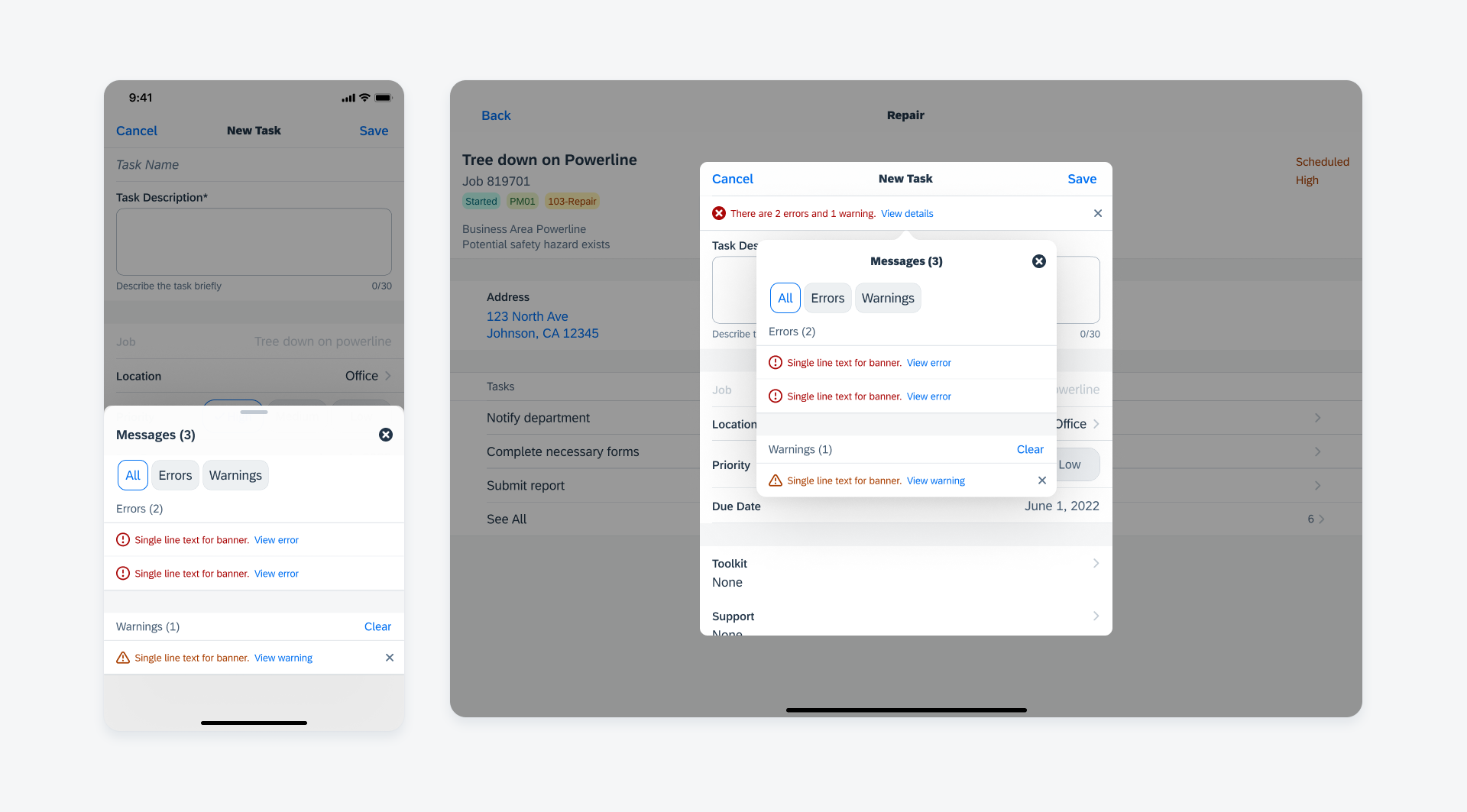
When a screen contains multiple messages, the banner can show an overview of the type and number of messages, along with an action link to open a multi-message handling detail view in a bottom sheet (compact) or a popover (regular). The type is customizable.
See also Multi-Message Handling.

Multi-message handling detail view on compact screen (left) and regular screen (right)

 Your feedback has been sent to the SAP Fiori design team.