Info View
FUIInfoViewController
Intro
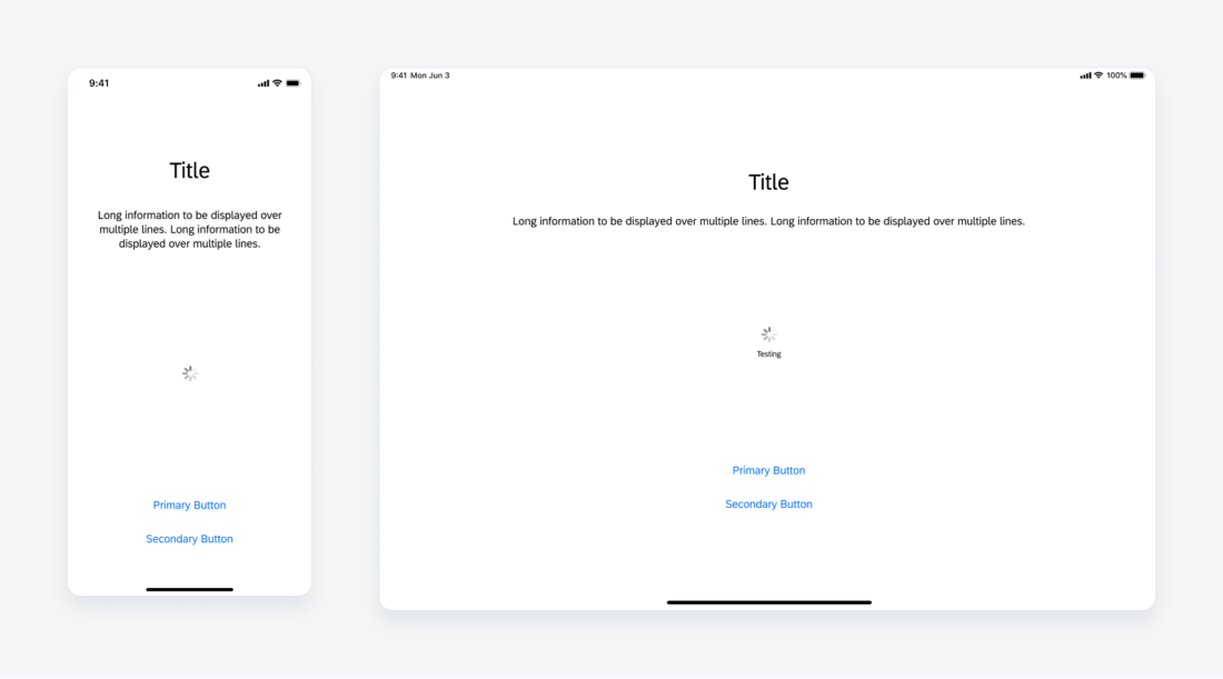
The info view is generally used in onboarding scenarios. It provides the application with the ability to show customizable information in a transitionary state that locks regular navigation methods. This pattern is closely related to the What’s New component as well as the feedback screens used in multi-user onboarding.
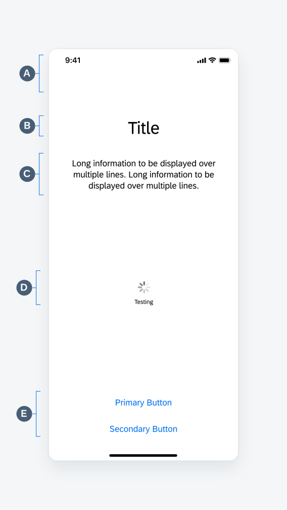
A. Navigation Bar
A default contrast navigation bar without any actions— doesn’t use a stacked modal to highlight the difference between the What’s New component.
B. Title
Use a clear and concise title to provide users the information you are trying to communicate.
C. Description
Explain your information in a summarized form.
D. Progress Indicator
• Spinner: The spinner is used to show the progress of the state of the screen.
• Label: Optional, be concise when describing the action to be done – limit to three words.
E. Button Stack
Uses button form cells, the top button is designated as primary and the bottom as secondary.
Progress Indicator (Spinner)
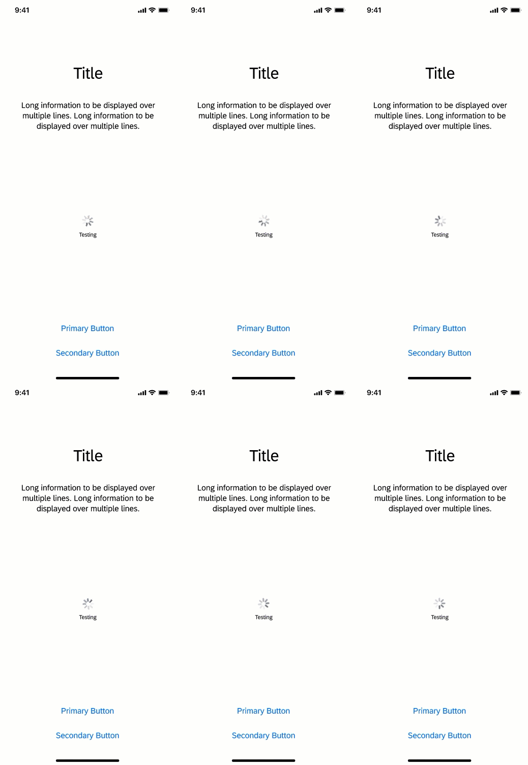
This indicates that the state of the screen is in progress, the spinner continues to rotate until the system or application is ready to transition.
Action Buttons
The actions in the button stack are emphasized and should allow the user to navigate from or alter the application state.
Development: FUIInfoViewController
Related Components/Patterns: What’s New, Multi-User Onboarding


 Your feedback has been sent to the SAP Fiori design team.