Multi-Column Layout
Intro
Columns are used to arrange UI elements. A layout may include one or two visible columns of different widths, adjusting dynamically to the size class. Large devices may show up to three columns.
When there are multiple columns, it’s important to consider the size of each one. For example, in a list-detail layout, the list should have a fixed width and the detail column should be flexible to respond to the available space. This ensures that the layout remains visually appealing and resizes for the different size classes.
In compact size class, only one column should be used. In regular size class, two to three columns are possible.
The SwiftUI class navigation split view allows to build multi-column layout apps that scale across all Apple platforms, including watchOS. On large devices with iPadOS or VisionOS, multiple columns are displayed side by side. On narrow size devices such as iPhone, iPad in slide over, or Apple Watch, all columns are collapsed into a stack.
Each column has its own navigation bar and an optional toolbar. Columns can be shown or hidden as needed. The primary column is often used for the sidebar as the central point of navigation. The supplementary column often contains a list, while the secondary column contains the content. Changes in one column trigger changes in the content of the other column. For more information, see WWDC Video “Build for iPad”.
Several components need to be exchanged in compact to a different component in regular size class as mentioned in Design Adaptive Apps.
Tab Bar and Sidebar
For distinct information hierarchies with a few primary destinations, it is best to use a tab bar in both regular and compact layouts.
For hierarchical and deep navigation, use a sidebar in regular and a tab bar in compact mode. The sidebar flattens the information hierarchy through primary and secondary navigation targets. Additionally, users can add shortcuts to their preferred content using the edit mode.
On large screens in landscape mode, the sidebar can be displayed alongside the content. In portrait mode or on smaller screens, the sidebar collapses to an icon. Tapping on the icon or swiping from the left edge opens the sidebar as an overlay on top of the content. Let the user decide to hide the sidebar to make room for content.
For iOS 17 or earlier, we recommend replacing the sidebar with a tab bar in compact size class. However, converting the sidebar to a tab bar requires manual effort from development. By default, the sidebar is retained in compact.
Mapping of Hierarchical Navigation Destinations
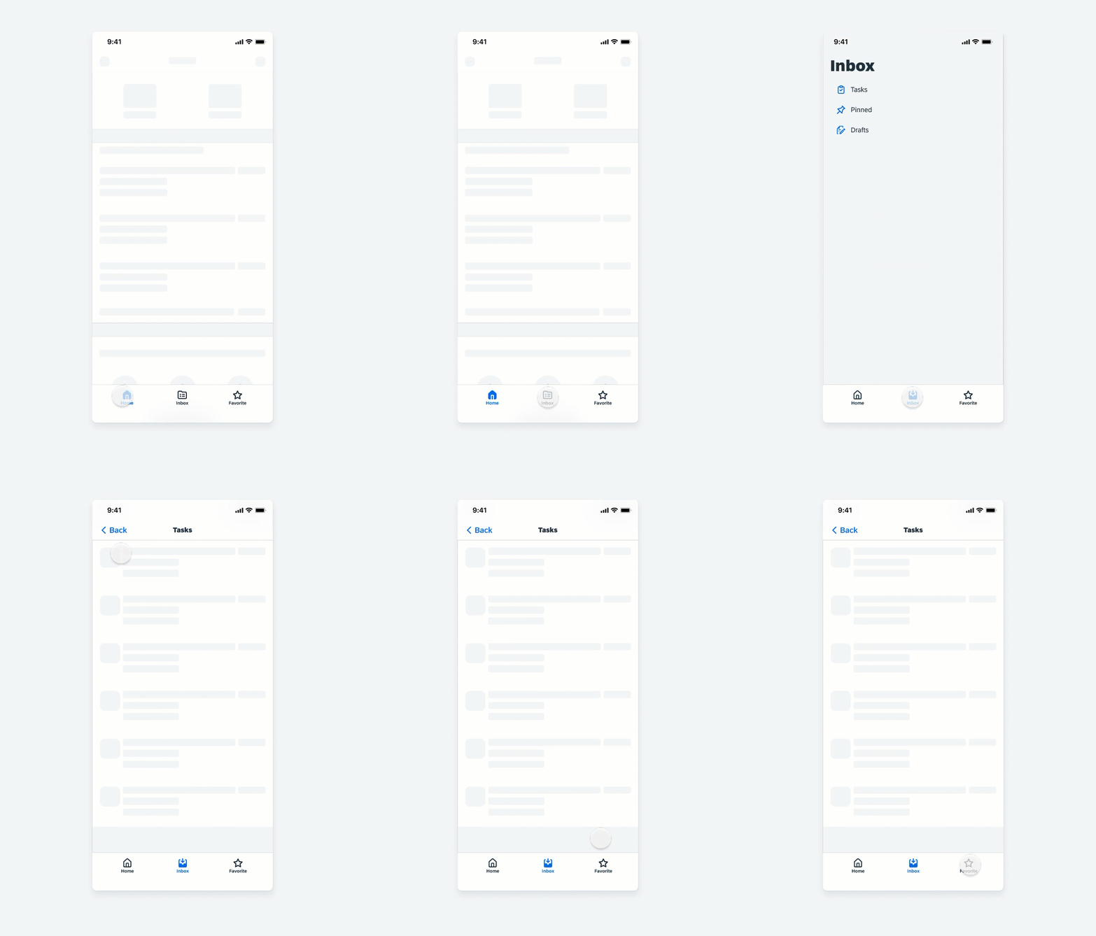
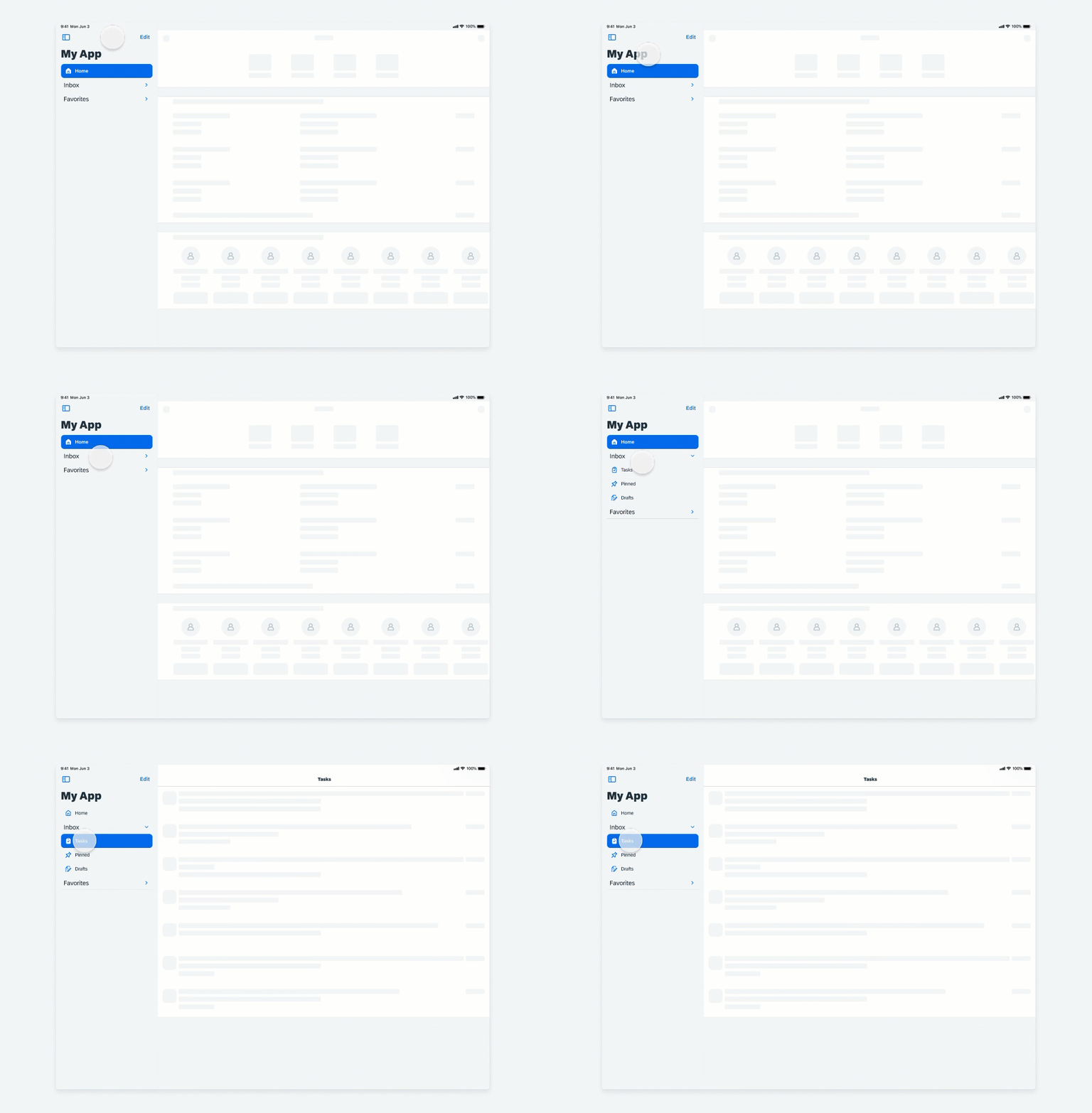
The sidebar allows you to show primary and secondary destinations, with secondary destinations placed under a collapsible section header.
The tab bar in compact size class only shows primary destinations. Secondary destinations are displayed in full-screen mode, allowing for further navigation.
For more information on how to convert a tab bar to a sidebar, see WWDC Video “Designed for iPad”.

Visualization of a hierarchical navigation pattern for compact size classes

Visualization of a hierarchical navigation pattern for regular size classes
For iOS18, iPadOS18 and vison OS2, the adaptable sidebar with tab view style has the following behavior:
- iOS 18: A tab bar at the bottom of the screen
- iPadOS 18: A tab bar that can be converted to a sidebar by the user
- macOS 15 and tvOS 14: A sidebar
- visionOS 2: An ornament, in addition to a sidebar for secondary tabs within a tab section.
Modal Sheet, Form Sheet, Fullscreen Modal, and Popover
Modality is a method to present content in a temporary mode to focus the user’s attention on a single task or set of controls. With adaptive design, modality on iPhone and iPad devices adapts to the screen sizes and uses the available space. A modal is often used for completing a task, updating content, or selecting filters. Depending on the task, the appropriate modal view should be chosen. There are modal and nonmodal sheets in compact size class, form sheets, full-screen modals, and popovers in regular size class.
Sheet in Compact and Form Sheet in Regular
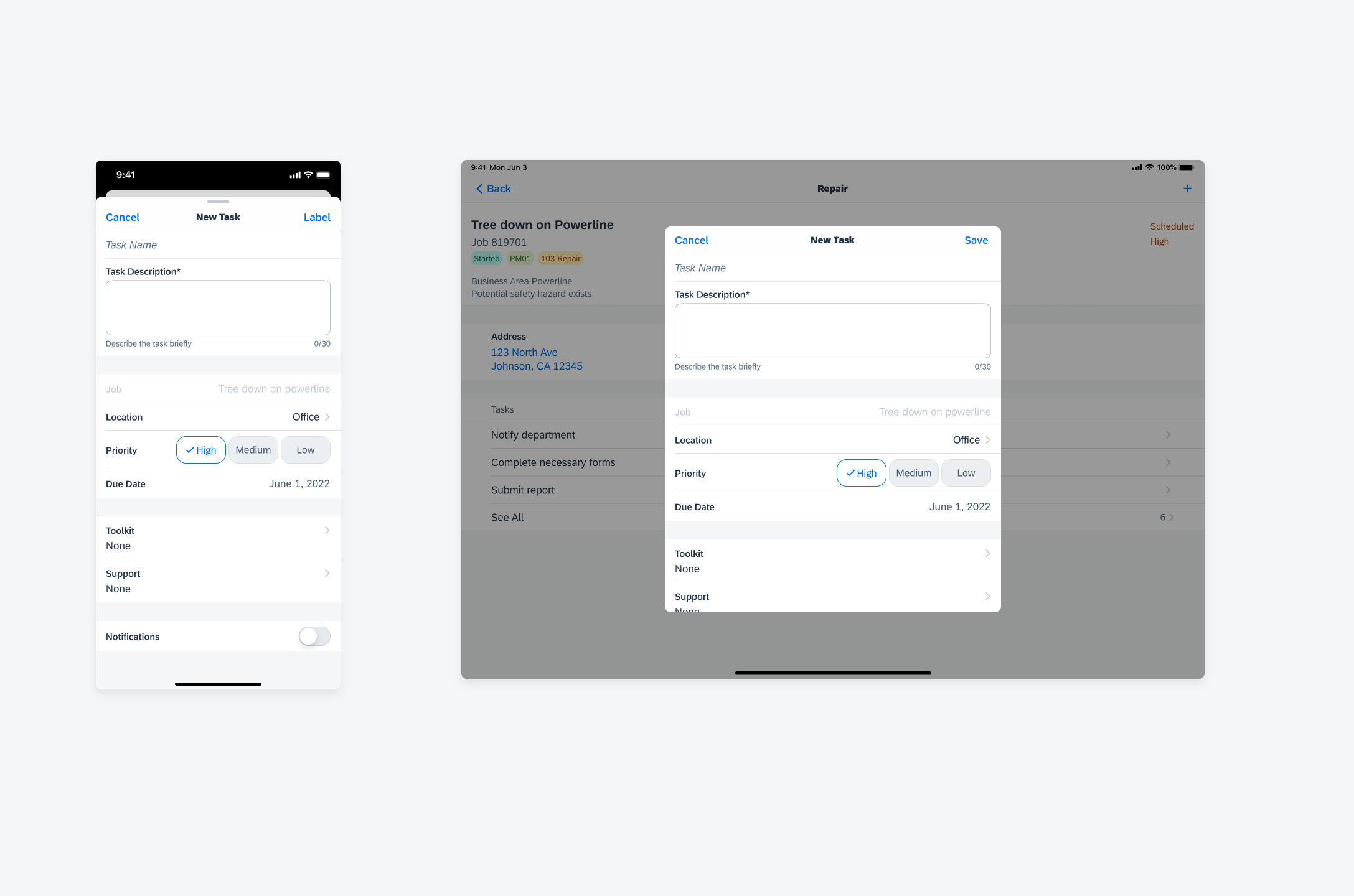
For distinct tasks, such as creating or editing an object, it’s best to use a modal sheet in compact size class and a form sheet or full-screen modal in regular size class. In compact size class the modal sheets slide in on top of the parent page, and the parent page shrinks slightly. The form sheet in regular size class is placed in the center of the screen with a semi-transparent overlay underneath.
Sheet in Compact and Popover in Regular
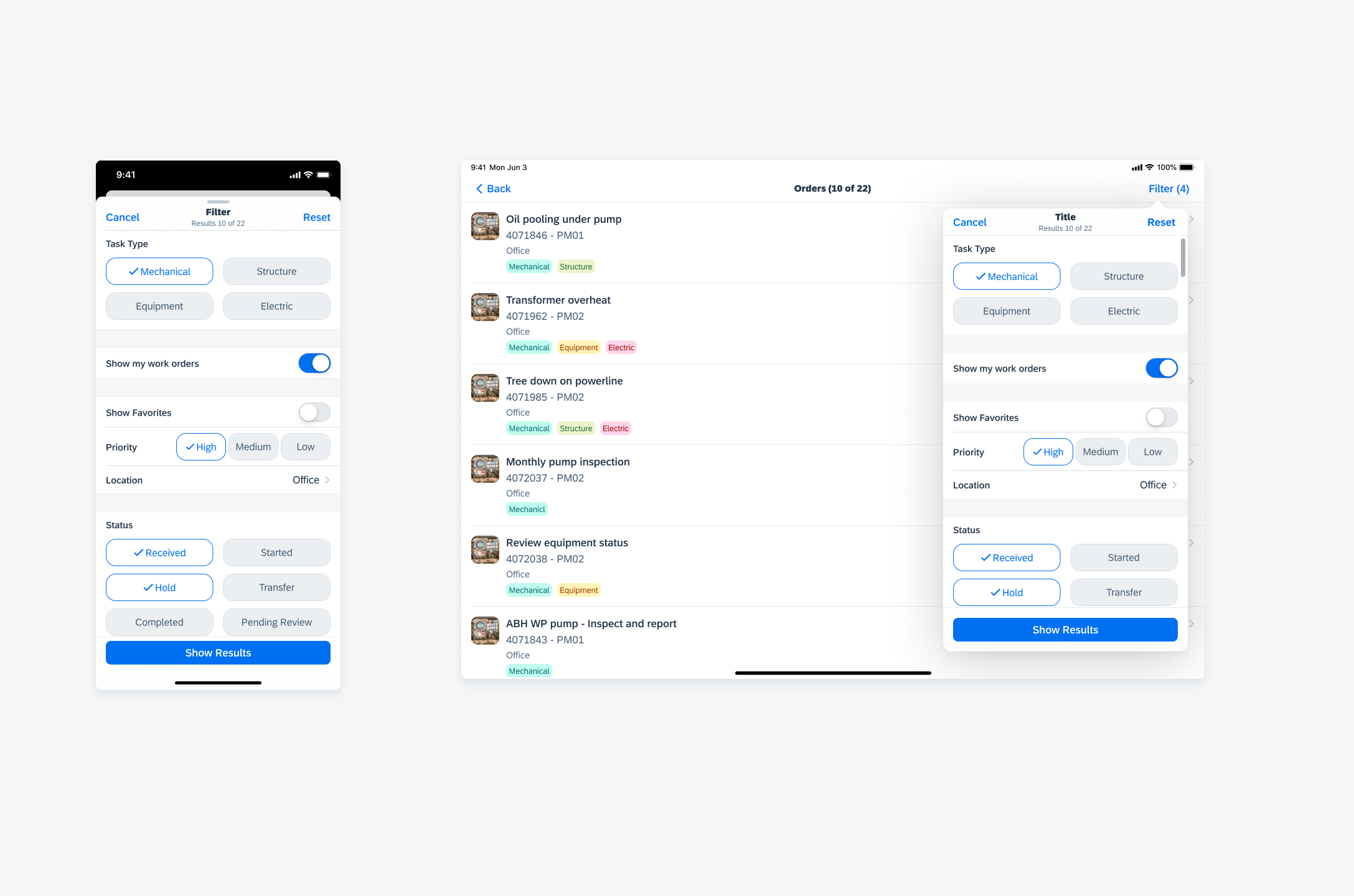
For quick tasks that influences the parent view, such as filtering a list, it’s best to use a sheet in compact size class and a popover in regular size class. The sheet in compact slides in over the parent page. The popover in regular appears next to the area that activates it.
Nonmodal Sheet in Compact and Popover in Regular
Use a nonmodal sheet when you want to directly affect the main task in the parent view, such as when formatting a note. A nonmodal sheet covers only a part of the screen in compact size class, allowing users to interact with the content behind without dimming it. It is also possible to expand the sheet with an optional grabber or through scrolling. It adapts to a popover in regular size class. For more information, see Customize and Resize Sheets and Modals.

Sheet in compact and form sheet in regular size class


 Your feedback has been sent to the SAP Fiori design team.