
Object Cell
FUIObjectTableViewCell
Intro
The object cell is a table view cell that fits inside the table view container. It is highly customizable to accommodate a wide variety of uses.
Object cell examples
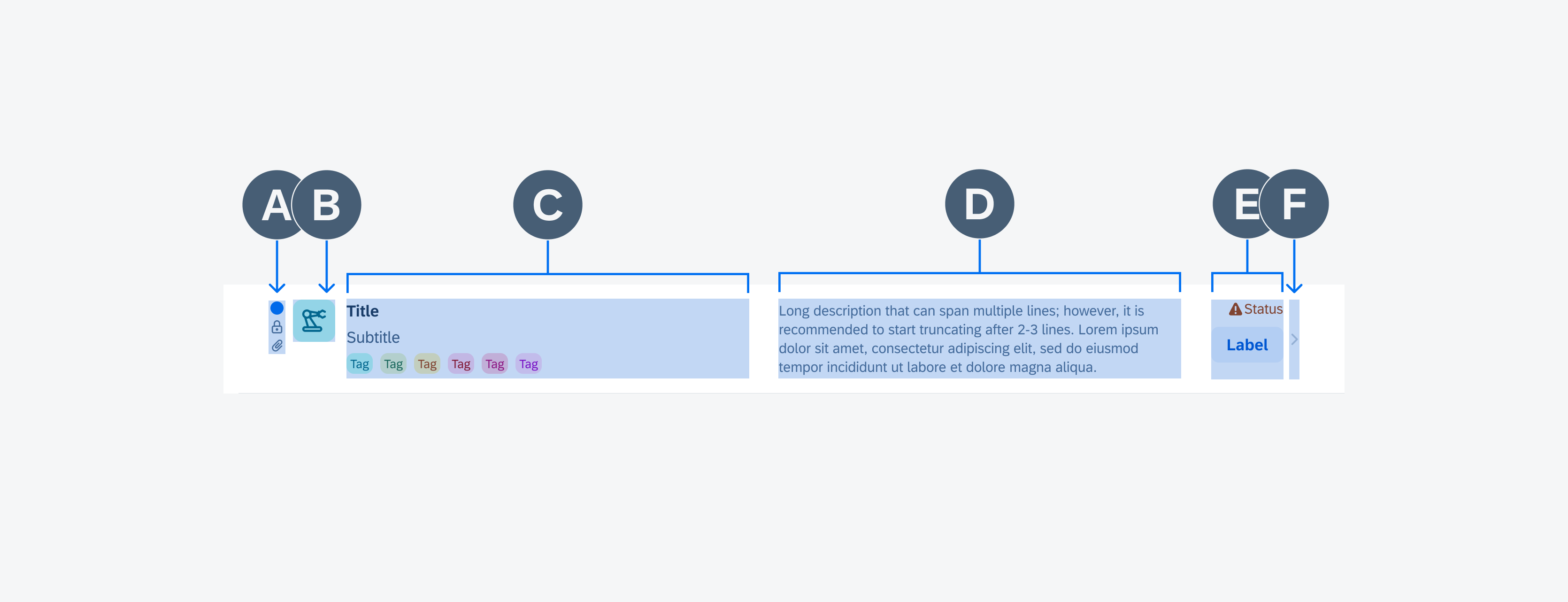
A. Left Icon Stack (Optional)
A set of up to three vertically stacked icons can be displayed on the left of the detail image. These icons provide information about the object, such as whether it is unread or if it has attachments.
B. Detail Image (Optional)
The detail image provides a visual representation of the object within a 44 pixel frame. Leveraging the avatar component, the detail image has a minimum size of 16 pixels and a maximum of 60 pixels. The image may have a square or circular frame depending on the type of object that the object cell represents. If the object cell represents a user, use a circular frame. If the object cell represents an object, use a square frame.
C. Main Content
The main content is the main area for text content. It allows for a wide range of component elements: a title, subtitle, footnote, caption, description, rating control, avatar stack, and tags. The title is the only mandatory content element for the object cell.
D. Description (Optional)
A description can be used to provide additional information about the object. The description label offers two display options: it can be truncated after a customizable number of lines, with the default set to three, or it can be configured to display the full content. Depending on the orientation of the device (portrait or landscape) the location of the description will change. In portrait mode, it appears at the bottom of the main content container. For landscape mode, the description appears in its own column shown above, this is typically a longer string of text than what is displayed in the title content area.
E. Attributes
The attributes are a vertically or horizontally stacked arrangement of labels and icons types that are displayed towards the right side of the object cell. These labels and icons can be used to indicate the condition of the item, such as its priority or status.
F. Accessory View (Optional)
The accessory view is used to add secondary action(s) in addition to the primary action of drilling down or as another indicator. These can include a navigational icon, such as a chevron (which would trigger a push navigation) an information disclosure icon, (which would bring up a model), single action download, or an overflow menu.
Vertically-Centered and Top-Aligned
An object cell comes in two different alignments: a vertically-centered alignment and a top alignment. For a vertically centered alignment, elements inside of the object cell should be kept to a single line.
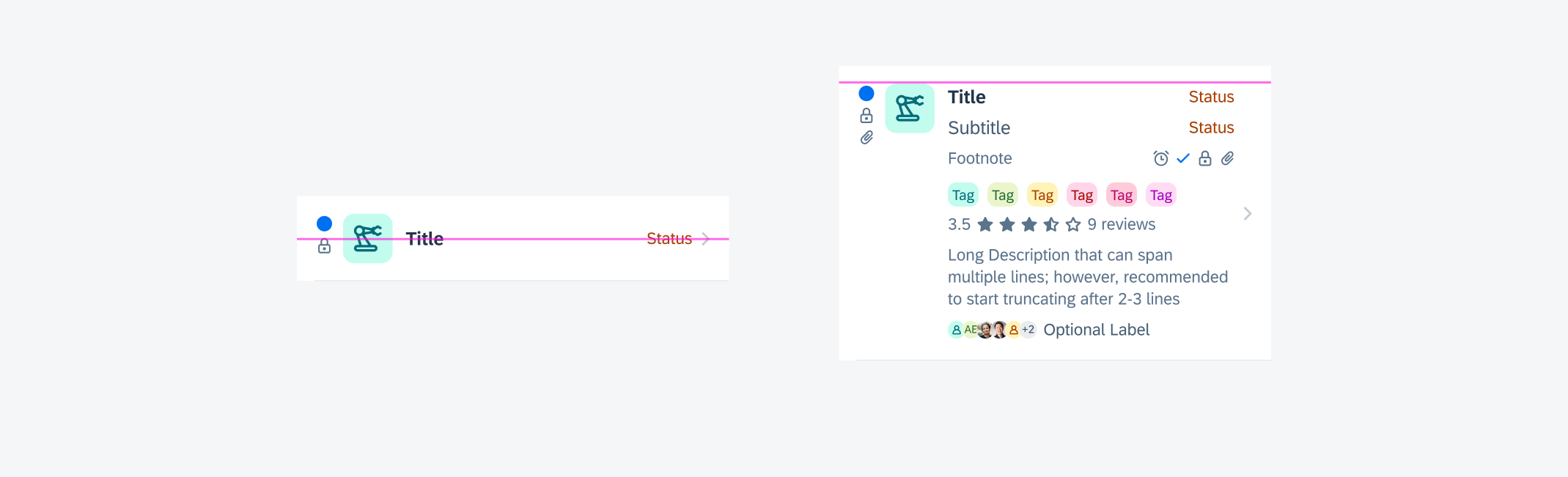
Vertically centered object cell (left) and vertically top-aligned object cell (right)
Preview
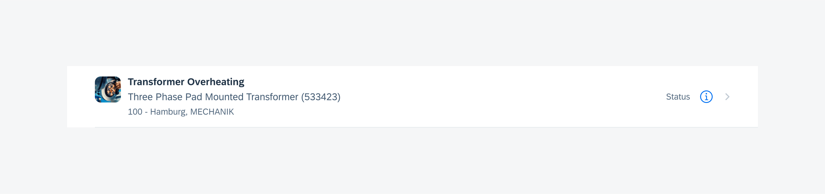
The preview object cell variation is the most common variation. It is used to display a preview of an object. A chevron icon is used in the accessory view on the right to indicate a drill down to the complete content, usually shown as an object page.
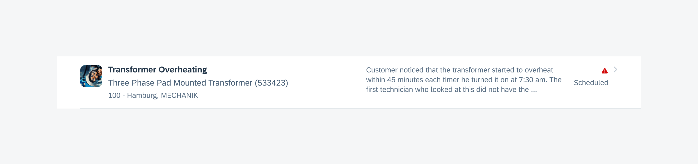
Object cell preview variation
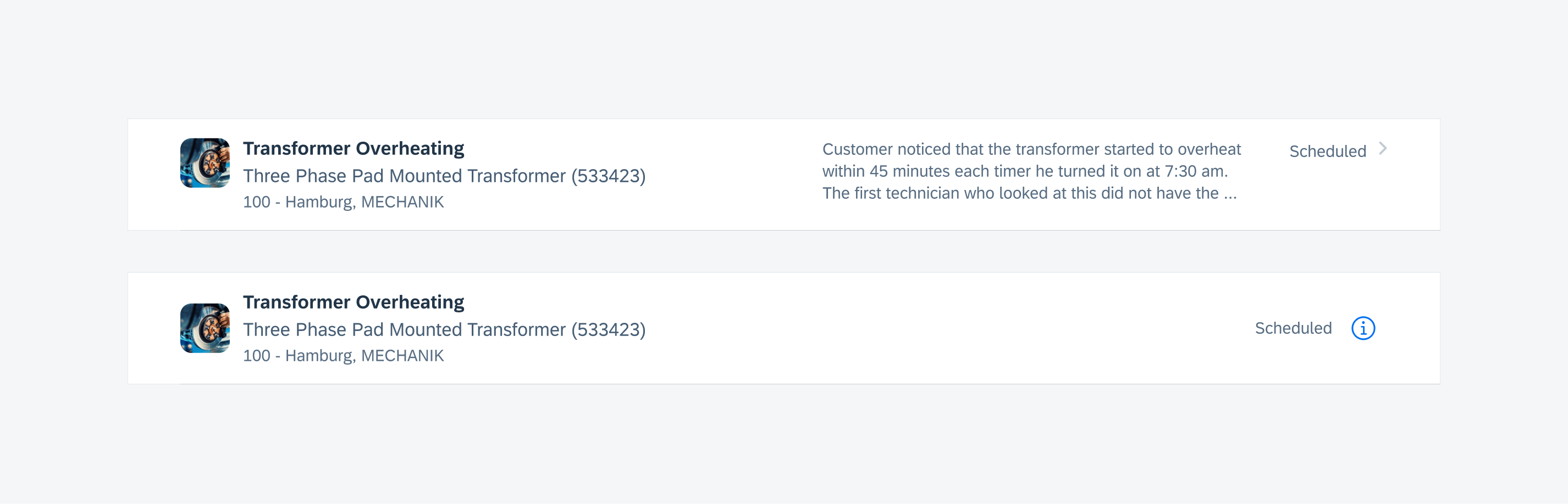
Quick View
The quick view object cell variation is used to display a simple object that doesn’t need a full object page. Instead, an information disclosure icon is used on the right, which brings up a modal when tapped. In the modal, some more information for the object can be viewed and a few simple actions can be performed.
Object cell quick view variation
Single Action
The single action object cell variation is used to display an object that has a specific action associated with it, such as downloading a document or adding an item to your cart. An icon or button is used on the right, indicating what the action is. The button can also be set to act as a toggle like in the example “Follow/Unfollow”.
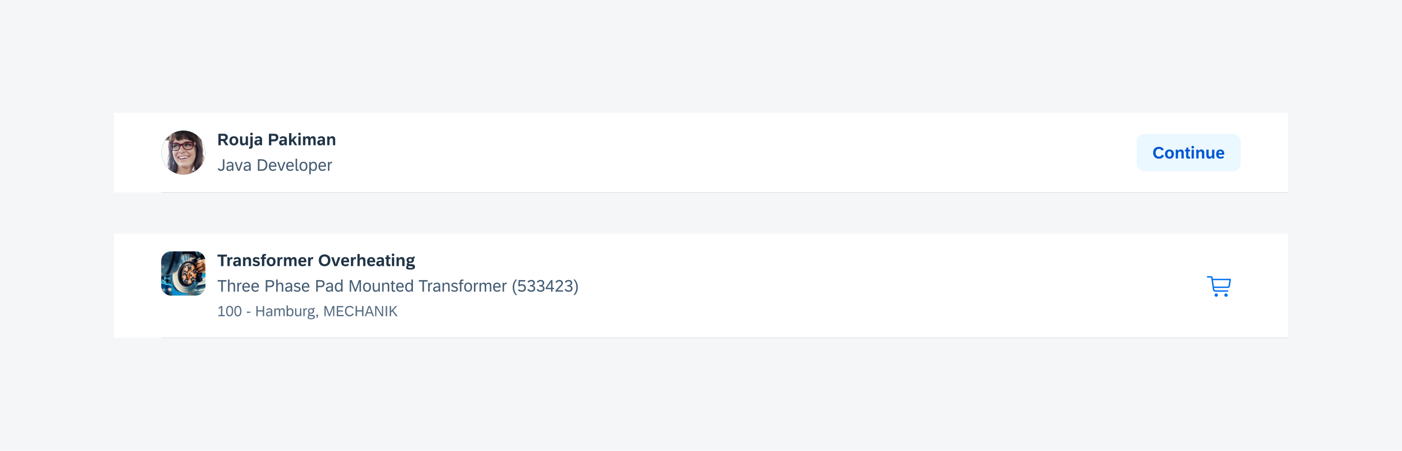
Object cell single action variation
Select (Edit Mode)
When the edit mode is triggered, users can select single or multiple object cells at once to perform an action, such as delete, change status, and so on.
Quick Actions
Quick actions are activated by a gesture such as swipe to delete.
Peek & Pop
Users can activate a peek & pop preview of an object by holding a long press on the object cell.
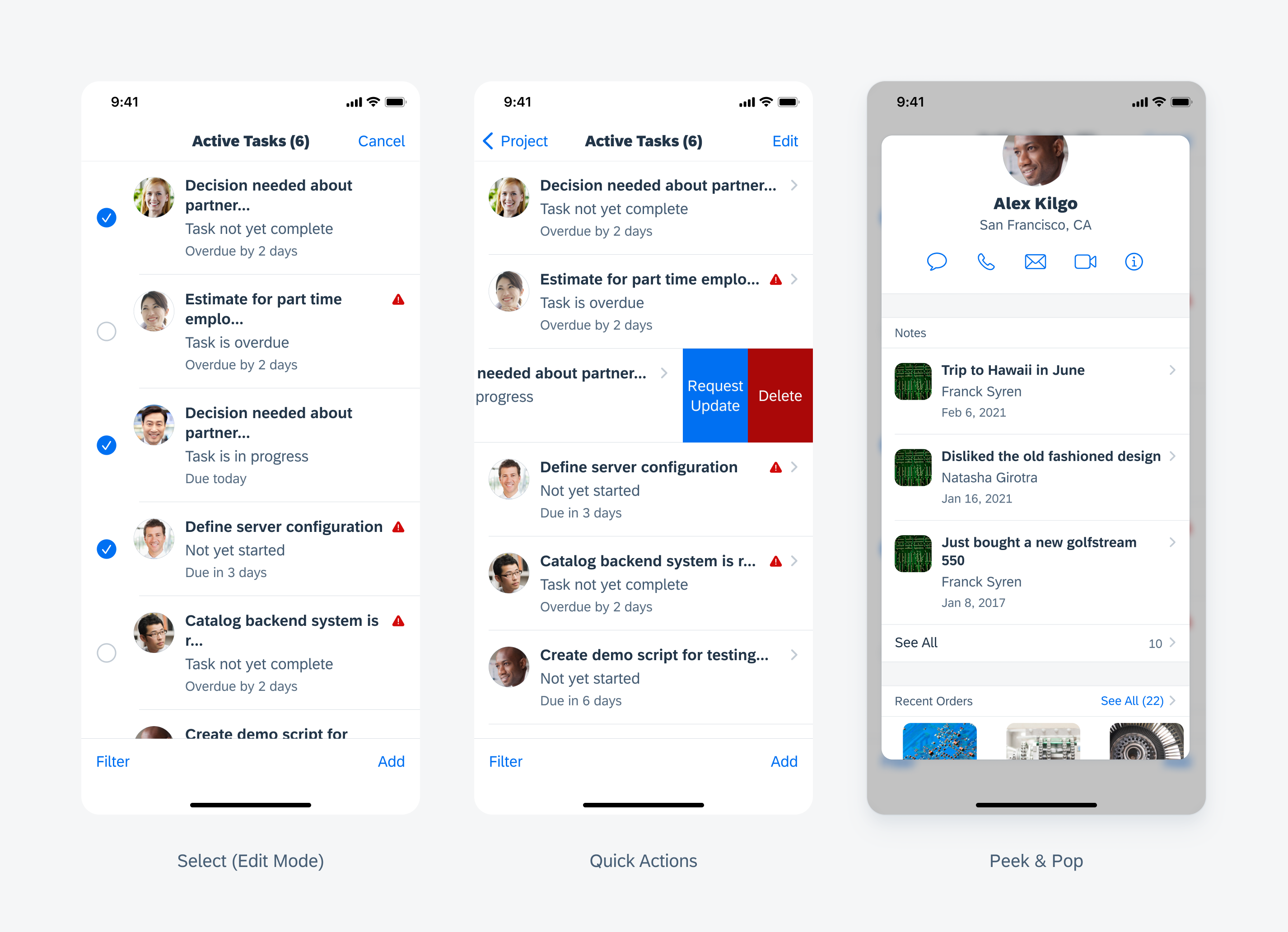
From left to right: select (edit mode), quick actions, and peek & pop
Navigation
The preview and quick view variations both include a navigational aspect. The preview uses a chevron icon to indicate a push to the full content of the object, while the quick view uses an information disclosure icon to indicate that a modal will pop up with the full content of the object.
Example of preview and quick preview navigation
Compact and Regular Width
The object cell is supported in both regular and compact width layouts. An optional description is available to be displayed in regular width. The width of the title content container and description container is flexible and can be set according to your liking.
Object cell's adaptivity for compact and regular width
Compact and Regular Height
The object cell also supports layouts with compacts height, allowing more objects to be exposed in smaller screens.
Example of an object cell's adaptivity for compact and regular height
Resources
Development: FUIObjectTableViewCell
SAP Fiori for Android: Object Cell, Key Value Cell
Related Components/Patterns: Contact Cell, List Picker, Collection View
 Your feedback has been sent to the SAP Fiori design team.