Profile and Settings
Intro
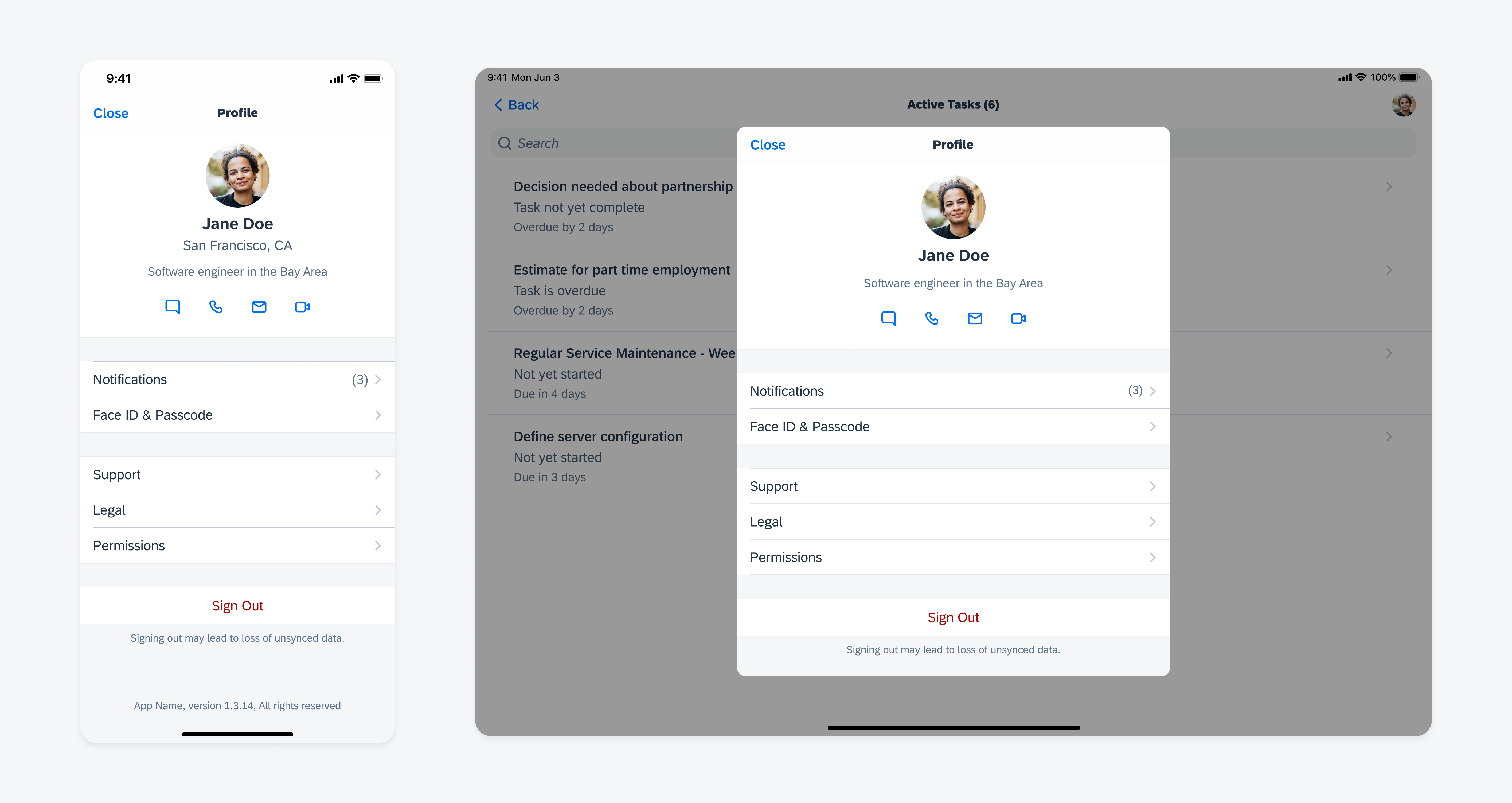
The profile and settings page is a modal view in form of a container that holds various user and app specific settings and allows the user to customize their app experience.

Profile and settings example
Content Structure
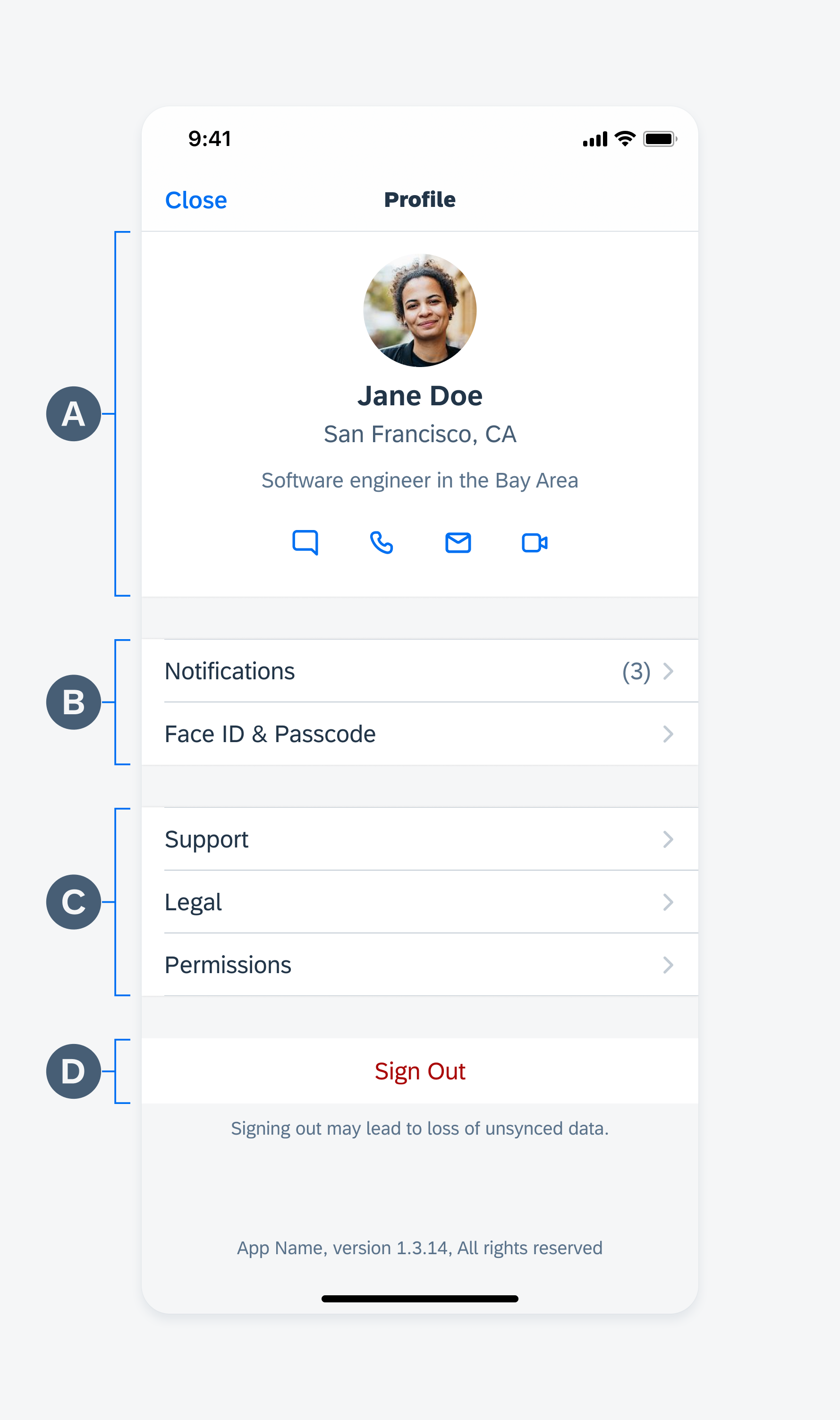
A. Profile Header (Optional)
The profile header can contain items that provide more information about the user such as a profile image, user’s name, job title etc. If a profile image is not available, then the user’s initials can replace the image.
The header can also contain an action that the user can take immediately such as changing the profile image, starting or ending a work shift.
B. Settings
Settings may include user’s personal information, app specific preferences such as units of measure, permissions, and notification preferences. It allows the user to edit and personalize their experience in interacting with the app.
C. App Information
The app information section groups general information such as the “About” section, “Legal”, or feedback. If the app only has a version number in the “About” section, place it at the bottom of the main profile screen.
D. Sign out and Sync
A “Sign Out” button allows the user to sign out of the app. In demo mode, this button is used to exit the demo.
A “Manual Sync” button can also be included in this section.

Profile content structure
Related Components / Patterns: Navigation, Object Details, Profile Header


 Your feedback has been sent to the SAP Fiori design team.