Rating Control Form Cell
FUIRatingControlFormCell
Intro
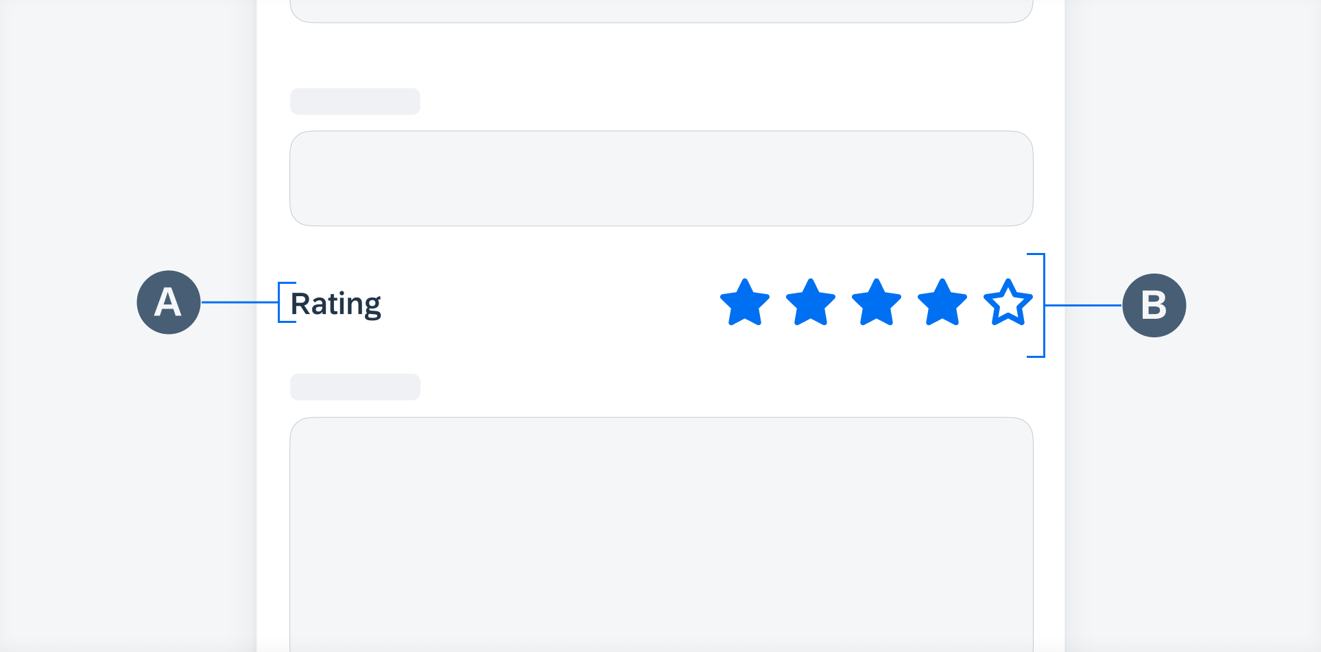
The rating control form cell is used to indicate an average rating for an object in a form cell. It also allows users to set their own rating on a numerical scale from 1 (lowest) to 5 (highest).

Rating control form cell in compact width (left) and regular width (right)
Users can set a rating in a rating control form cell using the larger interactive type of rating control. They can either tap the stars individually or tap and slide their finger horizontally along the stars to choose the desired rating.

Tap to choose the desired rating

Drag to choose the desired rating
Display
Shows the rating in a small read-only format. See Rating Control for more details.
Interactive
This is a larger tappable variation that enables the user to set the rating of an object. See Rating Control for more details.

Interactive rating control form cell (left) and display rating control form cell (right)
Resources
Development: FUIRatingControlFormCell
SAP Fiori for Web: Rating Indicator
Human Interface Guidelines: Rating Indicators
Related Components/Patterns: Rating Control


 Your feedback has been sent to the SAP Fiori design team.