Step Progress Indicator
FUIStepProgressIndicator
Intro
The step progress indicator is a progress indicator for tracking and displaying a user’s state in a user flow. It allows the user to navigate to another step in both the default view and the optional “All Steps” view.
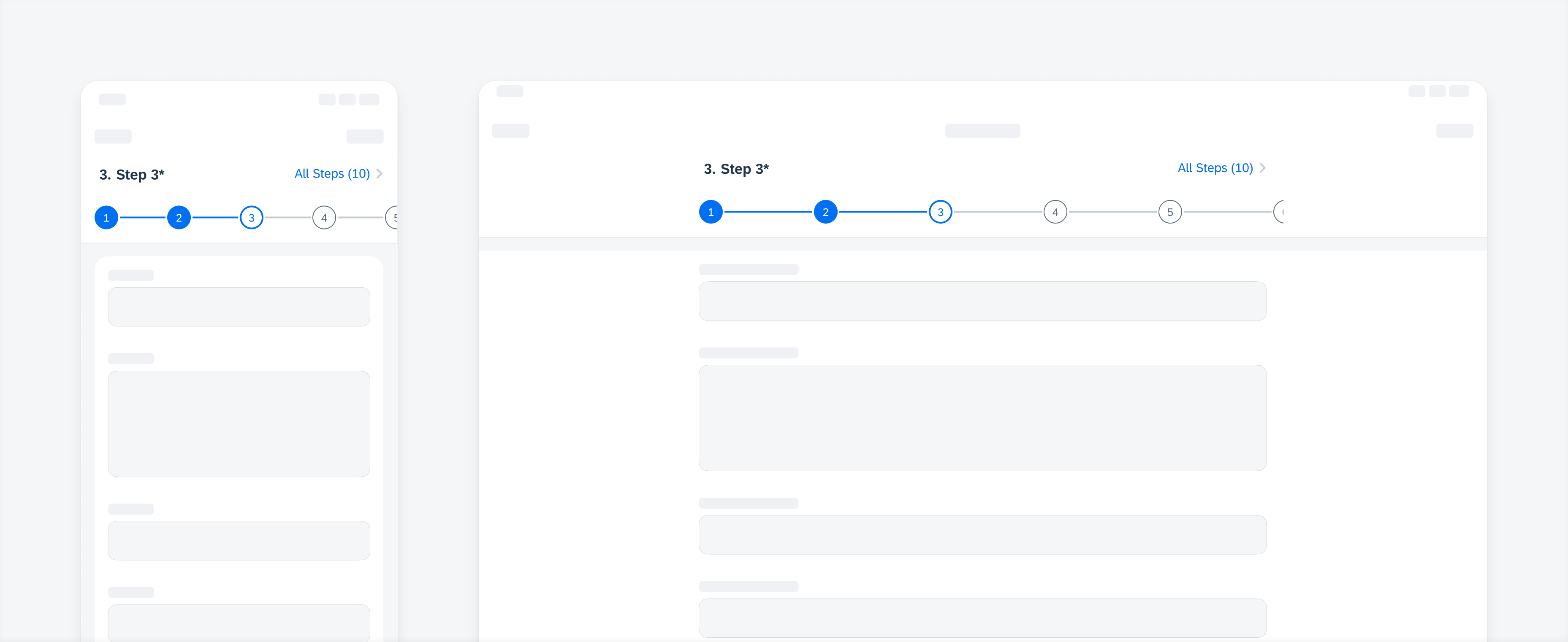
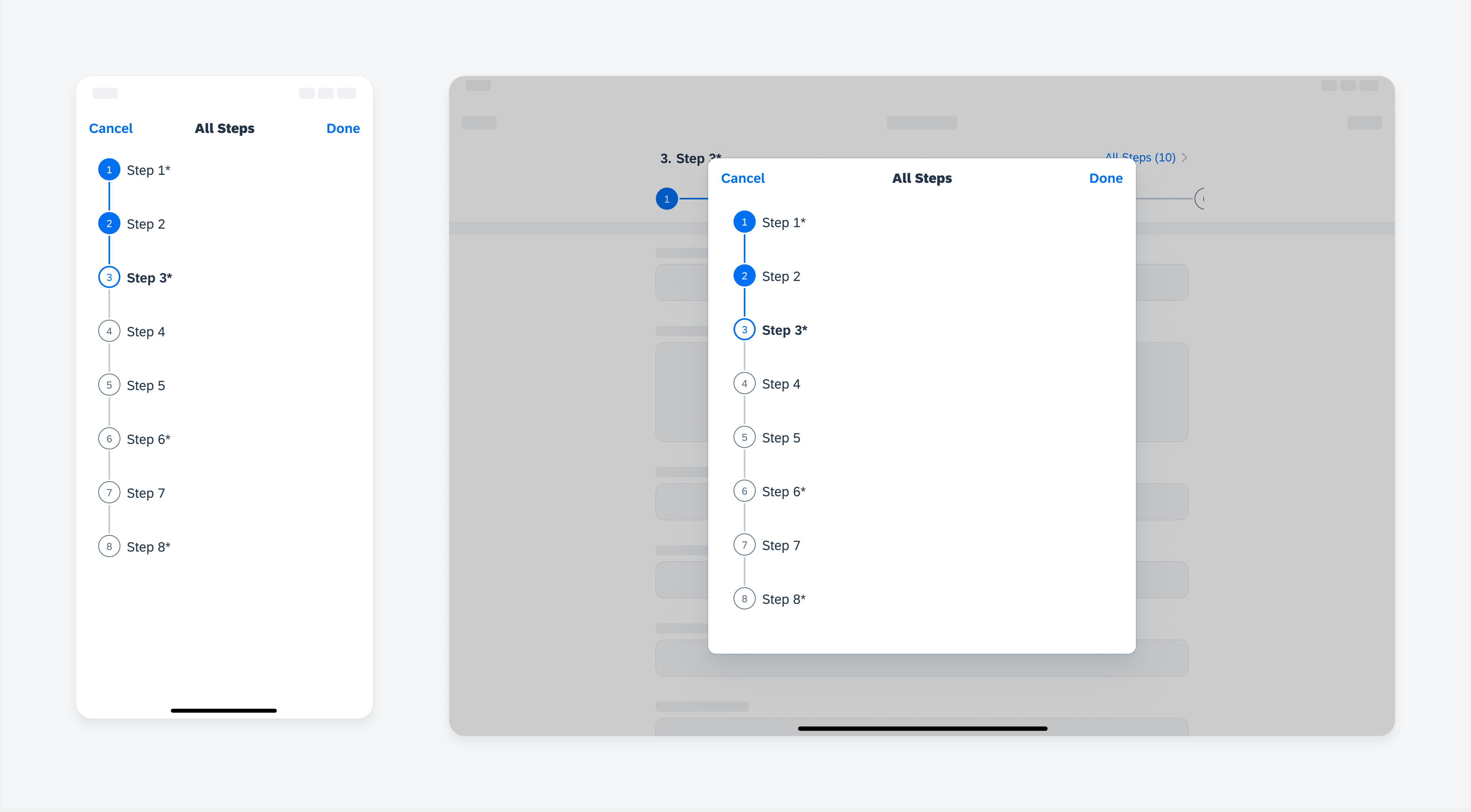
Step progress indicator in compact (left) and regular width (right)
- A step progress indicator should at least show two steps.
- Use dynamic steps for sub-steps and steps which are dependent on default steps.
- Displaying a partial view of the last step on the screen for a scrollable step progress indicator is highly recommended.
- Keep step names short – we recommend no more than two lines of text.
Default View
A. Current Step Name (Optional)
Describes the current step’s name.
B. “All Steps” Button (Optional)
Allows users to view all steps on another screen.
C. Step Node
Displays the number or icon representing a step in the user flow.
D. Step Line
A line that connects the current step with the next step. No step line for the final step.
E. Step Name (Optional)
Describes each step’s name.
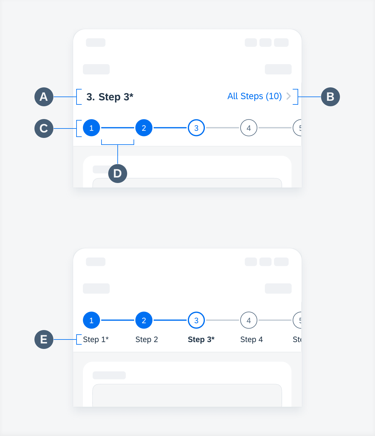
Step progress indicator “default” view
“All Steps” View
A. Step Node
Displays the number or icon representing a step in the user flow.
B. Step Line
A line that connects the current step with the next step. No step line for the final step.
C. Step Name
Describes each step’s name.
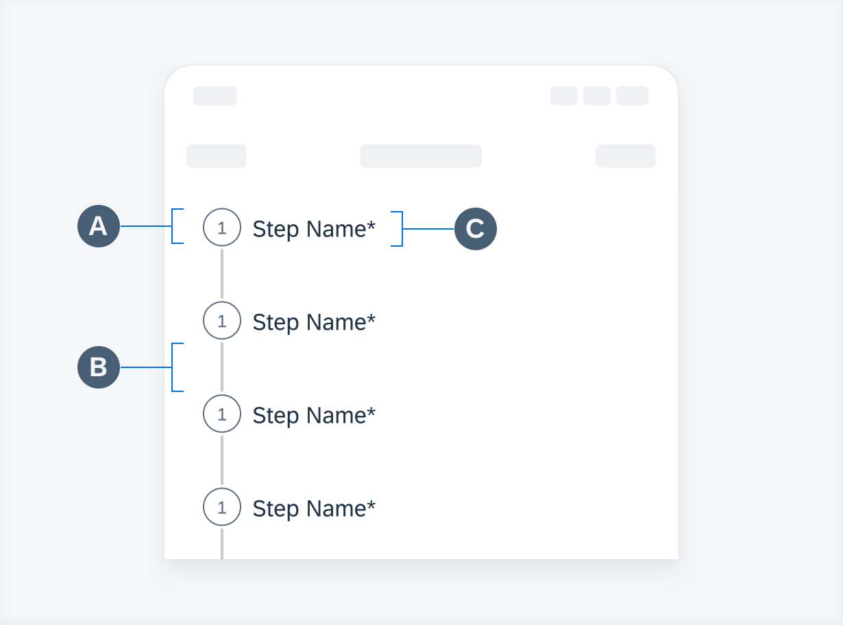
Step progress indicator "All Steps” view
A step progress indicator allows users to navigate to another step in both default and “All Steps” view.
In a linear user flow, users can tap on the next step when the current step is complete.
In a non-linear user flow, users can tap on any other step regardless of its state.
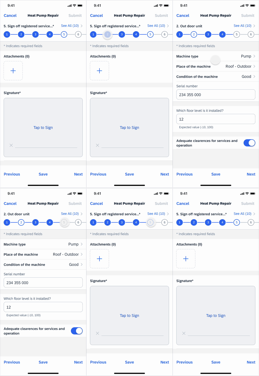
Navigation between steps
“All Steps” View
Users can tap on the “All Steps” button in the header to navigate to another page where they get an overview of all steps. The steps are displayed in a vertical format.
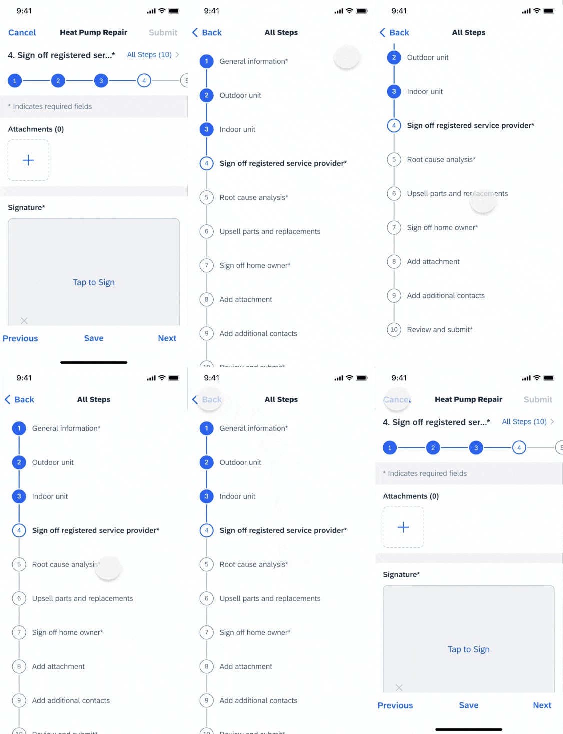
Tap on “All Steps” button in the header to navigate to “All Steps” view
Horizontal Scrolling
If a step progress indicator contains more steps than one screen can show, users can drag horizontally to view more steps.
When users complete the last step on one screen and try to navigate to the next step, the step progress indicator automatically scrolls to the next screen with the selected step pinned as the first step on the screen. However, if the last auto-scroll screen contains the final step, the progress indicator bar is right aligned.
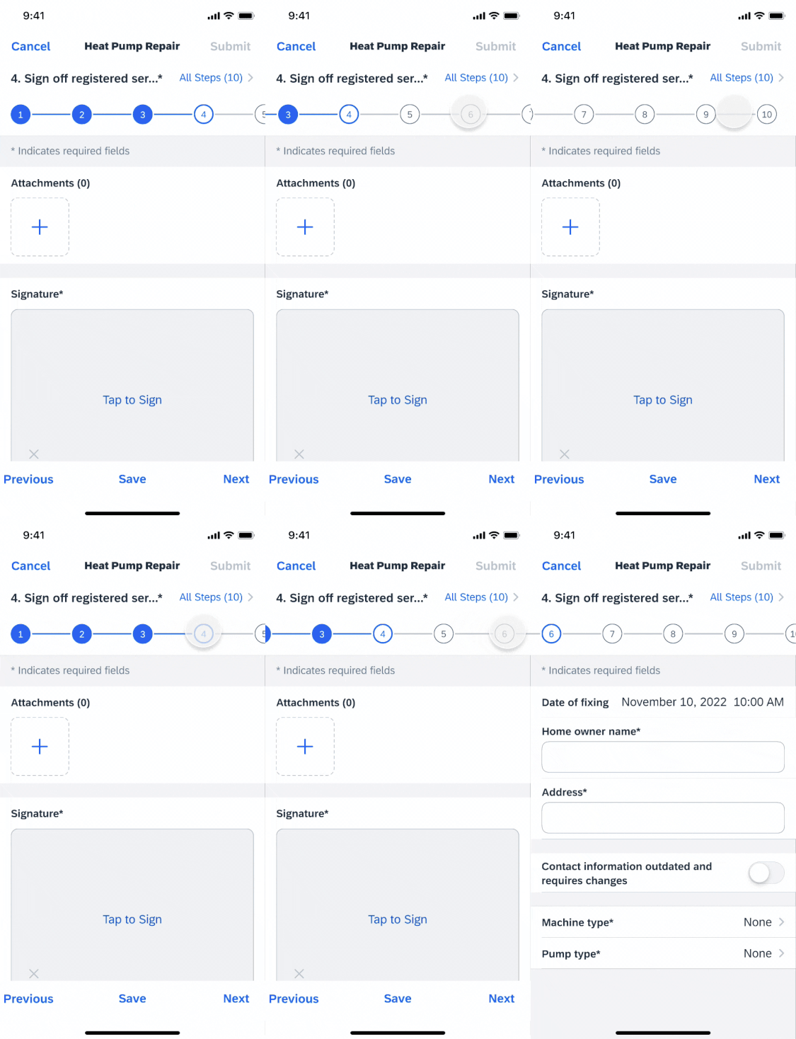
Horizontal scrolling
Value State
A step progress indicator may contain the following value states of a step: default, active, complete, error, error active, and disabled.
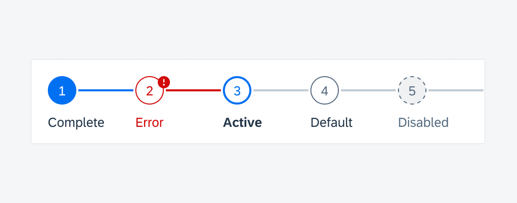
Step value states from left to right: complete – error – active – default – disabled
Numeric Step
Numeric steps default to a step progress indicator, which indicates the corresponding step number in the process, such as step “1”, “2”, and so on. The number should not exceed three digits because of limited space in the node. Numeric steps cannot be used together with icon steps.
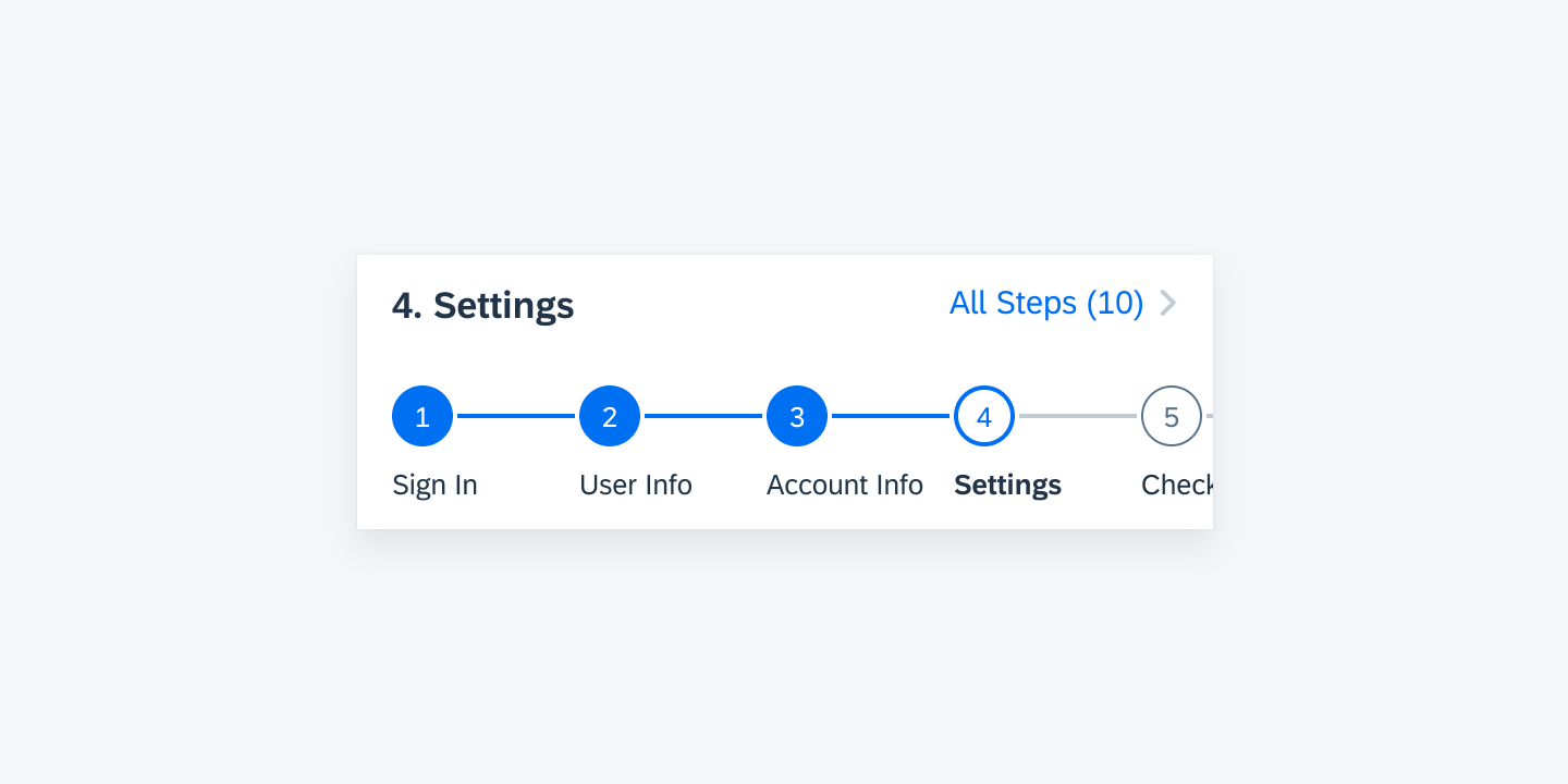
Numeric steps in a user flow
Icon Step
Icon steps can be used to replace the numeric steps, and the default icon size is 16pt. The icon can be swapped with any SAP Fiori icons depending on the user’s needs. Icon steps cannot be combined with numeric steps.
Icon steps in a user flow
Dynamic Step
Dynamic steps can be used as sub-steps, such as step “2.1”, “2.2”, and so on. It may also be used for a step that depends on certain user action during a previous default step, and is only displayed after the action is taken, such as choosing an option in a form.
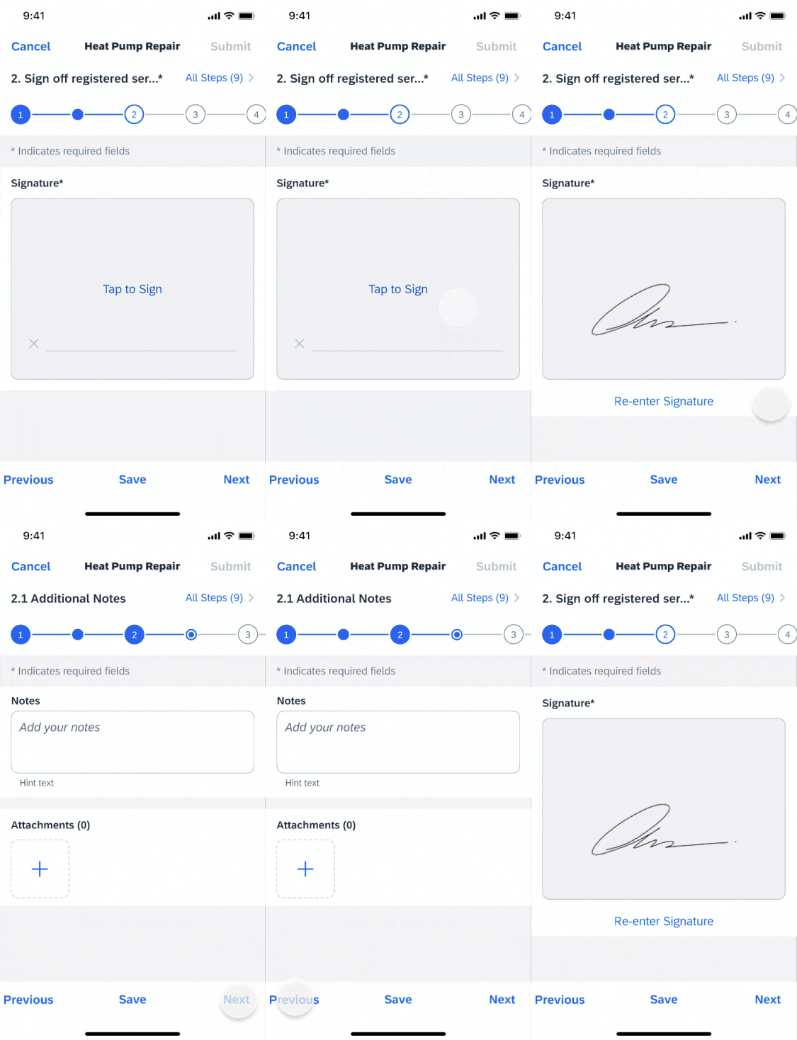
Example of a dynamic step based on user actions
Development: FUIStepProgressIndicator
SAP Fiori for Android: Step Progress Indicator
SAP Fiori for Web: Wizard Floorplan
Related Components/Patterns: Sibling Navigation

 Your feedback has been sent to the SAP Fiori design team.