Navigation
Intro
A proper navigation style offers a fast and clear path for users to finish their tasks. When designing an app, the first step should always be to evaluate the content structure of the app, and to then select the navigation style that will provide the clearest and most efficient user experience.
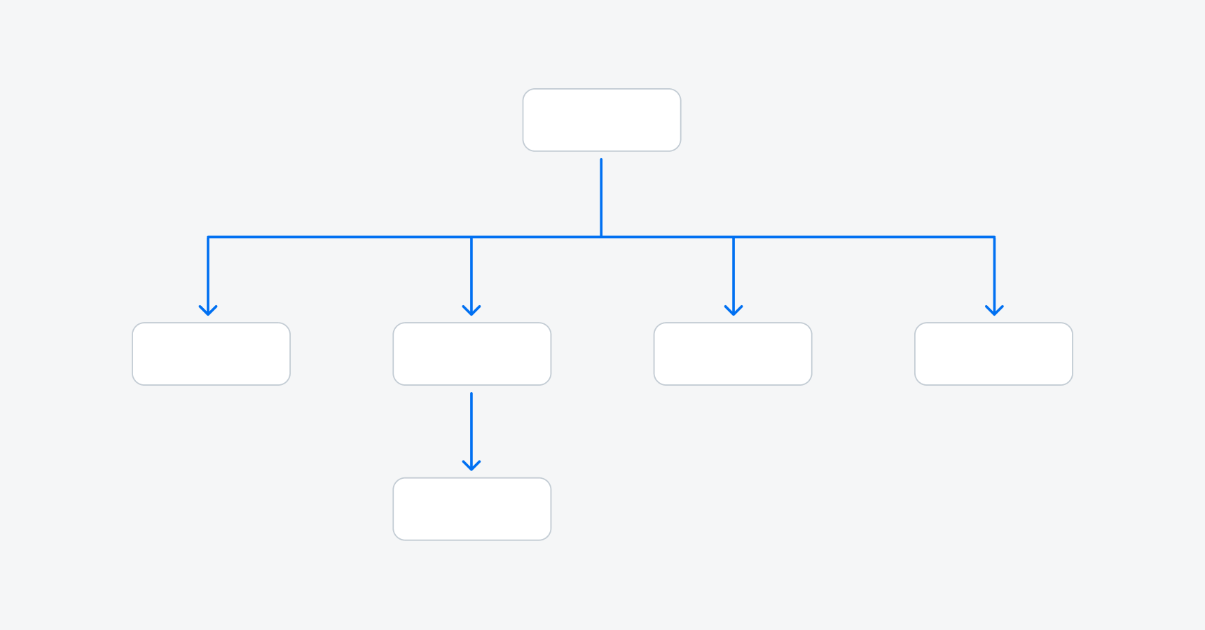
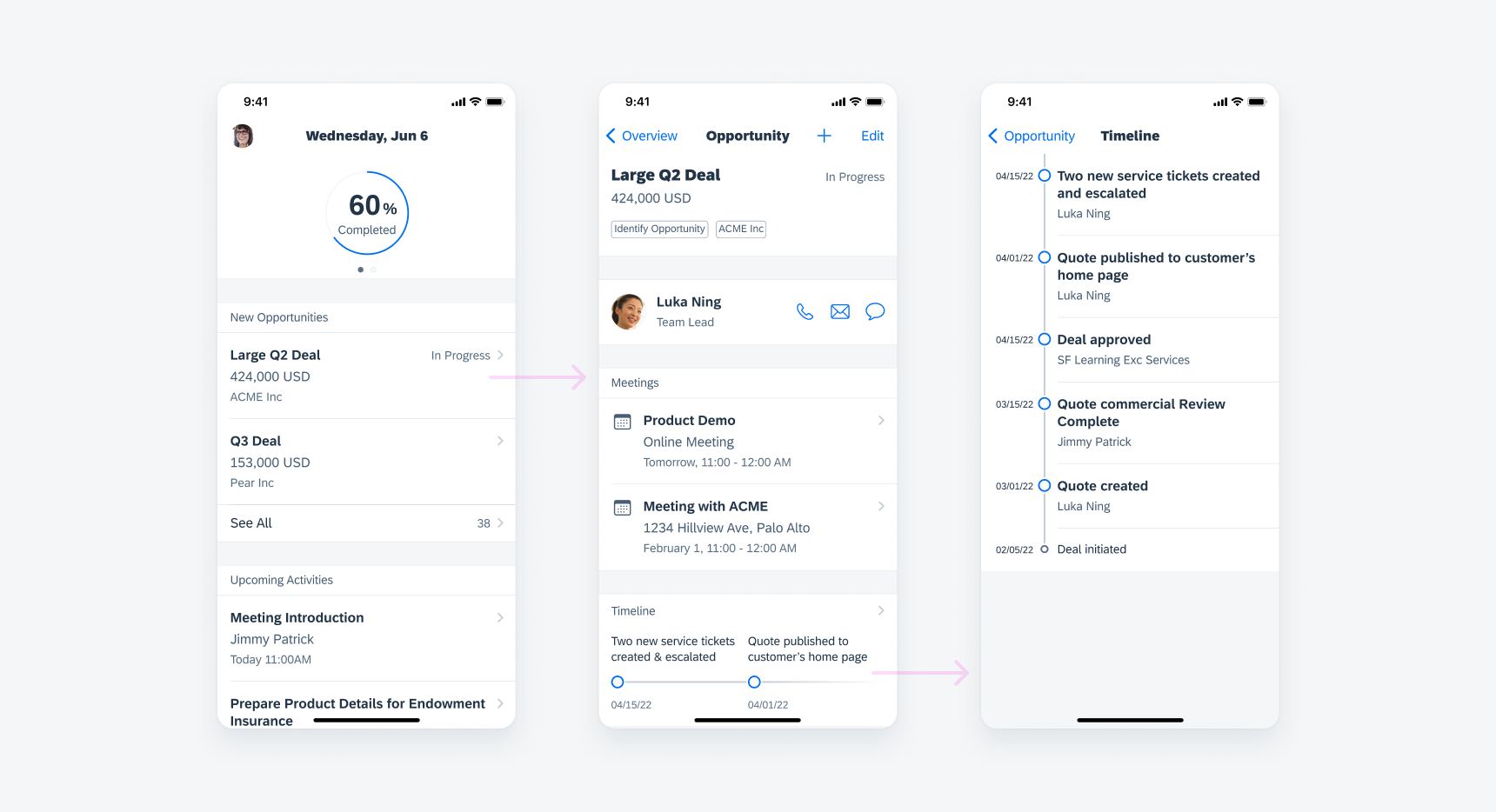
Hierarchical navigation is suitable for apps based on a single content category. Apps that use a hierarchical navigation style typically start with an overview screen that provides users a high-level summary of the entire app. Users can then access more detailed information by drilling down into the available content subcategories.

Hierarchical navigation
Prevent Endless Loops
In a hierarchical navigation style, the user can only go back and forth step-by-step. To prevent the user from entering an endless loop, you may consider displaying some information in modals when the user is in a deeper level of the app. To learn more about child objects, see Object Details.

Example of hierarchical navigation
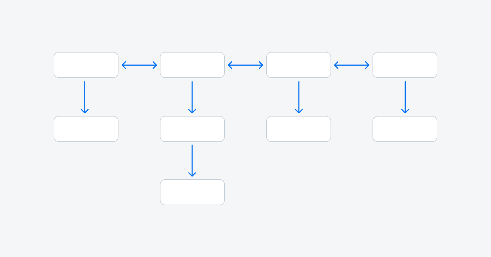
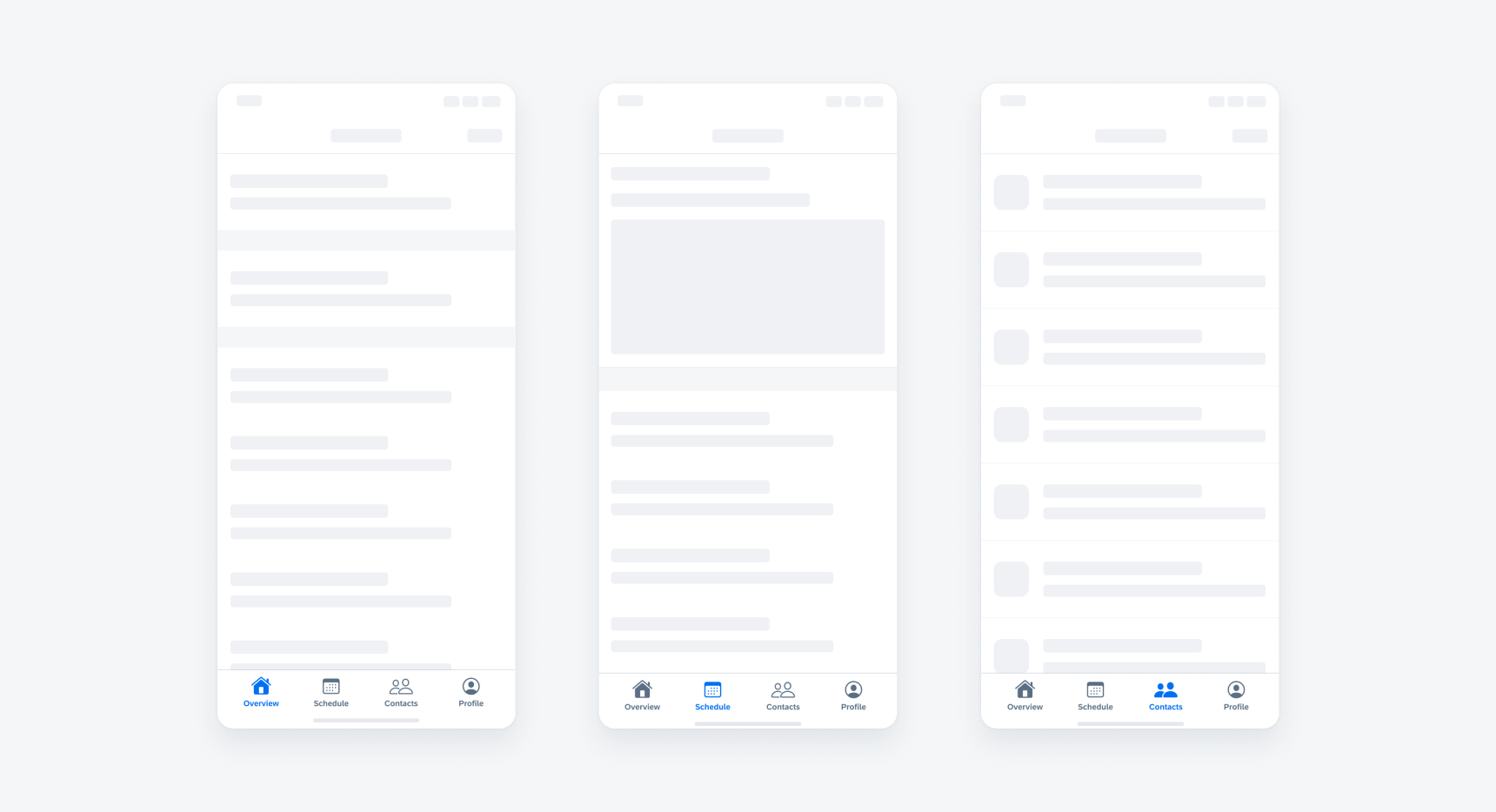
Flat navigation is suitable for apps that are based around multiple content categories. A tab bar is used in flat navigation, with each tab representing one content category. An optional search tab can be used to enable a global search feature. Inside each tab, the user can drill down in a step-by-step fashion to access increasingly detailed content.

Flat navigation
Profile
In most cases, it’s recommended for you to place profile and settings on the right side of the navigation bar and ensure it’s accessible in each tab. If the profile is frequently viewed by the user, for example, checking the progress, the profile may be in its own tab. To read more, see Profile & Settings.
Related Components: Navigation Bar, Sidebar, Sibling Navigation, Tab Bar


 Your feedback has been sent to the SAP Fiori design team.