Skip to search Skip to content
  • Home
  • Get Started
  • Explore SAP Fiori for iOS
  • What’s New
  • Foundation
    • SAP Fiori Design Principles
    • Accessibility
    • Adaptive Layout
      • Overview
      • Layout Basics
      • Size Classes
      • Multi-Column Layout
      • Design Adaptive Apps
    • App Store Appearance
    • Animation
    • Color
      • Colors
      • Design Tokens
      • Theming
    • Elevation
    • Format
      • Time and Date Formats
      • Rich Text Document
    • Icon
      • App Icon
      • Iconography
    • Typography
  • UI Components
    • Avatars and Images
    • Buttons
    • Calendar
    • Cards & Layouts
      • Cards Overview
      • Card Header
      • Card Body
      • Card Footer
      • Carousel Layout
      • Masonry Layout
    • Charts
      • Chart Overview
      • Chart Types
      • Chart Content Table View Cell
    • Collection View
    • Collection View Cell
    • Data Table
    • Dimension Selector
    • Feedback
      • Banners
      • Empty State View
      • Error Handling
      • Multi-Message Handling
      • Feedback Indicators
      • Illustrated Message
      • Offline
    • Filter Feedback Bar
    • Headers
      • Chart Header
      • KPI Header
      • Object Header
      • Profile Header
    • Hierarchy View
    • Info View
    • Input & Selection
      • Attachment Form Cell
      • Button Form Cell
      • Filter Form Cell
      • In-line Validation
      • In-Line Signature Form Cell
      • List Picker Form Cell
      • Order Picker Form Cell
      • Pickers
      • Rating Control Form Cell
      • Segmented Control Form Cell
      • Slider Form Cell
      • Stepper Form Cell
      • Switch Form Cell
      • Text Inputs
    • KPIs
    • Navigation & Search
      • Navigation Bar
      • Search Bar
      • Search to Select
      • Sibling Navigation
      • Sidebar
      • Tab Bar
    • Preview Table View
    • Progress Indicators
      • Linear Progress Indicator
      • Step Progress Indicator
    • Rating Control
    • Segmented Control
    • Signature Capture
    • Table View Cells
      • Contact Cell
      • Key Value Table View Cell
      • Object Cell
    • Tags
    • Timeline Preview
    • Timeline View
    • Toolbar
    • What’s New
  • Patterns
    • Augmented Reality
      • AR Annotations
      • AR Cards
      • AR Markers
      • AR Scanner
    • Authentication
      • Authentication Overview
      • Basic Authentication
      • Biometric Authentication
    • Consent Forms
    • Create & Edit
    • Document Scanner
    • Hierarchy
    • Map
    • Modality
    • Navigation
    • Onboarding
      • Single-User Onboarding
      • Multi-User Onboarding
    • Scanner
      • Barcode Scanner
      • QR Code Scanner
      • OCR Scanner
    • Search
    • Skeleton Loading
    • Sort & Filter
      • Sort & Filter Overview
      • Sort & Filter Form
      • Quick Sort
    • Widgets
  • Page Types
    • List Report
    • Object Details
    • Overview Page
    • Profile and Settings
  • Resources
    • SAP Fiori for iOS – Design Kit
    • SAP Fiori for watchOS – Design Kit
    • SAP Fiori Mentor App
  • SAP Fiori for watchOS
    • Get Started
    • Foundation
      • Design Principles
      • Colors
      • Typography
      • Layout
      • Navigation
  • Support
  • Contact Us

Fiori for iOS Design Guidelines

Explore SAP Fiori for iOS

Explore SAP Fiori for iOS

Categories

Accessibility

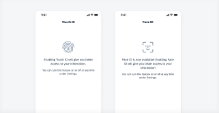
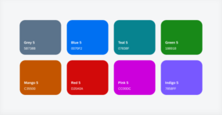
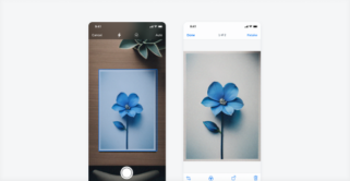
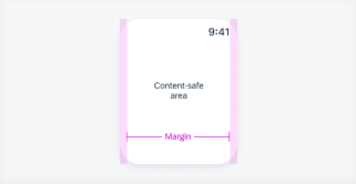
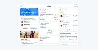
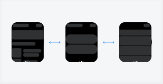
The iOS design system is designed to be compliant with accessibility standards. Our components are flexible, readable, and adaptable for usage by a wide range of users, providing an optimal and user-friendly experience for everyone, including individuals with special needs due to visual, motor, auditory, speech, or cognitive impairments. Color Contrast Ratio To ensure that [...]
Category: Foundation
Type: -

Animation

The SAP Fiori for iOS apps use four different types of transitions: Push Modal Zoom In / Out Dissolve Push The Push transition eases a new screen element onto the display from the side while sliding out the prior screen to the opposite side. Push transition is typically used for a drill down navigation. Push [...]
Category: Foundation
Type: -

App Icon

The app icon of SAP mobile apps communicate the purpose of SAP’s mobile experience and supports business users in recognizing the app in the App Store and on their home screens. Our app icon design direction complements the Horizon visual design and creates a recognizable mobile brand. The balance between individual icon metaphors, characteristic shapes, [...]
Category: Foundation
Type: -

AR Annotations

AR Annotations components are designed for exploring objects in a facility. They can be used to explore a warehouse, machinery, or a business object to enhance the user experience by leveraging augmented reality. Examples of a scan screen (left), pulsing marker (middle) and selected marker (right) Anatomy AR Scanner To view annotations in the world [...]
Category: Patterns
Type: -

AR Markers

AR markers represent an object in the world view. After an AR marker is selected an AR card appears at the bottom that displays relevant information about that marker. Unselected AR markers (left) and a selected AR marker with AR card (right) Anatomy AR markers appear in the world view and consist of three elements: [...]
Category: UI Components
Type: -

AR Scanner

The AR scanner allows users to initiate augmented reality experiences, such as AR annotations, after locating a preset image anchor to be matched. Examples of a coaching view (left), scanning view (middle) and matched scan view (right) Anatomy Coaching View The coaching view is an overlay on top of the camera view ( or 'world [...]
Category: Patterns
Type: -

Attachment Form Cell

An attachments control allows users to upload files such as image, audio, video, and text files as well as PDF, CSV, and presentation files. Tapping on the "Add (+)" button allows users to upload files from the photo library or other supported apps. Attachment grid on compact (left) and on regular (right) Usage Do Place [...]
Category: UI Components
Type: -

Avatars and Images

An avatar is a visual element used to display images. These can be user profiles, user initials, placeholder images, icons, or business-related images, such as product pictures.  Round avatars for profile images and squares for objects Usage Do Use a round avatar to represent a user or profile within table view cells, collection views, or [...]
Category: UI Components
Type: -

Banners

Thumbnail of Banner component
A banner is a notification that appears on the screen to inform the user about a certain event or a change in system status. It contains a short notification text and optionally a button to allow the user to take a recommended action Banner examples: an error, an offline, and a syncing banner Usage Use [...]
Category: UI Components
Type: -

Barcode Scanner

The barcode scanner allows users to quickly locate an object by scanning a barcode via the device’s built-in camera. It is also used when users need to efficiently manage business objects in a lengthy list report. Barcode scanner examples Anatomy The barcode scanner comes in a full-screen modal that includes a navigation bar, scan window, [...]
Category: UI Components
Type: -

Basic Authentication

The basic authentication pattern is used for general authentication purposes. Basic authentication examples Anatomy A. Navigation Bar The navigation bar includes a “Cancel” button for users to exit the authentication. B. Body Title The body title should be a concise label that describes the authentication step. C. Body Text The body text should detail how to [...]
Category: Patterns
Type: -

Biometric Authentication

Biometric authentication detects and recognizes certain human physical features for security authorizations. Apple supports Face ID and Touch ID as convenient and secure biometric authentication methods - and by extension so does SAP Fiori for iOS. Biometric authentication examples Anatomy A. Navigation Bar The navigation bar contains the title and "Cancel" action depending on the [...]
Category: Patterns
Type: -

Button Form Cell

A button form cell represents an action that can be taken in a view. Button form cell on compact (left) and on regular (right) Usage DoDos for button form cell Use a button form cell to represent an action within a current view. Don'tDon'ts for button form cell Do not use a button form cell [...]
Category: UI Components
Type: -

Buttons

Buttons allow users to perform actions, make decisions or to begin a process. The label of a button communicates the action that it is going to initiate. Examples of different buttons Usage Buttons should only be used for actions. Avoid using too many buttons – if users have too many options, it is difficult for [...]
Category: UI Components
Type: -

Calendar

The calendar view provides a visual overview of a week, a month, or multiple months. Example of calendar views on iPhone (left) and iPad (right) Usage Do Use calendar view to display a visual overview of a week, a month, multiple months, or a range of selected dates. Use calendar view to visually present correlations [...]
Category: UI Components
Type: -

Card Body

The card body is the central part of the card that is used to display additional information alongside the content shown in the card header. By using the card body, several components from the SAP BTP SDK for iOS can be integrated into a card, enabling the recreation of card types such as chart cards, [...]
Category: UI Components
Type: -

Card Footer

The card footer, also referred to as card toolbar, is the bottom part of a card that contains important or routine actions that directly impact the card, such as “Approve” or “Submit”. The footer can accommodate a maximum of two action buttons. Card with a highlighted card footer Usage When using the card footer to [...]
Category: UI Components
Type: -

Card Header

The card header is the uppermost part of the card that provides important information about the card and its related content on the detail page. The optional card header allows for a quick overview of key information, such as a title, subtitle, or status of the card. Card header examples Usage When using the card [...]
Category: UI Components
Type: -

Carousel Layout

A carousel layout is a design pattern that displays multiple cards horizontally, one after the other, with a glimpse of the next card visible on the edge of the screen. This partial visibility encourages users to swipe or scroll left or right to reveal more cards. Carousel with cards in compact size class (left) and [...]
Category: UI Components
Type: -

Chart Content Table View Cell

The chart content table view cell is a full-width view that provides a visual representation of one or more datasets. This component is designed for when the user needs to view chart data within a workflow in context of a business object, but does not need to drill into individual chart values. This cell does [...]
Category: UI Components
Type: -

Chart Header

The chart header displays simple chart data inside an object header. It gives at-a-glance information about the object it is connected to, and it is supported in both compact and regular widths. This chart type can be used only in the object header. Chart header compact width (left) and regular width (right) Usage Do Use [...]
Category: UI Components
Type: -

Chart Types

SAP Fiori for iOS supports multiple chart types. Depending on the type of data in your app and how users will use the chart, it is important to select a chart type that will best meet users’ needs. From left to right: line chart, column chart, horizontal bar chart, and donut chart floorplans in compact [...]
Category: Patterns
Type: -

Collection View

The collection view is a container that displays items in a grid. It previews a sample of content by presenting it in a highly visual layout and should not be used to display only text. Therefore, a collection view container should be populated with content that contains images to provide a more visual viewing experience. [...]
Category: UI Components
Type: -

Collection View Cell

The collection view cell is an object within the collection view. It displays content with images to provide a more visual viewing experience. For guidance on how a collection view cell can be used within the collection view, see Collection View. Different collection view cell examples Anatomy A. Image View Collection view cells are meant [...]
Category: UI Components
Type: -

Colors

watchOS Colors Thumbnail
The right choice of colors is an important aspect that should be considered in watch apps. It communicates the meaning and relationship of content, providing users with guidance to help them complete their tasks. Horizon Reference Colors The color palette for SAP Fiori for watchOS is based on the color parameters from the Horizon visual [...]
Category: SAP Fiori for watchOS
Type: -

Colors

Color plays a significant role by setting the visual balance for iOS apps. Color is used to define the visual hierarchy of UI elements and to direct the user’s attention to the most important tasks. Horizon Theme Color Palette Our color system builds on a unified color palette that aligns with our brand and helps [...]
Category: Foundation
Type: -

Consent Forms

The consent form pattern is generally used in onboarding scenarios. It stores a digital record of the user's understanding and permission of the terms of an event, activity, or service that will be performed by the application. Consent form in compact width (left) and regular width (right) Anatomy A. Navigation Bar The navigation bar contains [...]
Category: Patterns
Type: -

Contact Cell

The contact cell is a table view cell which fits inside the table view container. It is used to give quick access to the various methods of communicating with a contact. It is commonly found in an object and object details floorplan. Compact contact cell (left) and regular contact cell (right) Anatomy Anatomy of a contact [...]
Category: UI Components
Type: -

Create & Edit

The create & edit pattern is used to generate or update object. It is presented to the user via a modal and typically triggered by the create or edit actions on the navigation bar. The pattern may include a variety of combination of form cells to allow users to input information related to the object. [...]
Category: Patterns
Type: -

Data Table

A data table is a range of labeled columns and rows used to present numbers, text, or even images. Generally, data tables are a grid layout of columns and rows. The horizontal scrollable data table with a sticky header and column is available in both compact and regular screen sizes. Alternatively, the data table will [...]
Category: UI Components
Type: -

Design Adaptive Apps

No image available
Optimizing your app for all window size classes requires a clear understanding of its structure and the relationships between screens. In compact size classes, users navigate through screens hierarchically, whereas in regular size classes, multiple columns can be displayed side by side. Starting with One Window Size Class Begin by designing your app for a [...]
Category: Foundation
Type: -

Design Tokens

Design tokens are our cross-platform solution to managing color across iOS and Android. Design tokens are stored pieces of UI information such as color, spacing, sizing, and typography that collectively make up our design system's visual identity. Additionally, design tokens help us to maintain visual consistency, scale design decisions, and are simple to maintain and [...]
Category: Foundation
Type: -

Dimension Selector

A dimension selector is a horizontal bar divided into two or more mutually exclusive buttons. The dimension selector allows users to choose between several different measures of content, which generally is used for chart and view switching. Usage Do Ensure the dimensions of the selector are related to each other. Use a dimension selector to switch [...]
Category: UI Components
Type: -

Document Scanner

The document scanner leverages Apple’s VisionKit, allowing users to digitize physical documents with an on-device flow. Users can select automatic or manual capture and easily edit, retake, or delete specific or all scanned documents. Document scanner examples Anatomy A. Camera View The camera view enables users to focus on and capture their scan through either [...]
Category: Patterns
Type: -

Elevation

Elevation refers to the virtual height or distance of an interface element from the background surface, expressed through visual cues such as shadows and blur effects. In SAP Fiori for iOS, this principle is implemented through a subtle combination of translucent materials and minimal shadows, creating layered depth that aligns with iOS's minimalist design language [...]
Category: Foundation
Type: -

Empty State View

When mobile applications do not have access to or can not show data, an Empty State View can be used as a fallback to provide users with messaging about what has happened and what to do next. They can appear in, but are not limited to, cards or page types such as chart cards, chart [...]
Category: Patterns
Type: -

Error Handling

Errors are used to communicate to the user that something did not go the way it was intended to in the app. An error could occur either at the app level or at the user level. It's important to present the appropriate type of error message and when possible, provide instructions to help the user [...]
Category: Patterns
Type: -

Feedback Indicators

Feedback provides users with timely responses to actions or informs them about the loading state or condition of content or processes. There are two types of feedback: System feedback: provides system-generated feedback about the status of activities and processes, such as the network activity indicator, loading indicator.   User-triggered feedback: provides information to the user in [...]
Category: Patterns
Type: -

Filter Feedback Bar

The filter feedback bar is a horizontal bar that appears above a list of content. It uses interactive buttons to communicate which filters have been applied to the list and allows users to quickly apply frequently used filters. It is typically used in list report or work list floorplans. Usage Do Use a filter feedback [...]
Category: UI Components
Type: -

Filter Form Cell

A filter form cell is used to filter one or more values under a filter category. It is commonly used in the filter pattern for sorting and grouping. Compact width filter form cell on iPhone (left), regular full-width on iPad (right) Usage Do Use a filter form cell for short text and if the number [...]
Category: UI Components
Type: -

Hierarchy

The hierarchy pattern is a combination of the hierarchy view and a list report.  A combination of these views allows for a wider range of functionality in different kinds of workflows. For example, the hierarchy pattern can be utilized in a create use case. Workflows using the hierarchy pattern Anatomy List Report A list report [...]
Category: Patterns
Type: -

Hierarchy View

The hierarchy view shows the relationship between parent and child objects. It serves as an entry point for a user to get an overview about where an object lives in a larger hierarchical structure. For single level data sets, we recommend using a list report instead of a hierarchy view. Hierarchy views on compact (left) [...]
Category: UI Components
Type: -

Iconography

Iconography is essential to creating a cohesive and enjoyable app experience. Icons play a crucial role in communicating actions, information, feedback, and navigation. By providing a comprehensive icon library, our goal is to enhance the accessibility and overall ease of use of our customers’ apps. SAP icons have been redesigned for the Horizon visual theme [...]
Category: Foundation
Type: -

Illustrated Message

The illustrated message communicates empty, error, and success states through a combination of solution-oriented messages, engaging illustrations, and a conversational tone. The illustrated message turns a situation, even a negative one, into a better experience for your users while ensuring consistency.  General empty, error, and success state examples Usage Use the illustrated message when you [...]
Category: Patterns
Type: -

In-Line Signature Form Cell

In-line Signature Form Cell Thumbnail
The in-line signature form cell is a form cell that allows users to enter their signature into a form to verify identity and express intent of acceptance. The difference between this component and signature capture is that this component's interaction and behaviors are integrated into the form, allowing the users to review content during the [...]
Category: UI Components
Type: -

In-line Validation

In-line validation provides static information to a user or provides temporary feedback in response to a user's input and is commonly used with form cells in forms. In-line validation should be placed underneath the relevant form cell and may display hint text, a success message, a warning message, or an error message. In-line errors in [...]
Category: UI Components
Type: -

Info View

The info view is generally used in onboarding scenarios. It provides the application with the ability to show customizable information in a transitionary state that locks regular navigation methods. This pattern is closely related to the What's New component as well as the feedback screens used in multi-user onboarding. Info view on compact (left) and [...]
Category: Patterns
Type: -

Key Value Table View Cell

The key value table view cell is an uneditable table view cell that fits inside the table view container. It is ideal for displaying simple sets of data or information to the user. Key value table view cell in compact (left) and regular-readable width (right) Usage Do Display only a key label and value. Convey [...]
Category: UI Components
Type: -

KPI Header

The KPI header displays numerical data the user needs to keep track of during the day. It is typically used in an overview pattern to provide the user with contextual information. KPI header on compact (left) and on regular (right)   Anatomy The KPI header is a container that includes multiple KPIs that are important [...]
Category: UI Components
Type: -

KPIs

Key performance indicators (KPIs) are measurable values that are used to evaluate the success of an organization, an individual, a group, or a particular activity. KPIs are also used to highlight the current value of an object or as a summary of the object. KPIs can be used in a header, in the content area [...]
Category: UI Components
Type: -

Layout

When designing for small screens, it is important to keep content within the layout legible, aligned, organized, and accessible. The following article presents some best practices that offer guidance for the design of a watch app layout, such as rules for handling different screen sizes, margins, and touch targets. Usage As the screen on the [...]
Category: SAP Fiori for watchOS
Type: -

Layout Basics

No image available
Horizontal Space Compact Width The spaces between the left/right window edge and the component are called margins. In compact width layouts, full-width components have 16dp layout margins by default. The spacing between UI elements inside the components can be fixed or flexible with auto layout depending on each use case. Regular Width In regular width [...]
Category: Foundation
Type: -

Linear Progress Indicator

A linear progress indicator informs users about the status of ongoing processes, such as login progress, uploading files, or refreshing content. It communicates an app’s state and indicates available actions, such as whether users can navigate away from the current screen. Indeterminate linear progress indicator (left) and determinate linear progress indicator (right) Usage Do Use [...]
Category: UI Components
Type: -

List Picker Form Cell

A list picker allows for the selection of one or more options among values within a defined category. Use a list picker when there are more than eight values to select from within a single category or when the size and nature of the available options are dynamic and unpredictable. List picker on compact (left) [...]
Category: UI Components
Type: -

List Report

A list report displays a large list of items of the same object type and allows users to take actions on them. This page type provides the functions of searching, sorting, filtering, and grouping the data in the large list. Use a list report when there is a large list of items and the data [...]
Category: Patterns
Type: -

Map

Map Thumbnail
The map pattern is designed to display the location of business objects and give a visual indication of the object type, such as a point, polyline or polygon. It can also be used to show points of interest, optimized routing based on business criteria, and other quantitative location-based data. Example of the map view on [...]
Category: Patterns
Type: -

Masonry Layout

The masonry layout for cards is a design pattern in which cards are arranged in a flexible, grid-like structure, with each card adapting to the available space while maintaining alignment with adjacent cards. It optimizes space usage and provides an aesthetically pleasing visual layout. Masonry layout in compact size class and regular size class Usage [...]
Category: UI Components
Type: -

Modality

Modality is a method to present content in a temporary mode, generally through a modal sheet, form sheet or popover. With Adaptive Design, Modality on iPhone and iPad devices will adapt to the screen sizes and utilize the available space. A modal is used for completing a task, updating content, or selecting filters. It helps [...]
Category: Patterns
Type: -

Multi-Column Layout

No image available
Columns are used to arrange UI elements. A layout may include one or two visible columns of different widths, adjusting dynamically to the size class. Large devices may show up to three columns. When there are multiple columns, it's important to consider the size of each one. For example, in a list-detail layout, the list [...]
Category: Foundation
Type: -

Multi-Message Handling

Multi-message handling provides an overview of multiple messages, showing the type and number of messages, along with an action link to open a multi-message handling detail view in a bottom sheet (compact) or a popover (regular). Multi-message handling detail view on compact screen (left) and regular screen (right) Anatomy A. Header The header contains the [...]
Category: UI Components
Type: -

Multi-User Onboarding

The multi-user onboarding pattern is used to address onboarding scenarios where more than one users may share a device. Users are able to select from a list of existing accounts on the device to login with or add a new account.  This pattern is an extension of, or additional module to, the general onboarding pattern. [...]
Category: Patterns
Type: -

Navigation

A proper navigation style offers a fast and clear path for users to finish their tasks. When designing an app, the first step should always be to evaluate the content structure of the app, and to then select the navigation style that will provide the clearest and most efficient user experience. Hierarchical Navigation Hierarchical navigation [...]
Category: Patterns
Type: -

Navigation

Navigating on the watch should be quick and easy. To help users find their way around, it is important to keep the number of taps to complete an action and the overall app hierarchy to a minimum. Choose a suitable navigation concept for your watch app if it has more than one screen. Hierarchical or [...]
Category: SAP Fiori for watchOS
Type: -

Navigation Bar

The navigation bar is an integral part of the screen that indicates the position of the user within the app and contains the page-level control actions. Examples of a navigation bar on compact (left) and regular (right) Usage Use a navigation bar to represent the navigation hierarchy of the current page to the user. The [...]
Category: UI Components
Type: -

Object Cell

The object cell is a table view cell that fits inside the table view container. It is highly customizable to accommodate a wide variety of uses. Object cell examples Usage Do Use an object cell to preview information about an object in an object page.  Keep consistent height and alignment of all object cells in [...]
Category: UI Components
Type: -

Object Details

The object details page is a collection of attributes surrounding one particular business object. It includes a header area, a content area, and an optional action area. In most cases, users can drill down into specific attributes within the object details. Object details in compact width (left) and regular width (right) Anatomy Navigational Structure The [...]
Category: Patterns
Type: -

Object Header

The object header provides a quick view of the most important or most frequently used information about one instance of an object. It connects to the status bar and the navigation bar via a seamless background, and is visually separated from the content area below. To provide high level summary of the object on the [...]
Category: UI Components
Type: -

OCR Scanner

The OCR scanner is used as an alternative way of input when the user is completing a form. The scanner recognizes and picks up specific text from an object or document, and enters it into the form for the user. OCR scanner examples   Anatomy The OCR scanner comes within a full-screen modal that includes [...]
Category: UI Components
Type: -

Offline

Mobile applications do not always have the network connectivity needed to access real-time data. We therefore recommend providing an offline solution with your application that allows users to complete their tasks regardless of network connectivity. An offline-enabled SAP Fiori application should regularly synchronize data with the server. Provide an additional manual way for the user [...]
Category: Patterns
Type: -

Order Picker Form Cell

Order picker form cells are used for the purpose of sorting with multiple criteria where the sort order direction and the sequence of criteria matter. Example of order picker form cells on compact (left) and regular (right) Anatomy A. Order Picker Header The header contains a form label. B. Criterion Cell (higher priority) The cell [...]
Category: UI Components
Type: -

Overview

To ensure that an app runs on all Apple devices, it is important to have a consistent layout that adapts to various window or system contexts. SAP Fiori for iOS supports auto layout and adaptivity concepts that allow a great user experience for all devices on iOS and iPadOS platforms. The concepts provide a mechanism [...]
Category: Foundation
Type: -

Overview Page

The overview page type is a hub that provides previews of larger bodies of information sourced from different parts of the app. It contains details important to the user and provides quick access to items relevant to the user’s tasks. Use the Overview page if you want to highlight information that matters to the user. [...]
Category: Patterns
Type: -

Pickers

A picker is used for selecting a single value by scrolling through a short list of predictable values. It’s commonly used for selecting dates, time, or the combination of both. Time picker Anatomy A. Table Cell The table cell displays a label and a selected value. The selected value is in tint color when the [...]
Category: UI Components
Type: -

Preview Table View

Preview table views are used to display a preview of a list and are populated with Table View Cells, which include object cells and contact cells. Multiple preview table views can be stacked in a single-screen layout to provide quick access to different information. They are commonly found in the overview and object screens. Preview table view [...]
Category: Patterns
Type: -

Profile and Settings

The profile and settings page is a modal view in form of a container that holds various user and app specific settings and allows the user to customize their app experience. Profile and settings example Anatomy Content Structure A. Profile Header (Optional) The profile header can contain items that provide more information about the user [...]
Category: Patterns
Type: -

Profile Header

The profile header helps the user recognize and learn more about a person. It may also allow the user to quickly contact that person without needing to drill down into their contact details. It is usually used in an object pattern or profile and settings screen. Profile header on compact (left) and on regular (right) [...]
Category: UI Components
Type: -

QR Code Scanner

The welcome screen with scan uses a QR code scanner as another way to onboard. Before starting the activation process, the user must be provided with a QR code to scan. Users can scan a QR code by using a camera or by scanning via images saved on their phone camera roll/gallery. QR code scanner [...]
Category: Patterns
Type: -

Quick Sort

Quick sort is a contextual sort pattern that allows users to change the sort criteria of a component. It can be implemented on component level to allow sorting of list cards or preview table views. It can also be implemented in fullscreen view, for example, in list reports. Quick sort as a menu on a [...]
Category: Patterns
Type: -

Rating Control

Rating Control Thumbnail
The rating control is used to indicate an average rating for an object. It also allows for users to set their own rating on a numeric scale from 1 (lowest) to 5 (highest). Rating controls in compact width (left) and regular width (right) Anatomy A. Leading Text (Optional) The leading text for read-only states describes [...]
Category: UI Components
Type: -

Rating Control Form Cell

The rating control form cell is used to indicate an average rating for an object in a form cell. It also allows users to set their own rating on a numerical scale from 1 (lowest) to 5 (highest). Rating control form cell in compact width (left) and regular width (right) Anatomy A. Label The label [...]
Category: UI Components
Type: -

Rich Text Document

Text-heavy documents, such as end-user licensing agreements (EULA), privacy policies, or terms and conditions are displayed in apps using HTML or other forms of view. To ensure that the content of these rich text documents looks consistent across SAP iOS applications and can be understood by everyone, follow the style and accessibility guidelines below. Example of [...]
Category: Foundation
Type: -

Search

The search pattern is used to locate information or objects within a large collection of values. There are two types of search. Search on compact (left) and regular (right)   Variations Loading State After the user types in their search query, the loading state will be displayed through skeleton loading while the search results are [...]
Category: Patterns
Type: -

Search Bar

The search bar is used to locate objects within a large collection of items. It is usually used in a list report pattern or list picker to allow the user to quickly navigate to an object.  Search bar on compact (left) and on regular (right) Anatomy A. Placeholder Text The placeholder text is included to provide [...]
Category: UI Components
Type: -

Search to Select

Search to select is a control used to search and select multiple items from a large collection of values.  Search to select on compact (left) and on regular (right) Usage Do Use the search to select control to choose one or more items from a set. Positive example for search to select Don't Don't use [...]
Category: UI Components
Type: -

Segmented Control

A segmented control is a horizontal bar divided into two or more mutually exclusive buttons. This control provides users easy access to specific categories of content. Segmented control in compact width (left) and regular width (right) Usage Do Ensure the control's segments are related to each other. Use a segmented control to switch between views. [...]
Category: UI Components
Type: -

Segmented Control Form Cell

A segmented control form cell allows a user to quickly select from a small set of values. It is typically used in the create and edit pattern, or occasionally in the filter pattern. If the value label is too long or there are more than three values, we recommend using a list picker or a [...]
Category: UI Components
Type: -

Sibling Navigation

In apps designed with hierarchical navigation, sibling navigation can help users to easily navigate between child objects. Sibling navigation in compact width (left) and regular width (right) Usage Do Use sibling navigation when you have a sequence of objects, such as instructional steps, work orders, or hardware components lists. Don't Don’t use sibling navigation to replace [...]
Category: Patterns
Type: -

Sidebar

A sidebar provides app-level navigation and quick access to users' favorite or pinned contents. The sidebar is useful if you expect a user to switch between app-level destinations frequently. This component is only available in regular width. If you need app-level navigation on compact width, use a tab bar instead. Example of a sidebar in [...]
Category: Patterns
Type: -

Signature Capture

The signature capture allows users to input their signature by signing on the screen. The signature is captured and saved in the backend with a watermark.  Example of signature capture components in compact width (left) and regular width (right) Usage Signature capture is intended for users to authorize workflows when they sign while using this [...]
Category: UI Components
Type: -

Single-User Onboarding

In enterprise software, onboarding is the process of activating an existing user account and getting the user up and running with the app with key instructions. Existing user accounts are typically assigned by an admin or the IT department. The onboarding process can vary depending on the configuration of the app by the admin or [...]
Category: Patterns
Type: -

Size Classes

No image available
iOS defines two main size classes: regular and compact. These classes apply to both horizontal and vertical space. The compact size class is typically associated with smaller iOS devices such as iPhone or split-screen views on iPad, where screen real estate is limited. The regular size class is associated with larger devices such as iPads [...]
Category: Foundation
Type: -

Skeleton Loading

Skeleton loading is a progress indicator that is used when a screen or part of a screen is loading. It is best used when the structure and layout of a container are known, such as a page or card, and the system requires time to fetch and display the actual data. Skeleton loading of basic [...]
Category: Patterns
Type: -

Slider Form Cell

A slider form cell displays a continuous range of values along a track. With defined minimum and maximum values, a user can use their finger to slide the handle along the slider's track to select a value between the set minimum and maximum values. A slider form cell is typically found in create and filter [...]
Category: UI Components
Type: -

Sort & Filter Form

The sort and filter pattern allows users to narrow down results from a large set of data by setting complex sort and filter criteria in a fullscreen modal. Sort and filter form in compact width (left) and regular width (right) Usage The sort and filter form should be used for large complex filters with a [...]
Category: Patterns
Type: -

Sort & Filter Overview

The sort and filter pattern allows users to narrow down results from a set of data by setting sort and filter criteria. Sort and Filter Patterns Sort and Filter Form The sort and filter form is used for advanced filtering. For compact layout, it opens in a fullscreen modal, where the sort and filter options can [...]
Category: Patterns
Type: -

Step Progress Indicator

The step progress indicator is a progress indicator for tracking and displaying a user’s state in a user flow. It allows the user to navigate to another step in both the default view and the optional “All Steps” view. Step progress indicator in compact (left) and regular width (right) Usage Do A step progress indicator [...]
Category: UI Components
Type: -

Stepper Form Cell

A stepper is a control that displays and allows users to incrementally increase or decrease a select value. Stepper examples Anatomy A. Label Describes the intent or desired value of the stepper form cell. B. Helper Text (Optional) Provides additional information about the stepper form cell. C. Stepper Container Houses the actual stepper component. D. [...]
Category: UI Components
Type: -

Switch Form Cell

A switch form cell is used to toggle two mutually exclusive states: on and off. It is used to control the availability of related UI elements on the current screen and should always be used in a table cell. Switch control toggled off (left) and on (right) Behavior and Interaction To change the state of [...]
Category: UI Components
Type: -

Tab Bar

The tab bar (or: tab view) is a navigation element located at the bottom of a screen. It uses tab items to navigate between mutually exclusive panes of content at the same level of hierarchy within the same view. Tab bar in compact width (left) and regular width (right) Usage A tab bar lets users [...]
Category: UI Components
Type: -

Tags

Tags are used to display quick and useful bits of information to the user, such as keywords, labels, categories, or statuses.   Examples of different buttons Usage Tags display complementary information that relates to the object. They use a different visual representation than plain text and serve as independent bits of information. When incorporating tags into [...]
Category: UI Components
Type: -

Text Inputs

Text input controls are used to request a text entry from the user. They are usually found in the create or edit pattern. Compact width text input on iPhone (left), regular width on iPad (right) Usage To indicate that a text input is required, include an asterisk next to the label. On the top of [...]
Category: UI Components
Type: -

Theming

Theming refers to using a color palette and a logo to define a system-wide appearance for an application. It’s achieved by applying colors to major UI elements, such as text and background, with the intention to create visual harmony. It gives users a holistic visual experience throughout the application. This visual experience can be leveraged to [...]
Category: Foundation
Type: -

Time and Date Formats

There are many different time and date format conventions, with no “right” approach for all situations. Conventions also vary widely around the world, and it would be counterproductive to formalize a single, unified approach to representing time and date across SAP Fiori for iOS. That said, there are best practices to consider. Instead of a [...]
Category: Patterns
Type: -

Timeline Preview

The timeline preview provides the user with a brief glimpse of upcoming objects, events, or posts using a horizontal timeline sorted by chronological order. The objects in the timeline preview are read-only and tapping anywhere within timeline preview navigates the user to the full timeline view. Compact width timeline preview on iPhone (left), regular-readable width [...]
Category: UI Components
Type: -

Timeline View

The timeline view displays a list of items such as tasks, events, or meetings in chronological order. The information in the timeline view is presented as tappable cells that show the most important information about the object. The timeline view may be filtered or searched. Compact width timeline view on iPhone (left), regular-readable width on [...]
Category: UI Components
Type: -

Toolbar

The toolbar is a component with one or more buttons that is always located at the bottom edge of the screen. It is used for closing or finalizing actions that impact the current view. When scrolling, the toolbar remains fixed and does not scroll away. Toolbar in compact width (left) and regular width (right) Usage [...]
Category: UI Components
Type: -

Typography

SAP 72 is the primary font for SAP Fiori for iOS. These font styles are mapped one to one with SF font styles, allowing a smooth transition to SAP 72, co-existence with SF fonts when using SF Symbols, and to preserve accessibilities. Current available font styles for 72 Developer HintDue to limitations of the UI [...]
Category: Foundation
Type: -

Typography

SAP Fiori for watchOS uses SF Compact as its primary typeface. SF Compact is optimized for small screens and works seamlessly with the watchOS accessibility features, such as Dynamic Type. SF Compact has multiple weights in its display and text versions. For complications, we recommend using SF Compact Rounded. Available font styles for SAP Fiori [...]
Category: SAP Fiori for watchOS
Type: -

What’s New

The what's new component shows users the updates to your application. It can also be used for announcing news, bug fixes, etc. What's new component in compact width (left) and regular width (right) Usage Users can use the what's new component to view updates of an application in two ways: in a pop-up modal and [...]
Category: Patterns
Type: -

Widgets

Widgets display key information in a glanceable format on a user's device. Small widgets on an iPhone (left), medium widget (middle), and large widget (right Usage Do Only use SAP icons and SDK components so that the widget looks consistent with the app. For legibility, consider displaying widget content with a 16pt margin for texts [...]
Category: Patterns
Type: -
© 2025 SAP SE. All rights reserved.
  • Privacy
  • Legal Disclosure
  • Copyright
  • Terms of Use
  • Go.SAP.com
  • SAP Community Network

The SAP Fiori Design Guidelines will soon be moving to the new SAP Design System portal. Check out the new experience here.

We'd appreciate your feedback!

Processing your feedback

Thank you 
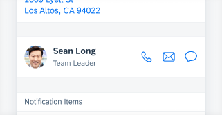
Your feedback has been sent to the SAP Fiori design team.

Thank you for your helping us to improve our guidelines!

 
We'd appreciate your feedback!
Please fill out the form to send us your feedback.
    • Can you tell us why?

Your feedback is anonymous, so you won't receive a reply. If you'd like help with a specific question, please visit the SAP Fiori Community