Navigation

Navigating on the watch should be quick and easy. To help users find their way around, it is important to keep the number of taps to complete an action and the overall app hierarchy to a minimum.

Choose a suitable navigation concept for your watch app if it has more than one screen. Hierarchical or page-based navigation are best used for watch apps.

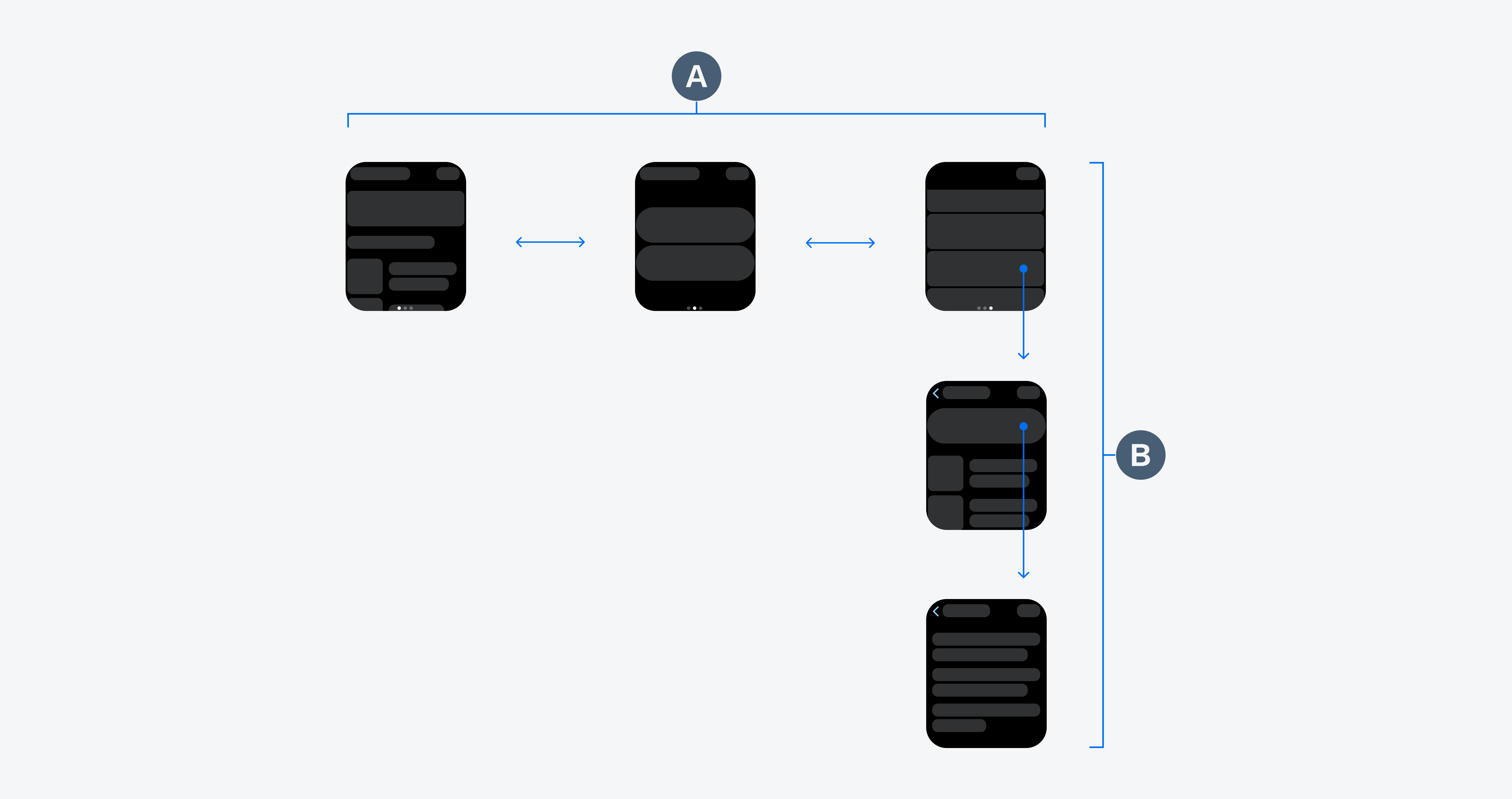
Page-based navigation (A) and hierarchical navigation (B)

Usage

Do
  • Provide clear navigation paths to your users.
  • Use no more than two to three hierarchy levels.
  • Divide information across multiple screens.
  • Let users complete important actions without scrolling.
Don't
  • Try not to use more than three hierarchy levels.
  • Try to avoid long scrolling areas on the watch.

Hierarchical Navigation

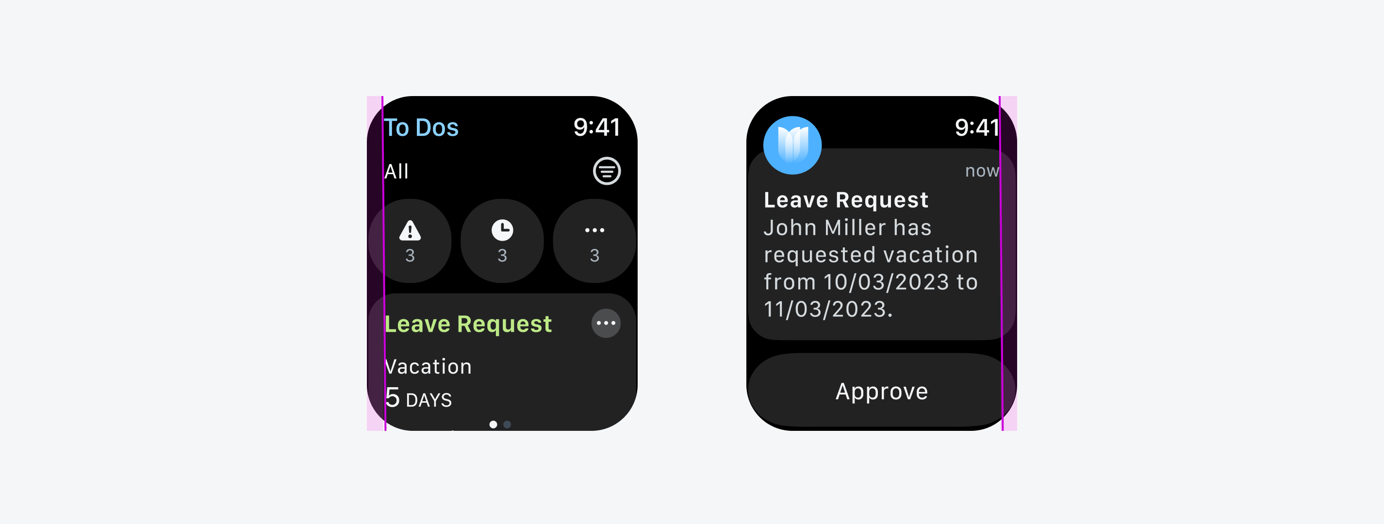
Build the navigation of your app hierarchically to ensure clarity for parent-child relationships of pages. In watch apps with hierarchical navigation, the home screen should already provide relevant actions or important information for the user. To access more detailed information about an object, enable users to drill down into available content subcategories by tapping on the object or by tapping on an overflow menu. Try to use no more than two to three hierarchy levels within your watch app.

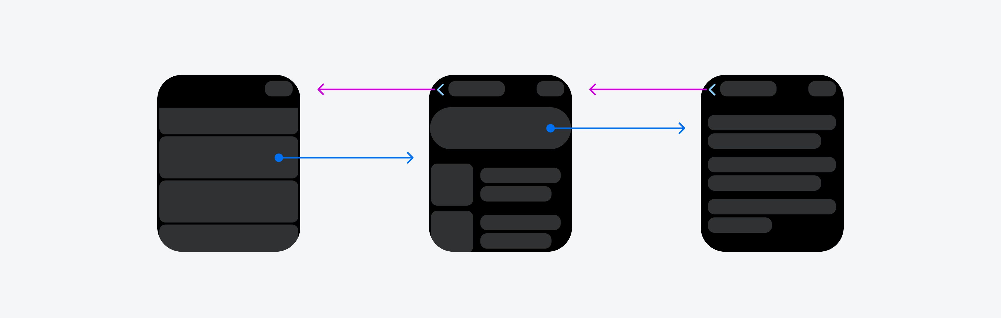
Hierarchical navigation for accessing more detailed information

Page-Based Navigation

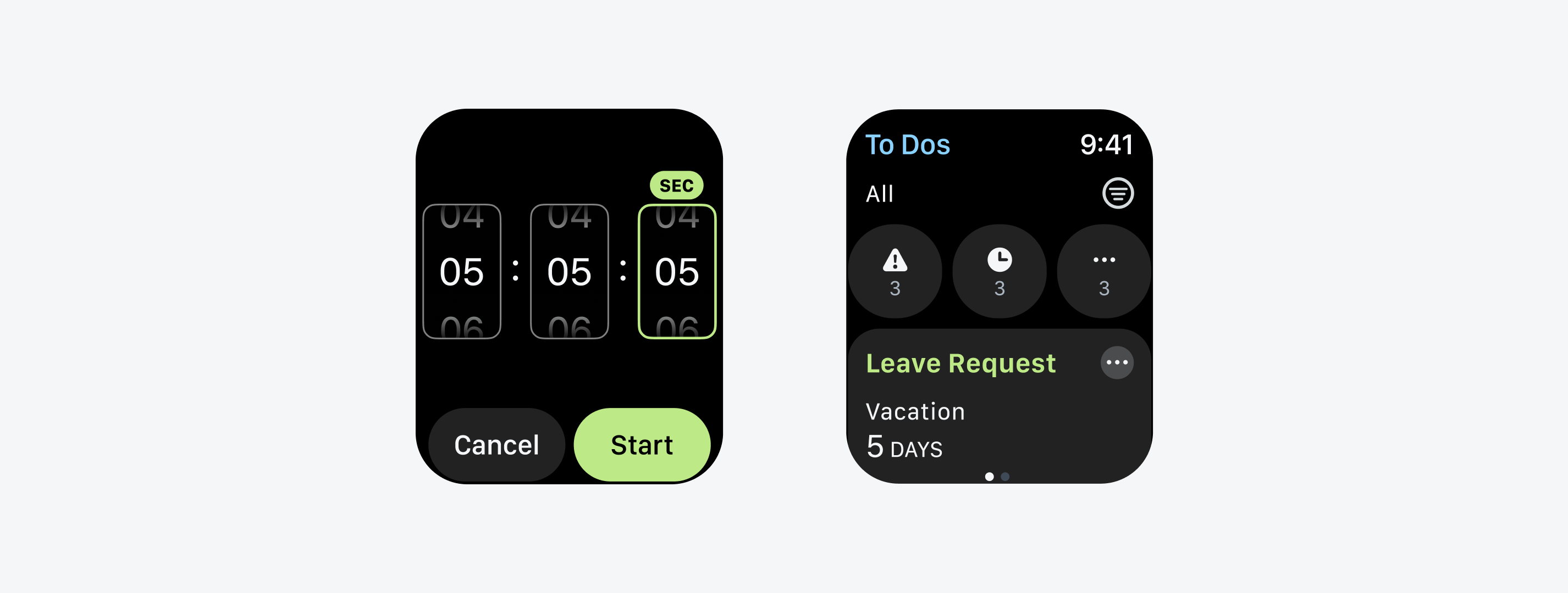
Page-based or flat navigation displays a flat collection of information that users can view one by one. Page-based navigation is best used for watch apps that are based around multiple content categories. Users can navigate between the screens by swiping left or right. The page-based navigation pattern does not represent hierarchical or non-sequential page relationships.

The number of available pages should always be visible and can be displayed using a page control. The current page should be visually highlighted with a solid dot.

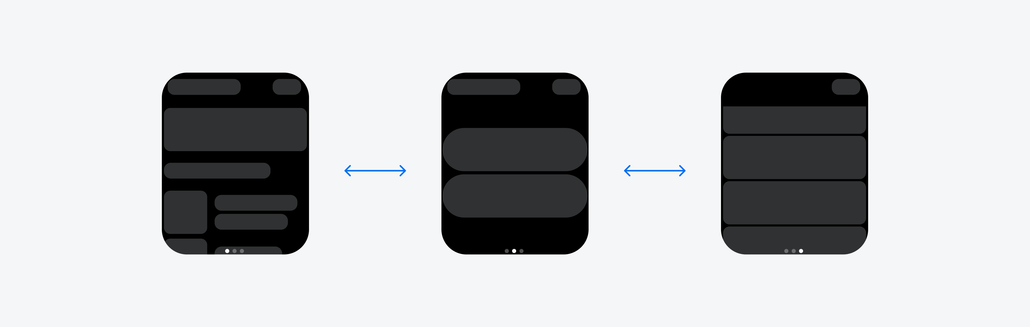
Page-based navigation for different content categories

Back Navigation

To return to the previous view or to close the current view, use the standard “Back” button. Users are already familiar with this from their mobile device and know that it allows them to retrace their steps through the different levels of the app’s hierarchy.

Resources

SAP Fiori for iOS: Navigation

SAP Fiori for Wear OS: Navigation

Human Interface Guidelines: Explore Navigation Design for iOS, Page Controls

Typography

SAP Fiori for watchOS uses SF Compact as its primary typeface. SF Compact is optimized for small screens and works seamlessly with the watchOS accessibility features, such as Dynamic Type. SF Compact has multiple weights in its display and text versions. For complications, we recommend using SF Compact Rounded.

Available font styles for SAP Fiori for watchOS

Resources

SAP Fiori for Wear OS: Type System

Human Interface Guidelines: Typography

Layout

When designing for small screens, it is important to keep content within the layout legible, aligned, organized, and accessible. The following article presents some best practices that offer guidance for the design of a watch app layout, such as rules for handling different screen sizes, margins, and touch targets.

Usage

As the screen on the watch is very small, we recommend using the full width of the screen for interactive UI elements. The frame of the watch automatically creates a visual padding around the content, so you do not need to add additional padding.

Allow enough space for interactive UI elements within the layout and try to avoid placing more than three components next to each other. More specifically, do not place more than three symbol buttons and no more than two text buttons side by side.

Two text buttons (left) and three symbol buttons (right) next to each other

Users want to see the most relevant content or actions at a glance, rather than having to scroll. Therefore, in some cases, it makes sense to place two text buttons with a short label next to each other if they are equally important to the user.

Automatic rotation of the layout is rather uncommon on the watch, especially since the display usually turns off when users turn their wrist – but in some use cases it makes sense to autorotate the layout. SAP software is often used in areas where workers point a QR code at a reader, for example, in logistics. In this case, the display should stay on and rotate to the desired position.

Information
For developer guidance, see isAutorotating.

Screen Sizes

Apps for watchOS always have a rectangular layout. When designing your app, keep in mind the different screen sizes of the Apple Watch. Currently there are screens with 28, 40, 41, 42, 44, and 45 mm. Always start designing with the smallest screen size. Then, optimize your design for larger screen sizes, such as the 45mm screen.

Align the text of the UI elements with the leading edge of the navigation bar title or “Back” button.

Text alignment within the layout

Margins

Even if you design a rectangular layout for your watch app, the rounded corners of the Apple Watch may cut off some UI elements. Therefore, the content should always be placed within the given margins and should not extend beyond them. If you are using the Design Kit for SAP Fiori for watchOS, the margins are already set. We recommend that you do not change the default margins.

Minimum margins
Minimum margins

Touch Target

To support adequate selection time and to avoid “fat finger errors” on the watch, interactive elements must have a touch target of at least 40pt x 40pt. Especially on small screens, it can be more difficult to select the desired UI element.

Minimum touch targets

Resources

SAP Fiori for Wear OS: Layout

Human Interface Guidelines: Layout, Supporting Multiple Watch Sizes

Colors

The right choice of colors is an important aspect that should be considered in watch apps. It communicates the meaning and relationship of content, providing users with guidance to help them complete their tasks.

Horizon Reference Colors

The color palette for SAP Fiori for watchOS is based on the color parameters from the Horizon visual theme. The colors displayed below are the main reference colors.

Horizon color palette

Color Palette

Compared to mobile apps, colors in watch apps are generally brighter and less saturated.  Additionally, watch apps are only available in dark mode to save battery life and accommodate different light conditions, like lower light or direct sunlight.

We recommend using the dedicated color palette to provide optimal readability and accessibility for users – which is even more important in critical situations due to the smaller screen size and rather short looks at glanceable content on watches.

Core Colors

The current color palette is derived from the main control parameters from the Horizon theme. The following table shows the main reference colors for SAP Fiori for watchOS apps.

Color Value Name Usage
#000000 Primary Background Watch background or label color for tint buttons
#F2F4FC; 14% Transparency Secondary Background Background color for cards or actions
#F2F4FC; 20% Transparency Tertiary Background Background color for secondary buttons next to a primary button
#222223 Quaternary Background Background for opaque buttons or cards
#F5F6F7 Primary Label Titles or primary text content
#D5DADD Secondary Label Subtitles, secondary text content or section header text
#A9B4BE Tertiary Label Footer text, status, tertiary text content or placeholder text
#8396A8 Quaternary Label Symbols or icons
#89D1FF Tint Tappable elements
#4DB1FF Tint Tap State Tap state of tappable elements
#FF5C77 Negative Label Negative or destructive actions or labels
#EE3939 Negative Label Tap State Negative or destructive actions in tap state
#FFC933 Critical Label Attention needed elements or labels
#FFB300 Critical Label Tap State Attention needed elements in tap state
#BDE986 Positive Label Positive priority elements or labels
#5DC122 Positive Label Tap State Positive priority elements in tap state
#5B738B, 50% Transparency Separator Non-interactive element, decorative elements, separators, hairlines or divider lines
#8396A8 Separator (Opaque) Higher contrast border or text field borders

Accent Colors

Accent colors are used to emphasize key parts of the UI or to highlight information. The following table shows the main accent colors for SAP Fiori for watchOS apps.

Color Value Name
#FFC933 Mango
#FF5C77 Red
#B894FF Indigo
#4DB1FF Blue
#64EDD2 Teal
#BDE986 Green
#FF8AF0 Pink
#FEADC8 Raspberry
#A9B4BE Grey

Resources

SAP Fiori for Wear OS: Colors 

Material Design: Wear OS Colors 

Design Principles

SAP Fiori for watchOS provides a consistent and holistic user experience for SAP software on wearables. Wearables are computer technologies that users wear on their bodies, creating a more personalized experience. Common types of wearable devices are watches.

The purpose of wearables is to support an activity in the real world by providing additional information, for example, evaluations based on sensors tracking the body’s vitals, or glanceable instructions without touching the device.

Differences Between Mobile and Wearable Devices

Designing for watch apps presents a fundamentally different approach from designing for mobile apps. Not only is the screen that users interact with much smaller, but also the way and duration users interact with the watch app is different compared to mobile apps. Therefore, the most important aspect of creating a watch app is to define focused wearable requirements instead of trying to mirror the scope of the mobile app. In addition, the user experience on a watch cannot be compared to the experience of a mobile device and therefore follows different design principles.

Mobile devices as standalone devices with app focus and wearables as optional devices with device focus

In contrast to a watch app, apps on a mobile device represent an end-to-end experience. That means, while the mobile device contains the complete app, the watch version focuses more on informing the user selectively, with, for example, relevant notifications or complications, and a maximum of one or two functions that can be performed quickly.

Passive use and brief glance interactions with the end device predominate on the watch:

Watch usage categories

In general, the usage of watches is divided into the following categories:

  • 85 % passive use, such as usage of the sensor
  • 10 % looking at the watch, such as notifications, complications
  • 5 % performing actions, such as setting timers

The image above shows that the way users interact with watch apps differs greatly from mobile apps – especially in terms of passive usage. As a result, the design process for watch apps must start with specifying the requirements. If guidelines for wearables are not considered, not only will the added value of a watch app quickly decrease, but also the general user experience of the app will be negatively affected. This may cause users to discontinue using the watch app because they do not depend on it.

Do
  • Focus on single actions and relevant information.
  • Try to use one-tap interactions.
  • Minimize hierarchies within the app.
  • Leverage a “favourites” or “recents” feature as well as usage patterns to infer user-based relevance of content.
Don't
  • Don’t translate mobile app capabilities to the watch.
  • Don’t apply mobile app information architecture to the watch.
  • Don’t assume that the mental model for the mobile app is the same as for the watch app.
Information
To keep future modification efforts low, we recommend creating designs for the smallest model from the Apple Watch series first. 

Differences Between watchOS and Wear OS

Keep in mind that there are also platform-specific differences when it comes to watch apps. The following table shows a rough overview of the most important differences of the operating systems watchOS from Apple and Wear OS from Google that influence the design of a watch app.

Feature

watchOS (Apple)

Wear OS (Google)

Tiles Component Instead of tiles, watchOS supports dock cards that have similar properties as tiles. Tiles offer users glanceable actions and information. Users can configure which tiles they want to be displayed so that they can access them by swiping from the watch face.
Back Navigation/Cancel Back button in title area or hardware button. Swipe right or hardware button.
Text Layout Mostly left-aligned. Mostly centered.
Icon Buttons Rather uncommon. Very common.
Text Resizing Cannot be deactivated. Components need to be optimized for that feature. Can be deactivated.
Display Form Factors Square display only. Round, square and rectangular displays.
Handover Feature Not supported by default. Default feature.

Design Principles

The following principles provide an overview of the fundamental factors of good user experience for wearables and additional guidance for SAP-specific software on watches:

  • Focus on critical information and tasks
  • Enable quick and informed actions
  • Show timely and relevant notifications
  • Provide device transitions
  • Leverage watch interactions
  • Include privacy and security features

Focus on Critical Information and Tasks

If you need a watch extension of your app, you have to consider the most important and most used activities of your mobile app. Only focus on these one or two features for the watch and avoid a complex information architecture.

Example of mobile versus watch app features

Also consider the context in which the features you selected will be used:

  • Where might the users be at the point of interaction with the watch app?
  • Do users require hands-free interactions?
  • Is the user’s environment changing?
  • What options could help users continue their task smoothly?

Keep in mind that users should always be able to see what the system is doing and that it is responding to their actions. Therefore, the UI should inform them about activity or status.

Voice assistant when no free hand is available (left), and automatic offline data storage to continue tasks even without reception (middle and right screen)

If your feature includes displaying multiple work tasks or to-dos, it must be apparent to users how many tasks they need to complete as well as the current progress. Also enable reminder notifications for critical work tasks or newly created ones.

Tasks and progress indicator of operations

Enable Quick and Informed Actions

To avoid users of a watch app from taking out their phone during interactions, the activities on the watch must be meaningful and quick to complete. In addition, the action to be performed should match the current context and the respective user. Therefore, only show one relevant action for this user that can be completed in less than 5 seconds. If the interaction takes more than 5 seconds on the watch, users are more inclined to use their phone instead.

For actions to be performed quickly and easily, the app should also have a simple navigation structure as well as a minimal or no hierarchy. For more details about navigation within watch apps, see Navigation. If possible, users should be able to complete an action and gain value with one tap.

Information
Previous watch designs have shown that users engage more with a watch app when it has only one or two features.

The home screen of your app should contain actionable content. A good example for this is the Apple Clock app: instead of showing the user controls to set a custom timer, the app provides commonly used defaults on launch and further defaults can be found with a simple scroll. The timers the user sets most frequently are surfaced to the top of the list. This is also an example for so-called “smart defaults” that will be perceived by users as valuable, and usage will increase.

Apple Clock home screen that shows recently used timers

If your app provides different actions, use button hierarchy to highlight the primary from the secondary action or to make semantic, especially negative actions, such as “Delete” or “Decline” recognizable.

Primary button for the most important action (left) and semantic buttons (right)

On a watch, errors can quickly occur by accidentally pressing a button. Especially in cases of negative or destructive actions, a loading screen or confirmation screen should be integrated to quickly undo mistakes.

Watch with confirmation dialog (left), loading screen (middle), and success screen (right)

Show Timely and Relevant Notifications

An important feature of watches are rich notifications that can be actionable. These are mirrored from your phone by default but can also be customized for the watch.

Tapping on a notification from the notification center (short-look) opens a long-look interface with quick actions

Notifications should be short and concise, appear in the right moment, and be of relevance and added value for the user. This could be, for example, a notification that appears when the decibel level is above a threshold that can cause hearing impairment or a notification reminding the user of a task that needs to be done at a certain time.

Make sure that the notification text is short but contains the most important information for the user. For non-destructive routine actions, consider providing notification actions.

Provide Device Transitions

Since watches show their full potential in combination with a paired smartphone, the watch app should be considered as a companion to the mobile version of the app. The watch experience should always be an extension and not a standalone app.

Therefore, users should be able to continue any interaction they started with the watch app on their phone. Make sure to offer users a seamless handover from the watch to other devices.

Device transition from watch to phone to proceed smoothly with tasks

For example, the handover feature can be used for notifications: if users get a notification on their watch, they have the option to open it on their phone to get the full context. Another example is the manual setting of displayable elements on the watch, such as KPIs: provide a handover that takes the user to the respective settings on their smartphone.

Leverage Watch Interactions

On a watch, where space is limited, it is important to offer the most common and native device interactions. Make use of touch gestures, such as scrolling and tapping, and use “swipe right to go back”. Similar gestures between watch and smartphone help users to quickly familiarize themselves with watch interactions.

Enable haptics to build an engaging and personal watch experience. System-provided haptics, such as scrolling with the Digital Crown, give users a feeling for actions. Use haptics for different states (e.g., success or failure) and actions (e.g., start and stop).

The small screen of a watch makes text input highly frustrating for users. Remember that after 5 seconds of interaction with the watch, users are switching to their phone. To avoid this, consider offering fallback options, such as predefined answers in text fields or voice input that is converted into text.

Predefined responses (left and middle screen) or a voice input option (right screen) as fallback options

Include Privacy and Security Features

Since a watch is worn directly on a user’s body and can collect not only movement but also data through various sensors, it is extremely important in a corporate context to inform users about what data the app is collecting. Only access user data that is necessary and essential for the current app context and avoid recording personal data. Transparency about data privacy and the protection of personal data is essential for the user acceptance of your app.

Configuration option for notifications (right screen), for example to not display confidential company information on the watch

Ensure that confidential company data is also protected, and only show necessary data that is essential in relation to the current task and context. Strive to let users configure how sensitive data is displayed on their watch.
Avoid including sensitive, personal, or confidential information in a notification. Especially company sensitive data must not appear in a notification.

Resources

SAP Fiori for Wear OS: Design Principles

Human Interface Guidelines: Designing for watchOS

Get Started

SAP Fiori for watchOS is a design language specifically adapted for SAP software running on watchOS devices.

Foundation of SAP Fiori for watchOS

Design Principles

Watch apps have their own design principles that need to be considered for watch app design. Learn more about the core of SAP Fiori for watchOS and find out how these design principles can help you create impactful enterprise watch apps.


Colors

Color is an essential element for watch apps to provide optimal readability and accessibility for users. Find out more about the SAP Fiori for watchOS color palette and how to use it effectively.


Typography

By using native fonts for SAP Fiori for watchOS, our design language blends seamlessly with the native watchOS user experience and accessibility features.


Layout

Learn more about layout best practices for watch apps to keep your content legible, aligned, organized, and accessible.


Navigation

A clear and short navigation path allows your watch app users to complete their tasks quickly. Learn more about navigation patterns for SAP Fiori for watchOS apps.

Resources

By using our Design UI Kit, you can save time and ensure consistency. This simplifies the design and helps you learn more about how watch elements work and are built.

Download the SAP Fiori for watchOS Figma UI Kit and start designing your own SAP Fiori for watchOS applications.

For more information, see Resources.