
Contribution
Intro
Everyone within SAP is welcome to contribute, regardless of their location or business unit. To make your contribution a success, please take a look at the following guidelines.
Contribution Types
We recommend that you contribute UI design always together with code and vice versa.
There are different contribution types for you to choose from:
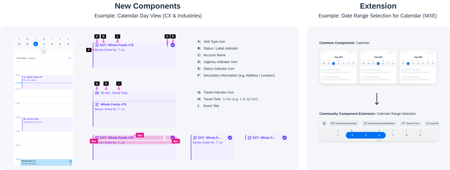
- New Component: Add a new community component to this project.
- Component Extension: Add a community component extension to this project by reusing an existing common component.
Note: (Optional) Feature parity is an important factor for our products. You are encouraged to contribute to both platforms to increase efficiency.
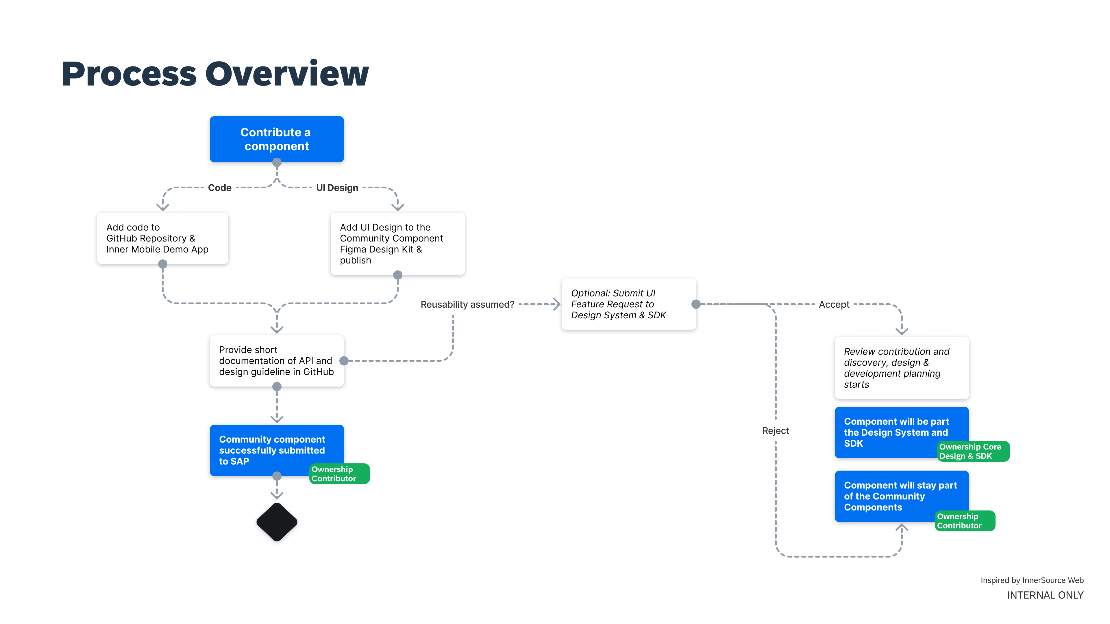
Contribute a Component or Extension
Our recommendation is to align with the teams responsible for the mobile design system and SAP BTP SDK for iOS BEFORE you start working on the contribution. You can contact us through our communication channels.
How to contribute UI design (components, features, and documentation):
Join the Community Components for Android & iOS Figma Project.
- Create your component on a new page in the Community Components for iOS and/or Community Components for Android Design Kit.
- Publish the Figma Library including your update to everyone at SAP and document your changes.
How to contribute code (components, features, and documentation):
- Add a component to the Android and/or iOS repository
- Provide a short description of its features, including an API description
- Include a screenshot or preview image of the component
- Add the component implementation to the InnerMobile Demo App
Note: (Optional) Create feature request if reusability by other product teams is assumed. Your contribution (code & design specification) will be reviewed by the maintainers of the project team.
Definition of Done
UI Design
- The UI component design adheres to the design guidelines of SAP Fiori for Android and iOS and respective Material Design or Apple Human Interface Guidelines.
- The UI component covers all aspects of the Mobile Design Spec Cheat Sheet.
- The UI component has been added to the Community Component Design Kit, tested, and documented via the Figma info panel.
- (Optional) A design guideline for your community component has been added to GitHub (see example component).
- (Optional) A design specification has been provided for more details here.
Code
See Contribution Definition of Done in GitHub.
Documentation
As a contributor, you are expected to document your UI design and code
- Development documentation in the code to comply with the SAP guidelines for coding rules and guidelines (VPN required)
- Design guideline as part of GitHub (see example component)
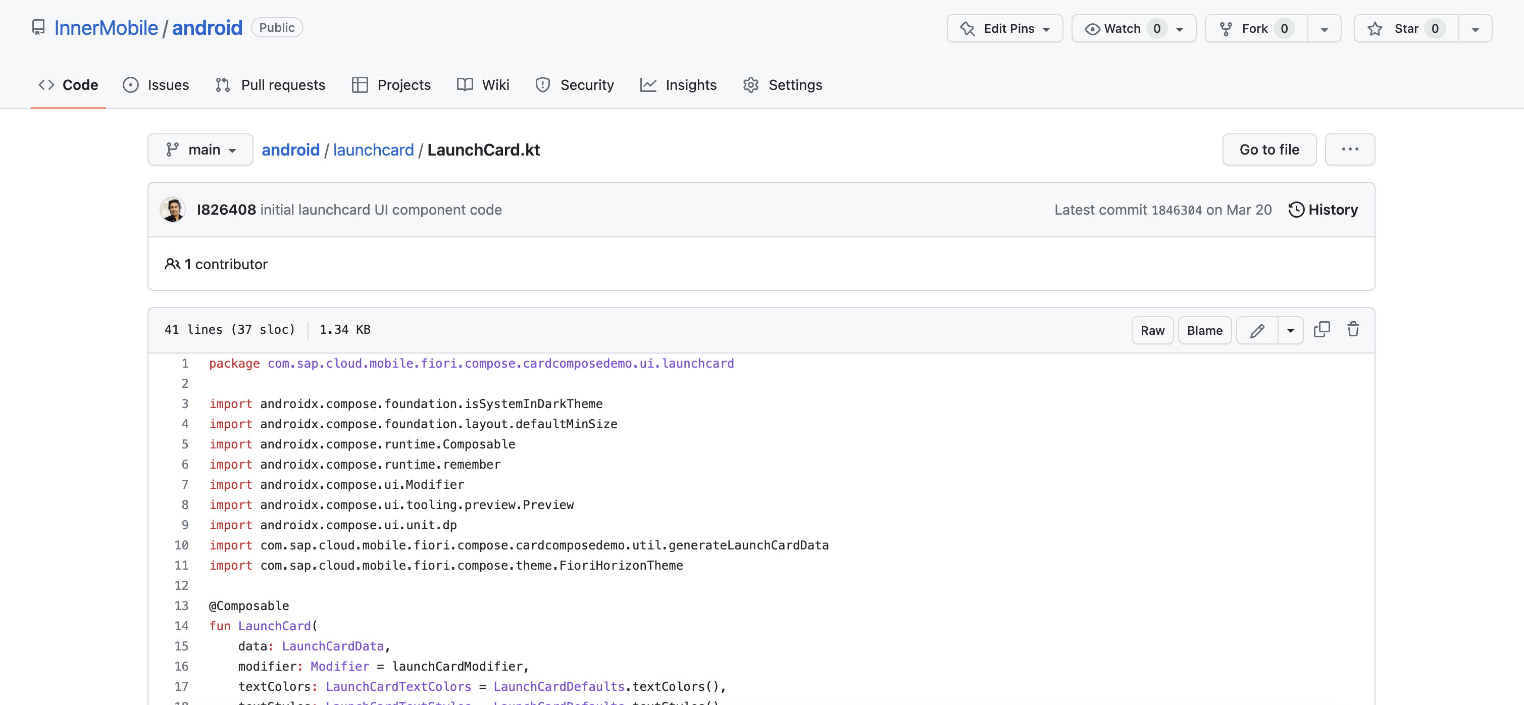
Sample Component in Code (GitHub)
Check out the sample component in the GitHub repositories
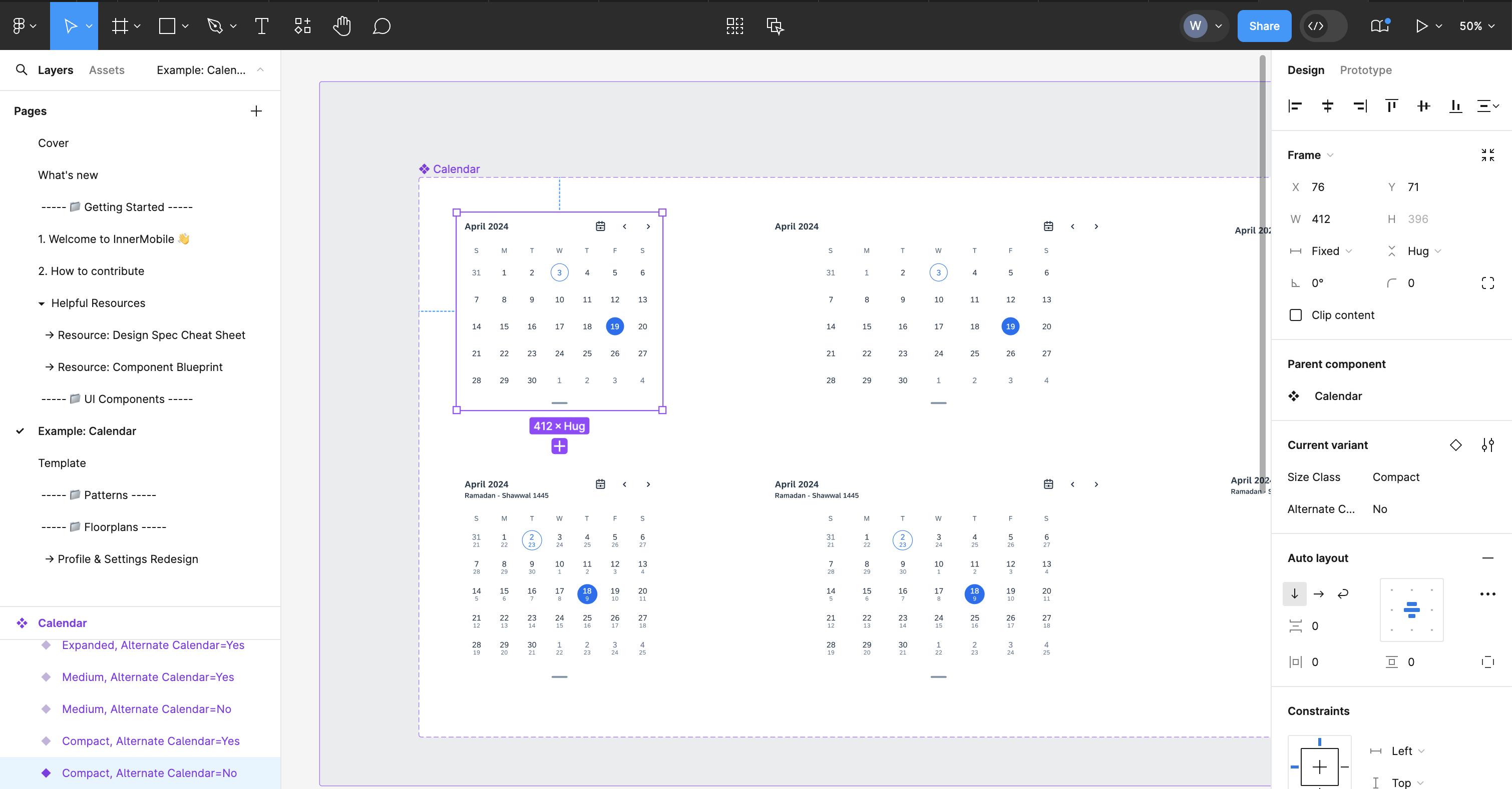
Sample Component in Design (Design Kit)
Check out the sample component in the Design Kit and Design Specification and learn how to design for the mobile design system
Resources
- Design Specification Cheat Sheet: Learn how to specify a component for the mobile design system for SAP Fiori for Android or SAP Fiori for iOS
- Design Guidelines for Android & iOS: Understand which components and patterns are already available in the design system for SAP Fiori for Android
- Figma Design Kit for Android & iOS: Leverage the existing Design Kit and reuse components and patterns to build your contribution
- Development Documentation for SDK Android & iOS: Learn about APIs and development documentation
- SAP Fiori Mobile Roadmap: Understand what’s next and maximize your impact (access needs to be requested)
 Your feedback has been sent to the SAP Fiori design team.