Masonry Layout
FUICollectionViewLayout.masonry
Intro
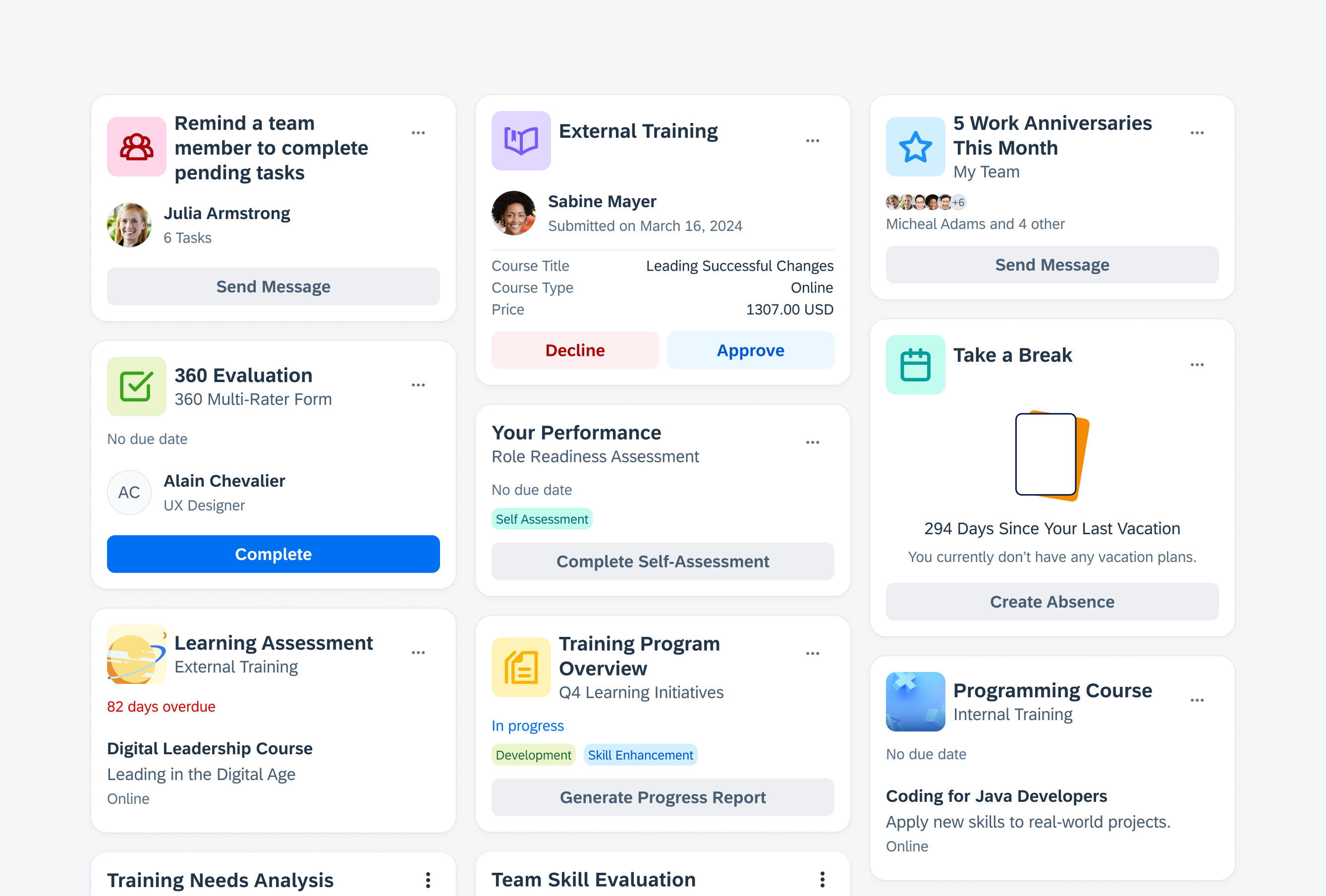
The masonry layout for cards is a design pattern in which cards are arranged in a flexible, grid-like structure, with each card adapting to the available space while maintaining alignment with adjacent cards. It optimizes space usage and provides an aesthetically pleasing visual layout.

Masonry layout in compact size class and regular size class
- Use a masonry layout if you want to showcase important content from different data sources, such as product features, KPIs, or statutes side by side.
- Use a masonry layout if you want to give users an overview of a specific set of data.
- Use a masonry layout if you want to enable a holistic and frictionless information approach.
- Use a masonry layout if there are nine or more cards to display.
All cards in a masonry layout have a consistent width, which is based on the number of columns determined by the horizontal size class (compact or regular). The number of columns and therefore the number of cards displayed in a masonry can be customized.
The height of each card can vary depending on the content, creating an asymmetric appearance in the masonry layout.
We recommend using a title for your card layout via the header cell component if your app includes multiple card layouts, such as a carousel and a masonry.

Masonry layout that dynamically arranges cards within a grid
Scrolling
Cards scroll vertically in a masonry layout.

Vertical scrolling in a masonry layout
Card Prioritization
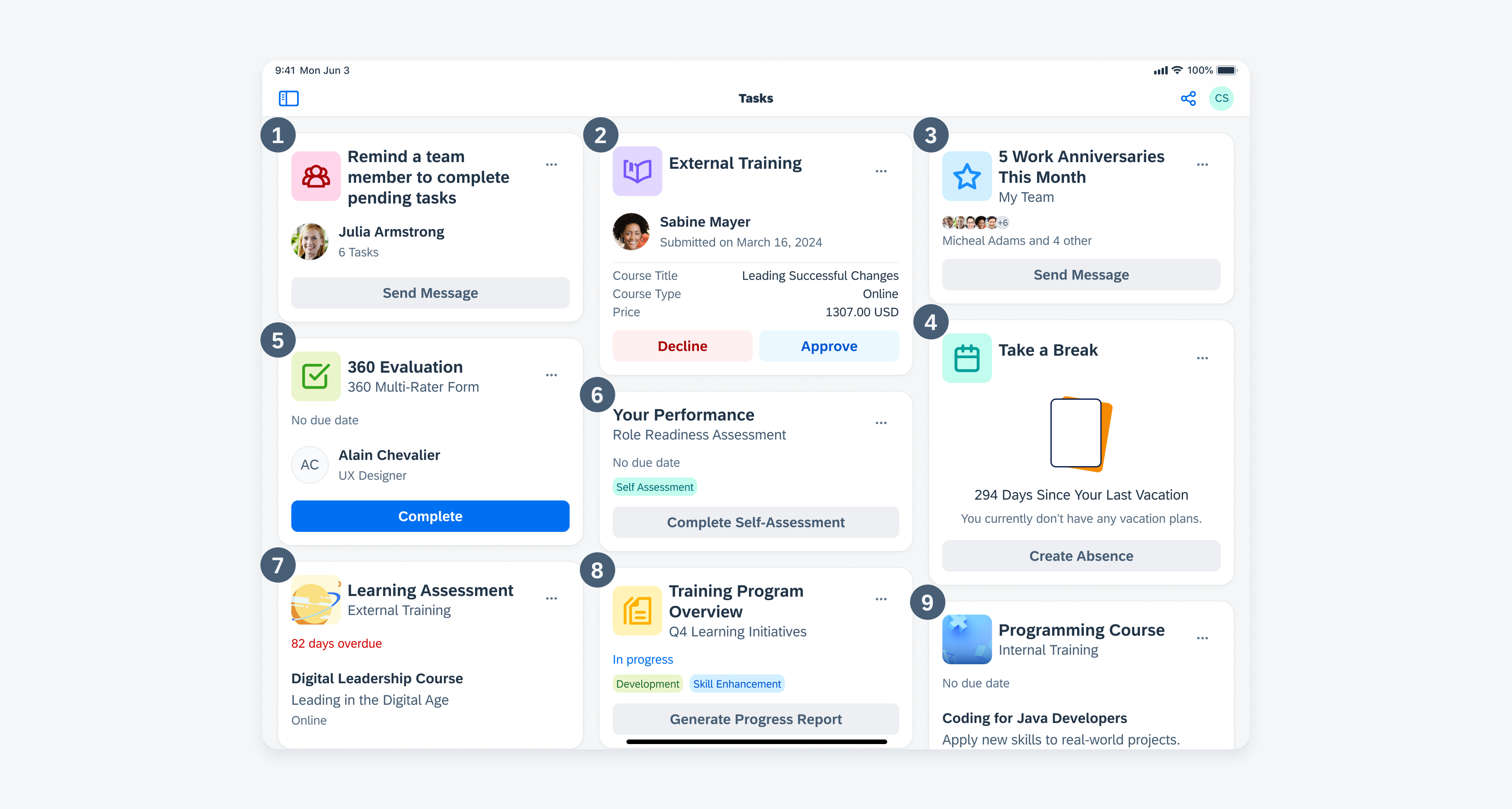
In a masonry layout, cards are positioned based on a prioritization of the top left corner. The most important card in a sequence is placed in the upper left corner of the layout. Following the placement of the first card, subsequent cards are arranged at the top and left of the layout. This means that each new card is positioned next to the top edge of the grid and aligned with the leftmost edge of the previously placed card.

Masonry layout showing topmost and leftmost card placement
The position of the cards is static and can’t be adjusted by the user.
Empty States
If there is no card in the masonry layout, we recommend using an empty state indicator in the layout container to communicate this information. This indicator serves as an informative message for users to let them know that no information or data is currently available or that some information needs to be created.

Illustrated message to indicate an empty state
The number of columns in a masonry layout can be increased based on the screen width, allowing more cards to be shown side by side.
For compact size classes, we recommend using one column only and arranging cards below each other. For regular size classes, for example, for an iPad app, we recommend using a masonry layout with three columns.
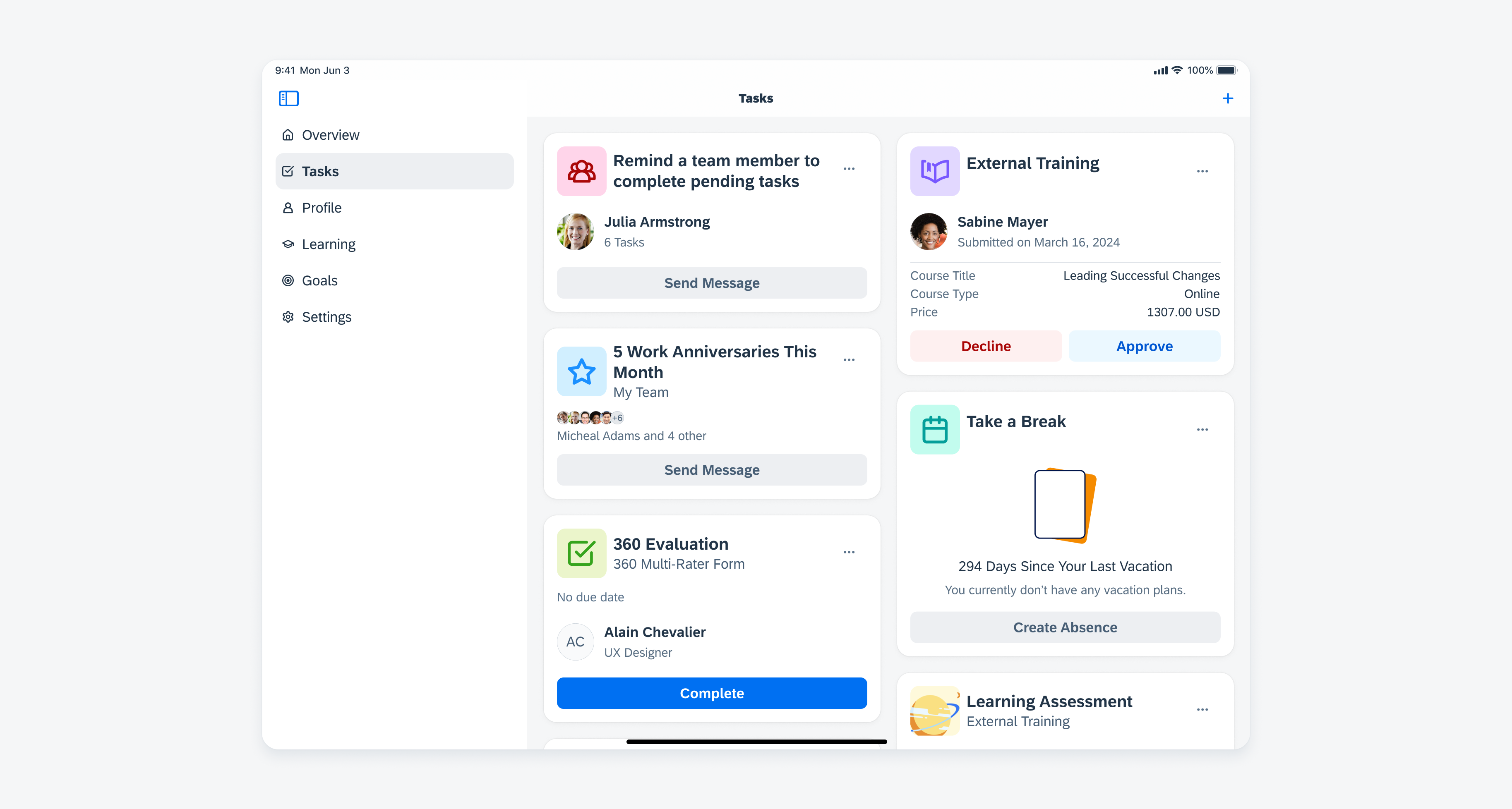
When using a sidebar, we recommend reducing the number of columns to make the card’s width fit better to the rest of the screen.

Masonry layout next to a sidebar
Depending on the context of the app, you can combine a masonry layout with a carousel. However, note that using both layouts on the same page can result in a visual imbalance caused by the outer margins of the different layouts. In a carousel layout, the spacing between the card and the outer edge of the screen is different on the right side compared to the left side. In a masonry layout, the spacing remains the same on both sides.
Resources
Development: Masonry Layout
SAP Fiori for Android: Staggered Layout
SAP Fiori for Web: Overview Page
Related Components/Patterns: Carousel Layout

 Your feedback has been sent to the SAP Fiori design team.